Lextenso éditions is a French publishing group specialising in legal issues. Created in 2008, it brings together all the publishing brands of the Petites Affiches group. The Lextenso.fr portal provides access to a case law database and several of the group’s journals: Petites Affiches, Gazette du Palais, Répertoire Defrénois, Bulletin Joly sociétés and Revue Générale du droit des assurances. Following successive integrations, 20 journals are now accessible. It was therefore time for Lextenso to review its brand architecture, in order to make its offering more legible, while at the same time strengthening its position as a major player in legal publishing in a highly competitive context with high-profile players such as Lexis Nexis and Dalloz.
Lextenso Editions
The digital revolution in access to the law!
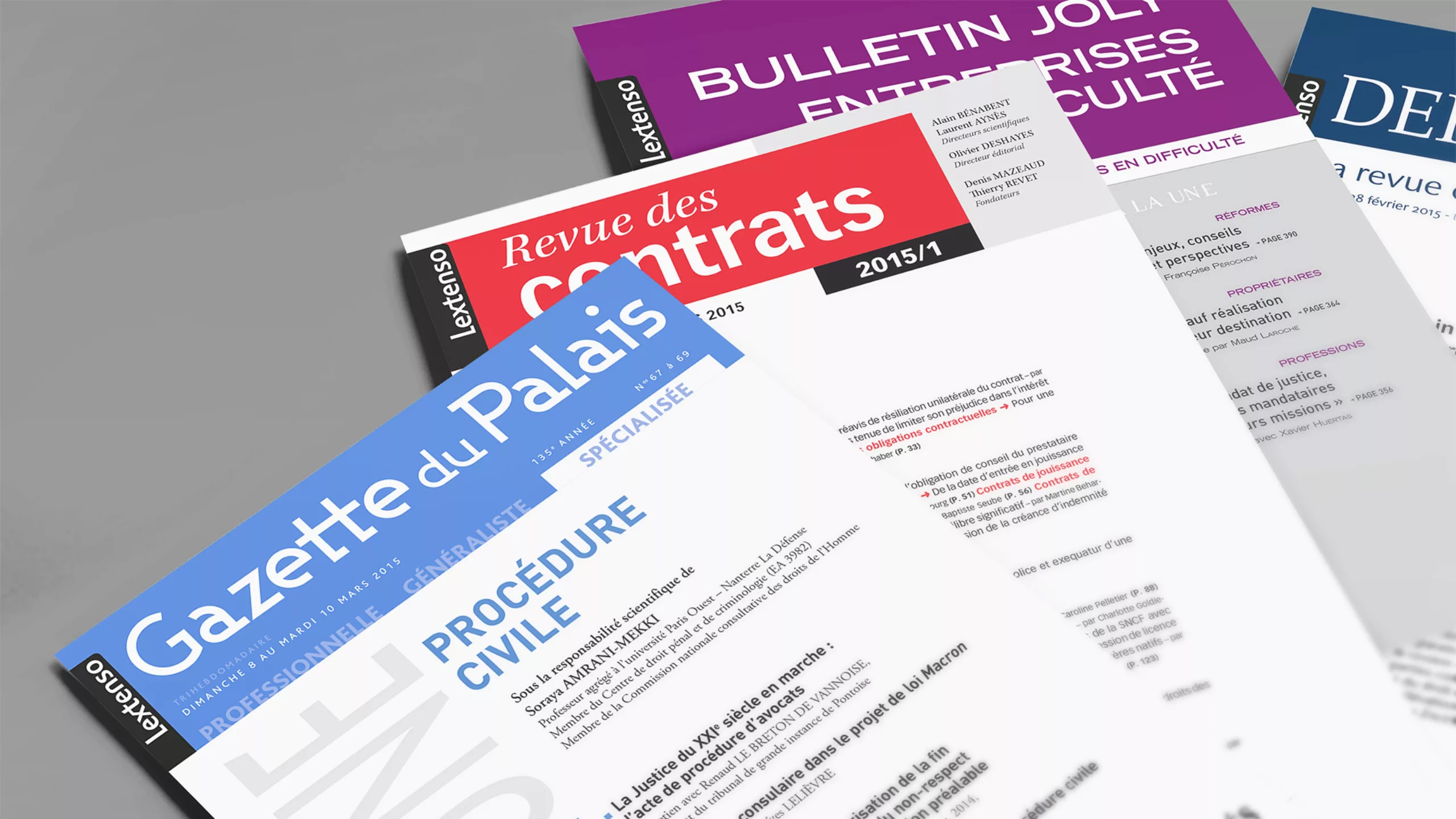
A visual redesign for greater simplicity
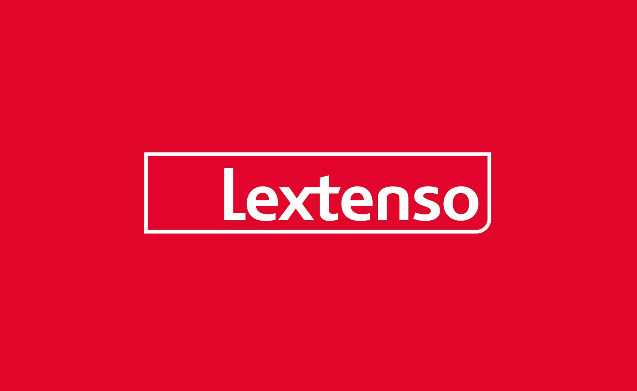
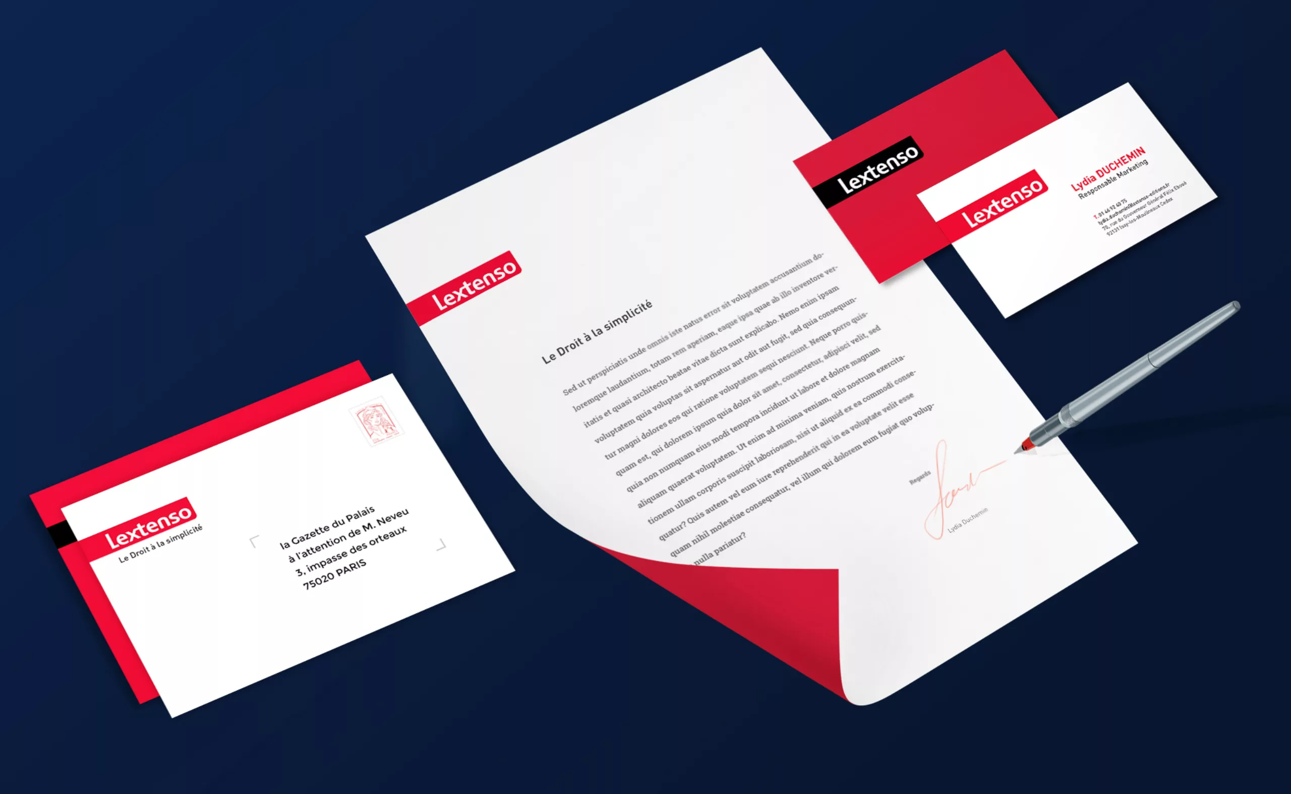
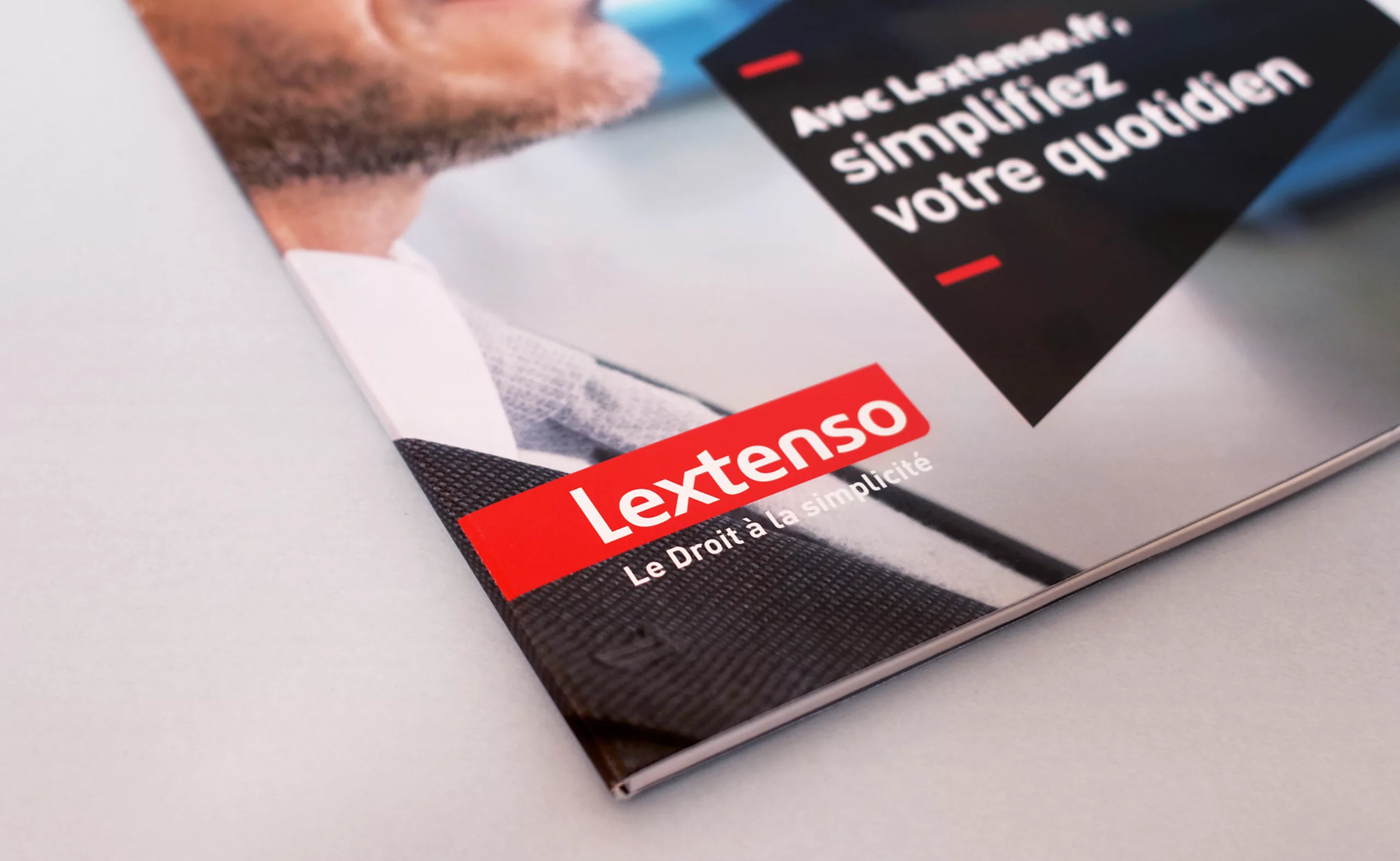
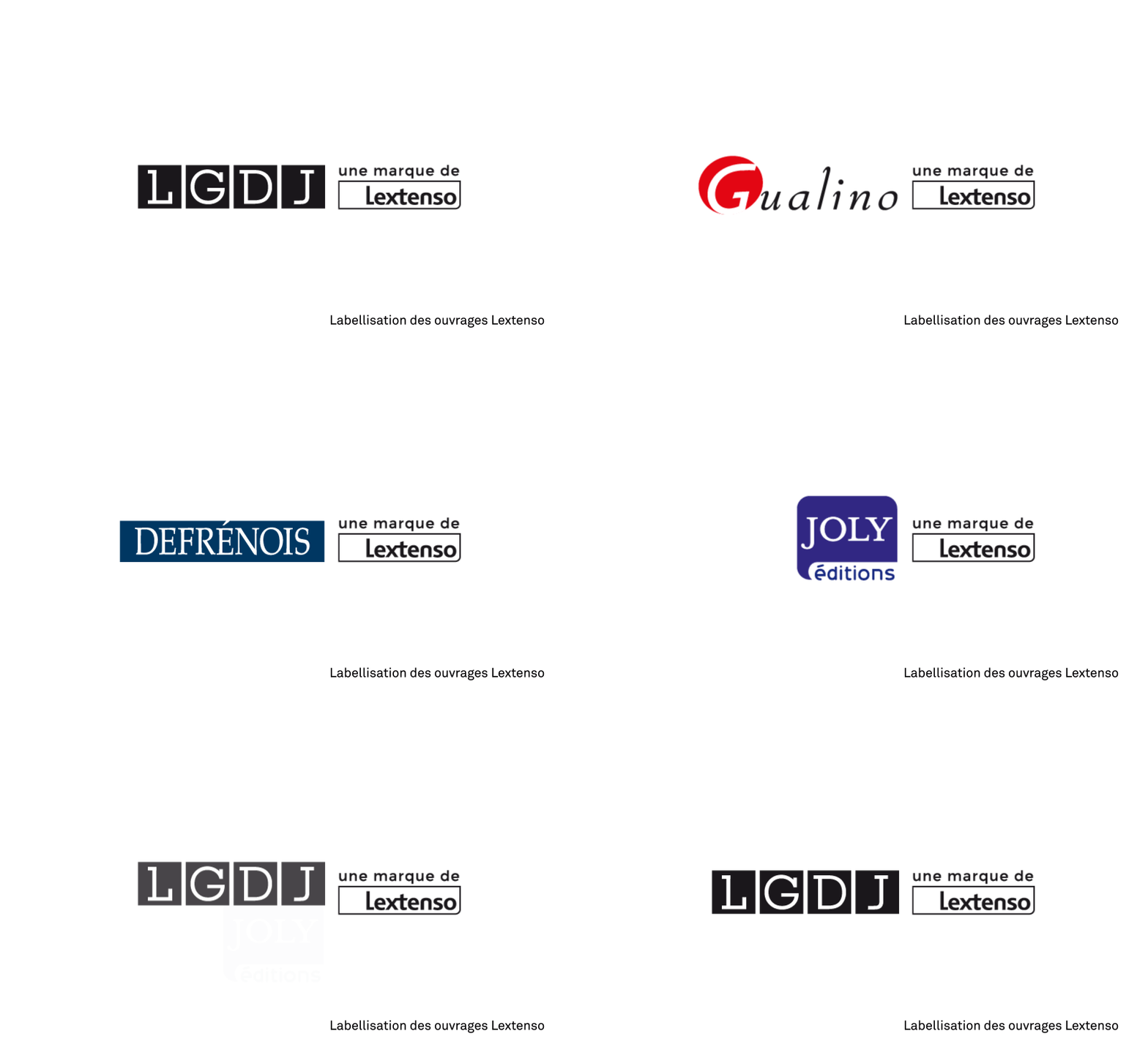
The aim of this redesign was to make Lextenso an umbrella brand capable of graphically federating all its different editions. The logotype is very often found in a context of double signatures. We therefore chose to keep the simplicity of a logo reduced to the expression of its lettering in a cartouche. Adding an emblem would have been of no use, especially when you have such a strong and meaningful brand name. Leveraging the image of the name ‘Lextenso’, born from the fusion of the root “Lex” (meaning ‘Written Law’ in Latin) and the expression ‘In extenso’, (meaning ‘In full’), was therefore the most obvious option.
A stronger cartouche and lettering
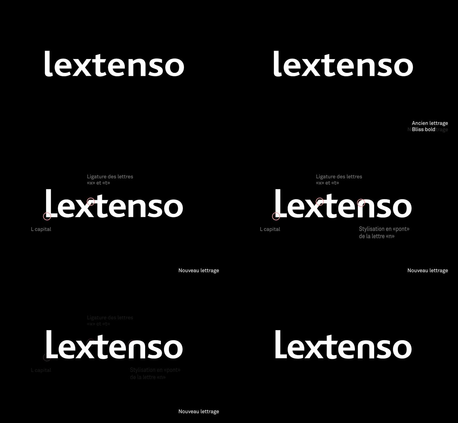
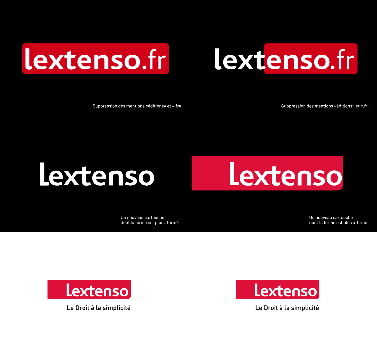
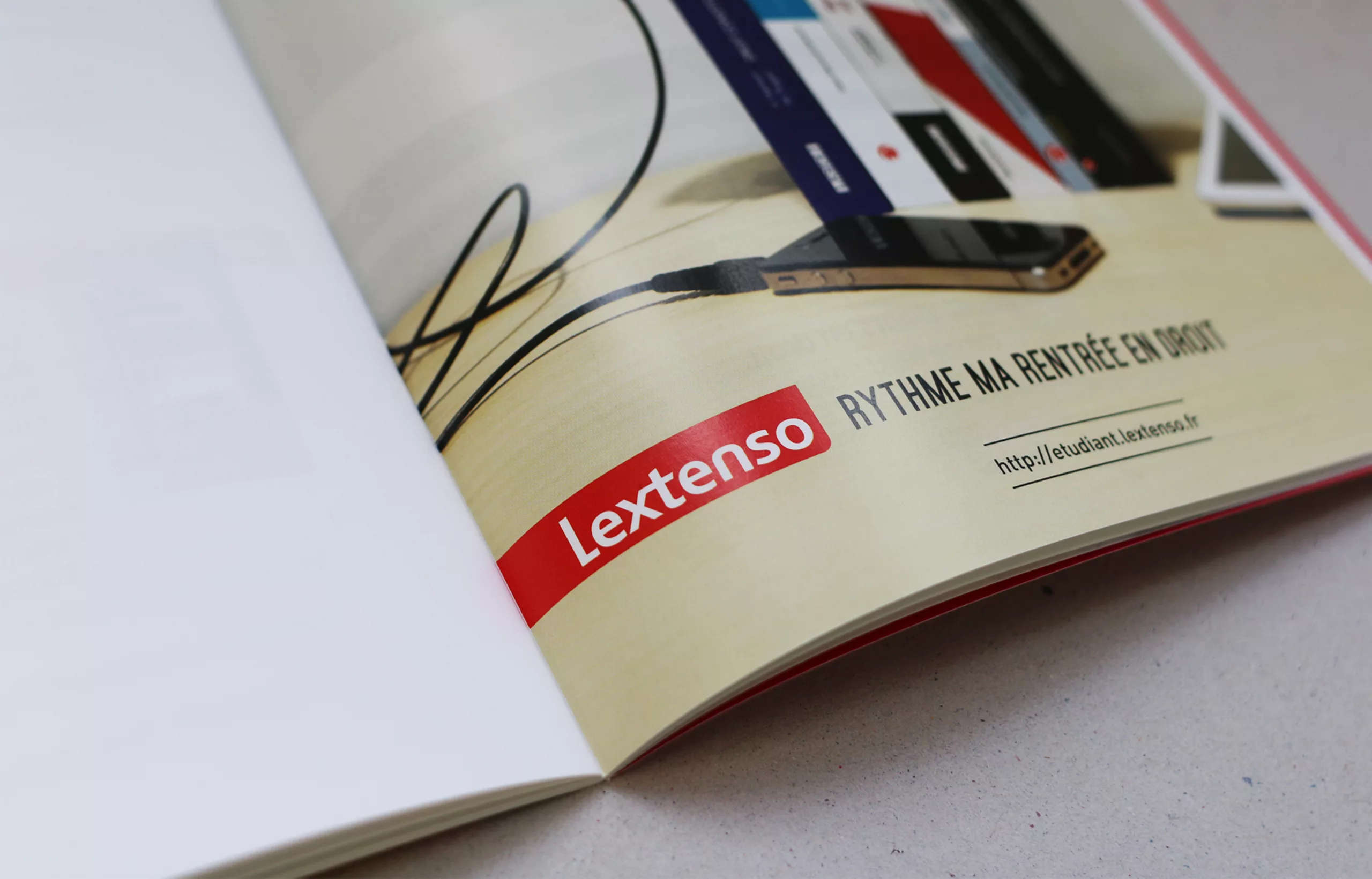
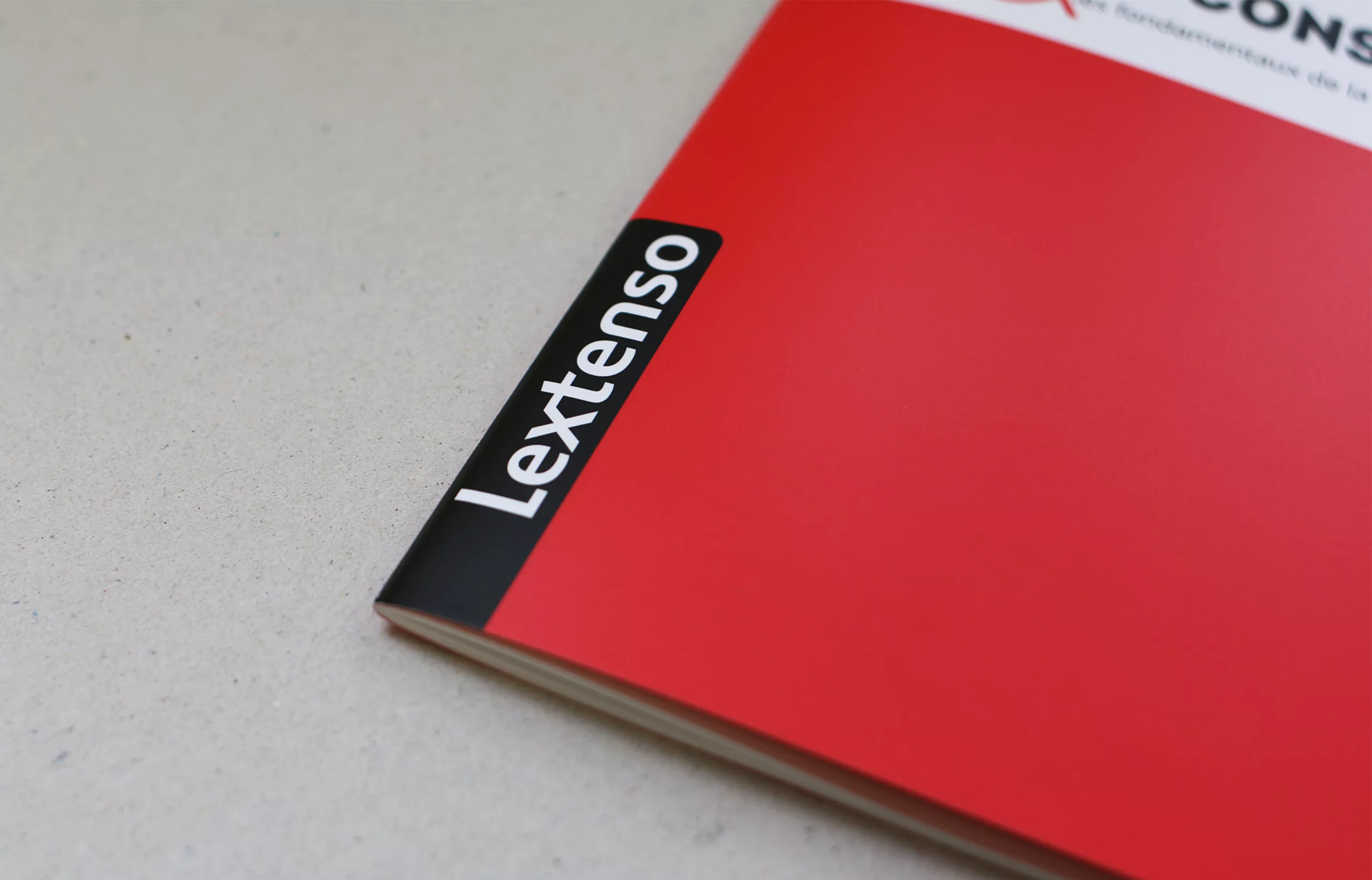
A single rounding has been retained to give greater elegance to the silhouette of the logotype. The left-hand side of the cartouche has been left blank to allow the logotype to be hung like a ‘cutaway’ label on publishing media. The lettering has been redesigned to give the brand more personality. It now has a more formal and rhythmic image (former wordmark in Bliss bold).
- The L becomes a capital
- Creation of a ligature for the letters ‘x’ and ‘t’
- Stylization of the letter “n” into a ‘bridge’
- Better alignment of the interlettering
- Overall reduction in the width of the typeface
The words ‘editions’ and ‘.fr’ have been removed in order to open up the ‘field of possibilities’ for the Lextenso parent brand. These adjustments have made it possible to strengthen and stabilise the Lextenso logotype, so that it can be built on a more solid foundation to fulfil its new role as ‘parent brand’.
A new digital offering and a redesigned website
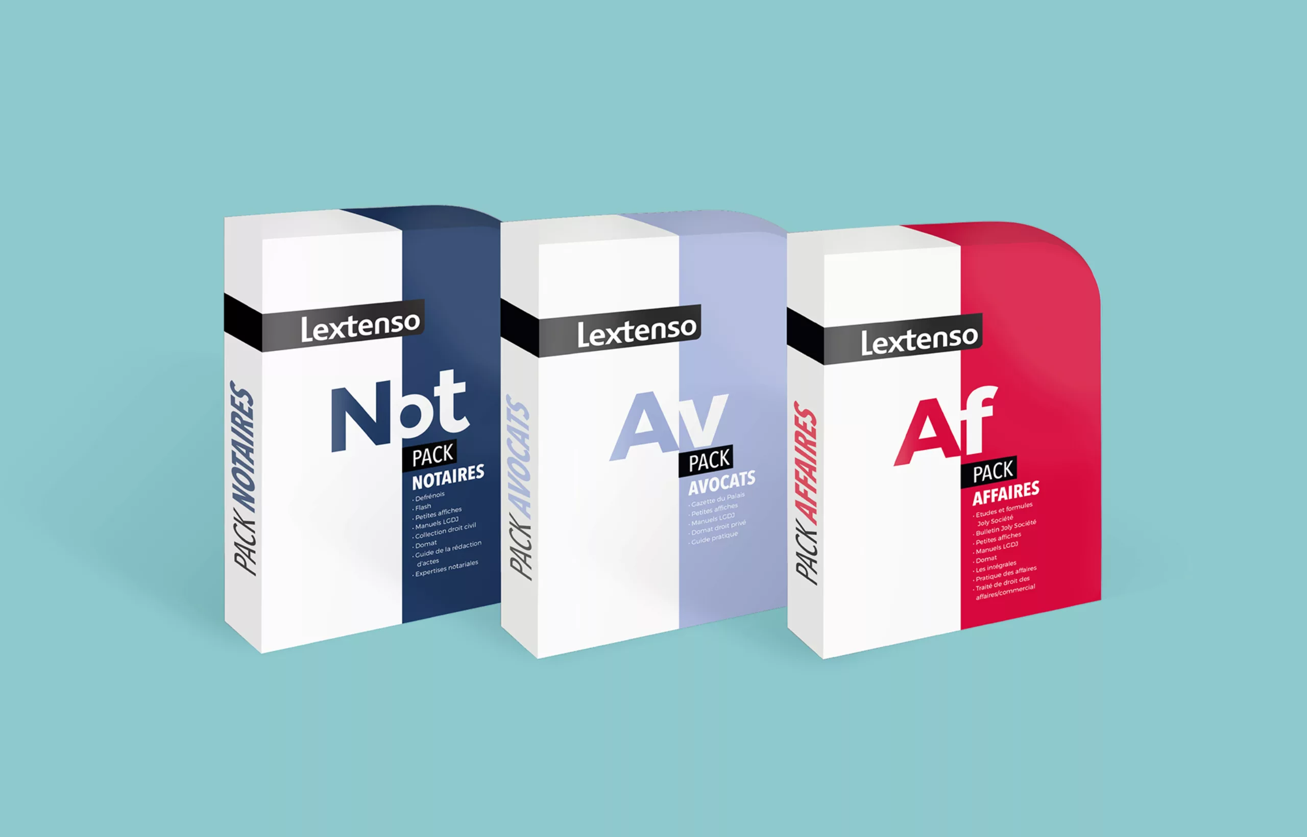
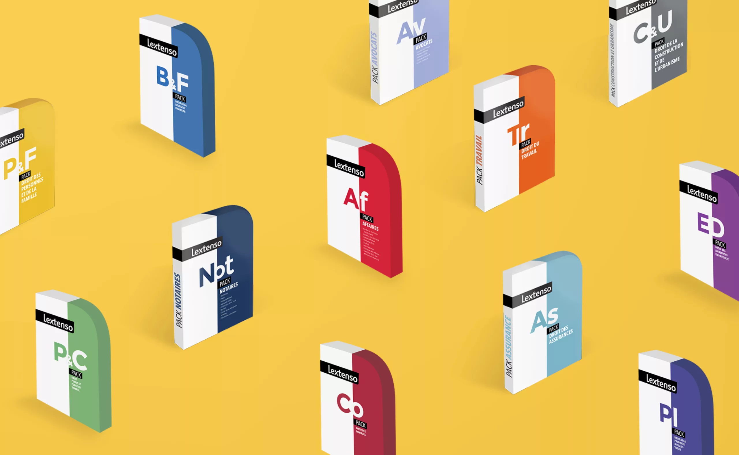
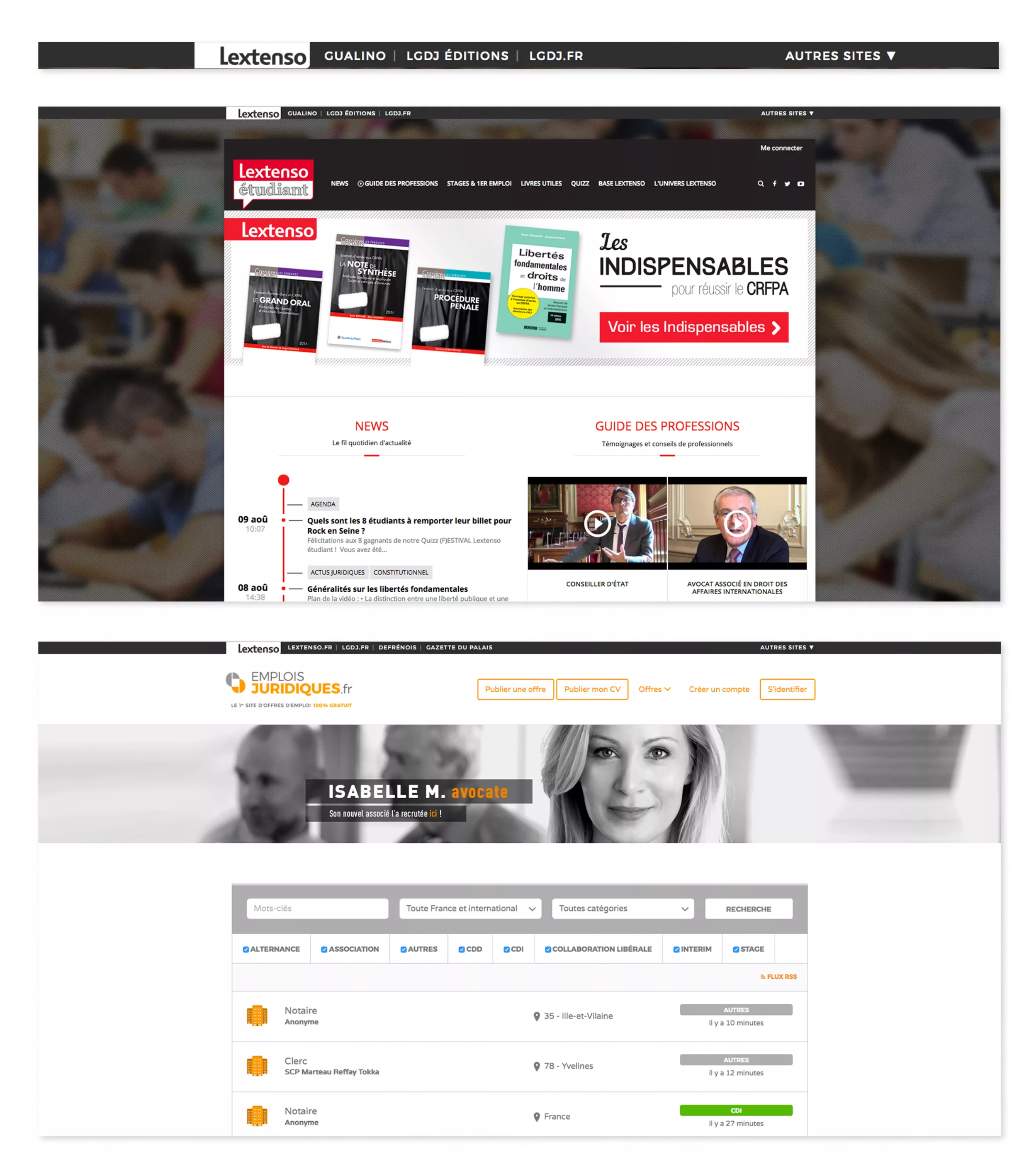
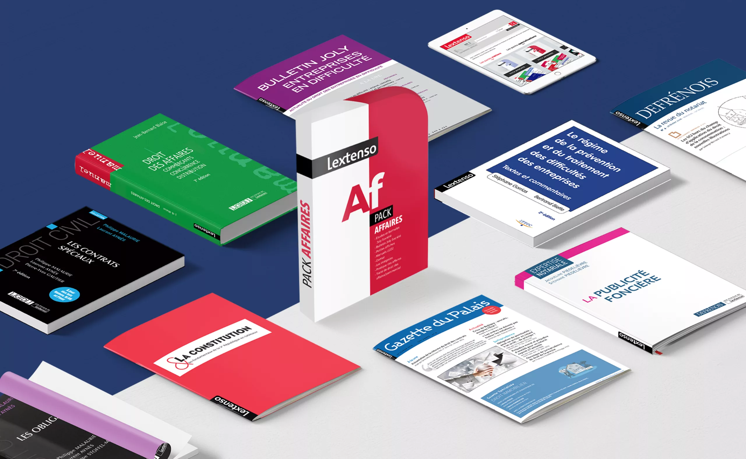
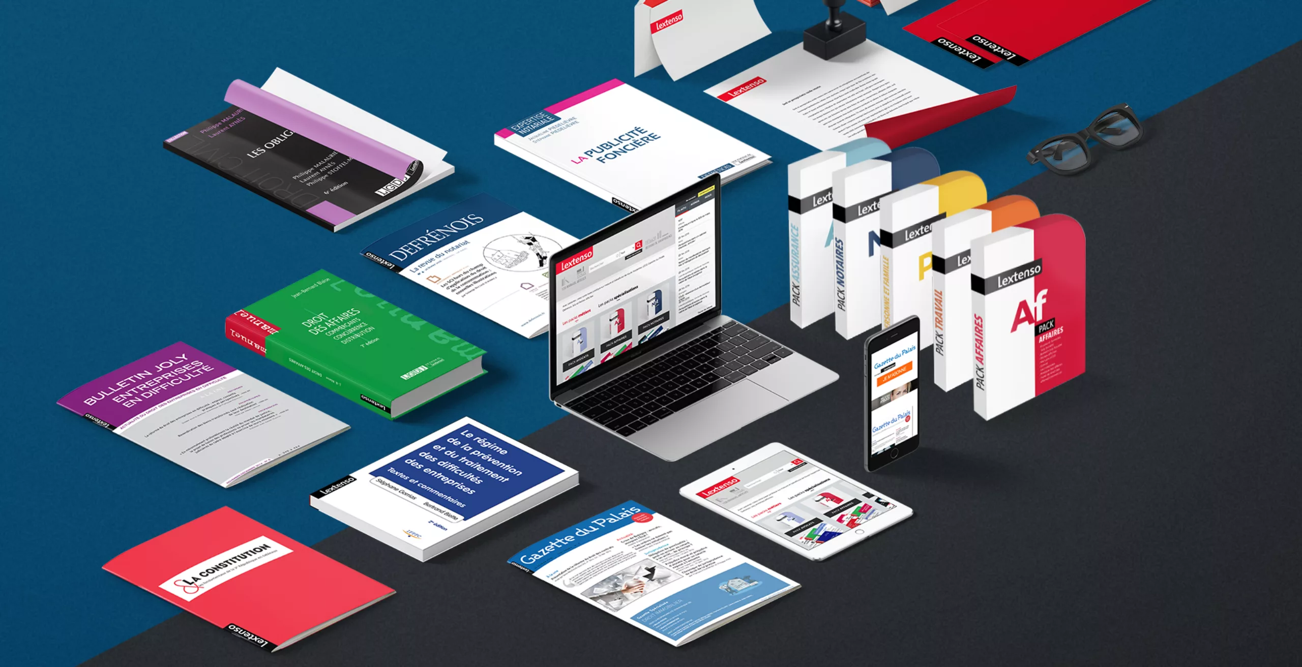
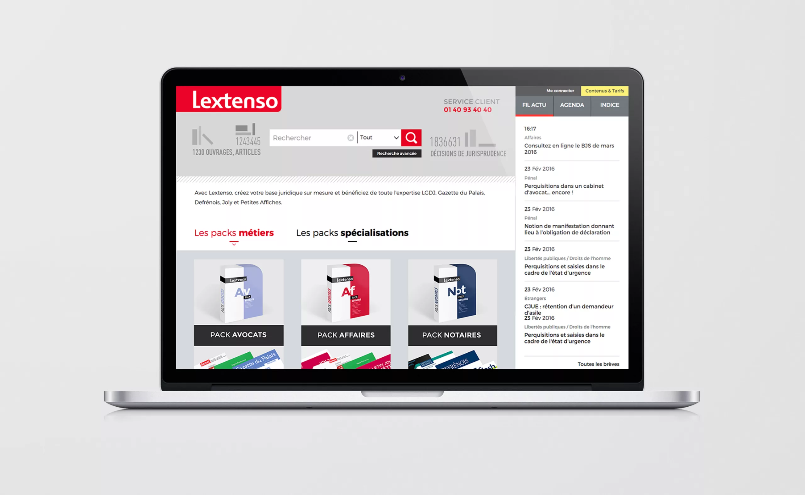
Along with its new graphic charter, Lextenso.fr’s digital offering has been completely overhauled. It is now simpler and more accessible, while retaining a legal information base that is one of the most comprehensive online. It includes more content, but this is now organised by pack. The design of the packs has been devised by graphéine to create an effective nomenclature for the “professions” and “specialisations” on offer, as well as providing a visual materialisation of the online offering. The design of the packs is inspired by the shape of the new Lextenso logotype, and introduces a range of attractive colours to a site that might initially have seemed too drab. The site’s interface has been reorganised and redesigned to enable customers to search through all the content of the various Lextenso editions.
The various sites belonging to the Lextenso brand now have a navigation bar that incorporates the new logo in its white reserve version. This makes it possible to carry out cross-sectional navigation while asserting Lextenso’s nature as an umbrella brand. Users can now consult the entire digital offering, including the brand new jobs-juridiques.fr website, whose identity was also designed by Graphéine.
