H3C Energies is an independent energy services and consultancy company whose objective is to make energy savings part of a sustainable development approach for its clients.
With more than 20,000 buildings audited in 10 years, H3C is one of the leaders in energy audits and is nationally recognised for the expertise and quality of its services.
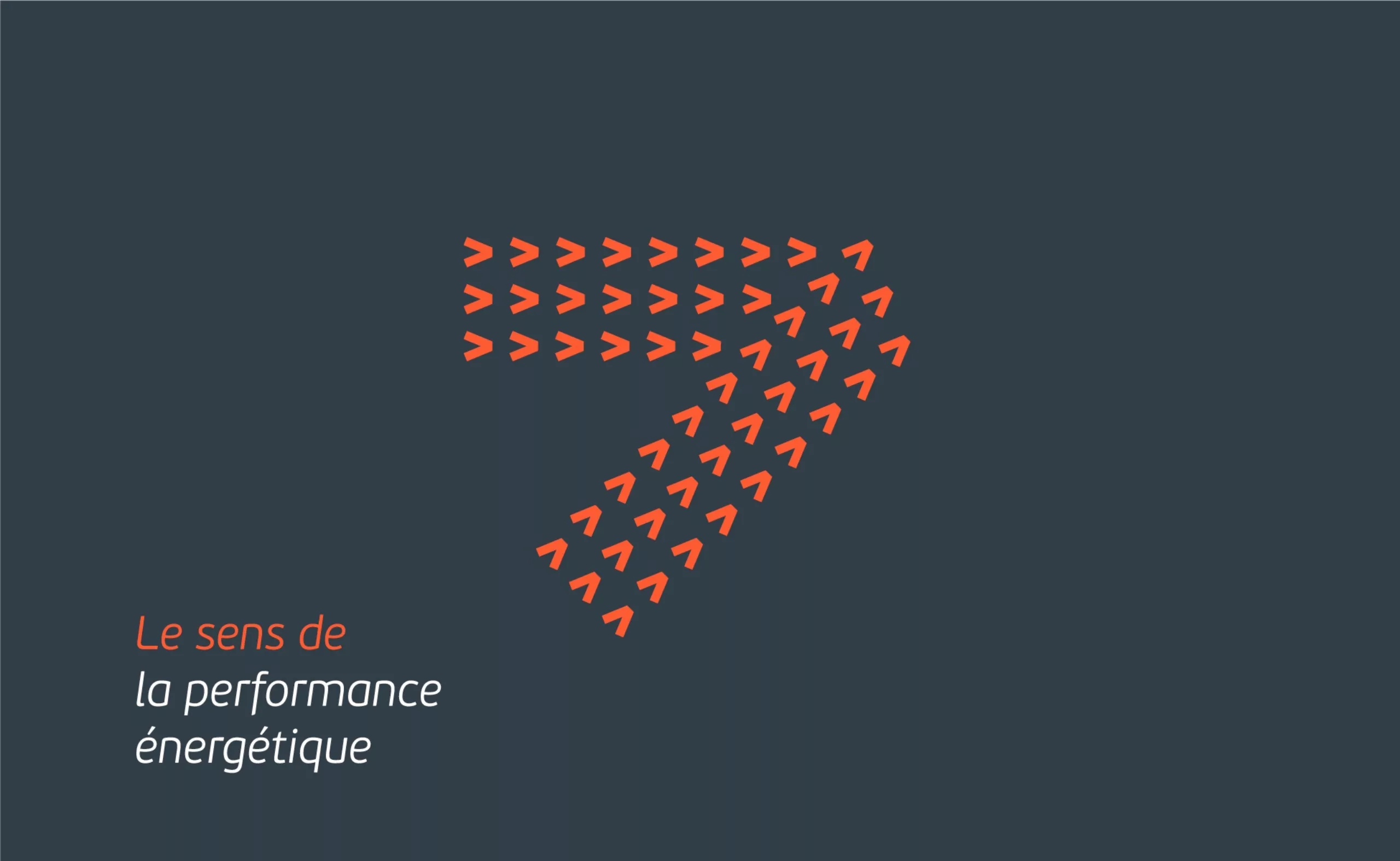
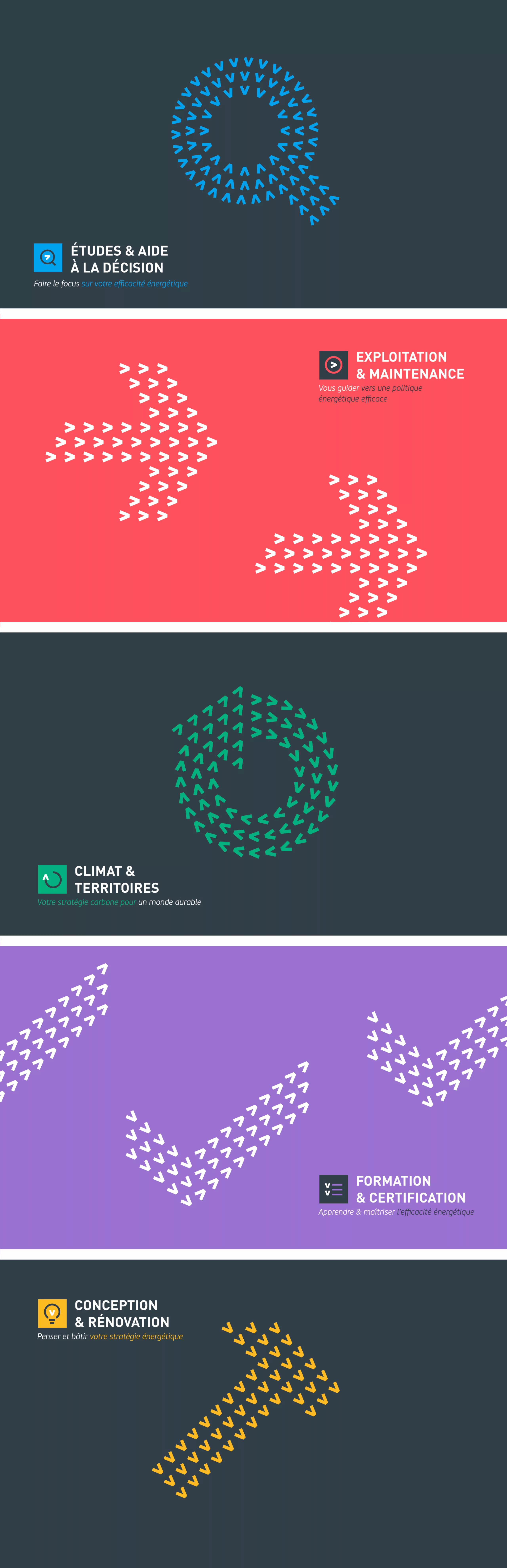
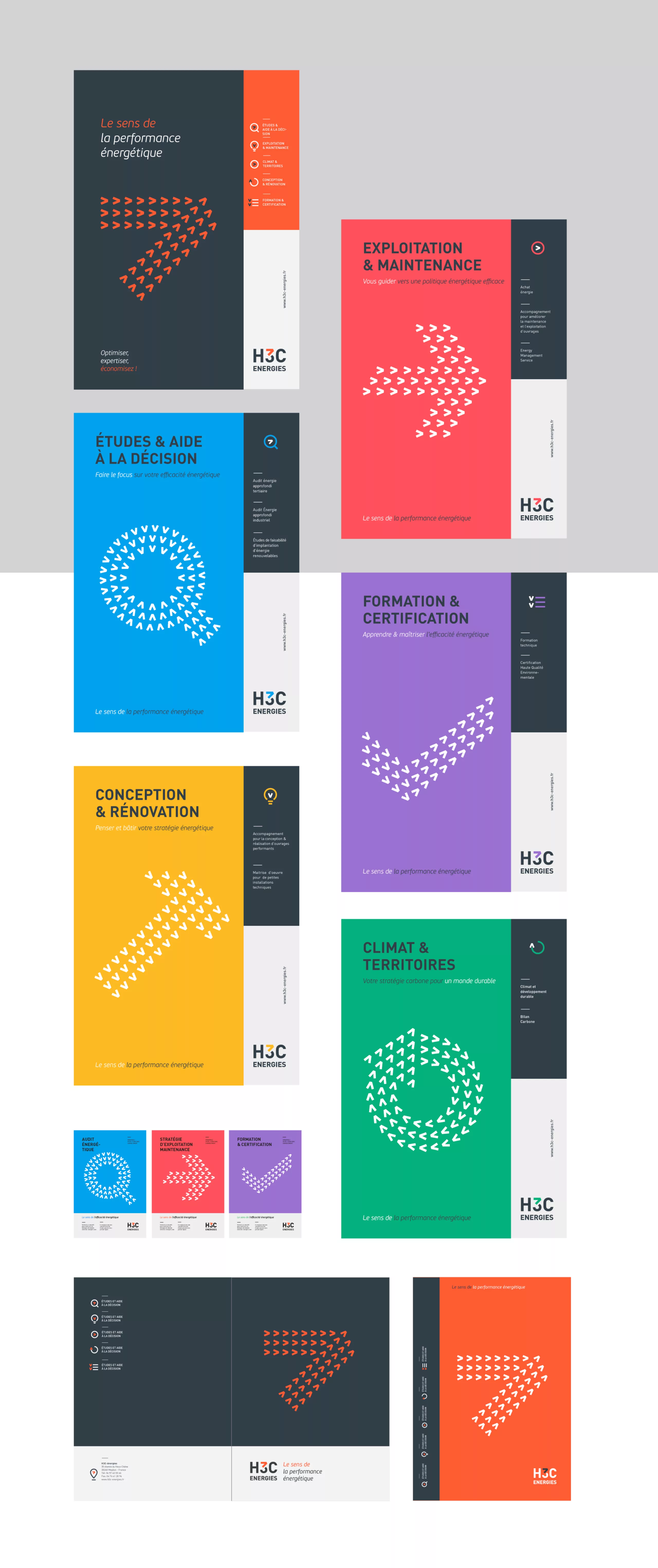
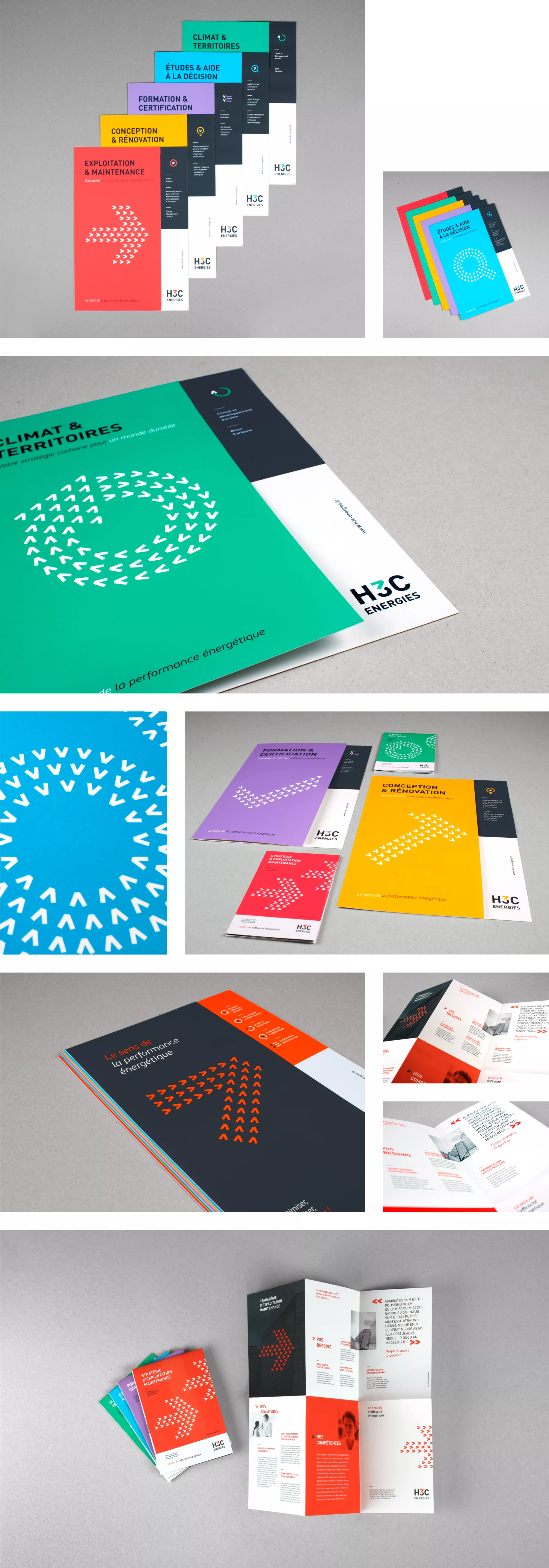
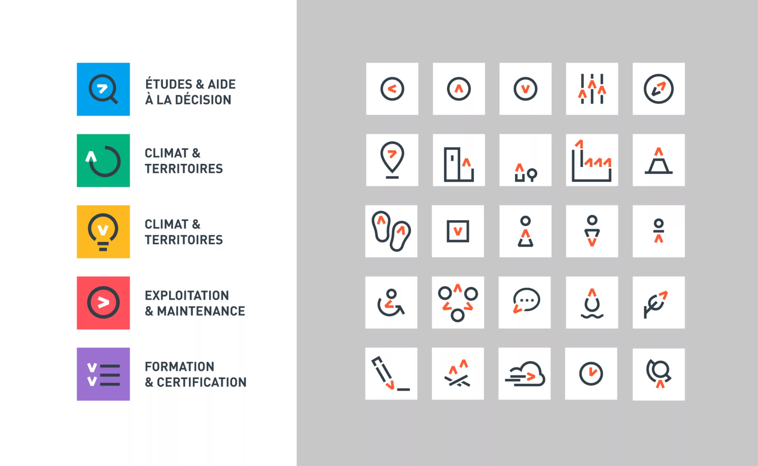
It was necessary to change their visual identity, while maintaining the fundamentals of their image. The previous logo, with its “N” shaped arrow, could cause some problems in reading the company name. We therefore proposed to keep the idea of an “arrow” indicating the “way to energetic performance”. But in the interests of minimalism, we merged this sign with the number “3” in their name. The result is a sober and effective brand block, which guarantees that the name “H3C” is easy to read and that the arrow symbol can become the visual leitmotif of the brand.
* The original baseline “Le sens de la performance énergétique” can be translated as “the way to energetic performance”, “sens” in french meaning both “sense, meaning” and “direction, way”).