2022

France Universités - Naming & Visual identity
New brand name and logotype for a better representation of French universities

The Conference of University Presidents (CPU) brings together the executive directors of more than 120 higher education institutions. It represents all French universities and many other higher education and research institutes. The association's mission is to be an influential force behind proposals and negotiations with public authorities at the national, European and international level.

Graphéine, creator of the former "CPU" logo in 2015, assisted and advised the Conference of University Presidents in its name change, and in the redesign of its logo and graphic guidelines.

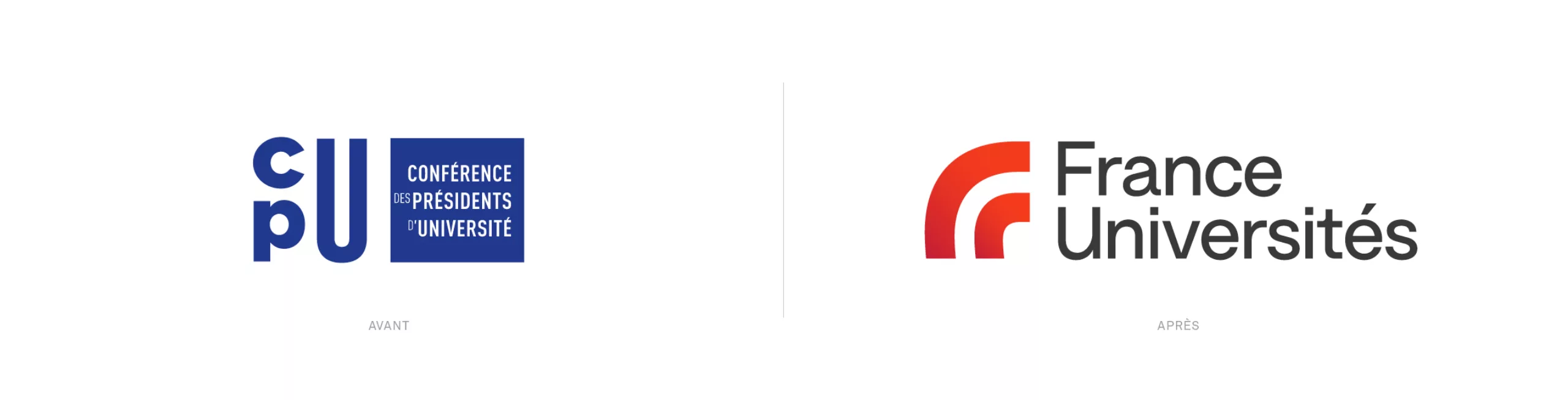
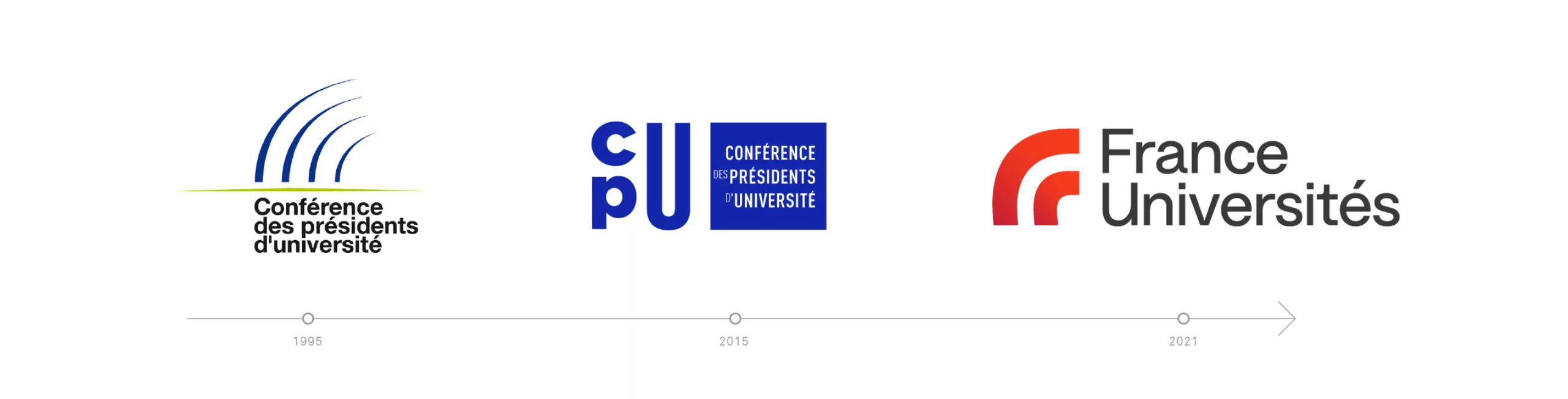
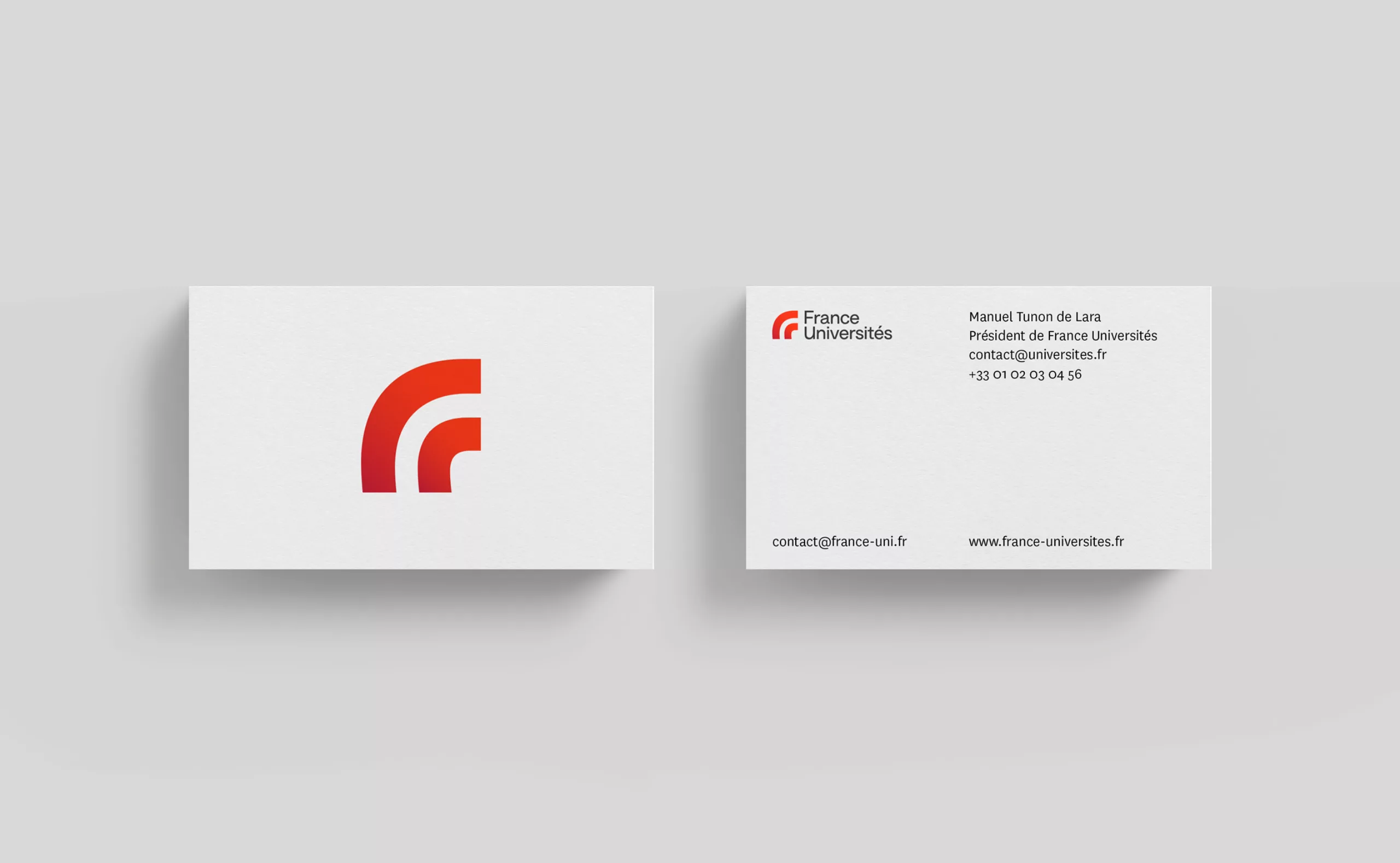
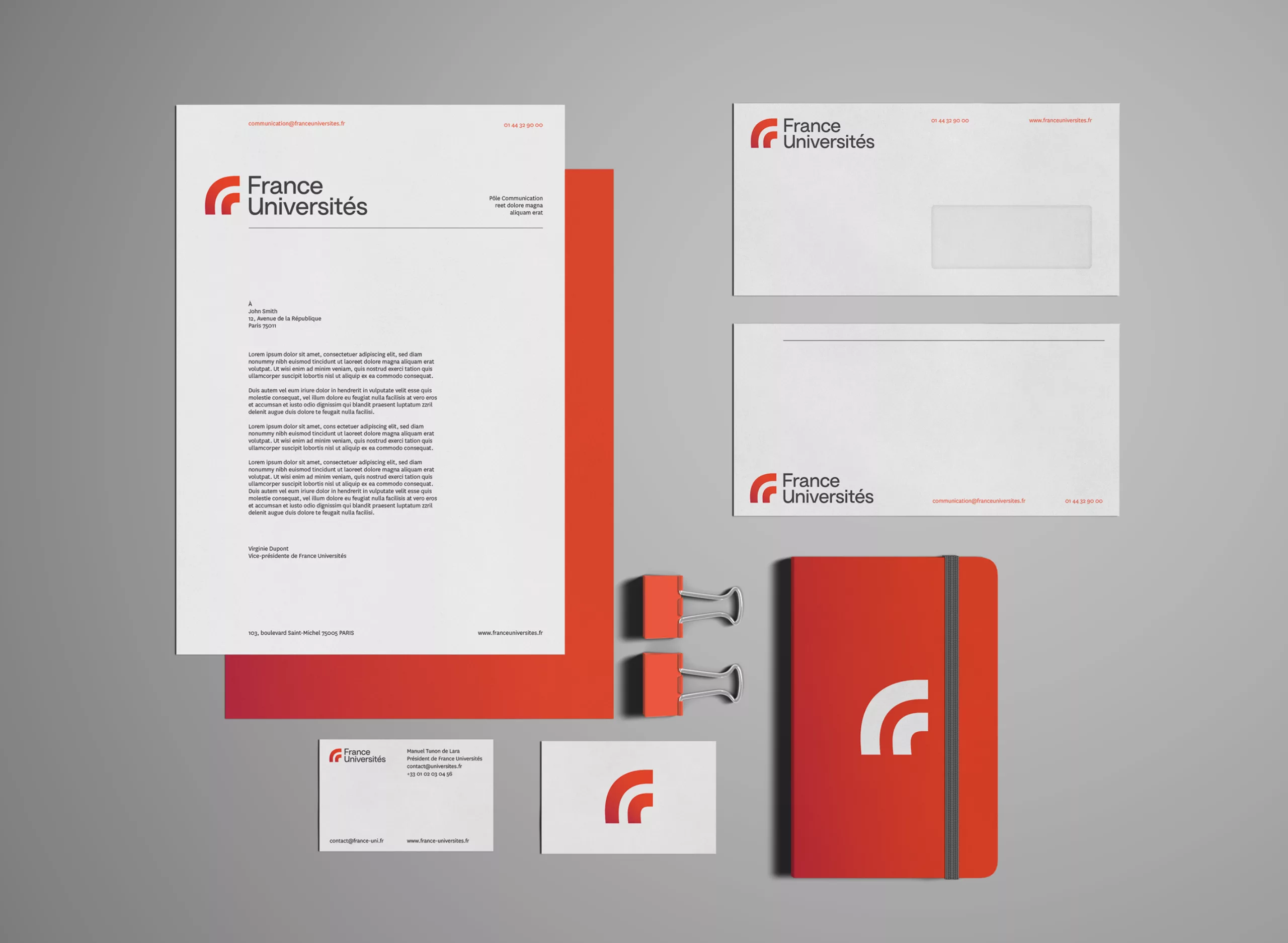
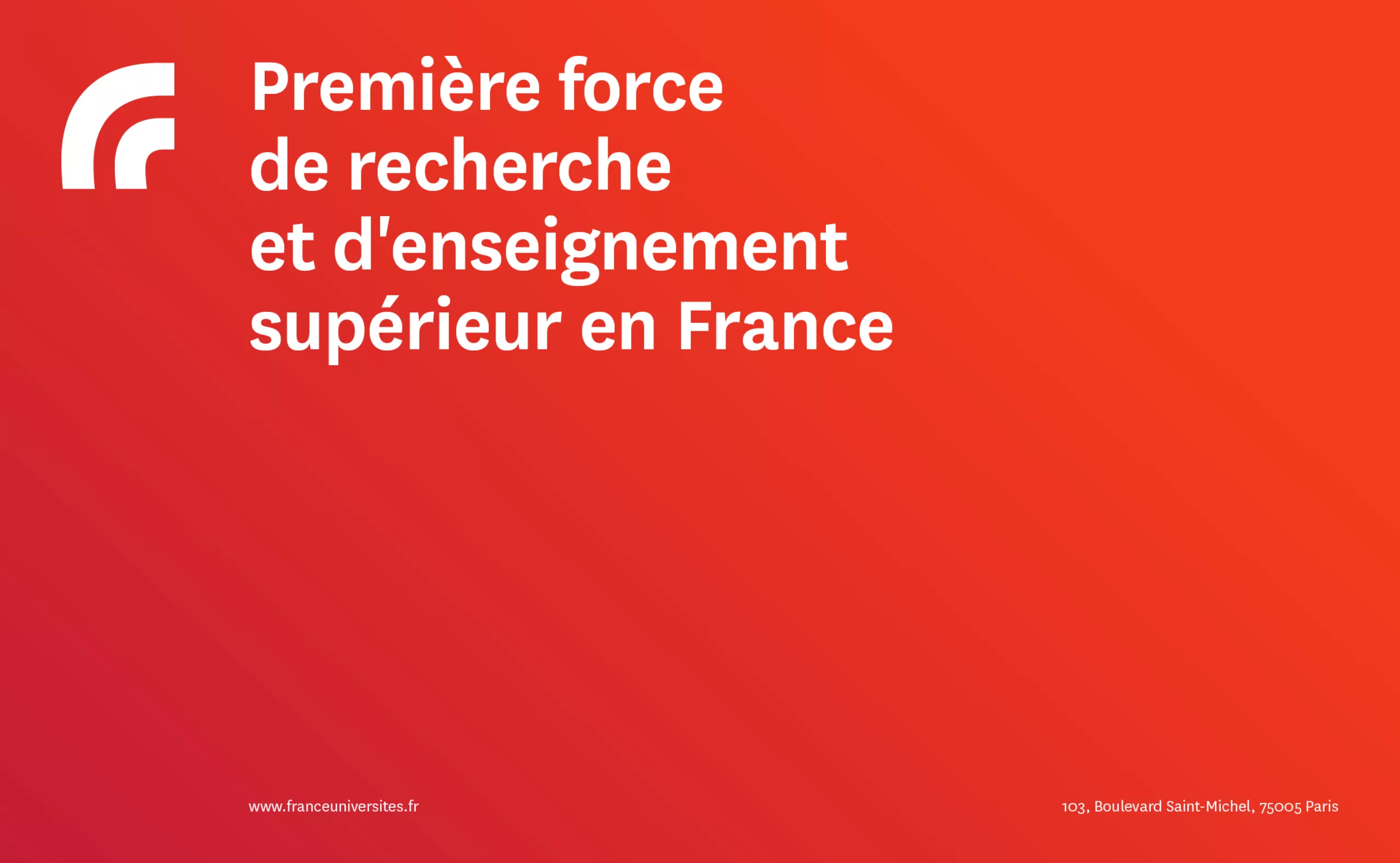
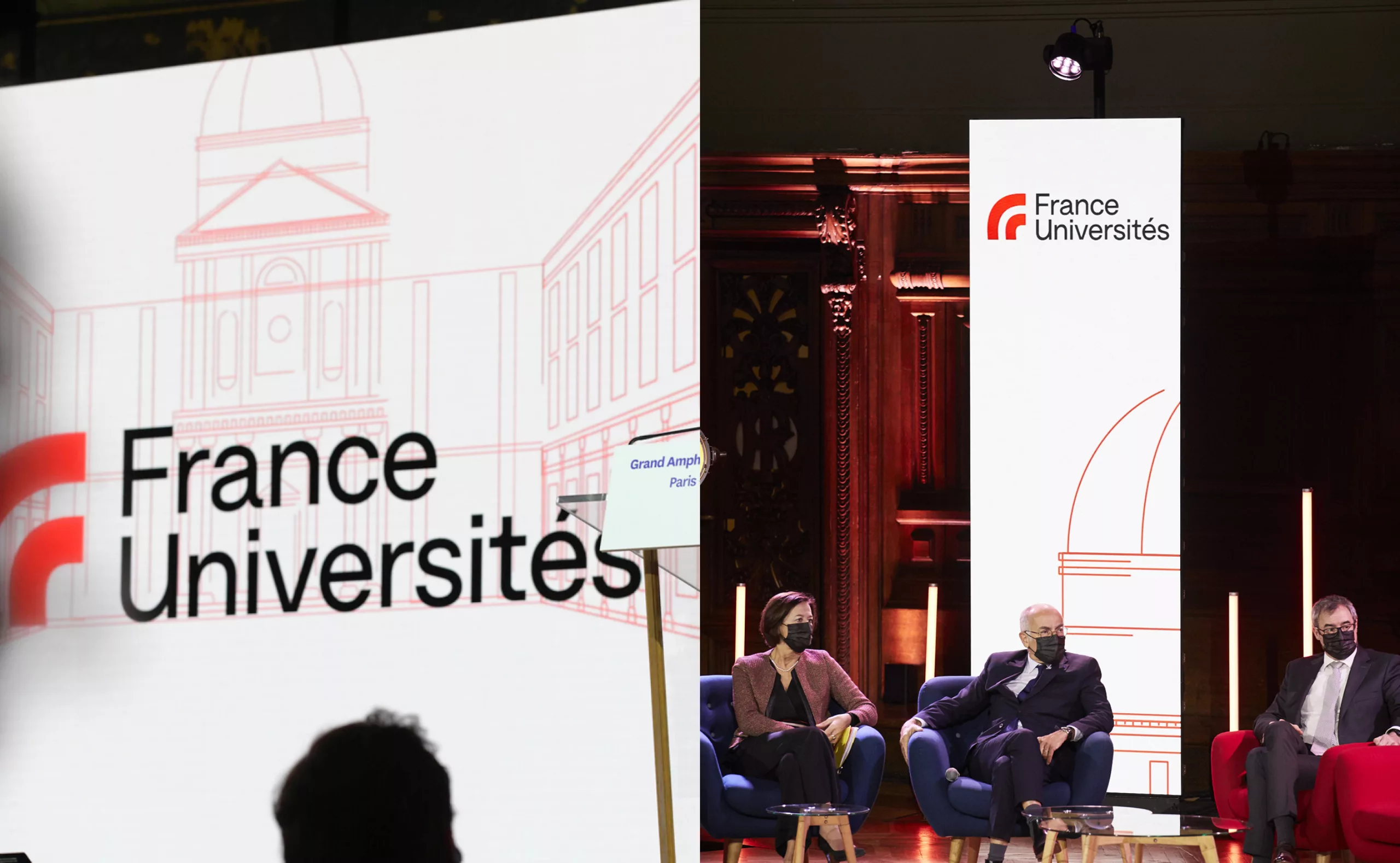
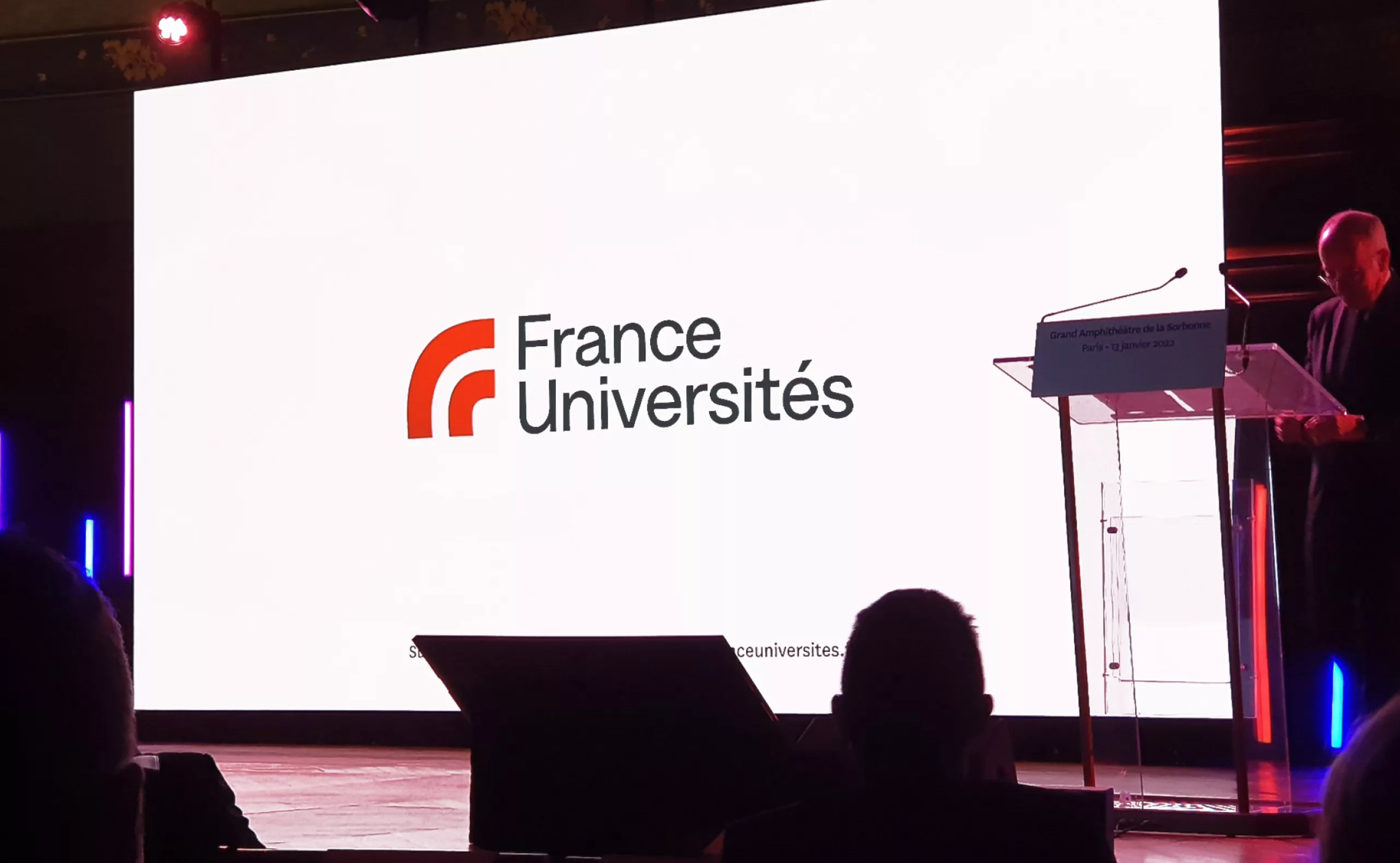
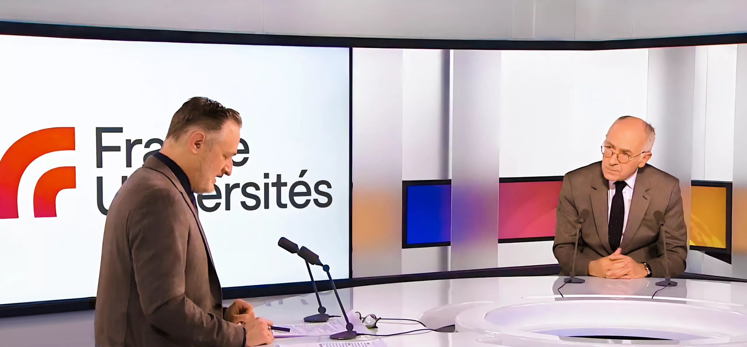
CPU becomes France Universités

For its 50th anniversary, the CPU is changing its name to "France Universités". Its director, Manuel Tunon de Lara, announced the new name at the semicentennial Congress which took place on 13 January 2022 in the large amphitheatre of the Sorbonne.
This change expresses CPU's willingness to open up and participate in societal change. The project aims to bring together its members and highlight the diversity of higher education in France. The previous title, restricted to the masculine form of the word ‘President’, was no longer in line with the need for greater inclusiveness. The acronym "CPU" was too bureaucratic to be understood on the national level and did not make sense internationally. Moreover, it conveyed too much of an "administrative" image.

The new name "France Universités" is a lexical construction inspired from English that creates a short and impactful title. It’s no longer necessary to translate the name. Every element of the name is immediately understandable regardless of nationality. The name allows for the establishment of a strong brand while reaffirming a link with the academic world. The plural "Universities" highlights the diversity of its members. This choice prevents any confusion with an individual institution and communicates the structure of the organisation with a compact, inclusive and socially relevant name.

A logo that represents the voice of French universities

The new logo that accompanies this name shift had to preserve the graphic impact of the old acronym logo "CPU". At the same time, a strong symbolism needed to be created to express the new vision of the association. To achieve this objective, Graphéine designed an emblematic monogram. This monogram embodies France Universités by combining the shape of the letter "F" - representing the French territory - with an abstraction of a university amphitheatre’s benches. Thus, this emblem modernises and revitalises the symbolism of the first logo created in 1995.

The logo is a dynamic shape with flair. Its institutional and energising red colour marks a break with the blue of the previous visual identity. Its simple and striking shape adapts perfectly to all of France Universités' communication media.

The new visual identity of France Universités now ensures a better representation of the institutions and their diversity with the ambition to better promote the French university model in Europe and in the world.

Context

The question of CPU's name change has been on the table for almost a year. Female university presidents are increasingly common in higher education. The existing name of the CPU no longer corresponded to this reality. Nor did it allow for effective recognition in international communications. The project was launched in October 2021, with a tight schedule for the creation of the new identity, as the unveiling of the new identity was set for January 13, 2022, the date of CPU's 50th anniversary congress.

Objectives

Taking into account the diversification of CPU's membership with a new, more inclusive name that aims for greater gender equality. Creating an internationally understandable name that facilitates the identification of the CPU with its partners, media and foreign counterparts. Defining and implementing a new logo and graphic guidelines in keeping with the ambitions of the CPU.


Share this project:
Project expertise:
Logo creation, visual identity and graphic guidelines. Creation of brand and company names.
Type of client:
Communication in the education, higher education and health sector. An indispensable partner in the transformation of the health and wellness industry through the alchemy of creativity and technology. Communication in science and research.

Related projects: