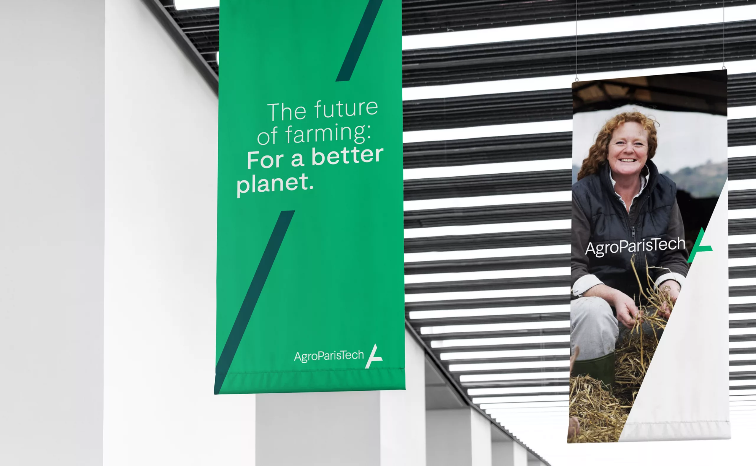
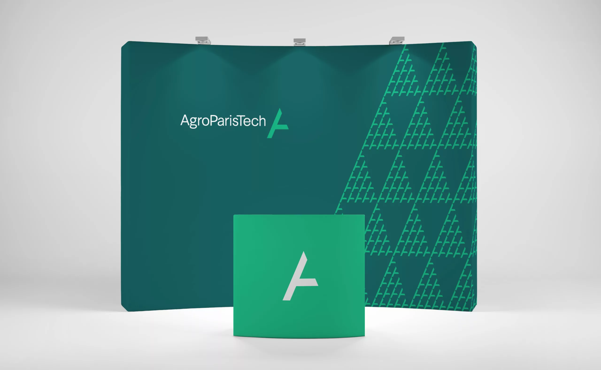
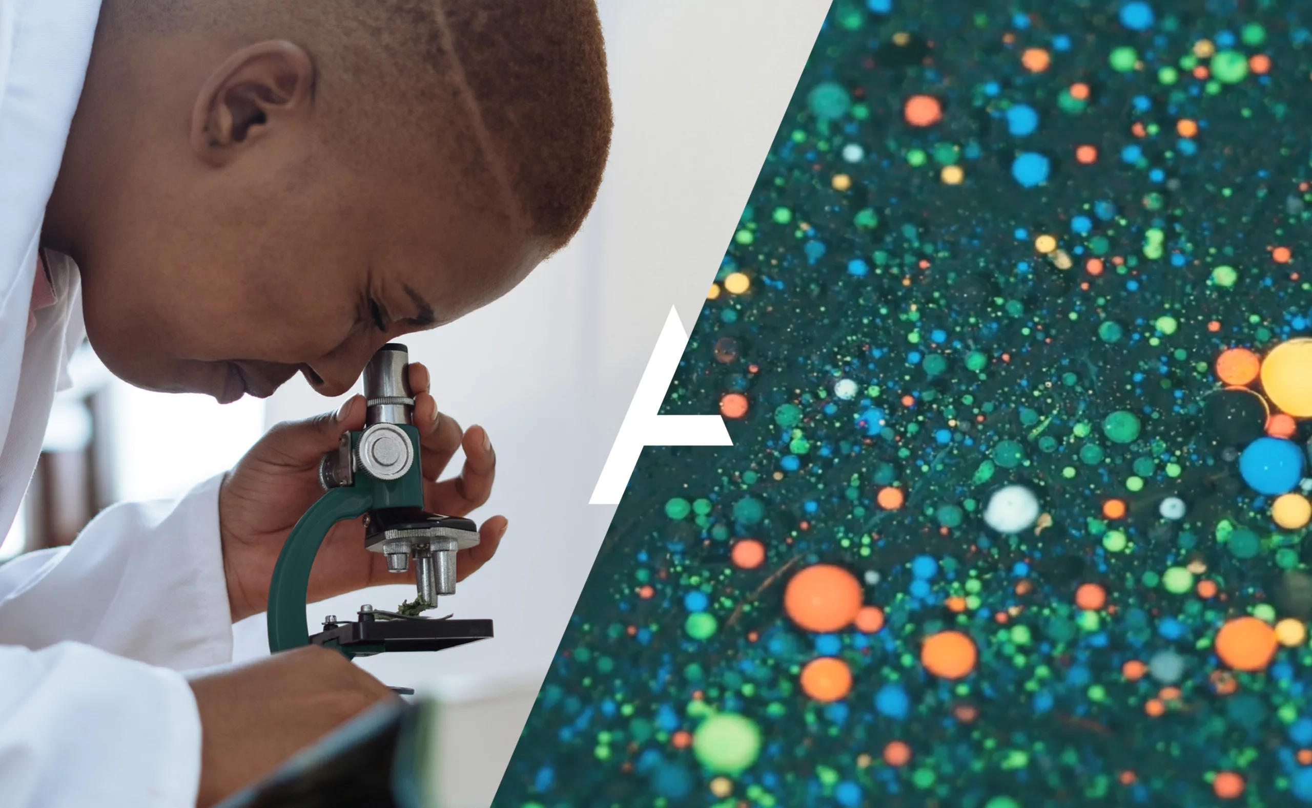
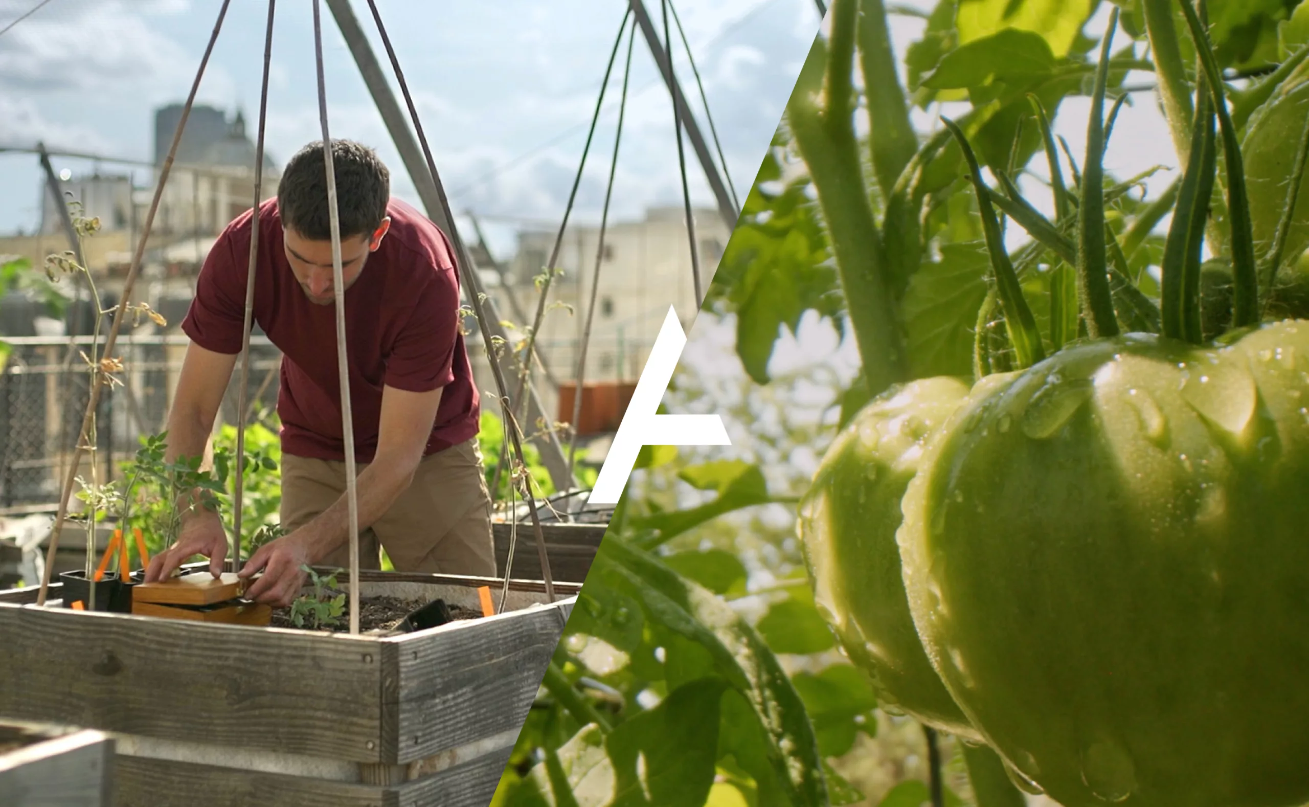
An established institution in higher education and research, AgroparisTech is a leader in the field of life sciences. It addresses the major global challenges of the 21st century: feeding the world population by managing land sustainably, preserving natural resources, promoting innovation and adopting the organic economy. Graphéine helped AgroParisTech create its new visual identity and implement a reinforced brand architecture. The new logo modernizes the previous identity by giving it more impact and flexibility, while respecting the DNA that has built its reputation for over ten years.
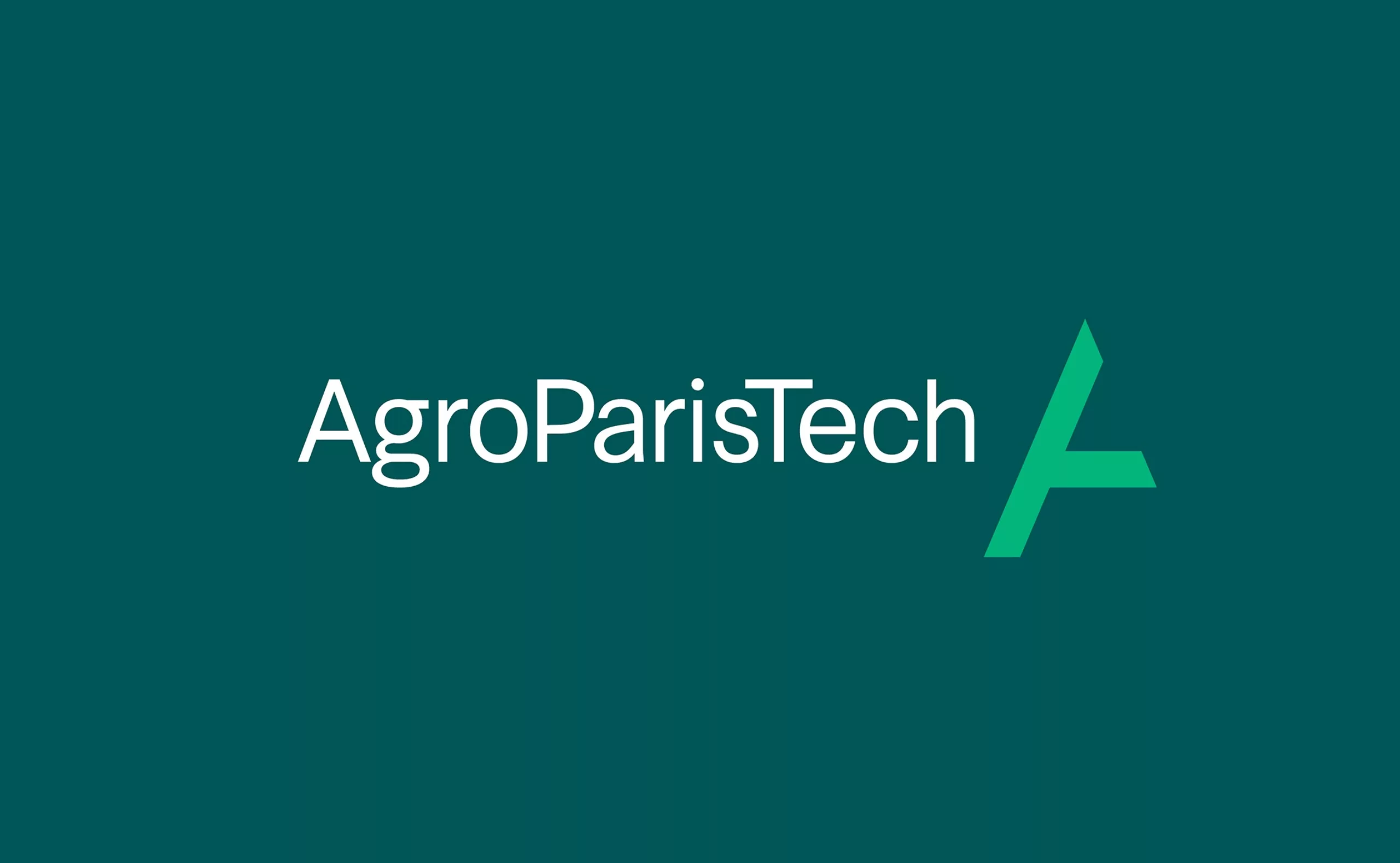
AgroParisTech
AgroParisTech brand identity, training committed engineers, innovating to build a sustainable future


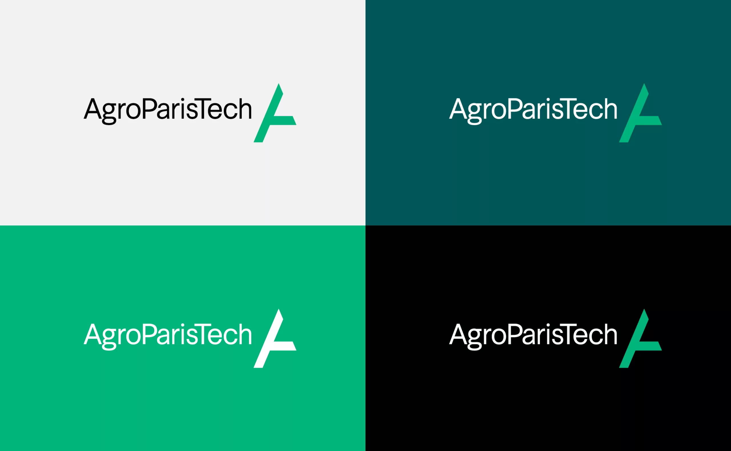
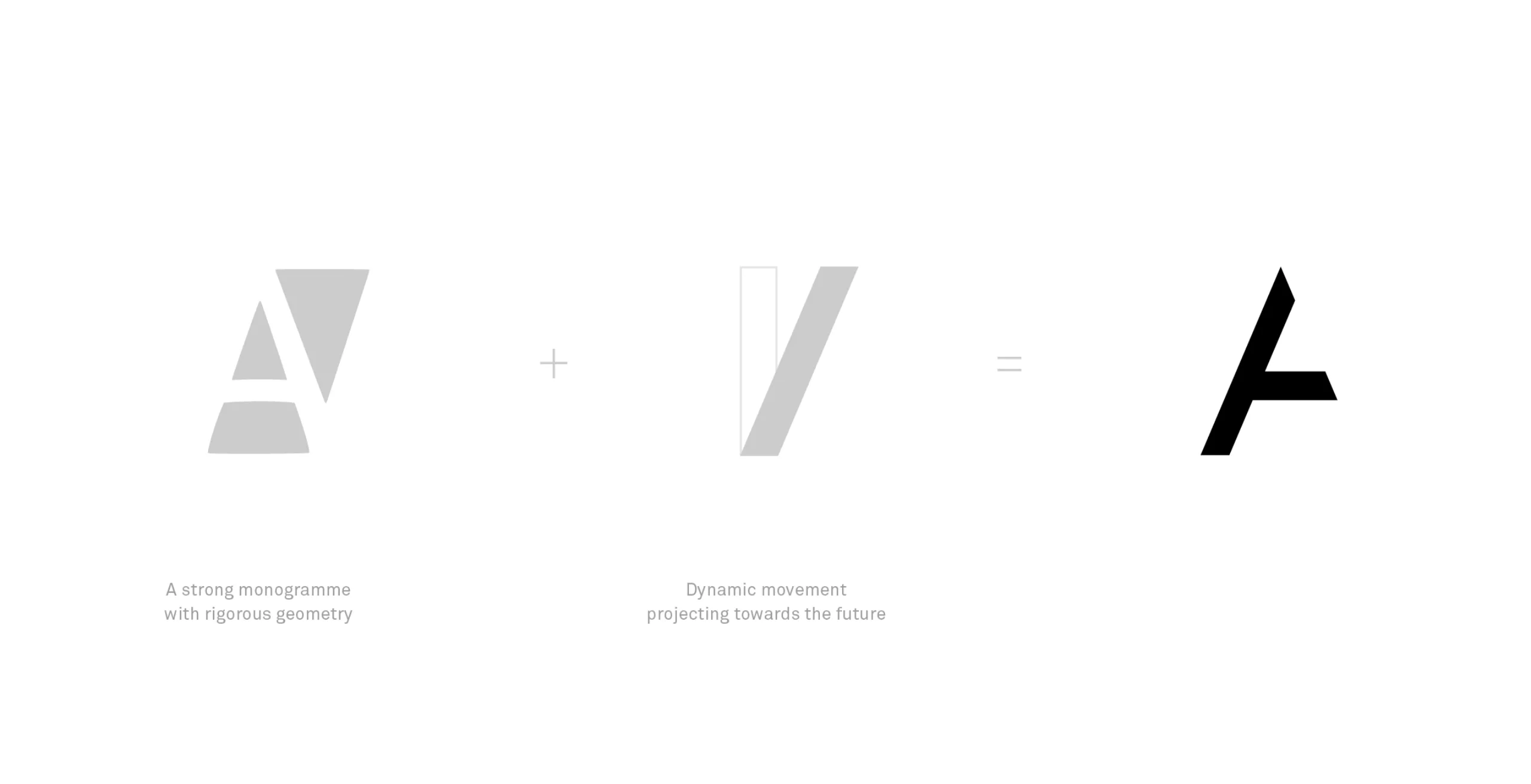

A new logotype open to tomorrow
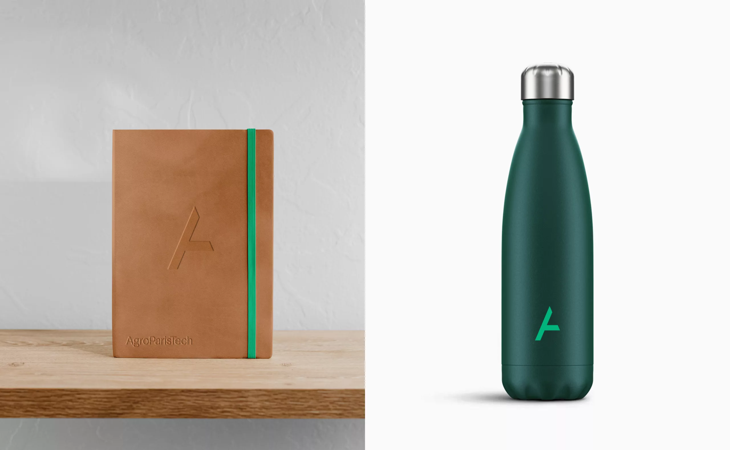
With a minimalist and asymmetrical style, the new symbol is at the intersection of lettering, pictogram and abstract symbol. It materializes the form of the A that was earlier hidden in the counter-form of the previous logotype. The symbol evokes an establishment, a branch, a growing stem and a springboard. It has a dynamic momentum that expresses AgroParisTech’s desire to meet the technological, ethical and ecological challenges of life. It is a symbol that is open in its design and in its positioning. We have separated the “A” monogram from the wordmark to create a distinct symbol. This separation allows us to create a “responsive logo” designed to adapt perfectly to digital media (profile picture, favicon, etc.), and make the most of the potential they offer (animation, audiovisual presentation, etc.).
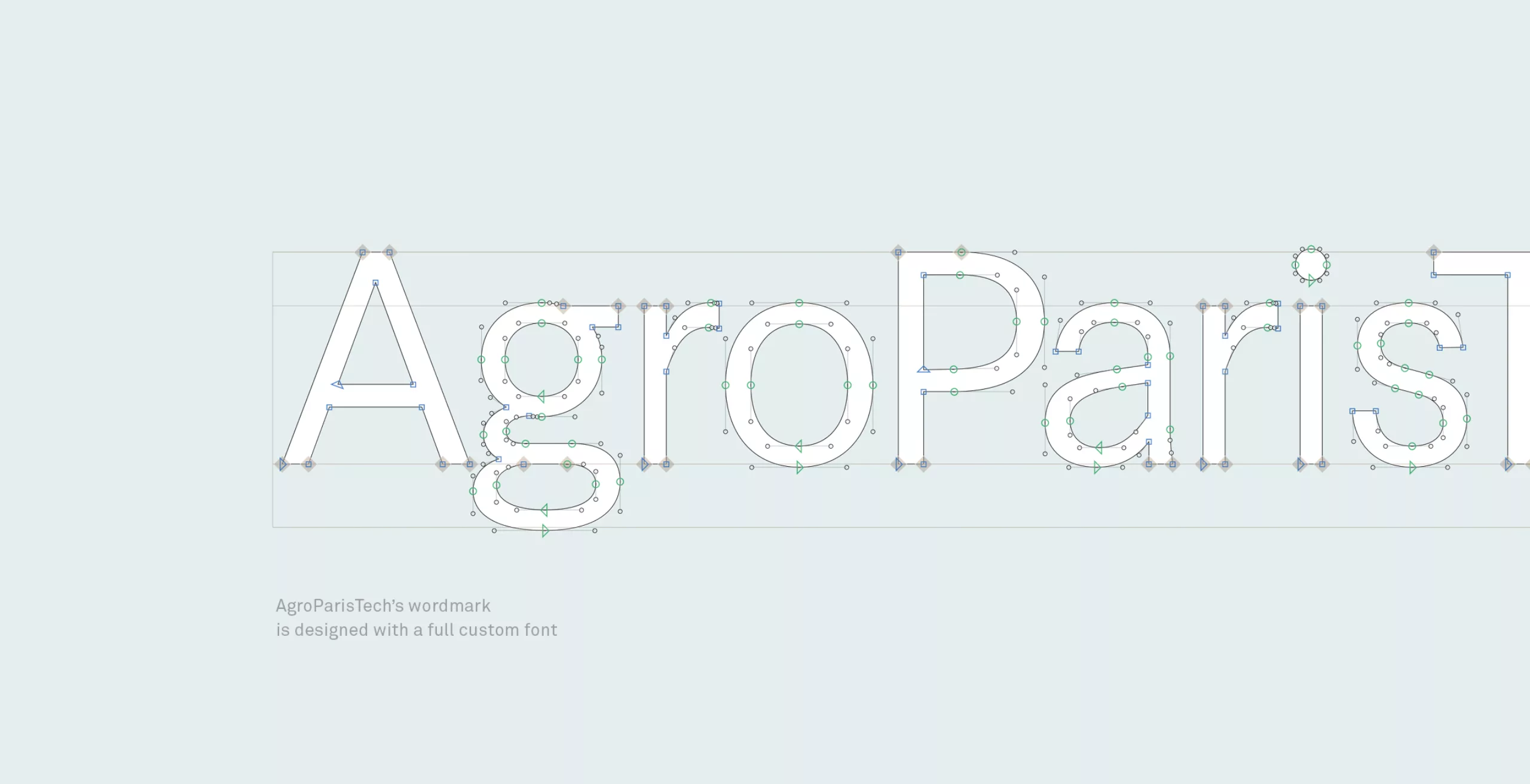
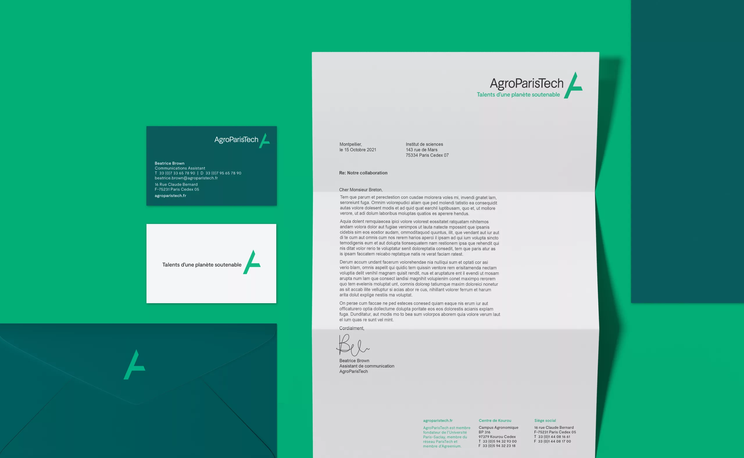

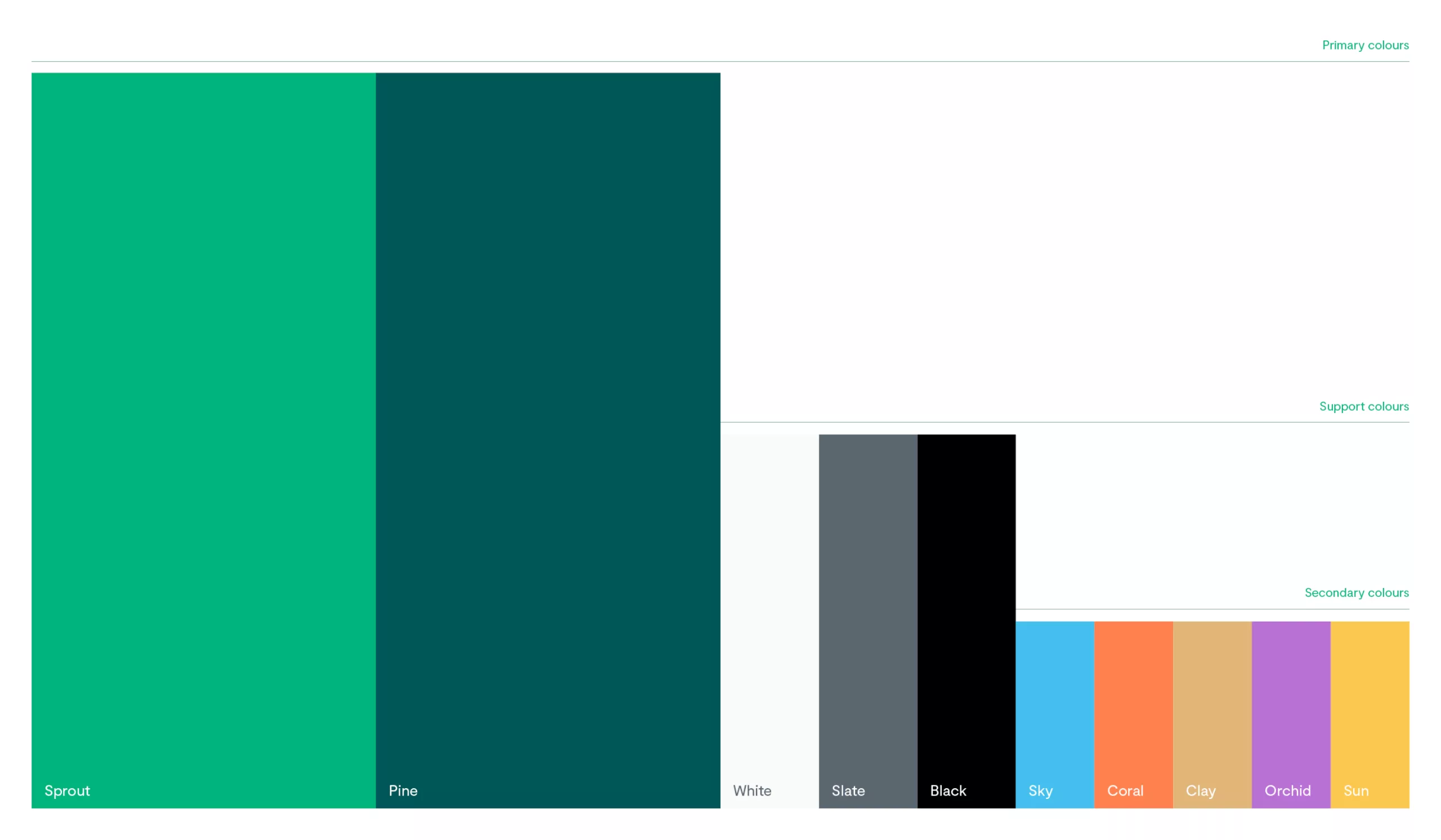
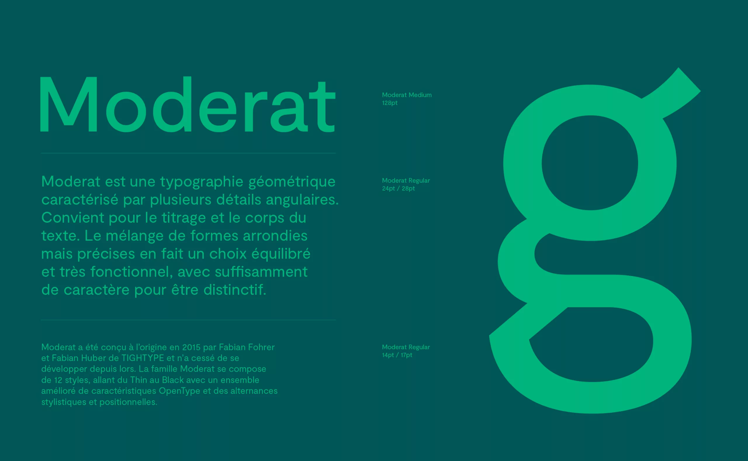

The “AgroParisTech” wordmark firmly evolves past the historical “ParisTech” spelling to assert “AgroParisTech” as a brand. By removing the serifs, the lettering was updated to suit contemporary conventions. It was custom designed to ensure maximum reading comfort and to optimize the length of the whole. The AgroParisTech color is illuminated with a new, more vibrant and radiant green. Synonymous with a resolutely optimistic vision of the future, the Pantone 3504C green stands out from other greens used by its partners.
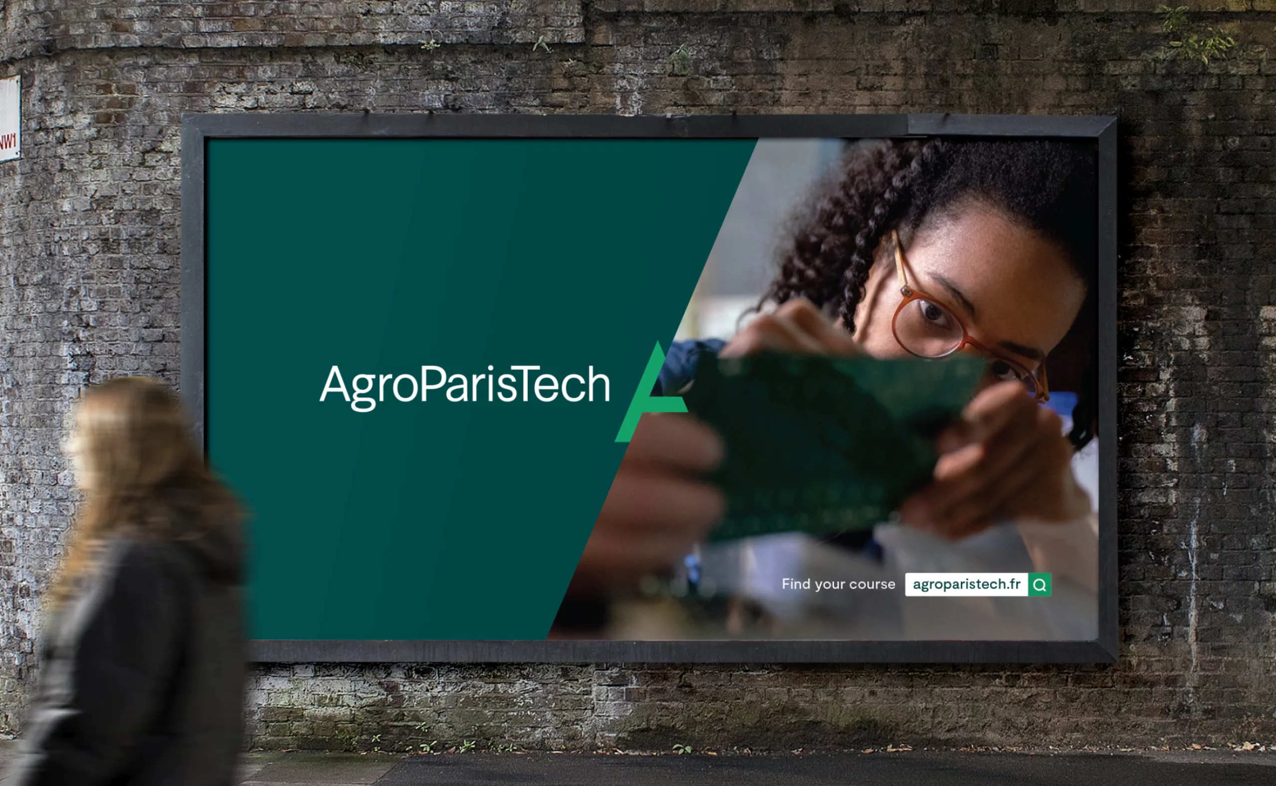
The logo remains the embodiment of AgroParisTech’s institutional signature. Far from being restricted to this role, it becomes a living element at the center of the institution’s commitment and missions. A symbol originating in AgroParisTech’s architecture and visual style, the new emblem is the window outlining its communication. It is at the heart of the new brand identity.


A new slogan to unite AgroParisTech communities
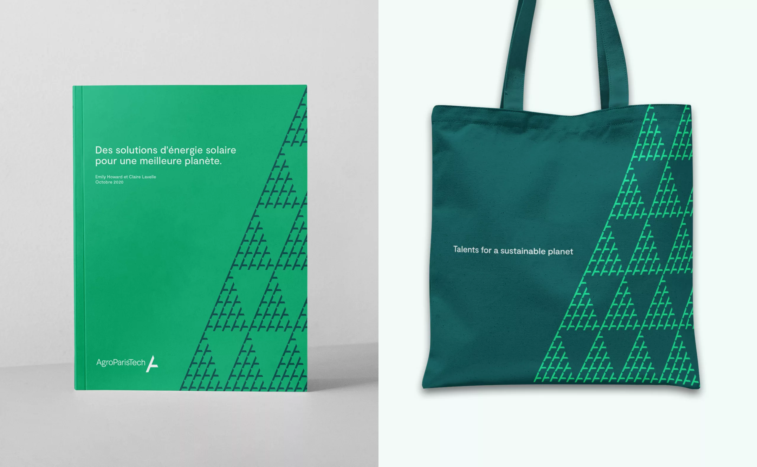
AgroParisTech has also adopted a new slogan: “Talents for a sustainable planet”. This new slogan brings together all the communities under the same flag: students, researchers, apprentices, auditors, doctoral students, technical, administrative and academic staff and alumni. It reaffirms their ambitions and strengthens the AgroParisTech brand. Right from the outset, the slogan was crafted to be easily translatable to English in order to help in developing partnerships abroad.
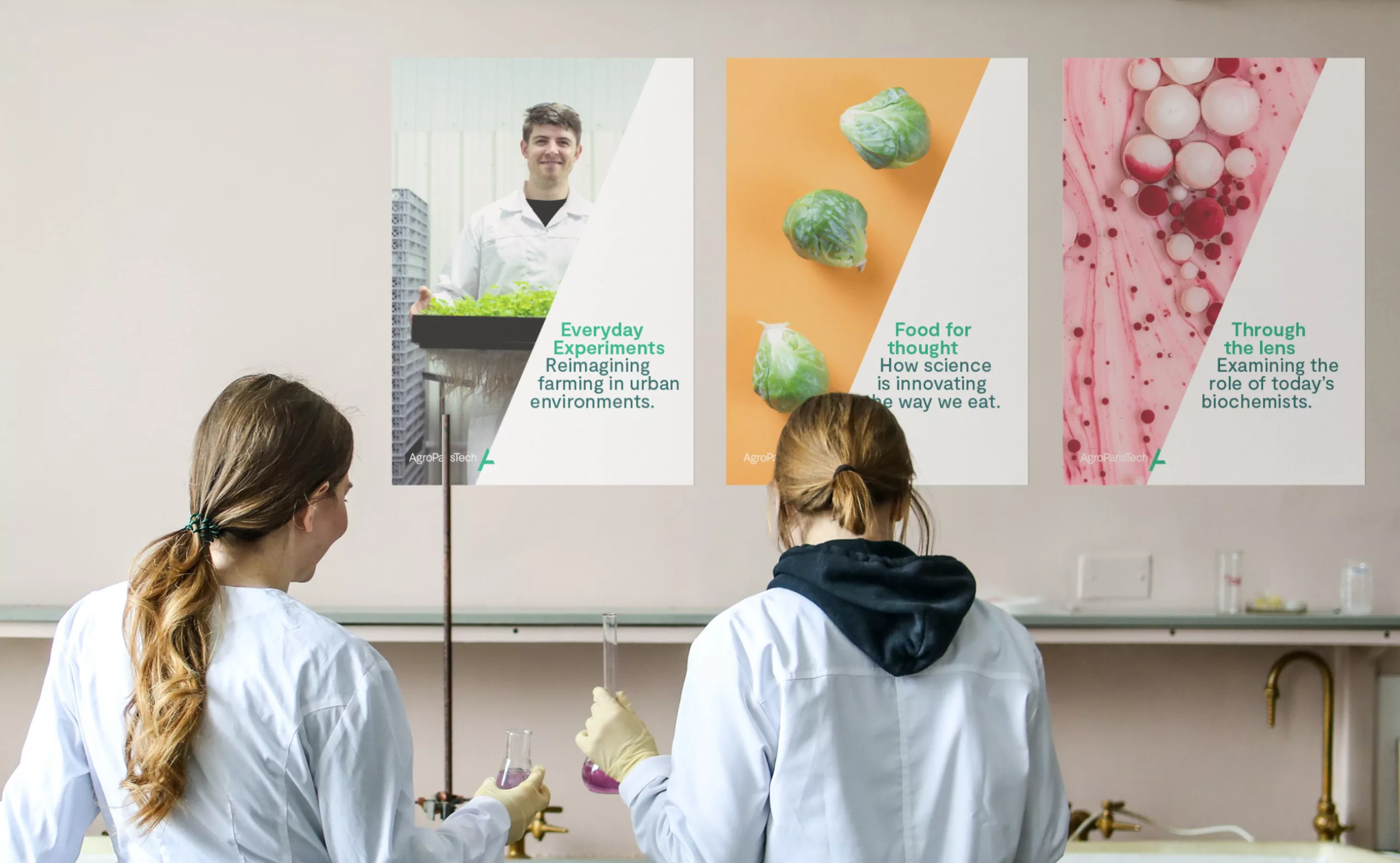
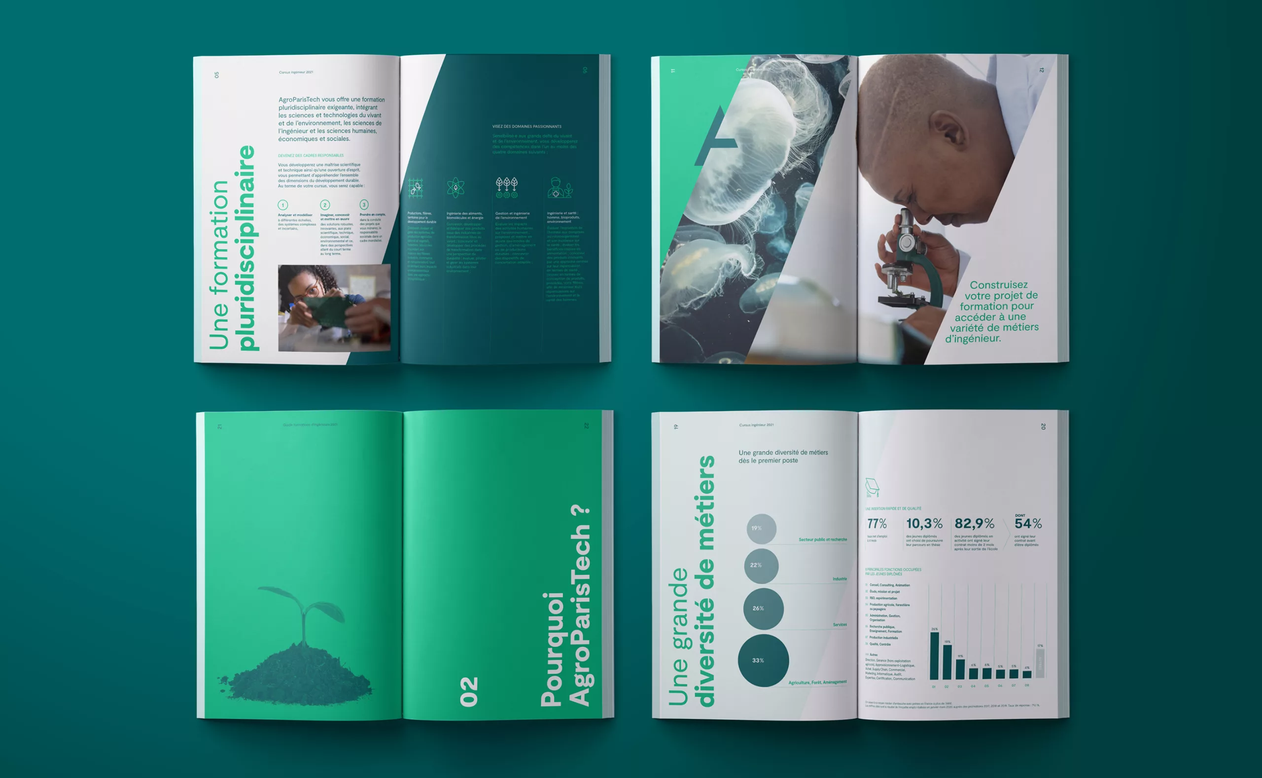
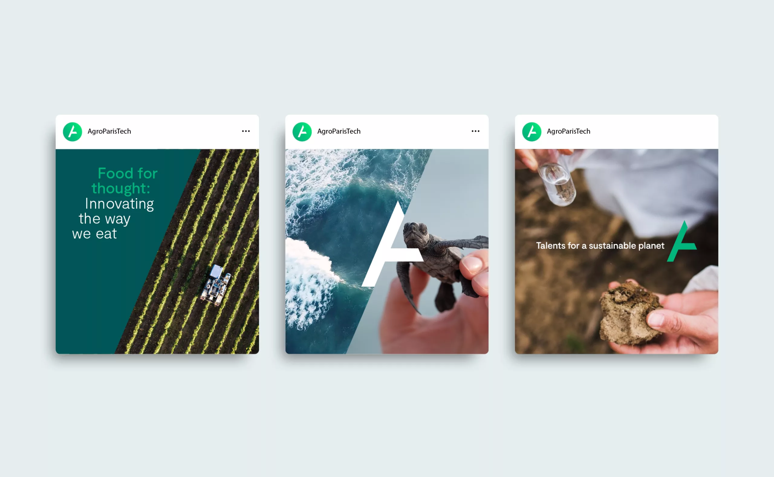

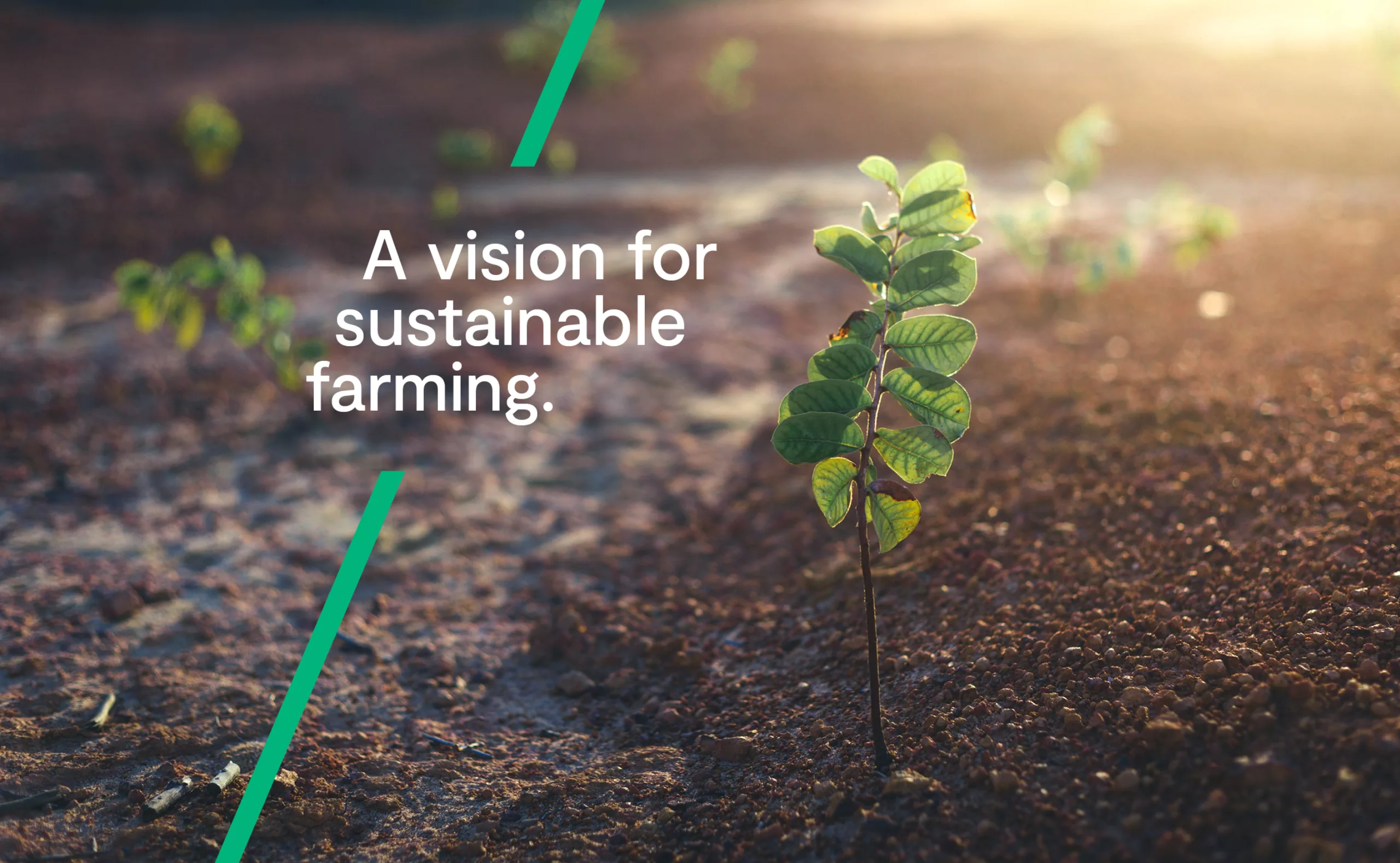
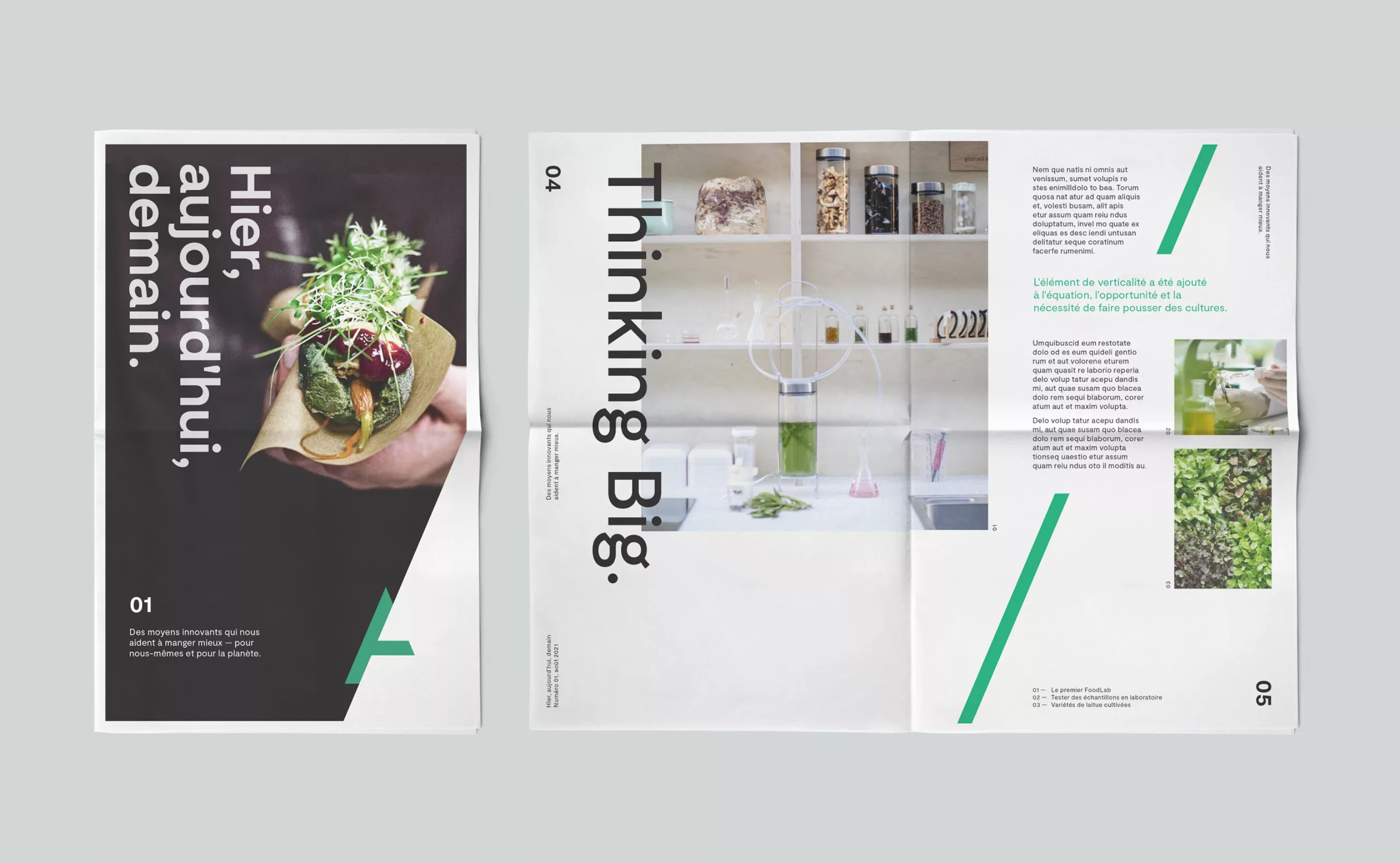
From a new visual identity to a unified brand architecture
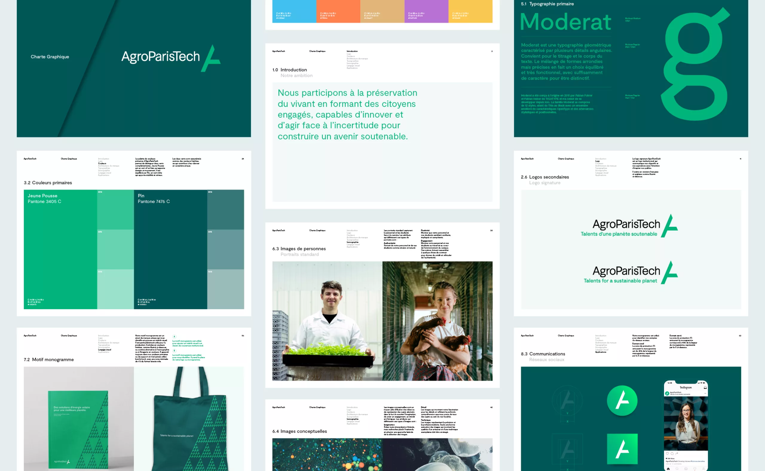
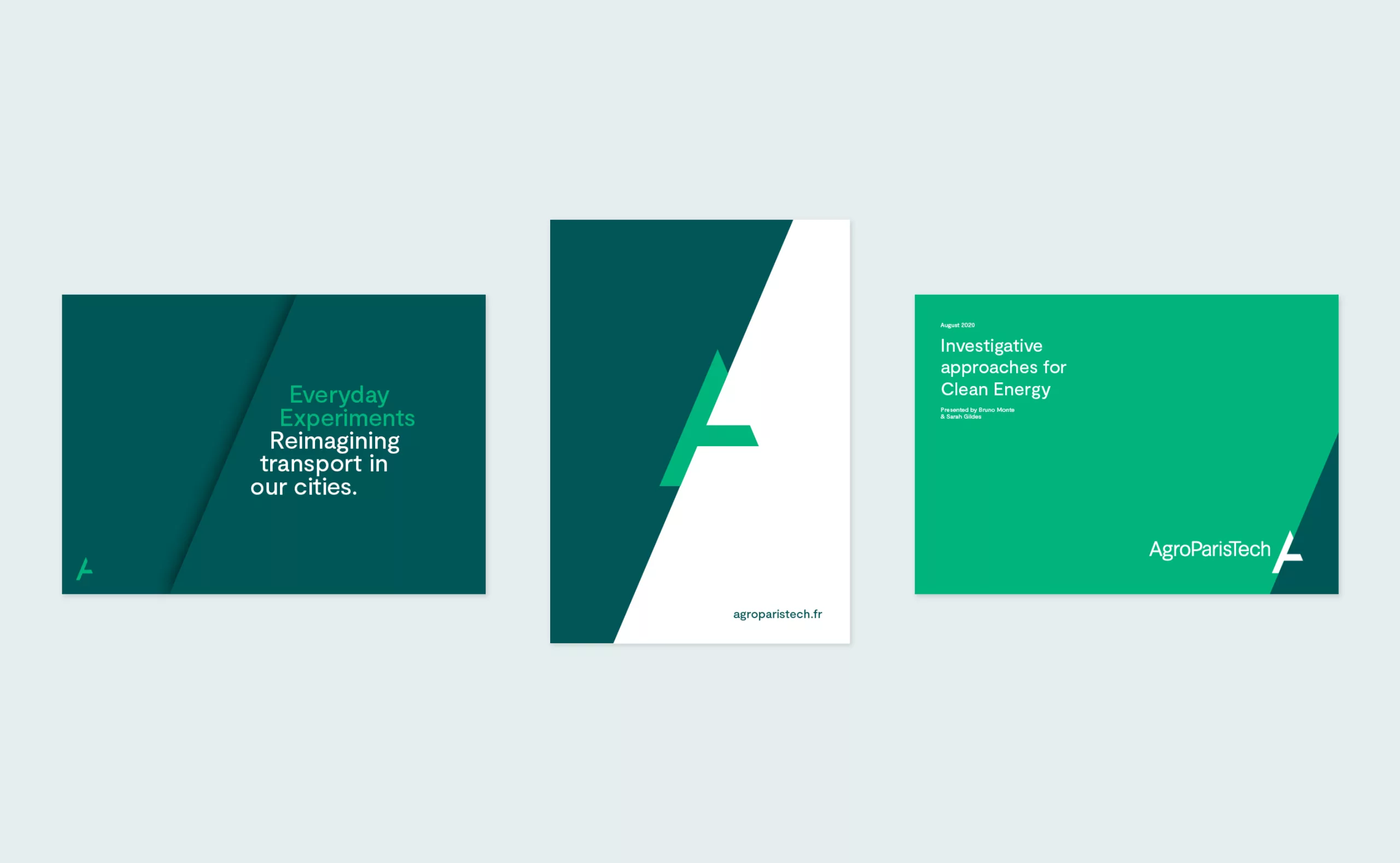
The new identity gives new impetus to the AgroParisTech brand and graphically translates the institution’s vocation: Contributing to research in thematic areas related to tomorrow’s agricultural, forestry, food and environmental issues, training committed stakeholders capable of innovating and acting in uncertain times, in order to imagine possible and sustainable futures. This project is also an opportunity to strengthen the institute by uniting all the teams around common values. The new graphic charter inaugurates a brand architecture that adapts the “mother brand’s” logotype to create a set of sub brands consistent with the graphic territory of the “AgroParisTech” brand (this includes sub brands for the campus, regional centers, Innlabs and community logos). We hope that this common and shared identity will be experienced as a source of pride and that it will contribute to the development of AgroParisTech’s influence and excellence.
