udice_case-study_20210113_0

2020

Creation of "Udice" naming and visual identity
A group for French research universities’ excellence

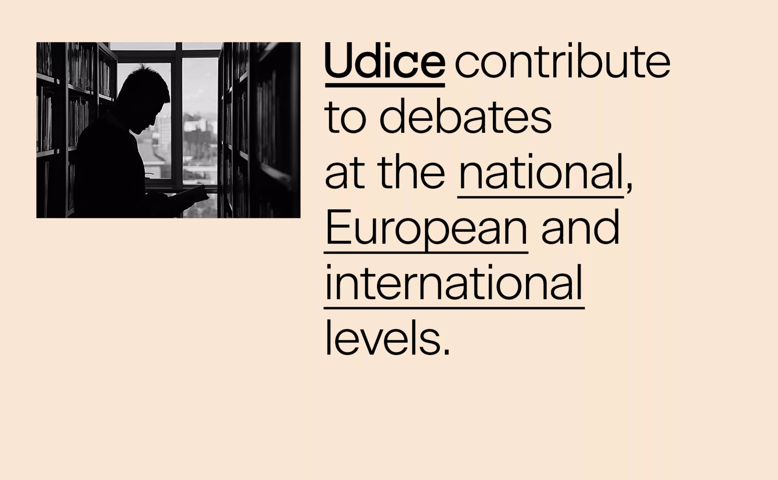
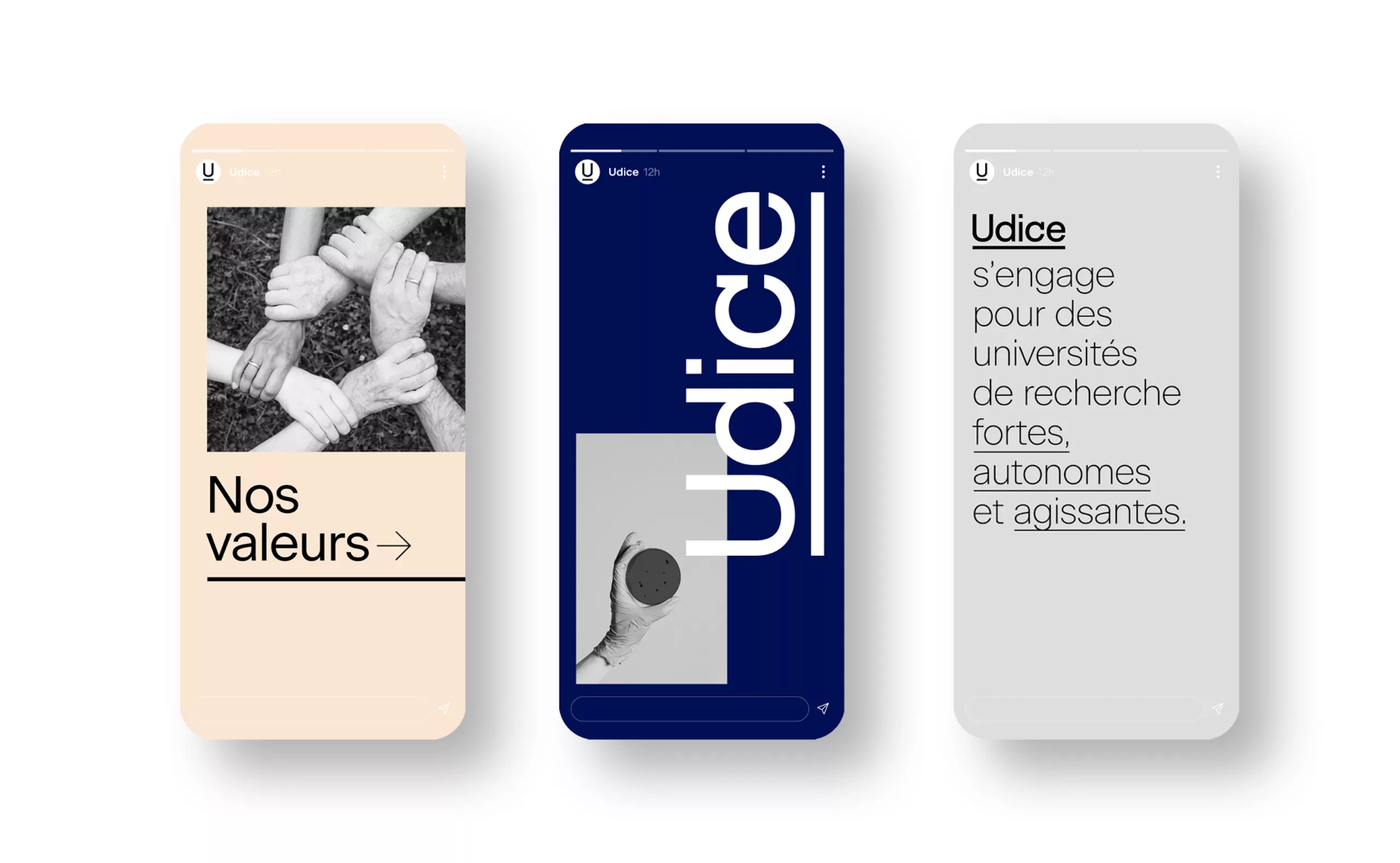
Udice is an association of 10 top French research universities formed on October 1, 2020. Formerly members of the CURIF, these universities are all IDEX certified. They are united by the same demand for open, inclusive science and high quality academic programs. These fundamentals define a clear mission: strengthening, through collective action, the capacity of French public universities to excel in their missions and activities, for the benefit of democratic societies. The goal is to have strong, autonomous and active research universities, on a national, European and international scale.

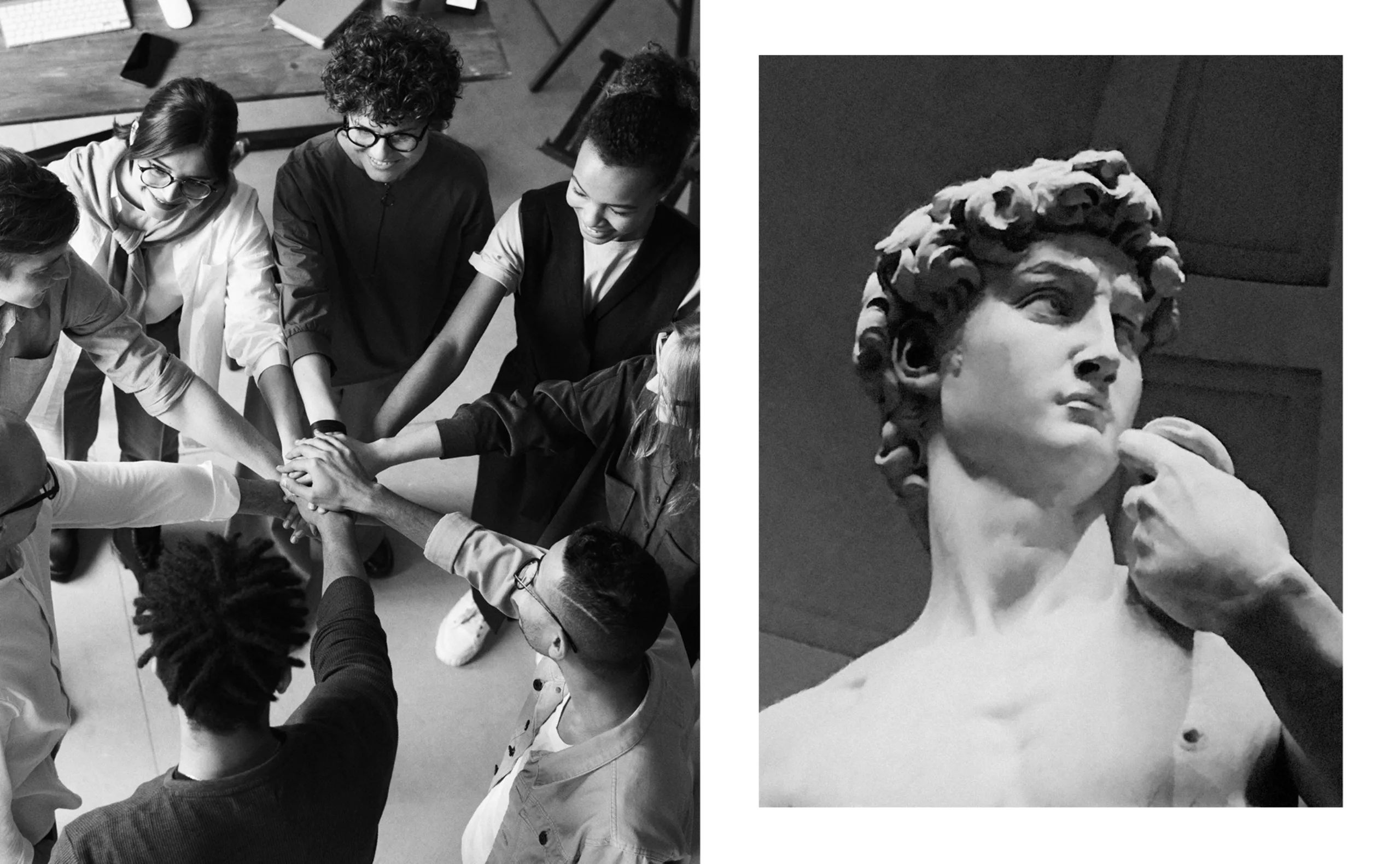
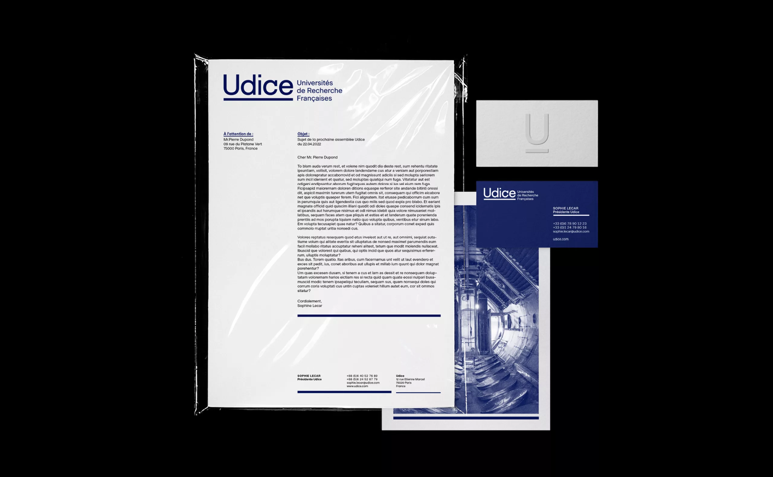
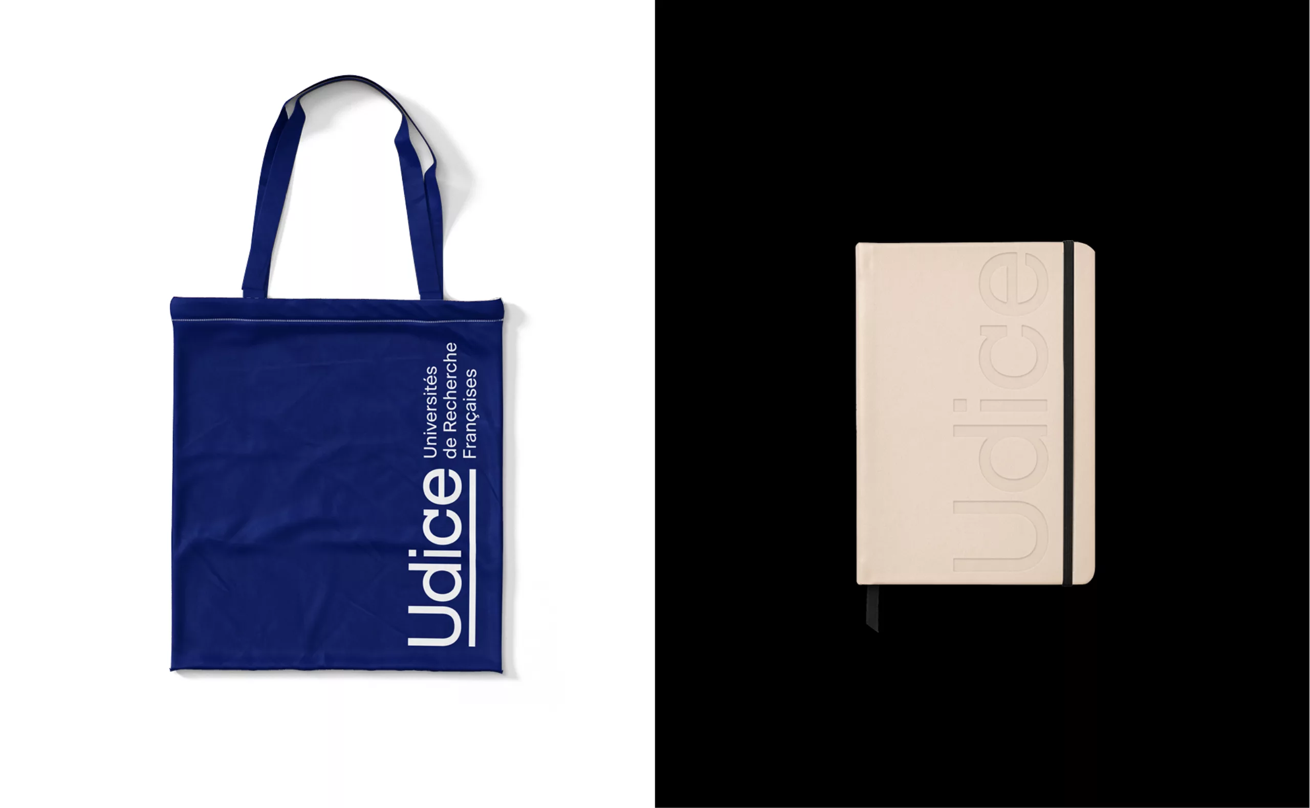
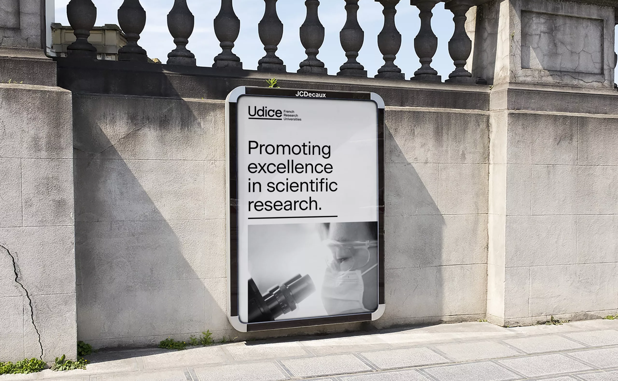
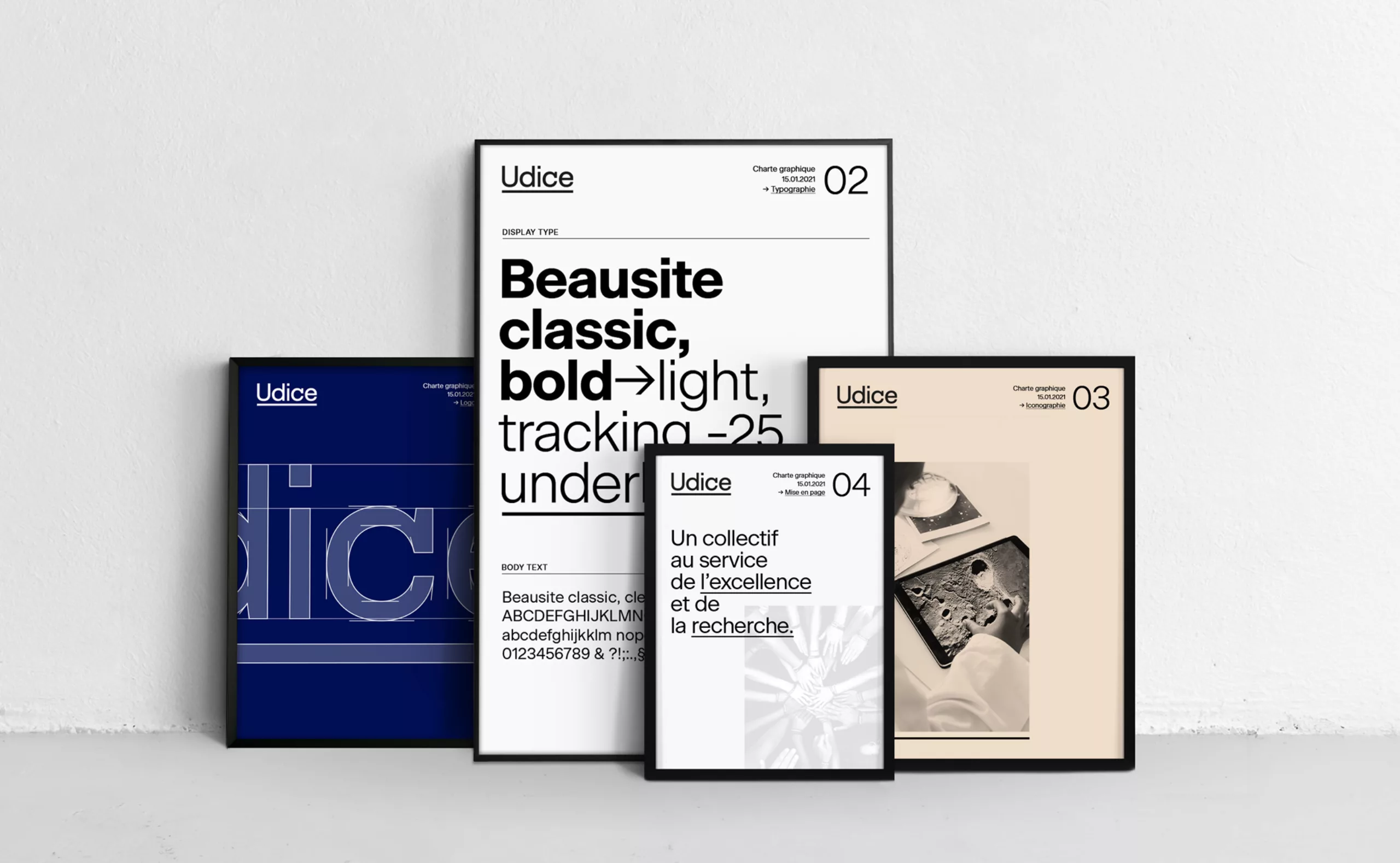
To contribute to the legitimacy and excellence of this association, we have supported Udice in the creation of its name, visual identity and signature. It was important for this group to have a strong institutional image that could support them in their interventions and speeches, as well as to stand out among the many other groups of intensive research universities in Europe and internationally.

A new name to unite the 10 founding universities

"Udice" is the French phonetic transcription of "U10", the provisional code name of the grouping. "U" being the initial of "University", and "10" being the number of founding universities of the association. By moving away from the number, the new name allows the structure to evolve while building on the legacy of the founding group. This "naming" trick creates a distinctive, short and institutional name with a strong academic connotation. Its sound is also very close to "Ulysses", a Greek mythological hero renowned for his cunning intelligence, whose advice was listened to and appreciated.

The signature "French Research Universities" explains Udice's activity in a very concrete way, where the name expresses the positioning and values of the brand.

A "Udice" logo that gives body to the association

In the field of research and higher education, the recognition of institutions is primarily based on their names. Titles and acronyms are kings. Integrated and cited in articles and press releases, they are the embodiment of a project.
For the design of the logotype, more than a graphic symbol, it was essential to enhance the name Udice. The lettering of the logotype is custom designed, assuming its simplicity and legibility in a geometric style and without contrast, playing on the repetition of round and linear shapes. The ending of the "c" echoes the barrel of the "d" and brings a touch of personality to the block - where the most imaginative will see a subliminal microscope hidden in the silhouette of the "c".

Underlining is most often reserved for important terms. It underlines here the union of the 10 universities under the same project. It becomes the line that symbolizes the unity of each and the grouping. It’s a graphic asset that is used on communication media to create a coherent visual universe identifiable as the "Udice" brand. Applied to texts and iconography, underlining participates in the recognition of the association.
Easily deployable internally, it creates an aesthetic in line with the seriousness required by the subject. This system also gives pride of place to large blue and beige flat tints. This soft and contrasted colorimetric range accompanies a modern and precise neo-grotesque typography that leaves room for the most important thing: meaning.

Aknowledgements: 

Thanks to Christine Clerici, President Université de Paris and President Udice ; Eric Berton, President Université Aix-Marseille ; Alain Fuchs, President Université Paris Sciences Lettres ; Jean Chambaz, President Sorbonne Université ; Frédéric Fleury, President Université Claude Bernard Lyon 1 ; Jeannick Brisswalter, President Université Côte d’Azur ; Manuel Tunon de Lara, President Université de Bordeaux ; Michel Deneken, President Université de Strasbourg ; Yassine Lakhnech, President Université Grenobles Alpes ; Sylvie Retailleau, President Université Paris Saclay ; Hélène Jacquet, general delegate, and Ilyas Kenadid, project manager, for their trust and involvement throughout the project.

Context

CURIF, created in 2008 and institutionalised in 2013, was based on the will of high-level public research universities sharing common values and united around a sense of belonging linked to the idea of excellence. The successive changes in the French higher education and research landscape, as well as the various waves of investment plans for the future, have profoundly transformed the French universities that are members of CURIF. A new grouping tightened around leading universities has been decided to support and defend scientific research in France and to create partnerships with similar groupings abroad.
The list of members is as follows: Aix-Marseille Université - Université de Bordeaux - Université Grenoble Alpes - Université Côte d’Azur - Université de Paris - Université Paris-Saclay - Université de Strasbourg - Sorbonne Université - Paris Sciences et Lettres

Objectives

- Create a name for the assembly that would be easier to understand by developing a subtitle.
- Define and create its visual identity (logo and graphic charter).
- Design a communication document for the association presenting its key figures and missions.


Share this project:
Project expertise:
Logo creation, visual identity and graphic guidelines. Creation of brand and company names.
Type of client:
Communication in the education, higher education and health sector. An indispensable partner in the transformation of the health and wellness industry through the alchemy of creativity and technology. Communication in science and research.

Related projects: