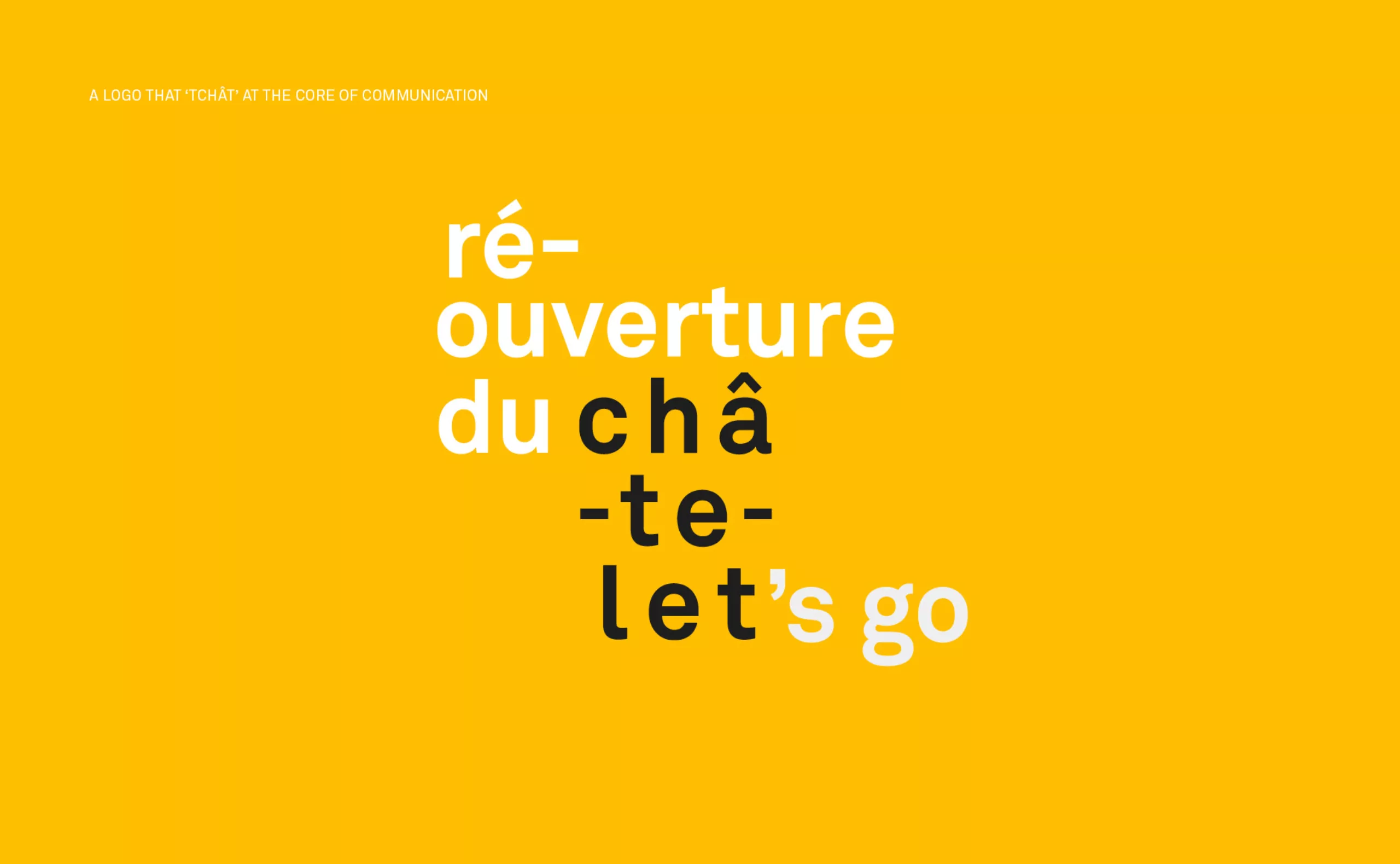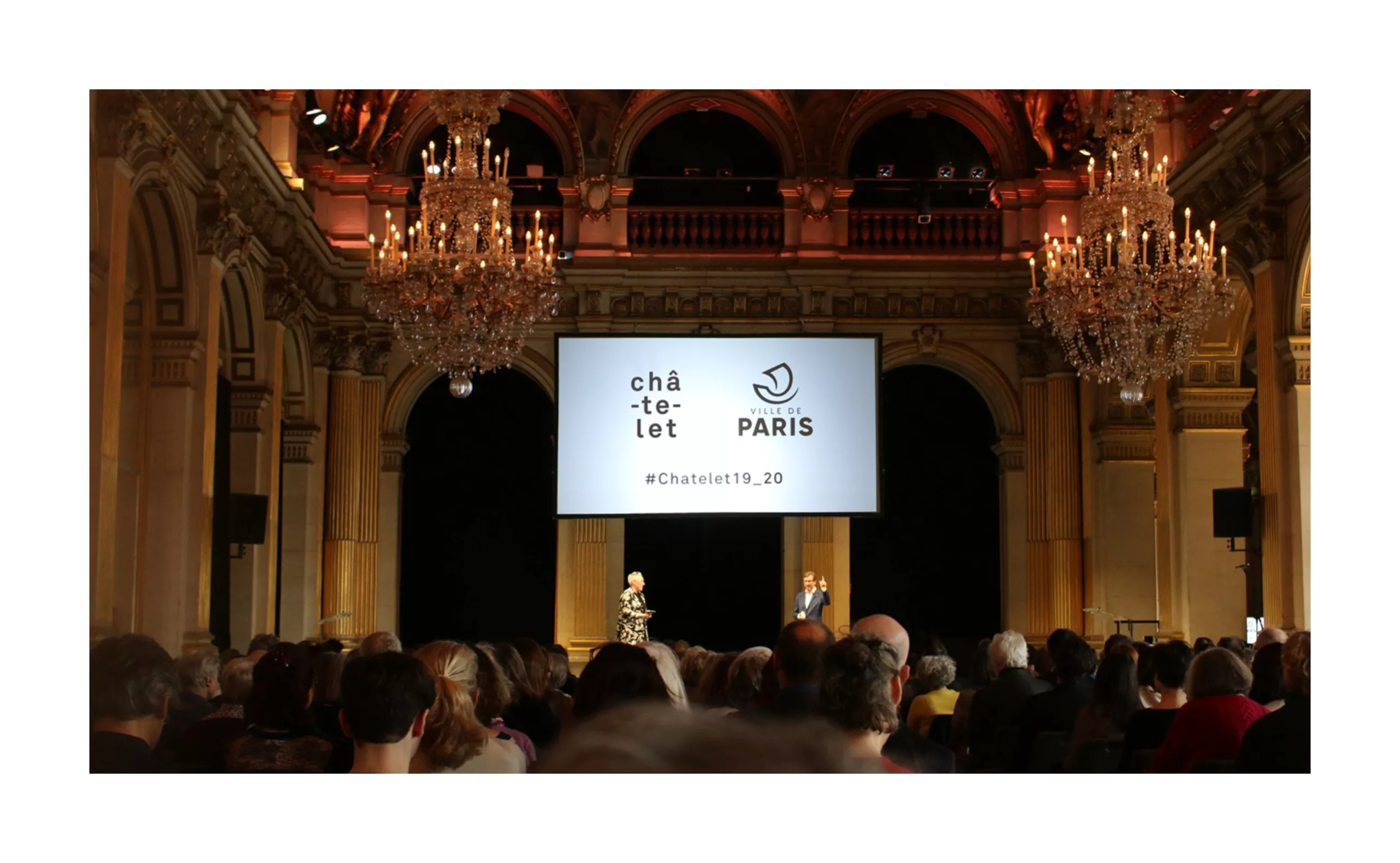
In 2019, the emblematic Théâtre Musical de Paris – Châtelet reopens its doors after two years of renovation and off-site presence. This new curtain-raiser is accompanied by a new management team with Ruth Mackenzie and Thomas Lauriot dit Prévost, and marks a new stage in the life of the theatre.
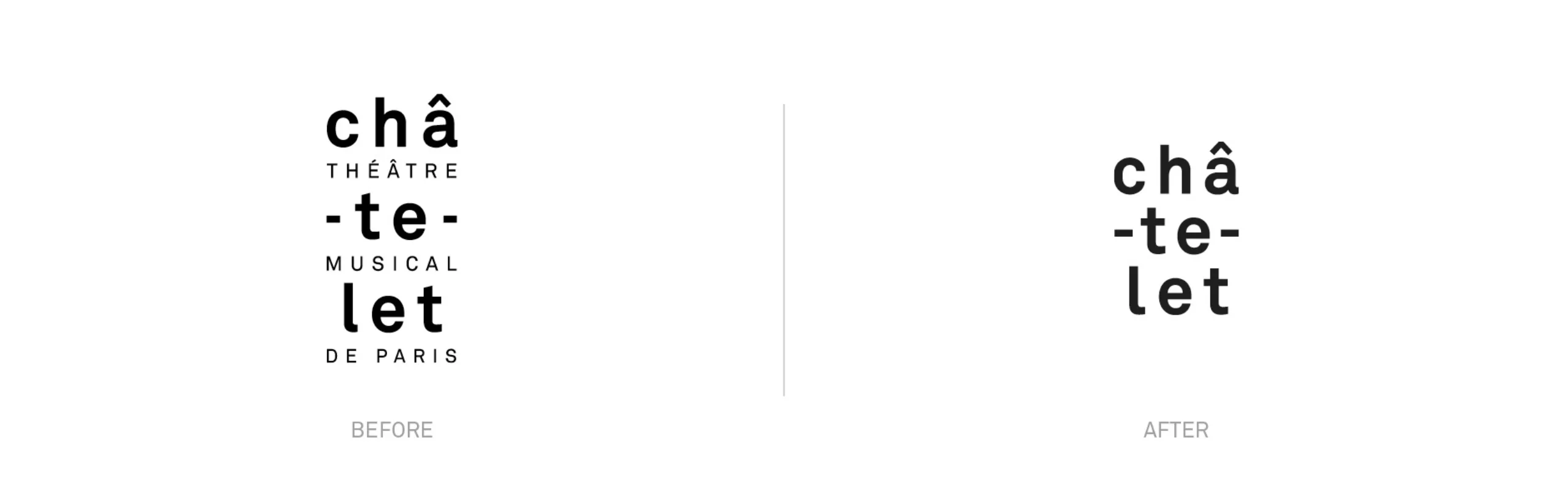
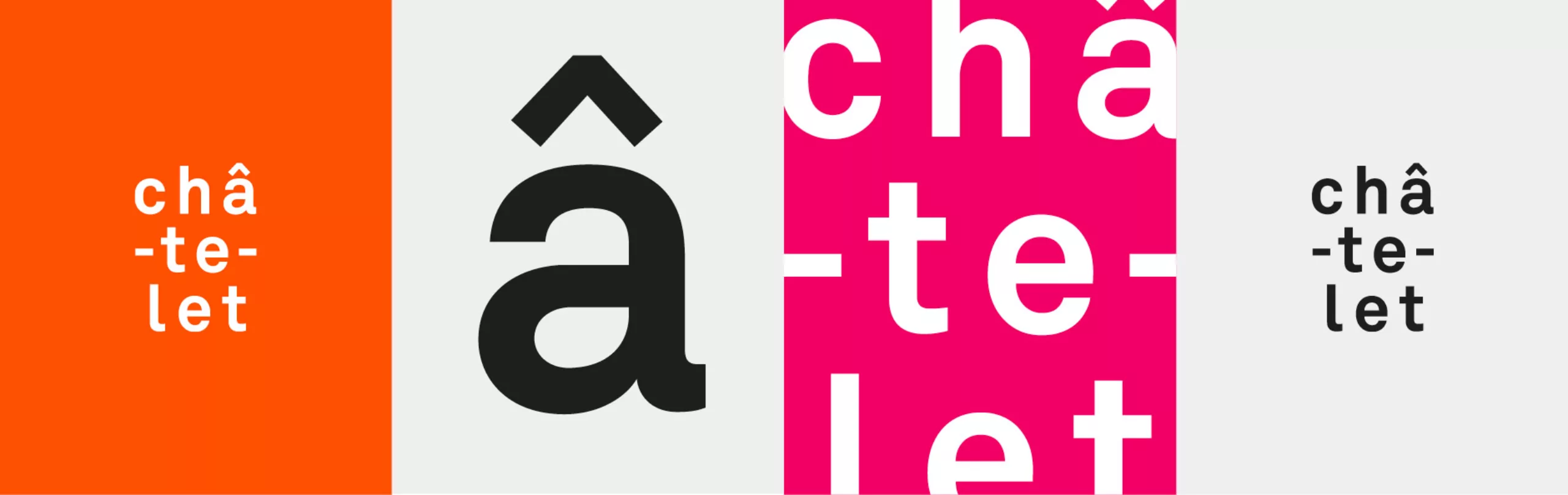
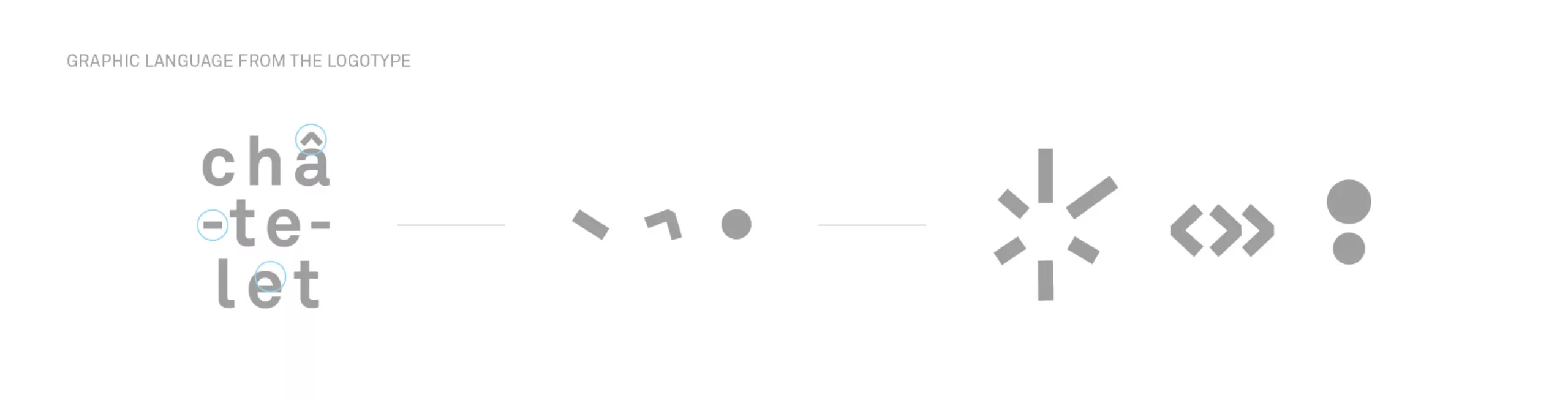
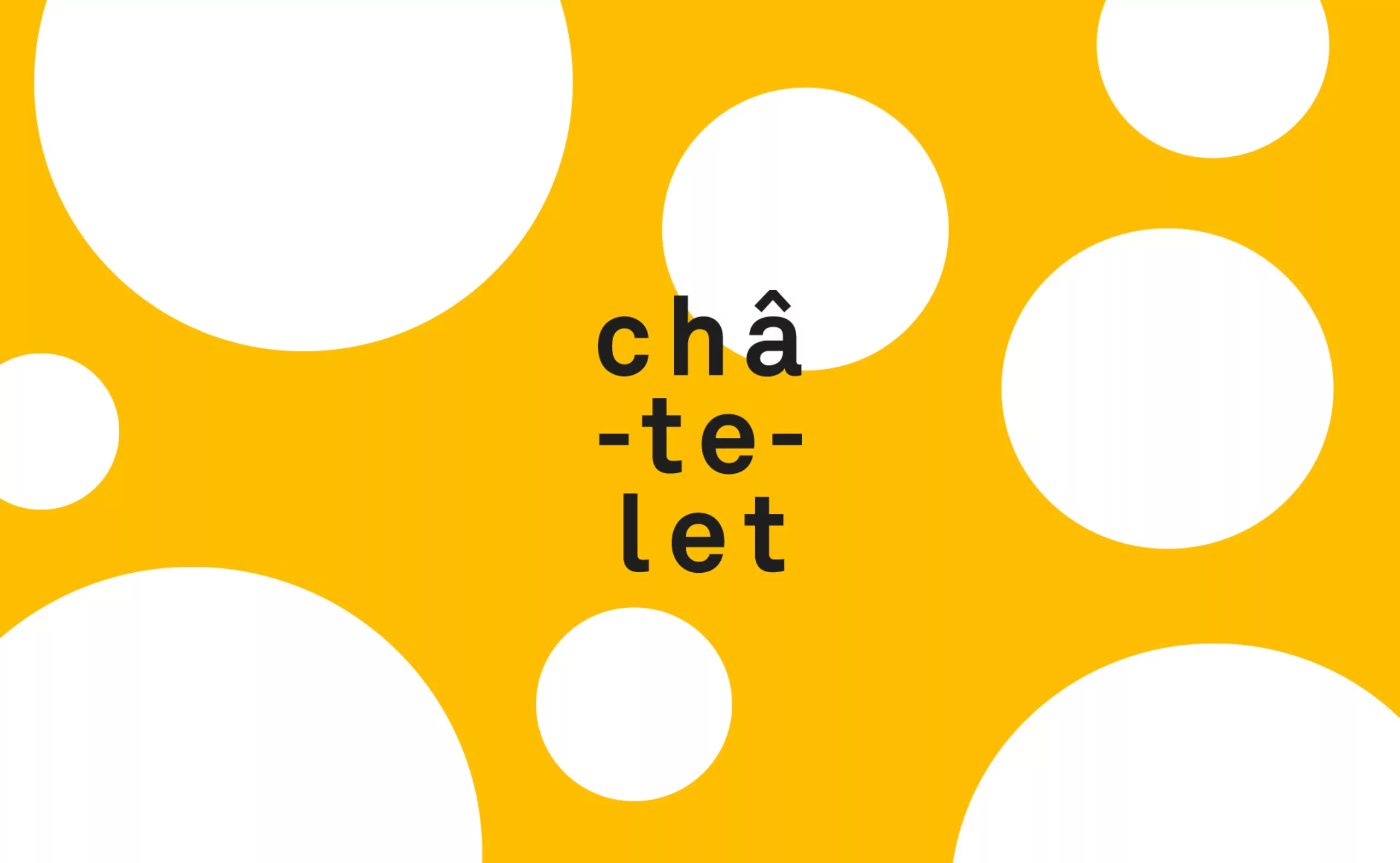
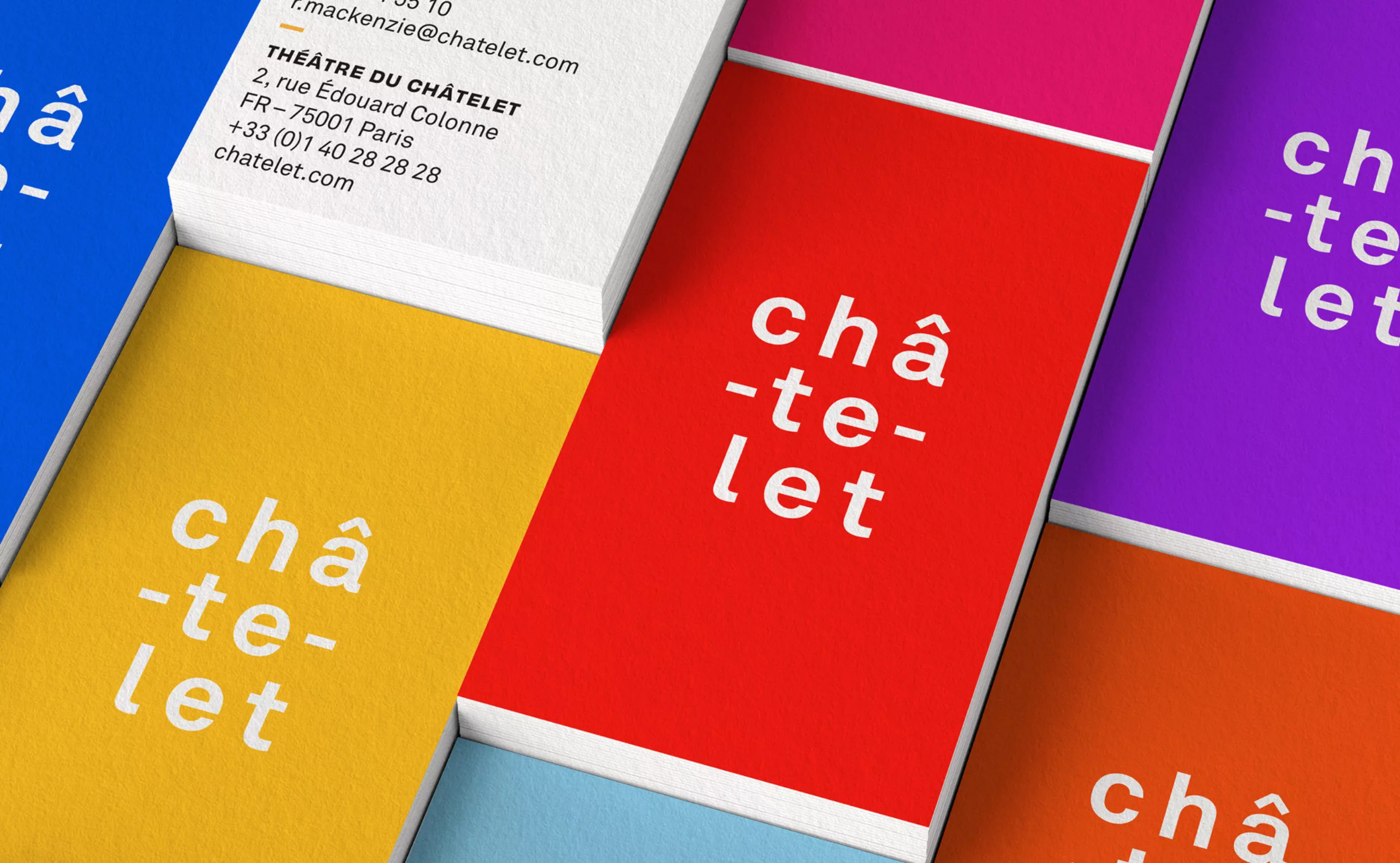
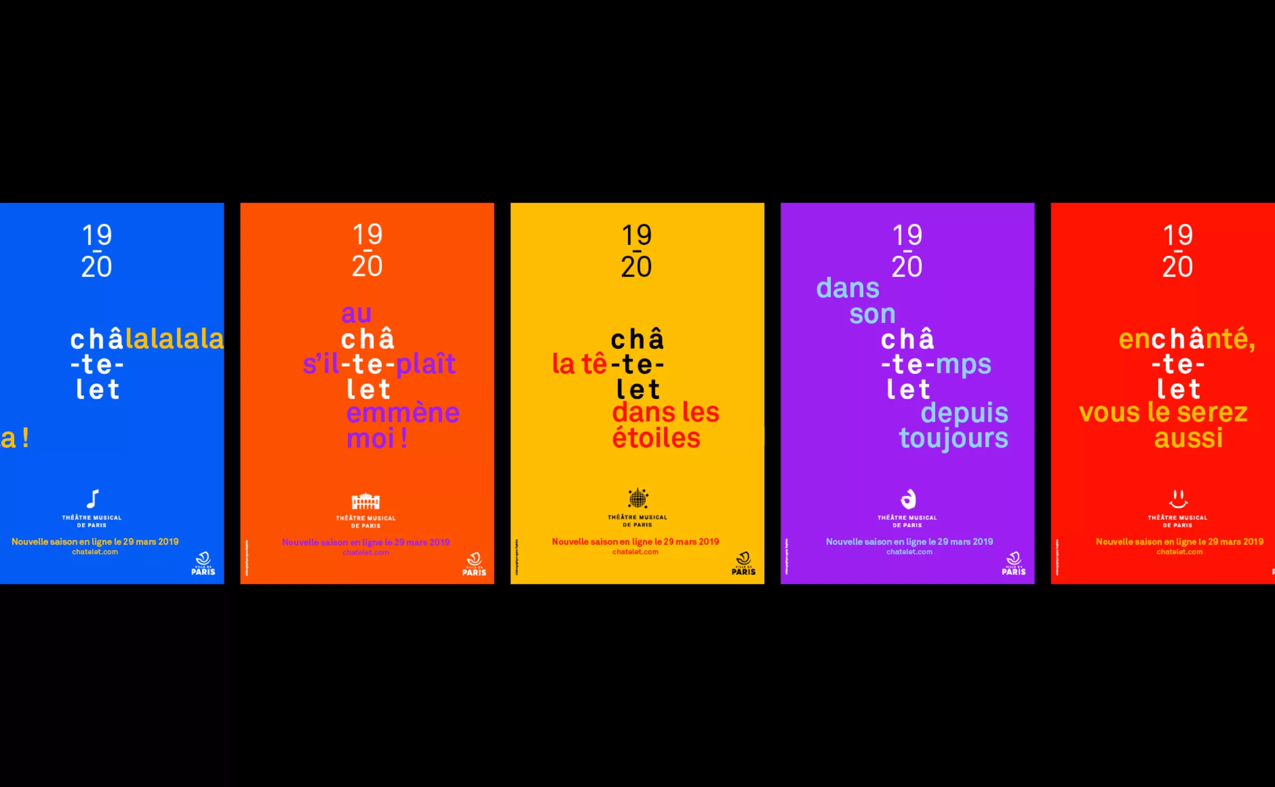
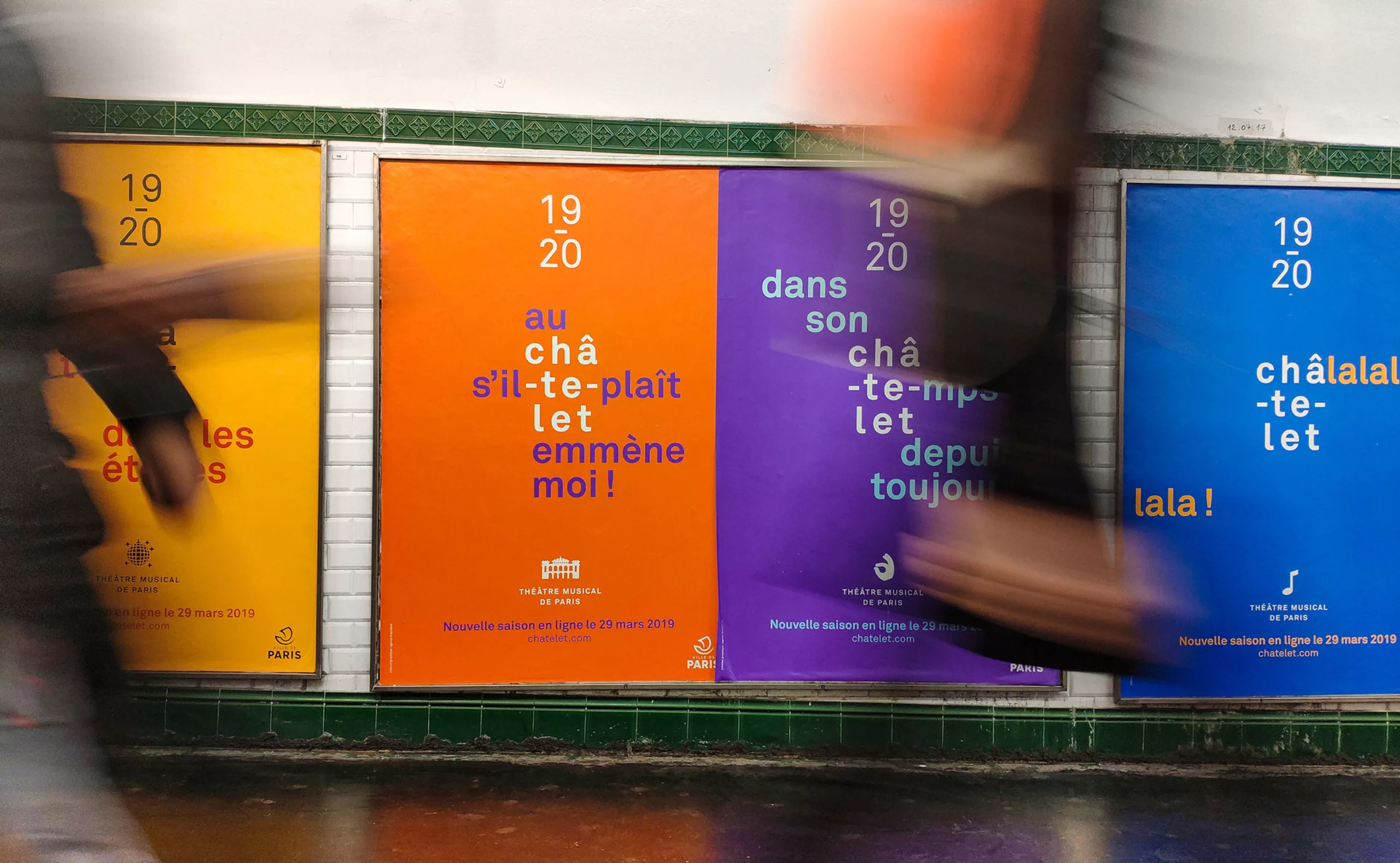
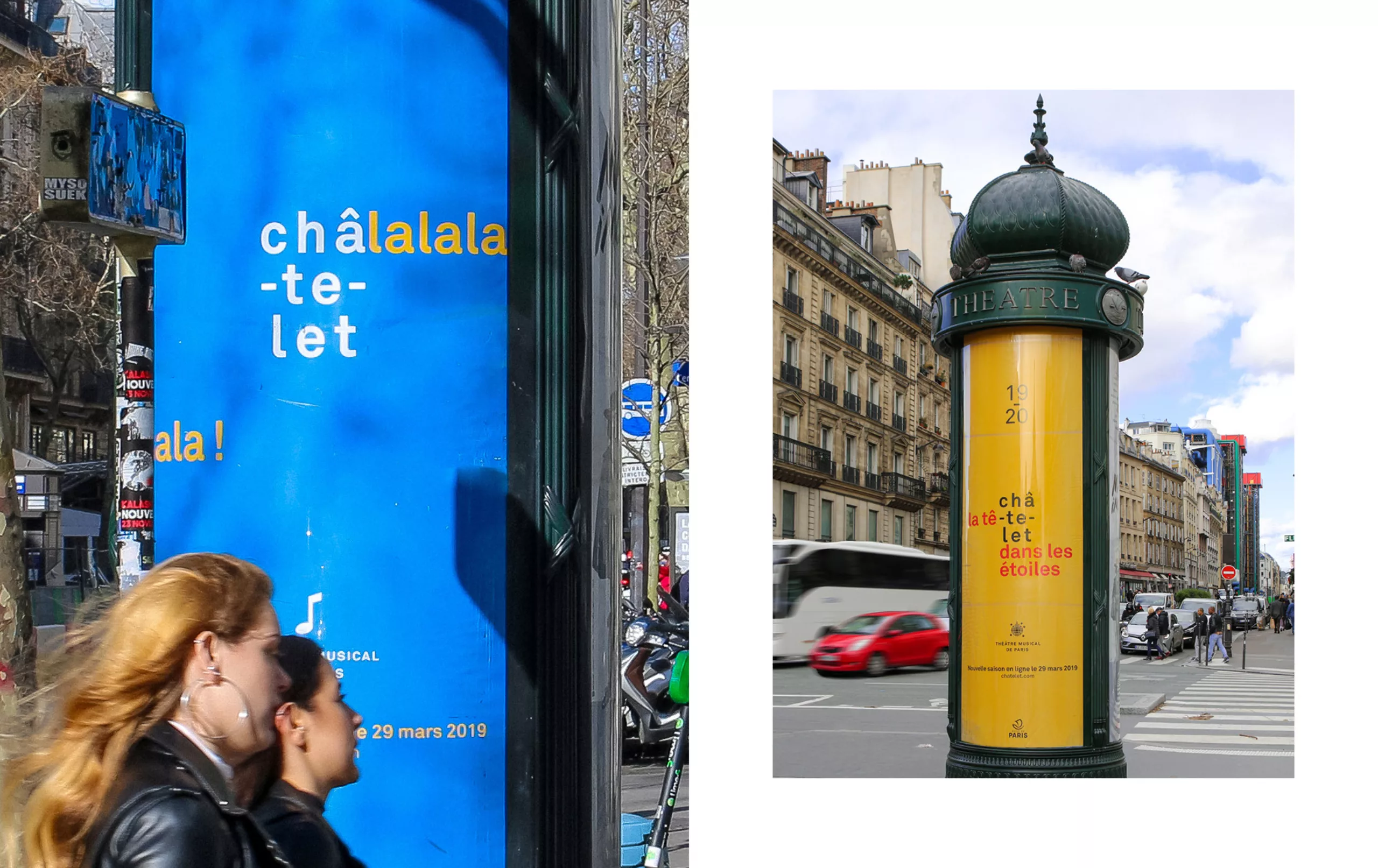
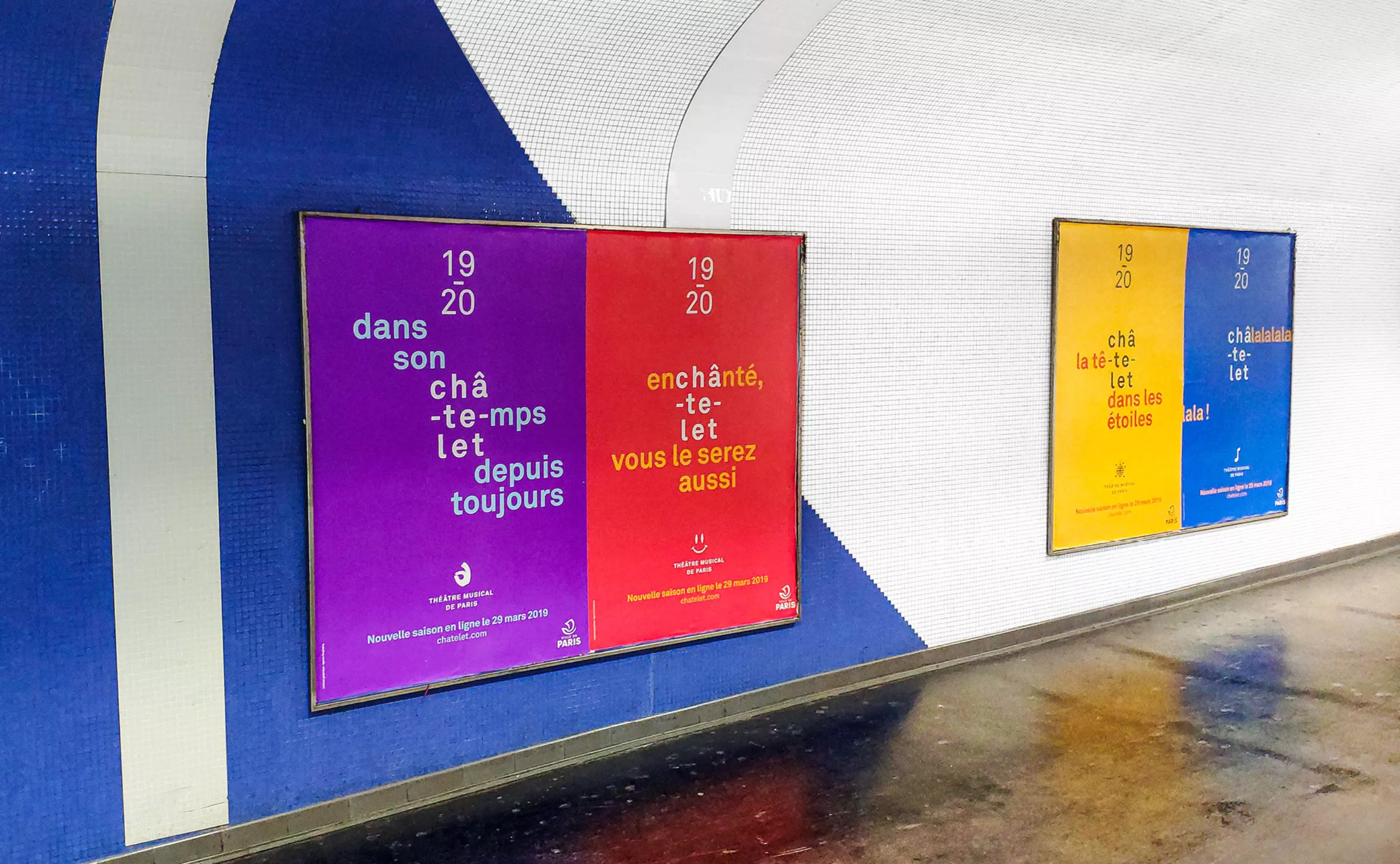
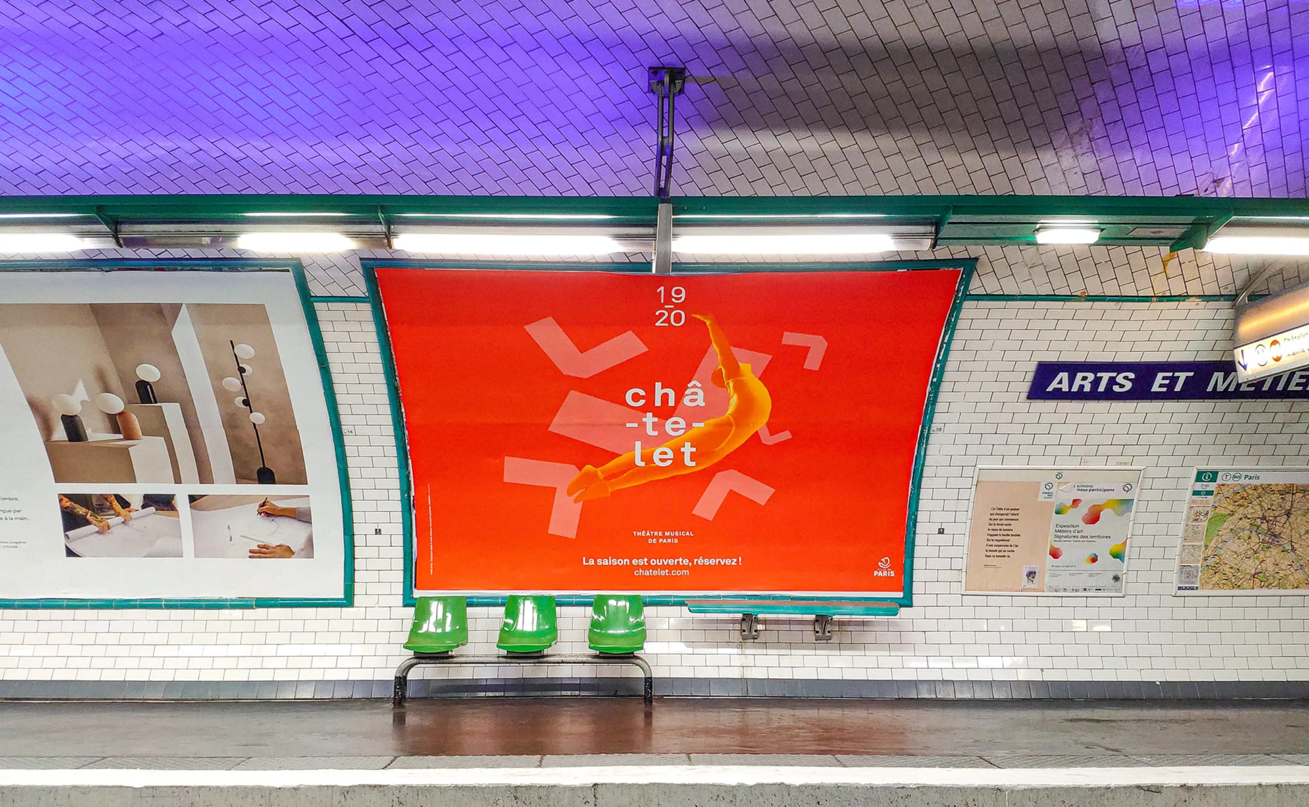
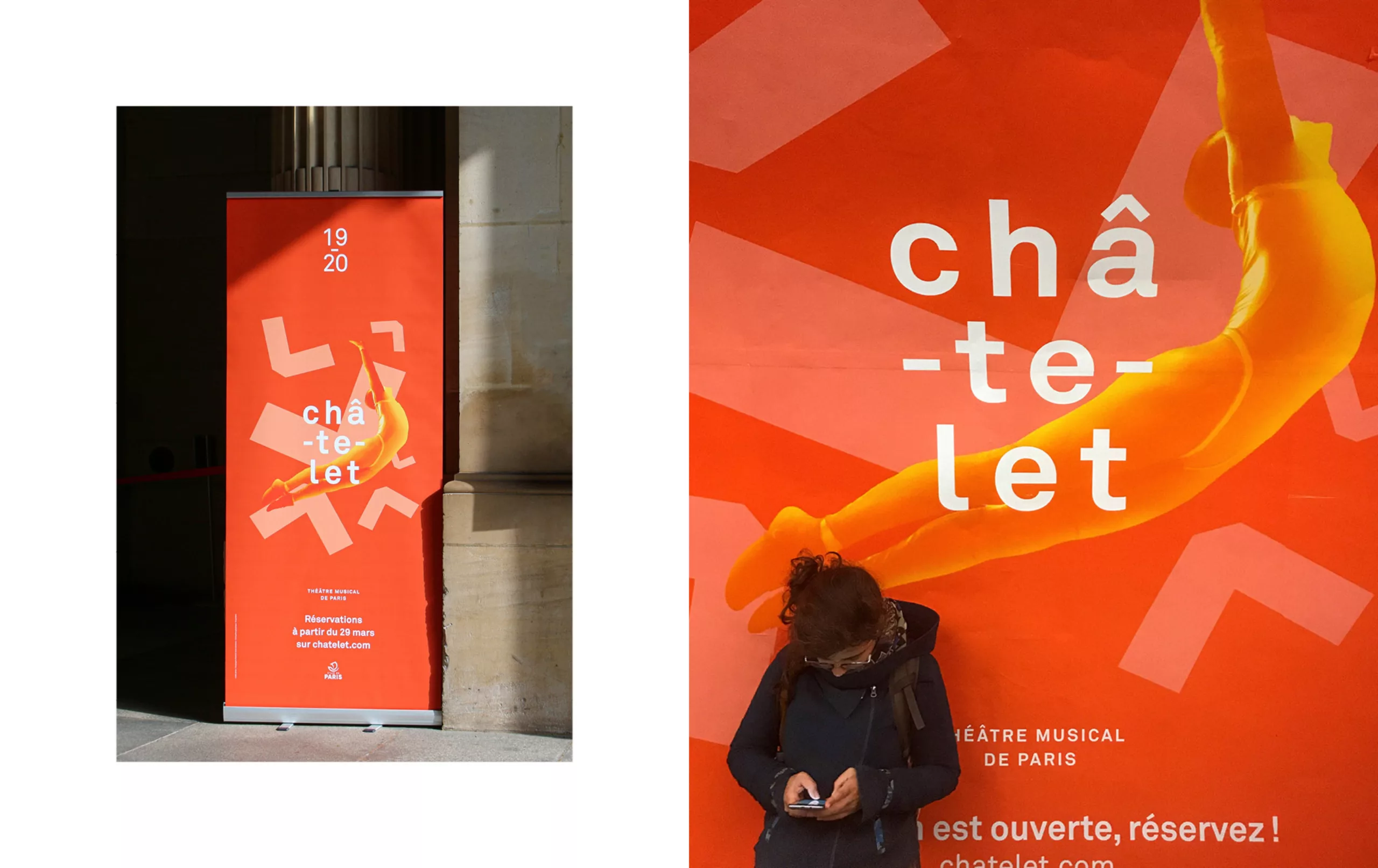
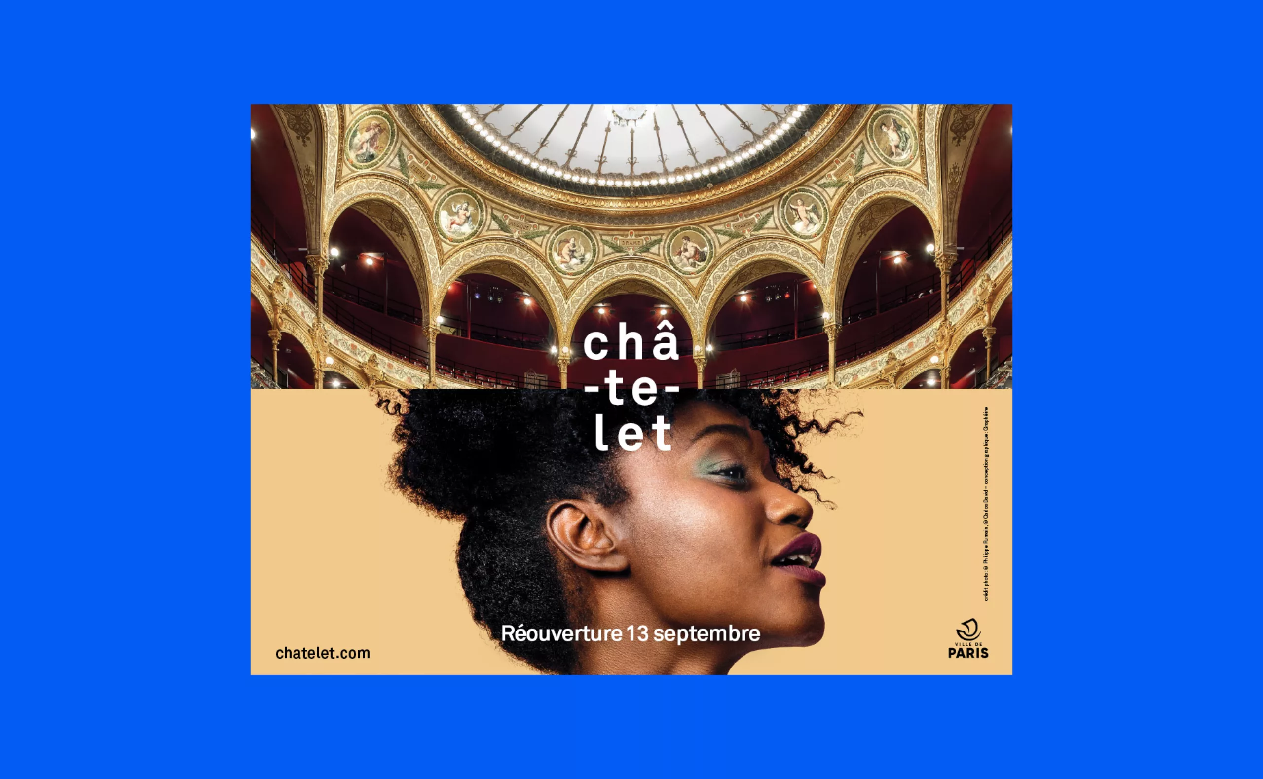
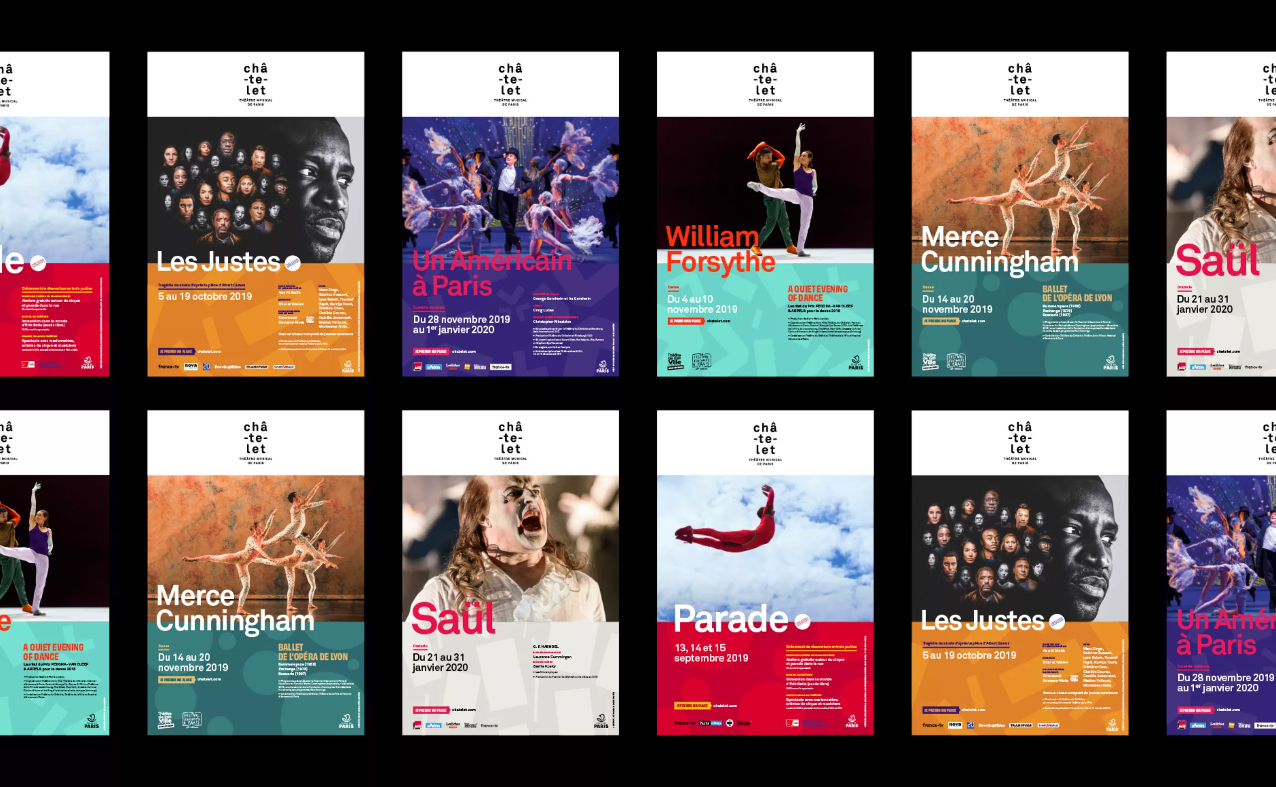
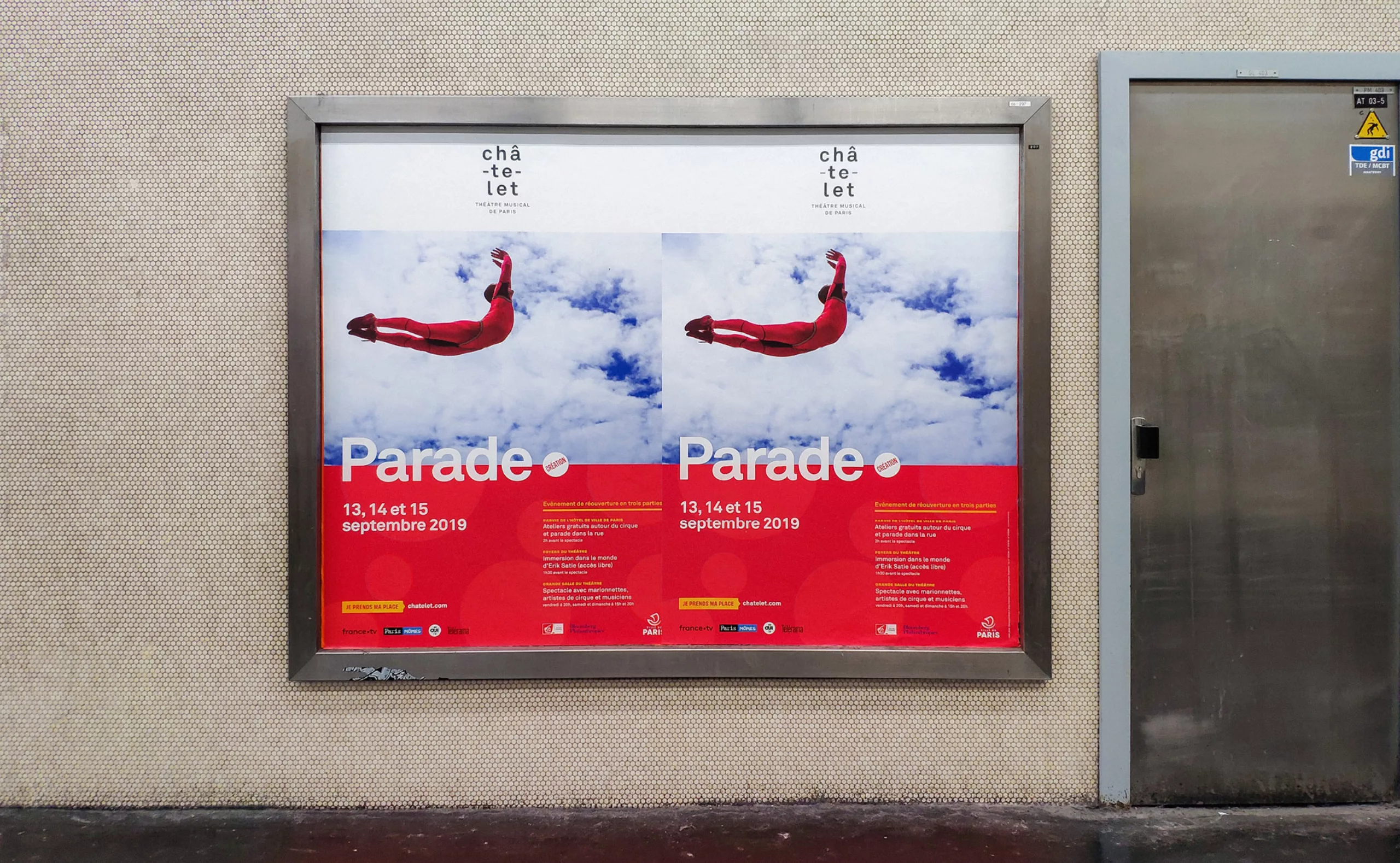
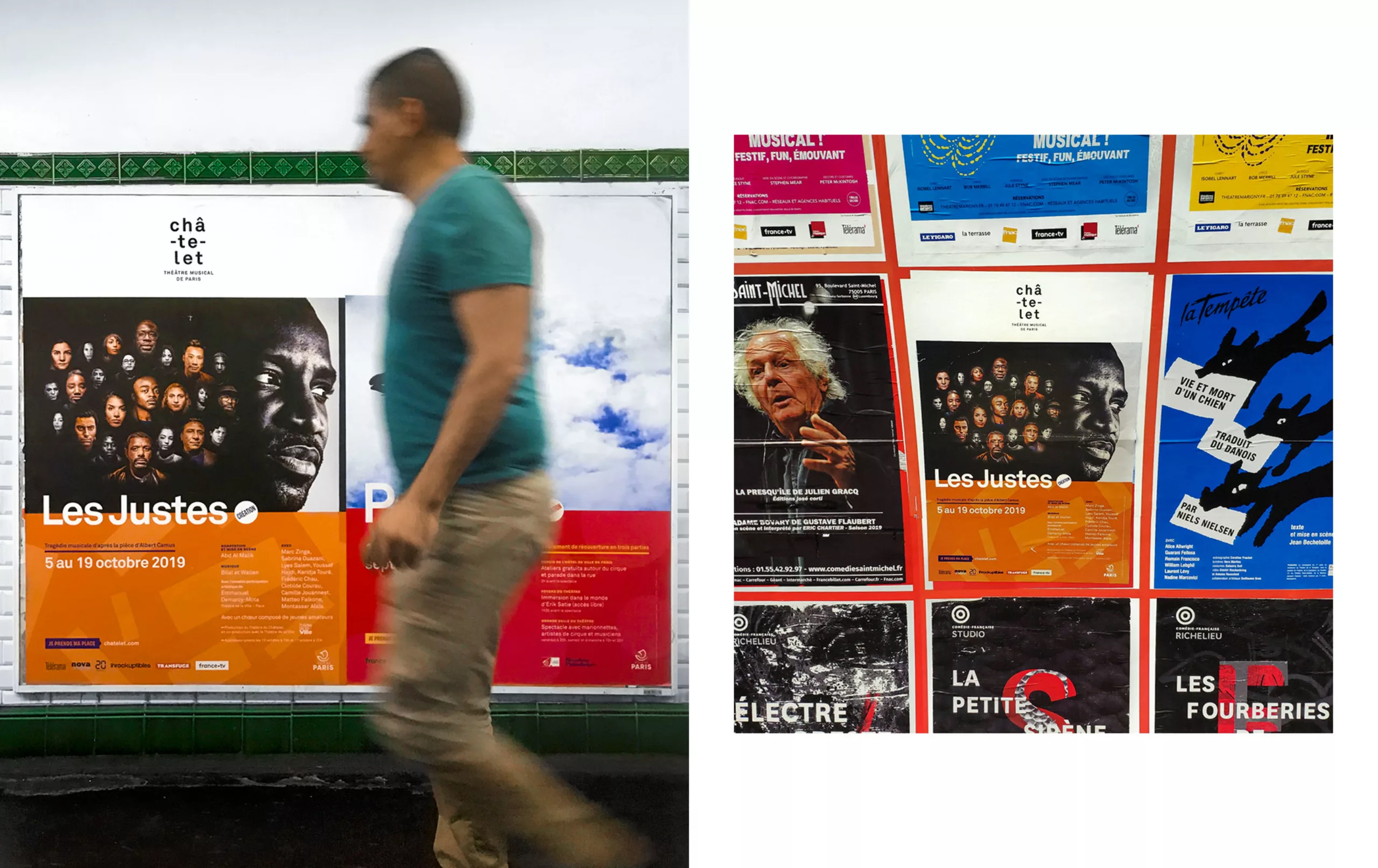
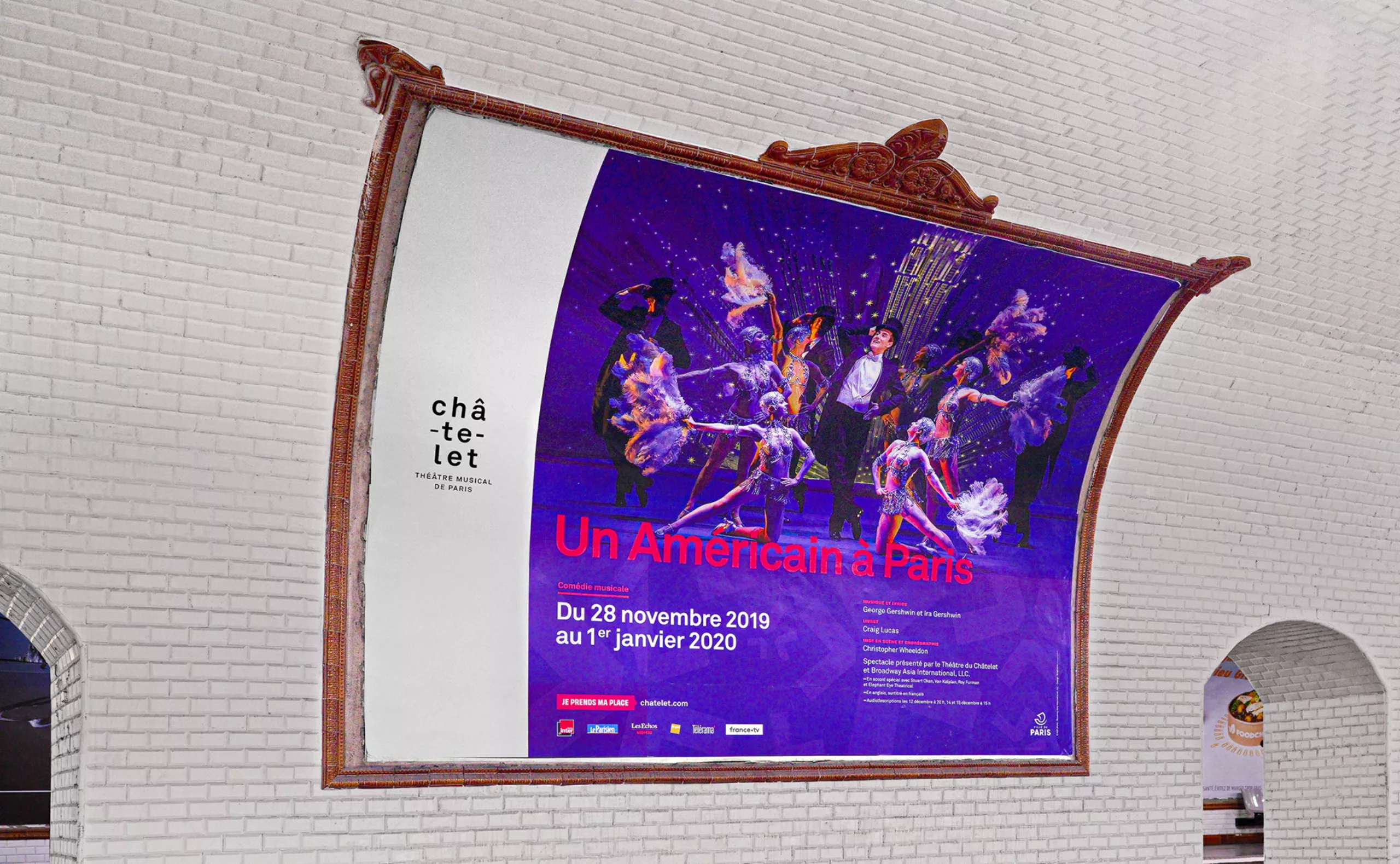
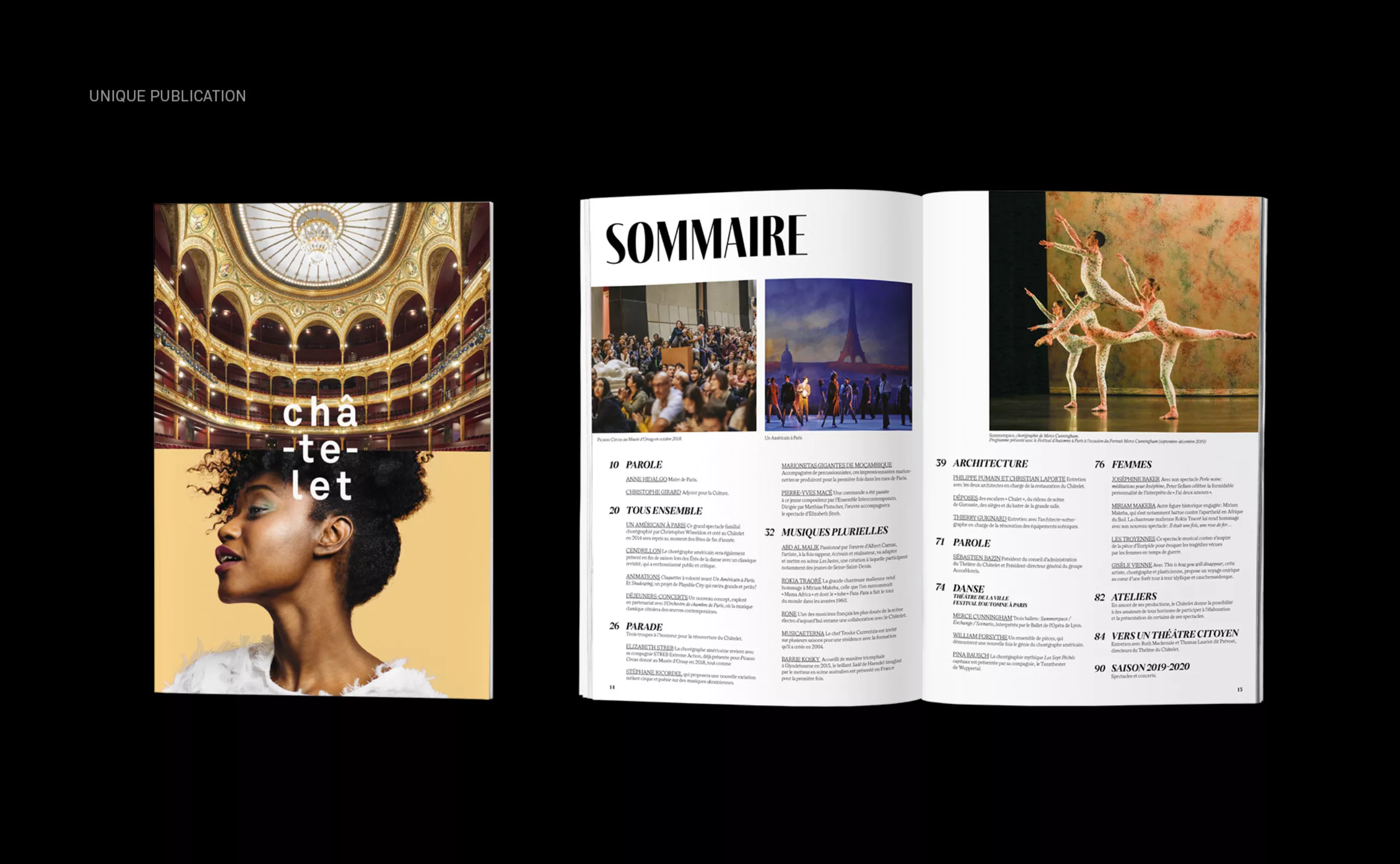
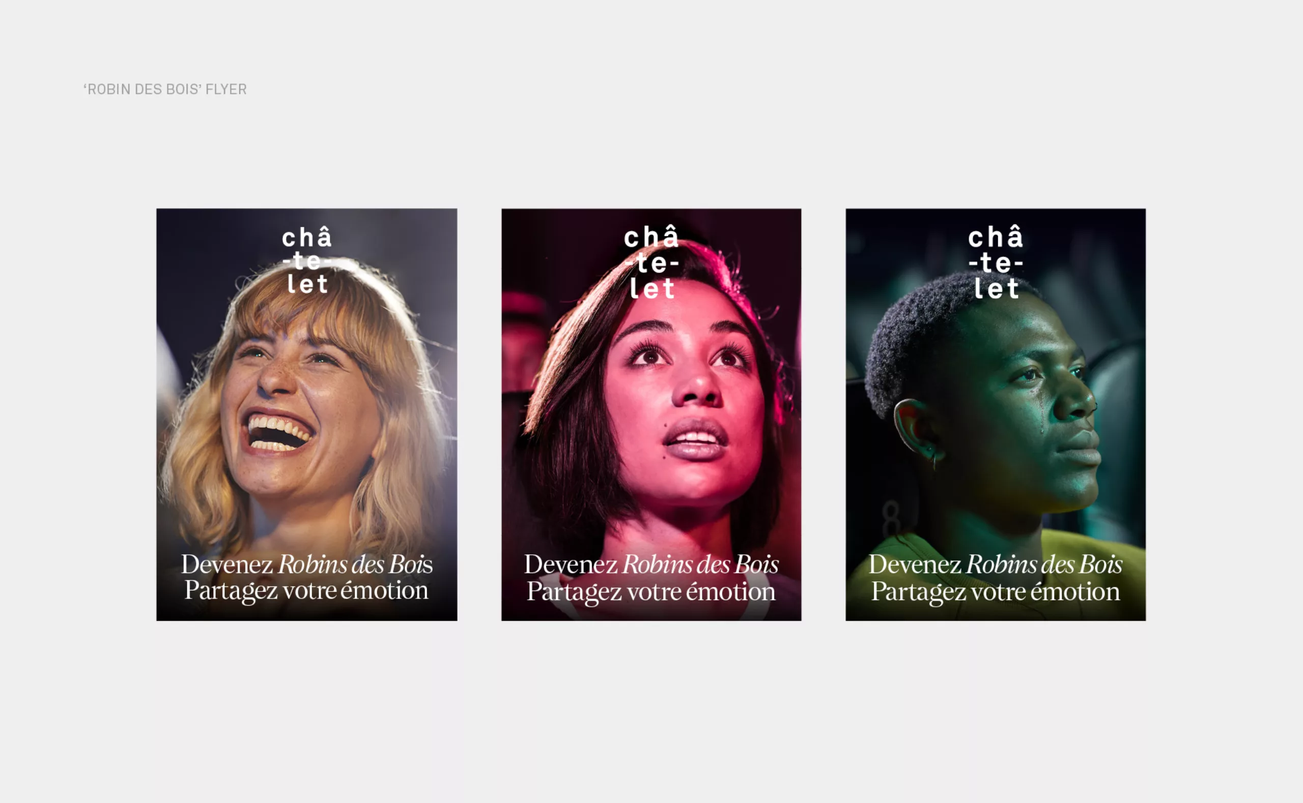
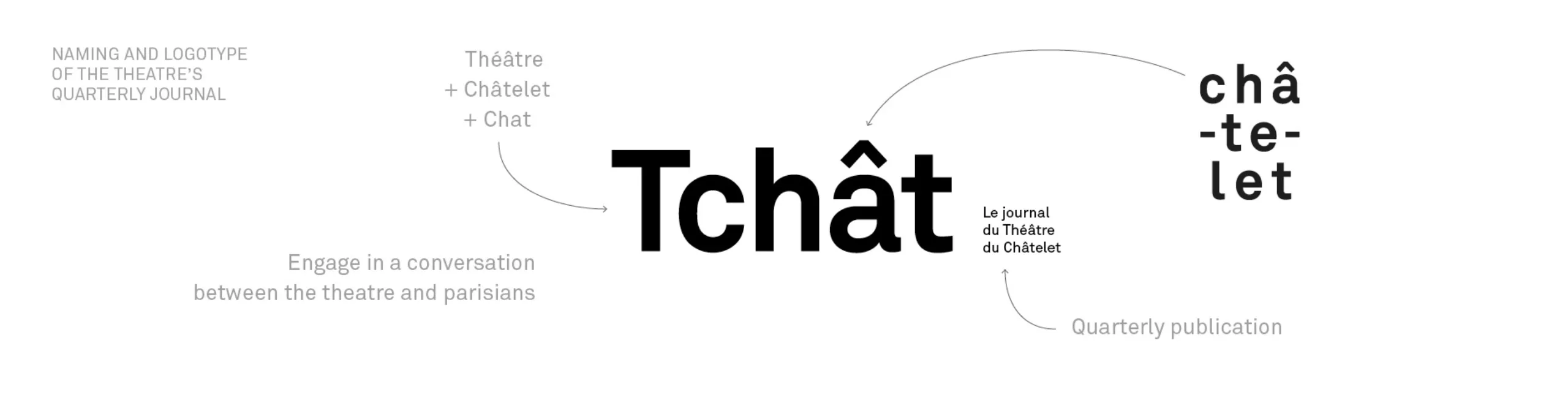
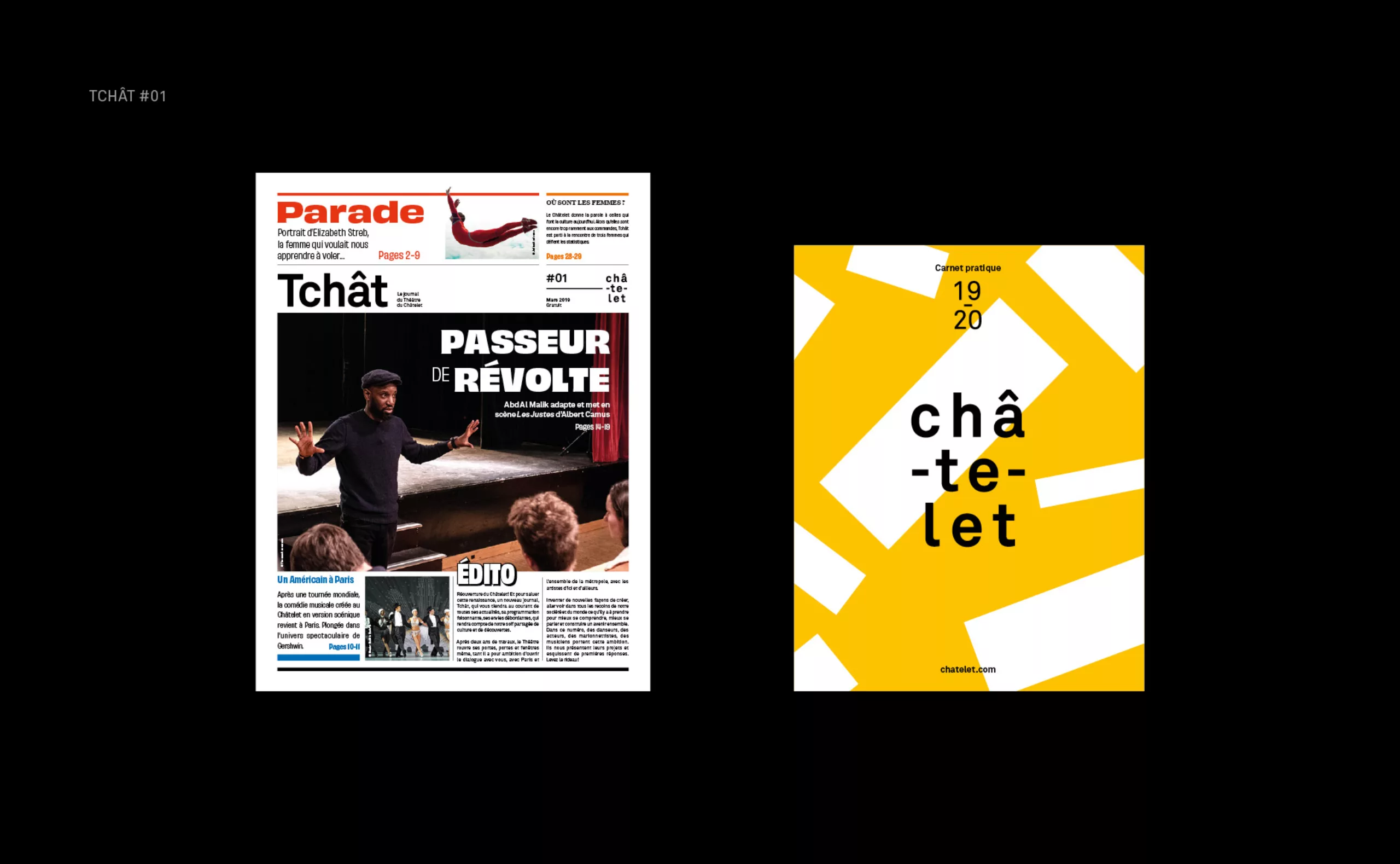
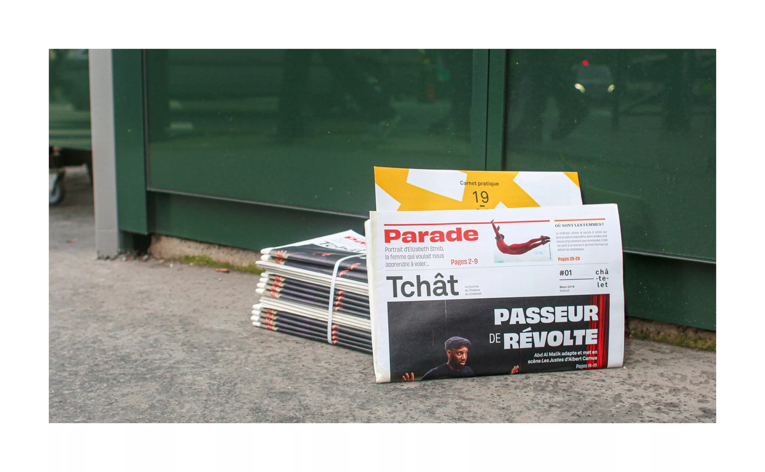
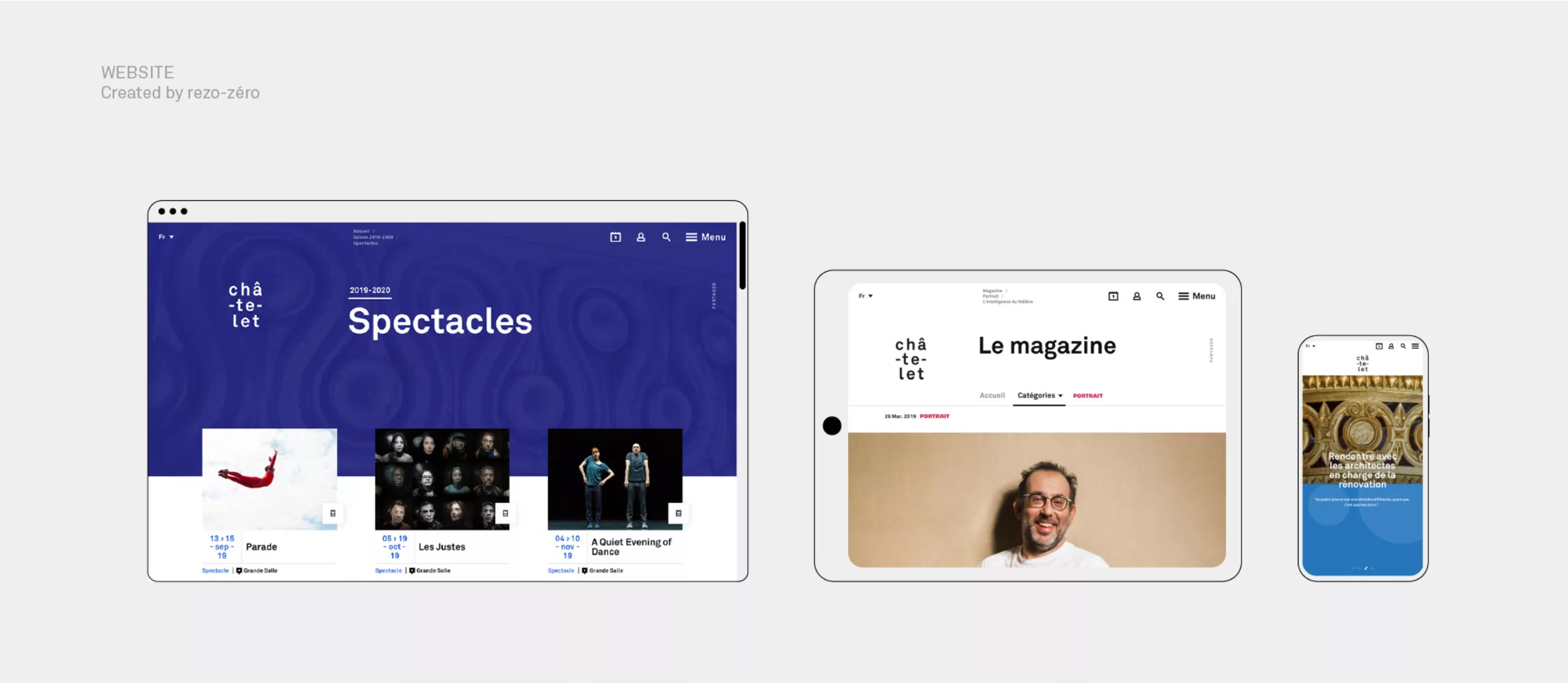
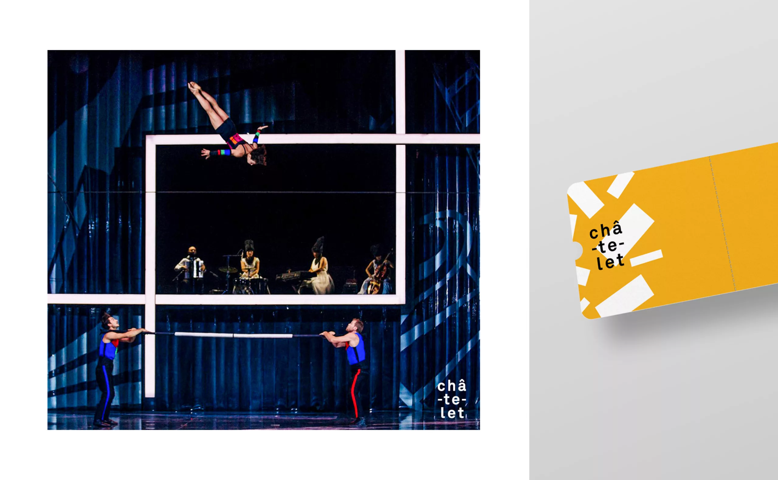
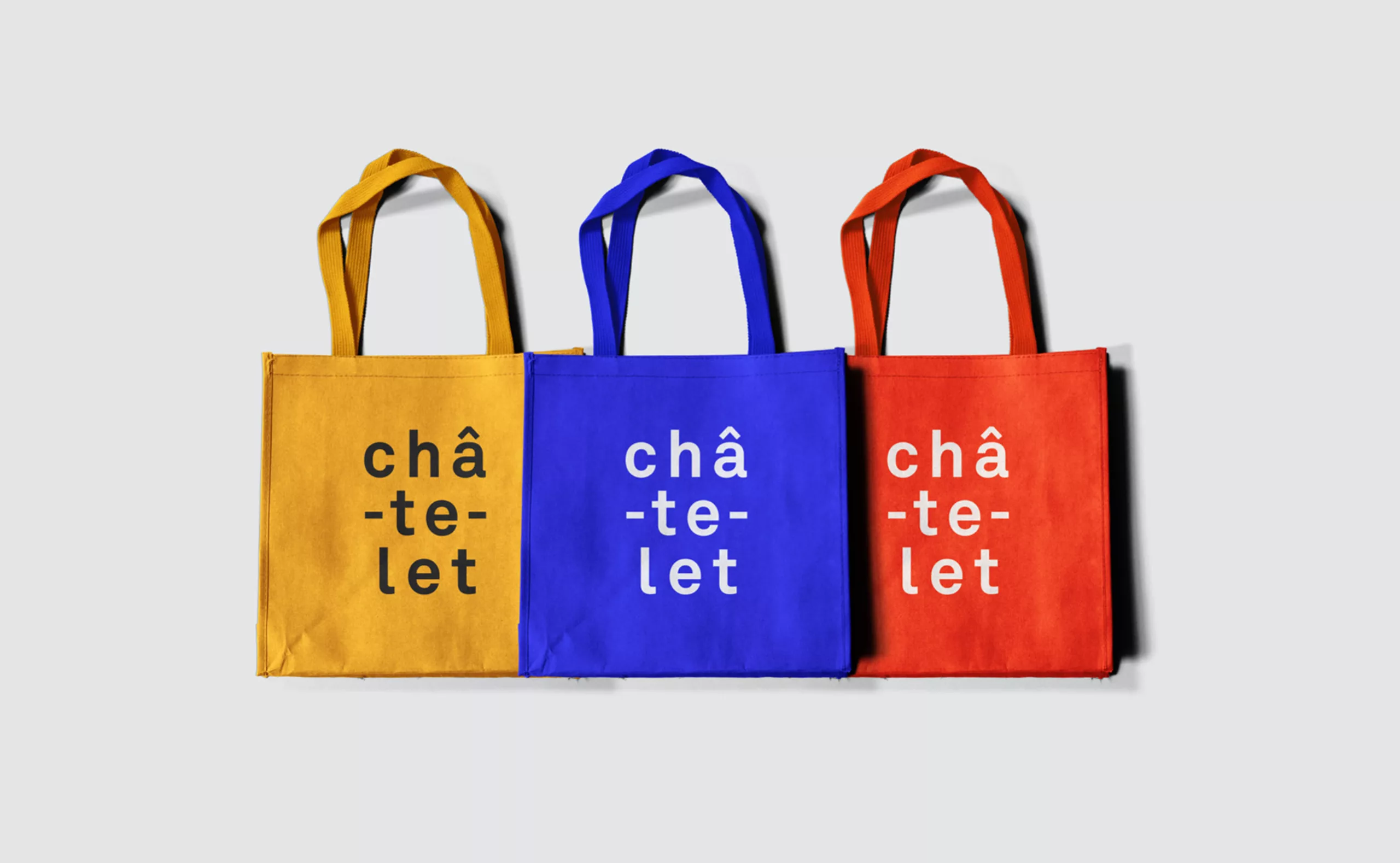
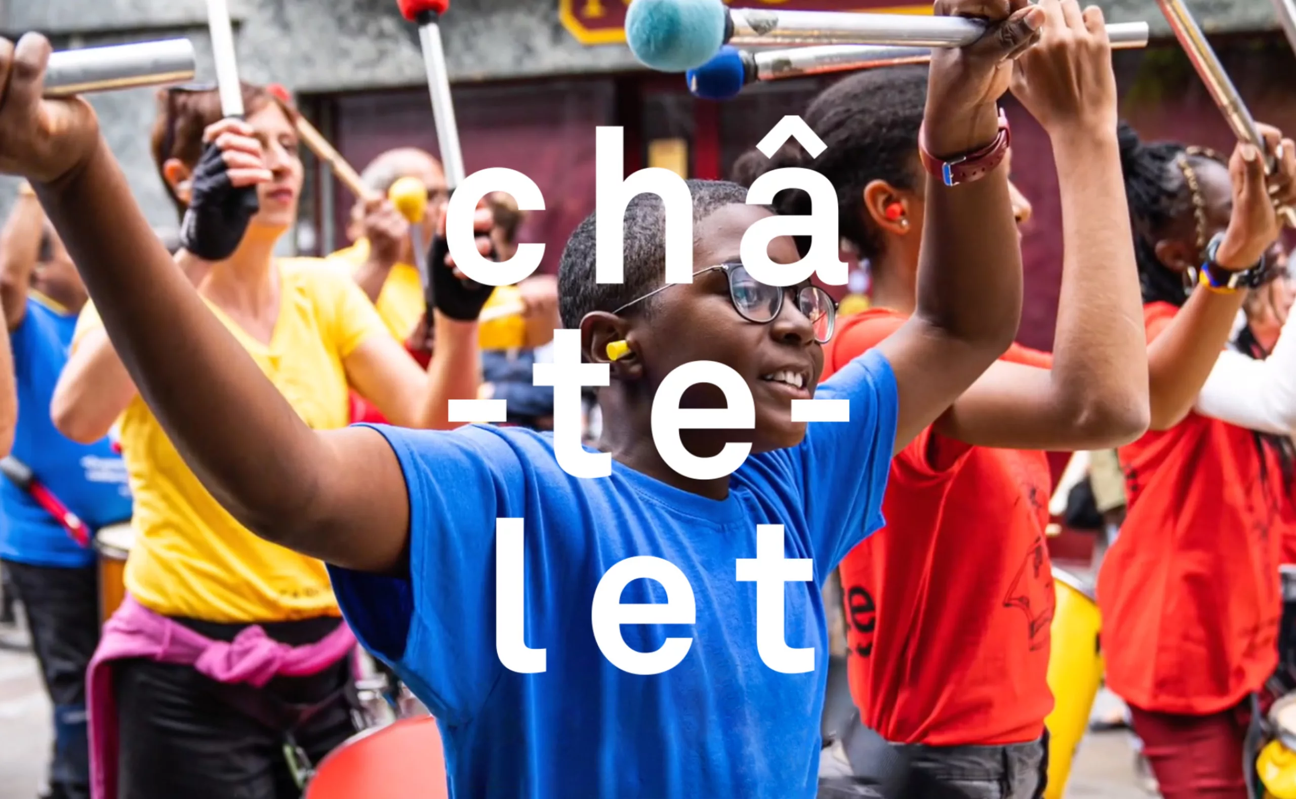
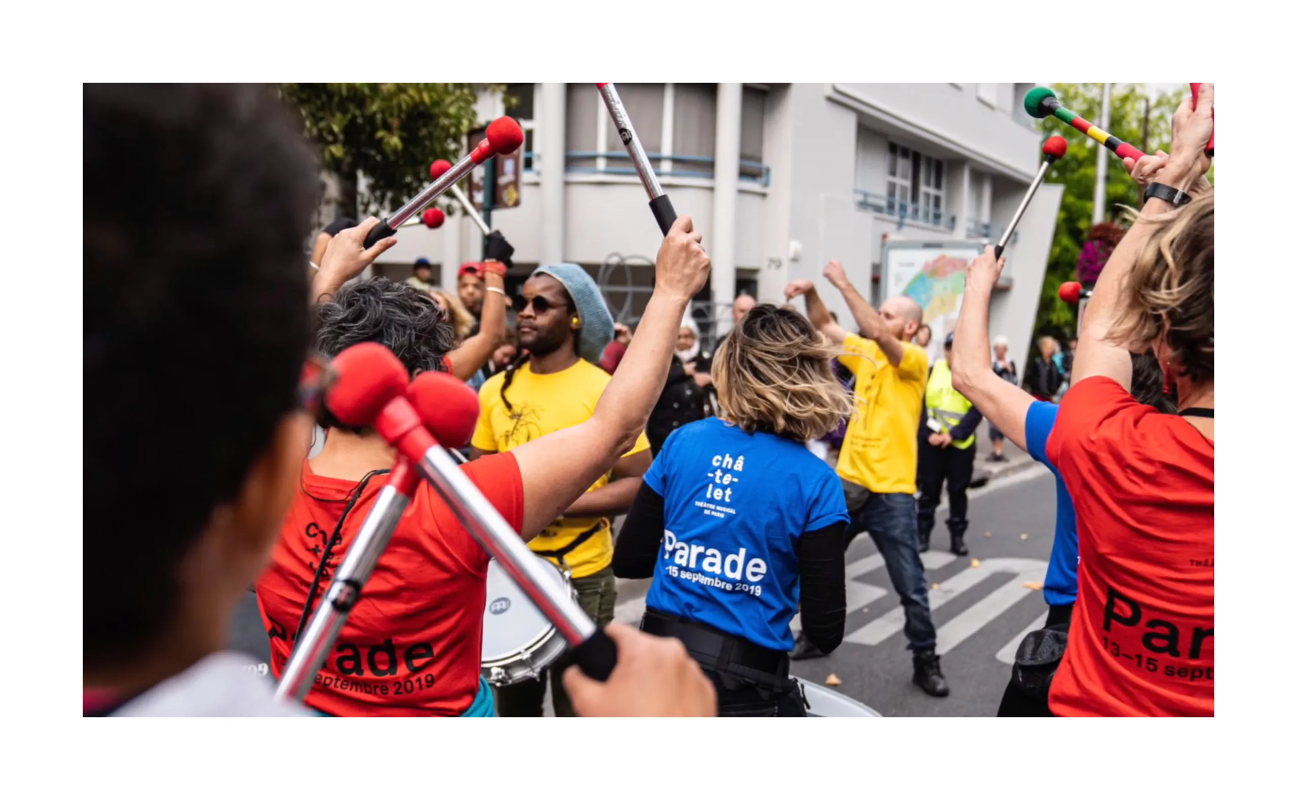
The main objective was to bring coherence to the theatre’s identity and give it greater visibility by developing awareness of the “Châtelet” brand. The institution also needed a graphic charter that could be adapted to a variety of situations, where the previous identity left little room for internal teams to intervene. The theatre’s new season is aimed at all audiences. The aim is to bring the theatre back to Parisians, whether or not they are new to the stage. The current logo was designed 12 years ago by French graphic designer and typographer Philippe Apeloig. It is now a monument in the cultural landscape. Despite a strong identity recognised by designers, the logo suffered from a lack of awareness among the public. Its discreet presence on poster campaigns, and more generally within the theatre’s communications, did not allow the ‘Châtelet’ brand to be promoted. Keeping this logo in the new graphic charter was an obvious choice. By breaking down into 3 levels, the word ‘châ-te-let’ is both sound and image. With its unique typographic composition, it invites us to draw links between arts, music, views and cultures.