Fontevraud brand identity
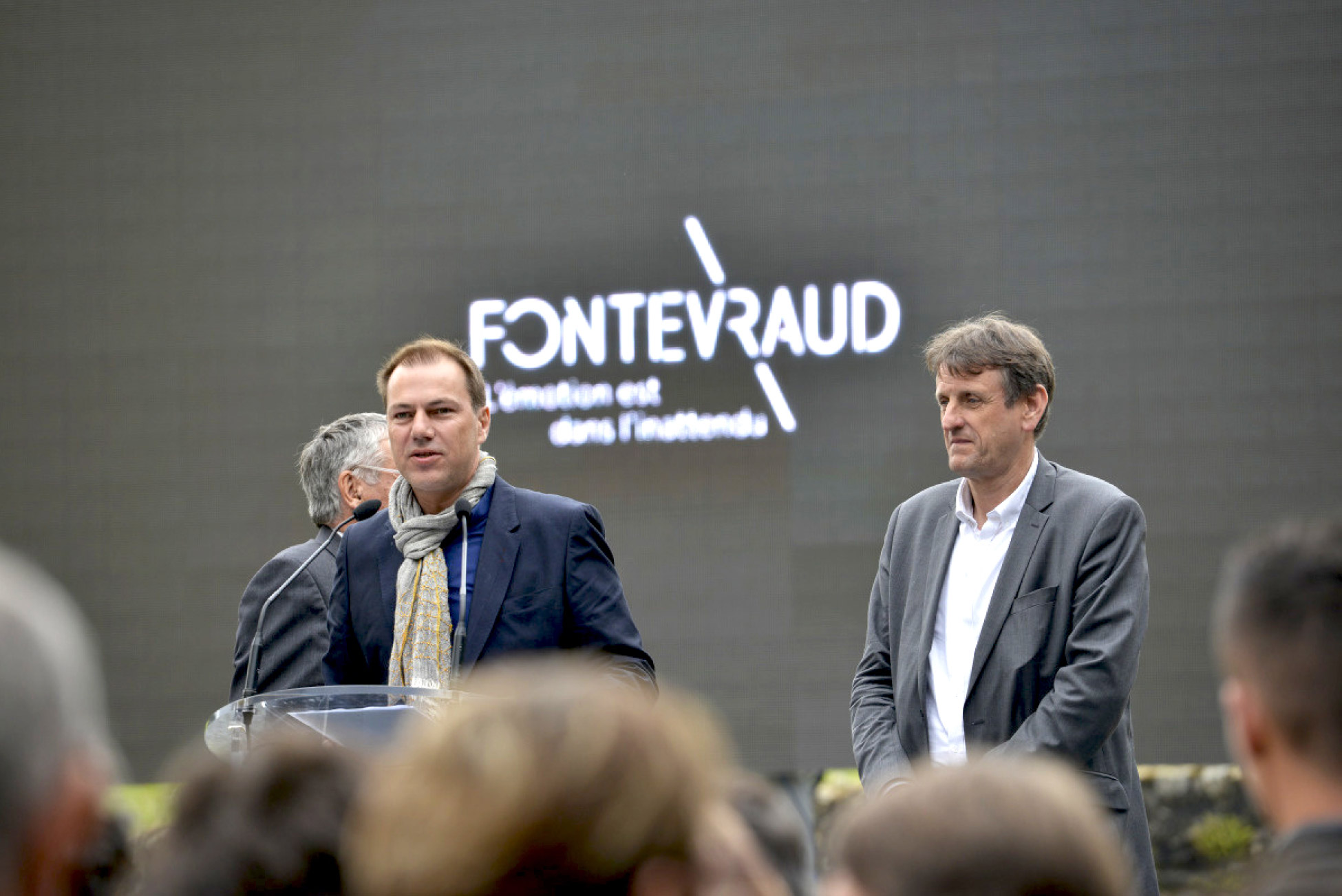
Last spring, we were asked to present a brand identity project for the Abbaye de Fontevraud. For the past 3 months, our work has been gradually unfolding, on the site, online and on screen !
An abbey with 9 centuries of history
Fontevraud Abbey is an ancient Benedictine abbey, seat of the Order of Fontevraud, founded in 1101 by Robert d'Arbrissel and located in Fontevraud, near Saumur. It is one of the largest monastic cities in Europe.
Initially a mixed monastery, housing both men and women in the same buildings, Fontevraud Abbey won the protection of the Counts of Anjou and later the Plantagenet dynasty. The queen of France and England, Eleanor of Aquitaine, made the abbey her necropolis, and her most famous son, Richard Coeur de Lyon, is also buried here. The French Revolution brought a definitive end to the religious establishment, which was transformed into a penitentiary until 1963. Renovations began in the 19th century, after the abbey was listed as a historic monument, and continue to this day. In 2000, Fontevraud Abbey was listed as a UNESCO World Heritage Site, along with the entire Loire Valley cultural site.
Architecture is a place, a sign, a story
Architecture marks the landscape with its ineffaceable presence, discreet or violent, contextual or in opposition.
The project to create the FONTEVRAUD brand reflects an exceptional political and economic will, as well as a strong desire for modernity and excellence. It expresses the ambition of a program that must be visible and understandable both within the site and beyond its borders. Above all, it must enhance the region. Fontevraud Abbey is a historic monument that belongs to our heritage. It must be preserved, protected and restored. We are faced with some particularly powerful landmarks, which can be intimidating in terms of their history and architectural qualities.
FONTEVRAUD is a holistic political project designed to create an ART OF LIVING TOGETHER, while continuing to create societal debates on questions of ecology, mediation, heritage, civilization... To raise questions and make visitors/actors think. It's an innovative, optimistic and daring project.

Graphéine therefore took on this commission with great enthusiasm and responsibility. With modesty and respect, our goal was to translate and crystallize the challenges of the FONTEVRAUD brand's visual identity project by multiplying the impact of the existing design in a global project that proposes a generous and open visual identity and signage system. We also studied the work carried out by the Jouin + Manku studio on the concept of space planning and furniture creation for FONTEVRAUD The Restaurant and FONTEVRAUD The Hotel, in order to endow the project as a whole with a coherent signature by thinking globally about all the facets of its "design": space design / graphic design / sound design / service design / olfactory design.
The objectives of this work
The creation of Fontevraud's new visual identity takes up the following challenges :
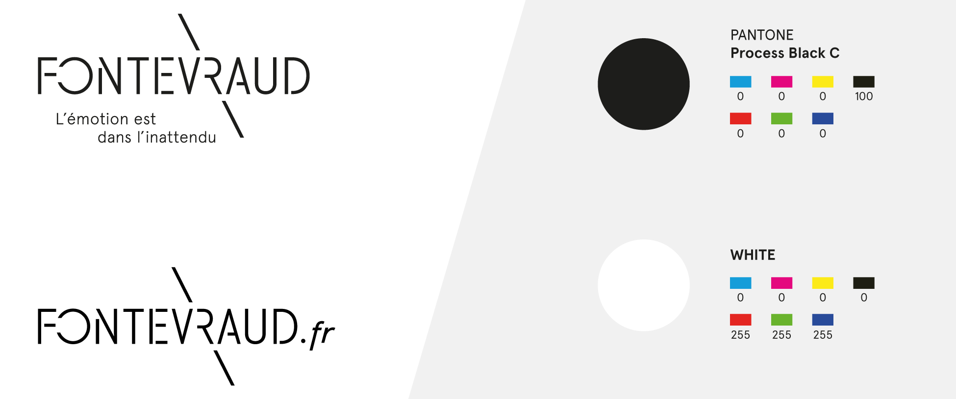
- A FONTEVRAUD LOGO: It crystallizes the identity around a FONTEVRAUD "brand block", elegant, sober, bold and inventive.
- TARGETS: The graphic line is demanding and elegant, but not elitist. It appeals to a wide variety of audiences!
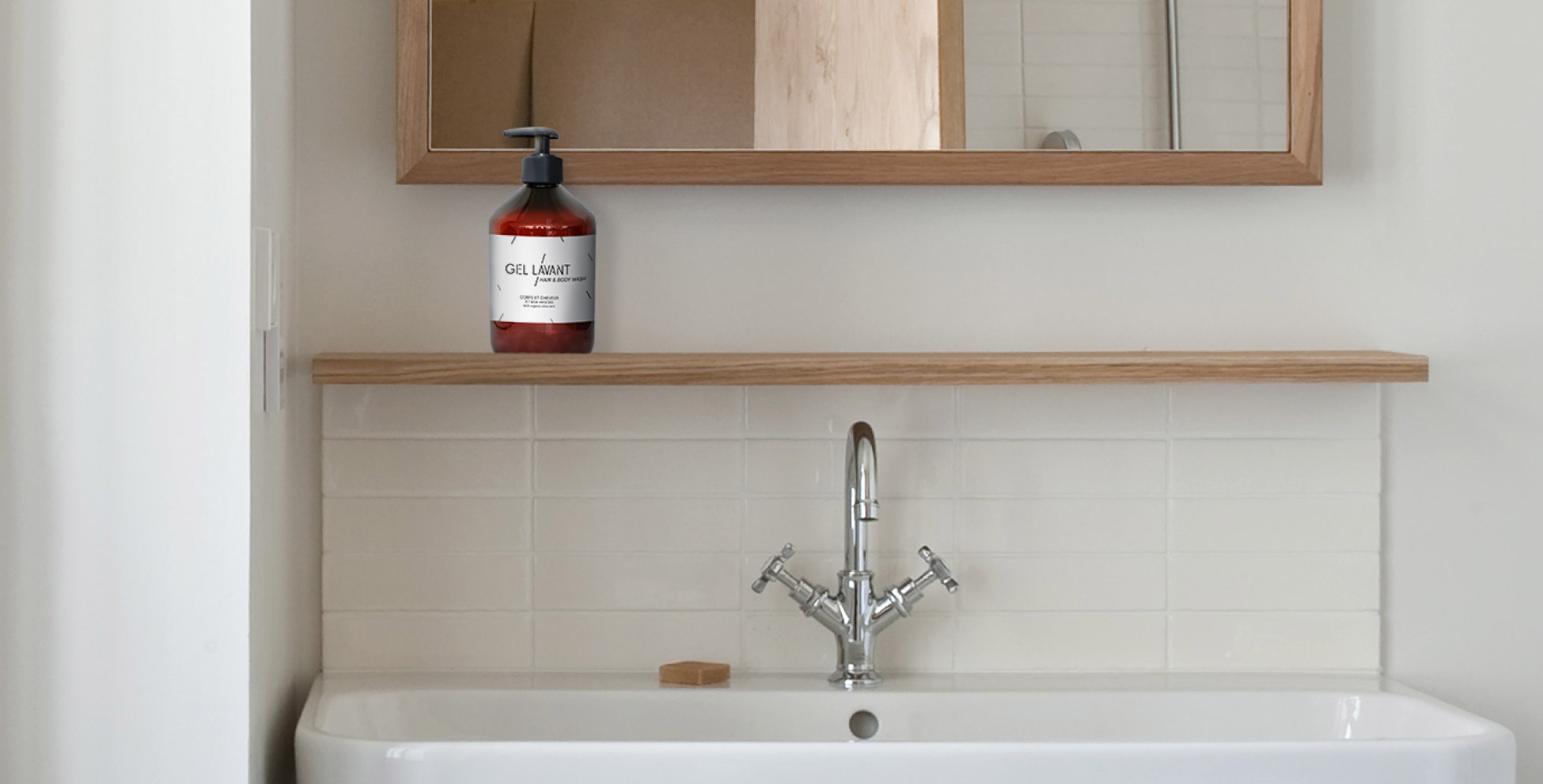
- ADAPT: The creation of an original typography allows us to adapt to distinct and graphically heterogeneous centers of activity. The visual system works with the same intensity for an exhibition poster as for the creation of packaging for the hotel's cosmetics.
- A GLOBAL COHERENCE, A STYLE: The style of FONTEVRAUD's visual identity is entirely transposable to digital media.
- CREATING A SCALABLE VISUAL SYSTEM
- A TYPOGRAPHY: The visual identity concept is based primarily on "salient" typography (original and distinctive).
- CONTEMPORARY DIMENSION: FONTEVRAUD's corporate identity reflects the project's contemporary dimension, drawing inspiration from its unique history and highlighting its past, but anchored in the present and resolutely focused on the future.
- SAINT EXUPÉRY: It embodies Saint Exupéry's phrase: "The essential is invisible to the eye".
The creative concept
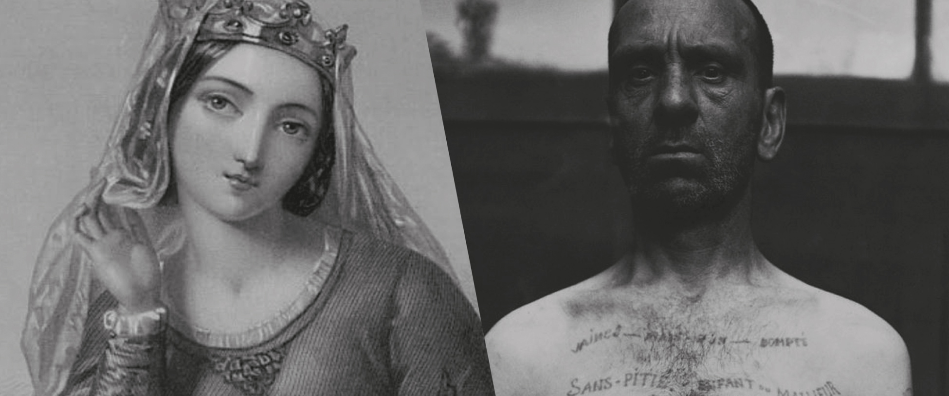
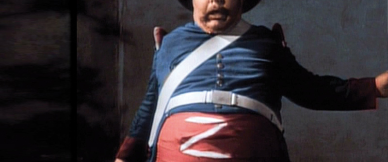
The conceptual starting point is the permeability between the notion of the sacred and the profane. Indeed, it's worth recalling at this point that while Fontevraud was a Royal Abbey for over 6 centuries, Napoleon saved the Abbey from demolition by turning it into a prison, a period that lasted until 1963. In 1975, the Abbaye Royale opened to the public, putting an end to nine centuries of life behind closed doors. So, from this long history, we have chosen to focus our attention on the Sacred/Profane antinomy.
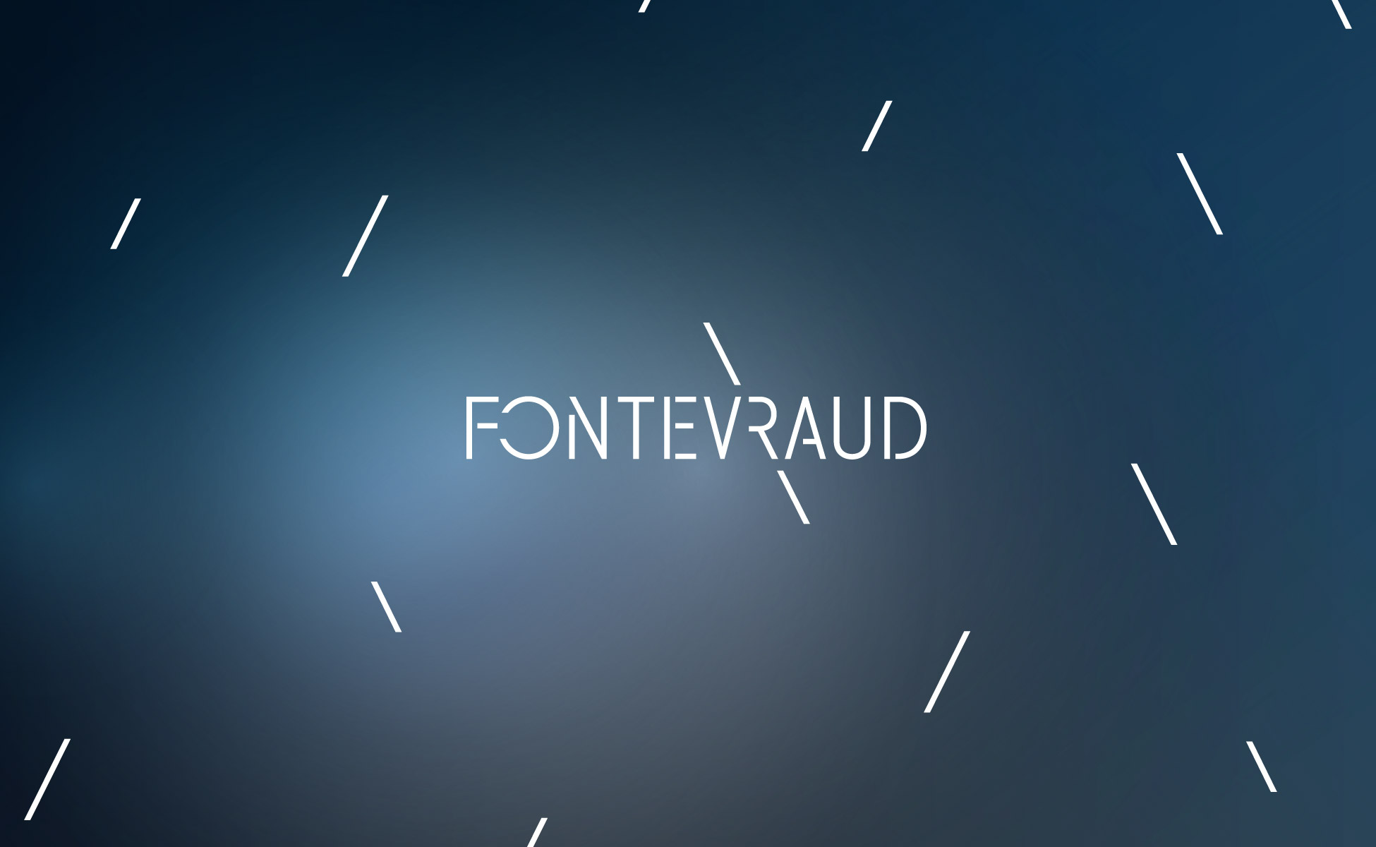
We chose to symbolize the sacred with a variation on a graphic element we named the "HALO".
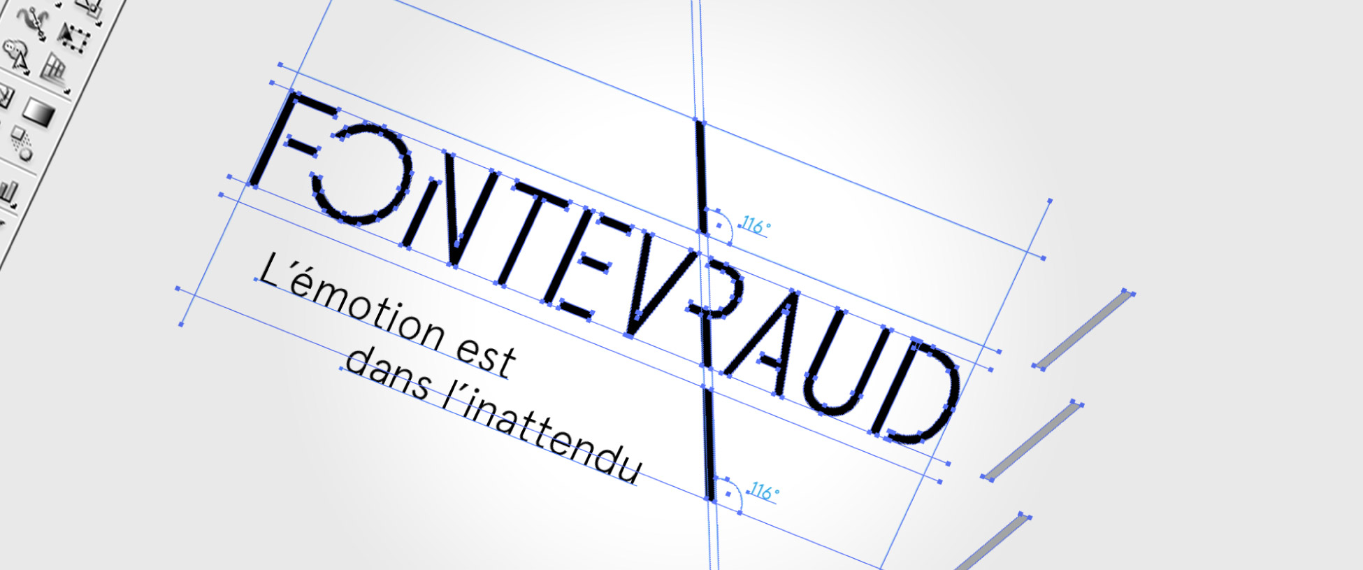
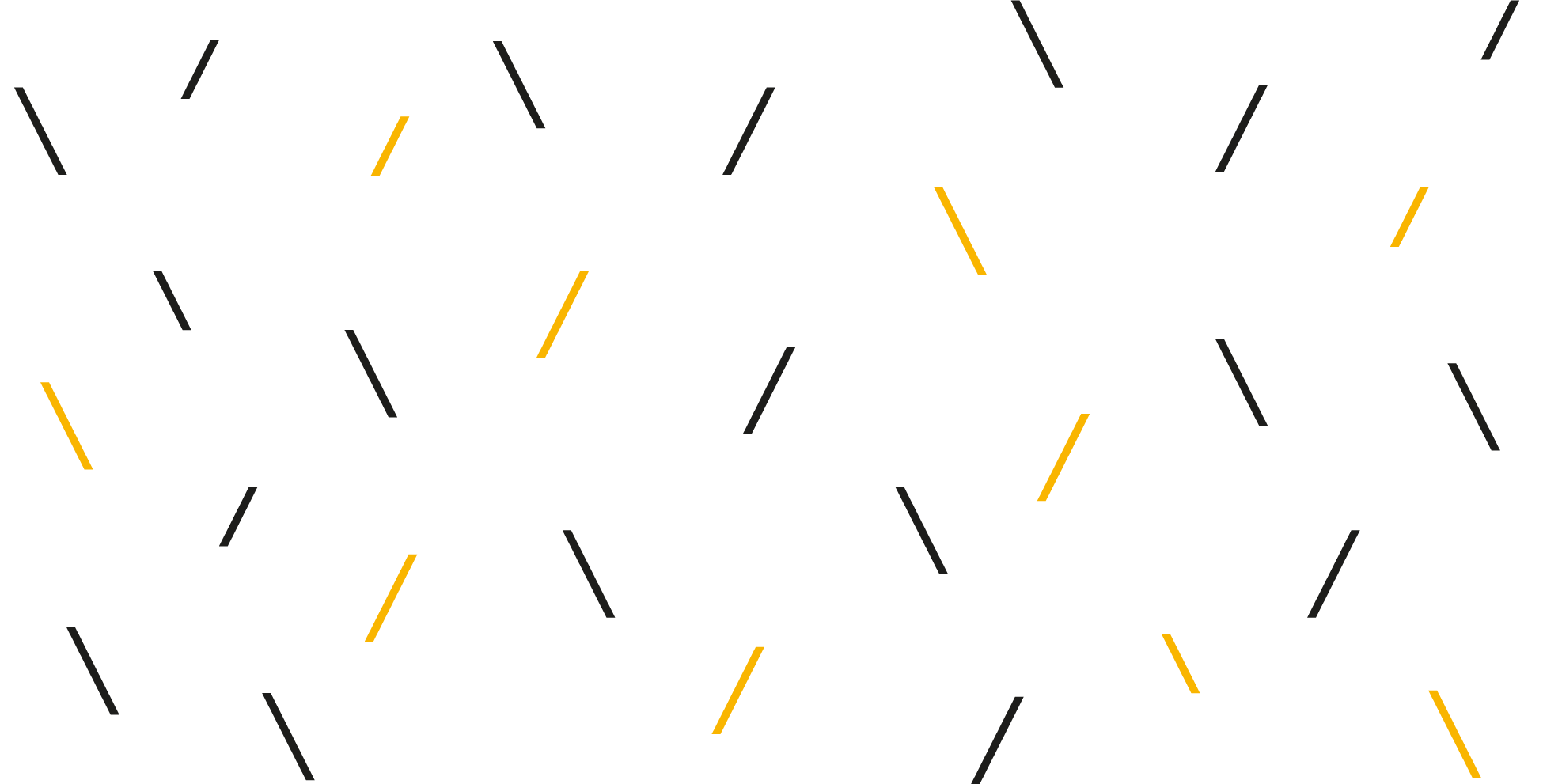
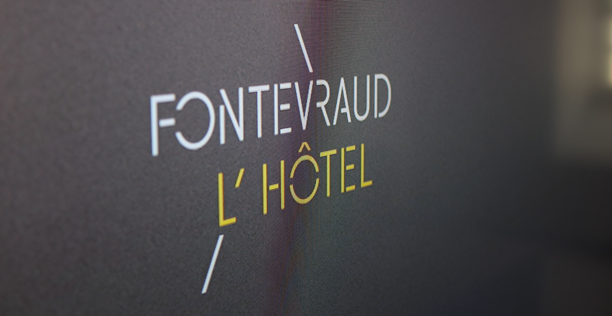
The profane is represented by the creation of a typographic script based on the "SLASH".
The link between the "HALO" SURFACES & the "SLASH" script forms the basis of the FONTEVRAUD brand's visual identity.
THE ICONOCLASTIC SLASH
> The slash symbolizes the "iconoclastic" spirit of the FONTEVRAUD brand.
What is crossed out: non-conformism, neither horizontal nor vertical, but oblique.
- The use of the "slash" asserts a political bias through a graphic break with the past: the aesthetics of scratches, scuffs and superimpositions, the work mocked and desecrated (ref. engraving and graffiti by prisoners on walls).
- The slash also evokes the language of computer programming code, emphasizing the digital nature of the Fontevraud brand identity. In a URL address, the slash indicates the path.
- The English word "slash" probably comes from a late 14th-century Middle French verb, eslachier, a variant of éclater ("to burst"). In English, To slash means "to cut through with a sword or knife".
THE LUMINOUS HALO
The luminous HALO refers directly to the halos of the saints and angels in Christian iconography, as well as to the feeling of bliss of the "enlightened" believer. It's a symbol of access to knowledge.
The presence of HALOS also evokes certain phenomena of optical hallucinations (phosphenism) which can occur when the retinal channels are saturated: Vision is then disturbed by remanescent glows.
The patches of light created by the HALO's different intensities animate the solid colors of Fontevraud's graphic charter. In addition to the use of bevelled surfaces and the chromatic ranges of the universes, this creates typographic inscription zones that are graphically identifiable with the Fontevraud brand style.
By playing on the HALO's variations in light intensity, we introduce an unexpected sensory dimension into FONTEVRAUD's visual system. Some of the brand's universes can thus be associated with highly INTENSIVE HALOS, while others can be supported by more discreet, evanescent HALOS.
The HALO is a device that offers great possibilities for adapting FONTEVRAUD's identity in motion design, as well as in digital installations.
Brand architecture
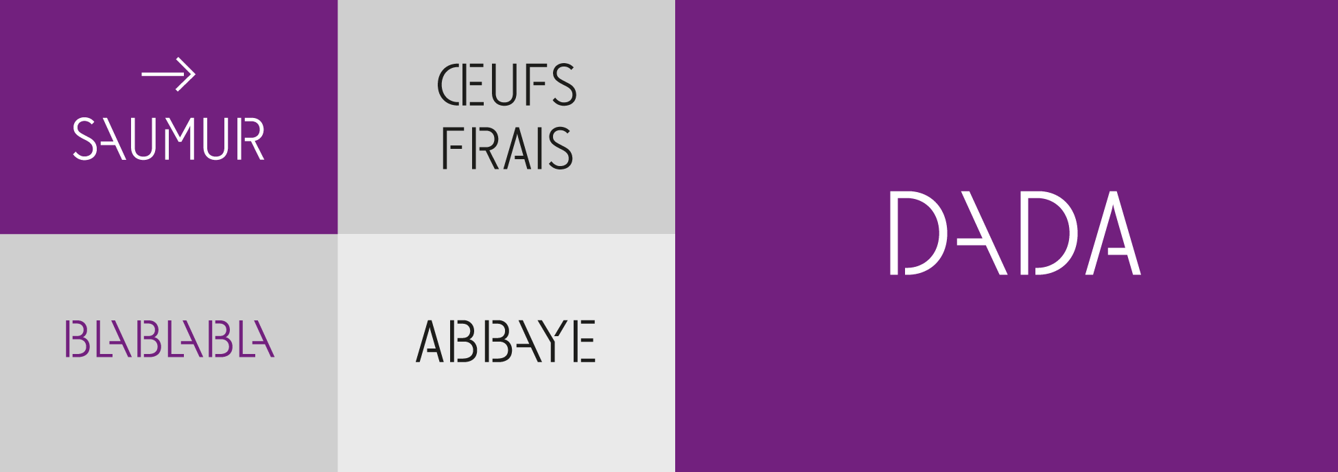
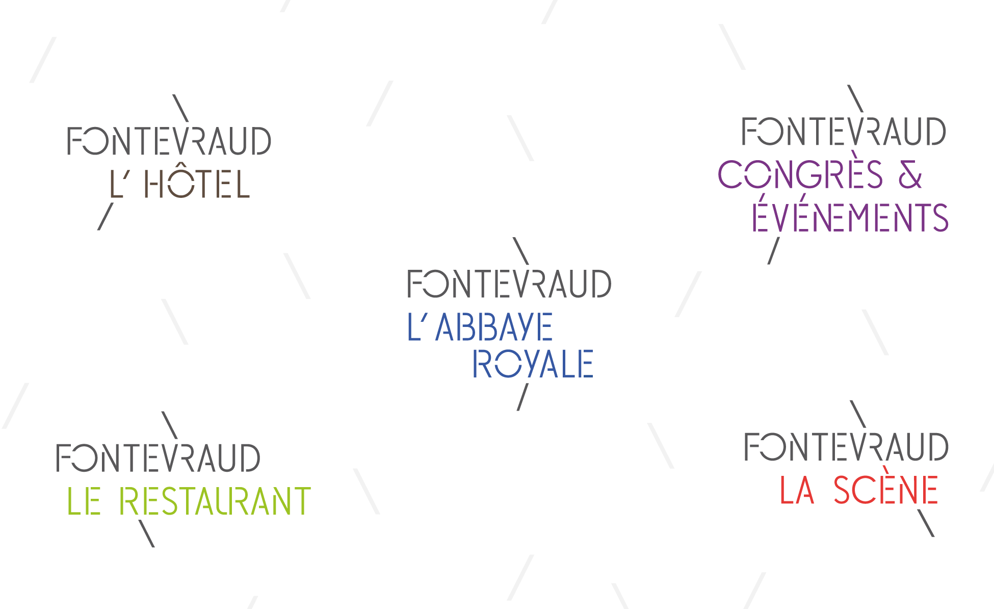
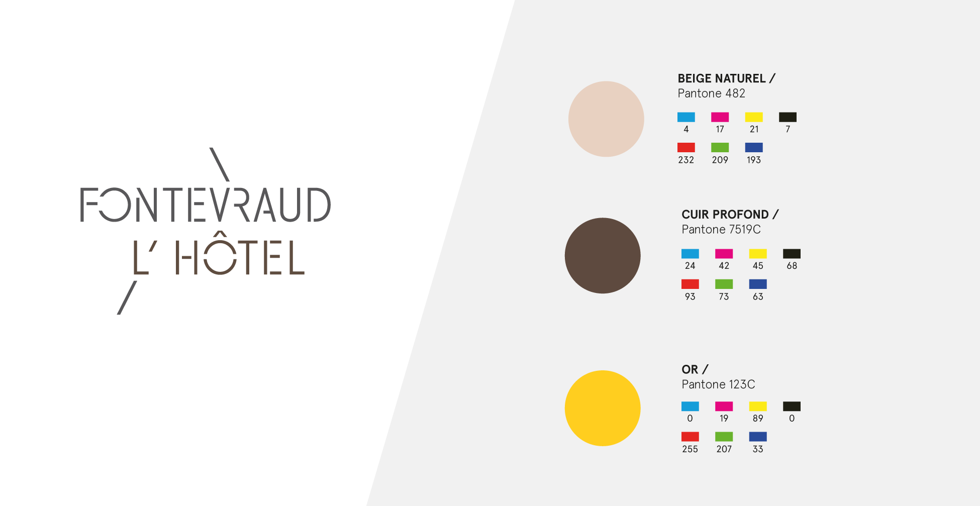
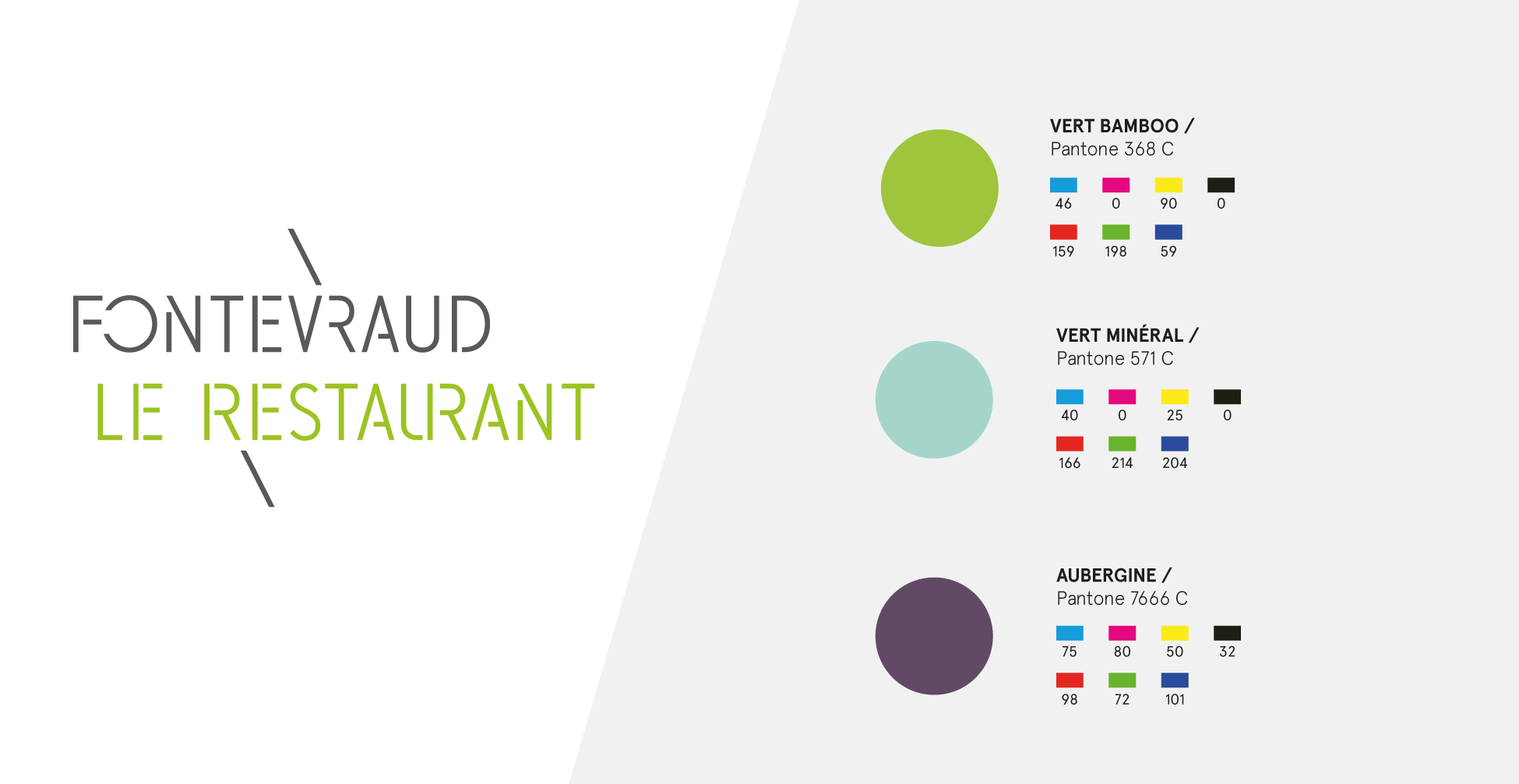
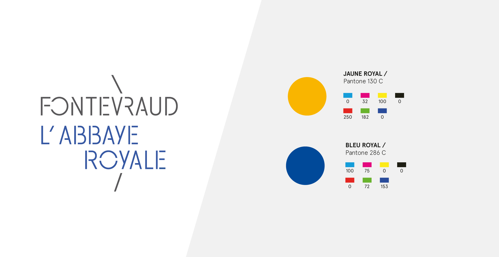
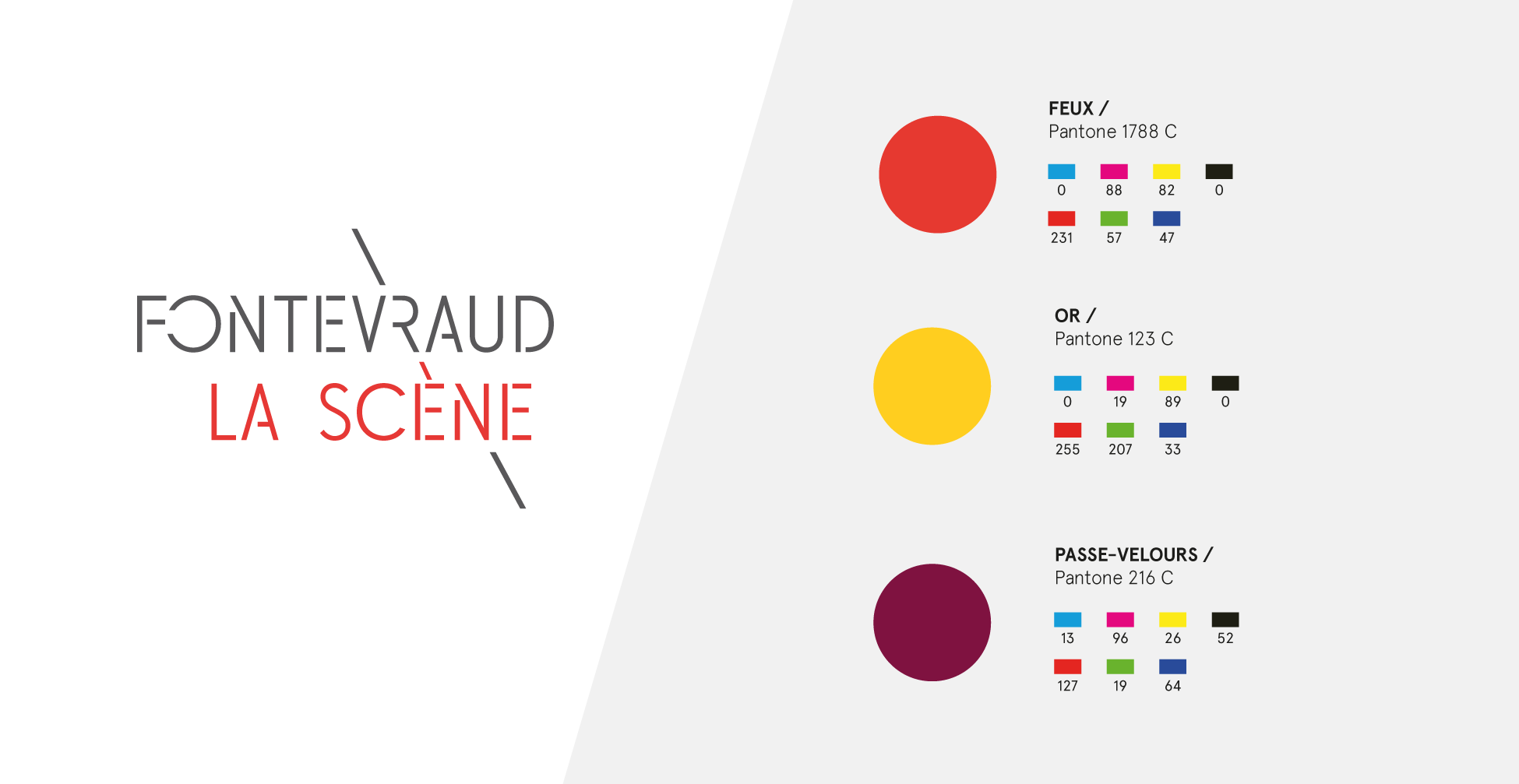
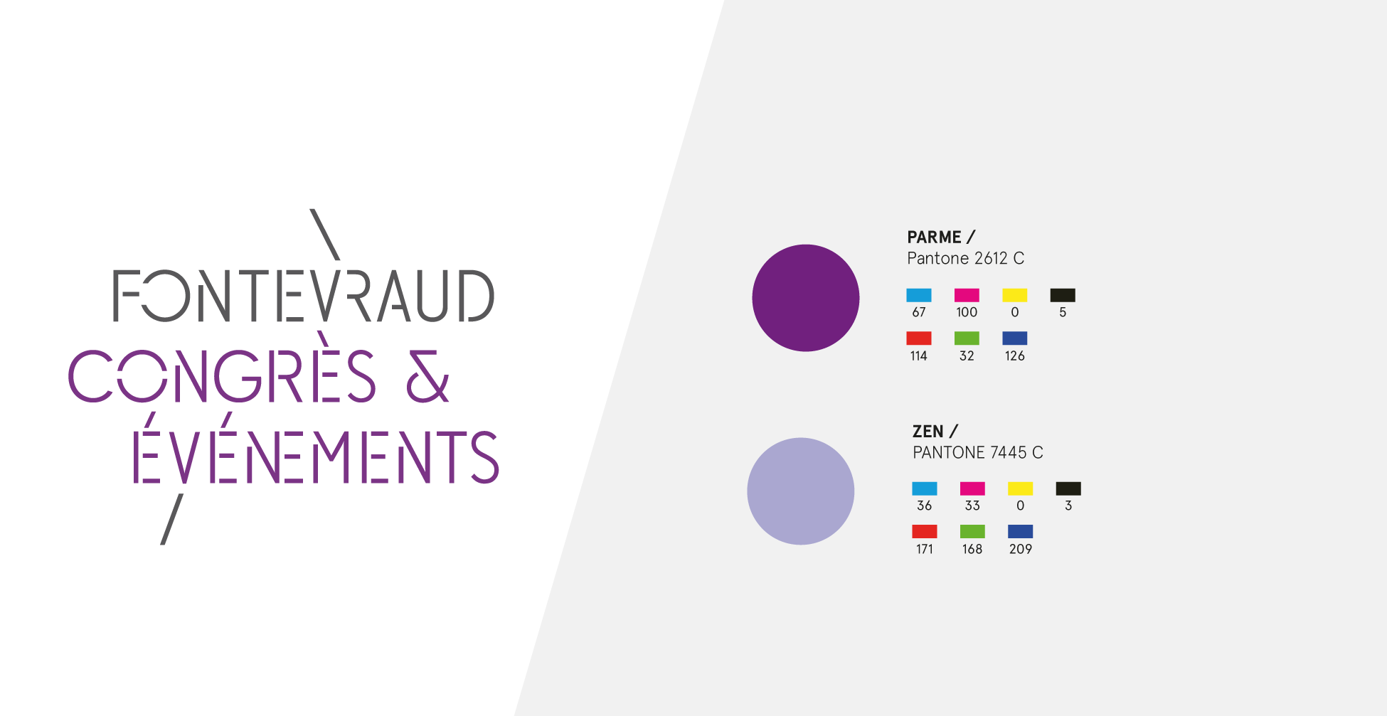
The daughter brands are based on the parent brand, with two or three lines, following the principle described above. Each daughter brand has its own world of color and iconography.
Charted funds
This principle of charted backgrounds makes it possible to create and visually enrich any type of document, without the need for iconography. Here is an example of how these backgrounds can be used.
A typographic creation
The branding challenges of the new "fontevraud" brand mean that its registration must be viable and easy, both on and off the site, in order to successfully achieve the imperatives of identification, communication and merchandising.
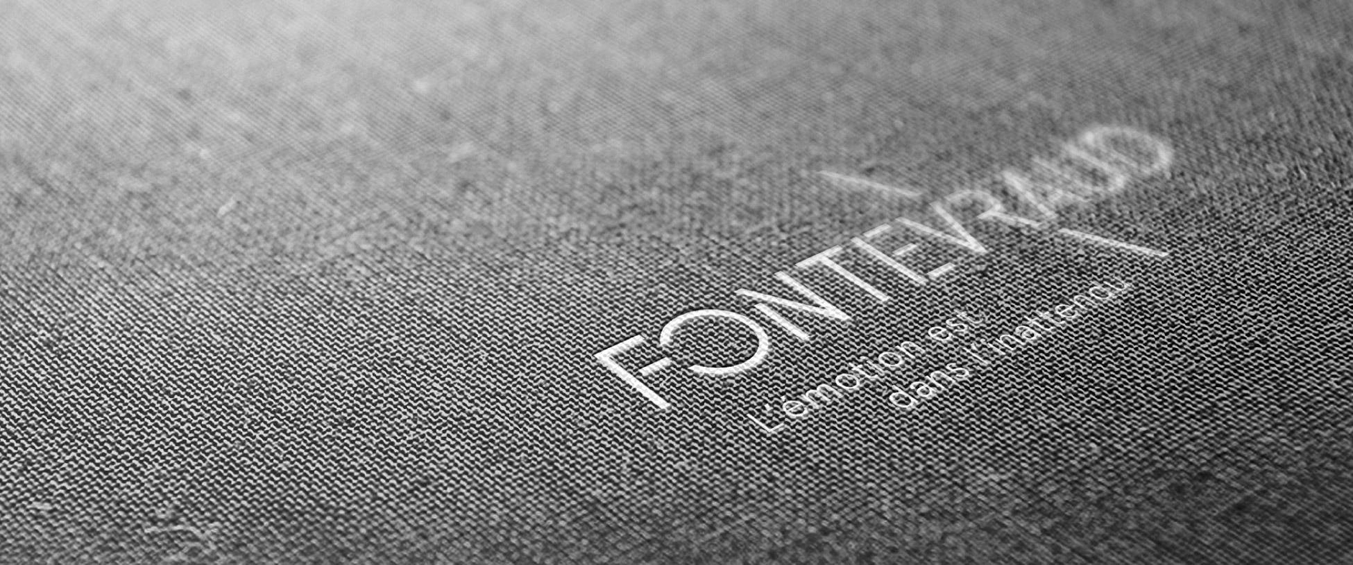
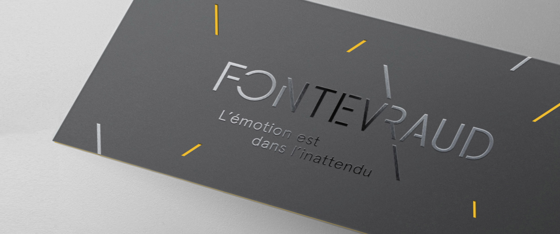
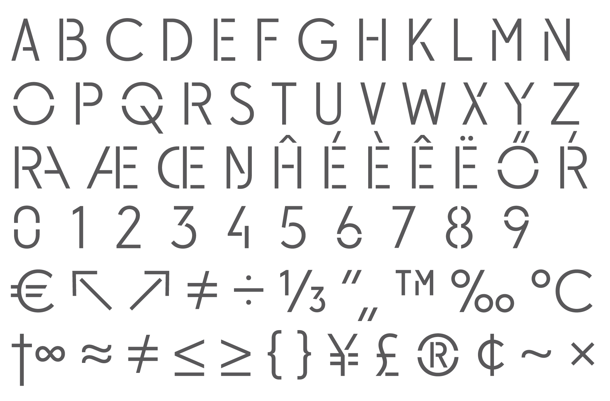
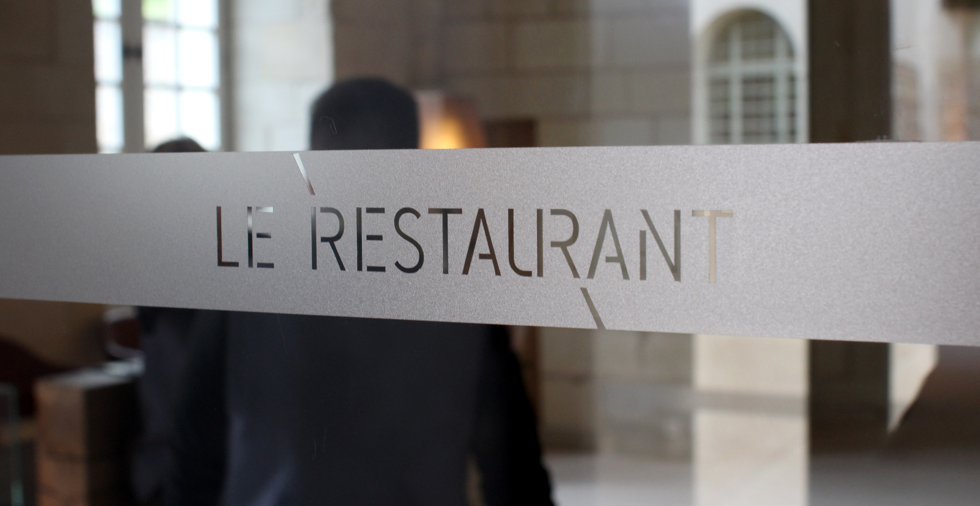
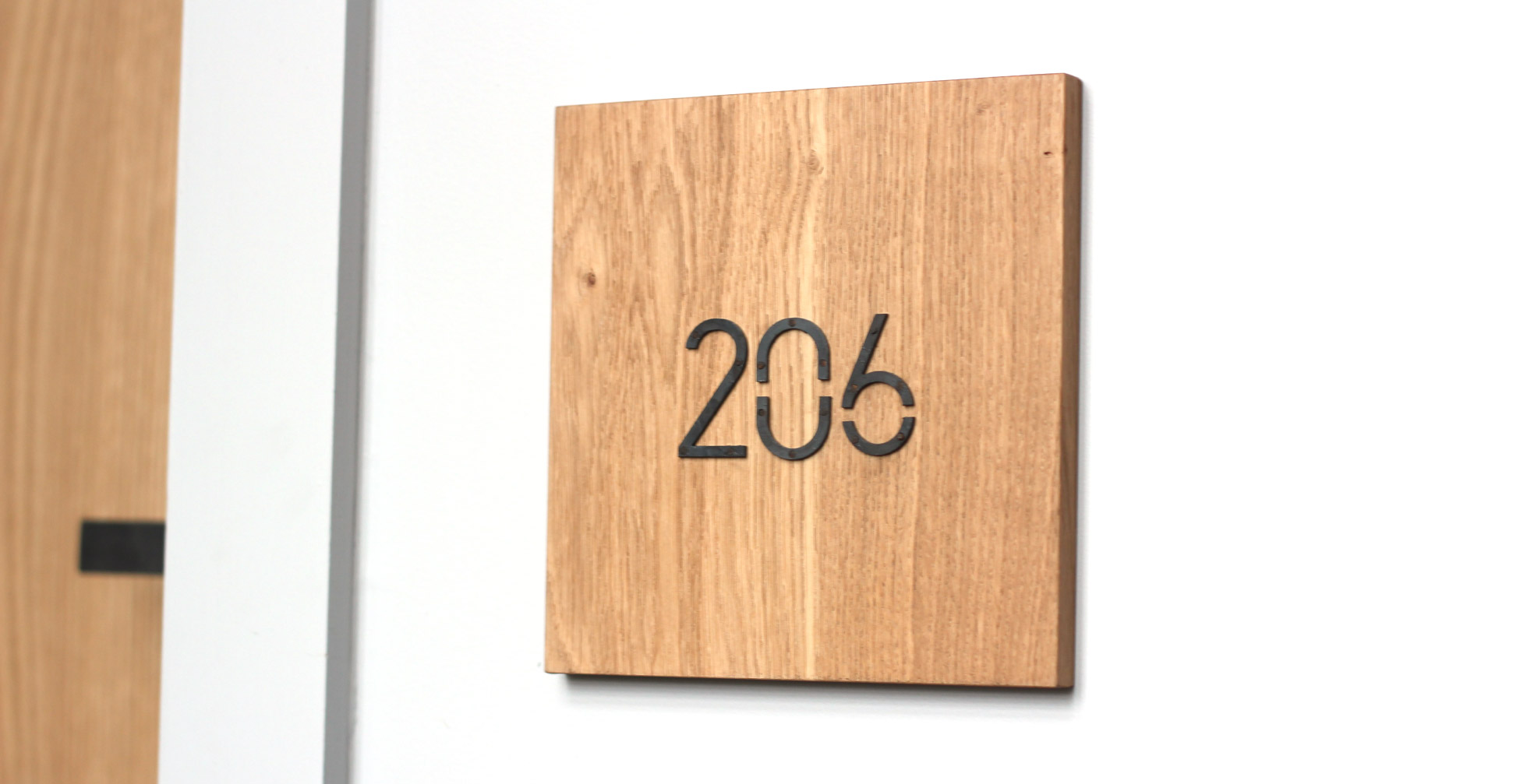
We therefore chose to design the typography using open shapes in a treatment close to the "stencil" style. We wanted to give the lettering a tangible reality to play with the architecture of the site. We were therefore faced with the functional necessity of creating a typography that would enable inscriptions to be made on as many surfaces as possible, apart from conventional offset and digital printing techniques.
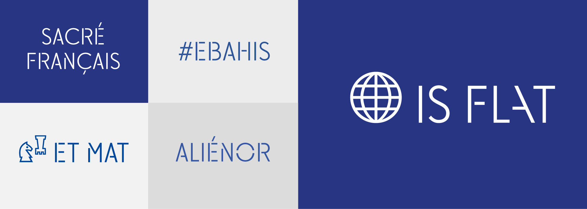
Particular attention was paid to the creation of ligatures, allowing multiple variations in the composition of titles, texts, logos...
Many thanks to Matthieu Corta for his assistance in finalizing this typeface.
L'Ibar
A small miracle of architecture and technology, the iBar is the symbol of the Abbaye Royale's commitment to digital technology. Touchscreen tablets of various sizes incorporated into the furniture offer new possibilities for discovering Fontevraud and the surrounding area. Historical information, cultural programming, games and quizzes are all available on the screens. A veritable digital media library to browse with a glass of Saumurois " fine bubbles " in hand ! Or not...
We therefore worked on the design of the icons for these interactive tables.
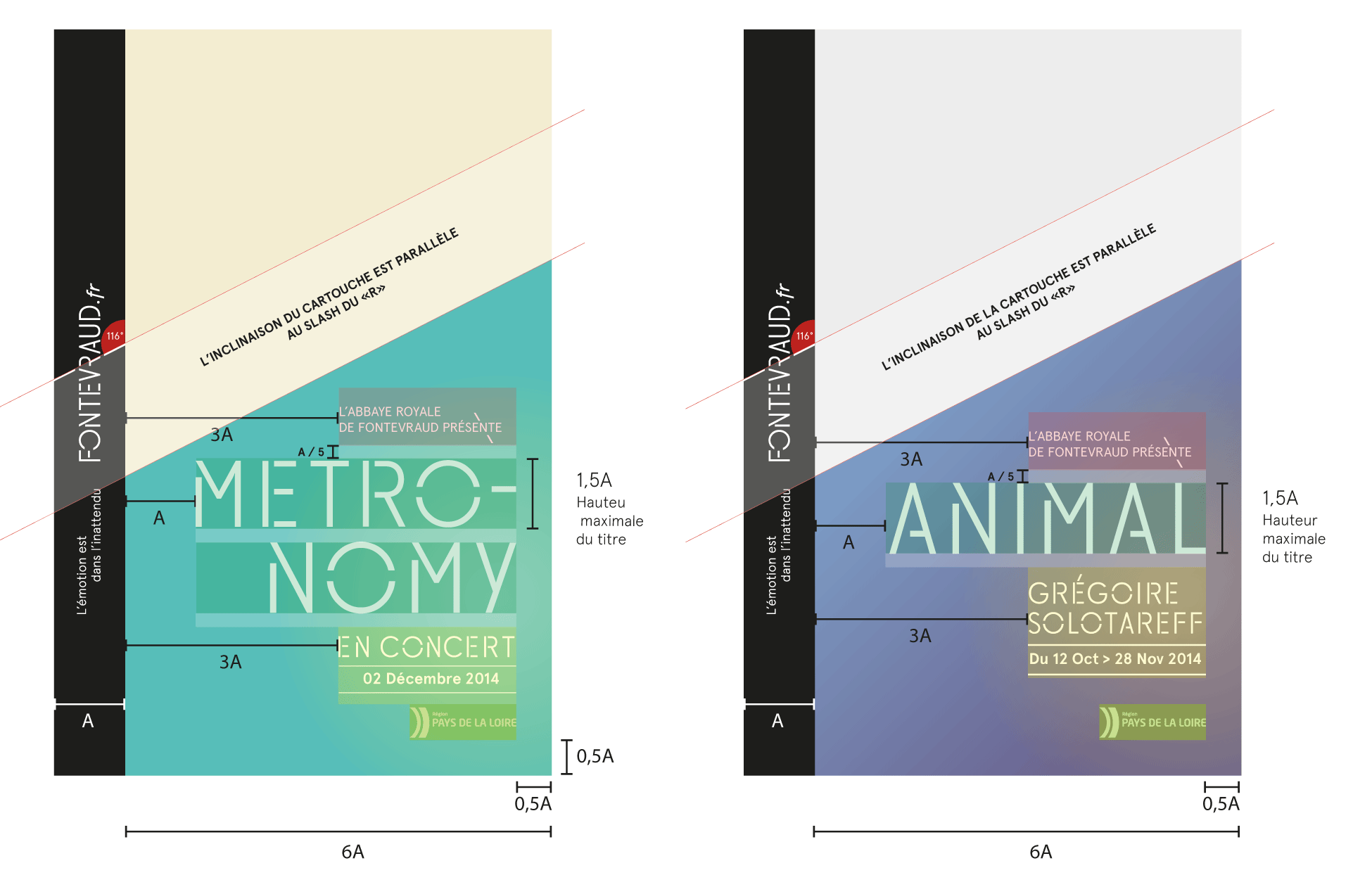
Composition principles
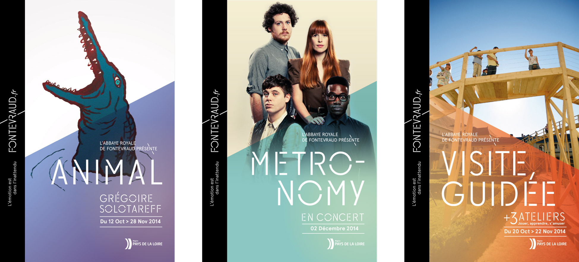
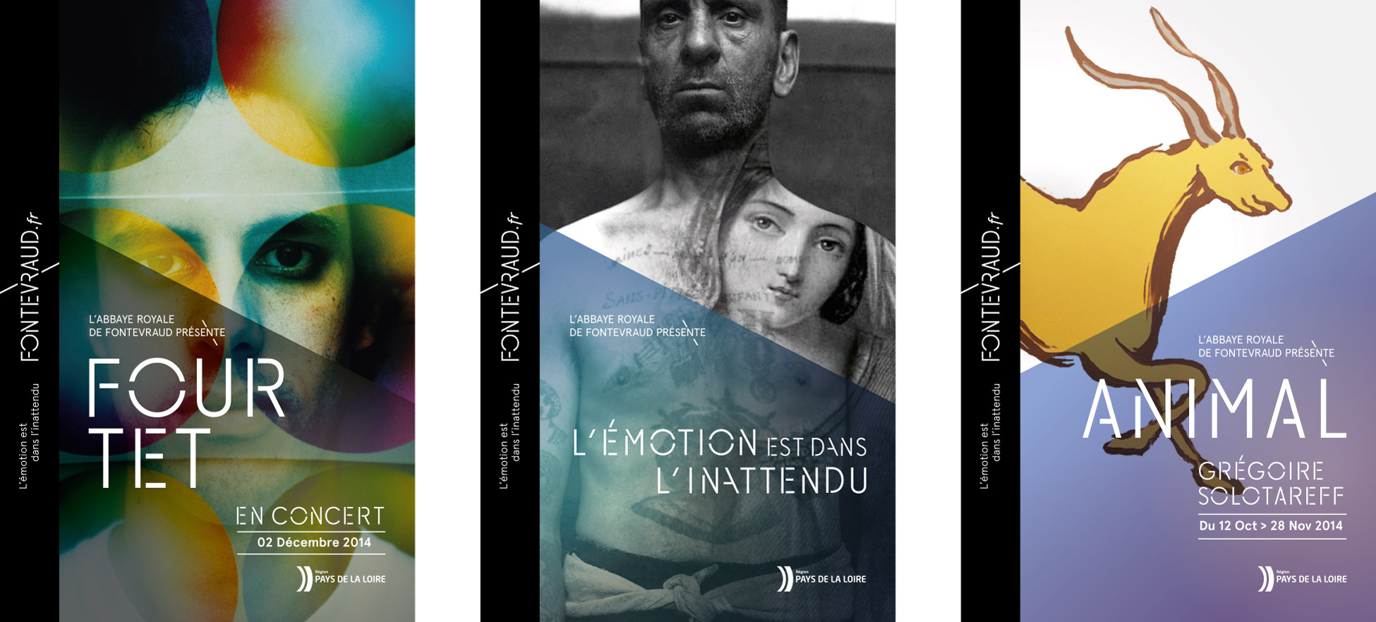
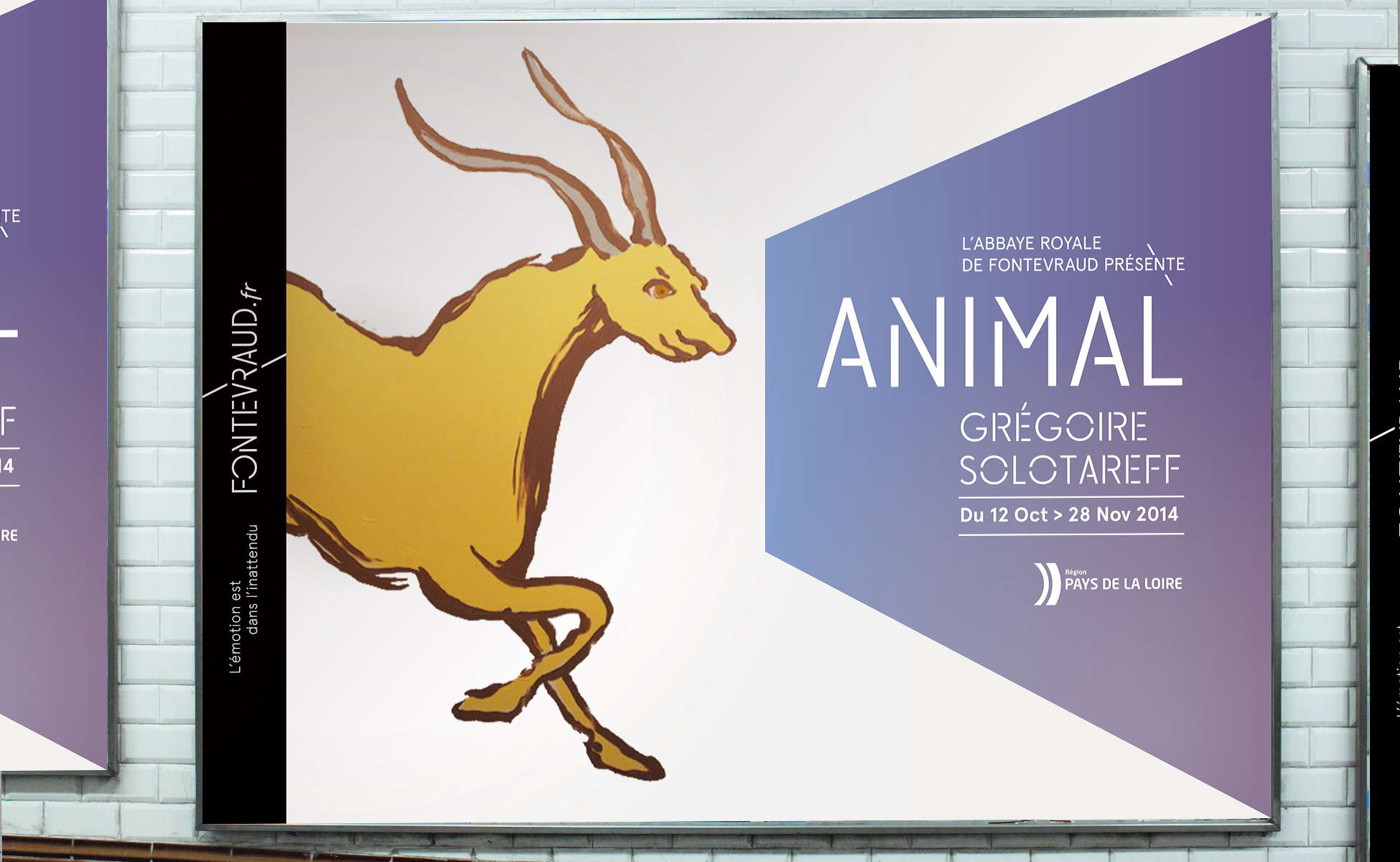
The posters
Fontevraud TV video package
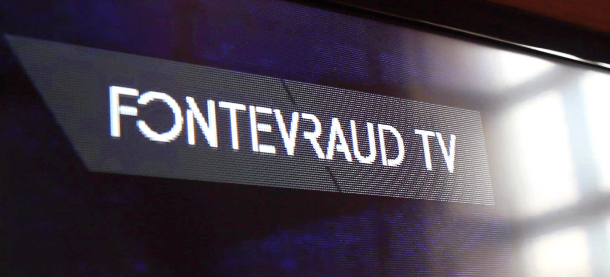
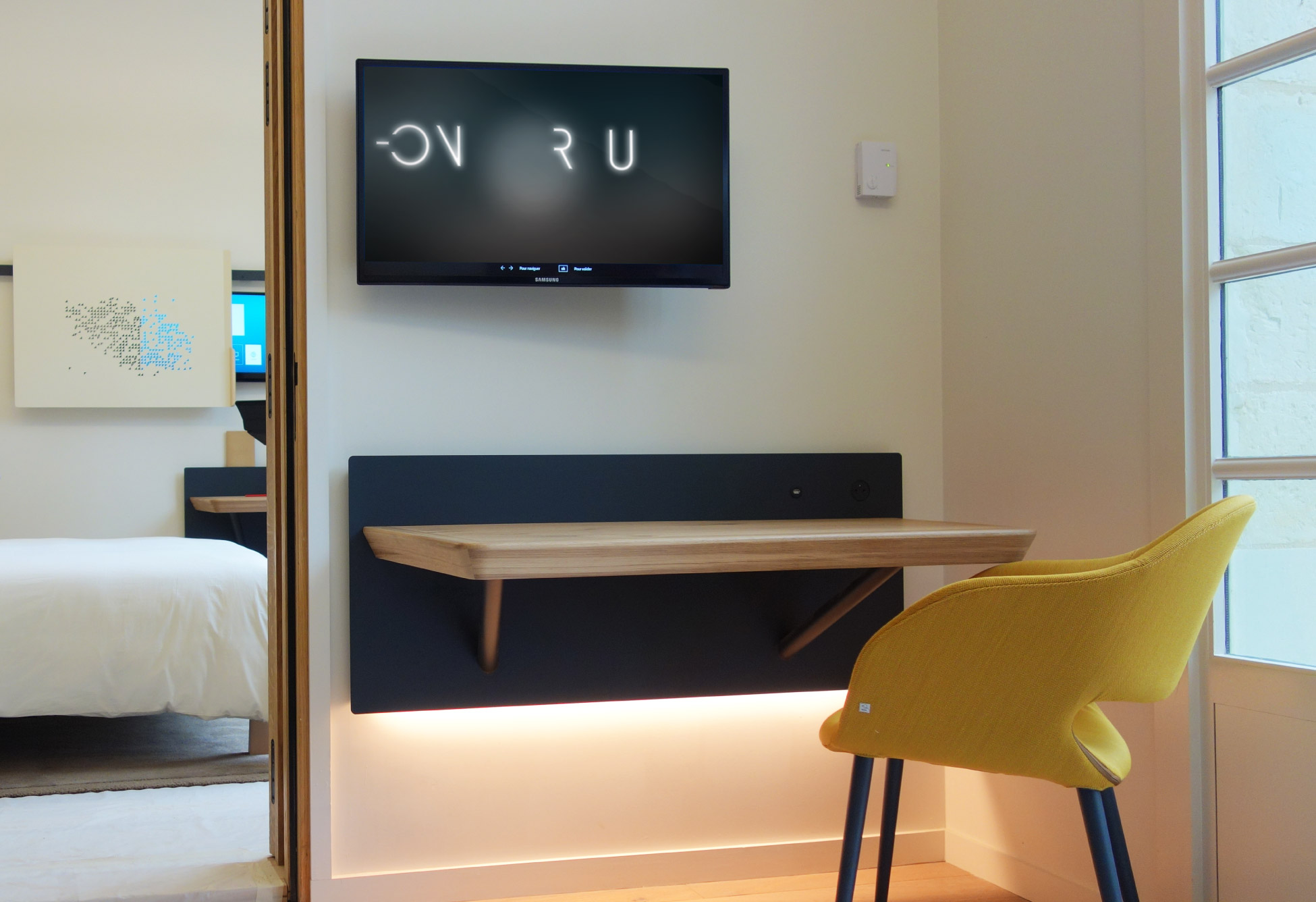
Each room is equipped with an in-house channel: Fontevraud TV... When the virtual opens onto an environment that couldn't be more real! Here's the video package we designed.
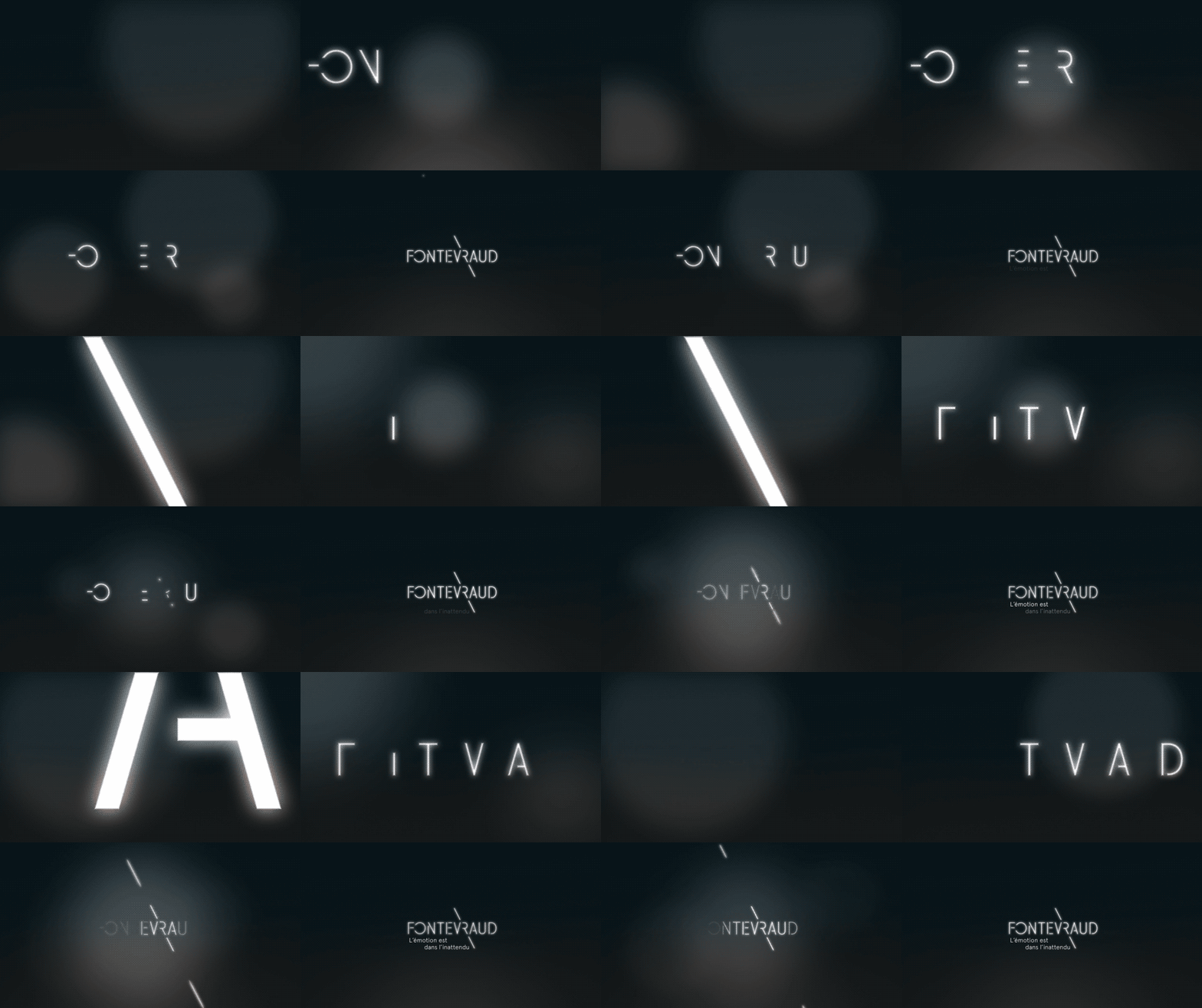
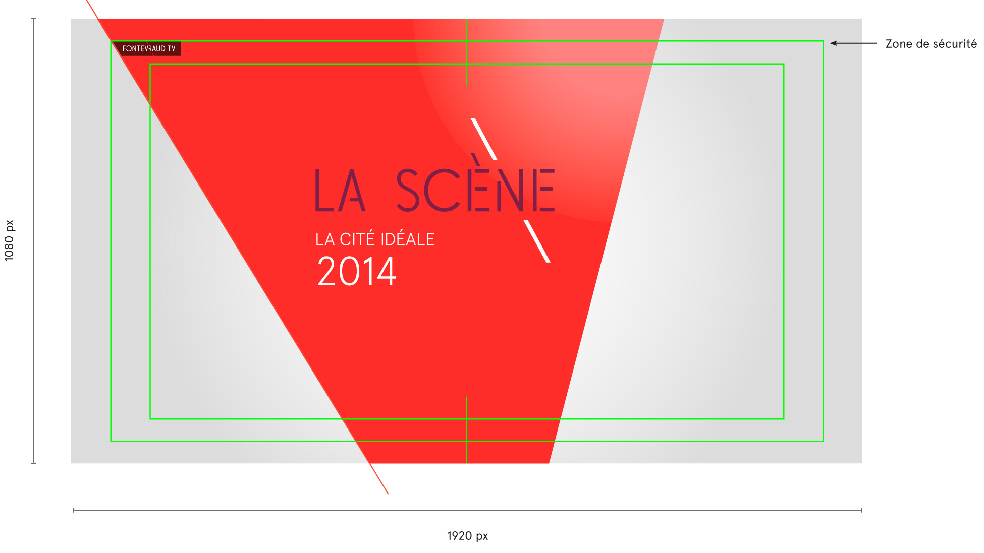
preview of the Fontevraud video introductory clip
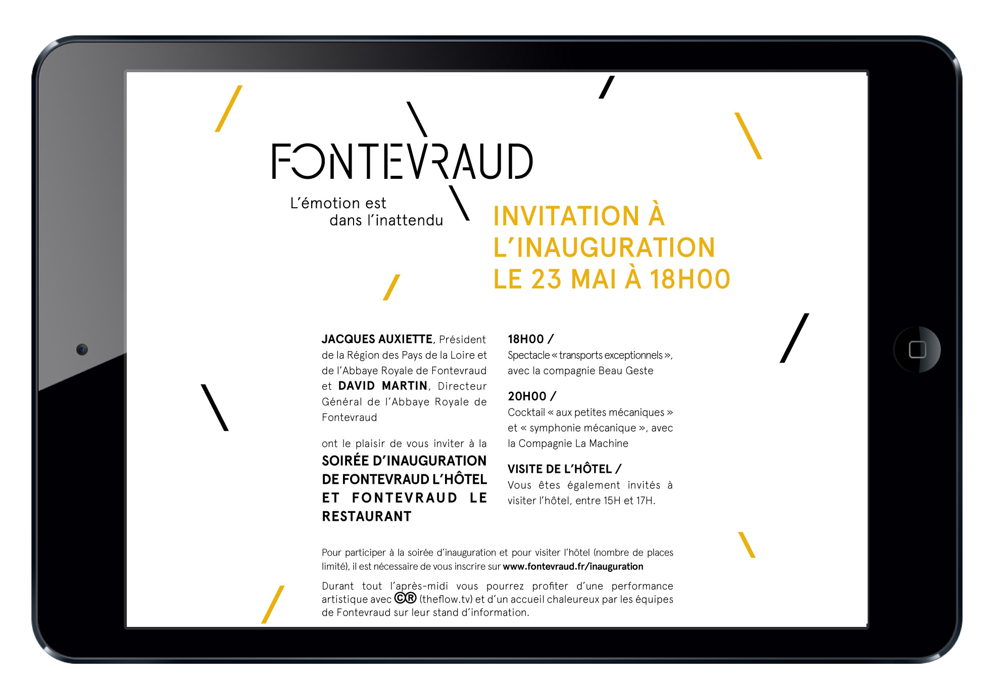
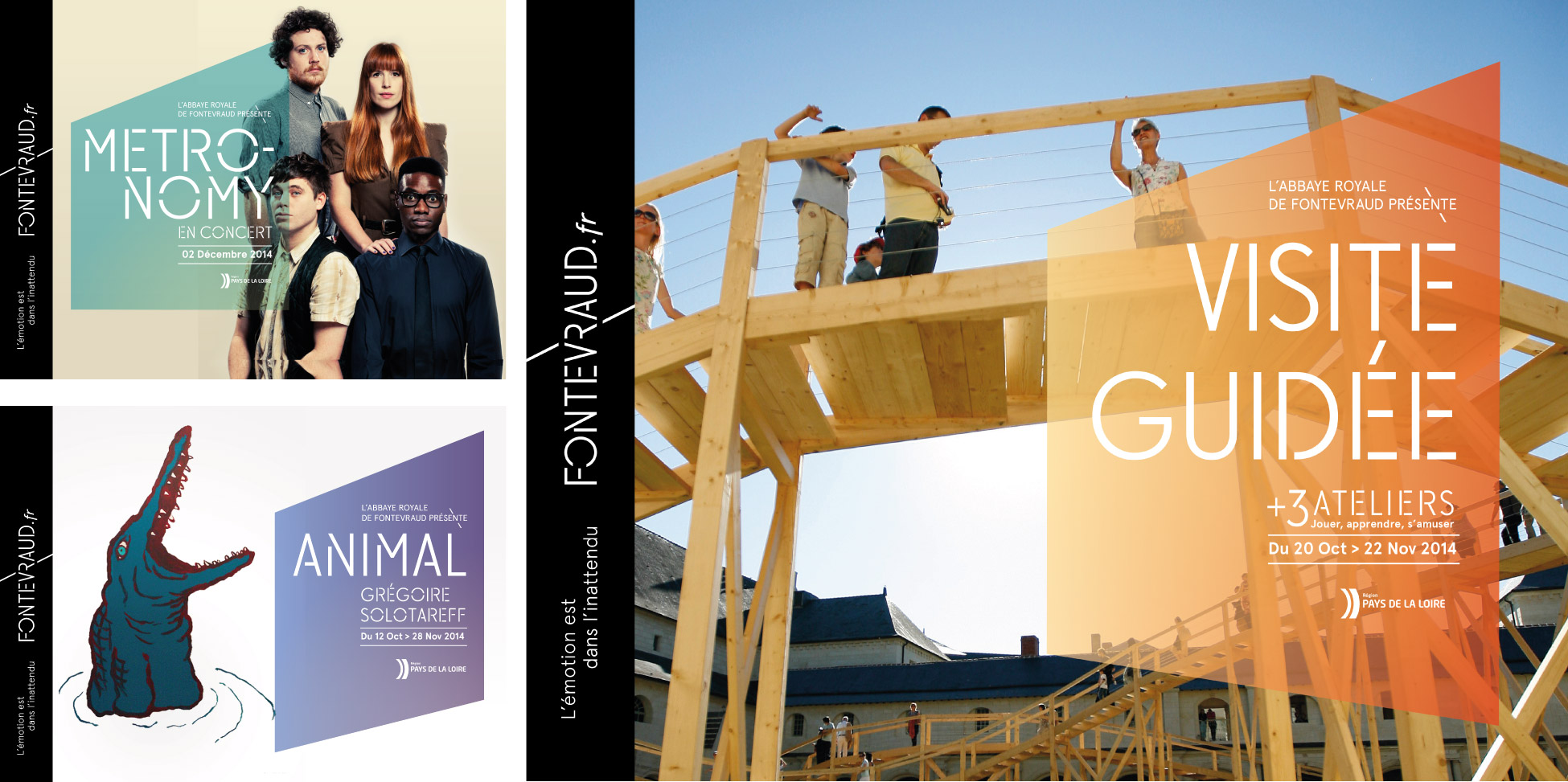
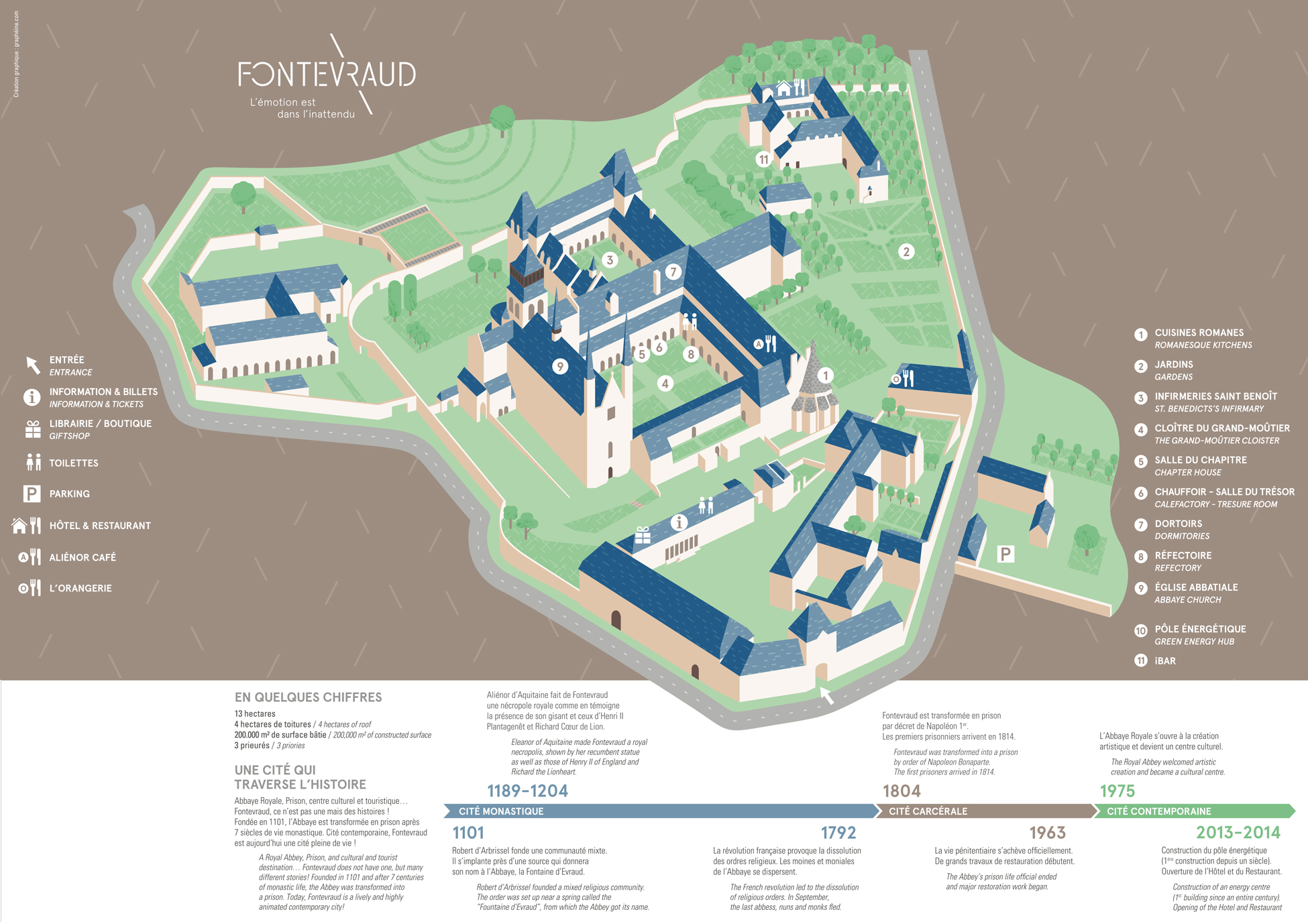
Here are just a few examples of how this layout can be used.
Site graphic design
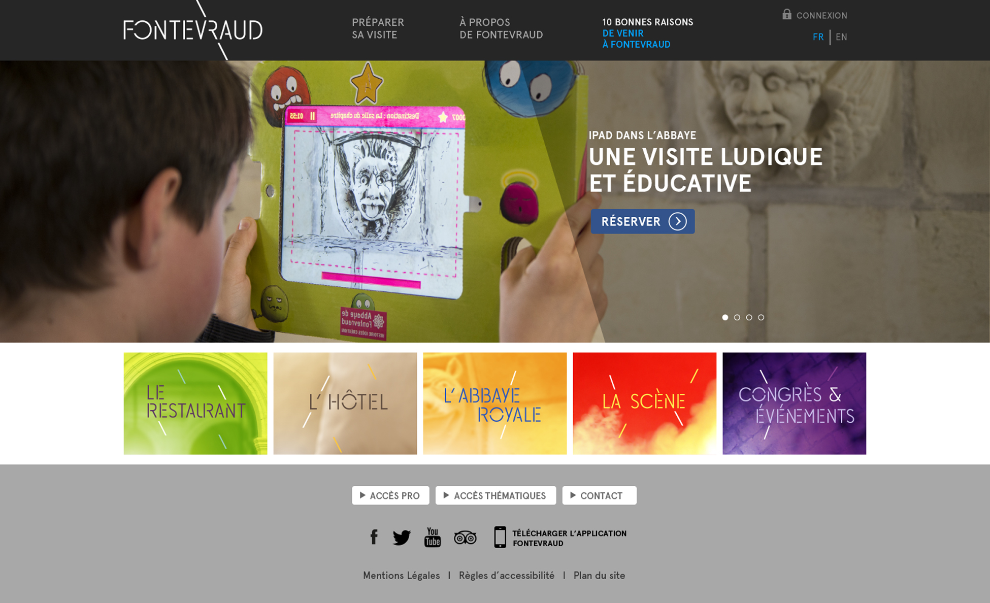
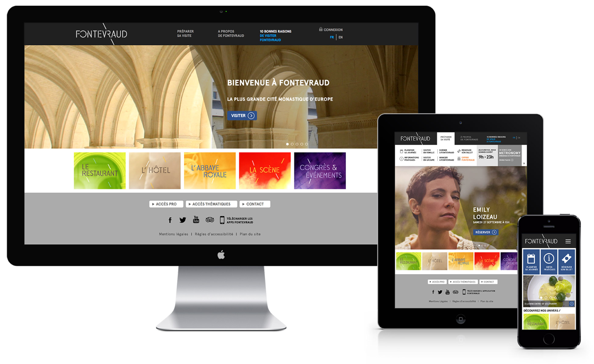
We also worked on the graphic design of the www.fontevraud.fr website.
And much more...
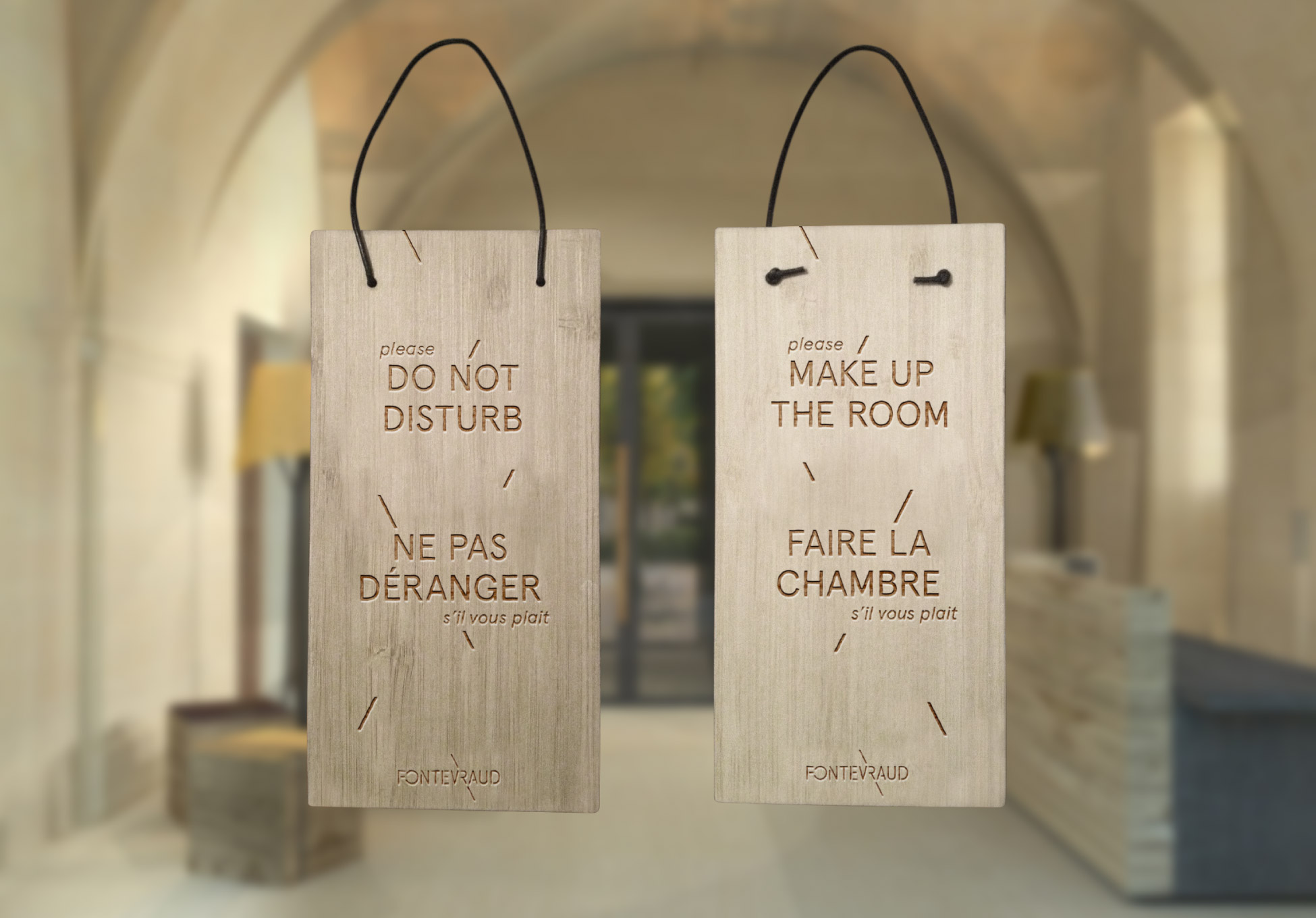
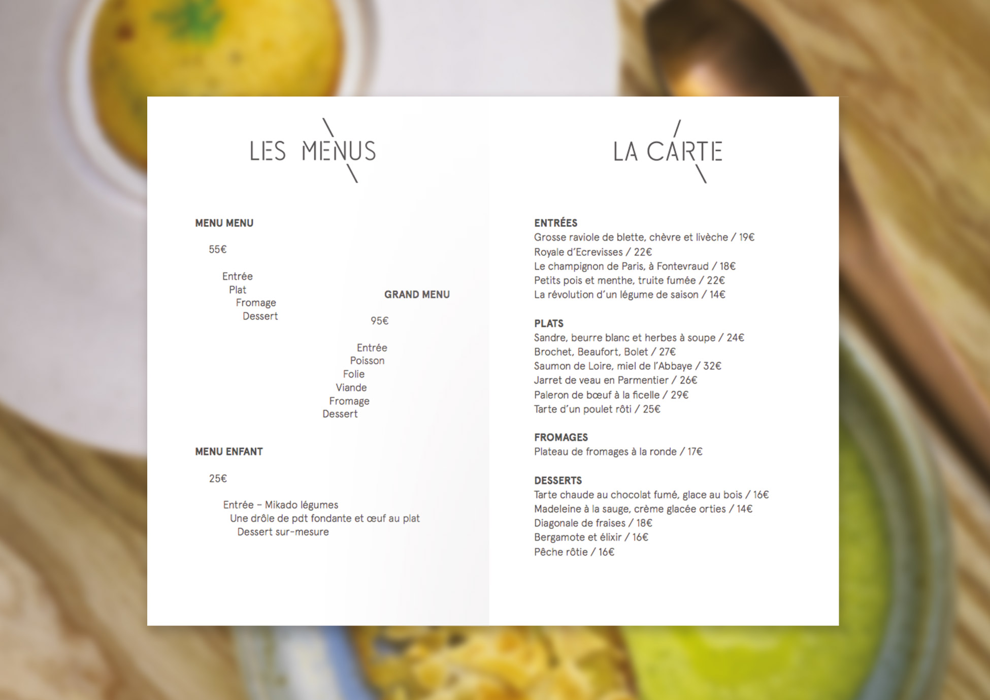
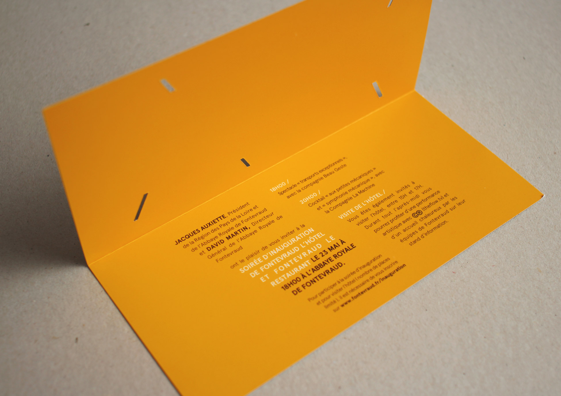
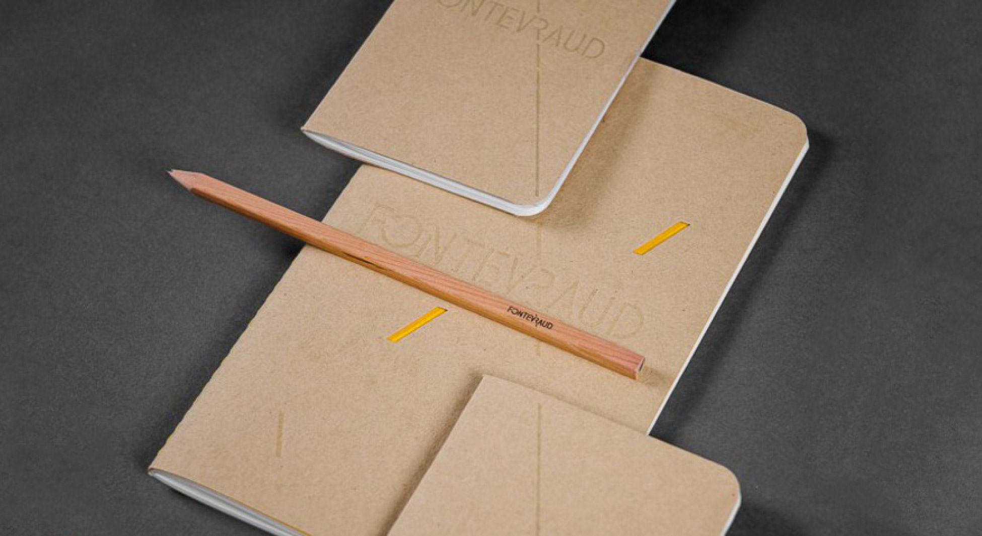
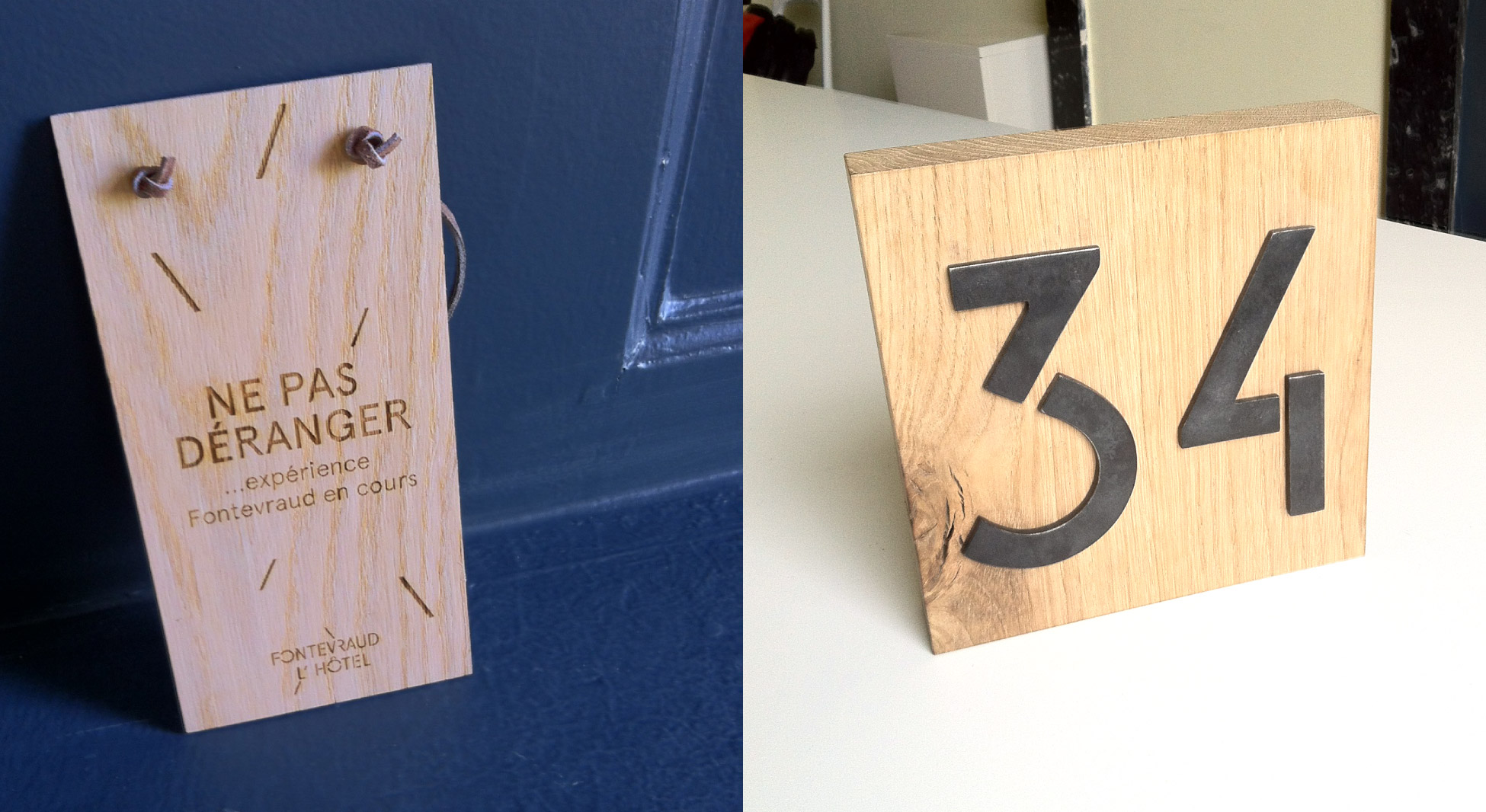
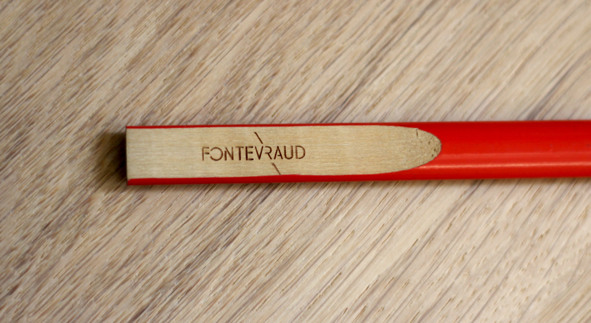
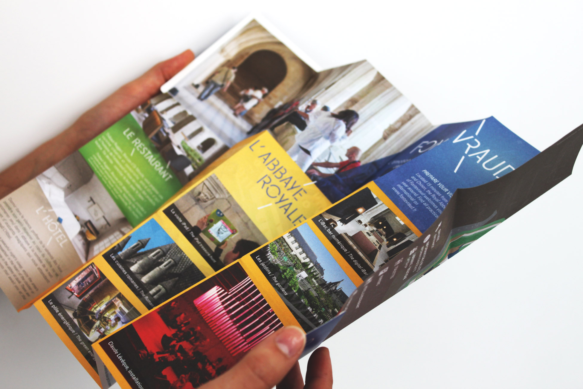
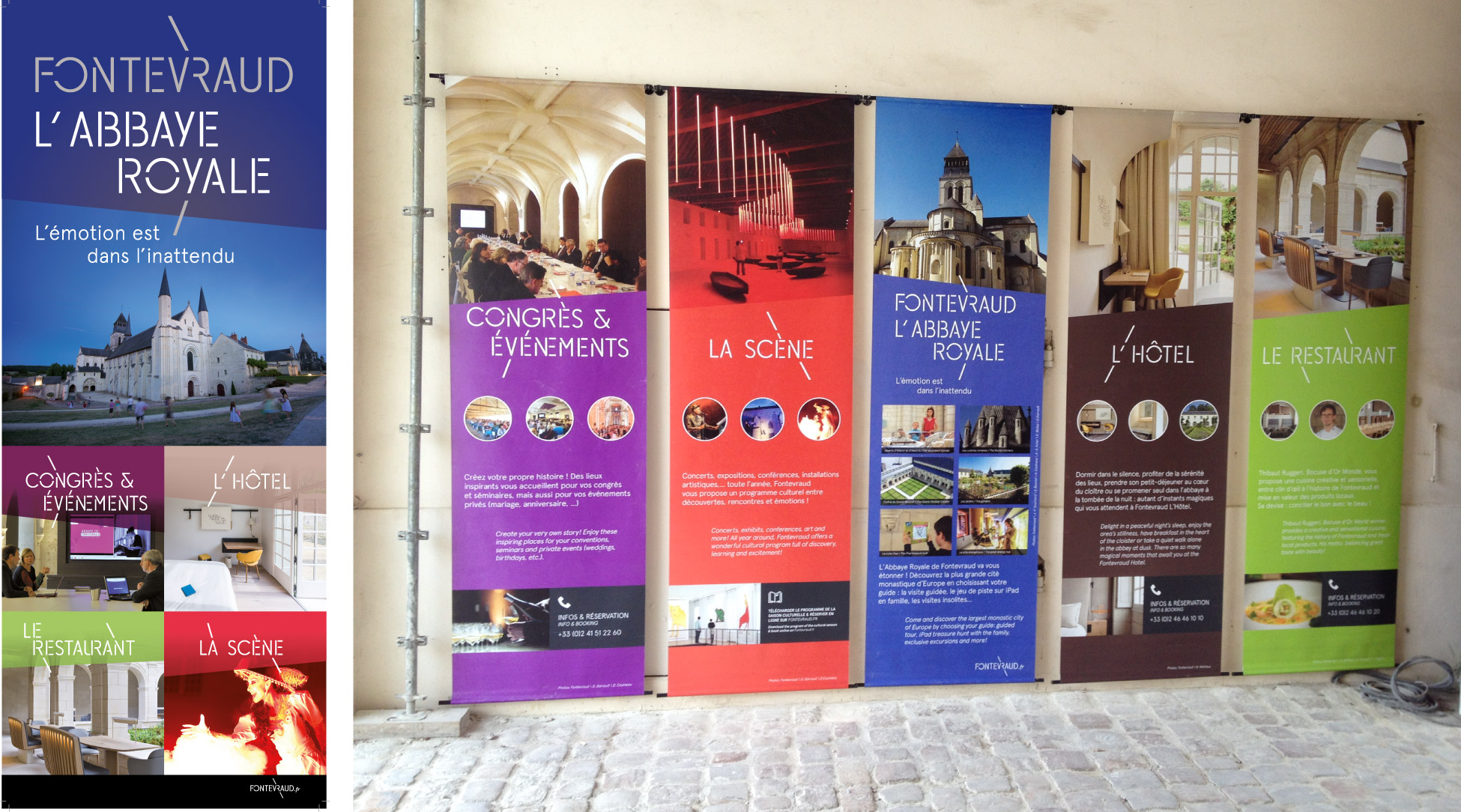
Every day, the identity is deployed on new media... Notebooks, pencils, z-cards, kakemonos, laundry bags, soap...
Here is a small glimpse of these variations...
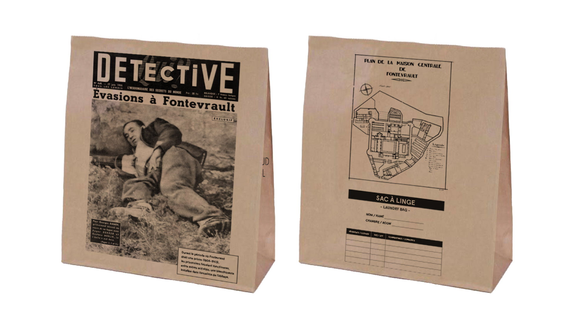
Below, the hotel's laundry bag. On one side, the cover of a magazine from the '40s with the headline "Escape to Fontevraud"; on the other, a map of the Fontevraud prison as a mischievous wink !
Thank you Fontevraud
Thank you to David Martin, Frédéric Dufau and the entire Fontevraud team for trusting us throughout the project. It's just incredible to work in such conditions, where everything is conceivable on principle, and when an idea is good, it's realized in the minute that follows, without brakes, without barriers and with an unrivalled level of high standards!
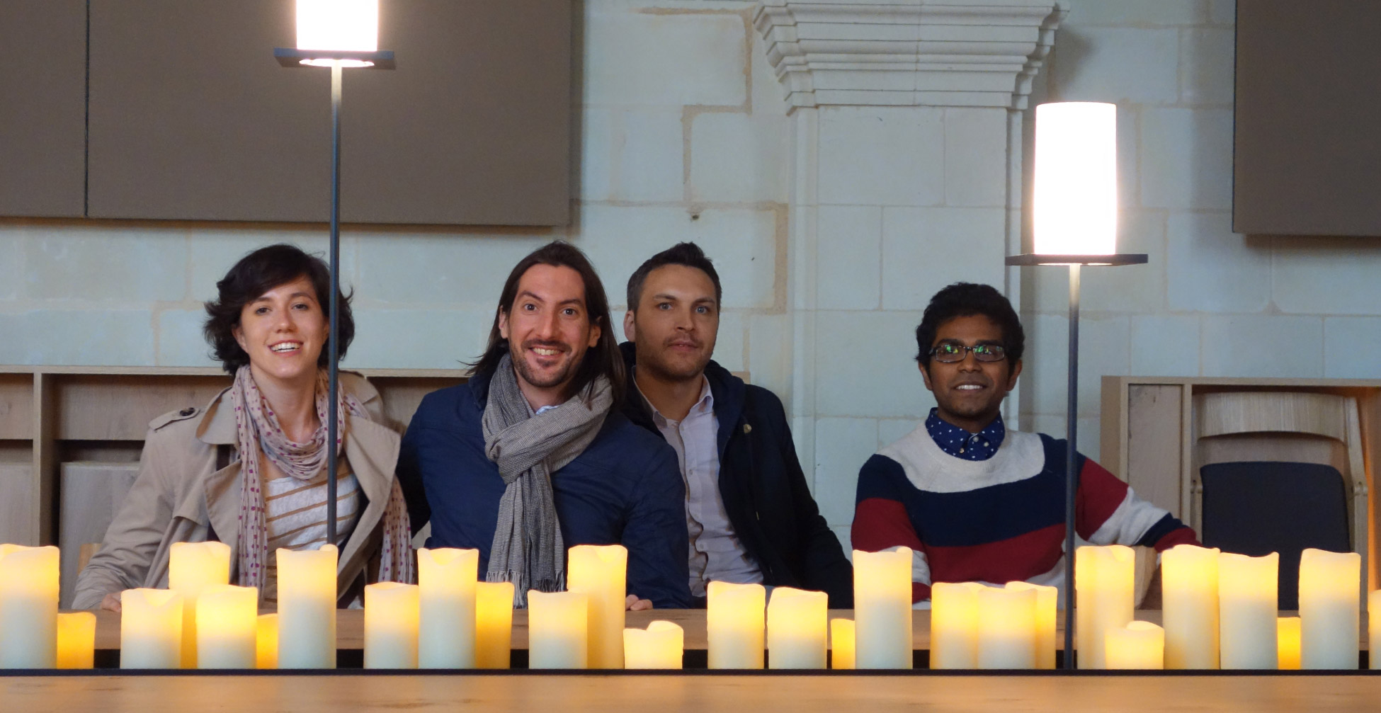
So, on behalf of the entire Graphéine team (below), we would like to thank you !
As a bonus, we would like to share with you a "prototype" animation that illustrates the concept of this project as we unveiled it at Fontevraud during our first presentation:
Share this post:








 San Serriffe typographic Island
 Design, creativity and oblique strategies!
 Tote bag, a new social totem?
 Sister Corita Kent, the Pop Art nun
 Donald Trump, the martyr who makes history
 Renaissances, real estate promotion – Brand identity
 AgroParisTech – Brand identity
 City of Claye-Souilly
 Les 7 Lieux, library of Bayeux – Visual identity and signage
 L’Influx – Visual identity
 Minimalism is dead !
 Dropbox and Indesign: the end of broken links!
 Best wishes 2016
 Design and empathy
 Time and creation #01 : working flat out, a tiring tradition
Leave a Reply