Visual identity for the Confluences Musuem

03 September 2014  |   0 Comments   |    |  

3-logo-musee-des-confluences

A few months ago, we were selected to present a project within the framework of a call for tenders (paid) for the design of the visual identity of the Musée des Confluences in Lyon. This is the unsuccessful project we submitted.

Some background information

The Musée des Confluences is a science and society museum currently under construction in Lyon (Rhône). The project owner is the Rhône General Council. Located at the confluence of the Rhône and Saône rivers, the museum will open its doors in December 2014. He is the heir of the Muséum de Lyon, closed to the public since July 2007. It will therefore include all the collections and will be completed as acquisitions are made.

The architecture of the building was designed by the Austrian firm Coop Himmelb(l)au. Here are some background elements to understand the project.

batiment-musee-des-confluences

plan-lyon-musee

confluence-rhone-saone-musee

photo-chantier-musee-confluences

The museum's ambition is to give all audiences the keys to grasp and understand the complexity of our world. Its purpose is to compare scientific knowledge and the functioning of societies.

Through three synthesis and reference exhibitions, the Musée des Confluences attempts to answer three questions: "Where do we come from? ", "Who are we?" and "What do we do? ».

The first is a search for the origins of Man, of the Earth. Life and death are questions to which all societies, all religions have always tried to find a meaning. The second is a questioning of Man's place in the world, his role and his behaviour towards his environment. The last one tells the story of men past, present and future.

collections-musee-des-confluences

What do you know about the Musée des Confluences?

When the project started, we made a micro-trottoir with the Lyonnais. It was a question of getting a more detailed idea of the perception that the future public could have of this museum, in order to multiply the looks on this building and on this project.

Words that make sense

Con-fluences

The Musée des Confluences links past, present and future, stability and mobility, real and imaginary, concrete and conceptual, science and art, nature and culture, here and elsewhere, known and unknown, knowledge and experience...

con-flu-ences

The flow is a story of movement, displacement in time and space, a line that encourages travel, discovery of elsewhere. A flow also leaves a trace, a footprint, a memory of its passage.

confluence-s

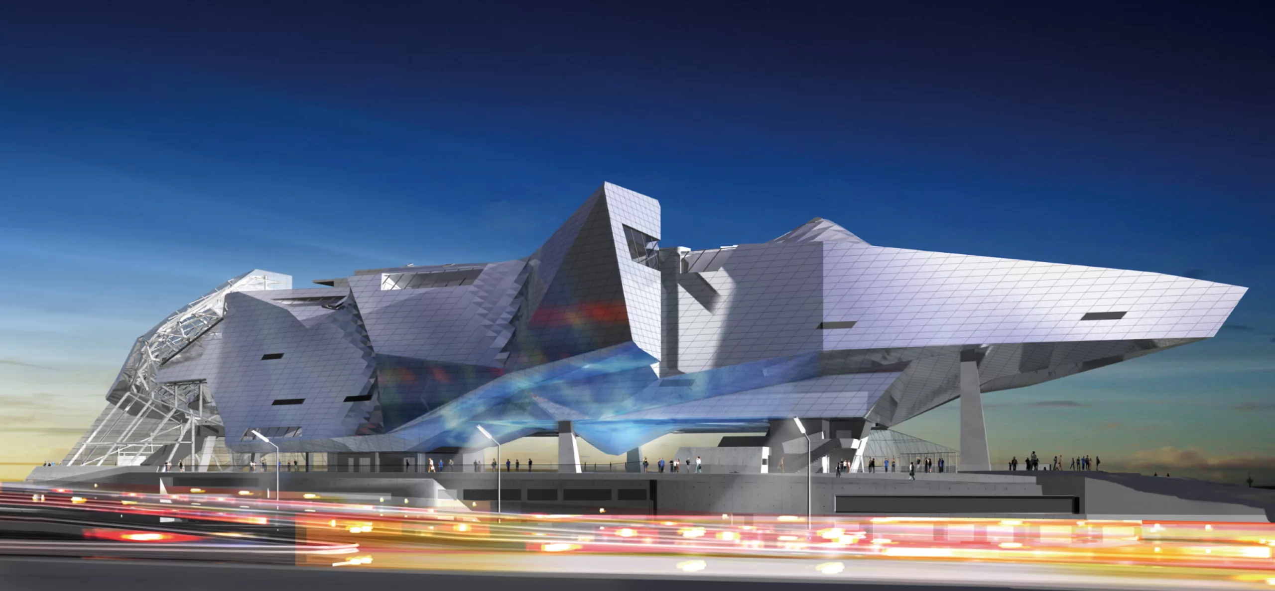
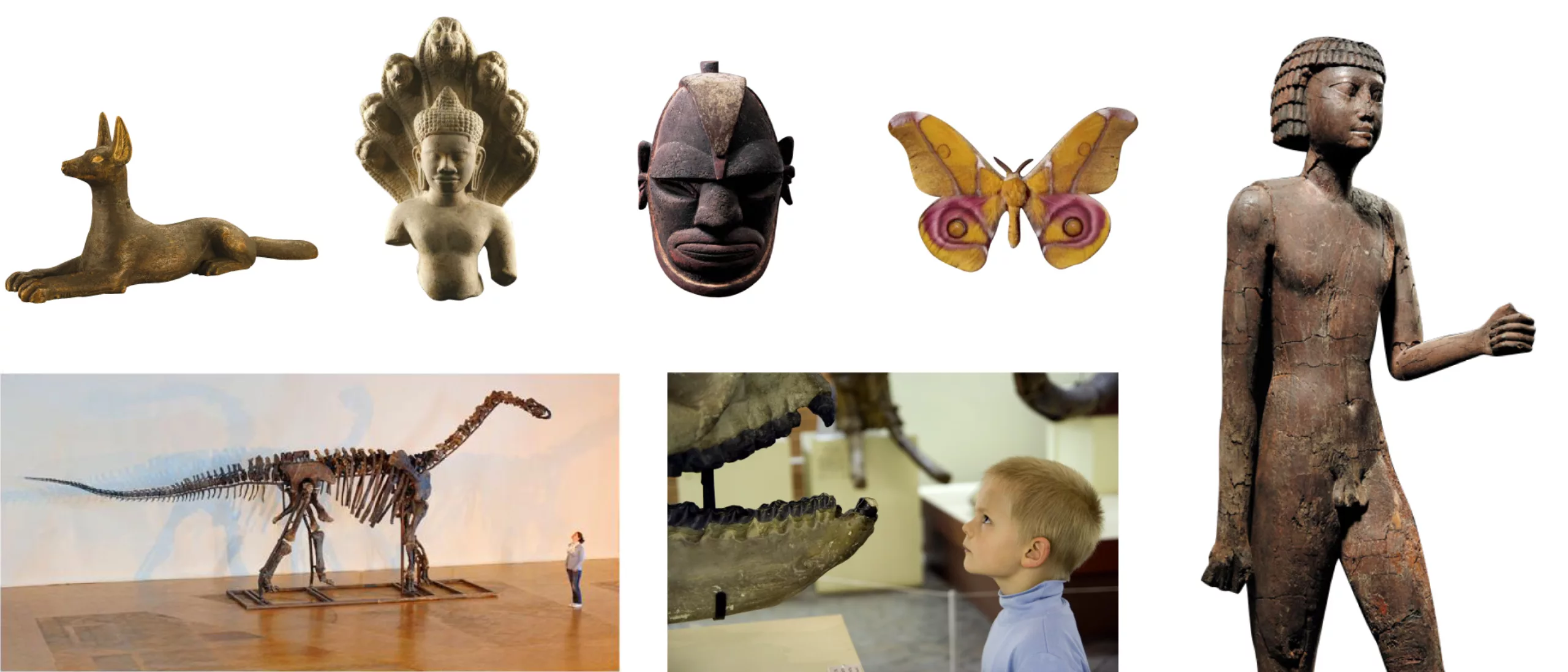
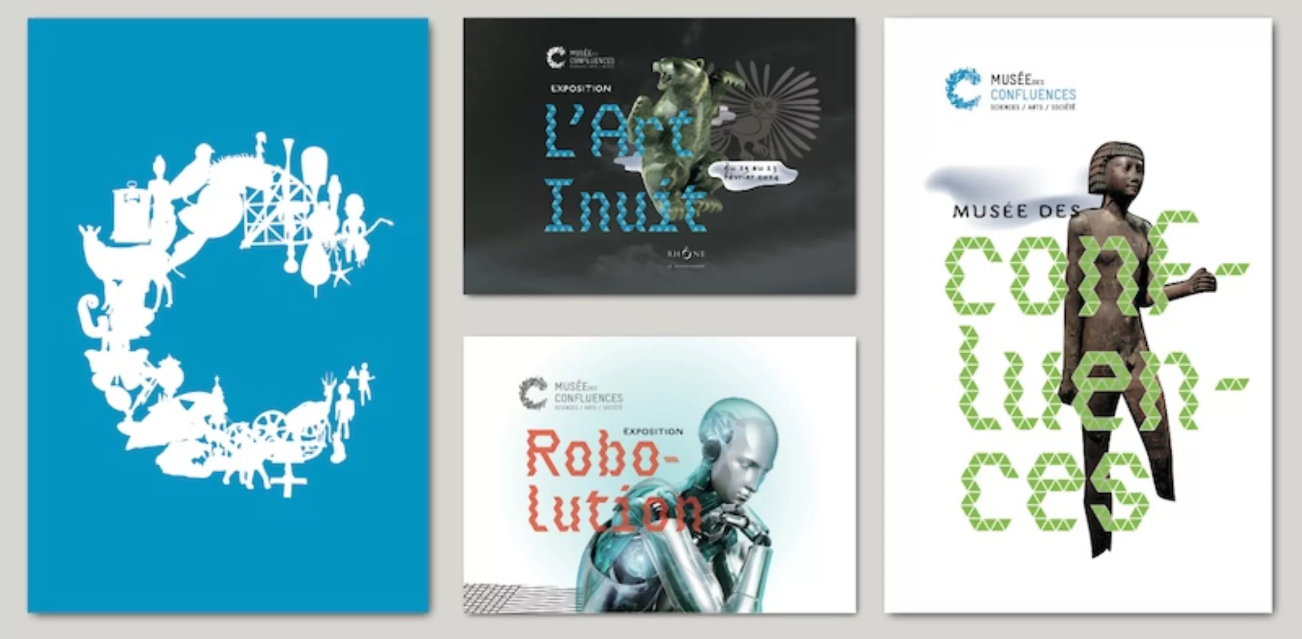
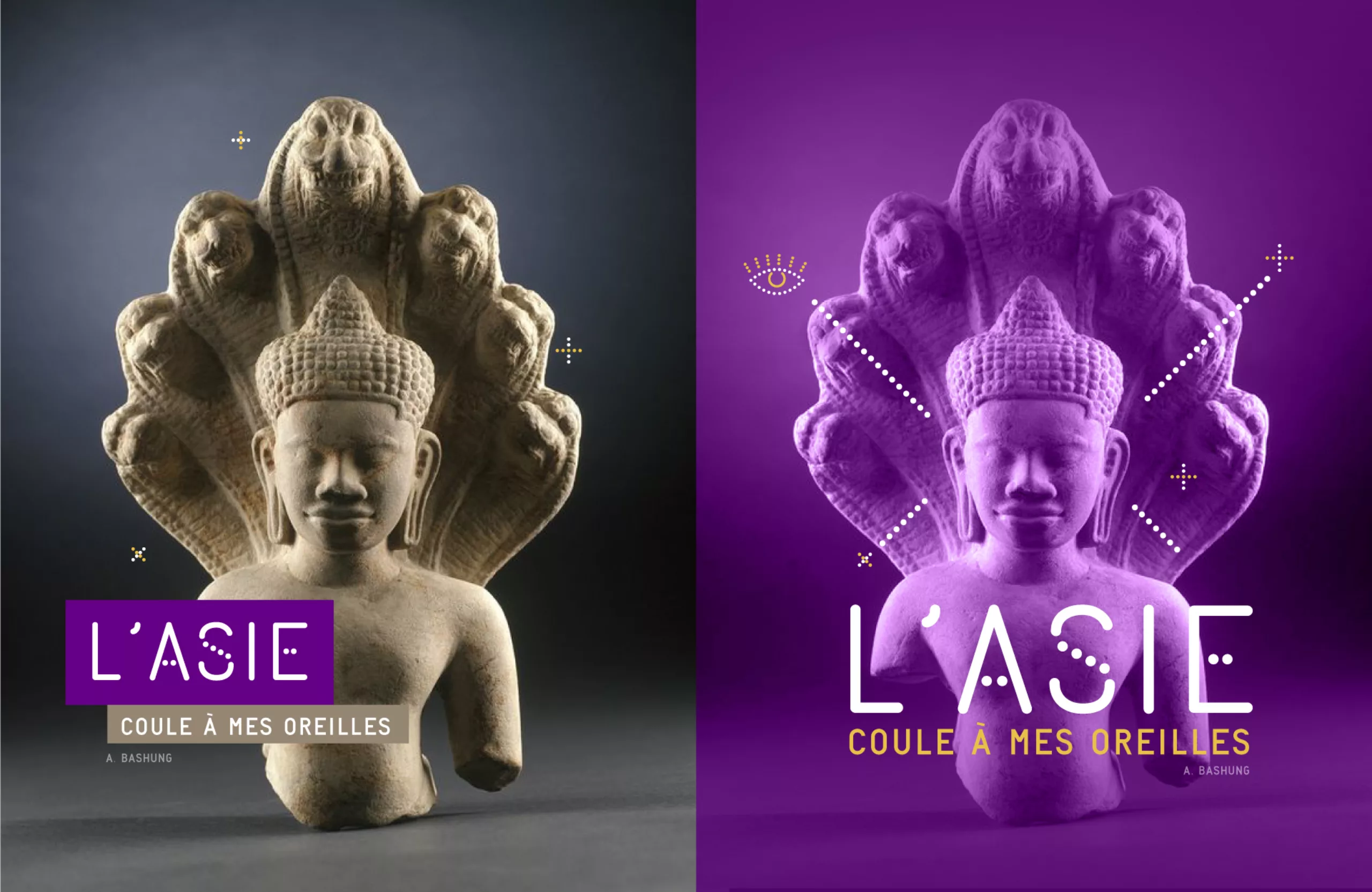
The Confluences Museum is a plural history. Plurality of objects (2.2 million specimens), subjects (Sciences, arts and societies), spaces (collective and individual, indoor and outdoor, aquatic and aerial...), audiences...

The confluence of symbols
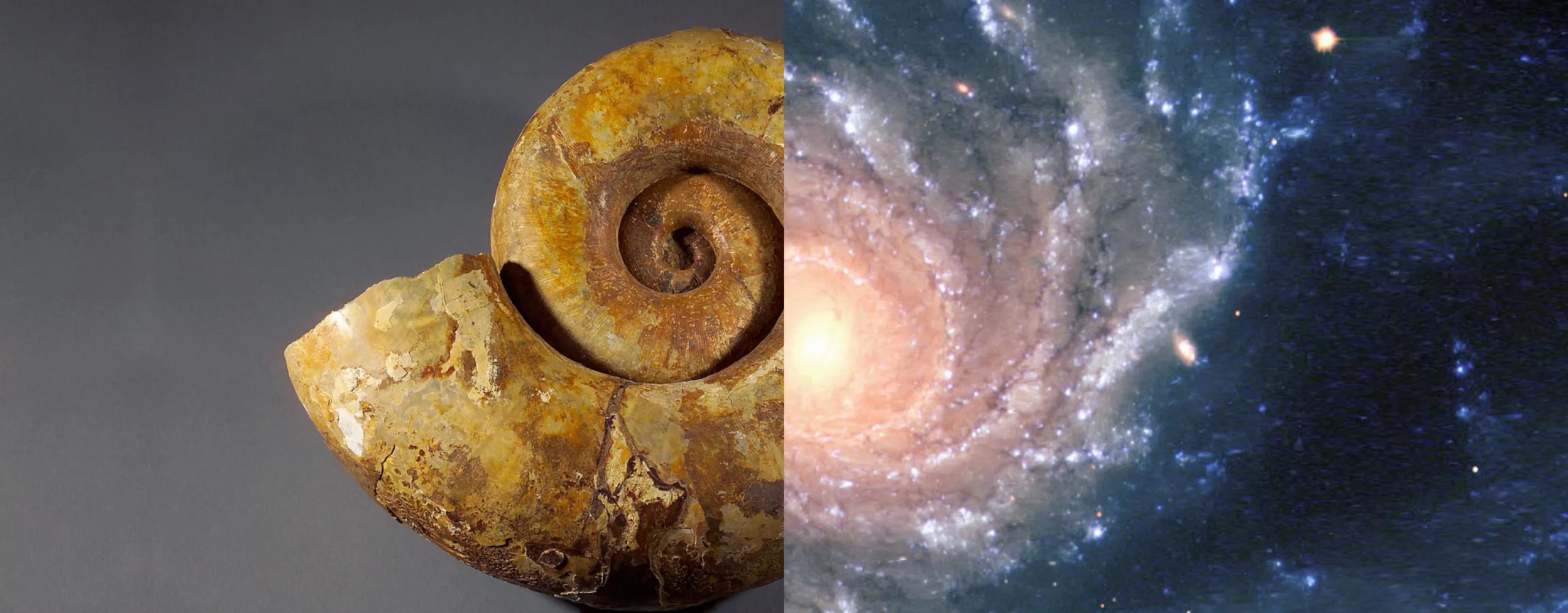
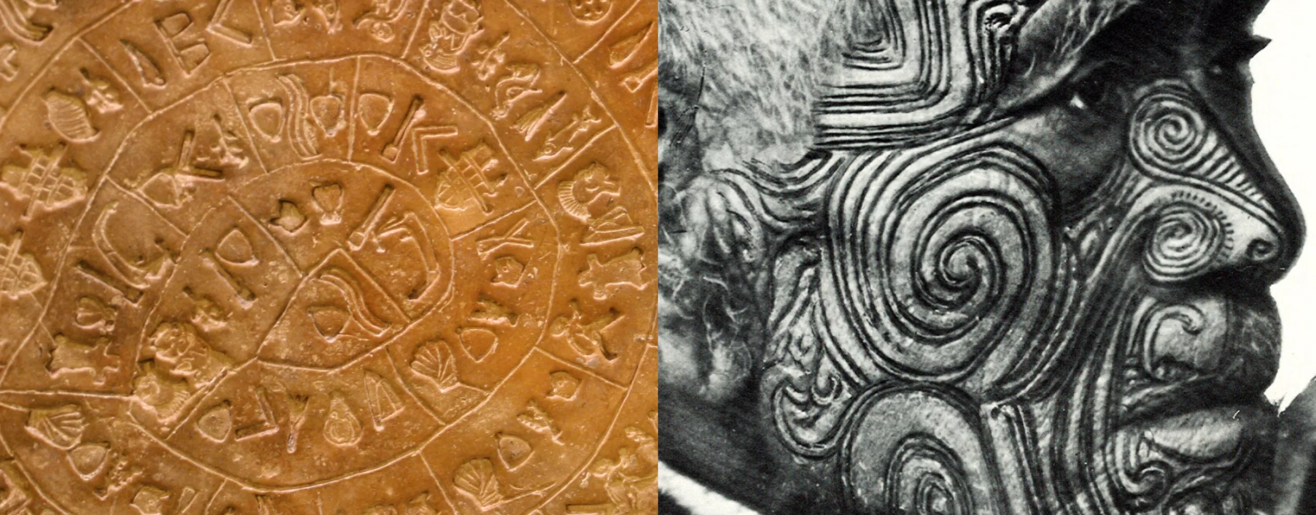
If the term "confluence" symbolizes union, a brief semiological analysis makes it possible to understand the symbolic charge present in this term.

The Kingdom of God
As running water is a principle of life, confluence sites establish the connection between the symbolic powers attached to several rivers. Thus Benares, one of the seven sacred cities of Hinduism, is established at the confluence of the Ganges and the Yamuna. The Yamuna is considered more sacred than the Ganges itself, because the ascent of this tributary brings back to the source, the origin of creation. This is what Genesis indicates in the mention of a great partition of the world by the rivers: the Pishôn, the Gihôn, the Tigre and the Euphrate flow from the river of Eden.

The world of men
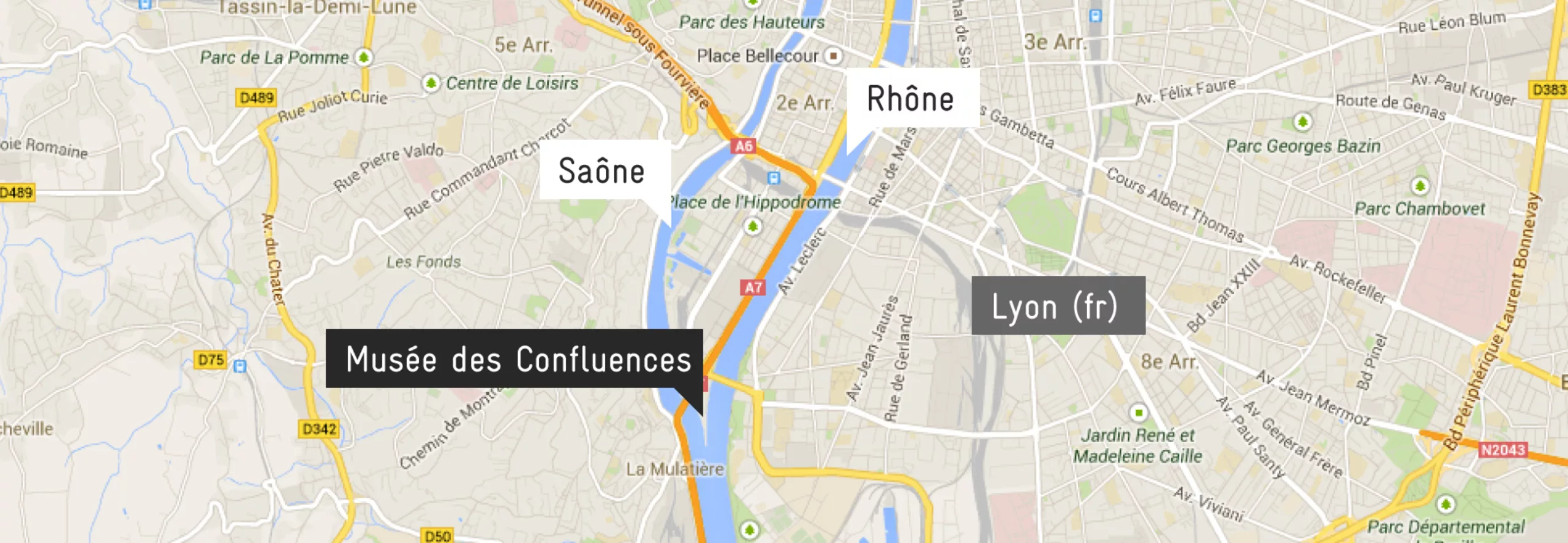
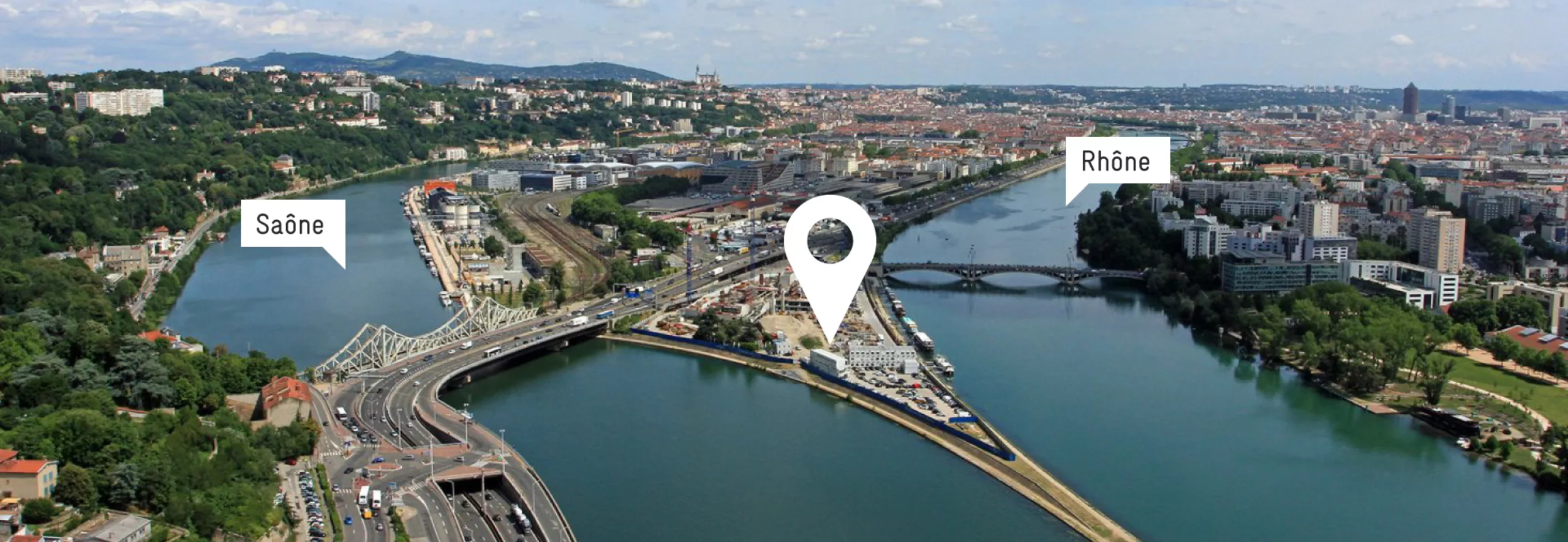
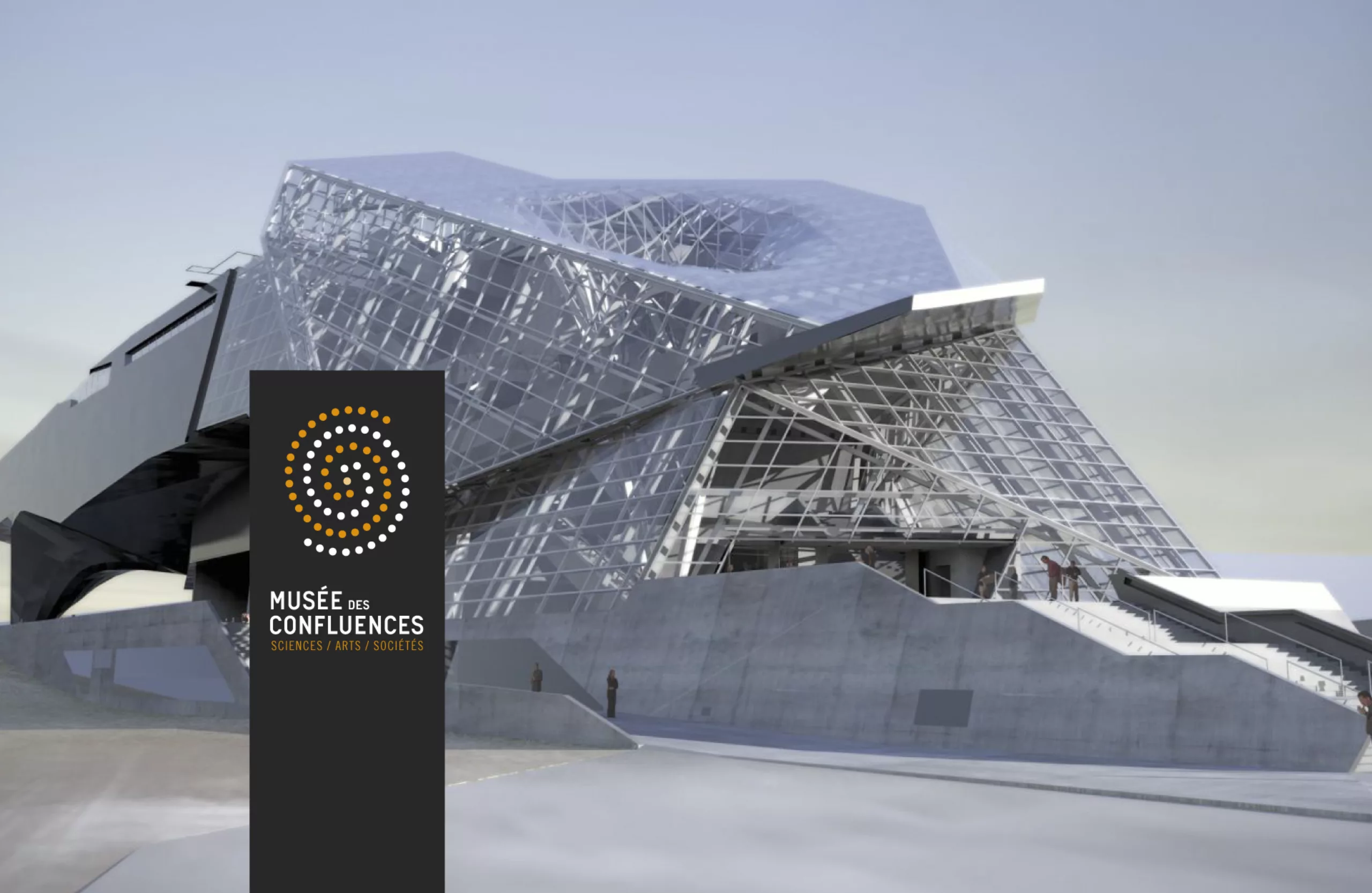
Upstream from all the meeting places of the rivers (confluence), the mystic finds the great division of the rivers (diffluence) of the exit of Eden which, downstream, structures the world of men, and, upstream, makes penetrate the kingdom of God. The organizational role of the sacred and the profane played by the confluence is so obvious that it has almost universal value: many confluences carry a temple, like Lugdunum (Lyon) which has its original site on the hill of Fourvière dominating the confluence of the Rhône and the Saône.
But we must not forget the major military and commercial role played by the confluences: it is not for nothing that many large political and commercial cities have settled slightly downstream of important confluences.

Research phase

recherches-geometrie

"A strong architectural gesture"
What dazzles at first glance in the museum project is the building.
A real architectural slap in the Lyon landscape, this vessel inspired our first research. From the cloud and the crystal are born fragments of project exploiting the notions of geometry, prism, mirror, or constellation. The building is a pretext for many graphic experiments that leave us perplexed... Isn't the project based on people and their environment? Basing the identity on the building, already very present physically, would make us miss many other notions dear to the project.

origine-recit-du-monde

Research on the building, imposing, is born the idea of a very human communication, to thwart the ambient geometry. We decide to make the museum speak, to involve the public with a message by and for man. This handwriting provokes a feeling of complicity, simplicity and proximity.

All that remained was to find a strong concept, a symbol that reflected the image of a museum "whose ambition was to describe and make understood the evolution, dreams and questions of human societies in time and space".

Spiral concept

spirale-universelle

Universal spiral

For the French ethnologist, Germaine Dieterlen, "The spiral is a universal glyph of temporality, of the permanence of being through the fluctuations of change".

The spiral, universal symbol found in all cultures, is obviously linked to the cycle of life, it is the symbol of fertility given by the dead, of rebirth. There are many examples: the universe formed in a spiral; it is one of the first drawings of man (megalithic and Neolithic); Mesopotamians carved spirals representing the intestines (sacred meaning); the Tower of Babel ("ziggurats" Mesopotamian) was a spiral, for Polynesians it represents immortality; among Egyptians it is the snail symbolizing the evolution of life...

spirale-naturelle

Natural spiral

The spiral is frequent in the vegetable and animal kingdom (leaf propellers, snail, shell). It is naturally found at the atomic scale, in the path of electrons around their nucleus, at the level of molecules, in DNA... until the famous Fibonnacci sequence, strongly linked to the golden number.

spirale-culturelle

Cultural spiral

The spiral is a symbol present in all cultures, from rock engravings to the logos of many contemporary companies... It appears in Celtic, Amerindian, Inca, Arabic, Japanese, Hindu, Aboriginal, African art... Surprisingly, no religious or political group has claimed exclusive rights on the spiral. It is a symbol that belongs to everyone and excludes no one.

Branding

1-le-design-du-signe

We find in this sign, the great symbolic notions of the word "confluences" evoked upstream, namely the meeting (Con-) of 2 spirals, the flow (-flu-) symbolized by the dotted lines, and the plurality (-s) through this multitude of points. The geometric construction of the sign is based on the inclination of the building's cladding patterns, which is not unlike the inclination of the Earth's axis of rotation. This inclination erases any orthogonal landmarks in the sign construction, inducing a singular dynamic.

2-design-signe-ange

One could imagine that this sign was drawn by fingerprints on the ground, a bit like a primitive motif or a rock painting. This impression is reinforced by the choice of colours.

3-logo-musee-des-confluences

At this stage, we had wished to confront this sign with different glances, without other comments, in order to verify the perception of the public. The result confirming the adequacy between the meaning we were trying to condense in this sign and the reading that a neophyte public could make of it.

Here's a few examples of this logotype applications.

8-papeterie-musee-branding

8-papeterie-musee-entete-lettre

8-carte-visite-design-musee

Below are the main principles for using this logo. It is designed in a responsive way, to adapt to the many possible uses while remaining as readable as possible.

4-identite-responsive

5-reduction-logo-design

Tool box

In order to conceive a global visual identity that can be easily used, declined and/or modular, we have imagined a set of complementary graphic tools (typography, pictograms, iconographic principles...)

6-custom-font

Creation of an exclusive typography. It is a geometric linear available in several versions. Given the titanic work that a typographic creation represents, we were not necessarily able to go into the subject as much as we would have liked within the 4-week deadline imposed by the market. It was a question of working on the idea of trace, of imprint, starting from a full character, which would erase itself, leaving a trace of its passage (dotted lines). Maybe it's a job that one day we'll have time to deepen!

7-creation-typographique-sur-mesure

symboles-universels

Creation of a bank of universal symbols.

10-pictogrammes-icones

Principle of pictograms playing on a principle of bichromy and of solid and dotted lines.

11-pictogrammes-musee

Below, two principles for using iconography. Depending on the situation, the integrity of the work (framing, chromy...) can be respected, or on the contrary, be modified.

12-iconographie

A work was also conducted on the editorial tone, deliberately offbeat, joyful and popular, in order to address a broad public and thus be able to break the distances between the museum institution and its public.

13-charte-editorial

Posters

14-affiches-musee-confluences-vertical

15-affiche-outre-mer-musee-confluences

16-affiche-colorees

Event and young audience communications

8-programme-musee

!-communication-jeune-public

Publishing

17-document-edition-musee-brochure

18-charte-editoirale-publication-scientifique

Signage

19-signalétique-interne-exposition-musee

21-signelatique-etages

20-signaletique-exterieure-musee

As a conclusion...

Our involvment in this project was total, that of our collaborators too, certainly beyond the compensation budget provided by the museum. However, we took a lot of pleasure in this reflection, despite the long hours of internal discussions, the divergent approaches, the frustrations to have to gather around a single project, all in less than 4 weeks. It is difficult to know precisely how our project has sinned. It was reported to us that it was a project that was based on its playful aspects and its multiple variations particularly took into account the public. Of course, the selected project had to be more convincing!

For information, it is the work of Intégral Ruedi Baur that has been selected (to see here). Congratulations to them!


Share this post:


Leave a Reply


Newsletter
Leave us your email and receive your monthly dose of Graphéine in your mailbox.