2024

Bourg-en-Bresse National Theatre
Visual identity, seasonal communications
Built in 1772, the Théâtre de Bourg-en-Bresse is much more than just an entertainment venue; it is a true cultural centre, with a strong influence on the town and the whole region. Elevated to the status of "scène conventionnée d'intérêt national" in 2008, then "Scène Nationale" in 2022. This recognition pays tribute to the work of Vincent Roche-Lecca and his team, who have worked hard to create a programme that is as dynamic as it is committed. The Scène Nationale is now taking a citizen-focused approach, reaching out to the people of the Ain, offering a public cultural service, supporting artistic creation and working actively alongside artists.
In the wake of the post-COVID period, when audiences are gradually finding their bearings in cultural venues, the Scène Nationale de Bourg-en-Bresse has decided to offer a new programme every four months, entitled "Pluriels". Against this backdrop of change, the Graphéine agency and the theatre's teams joined forces to completely rethink its identity. The challenges were many, ranging from communicating a new name to adapting to an unusual programming schedule.
It was clear to us that the creative concept had to revolve around the audience, which had been absent for too long. The people of Bourg-en-Bresse and the surrounding area became the protagonists of this new communication. "Theatrum Mundi" (the great theatre of the world) stands as a metaphor, suggesting that each individual plays a role, consciously or unconsciously, on the world's vast stage. Drawing its inspiration from life, human interaction and everyday life, the theatre becomes, in a way, a reflection of our society. That's why we've put the human being - whether audience member or collaborator - at the forefront, because it's the human being who breathes life and dynamism into this new Scène Nationale de Bourg-en-Bresse.
The podcast
The Graphéine team takes you behind the scenes of this project.
Decoding, analysis and anecdotes in your ear.

Concept
“The face is a stage”
The face is the most human of places. It is a "stage" on which the inner life of the person can be seen, with its ambiguities and abysses, and where singularity is brought to light. The face is the place of mutual recognition; the face is naked and offers to the judgement of others the features that identify us. In short, our face is our mark of identity.
Paradoxically, the face is both singular and plural. In Hebrew, face is called "panim", a word that is always in the plural and has no singular form. The plurality of panim does not mean that there are too many faces, but that the face cannot be reduced to a single unit.
It is through the face that we are recognised, named, judged, assigned to a gender, an age or a skin colour; we are loved, despised or anonymous, drowned in the indifference of the crowd. The face welcomes a smile or expresses emotions. The face is a stage.


A participatory process
We invited local residents to come and have their portraits sketched by Jonas at the launch of the season. This encounter with the public was used to build up a library of faces, which were then brought to life in a narrative linked to the theme of the term.
In addition to the participatory approach and the pleasure of meeting the theatre's audience, the ambition was to initiate a sincere and authentic approach where everyone could recognise themselves and feel involved in the project.


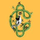
Clear line illustrations
The modesty of the graphics is in accordance with contemporary challenges. It's like a form of visual ecology, the opposite of "visual Formula 1" and dazzling 3D images. A clear line, a raw line, a spontaneous drawing that goes straight to the point.
Clear line isn't about performance, it's about transparency and efficiency. It seeks to enlighten us; it's a writing style with a universal vocation.
In the context of cultural communication, it's a 4x4 language that speaks to 5 to 105 year-olds. This type of drawing also has the advantage of being quick to execute (see: economical) and of lending itself perfectly to the demands of reproduction, whatever the medium. It's a simple and agile process.


Typography
Chaumont script is a font designed by Alexandre Bassi. It is inspired by everyday writing. We've all come across these traced letters, which can be quite ordinary. This font echoes the graphic treatment of our illustration, bringing an orality, a visual signature to the identity that anchors it in a popular, modest and spontaneous image.


Plurials
Every 4 months, the programme changes and revolves around a new theme (Cf: Livings, materials, loves...). Several illustrations are designed to illustrate the different themes.


Face à la diversité infinie de notre public, nous avons choisi de cultiver une vaste et éclectique communauté. Cette riche palette d'individus, aux multiples horizons, représente l'essence même de notre théâtre. Nous proposons ainsi de dessiner ensemble cette grande famille plurielle, offrant ainsi une multitude de perspectives et de regards.
Dans cette démarche inclusive, des ateliers ont été organisés, permettant au public de s'approprier pleinement notre communication. Chacun a ainsi pu contribuer à façonner notre identité collective.
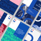
La communication s'articule autour de la création d'affiches pour chaque quadrimestre, ainsi que de brochures et de divers supports imprimés. L'illustration et la typographie jouent un rôle primordial dans la définition de notre identité visuelle. La police Chaumont Script, conçue par Alexandre Bassi, s'inspire des écritures du quotidien, évoquant des lettres tracées qui résonnent avec notre expérience commune. Cette typographie apporte une dimension d'authenticité et de spontanéité à notre identité visuelle, laissant transparaître une oralité et une simplicité qui nous ancrent dans une image populaire et humble.
Project expertise:
Publishing design, creation of magazine and brochure layouts. Logo creation, visual identity and graphic guidelines. Creation of illustrations. Graphic design of posters, flyers, letterhead and business cards.
Publishing design, creation of magazine and brochure layouts. Logo creation, visual identity and graphic guidelines. Creation of illustrations. Graphic design of posters, flyers, letterhead and business cards.
Type of client:
Cultural communication agency for theaters, concert halls, festivals, dramatic and choreographic companies. Heritage, museums & cultural spaces. Communication for live performance places and companies.
Cultural communication agency for theaters, concert halls, festivals, dramatic and choreographic companies. Heritage, museums & cultural spaces. Communication for live performance places and companies.
Related projects: