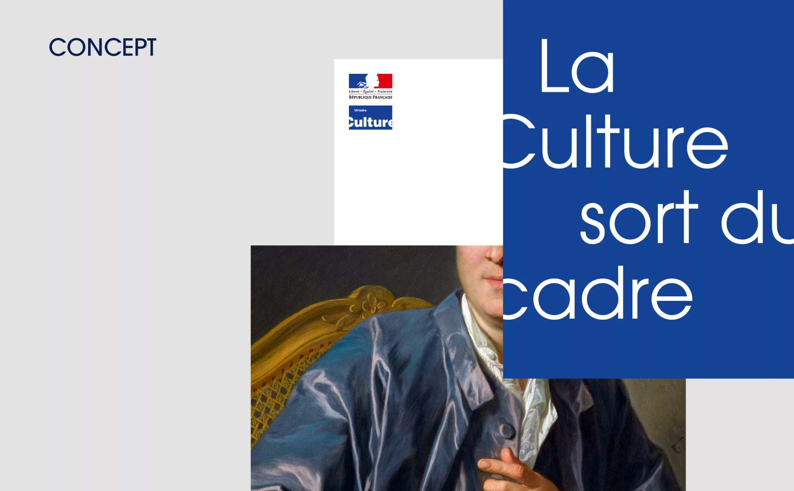
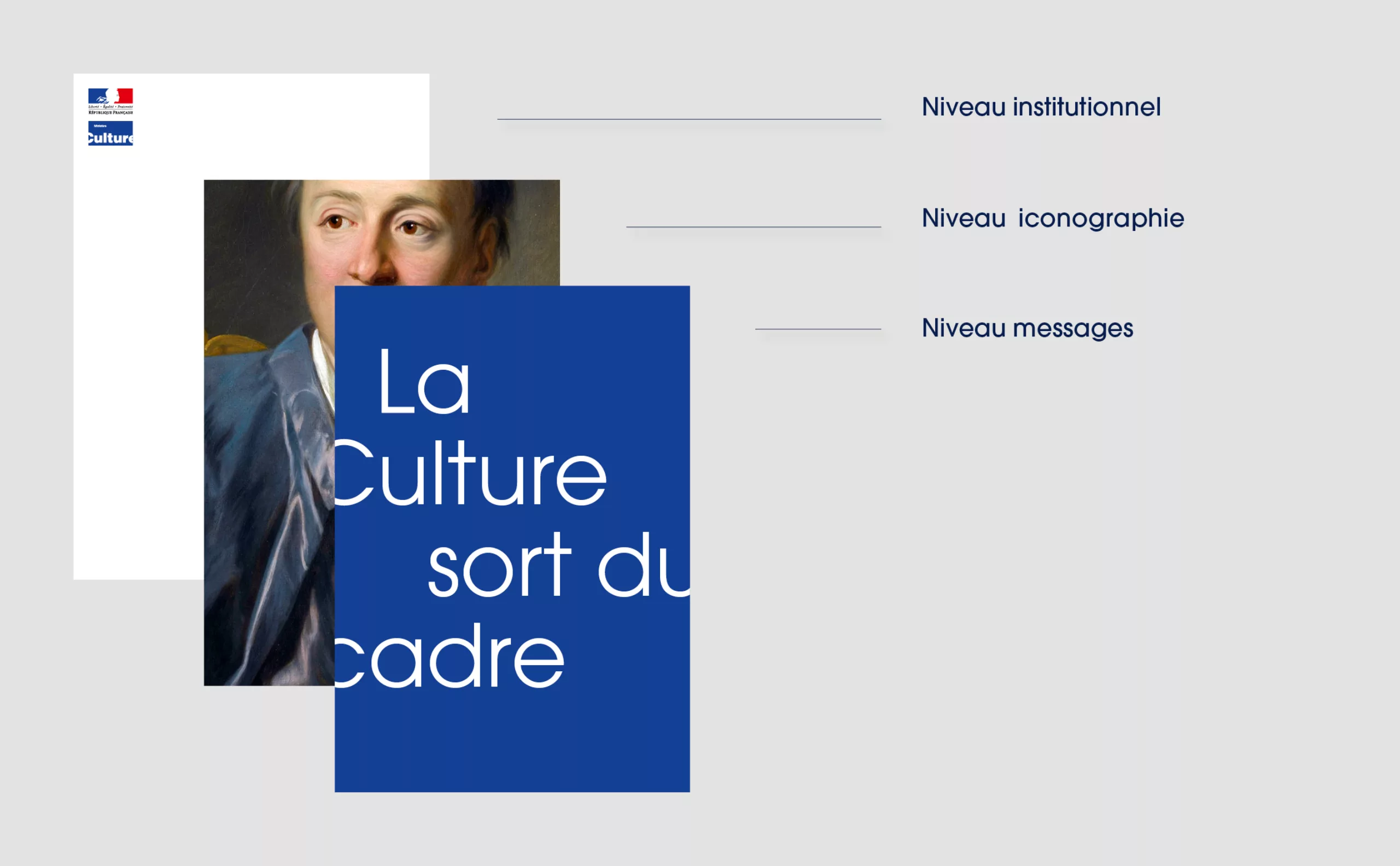
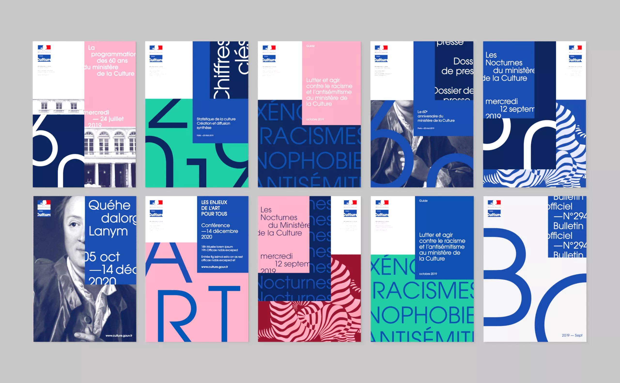
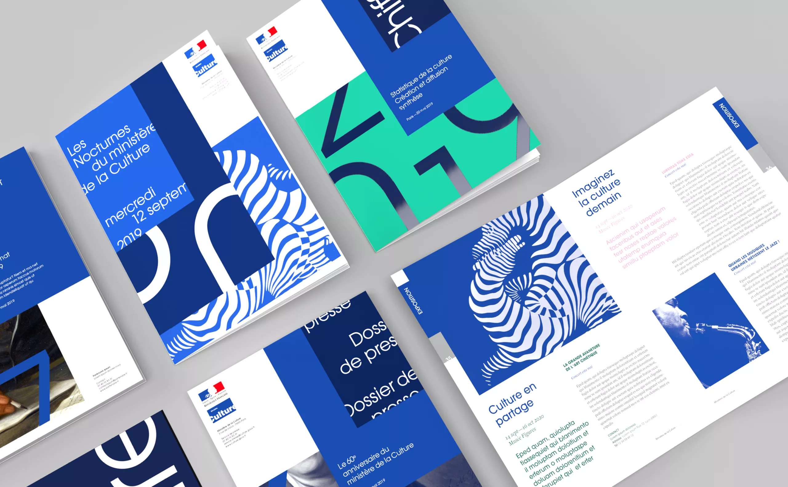
Charte graphique ministère de la Culture

2019

French Ministry of Culture
Culture out of the box

More flexible, contemporary, lively... culture goes out of the box!
Here is the new visual identity we have designed for the French Ministry of Culture.

The Ministry's logo designed in 1989 by Pippo Lionni already conveyed the idea that culture can't fit into a box. In 1999, the logo of the French Republic was added. In 2003, the studio LM Communiquer proposed a red frame graphic system to better identify the Ministry's communication. In 2019, Graphéine's mission was to rethink a more flexible and functional visual system, particularly with regard to new digital uses.

historique logo charte graphique ministère de la culture

The challenge of this project was to be part of continuity, while reinventing contemporary codes. We decided to keep as many of the existing ingredients as possible, despite certain weaknesses, such as the Republic logo, which could only be used on a white background. We couldn't accept this constraint, and by adding a midnight blue tint and taking on the framing in a radical way, we opened up new possibilities.


The podcast of the project

The Graphéine team tells you the behind-the-scenes story of this project. Deciphering, analysis and anecdotes in the hollow of your ears...
but sorry if it's in the language of "Molière".


logotype historique du ministère de la culture
Concept créatif

Concept

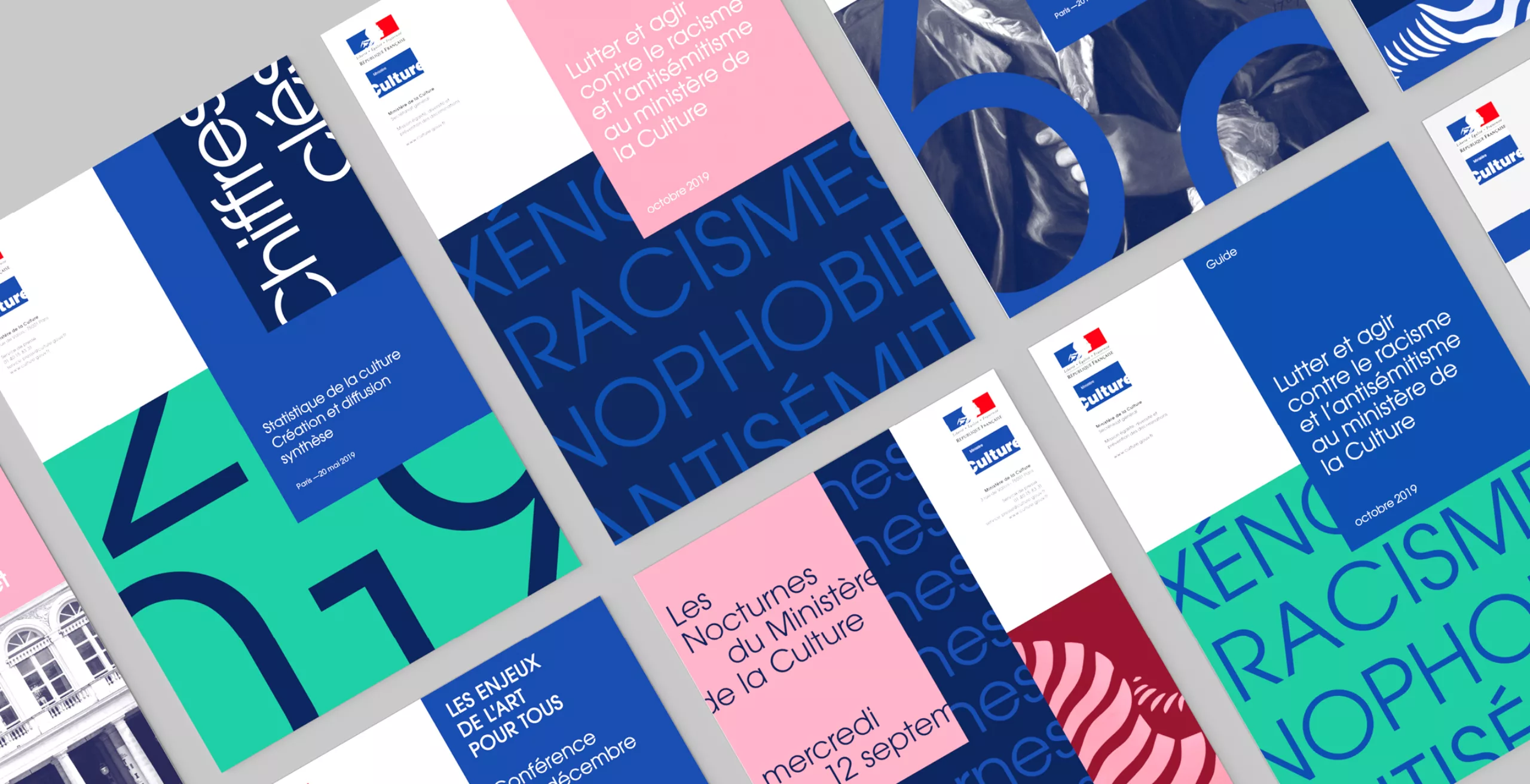
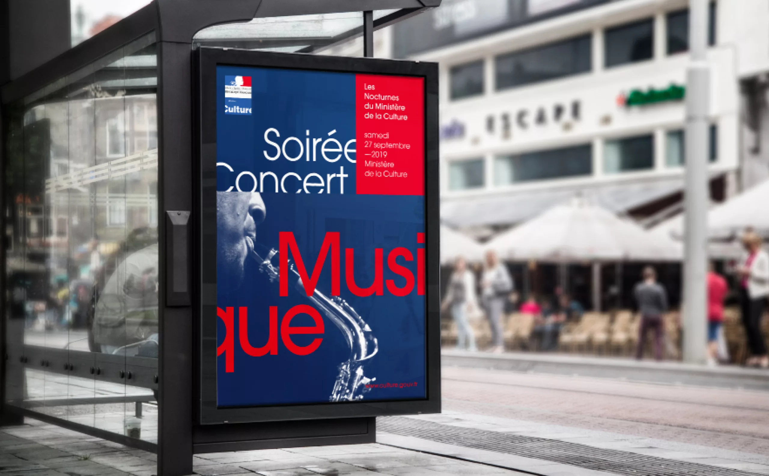
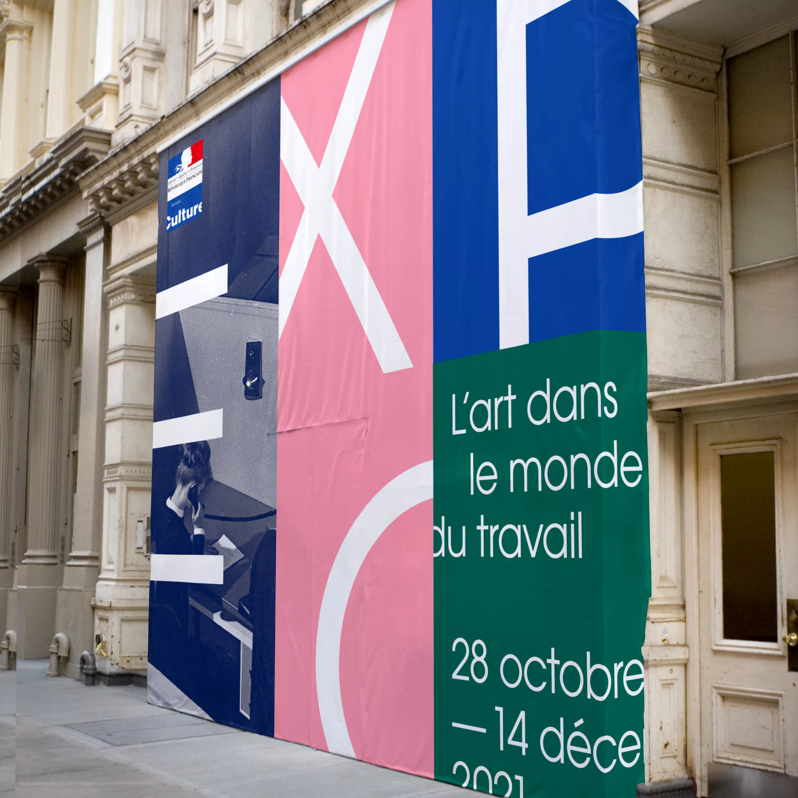
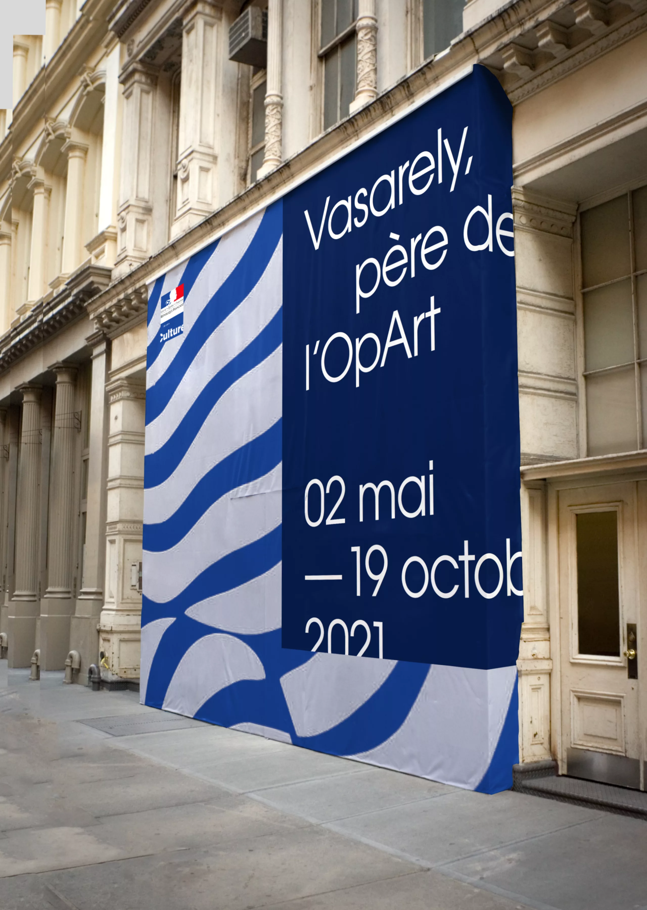
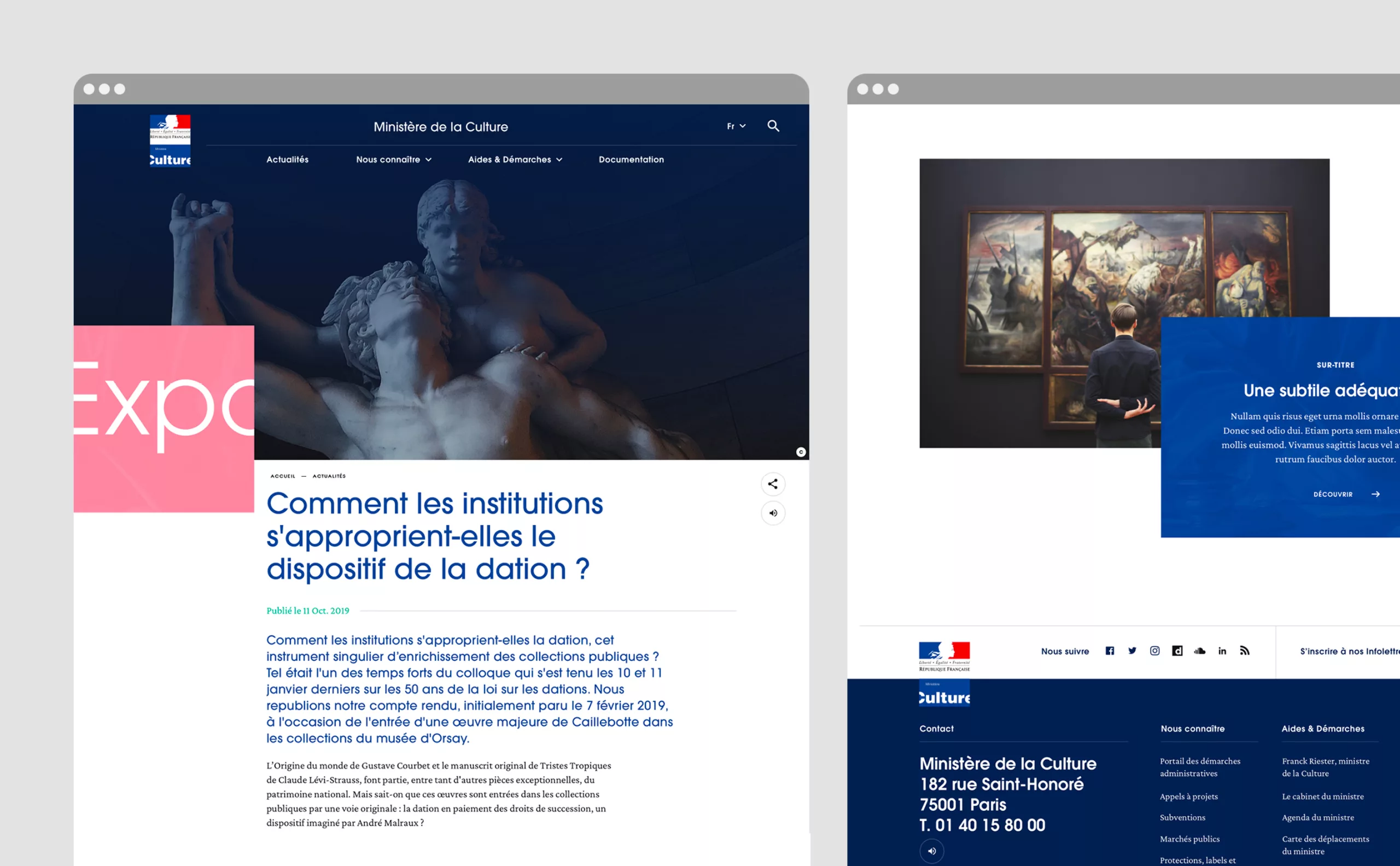
Starting from the existing logo, our will was to translate in a very simple way the idea that Culture is by nature unlimited, alive, overflowing, unexpected, sometimes irreverent or mysterious, always open and generous... and that it does not fit into a box of a framework.

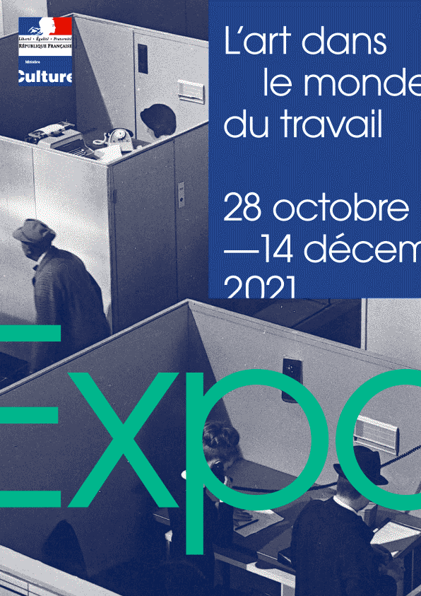
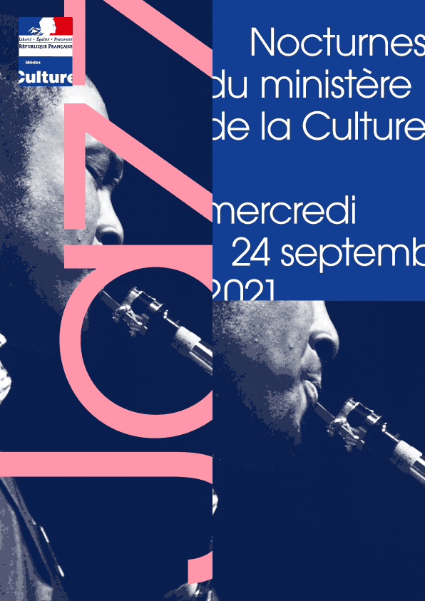
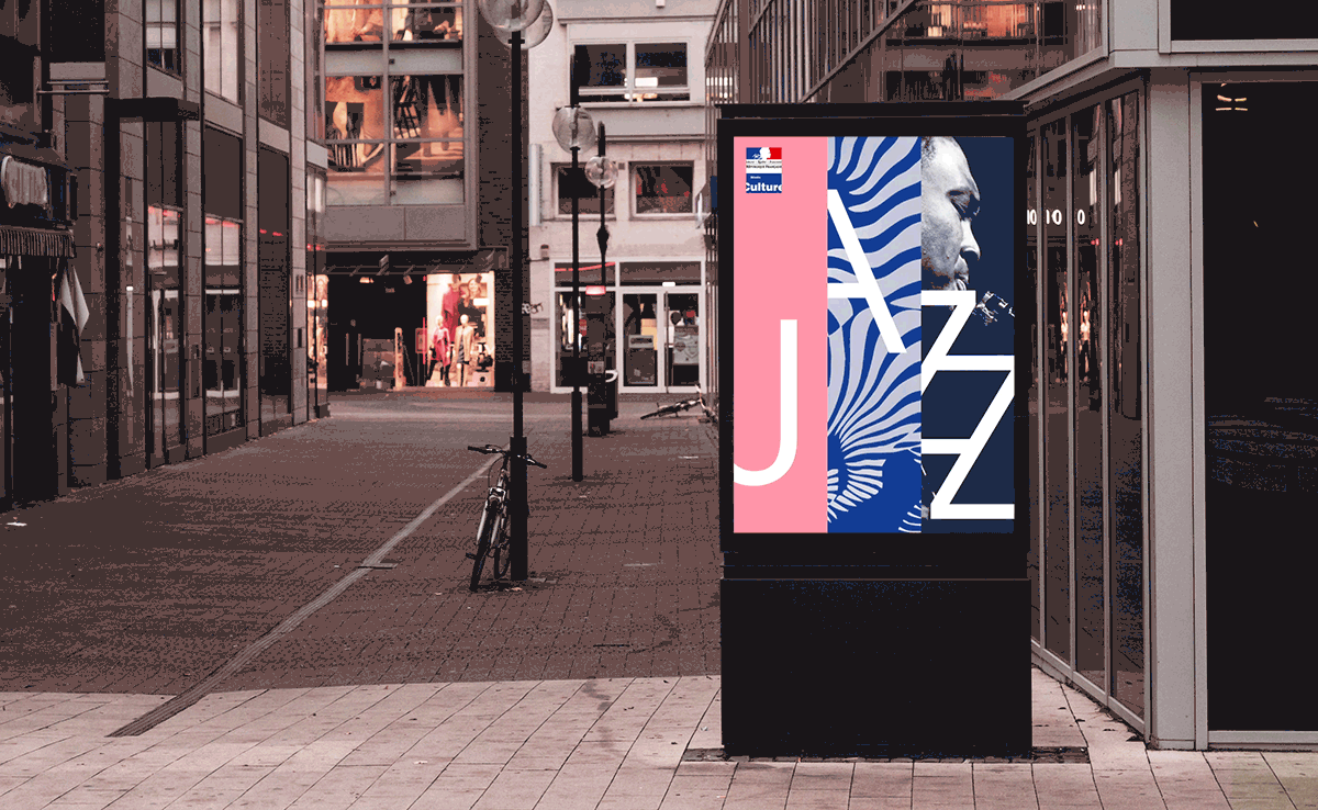
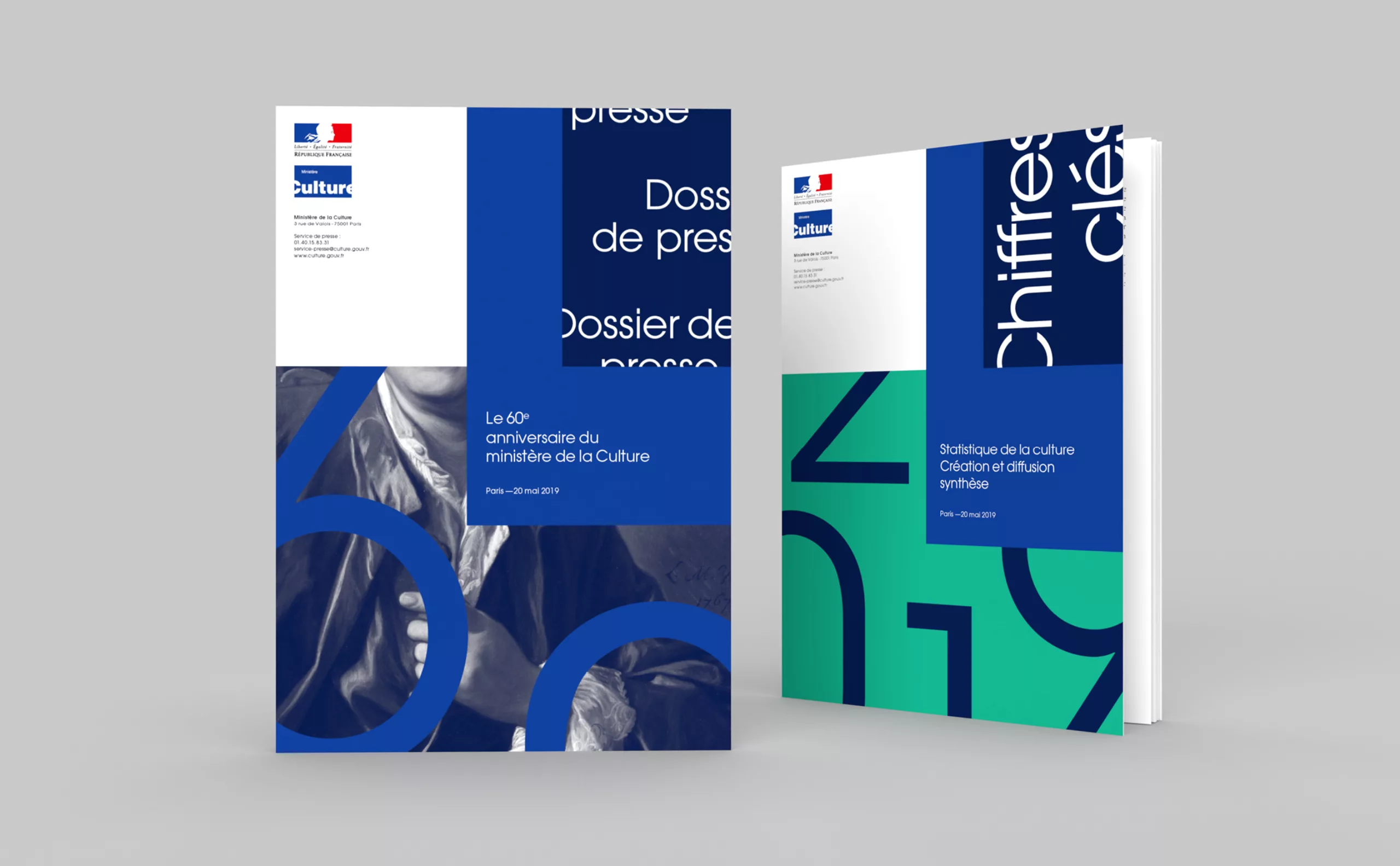
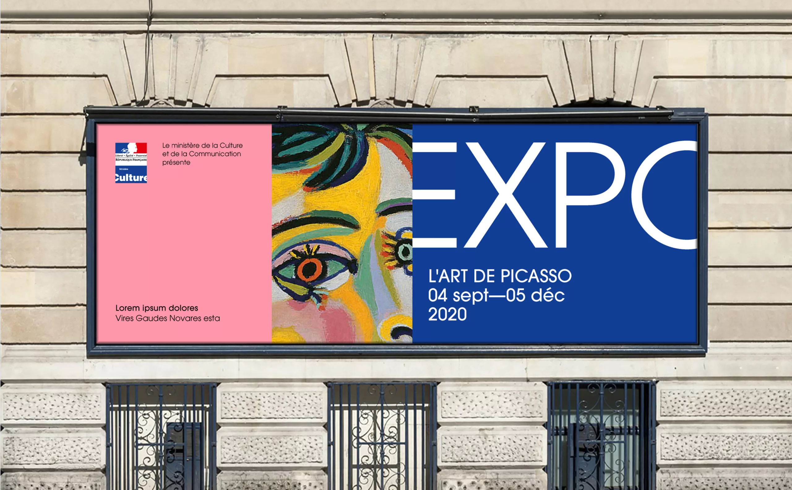
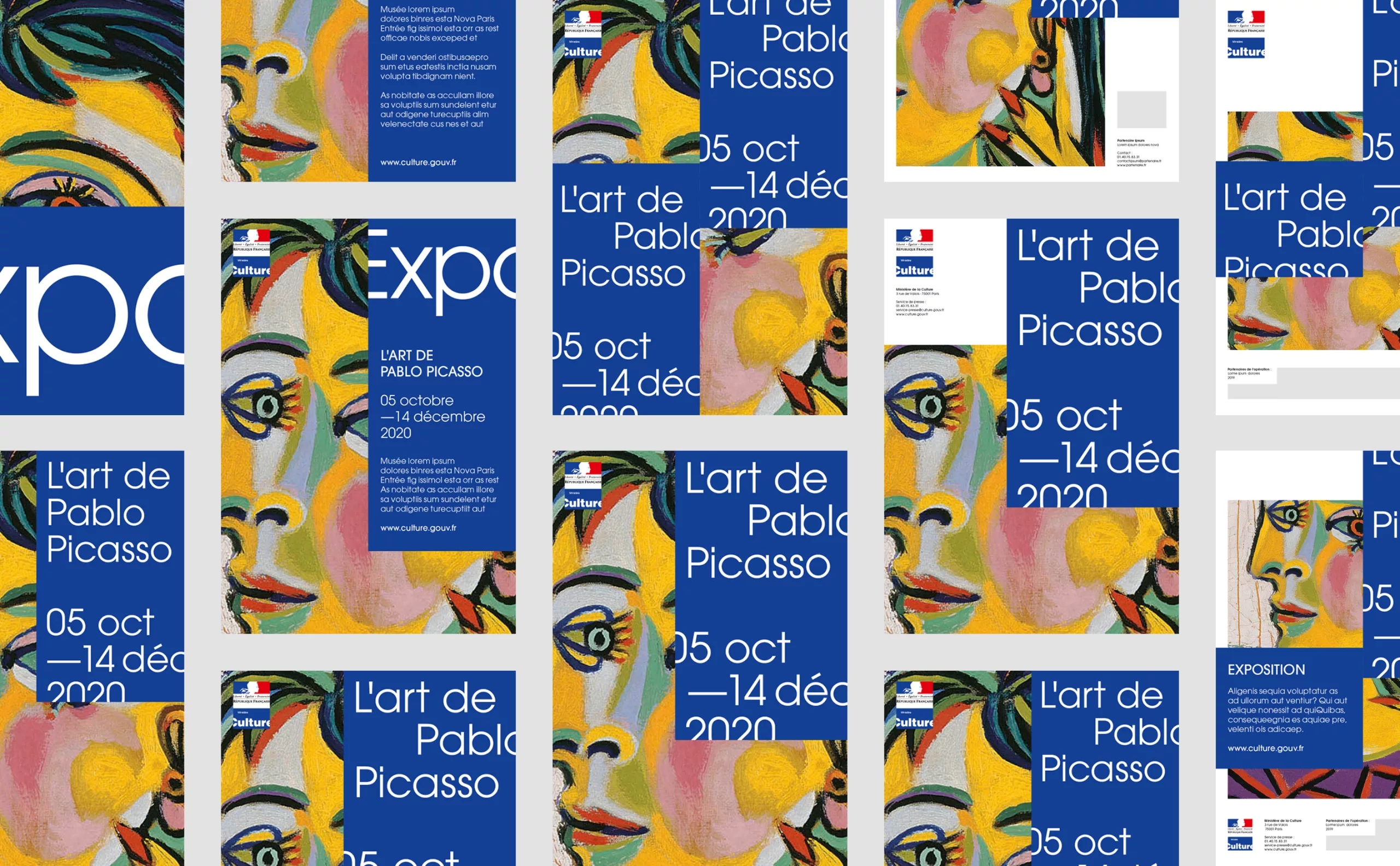
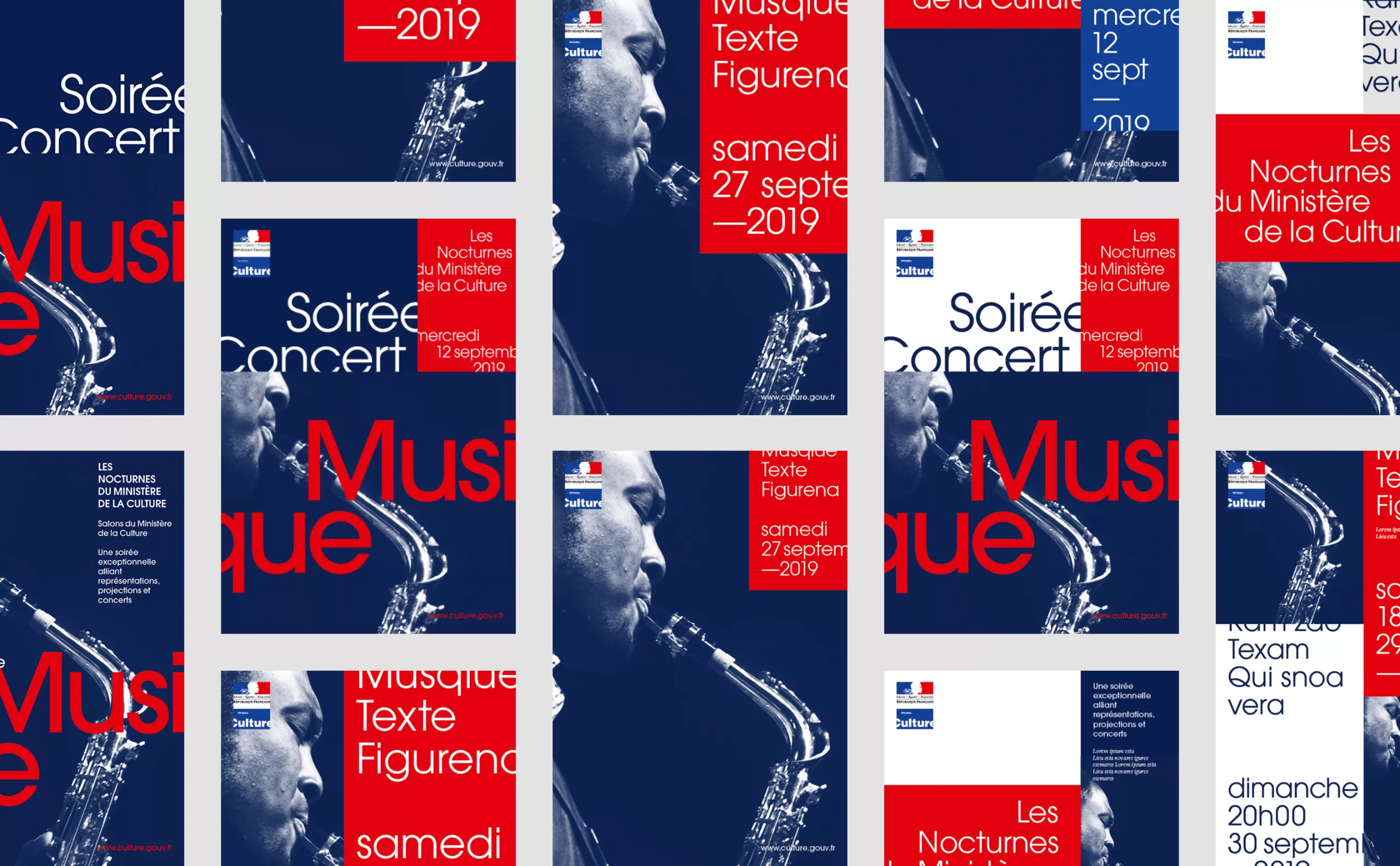
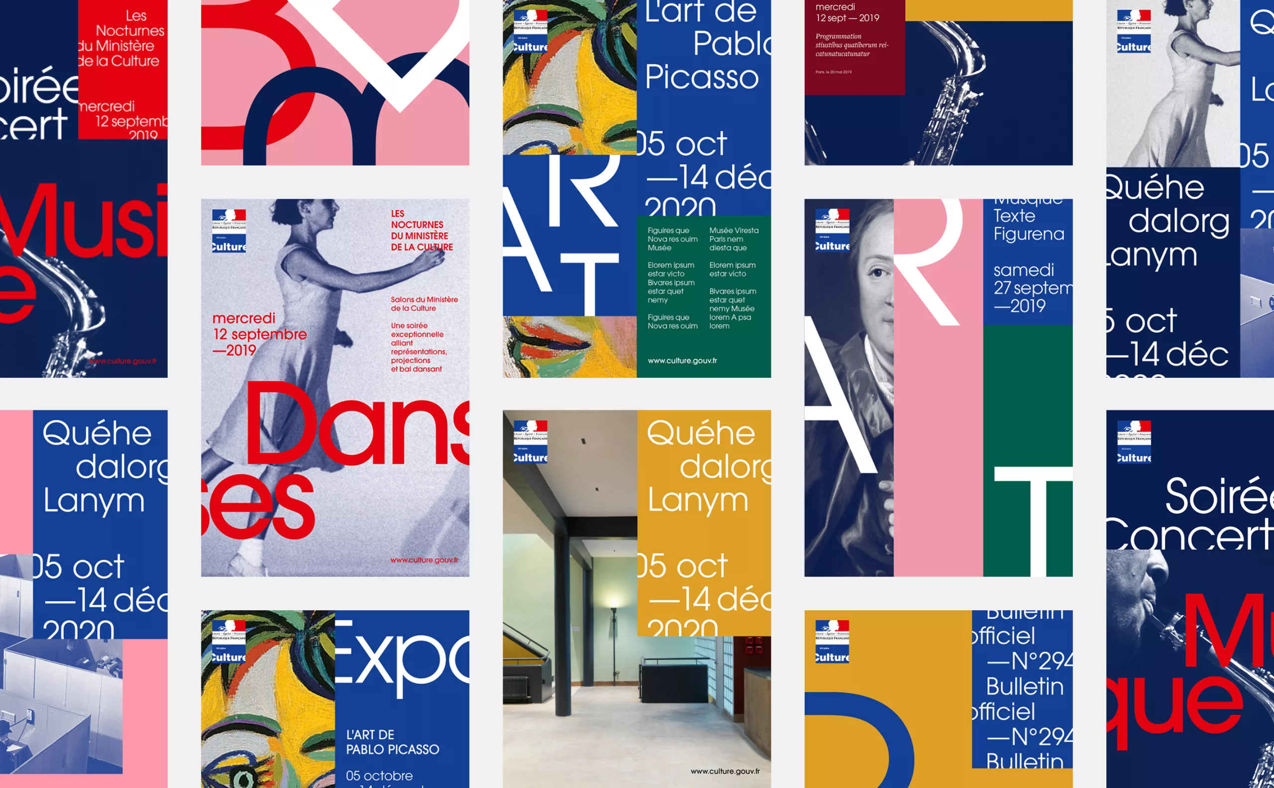
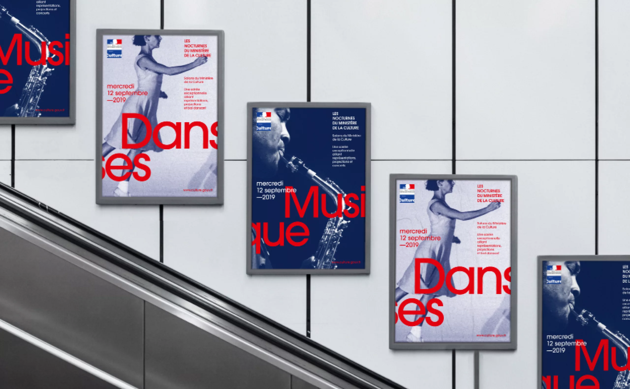
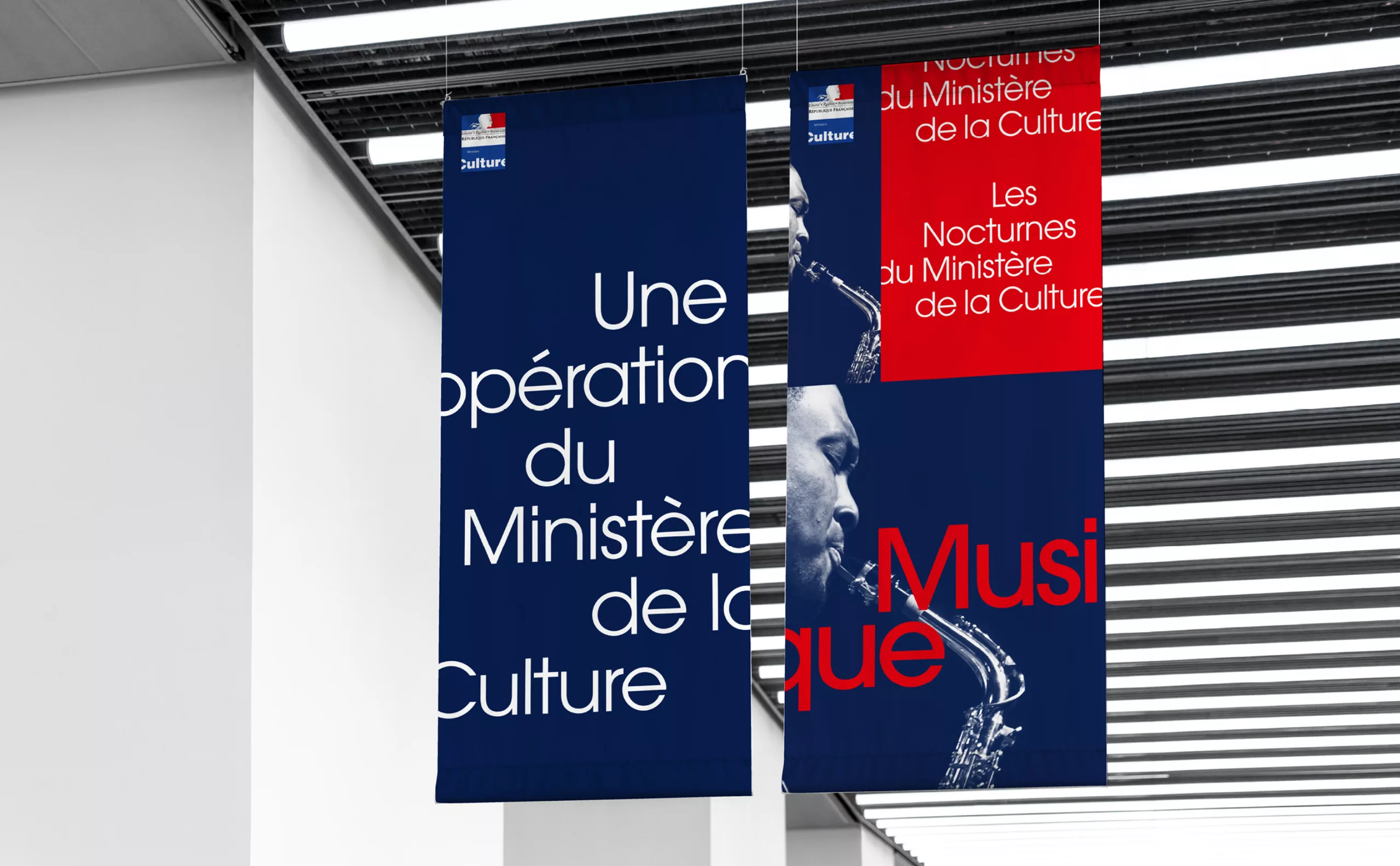
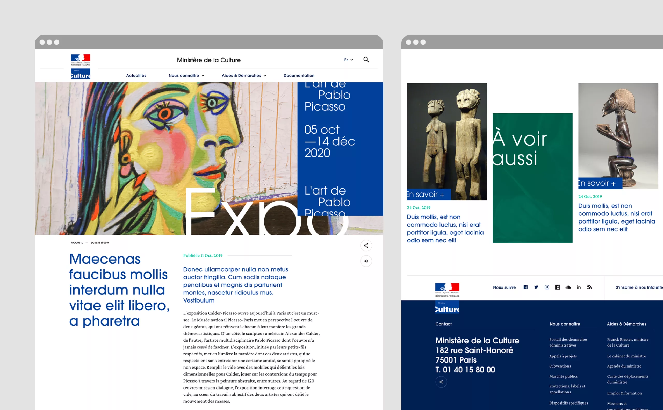
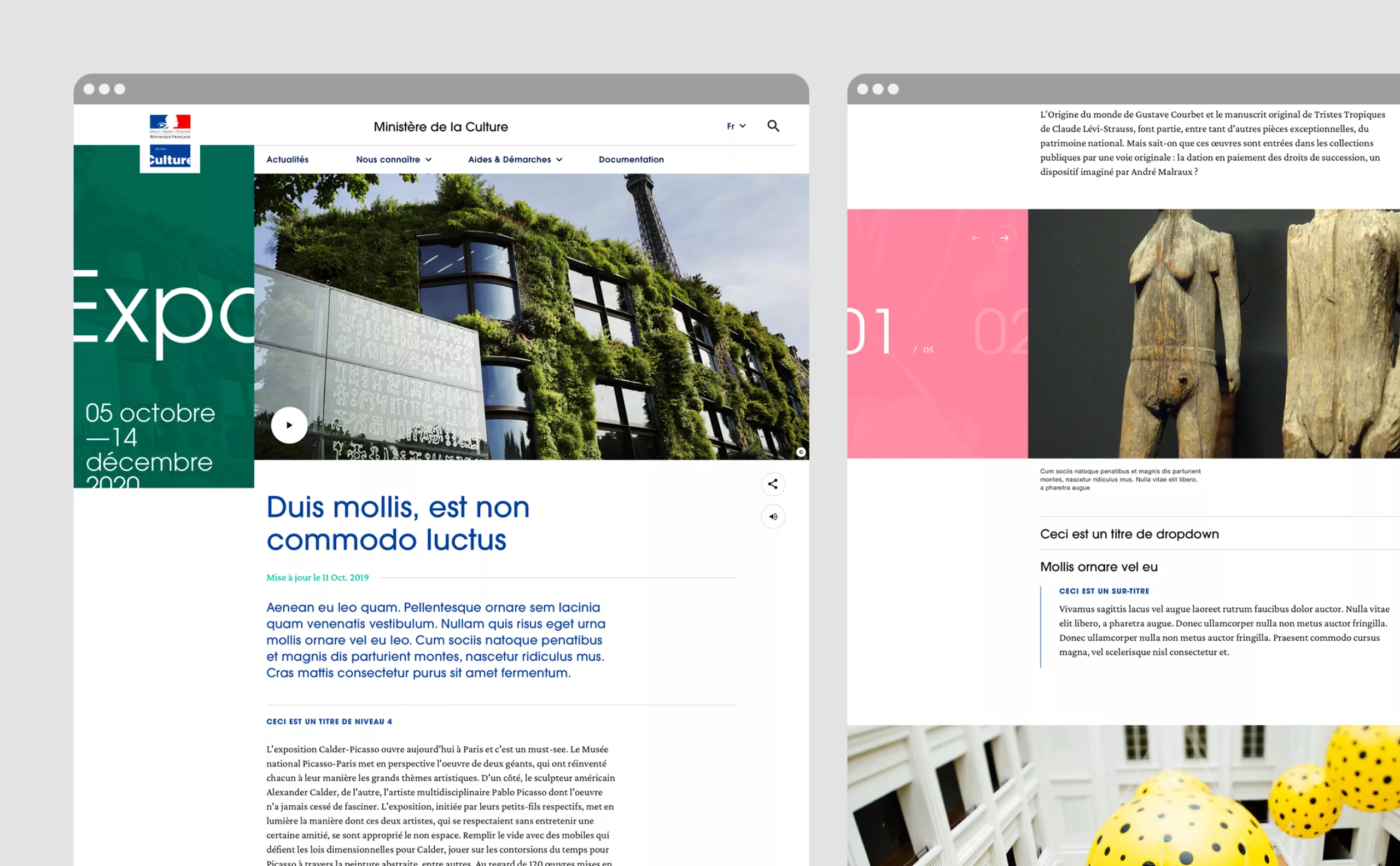
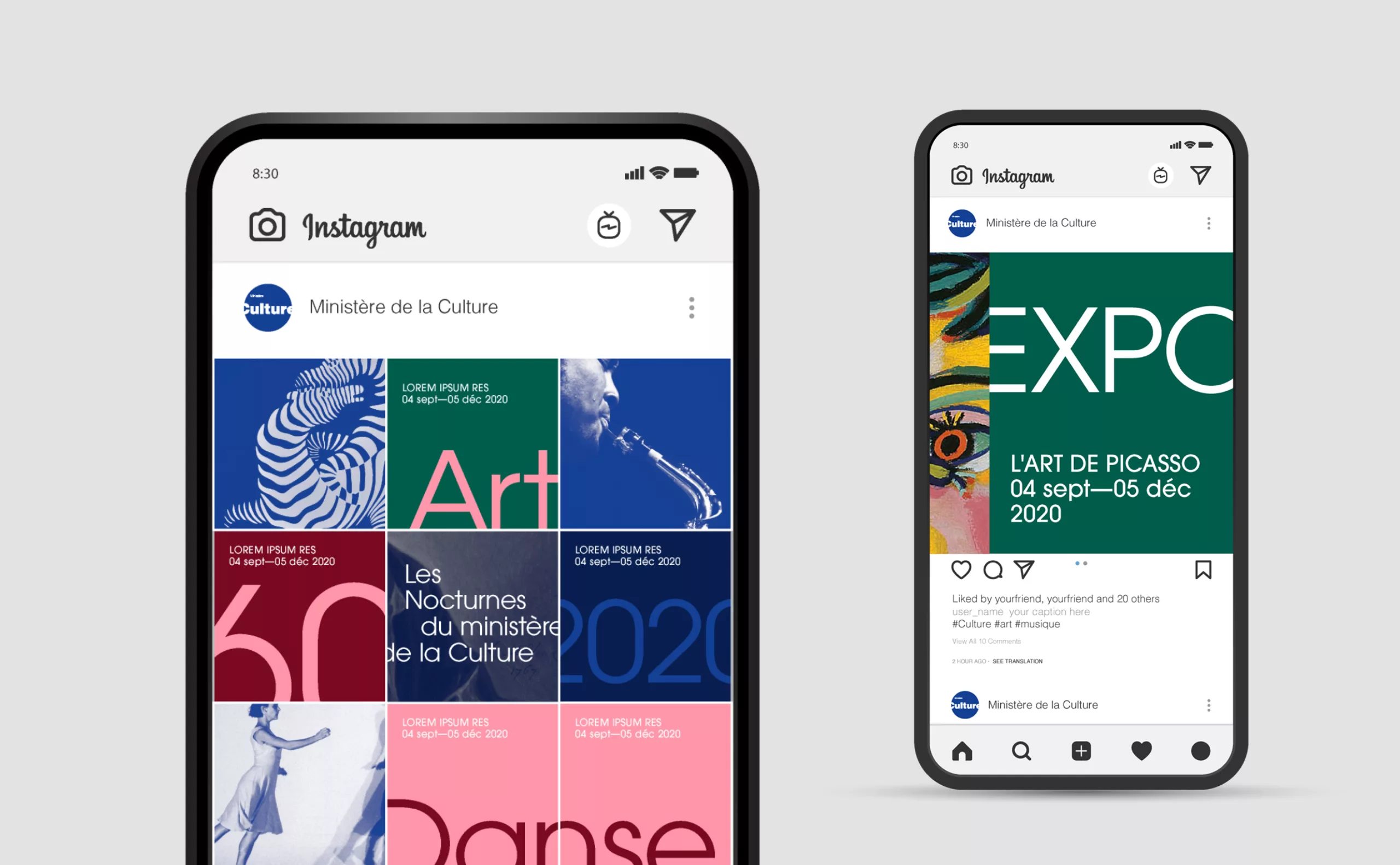
If the blue rectangle represents the institution (the frame), then the word "Culture" is an opening, an off-field that invites us to think, to dream, to desire...

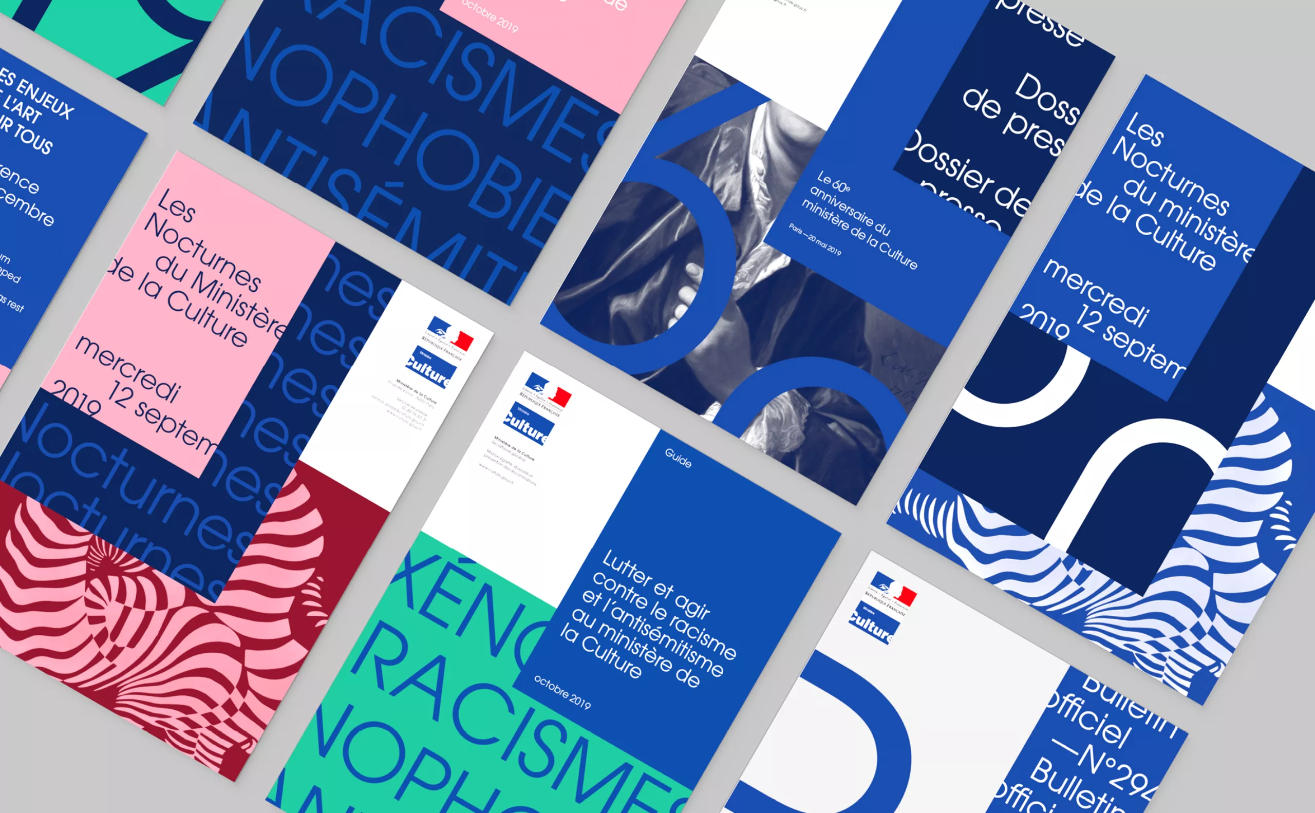
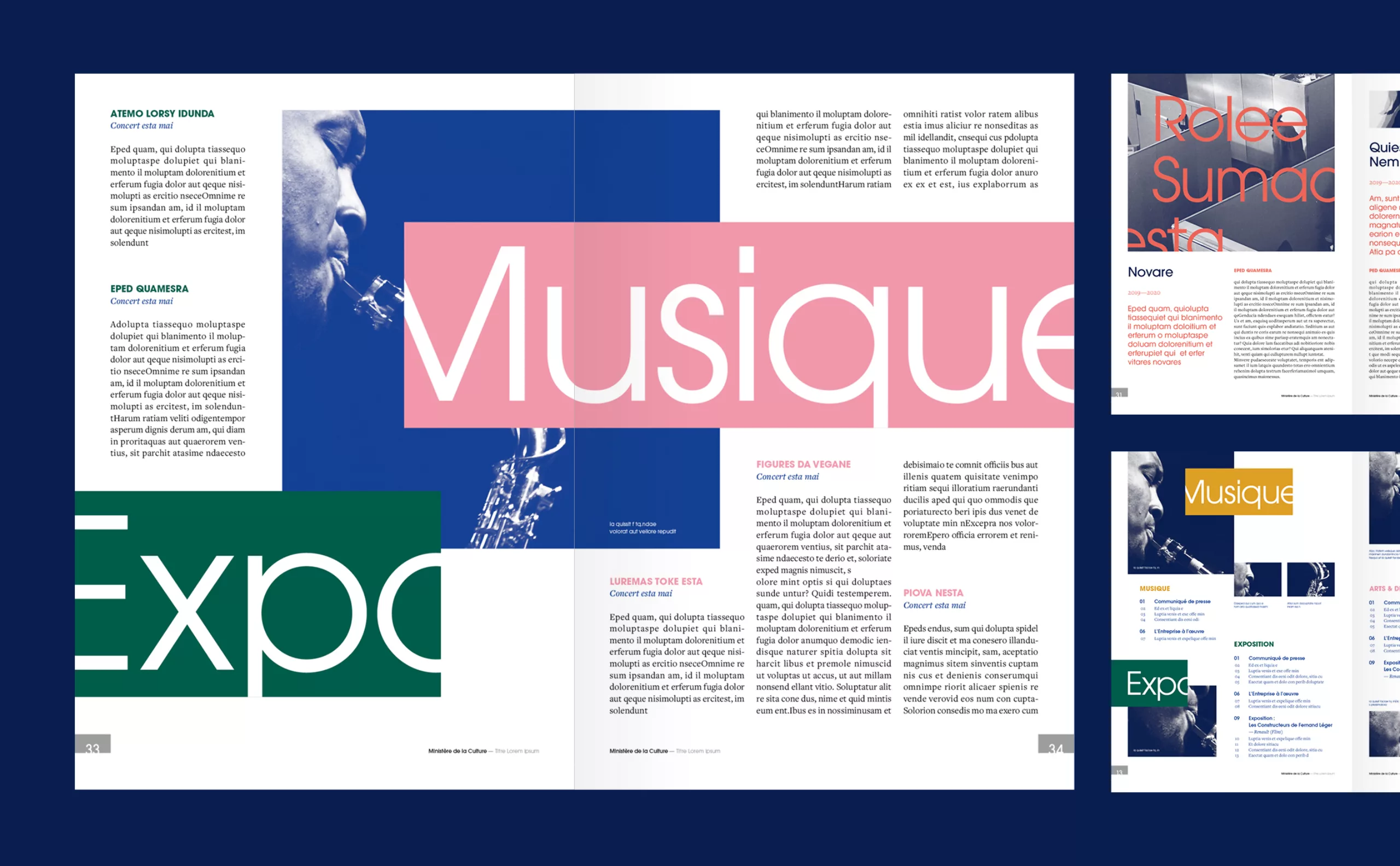
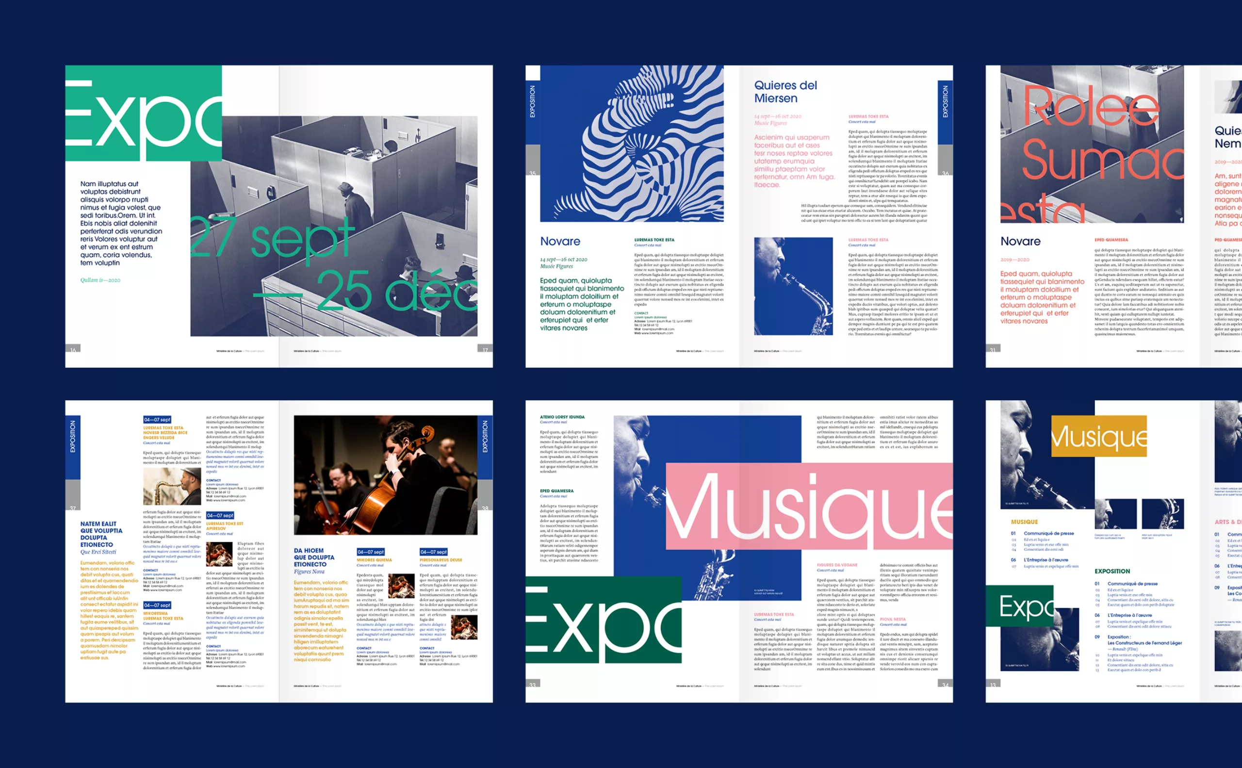
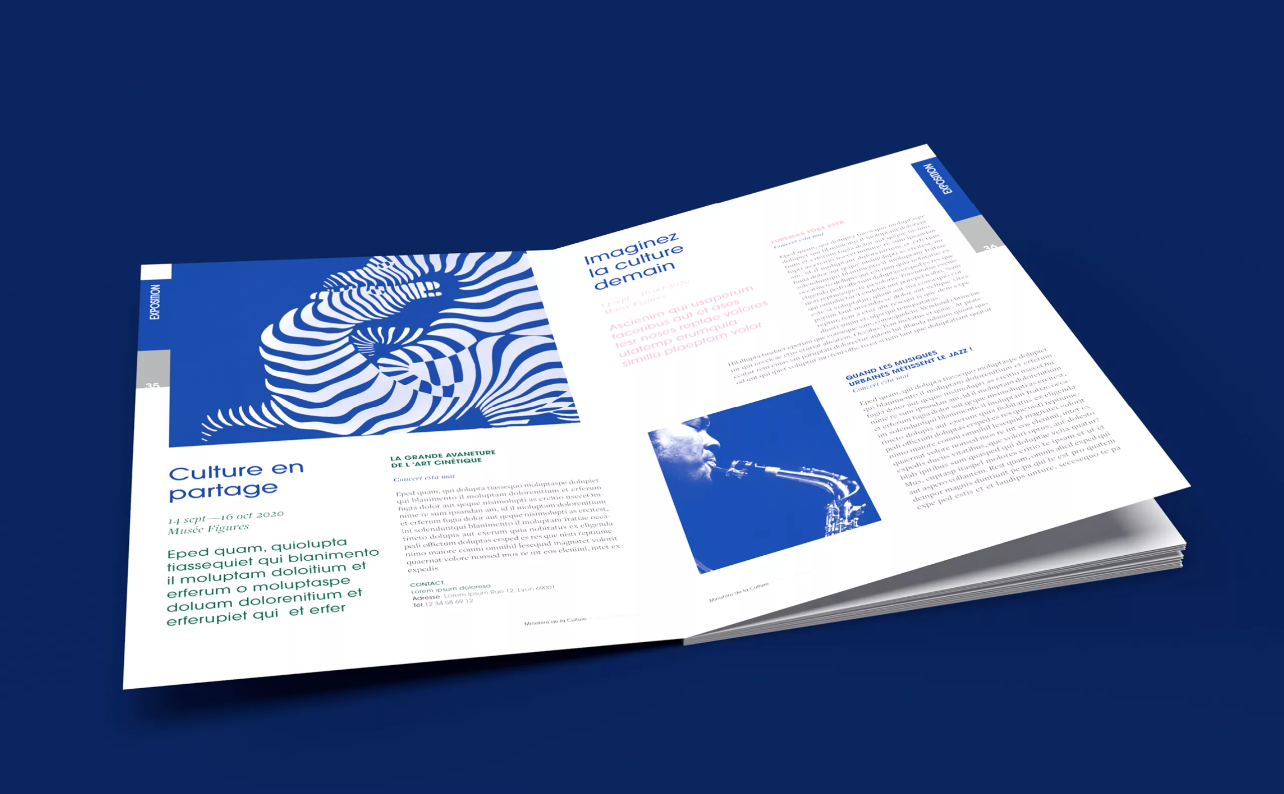
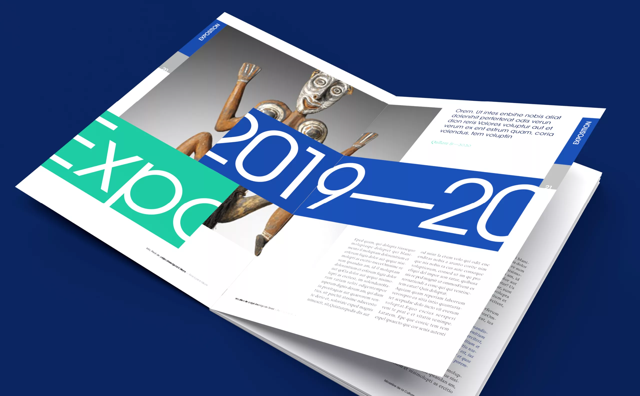
The idea of the movement

The frame, the picture and text have moved, "something" is happening! This compositional artifice places the institution in a logic of action, of movement.

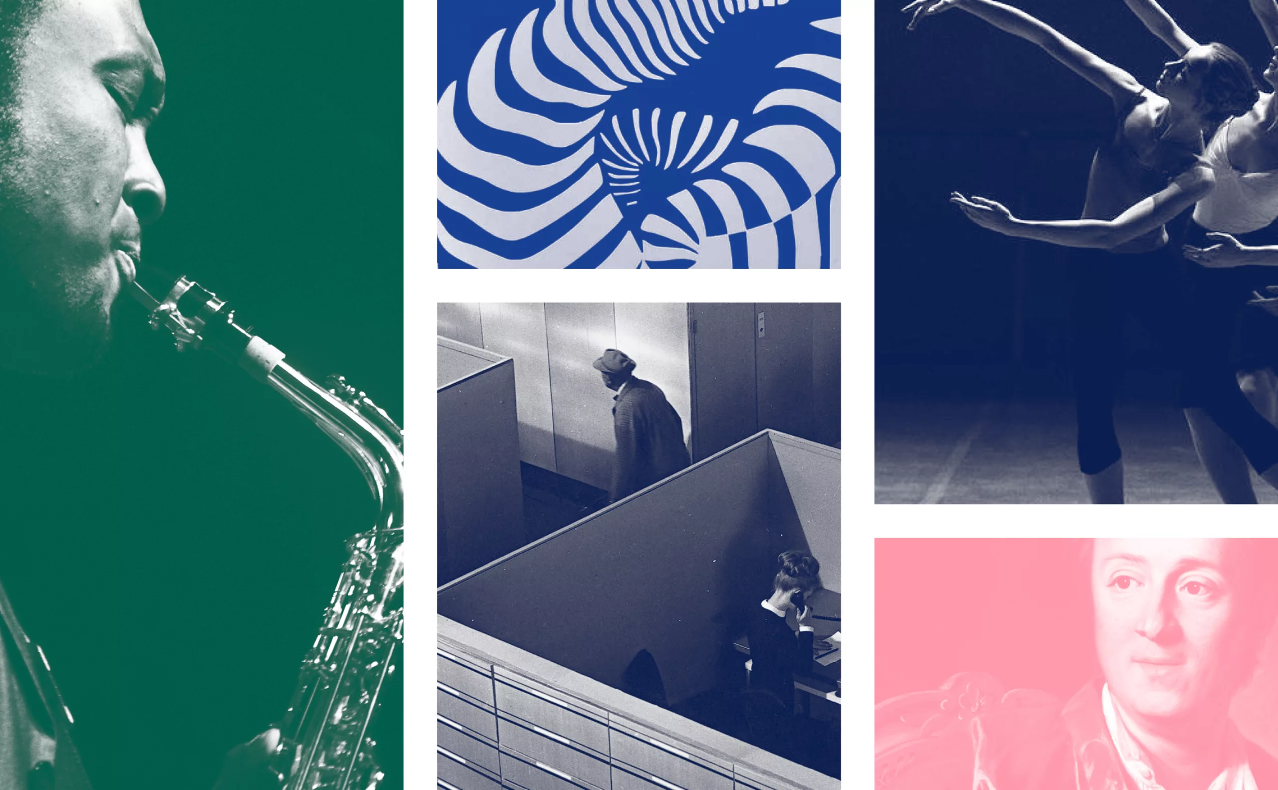
Feeding the imagination

Intentionally choosing off-centre images and overflowing text helps to arouse curiosity. The image is a "call" which "meaning" is not delivered immediately. The reader is invited to imagine what happens next and must, in turn, do the "work of the mind". This is one of the missions of the ministry!

Non-conformist

By choosing not to "fit in", this graphic charter invites its future users to be "non-conformist". An unexpected colourful choice, a surprising framing or an unexpected break in a title. Each user is free to take the risk of surprising!

concept créatif charte graphique
Bloc titre Culture

Typography

The choice of the Avant-Garde was pretty obvious. In fact, in addition to its timeless modernity, we were looking for a typeface with a great x-height so that it would be easy to read when the letter is cut.

principe typographiques
Principe charte couleur

Colors

Color is an important aspect of the project, especially the harmonic principles. A bit like in music, the idea was to be able to compose chords, without falling into the ease of major or minor chords, which are too basic. The idea was to look for more complex chords, a bit like with 7th chords in jazz, we propose to play on unexpected chromatic gaps.

Traitement iconographie

Layout principles

Mise en page ministère de la culture layout design graphic
mises en page ministère de la culture branding
motion poster ministère culture Expo

Motion design

The video animation is a perfect extension of the idea of going out of the box. The movement makes the message appear or disappear, the framing tightens, the color changes. The work on the motion design and video template has been created with Cowbell studio.

motion poster ministère culture Jazz concert
Principe affiche animée ministre culture jazz

Publishing

Couverture brochure mise en page rapport
Editions ministère culture

Posters

affiche exposition street
affiches musique danse métro
kakemono ministère
affiche musique rue
poster expo bache immeuble

Digital

Instagram réseaux sociaux

Webdesign

The UX design and digital art direction was carried out by our colleagues from the Rezo Zero agency.

Acknowledgements :

Thanks to Mr Franck Riester, Minister of Culture and Mrs Cécile Ozanne, Director of Communication, for having trusted us. Thanks to Emmanuel Boutier, artistic director in the communication department, with whom the collaboration was a real pleasure, both humanly and professionally.

Thank you to Dorian Bardavid, Head of Digital, and to our colleagues at Rezo Zero for their fantastic work on the digital part. Finally, thanks to Philip de Canaga and François Cauderlier from the Cowbell studio for the motion design part.


Share this project:
Project expertise:
Website and social media design. Publishing design, creation of magazine and brochure layouts. Logo creation, visual identity and graphic guidelines. Motion design and video creation.
Type of client:
Cultural communication agency for theaters, concert halls, festivals, dramatic and choreographic companies. Heritage, museums & cultural spaces.

Related projects: