unaf_case-study_01

2019

The Unaf Udaf Uraf network has a new common logo:
A unifying identity to highlight their actions across the national territory

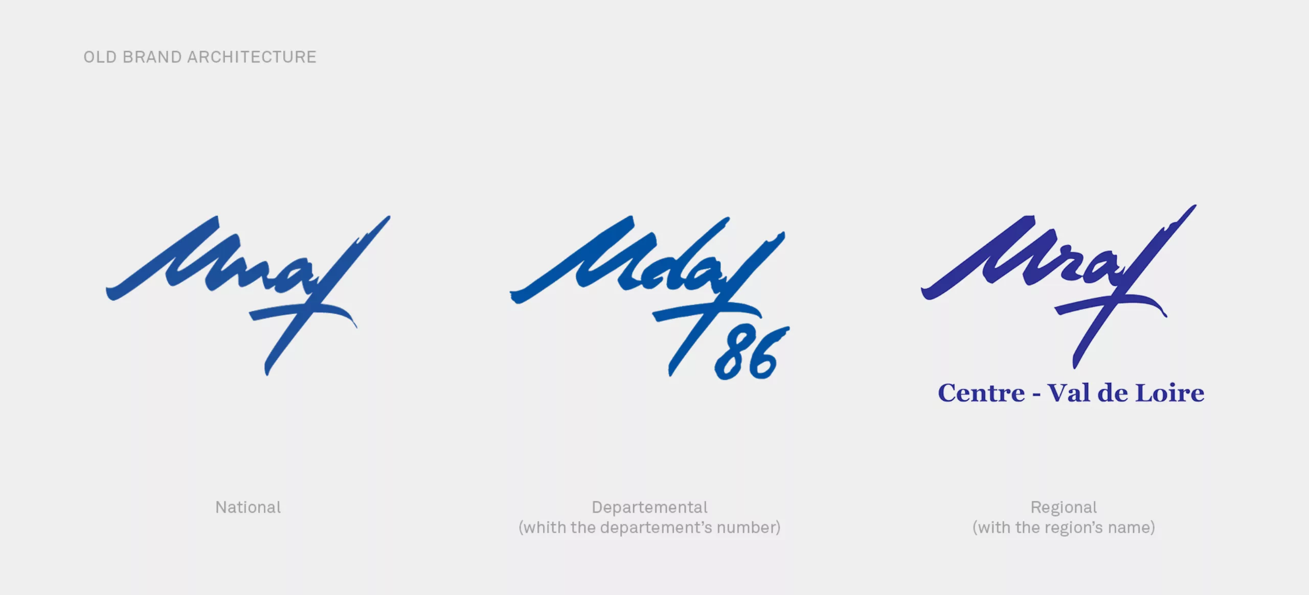
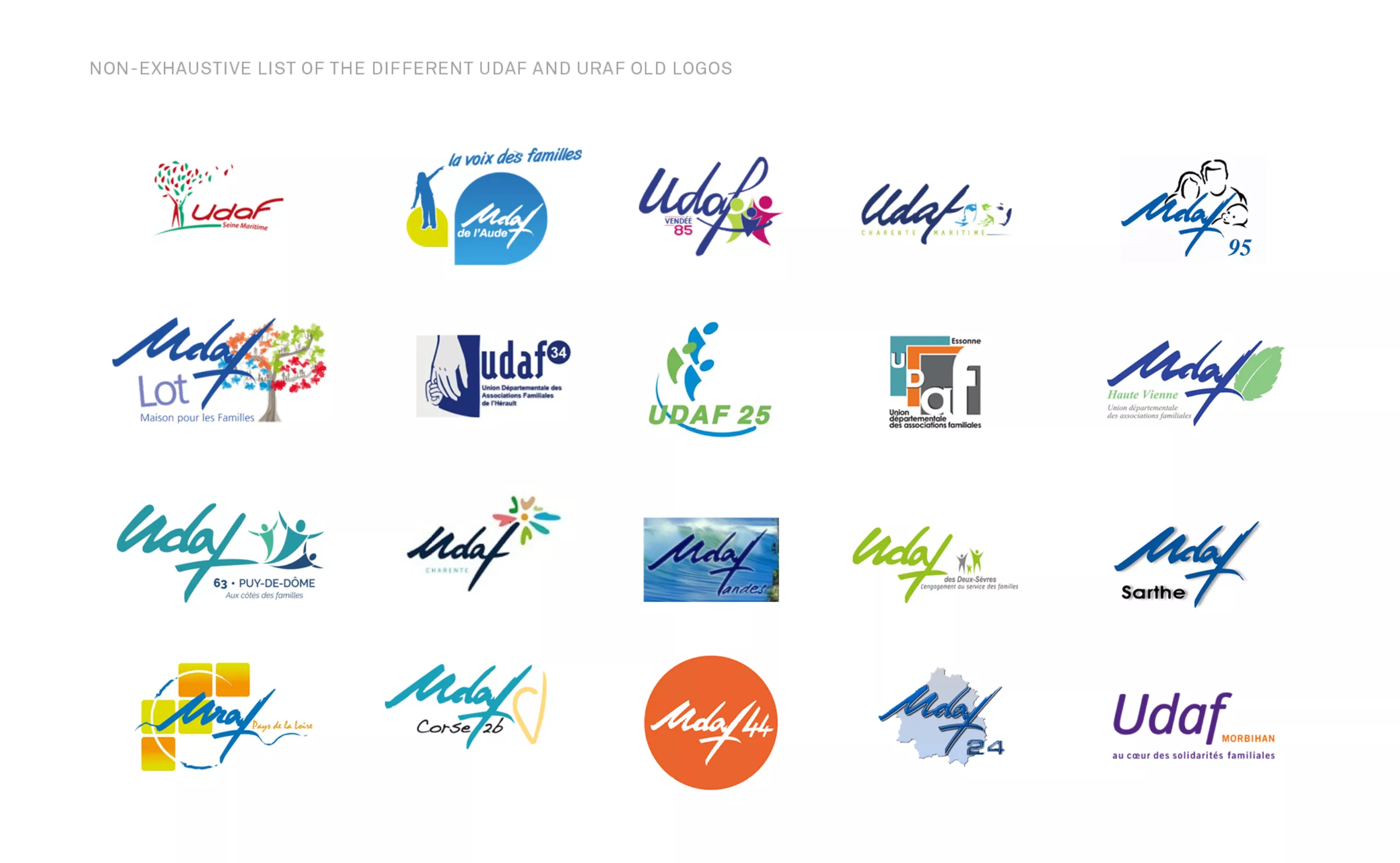
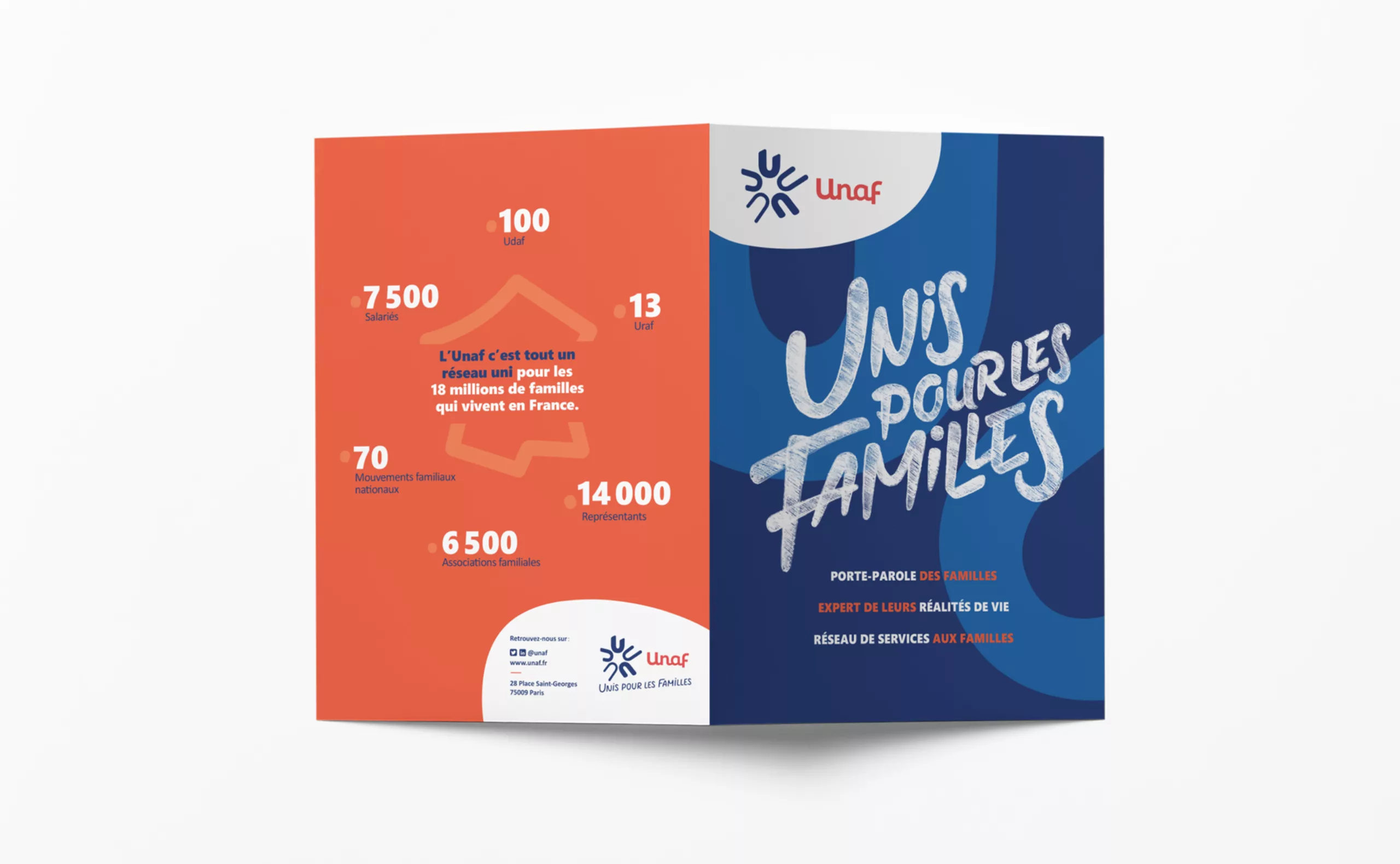
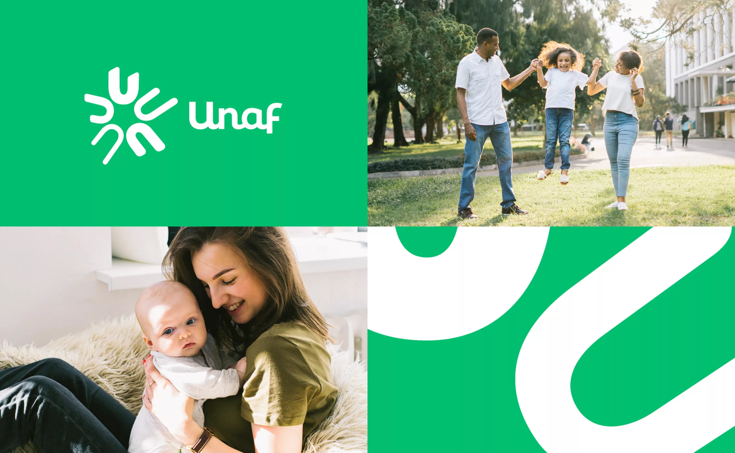
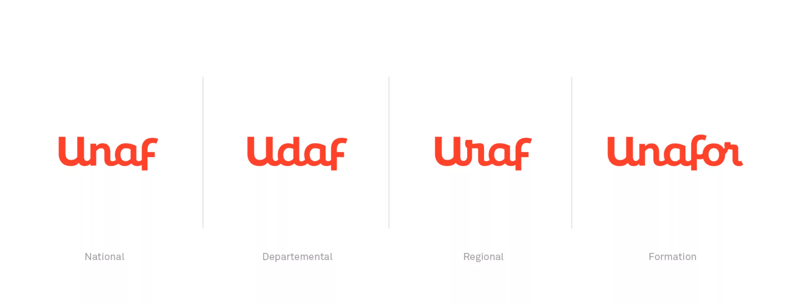
Unaf is an institution committed with and for families since 1945, is the expert on the realities of family life. Recognized as a public interest entity, it is the official spokesperson for families with the public authorities. It represents and supports the 18 million families living in France and defends their interests. A pluralist organisation, it brings together 70 family movements and 6,500 family associations of great diversity. It coordinates the network of Udaf and Uraf, which carry out missions of representation and providing services to families in each department and region.

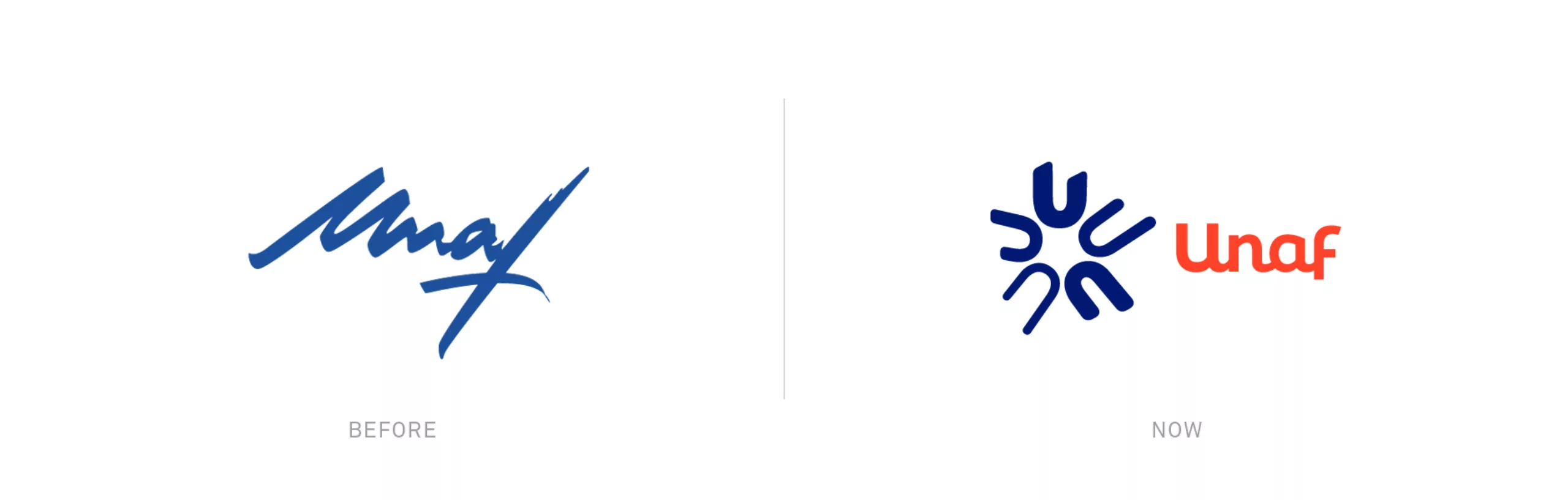
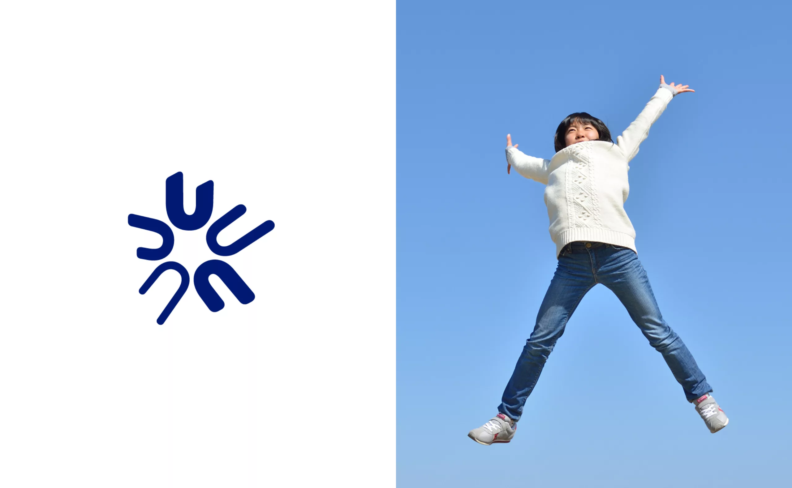
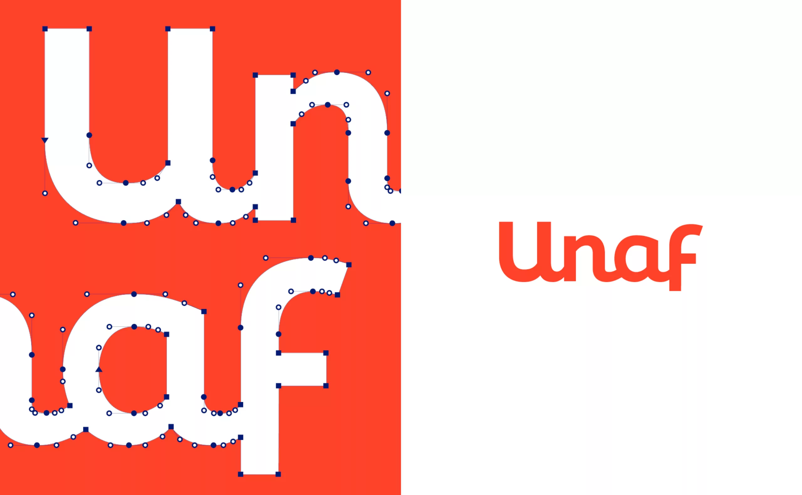
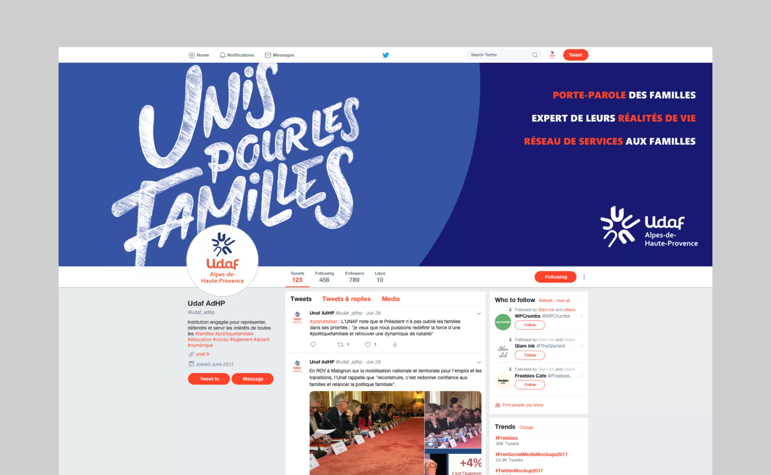
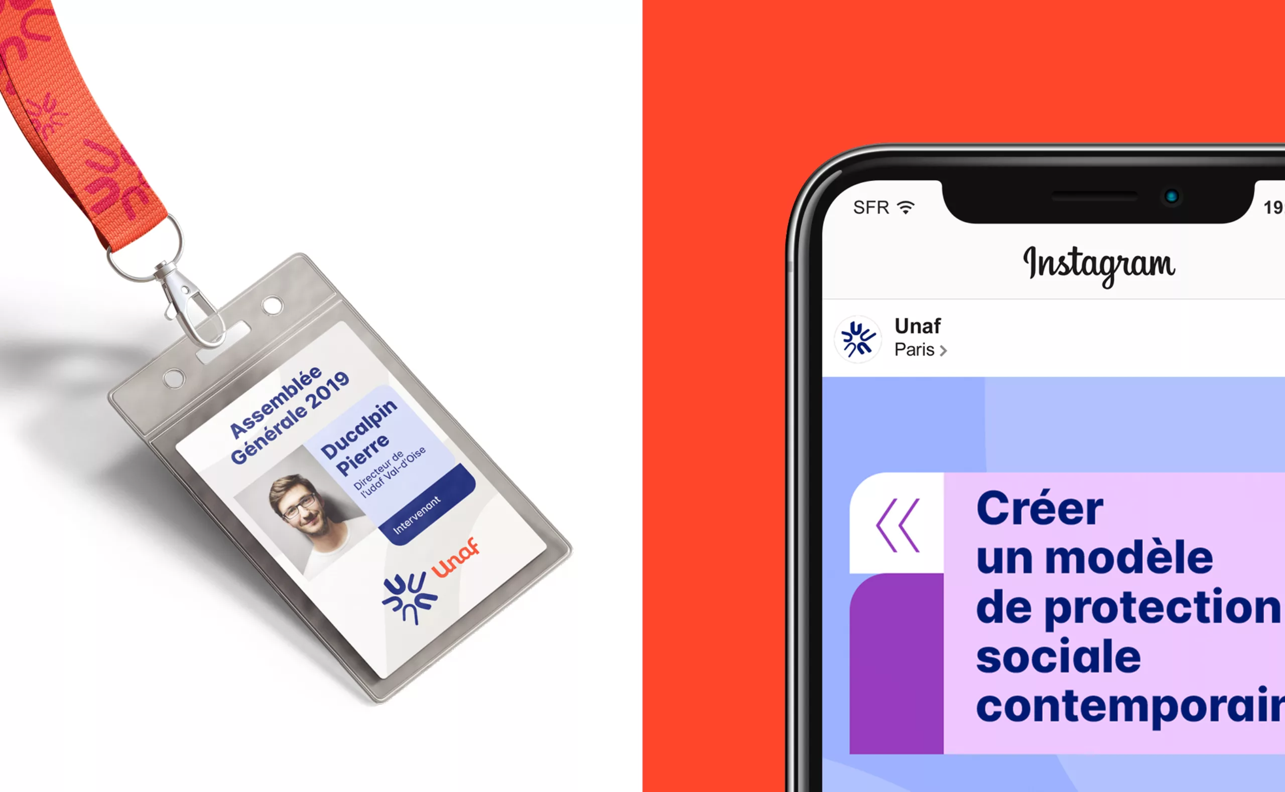
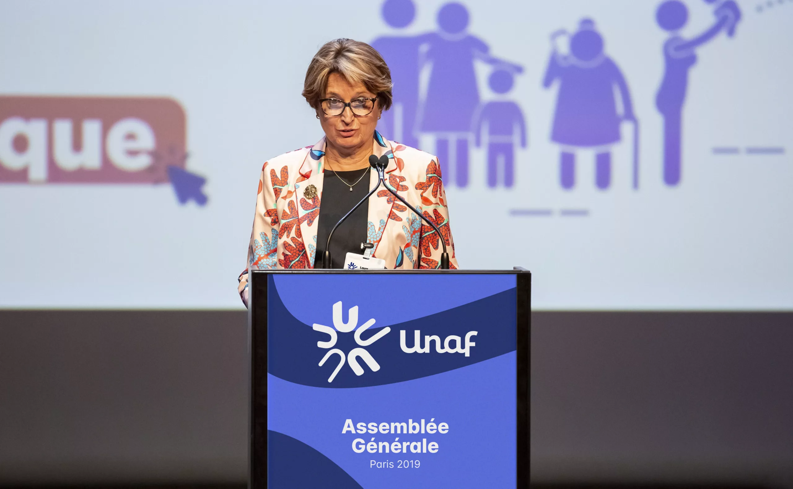
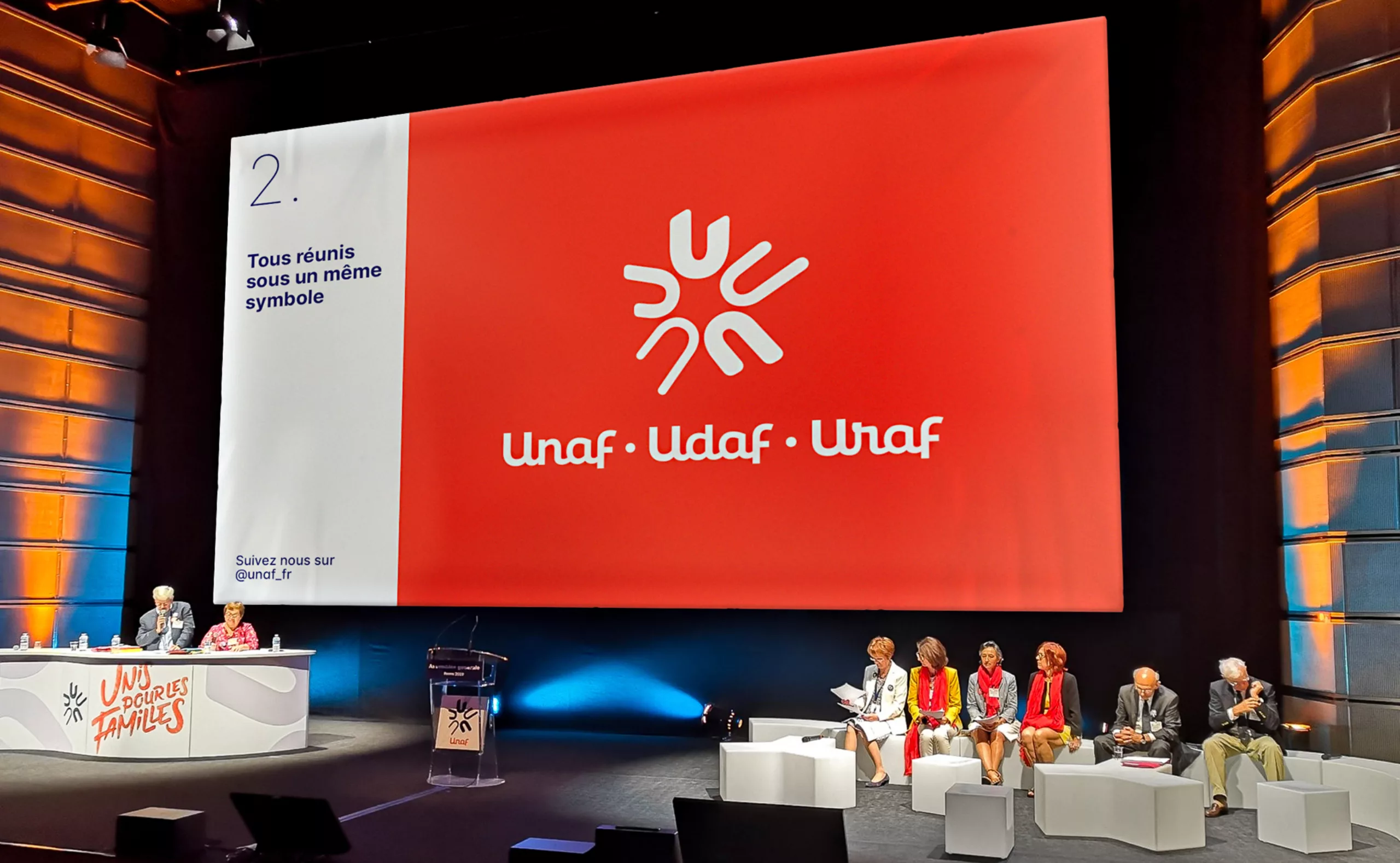
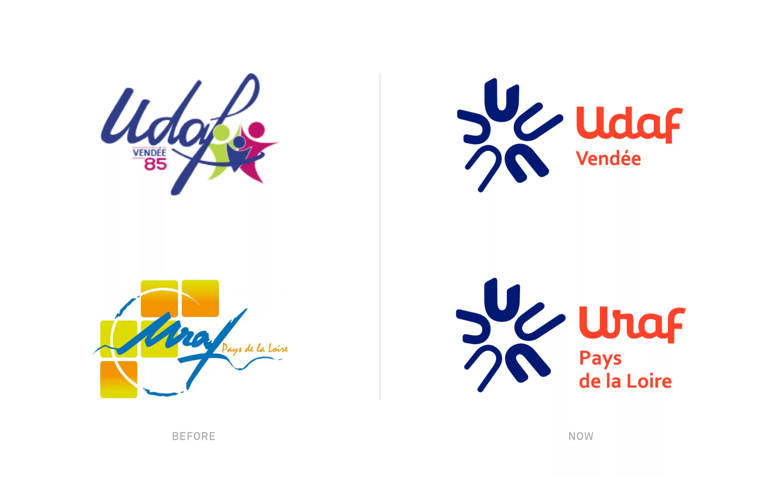
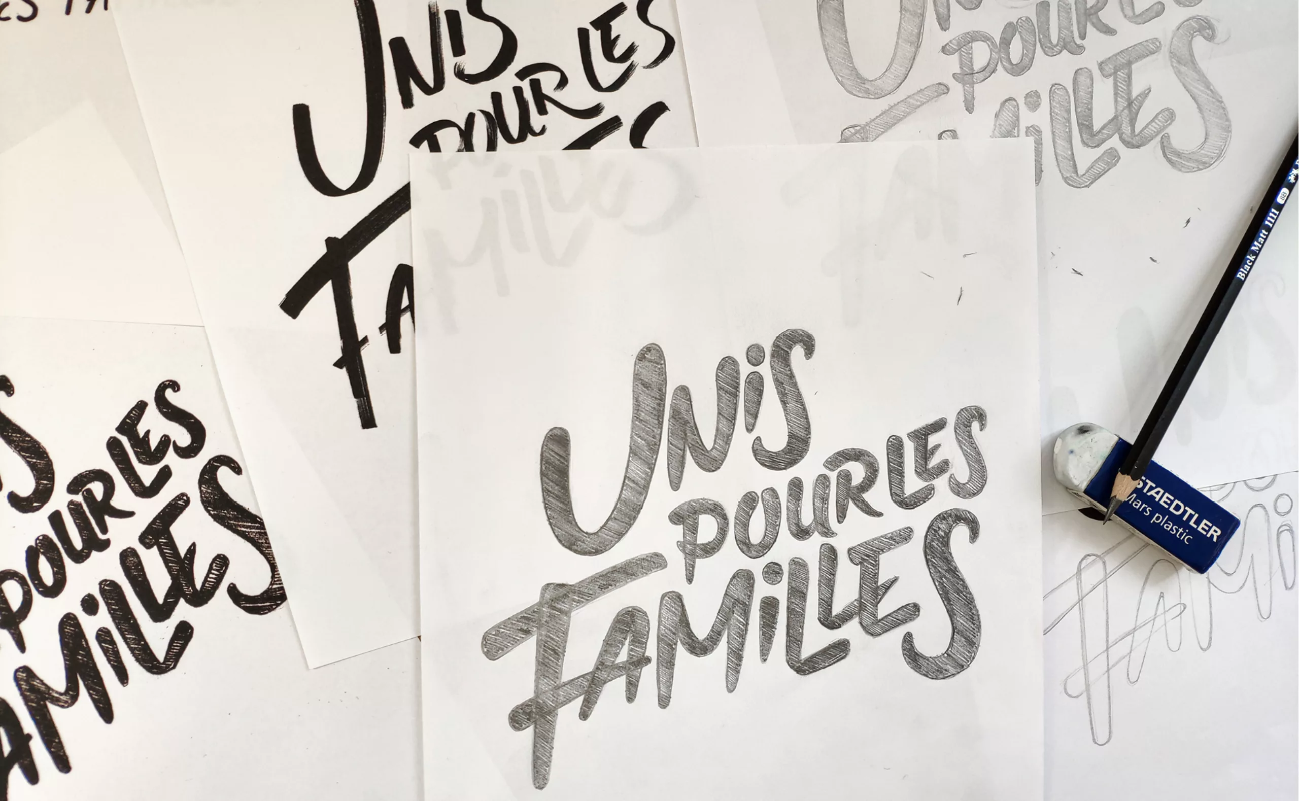
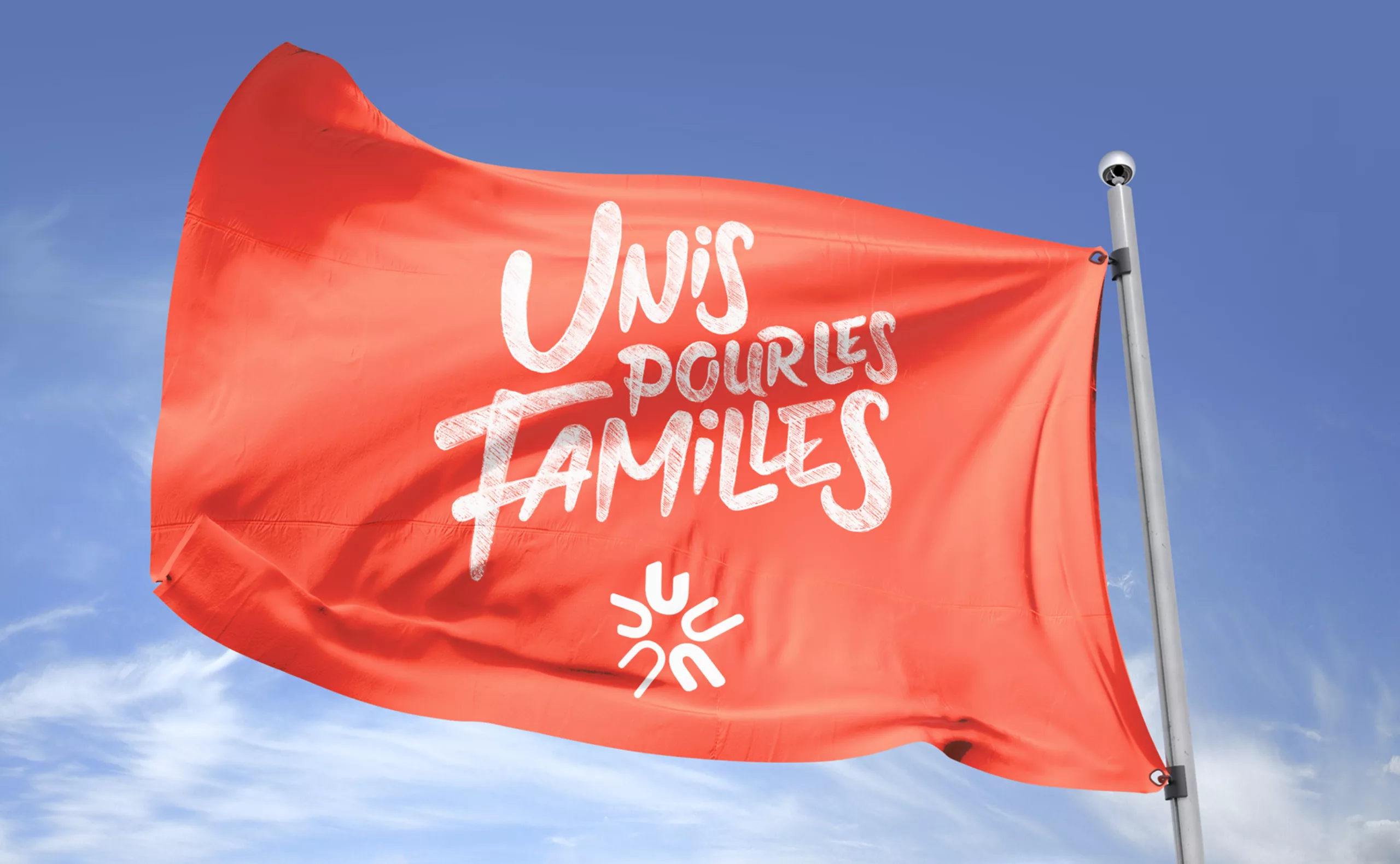
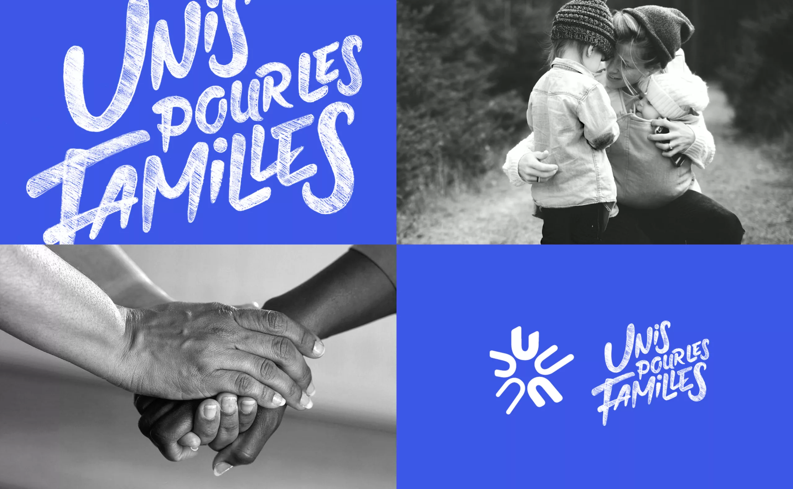
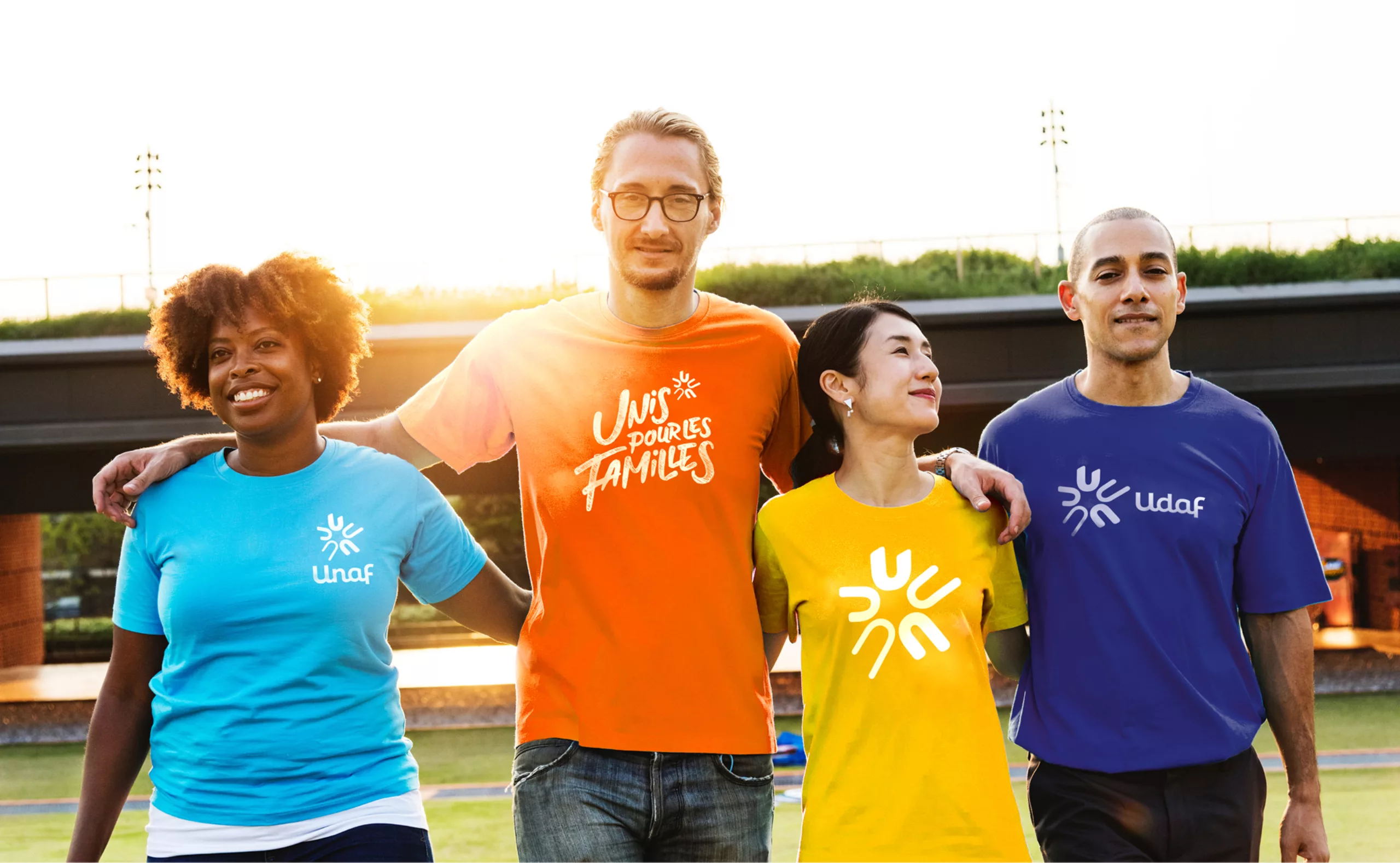
On June 22nd, 2019 in Reims, France, the Unaf Udaf Uraf network unveiled its new visual identity at its general meeting. At the end of several months of collaborative work, the network adopted a new common logo to assert its identity better and highlight its actions geared towards public authorities and families. Unaf's new logo is deeply rooted in the humanist values of a network born in the aftermath of the Second World War. Being revitalised and adapted to digital communication media, it is in line with the aspirations of today's families.

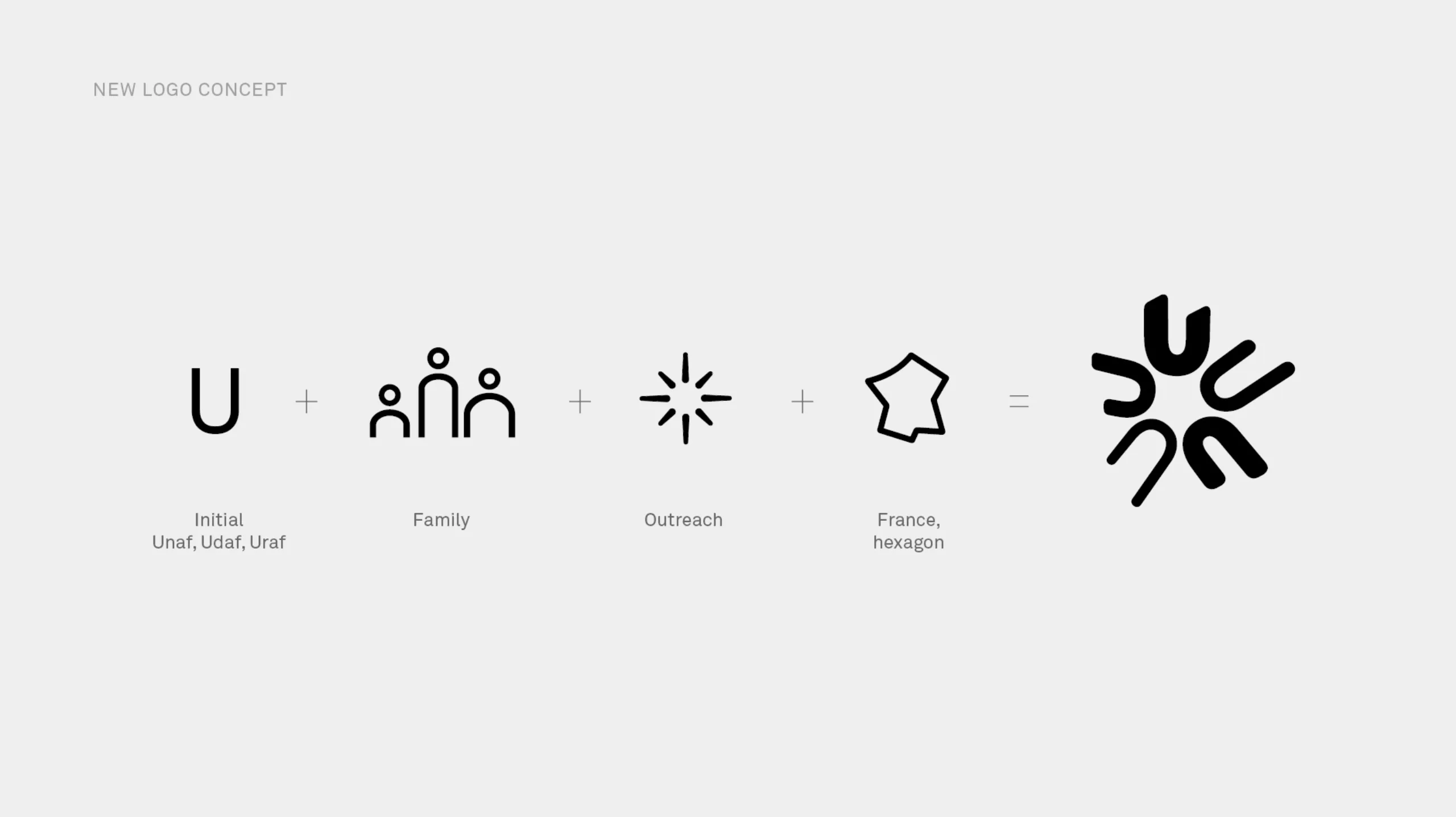
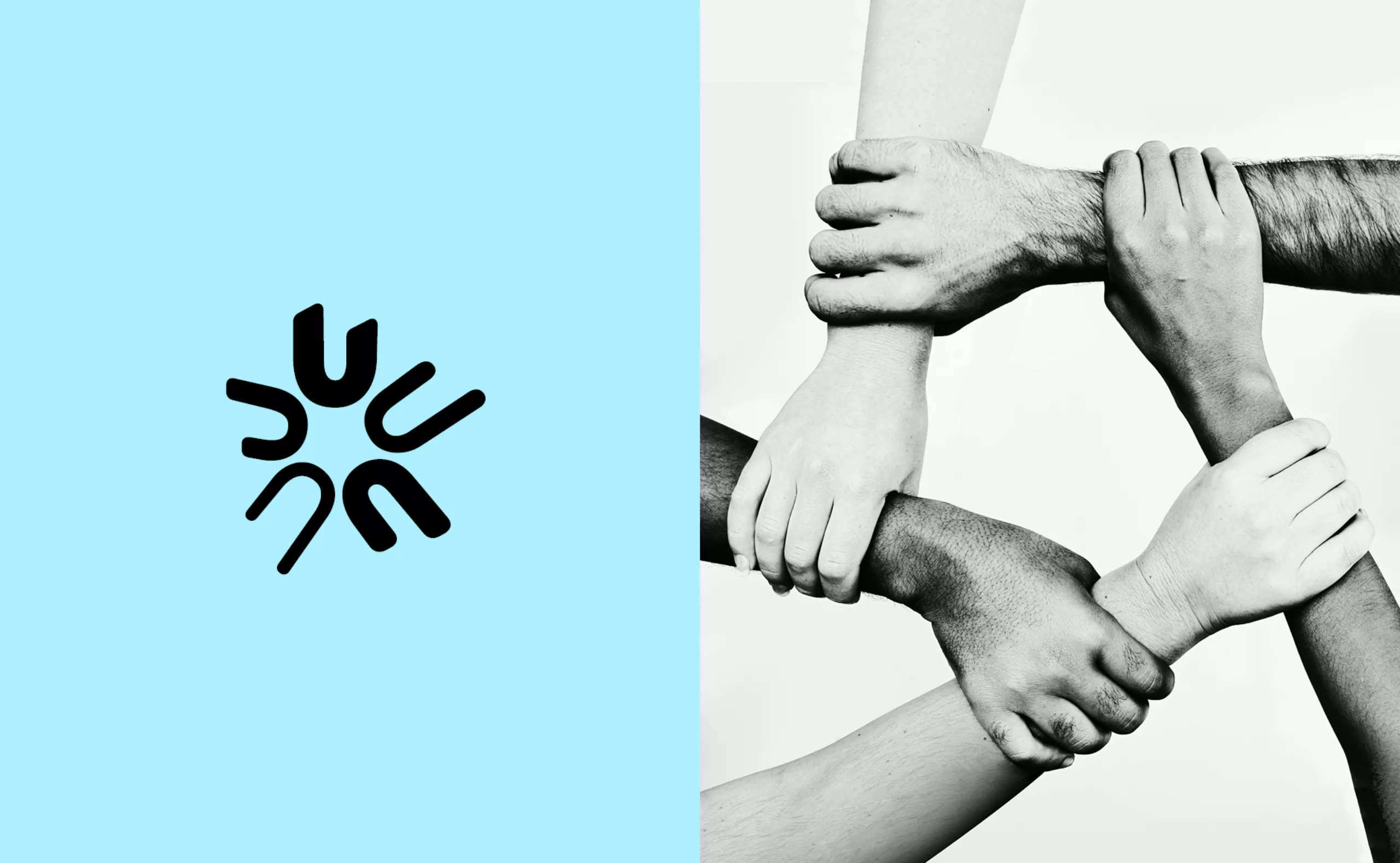
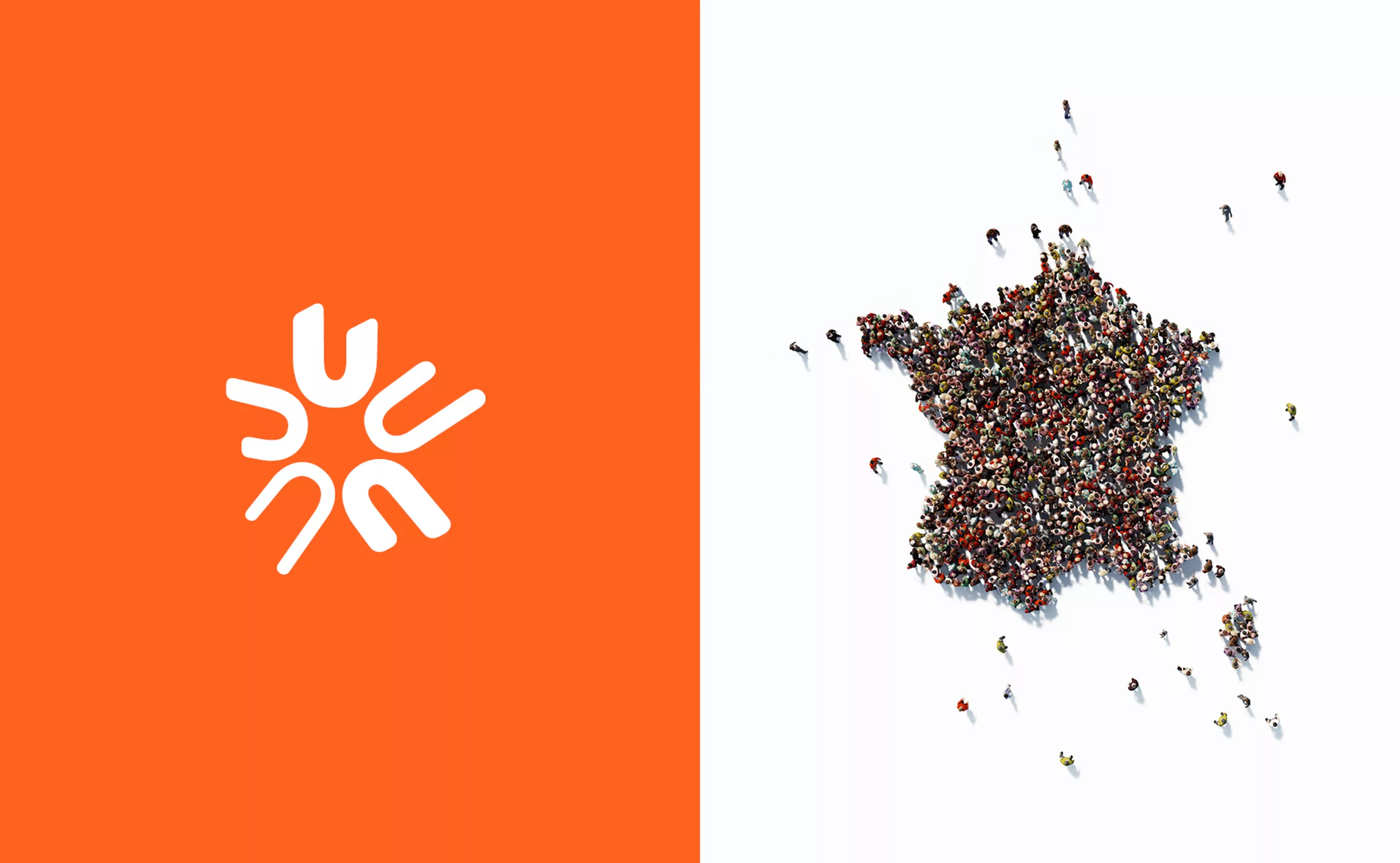
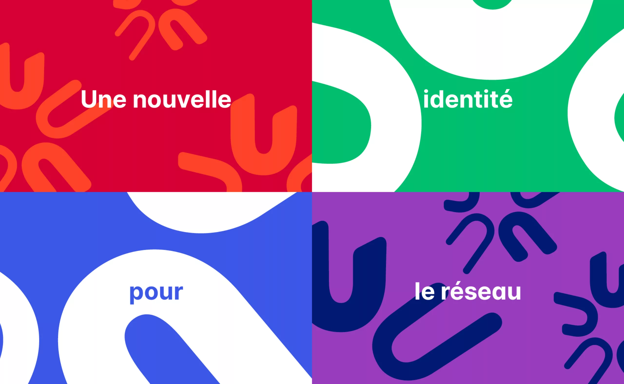
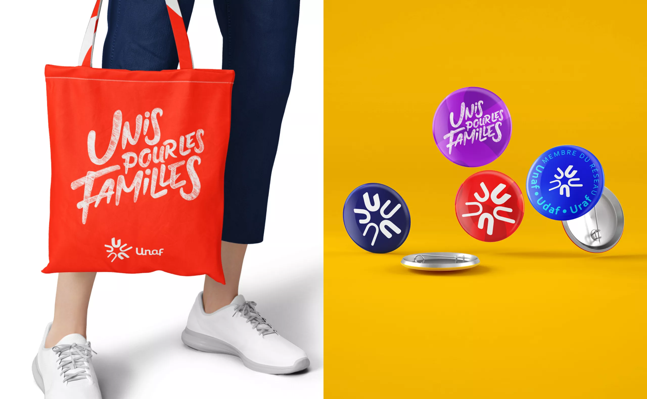
The new emblem symbolises the union of unions, France, the influence of the institution, the diversity of the families represented and the pluralism of the member associations. The slogan confirms the common will to improve the living conditions of families, « United for families ». The network now shares a common design language which showcases the connection that unites the members of the network all over the territory.

Uniting the entire network around a logo that conveys pride

The network lacked a common graphic charter and a visual harmony that would allow it to identify and strongly assert its organization.
Graphéine helped Unaf, Udaf and Uraf to modernize their aging visual identity and to reaffirm their common values. The aim was to unite them around the same vision.

The support of the entire Udaf and Uraf was essential to the success of this project. We deployed a didactic system of co-creation with the directorial team, the communications team and all the territorial representatives. Several working sessions were necessary to present the challenges of creating a visual identity and to analyse the problems of the logotypes in circulation.
These workshops and presentations made it possible to gradually define the course of the new visual identity in a collective manner. This was done by involving nearly all of those who support the network on a daily basis in this reflection. This method of collaborative creation has been a decisive asset in achieving the first step towards change: gathering everyone's expectations and uniting all the teams around a common vision.

A unique emblem to embody the diversity of families

In order to achieve the unity of the network, the visual identity now revolves around a common symbol, the round "U" that radiates. Unaf, Udaf, Uraf, United. This emblem is not figurative but evokes a universe open to individual interpretation. It gives each member of the network the opportunity to see their uniqueness or to translate their personal journey. It evokes the whole network, its role, its positioning, its support and its unity. These are all values that are found within families. This organized juxtaposition of U's also resembles the contours of France, the diversity of families and the institution's interventions.

Along with the colour blue we added a bright, luminous orange that reflects the combination of Unaf's institutional and social aspects. The visual identity is rounded off with the "United for Families" baseline. A signature that effectively reiterates the values, missions and accessibility of the institution. It is simple, direct, human and inclusive.
A "lettering" version of the "United for Families" baseline was created. Its script typographic style creates a direct visual link to the Unaf identity. It is a more illustrative and expressive version that complements the authoritative aspect of the logotype during the various institutional speeches.

The network is now truly united under one banner. A solar identity that embodies diversity to promote and defend all families.

A more modern and legible typographic design that retains the idea of the human link

The previous logo was based on a handwritten signature rendition of the acronym ‘Unaf’. This choice embodied the human and collective spirit of the institution. However, the final rendering posed problems of legibility and created an aging image of the network. Although it was dynamic, this design was unsuitable for the implementation of a brand architecture that could be used on digital media.

We have retained the cursive treatment of the typographical block. This makes it possible to present Unaf more as a name than as an acronym. This reflects the image of an institution more concerned with its closeness to its representatives than its statutory role. This graphic style, halfway between handwritten script and lead type, gives the block a strong personality. The new design of the lettering retains this human and connected style - through its ligatures - while improving the legibility of the headings.

As the acronym form of the name alone does not explain the nature of the network's activities, it was necessary to associate an illustrative symbol with it. This symbol allows a cohesive extension to Udaf and Uraf and becomes the link that brings them together. Previously, each Udaf had its own logotype to which it added the number of its department. In order to assert a united network, it was necessary to display a common, extended identity that could be proudly displayed.

Thanks

We are grateful to Marie-Andrée Blanc, President of Unaf, Laure Mondet, Head of Communication and Media Relations, Valentin Page, Digital Communication Officer, and to all the members of the network for their trust and investment.

Thanks to Philip de Canaga and François Cauderlier of the Cowbell agency for the motion design.

Context

Born in 1945 from the will to involve families in the reconstruction of the country, the National Union of Family Associations (Unaf), is a French association representing the interests of French families in the development of family policy. Recognized as being in the general interest and registered in the Civil Code, Unaf organizes dialogue between families represented by their associations and the public authorities.
As a national figure, it coordinates the network of Departmental Unions of Family Associations (Udaf) and Regional Unions of Family Associations (Uraf), which carry out missions of representation and services to families in each department and region.
The network lacked a common graphic charter, harmony and unity to identify and strongly assert its organisation. Graphéine accompanied Unaf, Udaf and Uraf in order to modernize their ageing visual identity and reaffirm their common values. The objective was to unite them around the same vision.

Objectives

- Increase the institution's notoriety
- To be seen as the expert on the family issue by policy makers, partners and the general public.
- Creating a common and unifying identity for the entire network.
- Reinforce cohesion by creating a strong sense of belonging to develop synergy and encourage the involvement of all.
- To harmonize the communication of the members of the institution in order to strengthen the image of the institution externally.
- Make the institution, its values, missions and activities known to all its components
- Creating a strong pride in belonging to Unaf's vision


Share this project:
Project expertise:
Logo creation, visual identity and graphic guidelines.
Type of client:
Communication in the education, higher education and health sector. An indispensable partner in the transformation of the health and wellness industry through the alchemy of creativity and technology.

Related projects: