2018

ObjetRama’s new brand identity
Gift ideas creator
Graphéine worked with ObjetRama, the French leader in distance selling of customized objects, in the evolution of its brand identity. This involves a redesign of the logotype that retains the brand's DNA, rather than creating a visual identity that breaks with the previous one.
More elegant and timeless, the new logo conveys the dynamic of innovation in which ObjetRama is involved. This evolution reinforces its image with a new visual identity and thus consolidates its position as a major player in the customized merch communication market.
Modernized, simpler, this new graphic design evolves the fundamentals of its brand while remaining faithful to ObjetRama's values: modernity, dynamism, innovation and reliability. The logo now better communicates ObjetRama's promise: to allow customers to easily customize their gift idea. It now works in one single color and in lowercases so as not to confuse the reading of the brand name. The wordmark is revamped and simplified; it gives a round and warm look to the brand. This new visual identity is set out in a graphic charter that applies to all ObjetRama's communication tools.


Storytelling of ObjetRama's new logomark: It’s a mockup world!
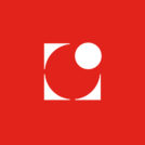
ObjetRama's trademark uses the "target" symbol initially created for the display logo for the personalization of "monlogo" (« my logo ») products commercialized by ObjetRama. This sign has the ability to synthesize the common idea that the general public has of a logo. It's impactful, memorable and perfectly in line with ObjetRama's mission: to be replaced by the customer's logo. It is a target that says "put your own logo in its place".
This logo communicates ObjetRama's promise: to allow customers to personalize their gift ideas. Previously, there was on one side the ObjetRama logo, and on the other side a totally different logo that was used as a mockup in the catalog. The new symbol now makes it possible to make the link between the monlogo "mockup" logo and the ObjetRama logo.


An icon to symbolize the idea of any logotypes ?
The "monlogo" symbol becomes the official emblem of ObjetRama.
The existing "monlogo" logo evolves. Its initial "O" stylized as ObjetRama is kept. The typographic block has been simplified and the chromatic code refreshed. It is the dot of the old ObjetRama "j" that gives the new logo its magenta color. This hue is both synonymous with warmth and emotions.


Typorama, ObjetRama's visual identity has been given a unique proprietary typeface.
The new wordmark uses custom lettering.
The whole set is composed in lowercase letters to give a round and warm look to the brand.
Only the letters "O" and "R" are in capital letters in order to eliminate the slightest ambiguity in the reading of the brand name.
The style of the typography is resolutely modern. It is a sans-serif designed to reduce the length of the name ObjetRama while giving it a maximum of personality. This new design, both elegant and timeless, conveys an innovative and ambitious image of ObjetRama.


Bonus: "Oh My Goodies!", our first creative intent
In a first draft of the rebranding proposal, we had neglected the potential to capitalize on a pre-existing graphic asset in ObjetRama's brand territory. The first idea "Oh my goodies" was an exciting and offbeat new vision of the brand. Proof that second degree and humor don't always work when it comes to rethinking a brand's image... and that any good rebranding must start with a thorough analysis of the existing and a dialogue with the client's expectations ;)

Rebranding, revolution ou evolution ?
While the first "oh my goodies" rebranding concept had been enthusiastically received by the marketing team, we had, on the other hand, aroused the scepticism of the company's founder, who, while acknowledging the boldness of the proposal, could not find the spirit of his company in this new vision.
When you start a rebranding project, you have to be humble enough to allow yourself to be surprised to discover pre-existing qualities in the brand identity that you are going to develop. This step is essential, just as it will be necessary to list the areas for improvement. Any visual identity in need of rebranding contains positive points that will have to be preserved. Very often we let ourselves be guided by a blind and pretentious desire that we are here to make a clean sweep of the past under the pretext that the choices that were made previously have not been scrutinized by our "creativity".
It is far more important to know the motivations that led to this identity. This will require a curious and sincere dialogue with the client. Then comes the time to question the relevance of the motivations at the time and the resulting graphic biases in relation to the new communication objectives.

Project context:
The old logotype was designed at the start of the company in 2003. ObjetRama wanted to revitalize an aging design and colours, as well as to have a strong, highly usable symbol in the form of a pictogram or emblem as an alternative to a long brand name. The brand's ambition was to move upmarket so that it could develop its distance selling business of promotional items and corporate gifts by offering "premium" ranges.
Targets and Deliverables:
To improve ObjetRama's brand identity. Simplify, modernize and facilitate the readability of the logotype.
- New logo
- Graphic charter document
- Custom typeface tailor-made for ObjetRama
- Movie clip set in motion design that illustrates the concept of the new visual identity
- Artistic direction of the iconography
- Templates for several communication materials (catalogue, stationery, commercial brochure, etc.)
Project expertise:
Logo creation, visual identity and graphic guidelines. Motion design and video creation. Typographic design.
Logo creation, visual identity and graphic guidelines. Motion design and video creation. Typographic design.
Type of client:
Communication agency in the consulting and services sector. Strategy or management consulting, operational consulting, digital services companies (ESN) formerly SSII or SS2I, but also all services to companies, or "B to B services" (for business to business).
Communication agency in the consulting and services sector. Strategy or management consulting, operational consulting, digital services companies (ESN) formerly SSII or SS2I, but also all services to companies, or "B to B services" (for business to business).
Related projects: