Who is the PoPA of the MoMA logo?
Thoughts about contemporary branding
MoMA, who are you?
Before I rush to the top of this logo-graphic investigation, allow me to make the presentations with one of the most famous cultural institutions that the big apple has to offer! The Museum of Modern Art in New York was inaugurated in 1929. Today the MoMA has become a must with one of the most important collections of modern and contemporary art in the world.
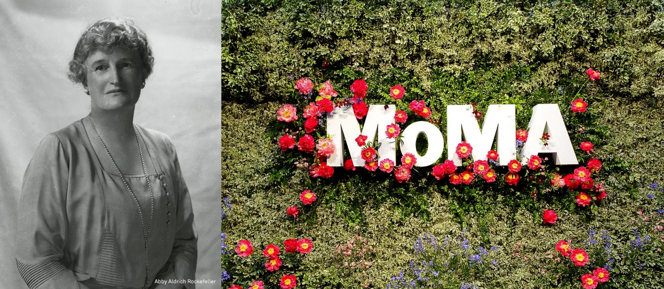
The creation of MoMA was an initiative of Abby Aldrich Rockefeller, an American socialist and philanthropist figure, and two of his friends Lillie P. Bliss and Mary Quinn, influential and progressive patrons. The three friends decided to create an institution dedicated to modern art in order to preserve recognized works and open the doors to young creation. Although Abby put a lot of energy into this project, unfortunately she did not contribute financially. Her husband was not very fond of modern painting, so he refused to devote part of his fortune to it.
Proof that the history of this family remains linked to that of the MoMA, on February 5, 2019, the Rockefellers made the largest donation ever made for a museum by leaving the sum of 200 million dollars to the MoMA!
“MoMA” a logo both image and sound
Two syllables so simple that they could be a child’s first word.
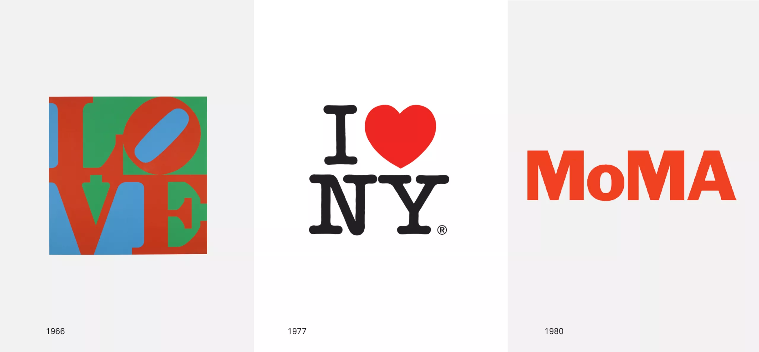
A sound that quickly imposed itself as an evidence and became the image of the Museum of Modern Art in New York City. Four letters that have become such an important work of art as those housed in the museum. An icon at the height of a city that is a world symbol of modernity thanks in part to Milton Glaser’s famous slogan “I <3 NY”.
A little “o” like a little mouth that says “MoMA!”. A simple graphic choice that gives all the rhythm and architectural dimension of a MoNUMENTAL logo. The small and the big; the round and the square.
MoMA(s) and PoPA(s) full of love
And yet, to get to this obvious point it took time, talent and love. Caring parents who, year after year, have followed one another to raise the child and make this creation the paragon of the visual identity of a modern art museum, often imitated but never equalled.
A mysterious Genesis
Their names are Morris Fuller Benton, Ivan Chermayeff & Tom Geismar, Matthew Carter, Bruce Mau, Paula Scher, Ben Parker & Paul Austin. The list is long and may be incomplete! All of them contributed to his education. The best designers have succeeded one another to sculpt and polish four letters that are now part of the world’s cultural and graphic heritage. Everyone has made a contribution. All of them respected his strong character given at birth.
But who is at the origin of this visual asset – this little “o” – so simple and brilliant and which gives all the salt of this memorable design?
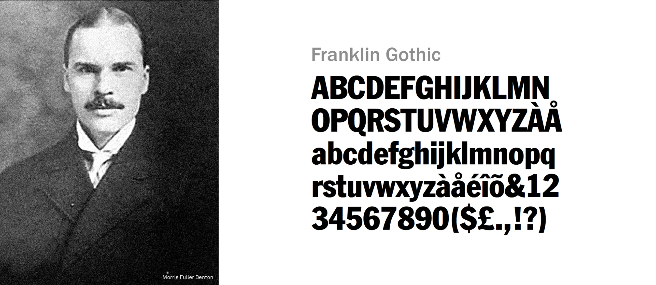
MoMA was born American and could have been named Franklin
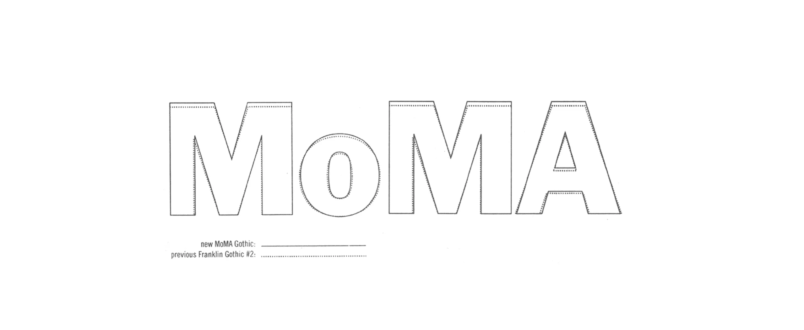
Initially, therefore, it was a typographic choice that will remain the matrix of the logotype for more than 50 years: Morris Fuller Benton’s Franklin Gothic No. 2. With the legibility and simplification of shapes as a focus, the Franklin Gothic is the American character that will impose the use of sans serif typefaces as the image of the new typographical modernity. Franklin Gothic stands out from the other sans serif of its time by the “double loop” design traditionally associated with the « a » and the “g” lower case of the serif typographies.
1964, first steps in an open and joyful simplicity
Let’s try to understand why this identity has been a success since 1964. The choice of the acronym to shorten the name has created a very strong emotional relationship between the institution and its public. This diminutive gives a much more accessible image. The syllables [Mo] and[ MA] refer to possession and selfness. “Me”, “Mine”and “My » that allows the institution to descend from its scale so that everyone can do it for themselves. It’s my MoMA.
The name becomes both memorable and emotionally charged for the public, while communicating the idea of democratizing access to culture.
The minimalism of this graphic choice succeeds in showing modesty, as much as this simplicity finds its sources in abstract art, suprematism, Bauhaus, in other words modern art.
It seems to me that this desire to reach out – without falling into nonsense and “populism ” – to the least educated audiences is to be found in Ivan Chermayeff’s initial response of 1964. The use of the orange-red colour for Franklin Gothic lettering N°2 supports this intention by adding a warm touch of colour.
Note for the future: it will be necessary to consider whether the success of this graphic gesture, its passage to the status of a cult work of world graphic design, and the devotion that follows – accentuation of minimalism through a black and white passage of the logo and successive accentuations of the “geometrization” of letters – is not a contradiction in terms with the museum’s mission to open.
This disappearance of colour, which gives way entirely to the sole form of the “glyph” (as an isolated sign of a writing system), seems to be the natural evolution of the most famous graphic signs in the world. The evolution of the Apple and Nike logos are perfect examples, as can the Christian cross.
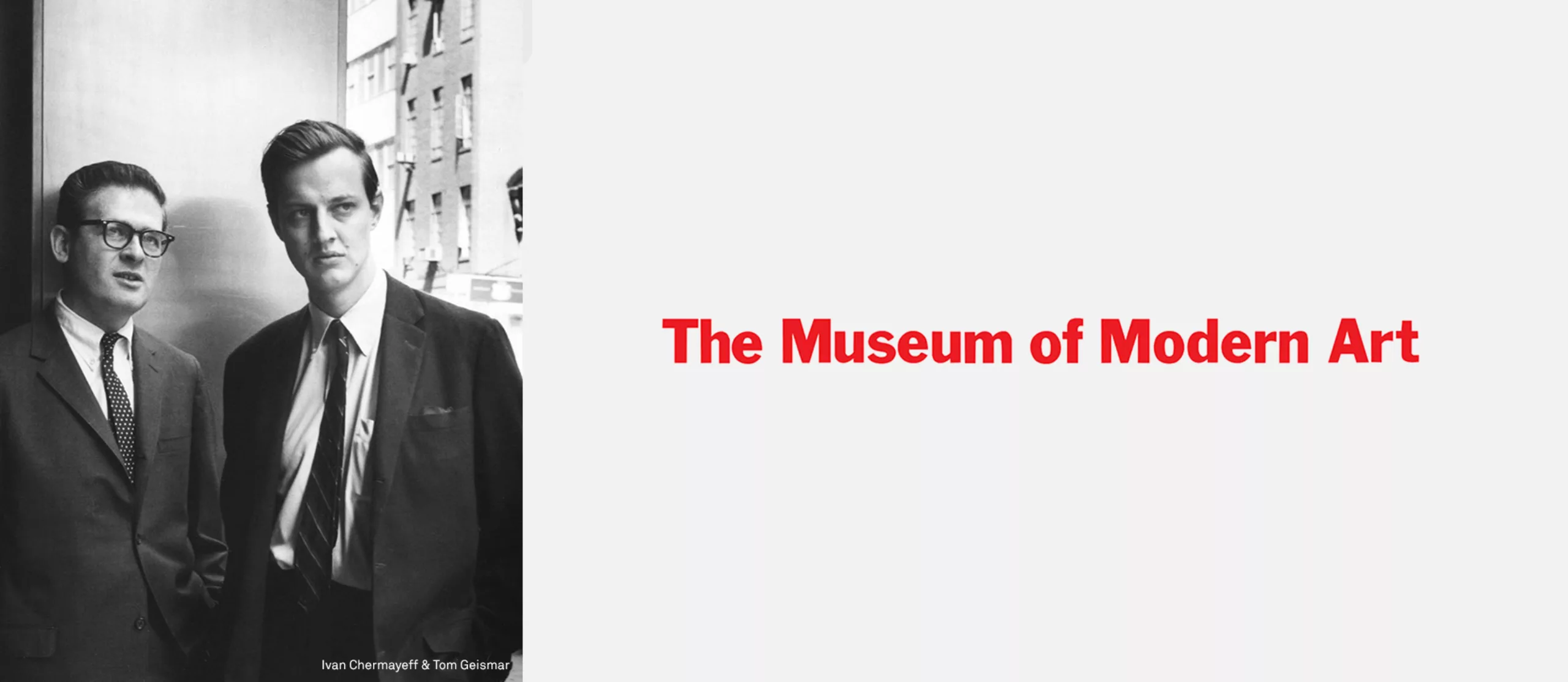
The point where it becomes really interesting is that, contrary to popular belief, the logo as we know it today, i.e. in its “MoMA” version with the little “o”, is not Ivan Chermayeff’s work, as his graphic relationship with the famous Mobil logo (geometric lineal lettering, M capital and tiny O) might have led to believe.
And you are not at the end of your surprises since this graphic discovery, this trick that makes all the difference, is not really the work of a designer!
1966 – 1980: The client, this unexpected genius!
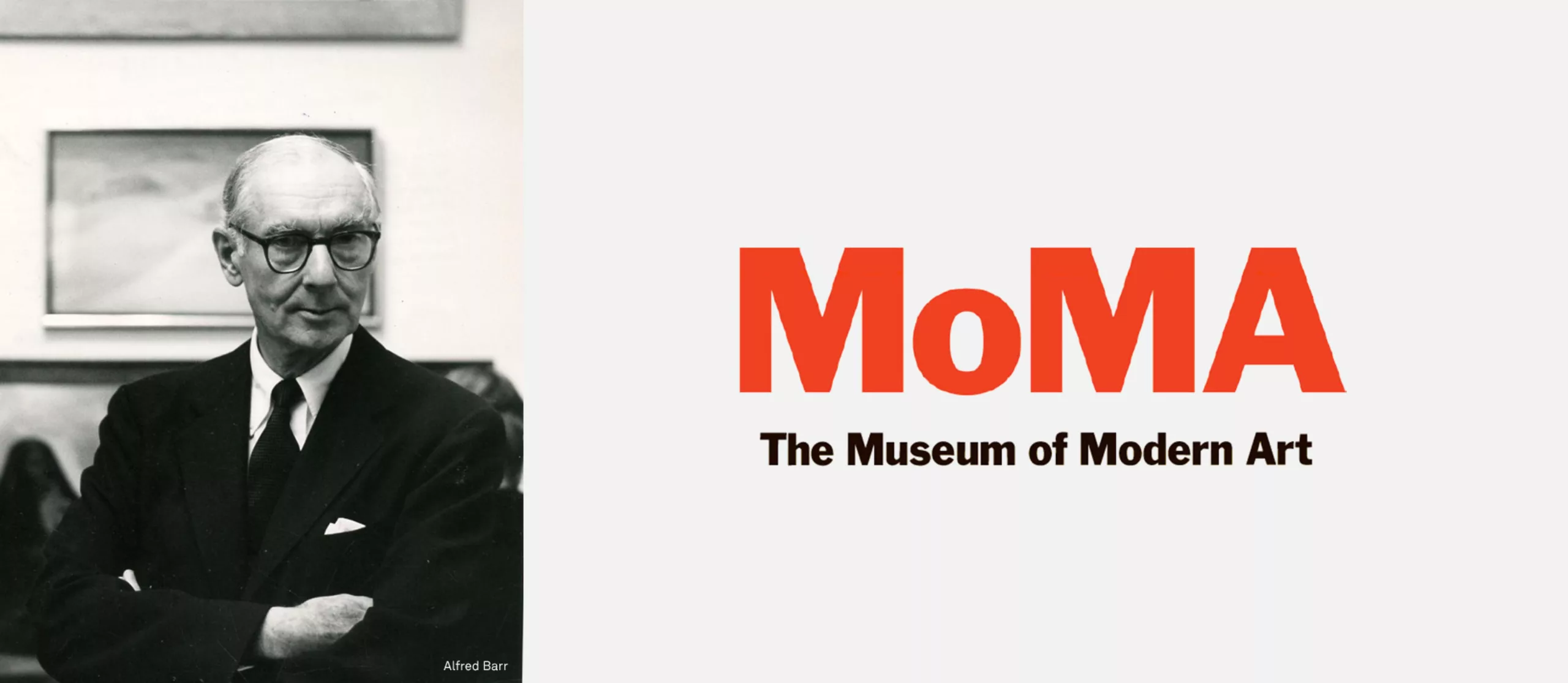
Indeed, incredible twist discovered during the writing of this article, this cult logo is actually a co-creation of the Geismar-Chermayeff studio which designed the acronym “MOMA” entirely in CAPS and composed in Franklin Gothic n°2 in 1964, and the other of the museum administration which had the brilliant idea to impose a tiny “o” on it! Stephen F. Eskilson, author and professor of art history, reveals this incredible anecdote in his book «Graphic design, A new history». According to Stephen, the tiny “o” appeared in the 1980s and was acclaimed by the museum’s internal administration because it gives more personality to the acronym and at the same time transforms it into a name. Another major advantage is that it makes it easier for people who do not speak English to say the name. If this version of the logo officially appeared in the 1980s, the idea is finally even older – the second twist discovered by reading an article in the New York Times on 21 September 2003 – since it belongs to Alfred H. Barr, director of the museum in 1966, then on summer vacation in Greensboro. His summer craze will also give nightmares to his colleagues who will not be able to bear this visual stuttering.
A brand gains value over time.
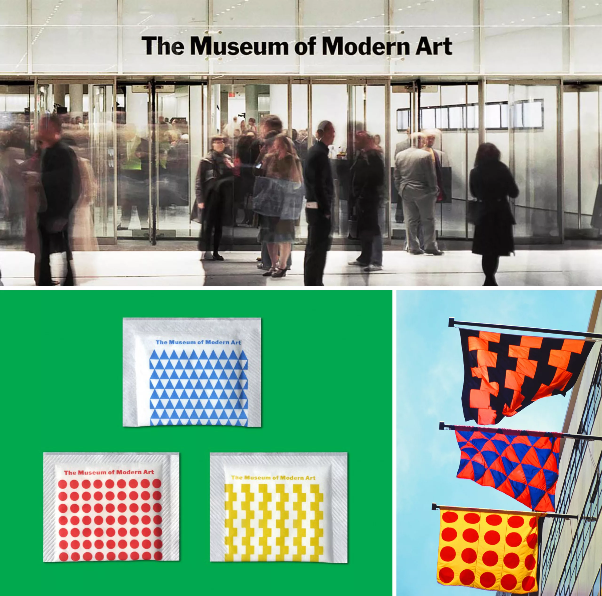
After almost two decades of in-house use, the MoMA logo is finally appearing on communication media for the public. The legend of the MoMA logo was born!
And at the same time, it’s the whole myth of the client who would have only bad ideas about design and who would destroy the beautiful creations of graphic designers, which is shattered 😉
2002: MoMA assumes its voice
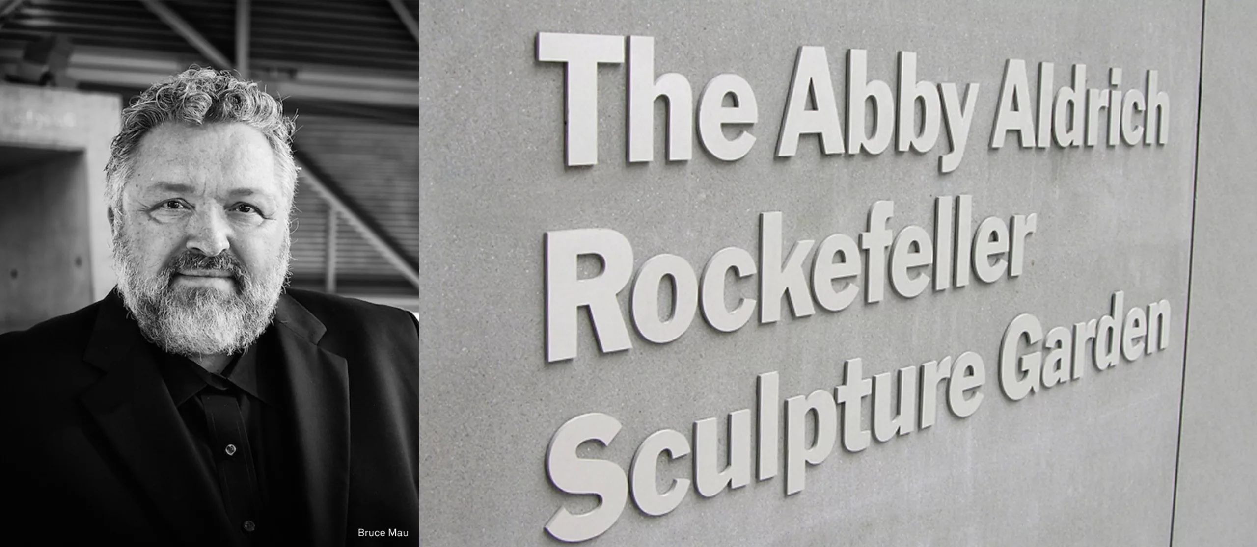
In the early 2000s, MoMA sought to affirm its brand image. The Museum feels limited in its possibilities of graphic expression. Tired of his own identity, it asked the Canadian studio Bruce Mau to explore new typographic alternatives to create a new signage system. After several unsuccessful attempts, the studio realized that Franklin Gothic was the perfect silent voice for MoMA. At the same time adapted to be visible in the urban context, its simplicity is also adequate to avoid parasitizing the contemplation of arts pieces. Rather than diluting its image in a multitude of typographical options, MoMA becomes full Franklin Gothic. This choice to capitalize on the existing, to make this graphic design last over time… it is the sine qua non condition to hope one day to become an icon. According to Wikipedia, the French noun “modernité” has been used since the second third of the 19th century. It’s an evolution of the medieval Latin “modernitas”, derived from the Latin adjective “modernus”, itself derived from the Latin radical “modus” (“measure”, “limit”, “way”, “mode”). In history, modernity is associated with the modern era, which began in 1453 with the fall of Constantinople, or in 1492, with the discovery of America by Christophe Collomb. To sum up, Modernity is therefore a little bit of Mode… and a lot of Eternity!
However, Bruce Mau noticed that the Franklin Gothic that the museum was using did not really seem to him to be real Franklin. Somewhere in its evolution, from Benton’s original version to its digital version, he had lost its spirit, becoming a soul-less hybrid digital version. And that’s when type designer Matthew Carter comes in!
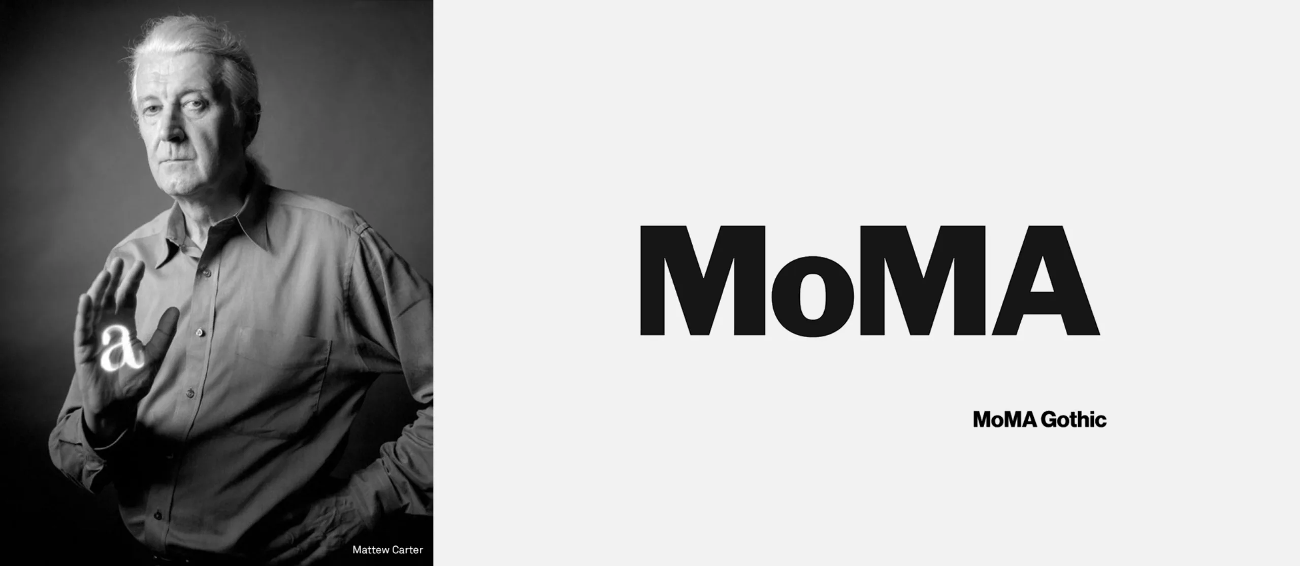
MoMA then shows its first signs of coquetry and undergoes a facelift under the expert eye of typedesigner Matthew Carter.
According to Matthew Carter, lifting the Franklin Gothic was like asking an architect to design an exact replica of a building. But it was a job he was happy to do. He considered the opportunity to study these letters in depth and to grasp them as faithfully as possible as a kind of education.
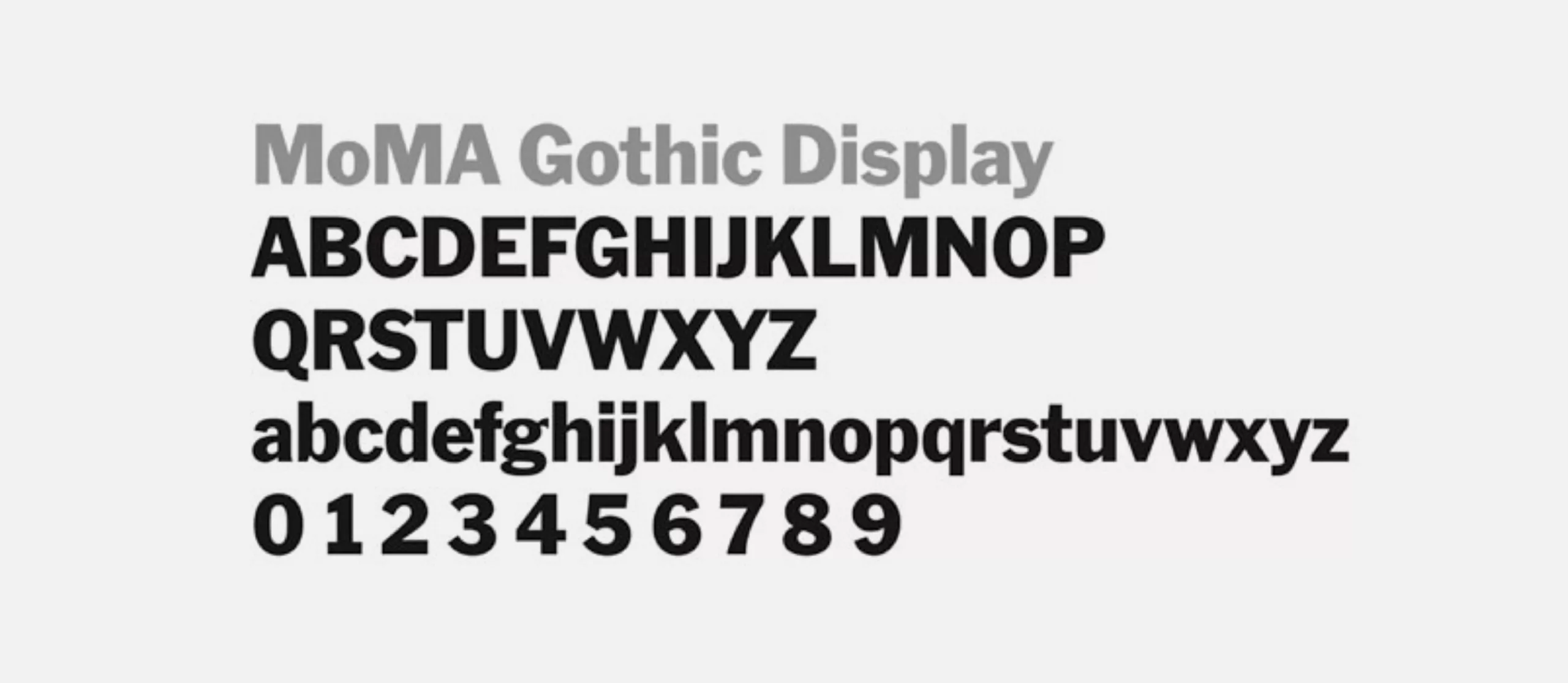
The result of this goldsmith’s work is the creation of the MoMA Gothic typeface. It’s available in two versions, one for signage and the other for the layout of body texts.
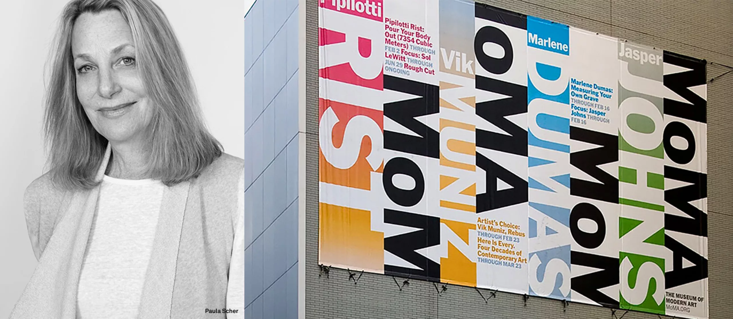
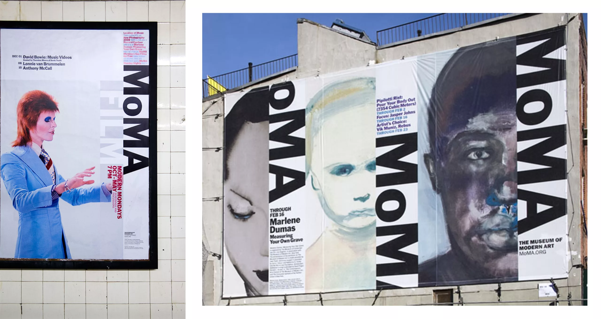
2004, the chic upperclass minimalism
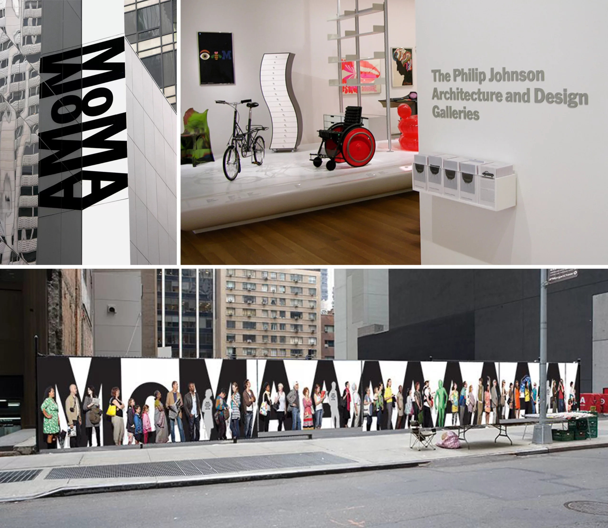
At the beginning of the 2000s, the objective of Paula Scher’s team was to bring consistency to the MoMA’s graphic charter and, incidentally, to highlight a logo that until now has tended to be somewhat overly shy on exhibition posters. As for the rest, there was no reason to question the design of the logo, which Pentagram considers to be an untouchable classic. Paula Scher’s solution lies in the design of a composition grid (surely scribbled in a taxi, her preferred place of inspiration) that perfectly ventilates each piece of information and in which the MoMA logo is tilted vertically in the margin. This unexpected and unprecedented visual approach for the museum will provide a highly effective signage effect, an essential quality to stand out in the New York urban landscape. This new design provided by Pentagram will undoubtedly be a decisive step in building the worldwide reputation of the MoMA visual identity.
The « good design » paradox
MoMA is not a public space. But since we can only hope that a museum of contemporary art should be accessible to as many people as possible, I have in mind Paula Scher’s comments about the design of public space, and more specifically the Highline Park logo, at her conference at ATypI in 2017:
“In a way, good design, things that are well thought out are codified for rich people, and the poor think they have no place there, and they don’t think that design is for them. And I don’t know how to overcome that (…)”. The MoMA logo succeeds in this balancing act of synthesizing the chic minimalism that delights designers, without sacrificing sympathy in capital thanks to a name that provokes a spontaneous affection that seduces a wide audience. Whether by chance or by genius, this reassuring and welcoming acronym unconsciously accentuates the museum’s association with a maternal figure.
What is “accessible” design? The subject is exciting so I share with you the link to the full video of this intervention:
– Opening of a big parenthesis –
As for the Highline Park logo, I don’t think the problem is that its design is “too good” for the public. Personally, and even if we can find condescension in Paula Scher’s reflection, I find this questioning legitimate and interesting. However, I don’t believe in “all-powerful design”. There are much more powerful mechanisms than that. The first reason has nothing to do with design, but rather with the gentrification of the neighbourhood, which gradually drives the most modest classes to the periphery.
The second reason may indeed be graphic, and may lie in what the very minimalist symbol unconsciously evokes. Highline park is a green flow built on a former suspended railway line in the Manhattan Borough. The logo designed by Paula Scher is a letter “H” whose double horizontal line also evokes a piece of railway line. However, it is not impossible that other visual connotations may interfere with this very clever, but austere idea. Warning! Warning! This hypothesis is probably very smoky and a little provocative, however I can’t resist the desire to share it with you (because sometimes you have to trust your intuition!):
– Closing the big parenthesis –
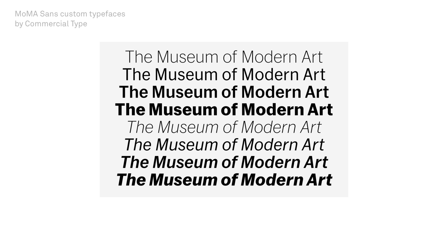
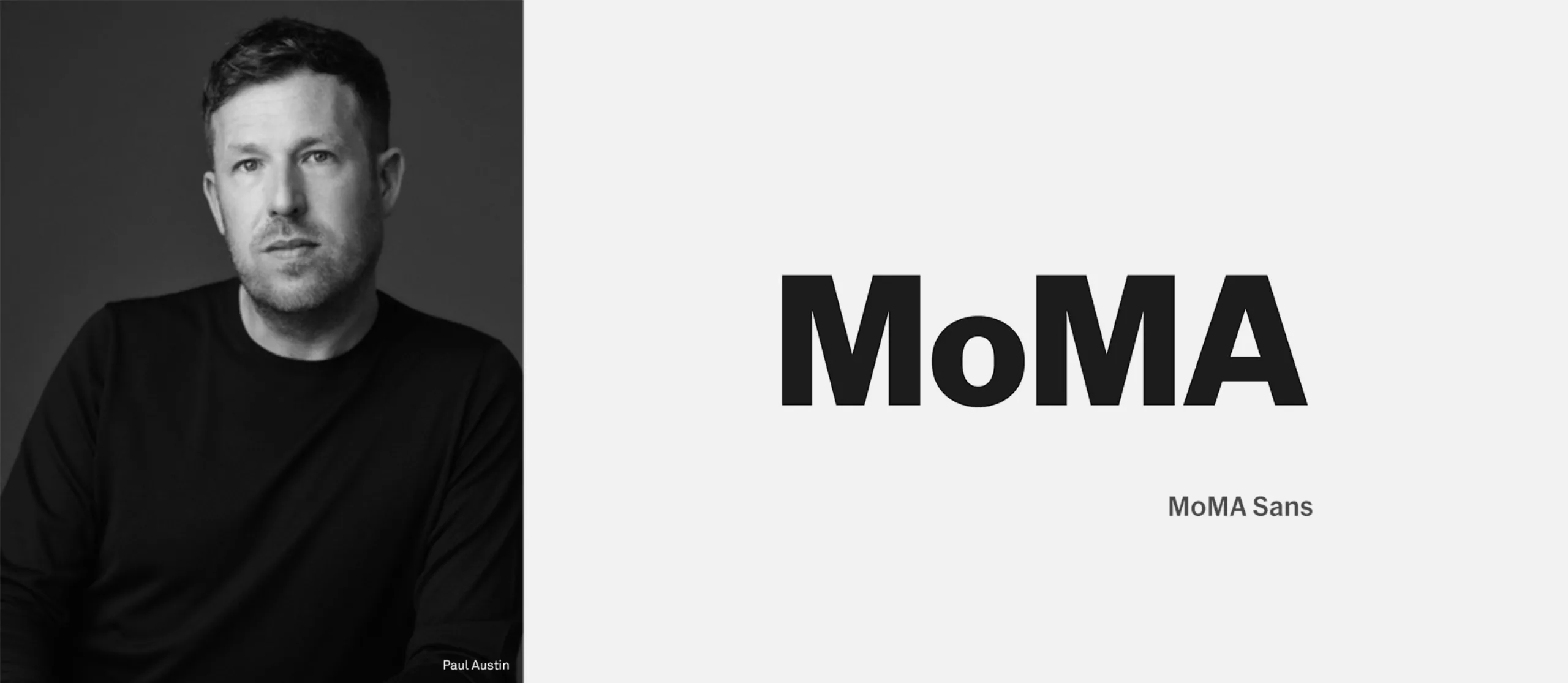
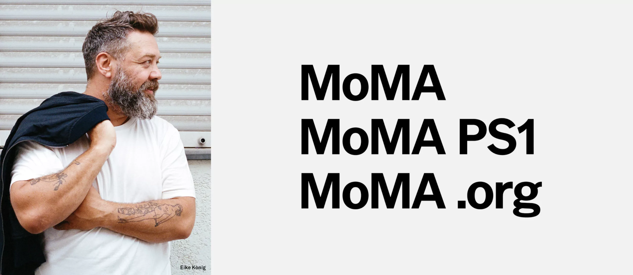
2019, MoMA gothic becomes MoMA sans
The Typographical Genealogy begun with Morris Fuller Benton’s Franklin Gothic in 1902 continues today with the creation of the MoMA sans commissioned by Made Thought Studio.
“Essentially, my pitch in one sentence to MoMA was basically the evolution from Akzidenz-Grotesk to Neue Haas Grotesk. I wanted to do that but with Franklin Gothic as the starting point. And then some just kind-of smoothing it out, a little bit bigger x-height, cleaner lines, a little bit warmer, less old looking. That was essentially the brief. And they found that very interesting. Matthew also said that that sounded like a good place to start, something like that. He was very gracious about his typeface being replaced, which was not of course guaranteed.”
I recommend you to read this fascinating interview with Christian Schwartz, designer of the MoMA sans typeface family, through the Type.today website: type.today/en/journal/moma_sans
Minimalism shifts into the “blanding” aesthetic
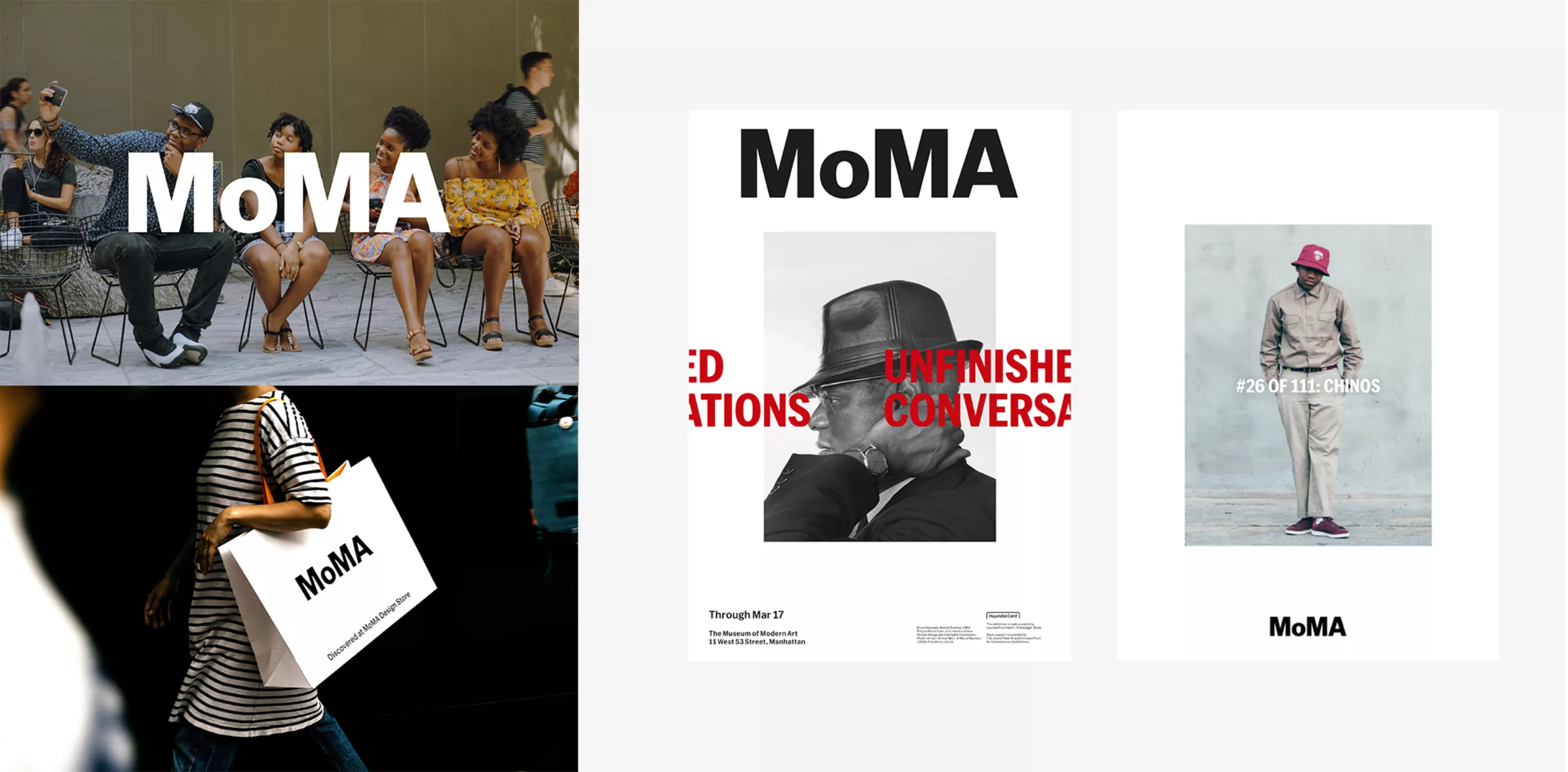
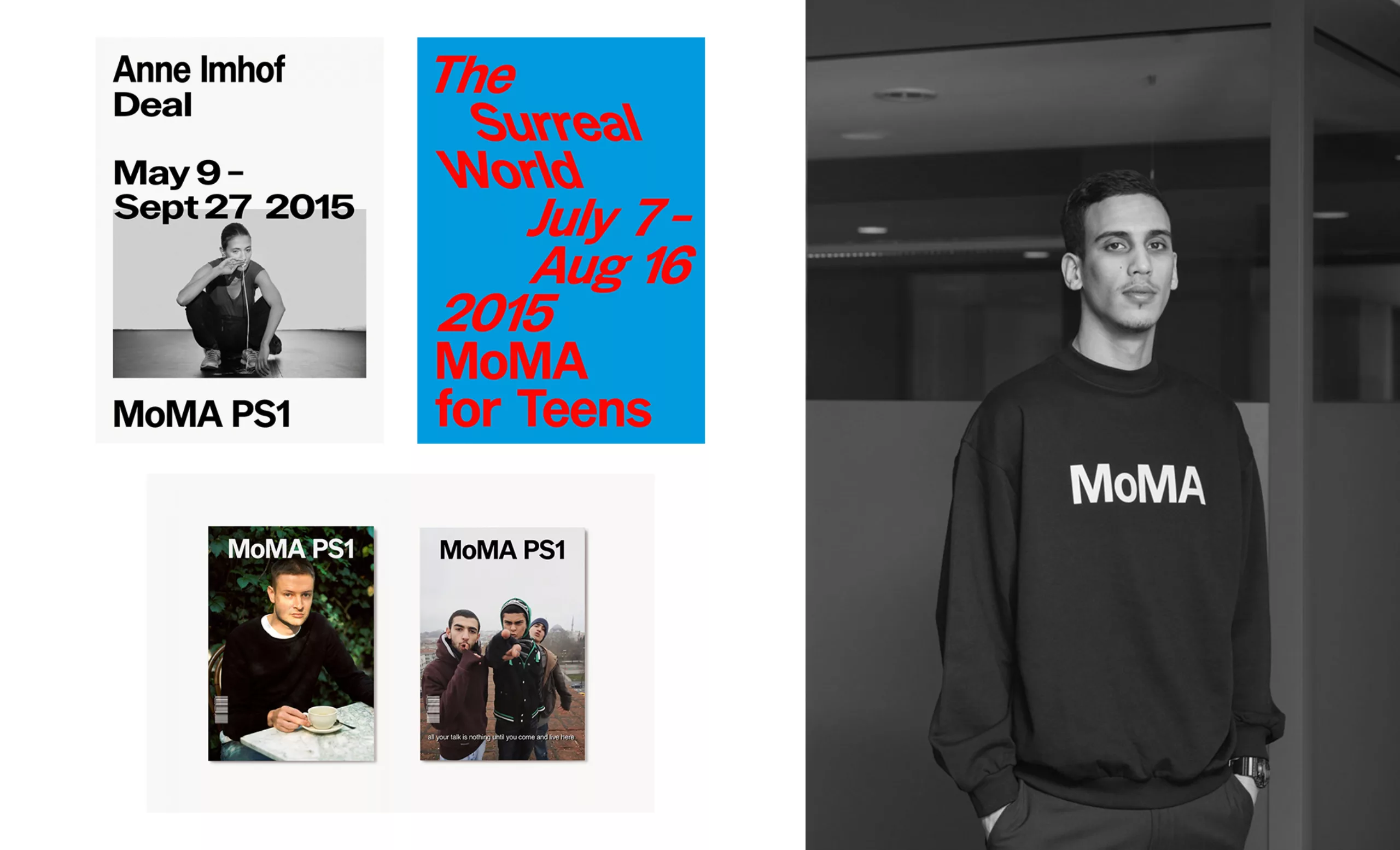
With the rebranding carried out by Made Thought studio, we are witnessing a new “MoMA” brand that merges the codes of luxury, contemporary art and streetwear. A praise of the brand, MoMA has become a haute couture house where DA stylists follow one another at its head. Or, the MoMA is just a very trendy “store”. Access to the discovery of modern art seems to have become a pretext to sell goodies on which the MoMA acronym ensures a certain hype. Bags, sweaters, when are the sneakers? Having been modern before everyone else, MoMA is now caught up in the aesthetics of “Blanding” (neologism created from “bland” and the word “branding” to express the idea of a brand without personality or neutral), an antithesis of branding that far from advocating the distinction of one brand among others, encourages an aesthetic of mimicry.
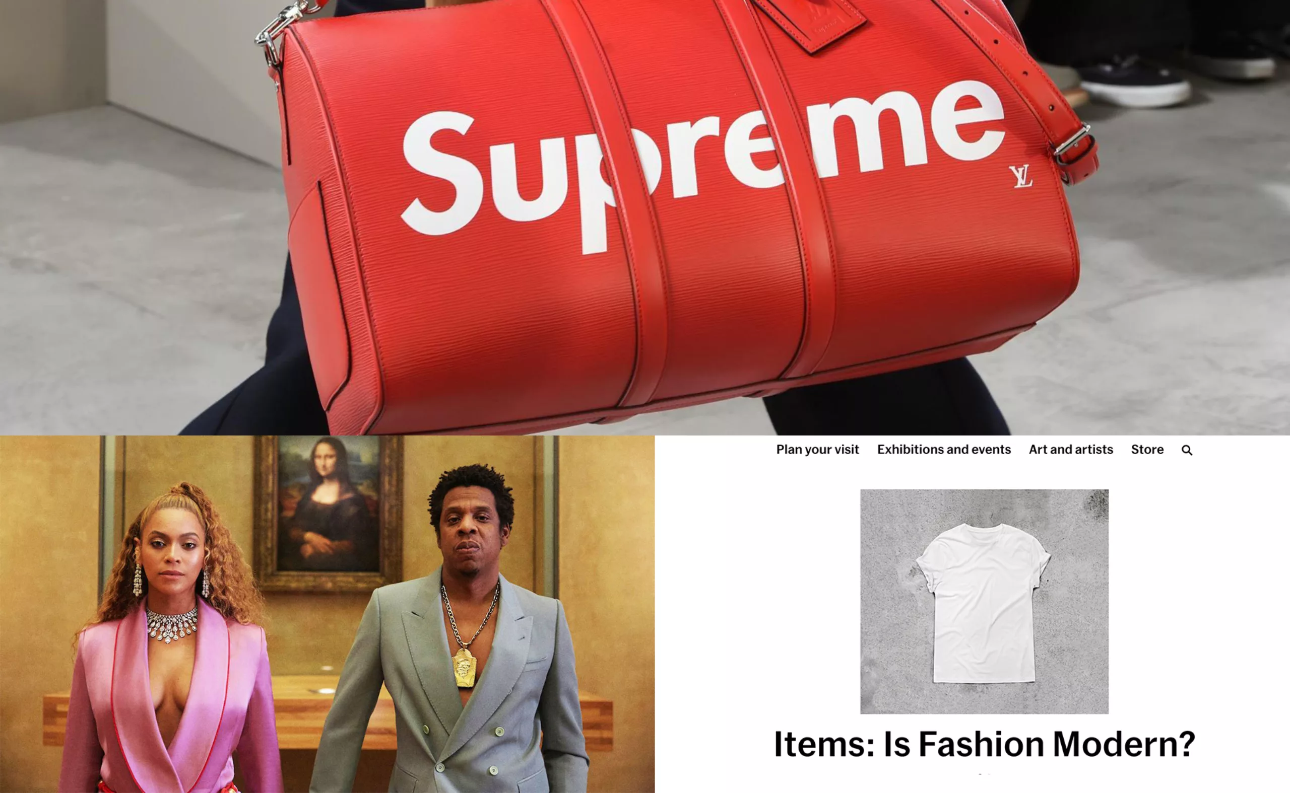
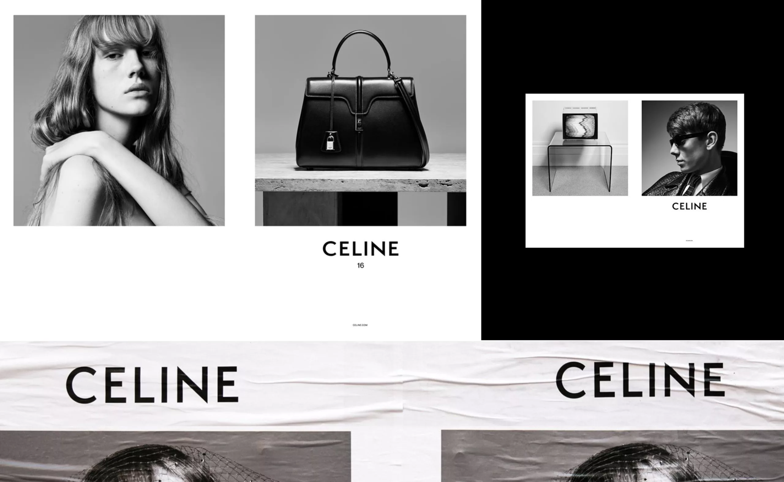
Branding fever has spread to the institution, and the logo, more than ever at the heart of the communication strategy, is reminiscent of the latest marketing choices made by BURBERRY and CELINE or SUPREME. The objective is the same: to reach a young, urban and globalized population that drinks from the Instagram flows that prescribe stars and brands. MoMA is a cult logo and its aura makes it very tempting to transform it into a design that is gutted and designed to sell cool. Virgil Abloh and Hedi Slimane, today’s DA stars as #Blanding apostles. The logo has become culturally more important than the works in the museum.
We live in an era of mass cultural tourism, as prophesied by Andy Warhol in 1975 who noted the following sentence in his diary: “One day, all department stores will become museums and all museums will become department stores.”
The rebranding pitch not selected from Hort Studio
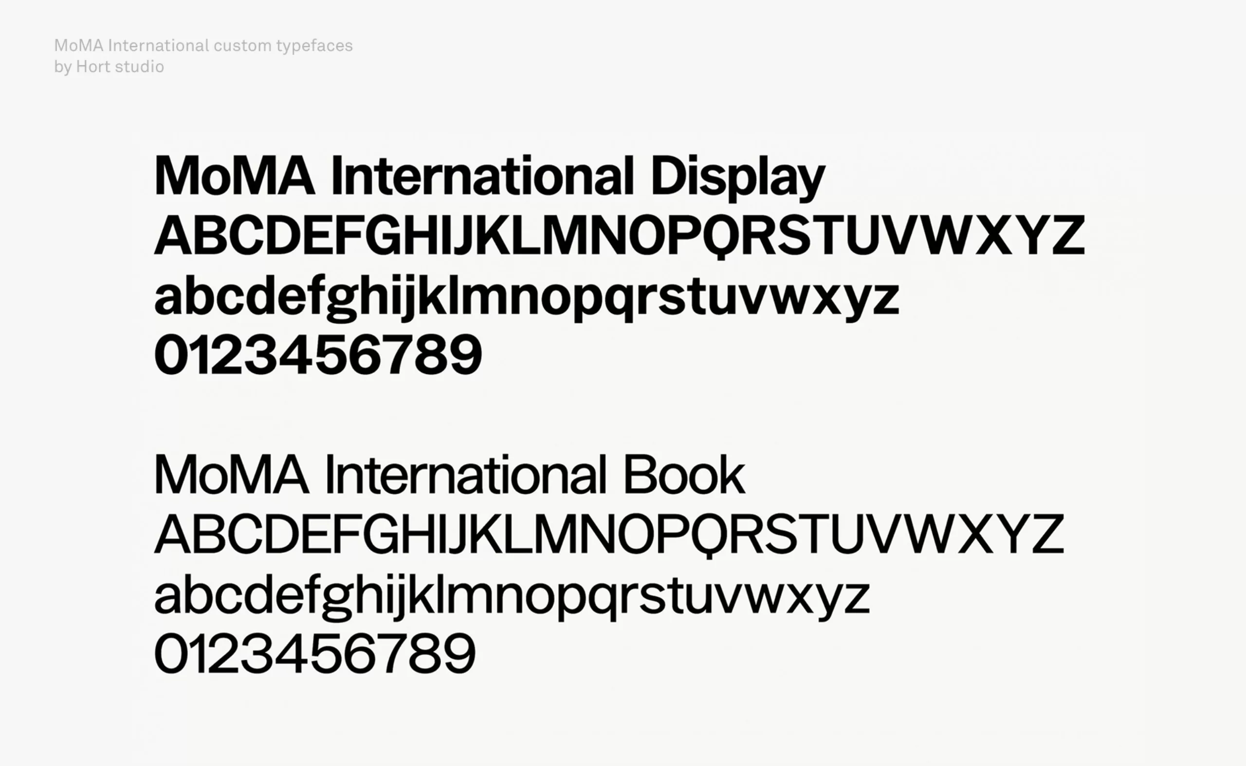
The rejected proposal of the Berlin studio Hort is symptomatic of this phenomenon. Familiar with making the big gap between visual identities for cultural institutions and international commercial brands like Nike, the studio has developed a graphic style that gives high priority to experimentation with typography in a falsely amateurist way. Glitch, deformation of proportions, play on readability. The letter is central, expressive and monumental. The answer from the Hort studio was very close to the system made by Made Thought.
The custom typeface “MoMA international” proposed by Hort is also an evolution of the original Grotesk typeface, with a less contrasted and more geometric design. This bias leads to an aesthetic of neutrality very similar to the signage of the New York metro composed in Helvetica and produced in 1966 by Massimo Vignelli.
In this sense, there seems to be a consensus among these studios that the Swiss international style should be the face of modernity.
The Zeitgeist of Western lifestyle is a clever mix of street culture, for the rebellious and alternative side, and codes from design and contemporary art for a good education. The ideal recipe to flatter a well-educated and well-off target who will be able to decipher the references of this aesthetic, and a sufficiently “urban” and “wild” dimension to please the most socially modest commuters.
The “collab”, a strategy of success for brands… and for museums
The same exchange of good practices that brings Beyonce and Jay-Z with the Louvre, Supreme and Vuitton, Kayne West and Murakami, Virgil Abloh and IKEA together. This mix of genres forces us to rethink the way we approach graphic design. Is there still a graphic design specific to the world of culture as there were for luxury or rap music? It’s the concept of street-luxury theorized by Virgil Abloh, a young architect born in 1980 and with a dazzling career, has become the designer that all brands are craving. MoMA’s new graphic charter rushes into this “cool bourgeoisie” trend with the use of large white margin (like the new visual identity of the city of Paris) framing visuals representing modern works of art or lifestyle-style mannequins, all straight from a fashion magazine. In 2019, being modern means above all knowing how to mix codes.
When a museum meets a sock, is it Branding for Millennials ?
Today, making ordinary white t-shirts simply flanked with a logo is the most effective technique to reach the attention of a larger and more diverse population.
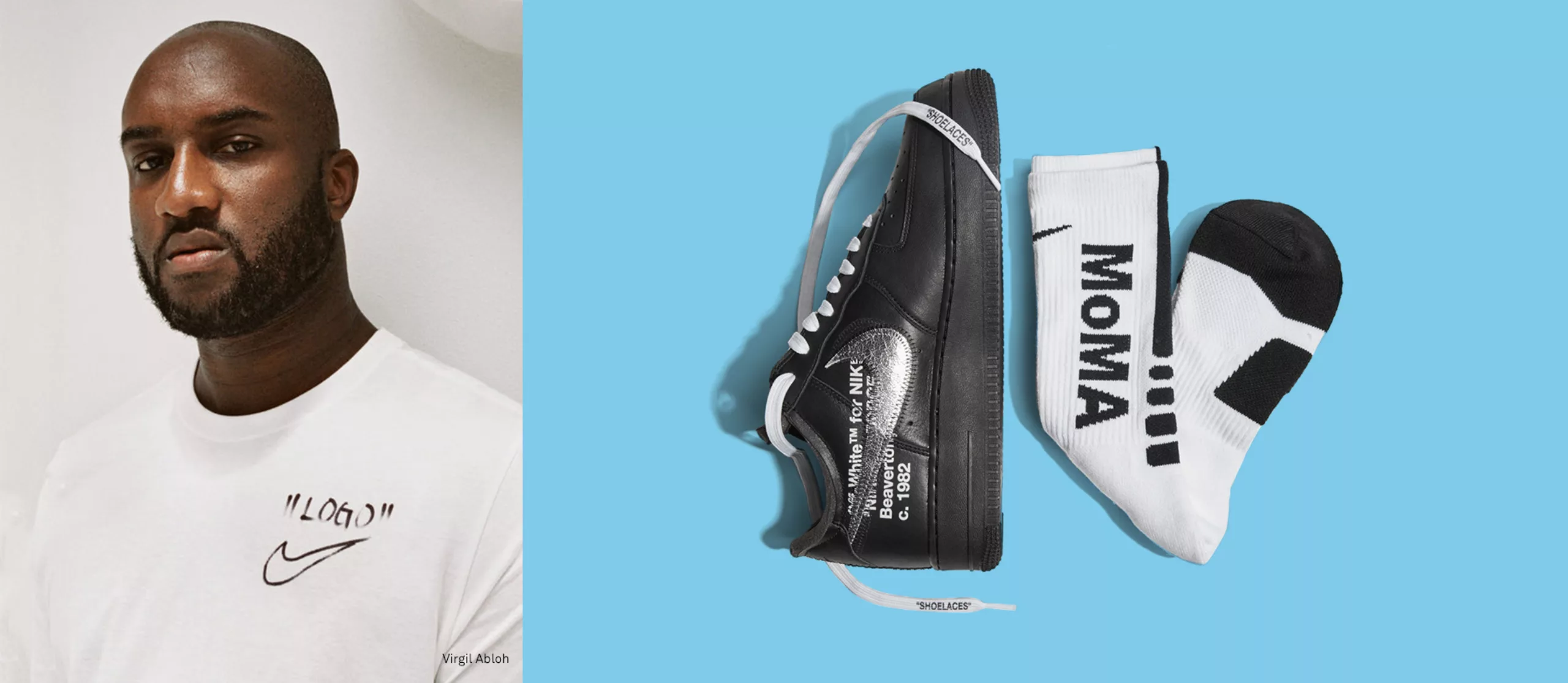
It was with this marketing idea that Virgil Abloh quickly became one of the most popular artistic directors on the planet. This intuition of an inevitable connection between Abloh and MoMA is suddenly validated through an internet search when I discover a sock marked with the MoMA logo, the product of a collaboration in January 2018 between MoMA, Nike and Abloh’s Offwhite brand created as part of the exhibition “Items: Is Fashion Modern? »
A brand that ingeniously mixes design, fashion and urban culture, that’s the image of MoMA in 2019.
This vision of the image is also shared – as written above, by Virgil Abloh, who bases his work on artistic dialogue with other brands. That’s why, when Paola Antonelli, curator at MoMA, sponsors “Items: Is Fashion Modern?”, an exhibition that explores 111 clothing and accessories that had a strong impact on the world in the 20th and 21st centuries, she sees Abloh as the perfect ambassador. From there came a collaboration between MoMA, Abloh and Nike, from which 1 pair of sneakers and 1 pair of socks with the MoMA logo were born.
Is culture giving way to the ease of merchandising, or is it taking advantage of fashion brands to reach a young audience, as the world of luxury does with streetwear?
The brand is a passport to cultural claims, as Jeff Staple, streetwear designer and founder of Staple Design, says: “Wearing the brand is like a badge of honor”. It allows the wearer to proudly affirm “I am in this category” and in the case of the Abloh x MoMA collaboration, “I understand what I am wearing”.
«LOGO» ®
Choosing MADE THOUGHT studio for this identity, as well as a collab with Abloh and Nike, MoMA clearly shows its ambition: to be the supreme brand of museums. It is a most effective way to seduce and attract a young generation that places brands, whatever they may be, at the centre of all their attention.
However, branding an institution, to stand out, to want to blur the lines between culture, luxury and urban fashion, isn’t MoMA moving away from its main mission? To be a recognizable cultural institution, which must be sufficiently open to exclude no one. This is an issue for many cultural institutions and that could give rise to a very complex, exciting but also far too long debate for this article.
One thing is certain, it would not occur to anyone now to change this acronym MoMA as it is so iconic and understood by all. So let us be glad that generations of designers will cherish this acronym for many years to come!
On the subject
-

Groupama’s new visual identity, a logo in the open countryside
Groupama has just unveiled a new logo that updates its graphic design by abandoning its campaign in favor of a “startup” aesthetic.
-
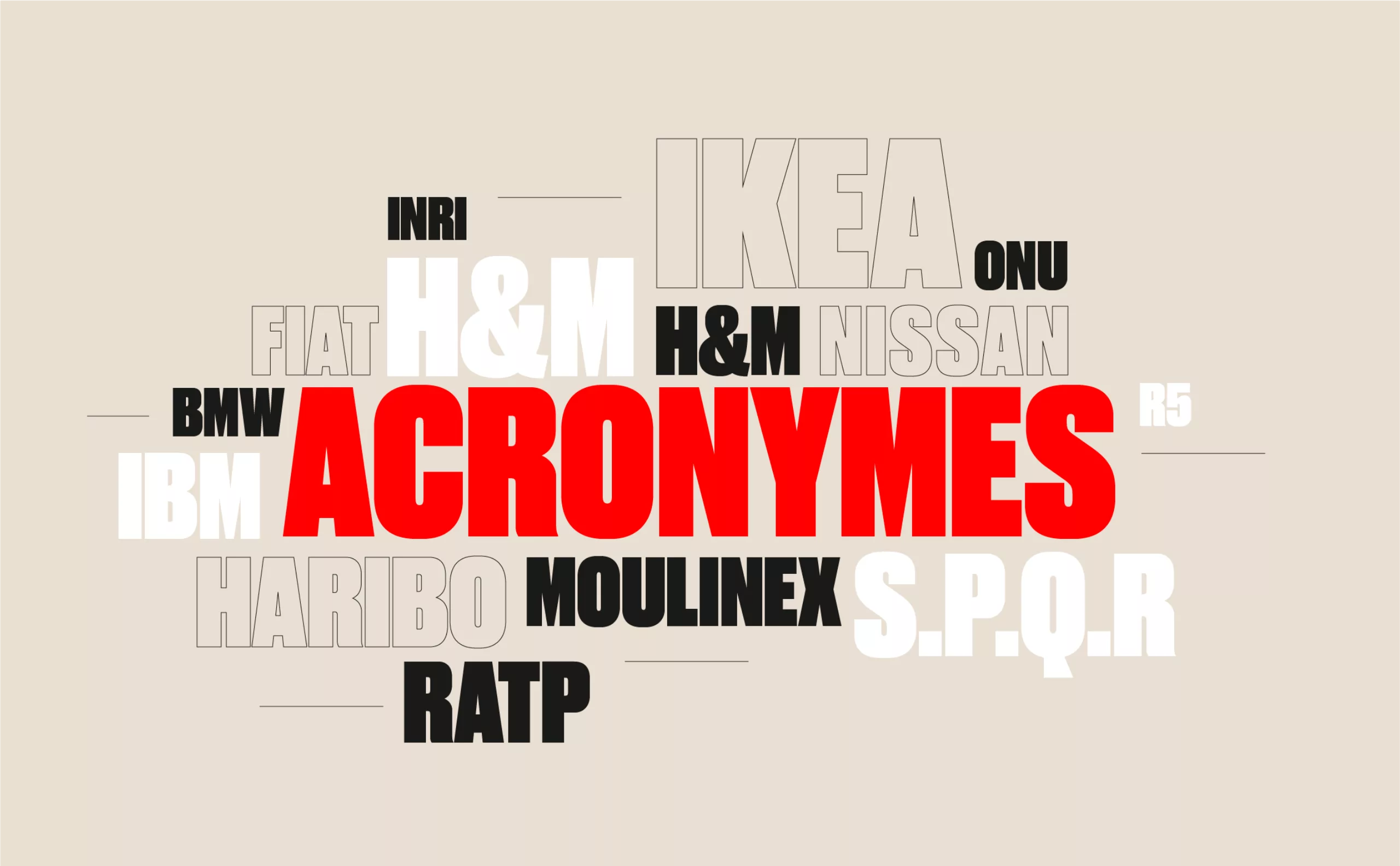
From surnames to acronyms: creating a brand name from letters
From founders’ surnames to initials and acronyms, brand names have always oscillated between abstraction and familiarity.
-

The UN logo takes on water during COP28
For COP28, two designers have come up with a new UN logo showing the rising sea levels and the future disappearance of much land and coastline.