Bakery branding pastry patisserie logo

2021

Épilogue
A Tale of Gastronomy

"No one is born a pastry chef, but one becomes one". Julien Goulet developed a passion for this profession at a very young age. "My parents were restaurant owners. Even as a child, I was always in their kitchen making chocolate mousses," he says.

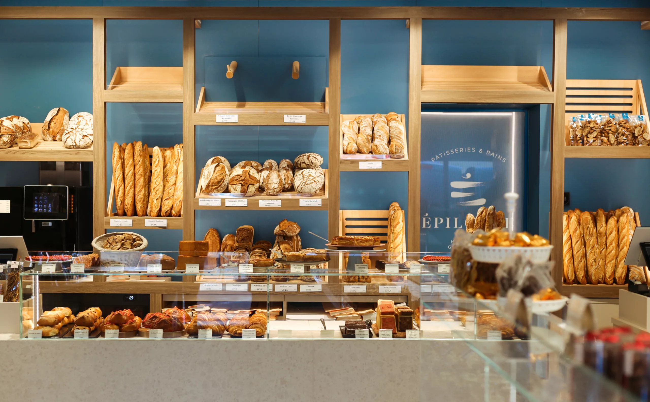
After working with Hélène Darroze in London, then Sébastien Bouillet in Lyon, and gaining solid experience in pastry making, Julien decided to set up his own business, with the ambition of working with local and seasonal products, in short circuits, in order to promote the producers of our regions. His main values are excellence, authenticity and passion.

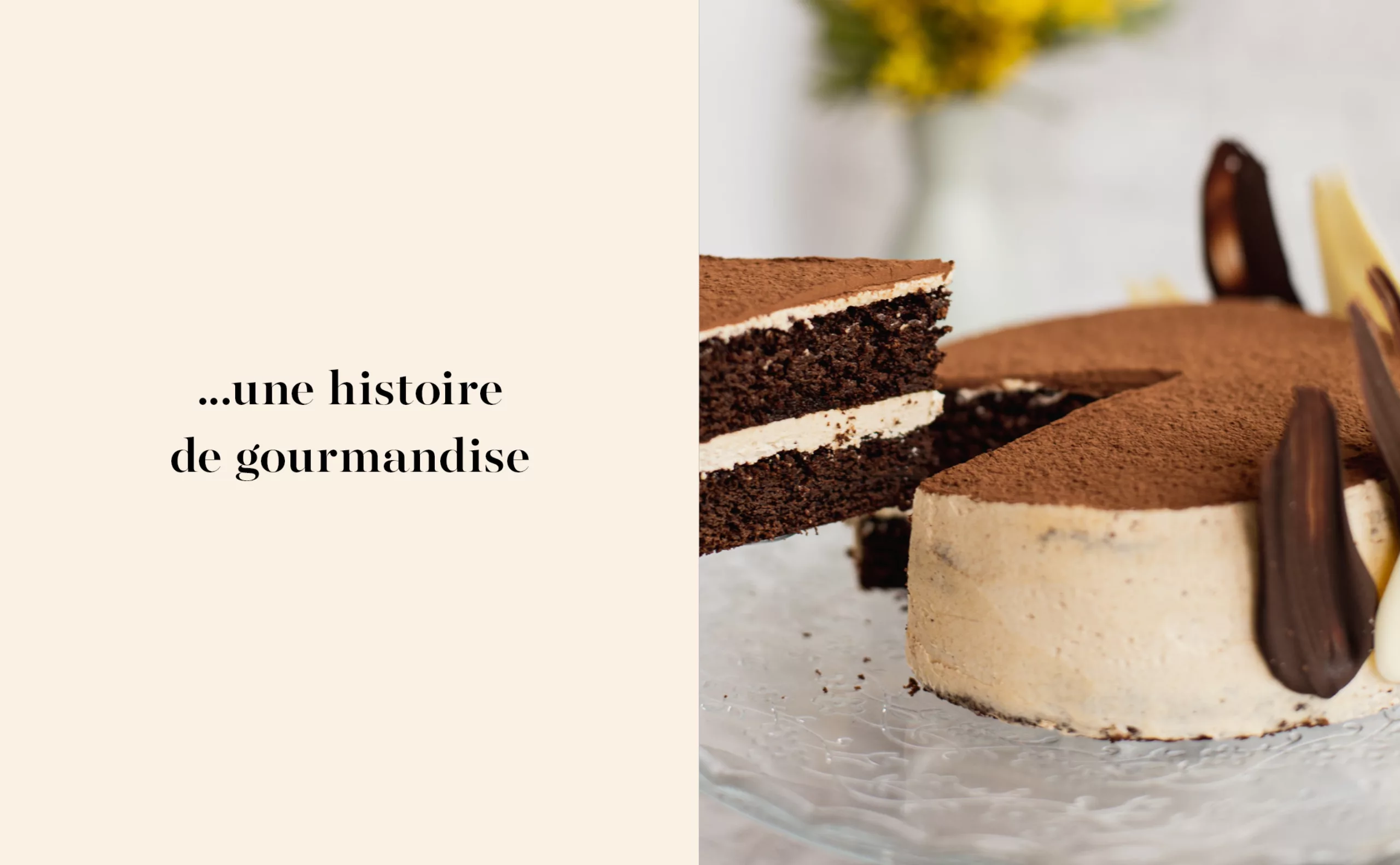
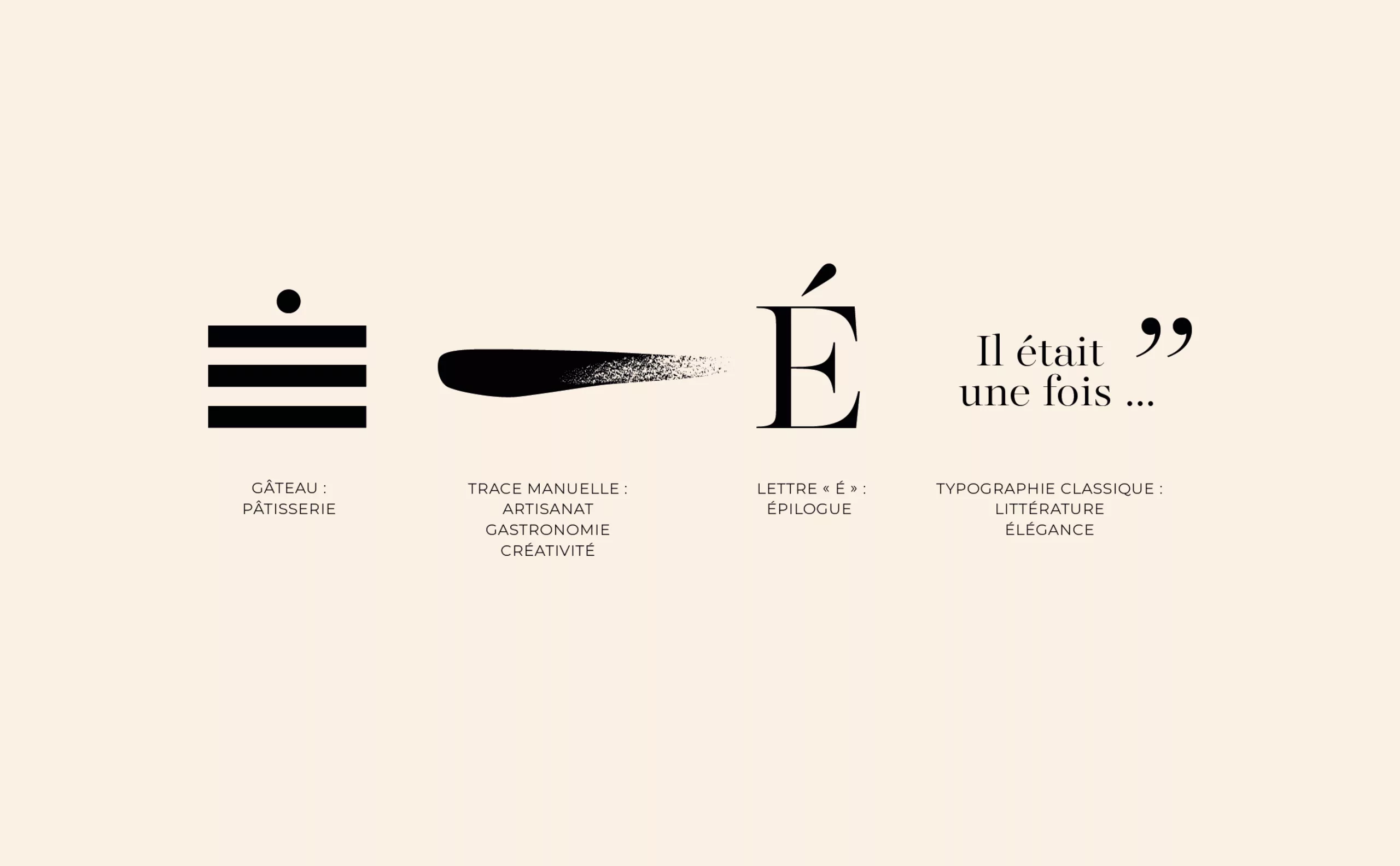
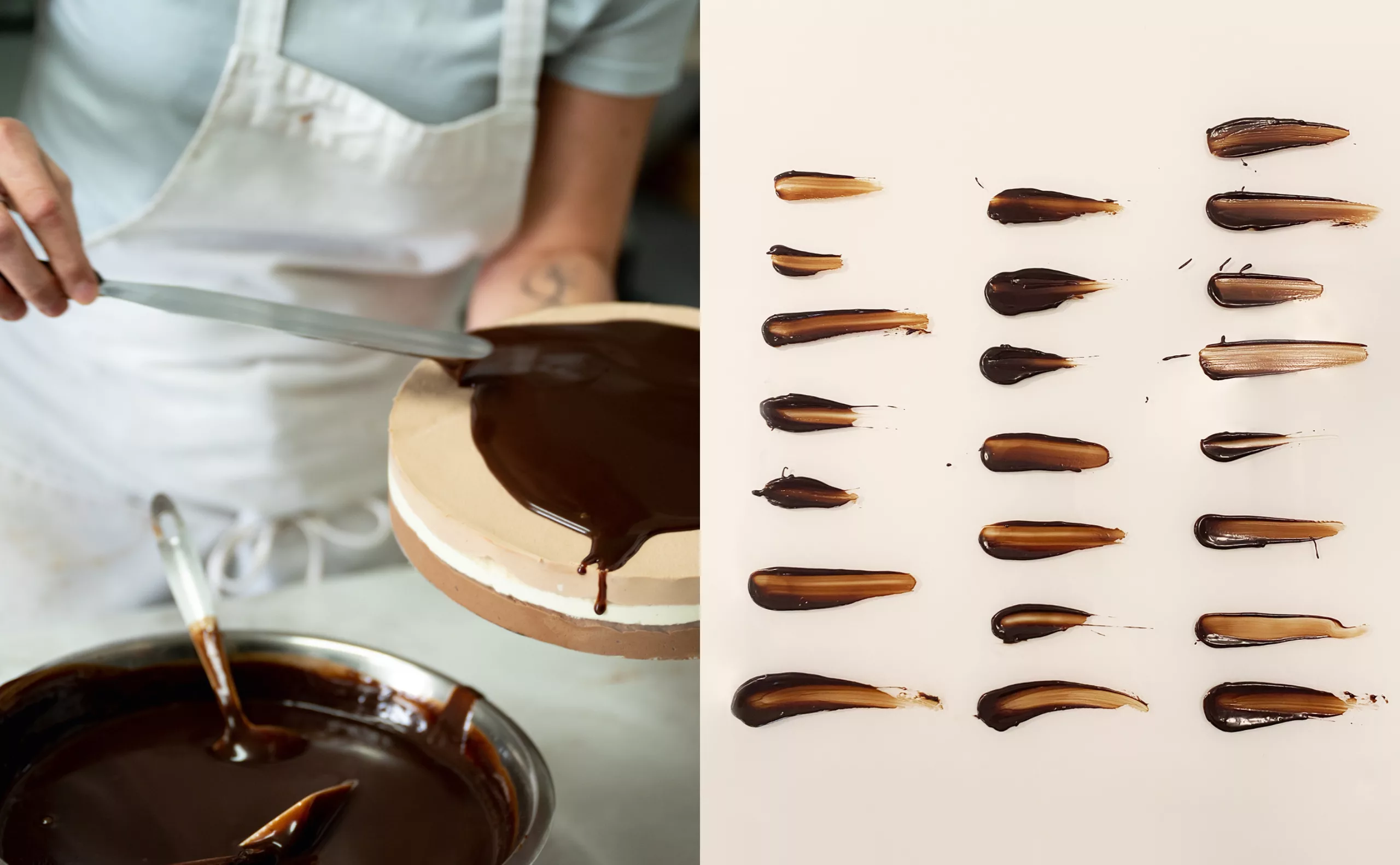
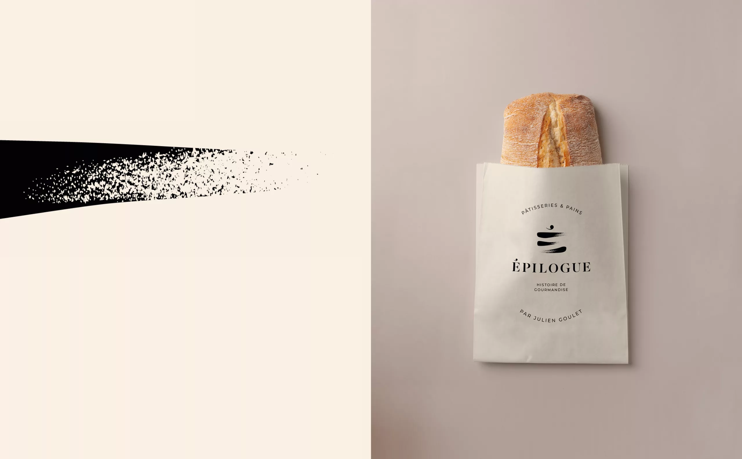
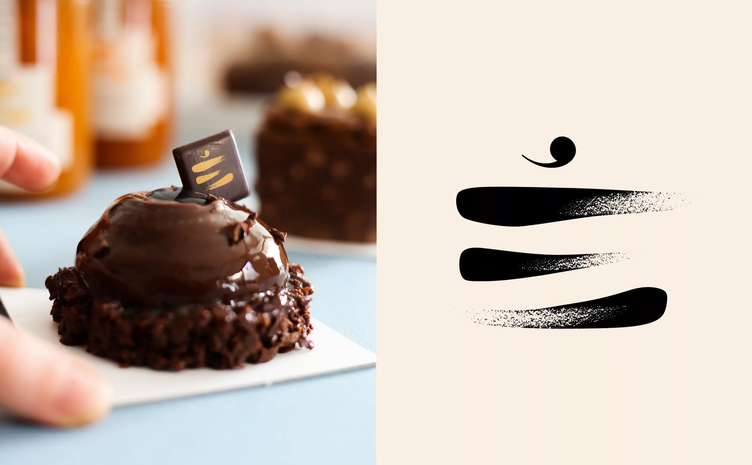
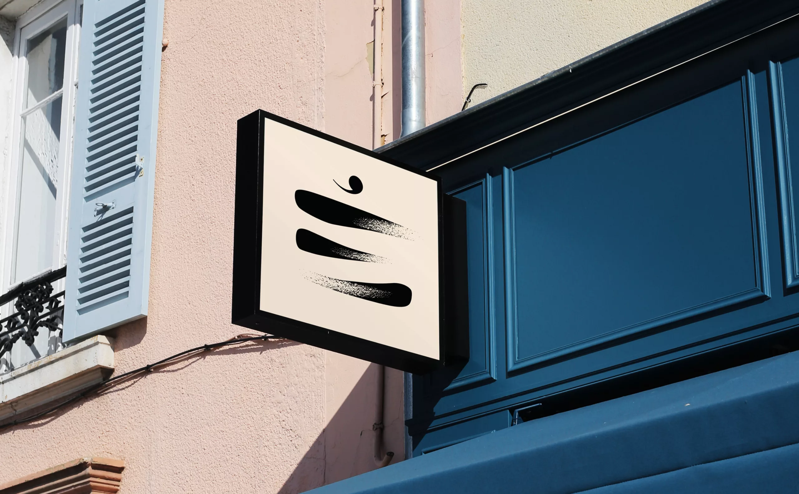
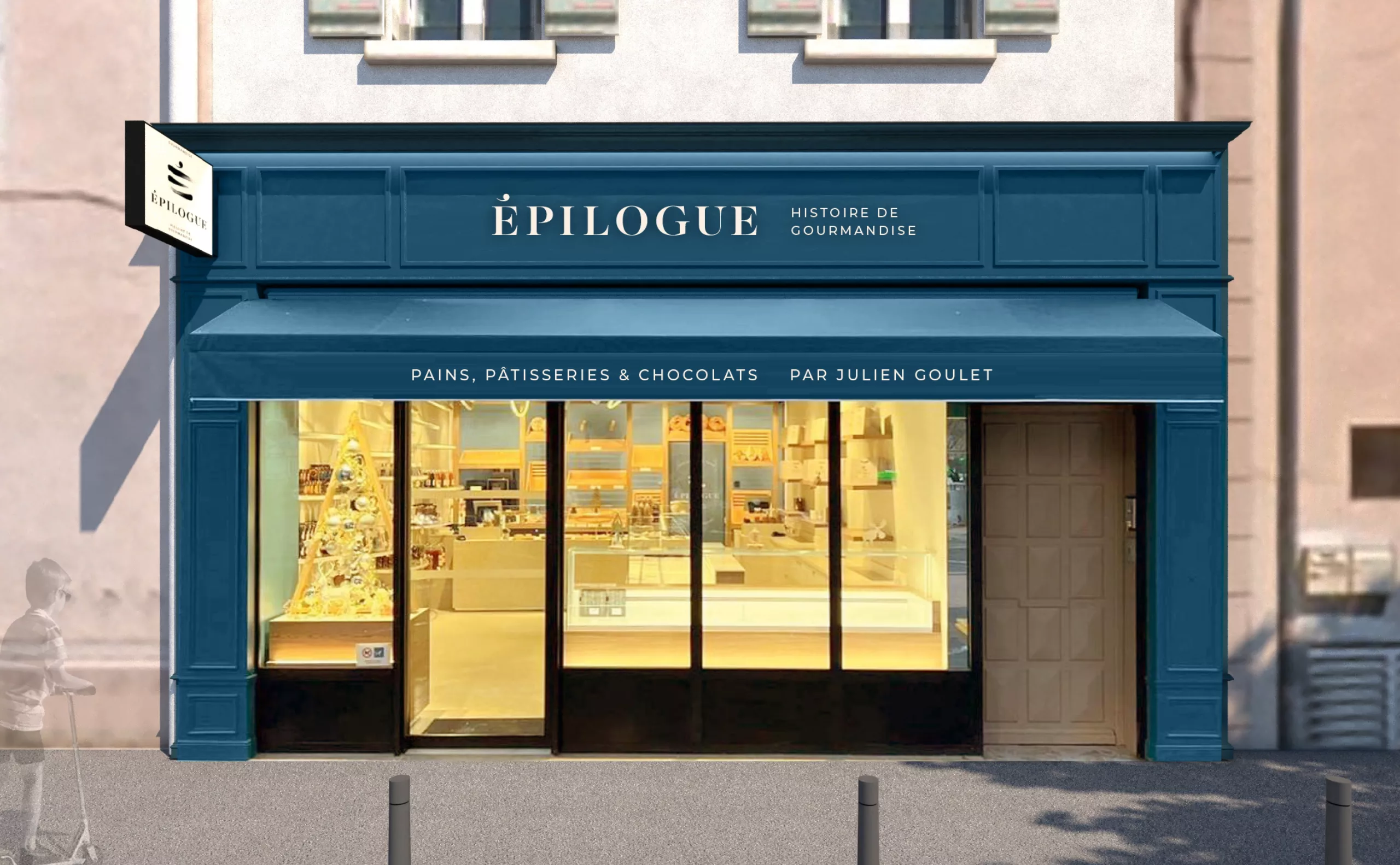
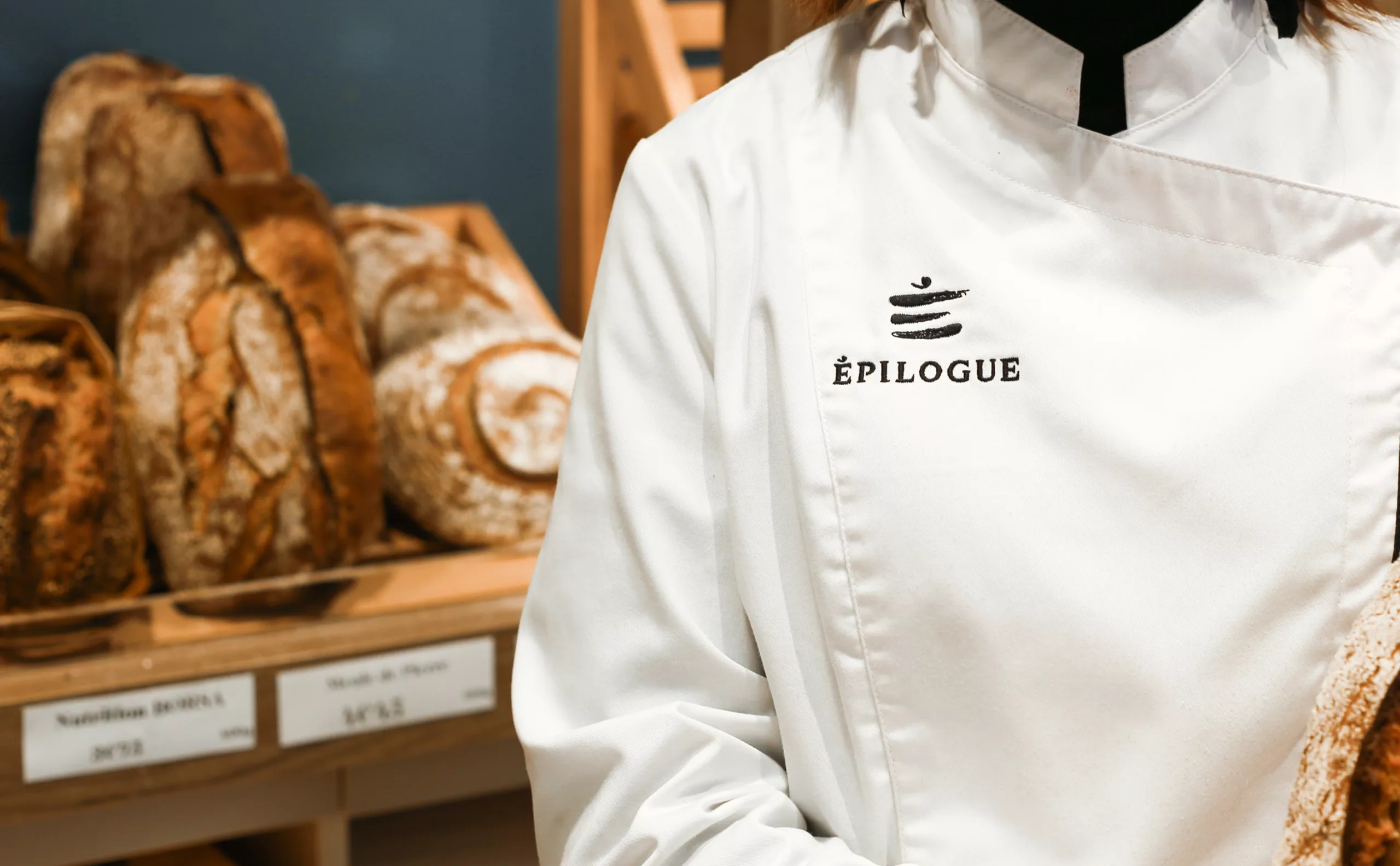
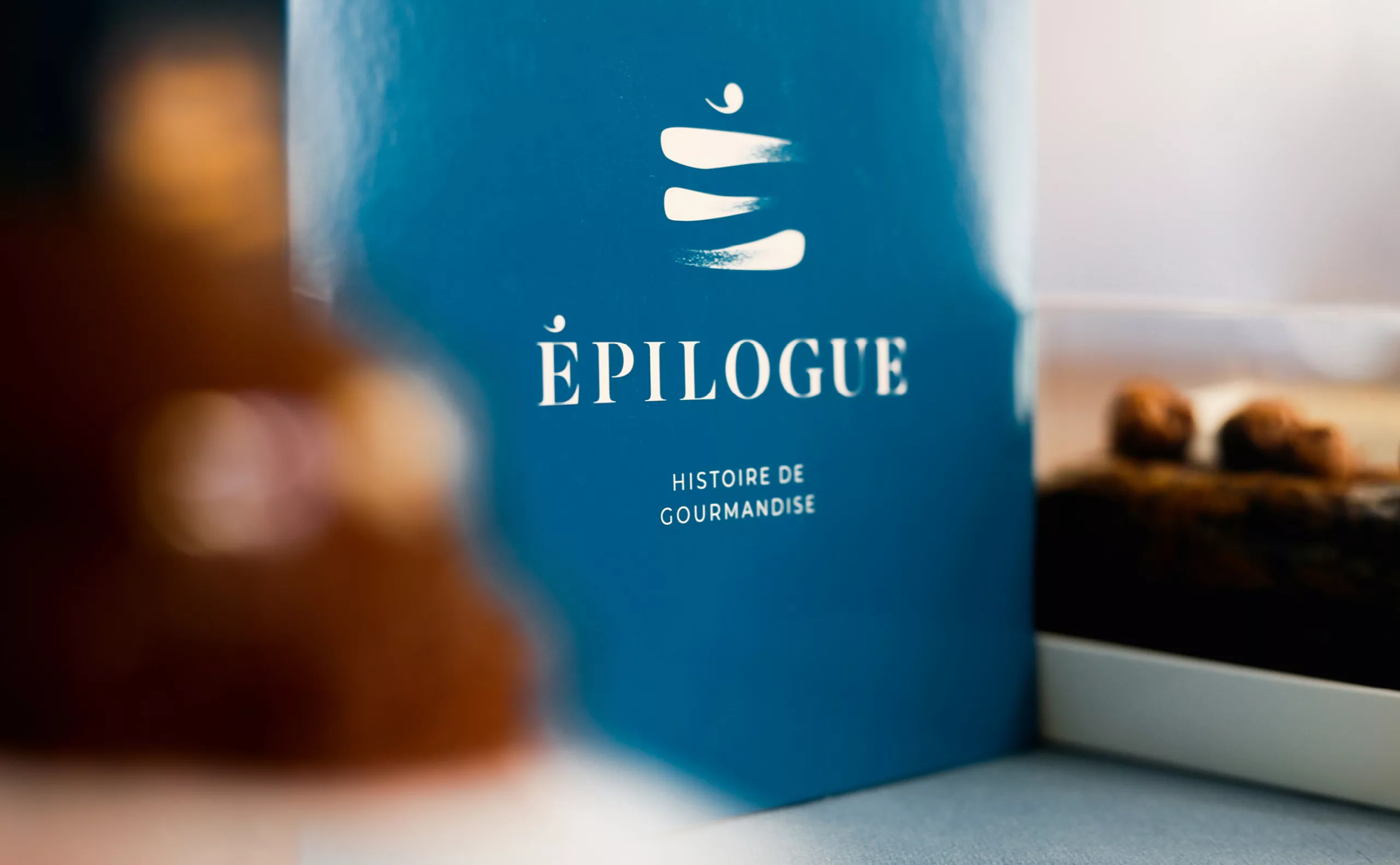
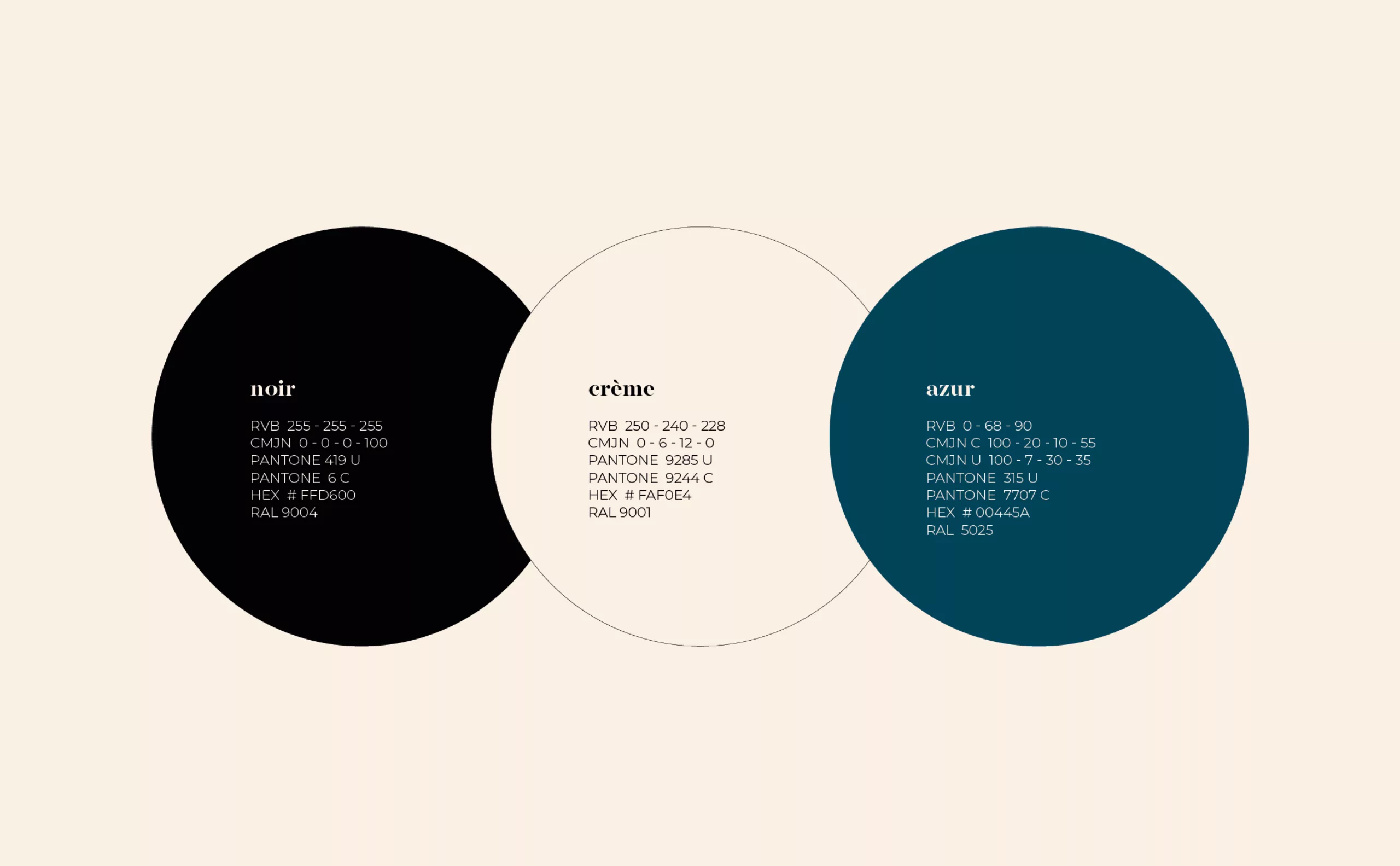
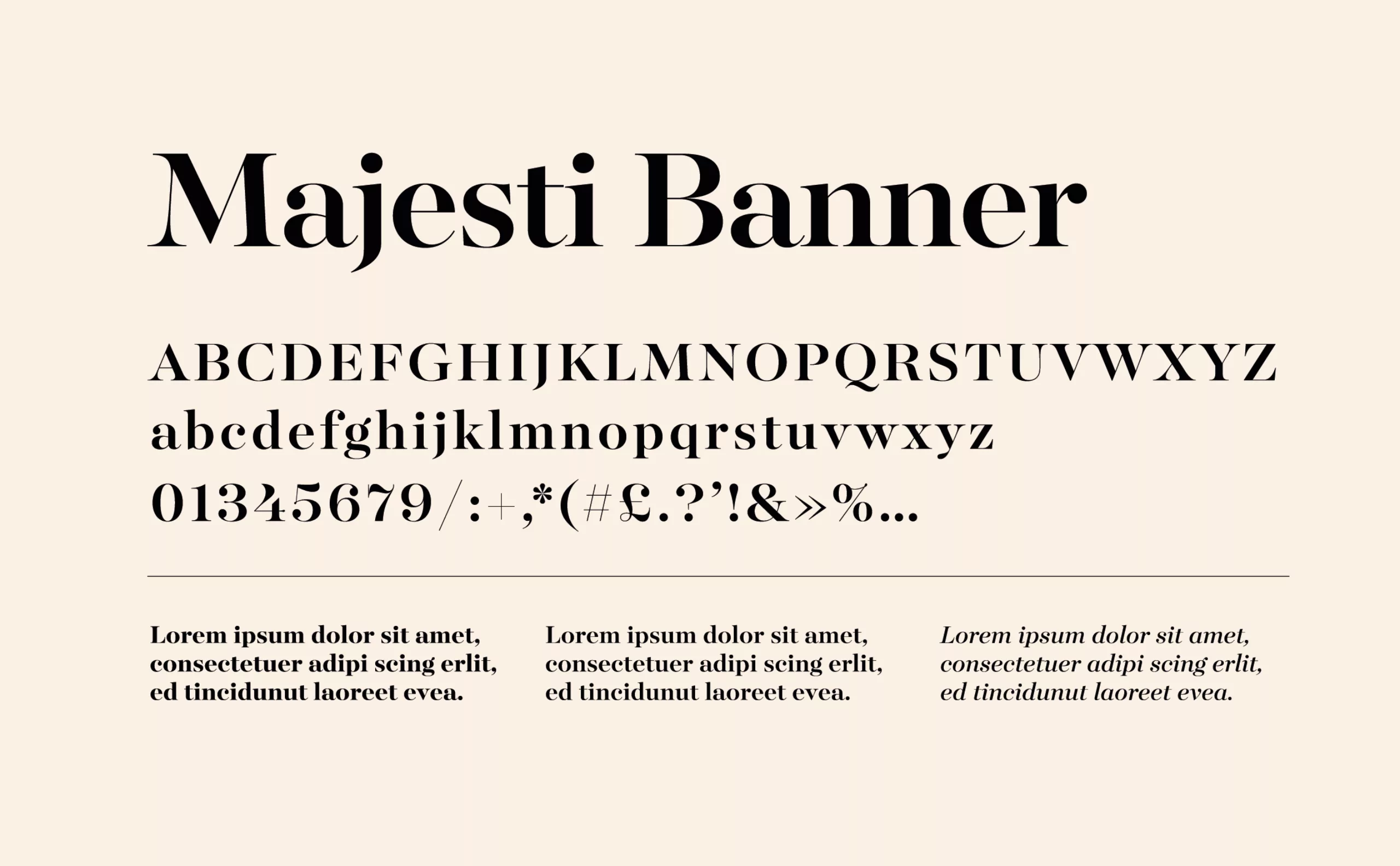
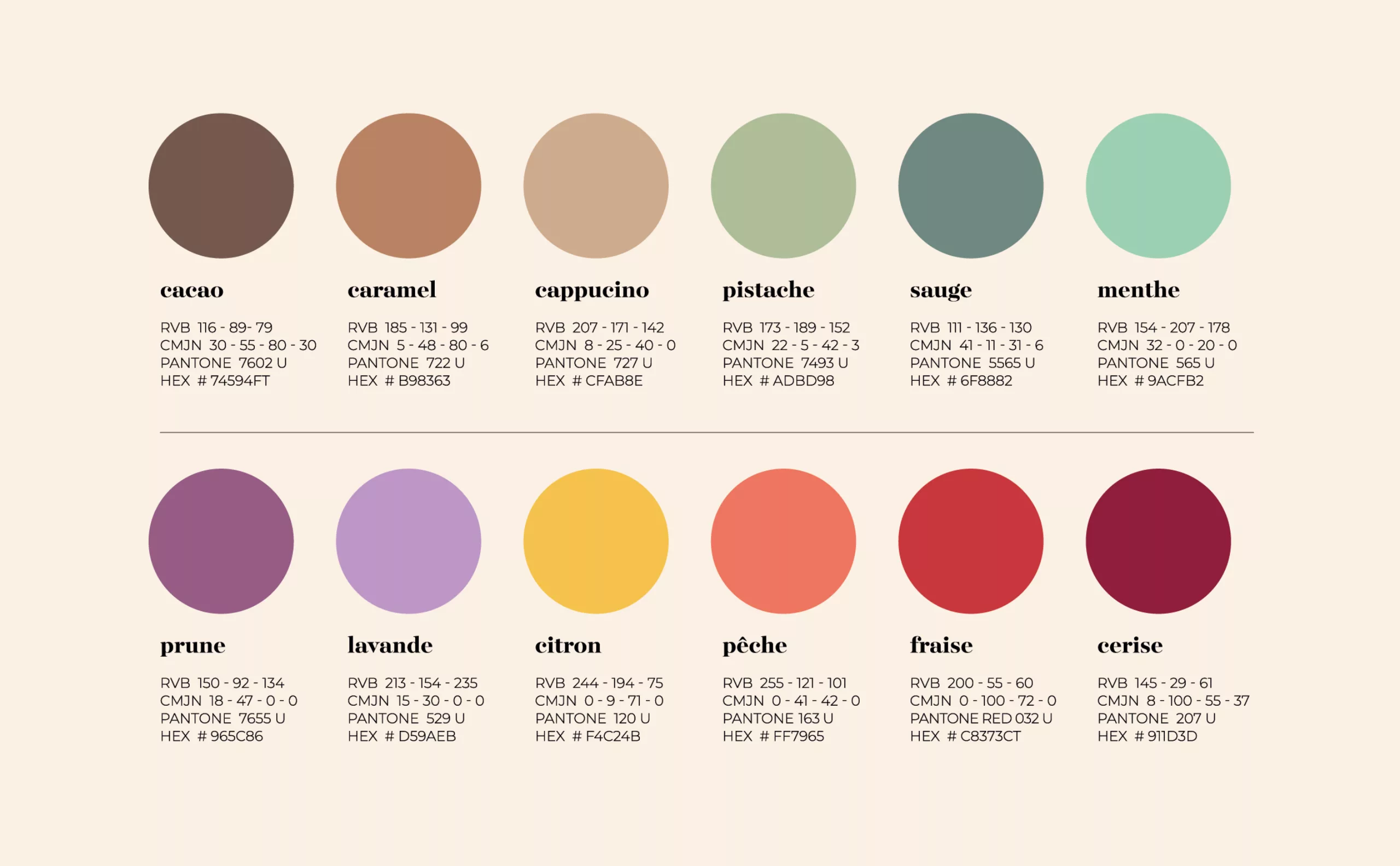
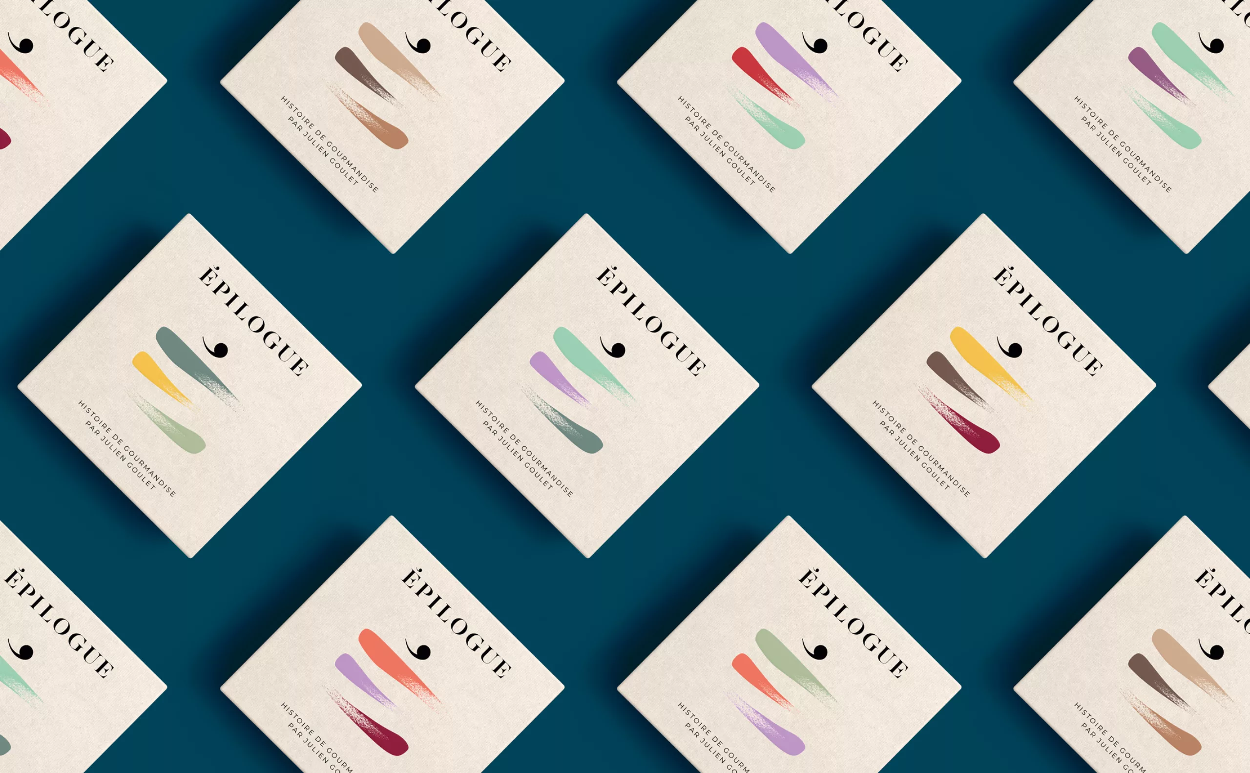
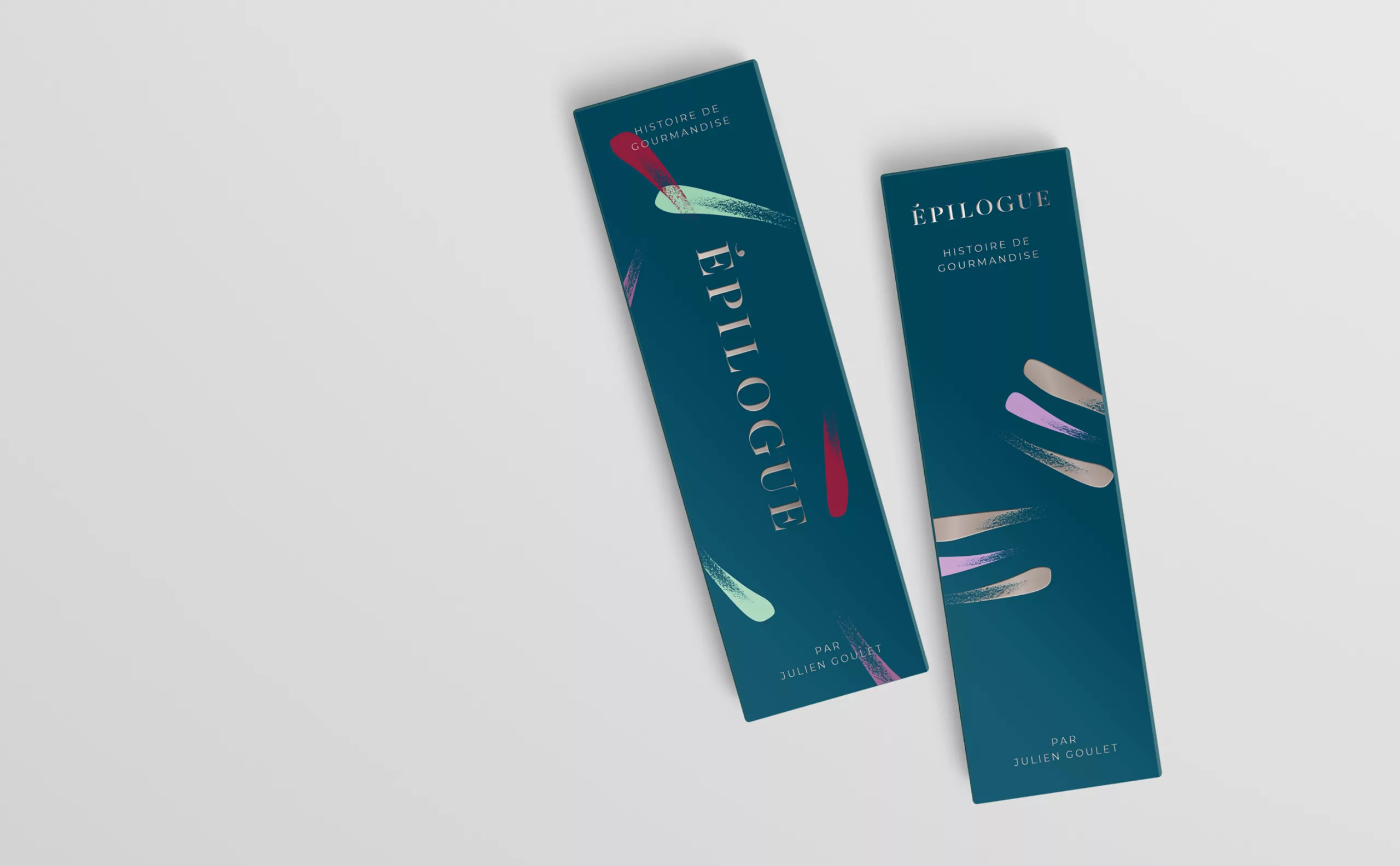
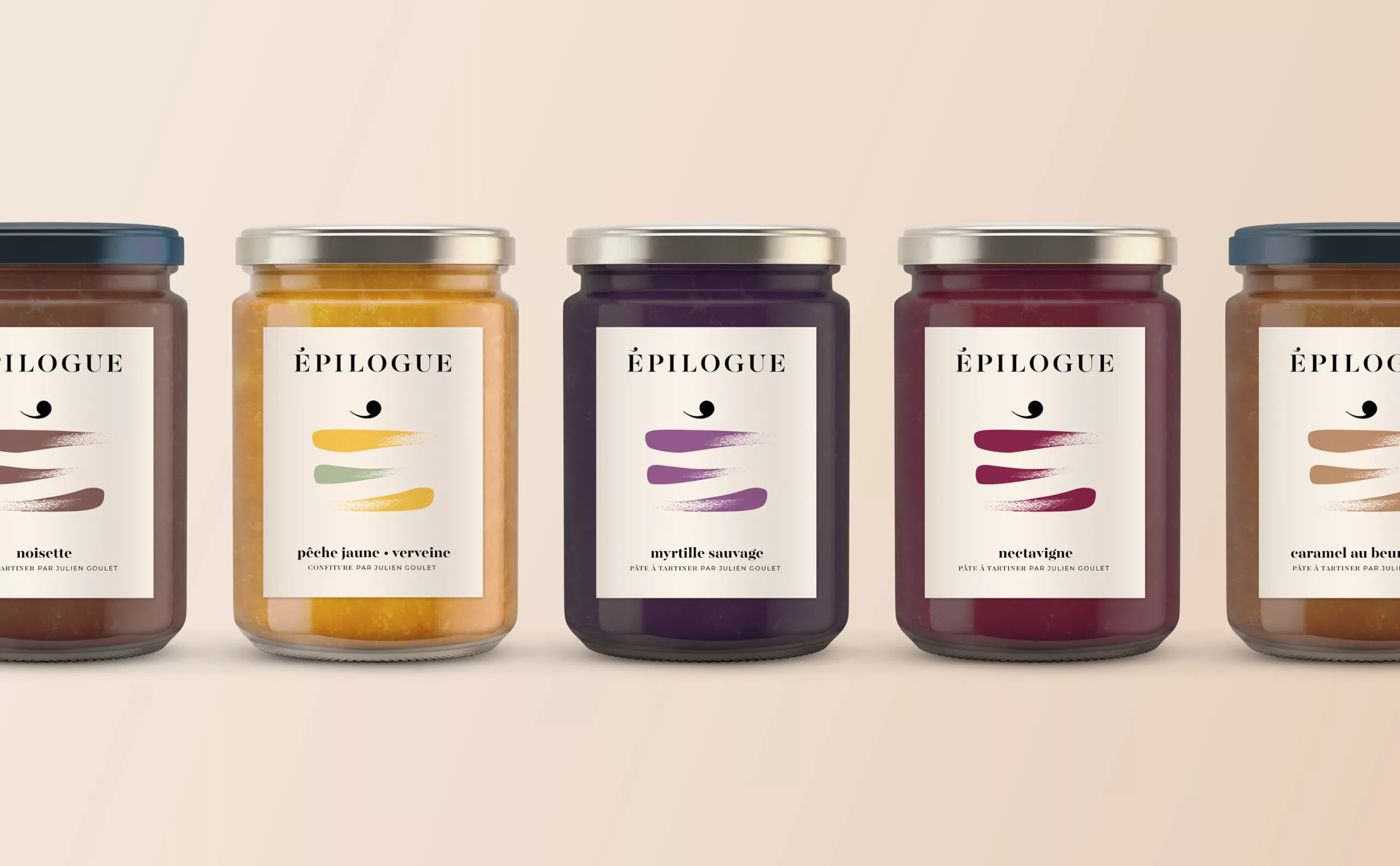
So we helped him to find this name and create this visual identity, and end up with this brand universe with sweet flavors, sometimes acidulous, and always crunchy on the edges.

Naming concept

If the epilogue is the conclusion of a speech, a poem or a literary work, why wouldn't it be the conclusion of a meal? The dessert would then be the epilogue of the meal. The prefix "épi" will evoke the activity of baking by evoking the ear of wheat ("épi de blé" in French).

The beginning of a never-ending story

You enter it as if you were in a bookstore, looking for a gift, without any specific idea. It is not a pretentious place. It is warm, and the smell of bread tickles our nostrils.

The stall is a library of flavors, the choice is abundant. The waiter advises us, with simplicity and passion. Each cake has its own story. The card is the summary, the window, the cover. The bread is sold by the pound and the macaroons are Harlequins. We talk about collections, books and revisiting old recipes. The atmosphere is authentic.

So we leave with a piece of history and the epilogue will be in our plate.

Logotype concept

The logo's icon is as much a letter "É" as it is a piece of cake with an apostrophe as the cherry. Three generously drawn lines represent the different layers of this typographic pastry. To reinforce the artisanal character, we took out our chocolate pans to draw the sign by hand and thus obtain the desired authenticity.

facade patisserie design

Colors

The choice of colors has been carefully selected. Depending on the flavors and seasons, the logo can be adapted to the different products marketed. Peach, verbena, sage or pistachio, the color range is there to make the mouth water.

marketing patisserie social media

Share this project:
Project expertise:
Logo creation, visual identity and graphic guidelines. Creation of brand and company names.
Type of client:
Communication agency in the agriculture, agri-food and forestry sector. Agriculture, livestock and fishing industries up to mass consumption and distribution channels (wholesalers, large and medium-sized stores, retail outlets, catering). Culinary and food communication agency. Brand design for restaurants, bars, brasseries, chefs, brands and food events. Consulting and strategy for sustainable food actors (CHR, producers, wine growers, food brands, drinks and spirits, grocery stores and food shops, institutions, ecommerce, digital concepts, etc.)

Related projects: