Maisons Paysannes is an association that has been campaigning for 50 years for the preservation of buildings and rural landscapes. It was created in 1965 during the rural exodus that caused the abandonment of traditional rural buildings. Its action is based on its great mastery of techniques and know-how, as well as its knowledge of traditional materials specific to each region according to its geology, vegetation and climate.
Maisons Paysannes de France
Maisons paysannes de France; New national & delegations visual identity system

Objectives:
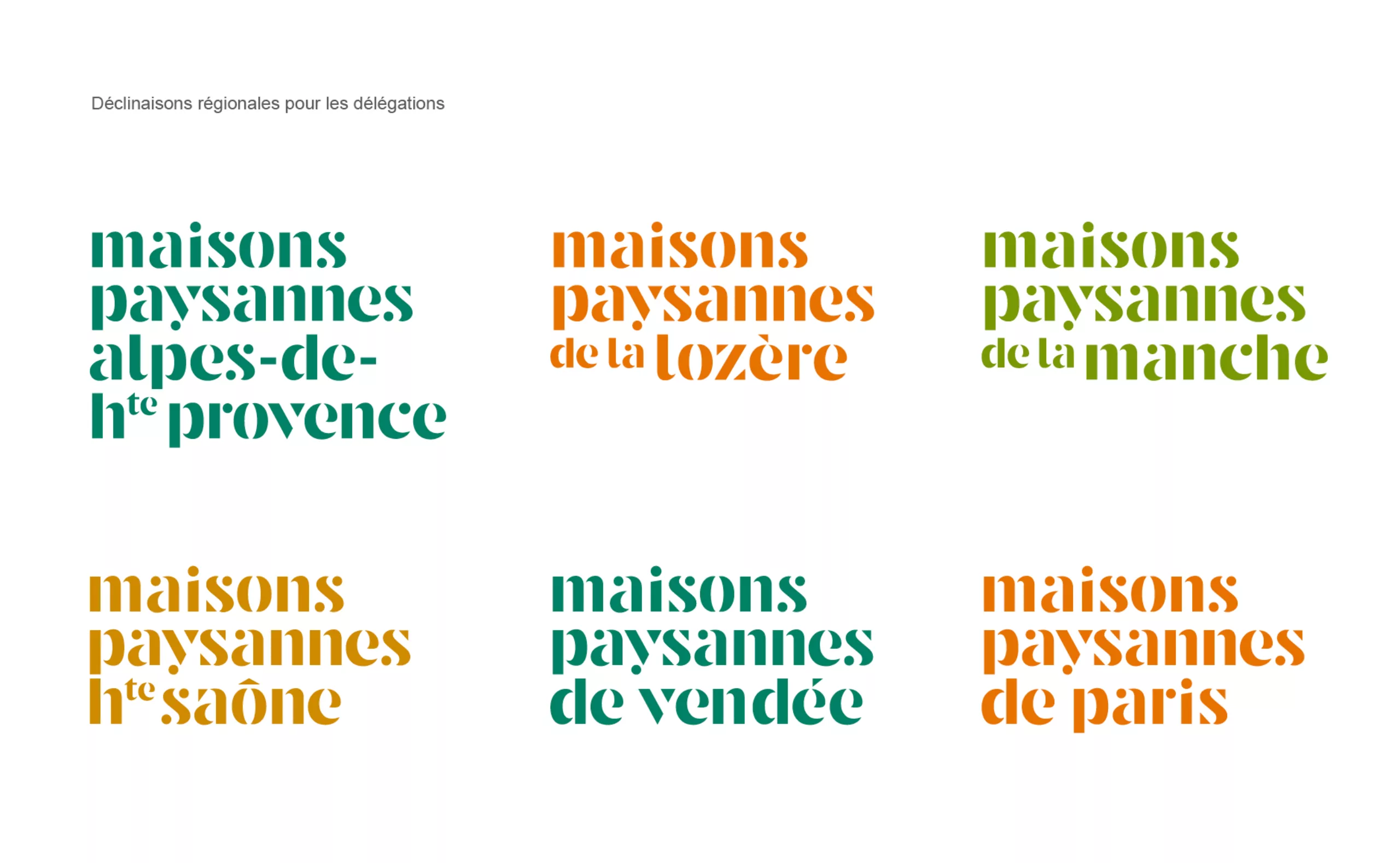
- Put delegations back at the centre of action by introducing local variations of the logo
- Maintain a clear identification of the association by the smooth sliding of the current logo towards an updated version immediately recognizable throughout the territory.
- Rejuvenate the association’s aging brand image
Identification in relation to the current logo:
- Bold letters, their roundness and flexibility
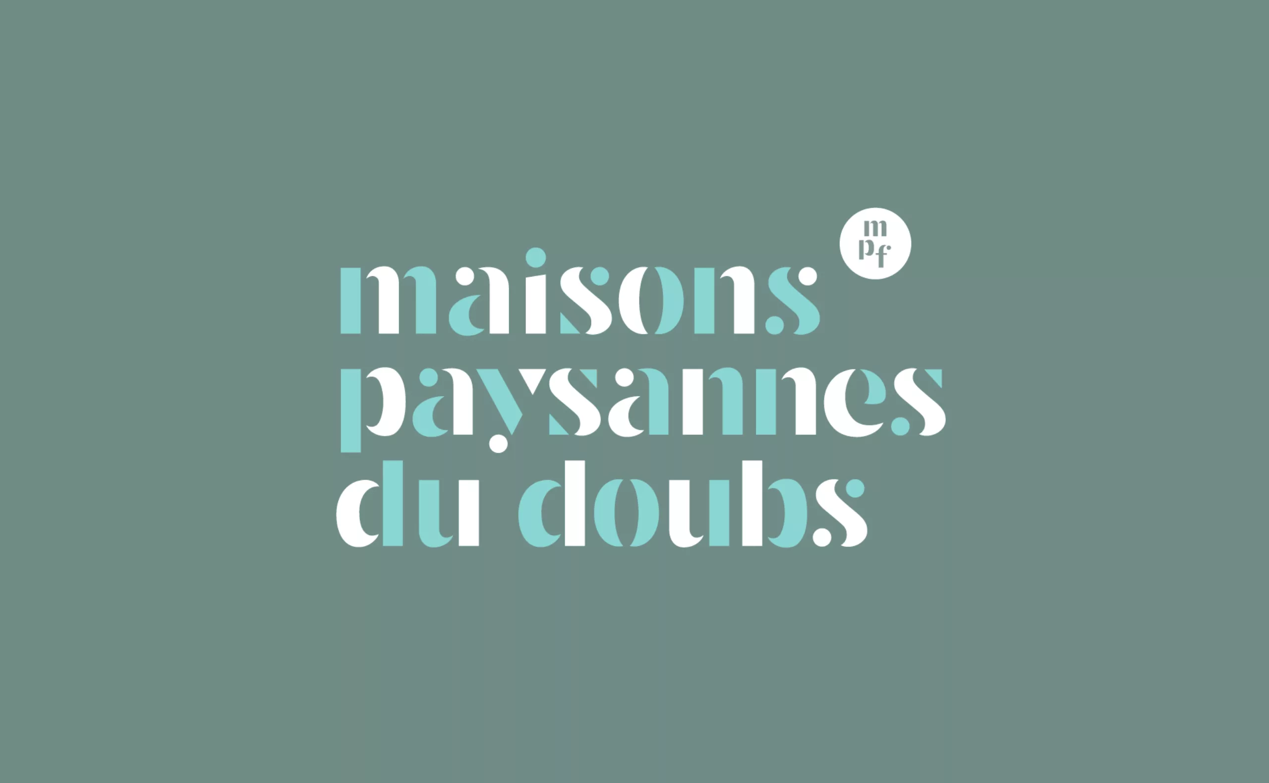
- logo set on three lines: feeling of solidity and strength
- a lowercase typeface: simplicity and community spirit
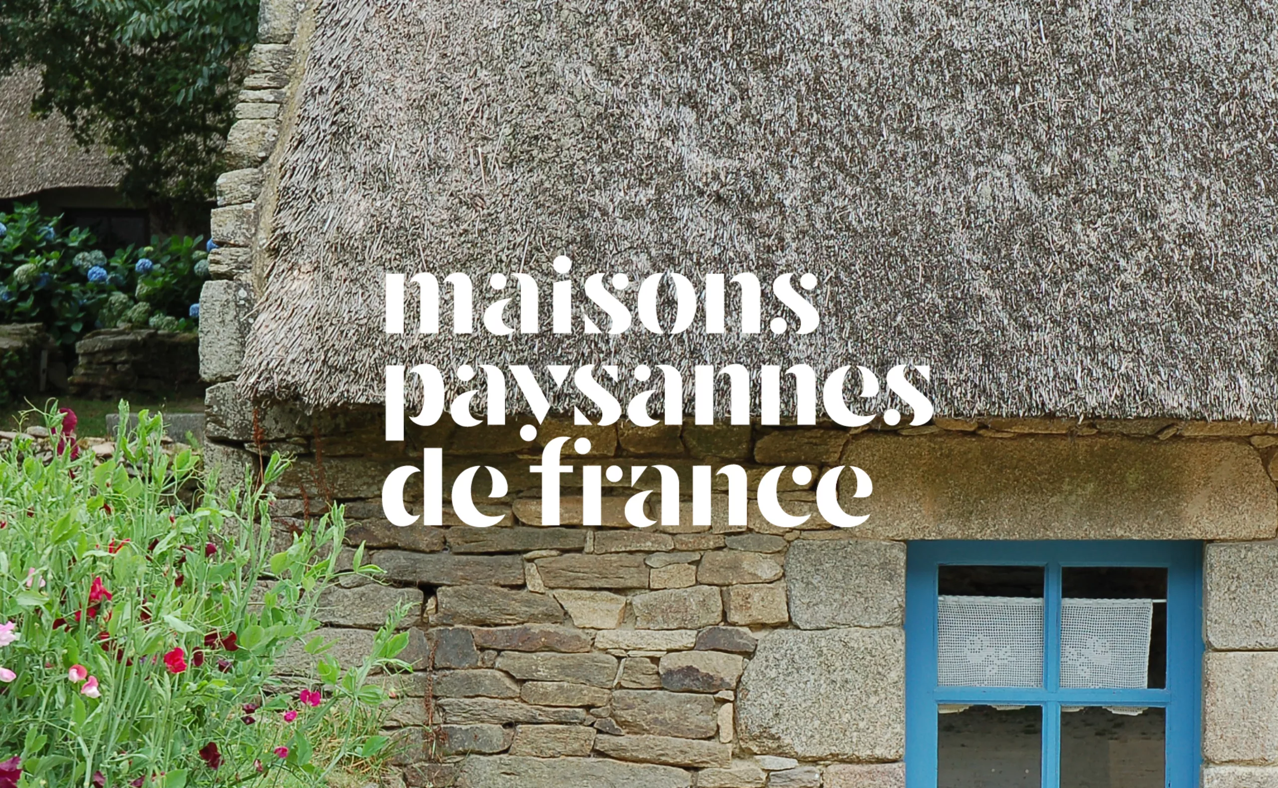

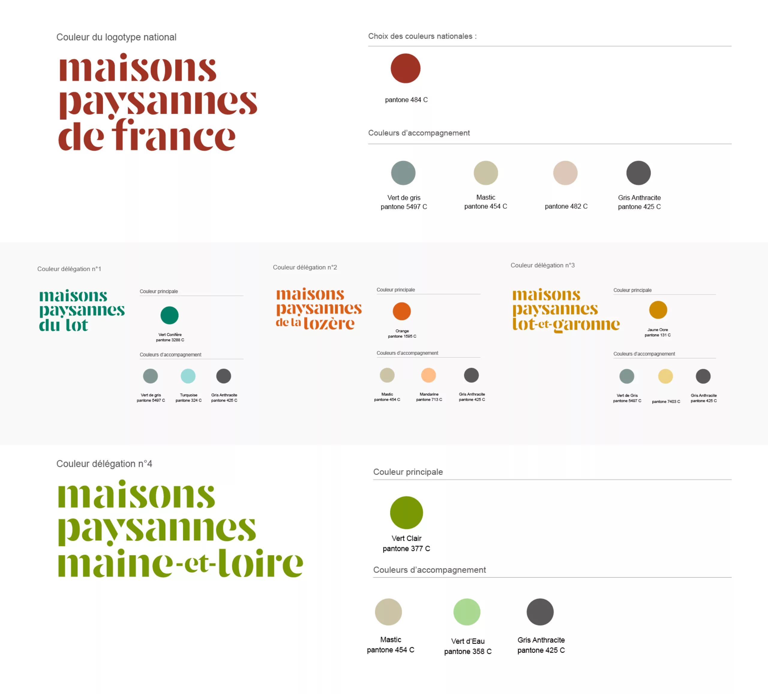
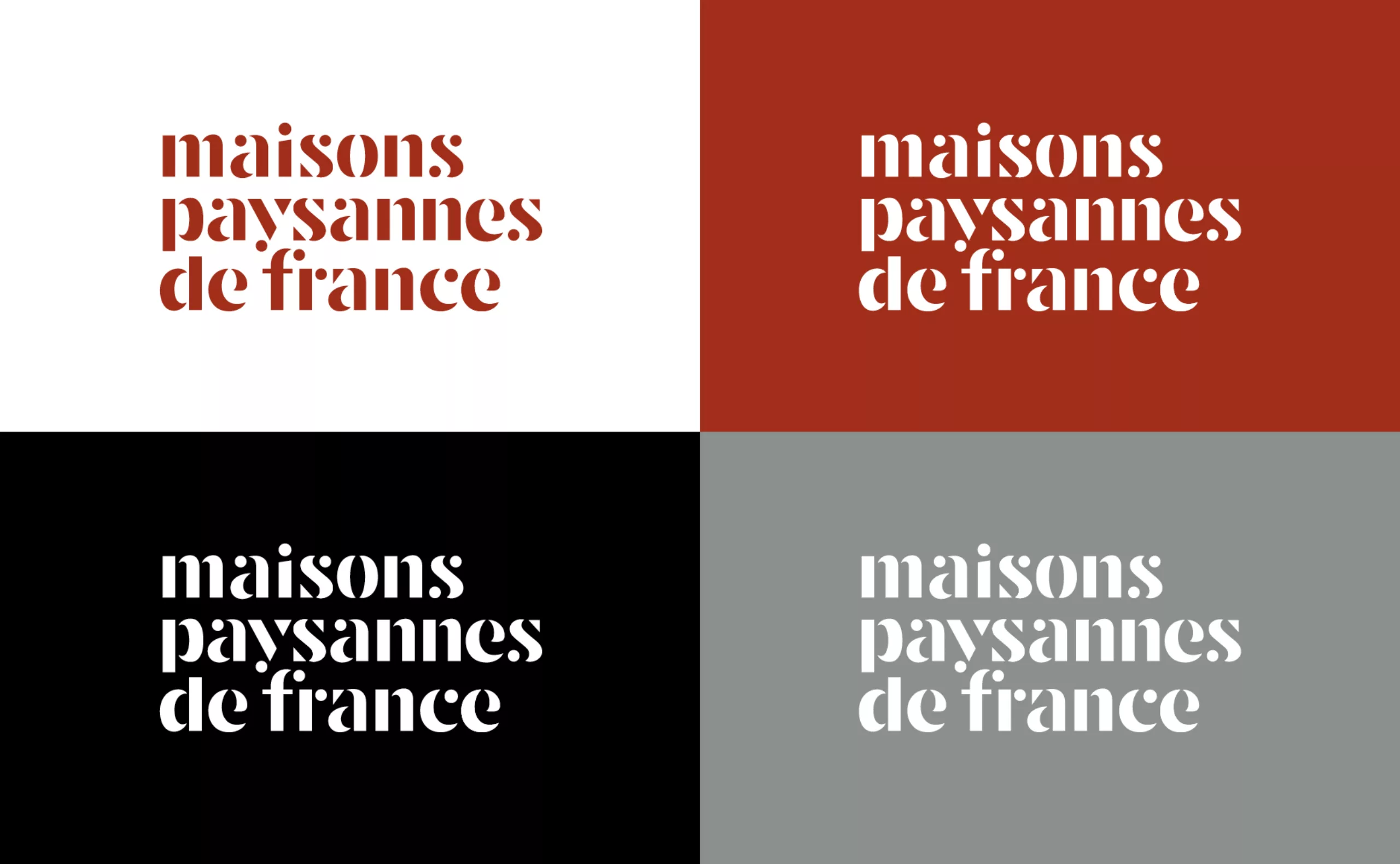
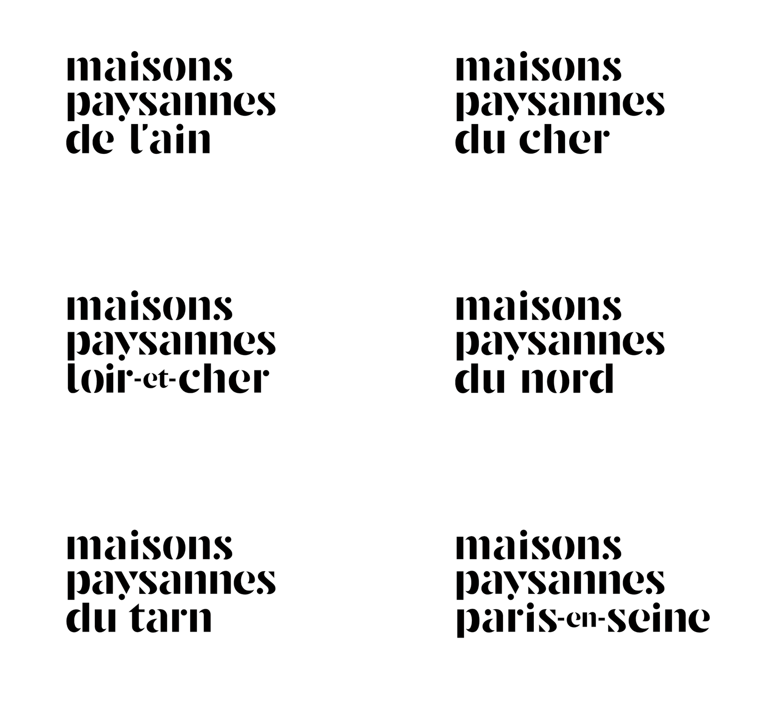
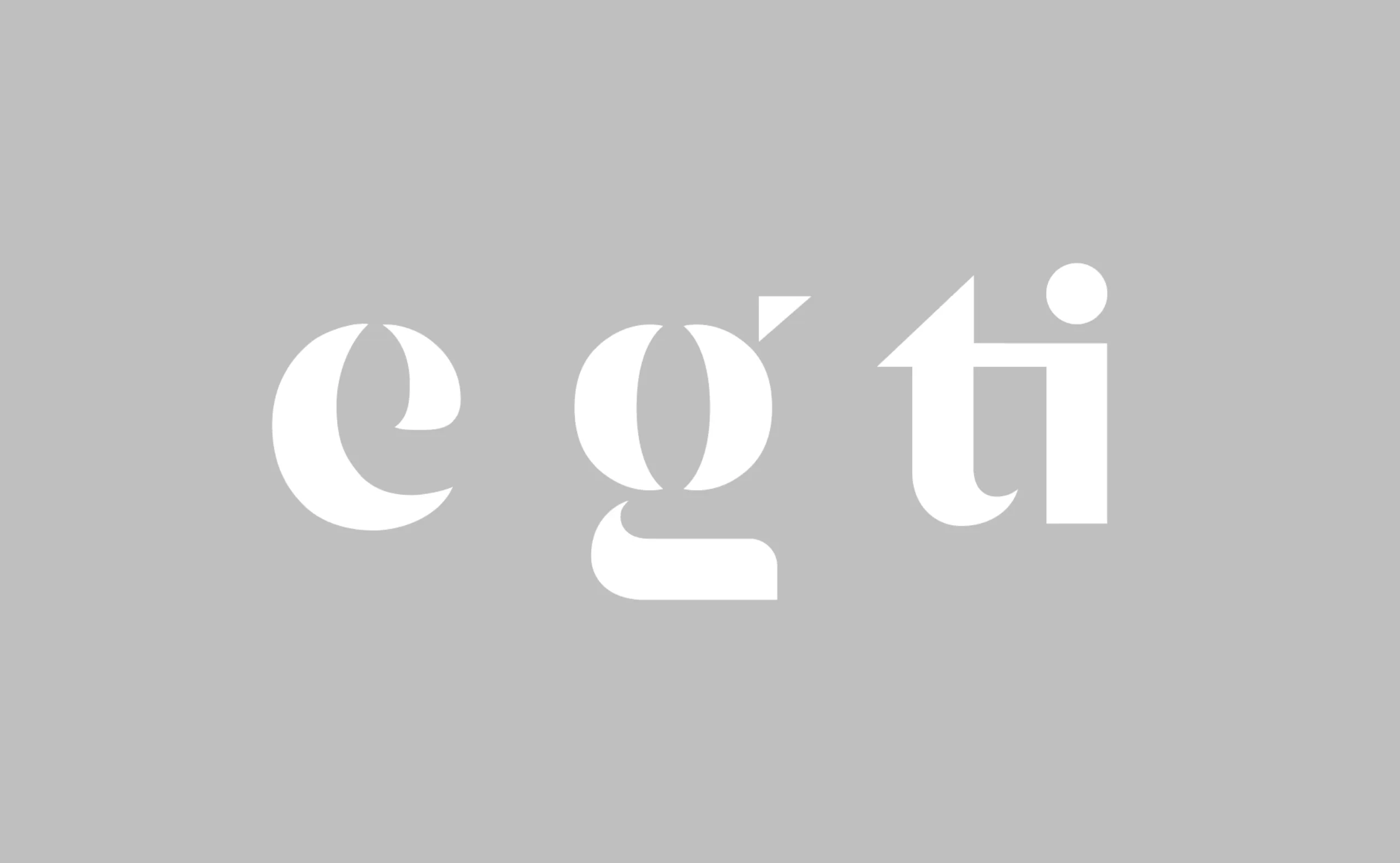
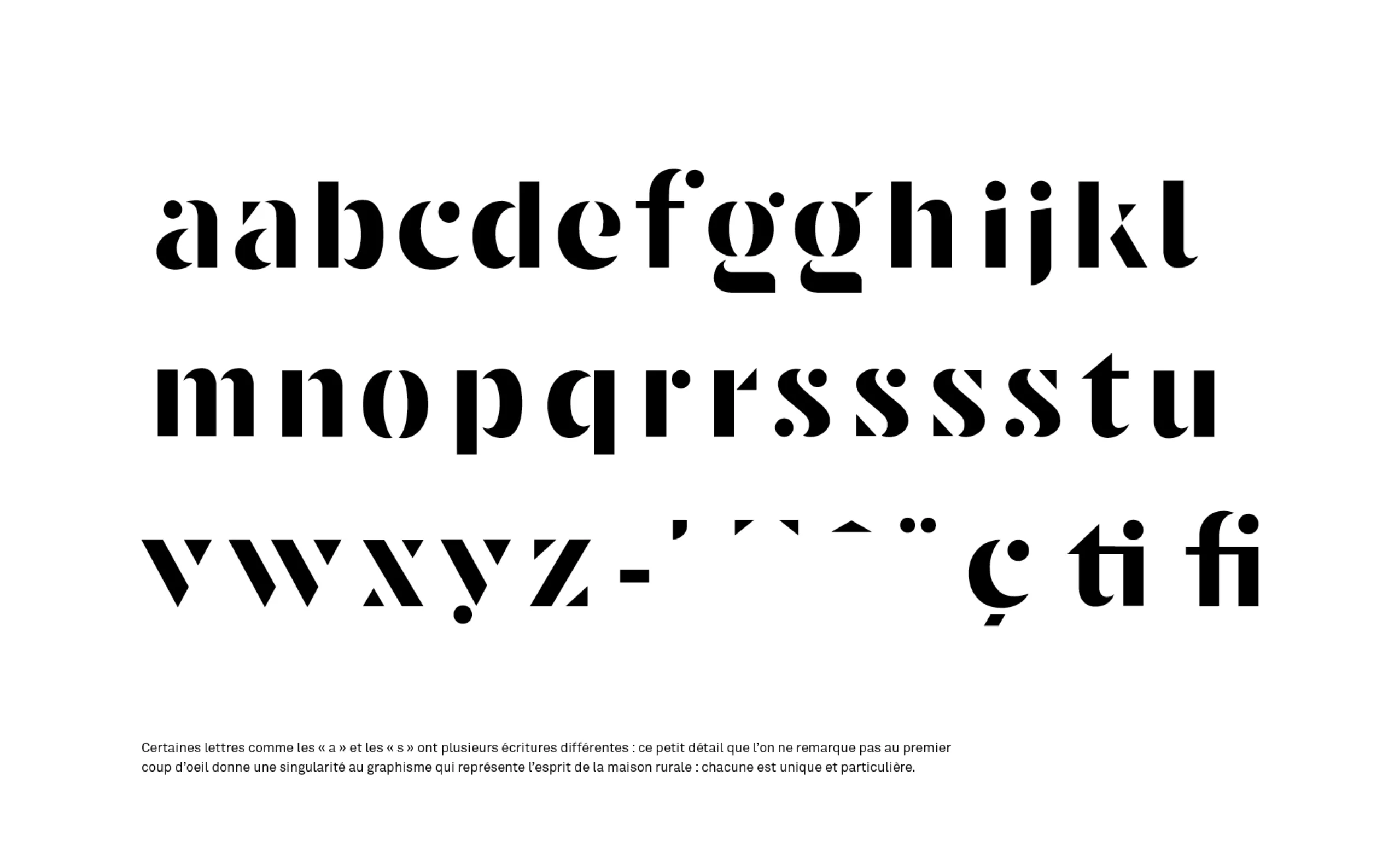
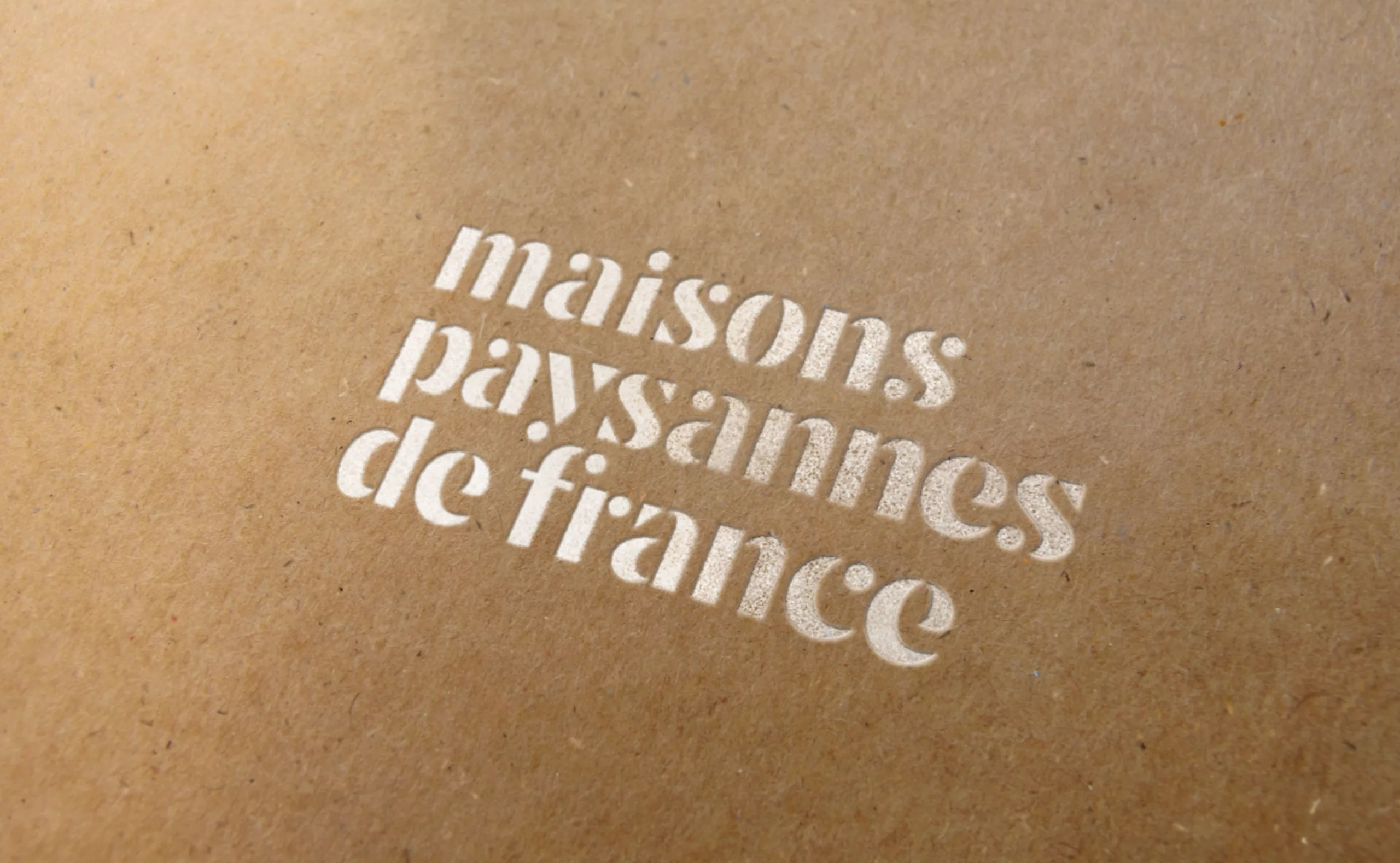
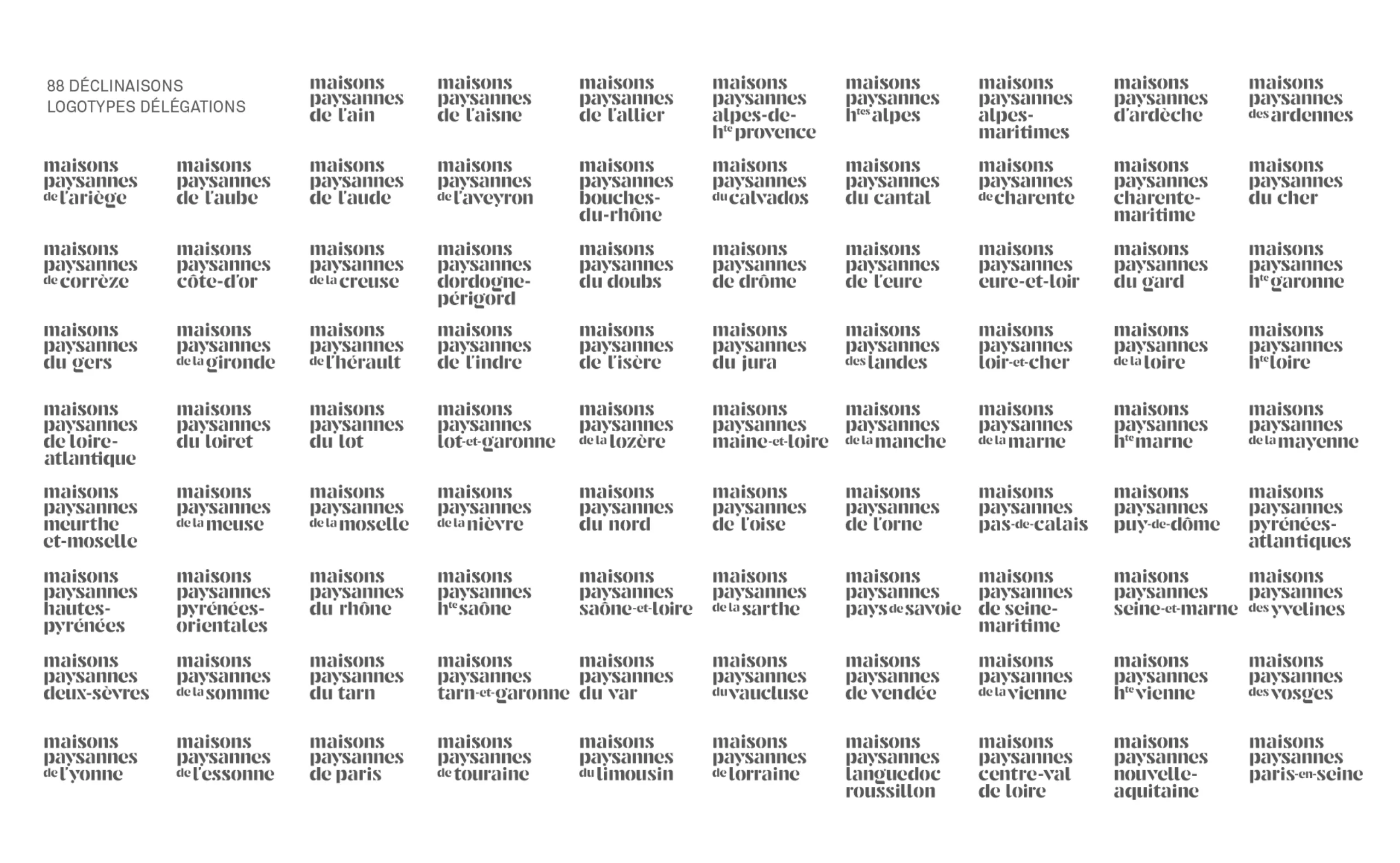
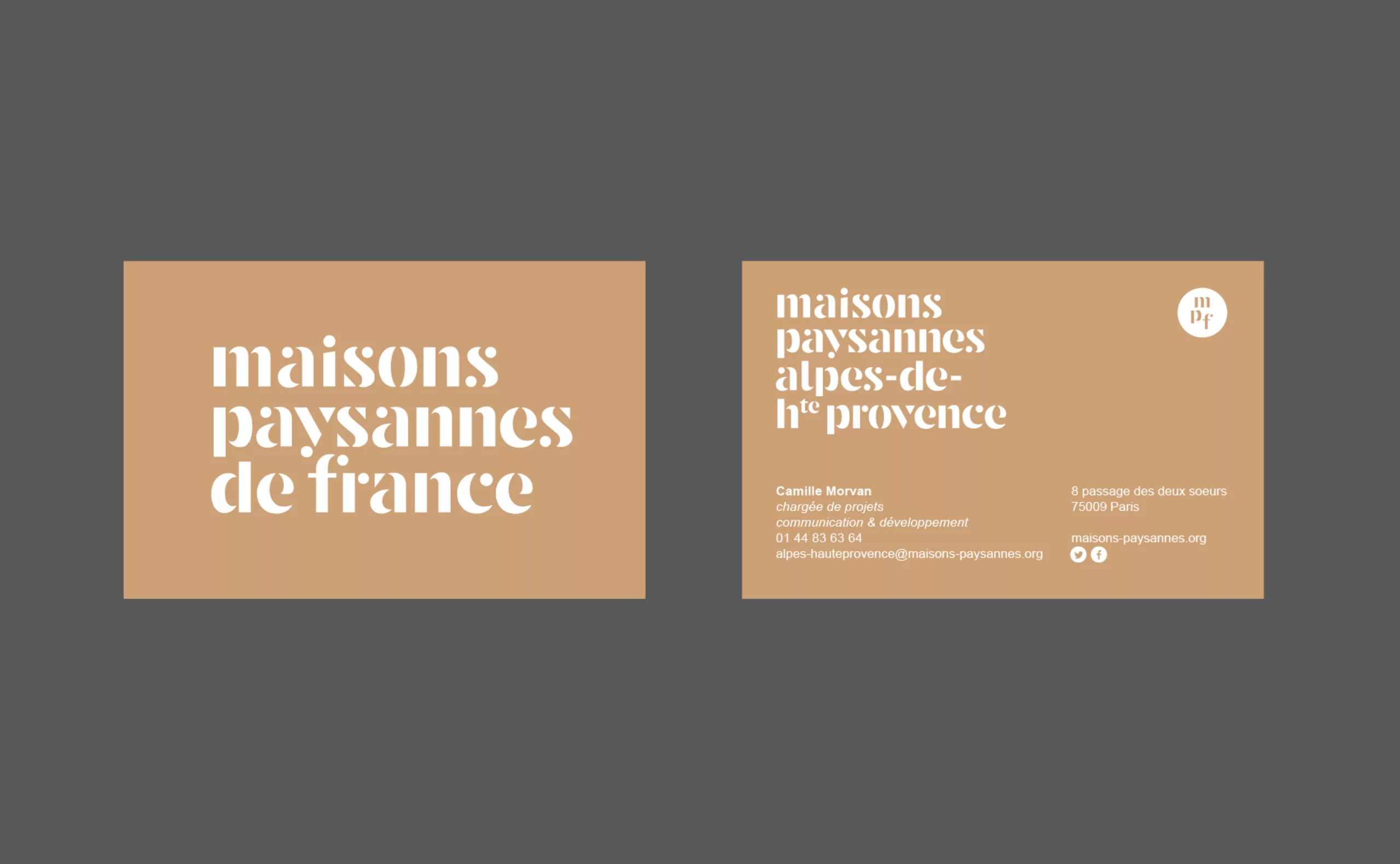
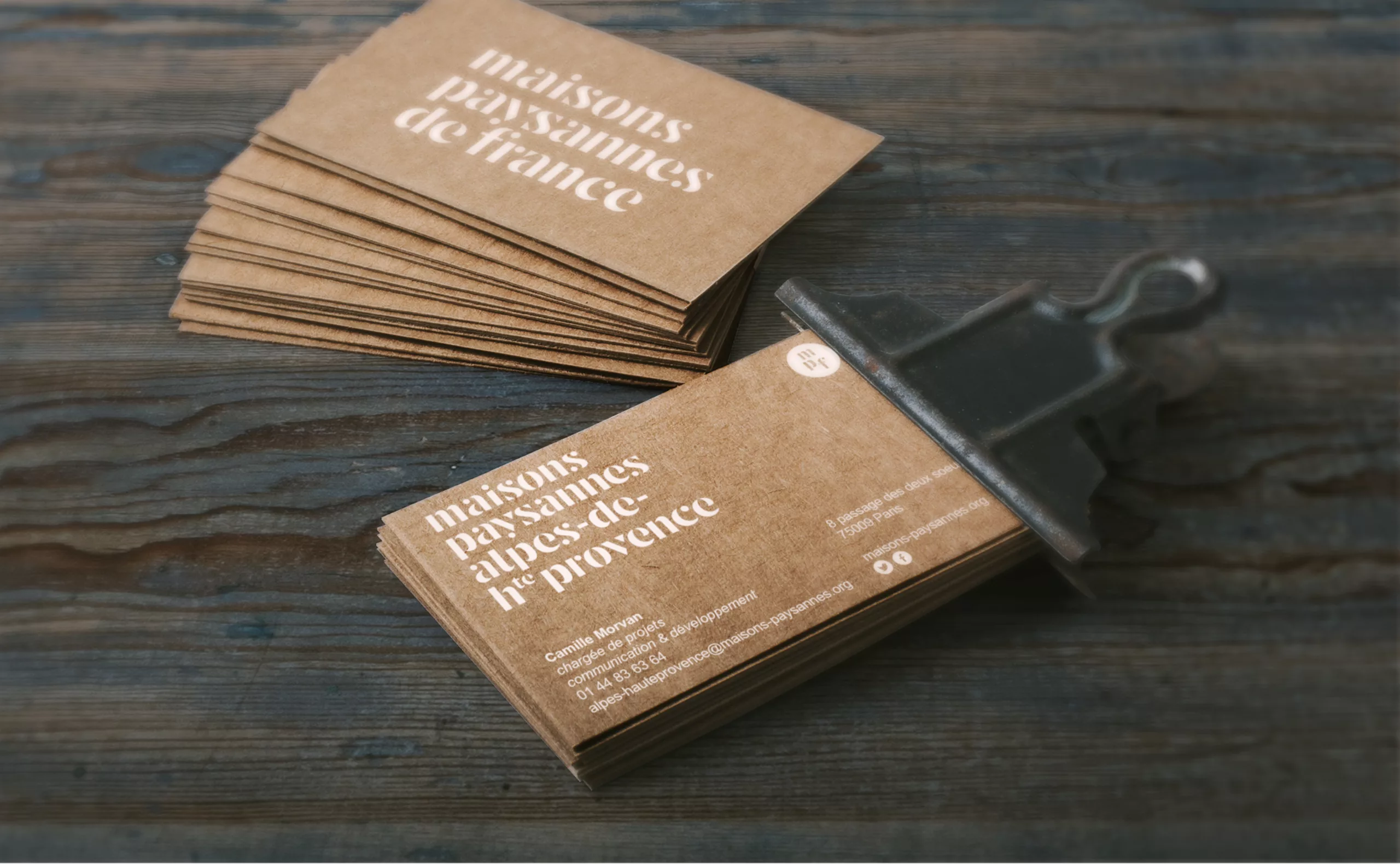
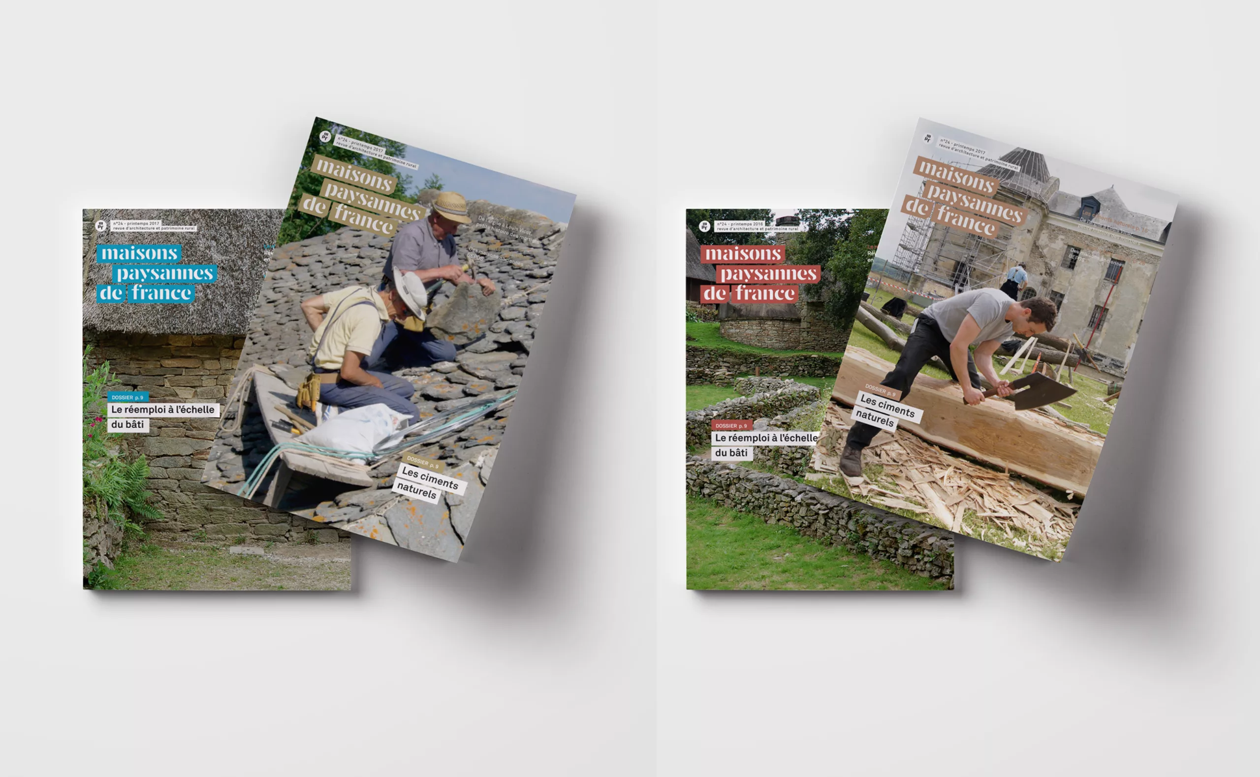
The new stencil lettering created for Maisons Paysannes de France evokes architecture and co-construction. It is an original design that installs a differentiating signature. The creation of this custom lettering allows the national MPF logo to be declined into 88 decentralized delegation logos.
Some letters like “a” and “s” have several different writings: this small detail that we do not notice at first glance gives a singularity to the graphics that represents the spirit of the peasant house, each one is unique, particular.
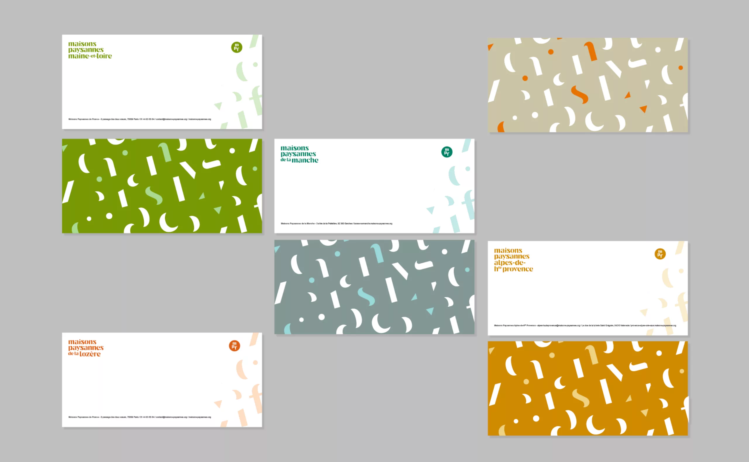
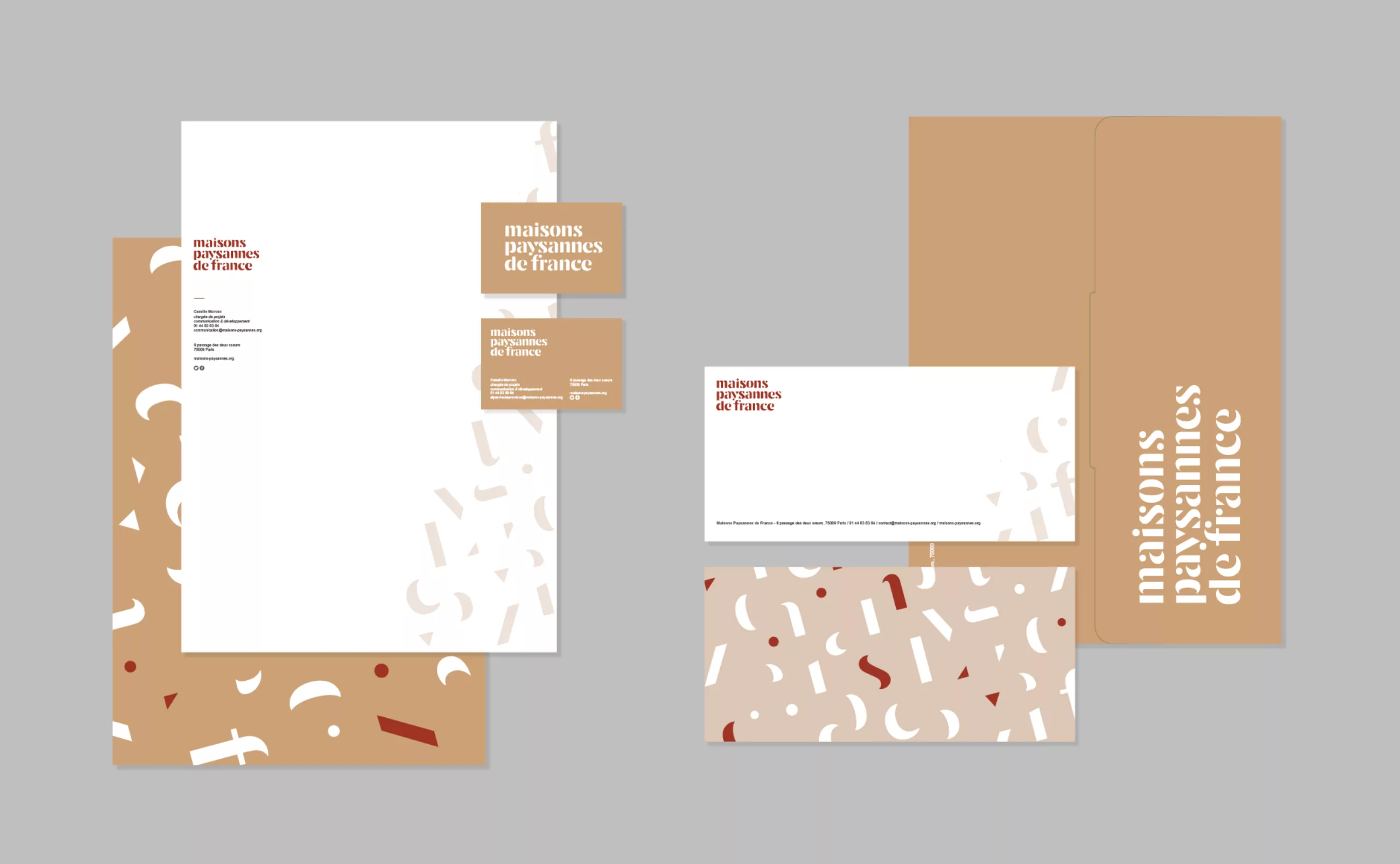
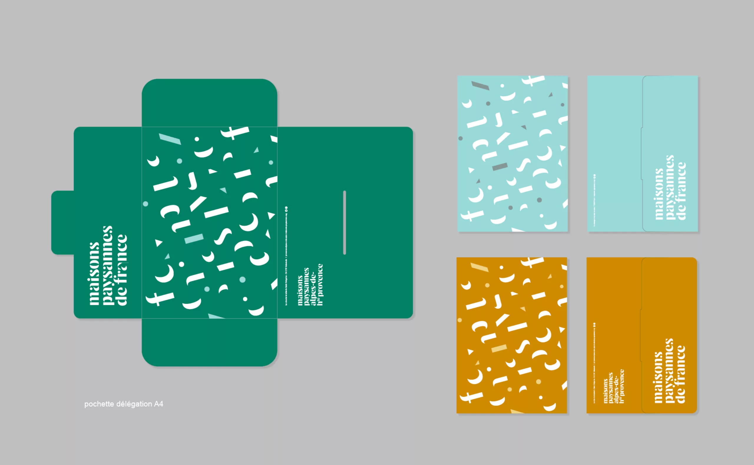
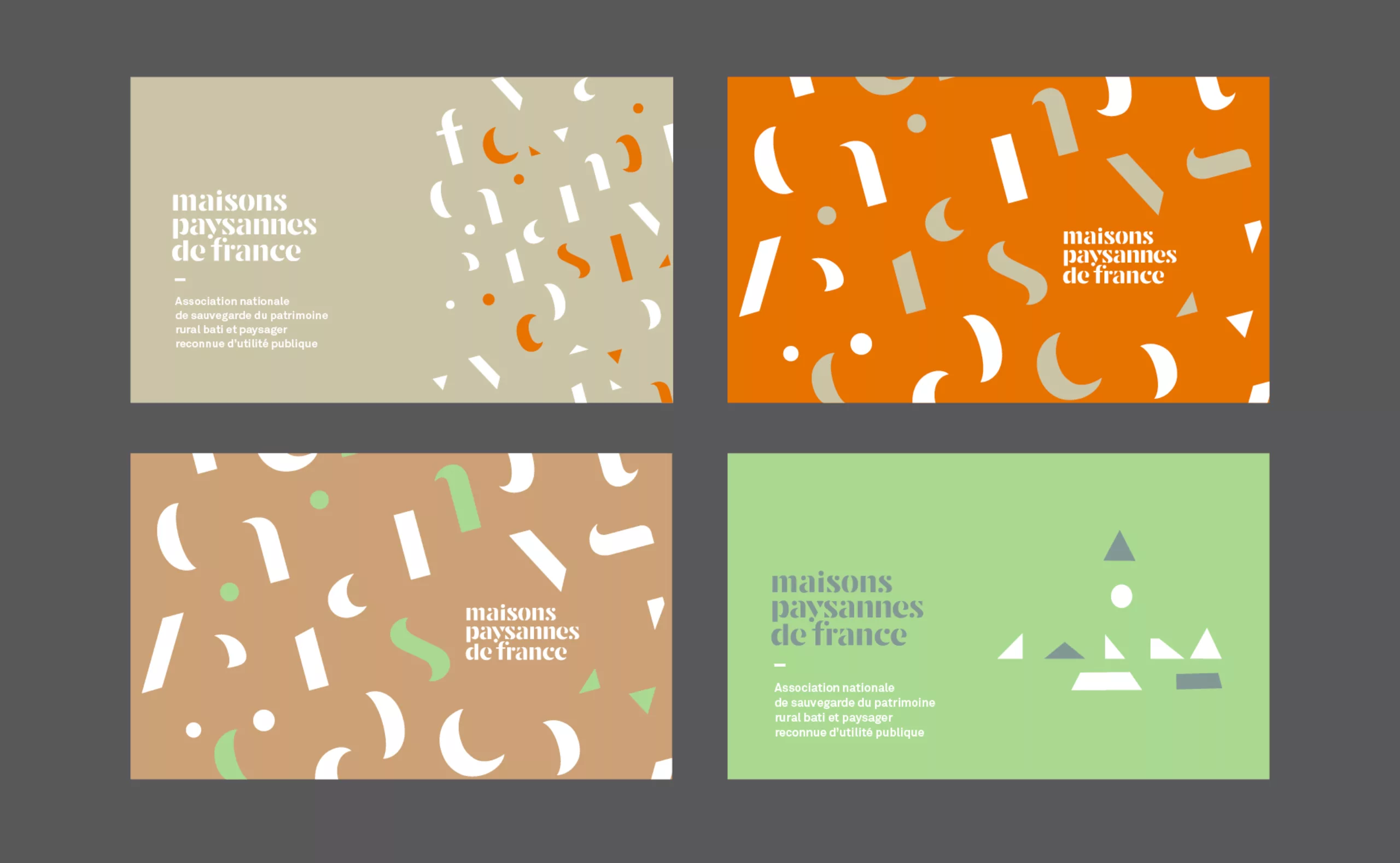
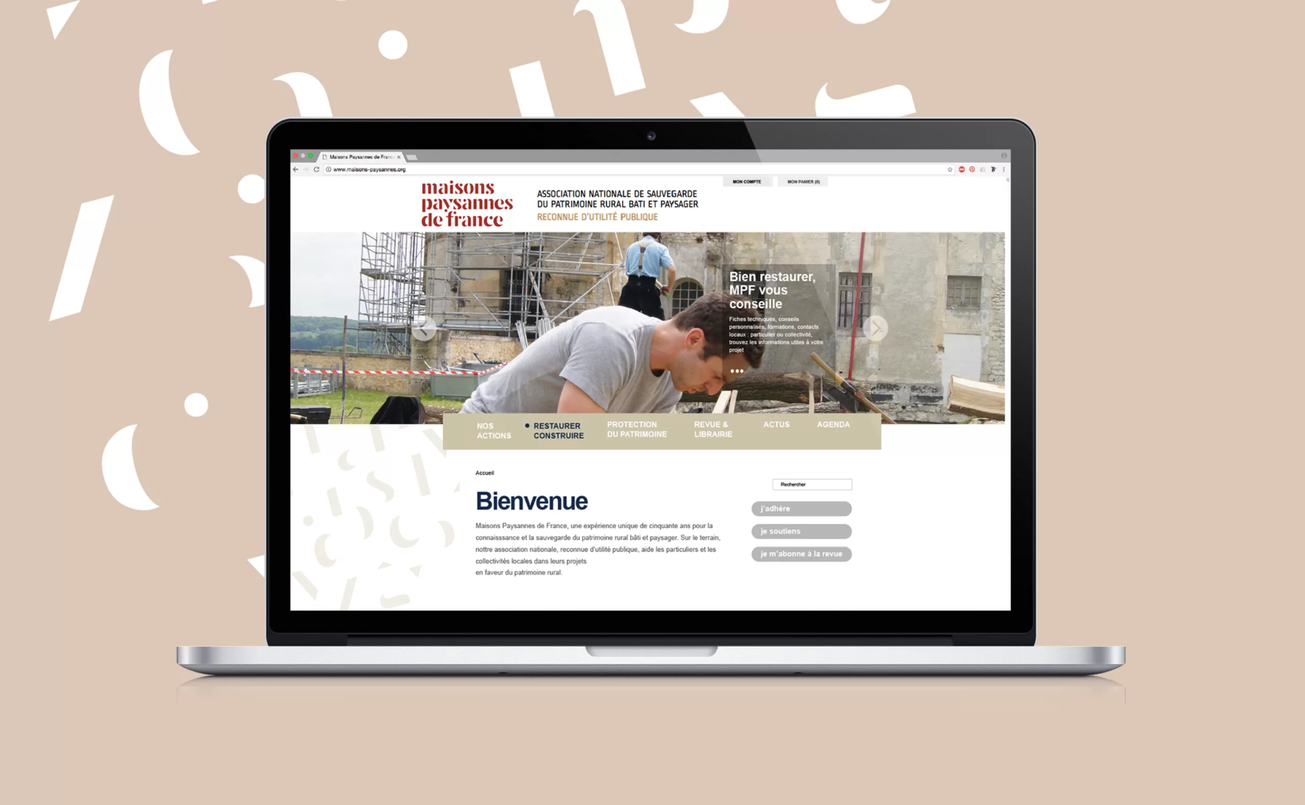
The lettering’s constituent forms make it possible to create patterns that can be applied to the association’s stationery and communication materials. These decorative elements are always in motion like a construction site. Here, each form is recoverable and reusable to infinity as are traditional materials.
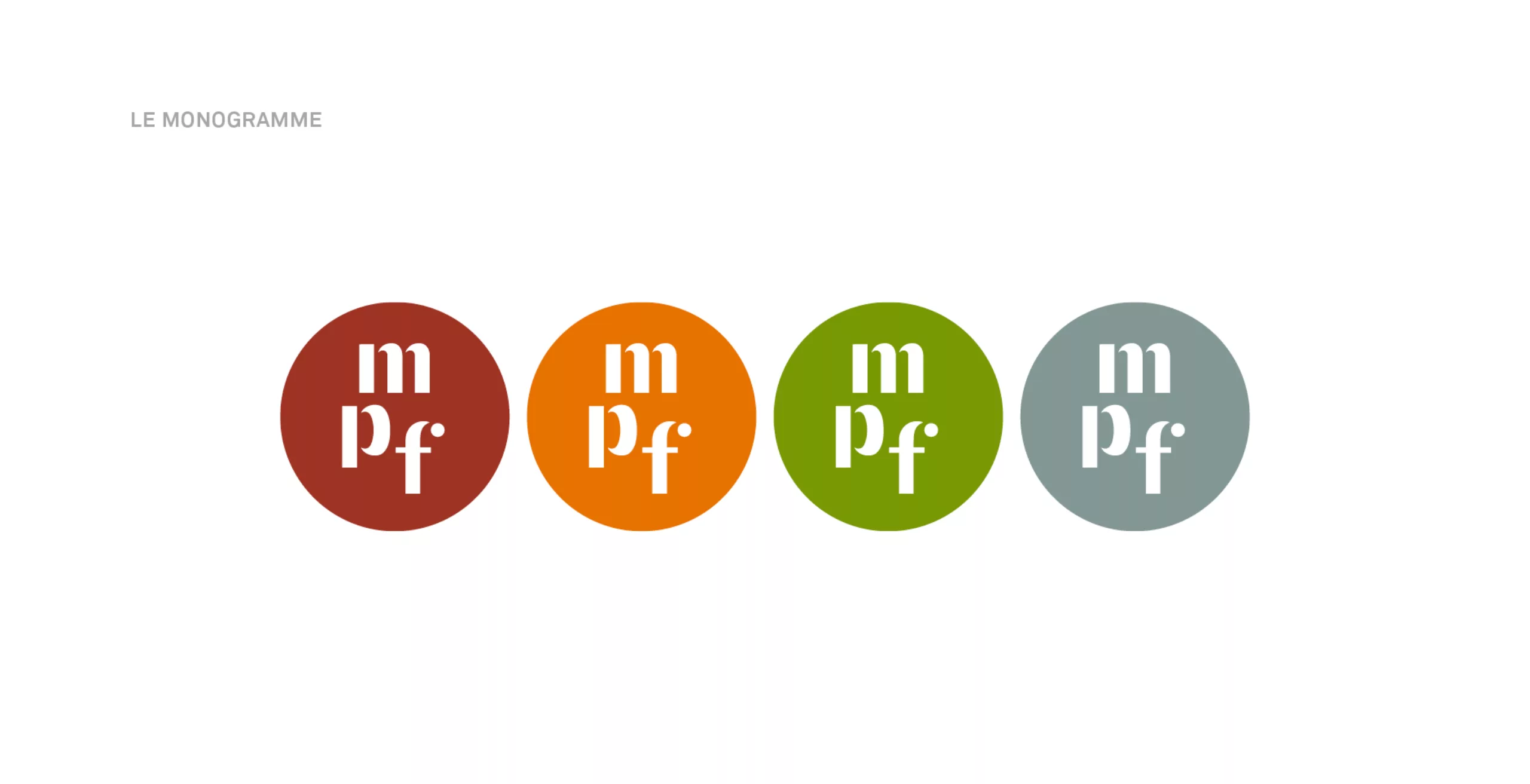
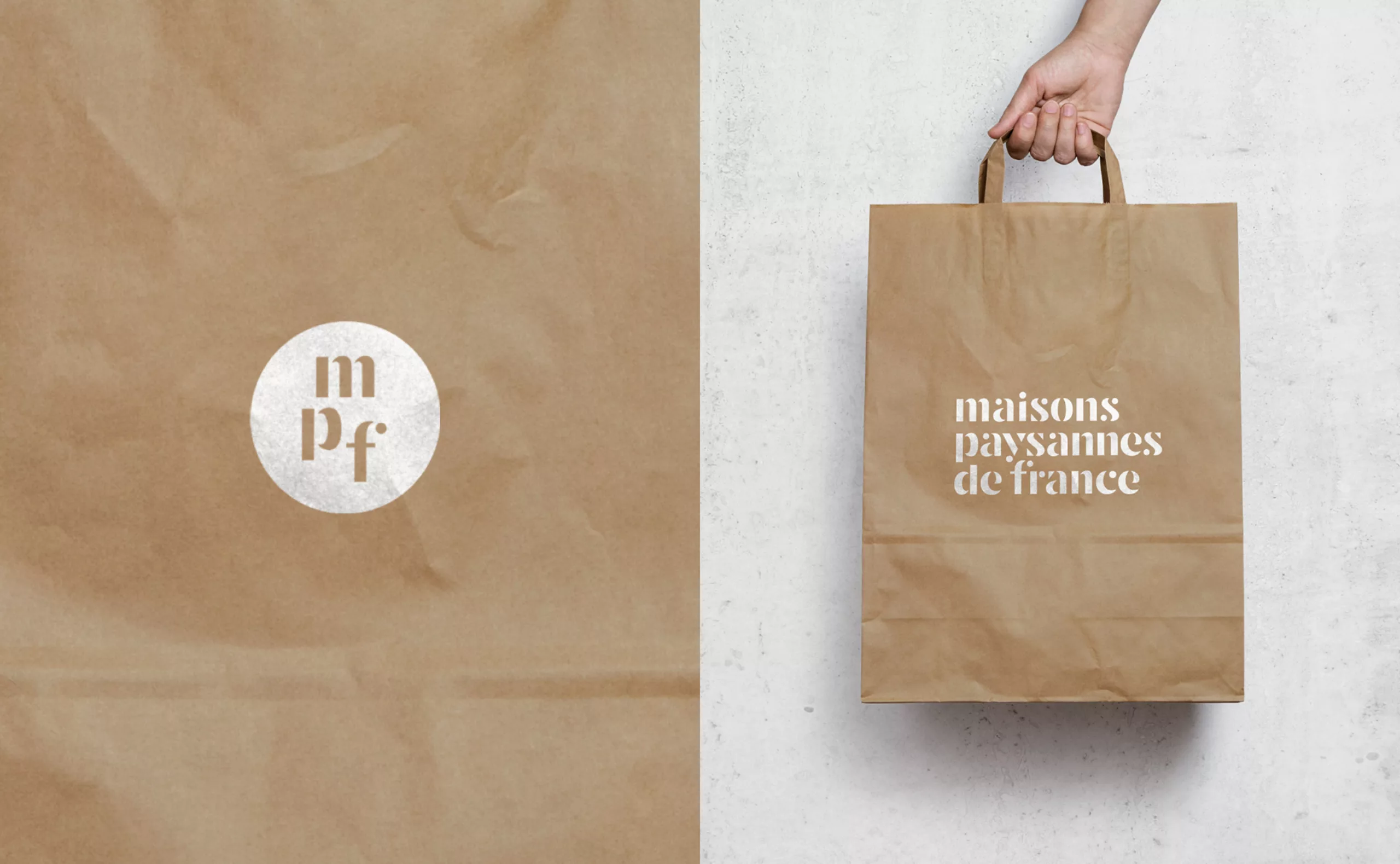
The communication of Maisons Paysannes de France can play with the presence of a monogram that functions as a reassurance label. It makes it possible to indicate in a subtle way the national antenna.
