SMAG-case-study

2018

Smag
Digital solutions for agriculture

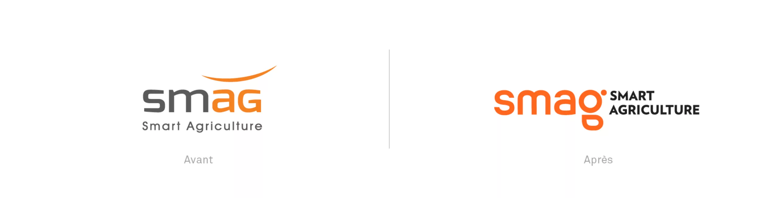
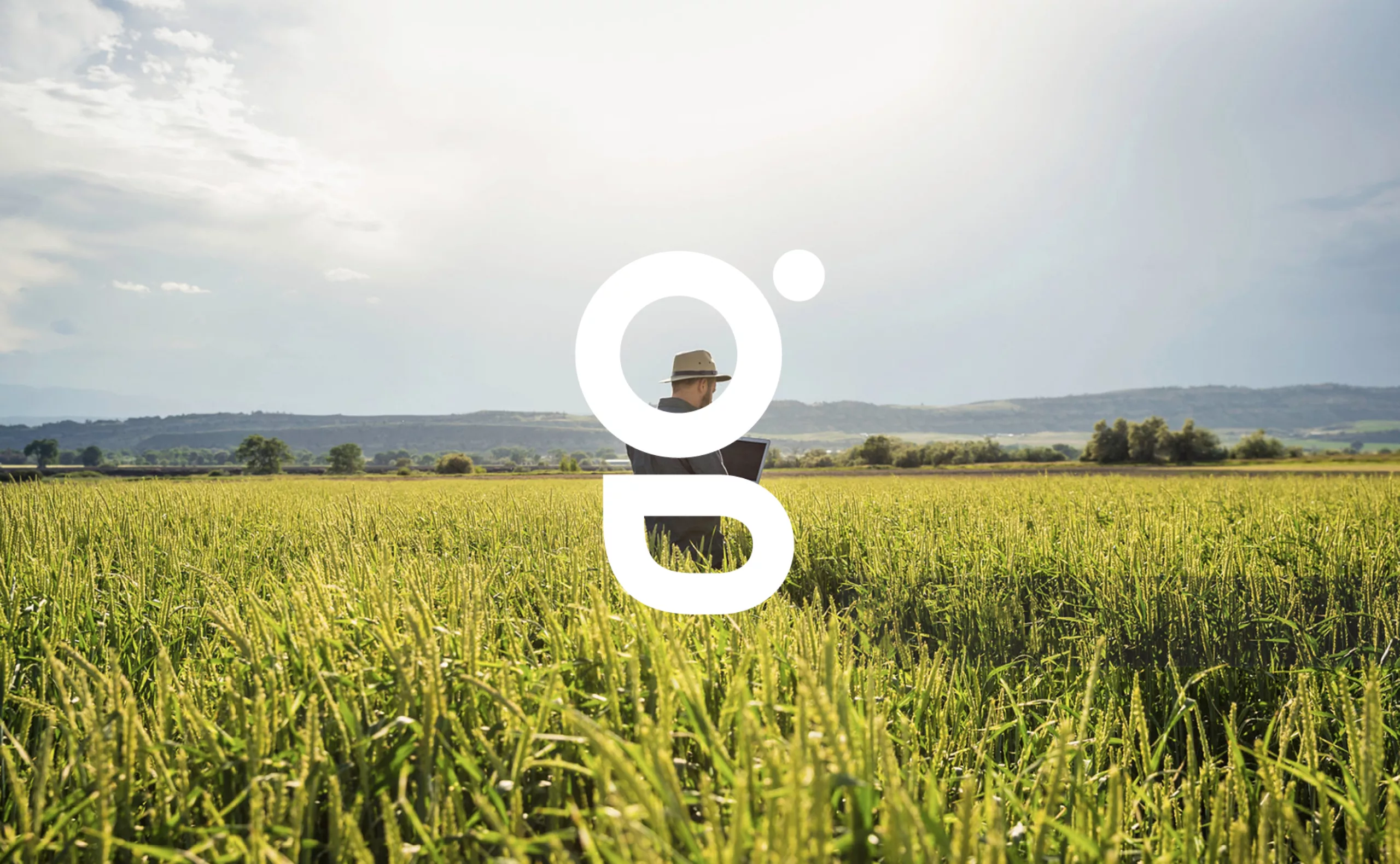
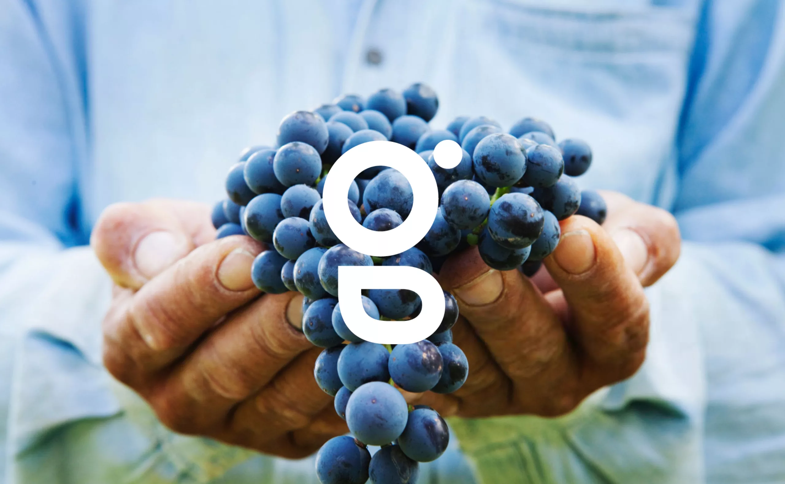
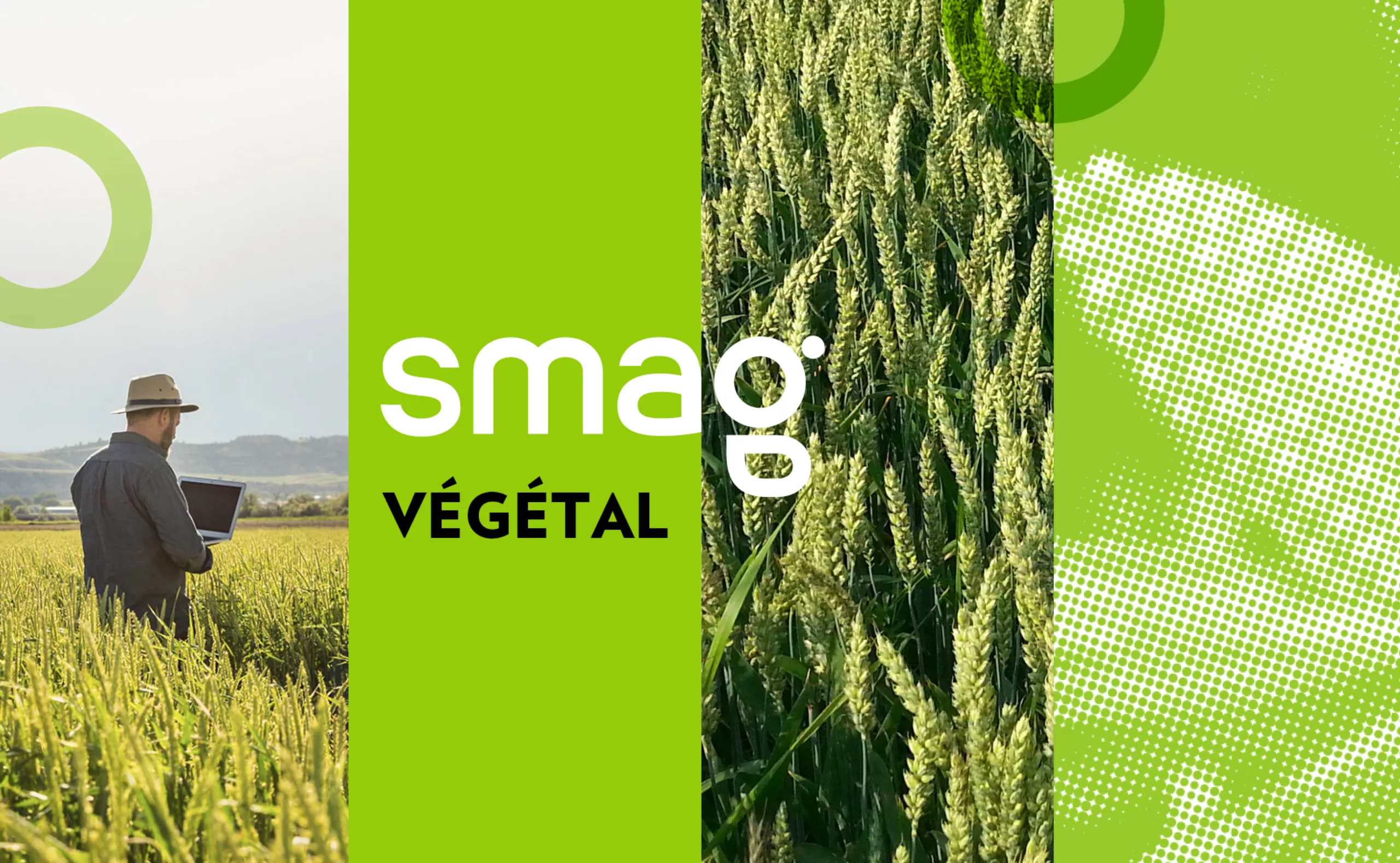
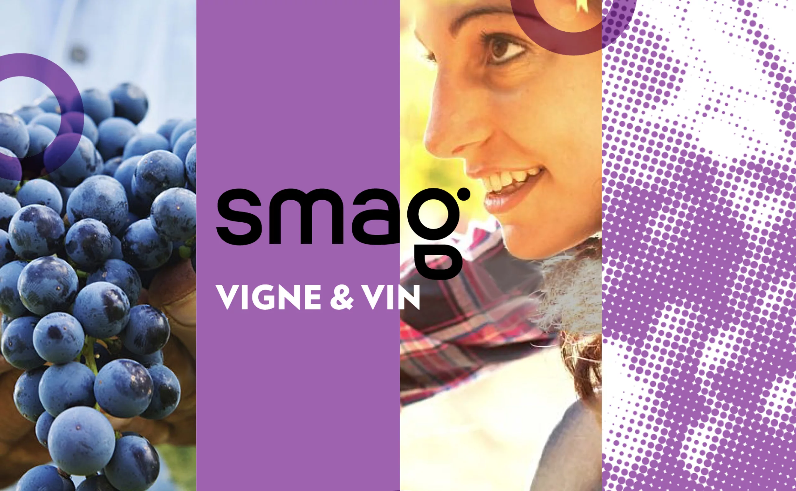
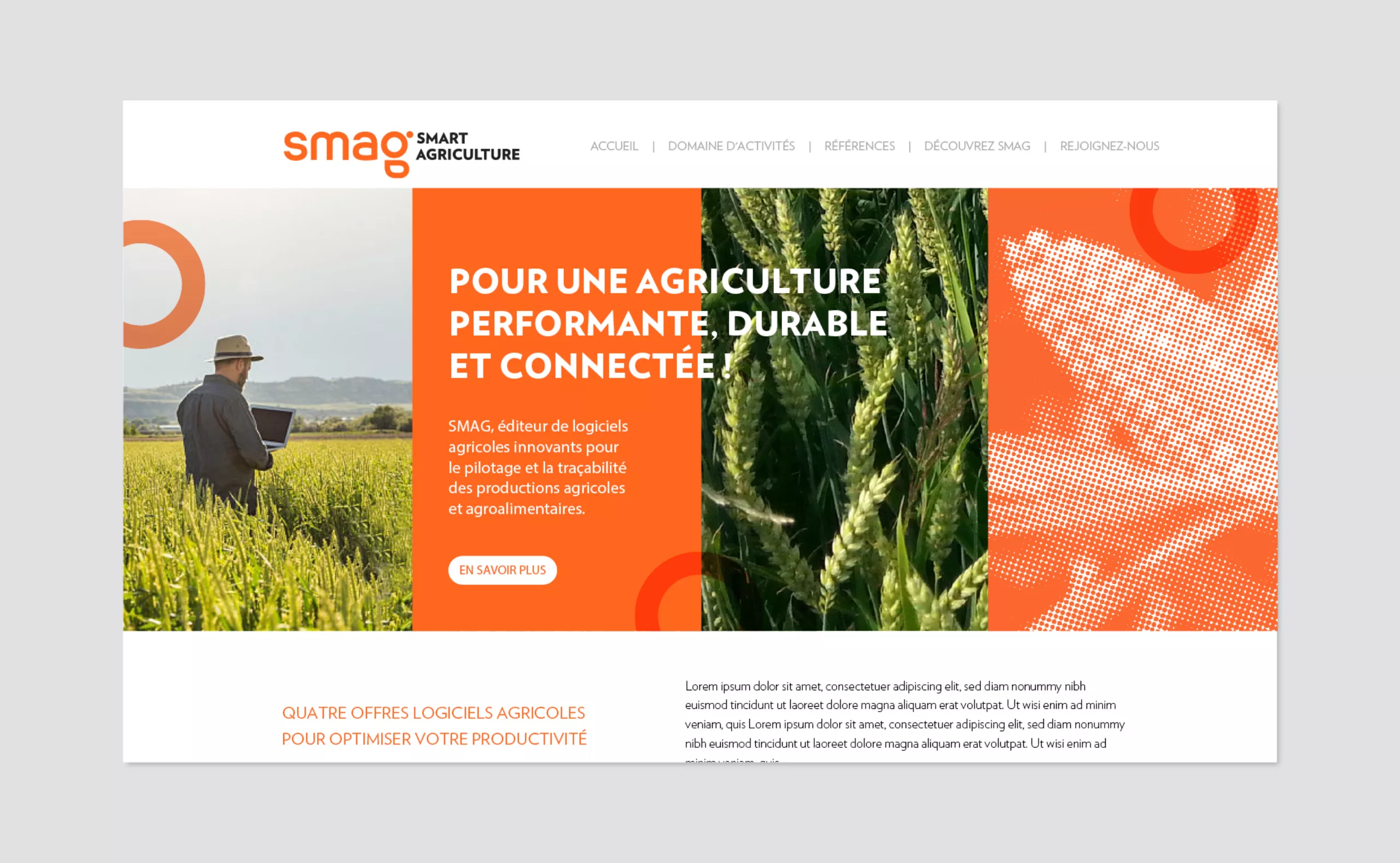
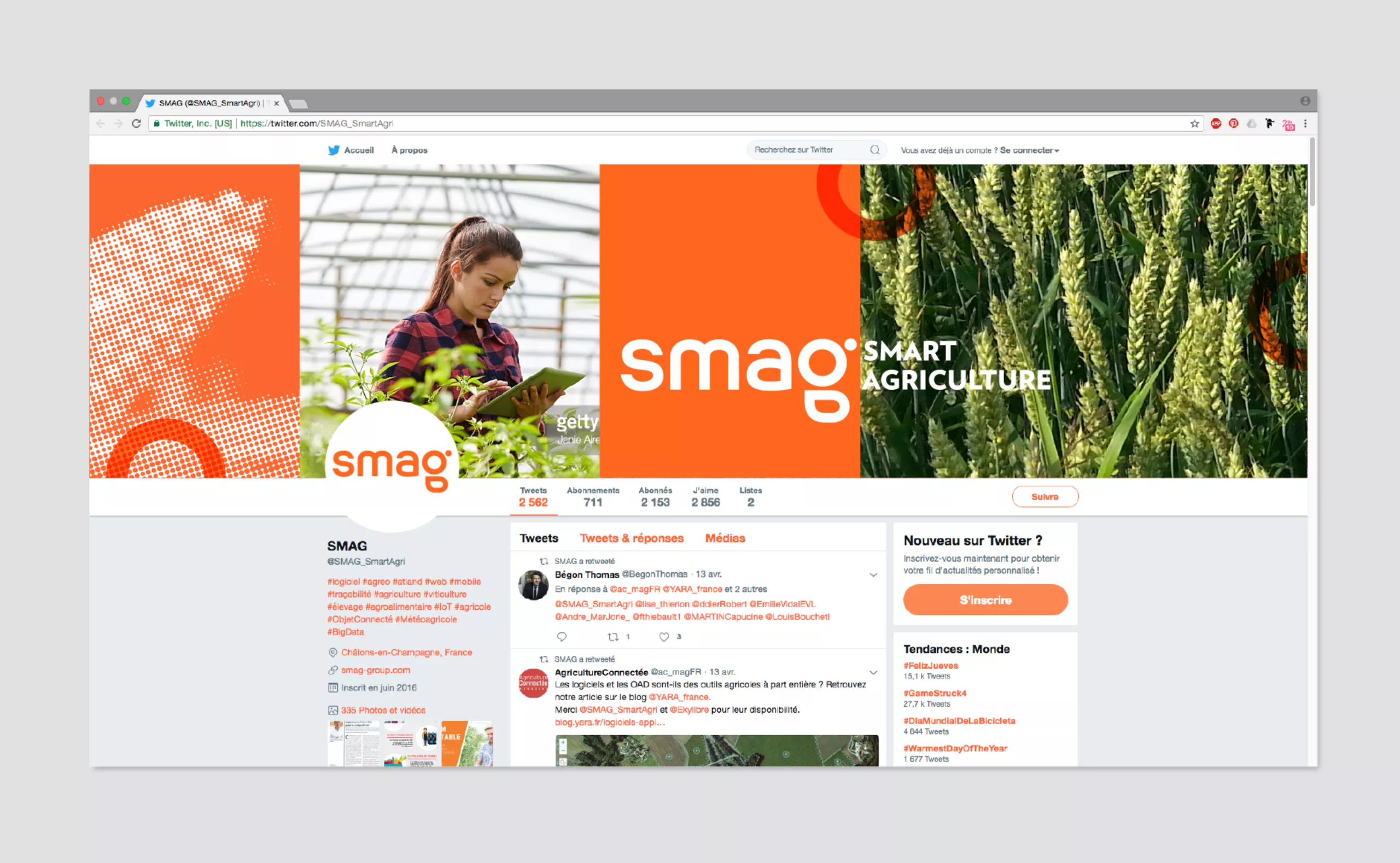
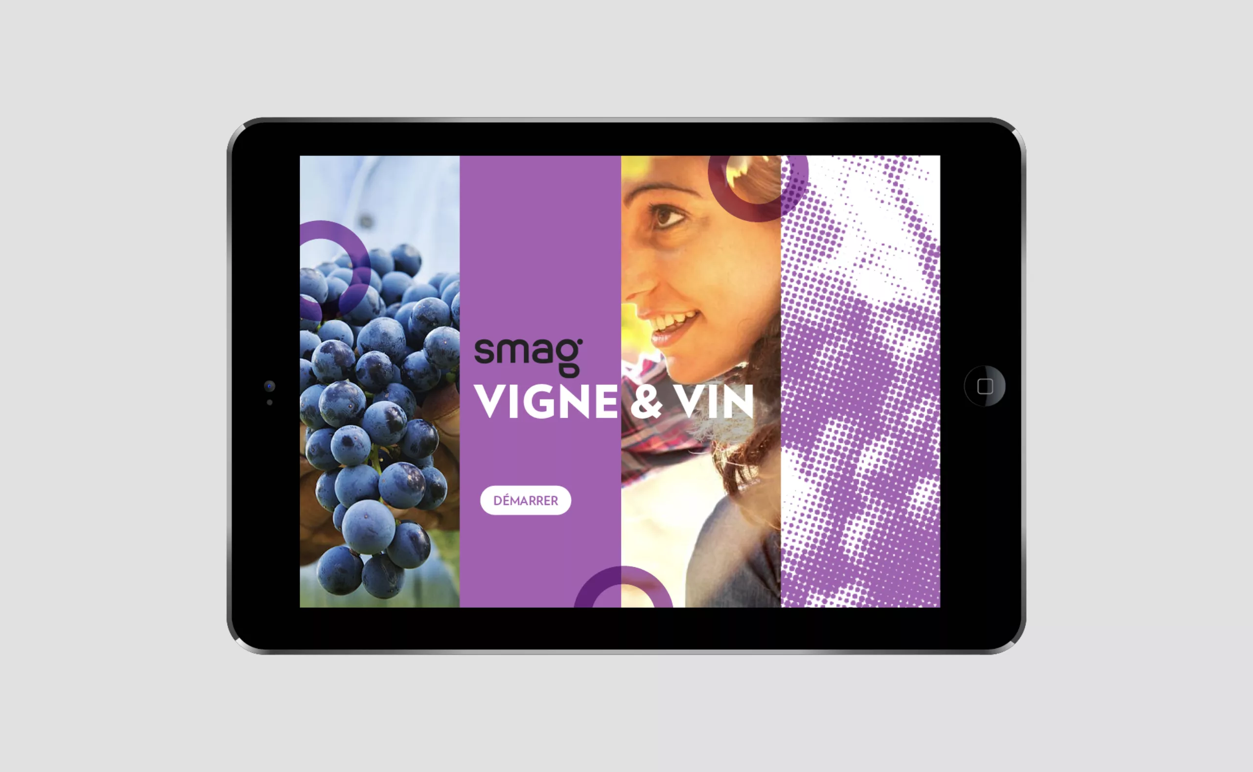
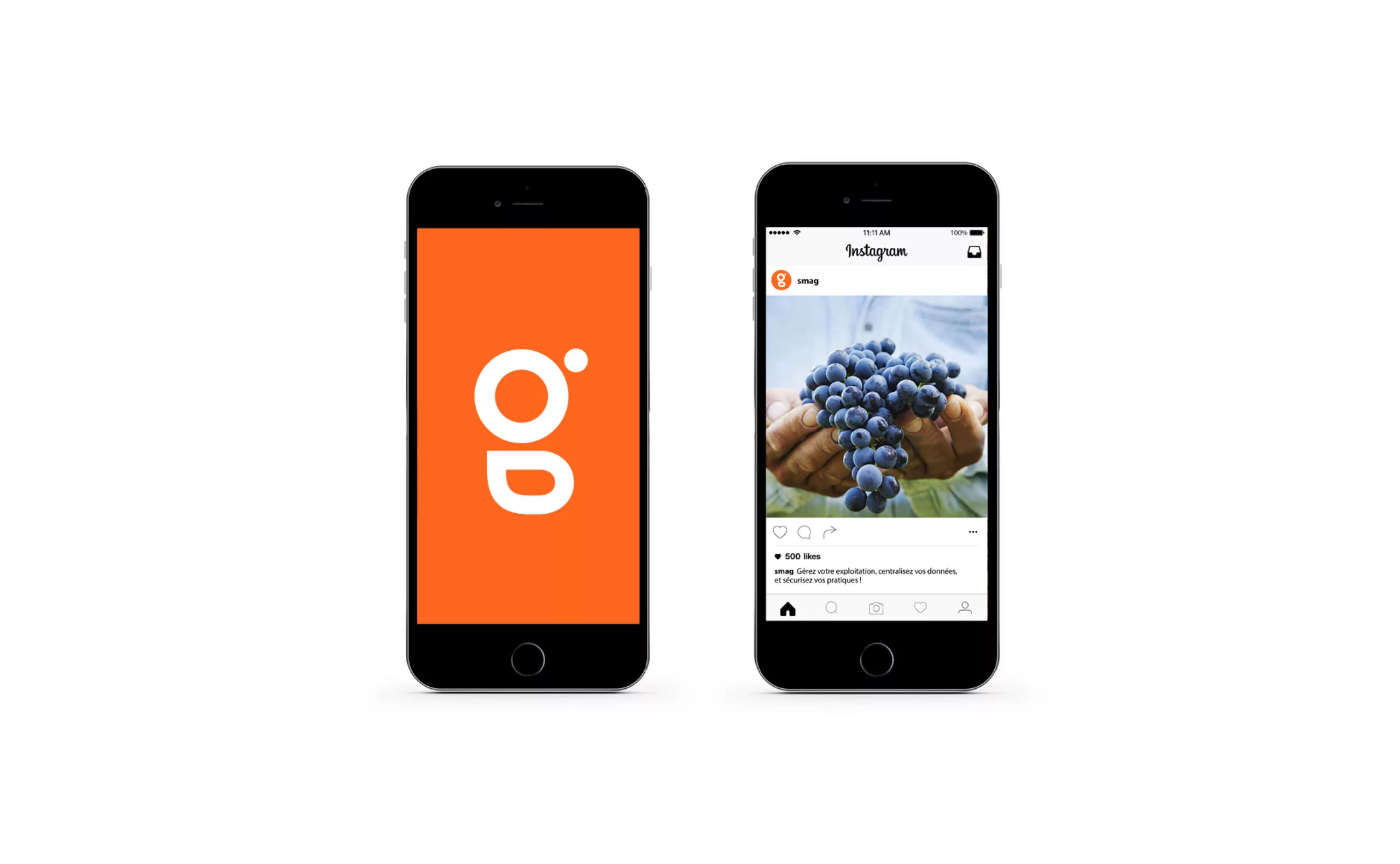
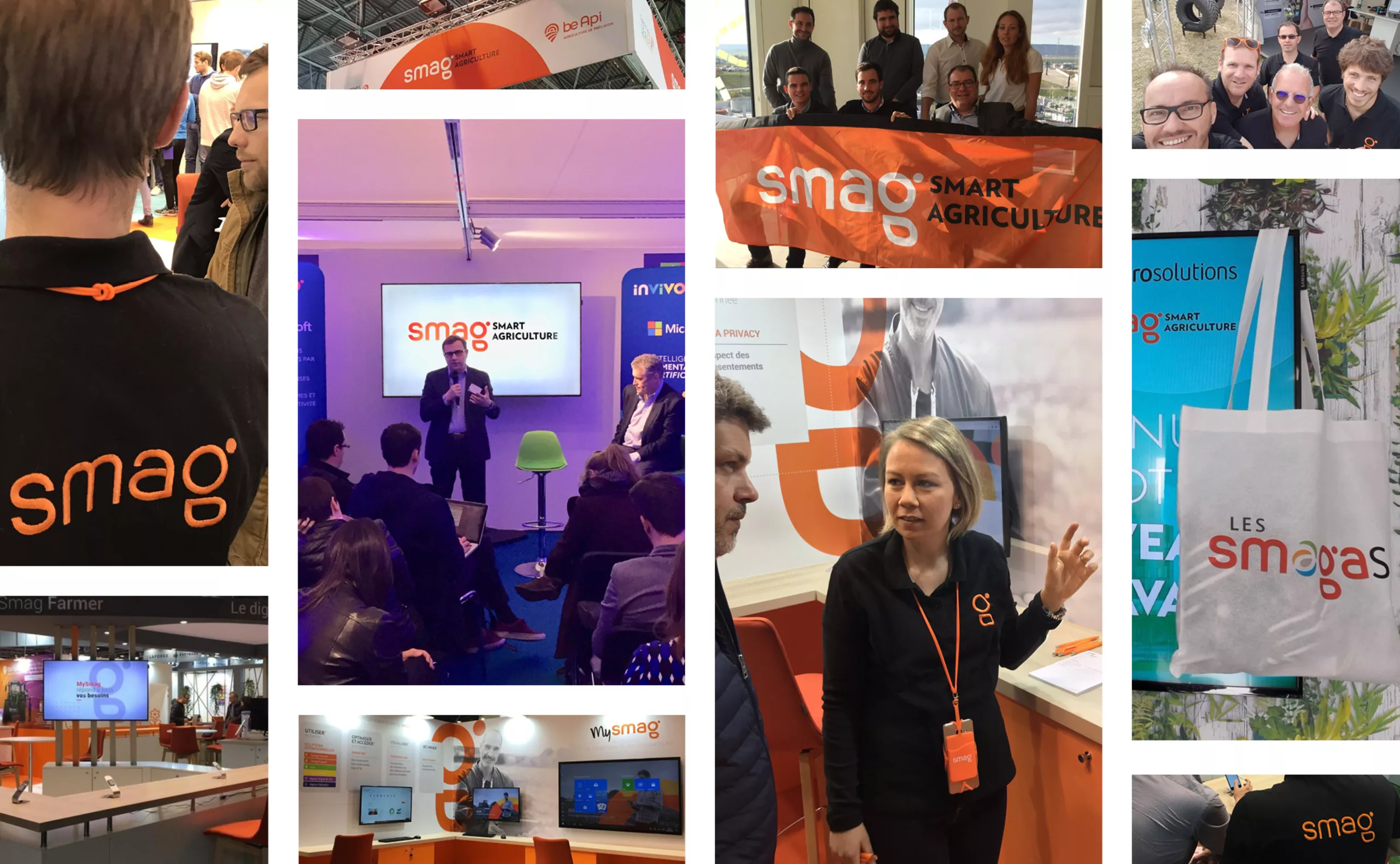
Graphéine gives a new lease of life to the brand image of SMAG, a company specialised in the digital transformation of the entire agricultural profession. A new logo and graphic identity that install a strong visual consistency throughout all communications, from print media to digital interfaces, from software solutions to the screens of the website.

SMART AGRICULTURE was created in 2012 with the merger of Maferme and Neotic, and became SMAG in January 2015. The SMAG brand has since acquired a strong reputation that allows its identification in its market without signature. It aims to become a leader in big agricultural data in France and abroad. To do so, SMAG needs to increase the recognition of its name, develop a sense of belonging to a community, and affirm its differentiation from the competition. 
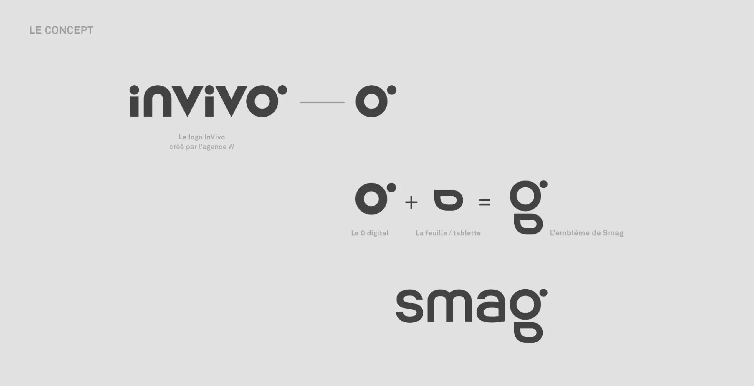
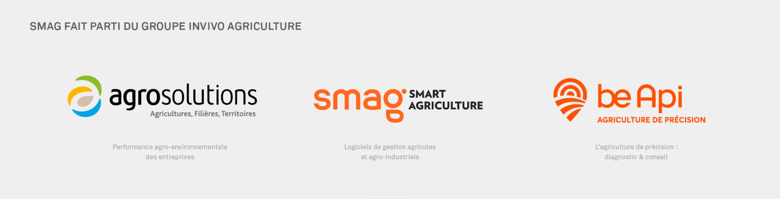
The SMAG offer, like Agrosolutions and Be Api, is part of INVIVO agriculture's brand ecosystem.
 Having designed the visual identities of Agrosolutions and Be Api, we had a strong concern not to repeat the same graphic solutions and find a tailor-made answer so that SMAG could claim a unique graphic identity within the agriculture pole of INVIVO.

A new SMAG logomark,
to bring together the digital and the agriculture world

This ambition motivated our teams to design a new SMAG logomark. Its purpose is to symbolize the digital and the agriculture world. Linked to the graphic design of the "O" from the INVIVO logo and adding the design of a stylized leaf representing agriculture and also a tablet, we create a "g", last letter of the name SMAG. The connection with the INVIVO logo, a shareholder of SMAG, allows keeping a certain consistency and bring users together in a single community. Unlike the logos of Agrosolutions and Be Api, SMAG's emblem is directly integrated into its wordmark.

The graphic asset creates a logo with a memorable and ingenious shape. This new logomark allows the logo to be more dynamic and visually striking. It makes sense with SMAG's brand, tools and intervention channels. The orange color has been revitalized and the typography of the logo has been completely redesigned to ensure an inclusive roundness. The software offer has been rebranded to create a brand architecture that is more consistent with SMAG's new graphic identity. Variations of the SMAG logo have been created through color variations to adapt the brand to the different "seeds, plants, vineyard and breeding" sectors.

Project expertise:

- Branding, Logo, Visual identity
- Visual assets, Graphic charter, Brand territory
- Type design

Sector of activity:

Communication in the digital, big data and mobile application sectors. Communication in the agriculture, farming industry and agri-food sector.


Share this project:
Project expertise:
Logo creation, visual identity and graphic guidelines.
Type of client:
Communication agency in the start-up, digital and technology sector. High tech & IT, IT BtoB, IT BtoC: software publishers, digital services companies. Communication agency in the agriculture, agri-food and forestry sector. Agriculture, livestock and fishing industries up to mass consumption and distribution channels (wholesalers, large and medium-sized stores, retail outlets, catering).

Related projects: