Roots_Paysages-case-study

2018

Roots Paysages
The landscape specialist

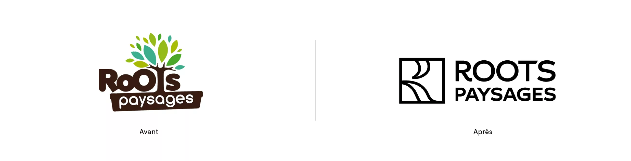
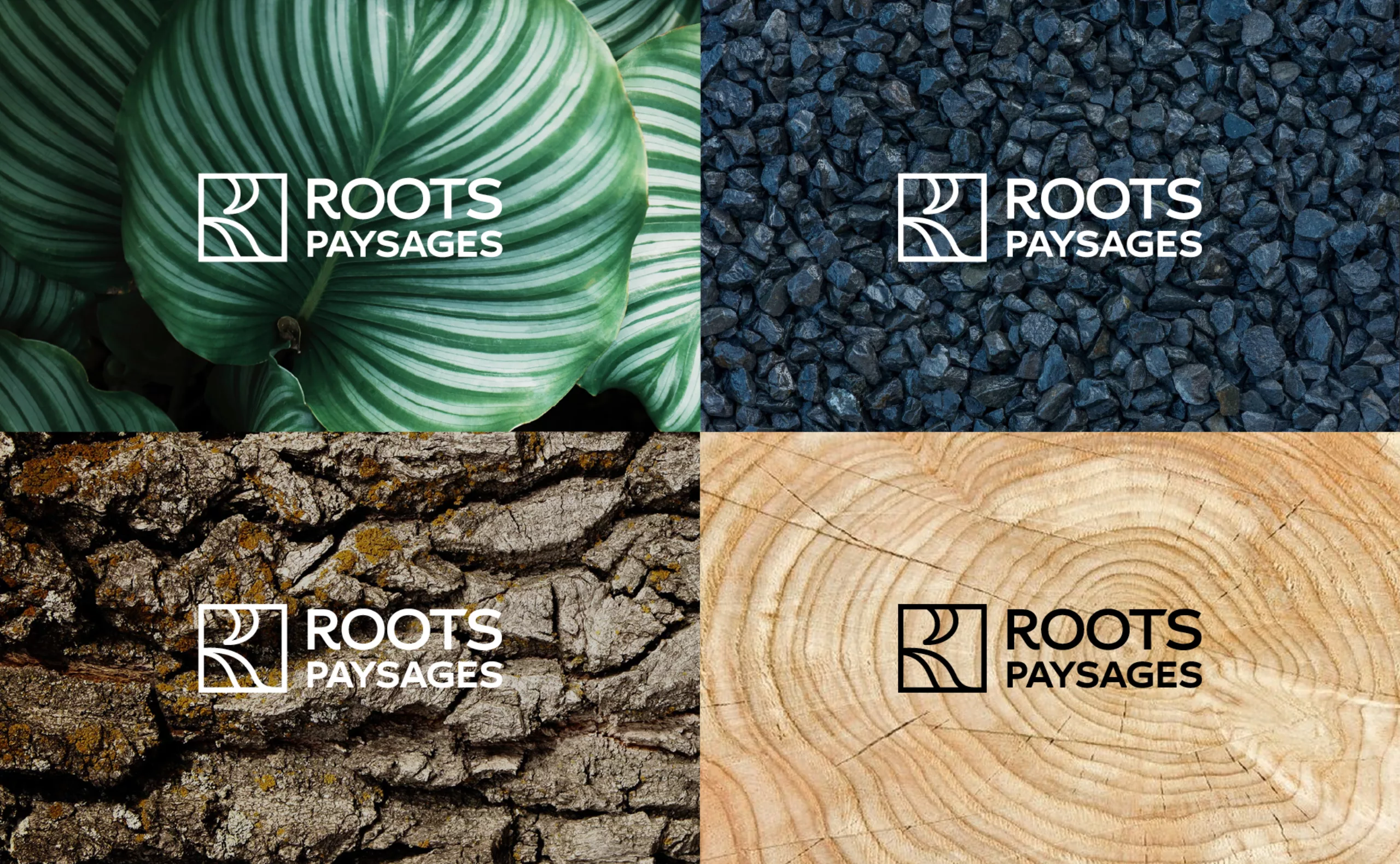
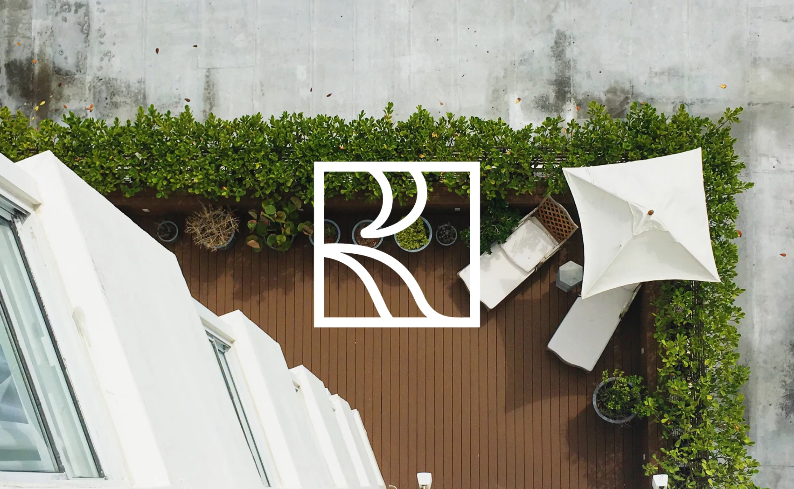
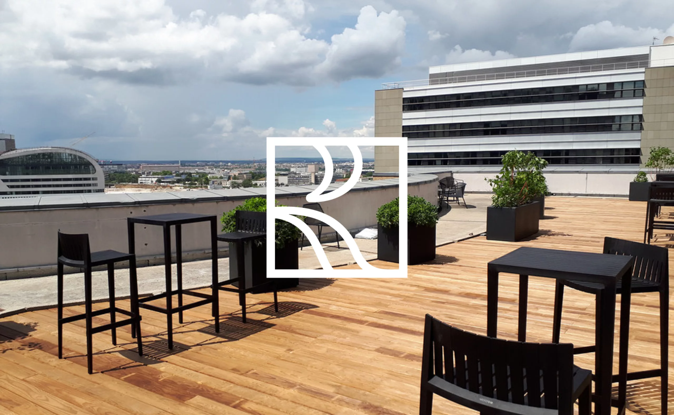
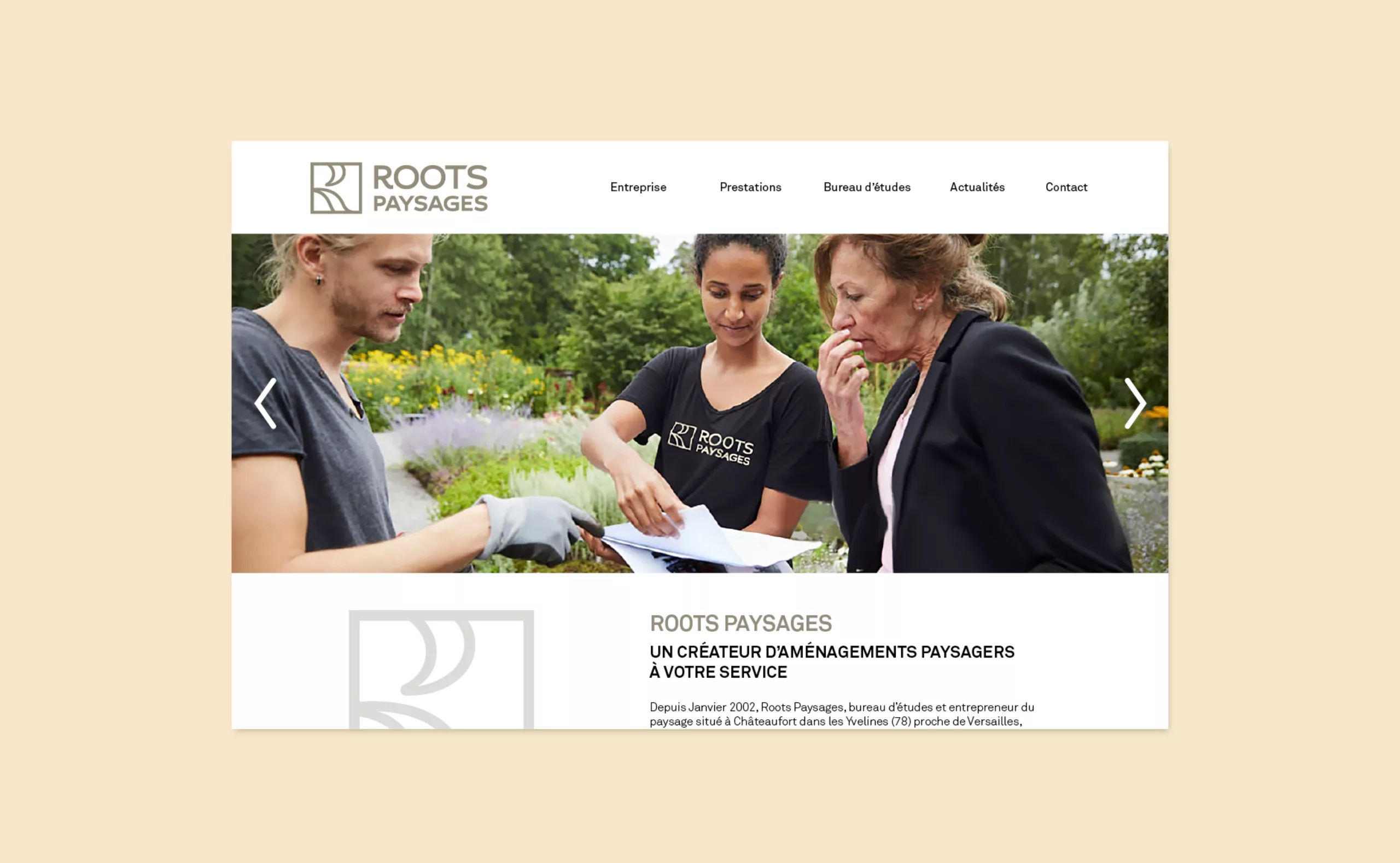
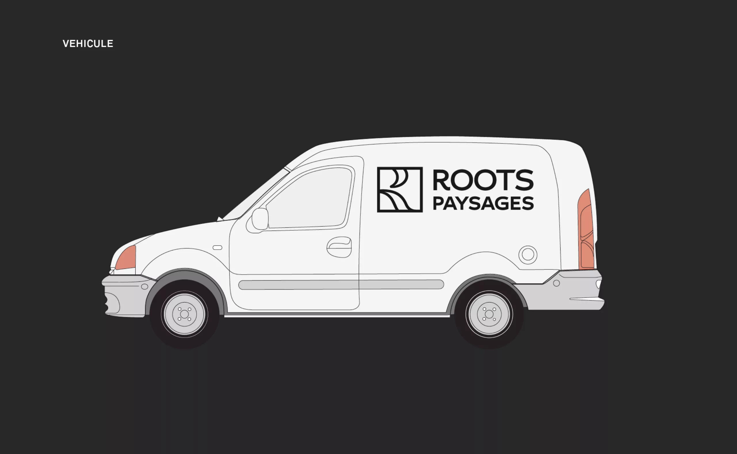
Roots Paysages is a landscaping company that creates landscaping for gardens and terraces. The company works with individuals, companies, communities for the design, construction and maintenance of gardens, terraces, plant walls... In 2018, Graphéine supported the brand in the evolution of its visual identity...

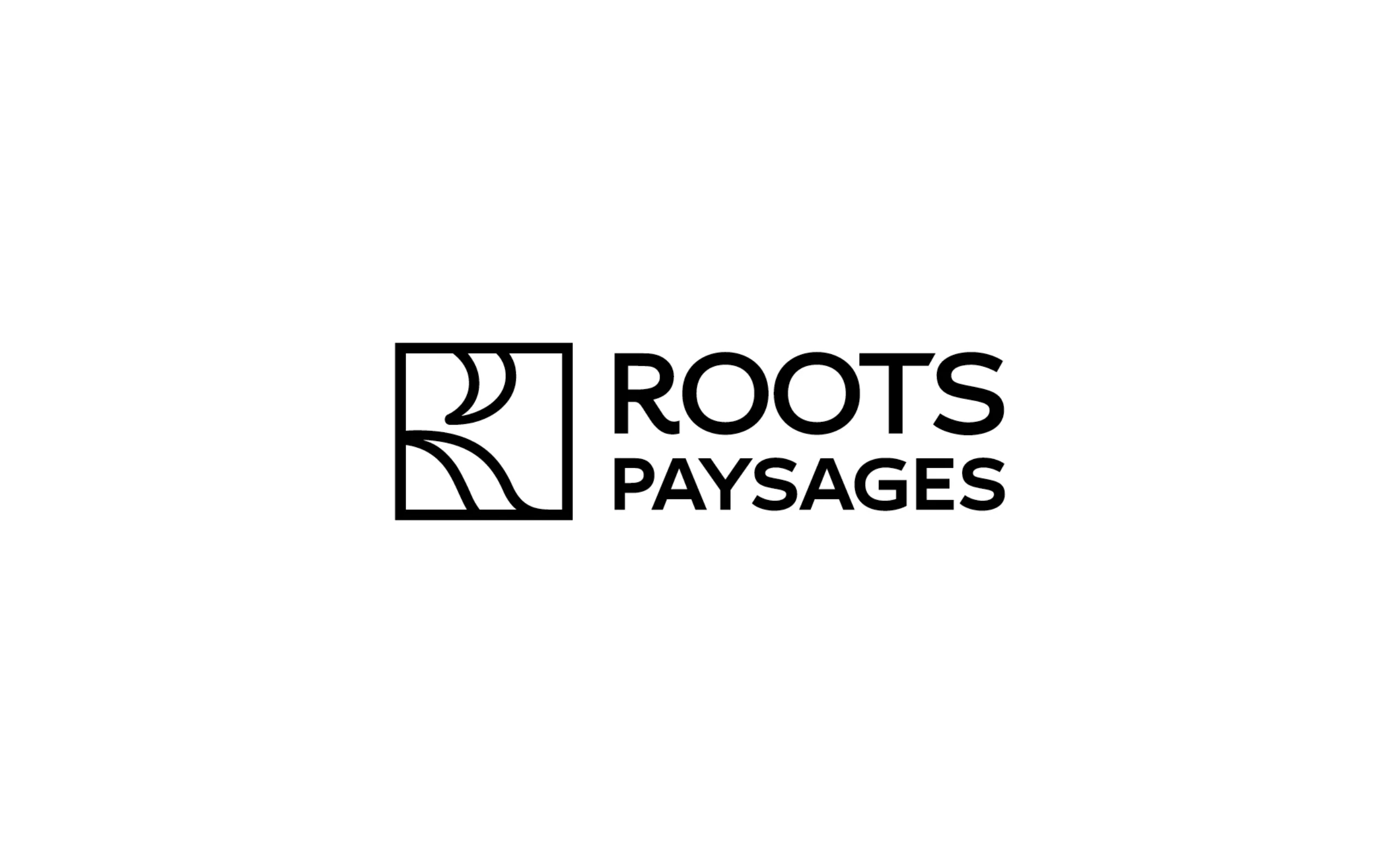
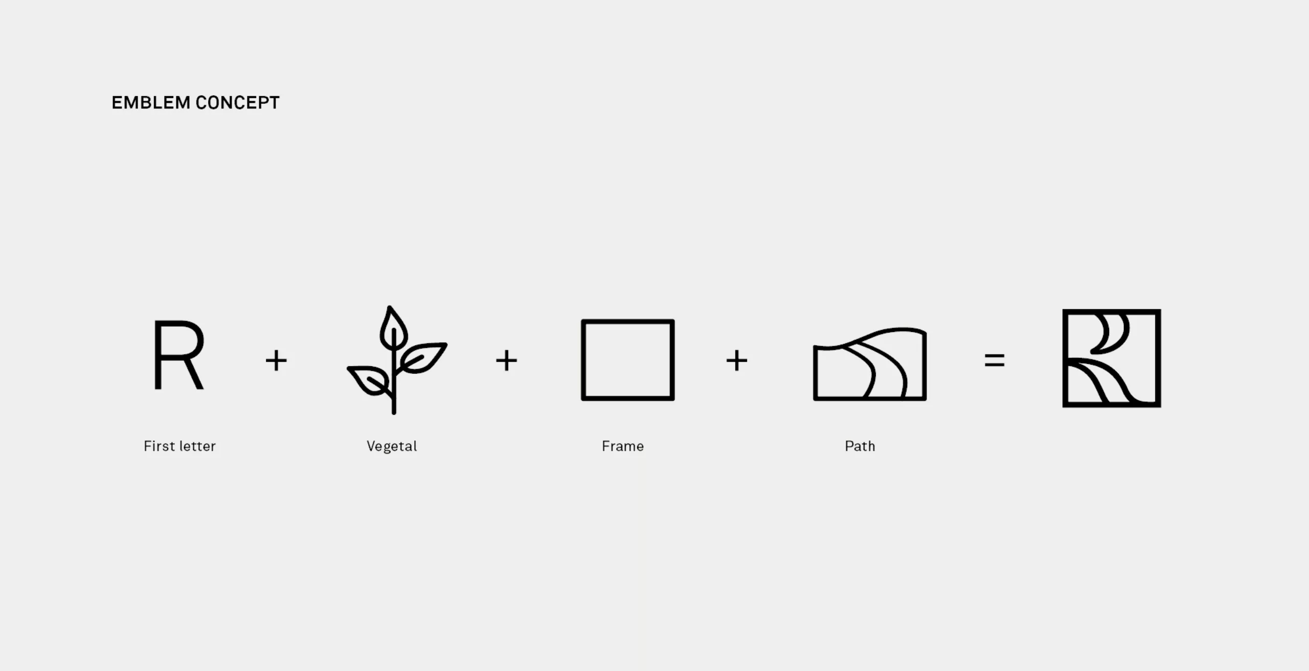
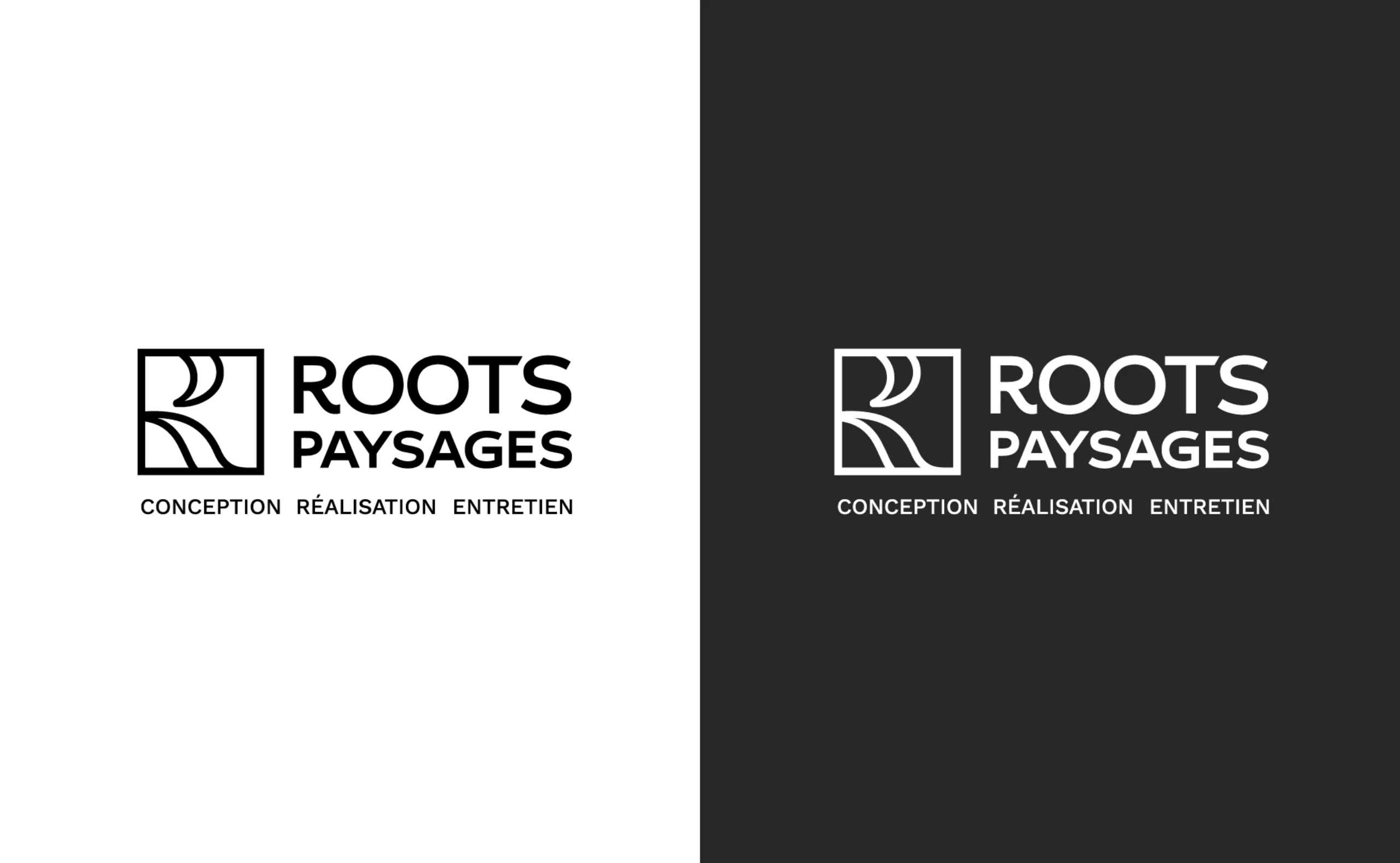
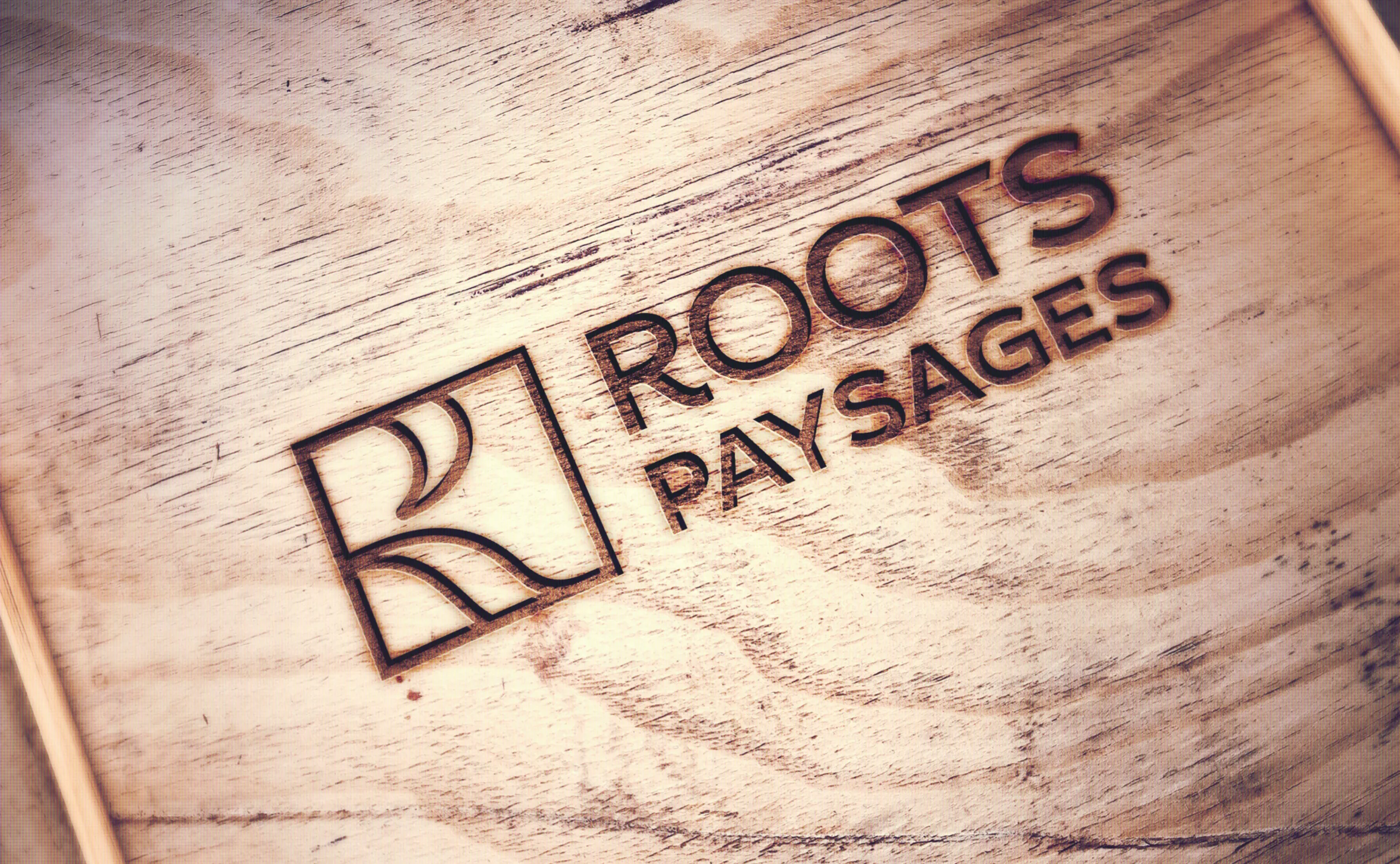
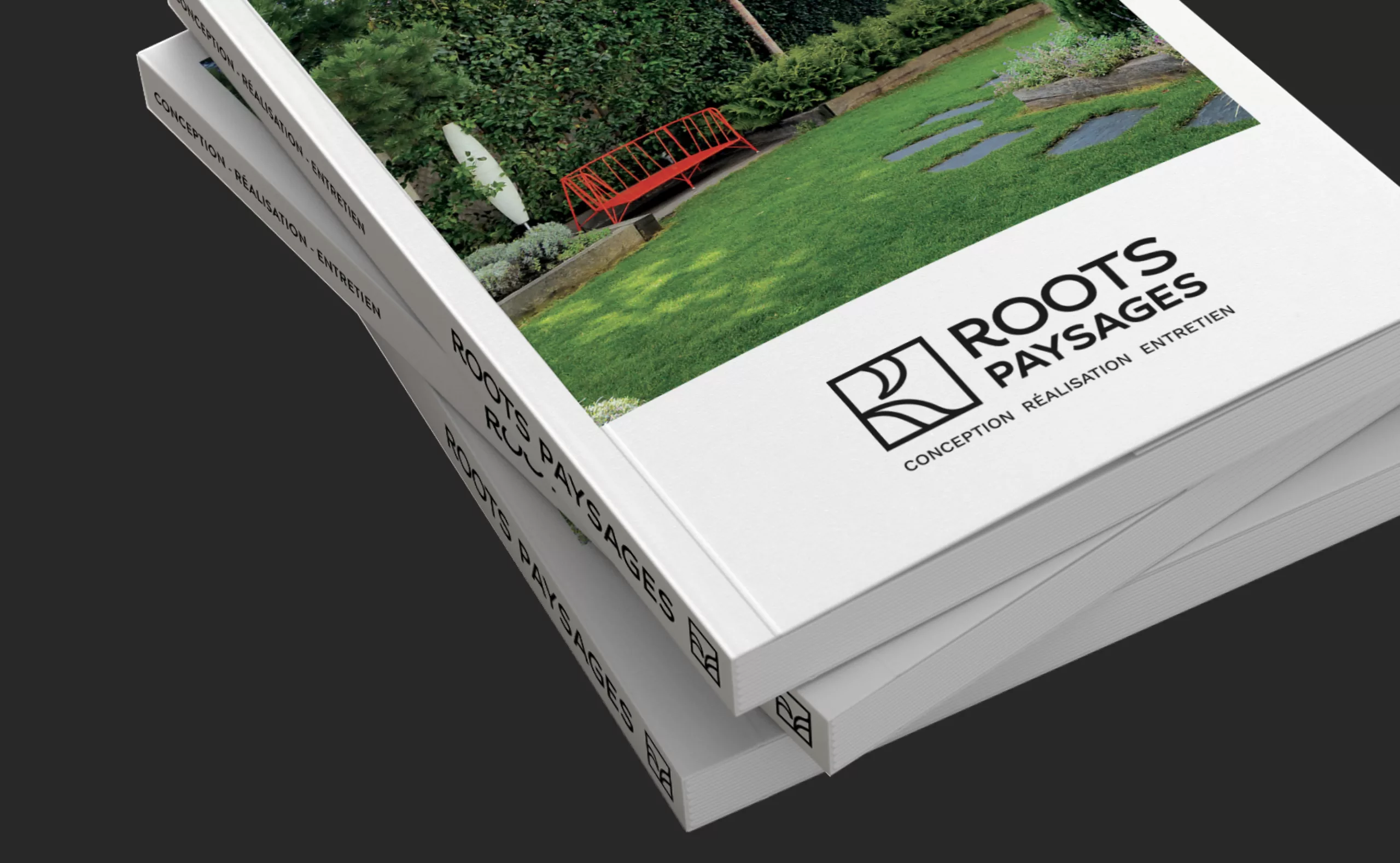
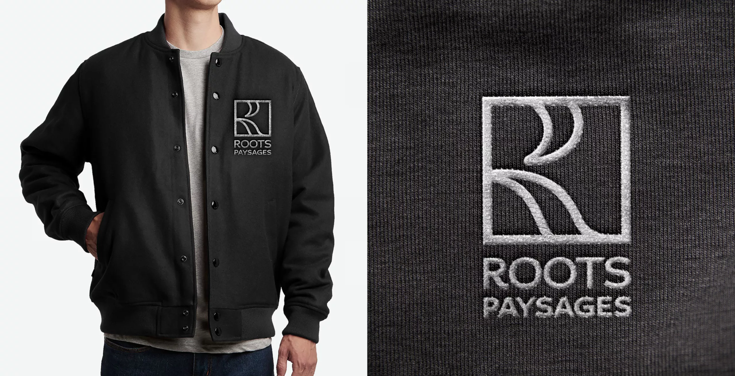
Initially, the Roots Paysages team wanted to change its name in order to convey an image in line with professionalism and the quality of the services. The brand's historical name and logo connoined a "hippie" image that devalued the level of expertise of the services offered. The expression "à la roots" meaning a relaxed and nonchalant state of mind, but changing the name of a brand that has been in use for more than 15 years and to which customers have been loyal has raised questions: In order to preserve the reputation of the name, Graphéine has accompanied Roots Paysages in the construction of its brand territory while at the same time taking the opposite of an image that is too casual. The name "Roots Paysages" has been retained while the typographic block has been completely redesigned, erasing the cartoon spirit of the previous logo.

A new emblem composed of the letter R has been created, the brand's lettering is designed by a play of vegetal shapes within a square, bearing the values of Roots Paysages and reflecting its elegance, sobriety and refinement, a more luxurious image that better reflects the company's location in the chic Parisian suburbs. The emphasis on the latter relayed the name Roots Paysages in the background, erasing the negative connotations that had been attributed to it.

This new brand image reflects Roots Paysages' values and commitments and marks a new stage for the company, which has also seen its signature evolve from the clumsy play on words "Your ideas take root" to "Conception Réalisation Entretien".

A signature that underlines the company's know-how and no longer seeks to explain the brand's anglicism. The company's website, vehicle fleet and uniforms were also revised to adapt to the new graphic charter.


Share this project:
Project expertise:
Logo creation, visual identity and graphic guidelines.
Type of client:
Communication agency in the agriculture, agri-food and forestry sector. Agriculture, livestock and fishing industries up to mass consumption and distribution channels (wholesalers, large and medium-sized stores, retail outlets, catering). Communication in ecology & environment.

Related projects: