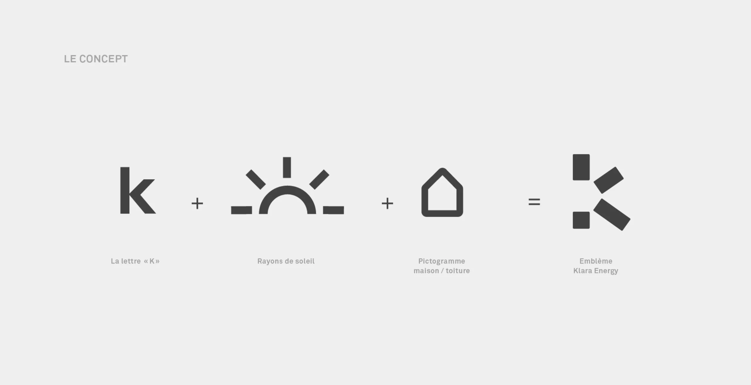
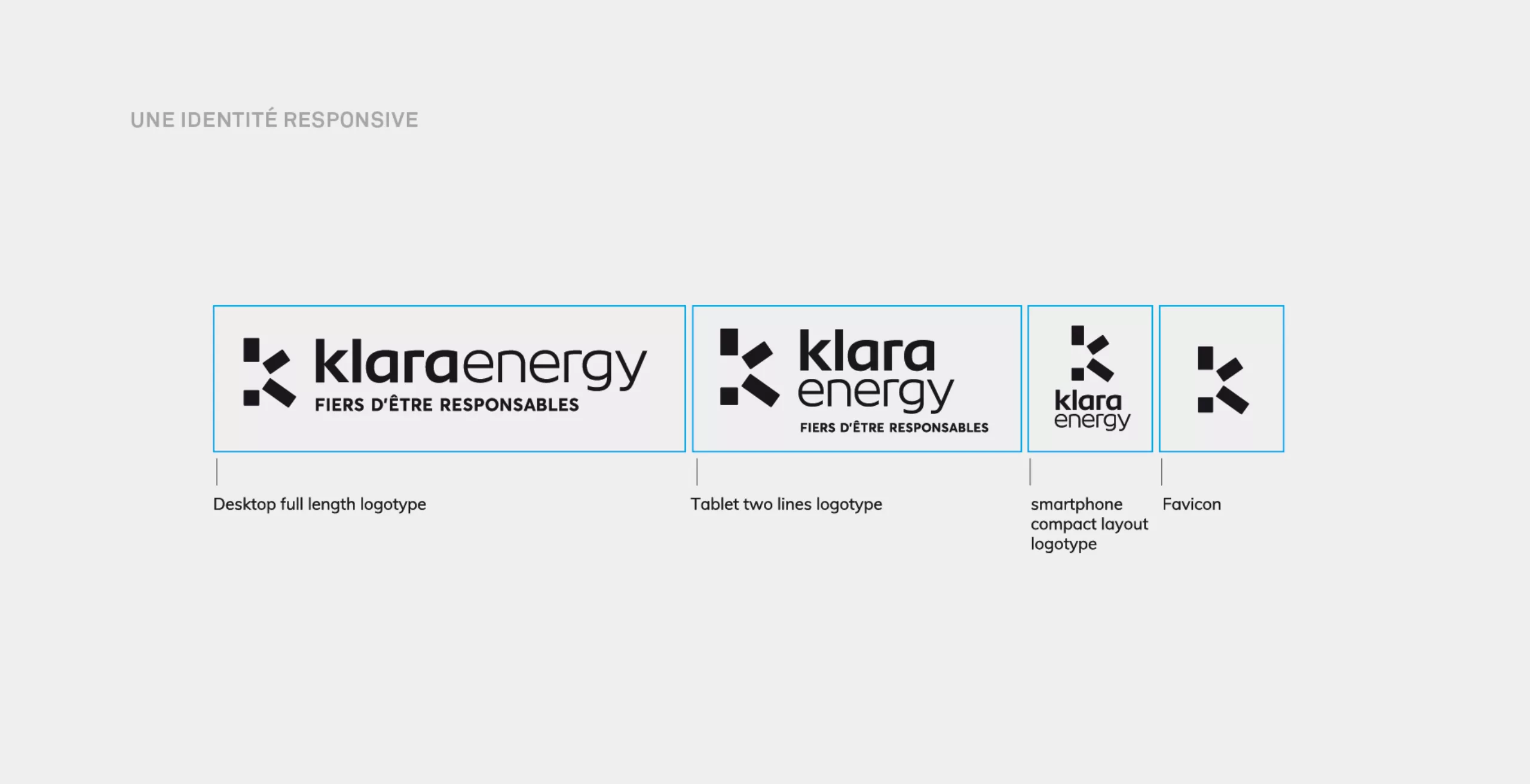
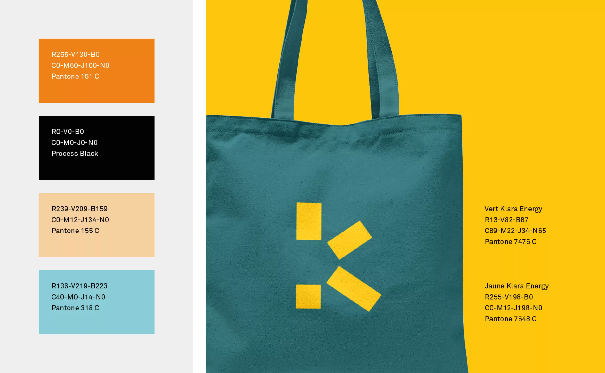
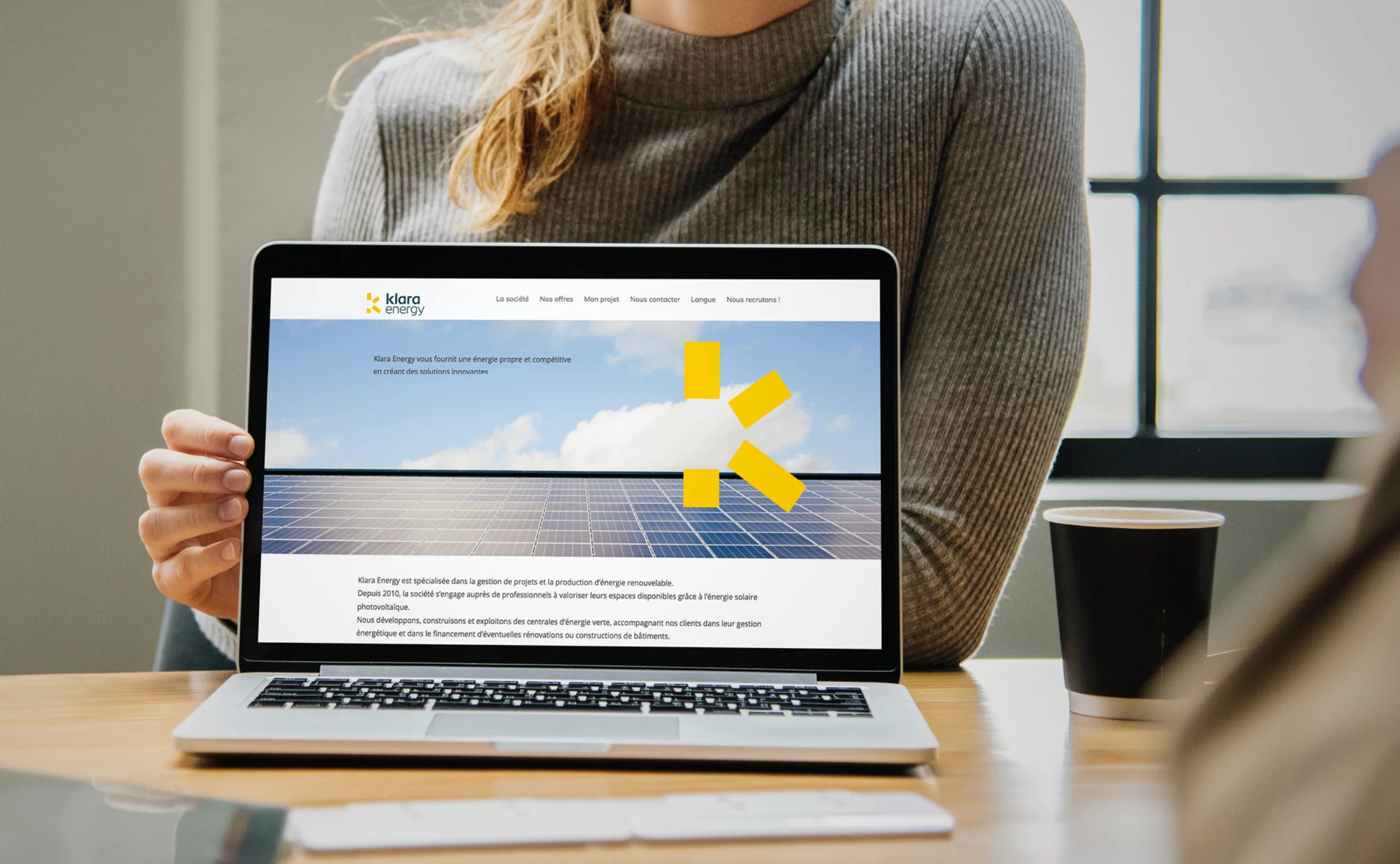
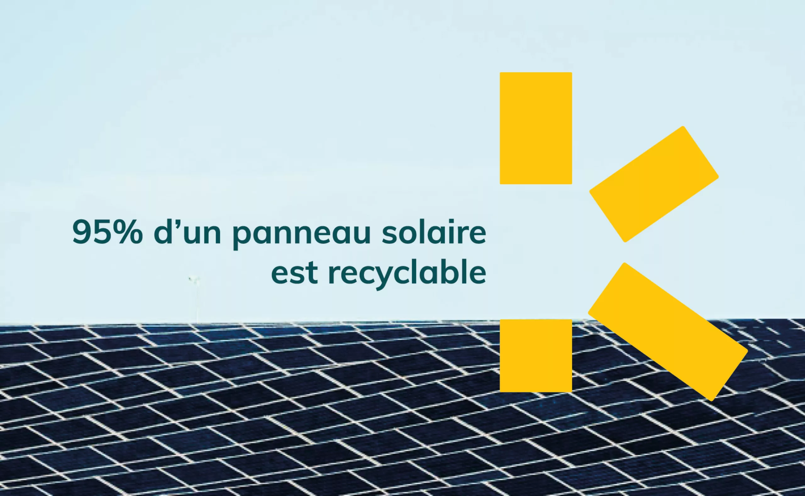
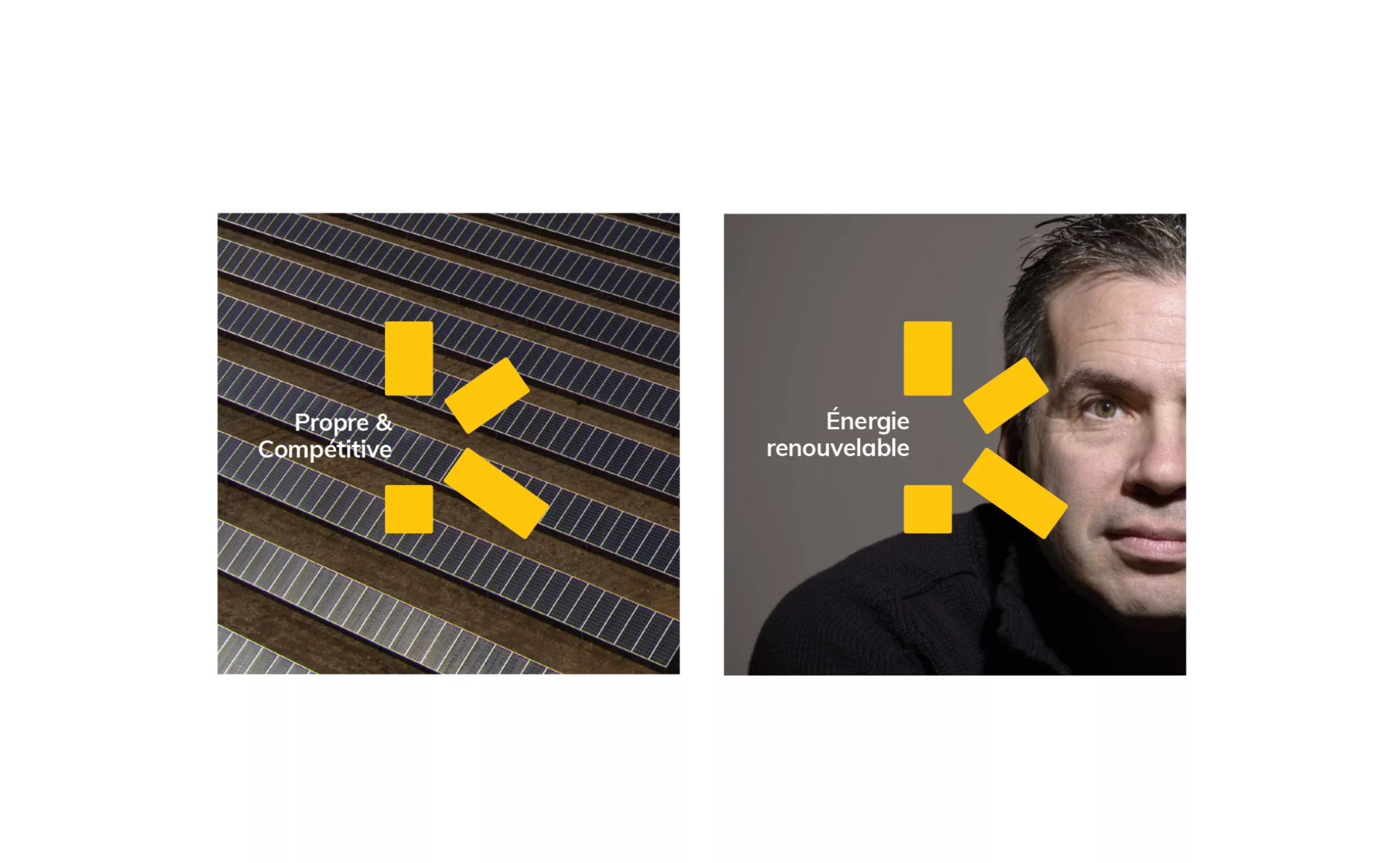
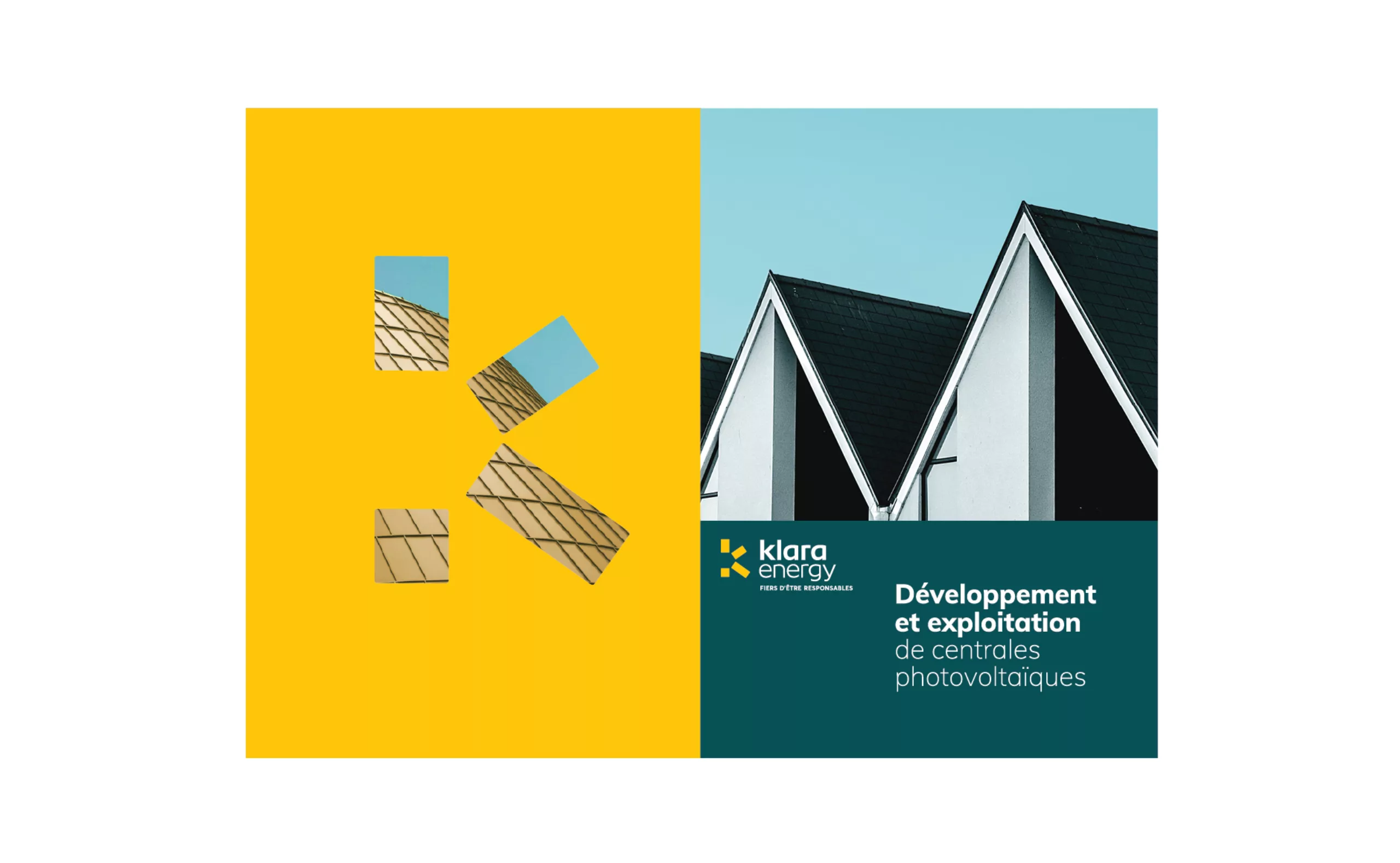
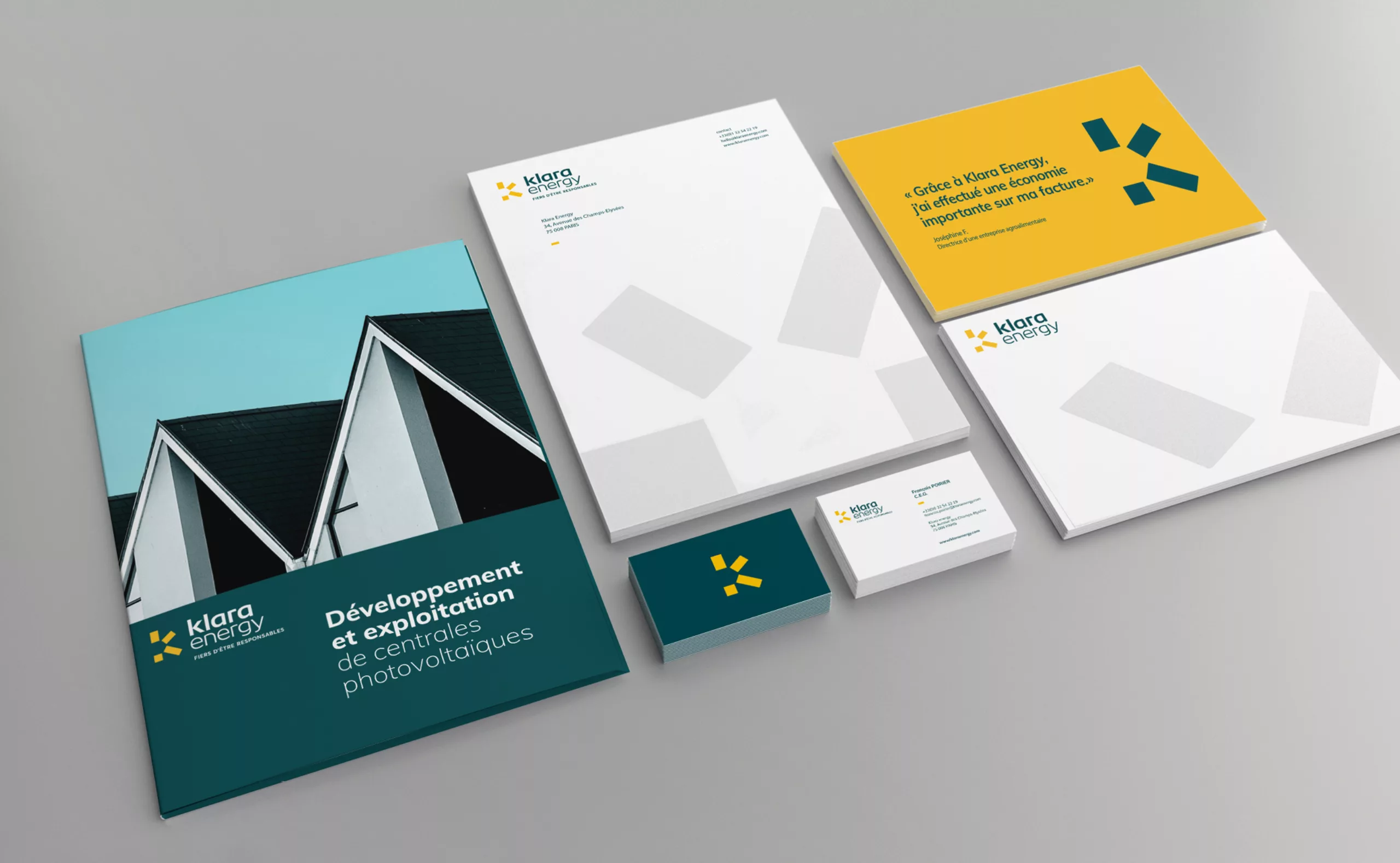
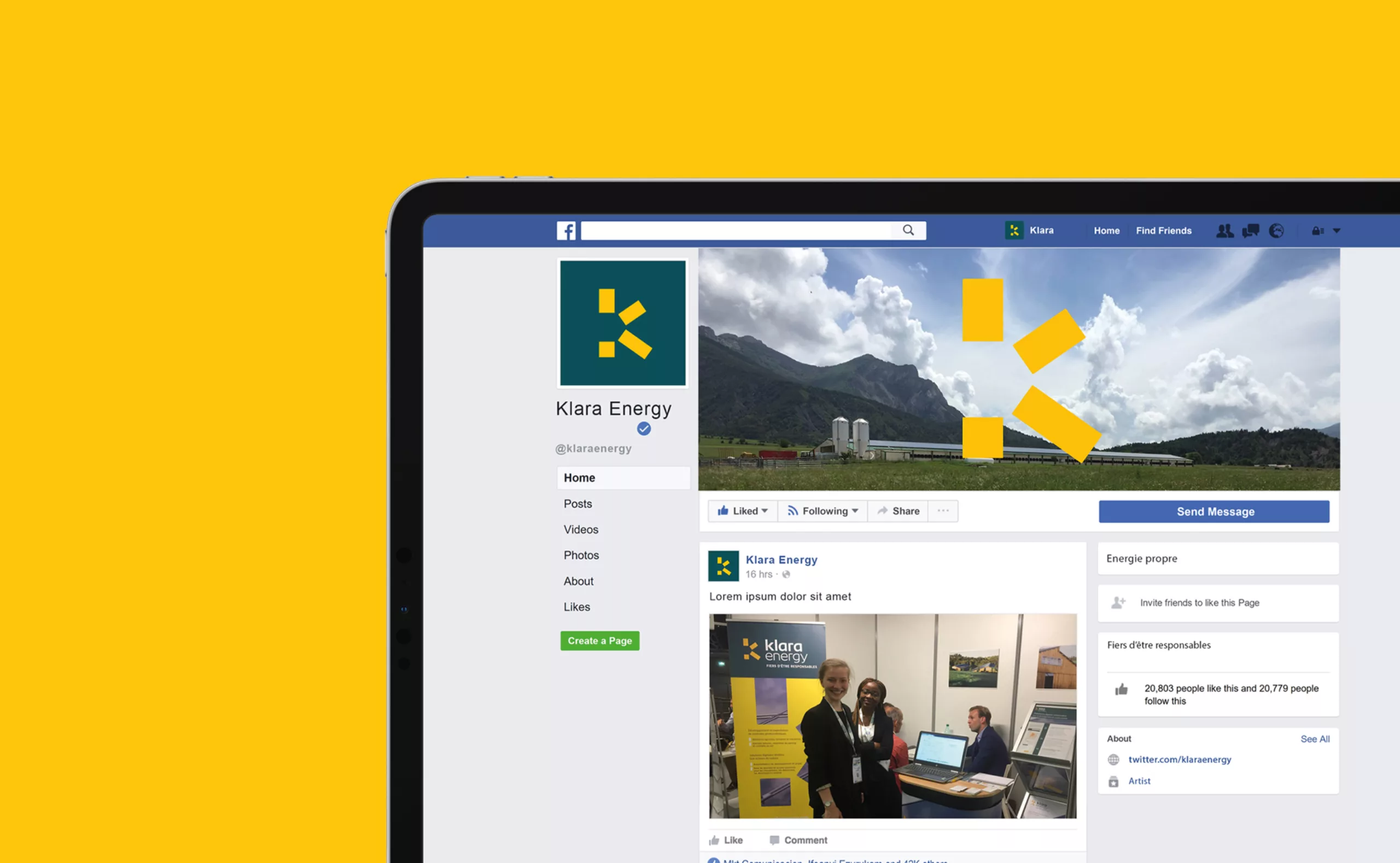
The goal of Klara Energy rebranding is to create a new brand territory that respects and enhances both the technical know-how of energy engineering related to the installation of photovoltaic panels, as well as the agility and simplicity in the use of digital solutions created to operate them. Graphéine agency advised Klara Energy in its strategic positioning both editorial and graphic.
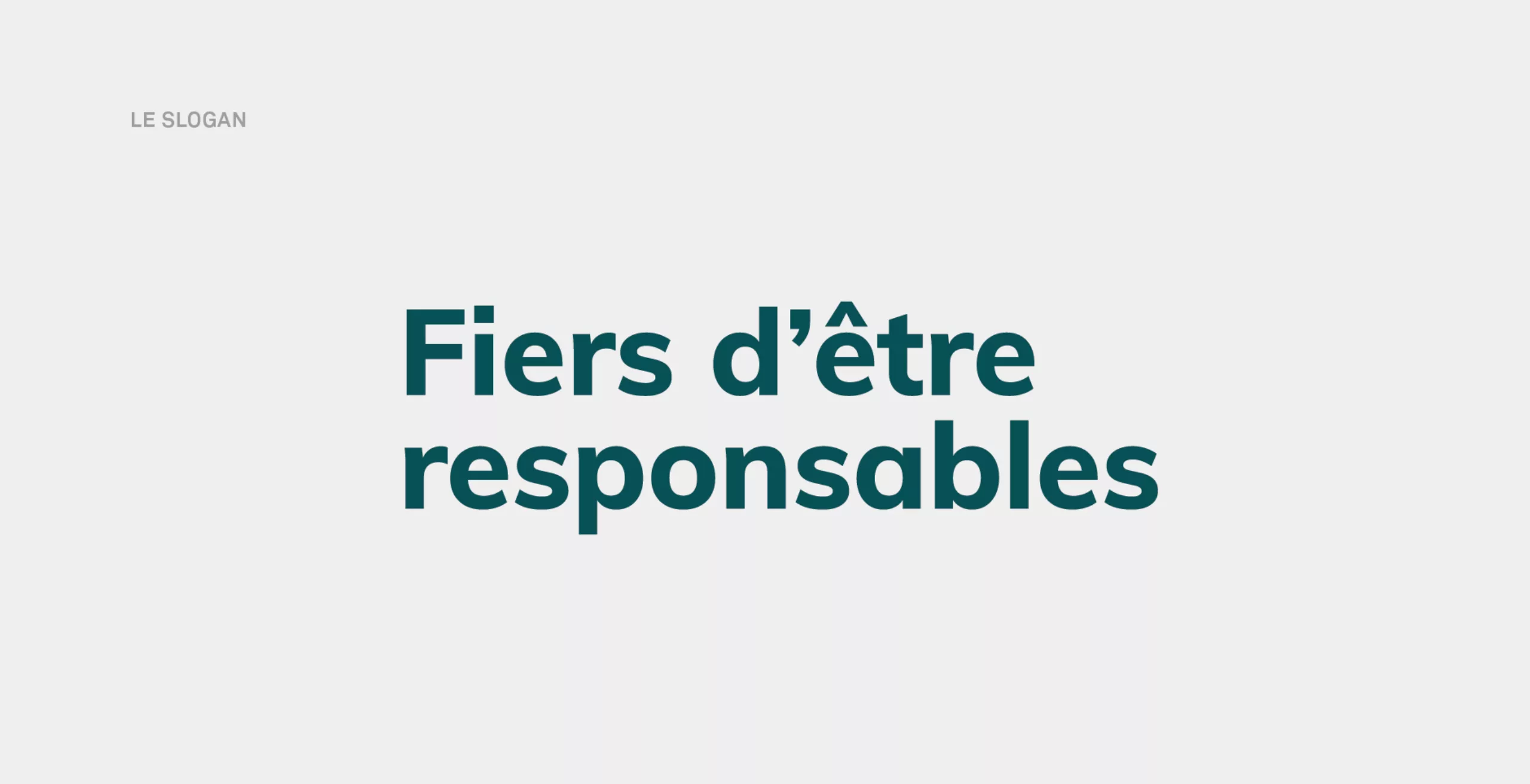
This reflection first of all led to the evolution of the brand name by anglicizing it. This transformation gives a more ambitious image to the brand. The next step was the creation of the new tagline “Proud to be responsible” that now effectively communicates the company’s ecological commitment.
