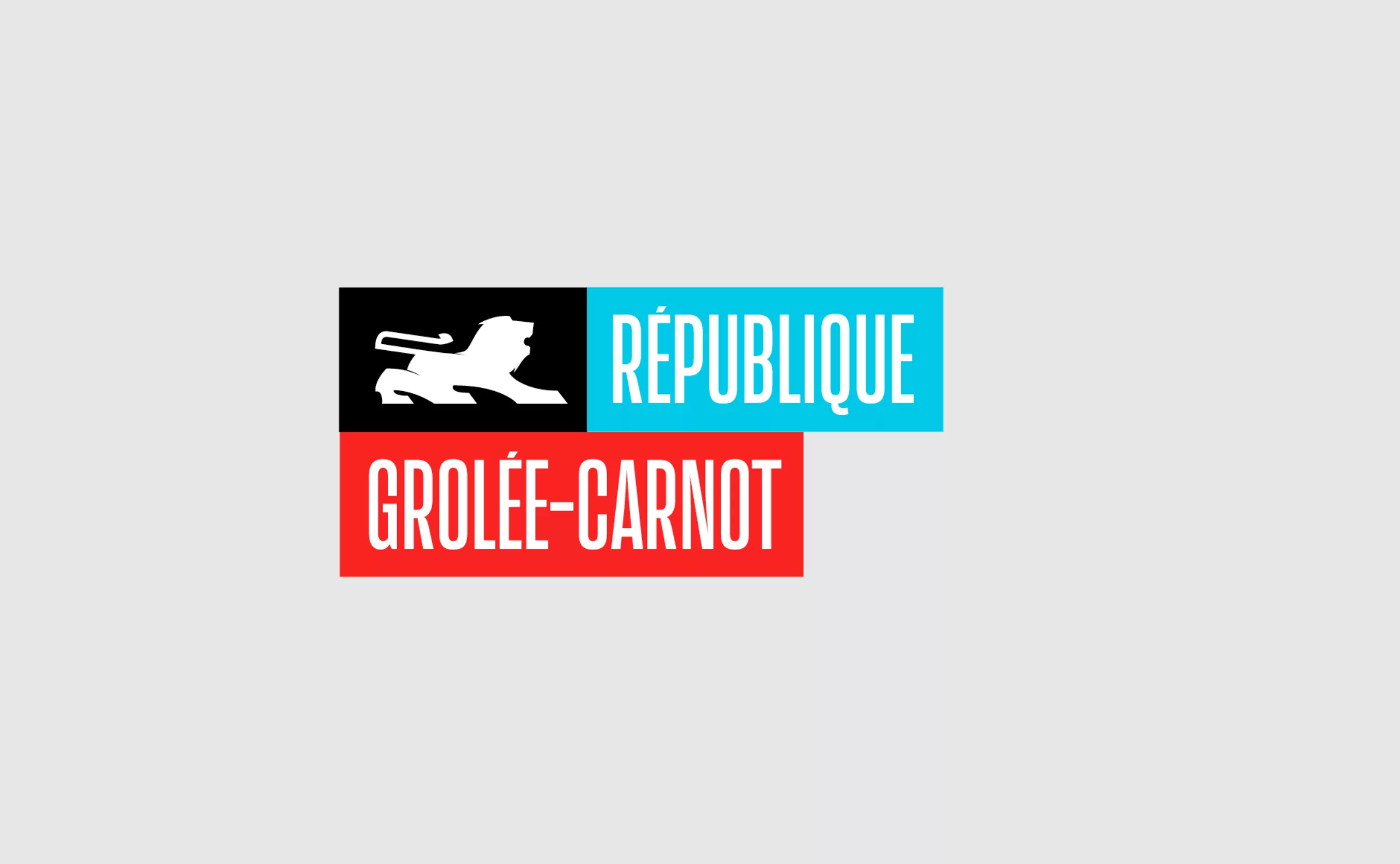
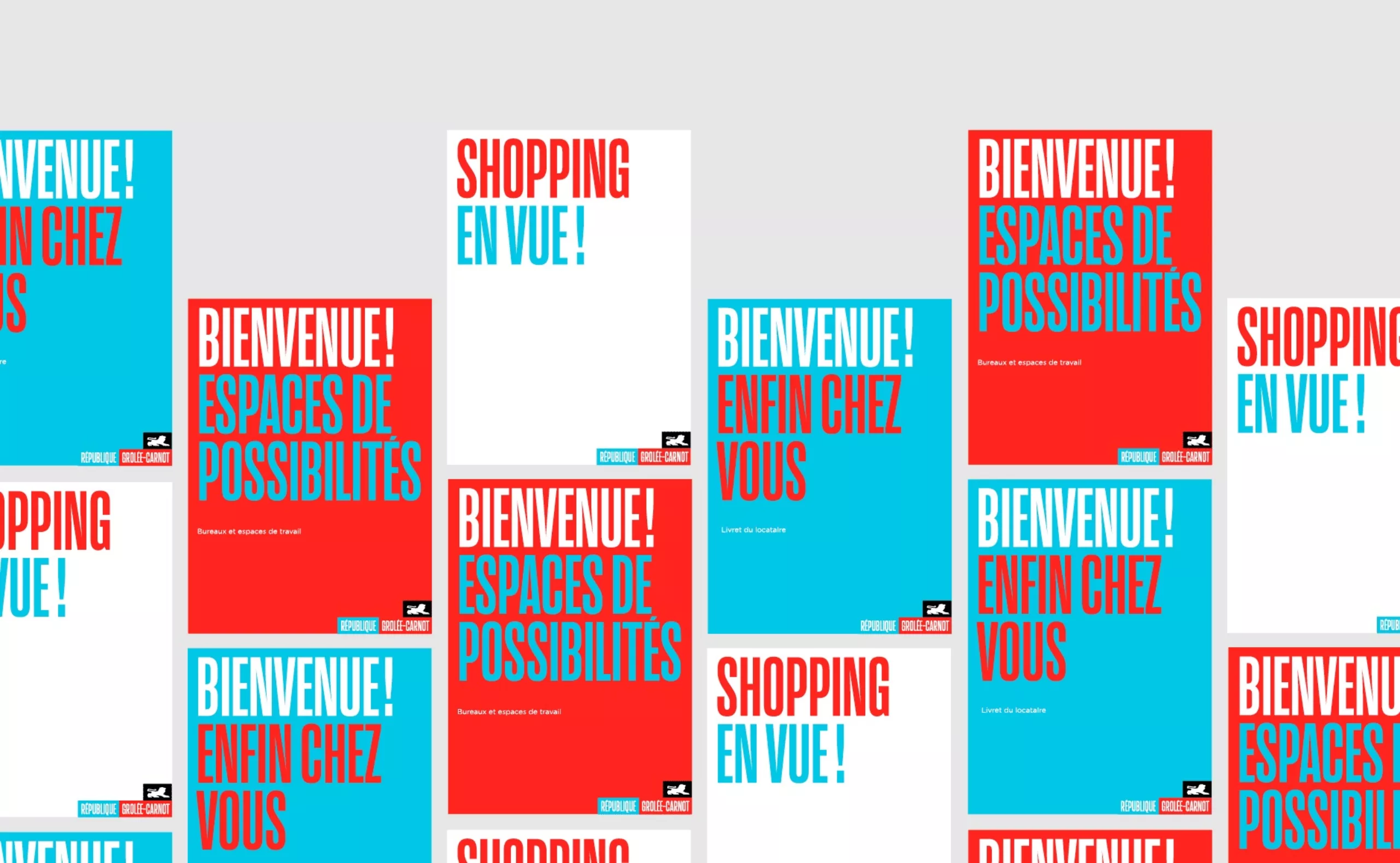
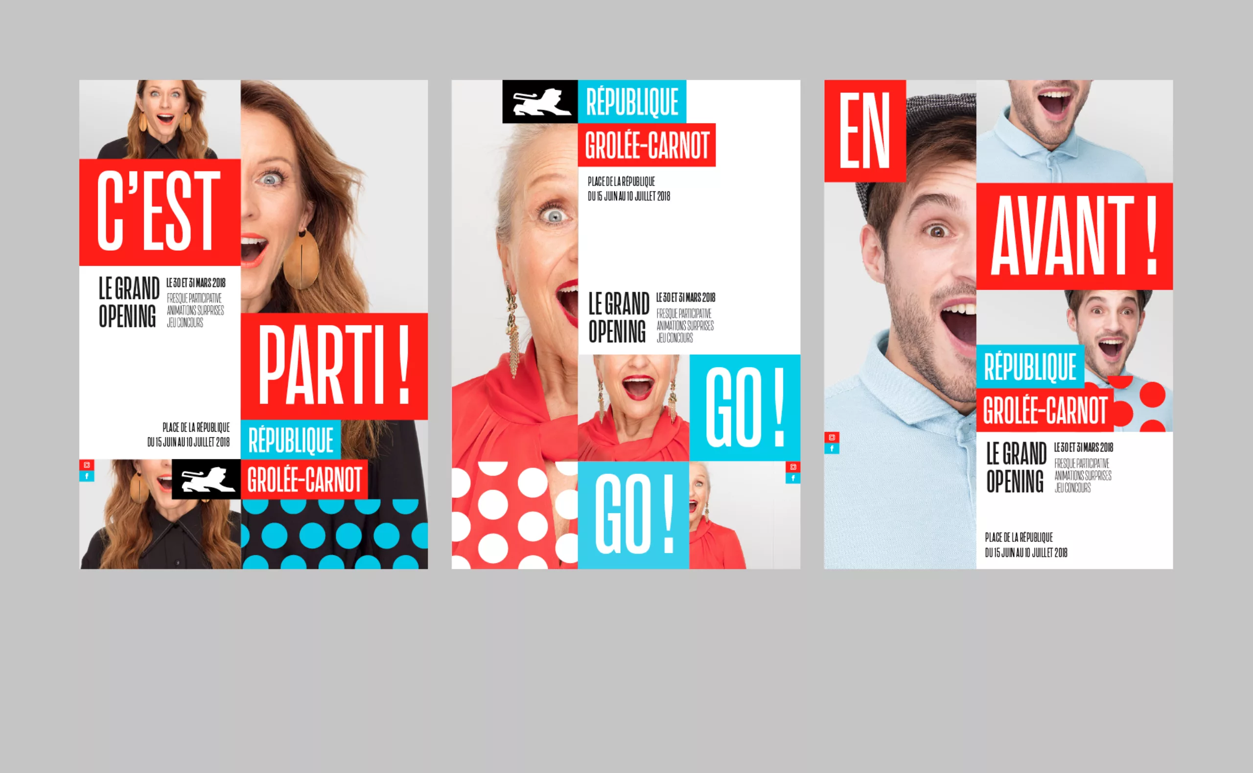
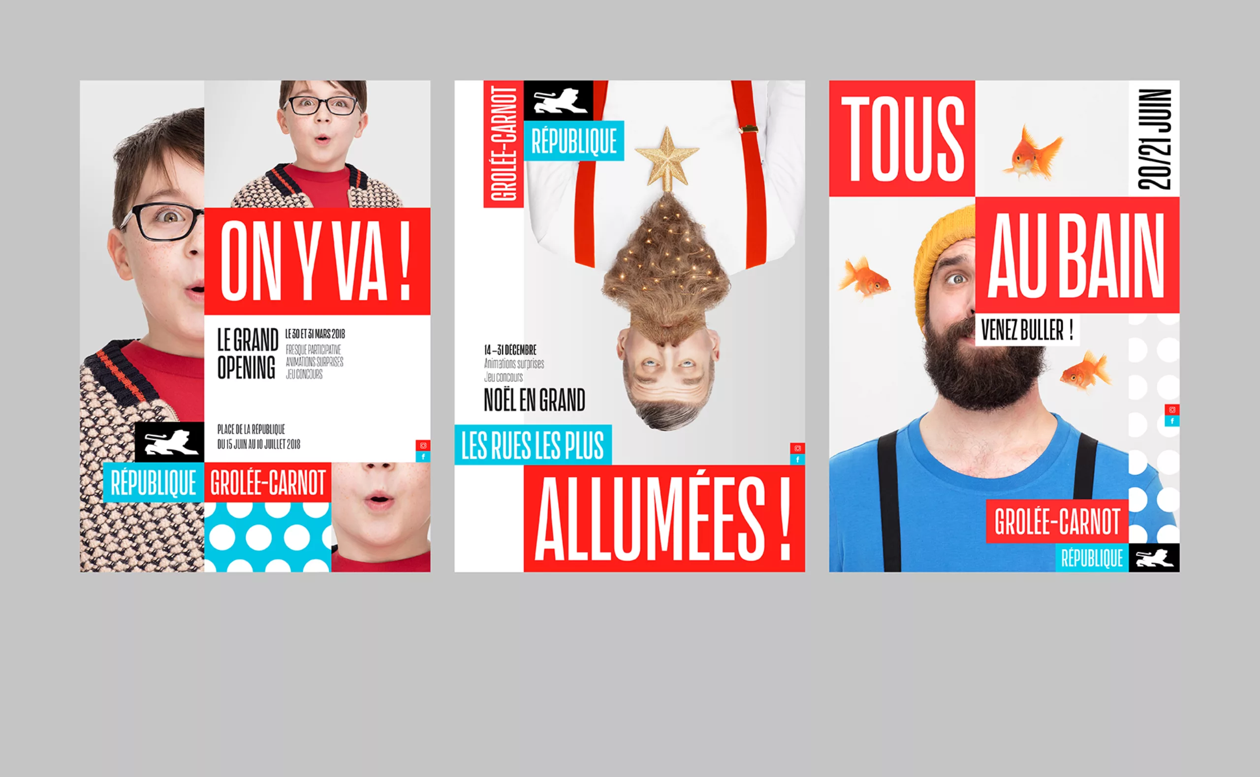
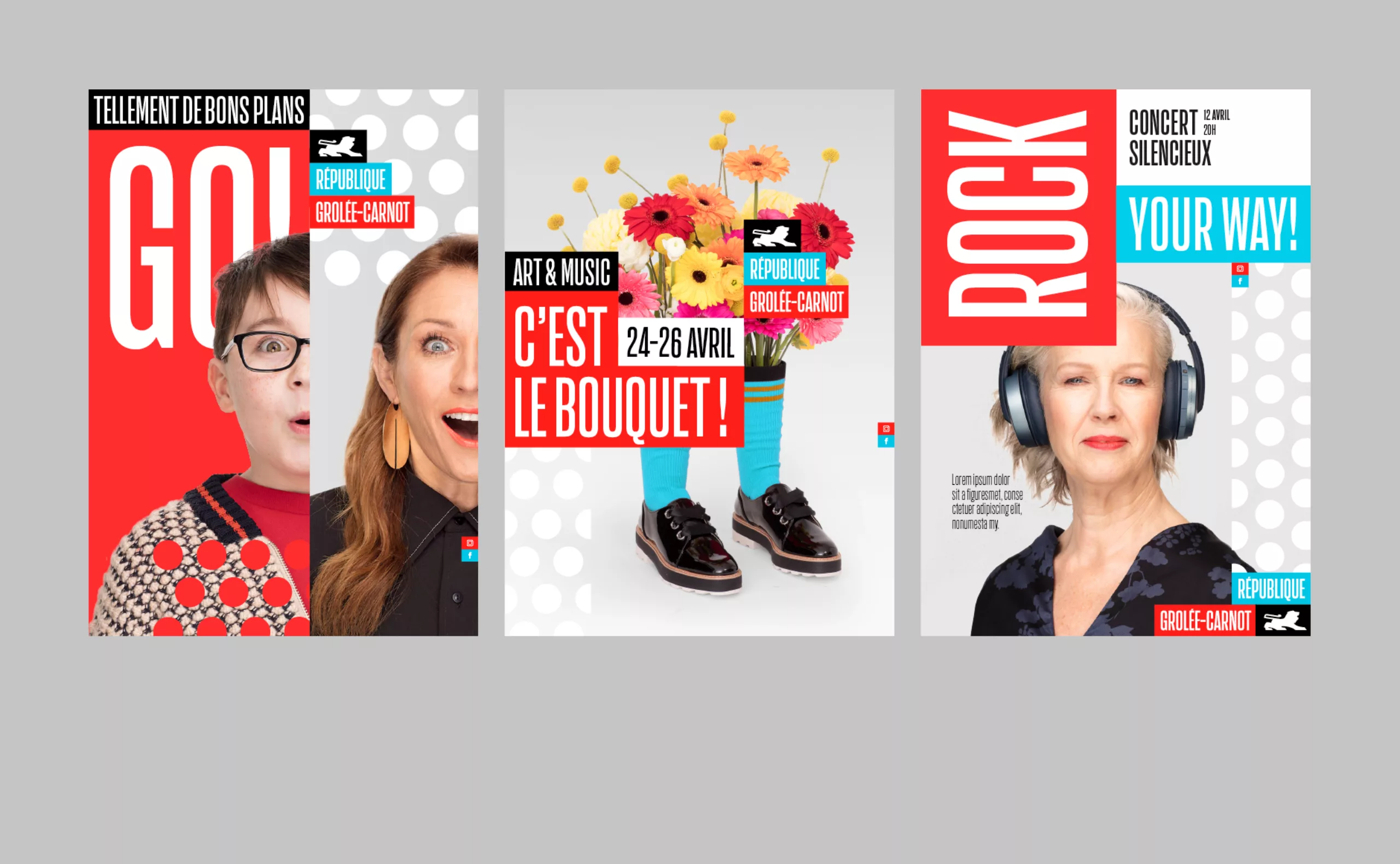
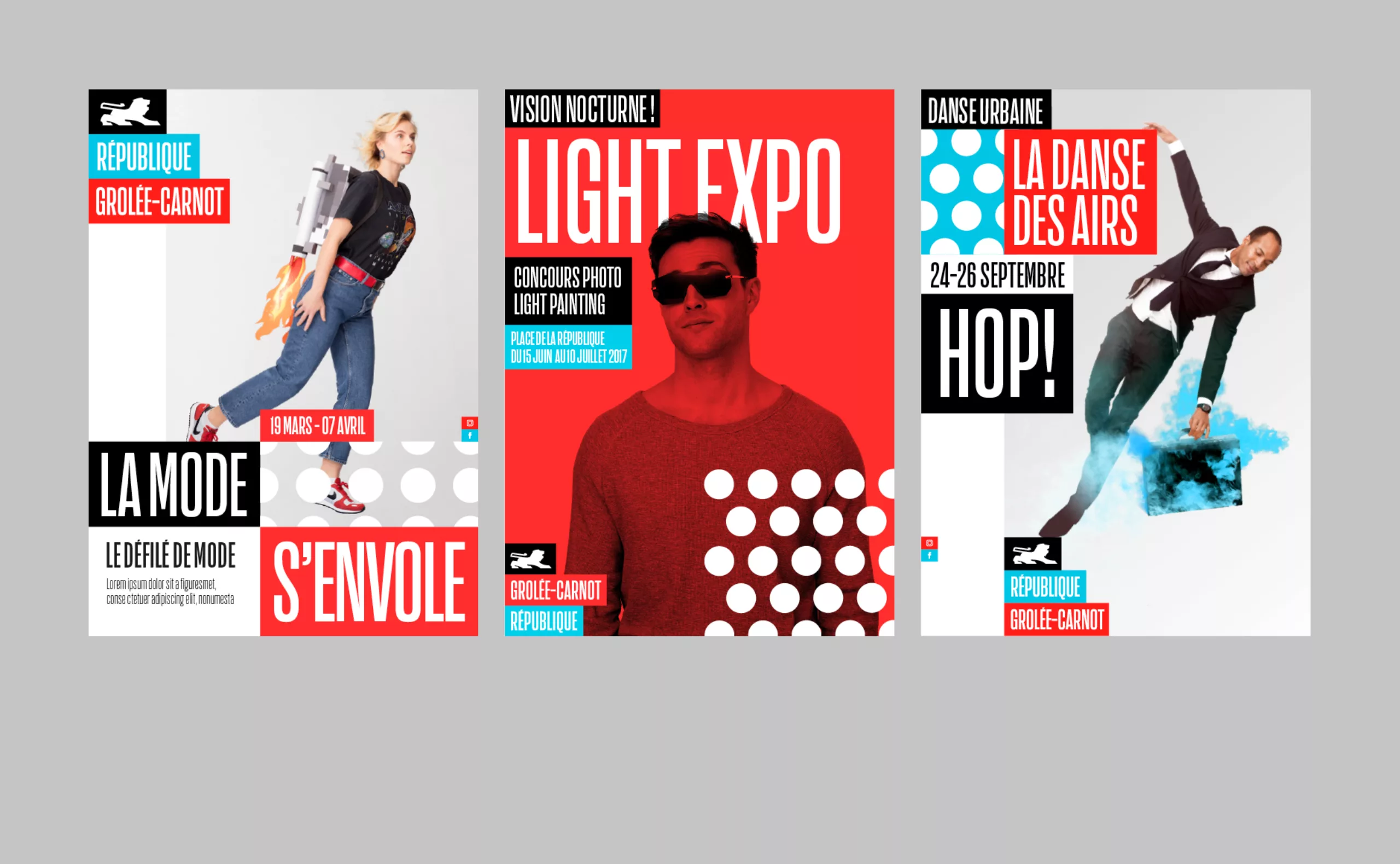
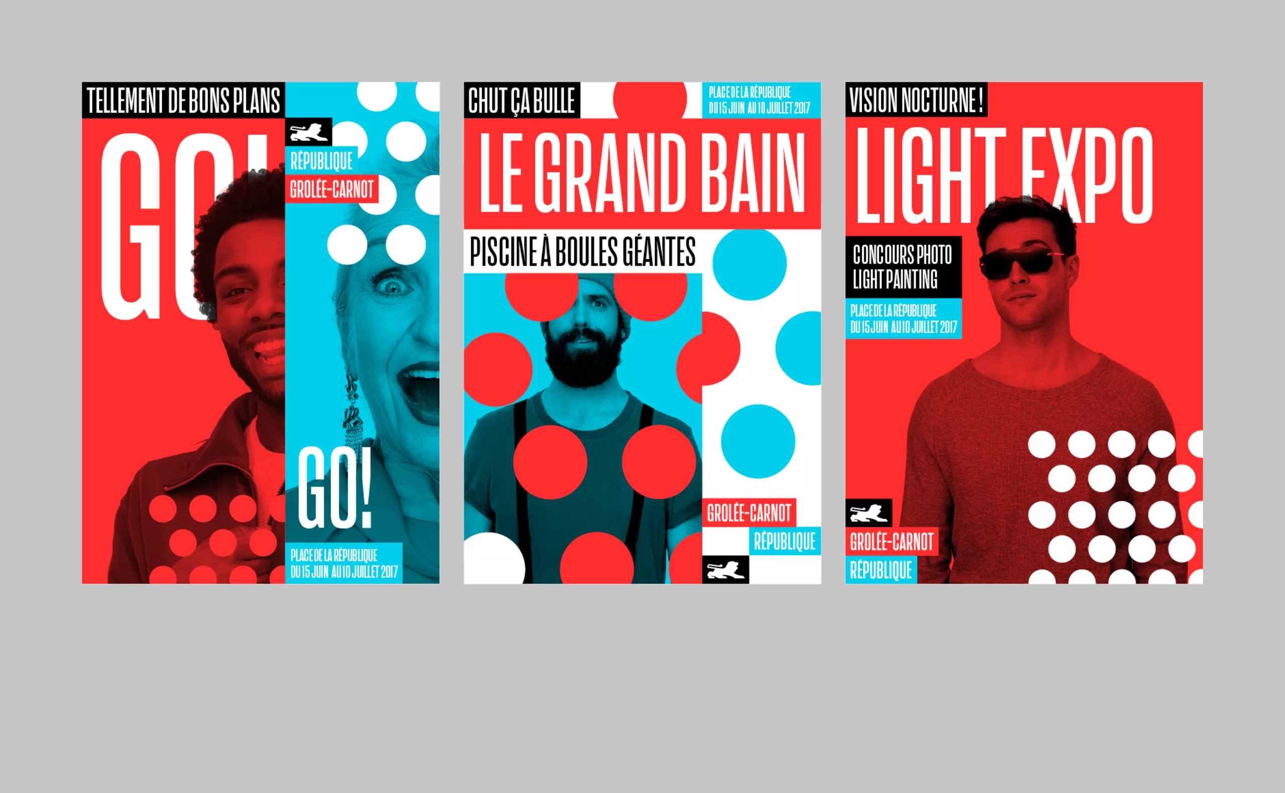
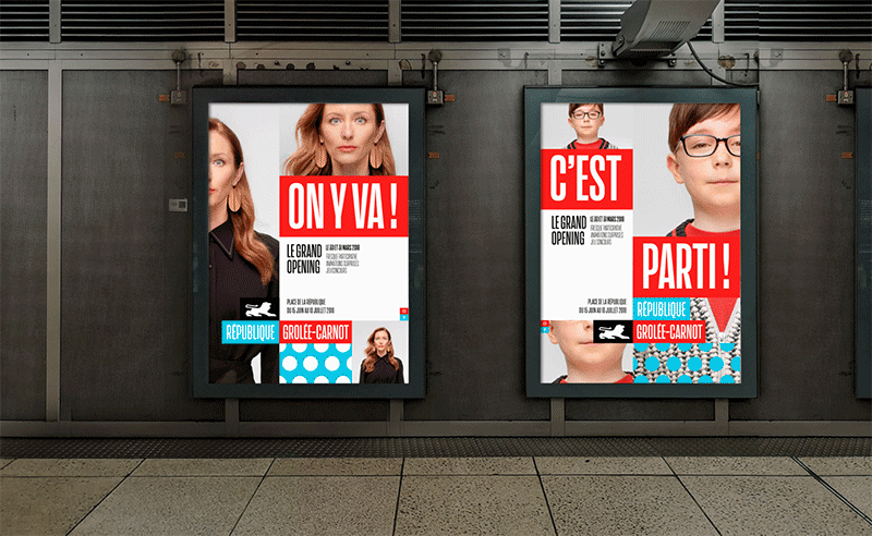
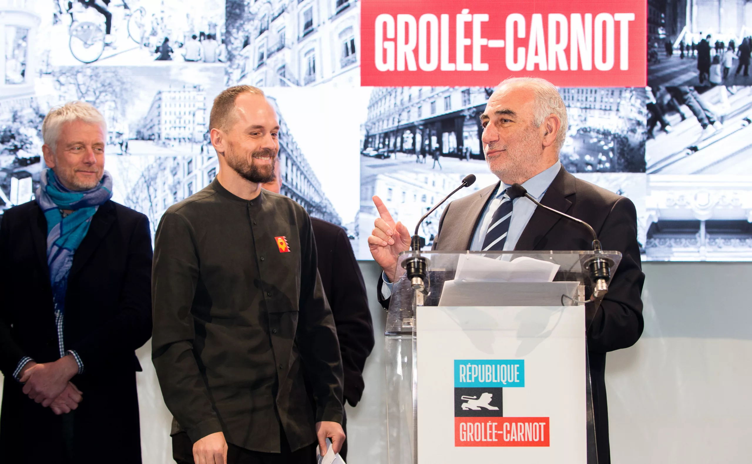
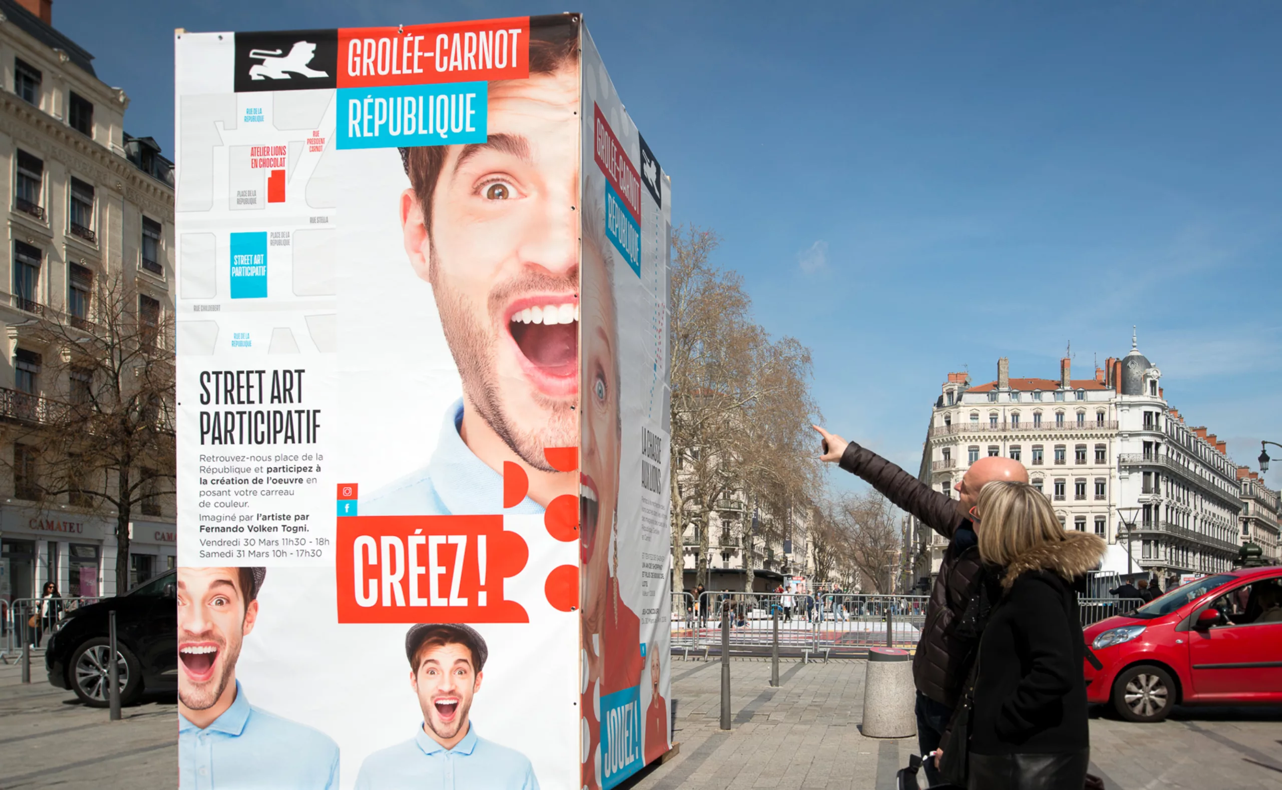
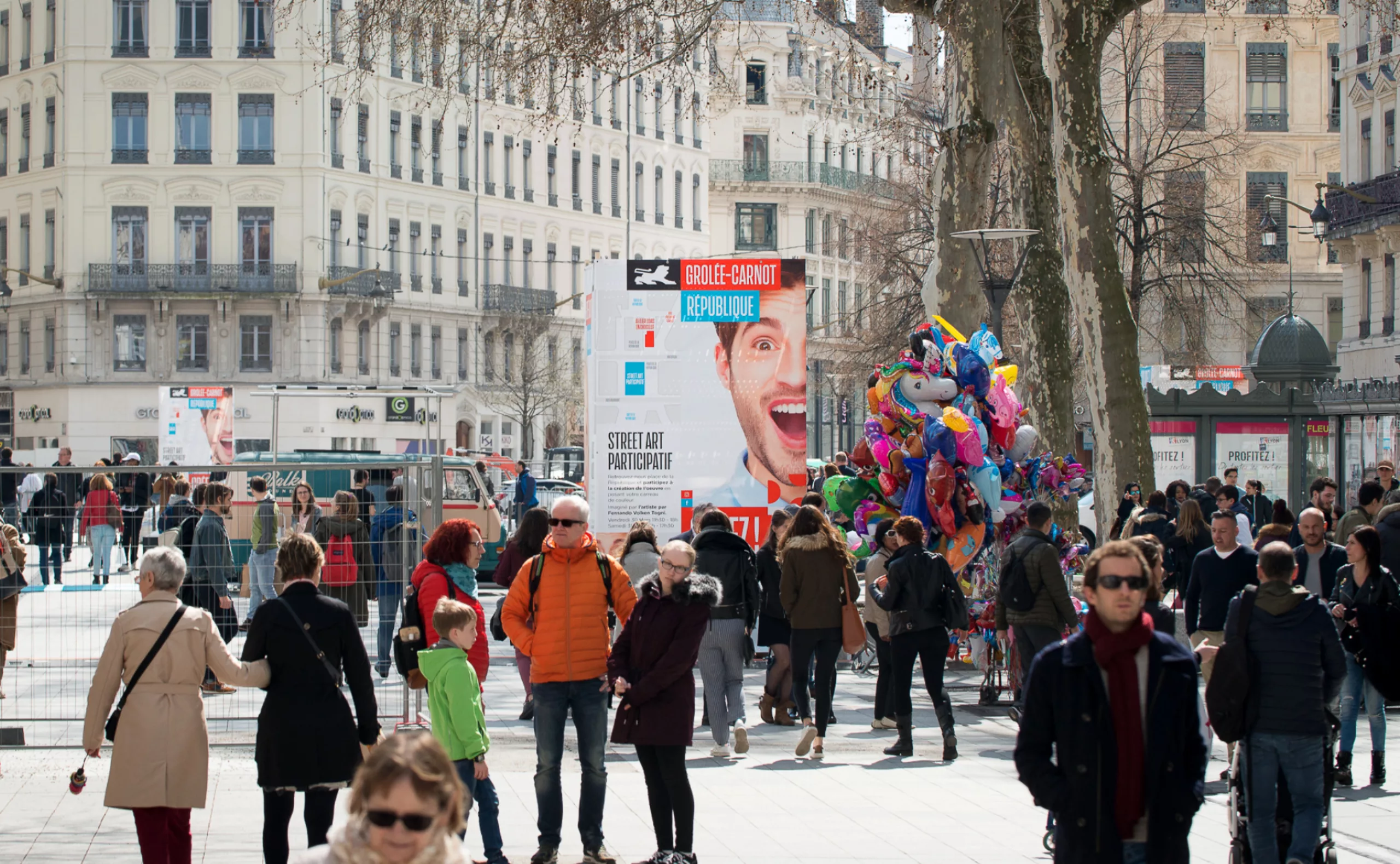
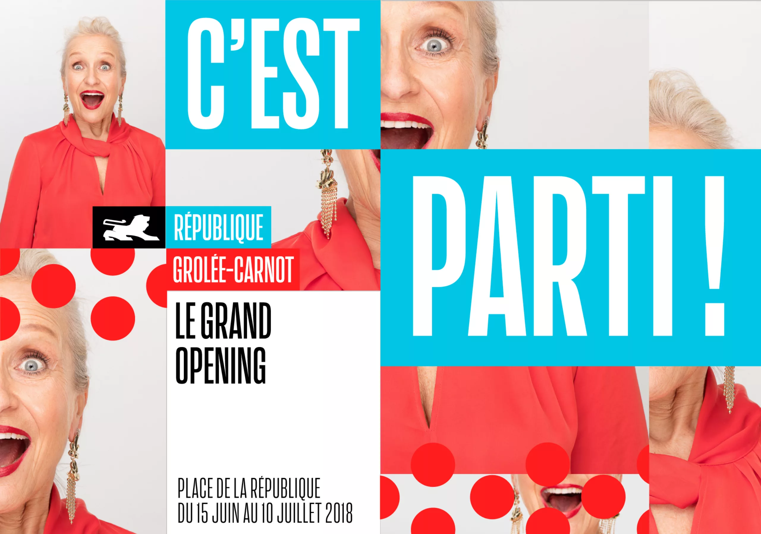
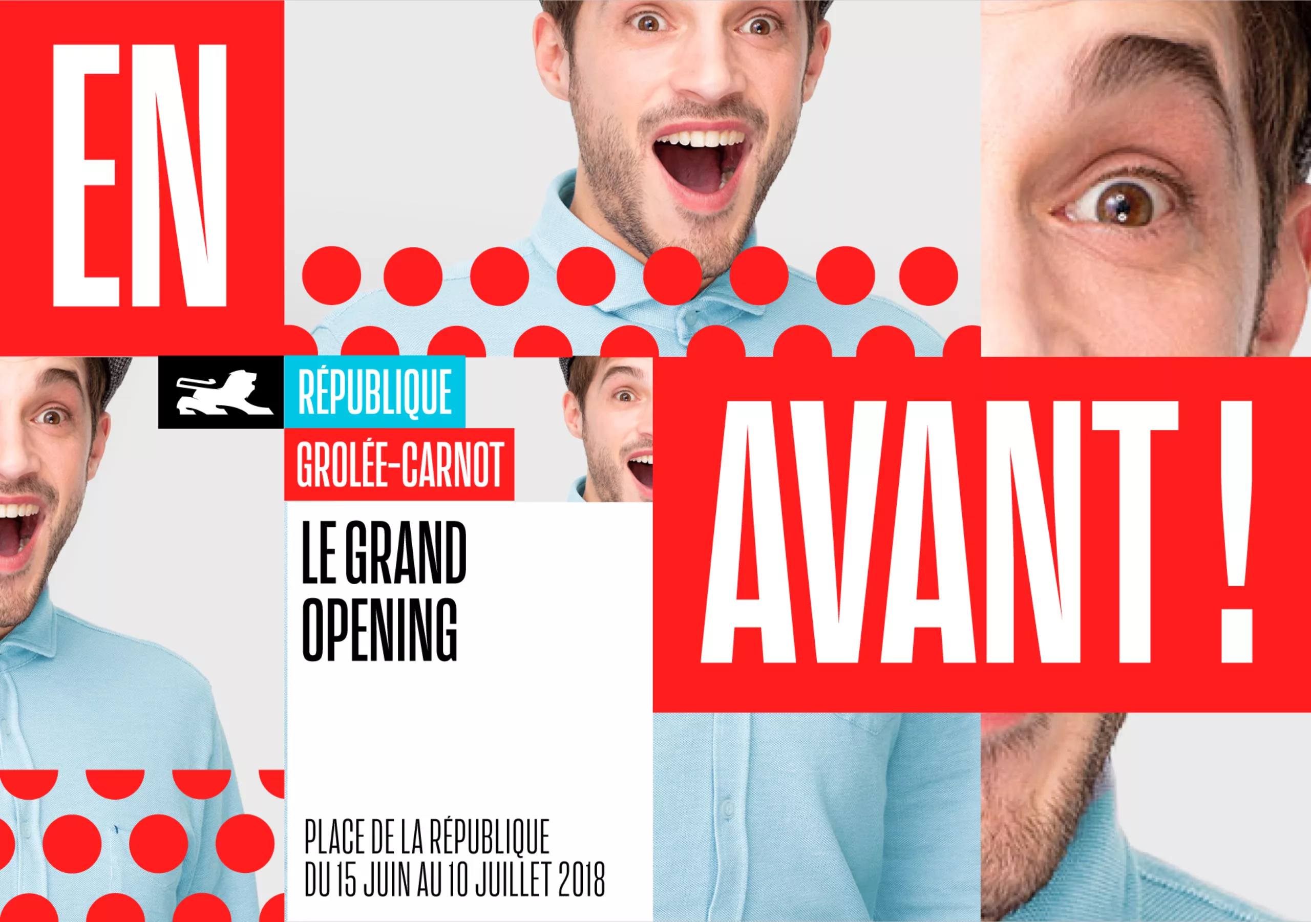
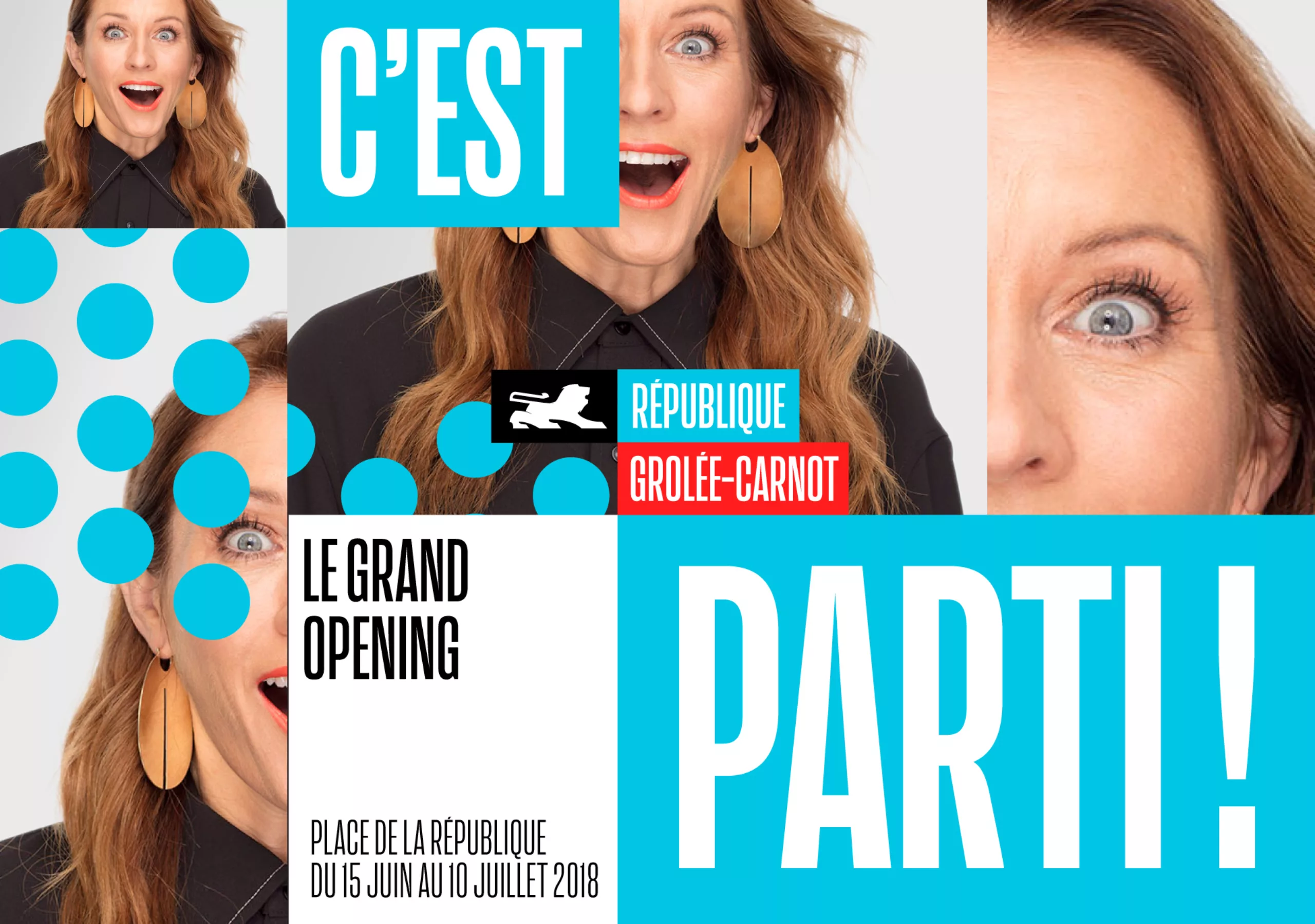
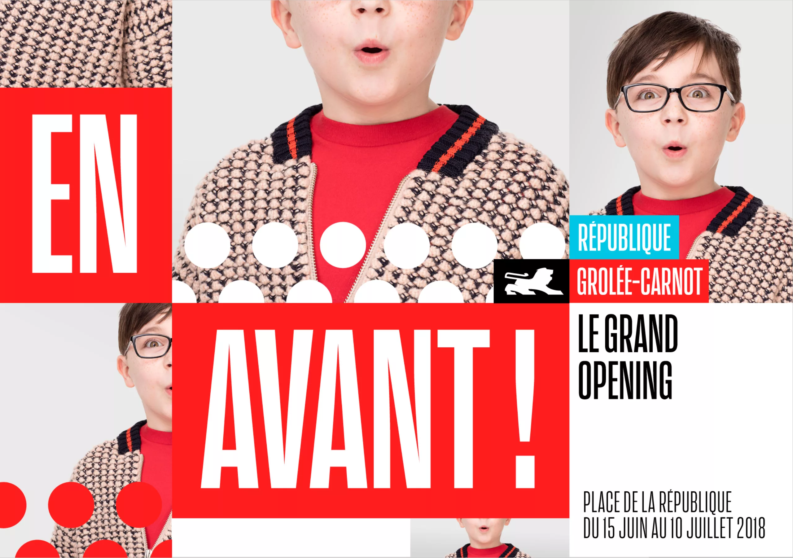
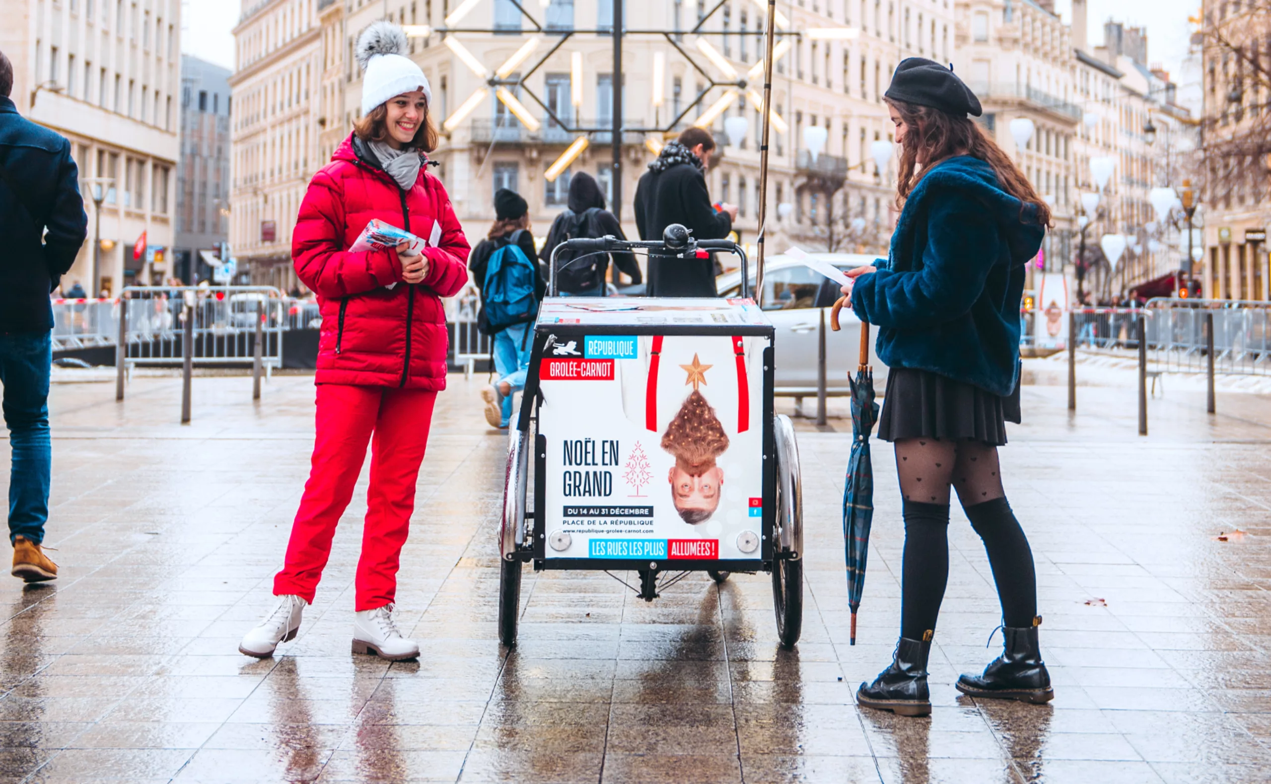
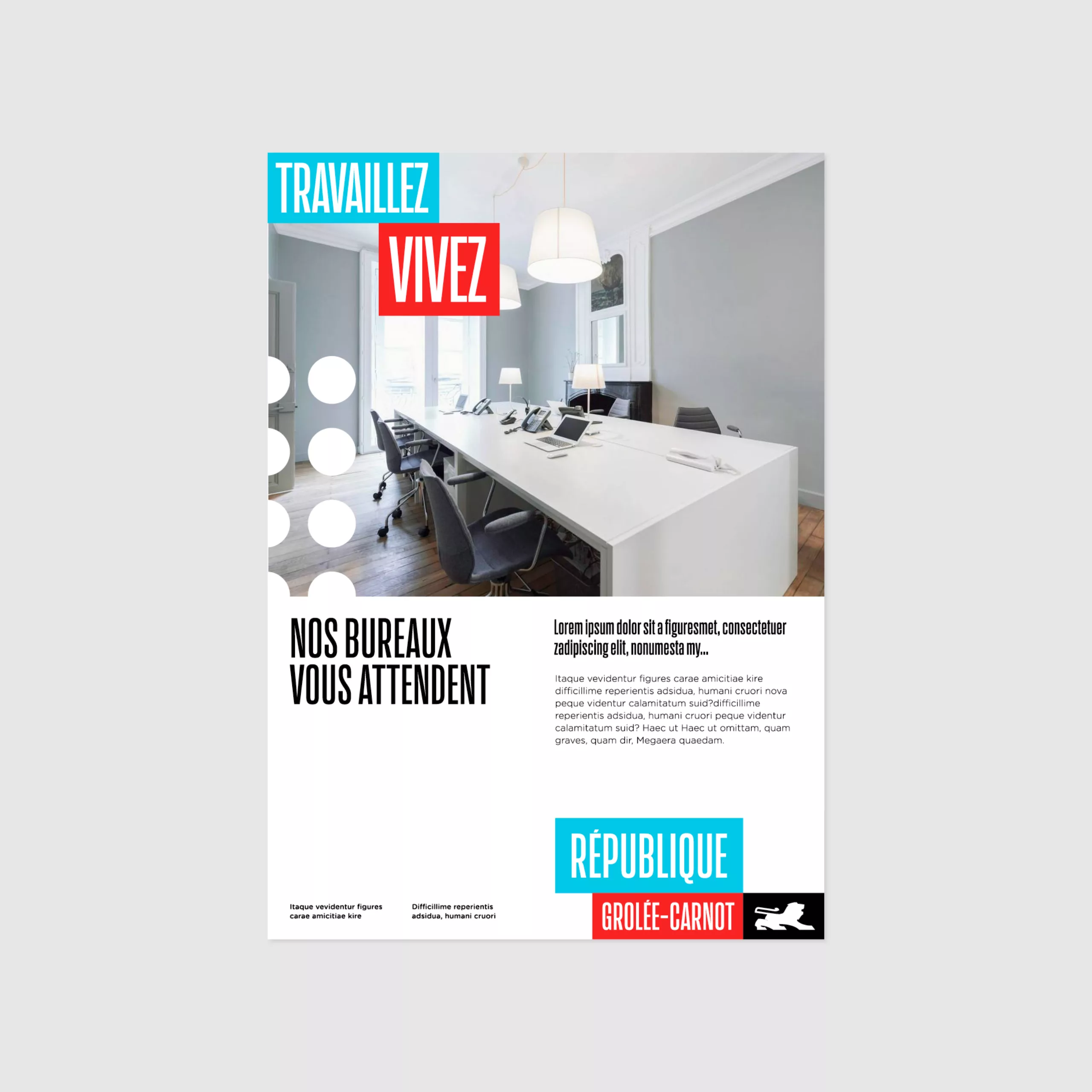
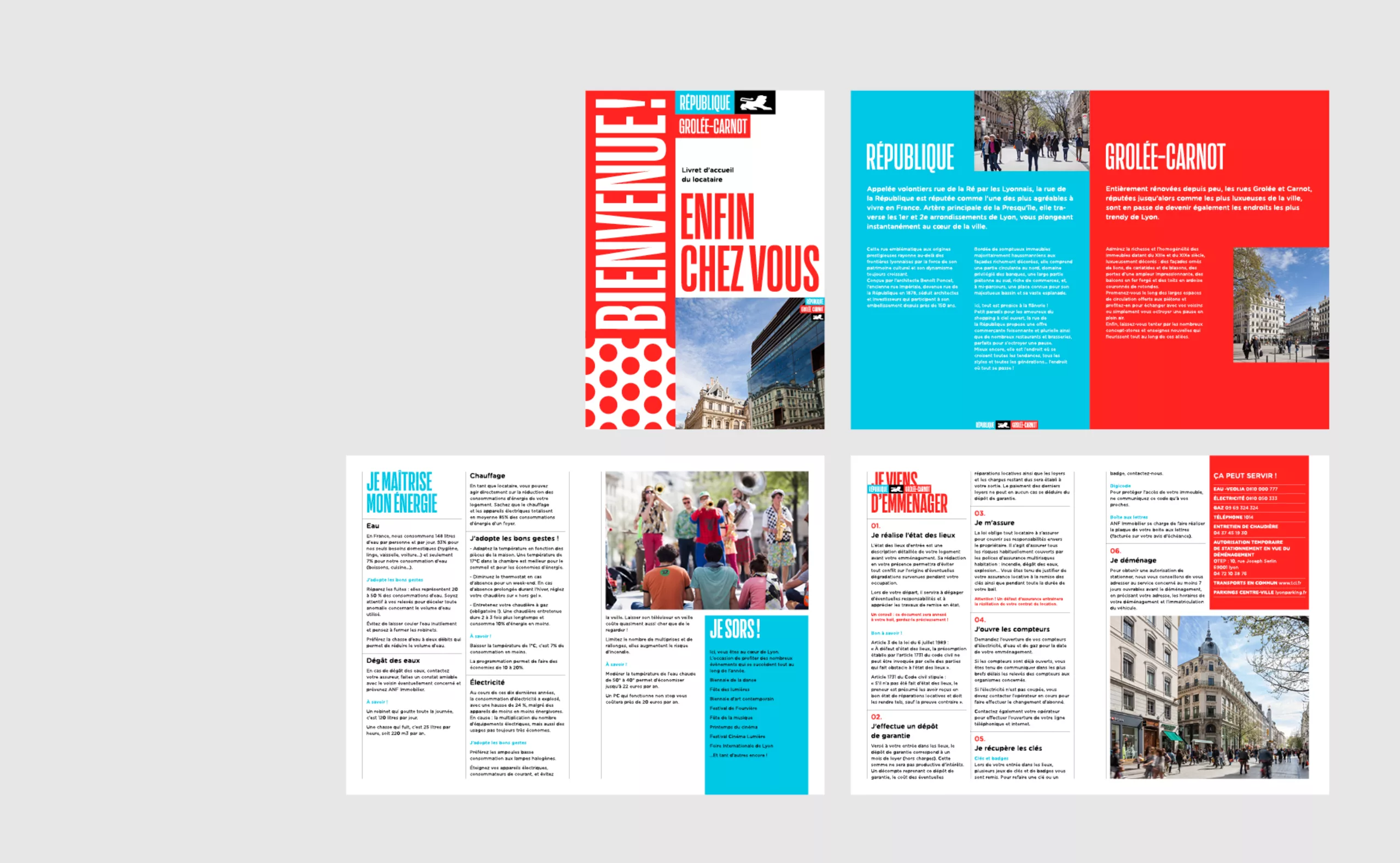
Branding rue de la République Lyon

2019

République - Grolée-Carnot
Branding of a shopping destination

The ambition of the brand "République - Grolée-Carnot" is to bring together Lyon's three main shopping streets under the same banner, and to make it an essential destination. Cosmopolitan, urban and dynamic, with more than a hundred shops, these streets create a real district with magnificent architecture, where it is pleasant to go out, stroll, vibrate and share.

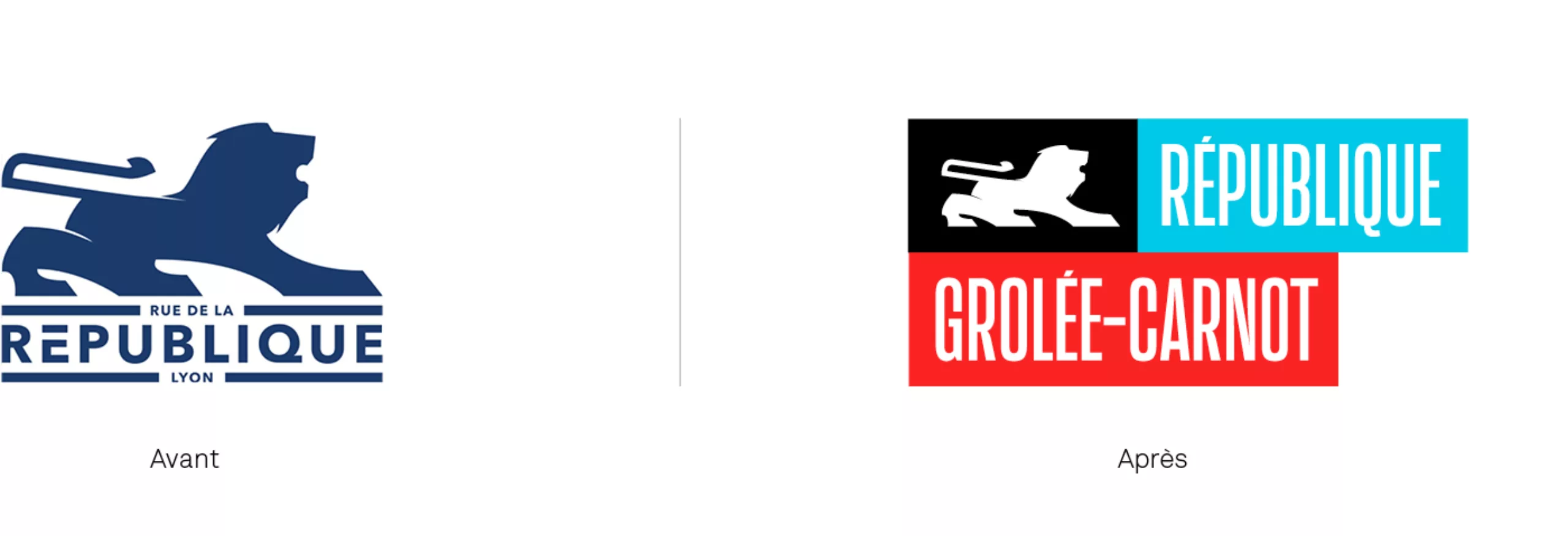
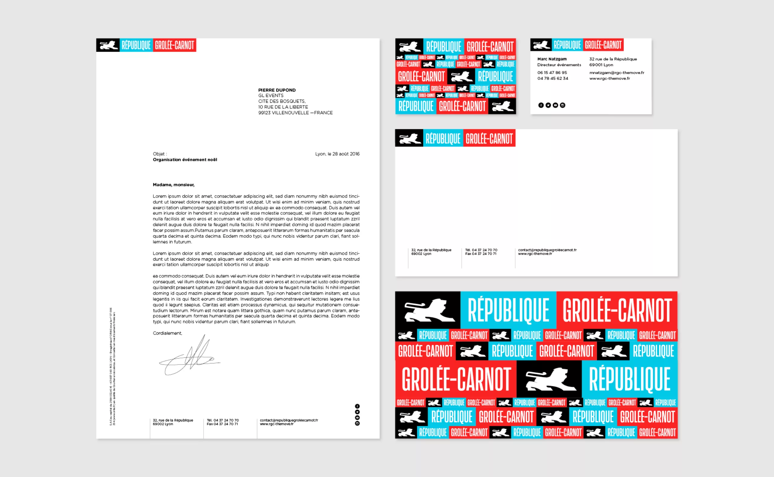
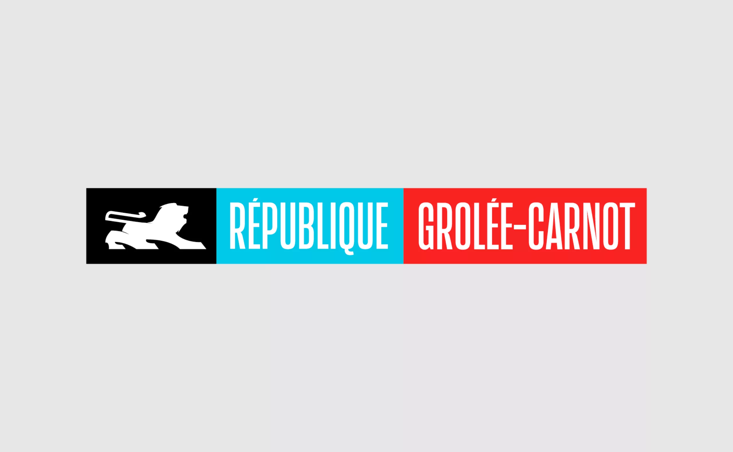
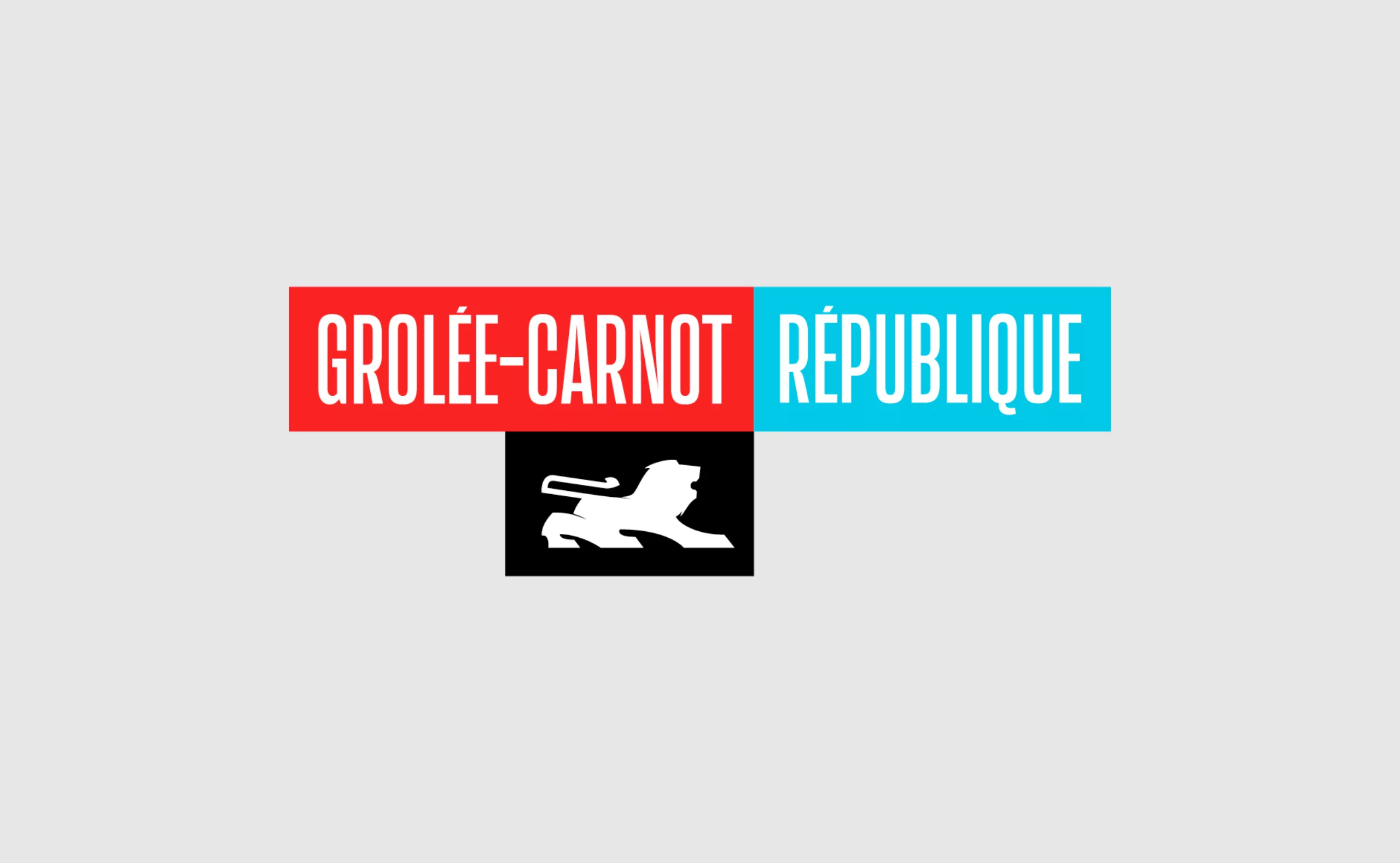
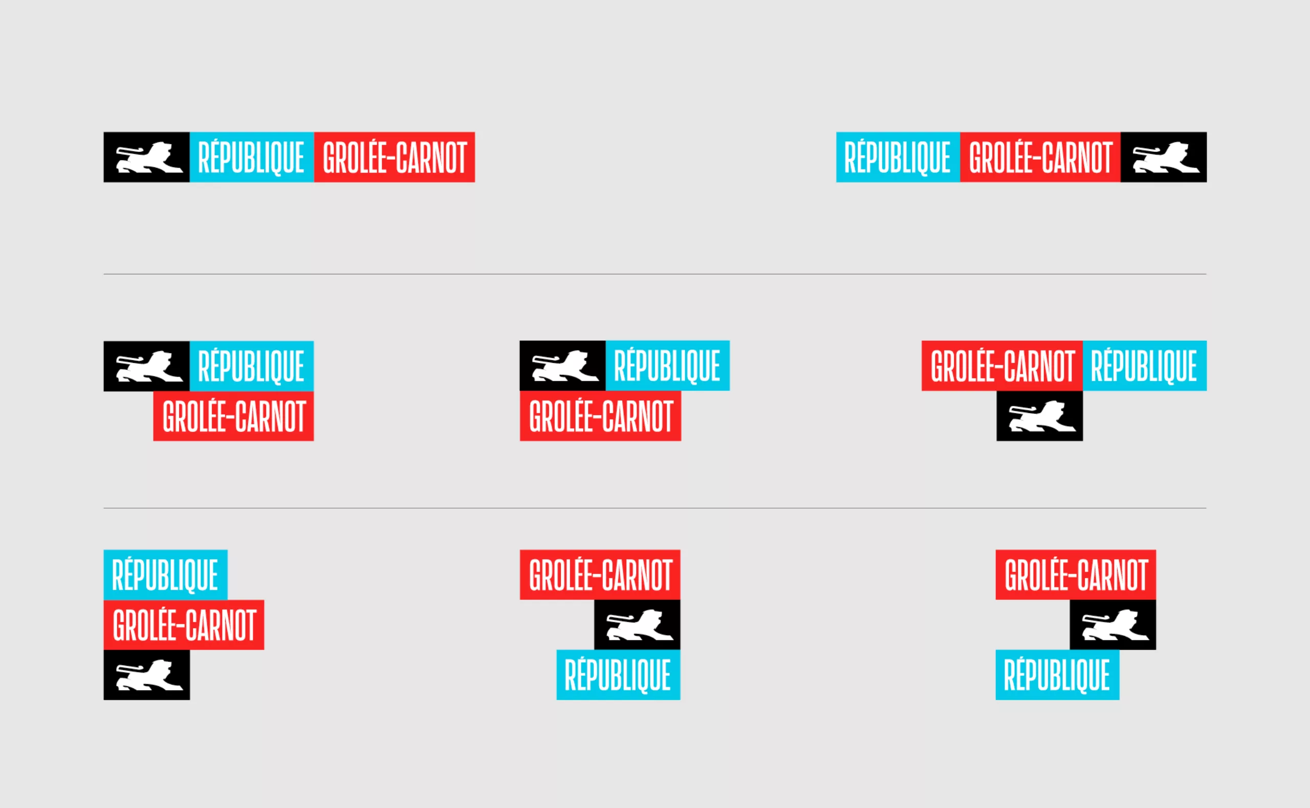
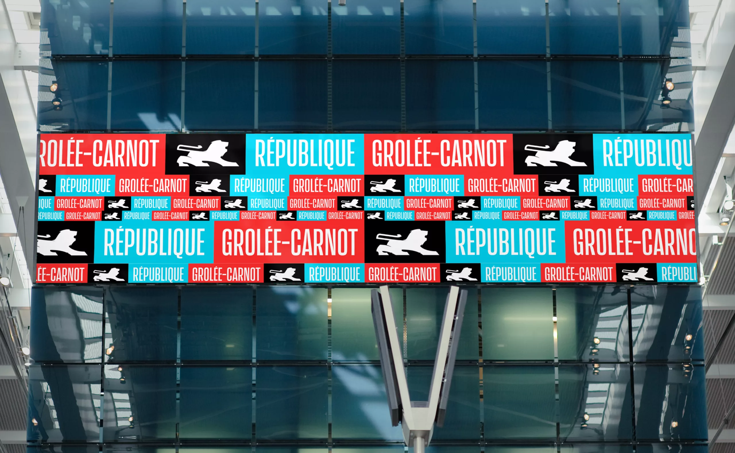
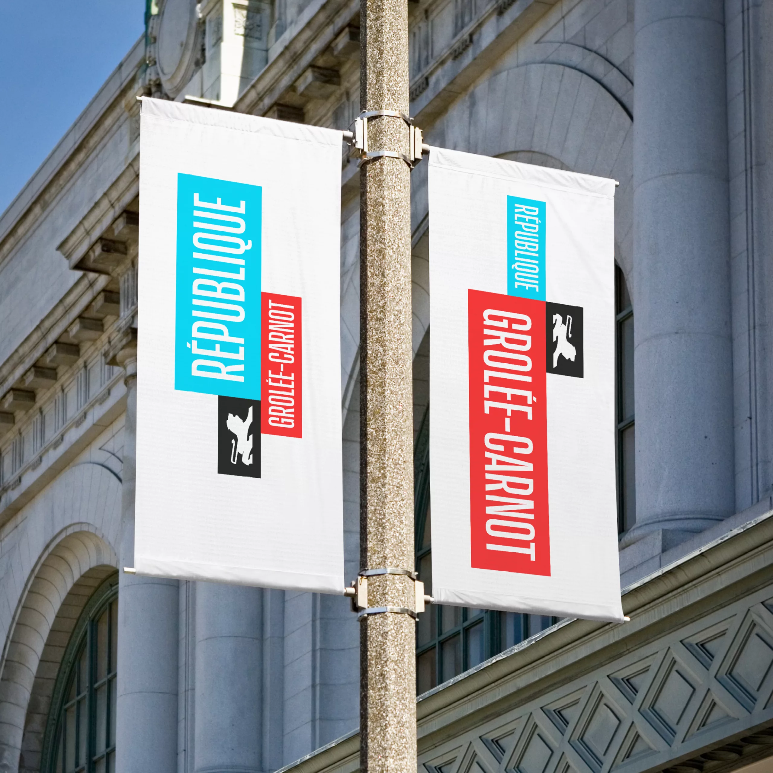
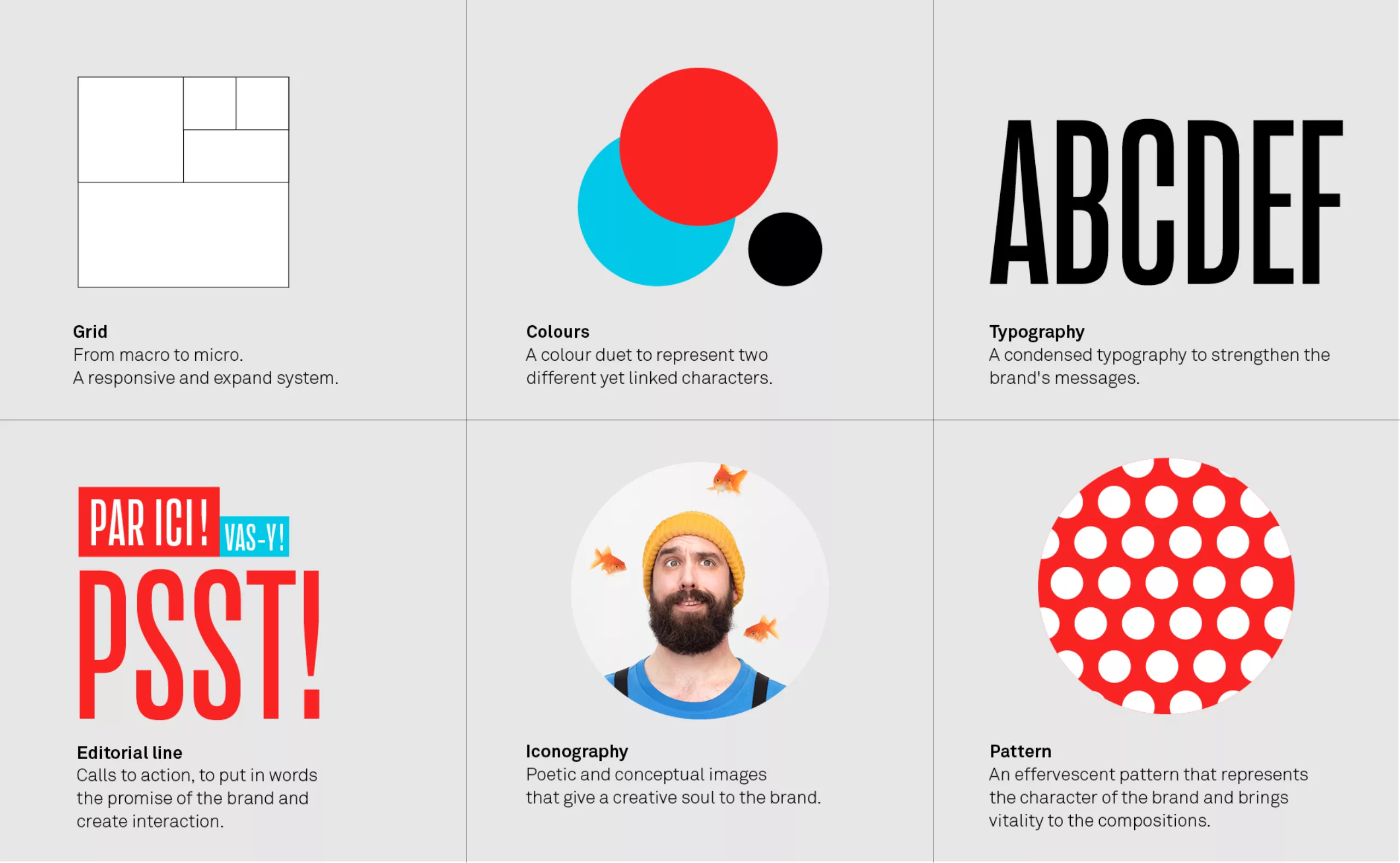
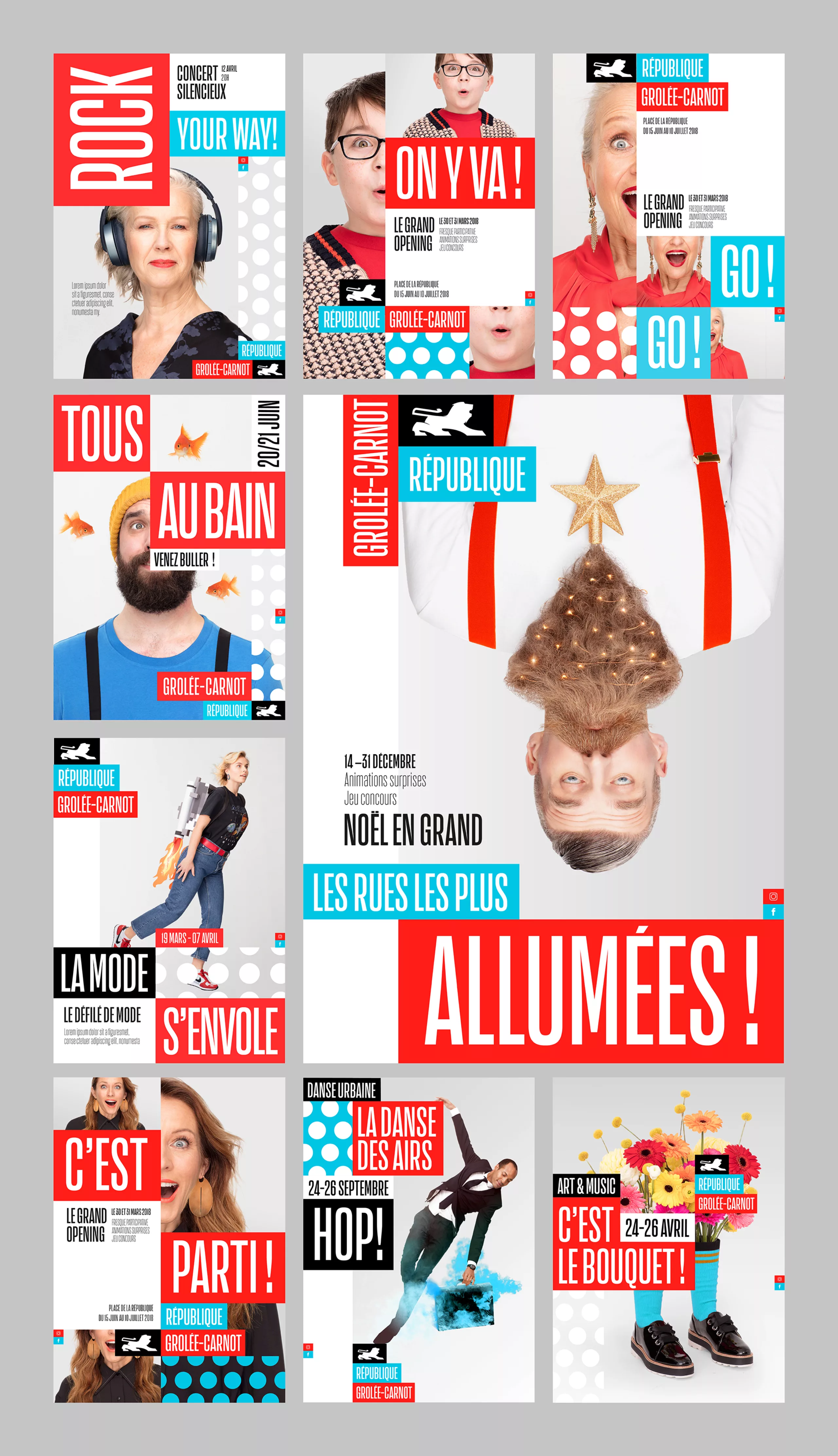
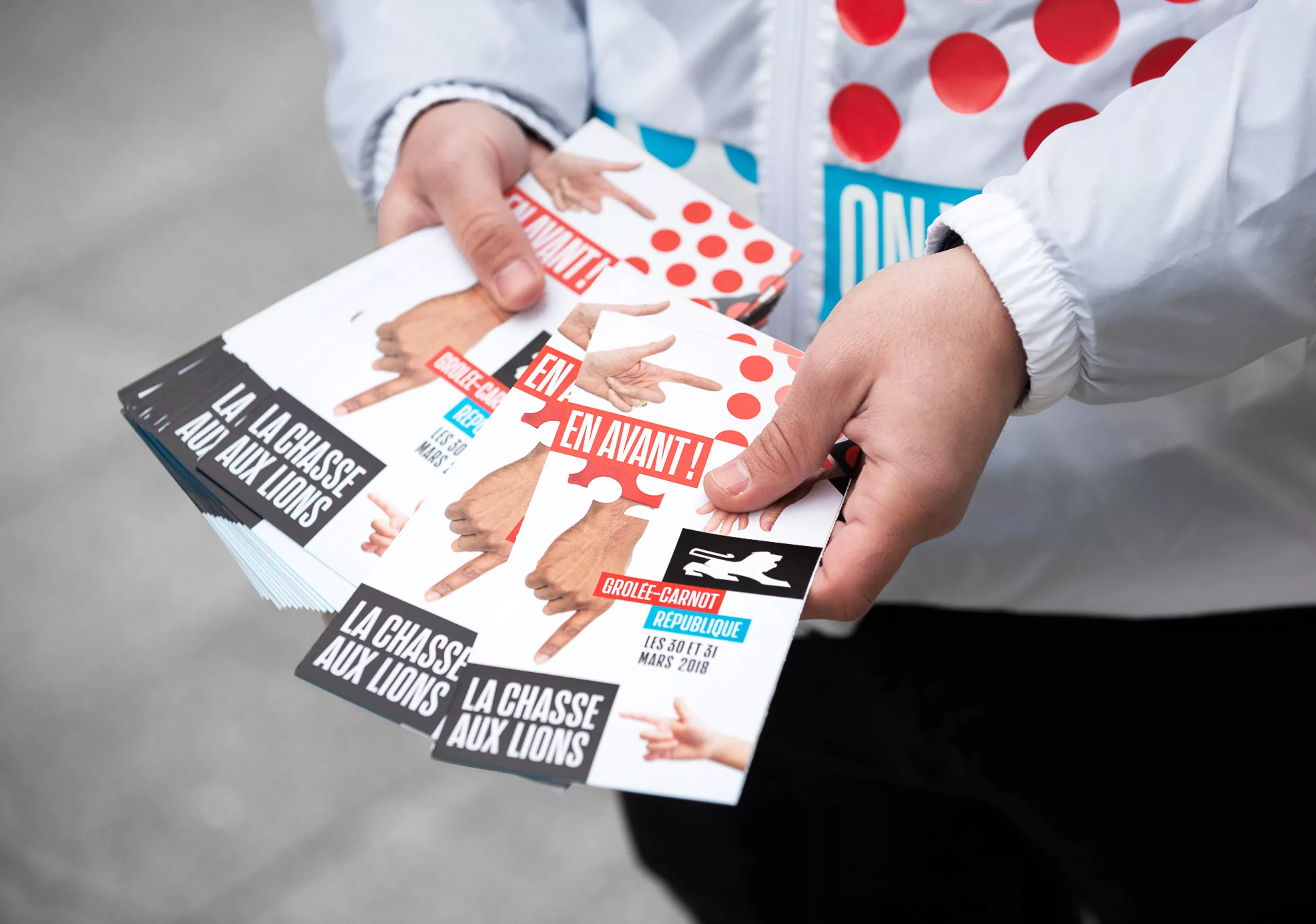
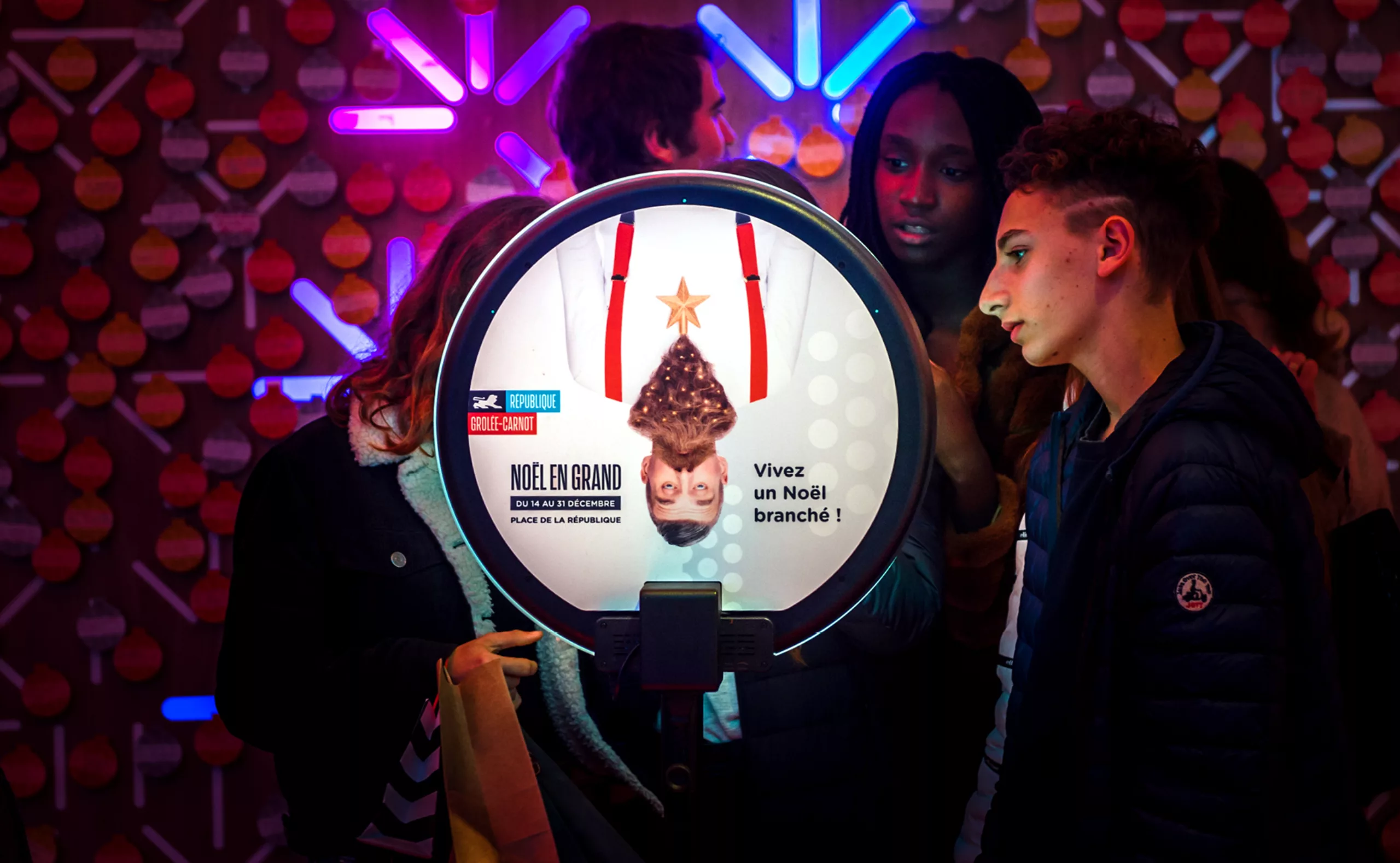
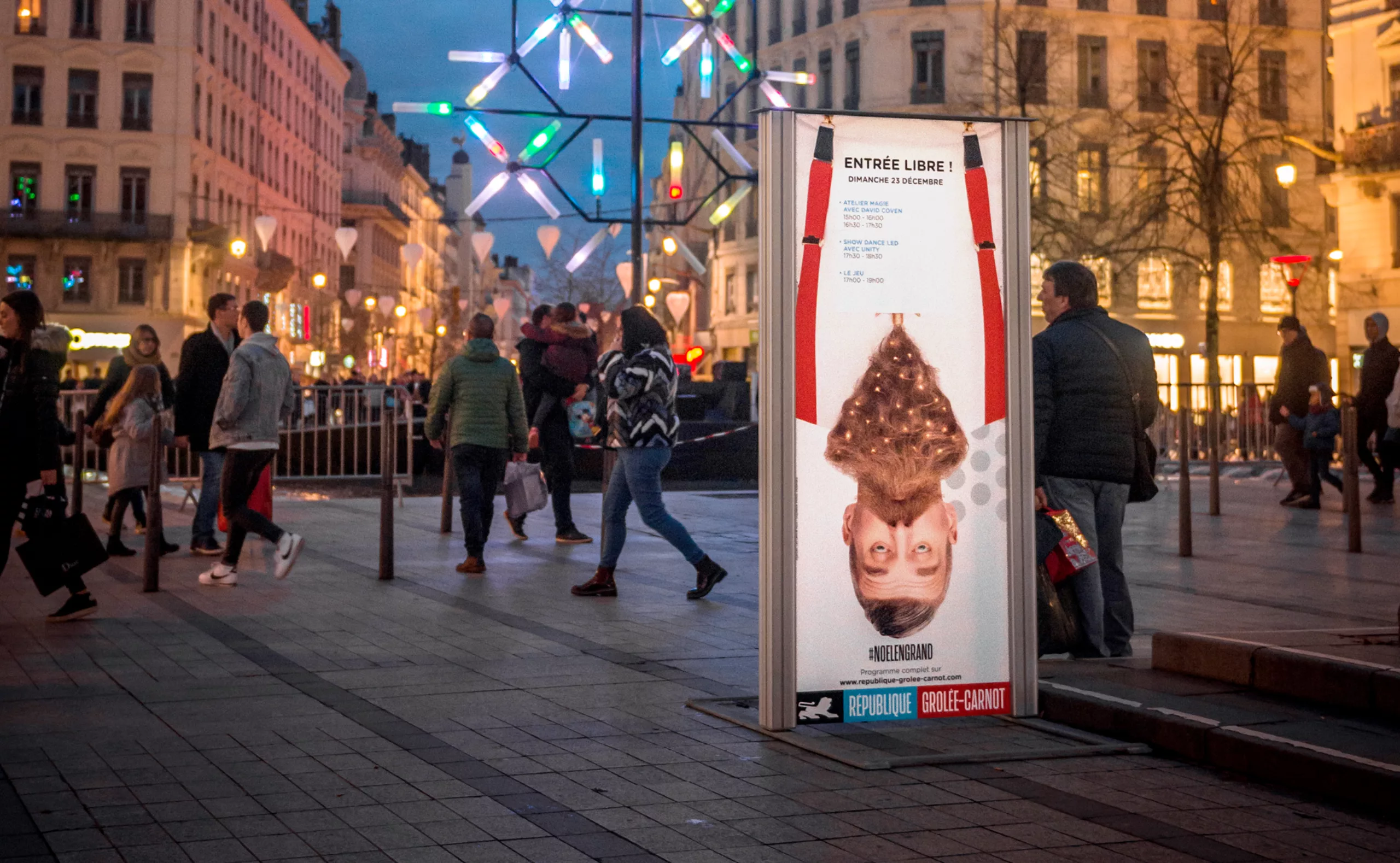
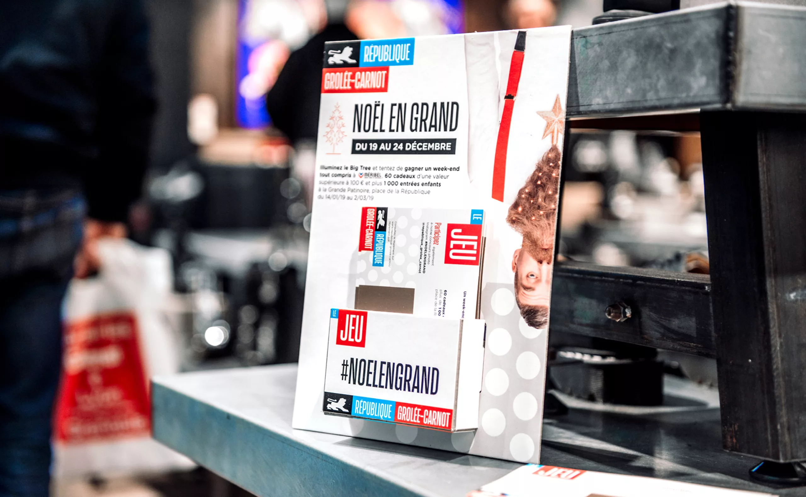
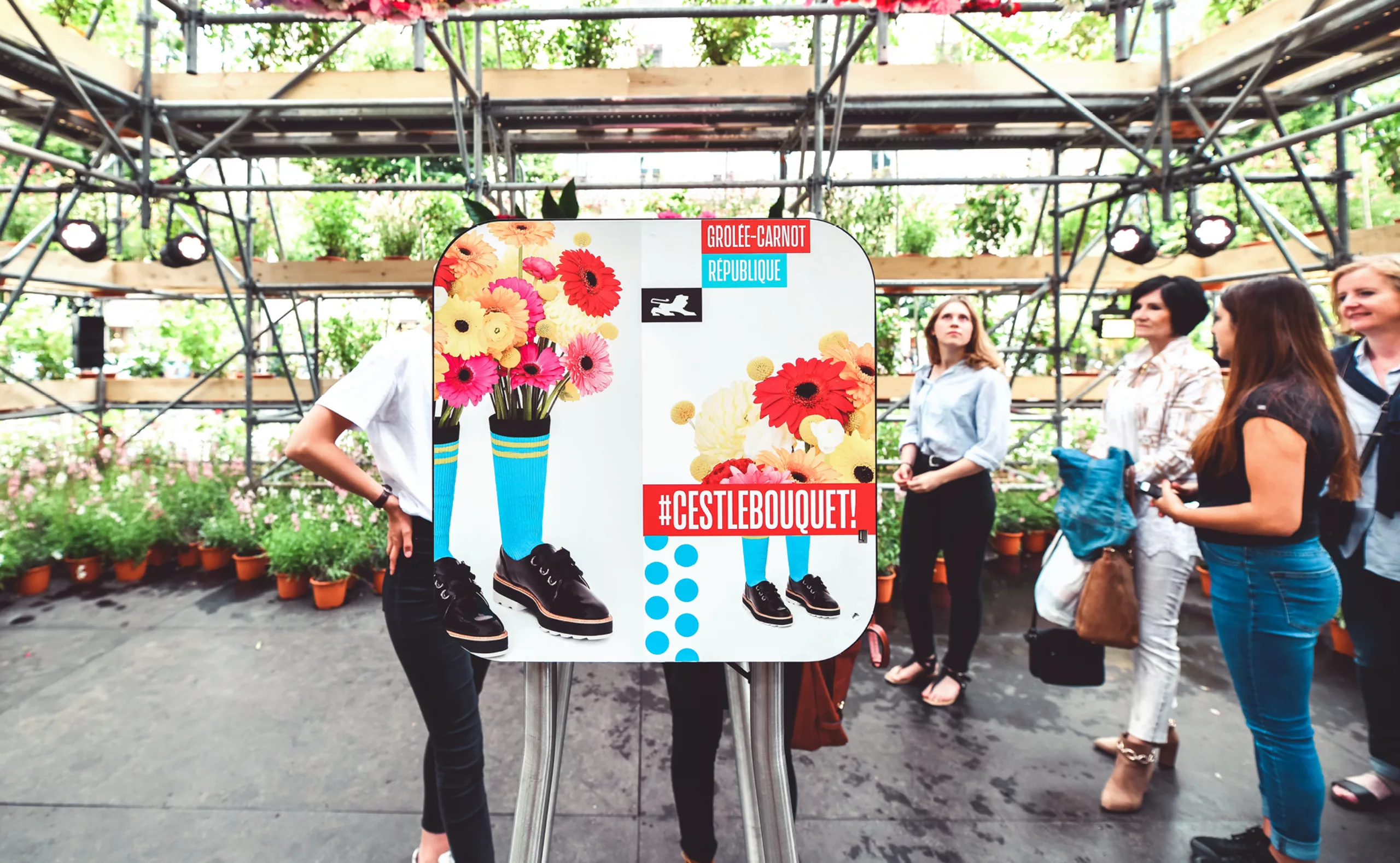
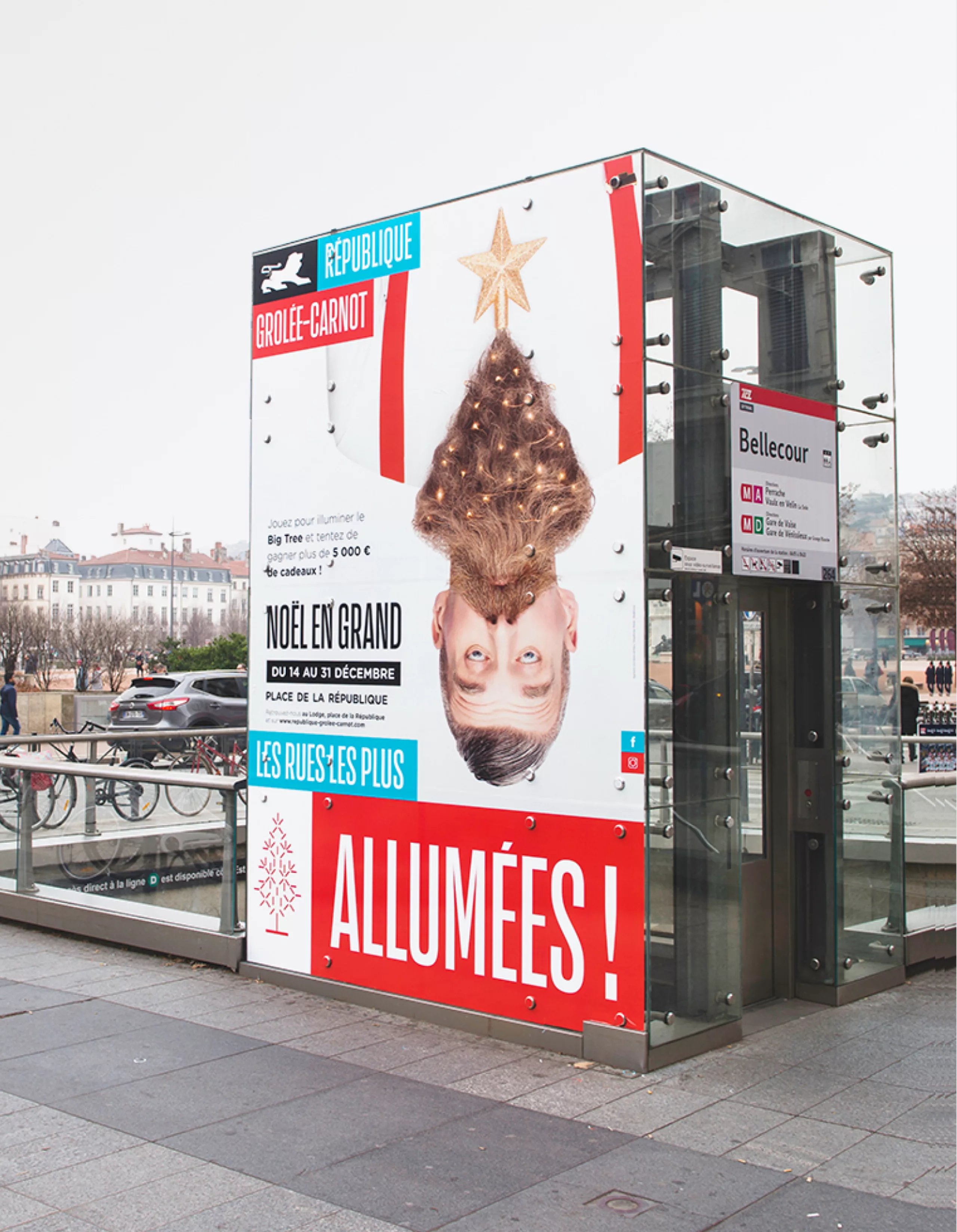
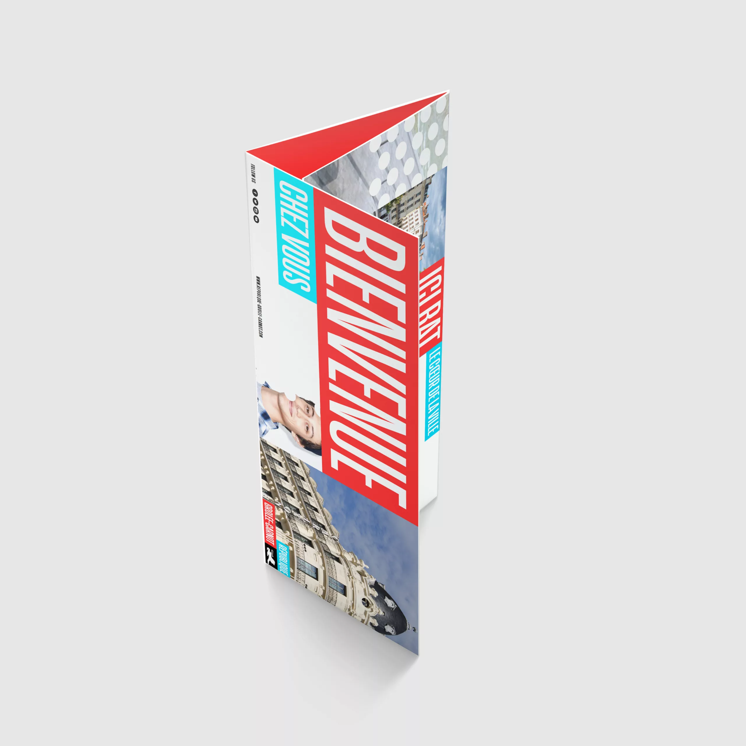
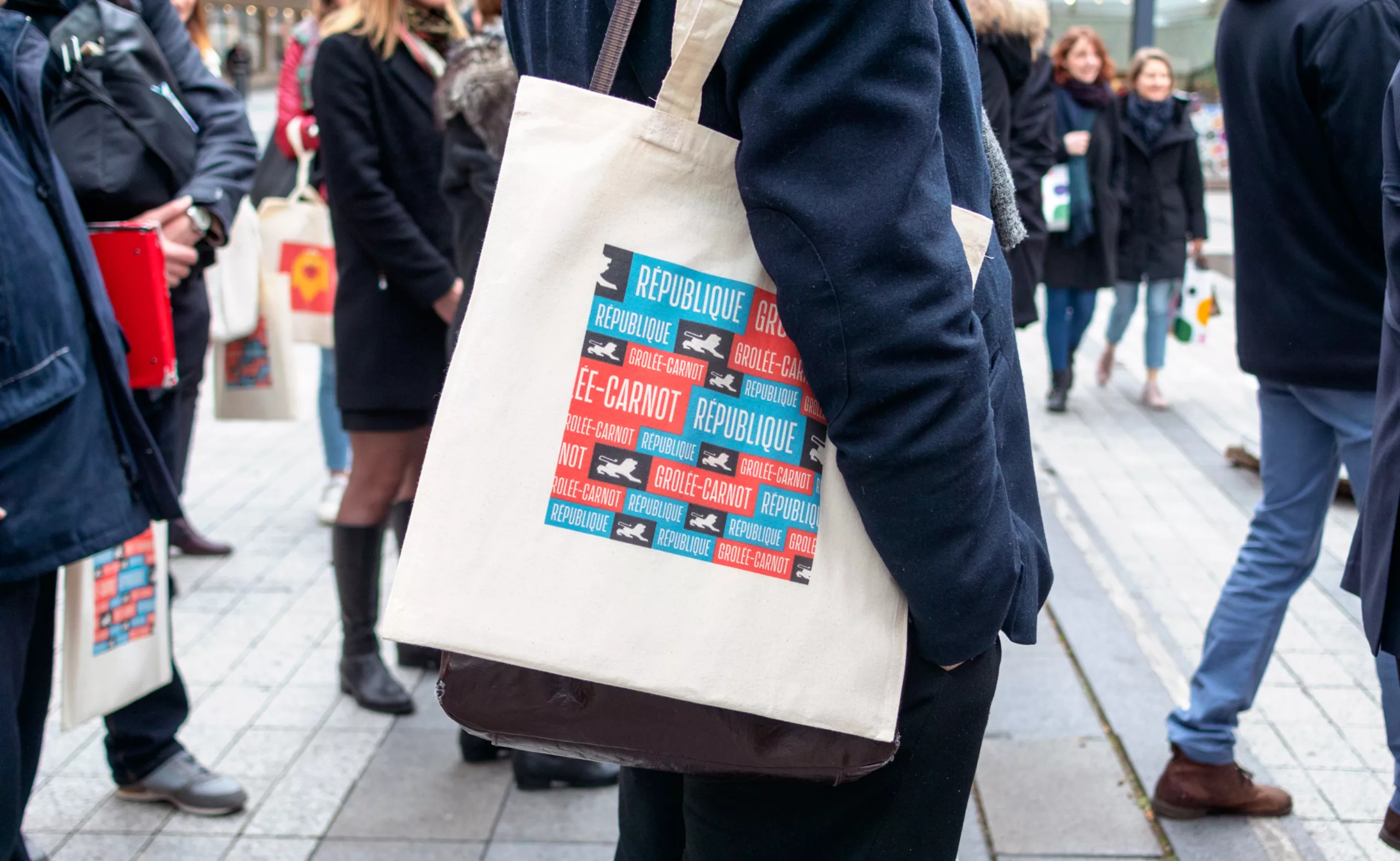
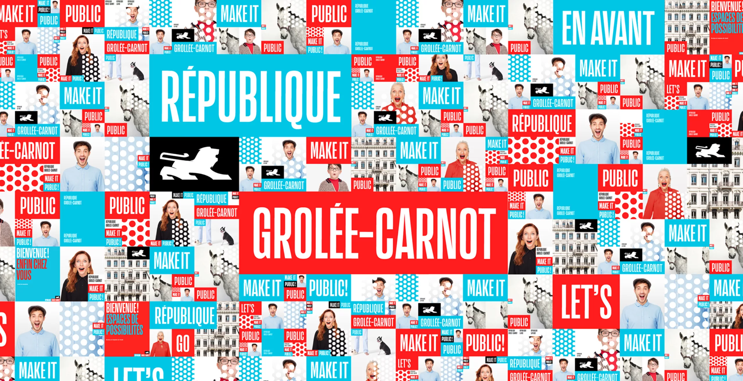
By proposing to unite these streets within a global brand, we have imagined a flexible identity system, allowing each street to express its personality. Blue for the rue de la République, red for its young sisters, Grolée and Carnot streets. The whole is linked by the symbol of the lion in a black block, an eponymous animal and emblem of the city. The result is an effervescent brand, always in motion, which plays with the codes of the French Republic in a contemporary way. Blue, white, red, as long as everything moves!

logo république avant après

The call of the city

It doesn't matter who you are. It doesn't matter where you come from. Let yourself be surprised by the rhythm, the excitement, the fizz of every moment. Walk, stroll, dream or work. This is where everything happens, where trends arise, where encounters are created and where smiles flow. Here beats the heart of the city.

papier à en-tête et carte de visite

To unite and federate

Uniting and federating are the key words of this project. For this reason, rue de la République, the city's essential and historic artery, must give some space to the newly renovated rue Grolée and rue Carnot. We have designed a flexible system where everyone can exist without shading each other, where things are composed and recomposed according to needs and desires. Always in motion, organic and flexible, like this district.

compositions des logos
kakémono
couverture brochure

Visual system

We have imagined this brand identity as a Lego box where ingredients come together in a thousand and one ways.
The grid structures the playground. The colour is limited and plays with its contrasts. The words are bold and the tone is enthusiastic. The typography is condensed and expressive. The image is human and poetic. The patterns, joyful and effervescent. The whole contrasts deliberately with the Haussmann minerality and classicism of this district.

charte graphique

Like this district, the graphic territory has no defined boundaries. It is composed of a multitude of effervescent fragments, always in motion. The grid is flexible and functional. It can change depending on communication needs and the entity that speaks.

Grille de composition affiches

Posters

Any modular graphic system requires a good foundation of construction. A solid grid will support all the compositions. We considered multiple examples of composition to meet the main uses of the brand.

poster branding street
opération promo

Portrait Republique street Ilka franz

Photos:
Ilka & Franz

The shots were taken by the famous London duo Ilka & Franz in the mythical Holborn Studios (Annie Leibovitz, Helmut Newton, Peter Lindbergh...). Each photo shot was doubled with a video shot. It took nearly two hours of make-up to make Santa's beard, while the girl with the rocket almost caught fire.

opération marketing Noël

Events

The Lyon based agency Tetro was asked to stage the events. Thanks to their know-how, new and interactive experiences have been created, such as a giant fresco, a floating garden or a huge ball pool.

Publishing

brohure 3 volets
plaquette commercialisation
editorial layout
tote bag

Thanks!

A project carried out in collaboration with the agency Les Gens et Vous. Thank you to Hervé Devineau, Antoine Barbot and Charlotte Bourquin for sharing this adventure with us.

Thanks to Garry Nickson, Marie-Aude Vannier, Maylis Dabat and the teams at ADIA, Grosvenor and Firce Capital for their confidence throughout the project.

Thanks to Ilka & Franz for their photographs and to Tetro for the events (Events photos: Andréa Aubert / Jean Barret).

Context of the project

In 2012, the ADIA group acquired a real estate portfolio in downtown Lyon, France. This portfolio has since been expanded to include several tens of thousands of square metres on Rue de la République, Grolée and Carnot streets. Several years of redevelopment work followed. In 2013, a first logo was launched, but it only concerned Rue de la République.

In 2017, the time had come to launch this brand strategy project, which will make it possible to create linked but distinct identities for Rue de la République and Grolée-Carnot.

Communication objectives

The ambition is to make République - Grolée-Carnot an outstanding example of how large traditional streets can be developed to create dynamic and revitalized civic spaces that attract people and businesses. It is therefore a question of making the project sustainable. In the end, this district aims to be the essential meeting place for Lyon's inhabitants - the perfect place to meet friends and family...


Share this project:
Project expertise:
Publishing design, creation of magazine and brochure layouts. Logo creation, visual identity and graphic guidelines. Graphic design of posters, flyers, letterhead and business cards.
Type of client:
Institutional communication agency, public communication for cities and territories, government institutions, social partners and public administrations. Communication in travel & tourism.

Related projects: