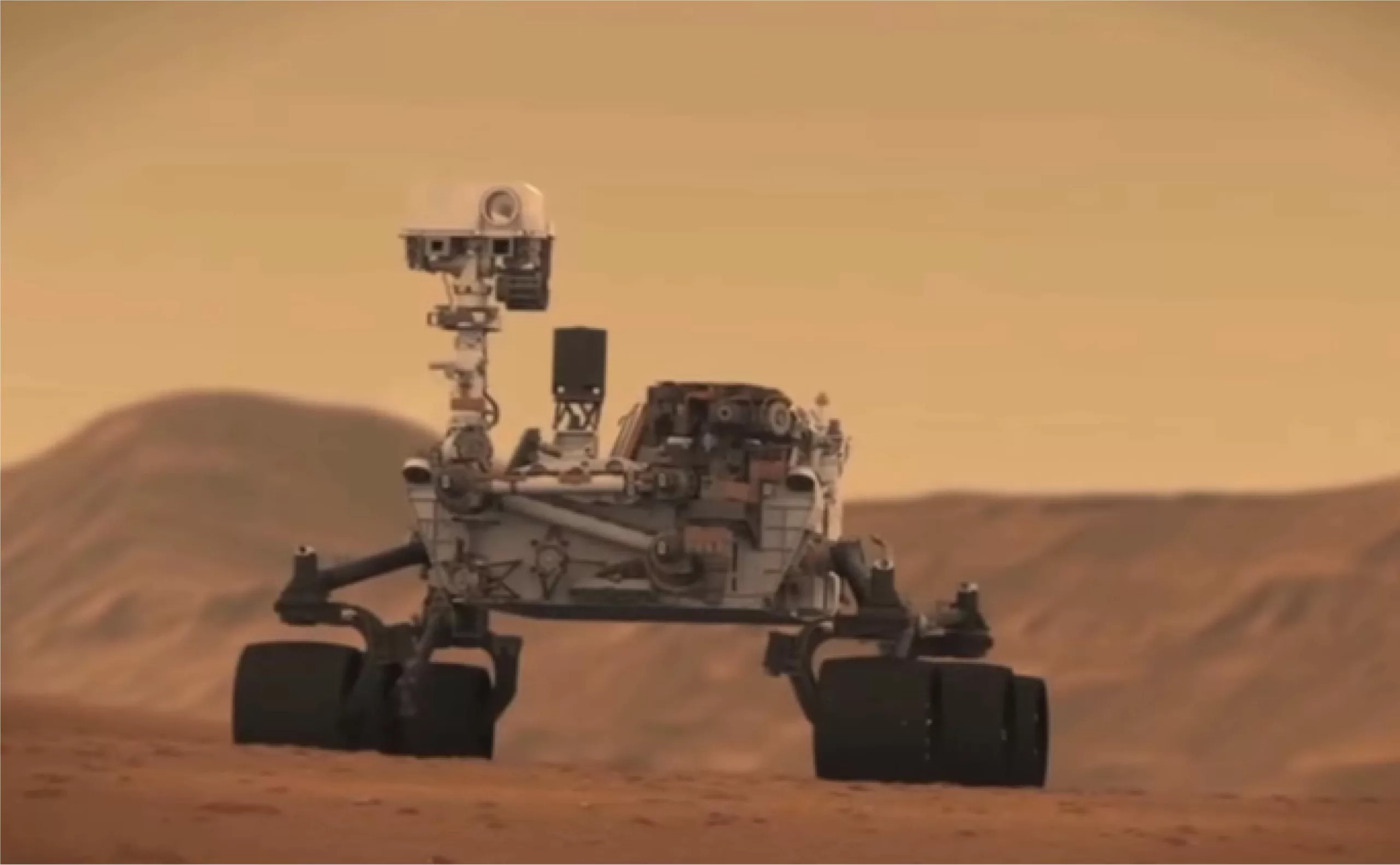
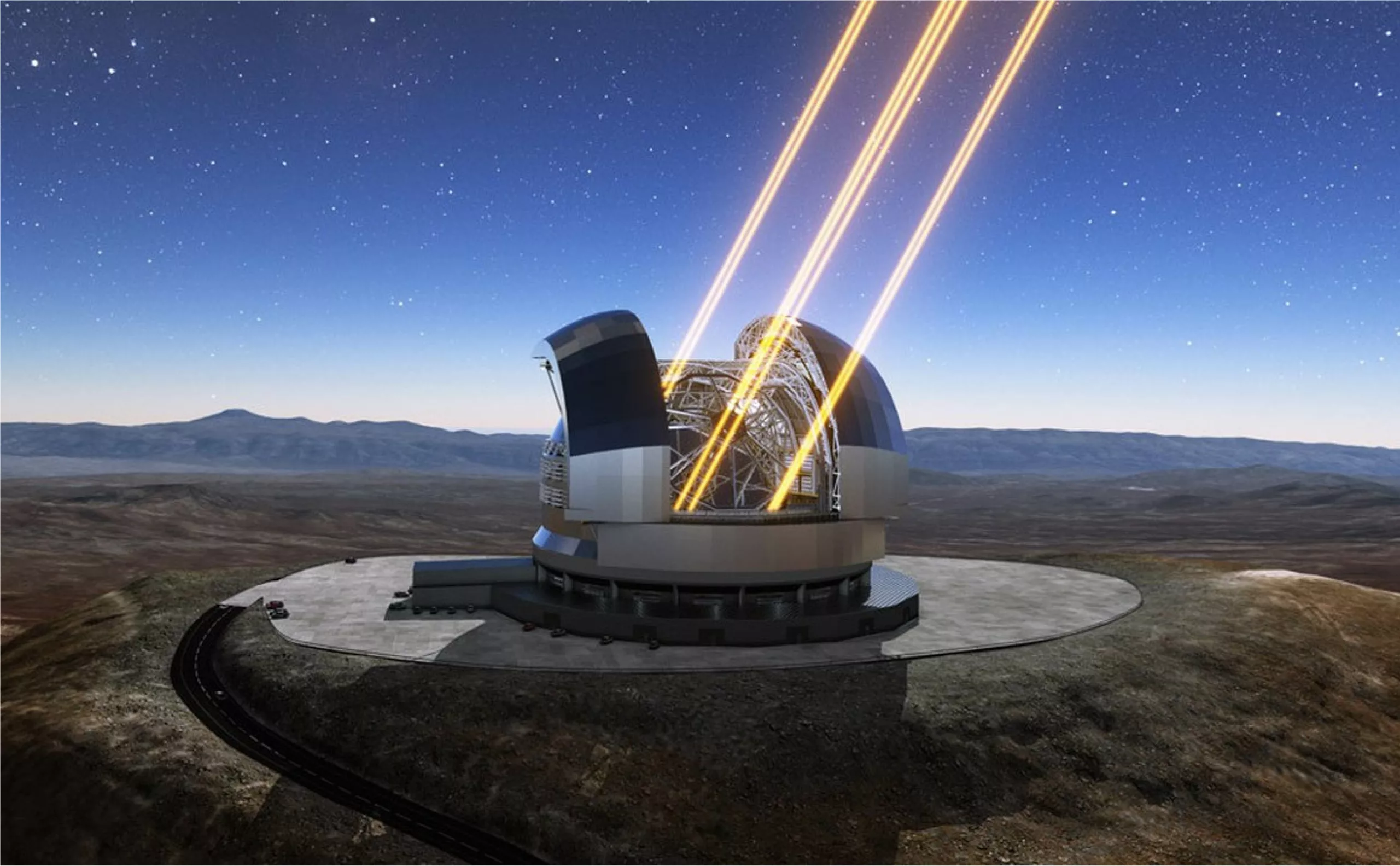
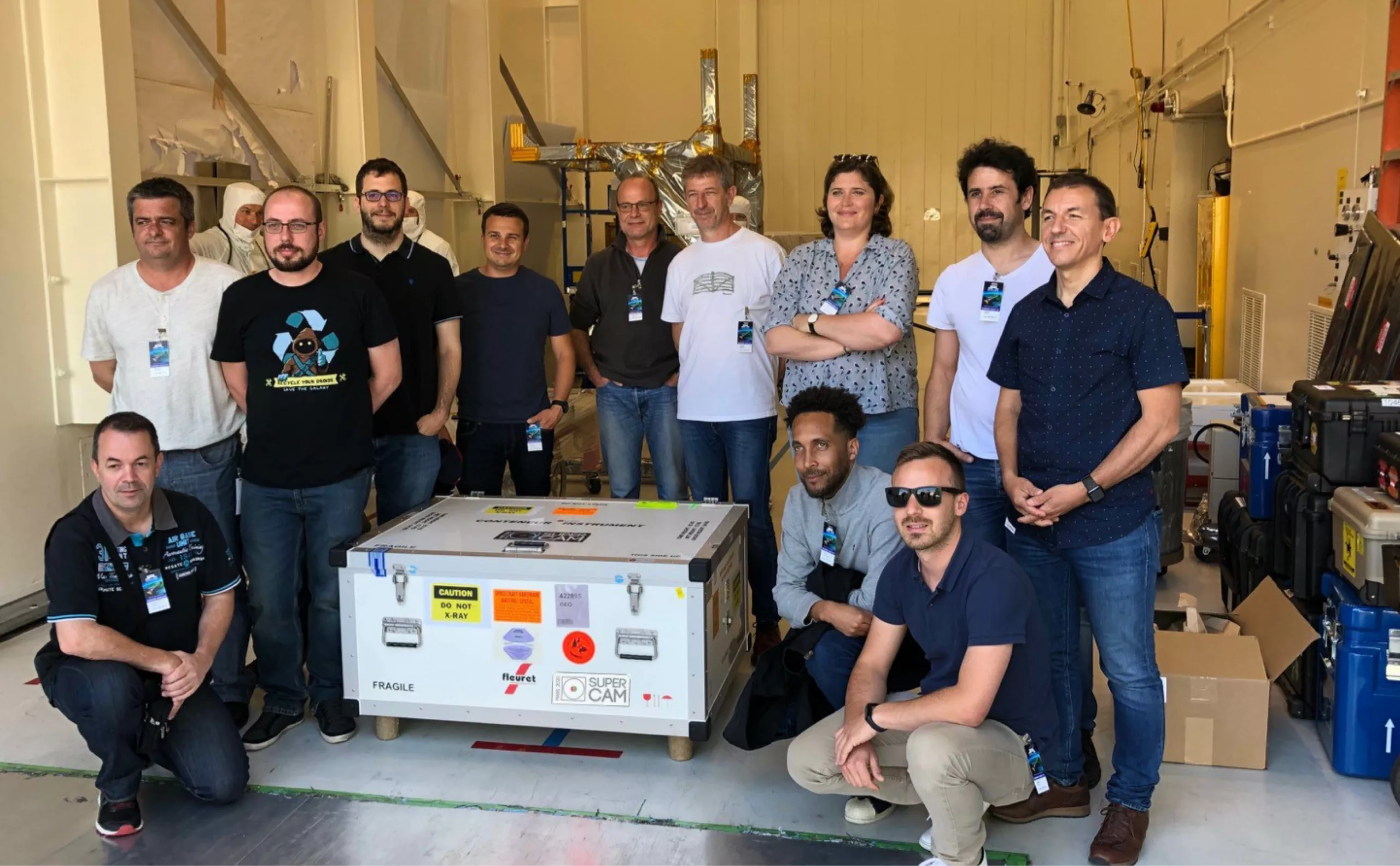
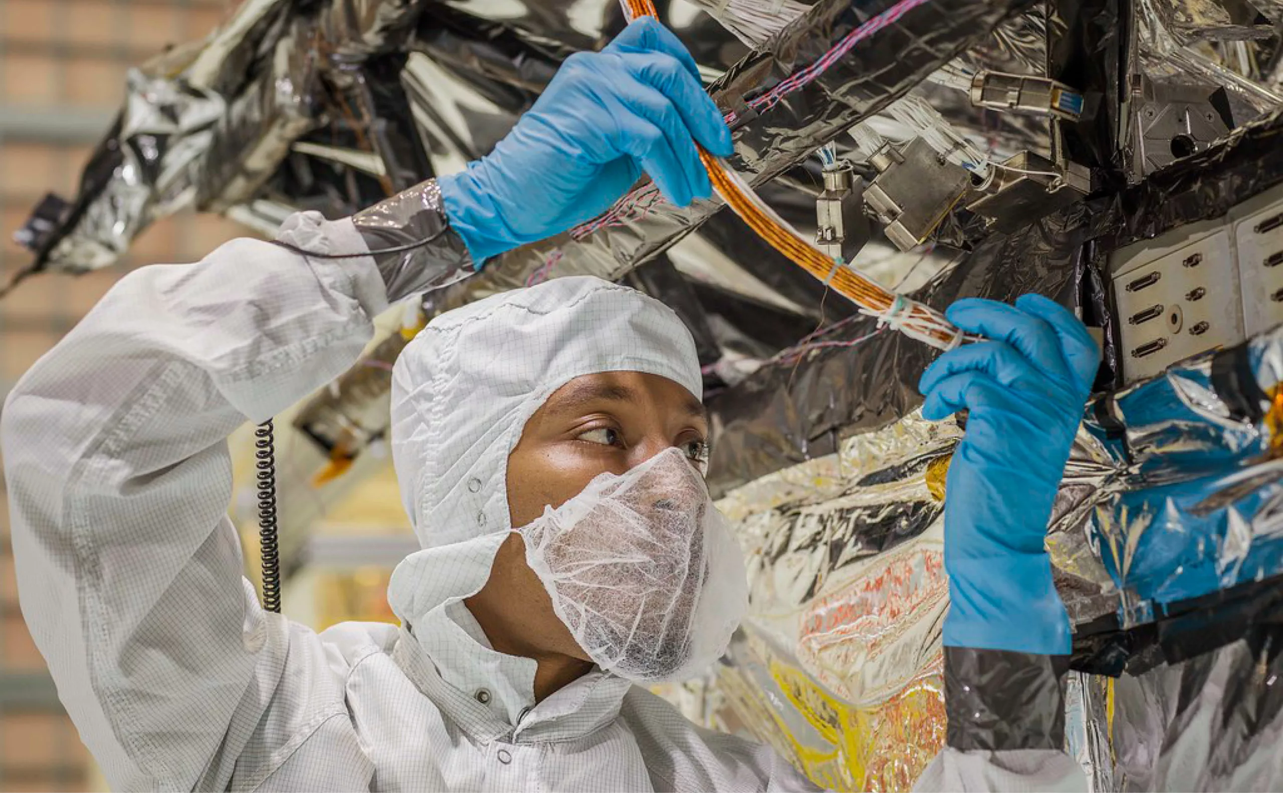
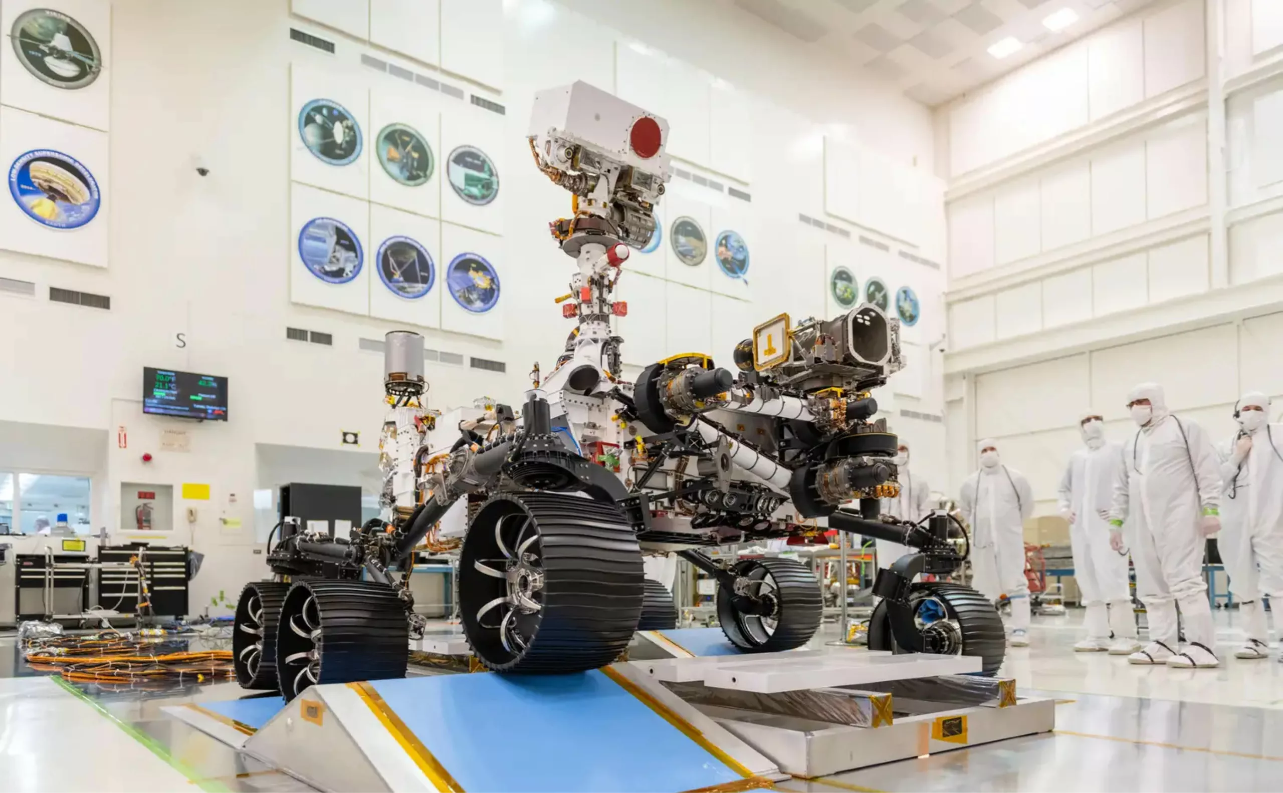
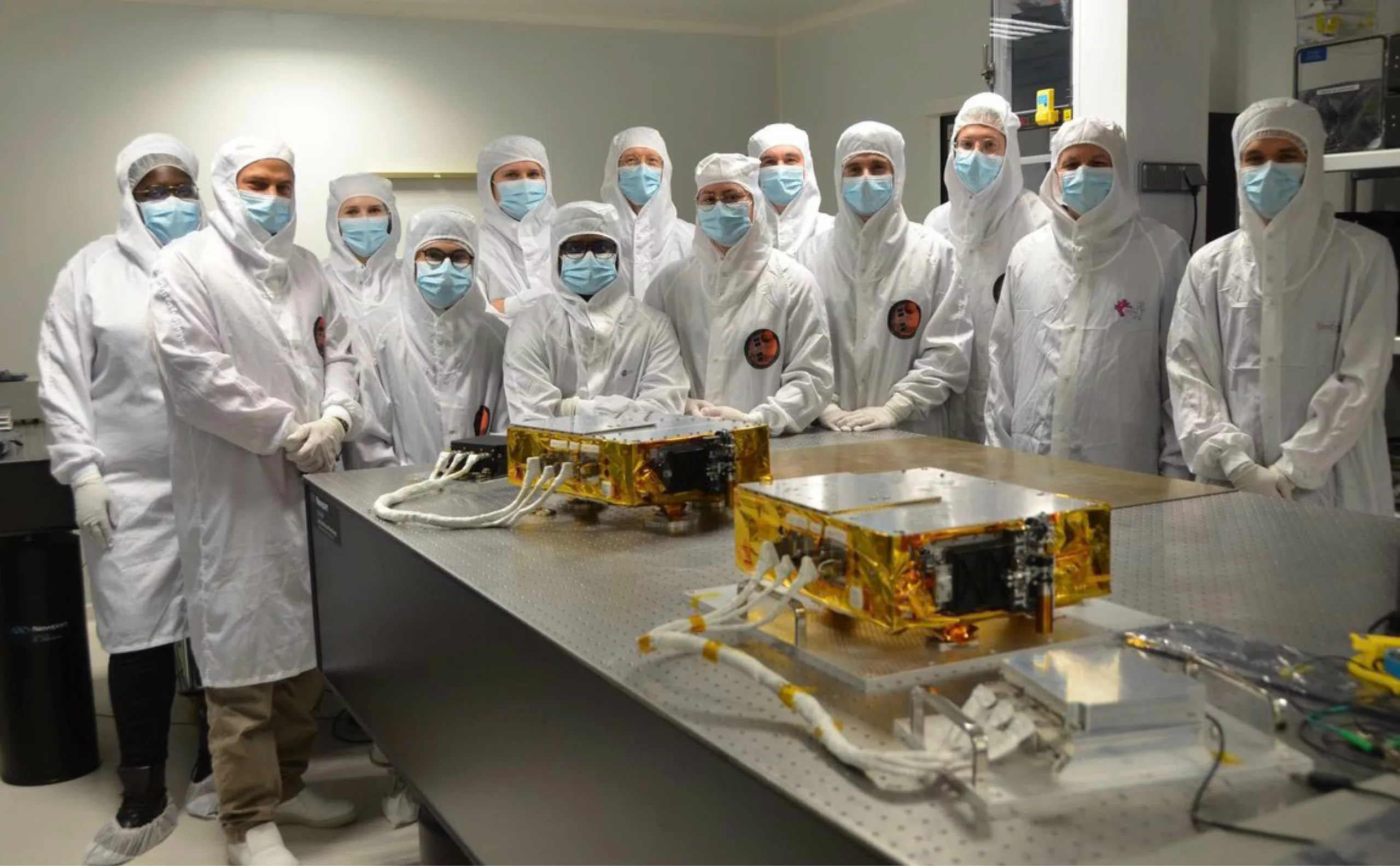
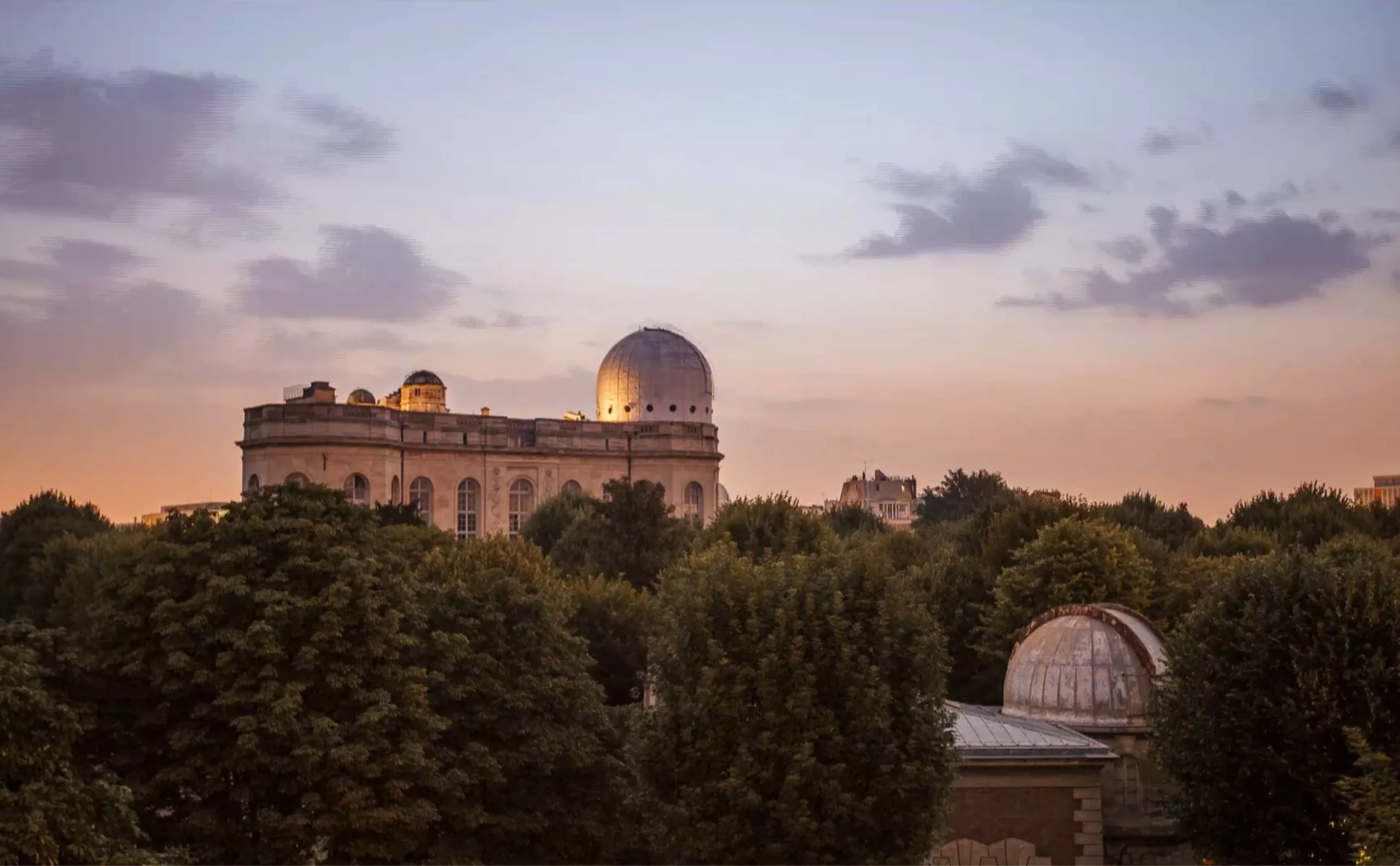
Paris Observatory is one of the world’s most prestigious space research centers. With 350 years of history, it is the oldest observatory still in operation. The Observatoire de Paris has been, and remains today, the scene of countless discoveries and inventions. From the discovery of Neptune, to the first measurements of the speed of light, to the development of the SuperCam for the Perseverance rover exploring the surface of Mars, the Observatoire de Paris ranks among the world’s leading research centers, on a par with Harvard’s Center for Astophysics.
Paris Observatory
Paris Observatory, 350 years of excellence and science of the Universe.
However, the Observatoire’s visual identity proved to be out of step not only with the establishment’s new strategic positioning, but also with its long-established international reputation and influence.
Graphéine therefore helped the Observatoire de Paris define its new brand positioning and create its brand new visual identity.

History
From the Sun King to Solar Orbiter
350 years of discoveries and innovations
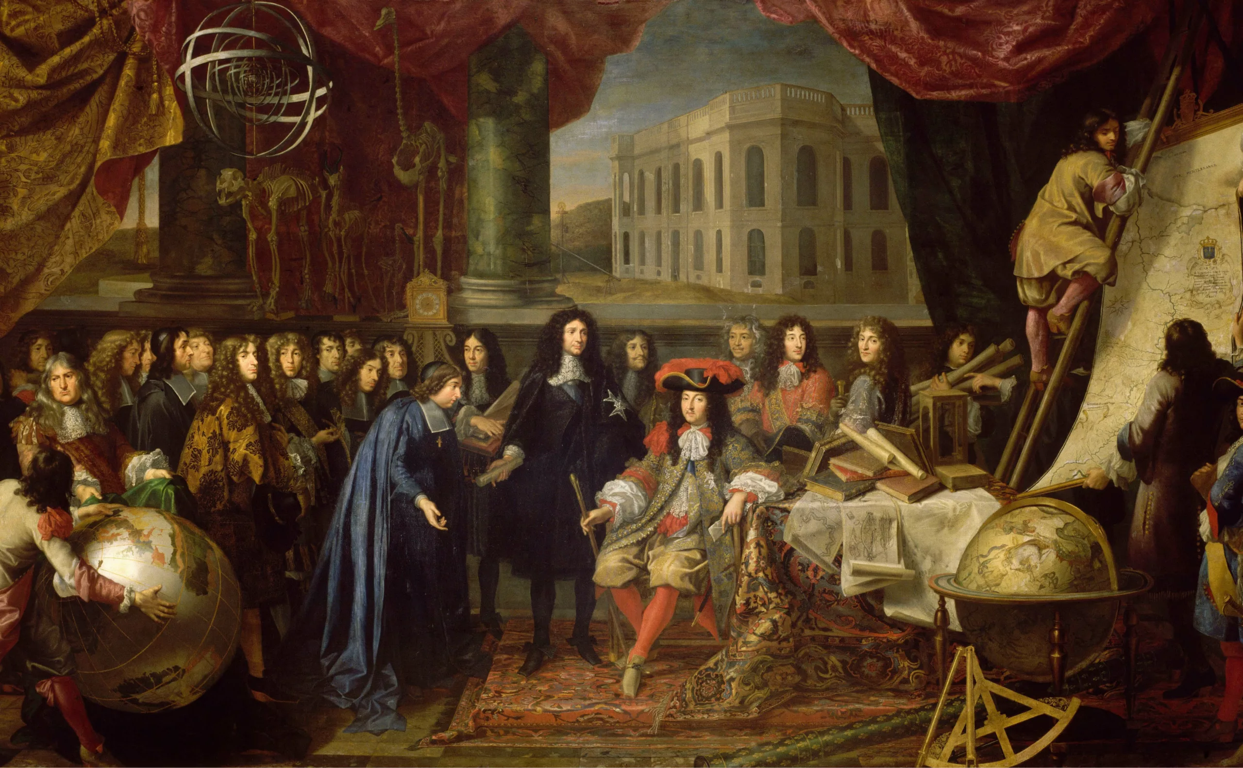
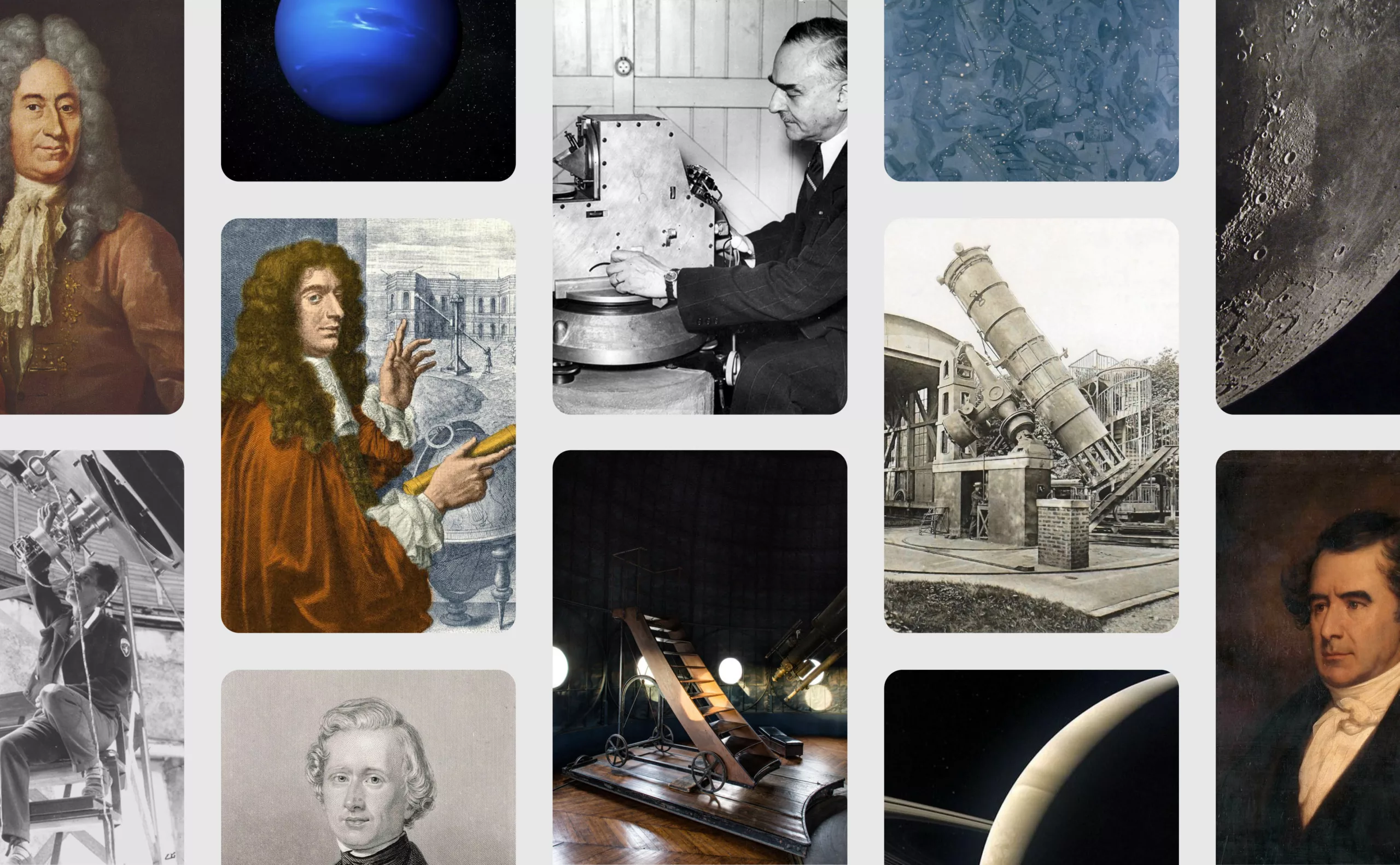
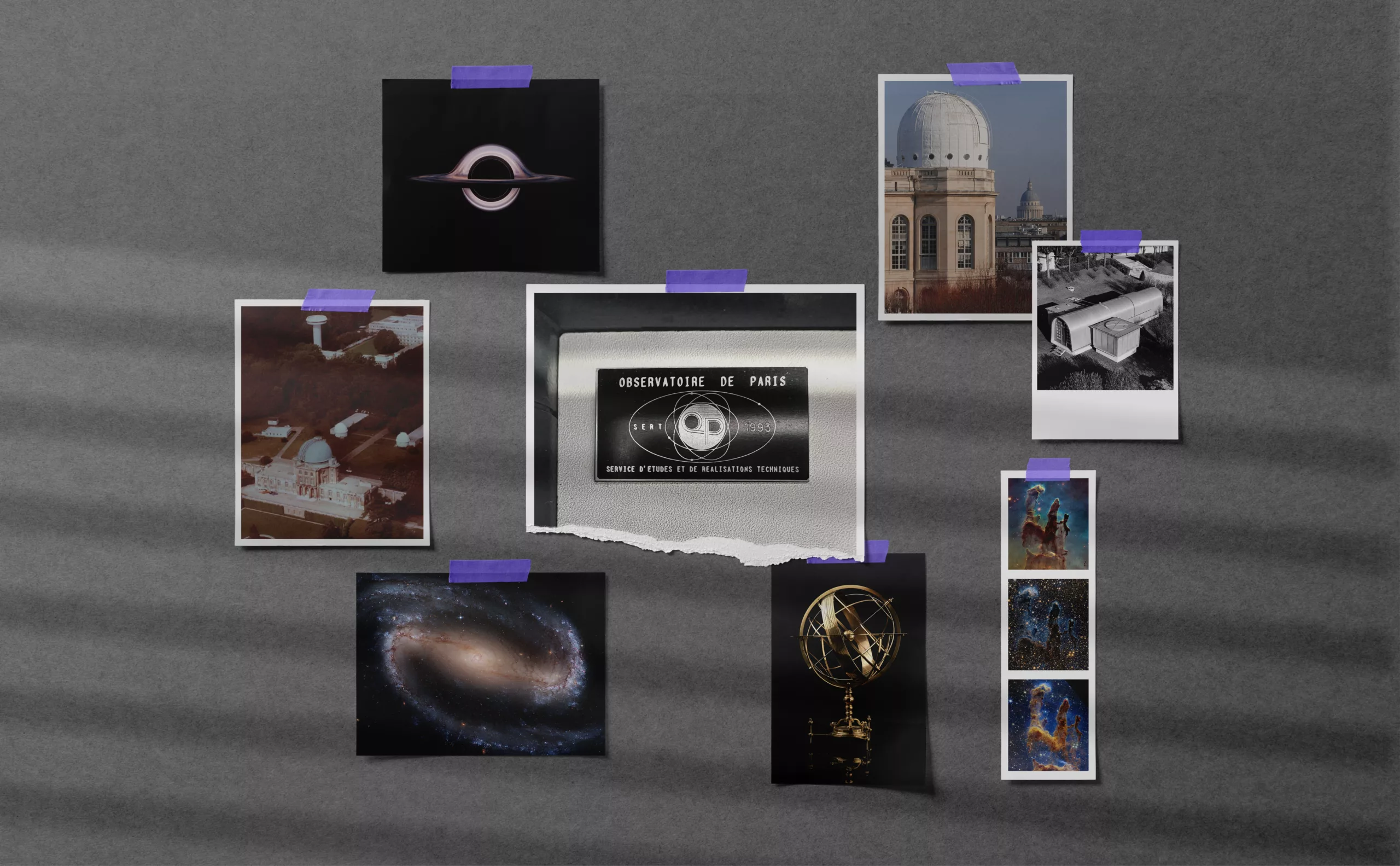
Founded by Louis XIV in 1667, this is the world’s oldest active observatory. For over 350 years, it has carried out astronomical research without interruption. By the end of the 17th century, it had become a crossroads of European learning, welcoming great scientists and fostering numerous discoveries. In 1675, Jean-Dominique Cassini discovered the division of Saturn’s rings. In 1676, Ole Rømer discovered the speed of light. In 1846, Urbain Le Verrier discovered Neptune, and later Léon Foucault measured the speed of light (298,000 km/s).
A contemporary player in the science of the universe
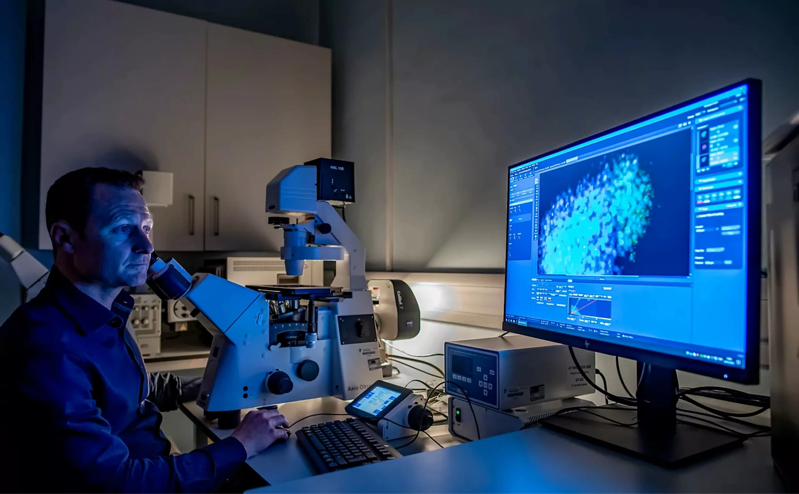
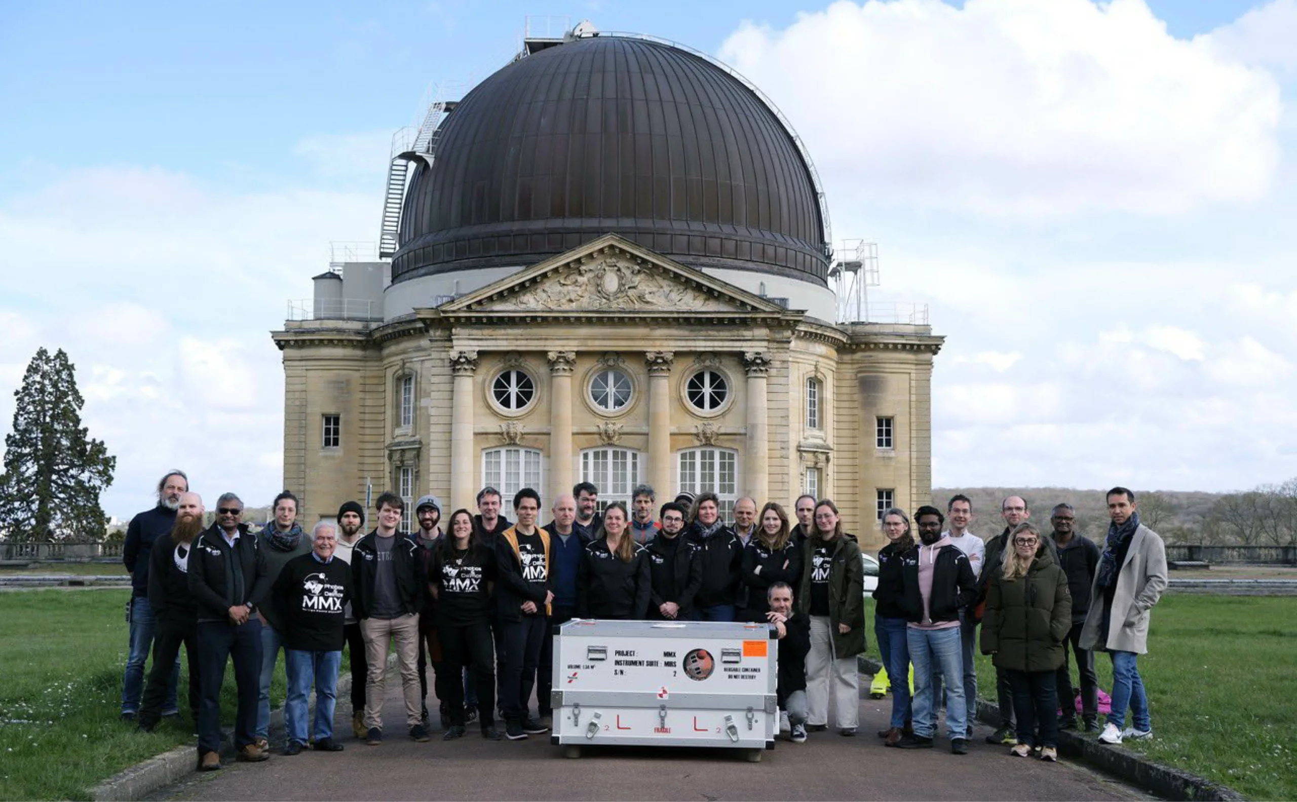
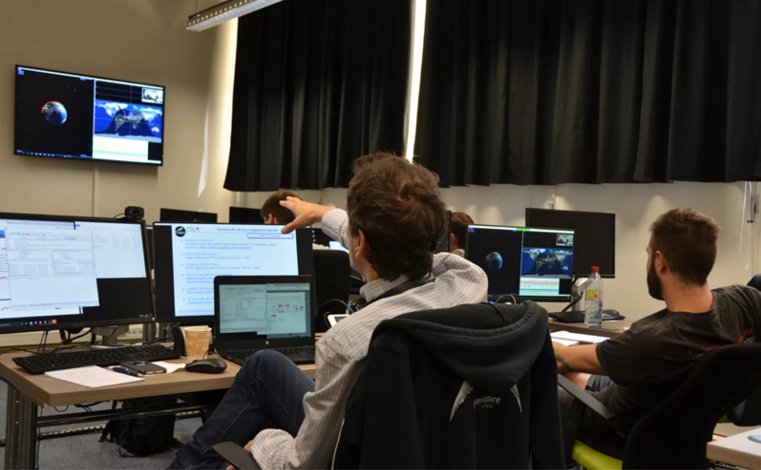
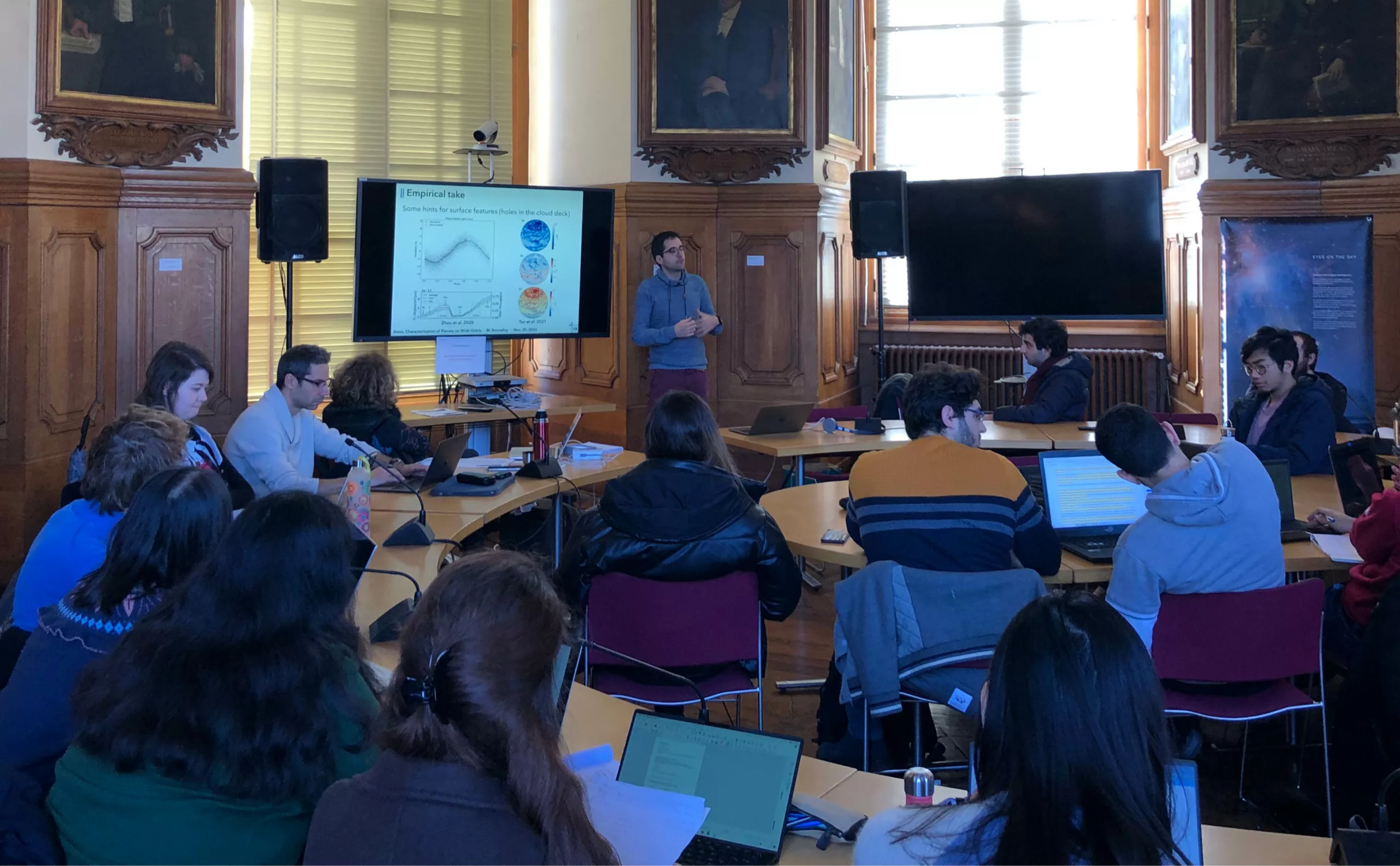
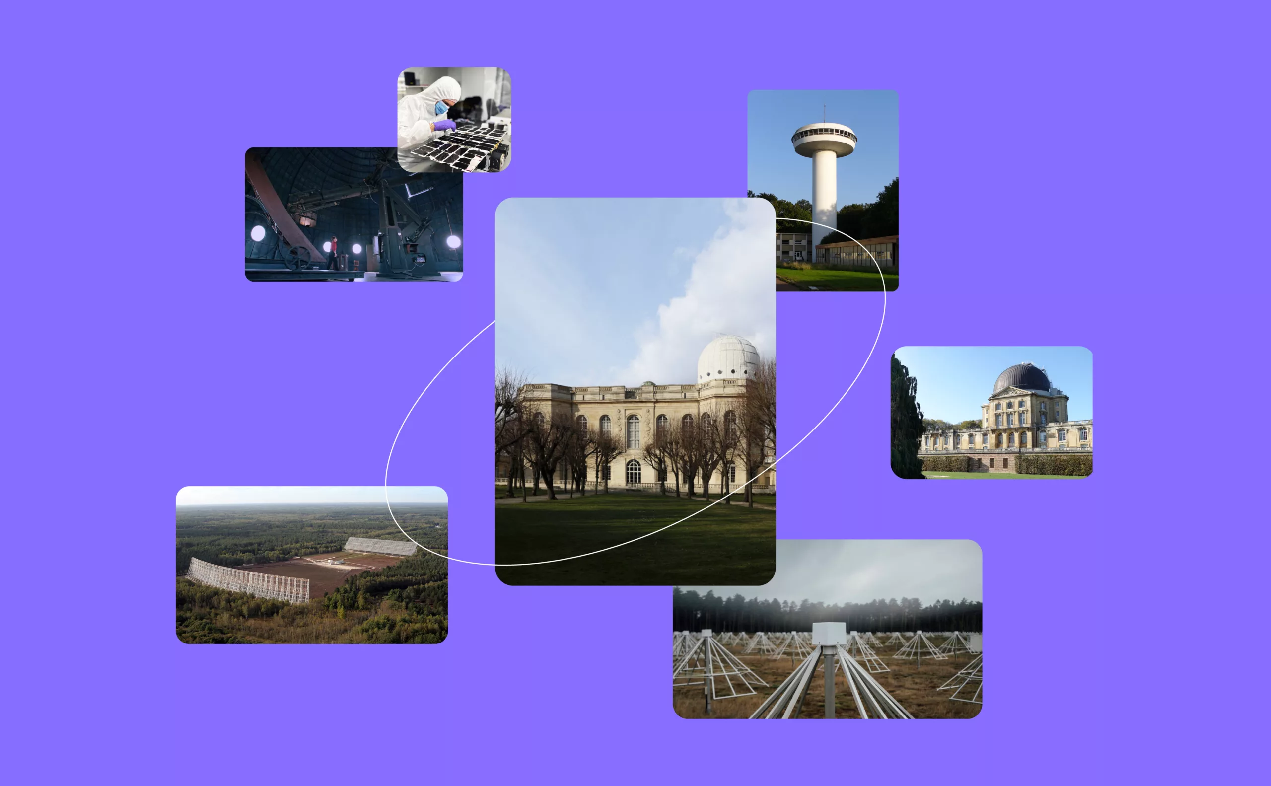
Today, nearly a thousand students and researchers perpetuate this quest for knowledge at three sites: Claude Perrault’s historic building in Paris, the Meudon Observatory, and the Nançay Radio Astronomy Station in Sologne. Current research covers the whole spectrum of astronomy and astrophysics, including instrument development, international observing campaigns, data processing, numerical simulations, laboratory experiments and theories.
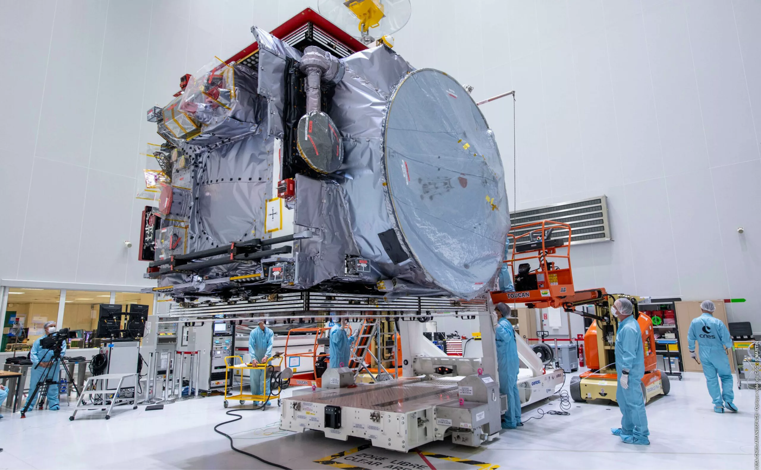
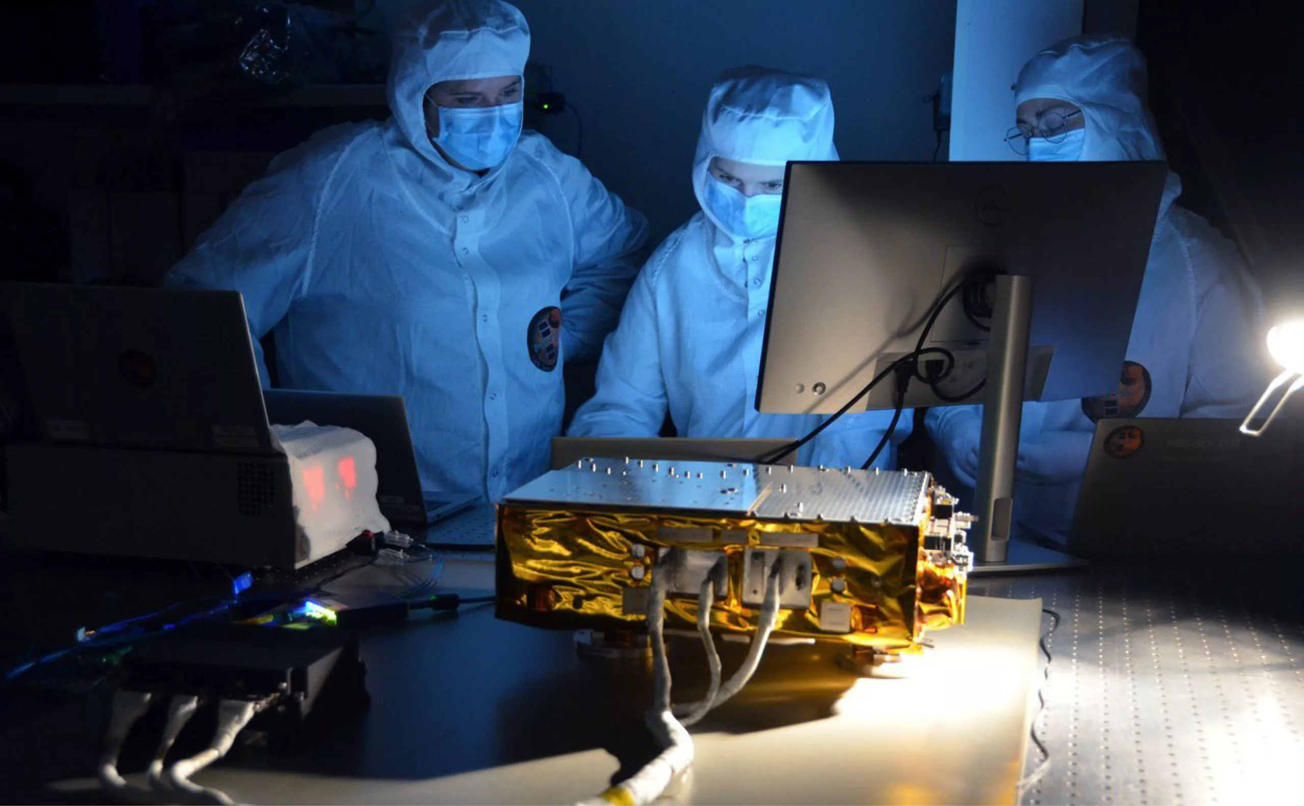
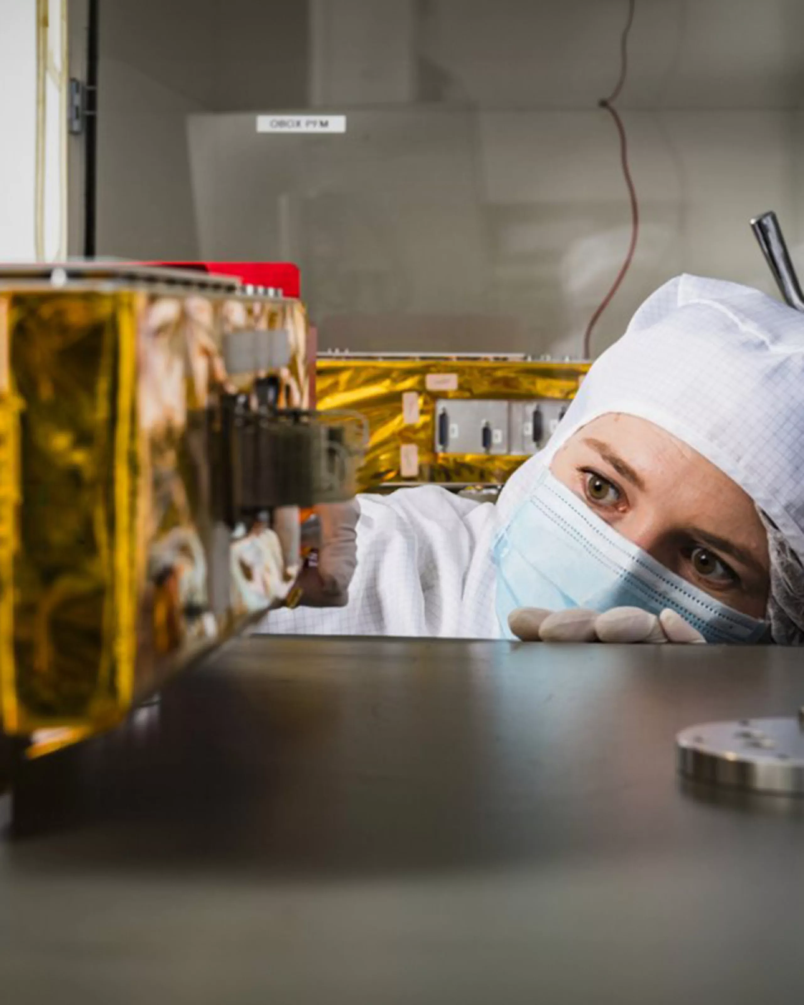
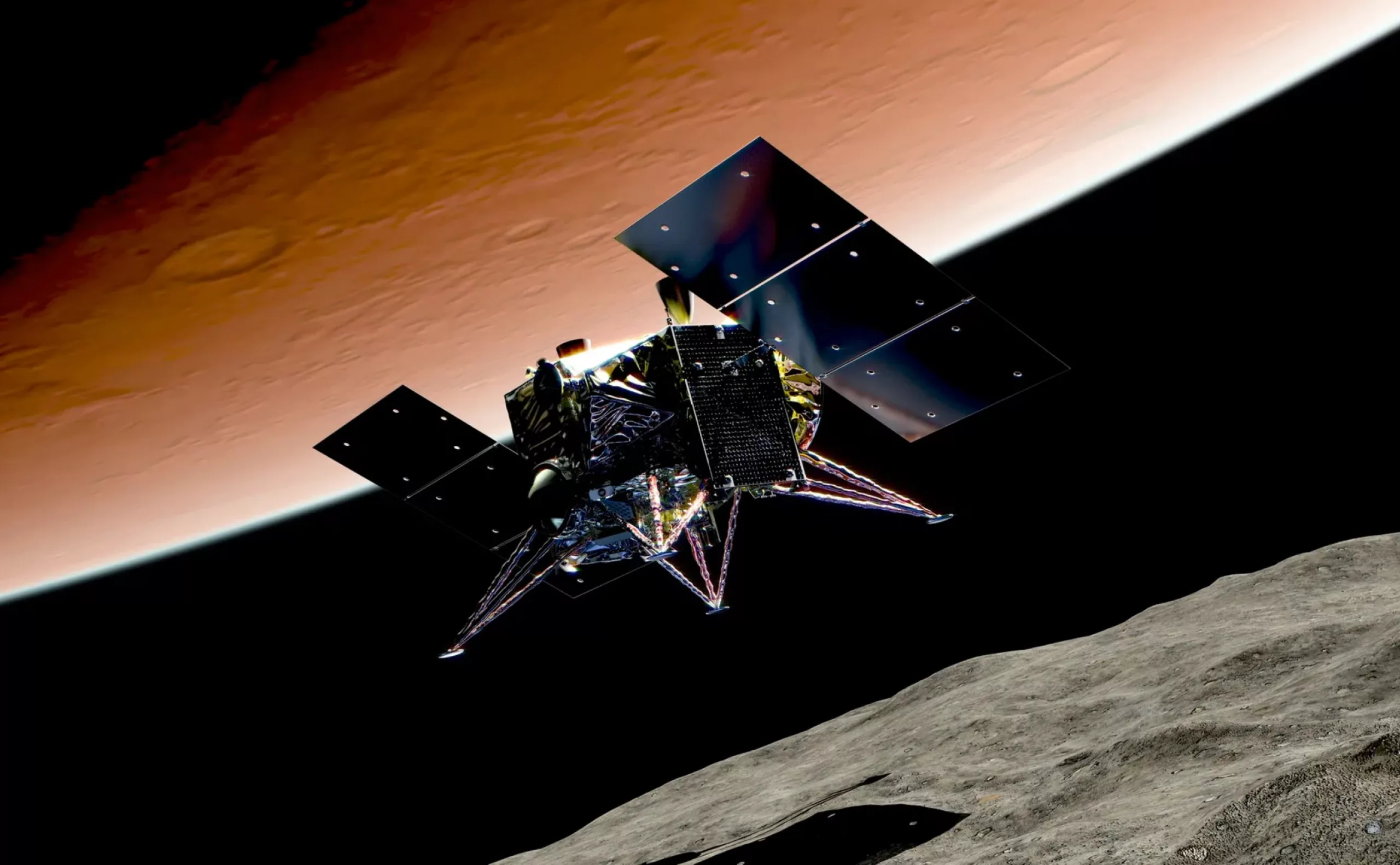
Observatoire de Paris contributes to major international space programs. In the 2000s, it took part in the Rosetta mission, developing research units to study the comet “Tchouri”. Ten years later, his teams developed the SuperCam for the Perseverance rover exploring Mars. He also contributes to missions such as Solar Orbiter, MMX, JUICE, and to the development of European telescopes with ESO and ESA.
Integration into PSL University
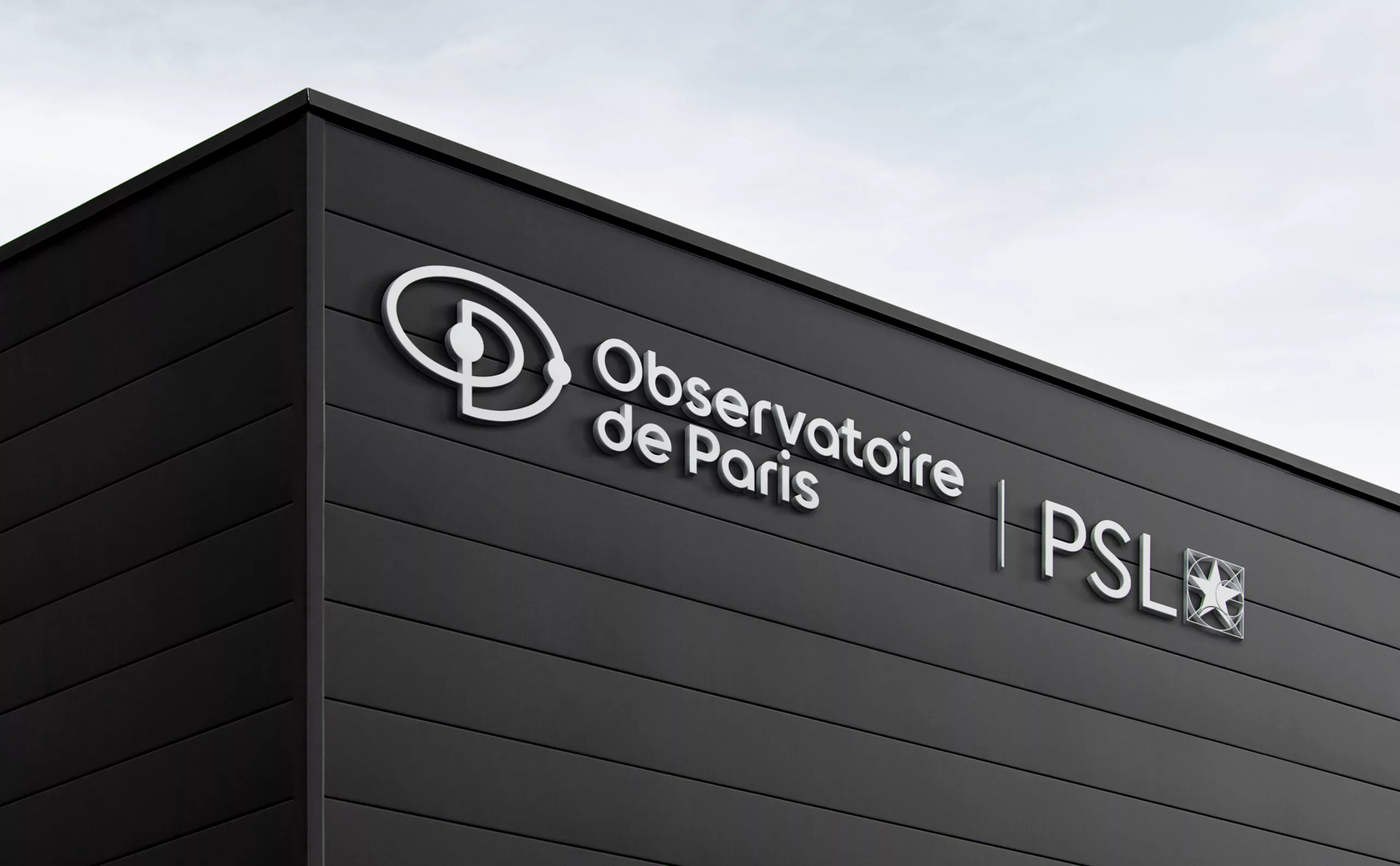
Since 2010, Observatoire de Paris has been part of the PSL University (Paris Science et Lettres), alongside Collège de France, École Normale Supérieure, Chimie ParisTech and ESPCI Paris.
Diagnosis and strategic positioning
The history of the Paris Observatory, while great and glorious, could sometimes turn it into a “museum institution”. The perceived image of the Observatory, with its 17th-century facades, contrasted with the reality of its current research and innovations. Many people are unaware of the scientific and technical exploits carried out at the Observatory, its rich history often overshadowing its core activity of scientific research and technological innovation.
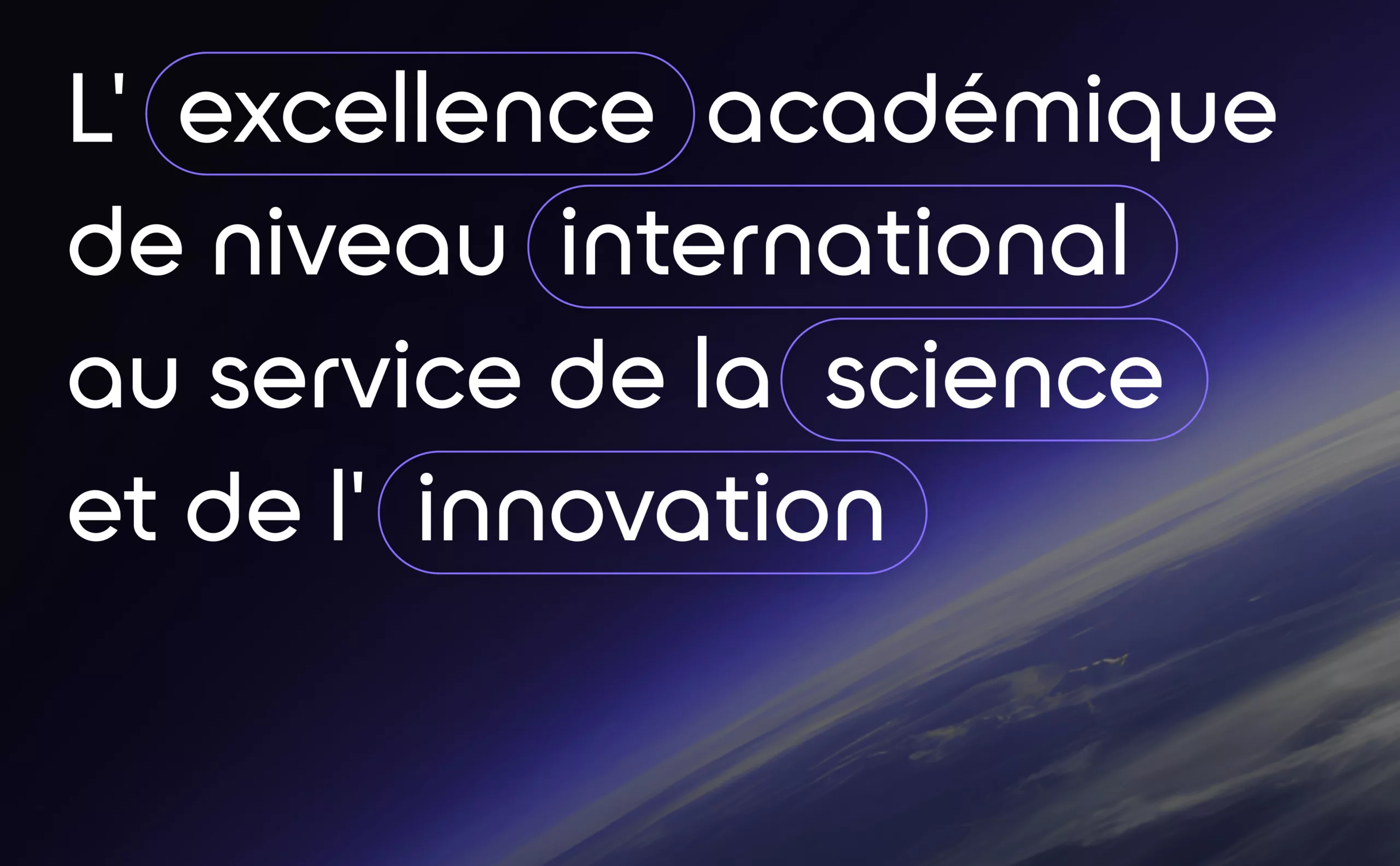
To appear less as a “museum institution” and more as a world-class scientific institute at the cutting edge of innovation and modernity.
L’identité visuelle précédente semblait datée et trop institutionnelle, ne reflétant pas suffisamment l’excellence, le prestige académique et l’innovation technologique. Le logo rond et ludique semblait s’adresser au grand public plutôt qu’au monde scientifique. L’Observatoire de Paris a pour objectif d’attirer les meilleurs chercheurs et de nouer des partenariats stratégiques. La nouvelle identité devait donc projeter l’excellence, la créativité et la modernité, tout en honorant son patrimoine historique, afin de renforcer sa position parmi les leaders mondiaux de la recherche spatiale.
Logotype
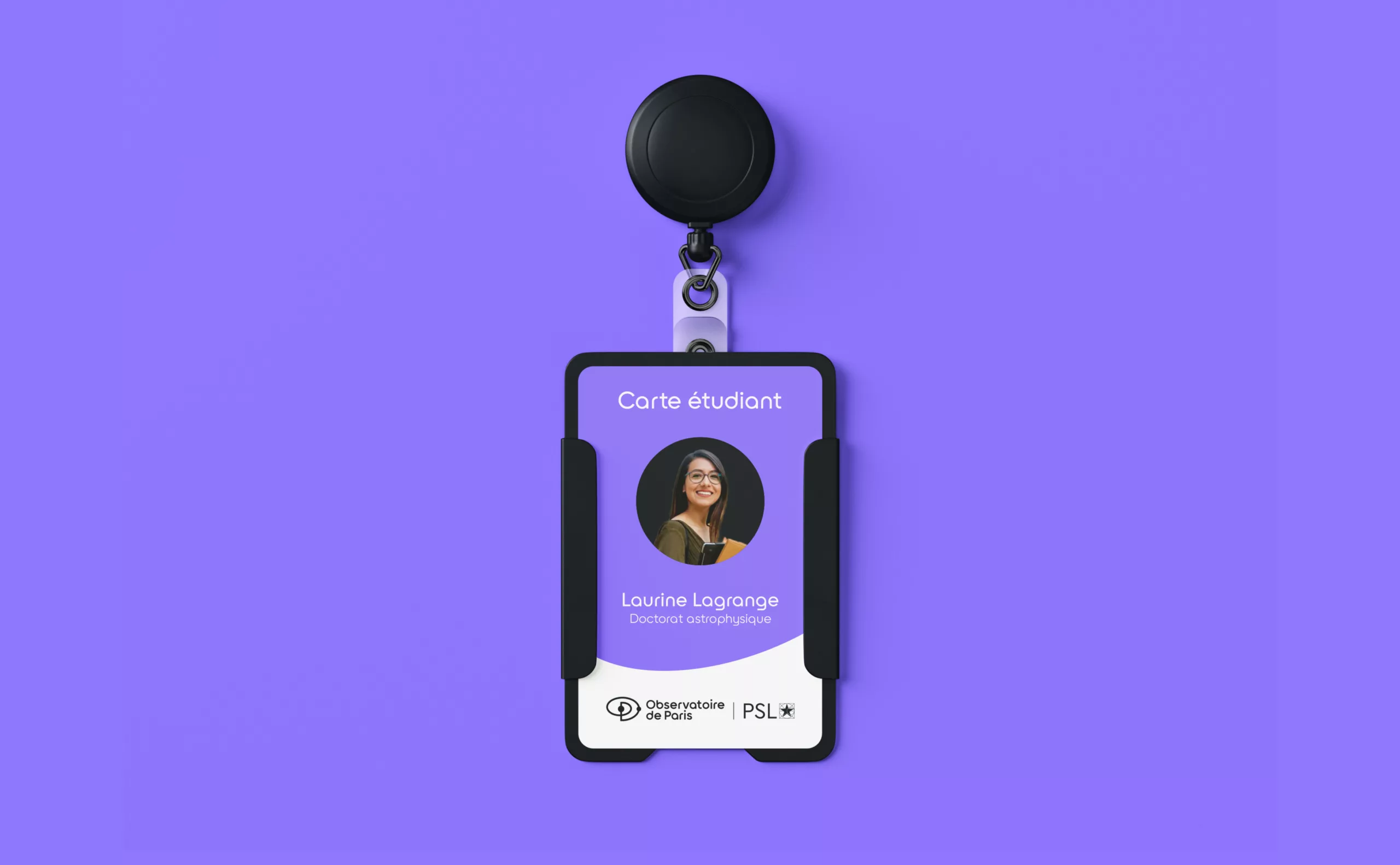
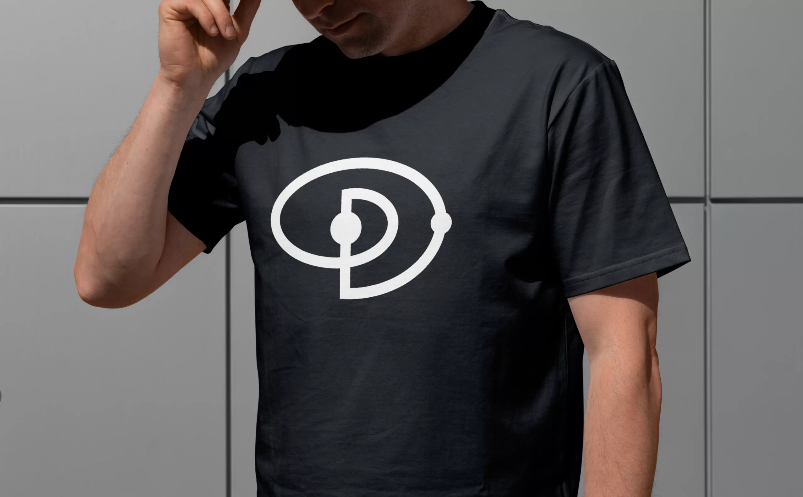
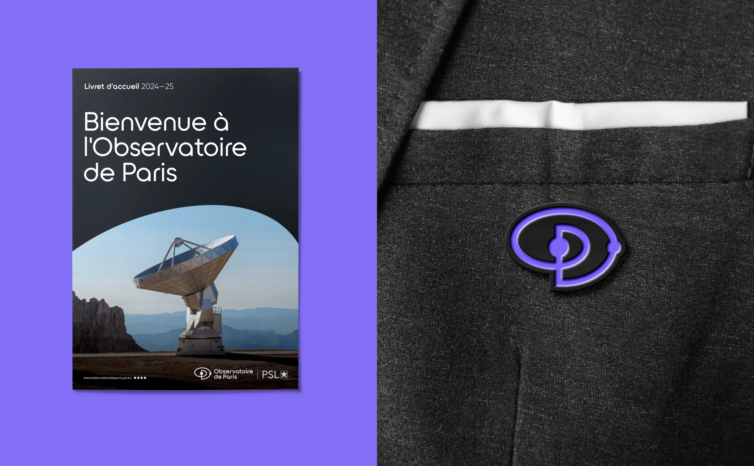
The Observatory’s previous logo had no sign of its own. In fact, the sign was inseparable from the brand block, which often made it unsuitable for new uses, particularly on social networks. For this reason, we decided to focus our research on the monogram.
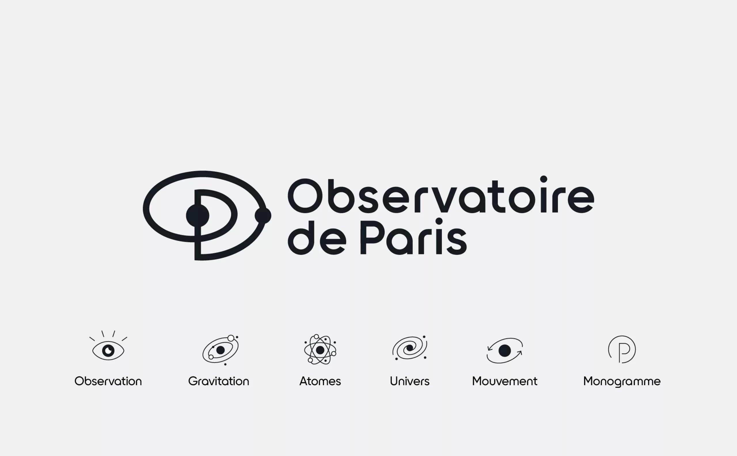
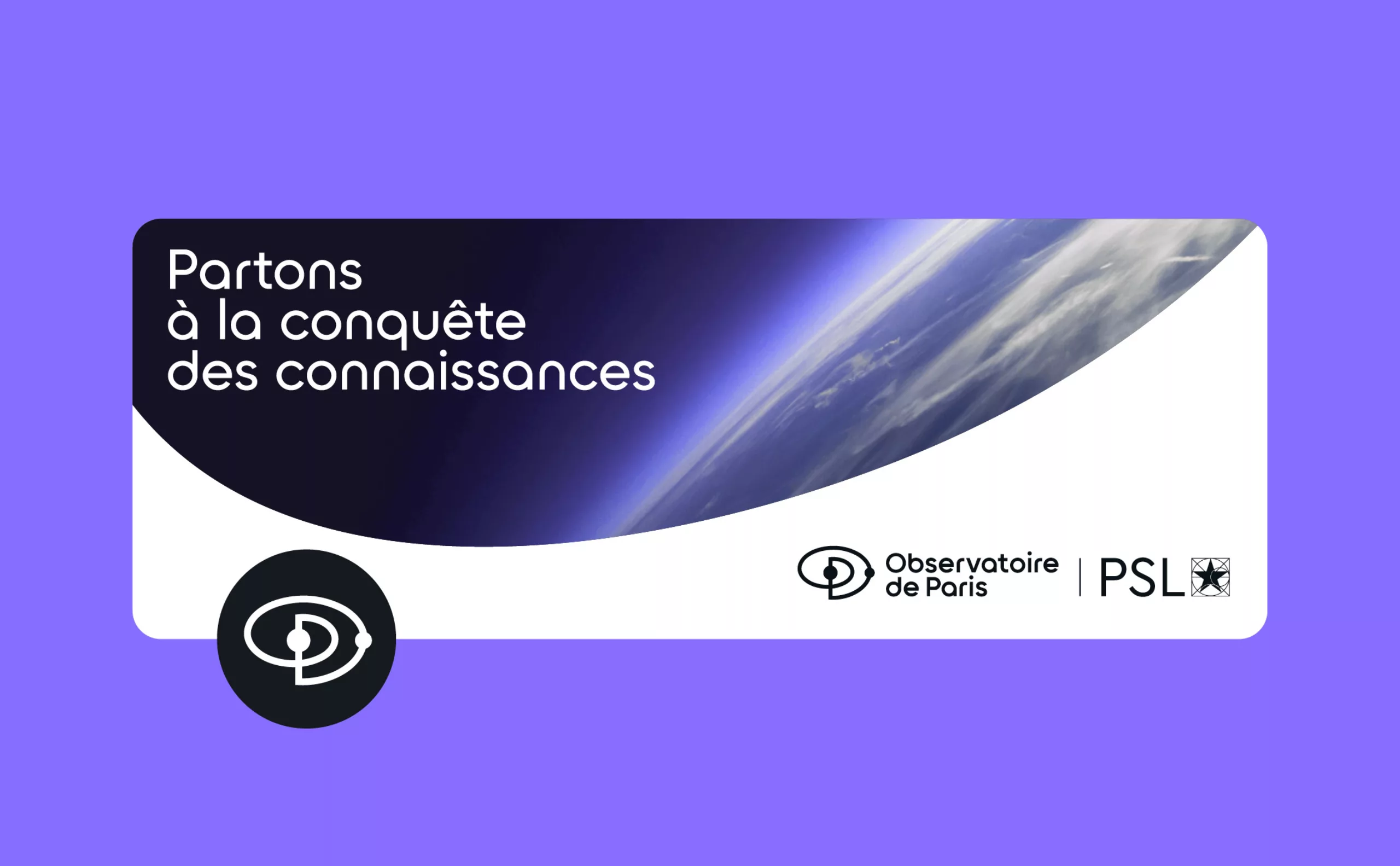
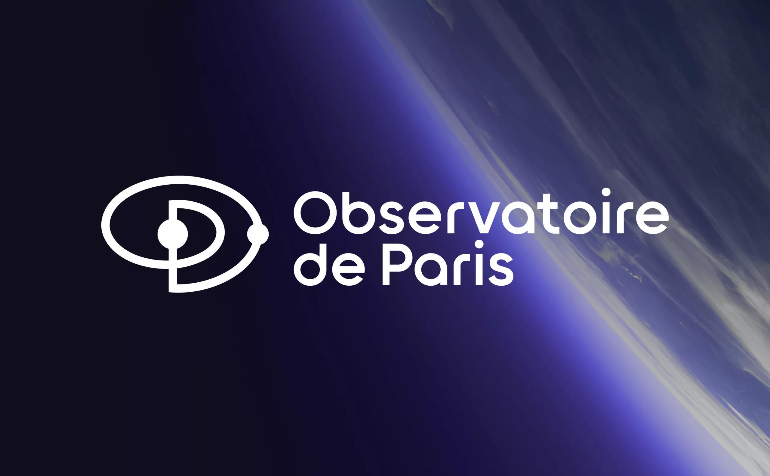
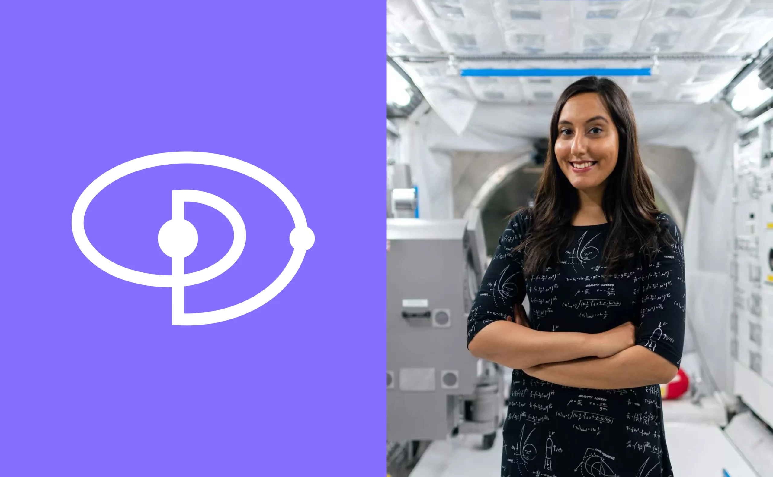
The combination of the initials “O” and “P” has given rise to a completely new symbol, which can be likened to the representation of a solar system, with a satellite orbiting its star. This celestial object follows a spiral trajectory, symbolizing the phenomena of attraction and expansion.

This “orbital monogram” anchors the Observatory’s identity in the tradition of academic excellence. For while this new identity aims to modernize the establishment’s image, it also honors its history. The logo-monogram has therefore been designed in much the same way as it might have been for a learned society of the 19th and 20th centuries, those circles of scholars and specialists who set up the art of emulation and the transmission of knowledge.
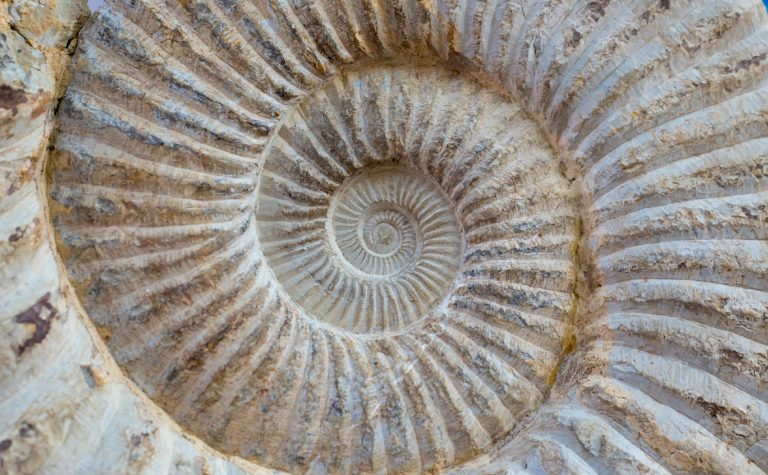
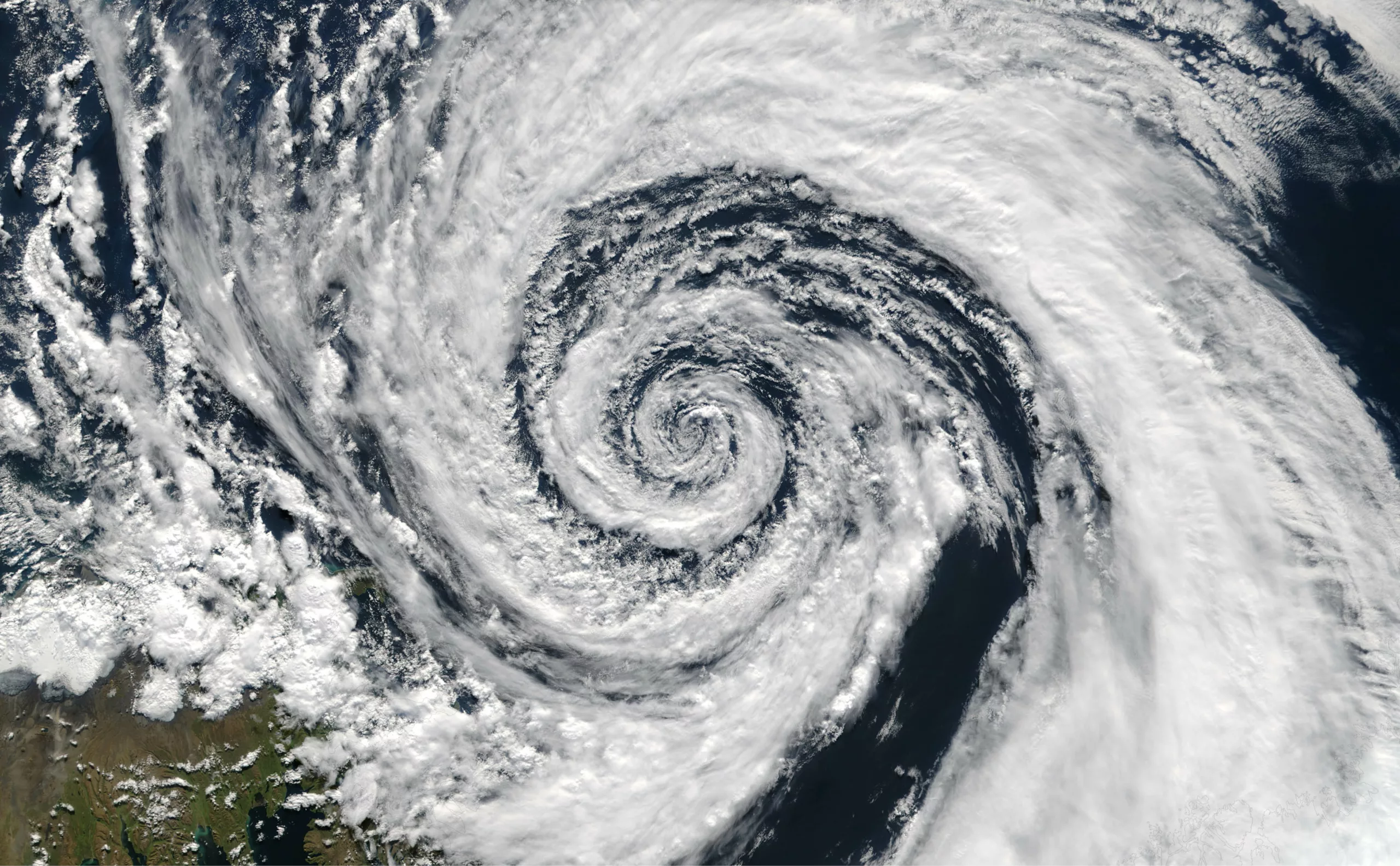
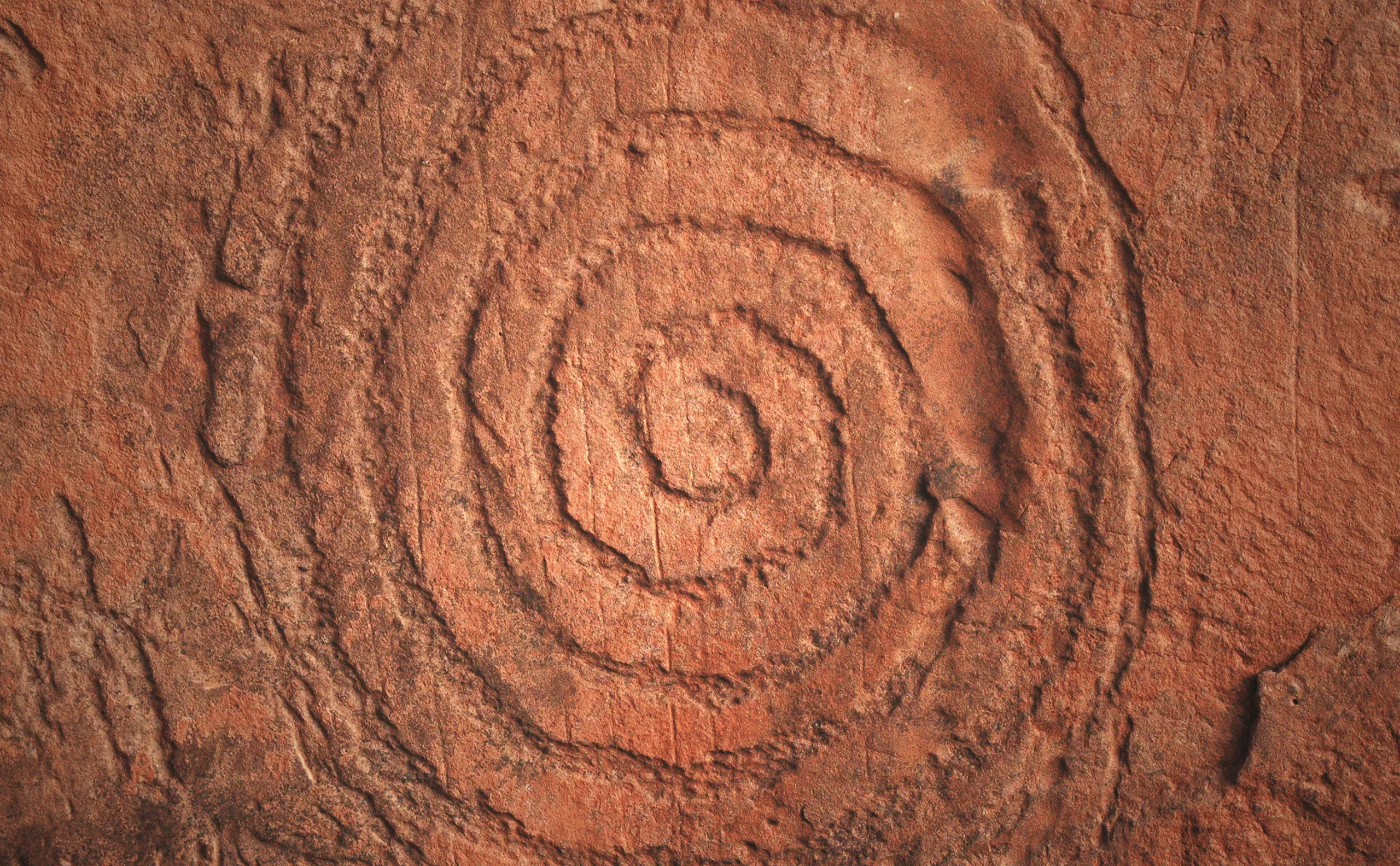
The spiral is not just another shape. It is one of the most widespread shapes in the natural world. It gives shape to embryos, fingerprints, strands of DNA, flowers, whirlpools, tornadoes, galaxies and more. This shape has intrigued and fascinated mankind for millennia. It’s an ancient symbol that features in the iconography of many cultures, whether mythological, spiritual and religious, or artistic and ornamental. Spirals are often associated with fertility, the cycle of life, movement and balance. They can also be seen as a cosmic metaphor, referring to the Universe and world order.
Since the dawn of time, man has raised his eyes to the heavens, to admire the spectacle represented by the celestial vault. And since the dawn of time, man has been drawing these intertwined curves to symbolize as yet undiscovered mysteries on earth and in the universe. So it was only natural that the world’s oldest observatory should display a symbol as legendary and ancestral as this one. It symbolizes not only the permanence of this centuries-old institution, but also its subjects of study – the universe, space, time and more.


Colors
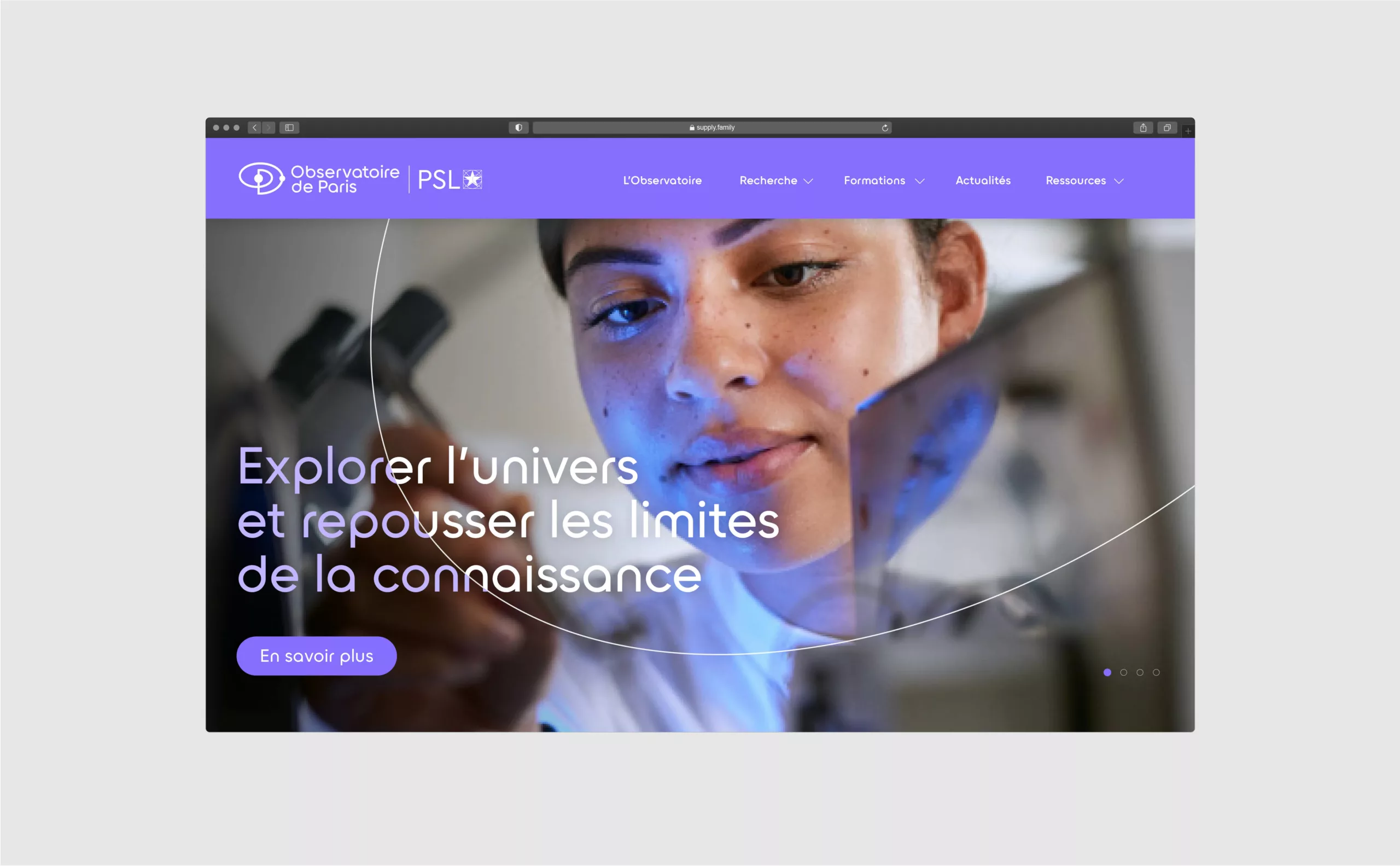
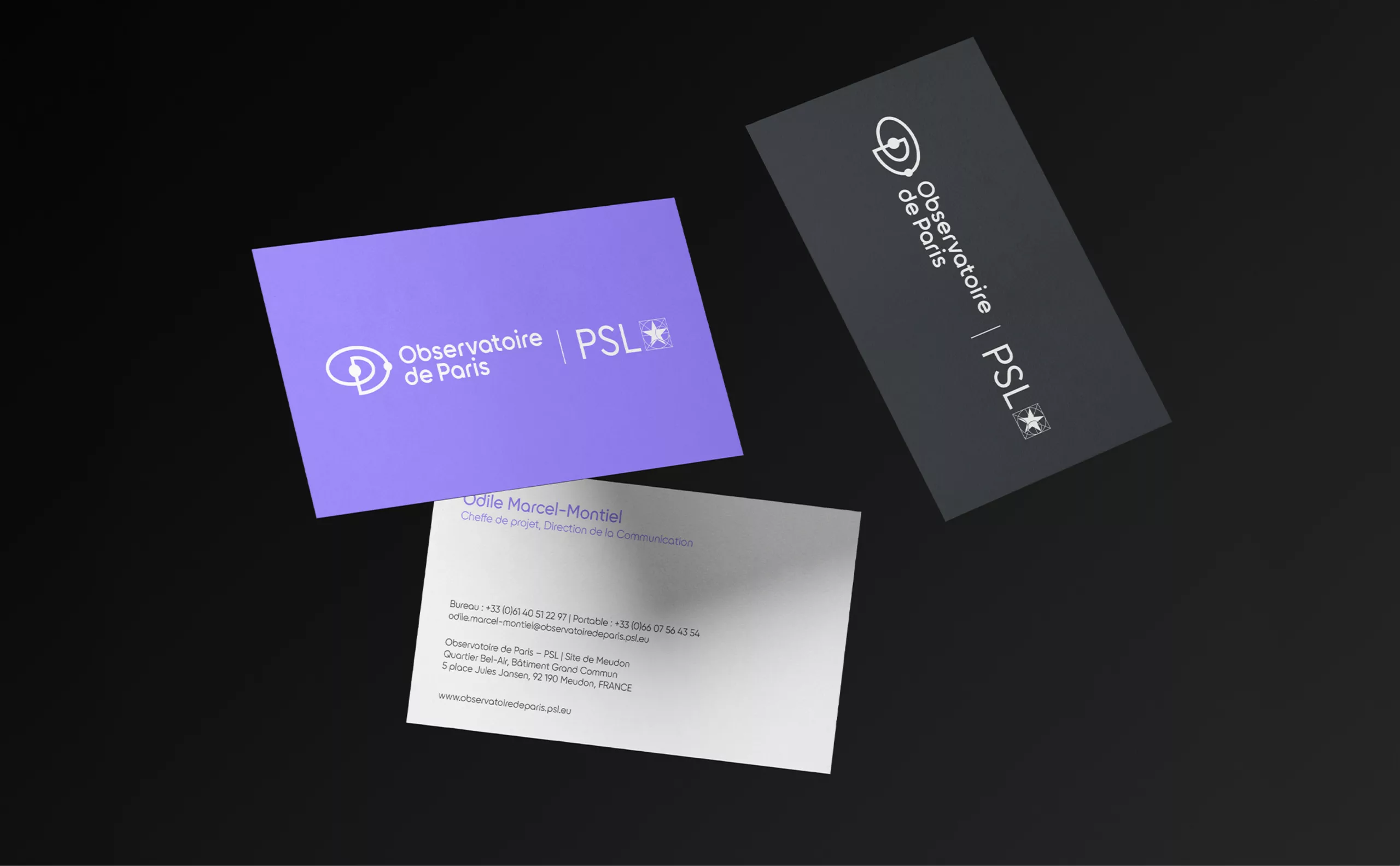
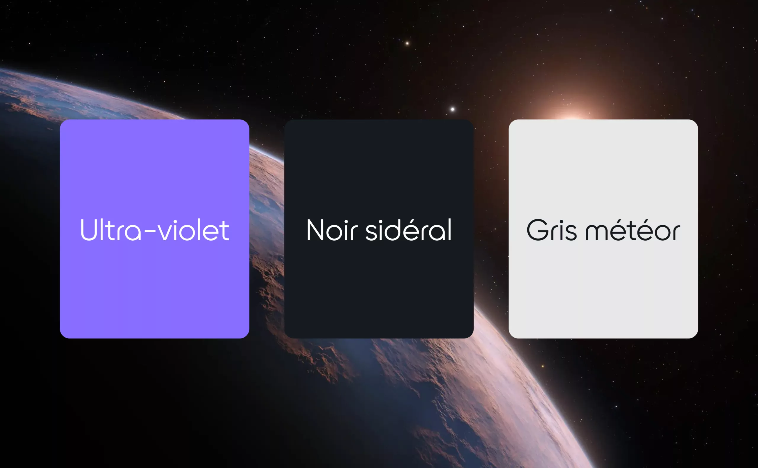
Until now, dark blue has been the color of the Paris Observatory. It turns out that this blue is shared by virtually all players in the aerospace sector (NASA, CNES, ESA, Arianespace, Airbus, Boeing, etc.). It’s a reassuring color, inspiring wisdom and confidence. But it’s also a cold, statuesque color that doesn’t sufficiently evoke the dreams, mysteries and passion that are so much a part of space studies and careers. That’s why we decided to replace the dull midnight blue with a brilliant violet, which we named Ultra-violet, in reference to those wavelengths invisible to the naked eye, but which are nonetheless an integral part of astronomical observations (along with gamma rays, x-rays, infrared and radio waves). Violet is a guarantee of power and dreaminess. It is the royal color par excellence, recalling the history of this institution and its heritage dating back to the ancien régime. At the same time, this color confers a much more modern image, as it elicits both creativity and innovation through its particularly saturated appearance.
Typography
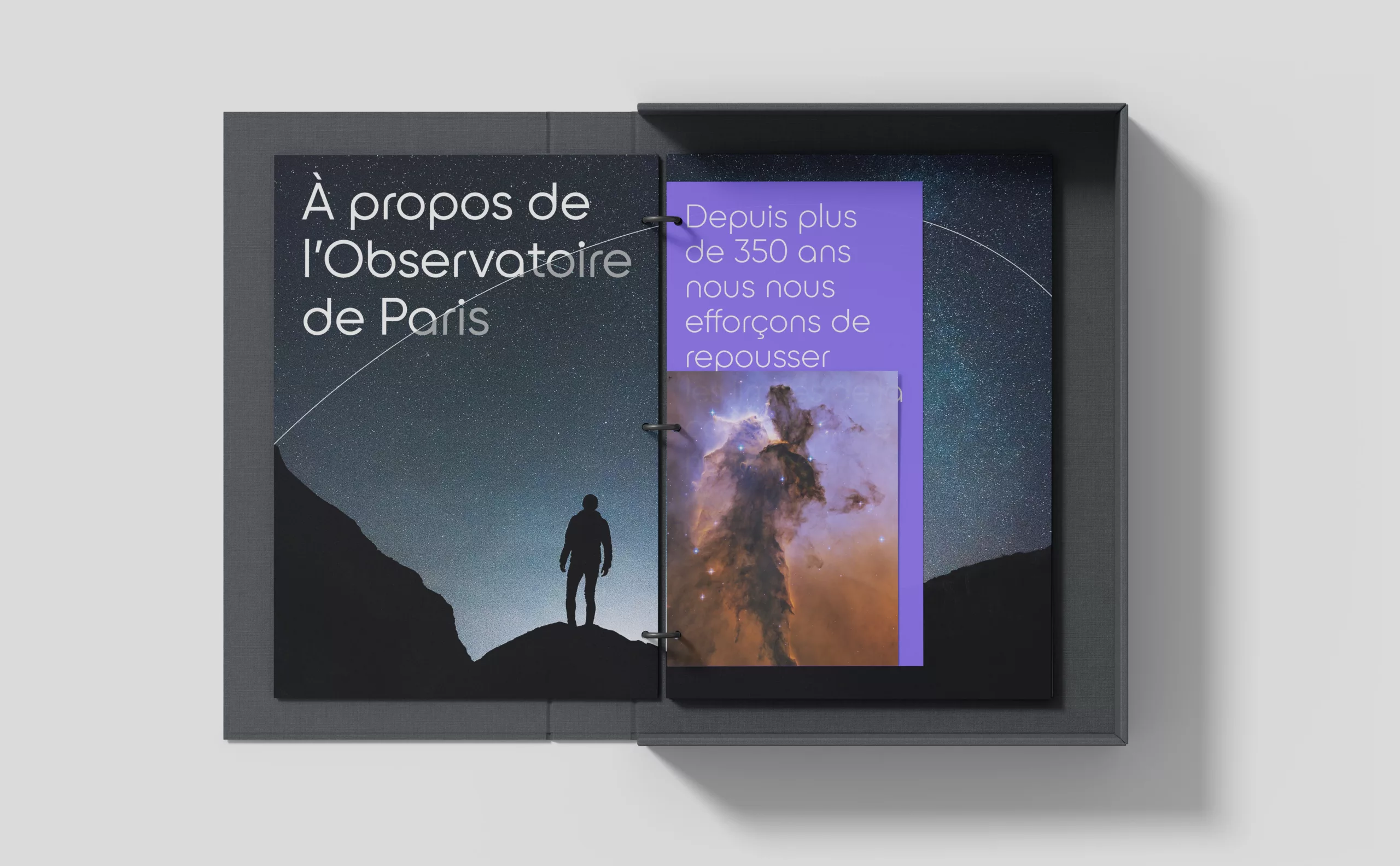
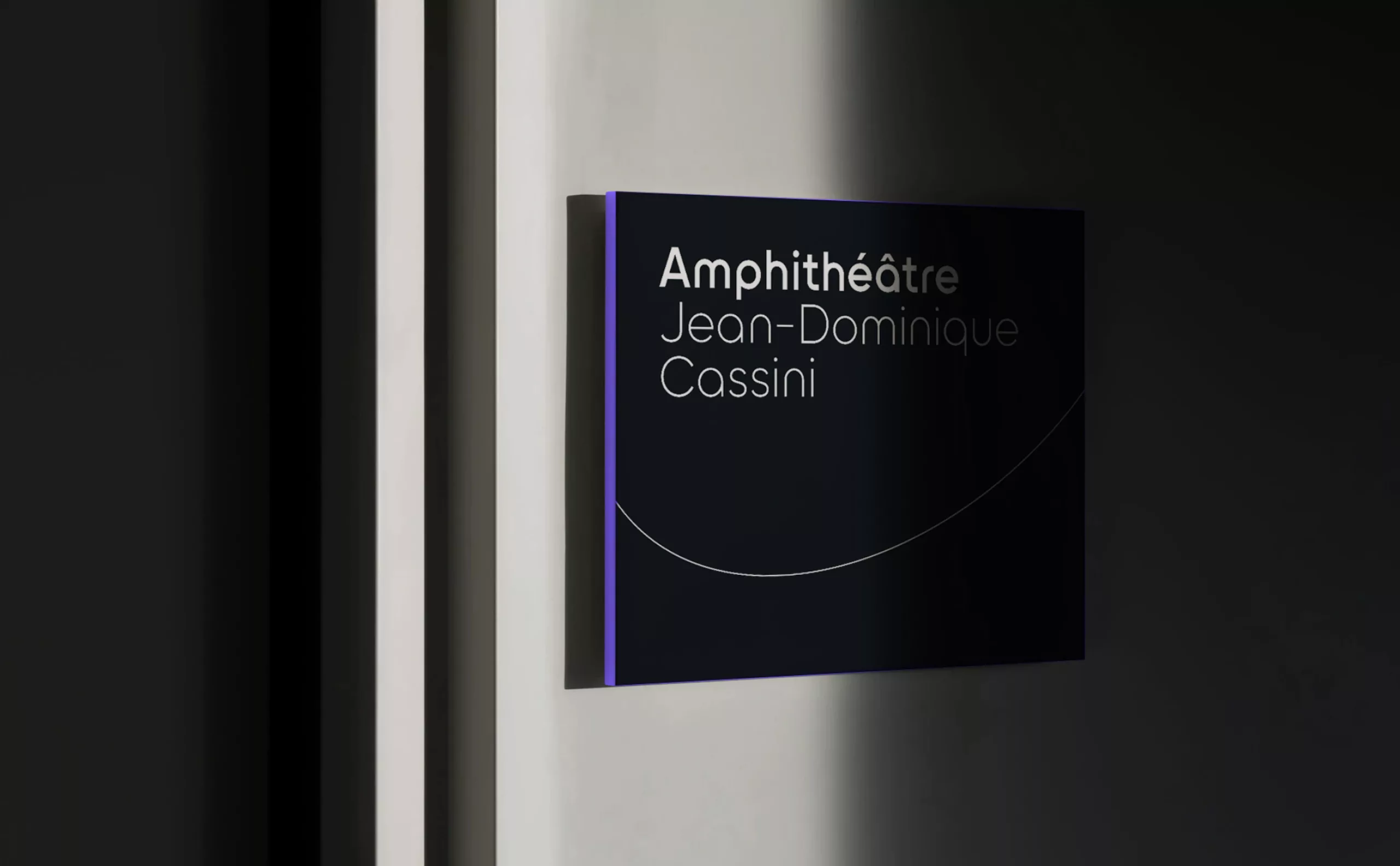
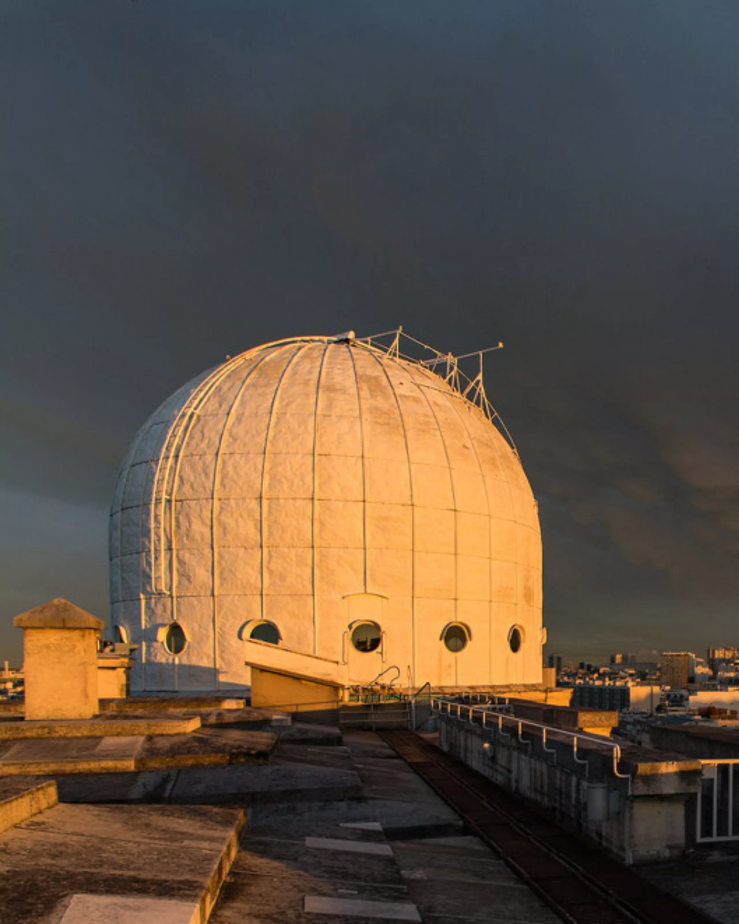
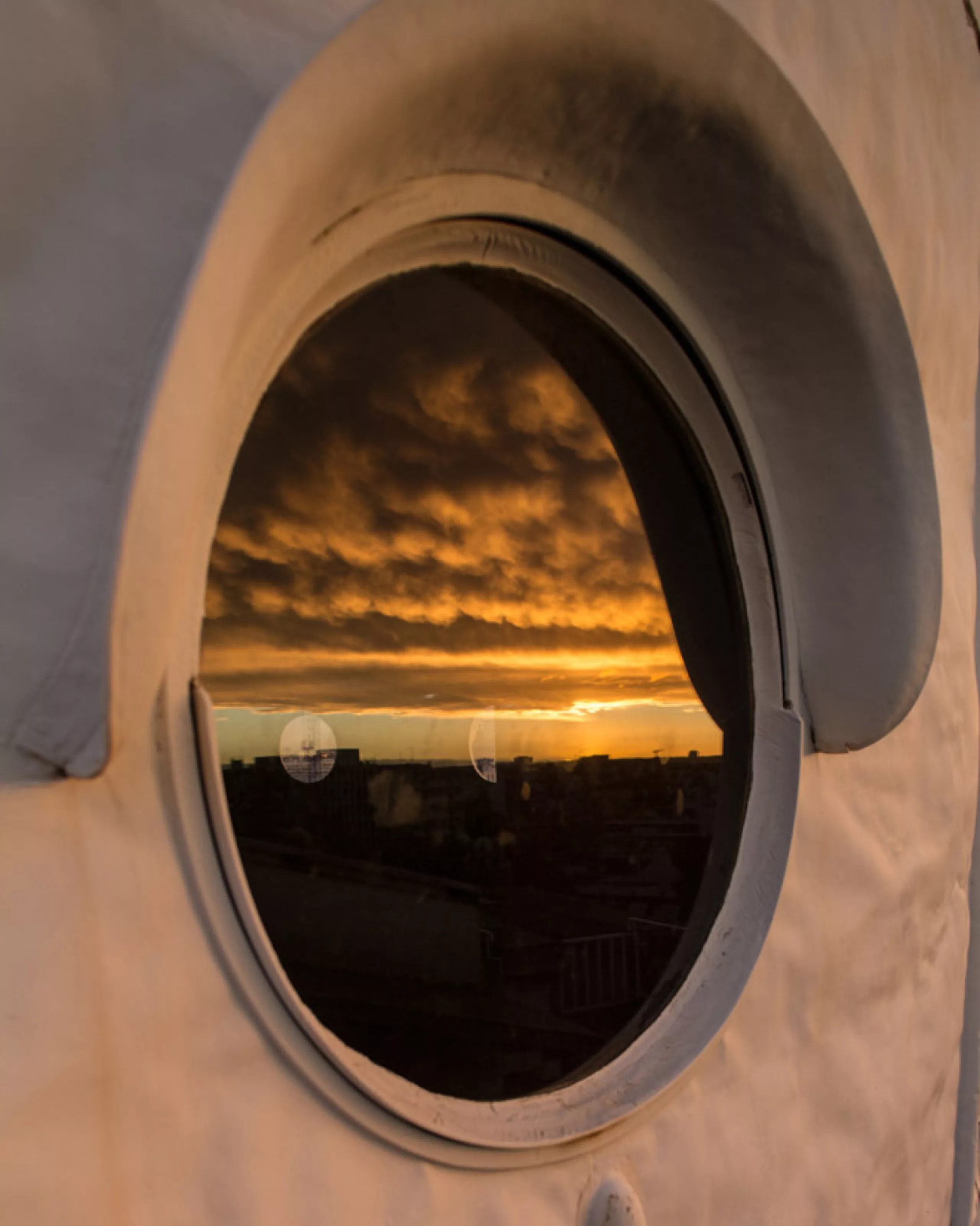
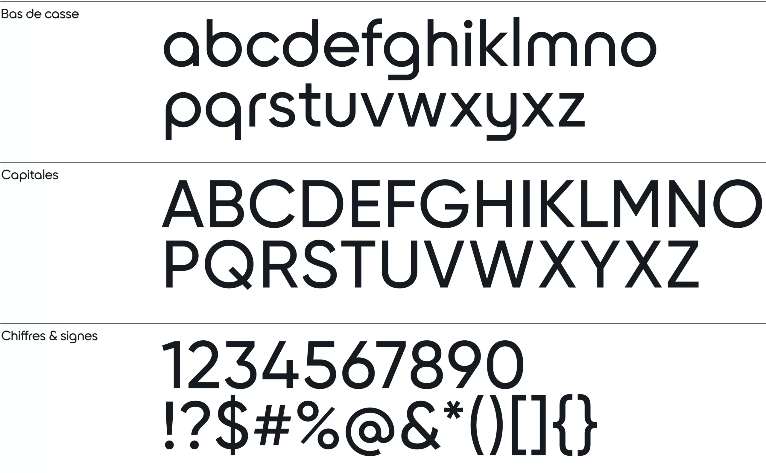
The Observatory’s identity and character are embodied in its logo and colors, of course, but also in its typography. This is Arago, a typeface specially designed for the Observatory, distinguished by its particularly geometric design. Its name refers to Francois Arago, an illustrious 19th-century French astronomer and physicist, after whom the famous dome on the roof of the Perrault building is named. The perfectly circular appearance of the letters is reminiscent of the round shape of the planets, as well as that of the portholes running around the dome.
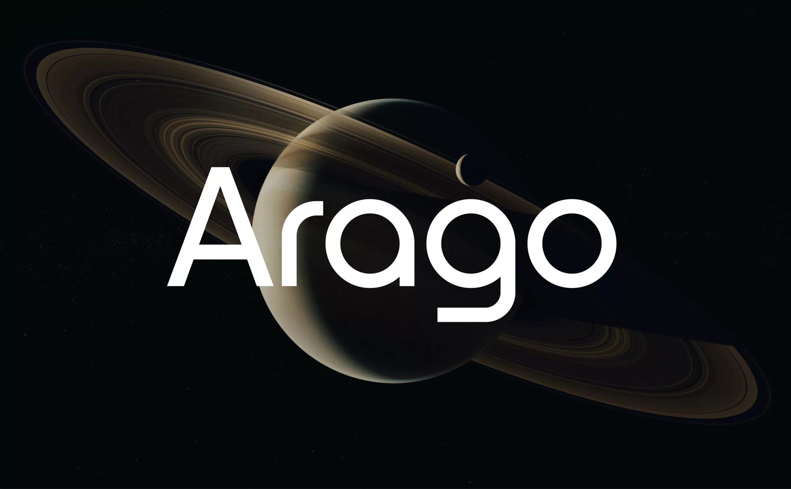
This monolinear, sans serif, geometrically shaped typeface was designed to convey an image of technicality and precision. It has a modern, neo-futuristic look, and is strongly inspired by the most famous of space logos, Nasa’s famous worm logo (see our article on the history of the American space agency’s logo).
Composition rules
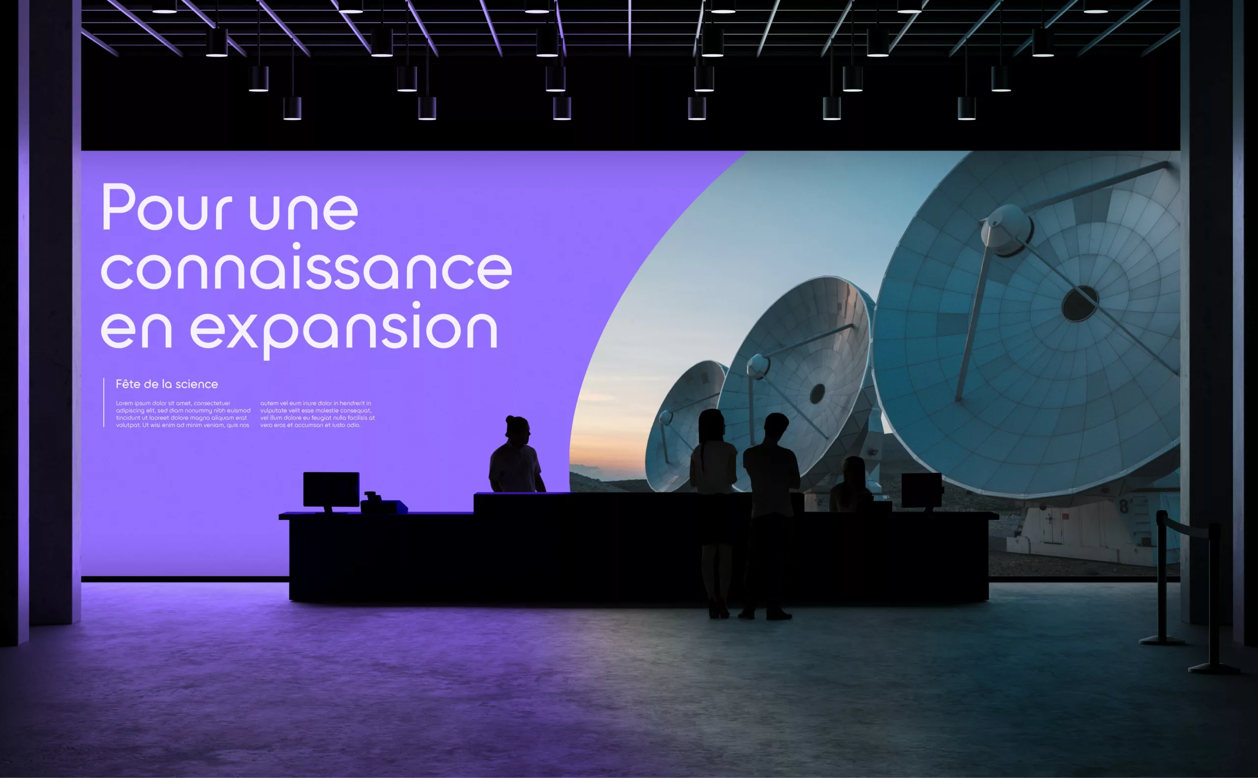
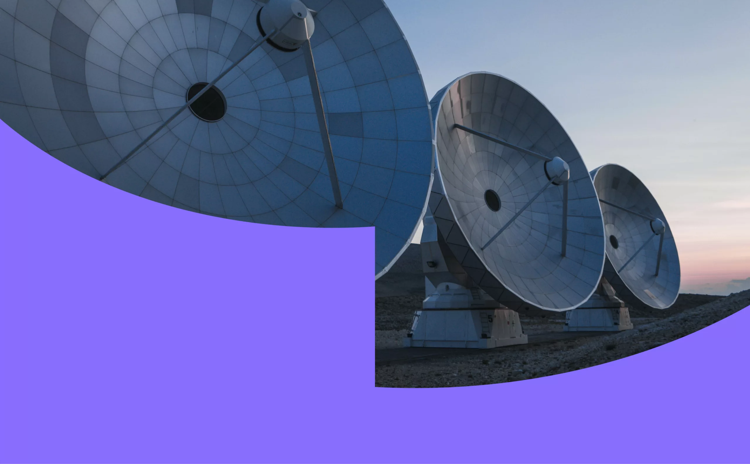
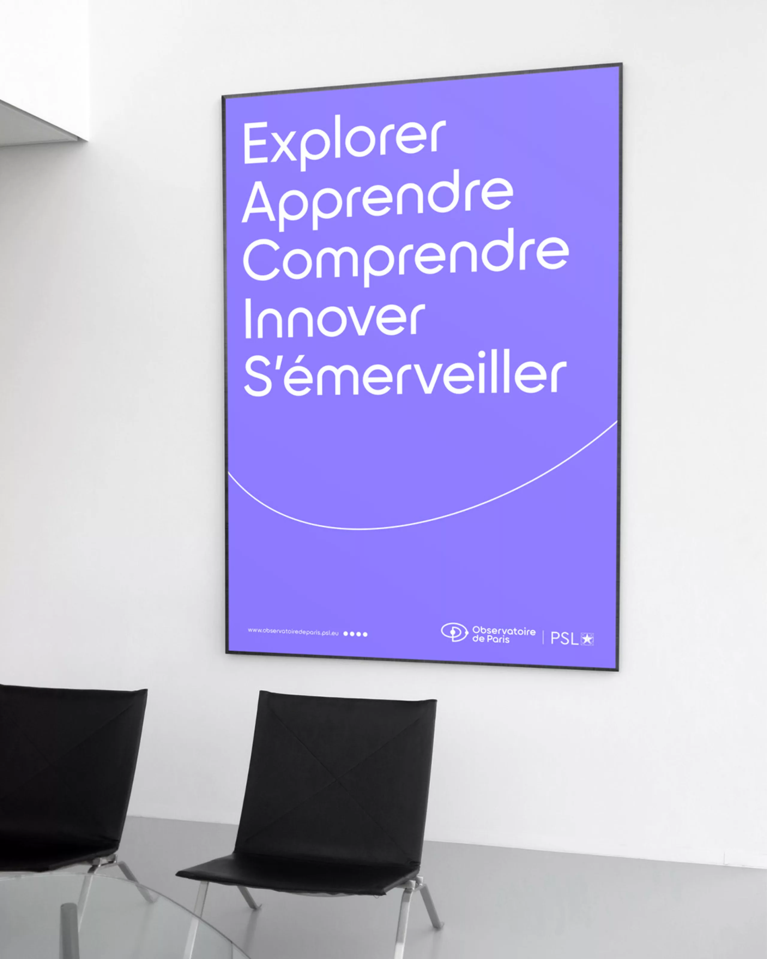
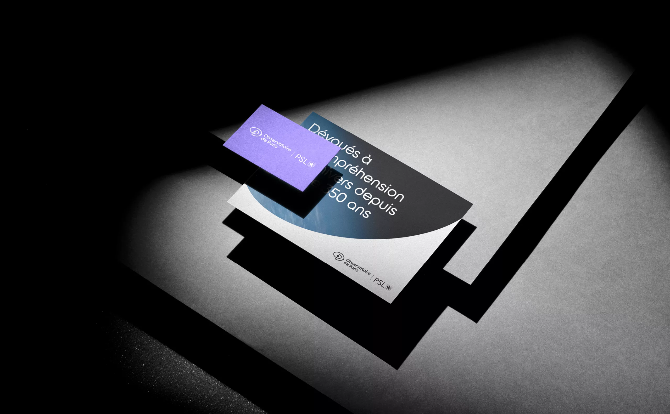
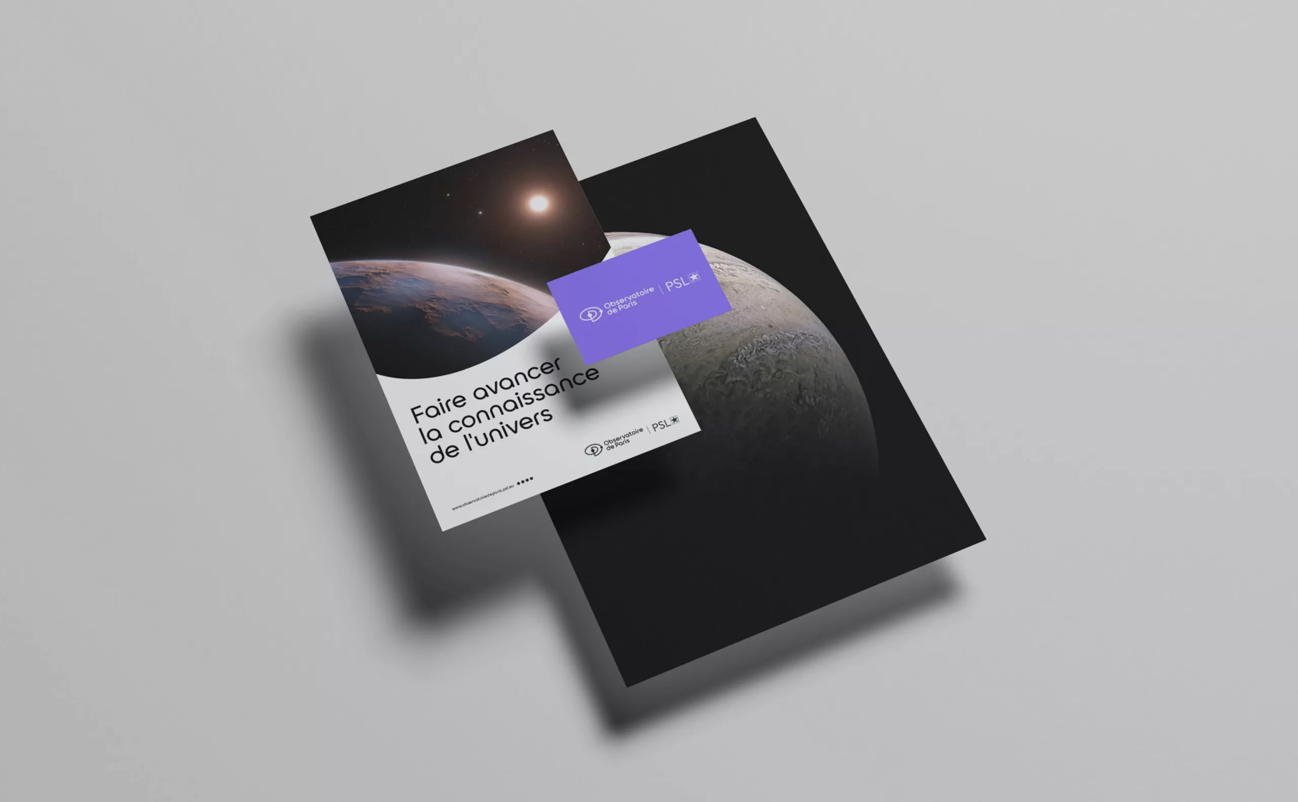
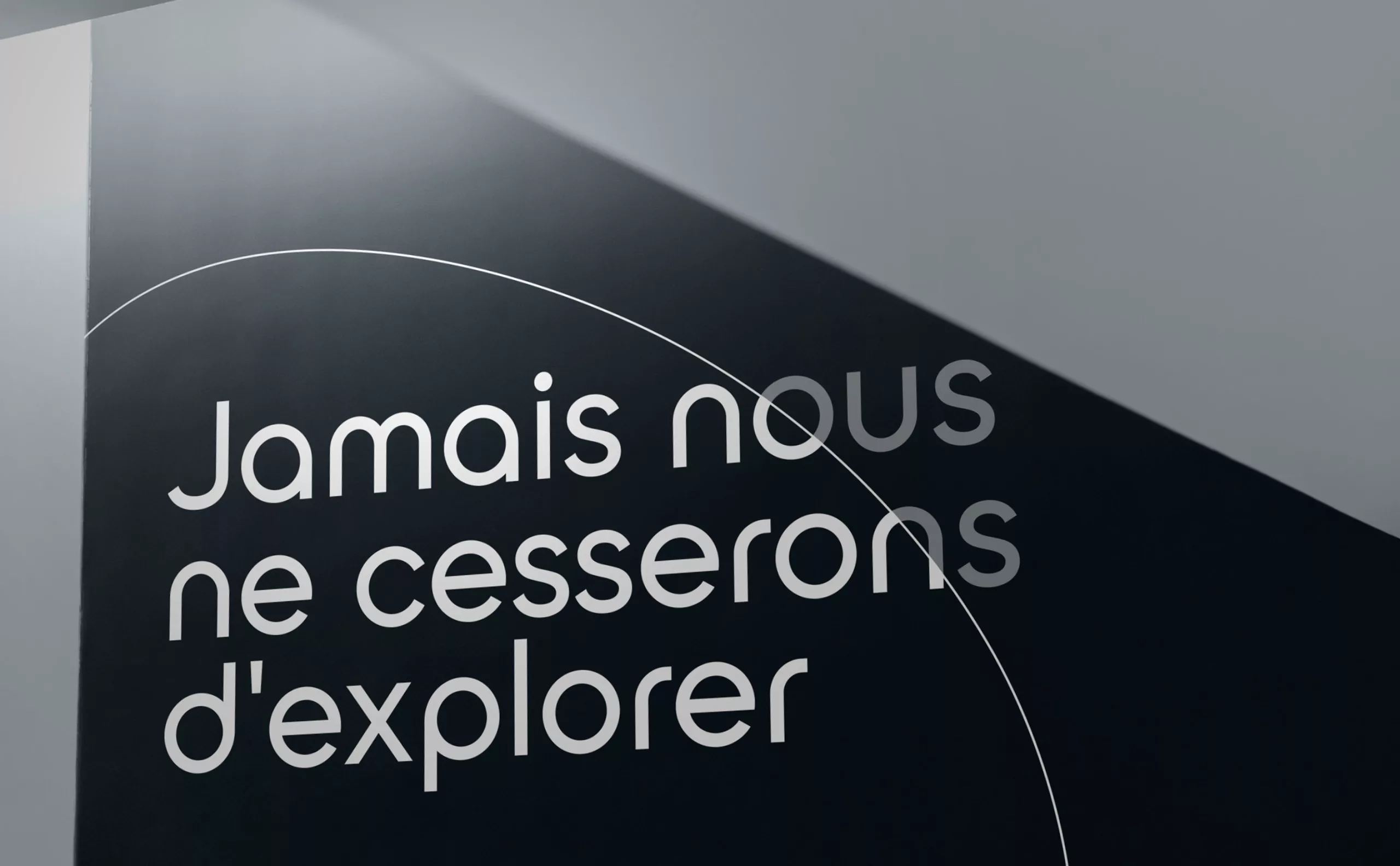
The principles of composition are directly inspired by the monogram. The silhouette of the monogram becomes a space for both text and image. By tilting this element a few degrees, the sign takes on a parabolic shape, reminiscent of the curve and trajectory of space objects, such as a rocket taking off.
These shapes give the brand a dynamic yet contemplative appearance. In this way, the Observatory demonstrates its determination to perpetually advance the science of the universe, projecting itself into the future with serenity and confidence.
