The history of the nasa logo
The short story behind nasa’s big logo
When you start a story with “According to Nasa…” the rest is bound to be irrefutable. You can’t be stronger than Nasa. It’s almost the same with logos. In fact, is not this the only logo to have walked on lunar soil ? Which goes to show !
But, because there always has to be a “but” to continue a story. “But according to NASA…” the famous logo designed in 1975 by Richard Danne and Bruce Blackburn looks like a “worm” ! That’s why, after 17 years of loyal service, Nasa decided to abandon it in 1992.
“Why”, you might ask ? Let’s take a closer look…
1st logo : The pre-meatball
This first logo dates back to 1959, when “NACA” was transformed into “NASA”. Basically, we went from the National Advisory Committee on Aeronautics to the National Aeronautics and Space Agency. A change of era, now we want to explore space…
So we drew a planet, stars, an orbiting satellite, and a “kind of wing” to symbolize aeronautics!
We’ll see how this logo came to be known as the “meatball”!
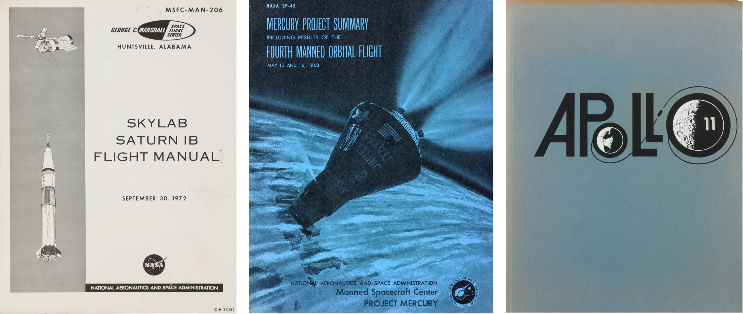
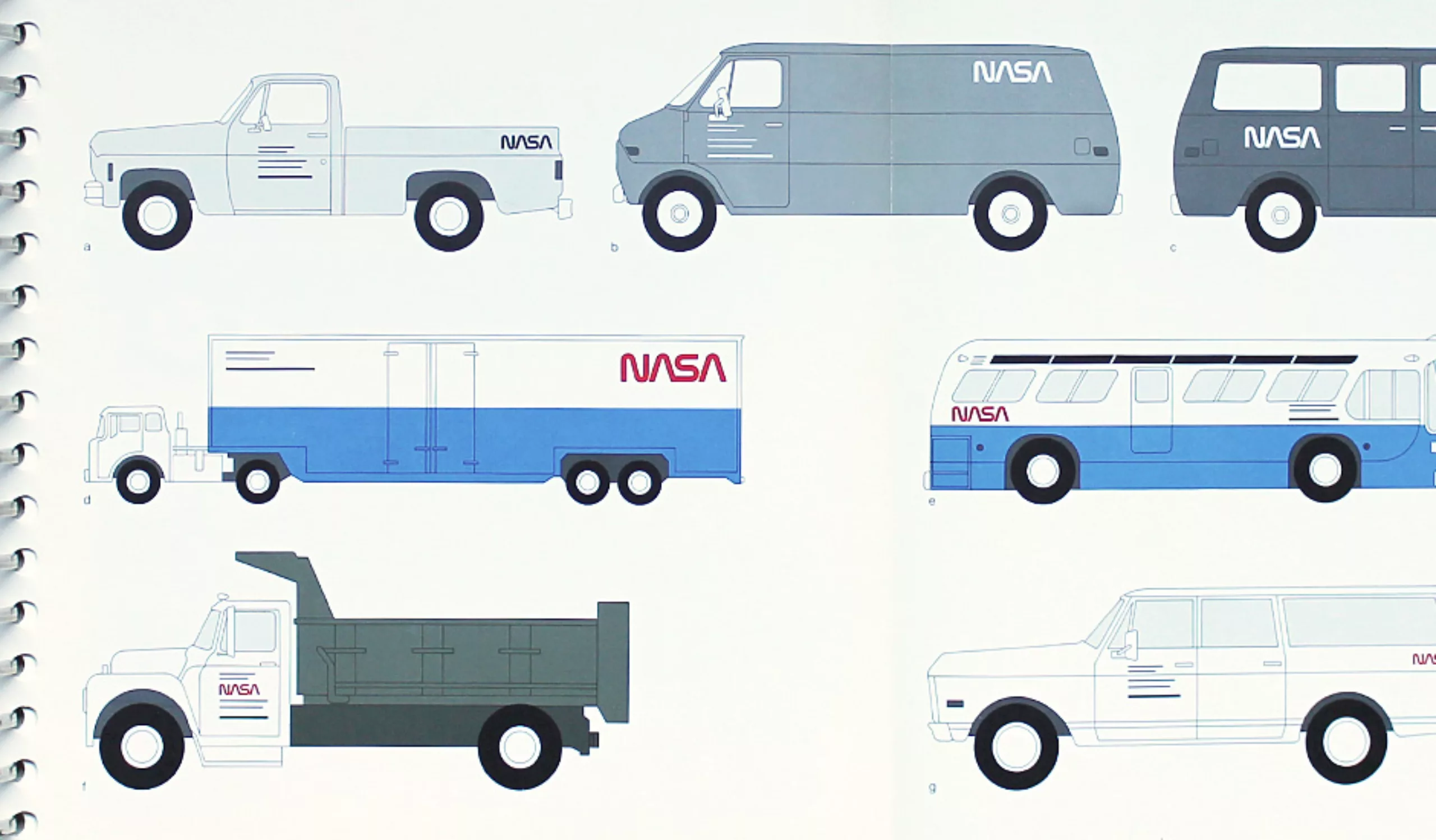
Here are a few examples of brochures from the period.
2nd logo : The worm
In 1975, Nasa’s management was strongly urged by Nixon and his Federal Graphics Improvement Program to establish a true visual identity, worthy of the world’s largest space agency. At the time, Star Wars was not yet a movie, but a strategic defense program. In short, in this environment, Nasa’s management needed to consolidate its reputation.
This identity remained in force until 1992. It was created by Richard Danne and Bruce Blakburn.
Almost 40 years on, this logo is still undeniably modern. It’s simple, technological, easy to use… in short, all the little things that make it a great logo.
In fact, its creator would describe it as “clean, progressive, could be read from a mile away, and was easy to use in all mediums.”
Despite its undeniable qualities, it received a cold reception. Richard Danne recounts this anecdote, between Nasa administrator James Fletcher and his deputy George Low:
Fletcher: “I’m just not comfortable with these letters, there’s something missing.”
Low: “Well, yes, the A has no bar.”
Fletcher: “Yes, and that bothers me.”
Low: “Why?”
Fletcher: (long pause) “I don’t feel like I’m getting my money’s worth!”
The designers were stunned by this last comment. The discussion then turned to the color red/rust. They had tried many other colors, including the more predictable range of blues, but the red much better suggested the action and “yes we can” spirit of the Space Agency.
Fletcher: “And that color, red, it doesn’t make much sense to me. ”
Low: “What other color would be better?”
Fletcher: “Blue makes more sense… space is blue.”
Low: “Sorry, but space is black !”
It has to be said that the presentation of the new logo didn’t get off to the best of starts. The work had been carried out in secret for many months, and it was through a clumsy letter that the identity was revealed. As it is not every day that one can read that a logo is as important as a “space command module”, I take the liberty of transcribing it in full!
“…we were fortunate to recognize that our graphic identity could be improved”.
James C. Fletcher”
As early as 1975, internal opposition to the new logo began. There were the “pros” and the “cons”. The new logo was soon given the glorious patronymic of “worm”, while the old one was dubbed “meatball”. The very serious Nasa website even goes back over the story (http://history.nasa.gov/printFriendly/meatball.htm).
While the meatball metaphor may seem explicit, given the shape of the logo, it’s also a technical term in aeronautics. In 1957, the US Navy referred to a “meatball of light” in its procedure for landing aircraft on aircraft carriers: “The pilot must keep a point of light in a mirror in his line of sight, and he must absolutely keep this luminous meatball in the center of his sight in order to land correctly .” This procedure became known as the meatball landing.
3rd logo: The meatball
Until 1992, the two logos were used in joyful cacophony. When new director Dan Goldin put an end to the recreation, the meatball crushed the worm. A few months earlier, the Space Shuttle Challenger had exploded in flight, taking its crew with it. This accident did far more damage to NASA’s image than a bad logo. For Goldin, it was a case of going back to the basics of Nasa’s history, invoking the glorious days of the Apollo mission and concluding with a lapidary “Magic is back at Nasa”.
The 1959 logo was therefore updated. The result of this in-house work is still in use today.
Ironically, this logo must be a delight to use. Easy to reproduce, even in small size, it can easily be placed on any colored background. The Facebook icon, reproduced opposite, is proof of this…
What lessons can be learned
It’s clear from this story that getting people to accept change is no mean feat. The creation of a visual identity is a costly undertaking that must reflect a strategic change in the company. Replacing a logo does not happen overnight; it is a major operation that needs to be prepared. Here are a few basic rules:
If a new visual identity is to be developed around a dialogue between management and designers, an extended consultation phase is obviously welcome upstream of the project. It can help to identify existing gaps, to enhance the value of the teams by including them in the process, or even to communicate the reasons for the current process. But the fact remains that strategic choices are made at the top.
When the time comes to deliver the new logo, it’s time to prepare your speech. The work that has often taken several weeks to become self-evident in the minds of managers will not necessarily be as clear-cut for employees. So it’s important to be pedagogical, to explain in simple terms the benefits of the change, and the advantages that each employee can gain from the operation, while anticipating as far as possible any difficulties they may encounter (e.g.: How do I change my email signature ?).
To get people to accept the change, it’s better to be “several” than “one”. The risk is to find yourself isolated. That’s why you should not hesitate to surround yourself with employees who are motivated by the project, and who can support the change. These people can then relay the “FAQ” and other legitimate requests for information.
Finally, you need to remain open to discussion. Managers should not be offended by the reluctance of certain employees to embrace change. The only way to do this is to listen to their concerns and take them into account. This means accepting that the project may yet evolve to take account of certain opinions. Hence the importance of not having printed 10,000 copies of the stationery before presenting the project to everyone !
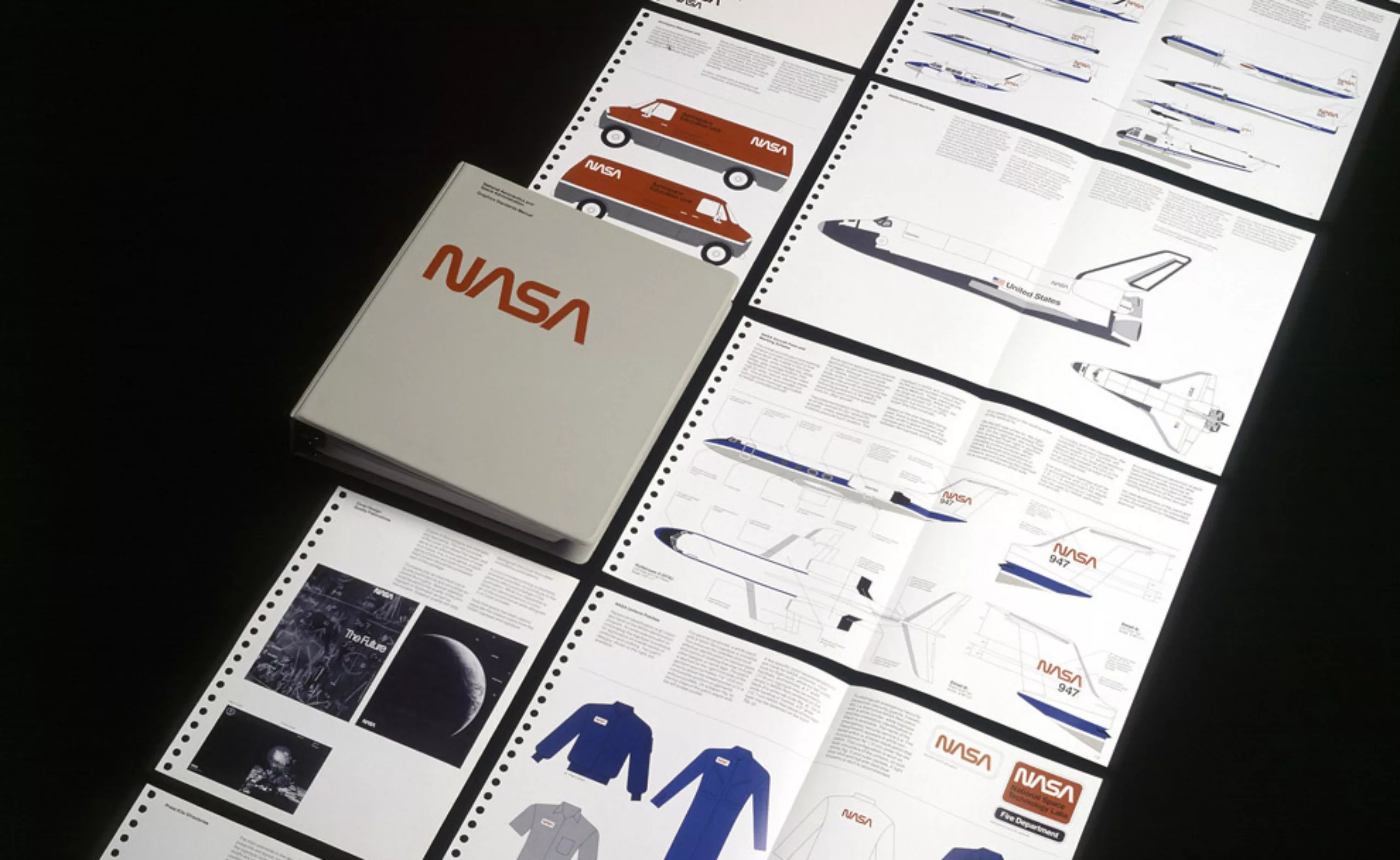
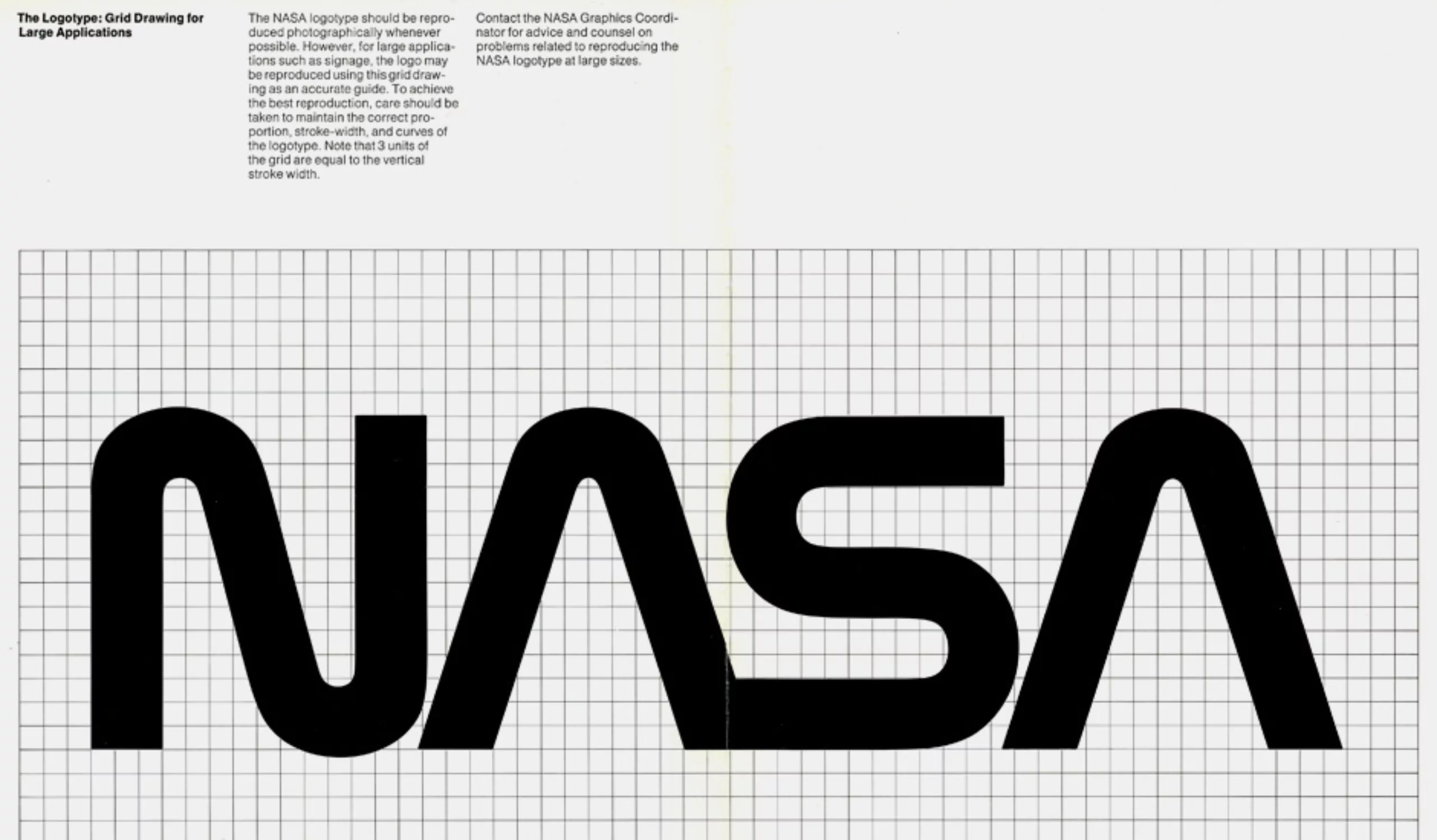
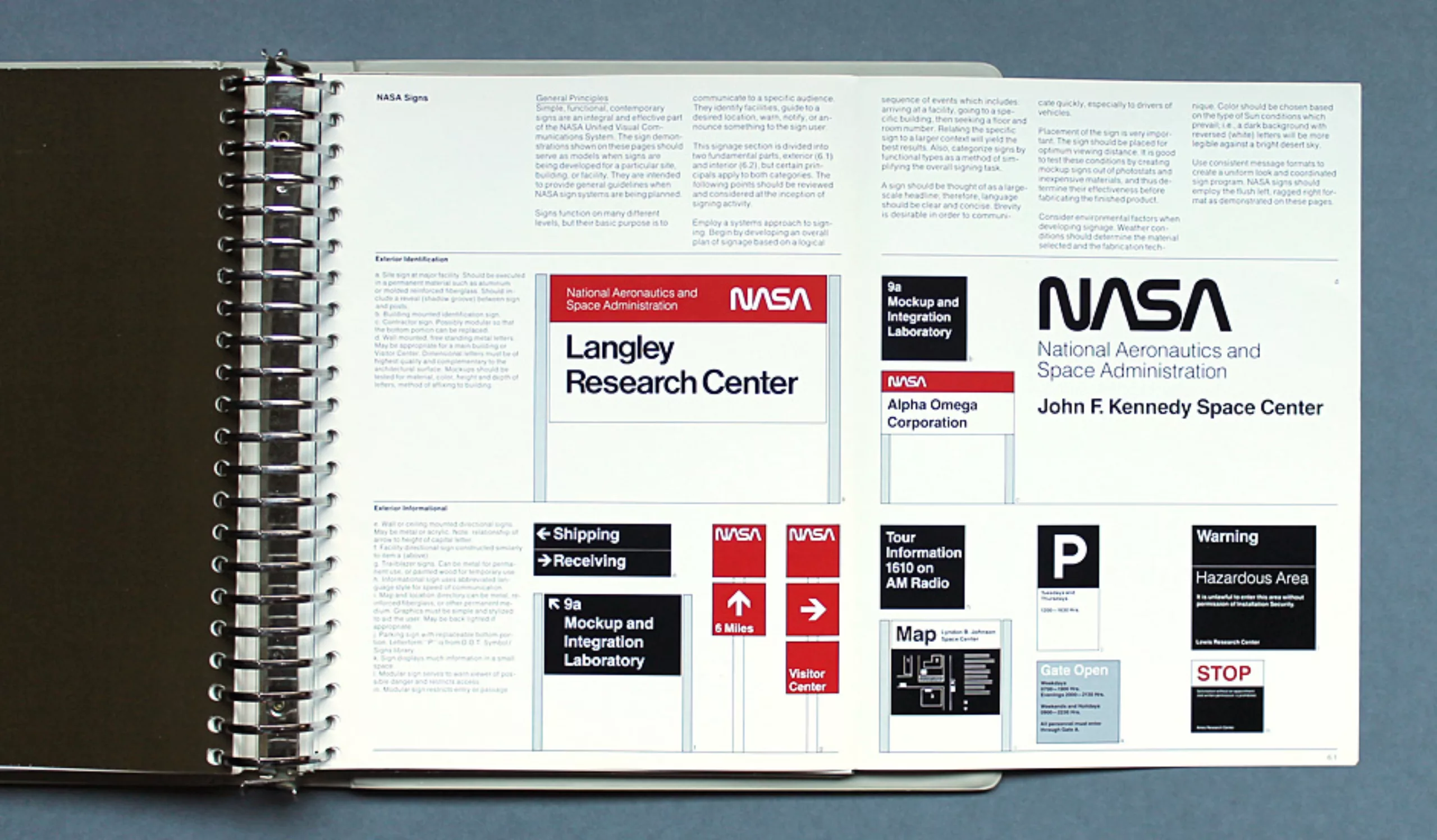
Graphic charter
Here are a few images of this famous 1975 graphic charter, which despite its forty years has not aged a bit !
And the cherry…
Here are a few of the video packages designed at the time…


A legendary logo
“That worm really looked good. it looked fantastic on the spacecraft,” Michael Bierut of the Pentagram Agency likes to recall. “In all objectivity, the worm was quite relevant, and the meatball an amateurish mess.”
Today, the logo has been abandoned, but it remains a mythical logo that has won numerous awards, including the “Award of Design Excellence” in 1984. Star Trek aside, I’m sure there are still plenty of fans among today’s designers ! Wouldn’t you agree ?
The worm is back !
Our sources :
- http://www.itsokaytobesmart.com/post/57834651348/nasa-vintage-logo-gif
- http://space.io9.com/twenty-awesome-covers-from-the-us-space-program-461436874
- http://www.flickr.com/photos/timgeorge/5999922362/ and http://www.flickr.com/photos/thisisdisplay/sets/72157627467855309/
- http://www.thisisdisplay.org/features/the_nasa_design_program
- SpaceX suit
On the subject
-
A history of mascots
Mascots, those soft, slightly silly characters, are nothing new. Here’s a look at their origins, from Antiquity to Japan.
-
Herb Lubalin, the letter as an image
Herb Lubalin’s biography in pictures. In his 40-year career, Lubalin has revolutionized the landscape of American graphic design by composing images with text.
-
A short history of book cover design – 2/4
Under the influence of Japan, France or Russia, book covers are constantly evolving with technical progress and crises.