Writing with images: from pictographic scripts to emojis
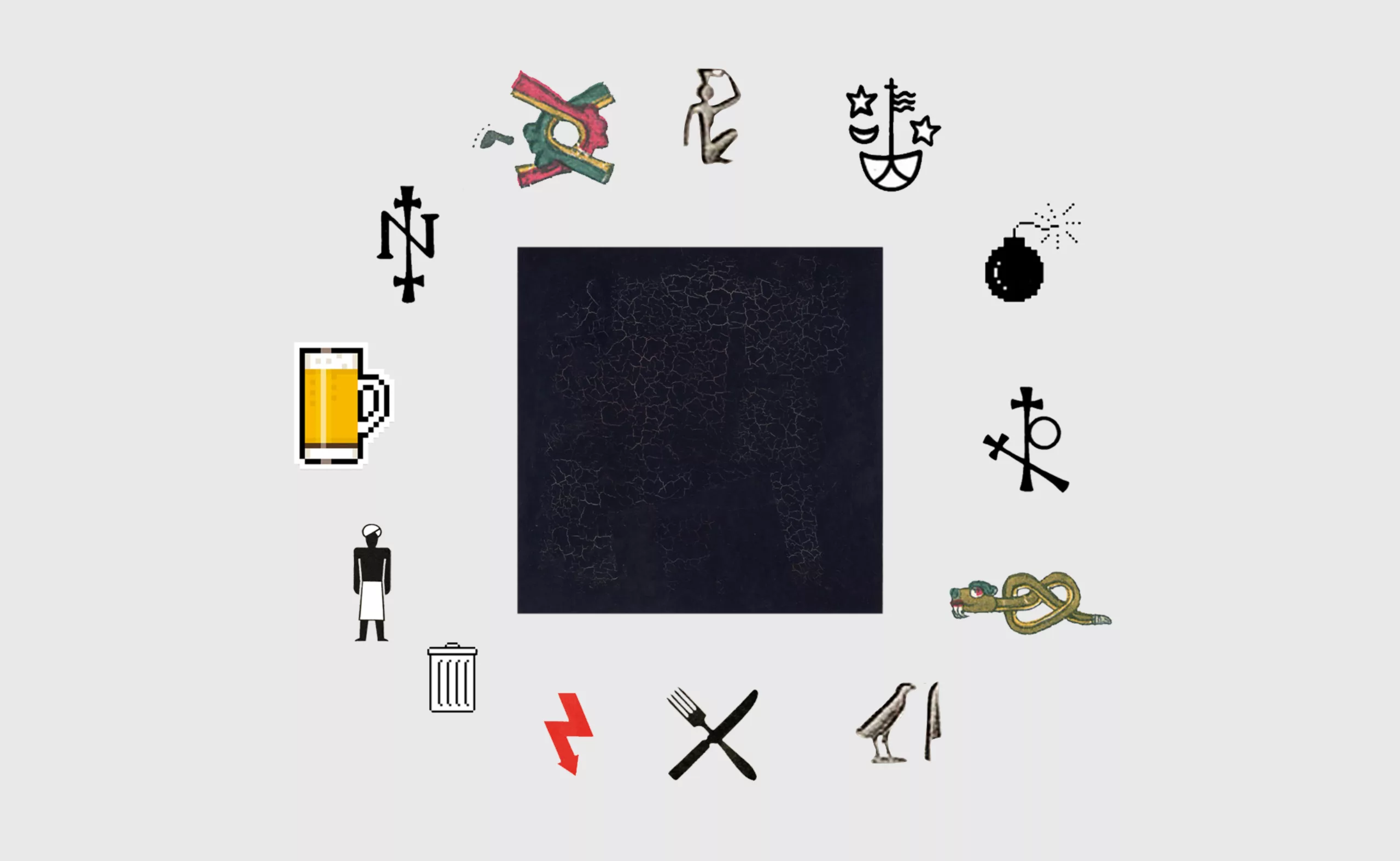
Humans, wishing to fix their thoughts, first started to write by drawing figurative images. The birth of phonetic alphabets then led to a gradual switch to abstract signs. Communication through images and pictograms does not cease to exist, becoming little by little not a writing but a universal visual language. In the digital age, communication continues to use image symbols, through emojis, heirs to this evolution of communication by image.
The first writings were drawings
It is often said that a picture is worth a thousand words, and, as if to prove this adage even before it existed, the first words themselves were pictures. If this is not necessarily the case anymore since the birth of phonetic alphabets, writing and drawing have always been closely linked, as the words “graphein“, from the Greek “engrave characters”, in the double meaning of drawing and/or writing, and “pictograms” from the Latin “pictus” (painted) and from the Greek “gramma” (written sign) remind us, intimately linking thought to the hand, to the manuscript. As for those who can’t speak, the hand is also used as a language since 1680!
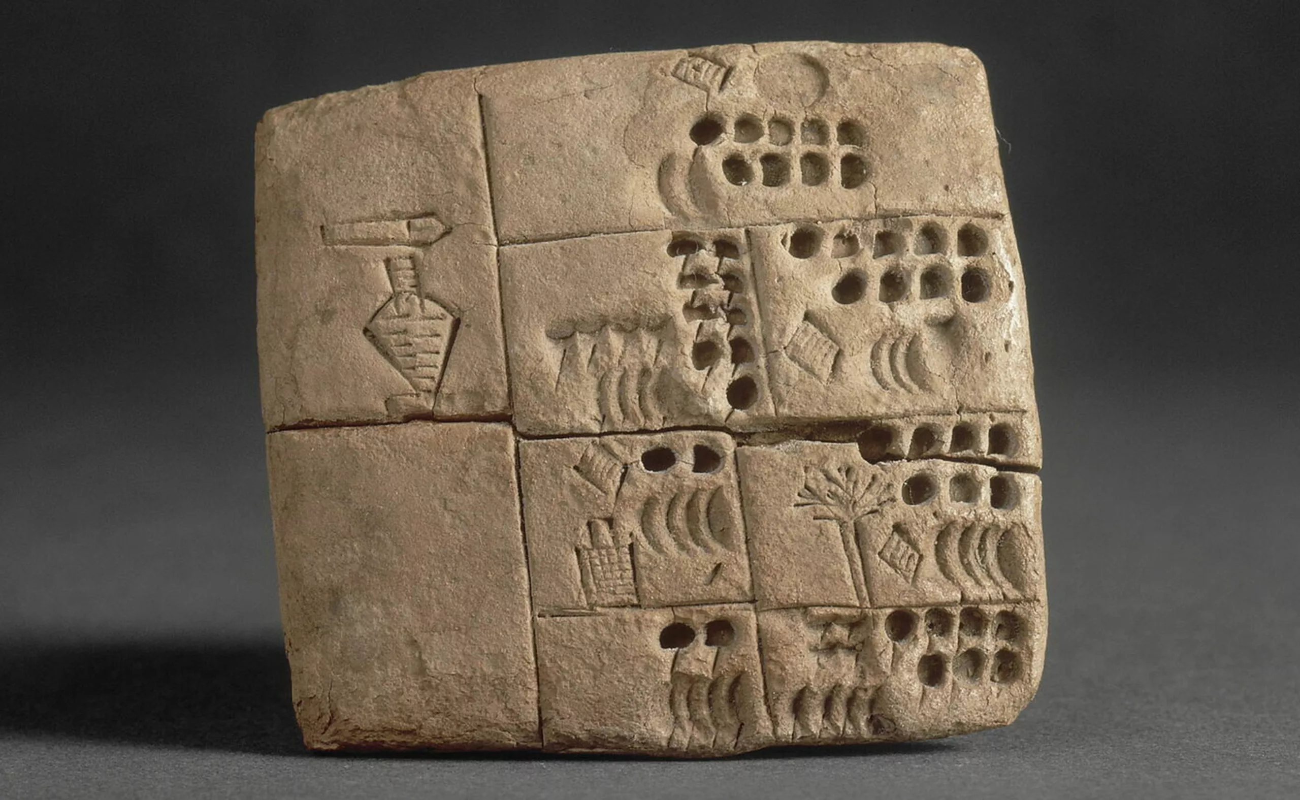
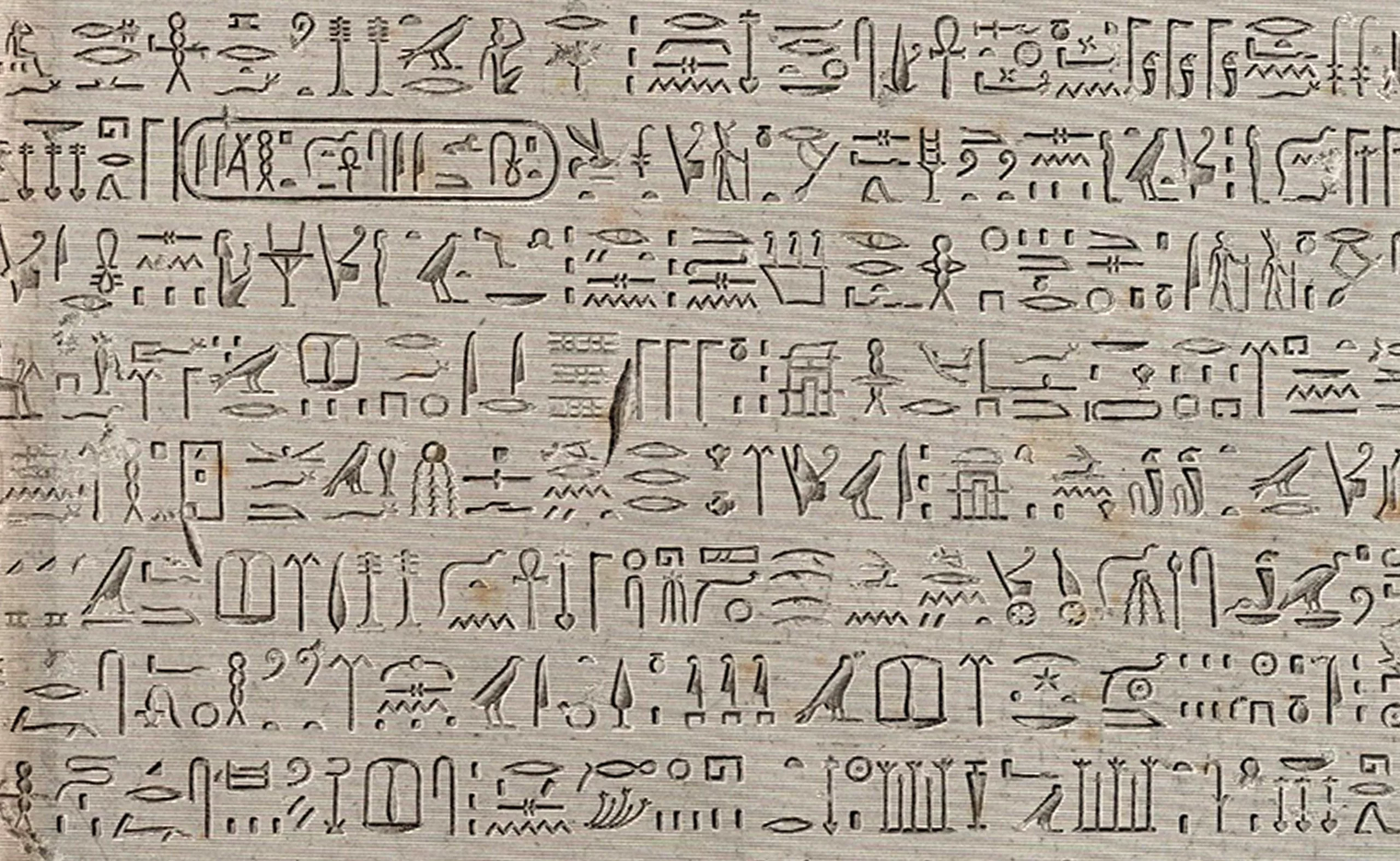
The first writings were pictographic and more or less figurative, as described by A. Frutiger in his book L’homme et ses signes. In general, they were used to draw up accounts or to recount the successes or the lives of notable personalities. Some are pictorial and descriptive, like the very first form of writing known to this day, the Sumerian of the Neolithic period (3500 years ago) with minimalist figurative signs inscribed in clay and still understandable today.
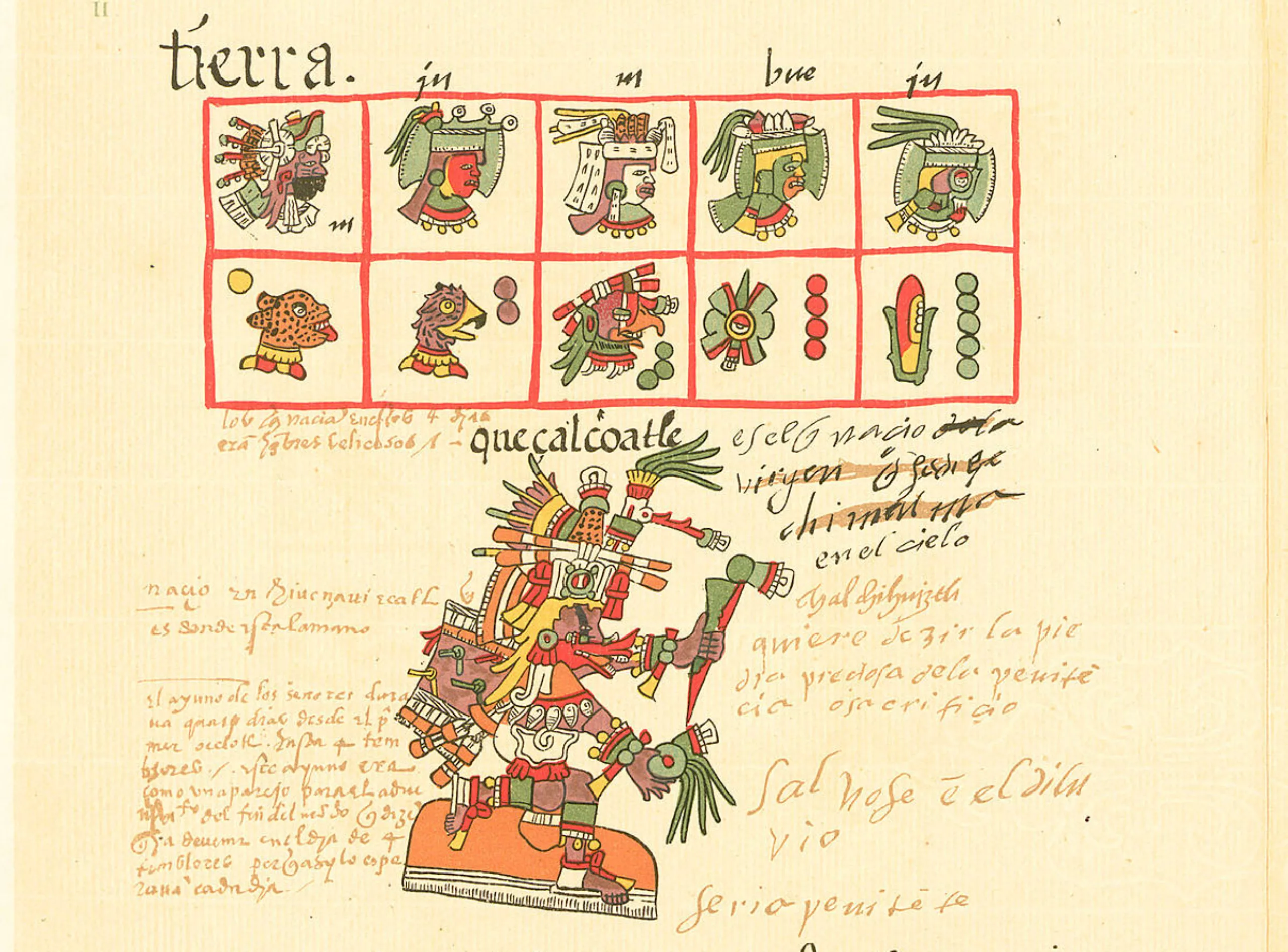
We also think of the Chinese ideograms with their refined forms, the pre-Columbian pictograms rich in details like buckets, just like the hieroglyphs (from the Greek hieros, sacred, and gluphein, to engrave: writing of the Gods). These last two forms of writing, ancestors of the icons of which we speak below, combine pictograms (signs images) and phonograms (signs sounds) associating themselves by rebus in ideograms (signs idea) readable like poems of text and image.
Other forms of pictographic writing are more abstract or figurative, but conceptual or even sacred or codified and therefore elusive without the appropriate context of thought, such as Hittite or Cretan writing, runes, or Rongo-Rongo, which originated in extinct societies. In order to be understood, pictograms are either agreed upon with images that speak to the greatest number of people, or they are based on specific cultural codes, which may disappear with time.
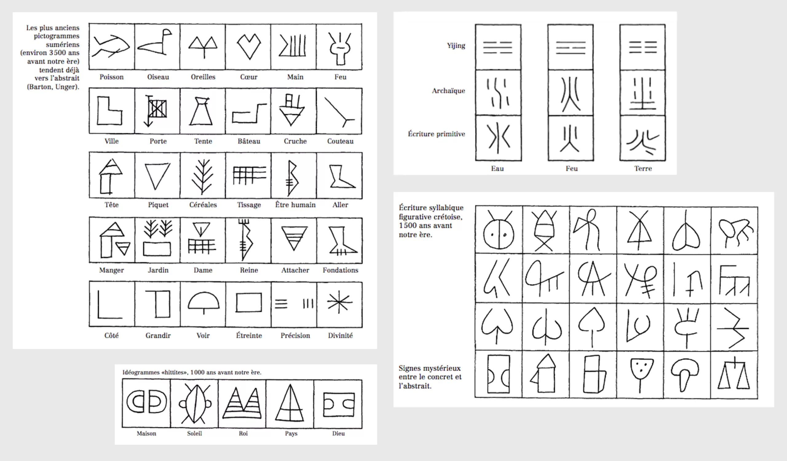
Writings from the man and his signs, A. Frutiger
As soft writing supports (clay, papyrus) and fluid writing tools (the stylus or the brush) were developed, the gesture was freed from the constraints which froze it (the stone and the chisel) allowing to write faster and to find a handwritten fluidity… making writing evolve towards increasingly abstract signs. The drawing-writings thus evolve into syllables, then around 1200 BC the first alphabets appear among the Phoenicians, “prototypes of all alphabetic writings” as A. Frutiger writes. The character is then no longer a pictorial symbol but becomes a phonetic unit: the letter, an abstract sign. It is only much later, in the 20th century, that is to say more than 3000 years later, that we will return to descriptive figurative signs to communicate in everyday life. But this does not mean that pictograms cease to exist!
Indeed, pictographic symbols continue to be used not as writing, but to mark belonging or origin. The idea of branding (the fact of affixing a mark, brand, and thus communicating through a visual sign recognizable by all) already existed in ancient Egypt or among the Romans to mark cattle, before spreading to America through the intermediary of the Hispanic breeders of the 16th century, the future cowboys.
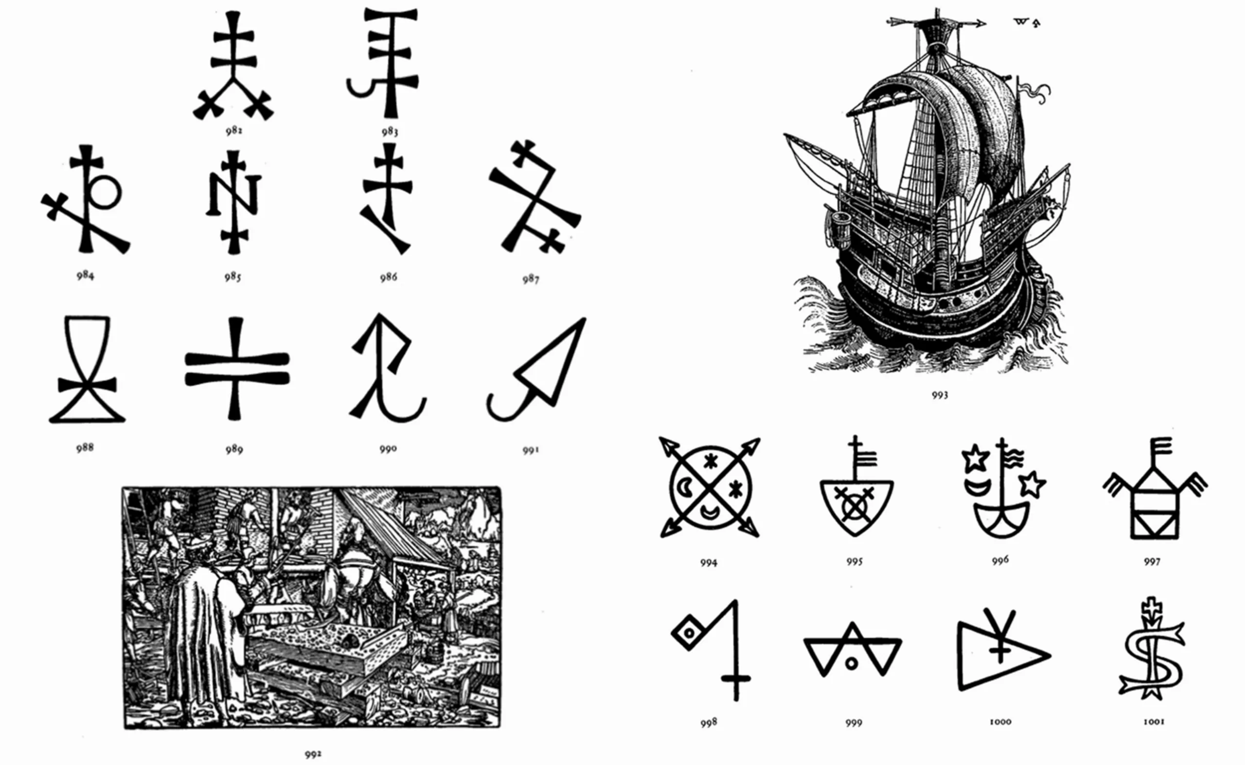
The word “brand“, comes from the proto-Germanic “brandaz” which means to burn, by hot marking. The craftsmen later put their “signature” (stylized initials) on what they own or make, inspired by cuneiform writing, hieroglyphs and other pictographic writings. On the military side, coats of arms and heraldic blazons also allow to visually communicate the identity of the troops, often by a sign of belonging recalling a territory. Since the beginning of the 20th century and still today, logotypes are the heirs of these monograms and pictograms, marking the visual identity of companies.
A pictorial language for all
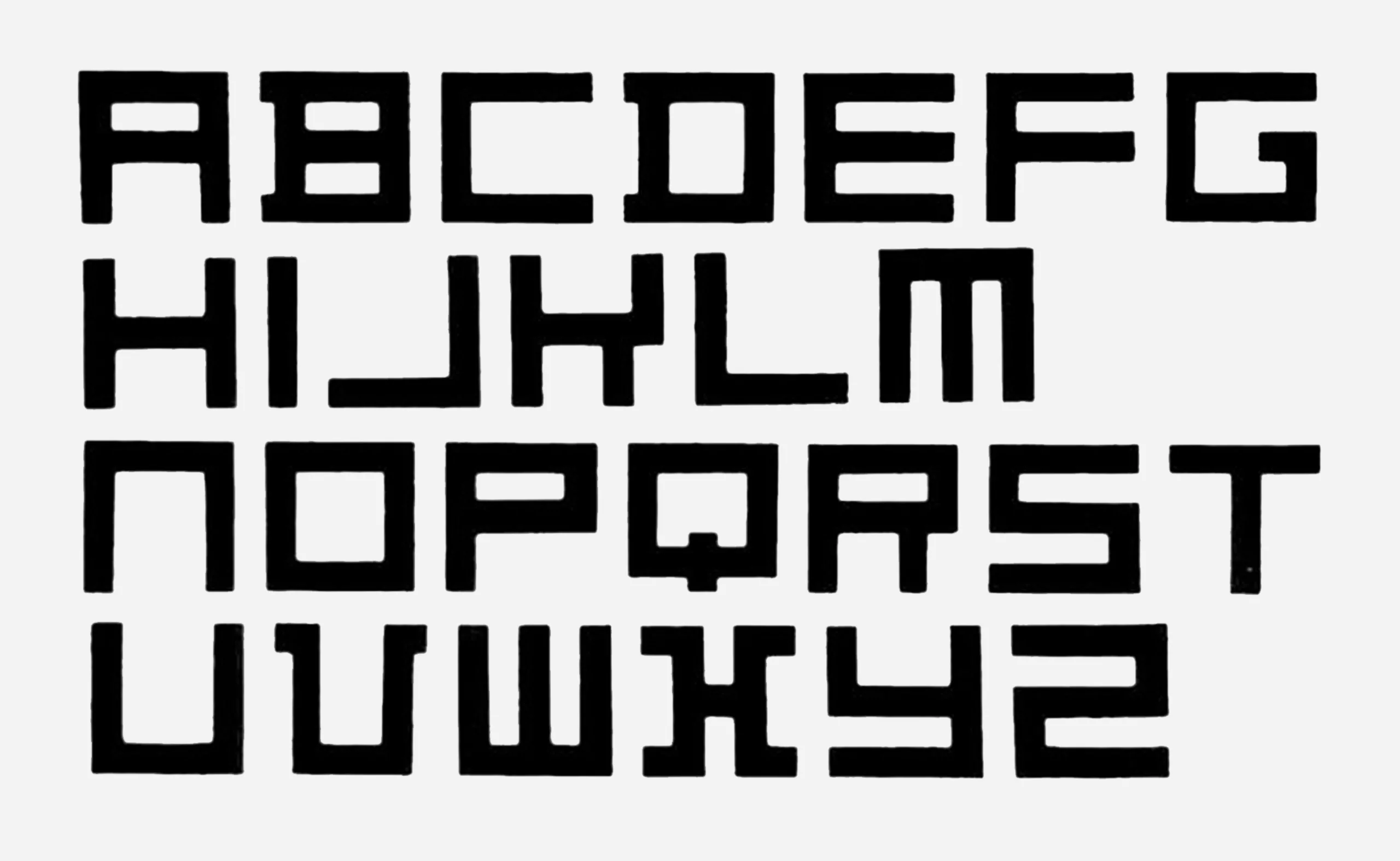
The real return of the visual and universal language is done with the modernist artistic movements, around the 1920s. At that time, they tried to invent a form of universal language through geometry and mathematics, which perfectly translated the rational thought of humans. For example, universal geometric alphabets were created at the Bauhaus school, injecting symbols into the abstract letter:
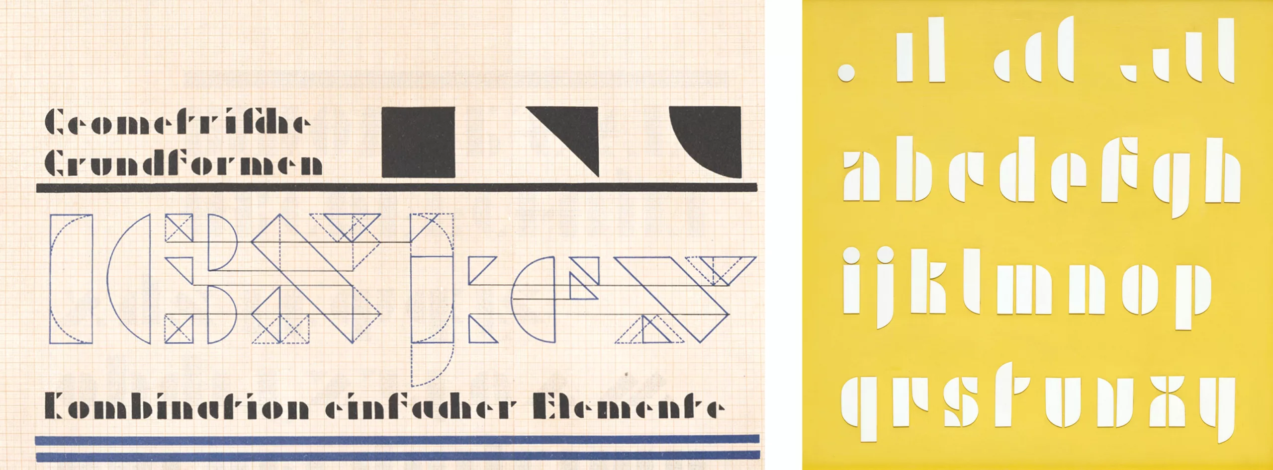
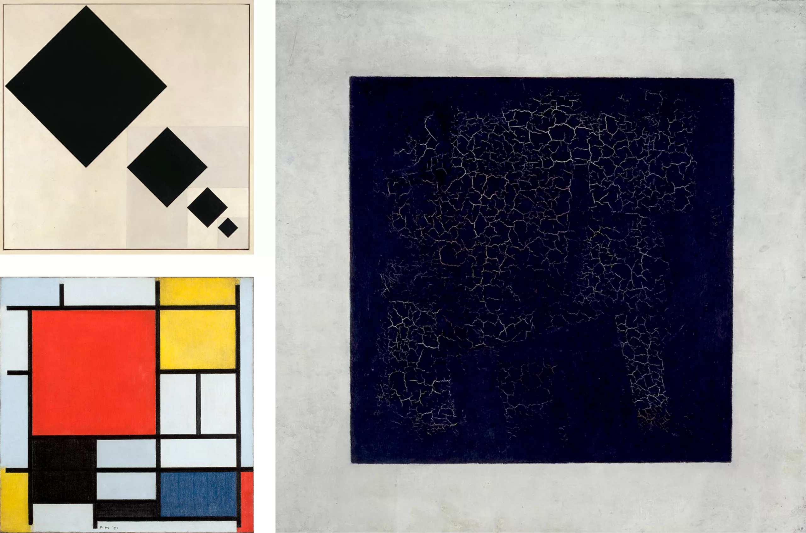
Some artists like the suprematist Kasimir Malevitch or the founders of the Stijl movement Theo Van Doesburg and Piet Mondrian, in search of the immaterial, of an absolute (sometimes spiritual) common to the whole of humanity, use to express this universal feeling the square, the pure geometrical forms and the primary colors. The use of geometry as a language, although limited and unilateral, can be considered as universal and pictorial in the sense that it touches on existential questions common to humanity and obeys rules, a mathematical “syntax”. The use of geometry also makes it possible to normalize the forms, to standardize them in a specific format for example, to represent the archetype of the desired thing.
C’est ce que feront Otto Neurath et Gerd Arntz avec l’Isotype.
Isotype, statistics by image
In 1952, Germany and Austria were going through a post-war crisis. In a concern for the emancipation of the workers, one wishes to democratize knowledge by making information accessible to all social classes, especially the lowest. This is how the Isotype was born, (first “method of visual statistics of Vienna”) around 1925, “a writing of hieroglyphs understandable by all and being able to be used as universal signs” as underlines Otto Neurath, sociologist and Viennese economist inventor of the concept. From the Greek “form, equal” (common shared characteristic), the Isotype is an infographic solution, a “statistics by image” that explains, simplifies and represents causes and phenomena through repeated symbols of fixed proportions, pictograms, through statistical diagrams. In 1930 Otto Neurath, his future wife Marie and the artist Gerd Arntz analyzed, simplified and drew -respectively- an Atlas (Atlas Gesellschaft und Witschaft) with 100 illustrations to illustrate and make accessible to the greatest number of people world statistics: population, countries and continents, power influences, various world exchanges and political or military relations, urban growth and workers conditions… This pictographic and statistical language is exported to the USSR and the United States, for which Gerd Arntz draws hundreds of visuals.

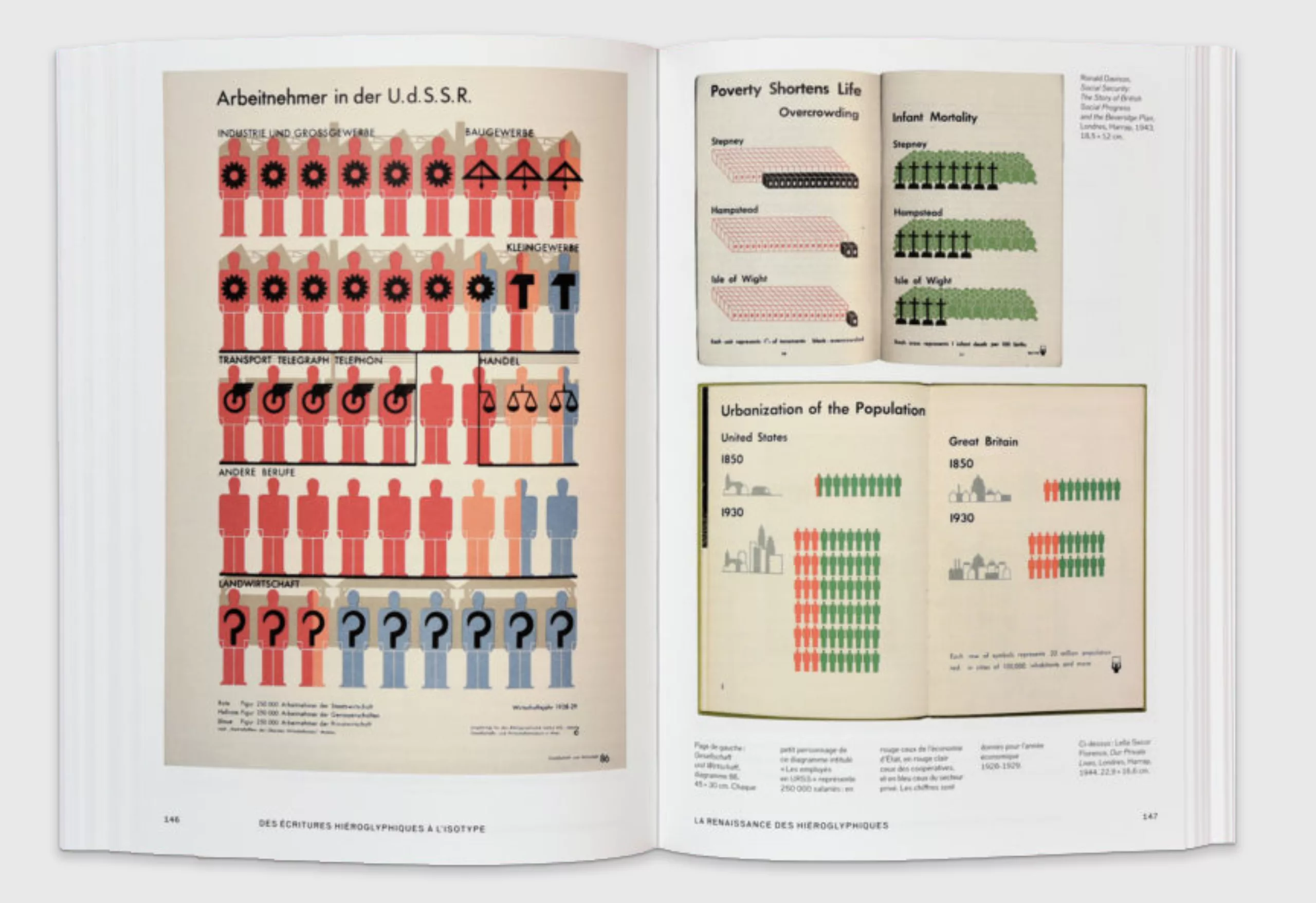
These simple pictograms will inspire road signs and means of transportation throughout the world. This system is still used today to communicate simply and effectively to the greatest number of people. This is the reason why the Olympic Games will also use pictograms in Japan since 1964, in order to communicate to an international public.
Emojis and icons, universal communication tools
With the advent of digital technology in the 1970s, icons invaded screens as a new digital and pictorial language, created in a grid. Pictograms or symbols in pixels representing an action or an object, icons allow to humanize the machine, and to create a sensitive link with the user. Their visuals simplify actions by creating a language through the association of ideas, through ideograms that represent a metaphor of the action, like road signs. For example, the trash can icon symbolizes deleting a file, the bomb symbolizes an error, or the watch face symbolizes waiting.
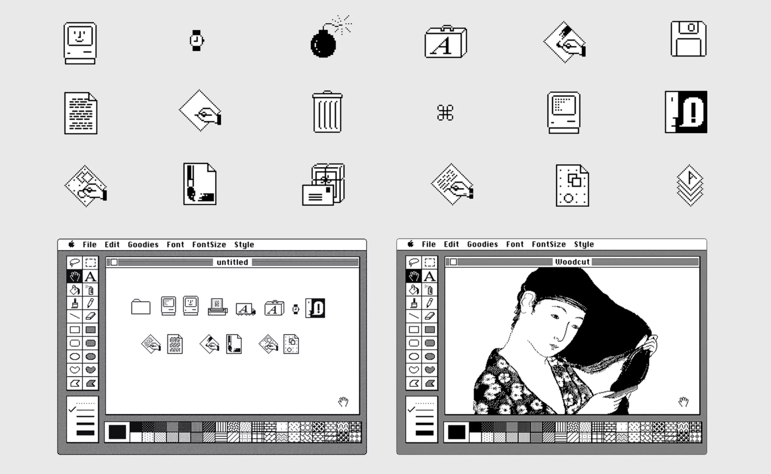
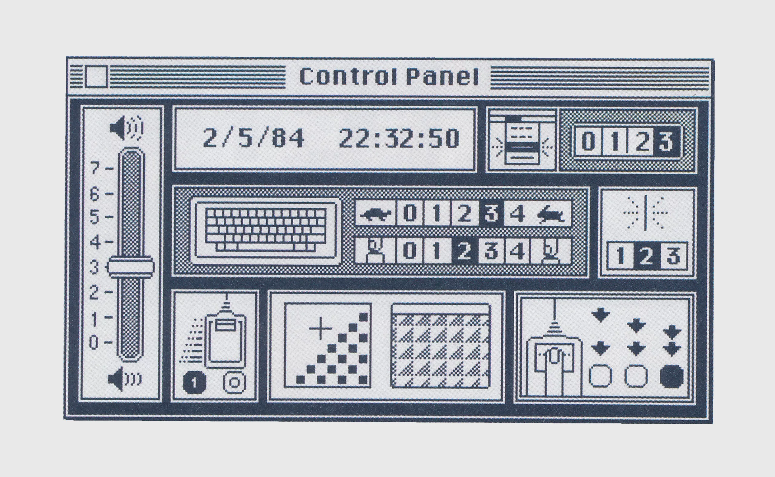
It is the graphic designer Susan Kare who designed in the 80s these icons that we all know, for Steve Jobs, on Macintosh. She invented, for the sake of “economy of expression”, the icons of the Paint software such as the paint pot or the brush, which will later be used by Adobe, as well as the first alphabet of emojis: the Caïro.
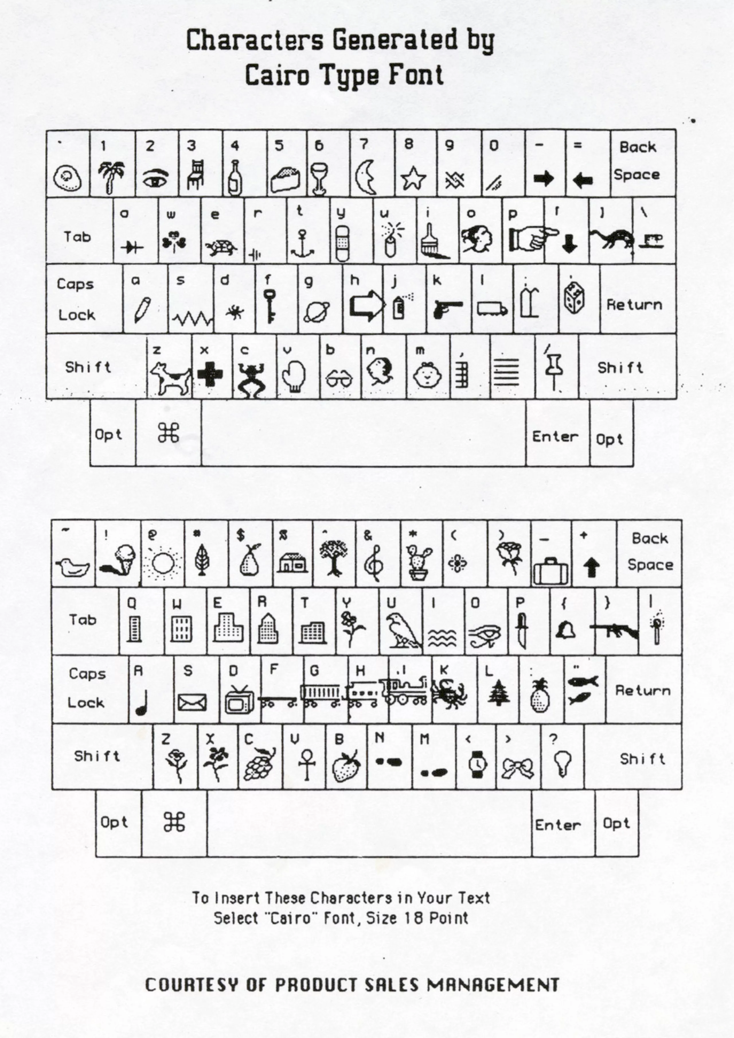
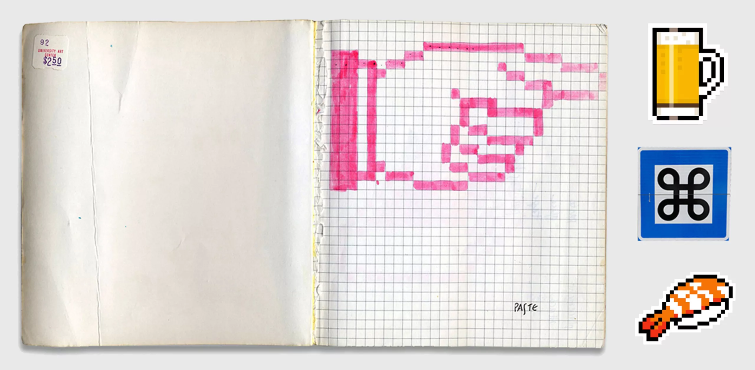
They will become icons (in the broadest sense of the theme) in the digital world, repeated in video games (the Bomb in Mario Kart or the hearts of life level) and even off-screen. To develop these icons, Susan says she was inspired by hieroglyphics, monumental statues by sculptor Claes Oldenburg, or an encyclopedia of symbols. The pictogram of the command , for example, is taken from a Swedish glyph used to represent heritage (below, the blue panel), thus symbolizing by association of ideas the castle, a place of power where one commands.
The term “icon”, used since the 70’s for the digital, is first from the portraits on wood used as a support of cult to deceased persons, then taken up in the religious art for this same function. The term is demystified and becomes synonymous with the worship of heroic profane personalities or stars from the nineteenth century (Mata Hari, Che Guevara, Marilyn Monroe …) before being taken up in the computer. Whether secular or religious, the icon serves as a symbolic prototype of the thing or person illustrated, it represents the visual idea of it. This idea is generally shared by the same cultural references, as it was the case for the pictographic writings of which we spoke above.
In the late 90s Japanese Shigetaka Kurita develops the first emojis for cell phones, inspired by hieroglyphics and manga symbols. The term emojis comes from the Japanese “e” 絵, image and “moji” 文字, character. They are accompanied by kaomojis, “kao” 顔, face and “moji” 文字, character, emoticons (such as the inevitable : ) invented in 1648 by the English poet Robert Herrick) composed with punctuation marks: ٩(◕‿◕)۶ (o˘◡˘o) \(★ω★)/ ╰(*’︶`*)╯
Since this invention and the creation of vectorized characters, which allow to create without the pixel grid, the emoji language has been considerably enriched as we said in our article on Unicode (digital standardization of scripts) and evolves with society. Today we find more inclusive emojis like pregnant men or prosthetic legs, and others that are no longer universal but specific to regions of the world like an orangutan, mate, a tuk-tuk, or a hand of Fatma. No longer used for information purposes, but in everyday conversations in which the speakers no longer see each other, emojis or pictograms can be used to underline an emotion by adding nuance to the text, or to convey ideas as was done with hieroglyphics, by inventing rebus song titles for example.
Throughout the centuries, and surely for a long time to come, humanity has communicated with images to express their thoughts. Because like these pictograms, Otto Neurath’s quote seems to be universal: “words divide, images unite”.


