apels_charte-graphique-agence-education-pour-le-sport

2021

Agency for Education through Sport
Visual identity

"The little morality that I know, I learned it on the soccer fields and the theater stages which will remain my true universities". 
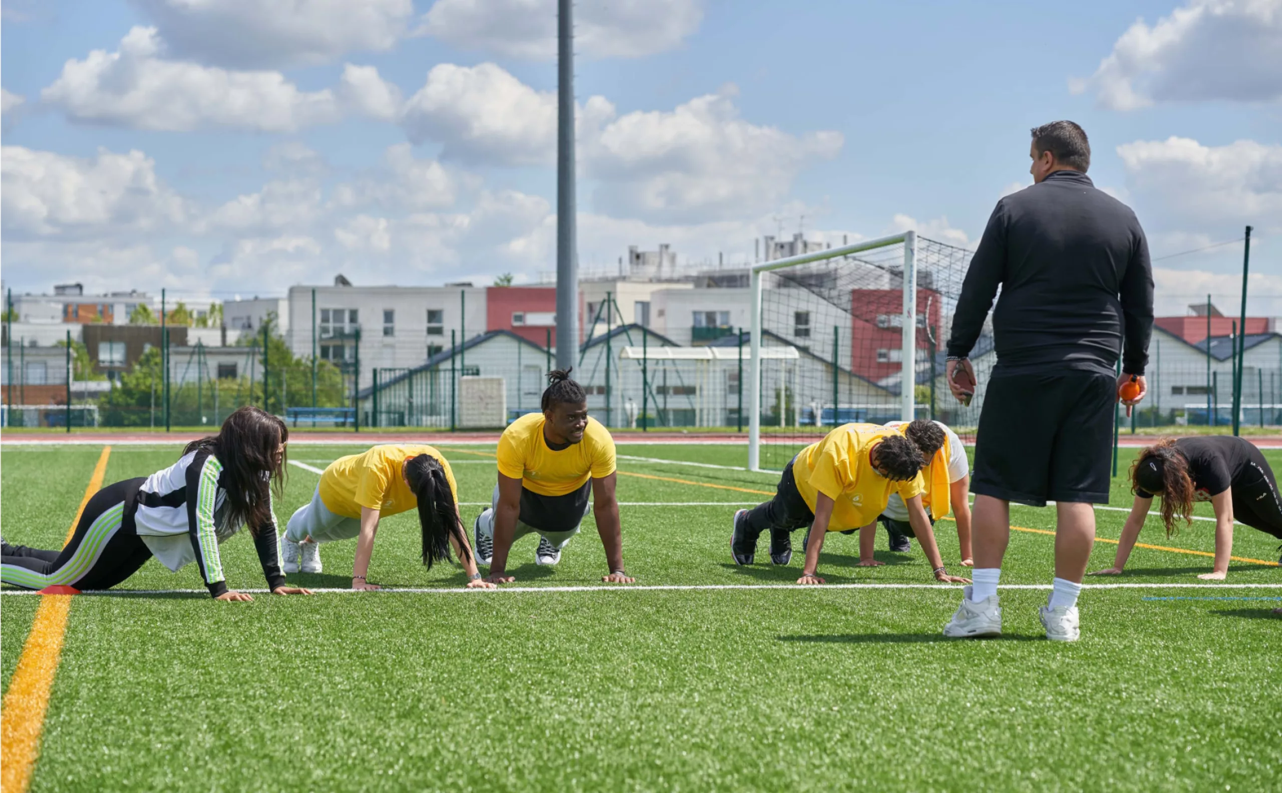
Albert Camus said it already, when in 1929 he joined the Racing Universitaire Algérois (RUA). If he never became a goalkeeper, Camus will remain all his life passionate about this sport and will consider soccer as a real school of life.

This vision is not limited to the practice of soccer. Sport in its entirety is recognized as a factor of social integration, a source of commitment and personal fulfillment. If work in a company requires rigor and team spirit, the athlete is the ideal candidate. A place of diversity marked by the collective, the taste for courage and effort... The sports field proves to be an unparalleled place of learning.

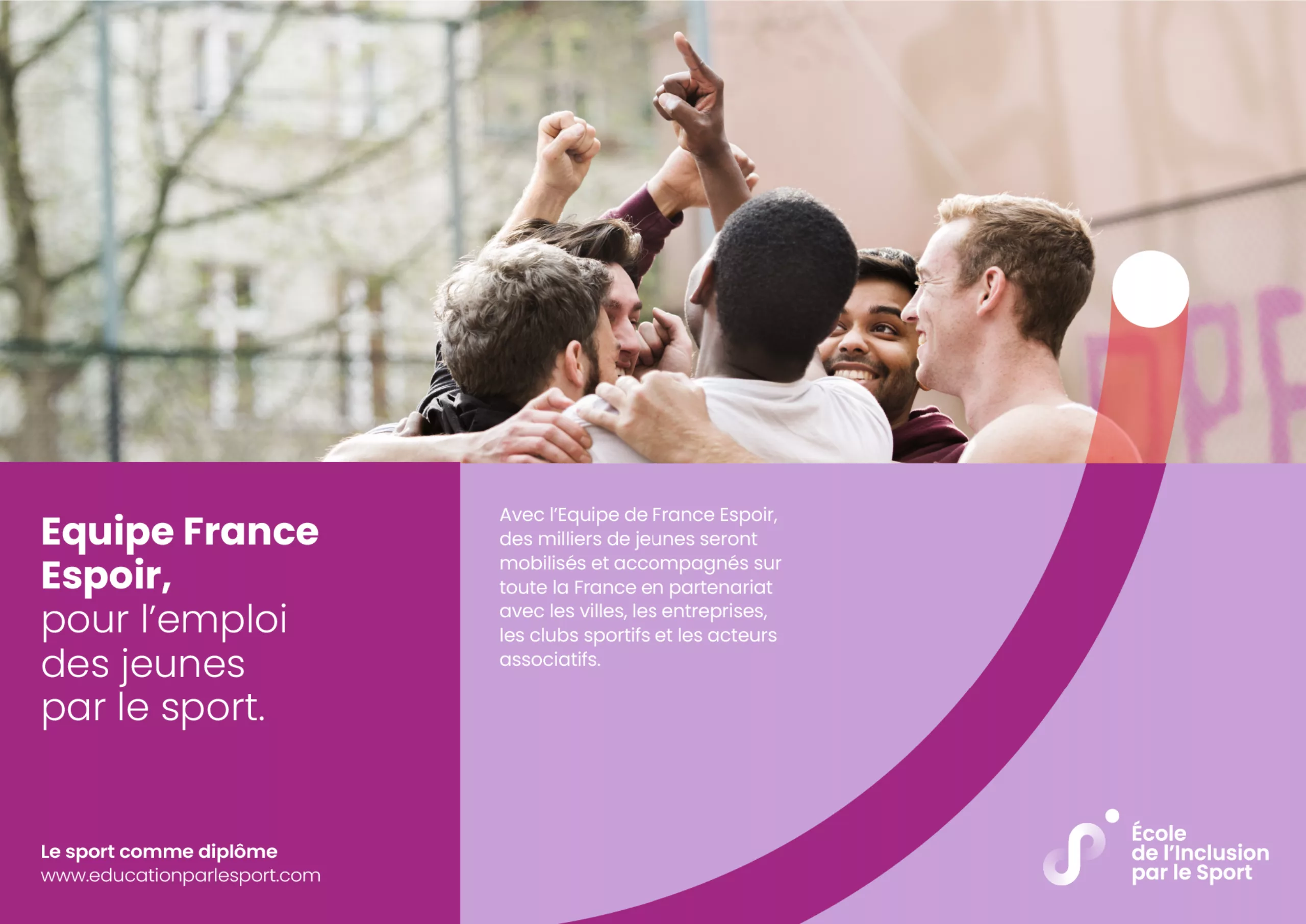
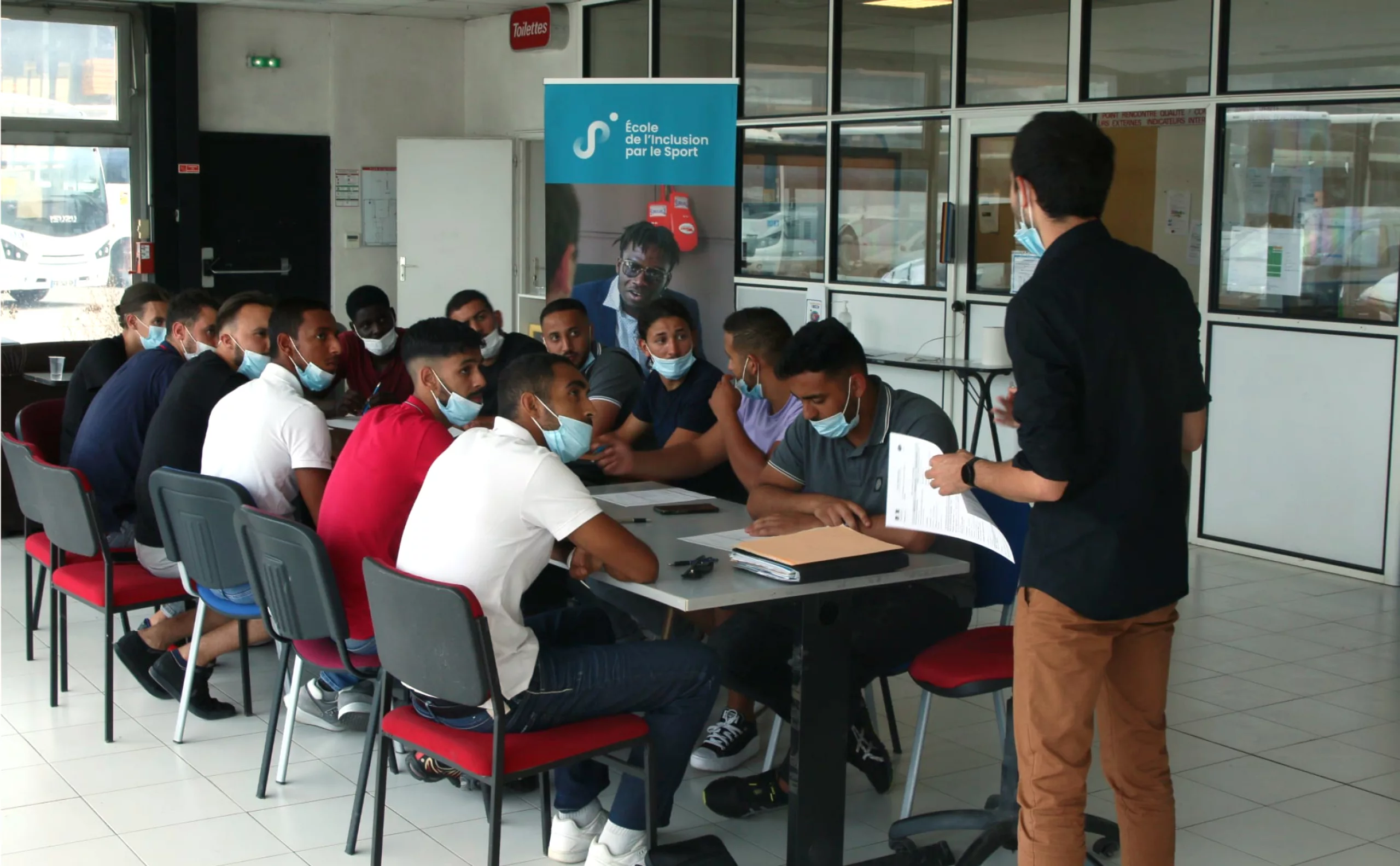
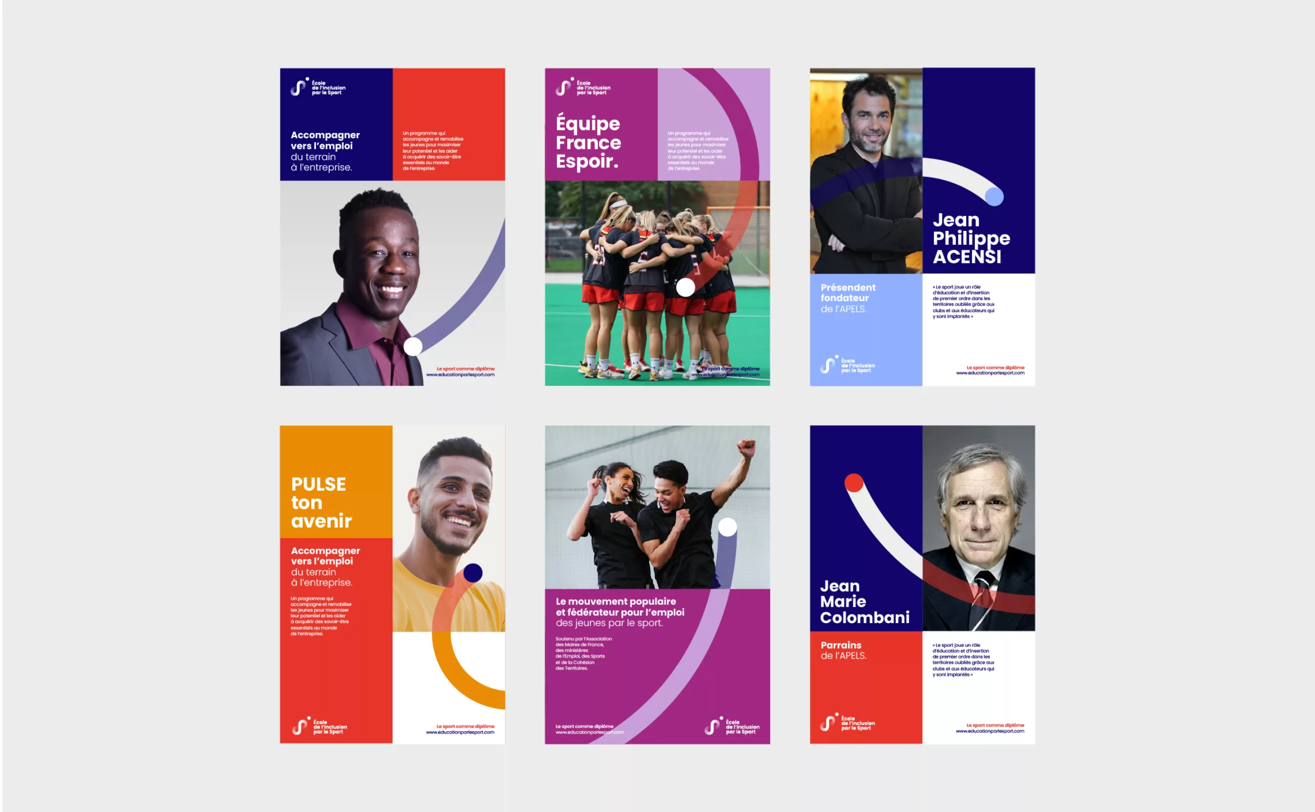
Convinced that sport plays a major role in the education and integration of young people in society, Jean-Philippe Acensi and Jean-Claude Perrin founded "Fais-nous rêver" ("Make us dream") in 1997. An associative movement working in the detection of the best initiatives in the field of education and integration through sport within sports clubs.

From this movement was born the Agency for Education through Sport, a national organization for inclusion through sport for young people with few or no qualifications. It allows young talents from forgotten territories to be recognized for their skills and "social skill", to take their future in hand to access employment.

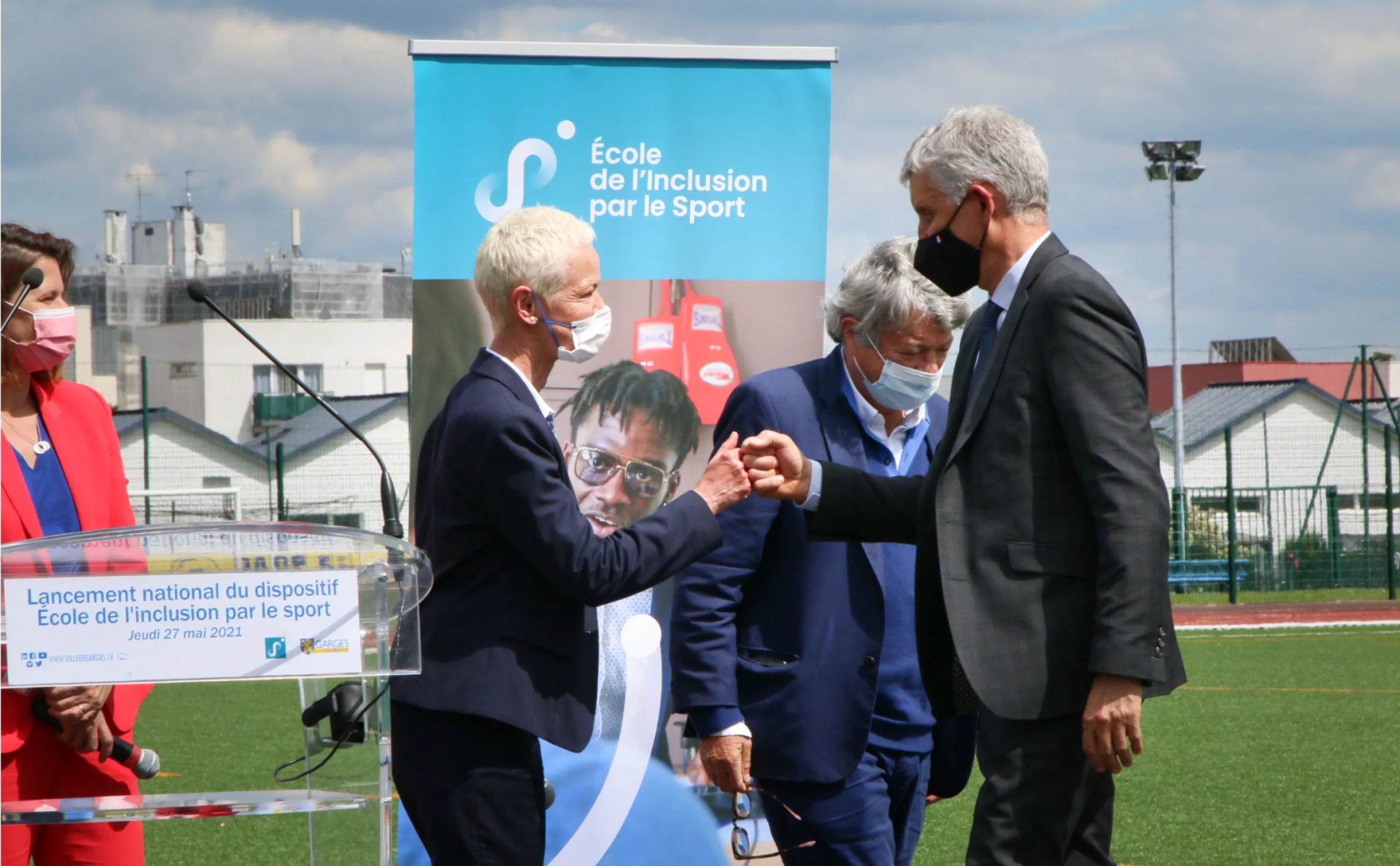
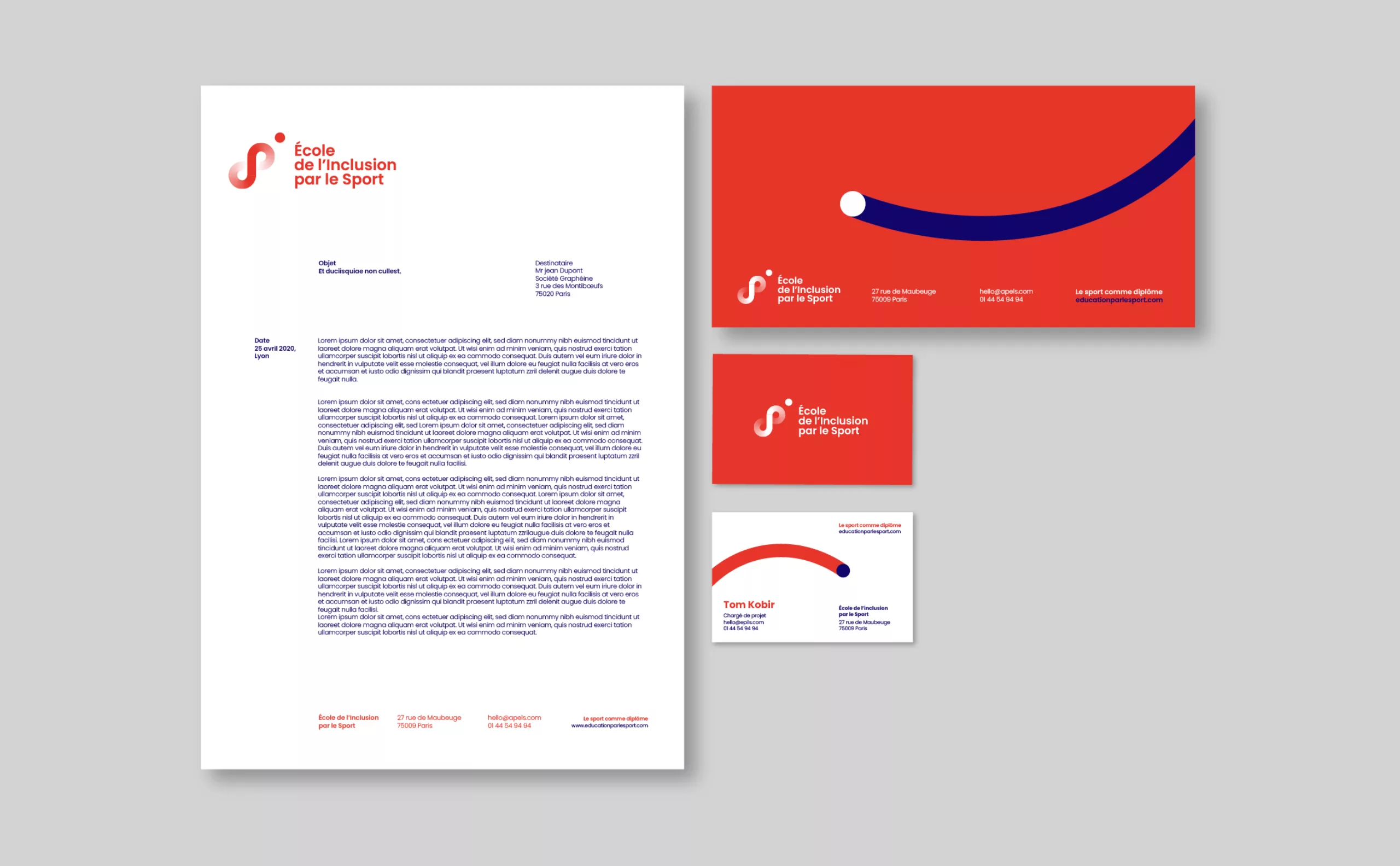
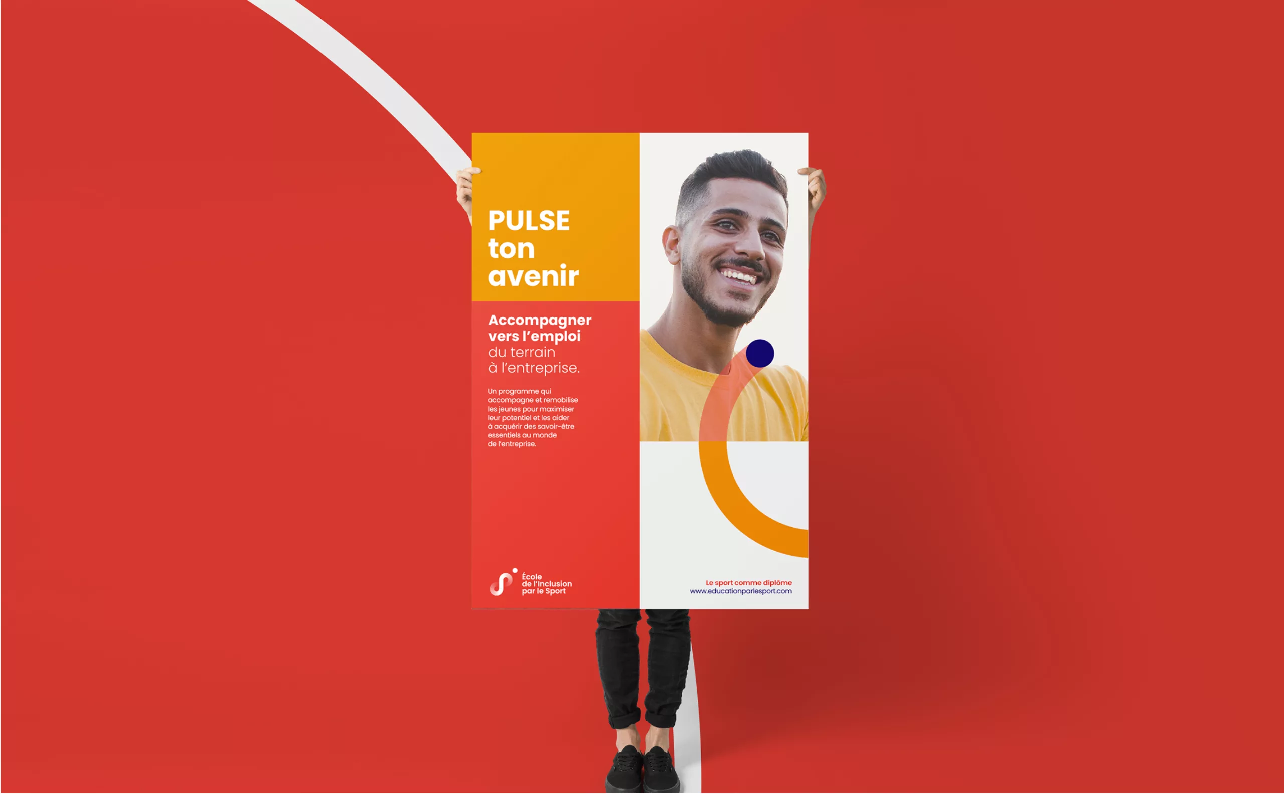
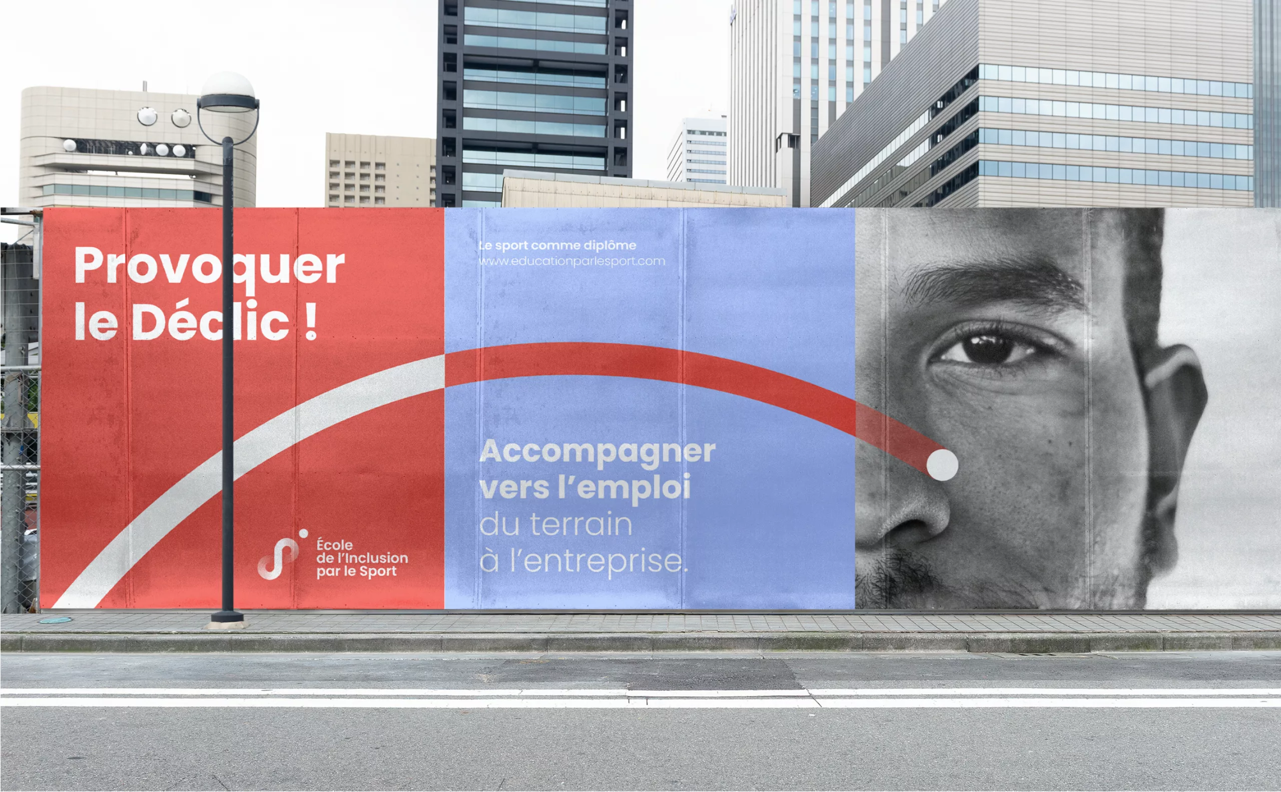
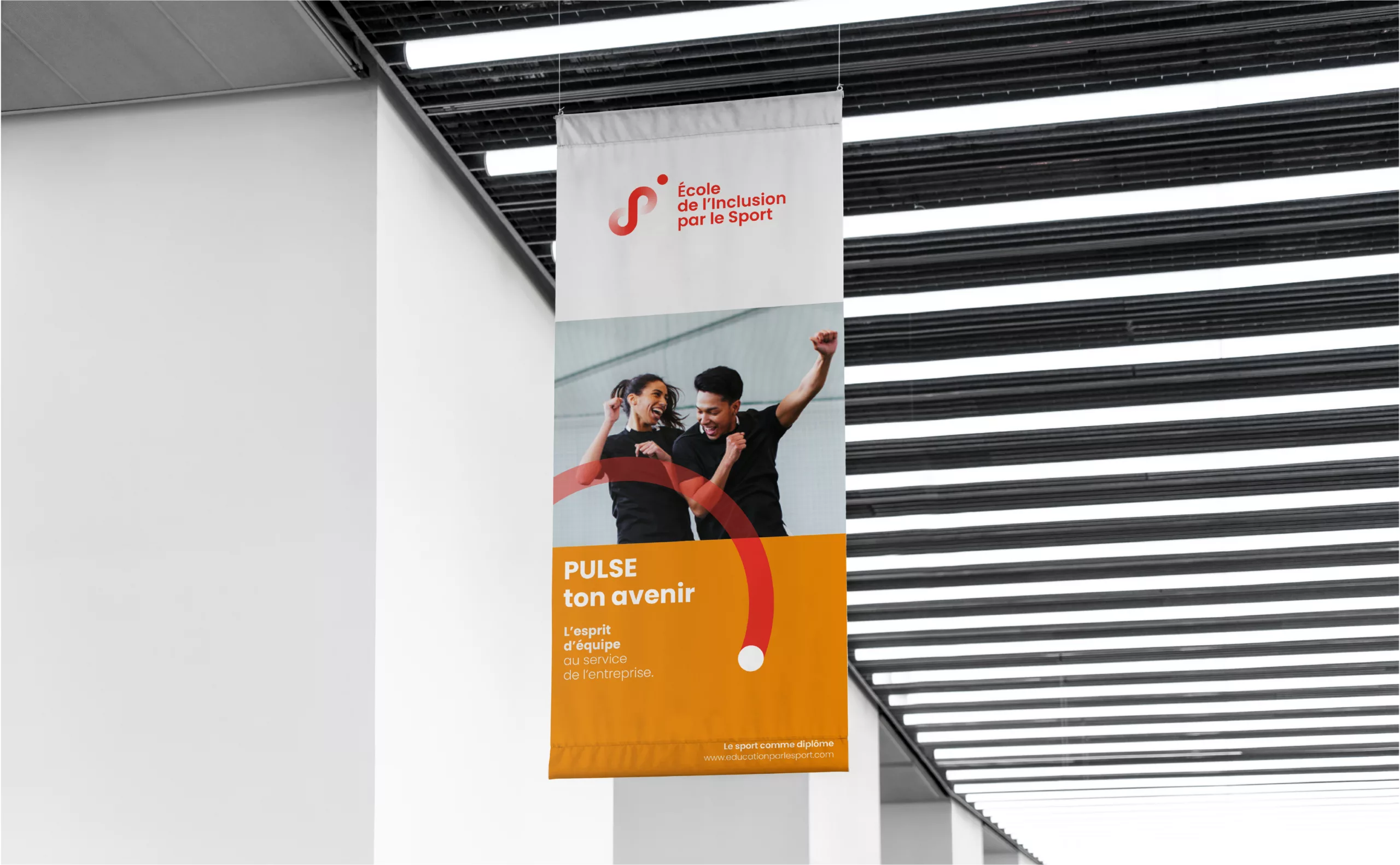
In 2020, APELS is embarking on the creation of the School of Inclusion through Sport. This is an opportunity to launch a coherent brand architecture project, in line with this desire to grow and act in favor of young people.

How to highlight the role of APELS in supporting the employment of young athletes? 

A road to working life through sport

The idea was to create a sign that would mark this desire to accompany the youth from the sports field to working life. Here, the young person takes flight towards the company, in a logic of cycle and meeting. The line starts its race and seems to never end it, in constant movement, forming an infinite sign testifying to this daily commitment.

Evocative of a silhouette in full race, the young person is placed in the center of the subject in order to evoke a course adapted to each one. The point comes in this logic to mark the accomplishment of the young person in his journey towards employment. It is both the starting point and the point of arrival.

apels_logotypes-structure-de-marque-fr
apels_Logotype-identite-couleurs-agence-education-pour-le-sport

A sign, three colors

Since APELS was the originator of the School and Training Center project, it was essential to create a unique sign, allowing for immediate recognition of the organization's actions. The color becomes a distinctive element for each of the brands created. The blue, institutional (but not less energetic), represents the Agency for Education through Sport. Combined with orange, it conveys the sporty, collective and stimulating values of the School for Inclusion through Sport. As for the Training Center, turquoise reflects a more thoughtful, mature sports energy, correlated with the idea of training.

A modular system

In a logic of accompaniment and a unique journey, the visual universe lets the line from the sign draw its own path. The dot wanders, takes speed, interacts with the text ... It is witness and spokesman for the actions conducted by the School.

The objective was to find a visual trick to deal with this singularity of the path and to adapt to all uses (in terms of format in particular). The layout grid thus respects a simple principle: rectangles fit together to accommodate the title, text and image and offer a "responsive" operation on all media.

apels_baseline-le-sport-comme-diplome
apels_mockup-affiche
apels_affiche-city-banner
apels_reseaux-sociaux-facebook
apels_kakemono-ecole-inclusion-par-le-sport
apels_presentation-power-point-identite-visuelle
_apels_visual-identity-color-tee-shirt

Share this project:
Project expertise:
Logo creation, visual identity and graphic guidelines.
Type of client:
Communication agency for associations, NGOs and SSE (Social and Solidarity Economy). The agency is specialized in all subjects of general interest.

Related projects: