2021
Brest Bretagne Handball
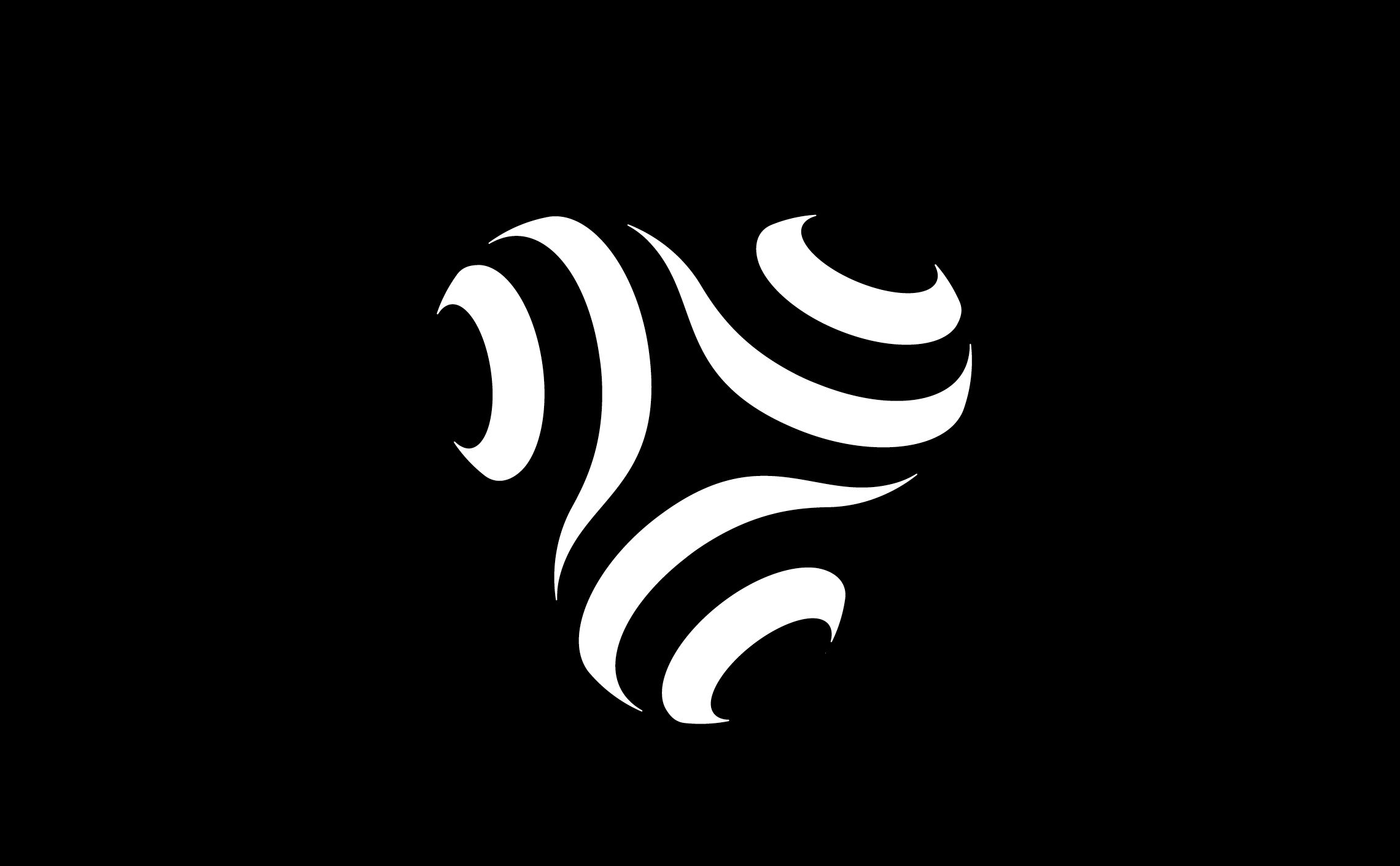
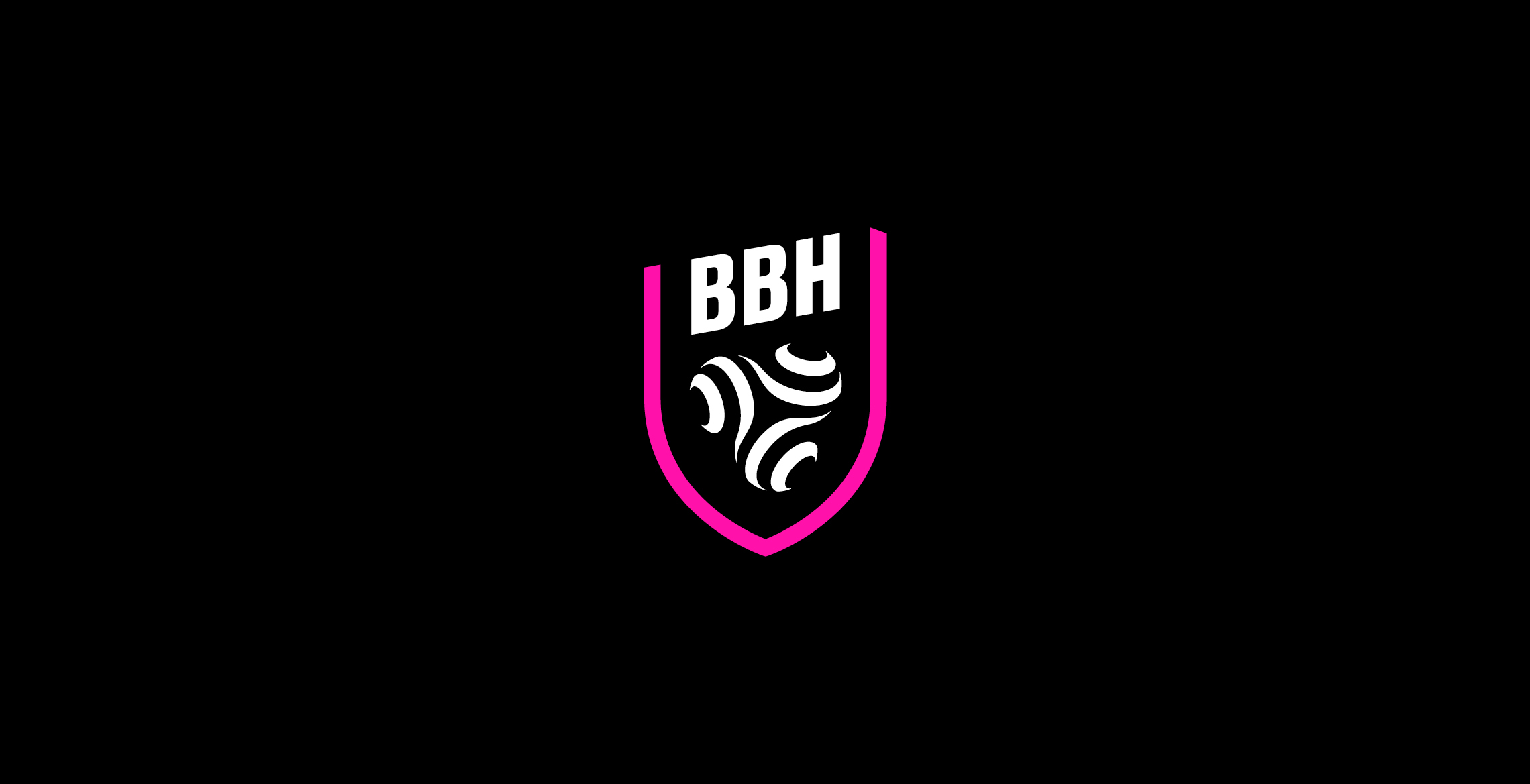
A triskel logo for the Rebels
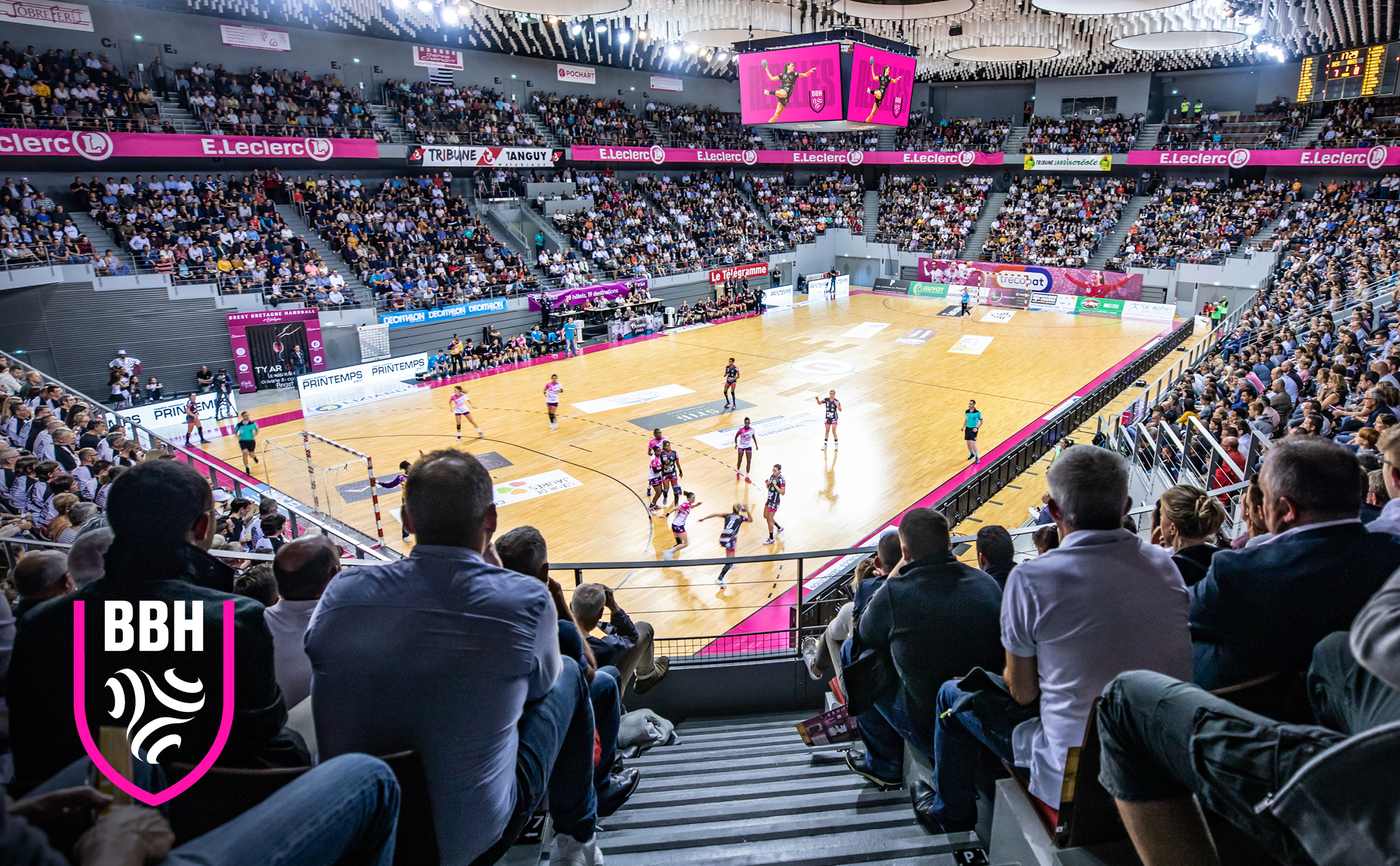
Brest Bretagne Handball (commonly abbreviated to BBH) is a women's handball club playing in the 1st League. The "Rebels" (the name of the team) have an impressive track record: three French cups, two French championships and recently a European Champions League final.
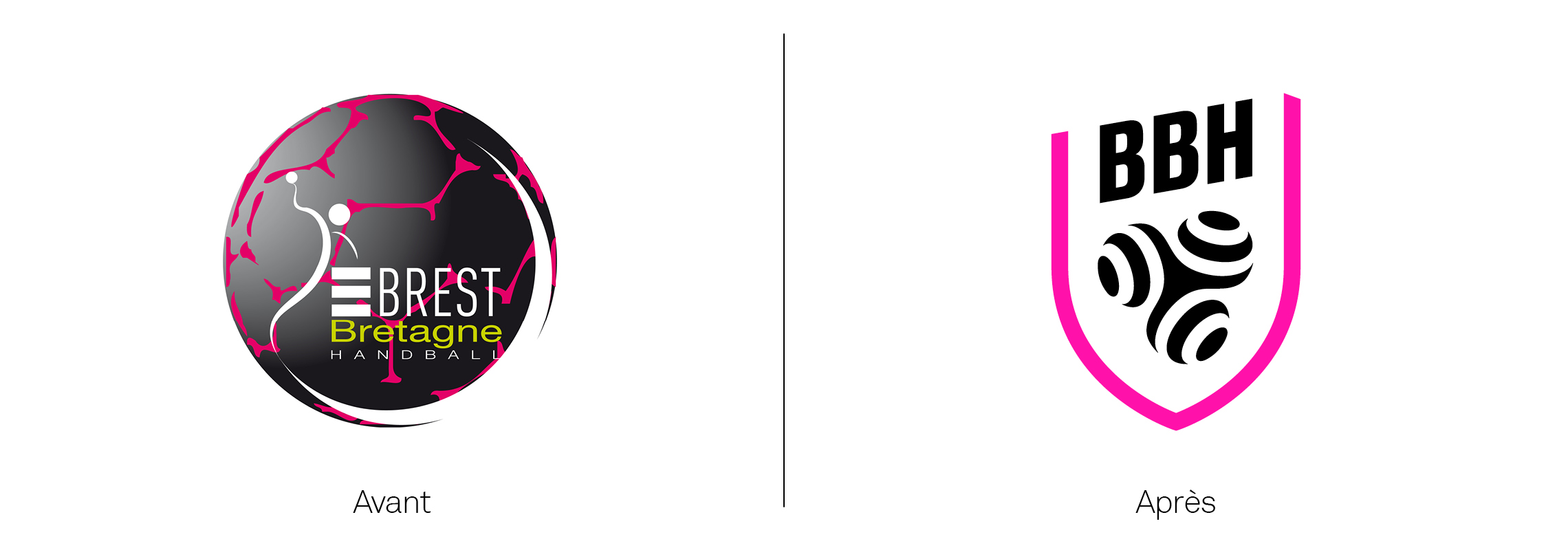
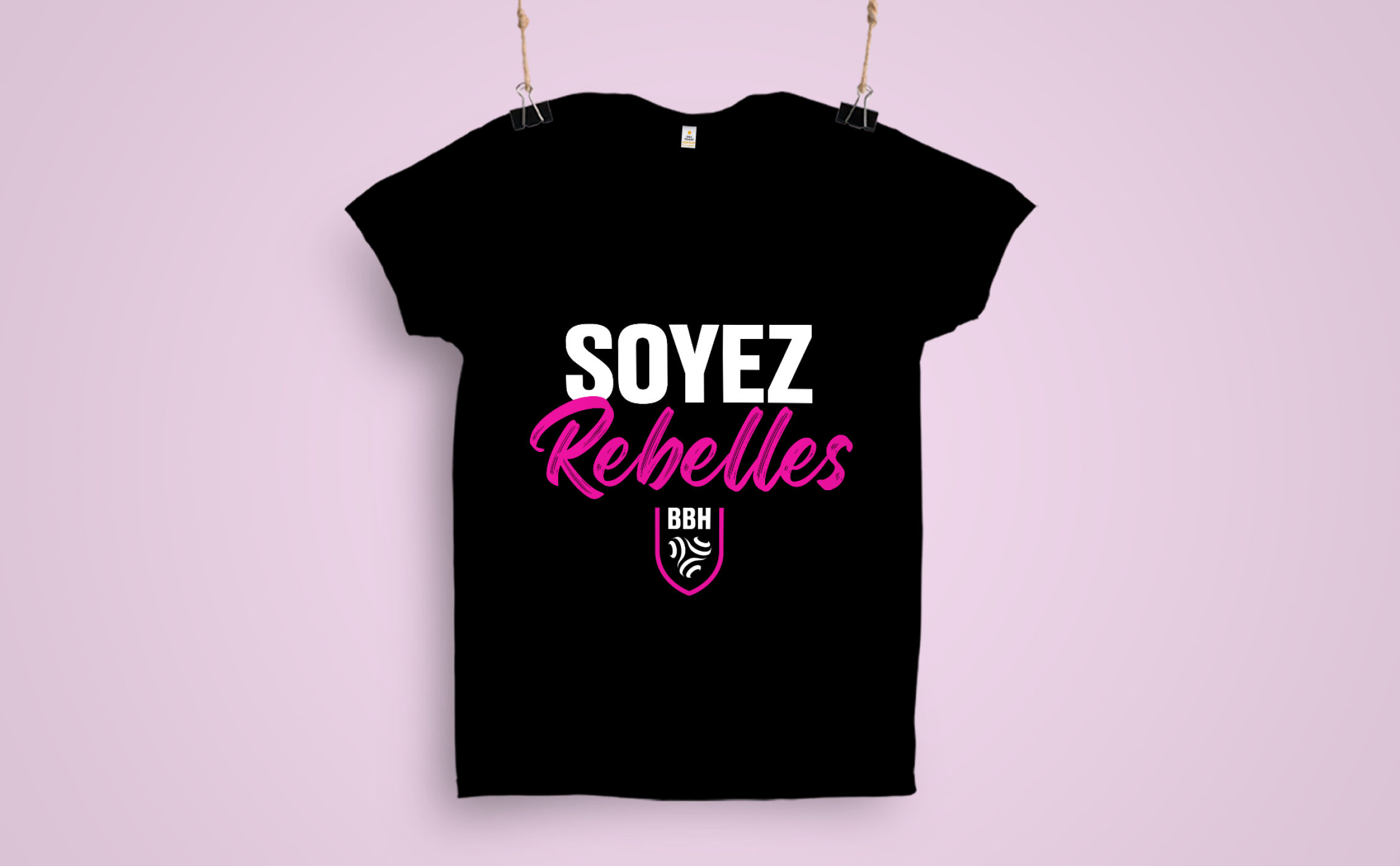
The 21-22 season will mark the 10th year of the club's existence, an opportunity for the club to completely rethink its brand identity. The old logo represented a ball and a player in a figurative way. Its lack of legibility was becoming a problem. From the existing logo, we only kept the emblematic colours of the club: black and pink.
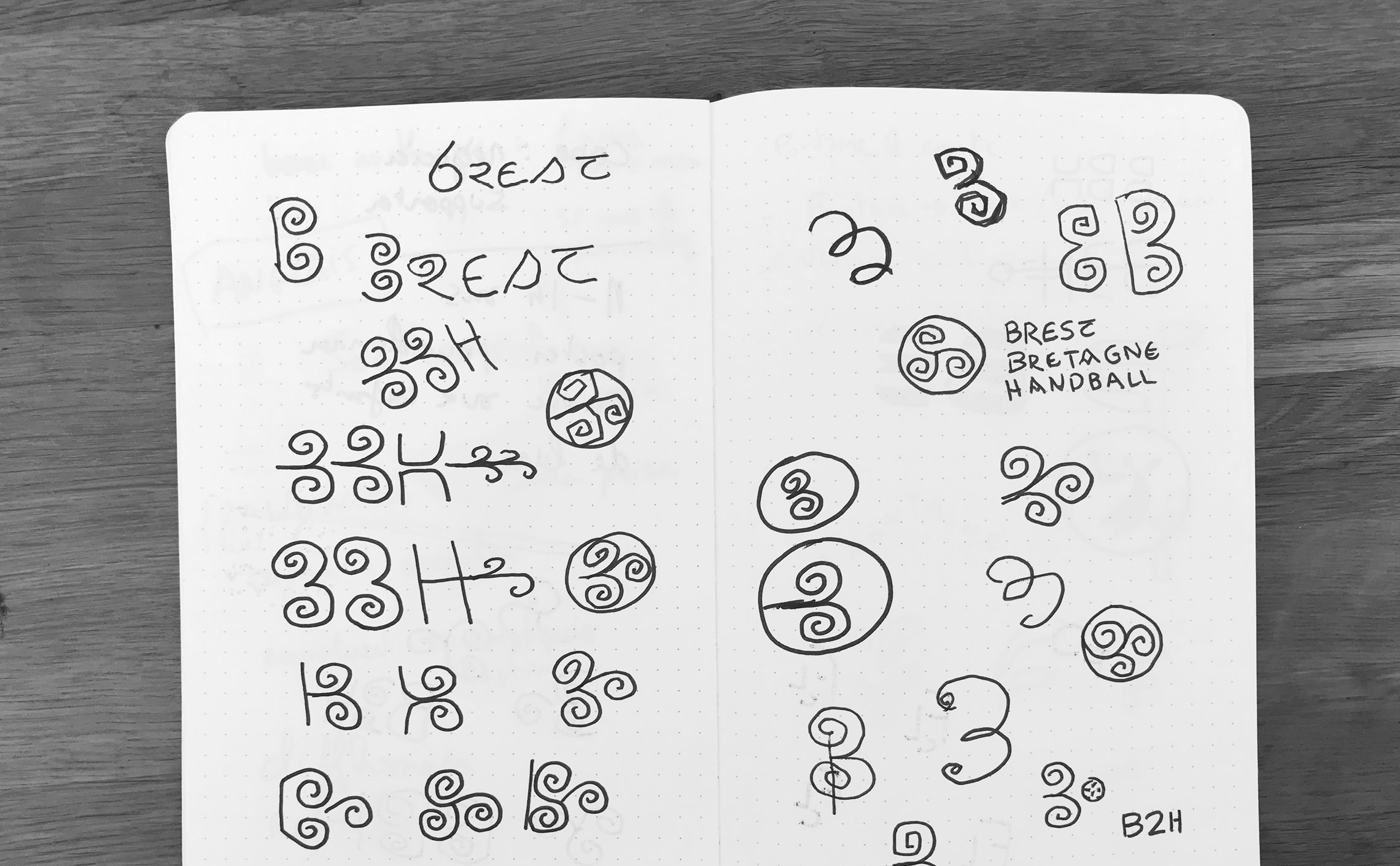
We quickly opted to capitalise on the BBH acronym. Indeed, this acronym has become widely accepted by the supporters. It was therefore necessary to associate a sign that could proudly carry the values and ambitions of the club: Passion, Sharing and Performance!
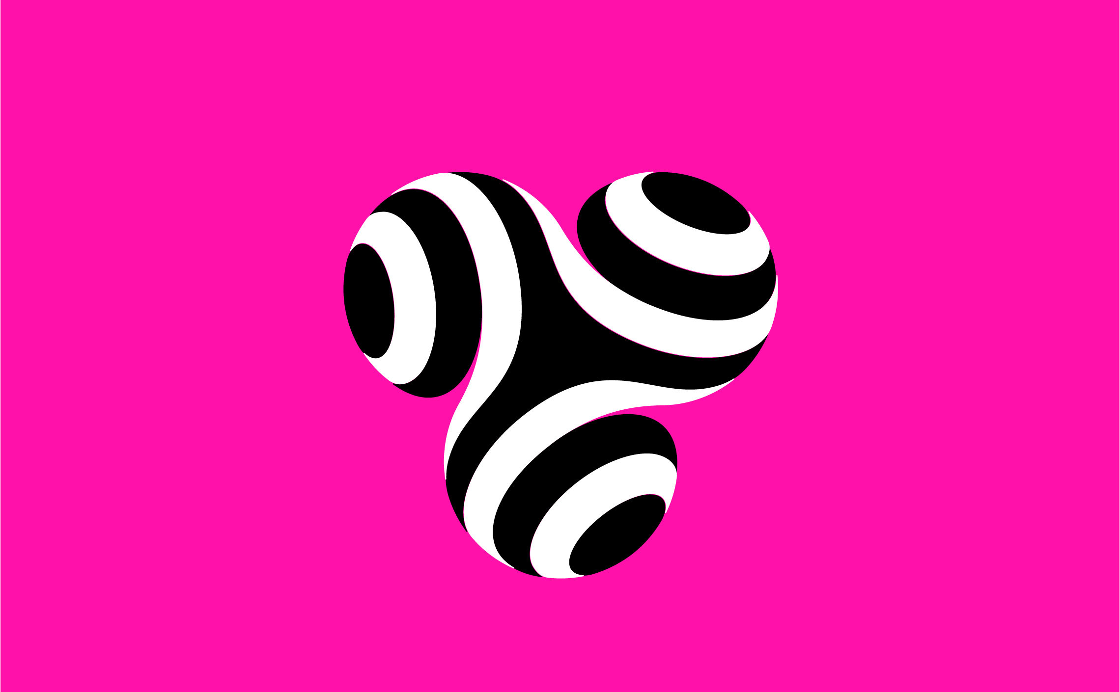
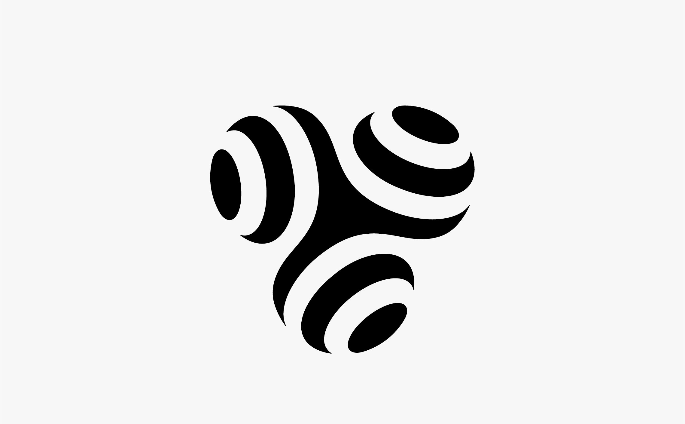
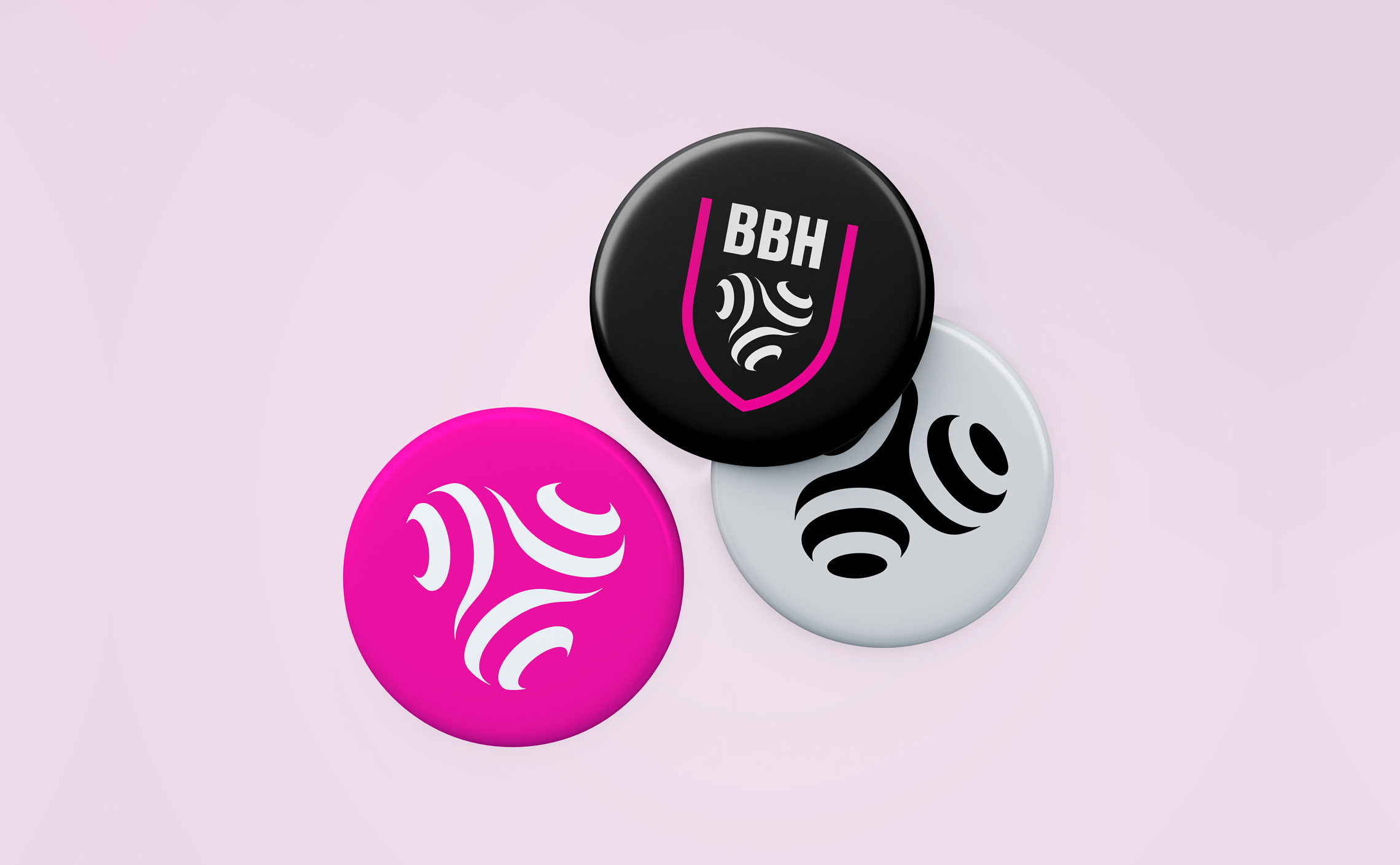
The Celtic symbol of the triskel appeared as an obvious choice. We will appreciate its perpetual movement, its collective synergies and its graphic strength. The 3 branches like the 3 letters of the club. With this triple promise to learn from the past, to focus on the present while looking to the future.
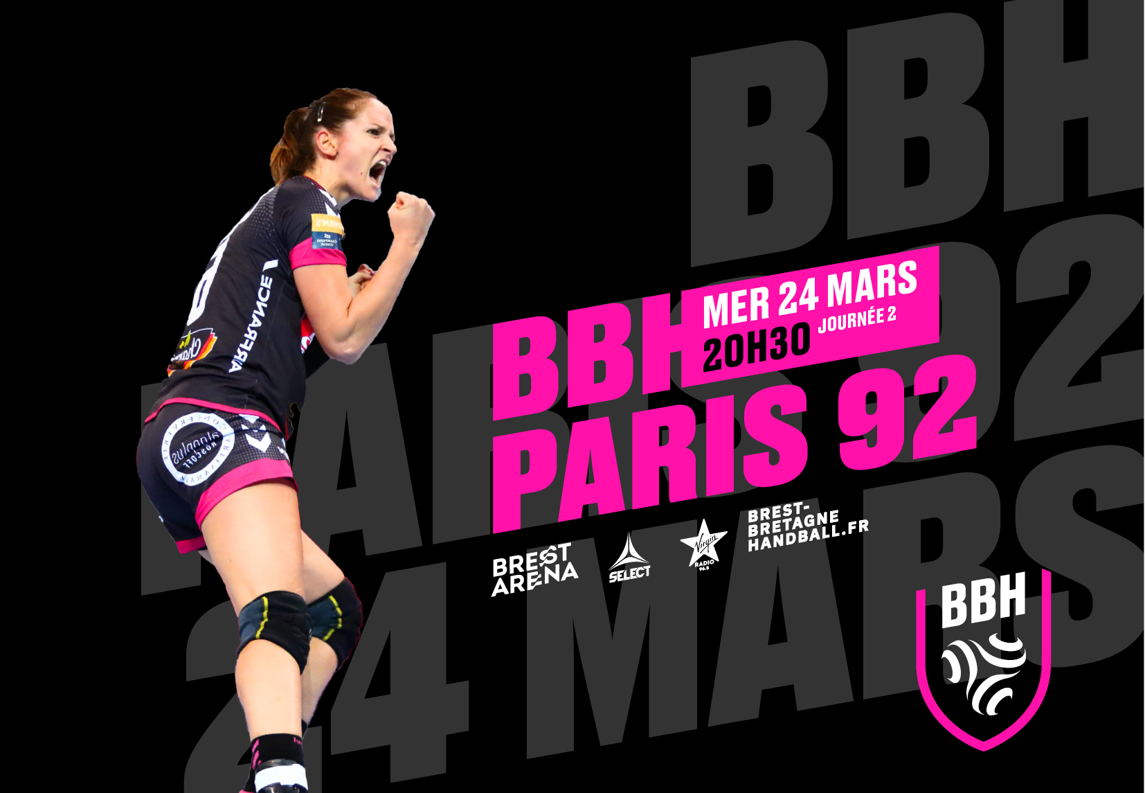
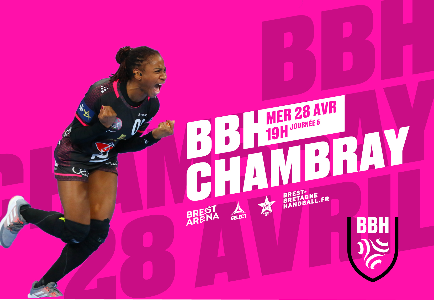
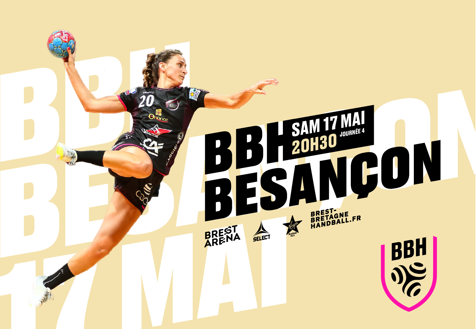
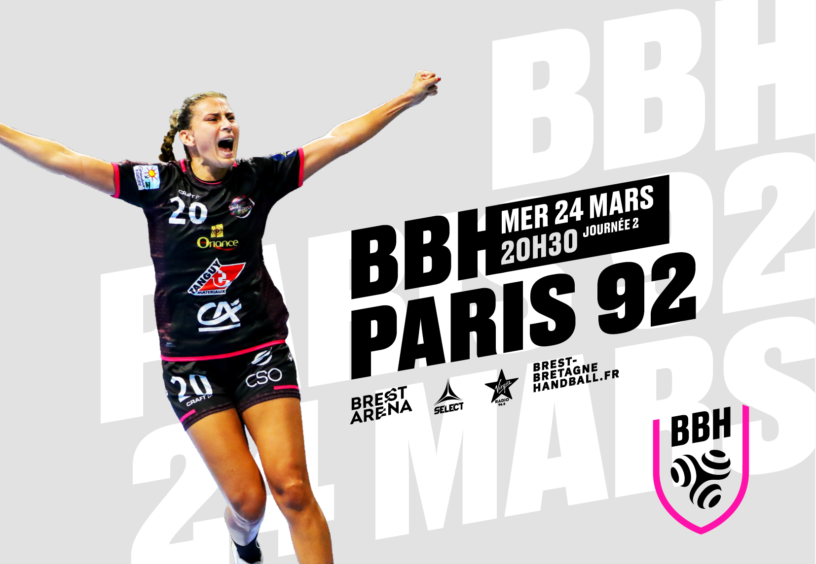
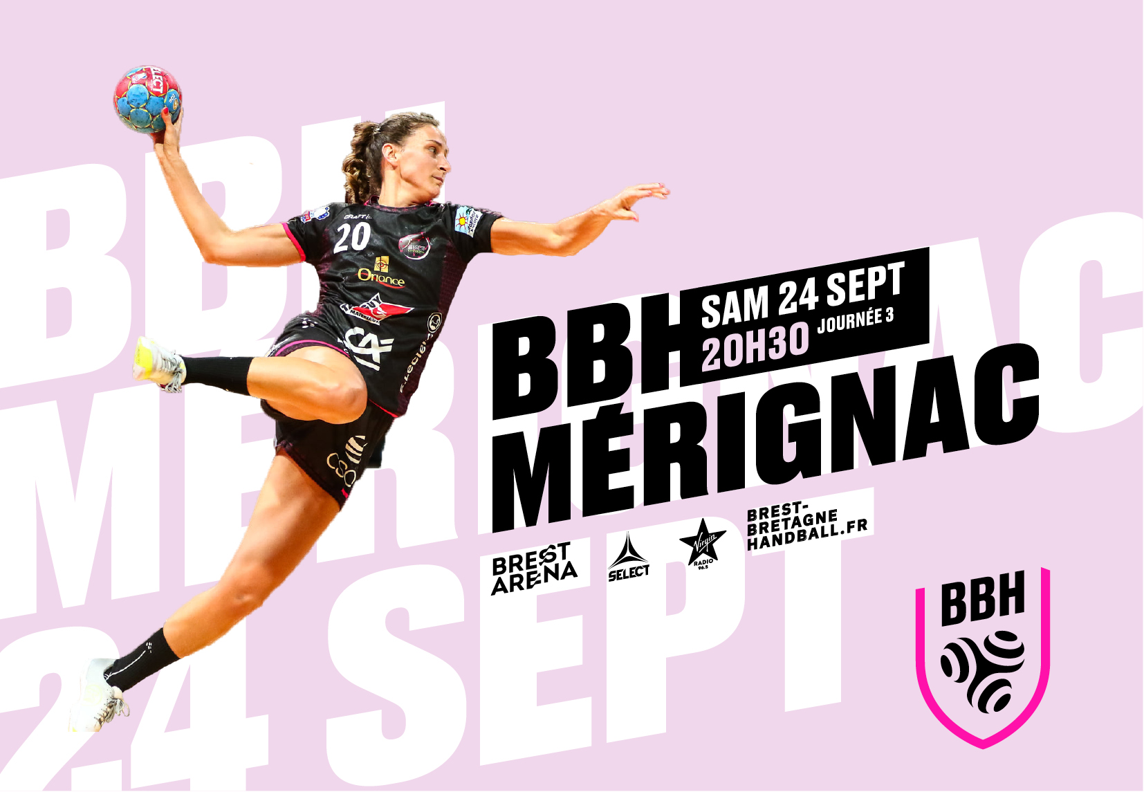
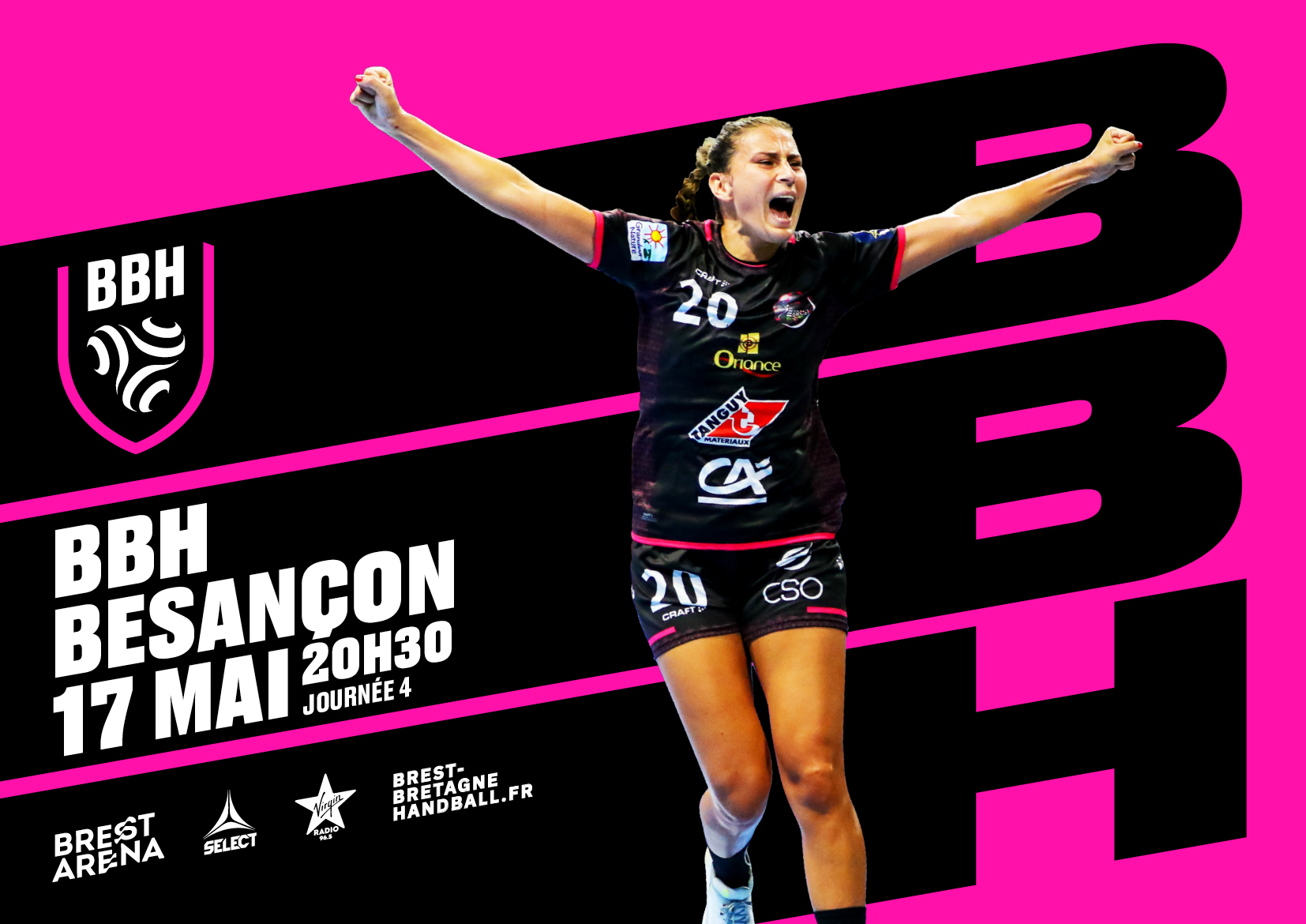
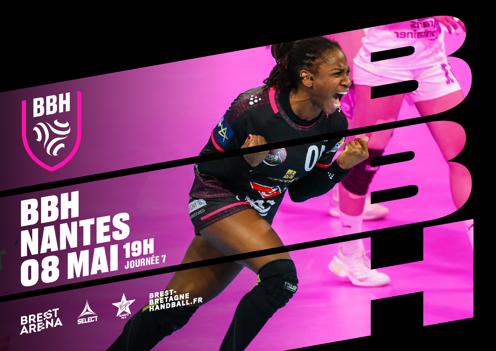
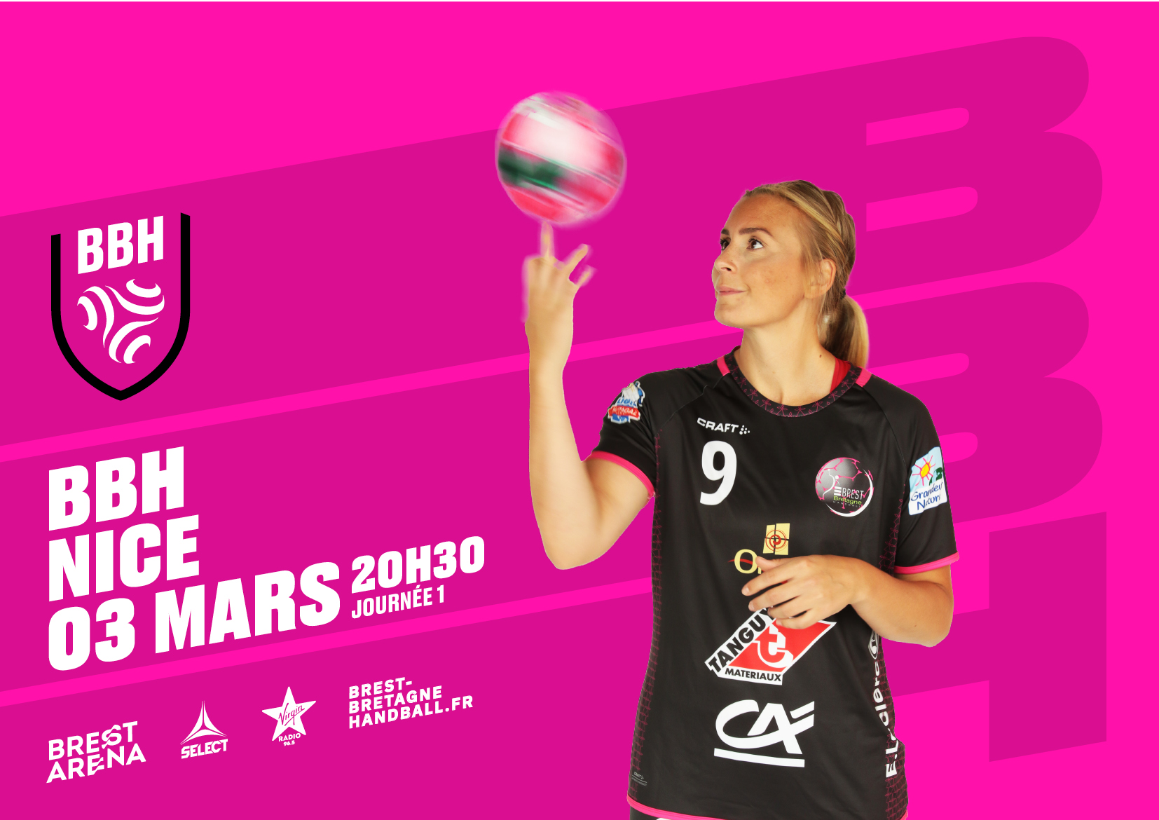
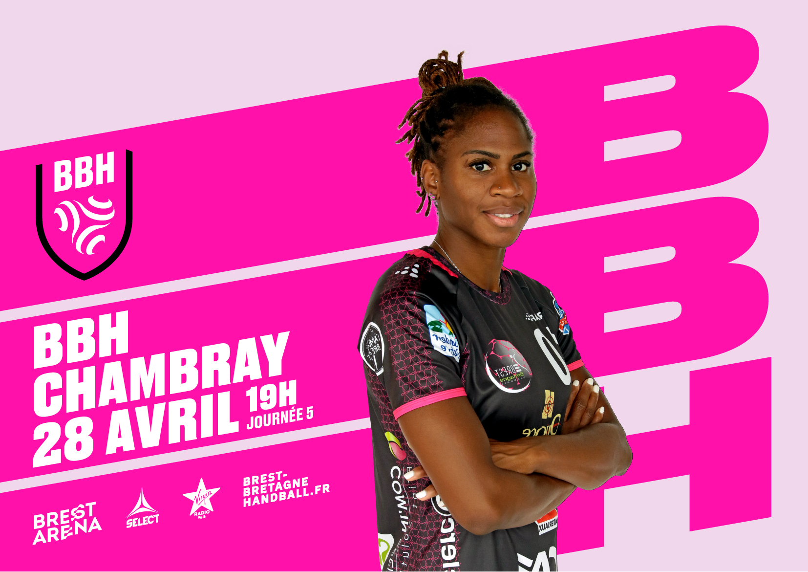
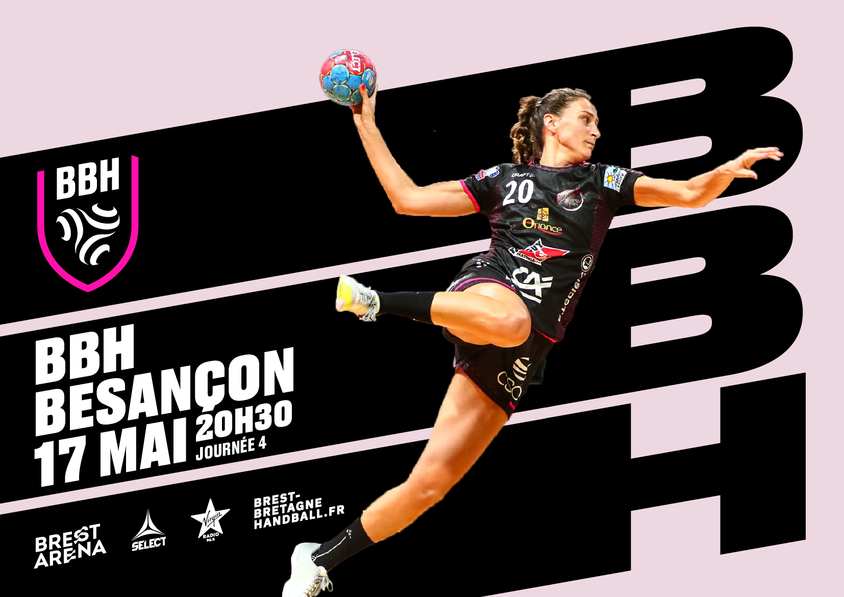
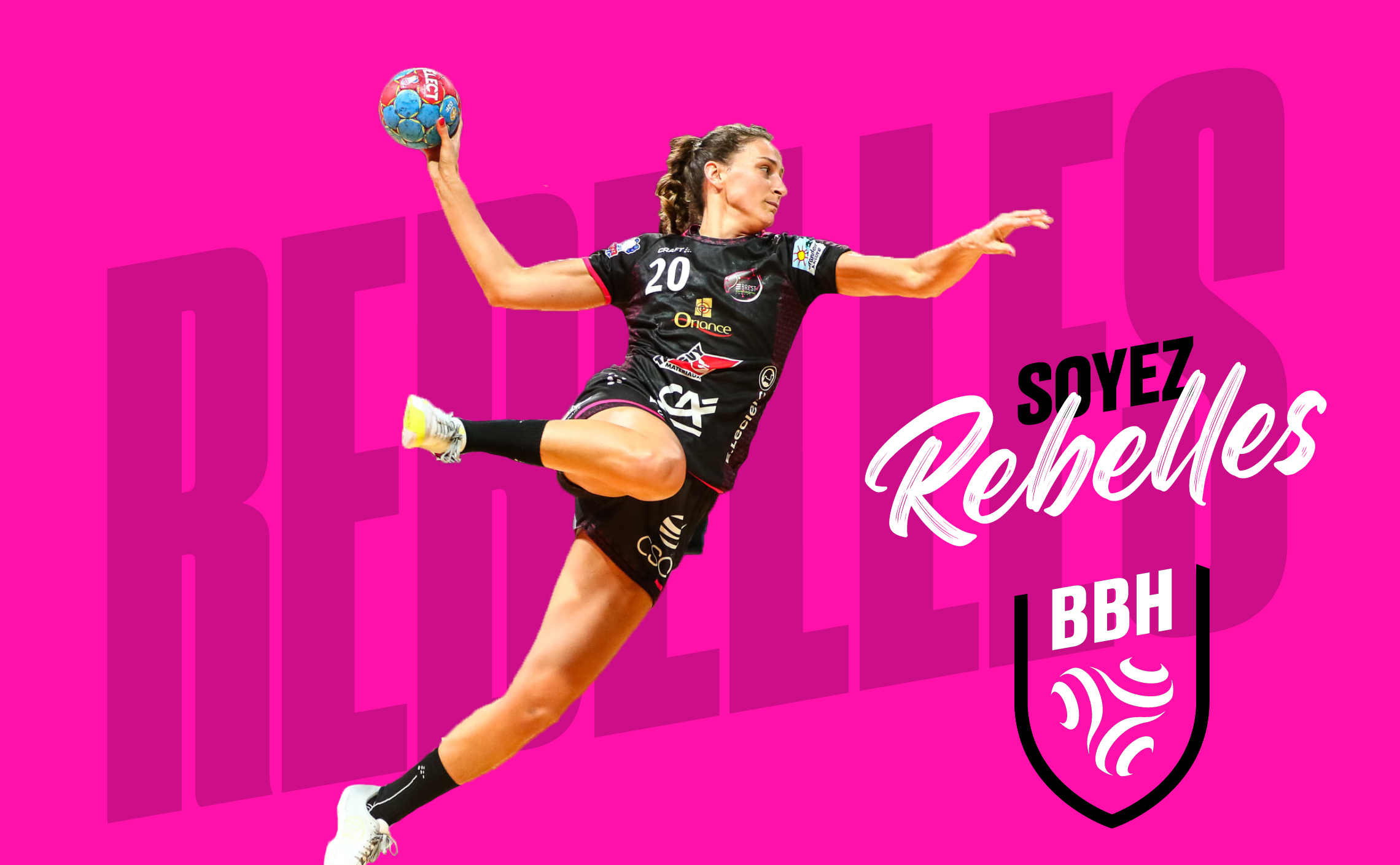
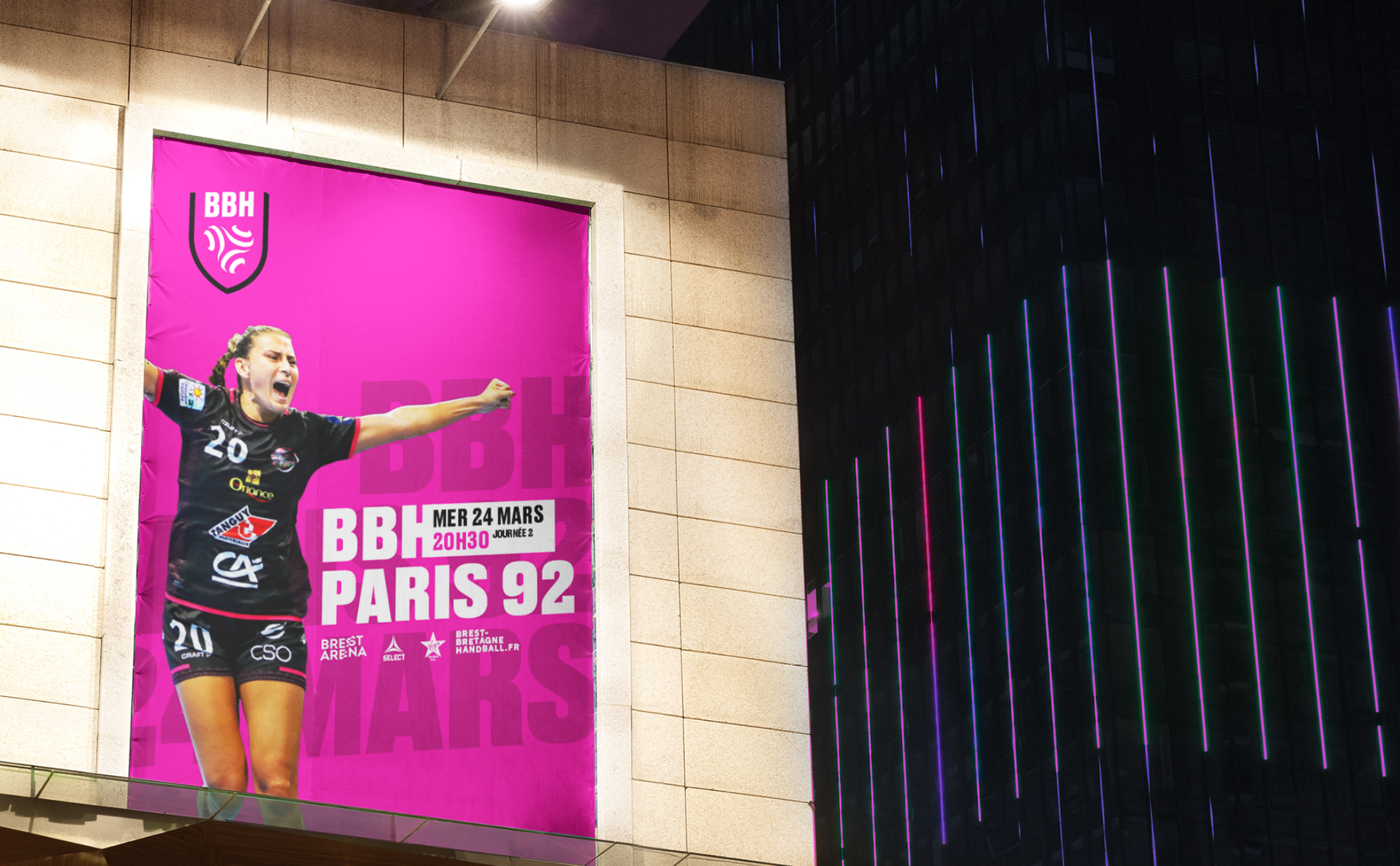
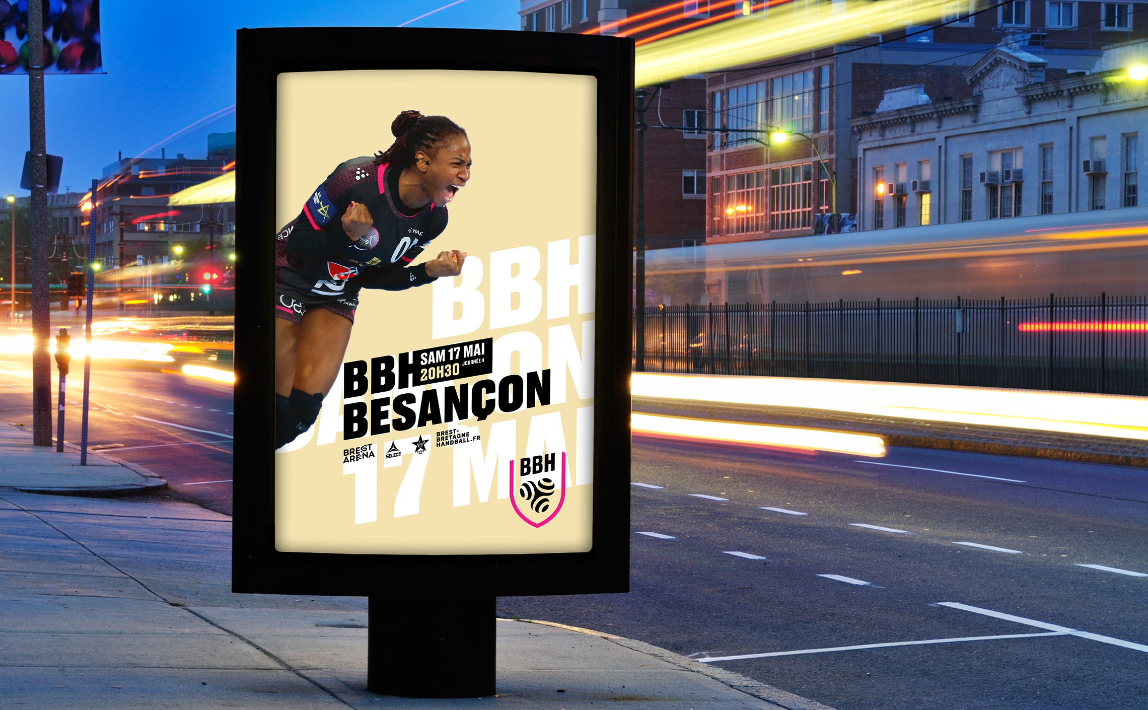
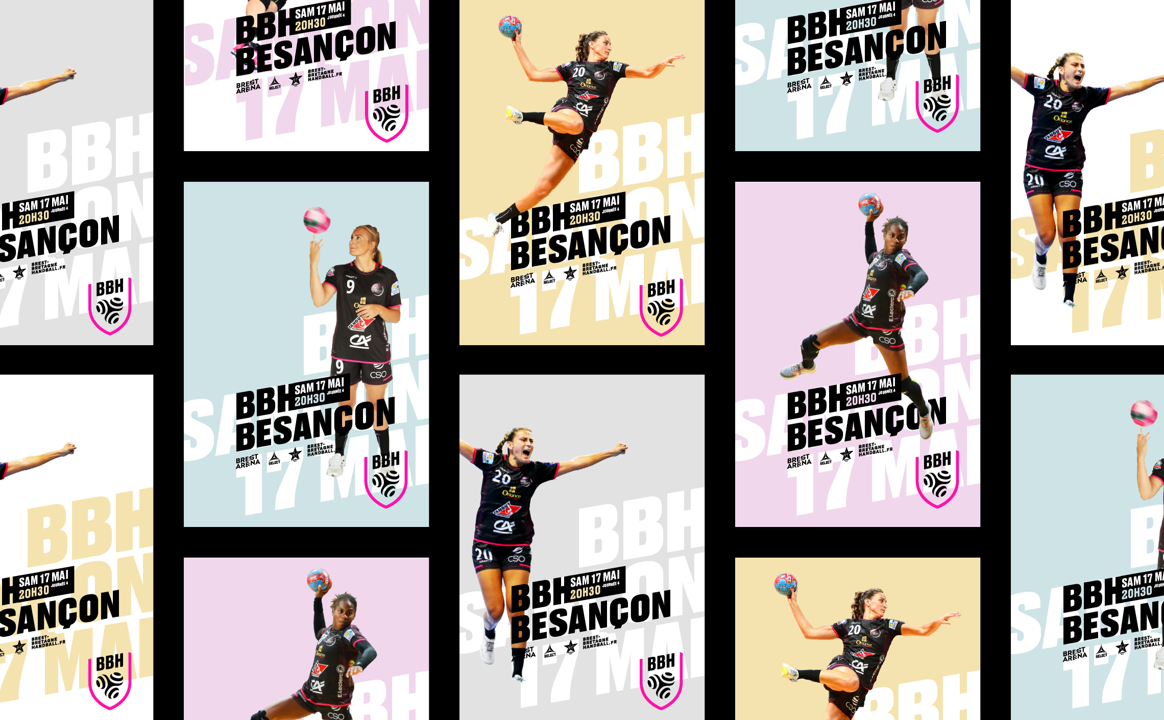
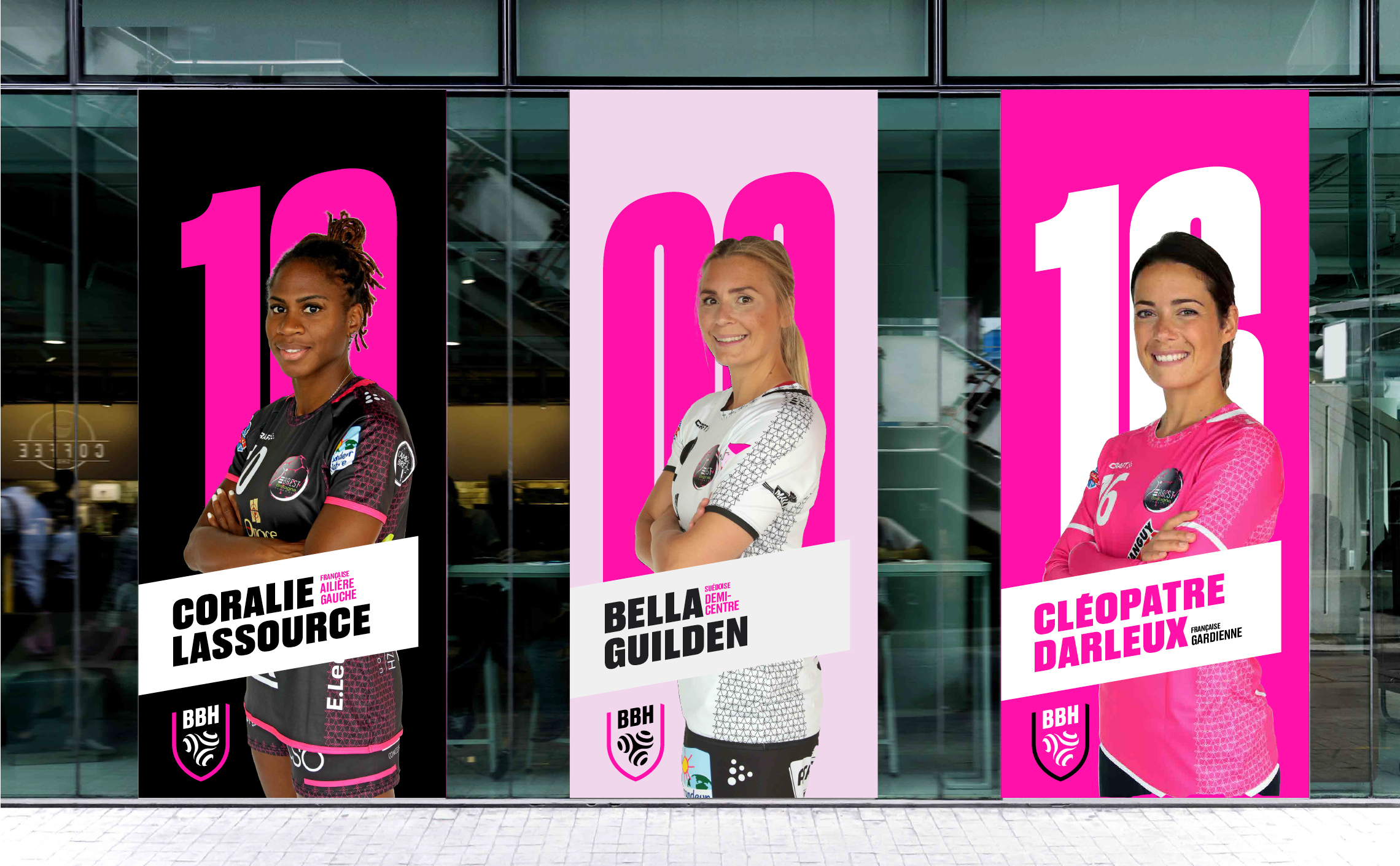
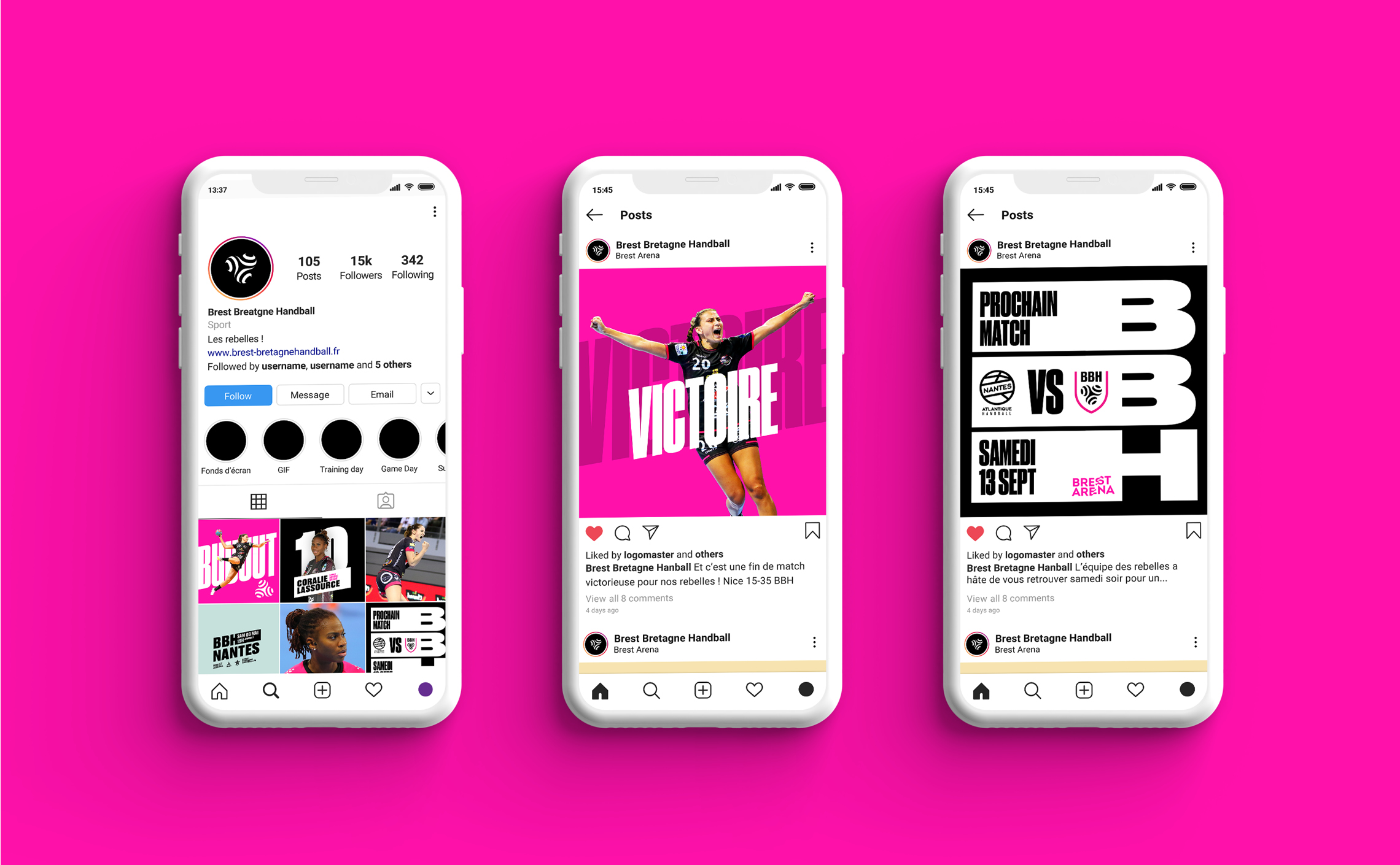
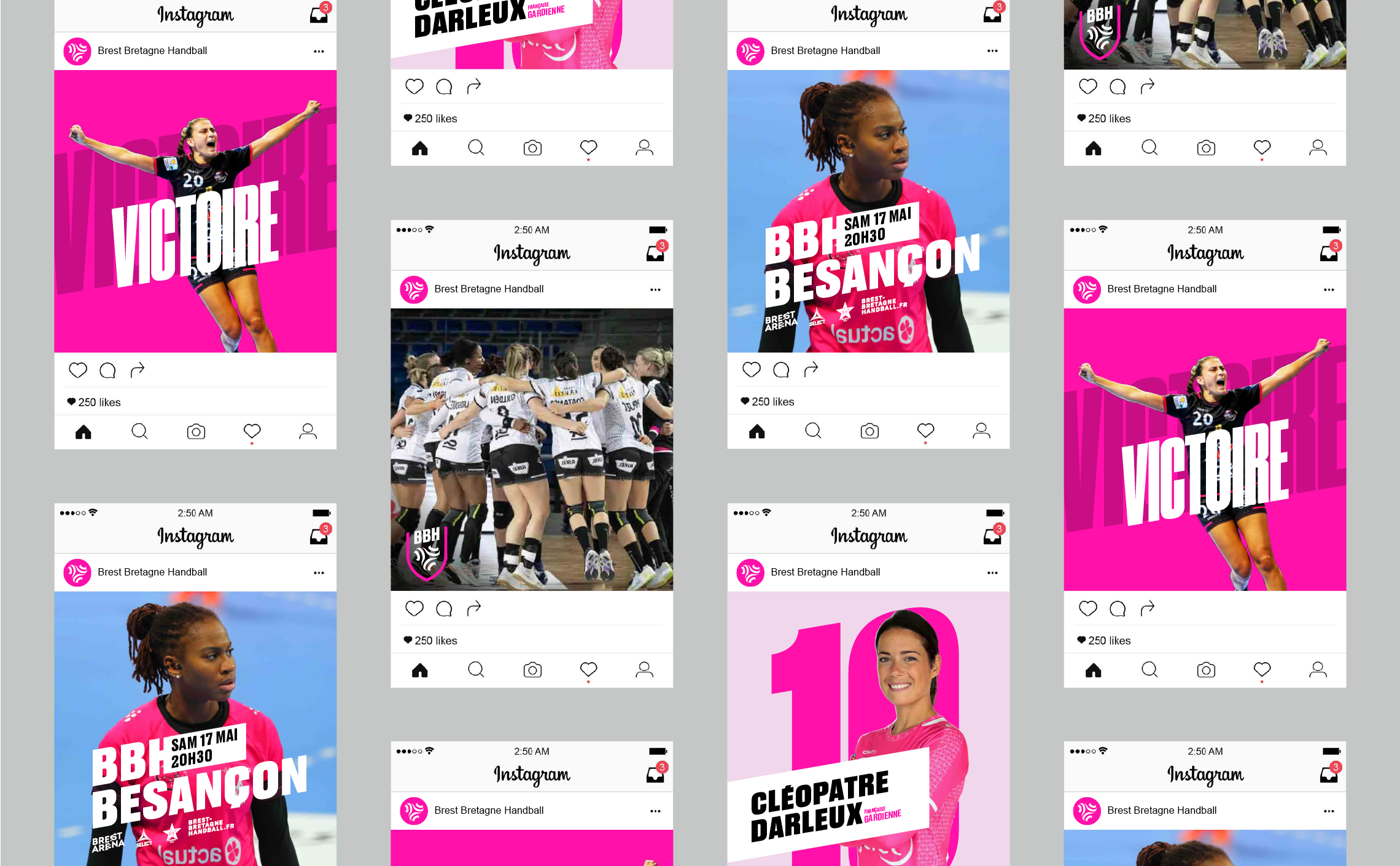
The seriousness of the salary gap between sportswomen and sportsmen, the lesser media coverage of women's disciplines, or the lack of recognition from peers are regularly highlighted. This is why we have tried to create a visual identity that would strengthen the visibility and media coverage of high-level women's sport. An identity that is both feminine and powerful.
We hope that this work will accompany the players in their victories and inspire future generations to get involved in sport.
Concept
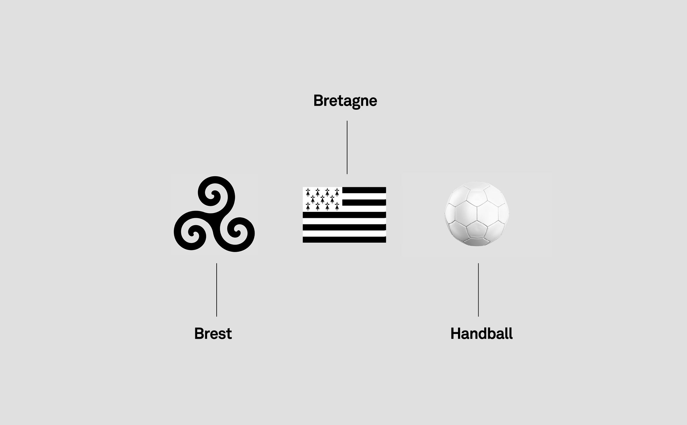
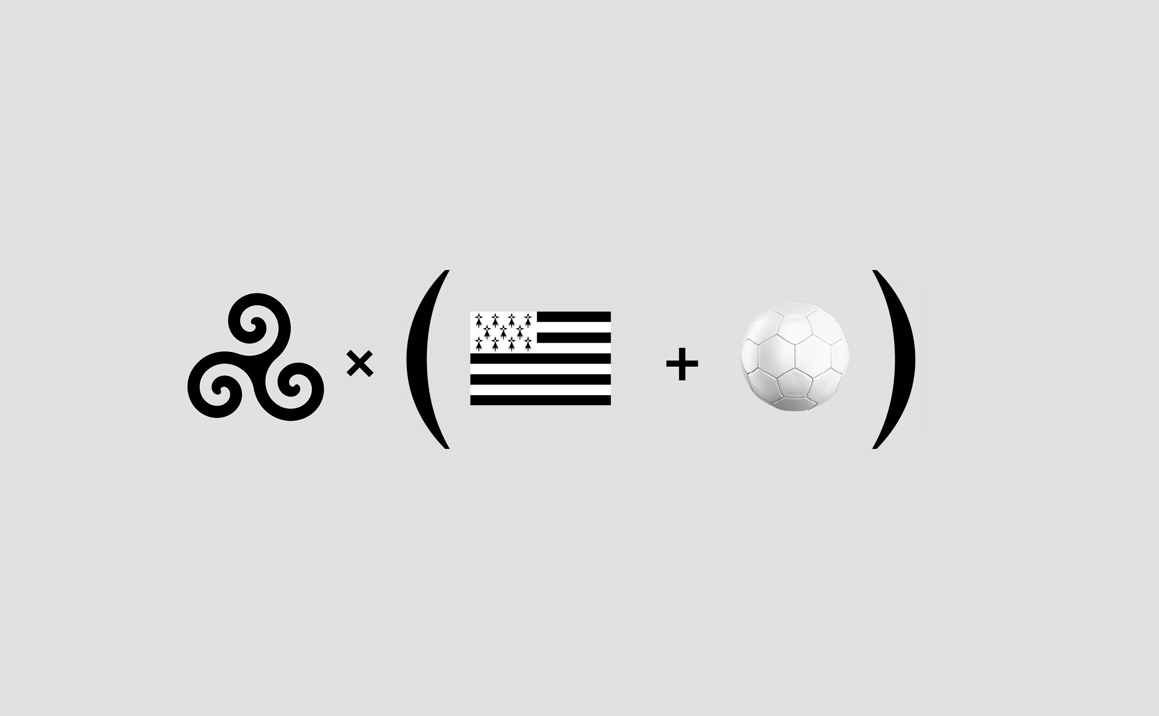
Black and white stripes, ermine, triskeles, the symbols of Brittany have not been missing over the centuries. Not all of them are old, showing a renewed sense of belonging. Some have disappeared, but the attachment to these symbols remains strong. The flag ("Gwenn-ha-Du"), for example, is widely adopted by the population without having lost all connotations of protest. The triskel, from the Greek triskelês "three-legged", is a Celtic symbol that dates back to the Neolithic period, and can be found engraved on numerous megaliths in the region.
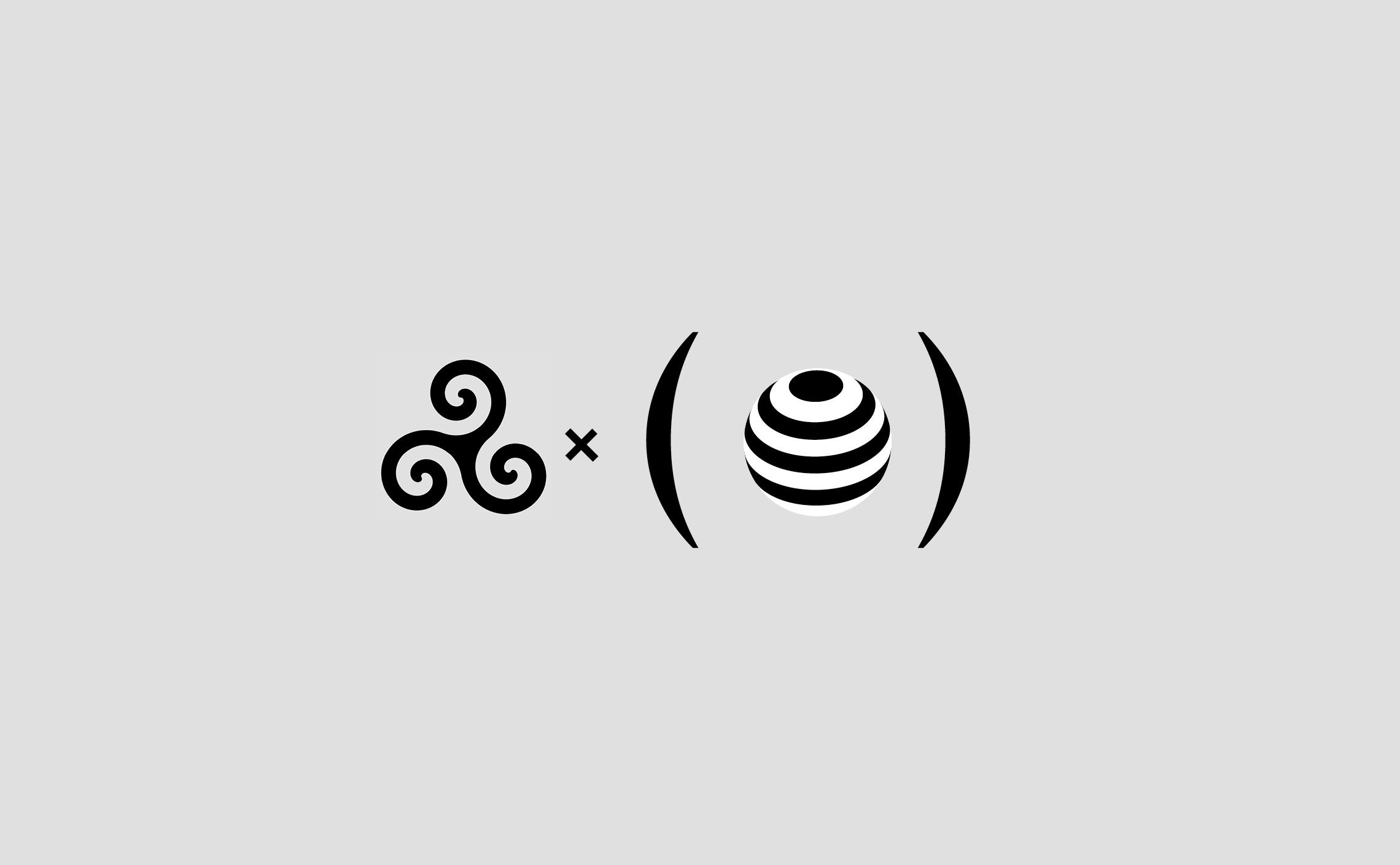
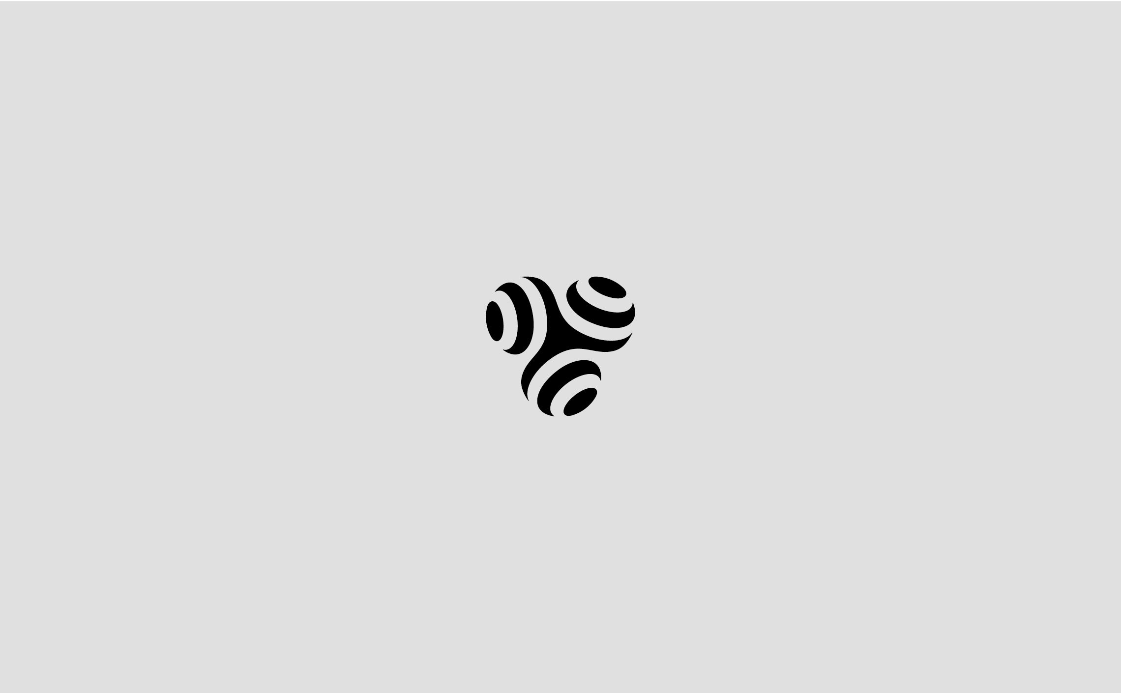
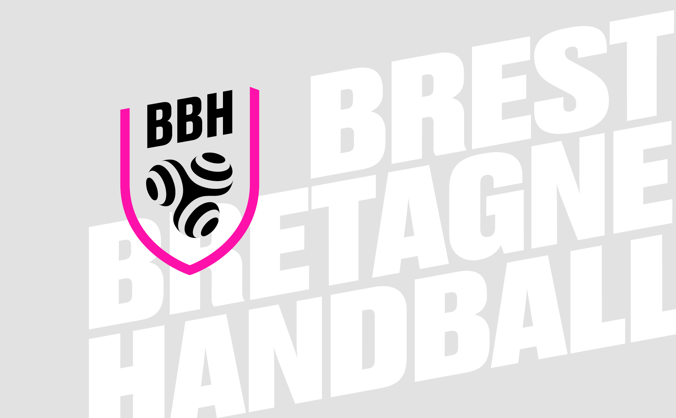
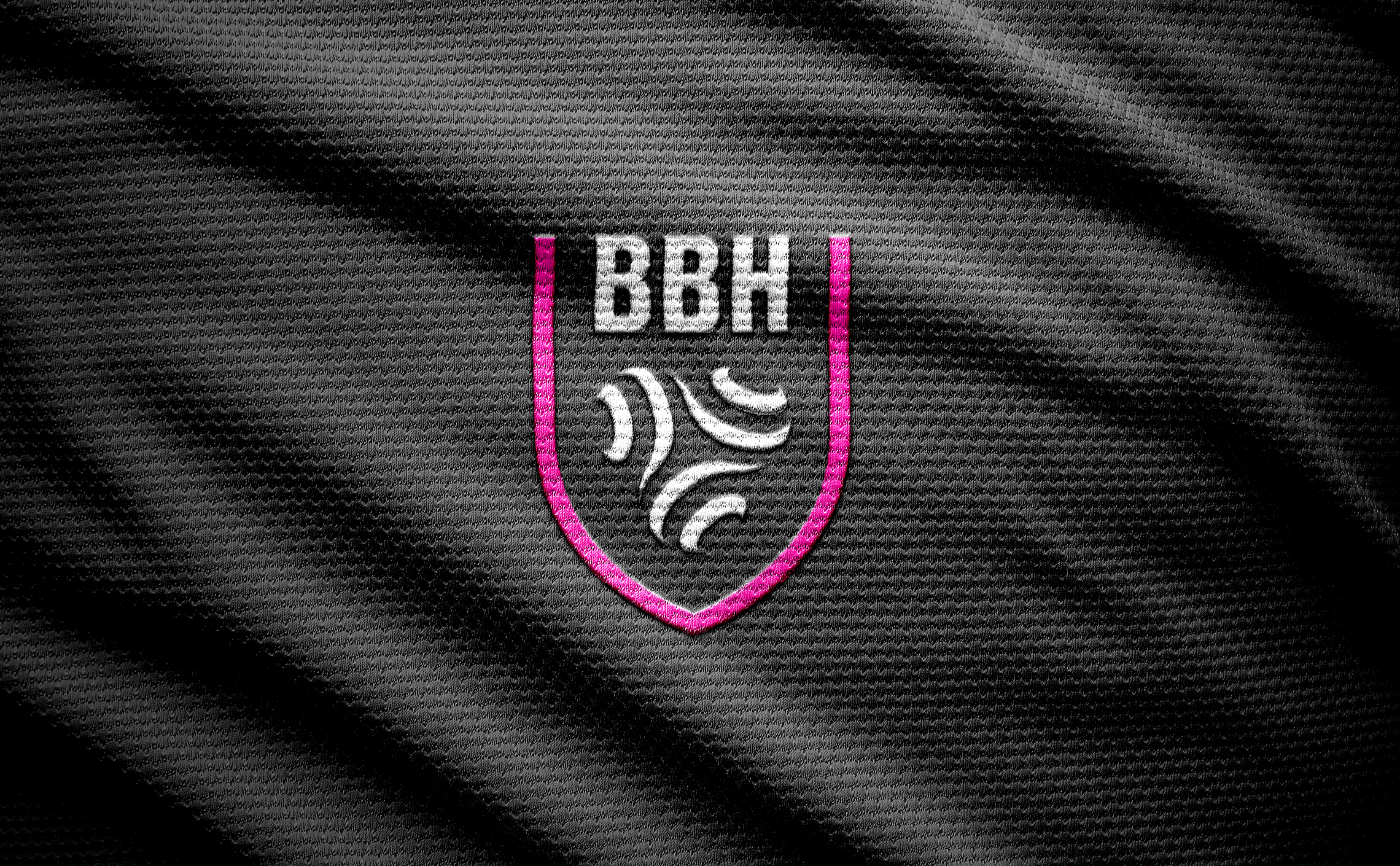
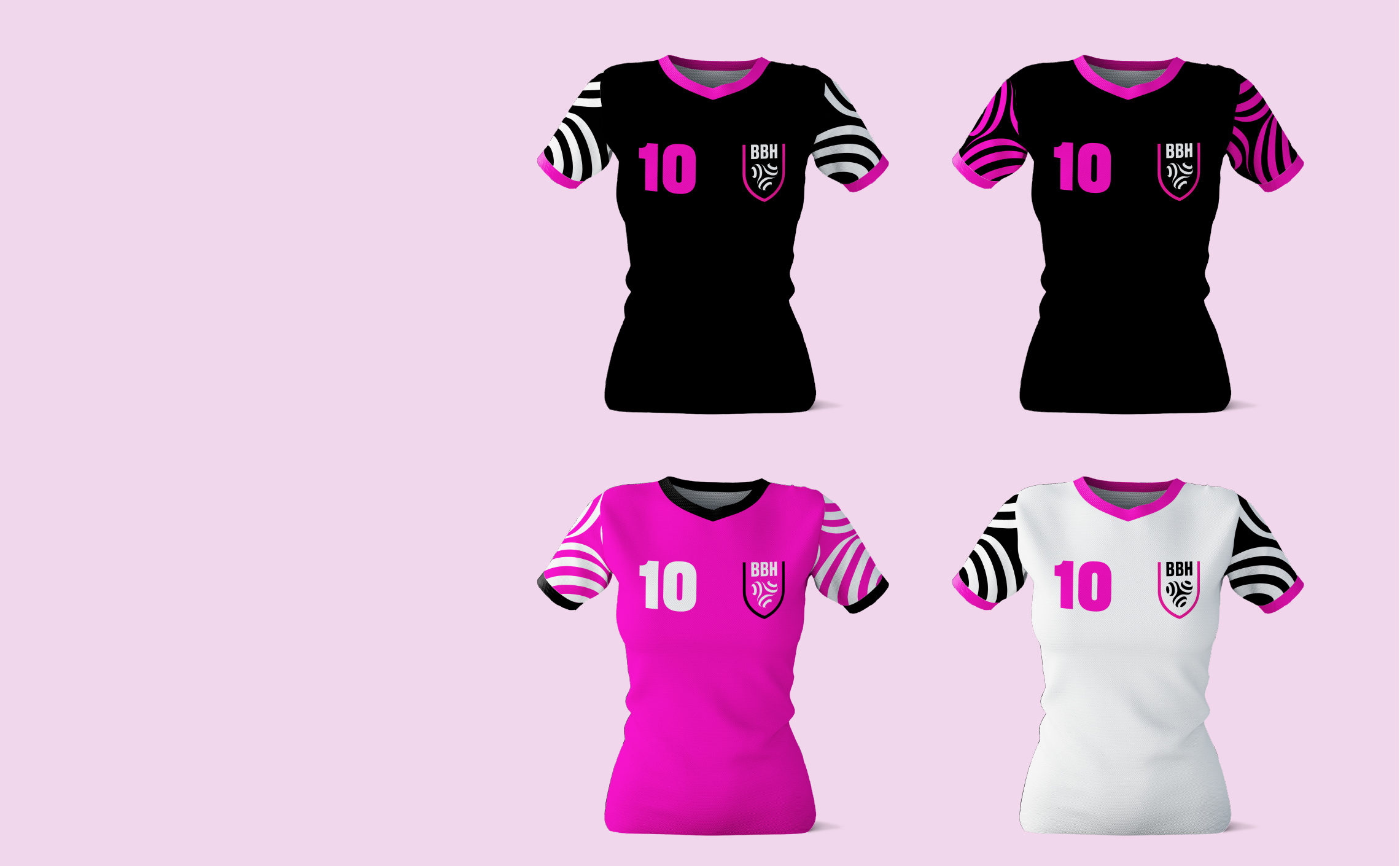
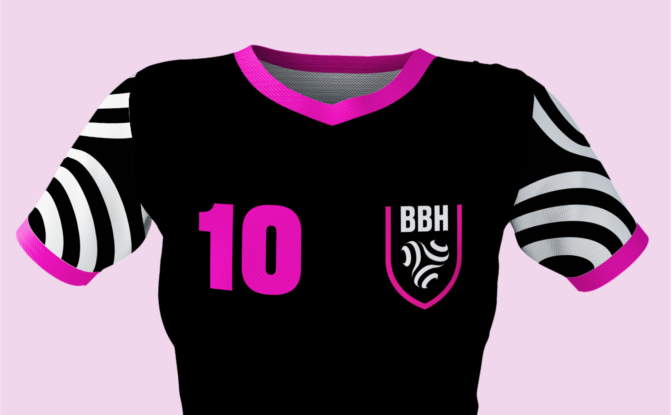
We therefore mixed the stripes of the flag and the shape of the triskel with the sphere of a handball. The result is a contemporary reinterpretation of ancestral symbols. The whole is composed in a silhouette of a coat of arms referring to the conquering spirit of the club.
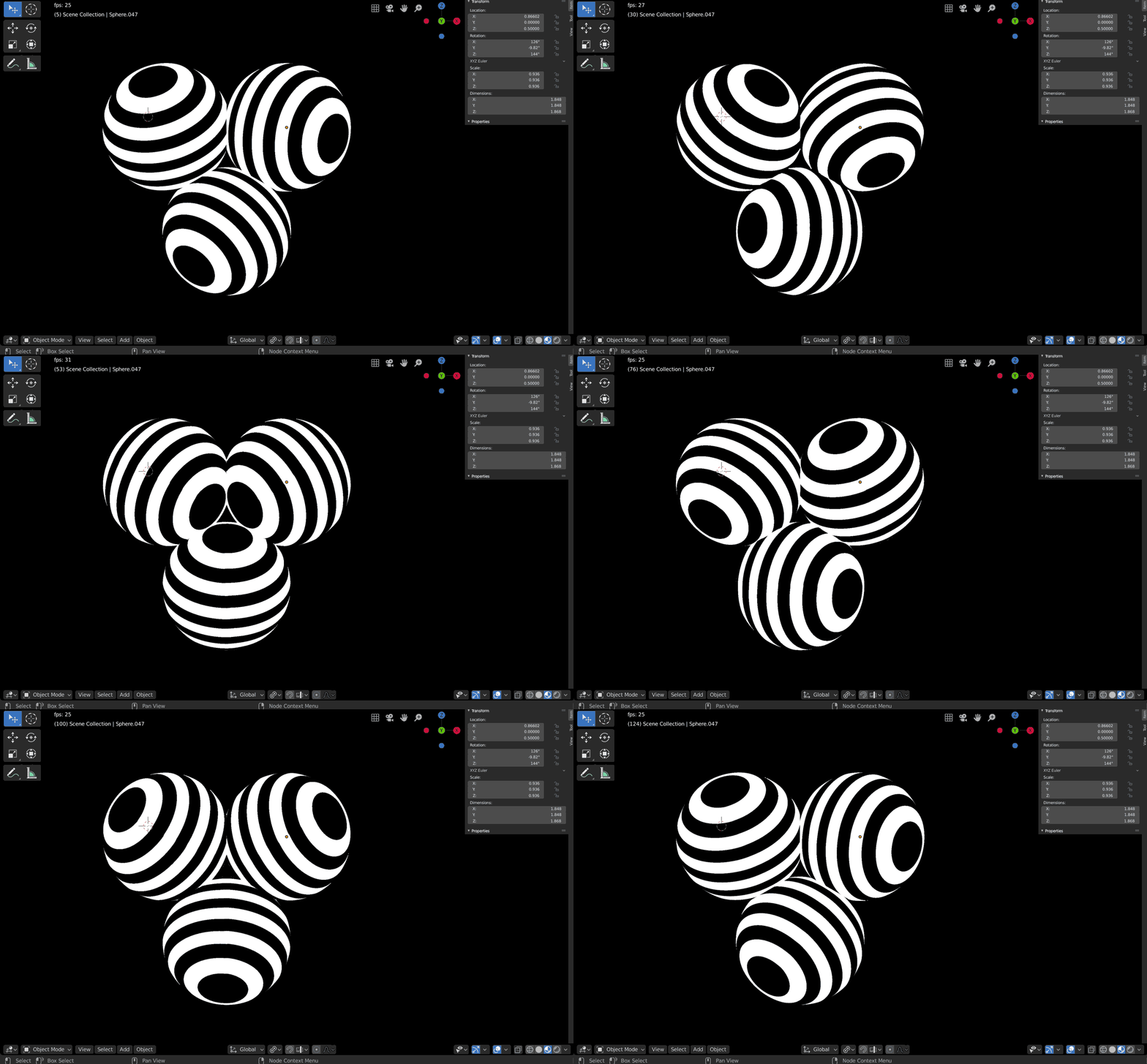
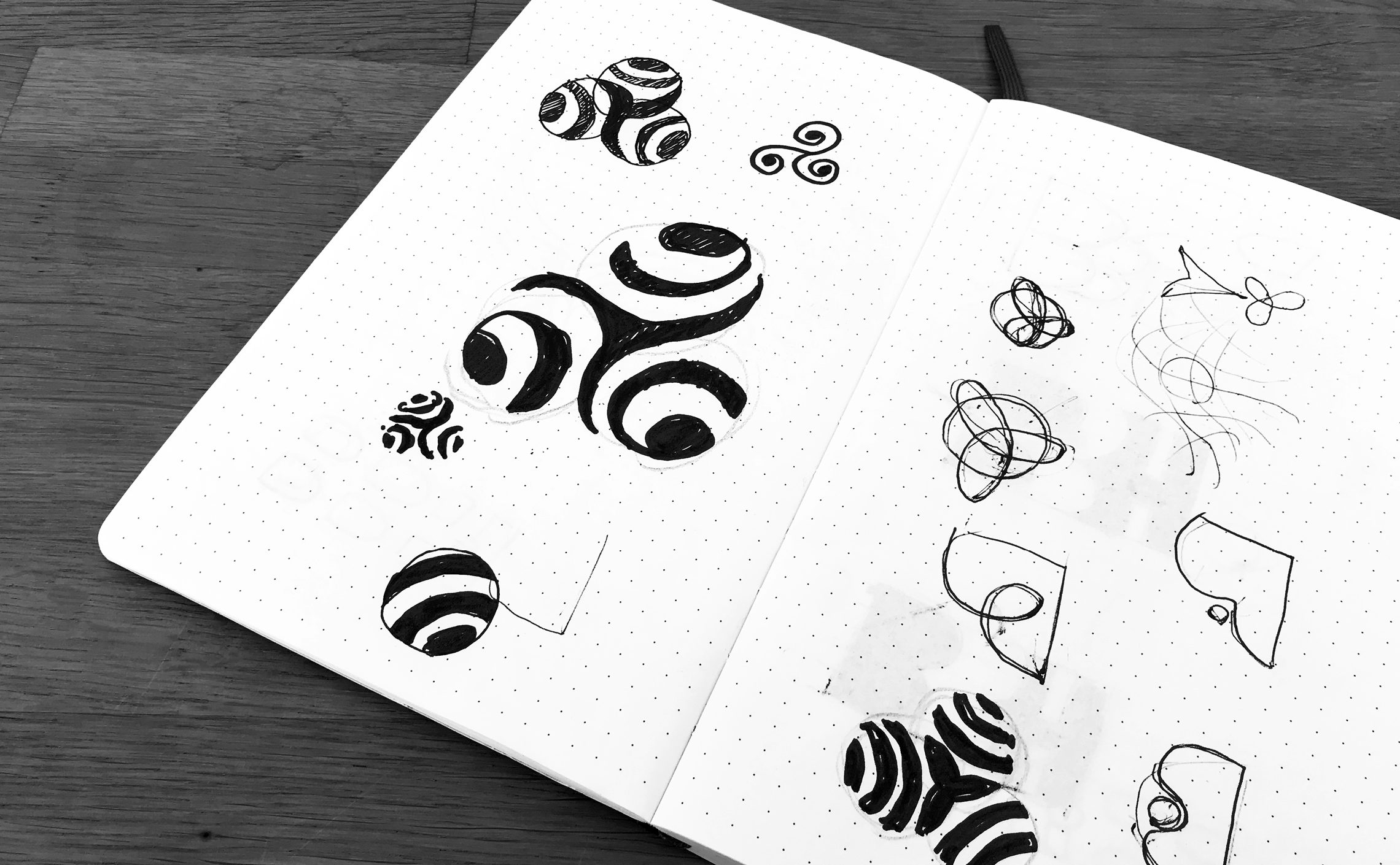
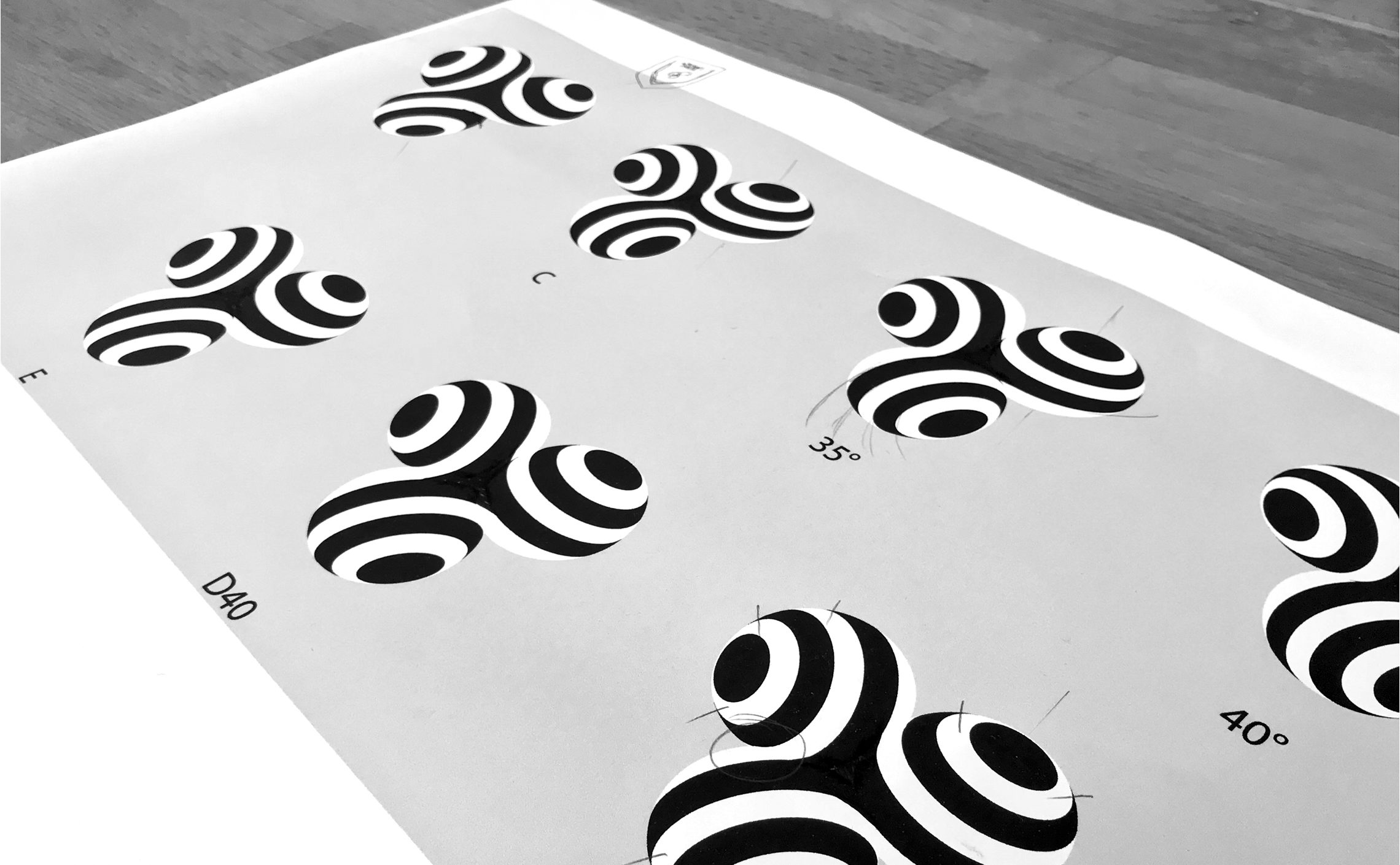
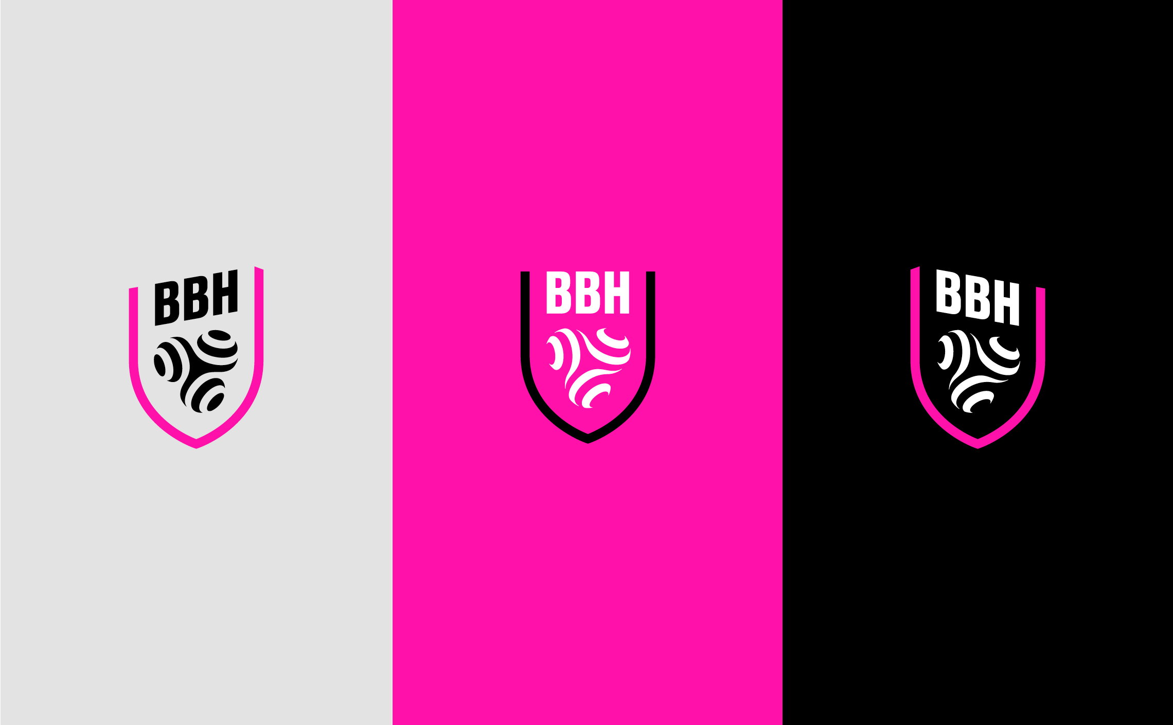
The development of this logo was an opportunity to revise the geometry! The challenge was to obtain a sign that could work equally well on a black or white background, while maintaining a harmonious link between the bands of each of the 3 spheres. While the result seems simple, the path to get there was complex. We therefore modelled the sign in 3D to facilitate its development.
Brest Bretagne Handball
Le Brest Bretagne Handball (couramment abrégé BBH) est un club français de handball, basé à Brest et évoluant en Ligue Féminine, soit le plus haut niveau de compétition français.
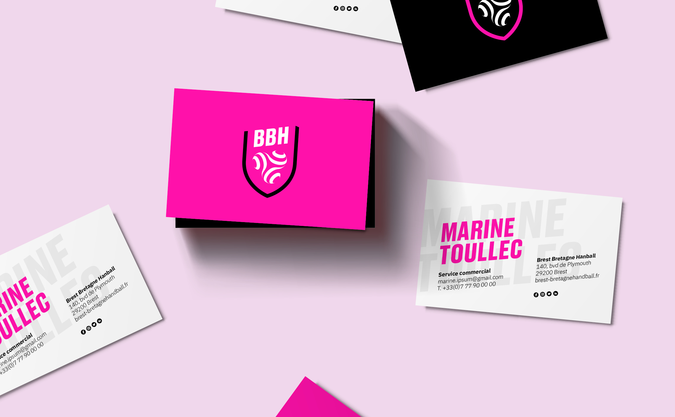
Logo creation, visual identity and graphic guidelines.

