GroupeCheval-CaseStudy

2020

Groupe CHEVAL changes its visual identity
A new brand image for the 1st mission-driven company in the public works sector

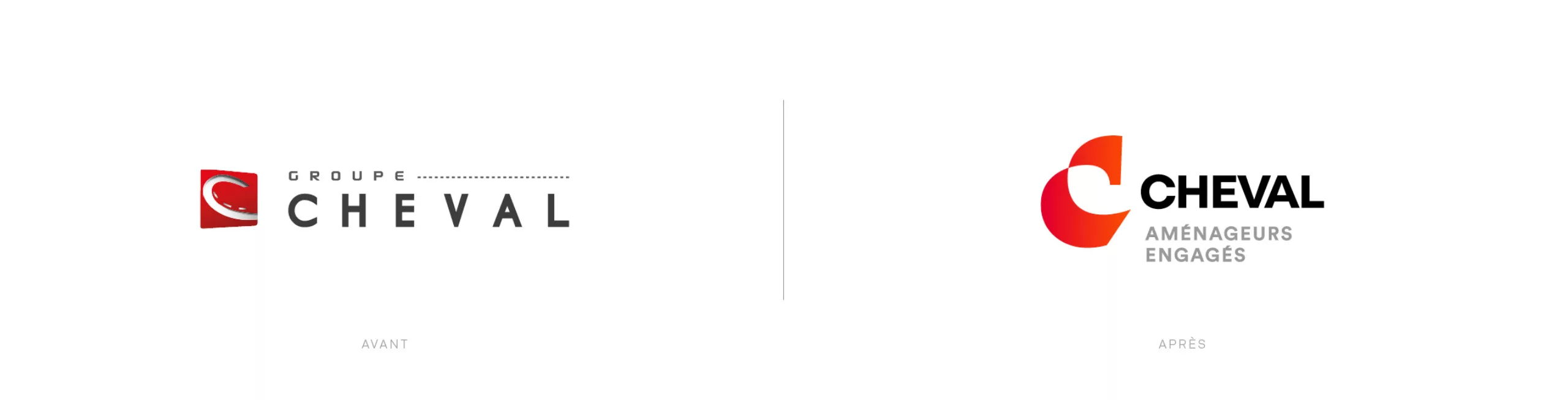
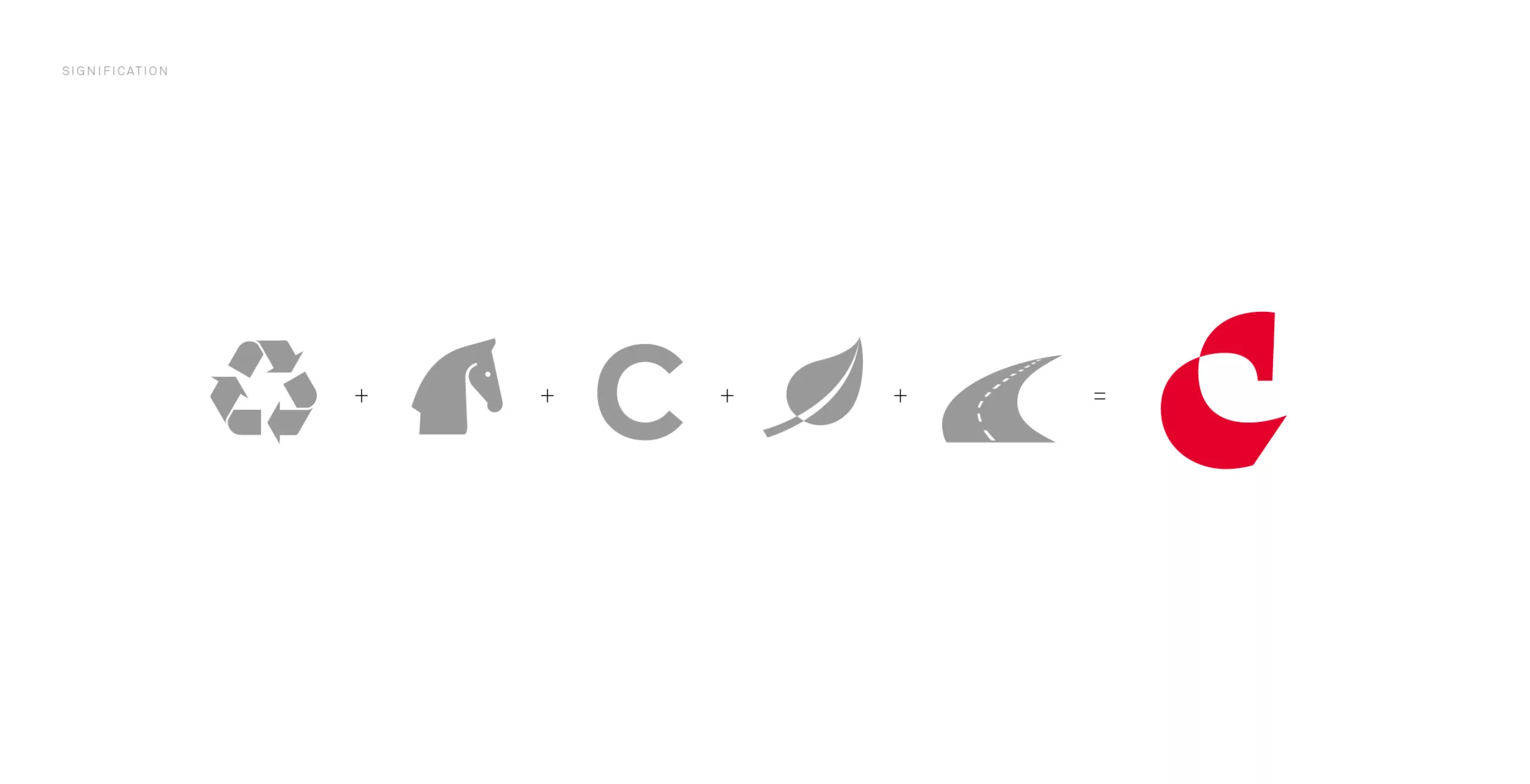
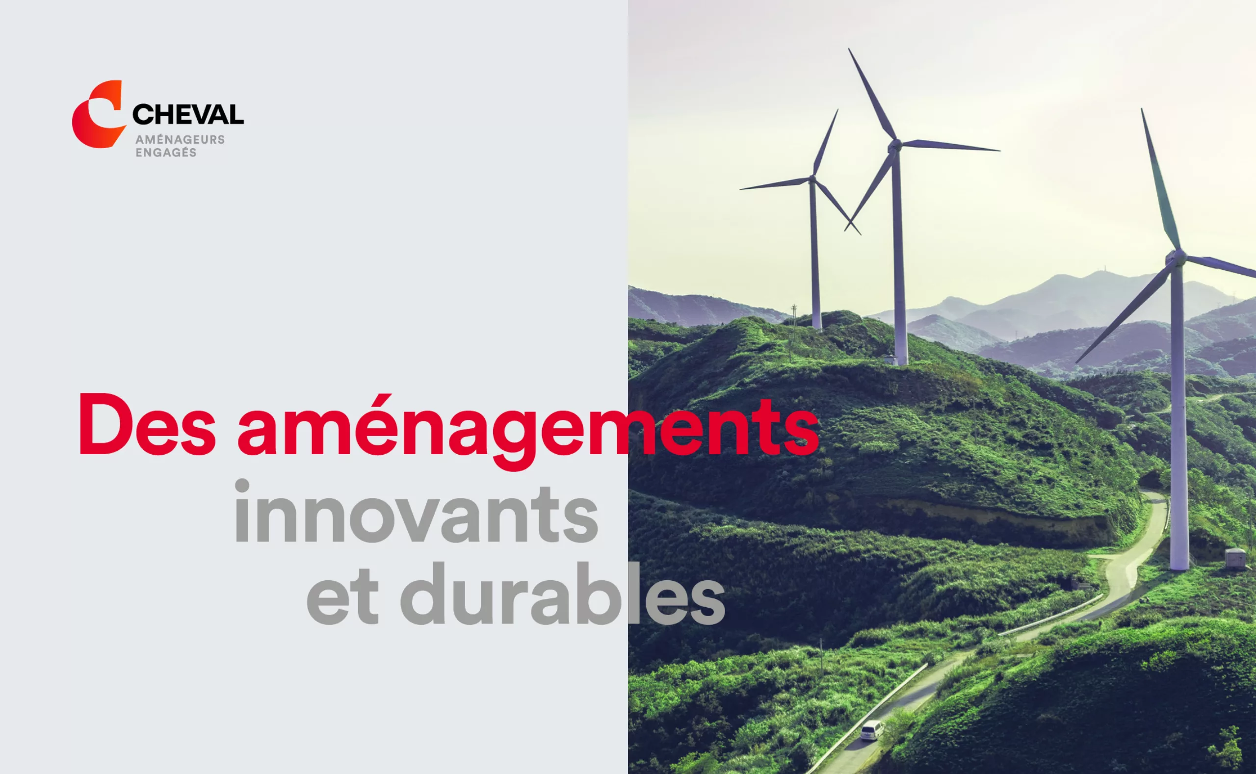
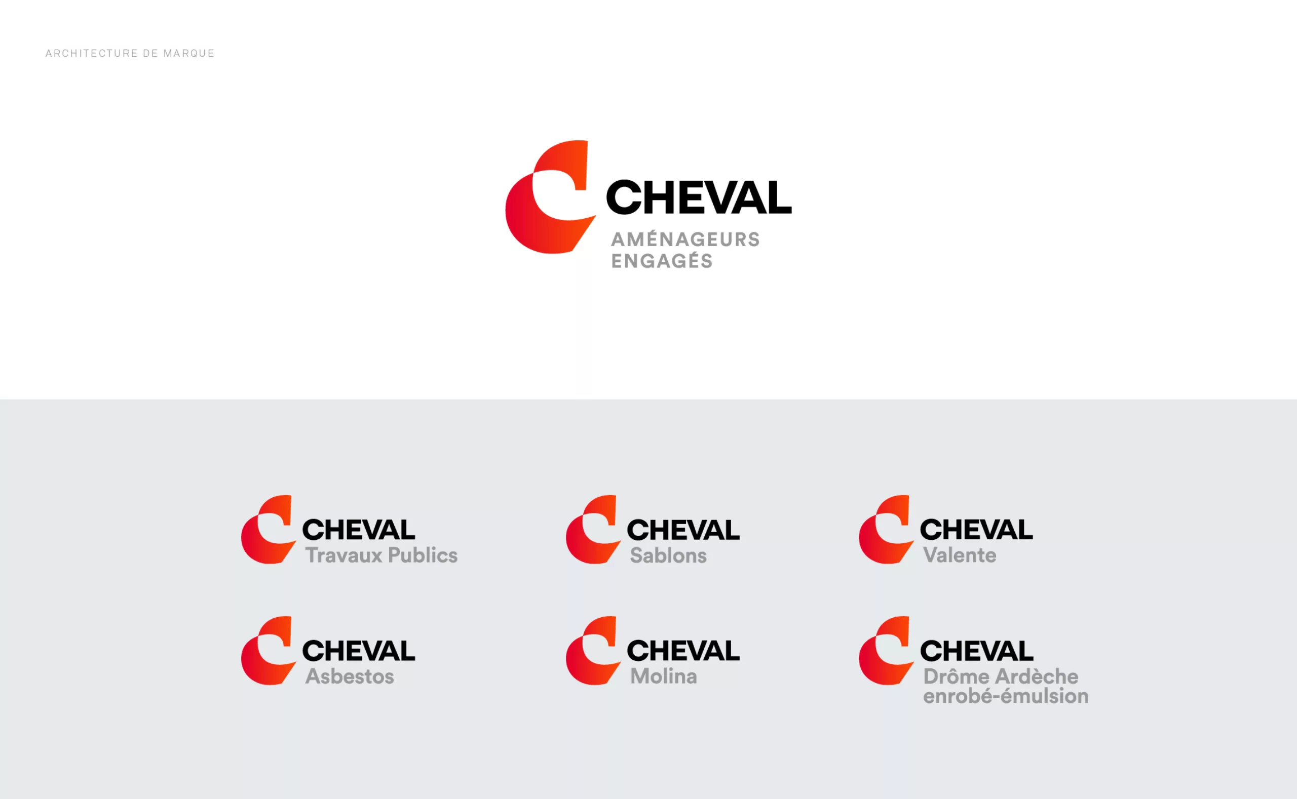
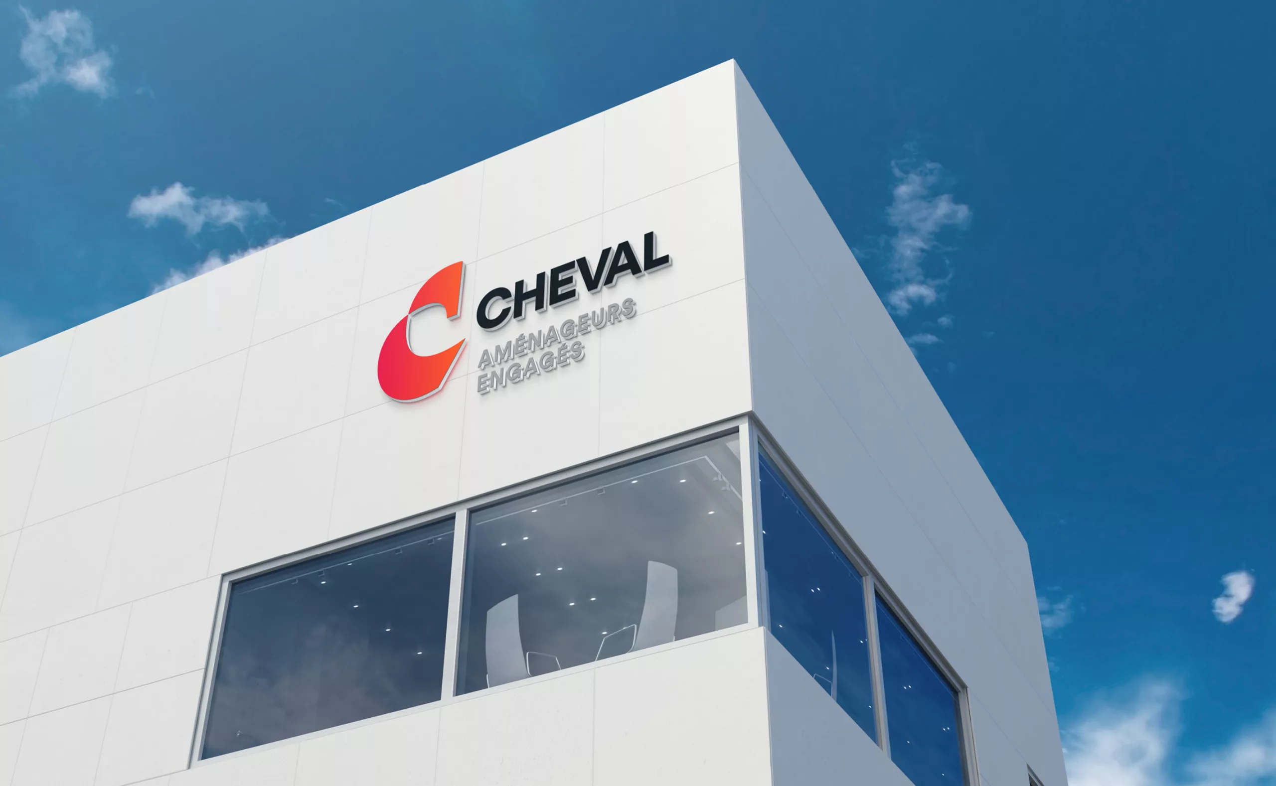
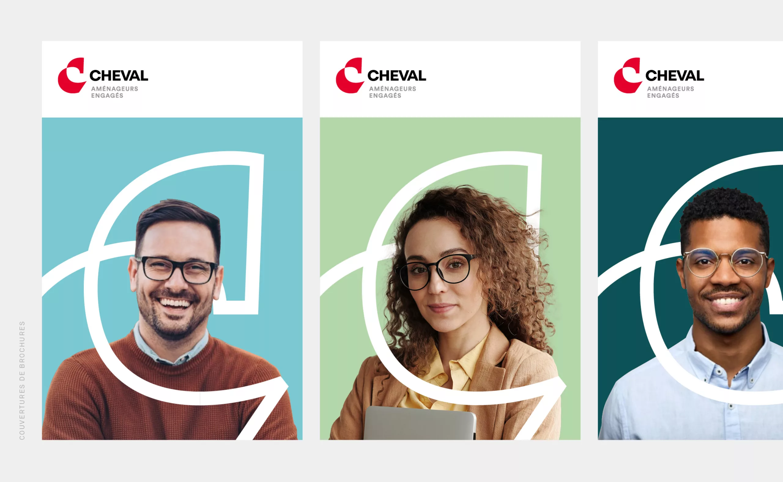
On 16 December 2020, Groupe CHEVAL was the first public works company in France to become a "company with a mission". The new signature "committed land developers" embodies the Group's raison d'être. The Cheval Group is a family group of local companies. They are men and women who are working for a better future. The ambition is to develop our territories sustainably and to contribute to the ecological transition.

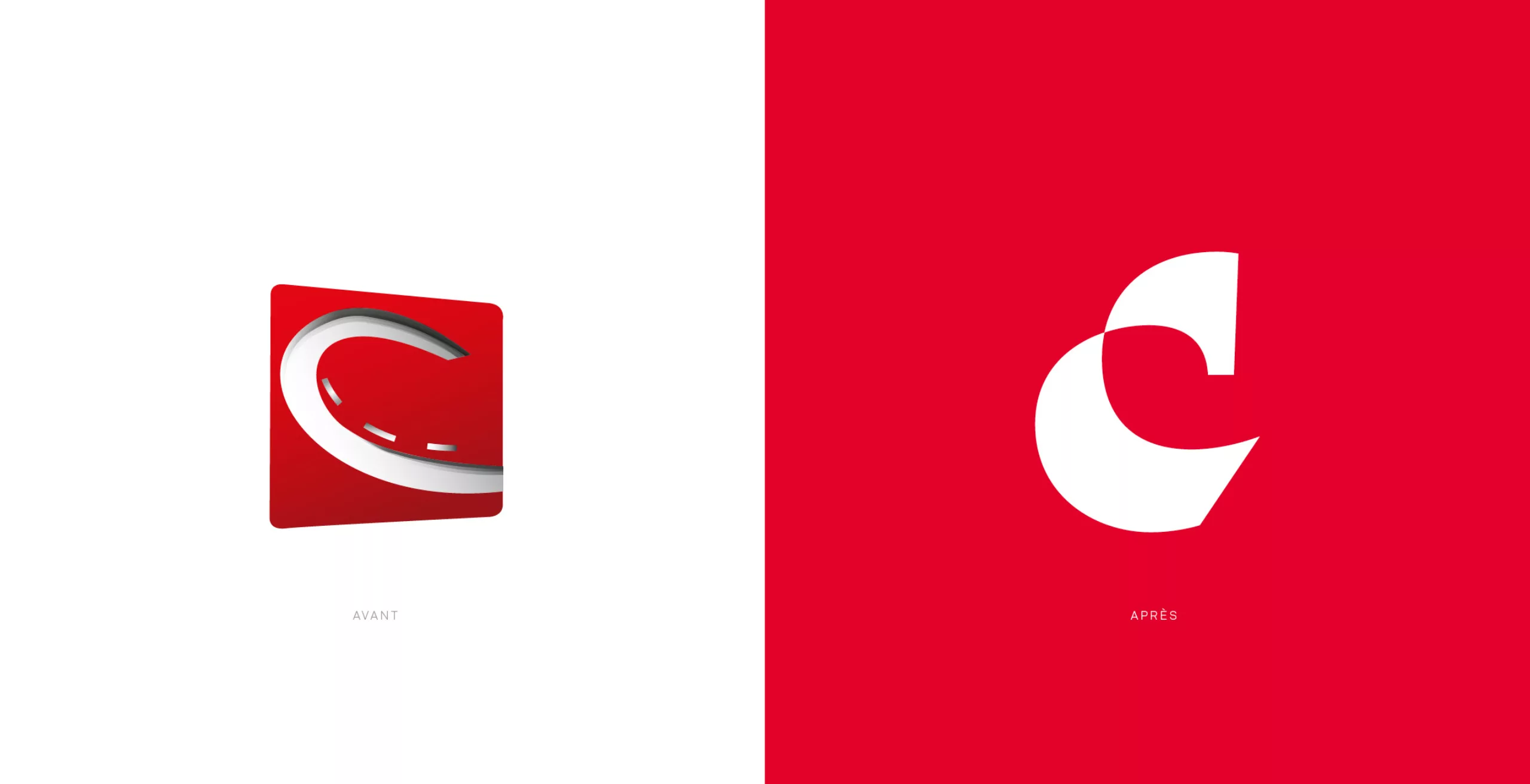
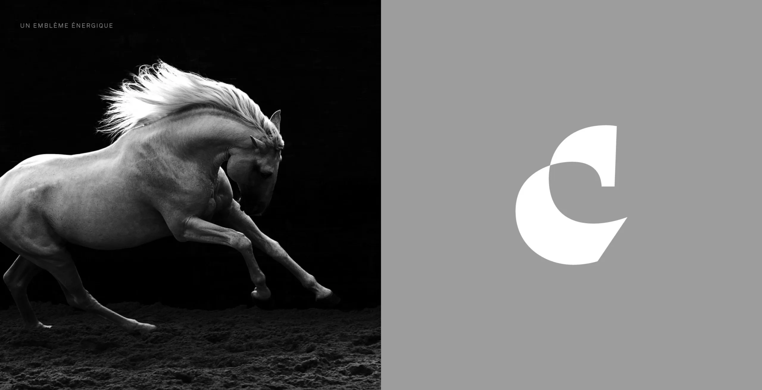
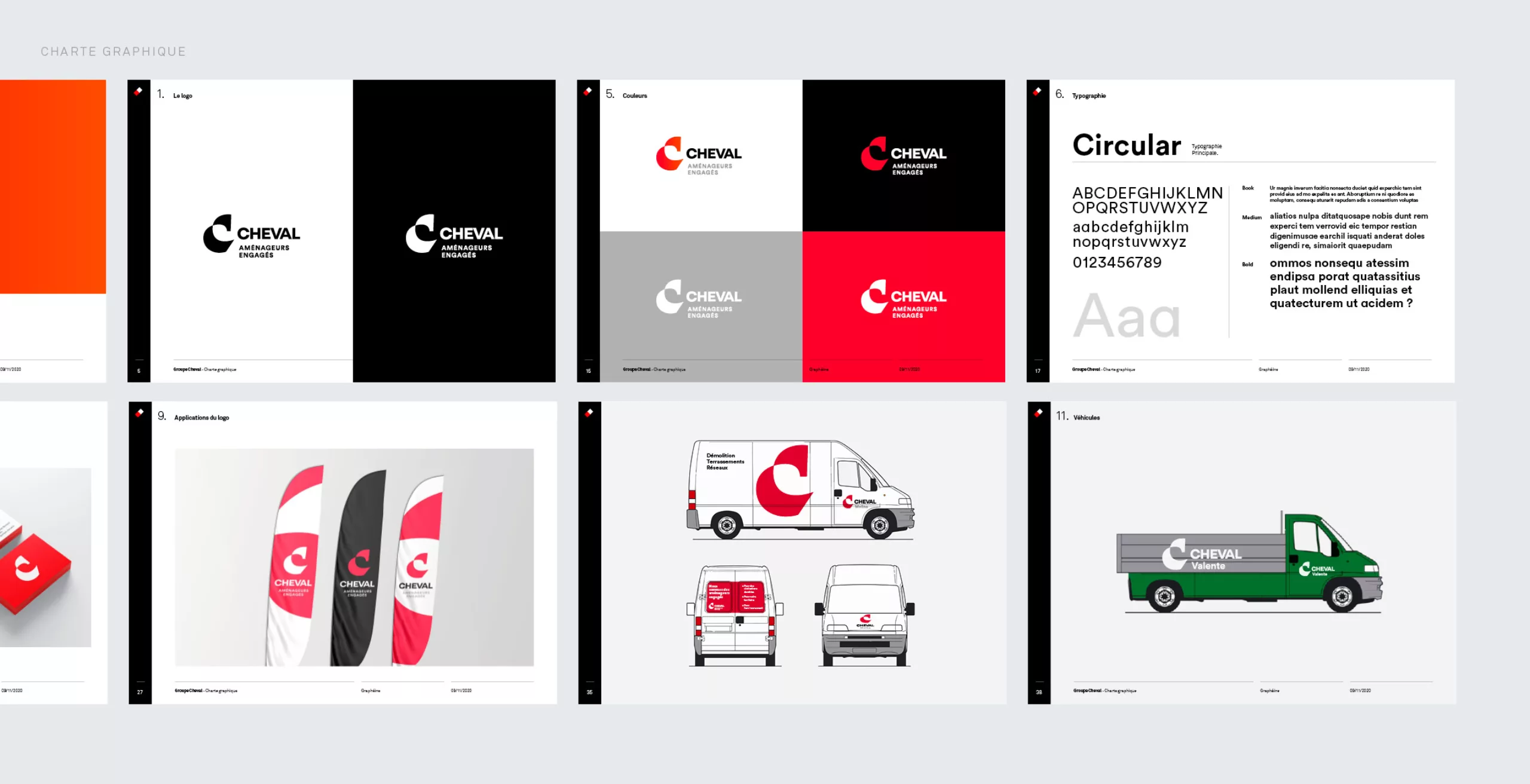
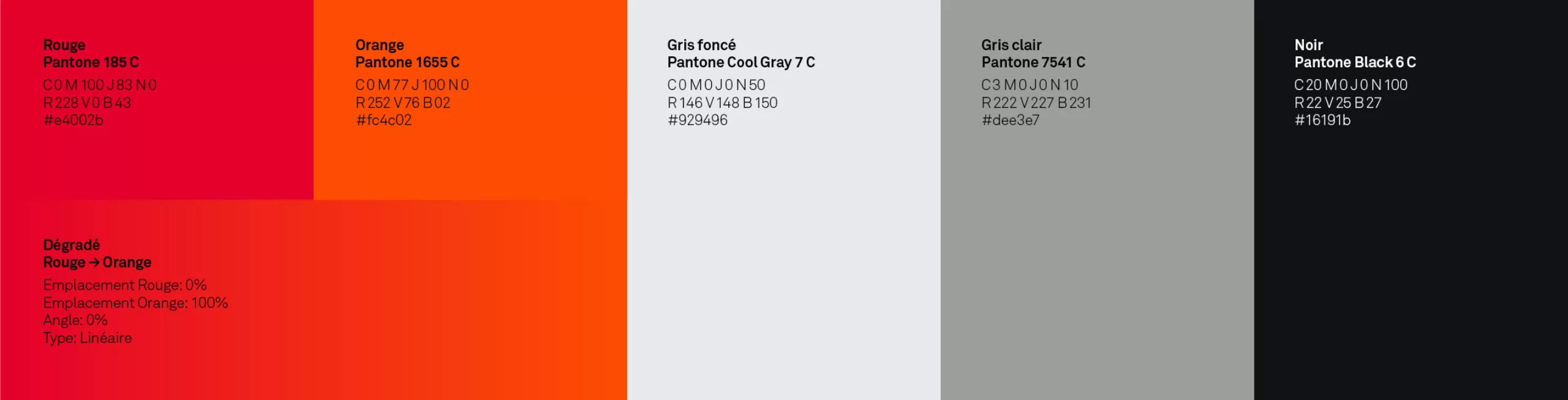
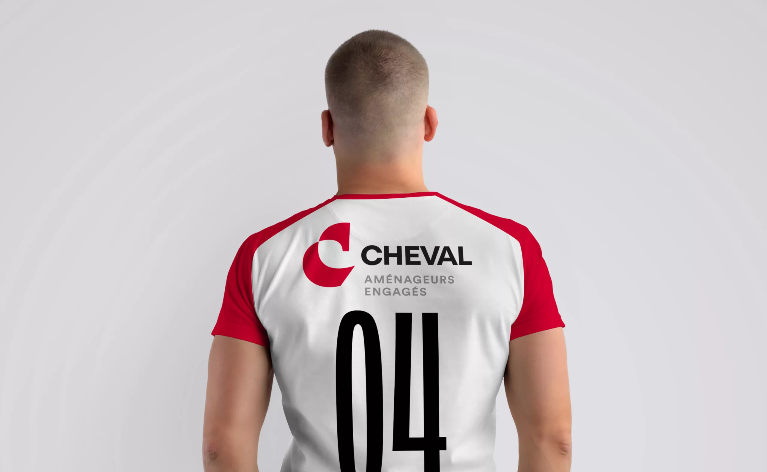
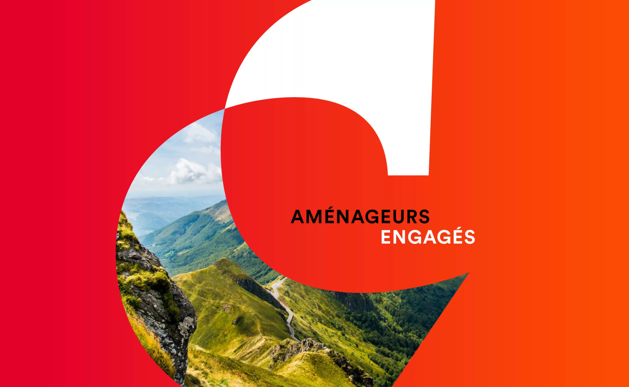
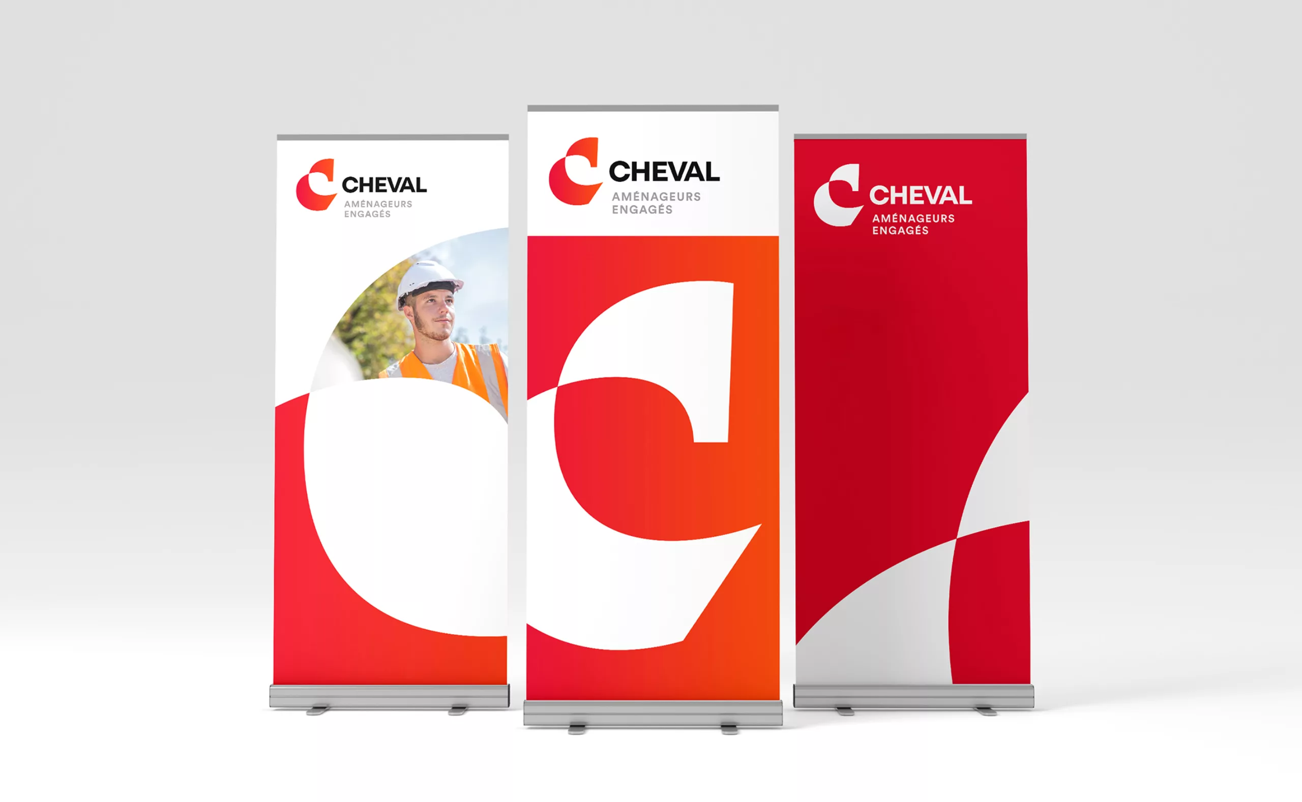
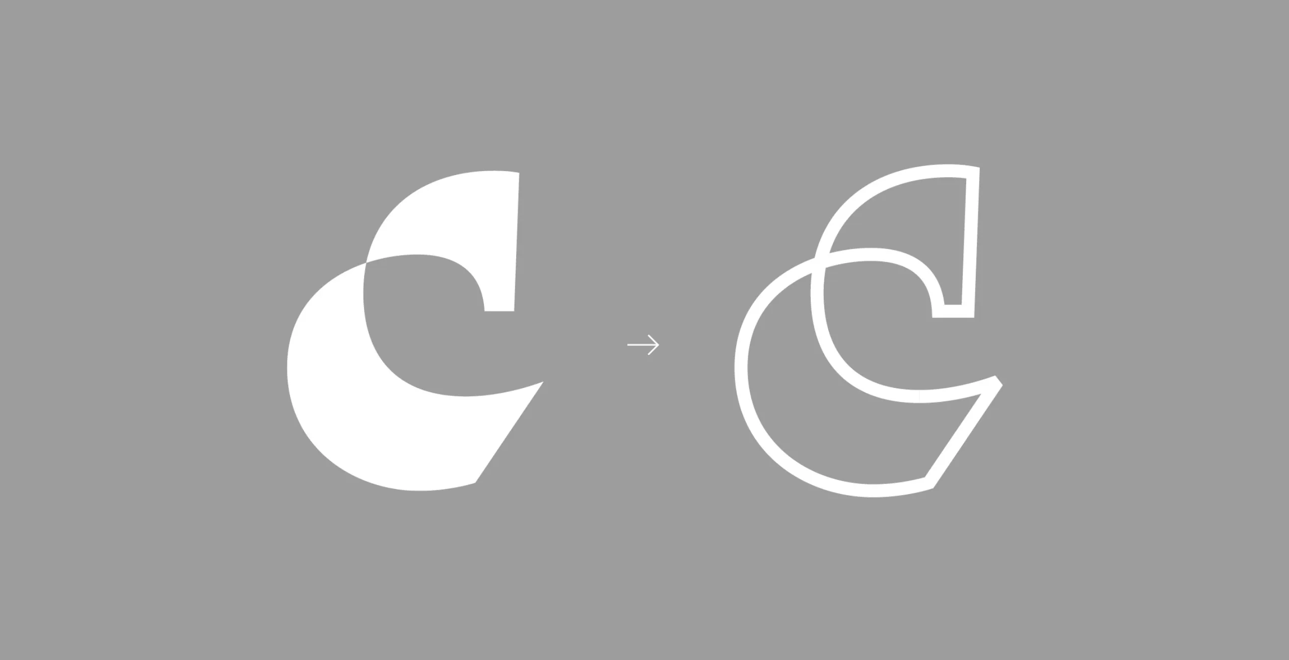
The previous logo represented the road infrastructure, but the idea of environment, landscape and preservation of biodiversity were absent. In order to be in line with the group's raison d'être, Graphéine helped Groupe CHEVAL to transform its logotype and graphic guidelines.

A strong and smart new emblem with meaning

By analysing the logos of competing public works companies, we found that the majority of their emblems favour a pure form with a flat colour treatment. No artifice or relief effect adds complexity to their rendering.

The redesign of the logo retains the principle of a dynamic and moving "C" lettering, while removing the "horseshoe" evocation and replacing it with a more fluid and "aerial " design. His shape evokes the lightness of a folding ribbon. By cleverly stylising the drop of this letter "C" we obtain a stylised horse's head and the whole letter becomes a spirited horse.
The extremely minimalist design of the horse's silhouette can present a risk when it comes to revealing the trick. Some people will see the horse at first glance and others will not. This contributes to the pleasure of discovery when the time comes.

A new brand architecture that better integrates its affiliates

The new brand design of the 14 affiliates heralds the beginning of a new era for Groupe CHEVAL. Beyond the change of logo and colours, this new visual identity :
- pays tribute to the DNA of Groupe CHEVAL since its creation,
- reinforces the unity of its different brands,
- allows to affirm that the Group gathers 630 women and men committed to sustainable development, for the territory and the environment,
- It is a new visual signature with a strong impact that takes on its full dimension in the context of the Group's vehicles.

Flocking of the 600 Groupe Cheval's vehicles produced by the company Smart Cover

Context

Groupe Cheval is a rapidly growing French public works company. The successive acquisition of several subsidiaries required a rethink of their brand architecture. The registration of a "raison d'être" in the company's statutes also motivated an evolution of their visual identity in order to better correspond to their values.

Objectives

- To have a strong, impactful, modern and flexible visual identity, so that Groupe Cheval and its subsidiaries are presented in a coherent way, enhancing the value of the "CHEVAL" brand
- To give the image of a powerful regional group
- To have the tools to create and develop in-house materials


Share this project:
Project expertise:
Logo creation, visual identity and graphic guidelines.
Type of client:
Communication in the industry, construction and public works sector.

Related projects: