Logotype communication immobilier logement social habitat

2021

All'Access
Combine real estate project
and serenity

We were commissioned by Alliade Habitat, a subsidiary of the Action logement group, the leading social housing in the Auvergne-Rhône-Alpes region, to support their brand All'access in the creation of its visual identity.

All' Access works to promote access to home ownership for employees and low-income households by offering quality housing for sale at below-market prices in the region's attractive areas, with local support for a secure project.

Social home ownership is therefore part of the tenants' residential career. Tenants are informed before each commercial launch of future operations. Communication is developed for them.

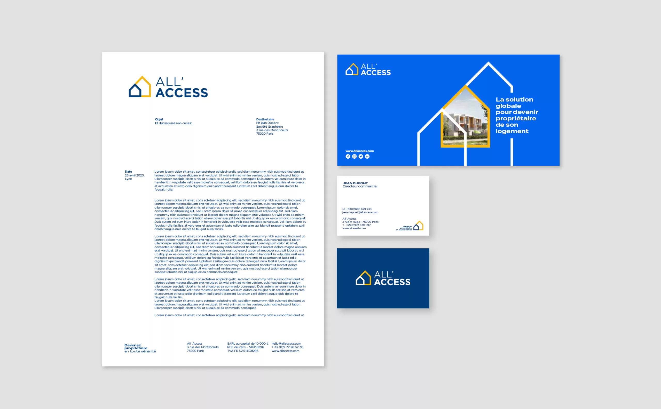
In order to ensure the development of the brand and give it new strength, we have defined a fresh and dynamic brand territory in close collaboration with the teams. The aim was to overcome a lack of awareness and to equip the teams with effective communication tools. The whole had to be consistent with the graphic identity of the Alliade Habitat parent brand.
Concept

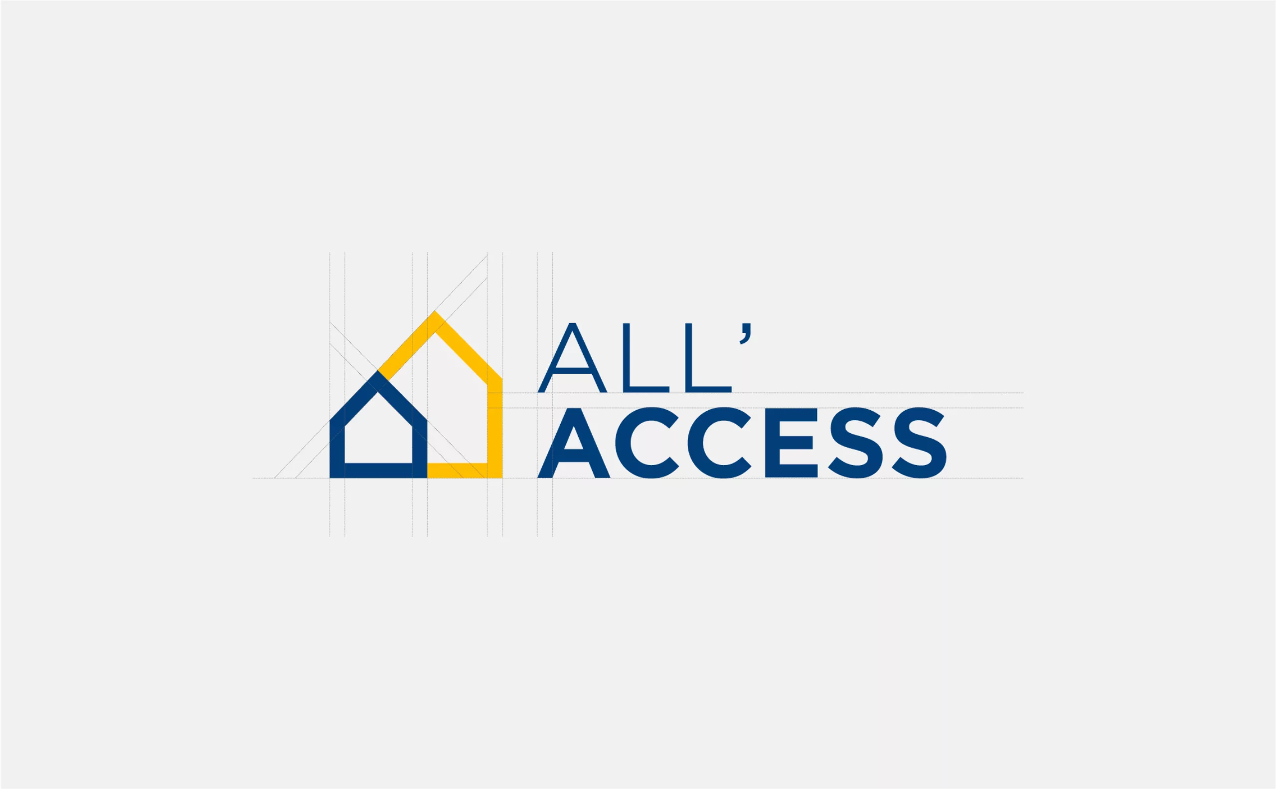
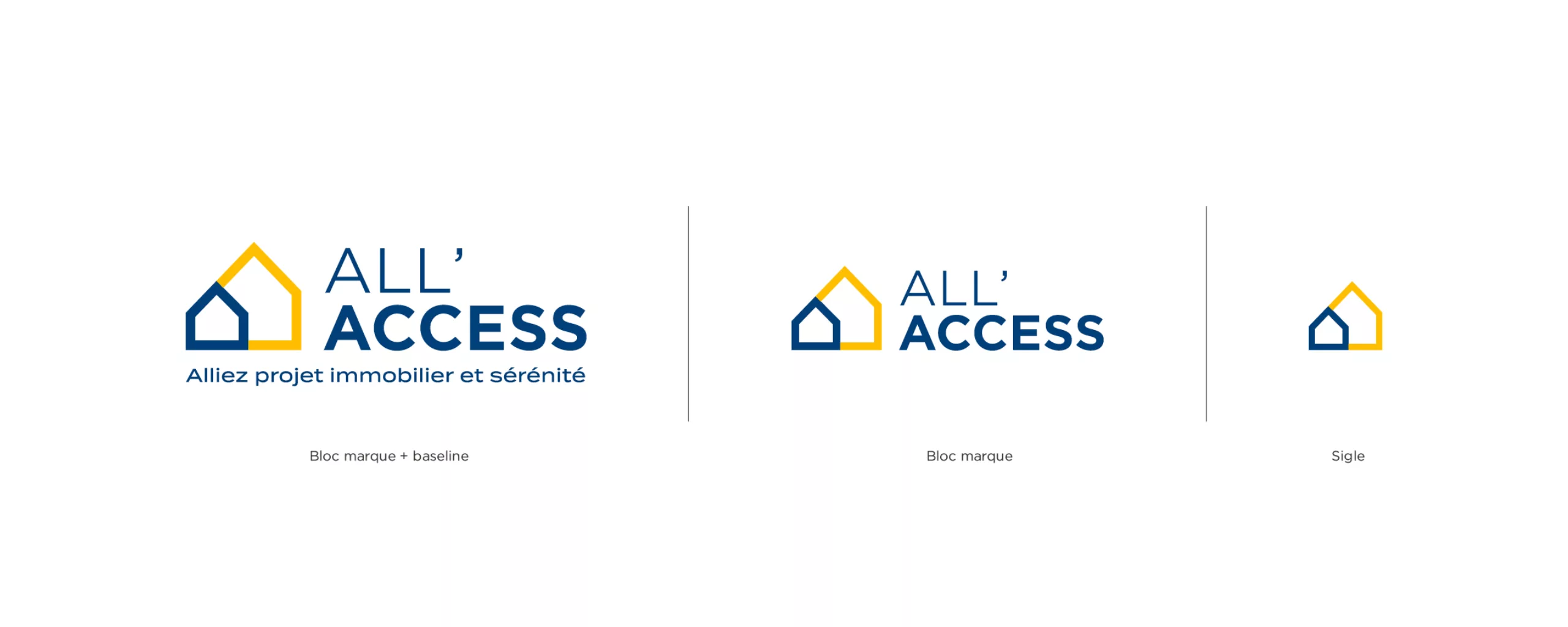
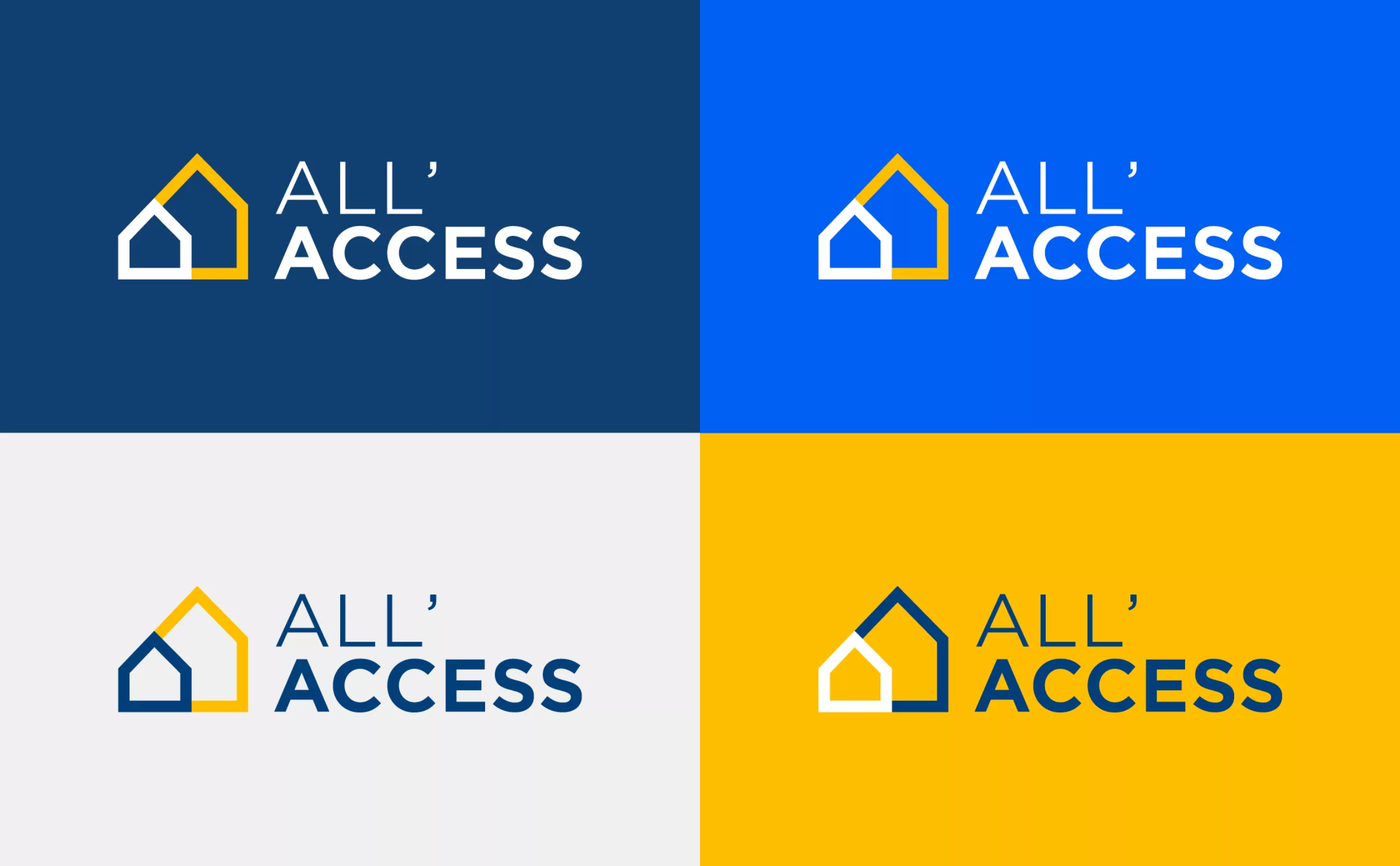
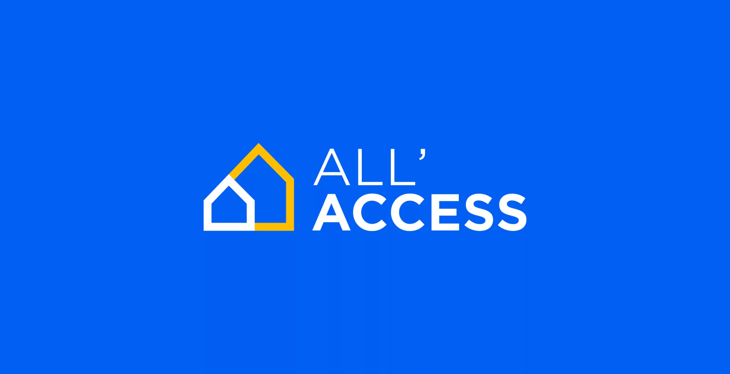
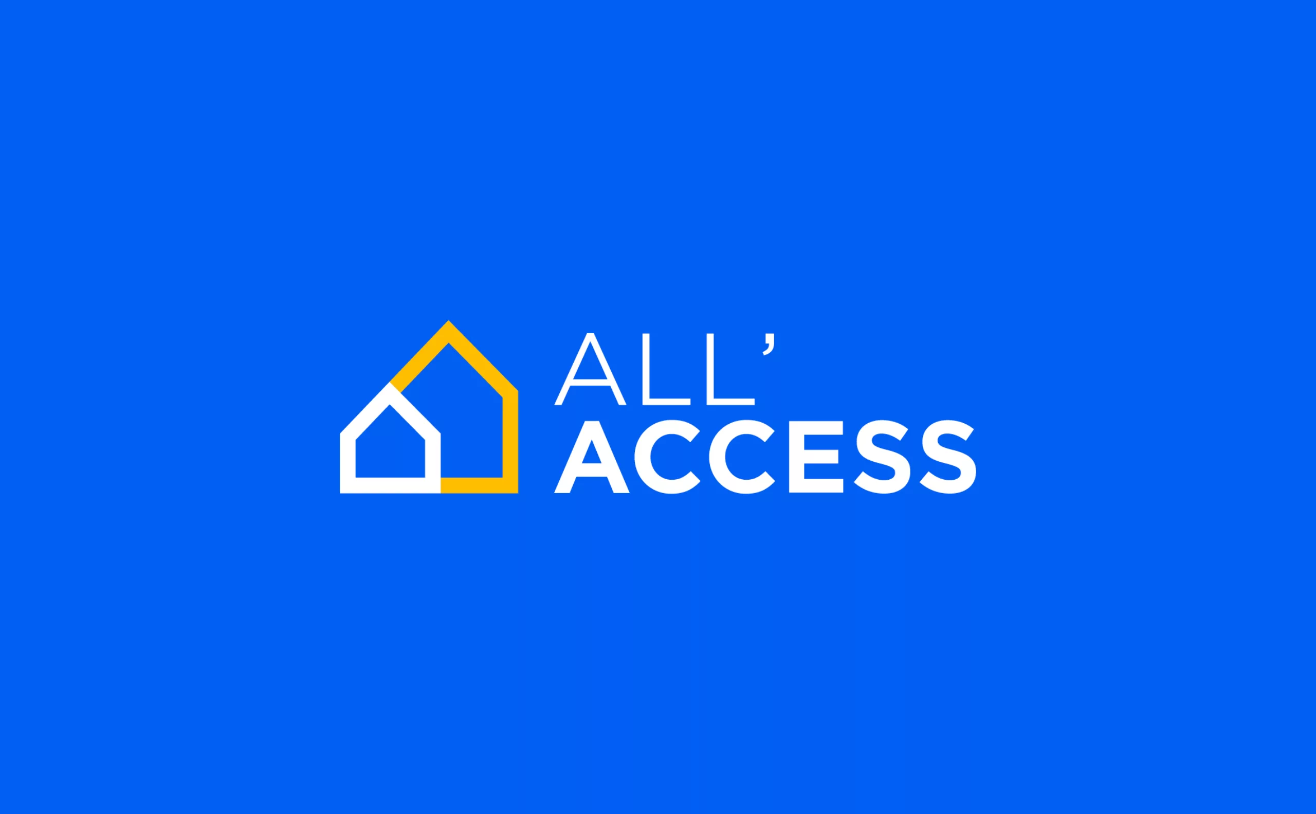
The new All'Access identity embodies the brand's promise: to accompany first-time buyers throughout their residential career by combining real estate projects with peace of mind. Indeed, the new All'Access logo is first and foremost arrows pointing upwards like a springboard, they help people grow and show the way to home ownership.

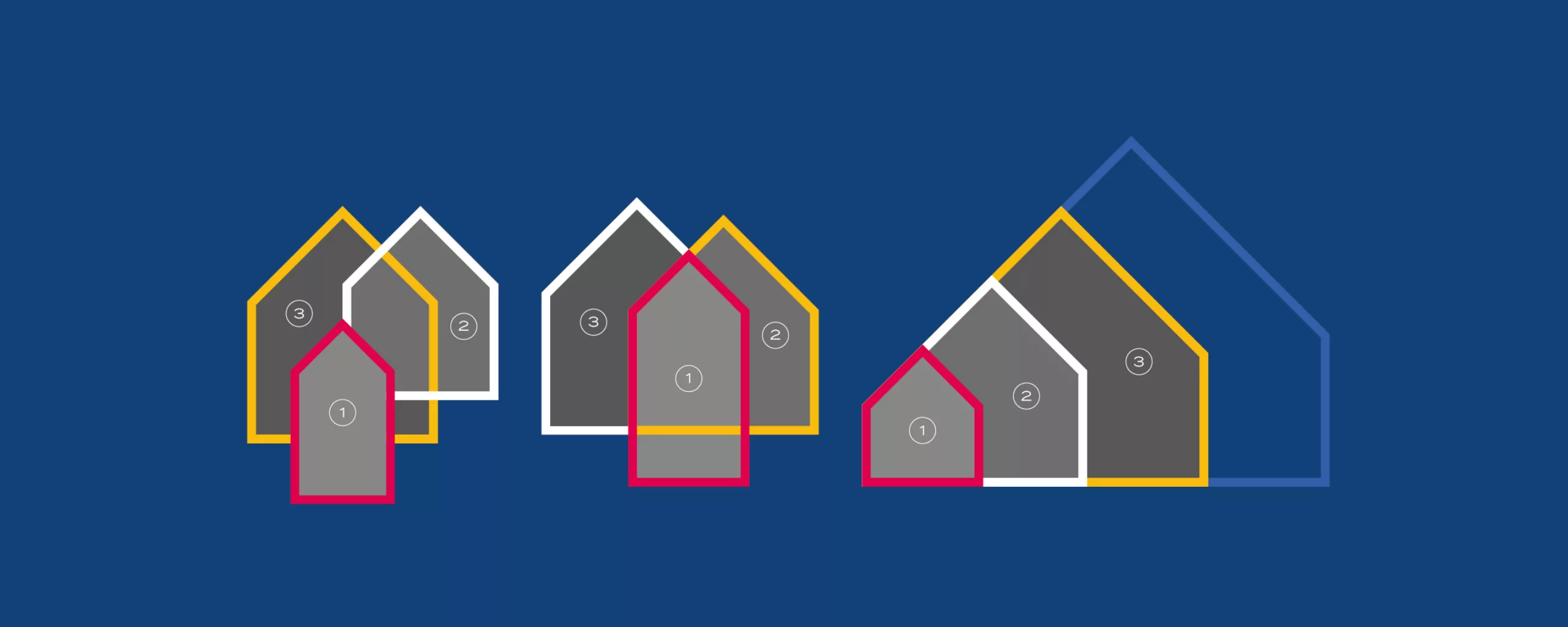
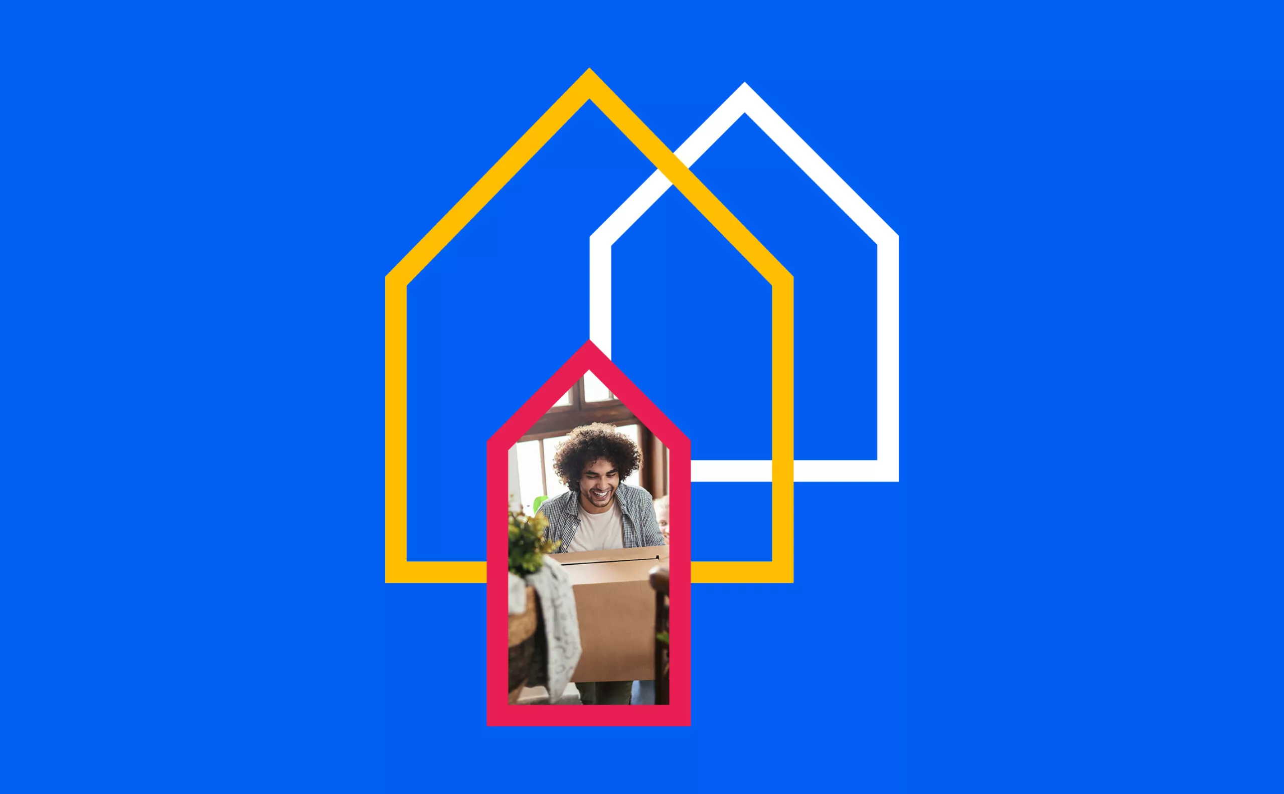
These arrows are also above all houses. There are two of them. The first one lets guess behind it a second more imposing one. The logo thus embodies the notion of progression to illustrate the fact that All'Access accompanies you throughout your life to best meet the evolution of your projects, one step at a time, always in complete serenity.

randing-immobilier-ALLAccess-brand_design-identity-logo-house-brand
##_Branding-immobilier-ALLAccess-typeface-Gotham-Termina-typographie
Branding-immobilier-ALLAccess-happy-identity-logo-branddesign
##_Branding-immobilier-ALLAccess-logotype-identity-color-blue-logo
Branding-immobilier-ALLAccess-happy-identity-logo-branddesign

A modular visual universe

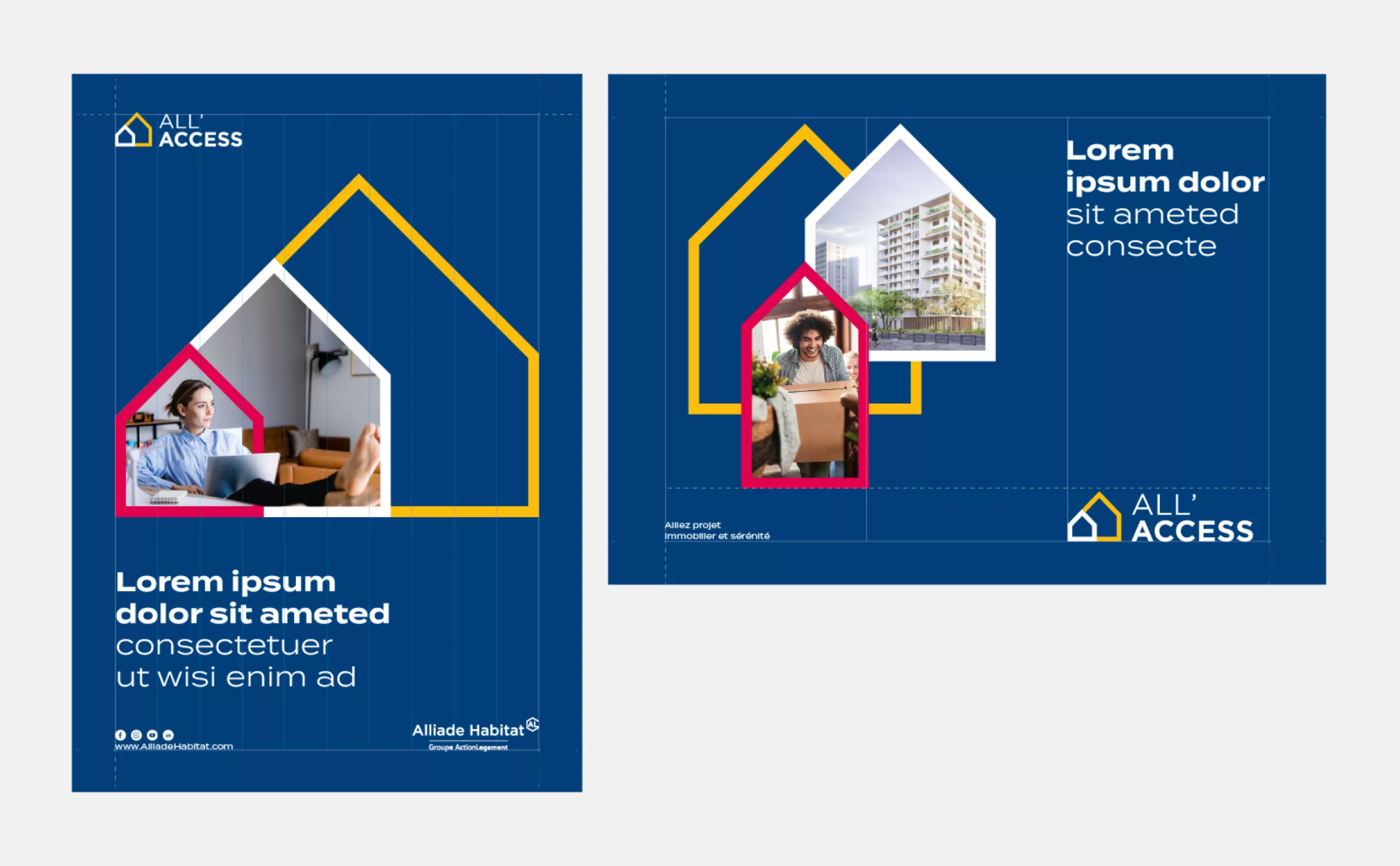
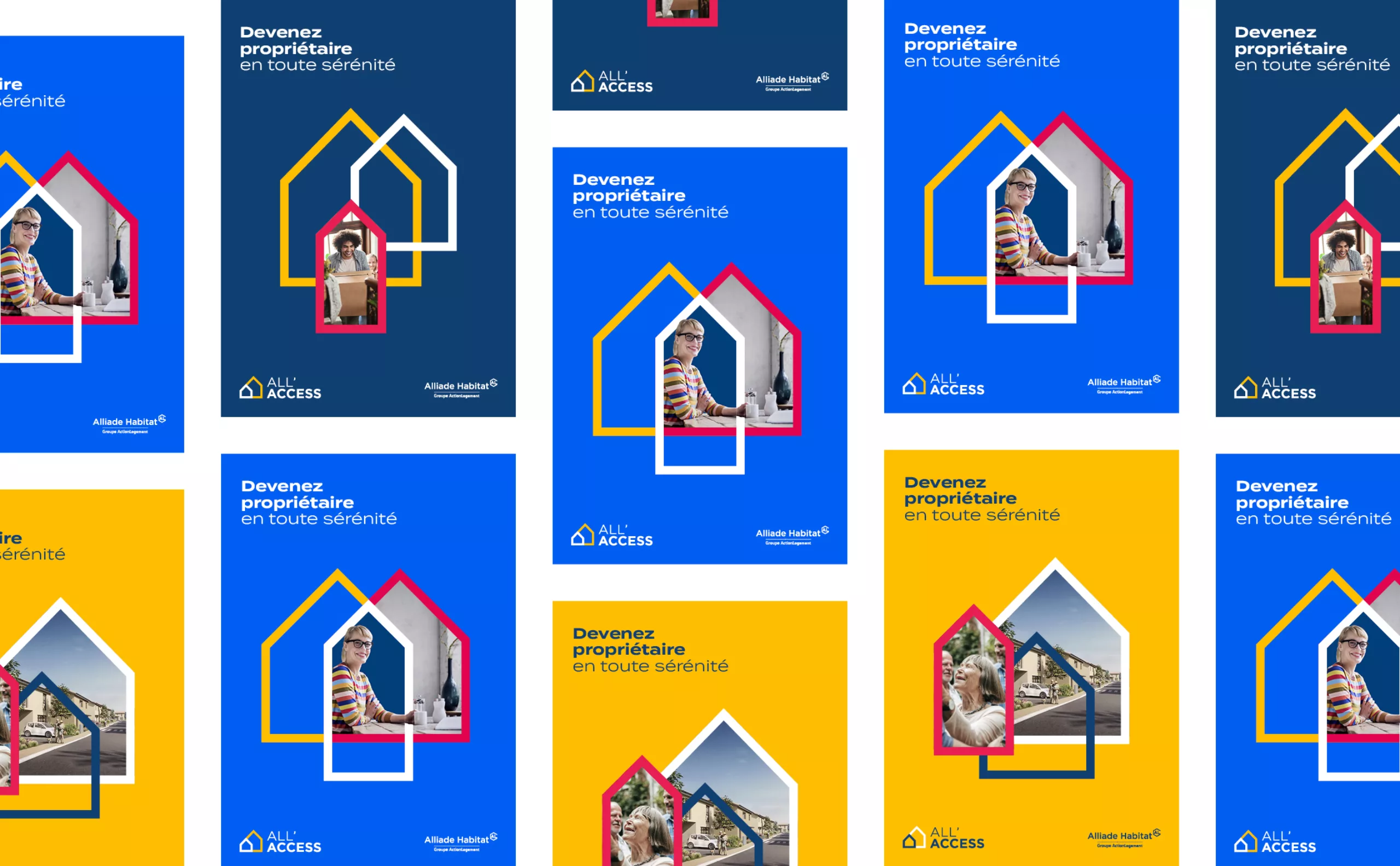
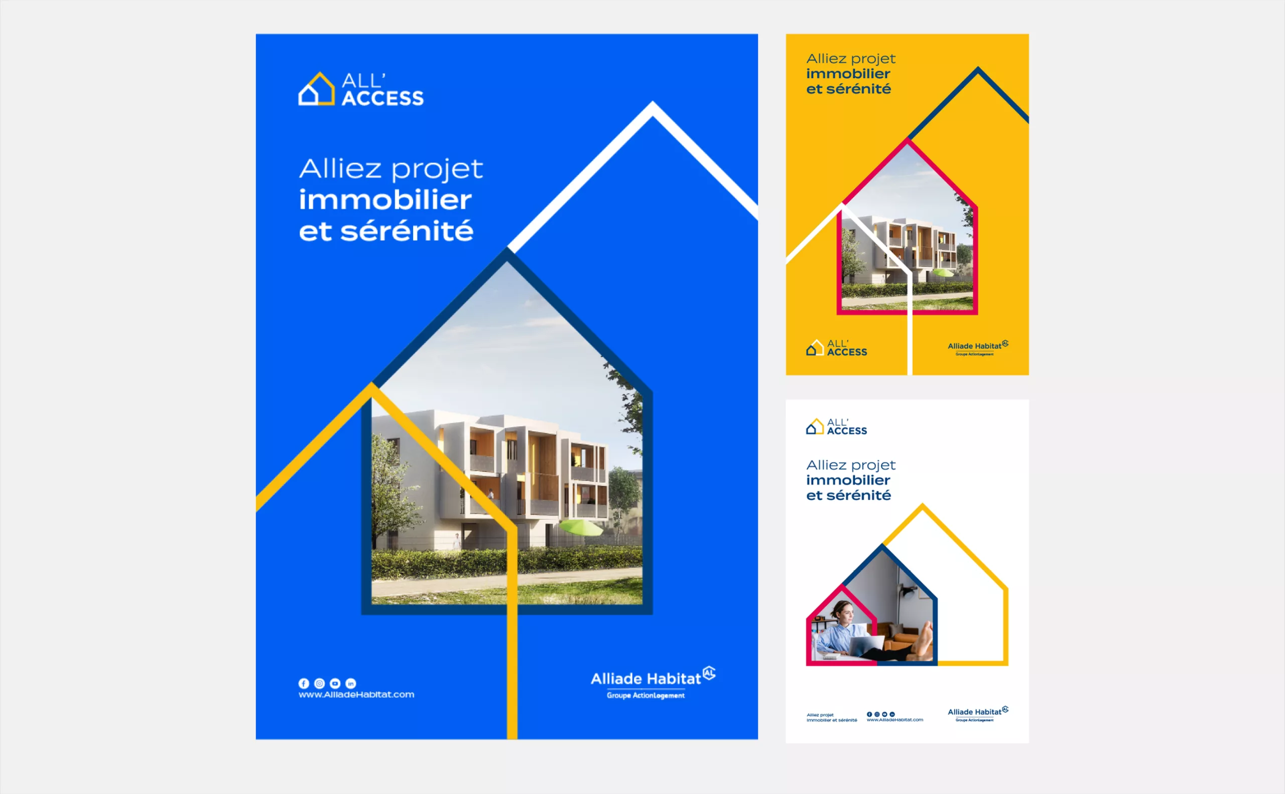
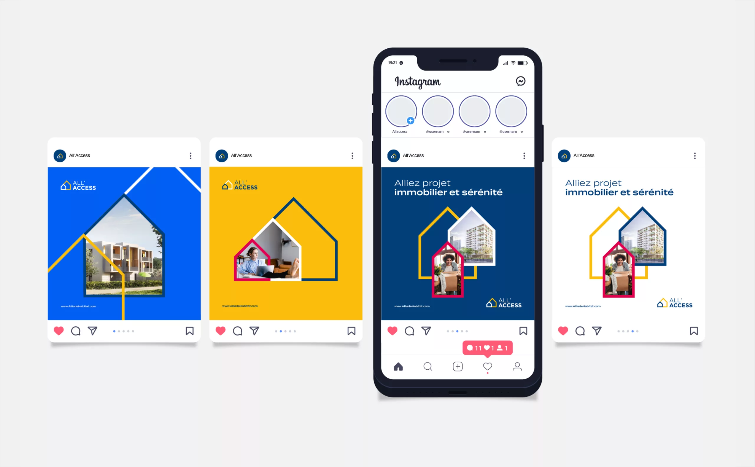
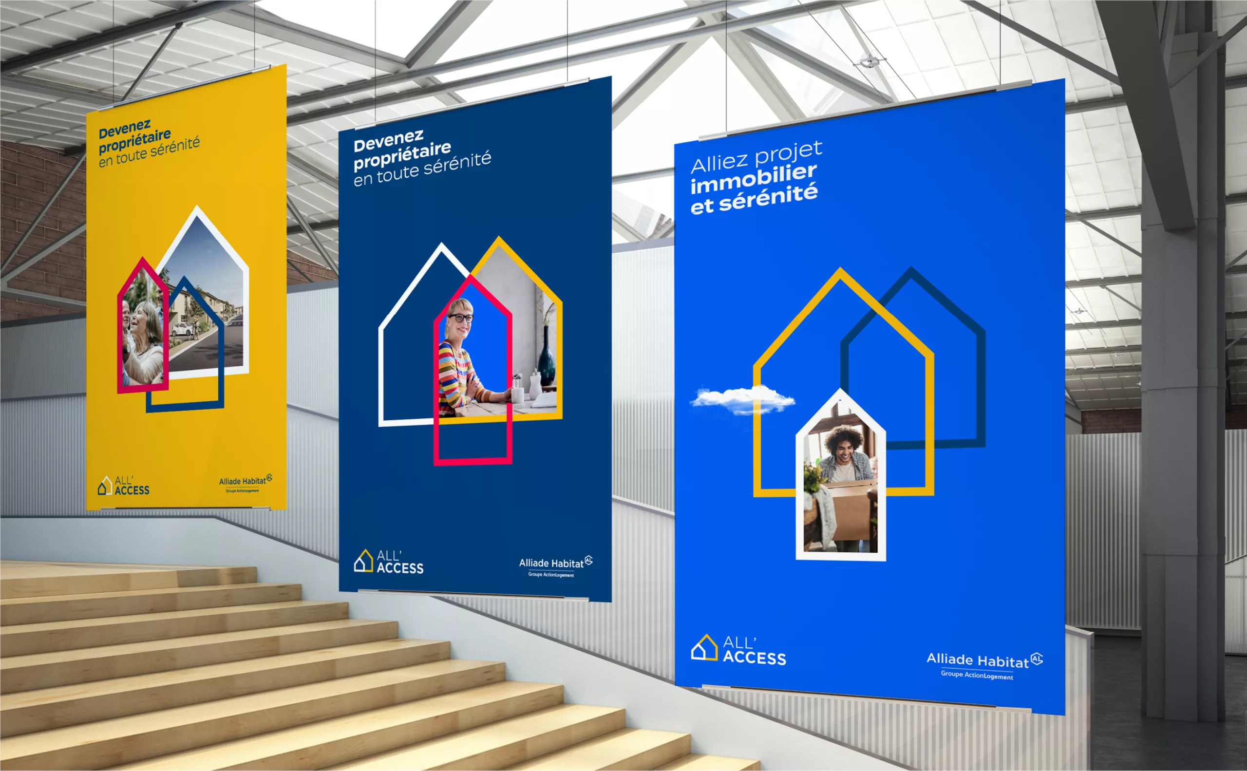
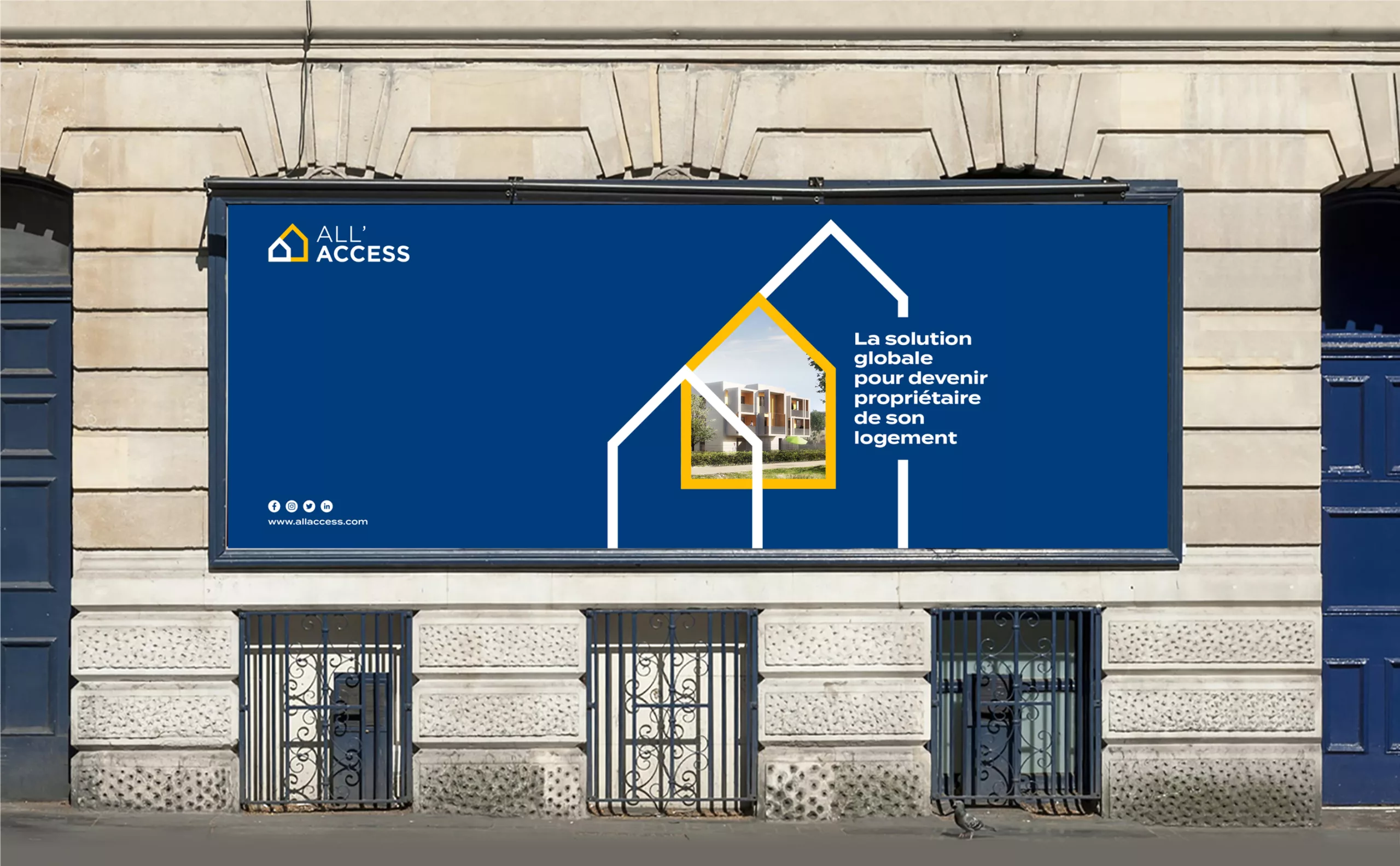
The logo is composed and re-composed to create spaces in which the image plays and dialogues in a free and structured way. As if to symbolize the adaptability of the brand to its customer, the system also evolves, proposing a different composition when the communication allows it.

##_Branding-immobilier-ALLAccess-logotype-poster-affiche-house-logo
##_Branding-immobilier-ALLAccess-print-poster-rental-house-logo
##_Branding-immobilier-ALLAccess-logotype-identity-poster-logo
##_Branding-immobilier-ALLAccess-logotype-print-carte-house-logo
##_Branding-immobilier-ALLAccess-logotype-instagram-rental-house-logo
##_Branding-immobilier-ALLAccess-print-Logo-rental-house-identity
##_Branding-immobilier-ALLAccess-logotype-house-affiche-poster-logo-visual

All'Access

All'Access offers a diverse range of products at affordable prices that are often lower than those on the market. It offers security for first-time buyers and support throughout the residential process.

The challenges of this new visual identity

To embody our values and our social commitment as a landlord committed to the well-being of its customers and thus help them achieve a better quality of life as homeowners.


Share this project:
Project expertise:
Logo creation, visual identity and graphic guidelines.
Type of client:
Communication in the industry, construction and public works sector.

Related projects: