Margaret Calvert: woman at work! How design saved UK’s drivers.
As part of our series of History of graphic design and its famous names, here is a portrait of a great lady whose discreet work has helped to save hundreds of thousands of lives in the United Kingdom!
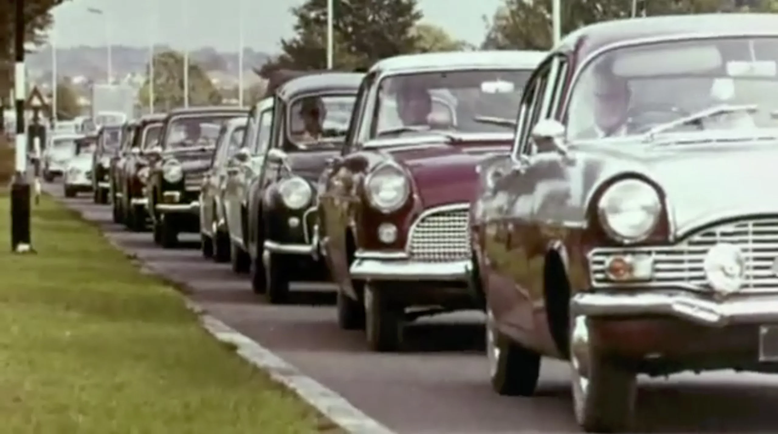
In the 1960s, the increase in wealth brought more and more traffic on the roads. To face this new reality, the government undertook serious highway work. And as cars were moving faster and faster, it was also a question of redesigning all of road signs, which were unreadable at high speed.
This was the mission entrusted to Margaret Calvert(1936 -) and Jock Kinneir (1917 – 1994) between 1957 and 1967. Their work subsequently became a model of modern road signage, replicated worldwide. Thousands of people see their work every day and take these signs for granted, without realizing the scale and revolutionary nature such a project had at the time! Quite like Pierre Novat and the French ski slopes…
From air to asphalt
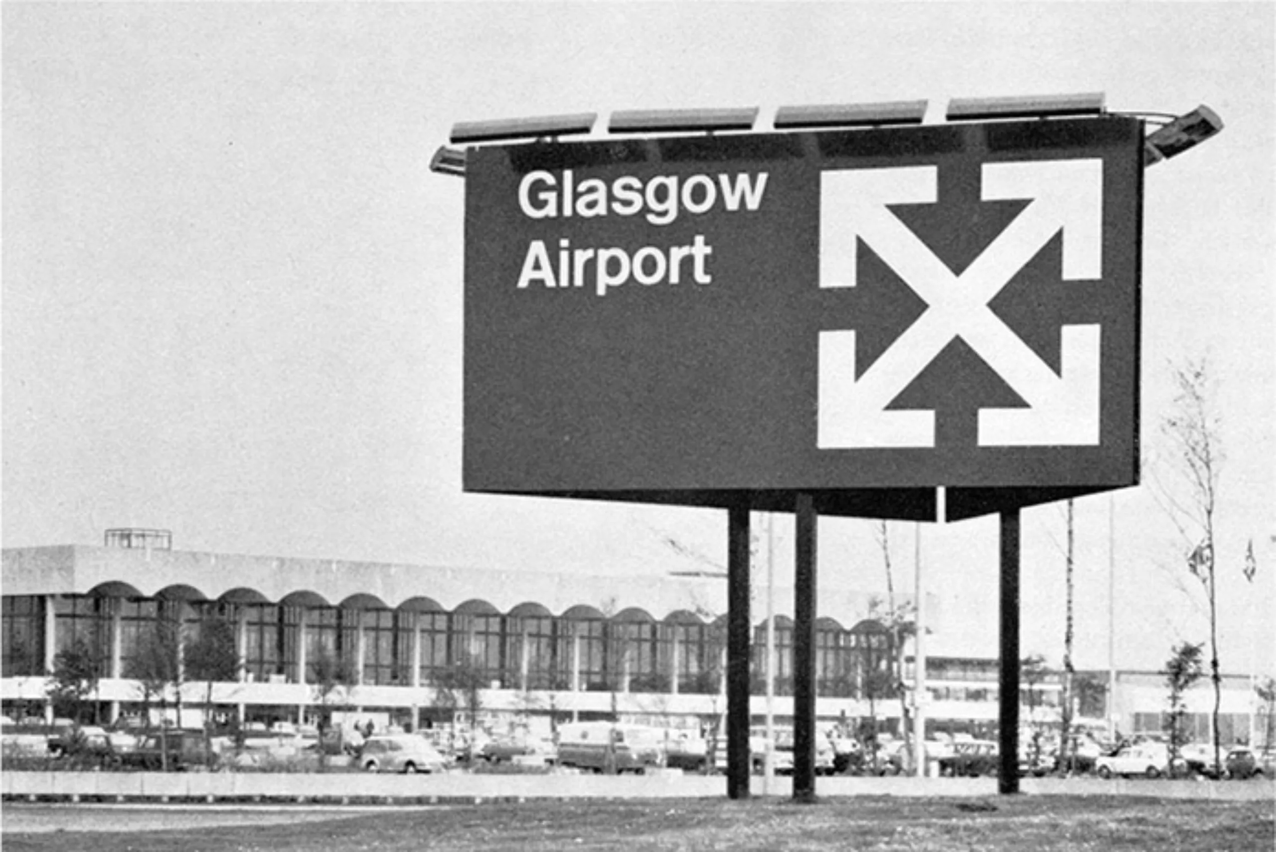
The future of these designers was born under a bus shelter in 1957. Jock happens to find himself in the same line as David Alford, one of the architects of a second London airport project. The latter, realizing that they were neighbours, offered Kinneir the opportunity to design the signage of Gatwick Airport, which had never been done by anyone before! Jock then hired Margaret Calvert, his student, and offered her her first job.
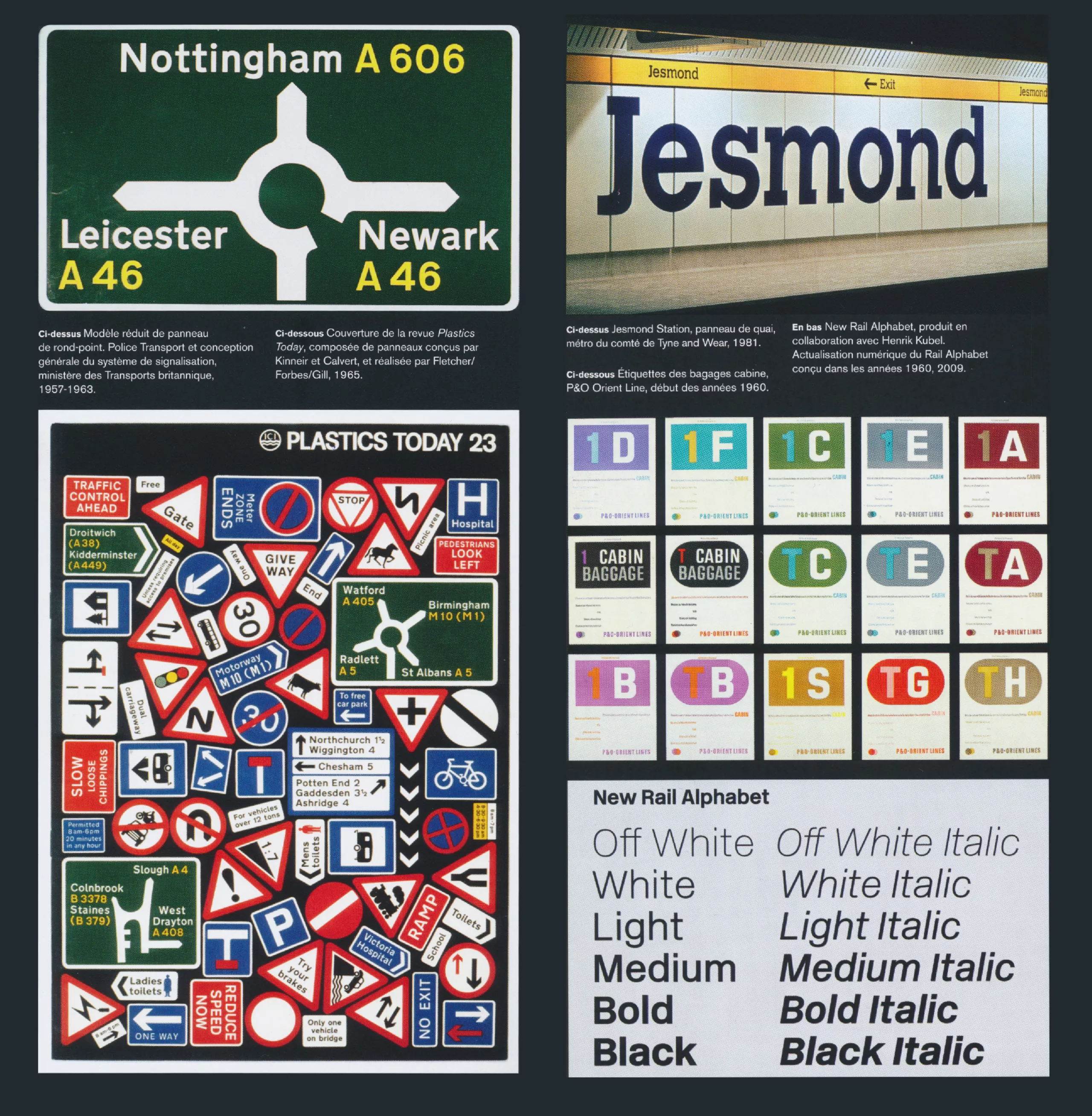
All-rounders, Calvert and Kinneir also designed the Rail Alphabet typography for the British Rail company, inspired by the Gatwick typography developed for the airport project.
After air and rail, all the road signs in the United Kingdom, starting with the motorways, were handed over to them between 1958 and 1965. It is one of the most ambitious design projects ever undertaken, as Margaret Calvert admits.
Margaret Calvert“It was really innovative. You really believed in it and wanted to be part of it – not in the sense of glory. It was just really exciting to be building it.“
From these first successful missions, their partnership office, Kinneir Calvert Associates, was created in 1966.
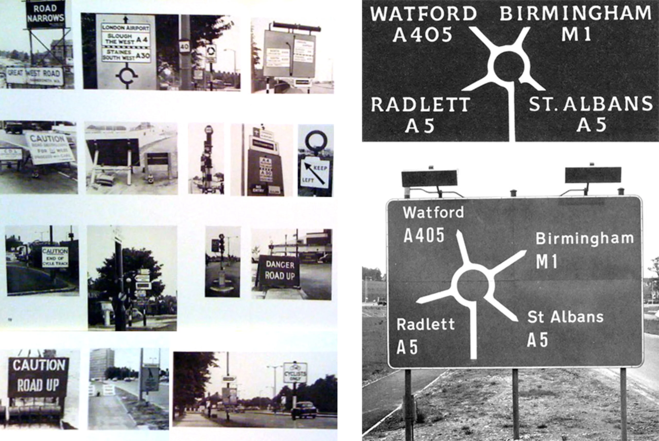
As a first step to underline the urgent nature of this gigantic signage project, graphic designer and typographer Herbert Spencer identified in his magazine Typographica the myriad of existing signs; a visual cacophony such as to threaten the safety of motorists. Ordered by different organizations, the existing typographies and colours varied from one panel to another, generating great confusion, as illustrated by the pictures below.
Below are Spencer’s photos. At the bottom right, the new proposal by Calvert and Kinneir.
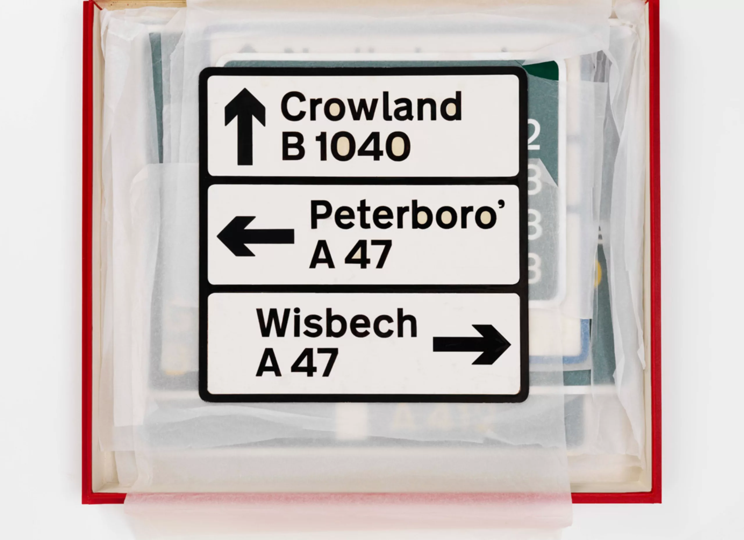
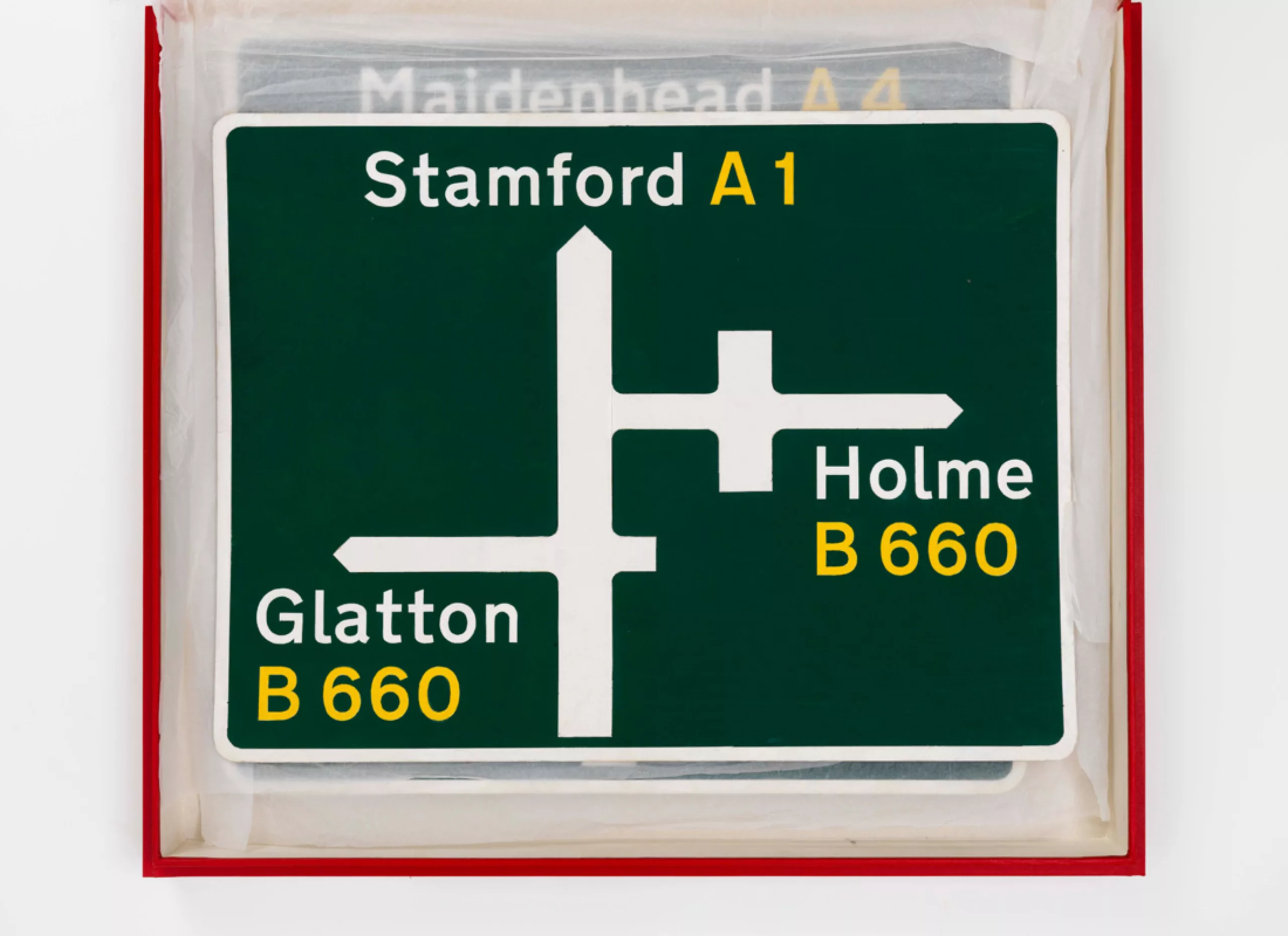
A whole new visual language is proposed with lower-case letters, a new typography and specific colour codes, adapted to high-speed reading.
Types, signs, panels
Initially, the Ministry of Transport wanted a project in line with what already existed in Germany, namely a white typeface on a black background for motorways, and a font with no German serif character. But the two designers decided to redesign everything in order to adapt as well as possible to the landscape of the United Kingdom.
The woman who designed road signs
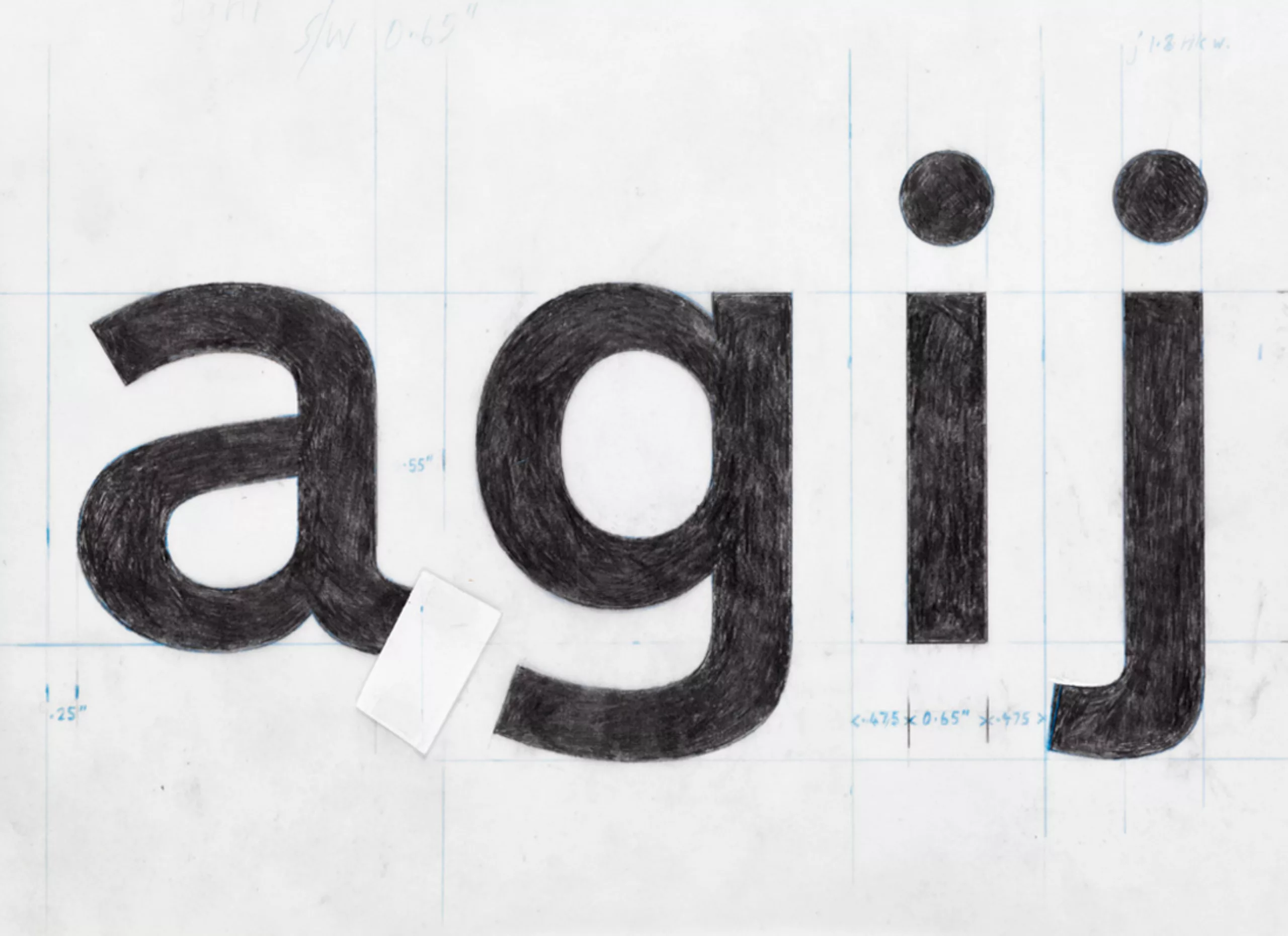
Carter created a specific typography in capital and lower case: the Transport. It was more easy to read, in order to recognize road names and signs at high-speed. In 2012, Henrik Kubel created the digital version of the Transport font and 6 new weights, with the help of Calvert.
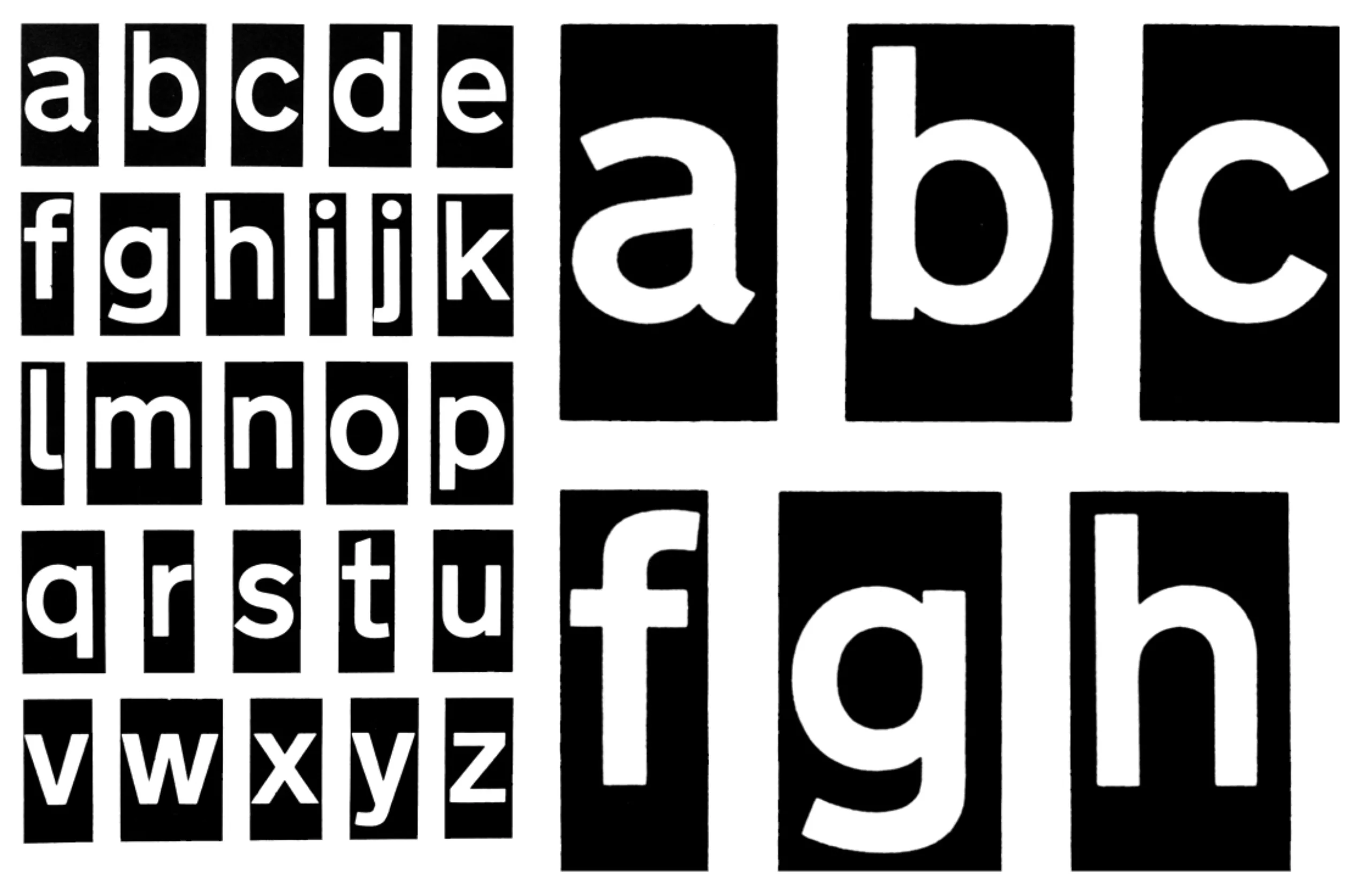
“We started from scratch, with a specification of the ideal letter shape, after studying other possibilities (including the adaptation of the Akzidenz Grotesk character – a major influence on proportions and overall appearance).
Important details, such as the curve at the end of the lower-case letter l (borrowed from Johnston) and the oblique curved lines of the letters a, c, e, f, g, j, s, t and y, have been specially designed to help maintain the word shape when the letters are slightly spaced; a necessary compromise to compensate for the “halo” effect produced with brightness of the headlights (Much like a Rembrandt portrait – with brush strokes that merge to focus the image). This typography, available in two weights, has been named Transport.”
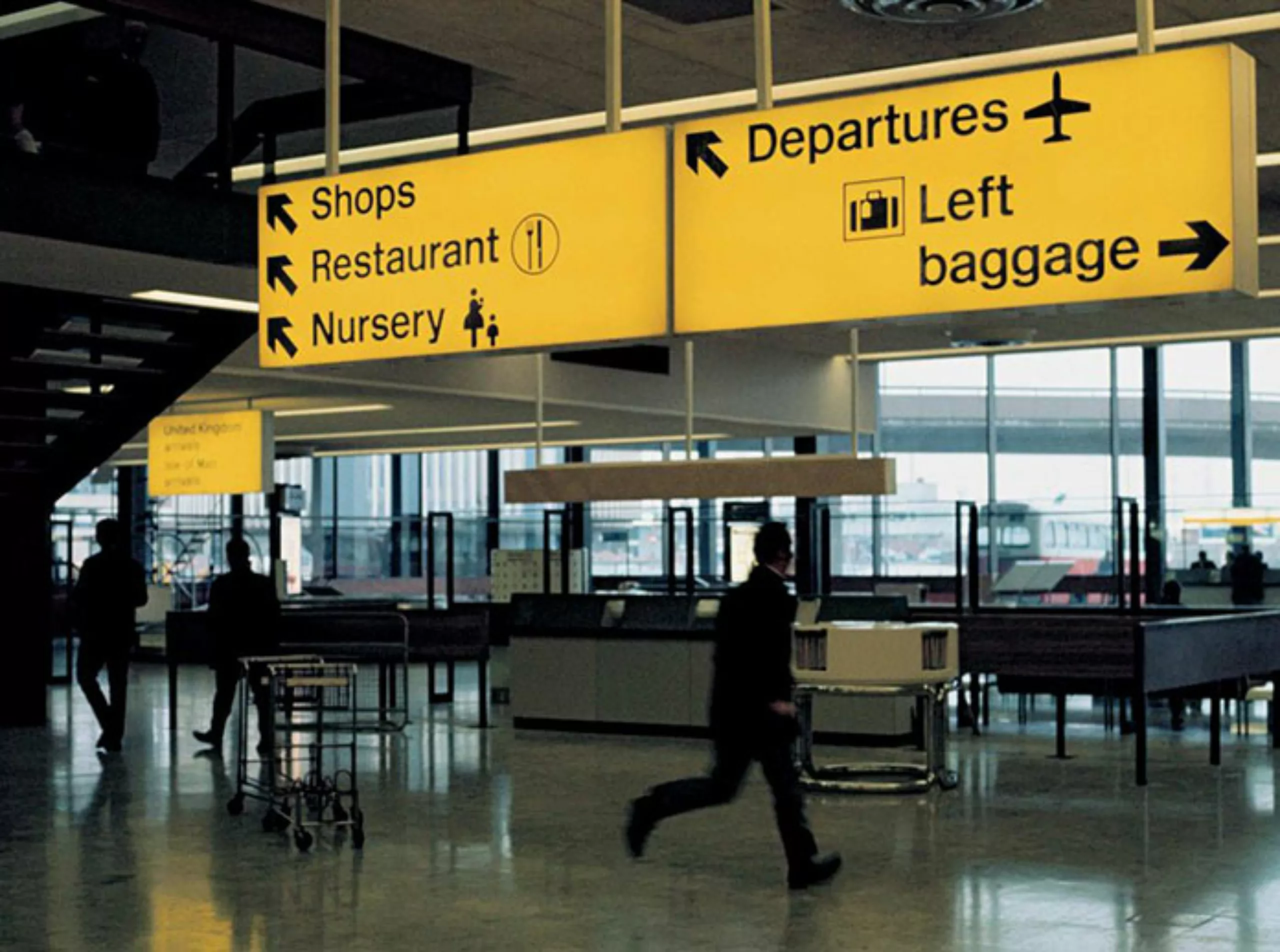
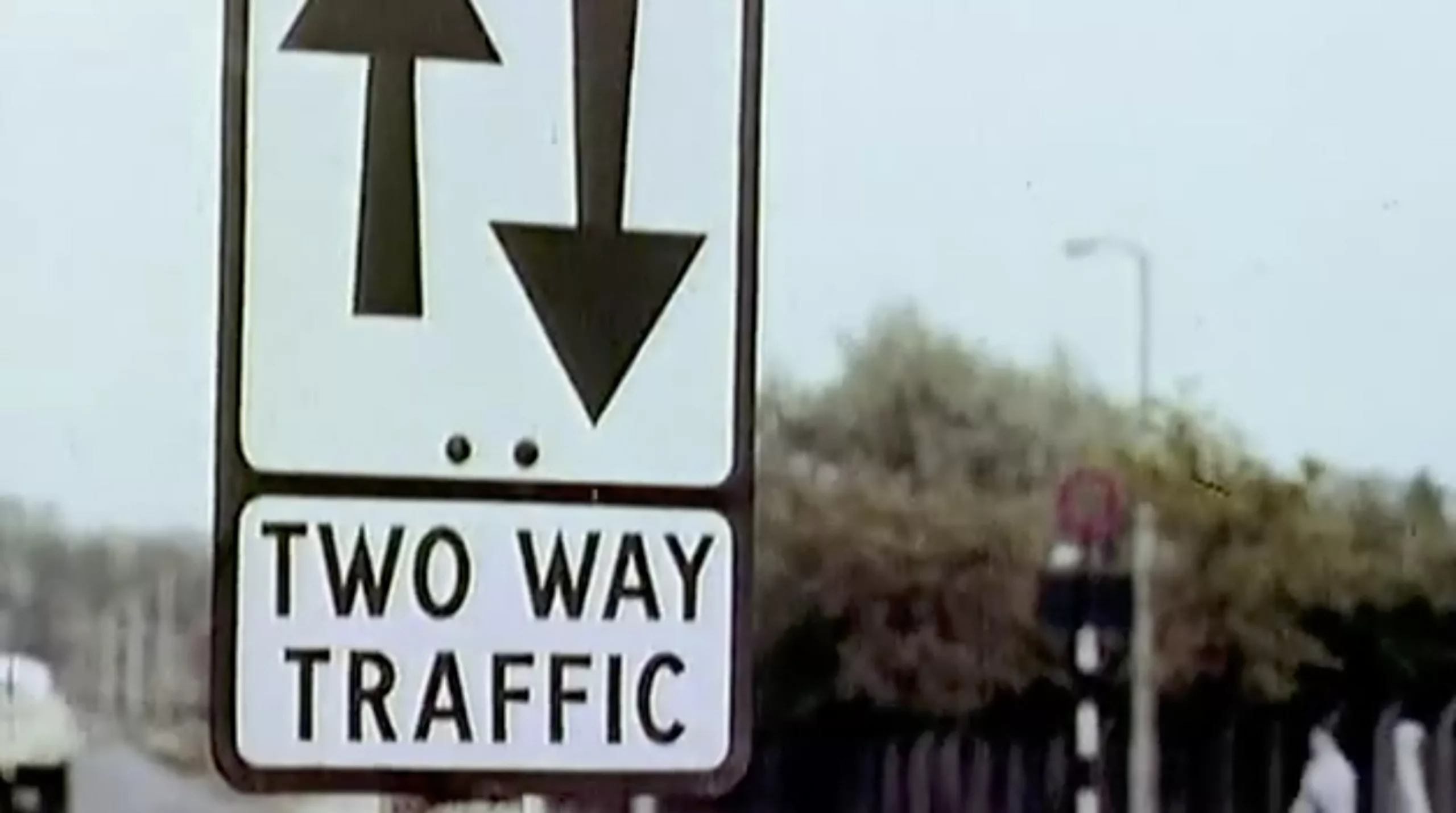
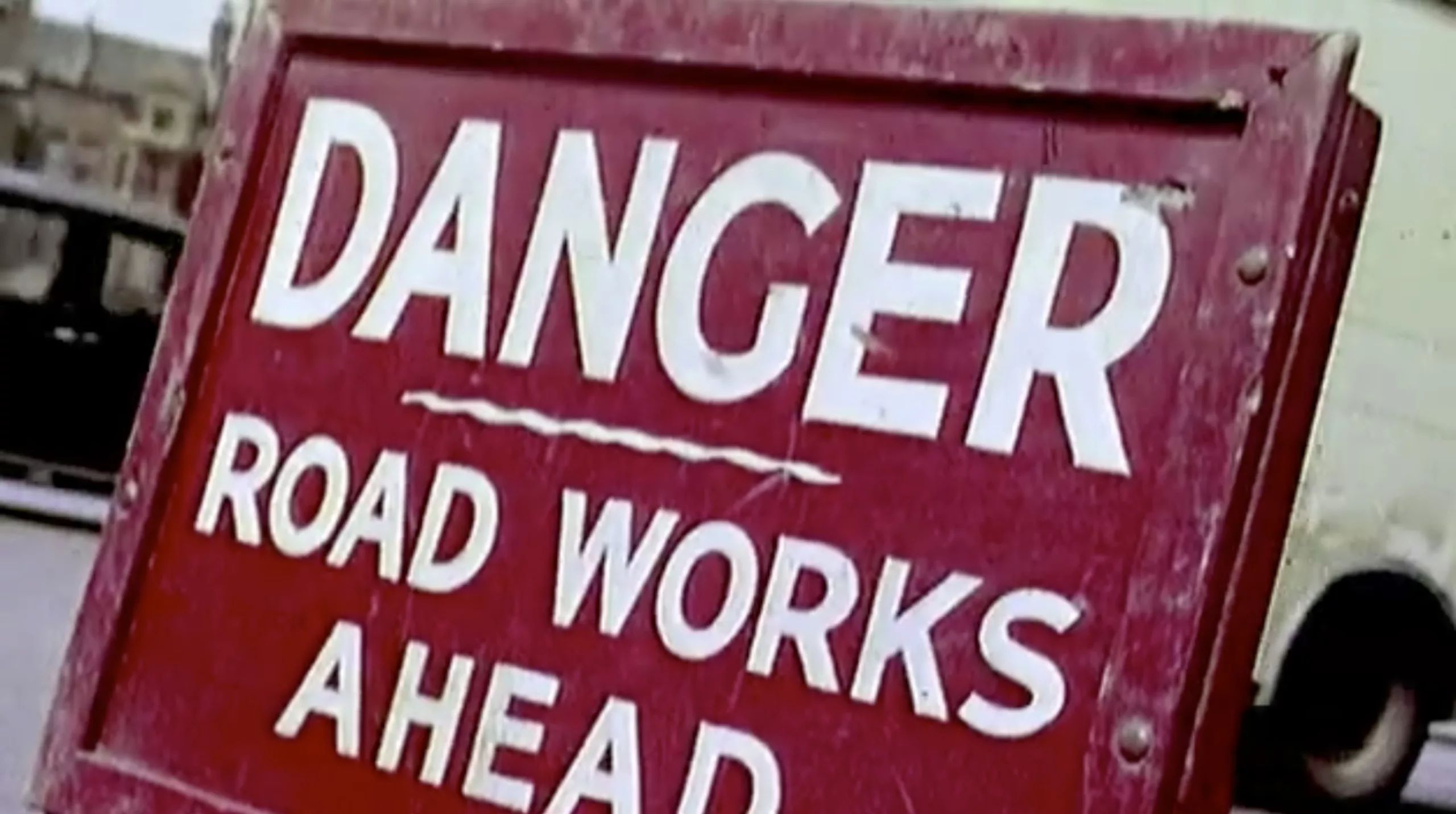
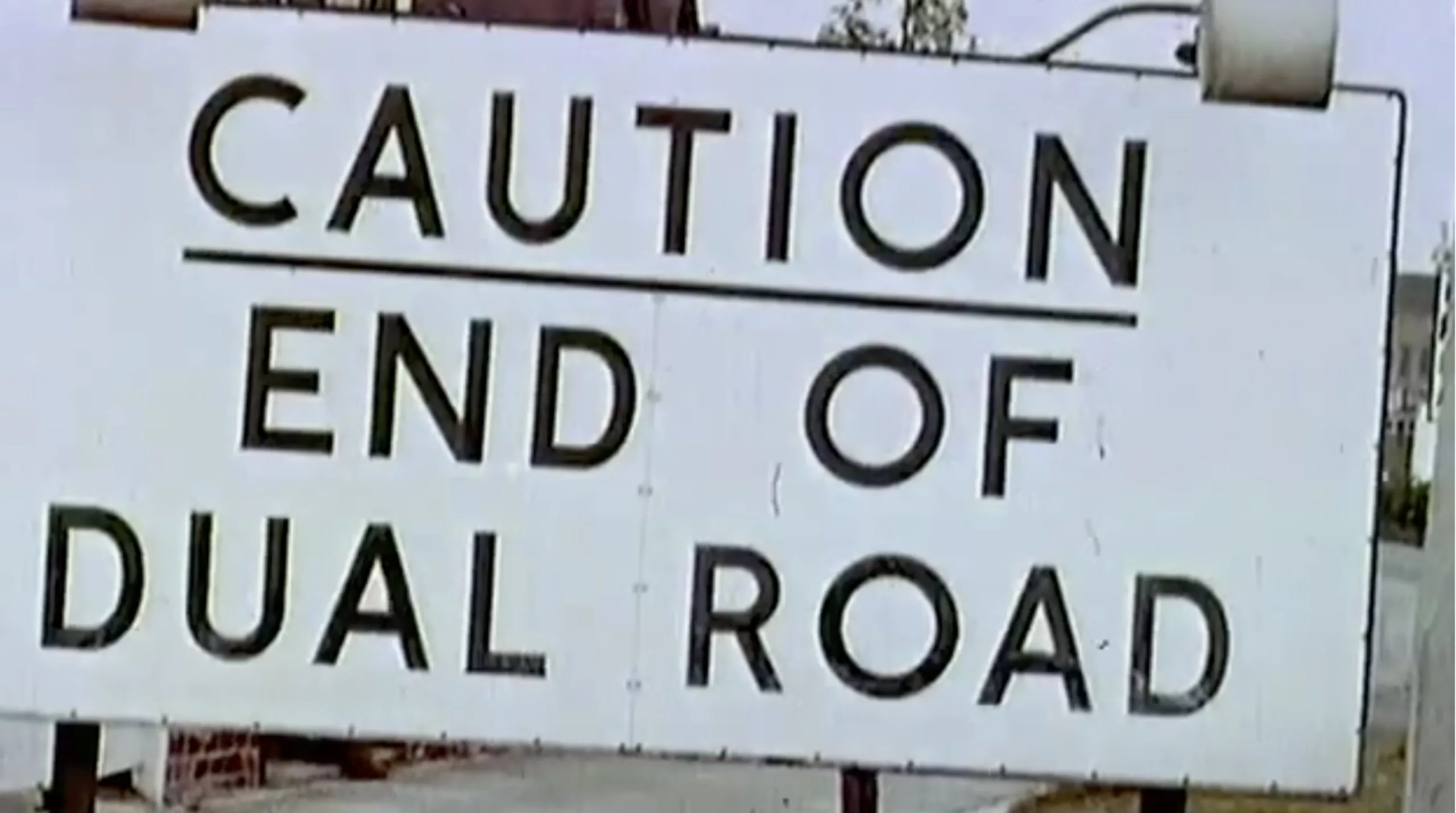
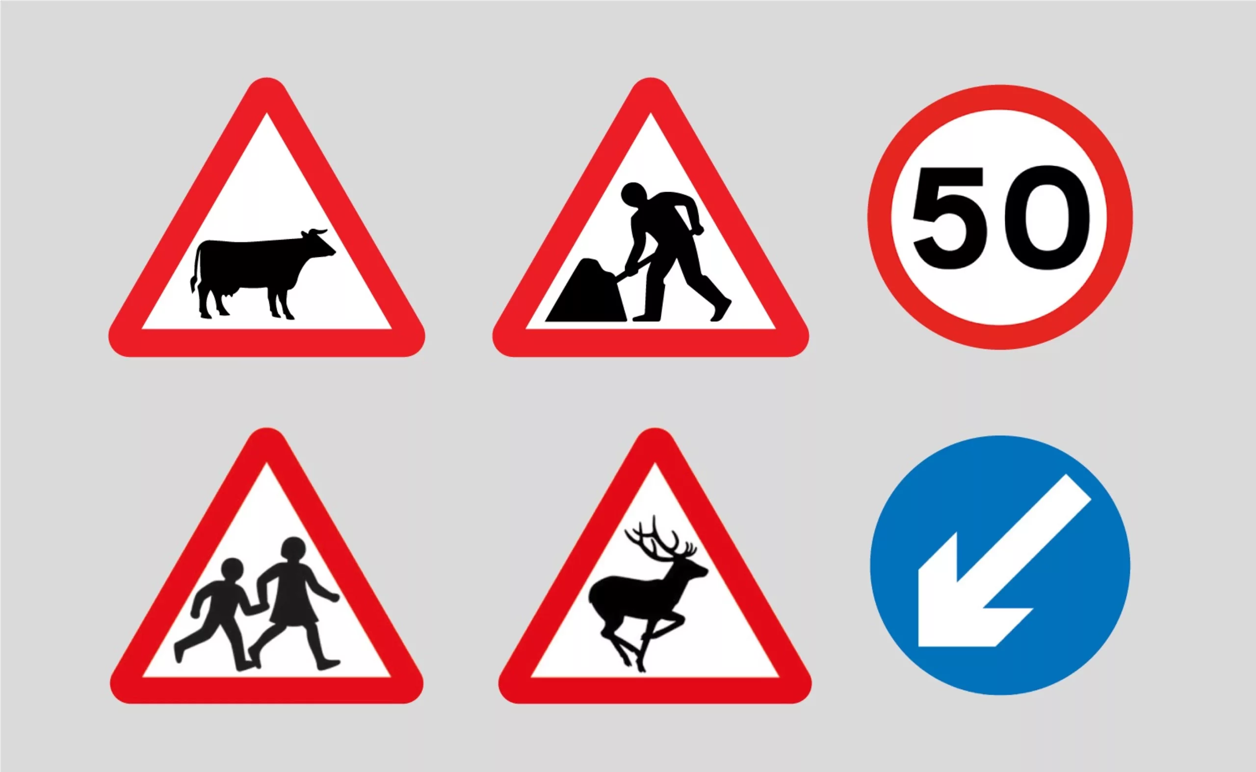
Kinneir & Calvert also created a whole system with different bodies and colours for each group of road signs, following the European protocol: triangles for warnings, circles for instructions and rectangles for information.
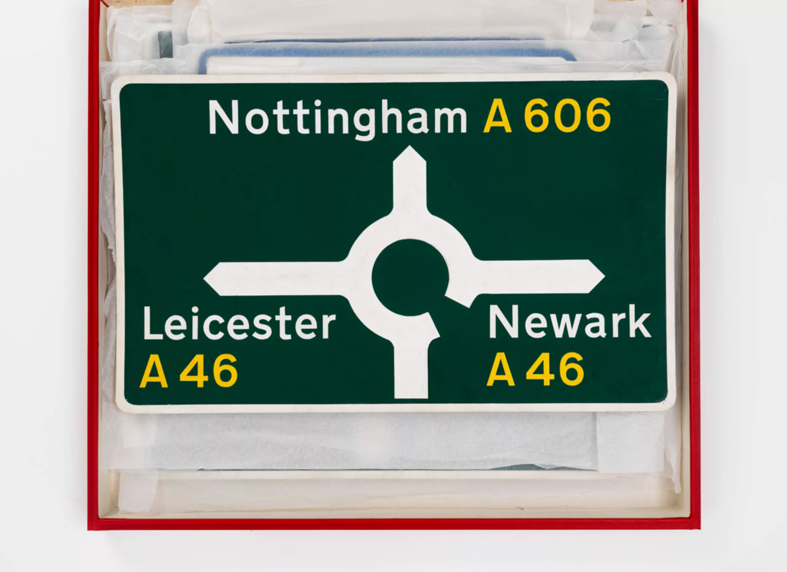
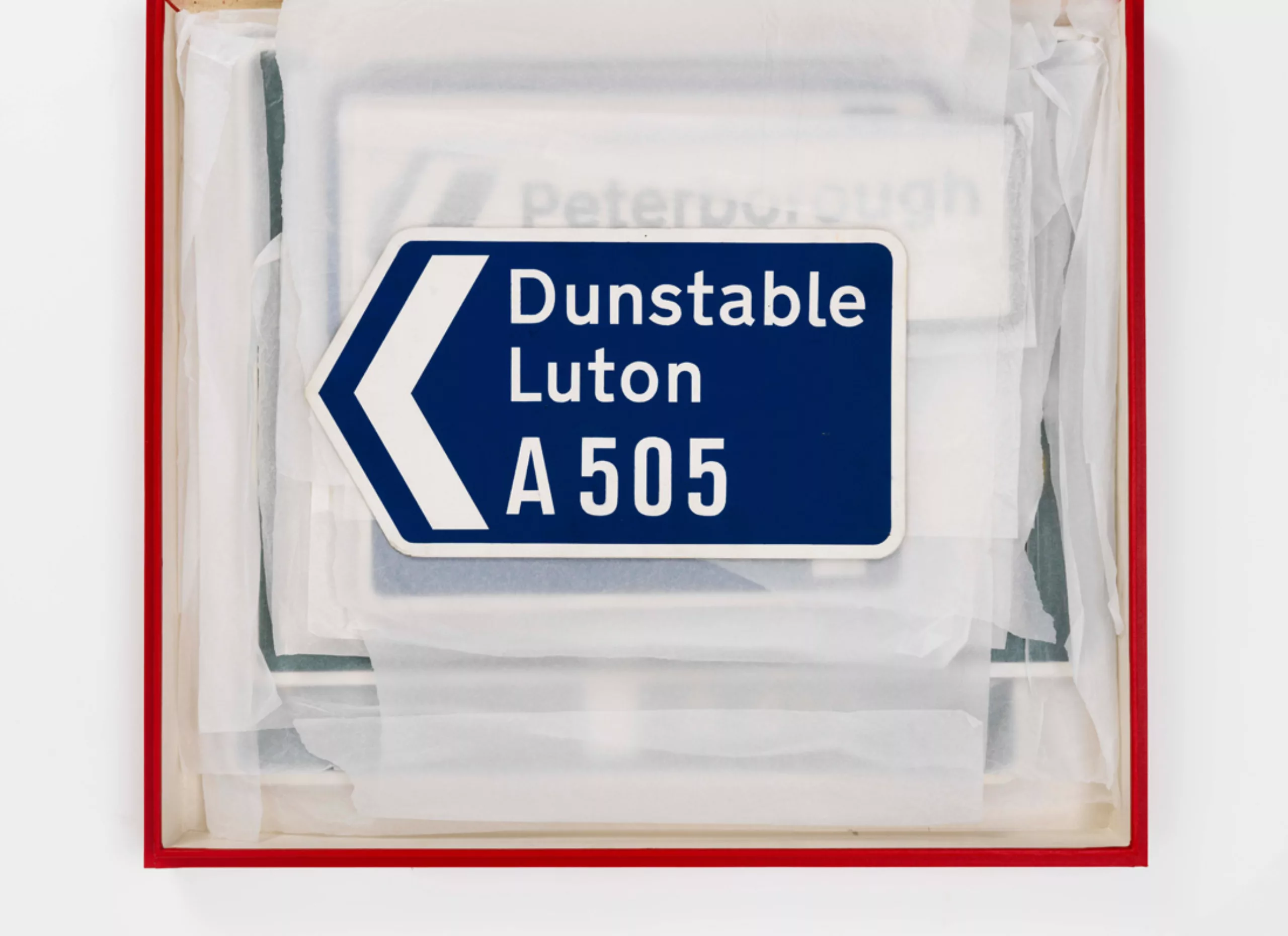
As Margaret explains, there are several elements to consider in this type of creation. First of all, it is not just a matter of creating letters, but mostly a matter of readability on the signs. It is not about typography but about lettering: the characters are designed to work in black on a white background, in white on a black background, or in white on a coloured background. This way, the brain easily recognizes shapes and does not need to read. This reduces the time required to understand the sign.
Margaret also explains that this design project’s mission to the general public is to be understandable. The designer has no place to integrate her sensitivity or her personal touch. She also explains that at the time there was no specialisation in graphic design in schools. It was called commercial art.
Margaret Calvert“It’s not about fashion, it’s purely logical, functional and aesthetic. It couldn’t be simpler.”
And Kinneir to outbid
Jock Kinneir“Consistency in design is the visual equivalent of grammar for language.”
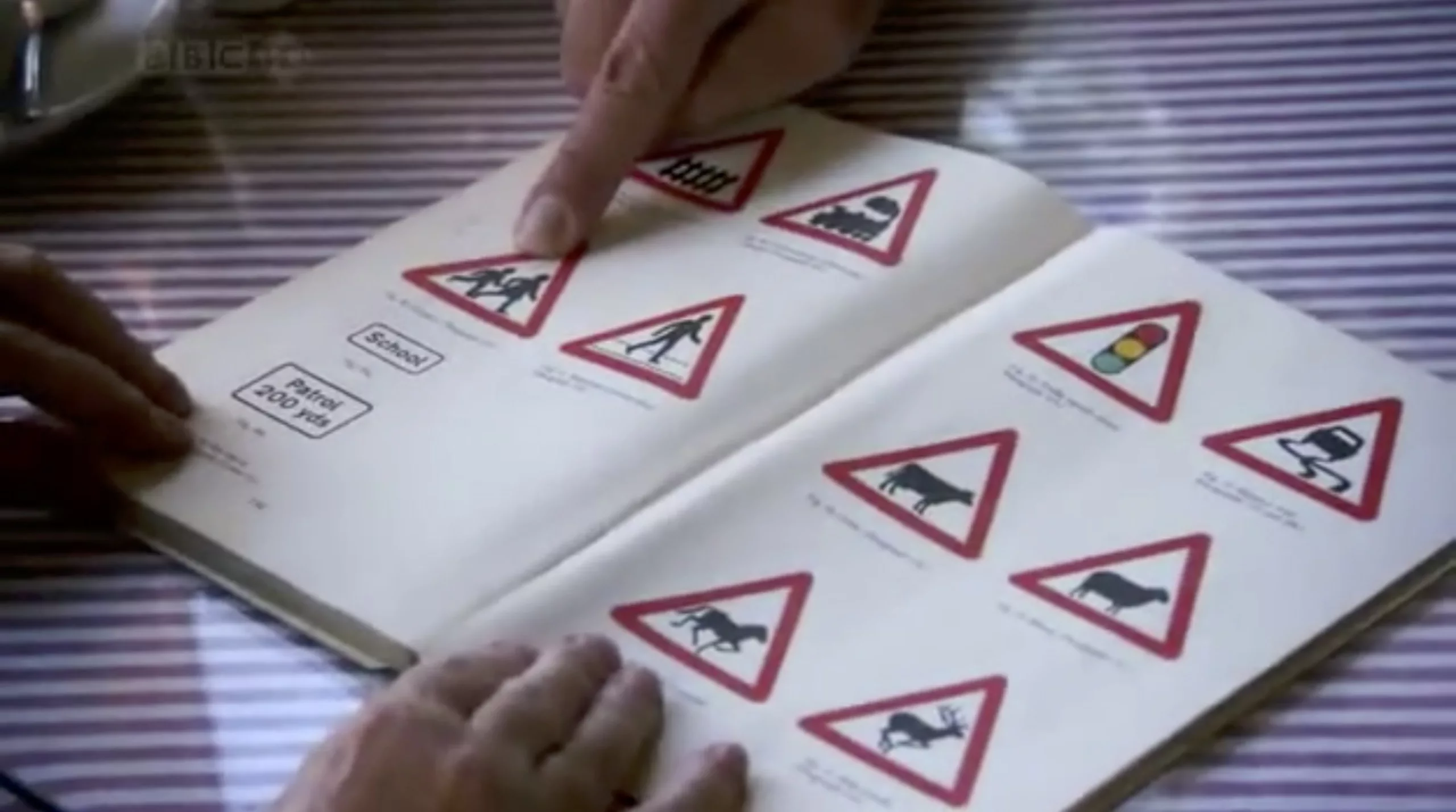
Margaret drew most of the pictograms, many of which were based on her own life. For example, she relates that the panel “Children crossing over” is based on an image of herself as a child. The cattle warning sign is based on a cow called “Patience”, who lived on her cousin’s farm in Warwickshire.
Legacy and tributes
Now 80 years old, Margaret Calvert was awarded the title of OBE (Officer of the British Empire order) for her services in typography, graphic design and road safety.
To celebrate the 50th anniversary of this signage, MADE NORTH also set up an exhibition at the London Design Museum, involving artists and designers to rethink these famous panels:

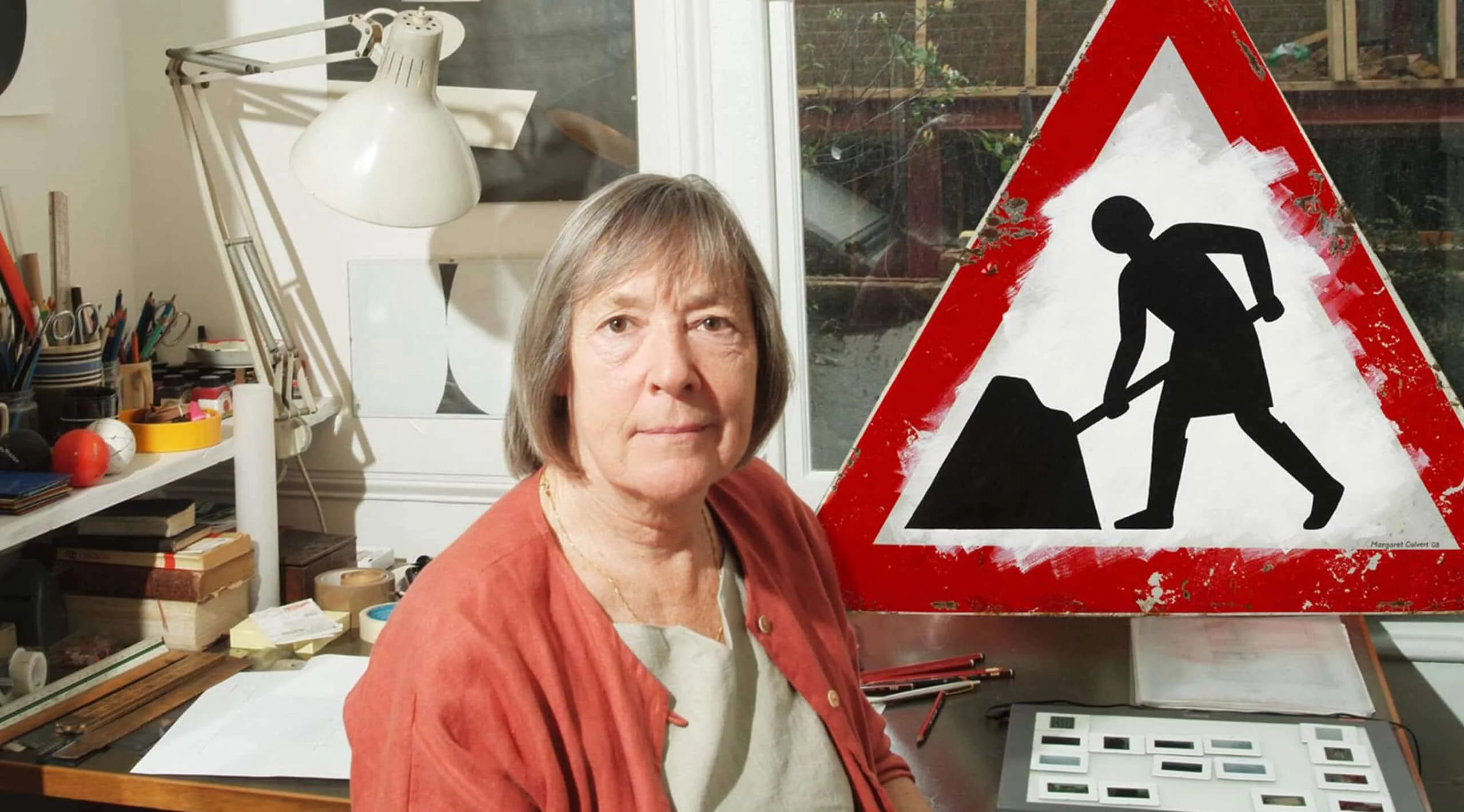
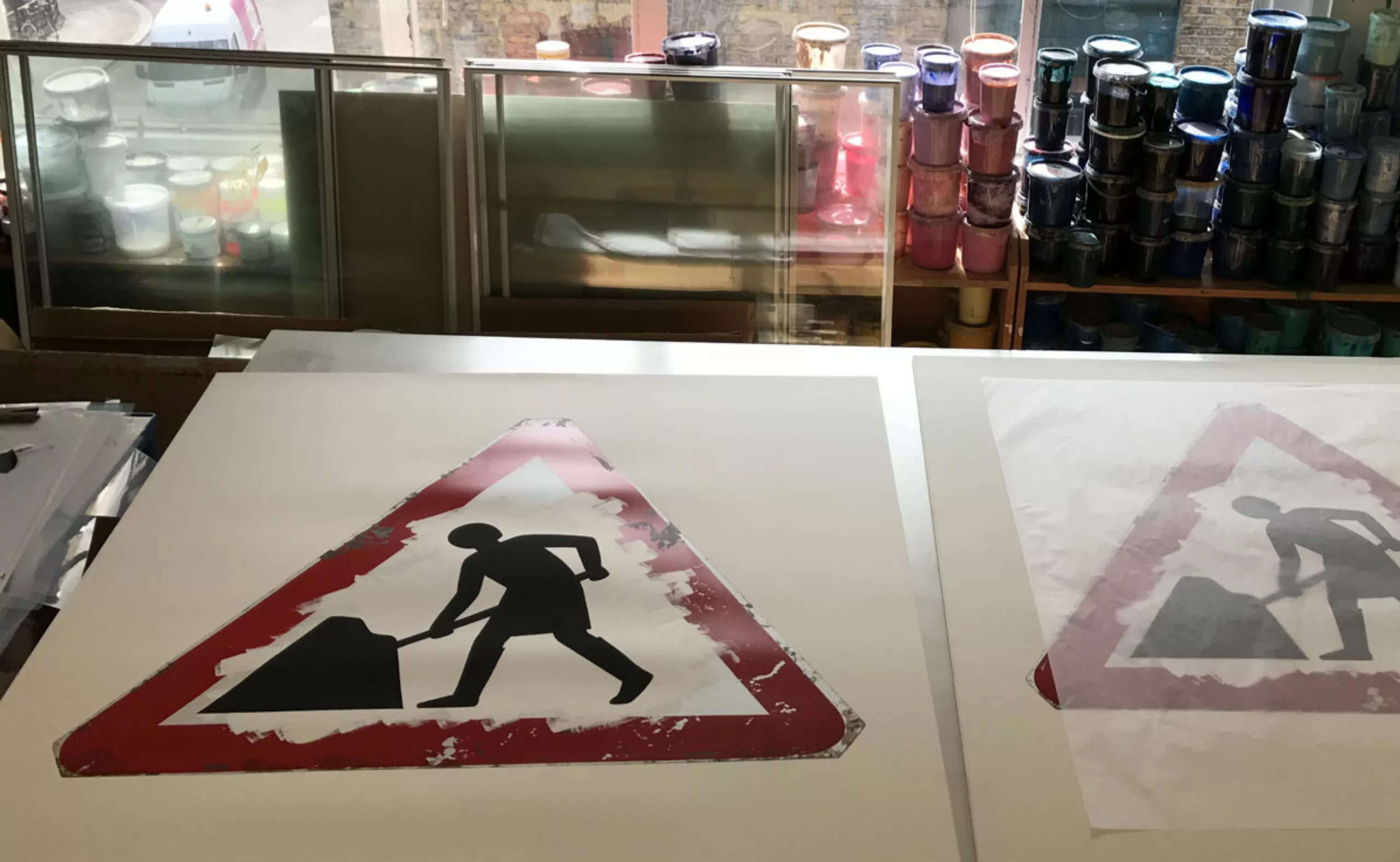
Margaret Calvert also recently reviewed her famous “man at work” sign (or “man struggling with umbrella” as she calls it) and transformed it into a “woman at work” print with Jealous Studio.
After this huge road sign mission, Kinneir warned Calvert that these signs will stick to her skin for the rest of her life. She is now indeed recognized as a design icon in Great Britain, and as the woman who created the road signs in the United Kingdom, unintendedly
Calvert describes this project with a sour laugh, as the “nightmare” of her life. Fifty years later, as she walks past her work every day, she cannot help but notice the slightest irregularity. Probably the ordeal of any known designer!
On the subject
-

Debbie Millman: searching for the meaning of design
From consumer logos to social movements, Debbie Millman questions the meaning of design in society through her work.
-
Bauhaus Football Club, the greatest design team of all time!
The Bauhaus Football Club, the story of the most beautiful design team in the world.
When the football world cup is a pretext to revise your classics…