
Typorama #02: Helvetica, my love!
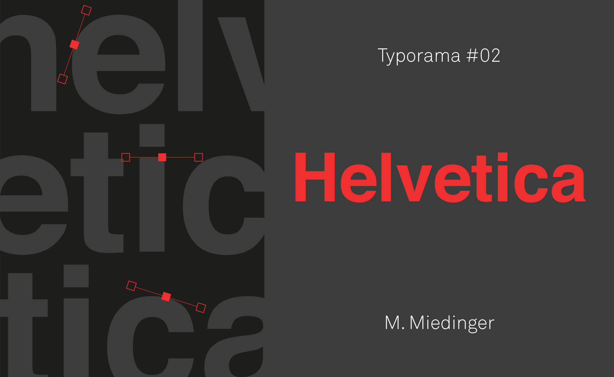
In the style of portraits of great designers, we continue our series on the typographies that have left their mark on the world of graphic design. Here is Typorama #02, about Helvetica!
Helvetica, still young at 60 !
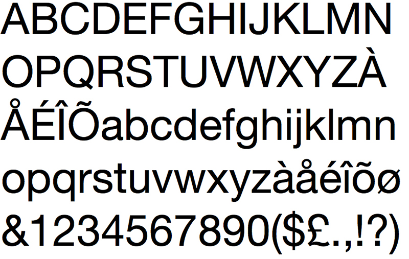
Its name leaves little doubt as to its geographical origin. Where some typefaces seem dated at the time of their release, Helvetica, at 60 years old, seems as popular and contemporary as ever. Its longevity, influence and neutrality mean that we love it as much as it annoys us. Let's take a look back at this typographic monument, which since its birth has influenced much of the world and is in itself a symbol of Swiss style.
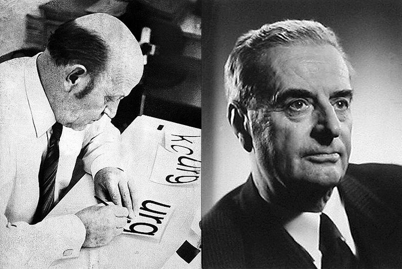
It was under the direction of Edouard Hoffmann, director of the Swiss Haas foundry, that Zurich graphic designer and typographer Max Miedinger designed the famous Helvetica in 1957. He based his design on Akzidenz-Grotesk, a lineal typeface conceived by the Berlin foundry H. Berthold AG in 1896. Miedinger and Hoffmann's aim was to offer a modernized version. From an optical point of view, they wanted to create the most harmonious of all fonts. Regular typefaces that always end up vertical or horizontal, great symmetry and constant line thickness give this linear typeface a rigor and neutrality that reflect the Swiss style. It favors a uniformity that is meant to be accessible, to the detriment of an overly cumbersome personality. For its detractors, its great quality becomes its great flaw, and they lament its aseptic standardization. For them, where Helvetica goes, creativity and diversity go. Indeed, Miedinger wanted the emphasis to be on the message conveyed by the typeface rather than on the typeface itself.
The Helvetica protocol
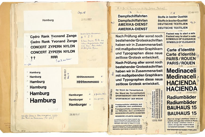
A few years ago, we introduced you to the "Helvetica protocol", which is preserved in the Basel printing museum. These are the notebooks recording all the studies that led to the final design of the Swiss typeface. Step by step, step by step, with proofs, we discover the slightest changes to the lettering and the full range of possible typeface combinations. This unique document provides a detailed insight into the immense task of developing a typeface family (Bold, regular, italic...). In the end, it took a year of painstaking work to achieve a result as simple and effective as Helvetica!
To find out more : Découvrez les trésors du musée de l'imprimerie de Bâle
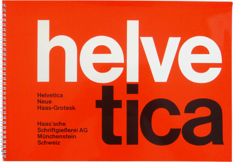
Under the name "Neue Hass-Grotesk", the result was presented for the first time at the "Graphic 57" international trade fair in Lausanne, where it met with great success. The typeface was a perfect match for "Swiss typography", which at the time had a strong international following.
For marketing reasons, the typeface was renamed after the official Latin name of Switzerland: Confœderatio Helvetica.
Conquering the world
Helvetica was exported to the United States, where it found its way into the hands of many art directors. Apple also decided to buy the rights to use Helvetica, which made it widely available. This was not the case, however, for their competitor Microsoft, who decided to use another font: Arial. Designed in 1982, but integrated into Windows as a default typeface in 1992, Arial, although very popular, was designed to compete with Helvetica and is an imitation of it. The competition between these two companies is therefore also based on typography. Funnily enough, however, Microsoft used Helvetica in bold italic for its logo from 1987 to 2012, rather than Arial.
![]()
I love you, me neither...
It's the "universal" typeface par excellence, with no innuendo, no unconscious message. Its form disappears to let the reader concentrate on the substance of a message. Add to this the fact that it's one of the most legible typefaces in the world, and you have the gold medal for cognitive ecology.
It's true, when the hubbub of communication resounds, we tend to like discreet, calm people like Helvetica... and then when the silence returns, we want to break the monotony with a big burst of laughter (cf: la Comic-sans) or a delicate melody (cf: Le Didot). In short... we love Helvetica as much as we hate it...
The star of logos!
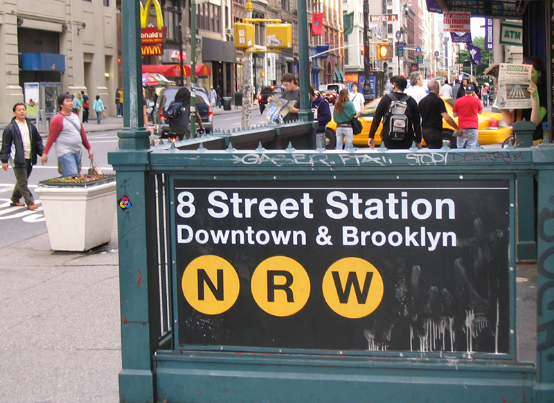
Helvetica logos have been ubiquitous for over 60 years. Thanks to its legibility and neutrality, many companies, governments and institutions use Helvetica for their official documents, signage and branding.
The list of companies using Helvetica in their logos is endless: Post-It, Jeep, Evian, BMW and Nestlé.

Many cities also use it for their public transport systems, such as the subways in Chicago, Madrid and New York. It is also the official typeface of the Canadian government's corporate identity.
As a joke, Helvetica is even an insurance policy in Morocco! (Thanks to Tarik for the info!)
The popularity and longevity of Helvetica proves the timelessness of this typeface, which can be found today in 110 versions, including Latin, Cyrillic, Hebrew, Greek, as well as Chinese, Japanese and Korean writing systems. Switzerland, a country with four official languages, has succeeded in making itself understood worldwide through a fifth, even more universal language: Helvetica.
And Max? What's become of him?
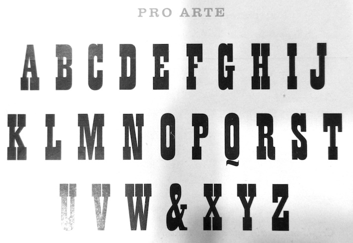
Apart from the Hevetica, Max Miedinger left few other achievements. Three typefaces were marketed, again by the Haas foundry. Pro Arte (1954), a cowboy typeface, Helvetica Rounded (better known as VAG Rounded and originally designed for Wolkswagen) and 'Horizontal (reissued under the Miedinger name), which was intended as a competitor to another star typeface, Aldo Novarese's Eurostile.
Max Miedinger died in Zurich in 1980.
Happy Helvetica to you
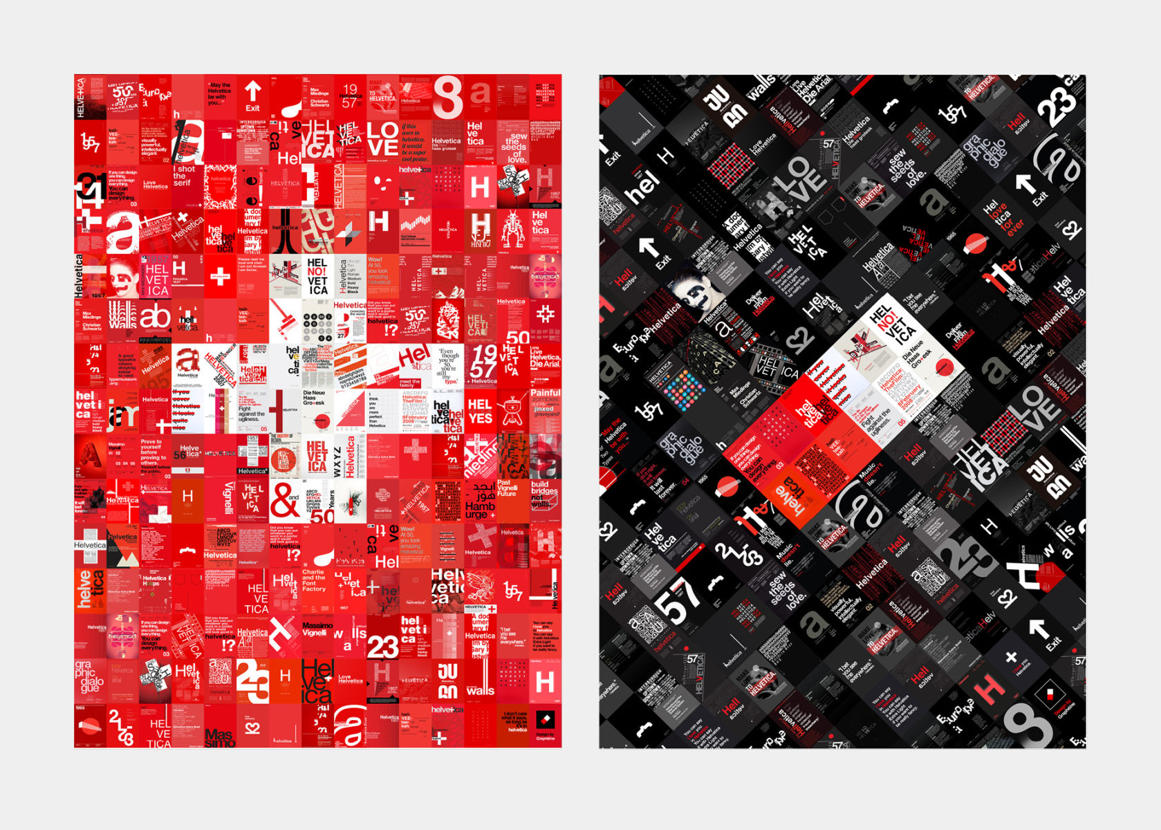
To mark the 60th anniversary of the creation of Helvetica, the number of tributes has multiplied. For example, 60helvetica is an exhibition of original posters in which designers from all over the world express their love, their regard, or even their defiance of this typeface. Below are the two posters we presented. It was a critical look, in the form of a mise en abyme of the thousands of "Tribute to Helvetica" posters that can be found on the Internet. You know, those stereotypical posters, always in red, white and black, most of which are copy and paste. Copy-pasting is exactly what we did for this poster. It's a bit like the shepherd answering the shepherdess: we talk frankly, we criticize each other, but basically we've been keeping the sheep together for 60 years!
To find out more : Découvrez les affiches en hommage à l'Helvetica
The Helvetica reef
To round things off, here's an episode on Helvetica typography from the Océan des Cent Typos podcast. A podcast where you can follow the adventures of the intrepid Malo Malo! ...whom we thank, by the way, for writing this article! :-)
Share this post:
 San Serriffe typographic Island
 Design, creativity and oblique strategies!
 Tote bag, a new social totem?
 Sister Corita Kent, the Pop Art nun
 Donald Trump, the martyr who makes history
 Ville d’Annecy – Visual identity
 ICC Immersion – Visual identity
 Hospital NOVO – Visual identity
 Dick Bruna, minimalist graphic designer and father of the most famous rabbit on the planet
 Typography and ecology
 Saint-Étienne Opera house: Emotion in the foreground!
 Herb Lubalin, the letter as an image
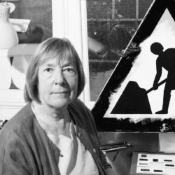
Leave a Reply