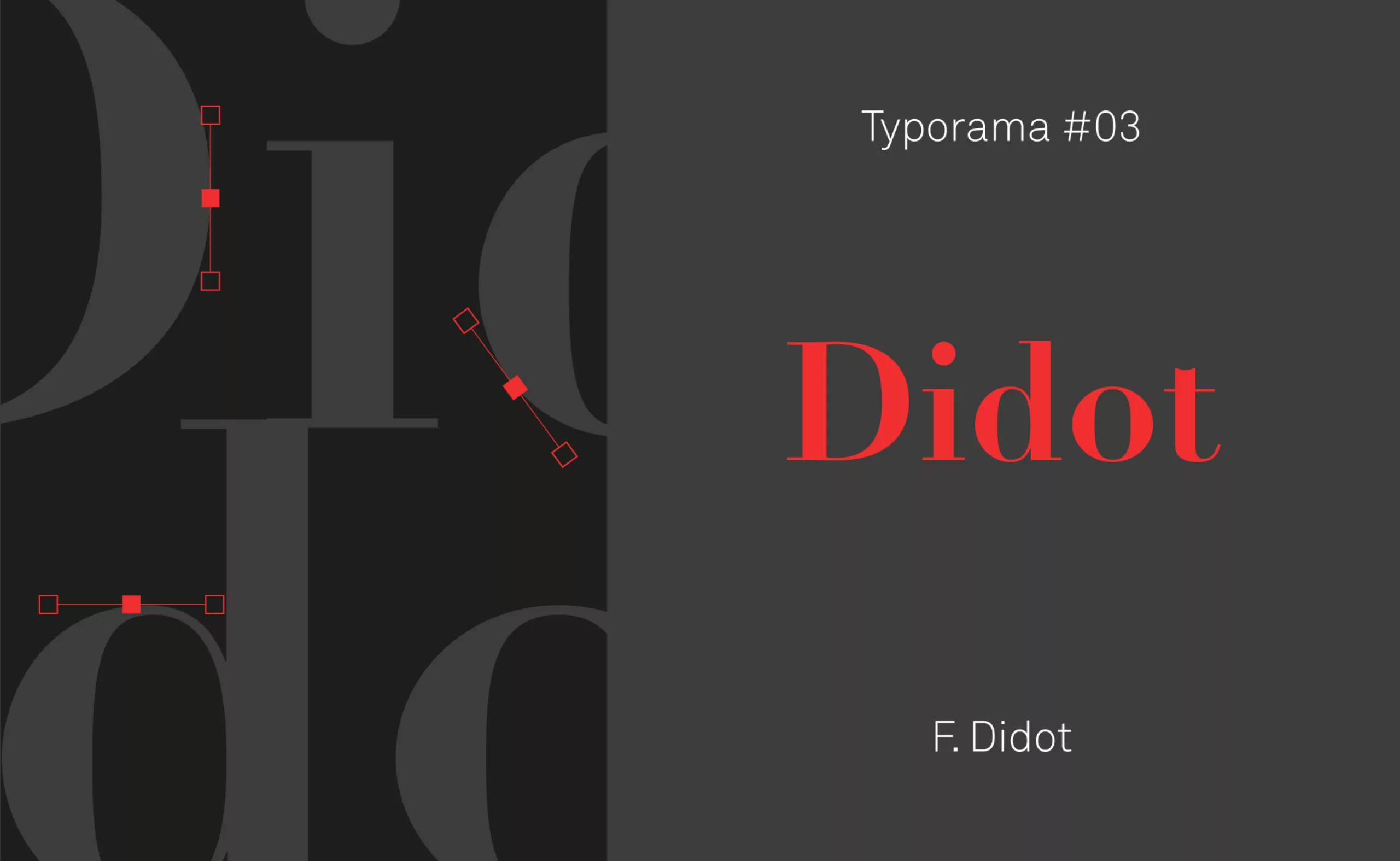
Typorama #03 : Didot, in fashion since 1811 !
In the manner of portraits of great designers, we continue our series on the typographies that have marked the world of graphic design. Here is Typorama #03, on the Didot!
Didot, that’s the whole point!
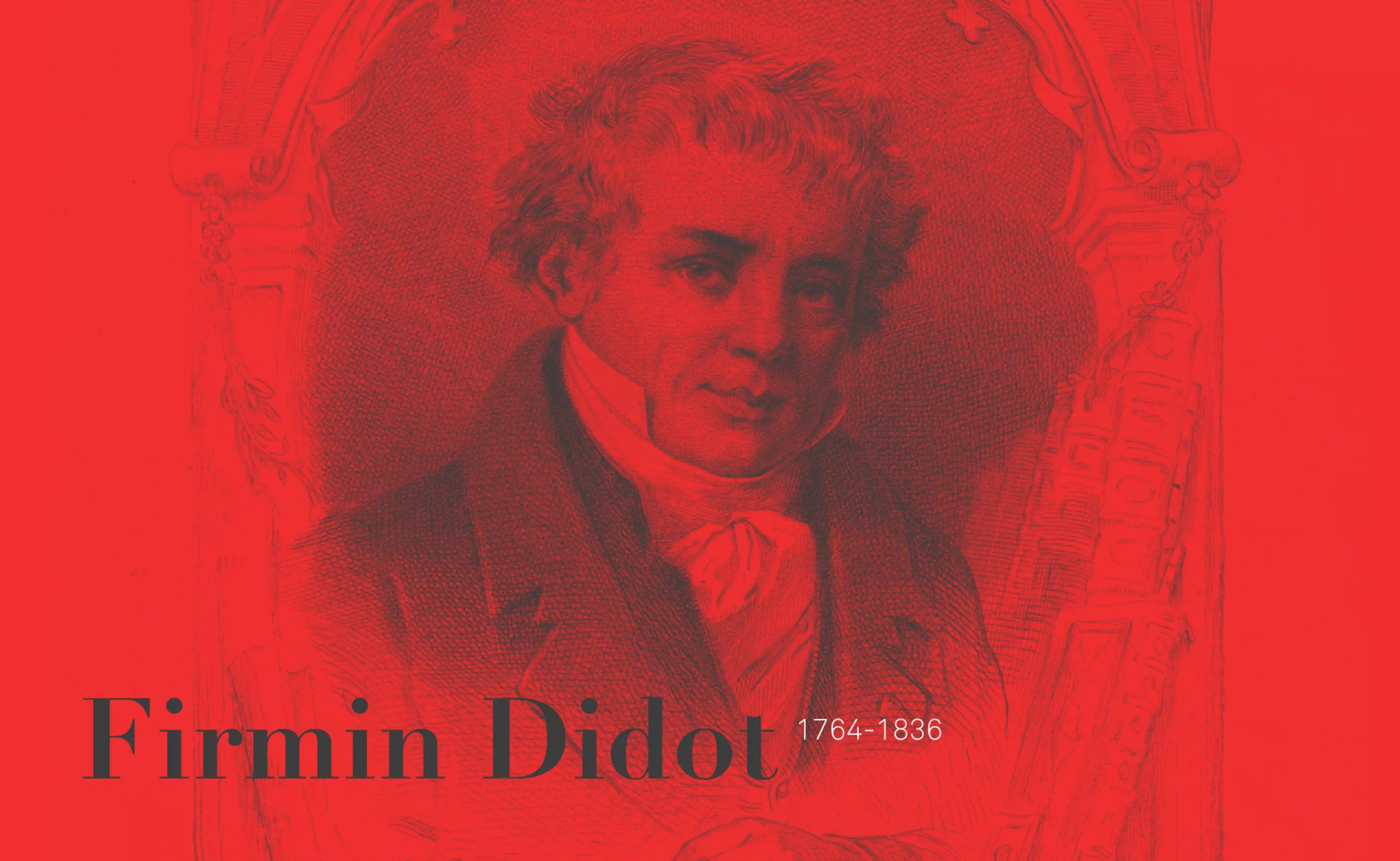
A true spearhead of 19th century French typography, Didot was created between 1784 and 1811 by Firmin Didot, a type designer from a great dynasty of printers and typographers.
Let’s discover how this bicentennial typeface managed to combine finesse and elegance to cross the centuries, and still assert itself today as a timeless fashion statement!
In the Didot family, I ask for the son…
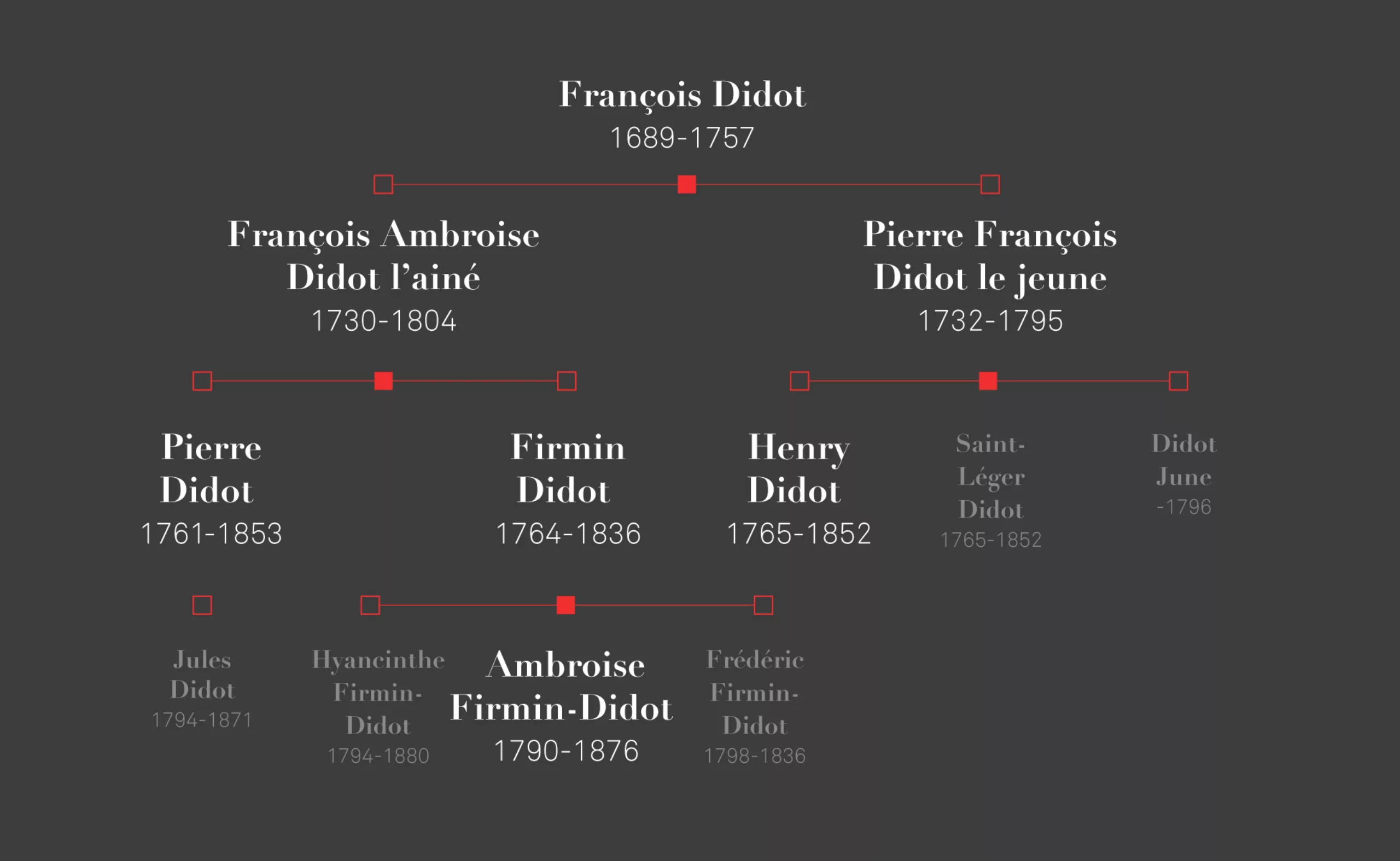
The Didot family is a bit like in the game of the 7 families, all the members have their importance. It is a family of booksellers, publishers, printers and bibliophiles who master all the branches of the book industry.
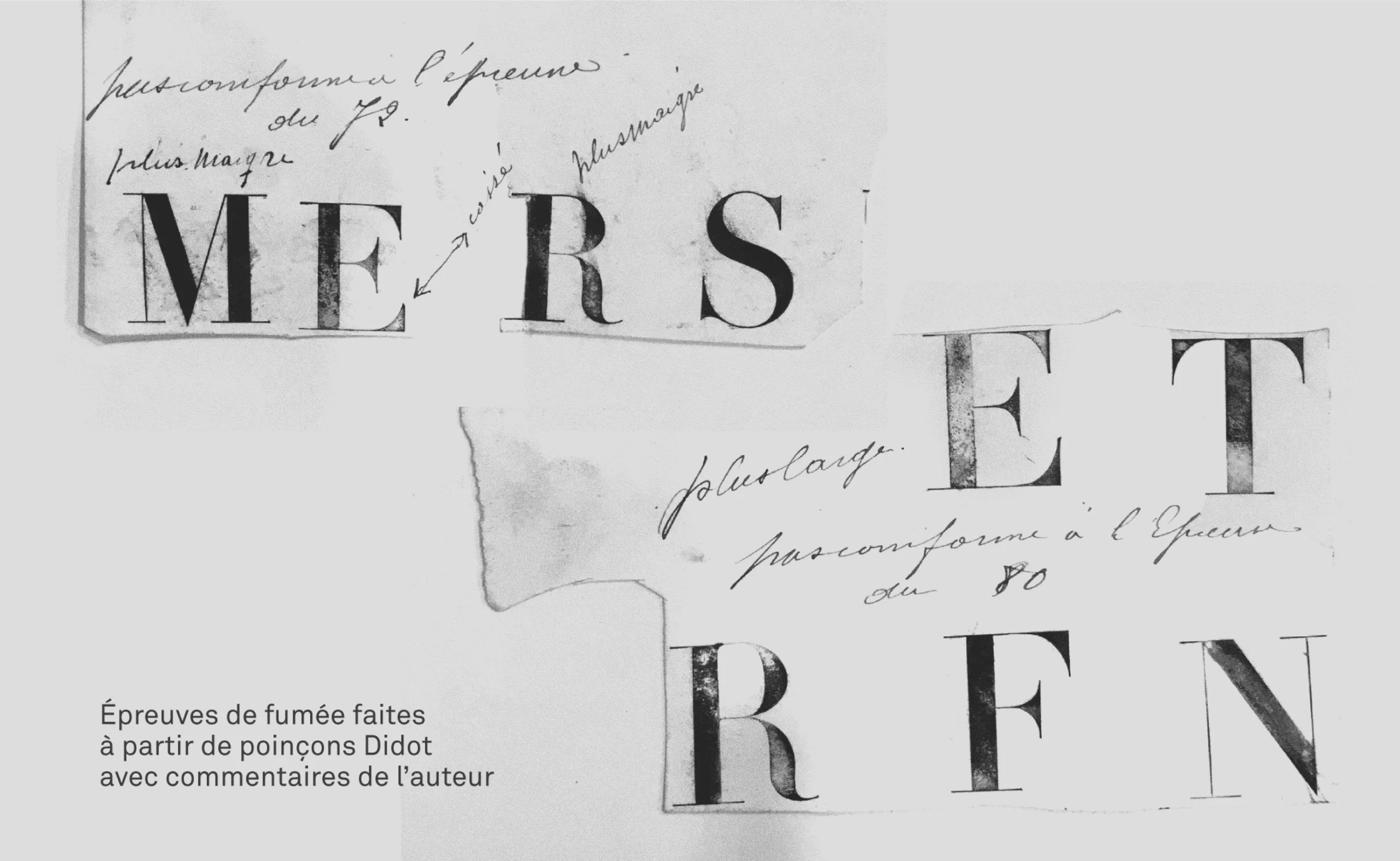
The story begins with the grandfather, François, who settled in Paris and published the series of Voyages de l’abbé Prévost. The father, François-Ambroise, laid the foundations of a unit of measurement that would gradually be accepted by all printers: the typographic point or Didot point. This revolutionary measure will allow to calibrate more finely the texts, ensuring a perfect page setting, according to implacable mathematical equations! Until then, the characters were melted in a rather variable way, and no precise standard allowed to calibrate them effectively.
There is also the uncle, Pierre-François, known as the young one, printer at the court, engraver and inventor of the Didot typefaces, of a great readability.
But the joker of this family is Firmin Didot. Engraver, founder, who will popularize the “Didot point”, while being also an exceptional engraver of characters. He was also elected deputy for a while and defended the interests of the book trade and the press. Imagine Jean-Baptiste Levée or Alice Savoie in the National Assembly… that would be classy!
A familial and paternalistic capitalism
The Didot family will invest in many paper mills and printers. At the time, the mechanization of these industries was to reduce to unemployment the young women employed in the lowly jobs (undoing the hems and unstitching the buttons of the rags used for the manufacture of the paper pulp). But Firmin Didot did not intend to accept this fate and came up with the daring idea of retraining these young women in typography.
At the time, this profession was exclusively male, and these young women were often illiterate, which is far from being practical for composing books. Firmin-Didot will transform in a few years these “peelers” into confirmed typographers.
It must be said that these women formed a competent workforce isolated from the currents of ideas in the capital and less demanding in terms of remuneration. The Firmin-Didots, who were followers of Christian philanthropy, created an “industrial colony” in Mesnil-sur-l’Estrée to educate and train their future employees, to house them in their workplaces and to ensure their material, physical and moral well-being. A mutual health insurance system was even created in 1839, allowing employees to be reimbursed for their health care.
More than two centuries later, this printing house still exists. The old machines are of course stored in the museum and the presses are now printing millions of copies of Harry Potter!
When you have Napoleon as a client…
1811. Telephone call (fictional moment of the article).
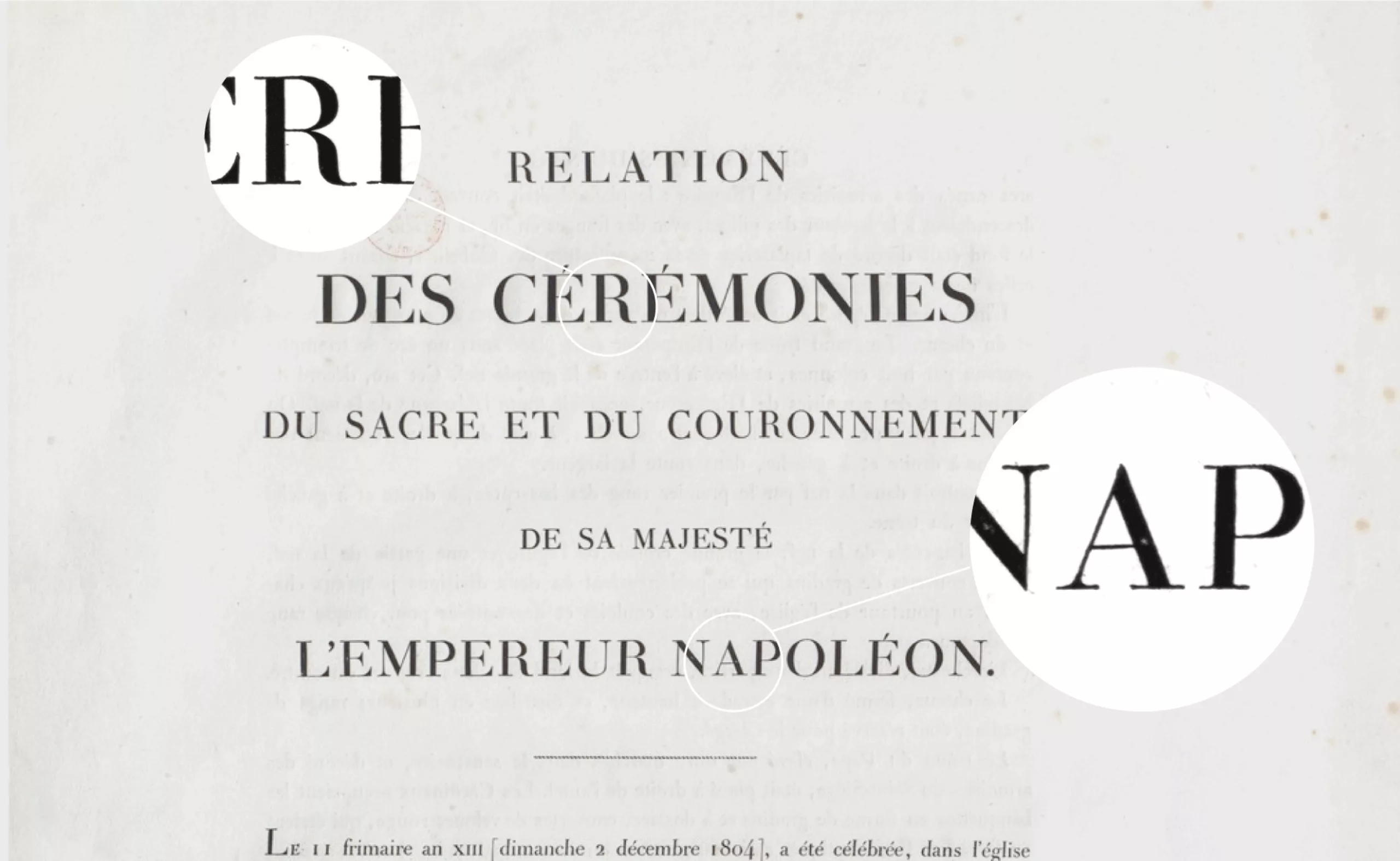
“Hello, this is Napoleon, we are inviting tenders to create a typeface to replace the “Romain du Roi” with the “Emperor’s Roman”. Are you interested in this? ”
Firmin, who had a number of designs in his drawing board, decided to finalize his most daring typeface, the Didot millimetric, whose name is taken from the metric system. It will be used for the printing of the Rite of the Emperor Napoleon in 1815. From then on, the Didot typeface will be massively used in France until the 1950’s, in particular for the regulatory printed matter, the school books, and a great part of the scientific edition.
This typography was imposed in the 19th century to the detriment of its competitor Garamond (designed by Claude Garamont in the 16th century). If the Didot represented the renewal of an era, modernity and nascent industrialization, the second typeface was a reminder of an old regime that people wanted to forget after the Revolution.
Pierre Faucheux, a famous French graphic designer, author of hundreds of book models in the 20th century, was a deep admirer of the Didot typeface. For him, the Didot is the very typeface that symbolizes the French Revolution. “By its design, the Didot is revolutionary like a guillotine. The solid lines are the black blades and the flat lines are the cutting edges of the blades.”
Pierre Faucheux“The Didot is revolutionary like a guillotine. The solid lines are the black tears and the thin lines are the sharp edges of the blades”
As revolutionary as this character is, one cannot call the Didot family revolutionaries! It would even be the opposite, they take care to play with times as much as with political regimes. Business is business.
The French elegance
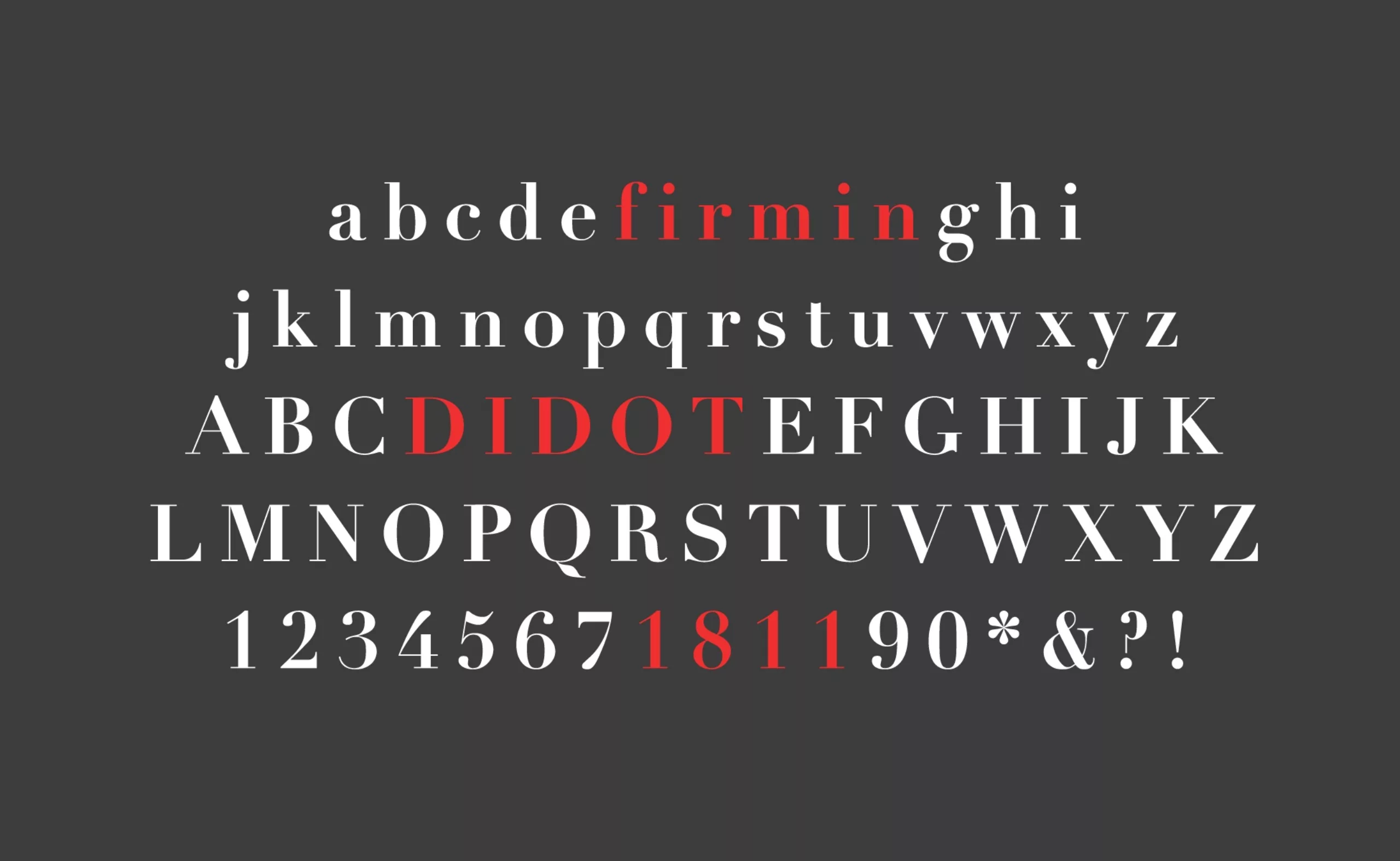
Didot is a serif typeface characterized by fine serifs and a strong contrast between very black and imposing solids and extremely delicate strokes. This contrast gives it an elegance, a refinement as well as a strong readability.
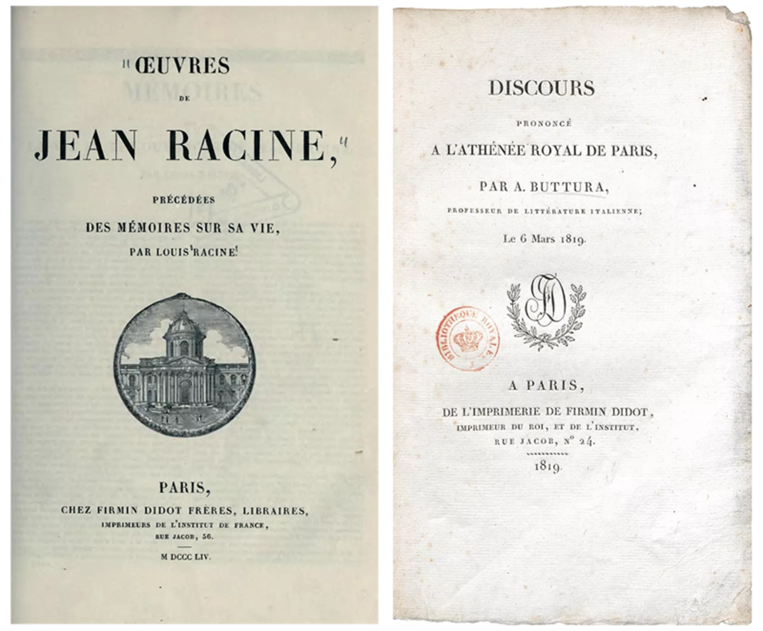
The refined and subtle aspect of the typeface allowed it to meet a huge success beyond the French borders and its great readability associated with its smoothness opened the doors of the literary world. The Didot will be for example adopted by the great playwright Jean Racine who will use it to publish his works as well as by the very official Royal Printing Office of the time.
The influence and importance of this typeface are such that it gave its name to one of the four typographic families of the Thibaudeau classification (the didots) as well as to one of the eleven families of the Vox-Atypi classification (the didones). These two nomenclatures make it possible to sort the various existing typefaces into large families according to historical or formal factors.
Fashionable since 1811!
The elegance expressed by this typography is still very popular today. The world of fashion, for example, has appropriated it through logos such as Giorgio Armani or America’s Next Top Model. Magazines such as Vanity Fair, Elle or Vogue use it to inform us of new trends.
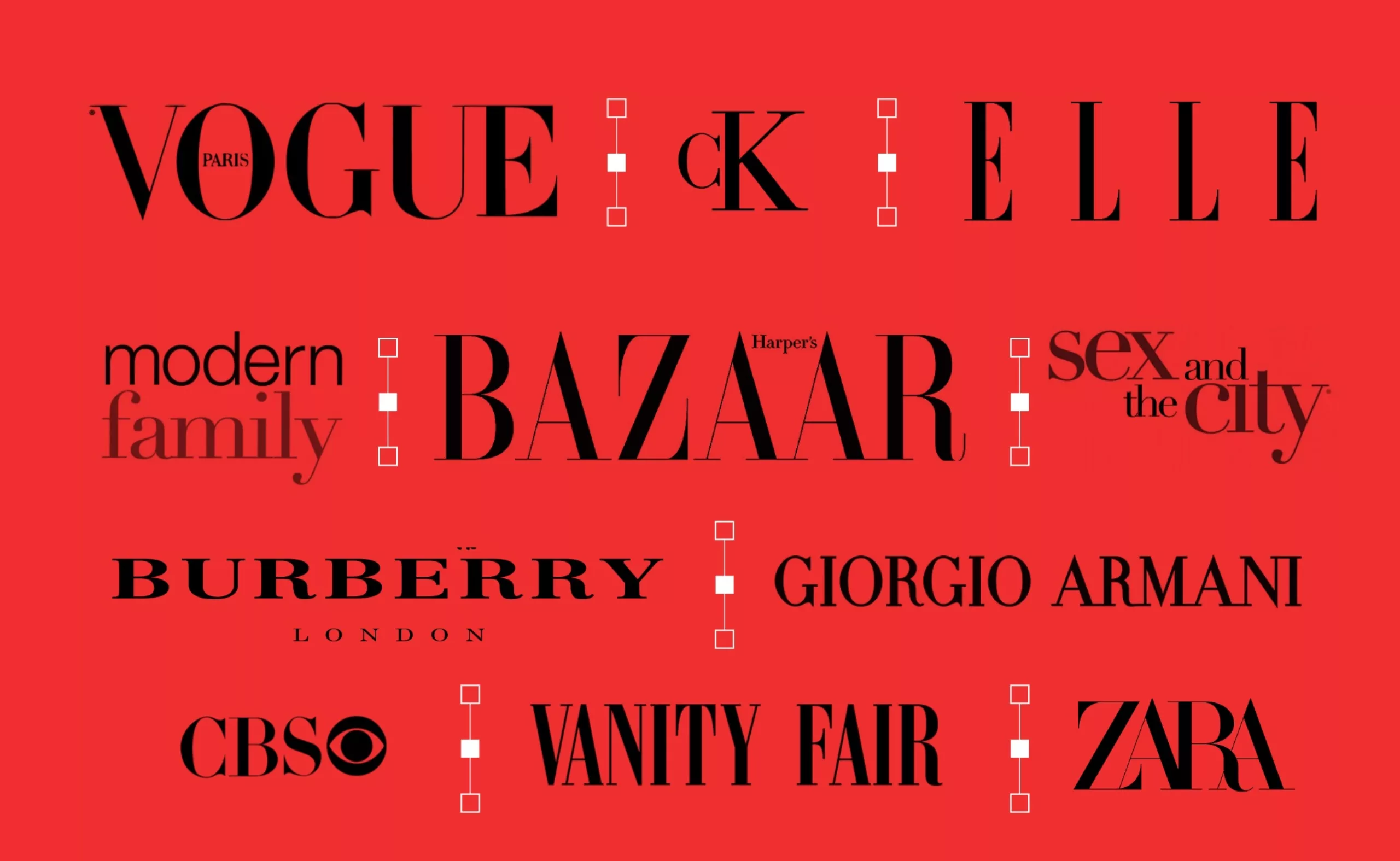
This typeface is also found in some logos of American TV shows such as Sex and the City or Modern Family. In the first case, it is the fineness of the typeface that is associated with the elegance of the trendy New Yorkers of the series while for the second, it is its traditional aspect that is opposed to the modernity of our time.
This typeface will however be less used with the advent of the web in the early 2000s, because the low resolution of screens could not pay tribute to the fineness of its serifs thus losing readability.
Like many old typefaces, Didot has undergone many redesigns and reinterpretations. It is however in 1991 that two foundries will offer us the two most contemporary and successful versions of this typeface. The first one is the one of Adrian Frutiger created for the Linotype foundry while the second one comes from Hoefler & Frere-Jones and was designed for the fashion magazine Harper’s Bazaar.
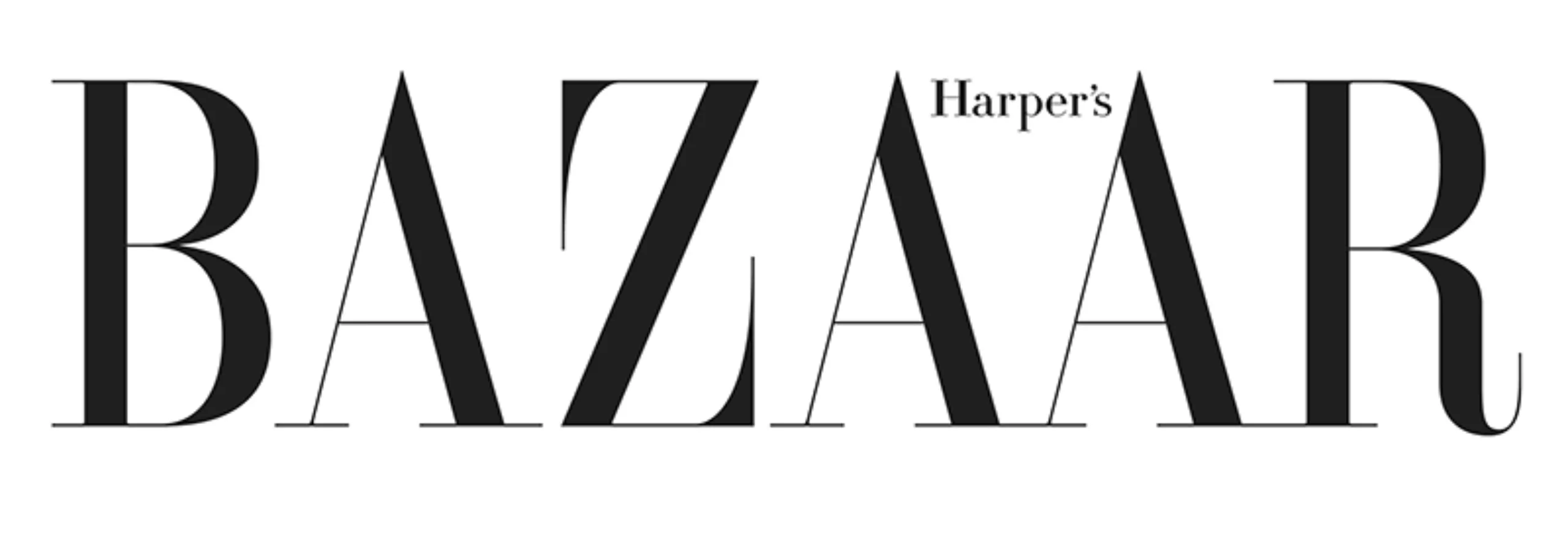
These two redesigns manage to preserve the contrast and finesse of the original version while paying tribute to the immense work of its original creator, Firmin.
And to conclude, and end our little overview of the Didot, we can note the recent change of visual identity made by the brand ZARA. Probably to reposition itself as a more luxurious brand, the Spanish group has not hesitated to detach itself from the basic rules of typographic composition, yet so dear to Firmin Didot!
More than two centuries have passed since its creation and yet Didot still looks young. This typography of the past still informs us today of tomorrow’s trends: this is what we can call French elegance.
The Didot Archipelago
To finish, we propose you the episode on the Didot from the podcast of the L’Océan des Cent Typos. A podcast where you can follow the adventures of the intrepid Malo Malo ! …who we thank, by the way, for writing this article ! 🙂
On the subject
-
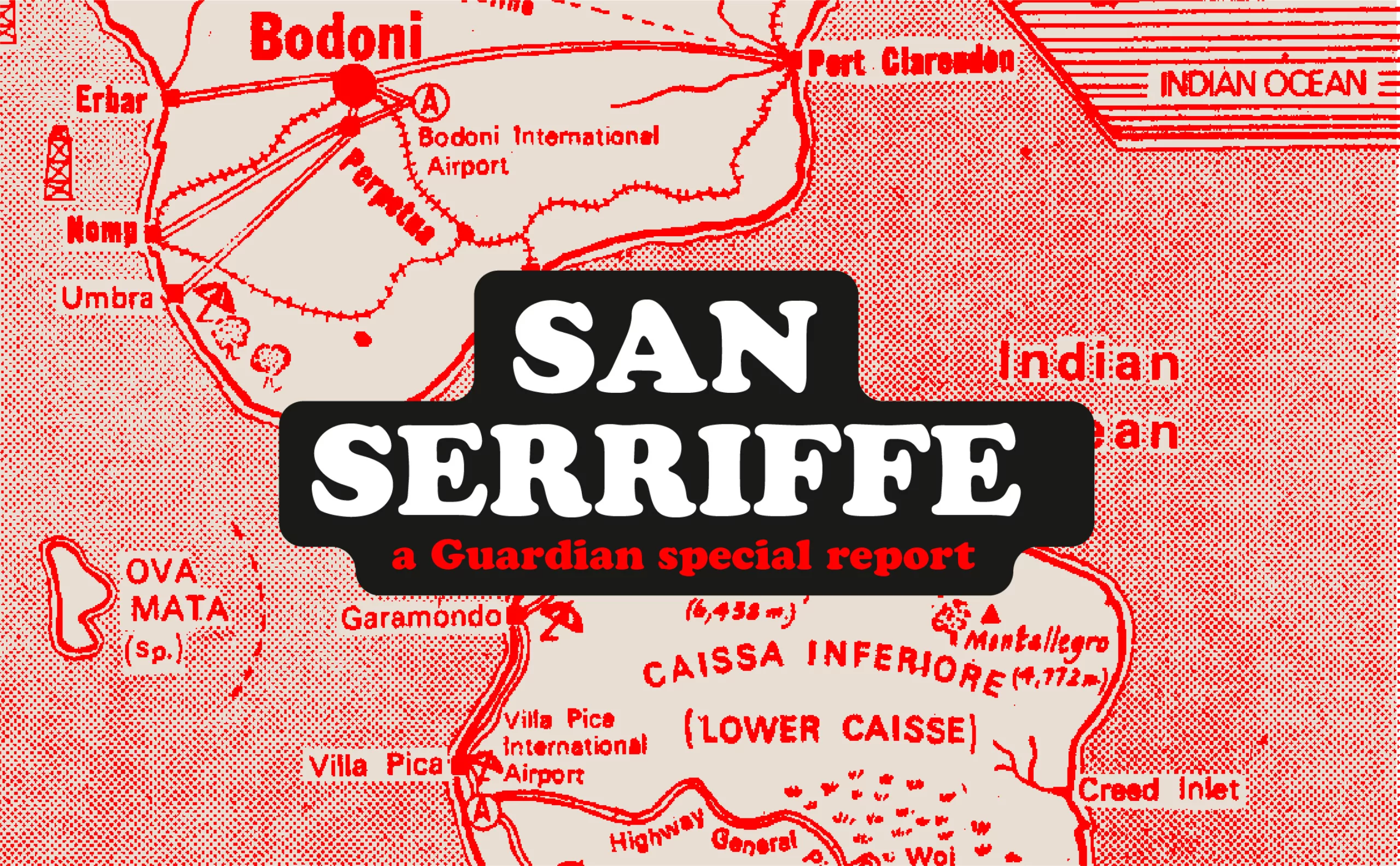
San Serriffe typographic Island
Discover how The Guardian tricked its readers into inventing the island of San Serriffe, a fictional republic born of a typographic April Fool’s joke that has become cult status. Between subtle satire and typographic wordplay, immerse yourself in one of the most brilliant journalistic hoaxes of the XXᵉ century.
-

Typorama #06 : Futura by Paul Renner
From the Nazis to the moon, Futura is probably the most used typeface in the world, and yet it’s not new!