A short history of book covers – 4/4
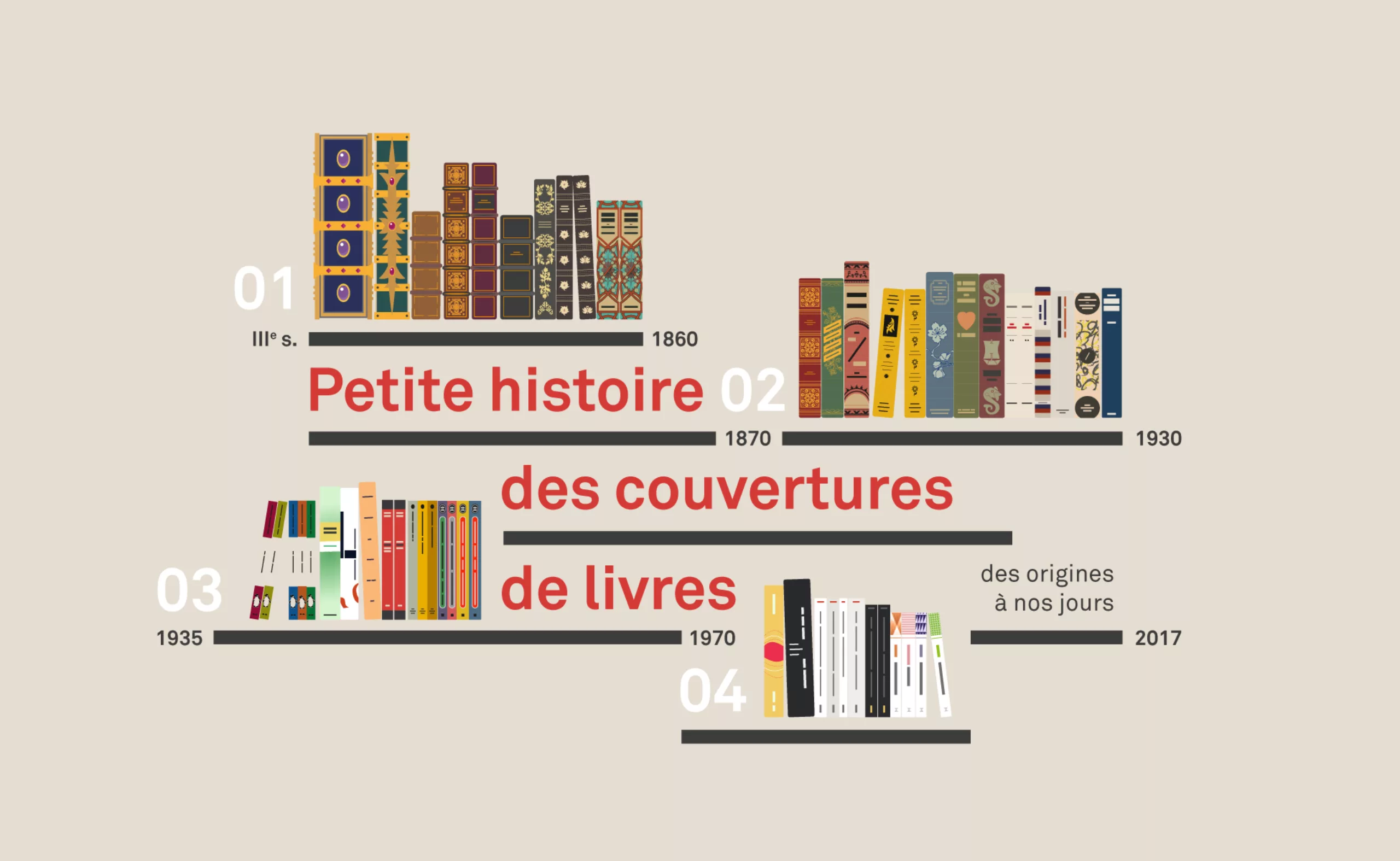
Even more exciting than Game of Thrones, here is our summer series, sweeping the graphic evolution of book covers to the present day, through its most striking revolutions. If you missed the first three chapters, we invite you to read them by clicking on the links below:
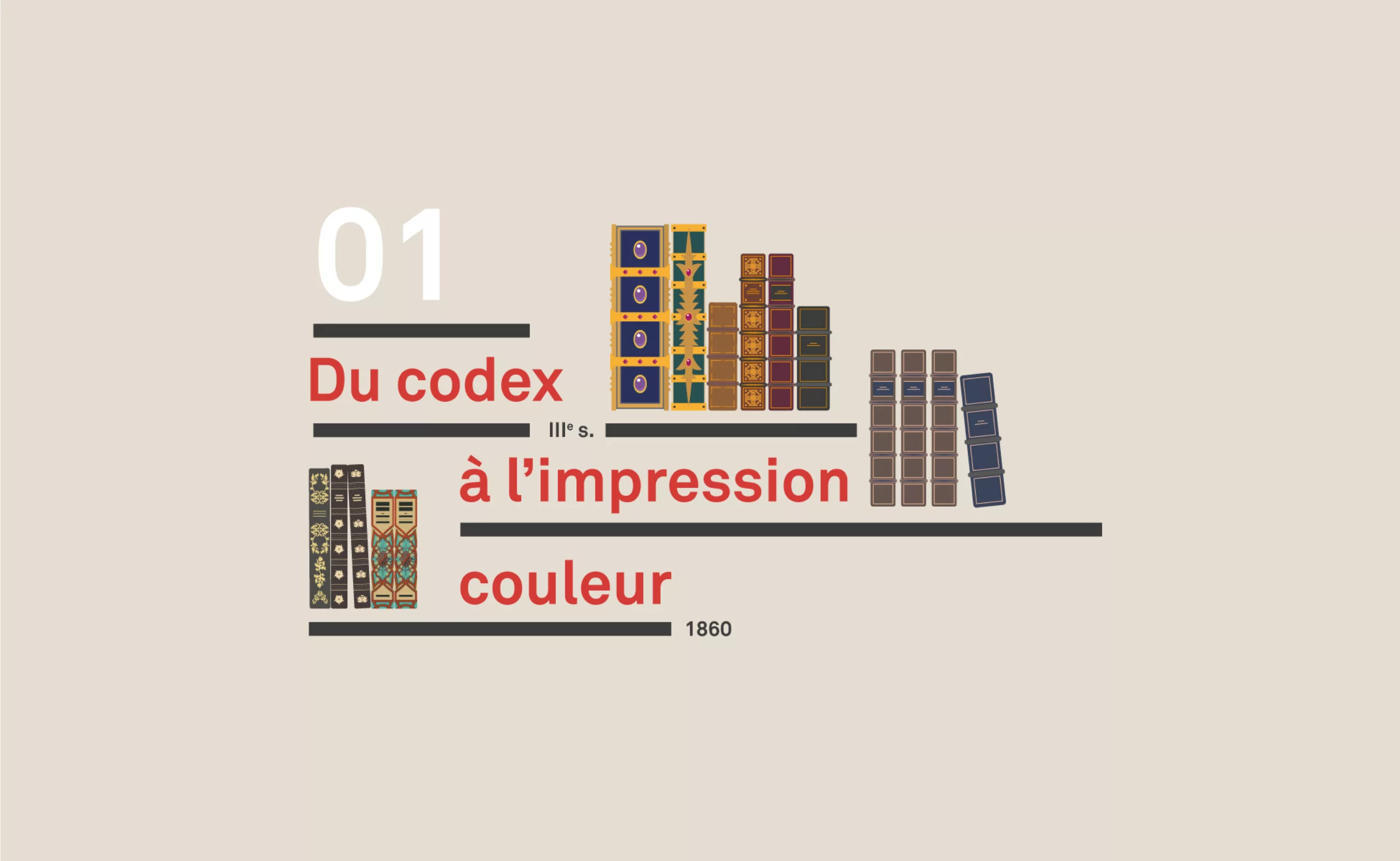
Chatper 1: 3rd century to 1860
“From Codex to colour printing”
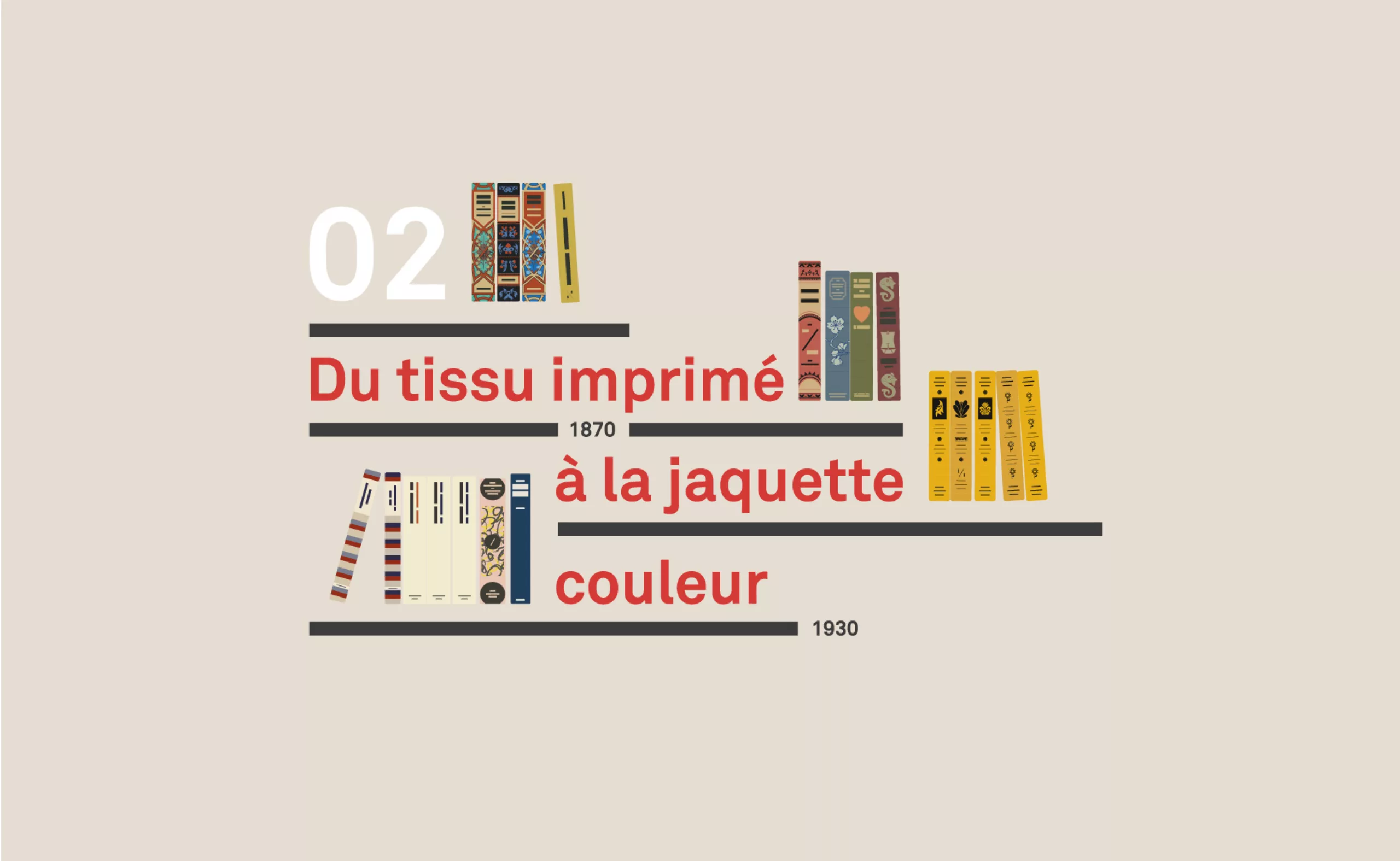
Chapter 2: 1860 to 1935
“From printed fabric to colour jacket”
Chapter 3: 1935 to 1970
“From paperback to abstraction”
Chapter 4: from 1960 to the present day
“French paperback, contemporary graphic design and covers”
Chapter 4 : French paperback, graphics and contemporary covers (from the 50’s to today)
Dans ce dernier chapitre nous aborderons les particularités des maisons d’éditions françaises, le clivage entre le livre de Poche et Folio, l’influence de graphistes comme Massin ou Faucheux, et le retour du beau livre avec les jeunes maisons d’édition.
The appearance of the “Poche” (paperback) publishing house in France in 1953 changed the intelligentsia and revolutionized access to books. The sober design of the Gallimard covers, which until then had served as a reference, was called into question by the american influence and allowed for a certain graphic liberation of the book. As for the Scorpio Editions, they hurt a lot, especially the defenders of virtue!
In this last chapter we will discuss the particularities of french publishing houses, the split between the book of Poche and Folio, the influence of graphic designers like Massin or Faucheux, and the return of the coffee table book with young publishing houses.
Hang on, let’s go!
The Gallimard Dynasty
In France, white is king. The collection of the most famous publishing house is nicknamed “white”: Gallimard. The NRF / Gallimard publishing house (1919) subjected its editorial responsibilities to literary figures such as Camus, Sartre, Merleau-Ponty, Caillois, Aragon, Queneau or Malraux and exerted a major influence on the french publishing world. It brings together the authors, intellectuals and bourgeoisie of the Saint Germain district and serves as a model for all the following great houses…
The sober and white graphics of the NRF that we know today already exist since 1910, under André Gide’s wish to “clean up literature“. The collection became Librairie Gallimard in 1919.
Below, the series of Marcel Proust’s novels published between 1918 and 1927, which seem well ahead of what was being done at the time in the world of books, far from the flourishes and illustrations of the books of the time..:
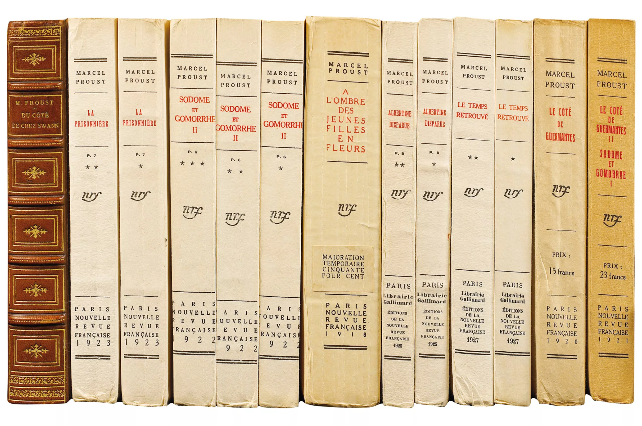
It is assumed that they were intended to be bound and covered with leather as in the first book on the left. And yet, with time, this edge and cover page information, normally doomed to disappear, did indeed persist despite (r)evolutions, by migrating on an all-paper cover, and without changing almost nothing to the initial layout.
So it’s a non-evolution in a way, since the arrival of the paper cover didn’t upset this layout.
To promote perfect legibility, the collection is adorned with a white (or rather cream) paper that stands out from the poor quality yellow papers of its contemporaries, and a Didot typography from 1921. The balance of the text, the light of the background, and the overall structure make it a classic cover par excellence. Classical, in the opposite direction of Baroque, decorations and colors…
For the short history, the Didot characters are exclusively used for Louis XIV and reserved for the Royal printing house until 1811. The use of this typography thus makes it possible to reinforce a position of classical and prestigious works. With its handwritten monogram, it is part of an illustrious French tradition of printing and letters.
The “white” one evolves (a little). In 1913, the title is changed to Roman characters. In 1924 we read “Librairie Gallimard”. In 1959, the monogram nrf is taken again in Didot character by Robert Massin.
More than 100 years later we can still throw it, with a good slap in the 4th cover: “you haven’t changed”!
Of course, this classic form announces a content that is just as much so, containing essential authors of French literature. But the colour of the collection goes even further; the reference is such that it is now customary to speak of “white” literature as a separate style, as opposed to “black” novels and other detective novels.
One immediately understands the literary character that will be announced by a white set, whatever its publishing house.
The white and its disciples
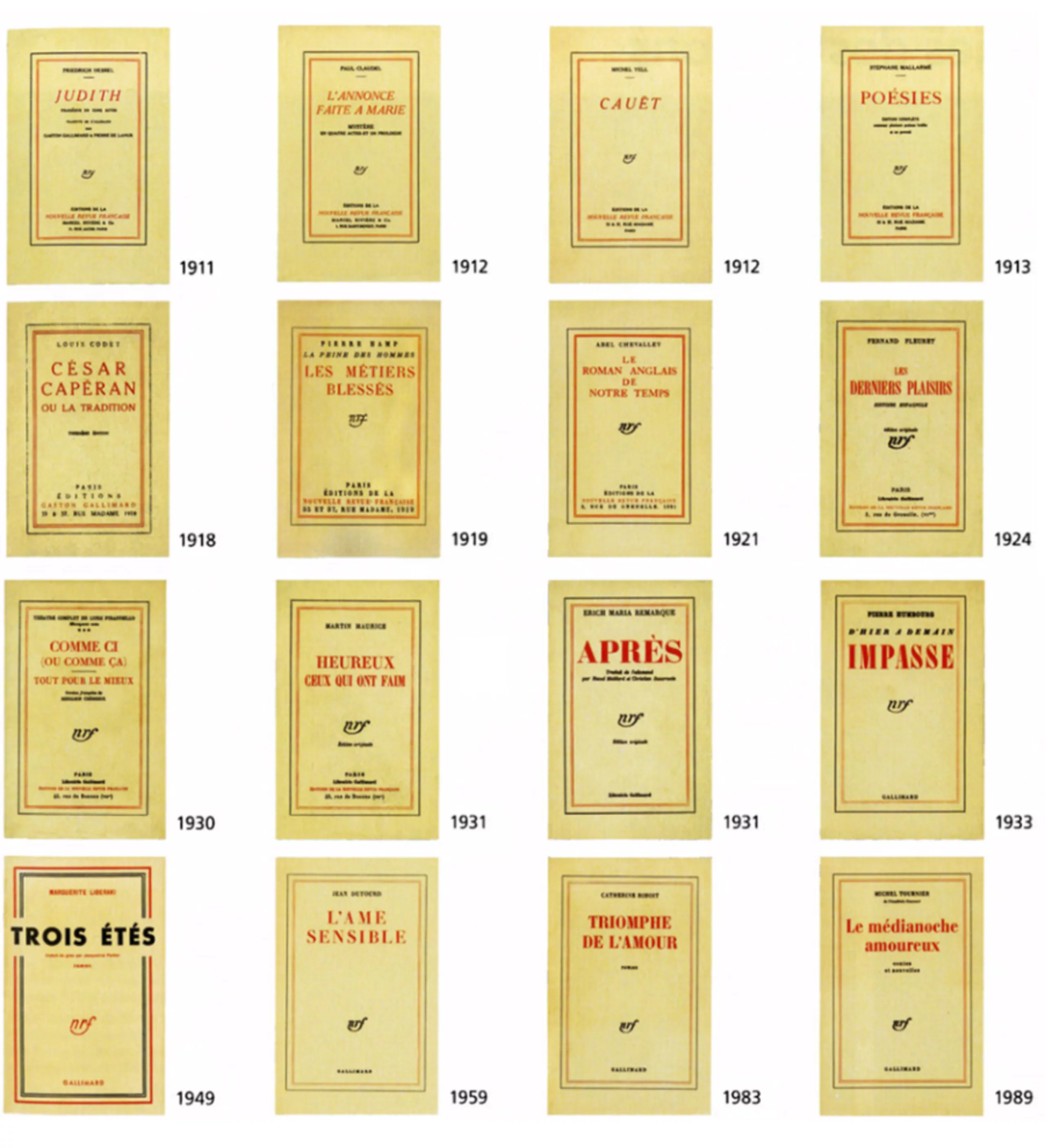
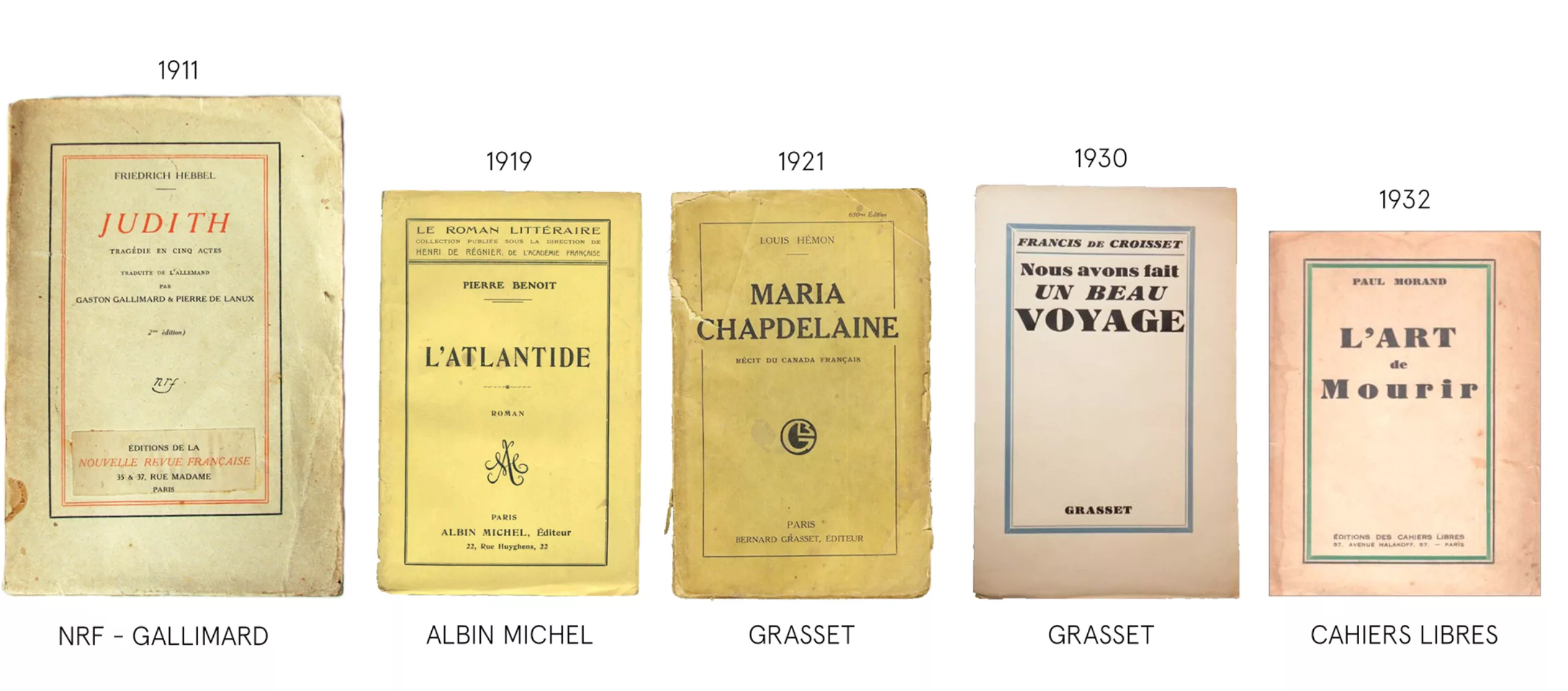
A sign of this graphic supremacy, and to set the tone, the other major French publishing houses only decline these graphic codes by playing with the elements. As the history researcher François Vignale says about Gallimard: “the house is a reference for all those who came after“. Here is a small sweep of this heritage through the ages (thanks to Laure Leroy for the help).
From Gallimard’s beige/red comes Albin Michel, who sometimes takes up the blue net frame as will Grasset or the Miduit editions, sometimes the red letters of the title. We find the oversized red frame in the Seuil editions, or later with the collection of Cahiers Rouges de Grasset, with the black frame on a red background. This edition will sanctify the author in the year 2000 by adding his blindfolded eyes on the cover. A subtle way to highlight the content without falling into a more “popular” visual illustration.
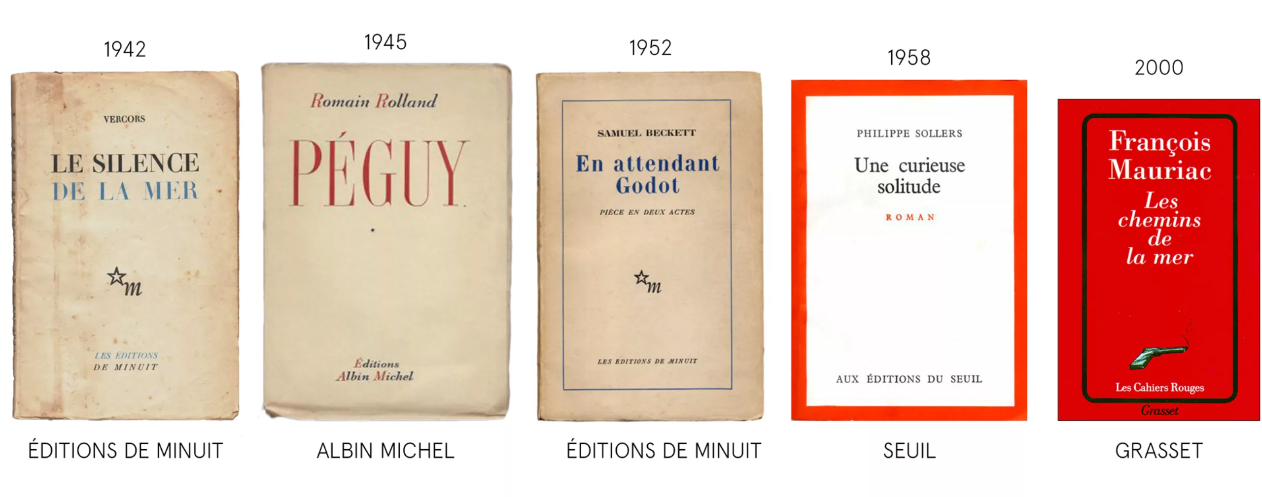
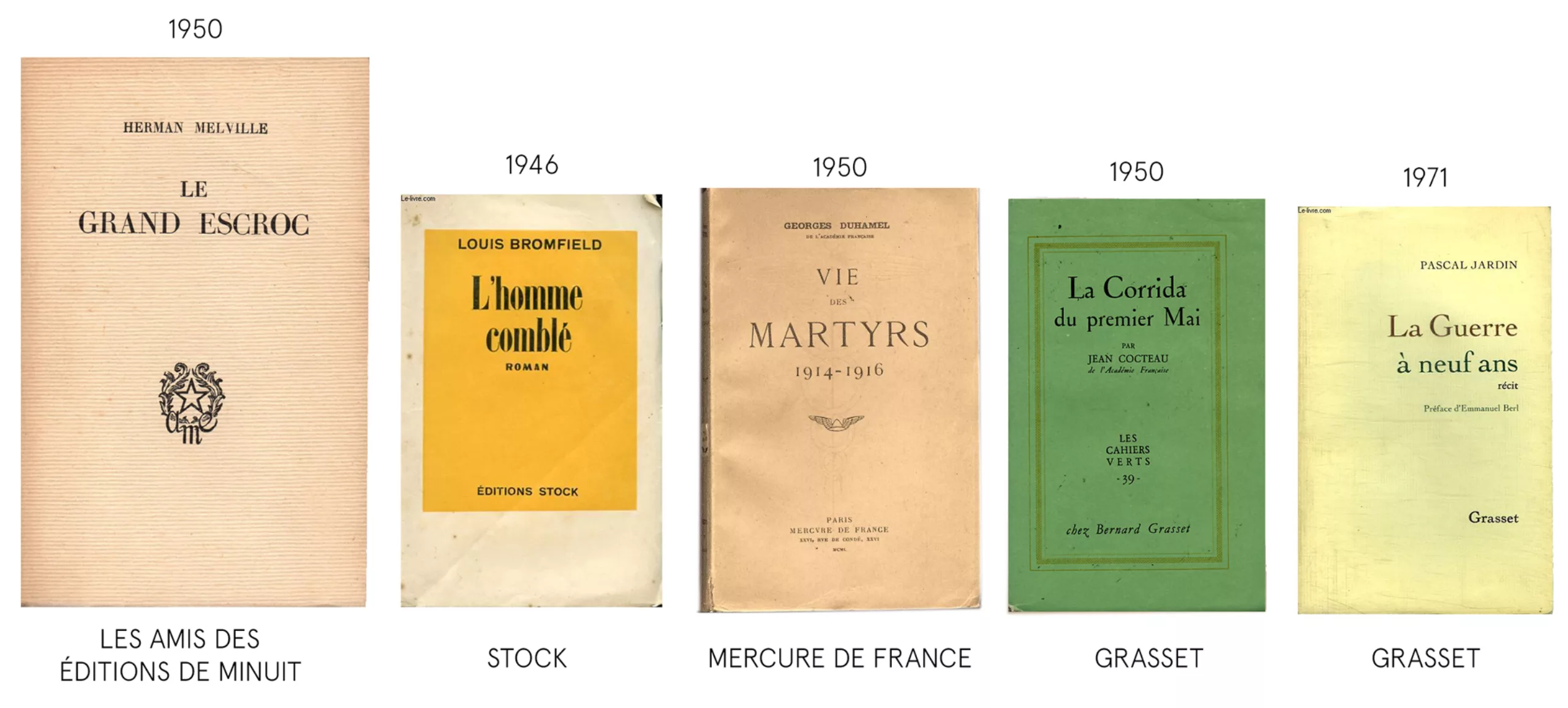
A quality fantasy, Les Amis des éditions de Minuit play with a laid paper, which can then be found as a distinctive sign at Grasset or Actes Sud and Mercure de France. As if to compensate for this lack of fantasy, colour appeared with Stock in 1946, who framed his text with a solid yellow, then the Cahiers verts in the 1950s.
Finally comes Grasset‘s famous “yellow” 20 years later, which of course echoes Stock‘s “white“, then Stock’s “blue” in 1995, itself a variation of the pale blue of Mercure de France. Jean-Marc Roberts, who originally designed the cover of Stock, affirms his legacy: “I was nostalgic for the pale blue of Mercury. That’s how I found my night blue.“
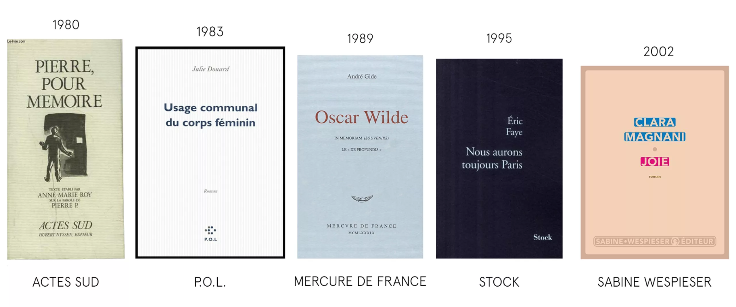
As early as the 1980s, houses went further. Actes Sud dares to mix illustration with classic format and quality materials (on laid paper), creating a collection with singular iconography. Shortly after the P.O.L editions innovate with a typography without empatement, the Gil, which breaks with this great french tradition. In 2002 the Sabine Wespieser editions play with a strictly typographic cover and classical composition, yet modern with a text that subtly becomes image, thanks to touches of color.
Generally speaking, all try graphic combinations with the little margin they are given: a sober background, red, black or blue for the letters, and sometimes a net to frame the whole.
Today we end up going around in circles without much innovation, while still managing to have visually strong houses with their own graphic identity, but almost always under this classic heritage of “the white”.
In this context, Faucheux brings his touch of graphic fantasy, in total opposition with the white: it is the great return of the book-object, to contemplate, to love and to collect.
Faucheux, or the return of the book-object
After the Second World War in 1946, Pierre Faucheux was the first artistic director of the French Book Club, a library of remarkable books inspired by Anglo-Saxon and German clubs (such as The American Book of the Month, since 1936). Books are sent directly from the publisher to the reader, via a subscription system, without going through a bookseller. Each book is an inventive medium, allowing Grim Reaper to experiment with layouts, printing materials and new typographical rules.
We are in the midst of 30 glorious years, and publishers are beginning to understand the power of graphics as a modern element to stand out. Bringing together a whole bunch of talented graphic designers (Massin, the future DA of Folio which we talk about below, came back in 1948), the French Book Club brought the profession of Artistic Director to France.
These books are a brilliant coup that dismantles the sobriety of classic books and “white” literature. For Faucheux, each book is unique, and he strives to give them a graphic soul, made to measure. The sober and white cover for everyone does not correspond at all to his vision. So he designs books to keep for their beauty and singularity, as before Gallimard’s appearance, but going even further.
Without a common theme as in a publishing collection, club books are all unique and connect background and form. Faucheux alone will produce more than 700 titles!
1953:
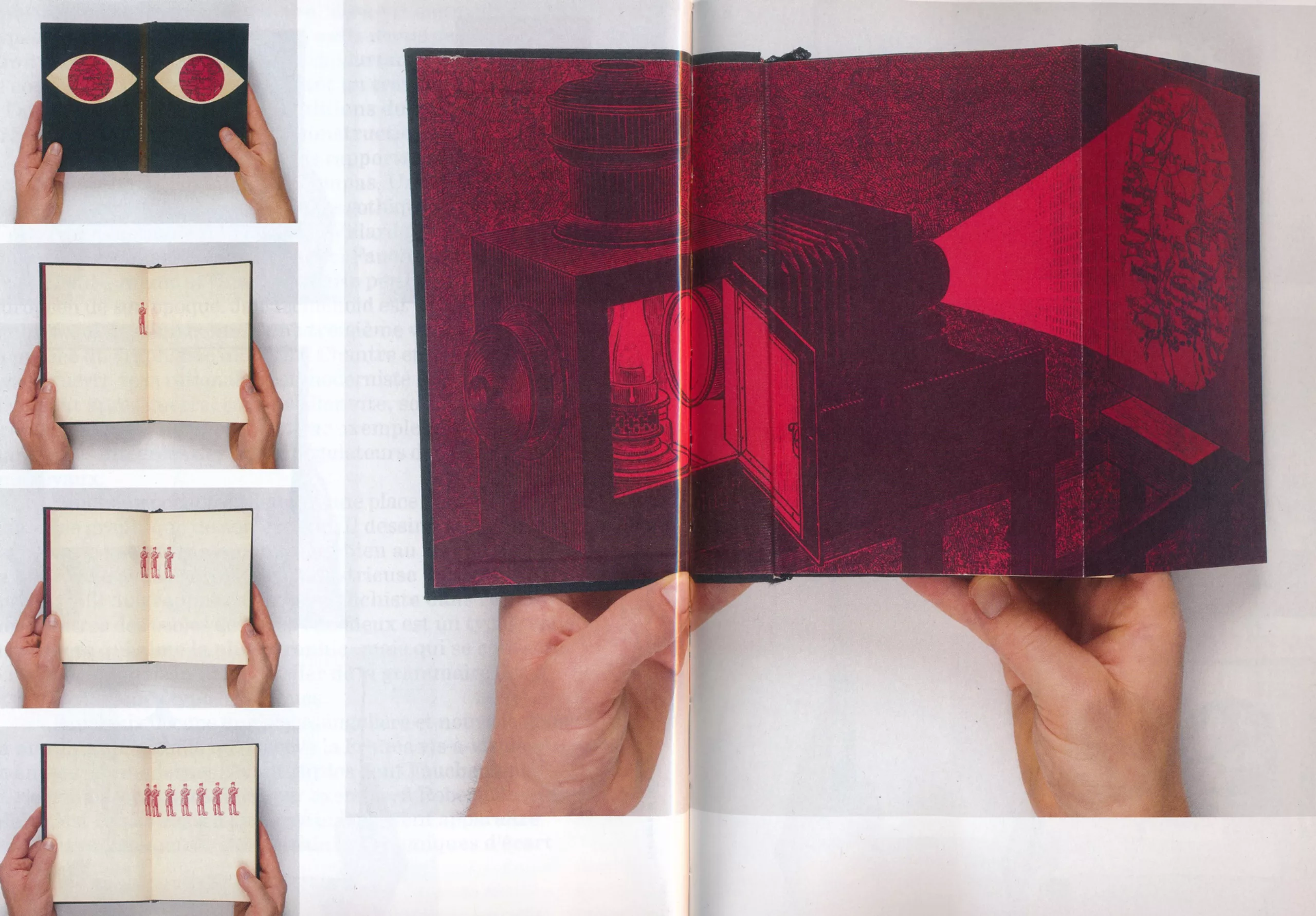
Faucheux was trained as an architect, and without having obtained a diploma, he saw the book as a monument to be built. It is thanks to this gap and this mixture of styles that he creates new supports. Close to the Surrealists and Breton, he concentrates his work on the “absolute gap“, a decompartmentalized thought that mixes genres (he notably creates the écartelages from photographs photocopied in several copies, like the one below).
Inspired by the collages of the Dada movement, or by the typographic style of the constructivists, it stands out from the irrationality of the former and the too industrial character of the latter to create a new material that is at once free, artistic and popular. The use of photography in printing since the late 1920s with constructivists allows a reconsideration of text with image, as a “texture of solidarity” (S. de Puineuf): the two are one.
1966:
But the most important thing to remember is that he illustrates books using typography, he who said “hate illustrations”… Grim Reaper always read the books he laid out, translating the text and bringing it to life through characters. He also introduces the popular language of cinema by introducing some kind of opening and closing credits to announce the content. A great revolution, the club’s books introduced a notion of movement that had not previously existed in classic books.
Today we remember Faucheux as a graphic designer for Le Livre de Poche, Les éditions du Seuil, or Le nouvel Obs. His 40 years of graphic career have radically changed and influenced graphic and typographic cultural theatre in France.
His work can be summed up in the phrase borrowed from Robespierre for the XIth exhibition of Surrealism, “the absolute gap”, for which he creates the staging and the communication media: “To fulfil your mission you must do exactly the opposite of what existed before you“.
1964:
1955 and 1957 :
We understand better why when Poche’s book arrives, when the book club just begins to run out of steam, it is literature that is desecrated. Once reserved for “experts” scholars, it becomes accessible to all, and presented as any other mass consumer good. The guillotine falls.
French “Poches” (paperbacks): american influences and french nationalism
The advent of the Penguins in England in 1935 and of paperbacks in the United States in 1939 (see Chapter 3) brought a new wind to the world of books. In France, the cover graphics are influenced by Gallimard and the genius of Faucheux. At the same time, the first pocket collections, inspired by the american sisters, dealt a serious blow to the morale of intellectuals. When created, this colourful and eye-catching Poche edition has nothing to do with French codes…
The american way (Hachette – 1953)
In France, even if some publishing houses had already offered such content and format before Penguin, it was not until 1953 that Henri Filipacchi of Librairie Générale Française, a subsidiary of Hachette, created the Le Livre de Poche collection. Borrowing printing techniques from the press for wide circulation and reduced costs, it is designed to meet the expectations of the general public.
Cécile Boyer-Runge, director of Poche Publishing for several years, explains that in 1953 “we had to make books attractive and popular, while maintaining editorial quality. The choice was therefore to find poster designers, illustrators, draughtsmen to transform the object book into coloured object. This really broke with the intellectual codes of the time. Literature was presented in an austere manner. Many found the Pocket tinker and vulgar“.
Designed without any real graphic audacity or unity for the time, the Poche Book simply takes up the codes of american paperbacks, and even cinema posters. Polychromy is required. But it’s a real French revolution! For the first time the full texts of novels are available in pocket format, for everyone (the book for everyone!). Which is not without displeasing the intellectuals…
The first three books are successful novels that have already proved their worth:
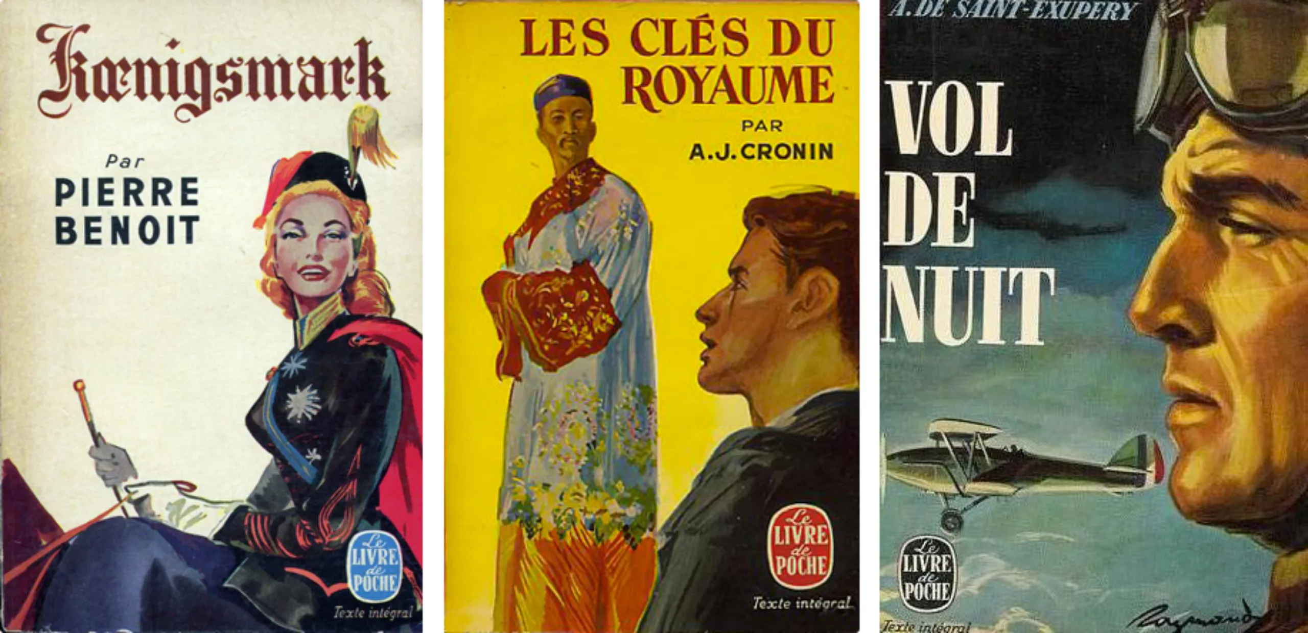
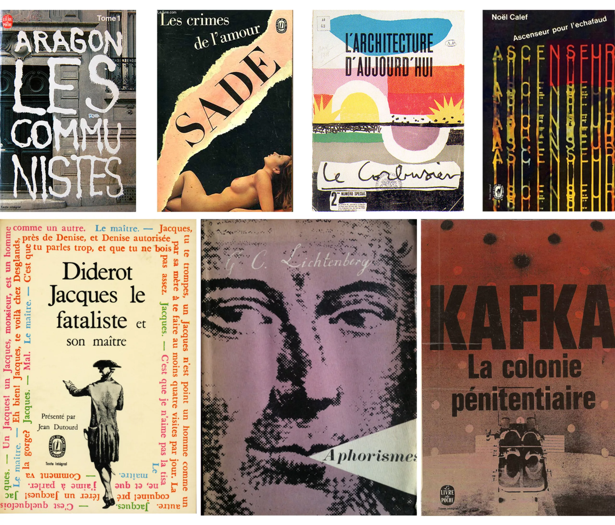
Then come other novels, illustrated by more or less famous artists. Colors, titles, typos vary from book to book. And despite their literary content, the covers are still reminiscent of the stories of adventure, sex and blood that are all the rage among Americans.
Massin, artistic director of the Folio collection, which will be discussed below, says in this regard that “this anarchy of presentation – titles arranged sometimes at the top, sometimes at the bottom, sometimes in the middle, and in characters each time different – gave rise to an image of the collection which, in addition to the bariolage of the slices, made it immediately recognizable“.
By its audacity and its very american style, the creation of the Poche edition is the hérisse of more than one. Unlike the United States, it is not morality that is threatened, but the very status of intellectuals.
These are profound debates that are raised, with the pros and cons of democratizing reading. Among the arguments against, putting authors’ stories in the hands of the people made “read lots of people who didn’t need to read” as the young man in the video below says. “Before people were humble before literature, today they have acquired the right to take it too high” (or to take themselves a little too seriously?).
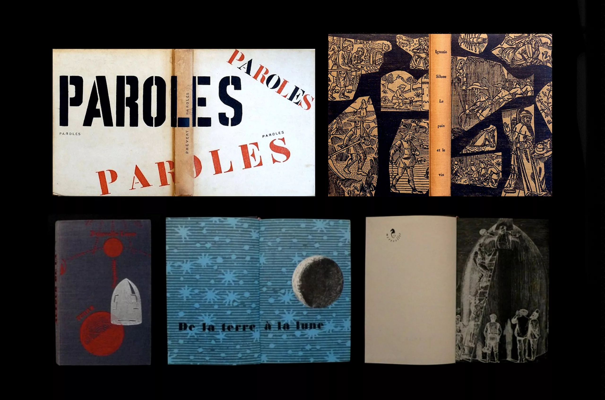
Later in 1964, Faucheux was artistic director of Les Poche, and offered the cover of André Breton’s Nadja. Leaving codes in the American style, and closer to club books, Faucheux revives french classicism by adding a white title in a more sober typeface, which he mixes with the content of the book – here the Dada movement.
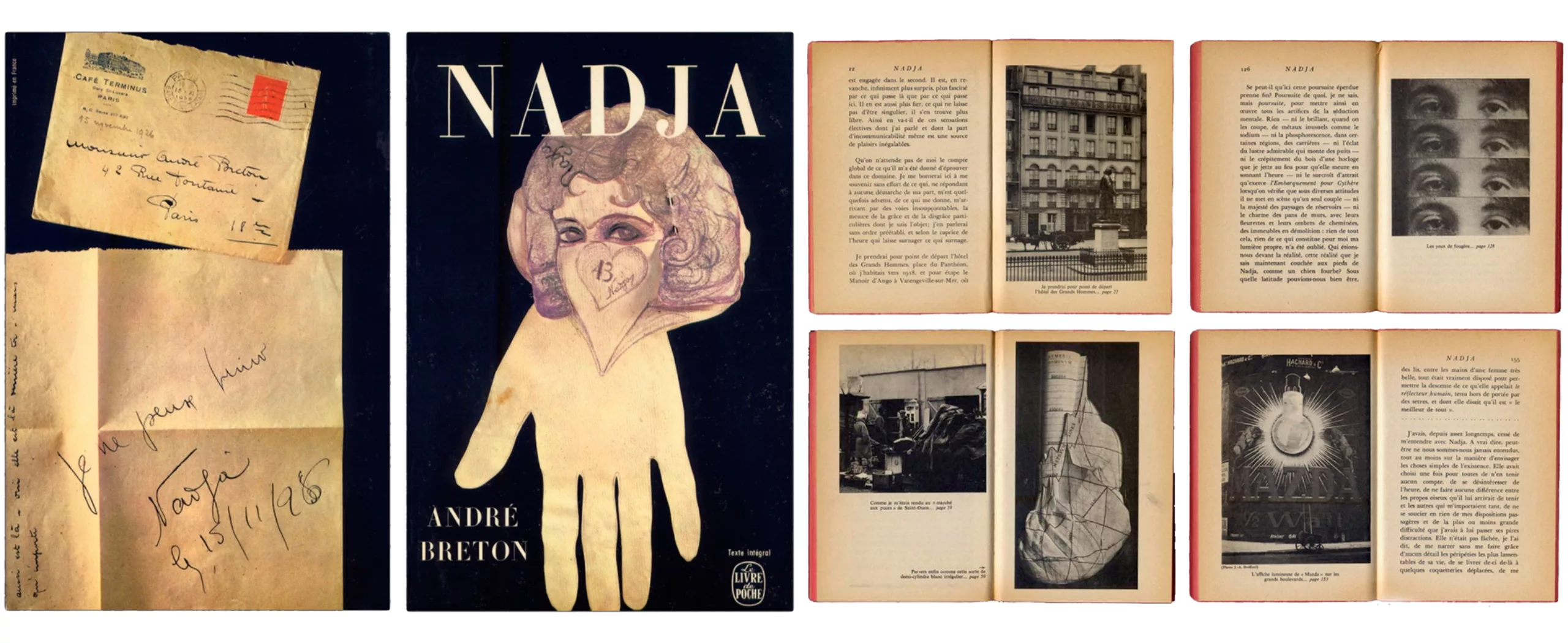
In this vein, Faucheux set out to distinguish itself from American codes by introducing more typography and graphic work, which are the particular signs inherited from French houses.
He thus creates the whole series of In Search of Lost Time, with archive images and a white label with a red frame that reminds Gallimard’s codes.
One could also have looked at the pocket formats of the collections 10/18 (1962) or Points (1969), but the article is already well stocked… In short, the first is inspired by the Pop Art movement with Warhol-style colours and portraits mixed with Roy Lichtenstein’s wefts. The Points collection is created around a more architectural or even Swiss geometric shape. But we preferred to focus on Massin’s work for Folio.
Little bonus: we invite you to discover the work of Dick Bruna, a dutch designer whose book covers are quite innovative and graphic!
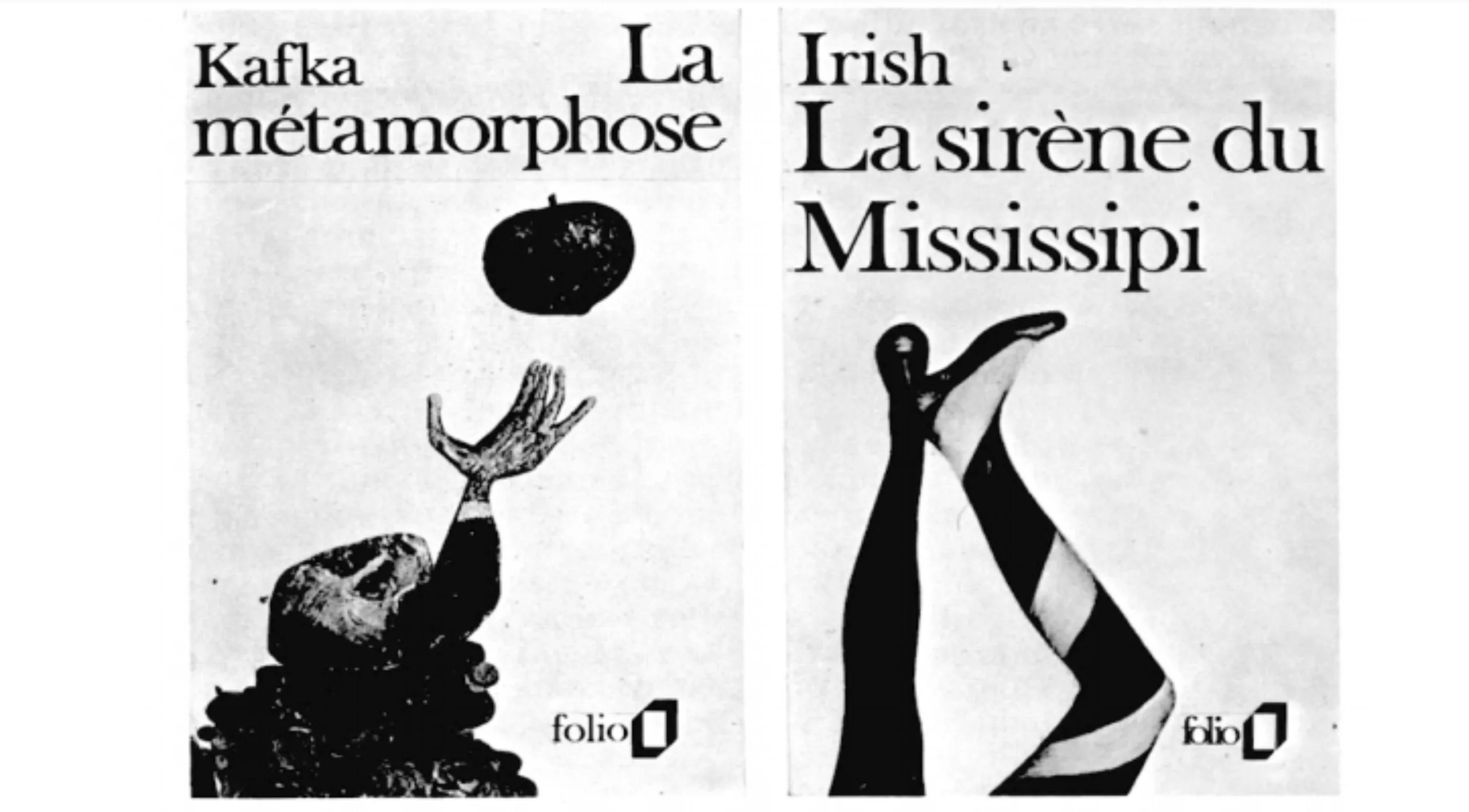
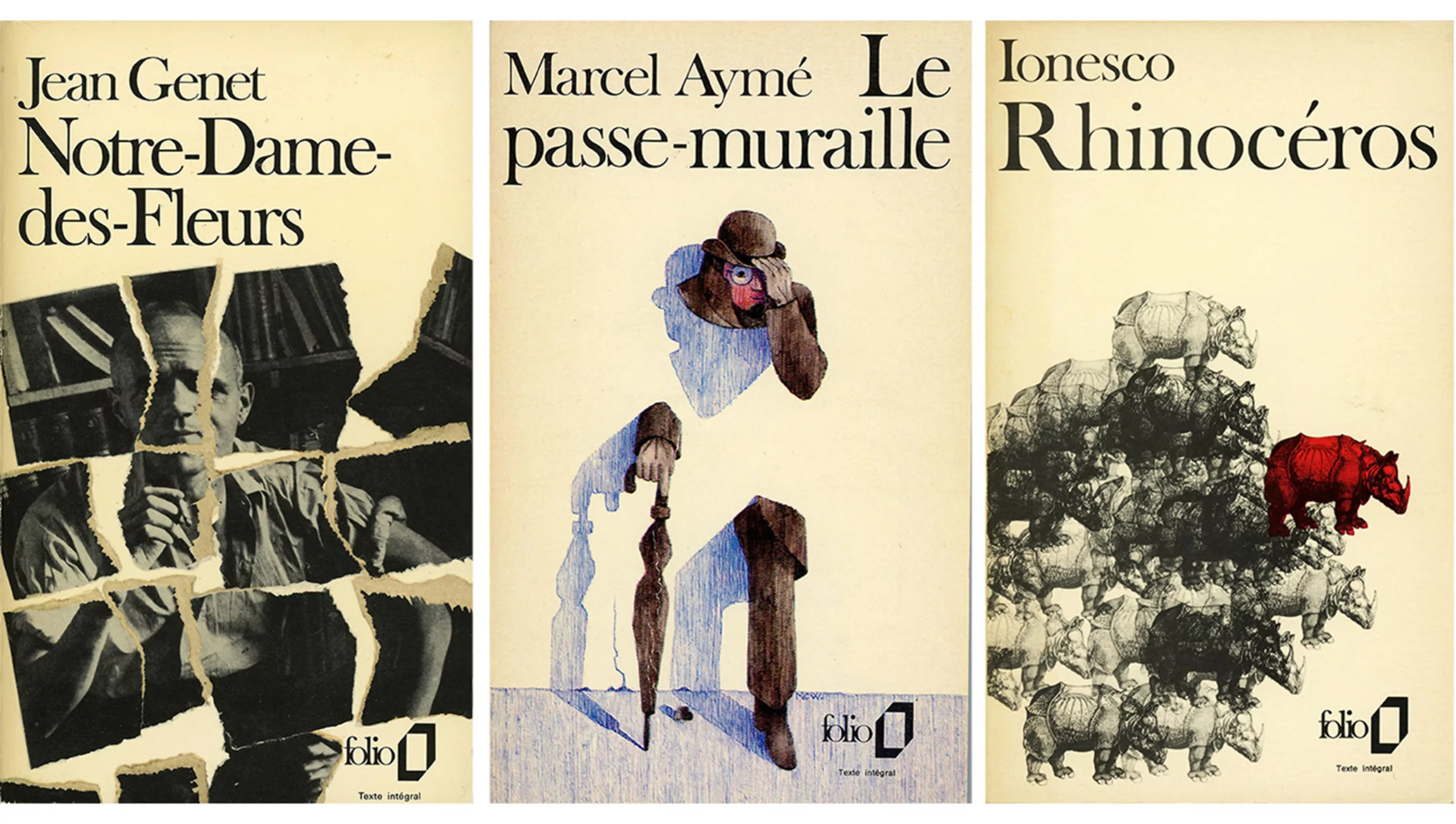
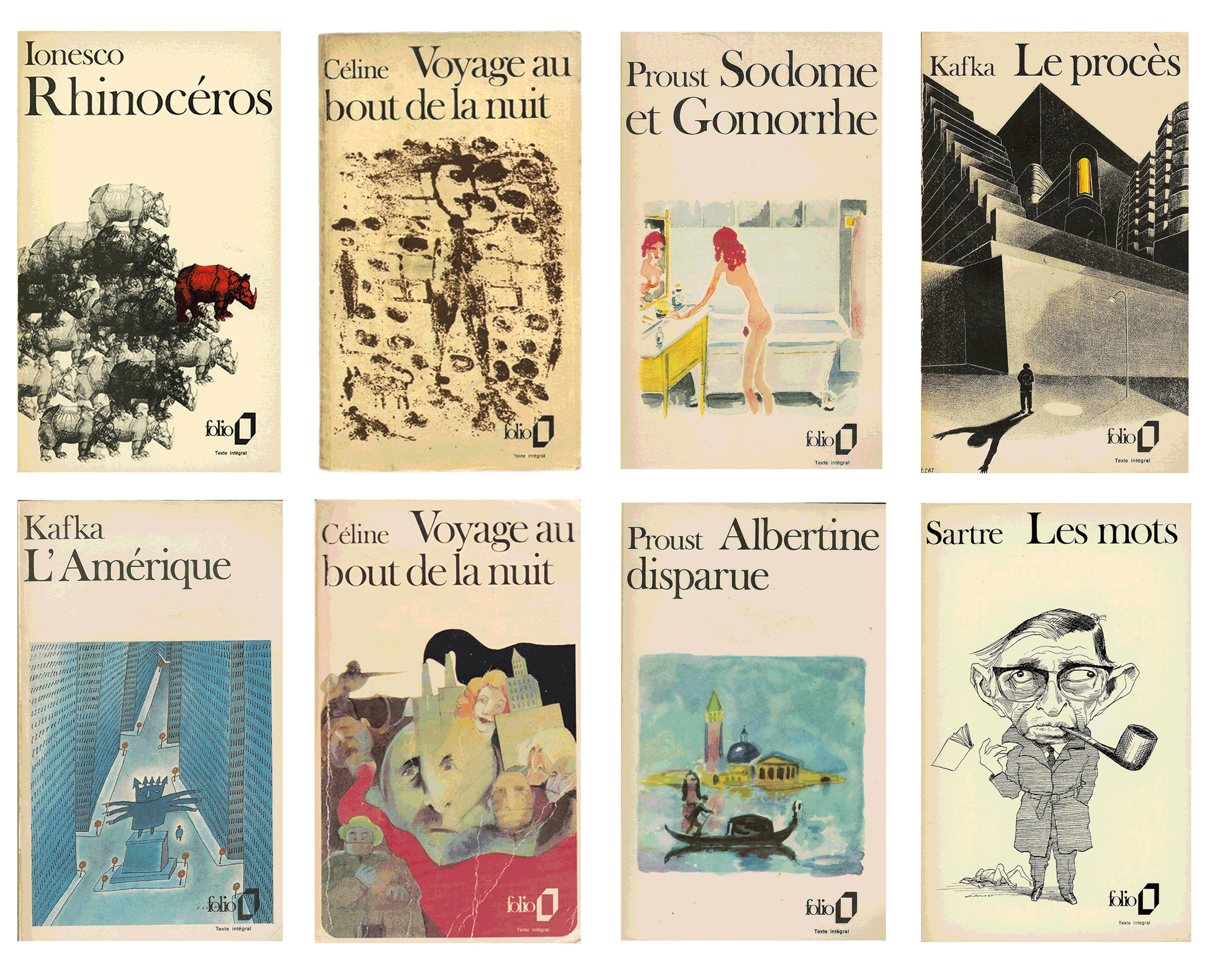
Folio, the French paperback (Gallimard – 1971)
A part of the collection of texts by contemporary authors of Le Livre de Poche belongs to Gallimard Publishing (more than 22%). But in 1971 the contract between Gallimard and Hachette ended. Massin, graphic designer and artistic director of Gallimard, developed the graphic charter for Gallimard’s pocket edition: Folio.
Massin is the man who launched contemporary graphics in France, breaking the barriers of specializations. Self-taught and versatile, he is at the same time photographer, artistic director, poster designer, or graphic designer. He plays with letters like images, seeks to give visual meaning to typography, and creates the profession of artistic director.
If Massin hit the nail on the head with his Folio, it’s because he went to a good school. Influenced by Faucheux who initiated and formed him, or by Jazz from the United States, he freely creates a new universe for the greatest number. For him, a book cover should function as a mini poster, directly conveying a message and the desire to buy the book. He inherits this point of view from Faucheux, who himself takes it from Karel Teige.
Massin explains his creative process (read in full on indexgrafix) about creating Folio:
“I dreamed of a cover that, if possible, would be the opposite of the one that had been favoured by the public until then.(…) This general public, at the time (in 1953) being refractory, it was believed, to graphic audacities, conditioned that it could still be by conventional imagery in terms of illustrated covers. (…) Twenty years ago, there was no talk of packaging, design or graphics.”
One evening, he cuts pictures out of magazines which he assembles on white sheets. The next day, with a rested head, he has the click. And that same evening, with the help of his assistants, he creates 12 fictitious covers. Typo Beskerville old face always placed at the top, label “à l’emplacement immuable”, white background, free illustration (illustration, photo, collage, watercolour, portrait…) Folio was born.
Below, Massin’s first models for Folio:
And a little board that we like, taken from a relaxed approach to the history of graphic design published in Libération in the summer of 2014, followed by the first covers of the Folio published in 1971 :
The Folio revolution is mainly linked to its new 10×18 format (the same as the Penguins editions in England or Fisher in Germany), and above all to the improvement of legibility thanks to more adapted bodies and a “more airy presentation”. Massin explains that printers used to have limited page constraints to convert a story into a pocket version, resulting in books of x pages but with tight and difficult to read texts. Folio is proud at its launch to privilege a pleasant reading above all, by putting the accent on the layout.
It is a small revolution in the world of popular books, straddling between popular illustration and classicism, it wants to revive the graphic codes of French literature, and restore its coat of arms.
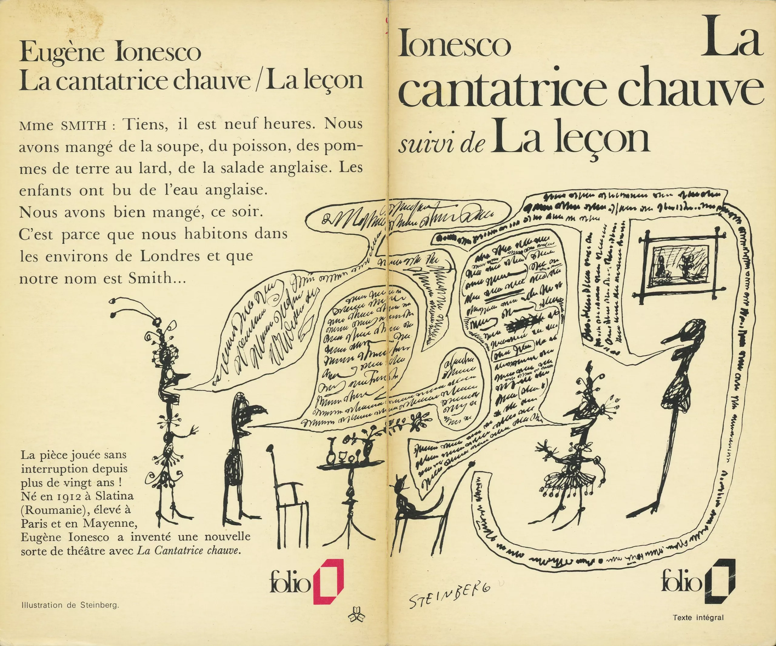
Most of the covers are made by Massin and his assistants, and sometimes in collaboration with external artists or graphic designers, such as La Cantatrice Chauve by Steinberg or Voyage au bout de la nuit by Dubuffet.
Finally, it is quite interesting to compare the cover styles of the two Poche and Folio collections to the same years, here between 1971 and 1977 (gif below). One has the impression to compare the american style with the french style (Poche) with the french purist style inherited from Gallimard (Folio).
It is nevertheless worth noting the intervention of Pierre Faucheux’s genius – nicknamed Mister Cover – for the Poche publishing house, with Anthologie de l’humour noir illustrated by André Breton and l’Arrache coeur (3rd and 4th on the right, top line) for which he creates a torn paper typography. Two volumes with innovative and avant-garde graphics, inspired by his experience with the French Book Club.
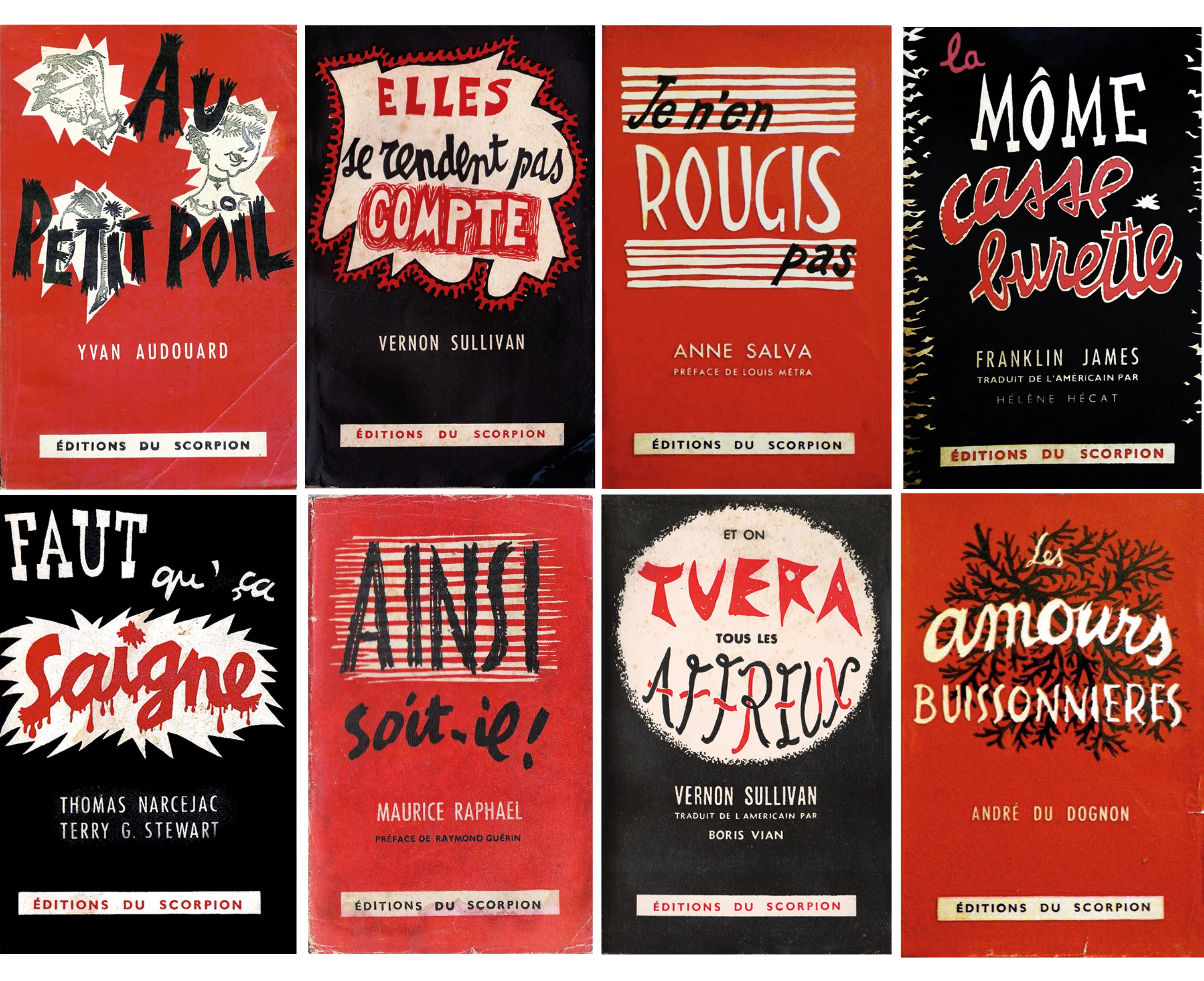
Scorpion Editions, scandal thrillers
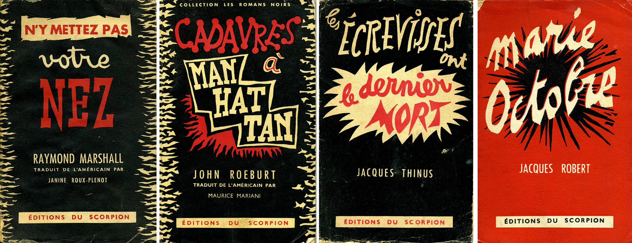
“Something american style”
In parallel we see the appearance of the Scorpion editions, a house of scandalous detective novels that robbed the french market in 1946. Its director, Jean d’Halluin, in his twenties, is getting closer to a host of well-known writers in the world of the thriller. Among them, Boris Vian thanks to – or because of – who the scorpio will be remembered.
At the time, American books were selling well; liberation brought with it a taste for American culture (and a slight penchant for ole-ole books). Henry Miller’s Tropic of Cancer is a hit. The press has a tendency not to see these books with a good eye, because of their character a little too “pornographic” for the french mores…
Out of financial need or simple provocation, d’Halluin asks Vian to compose an American-style detective novel under an pseudo to create a sensation and boost sales. To which Boris replied: “Give me ten days and I’ll give you something”.
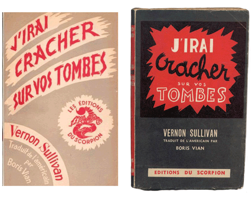
In the autumn of 1946 the “something” appeared: J’irai cracher sur vos tombes (“I shall spit on your graves“). The cover (left) is screaming with an aggressive blood-red typeface. It is soon followed by a new black-red-white print which will become a real signature, by the painter Jean Cluseau-Lanauve.
Fourth book published by Scorpion, it is the one that will propel the publishing house. Vian wrote it not in 10 but in 15 days under the pseudonym of Vernon Sullivan, the famous unpublished (and completely fictitious) American author. He took care to slip in erotic scenes, which, as he says, “pave the way for the real revolution”. But the revolution is taking a long time because for the moment the press is sulking.
The lover, the priest and the glory
Fortunately (?), a fact worthy of a good american detective novel turns the book’s fate upside down: a businessman’s mistress is found strangled, Sullivan’s book at her bedside… The press seizes the scandal to condemn the book, which Daniel Parker, a Protestant pastor who sees in the themes of the book (sex, blood, death…) an unhealthy incitement. To hell with those who read Vernon Sullivan!
The book offended the critics to such an extent that it was taken to court, then banned… until 1968! But the scandal fuelled curiosity and no fewer than 120,000 copies were sold, printed by chance before the ban.
In an attempt to bury the case and the accusation of a false author, Vian and an American GI friend circulate an “original” edition in English “I shall spit on your graves”.
Scorpion editions are launched.
D’Halluin then published increasingly heterogeneous novels and, to make a long story short, he put an end to Scorpion in 1969, riddled with debts. We will remember the ultra graphic and offbeat black and white red covers of the editions, and its brief but biting success like a scorpion bite… of course (huhuhu).
For a little fun and in another genre, this graphic style reminds us well of the censored and ingenious typographic posters of pornographism, which appeared in the 75’s (to see absolutely!).
The return of the coffee table book
Tradition and modernity
After Gallimard, as we saw above, the following houses vary their graphic codes from “white”. It was only in the 70s and 80s that publishing houses dared more colour, typographic games or new formats, adding a little modernity to the traditional cover.
In the 2000s a new kind of covers appeared. Contemporary French publishing houses, younger, are moving in the reader’s direction – now used to sober quality content and in search of graphics – while offering atypical visual codes for French publishing. Typography, intervention of illustrators, choice of quality paper or embossing… the covers – and the contents of the books – are more qualitative and particular.
The sensual book
By mixing typographical heritage and french quality with resolutely modern illustrations, they transform the book into an object of desire. Far from the classic cold book and unchanged for centuries, these houses propose books which recall those of the clubs of Faucheux. Dominique Bordes, founder of Monsieur Toussaint Louverture, claims to be inspired by club books “when you see books like that you want to touch them, eat them, have them. I wanted to give the same feeling with my books”.
It is again the return of the beautiful book, a new collector’s item appealing to the senses. Fibre cardboard, quality paper, sewn books, graphic illustrations appealing to the imagination… the new books are beautifully crafted objects that you don’t want to damage in your pocket and that you enjoy browsing through while being surprised by their content. Bordes specifies: “Reading is a sensual experience and, however one goes about it, one must try to amplify this experience by giving a specific weight to each work, a particular texture that one can touch, an existence that one can feel, that one can manipulate, that one can love. And who loves us. The why is there.”
Unlike book clubs, which were unique, these are sold in specialized bookstores and find unity in the aesthetics of their collection. They reach an educated public, neither too literary nor too popular.
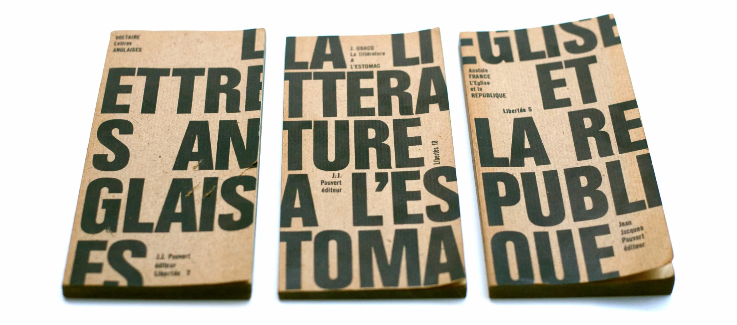
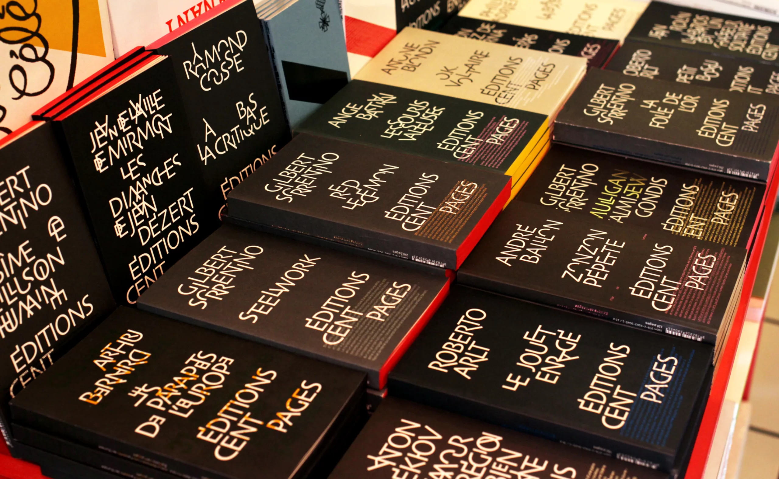
The typographical book
Among these modern houses are the Cent Pages editions (1987, revised in 2002) with black and typographical covers (“Rouge-Gorge” collection). With no hierarchy between title, author’s name or publishing house, they are an ode to typography, a manifesto, following the legacy of Faucheux and Vox.
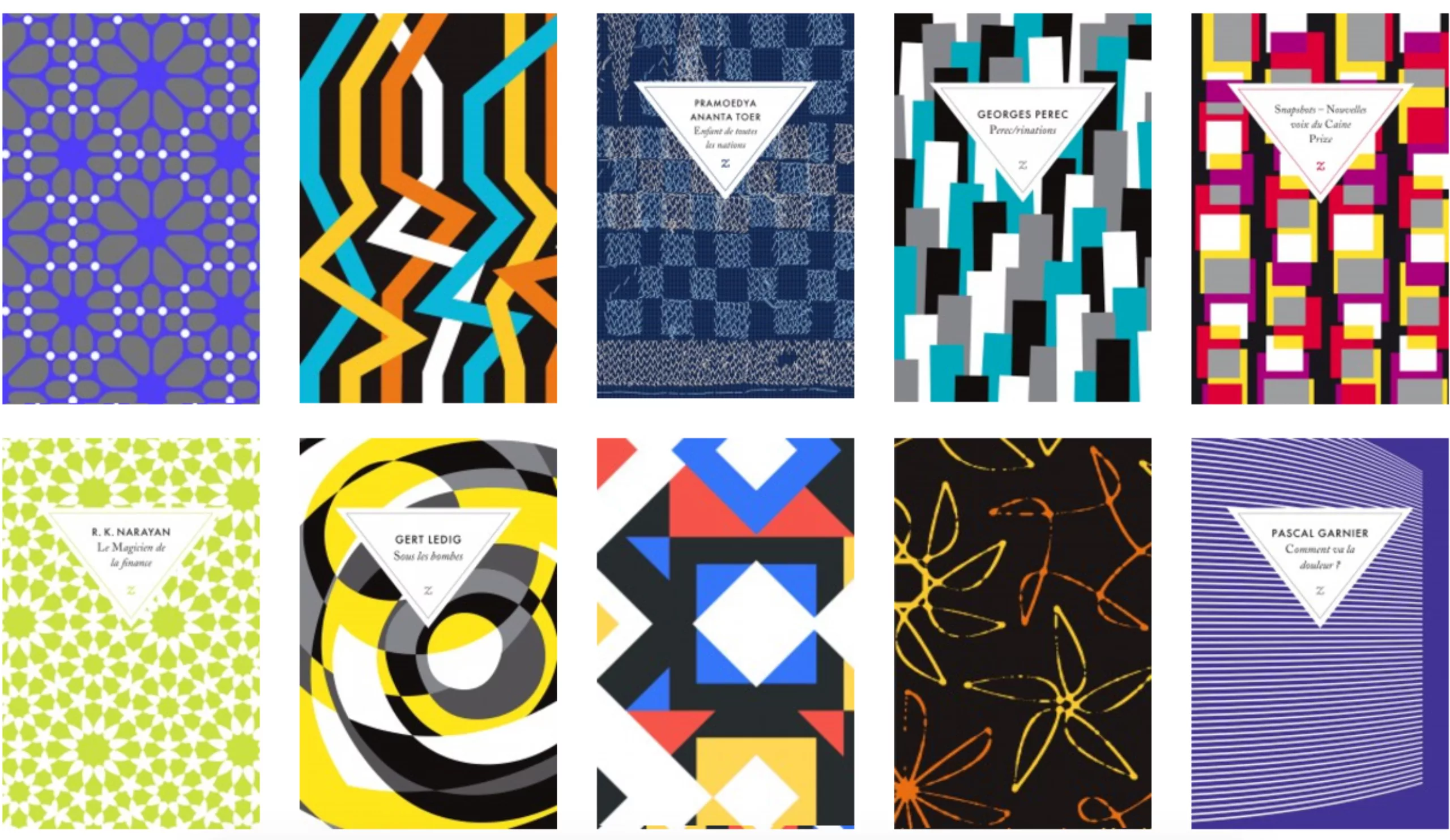
Zulma the original
Among these editions that stand out are of course Zulma, recognizable by its white triangle cartouche on a colored paper background. Graphéine had started their visual reconversion in 2006, and we went to interview Laure Leroy (director and co-founder) to probe this graphic position.
As Laure explains, digital isn’t working, at least not as well as some would have hoped. The great revolution has once again come from books, which seized the opportunity to reinvent themselves in the 2000s.
Readers now want a beautiful object, to rediscover the pleasure of the book. Zulma’s visual reworking is such that today the brand can be recognised at a glance. Although some authors are published completely unknown we quickly understand that it is the object itself, and therefore the publishing house, that creates this covetousness.
In 2006, Graphéine worked for Zulma Editions, first on mini-sites, then on the redesign of the website. At that time, their covers were not really interesting, and we had offered to accompany them in this work and to cite as an example the work of David Pearson, an English graphic designer collaborating with Penguin Editions.
Zulma then approaches the latter directly. The idea is to create “something very different and very original“, to publish both French and foreign literature, and play with the typographical and graphic codes of both genres. It is a rebirth for Zulma which is then born as would a new publishing house, or at least it is so that it imposes itself. Economically, it’s simple: prints double with the arrival of new covers! A beautiful proof of the added value of design.
It is then the first house to mix references to classic publishing and contemporary graphics. The label reminiscent of writers’ books and school notebooks allows the house to be linked to traditional codes, and the colours bring that touch of modernity that breaks these codes.
It is now a well established collaboration that allows the publication of about ten books per year. After a brief/summary like a moodboard, David Pearson imagines and proposes a visual atmosphere, singular and not necessarily symmetrical or repetitive. The whole is then proposed to the author, and almost always validated as it is. The visuals proposed by David then become “open doors on the imagination“.

The book, this Phoenix
Looking back over 1800 years of evolution (!) through this series, we can see that book covers feed traditions cyclically through innovation. Some collections become traditional bases and become models, others rebound and develop new aesthetic codes to transform themselves into a beautiful object of collection, then becoming models in their turn.
What is certain is that the social and technological revolutions are chanting these trends, and that the covers speak volumes about the content of our mores.
If today our mass society plunges us more and more towards the all-consumable, the sensational or the instantaneous, they are indeed flash covers which attract our eyes mainly… On the other hand, despite the financial difficulties, the literary counter-current is not suffocated either by the wave or by technology, and it seems that the publishing world will resist the invader again and again, or at least to be forgotten.
Long threatened by digital technology, the contemporary book makes its comeback, for the better, because “that which does not kill makes us stronger” as Nietzsche said. And Laure Leroy emphasizes: “No better way to save the book than to make real books.”
Like a Phoenix (yes I know, it’s deep), the book is always reborn from its ashes to dazzle us more beautifully. Over the centuries, we have seen the precious religious treasure-book covered in leather or fabric, then containing illustrations and profane texts, the solid and heavy book becoming soft and transportable and becoming all-paper… the king-book passing from the people’s bread bun, then a private-loved object with the club-books, to become today a beloved object thanks to the young publishing houses.
We must therefore take a positive view of these auspicious changes. The graphic evolution of the covers of books reflects this perpetual and necessary renewal to make last an object which does not cease to be invented to better please us.
Thanks to Ouvrir L’oeil bookstore (Lyon) who let us take pictures of his stalls and to Laure for giving us a few enriching minutes.
Text: Tiphaine Guillermou
Sources / To go further:
- FR vs US: www.slate.fr/story/69737/pourquoi-france-couvertures-livres-sobres
- Folio: www.indexgrafik.fr/folio-les-avatars-dune-couverture/
www.flickr.com/photos/56781833@N06/sets/72157631348379120 - Faucheux: www.indexgrafik.fr/pierre-faucheux/
- Massin: www.pixelcreation.fr/graphismeart-design/livres/robert-massin/
- Memory on the art of visual identity in French literary publishing: http://dante.univ-tlse2.fr/431/1/camille_zammit_2014.pdf
- Scorpion Editions: www.taurasdubouquin.tumblr.com/post/125348148572/une-magnifique-supercherie-litt%C3%A9raire and www.leboudoirdezigomar.wordpress.com/2013/05/29/la-memoire-du-scorpion/
- Monsieur Toussaint L’ouverture Editions: http://monsieurtoussaintlouverture.goodsie.com/livres
- Zulma Editions: www.zulma.fr/
www.actualitte.com/article/interviews/design-de-couverture-le-livre-est-sa-premiere-publicite/65860 - About colours: http://bibliobs.nouvelobs.com/actualites/20071219.BIB0508/les-couleurs-du-succes.html
- The UK’s best 2018 covers: https://abcoverd.co.uk/archive
On the subject
-
A short history of book cover design – 3/4
From Penguin Editions to the birth of graphic design, the cover is an open book on the social mores of a country and an era.
-
A short history of book cover design – 2/4
Under the influence of Japan, France or Russia, book covers are constantly evolving with technical progress and crises.
-
A short history of book cover design – 1/4
From codex to colour printing!
Here is the first part of this series of articles sweeping the evolution of book covers to the present day, through the most striking revolutions.