A short history of book cover design – 1/4
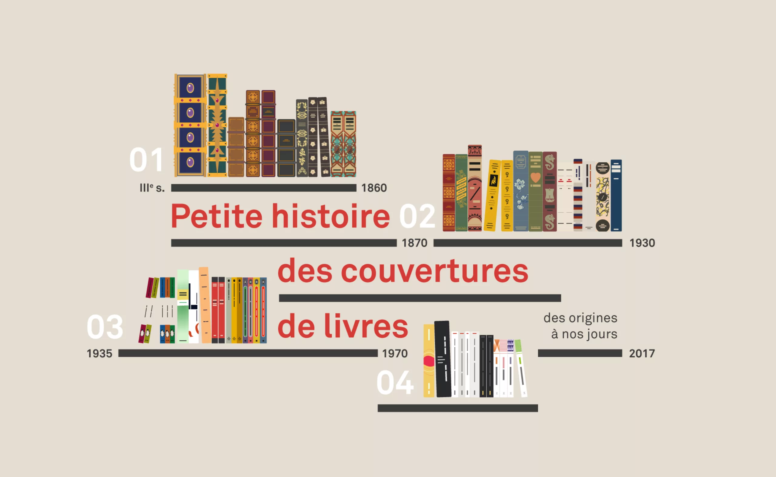
Panorama of book covers through the ages!
Here is a new series of articles dedicated to the history of book cover design.
In Molière’s language we like to say that “the habit does not make the monk”, but the Shakespearian equivalent will be “don’t judge a book by its cover“. Yet we all know how important “first impressions” are. Hence the importance of the “cover” in the desire to read this or that book. Today, the cover is a real marketing object and plays the role of packaging for literature. However, the history of this modest rectangle of paper is rich in lessons, moving from the conservation function of the first manuscripts to the object of great consumption, it animated generations of graphic designer.
So here is the first article in our series scanning the graphic evolution of book covers to the present day, through its most striking revolutions.
Chatper 1: 3rd century to 1860
“From Codex to colour printing”
Chapter 2: 1860 to 1935
“From printed fabric to colour jacket”
Chapter 3: 1935 to 1970
“From paperback to abstraction”
Chapter 4: from 1960 to the present day
“French paperback, contemporary graphic design and covers”
Chapter 1: 3rd century to 1860
“From Codex to colour printing!”
As early as the 3rd century, papyrus rolls (volumen) from antiquity are now folded and assembled in codex. This radical change marks the birth of the book as we know it today, or almost. The book is the cover to protect and enhance it. But it will take time to go from precious stone inlays to polychrome prints! A few centuries and several wars, to be precise.
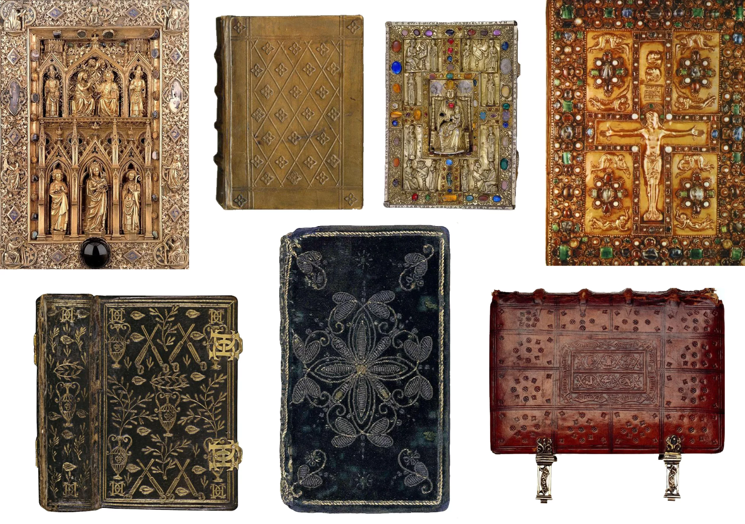
The treasure book
A precious object (Antiquity – Middle Ages)
Until the early 1800s, and particularly during the Middle Ages or the Renaissance, the book was a precious object for two reasons: its content and its form. First, it contains almost exclusively sacred texts: the holy word, a religious treasure, is reserved for monks. You might as well say that we rarely had a Bible on our bedside table at home – besides, between us, we still had to know how to read.
If we take into account the fact that before 1450 each line was handwritten, decorated with gold illuminations, and that the covers are works of art in their own right, we understand better why its form was as precious as its content.
Before, book “covers” looked like this: hand-engraved or embossed bindings, precious stones, ivory, silk, clasps, embroidery, leather, and gold and silver threads. The kind of book that it would be a little hard to slip into your handbag in the subway (see large by clicking on the picture).
The book was at the time a medium reserved for scholars, which was consulted on the spot and passed on like a treasure, solidly protected to last over the years.
The printing revolution (1450)
With the invention of lead movable type printing by this dear Gutenberg in 1450, we see the appearance of more and more books a little less precious, with embossed leather covers. Less time, less manpower, more books!
We pass from 15 000 000 printed books in Europe at the dawn of the invention of Gutenberg to more than 200 000 000 books a century later, and 1 000 000 000 printed books in the 18th century (that makes a lot of zero). Thanks to Wikipedia who teaches us a lot about the history of printing. Even if we are still far from the paperback books which will appear 500 years later (sorry for the spoil), it is well the revolution at the time.
To judge a book by its cover
Protective binding (until the 16th century)
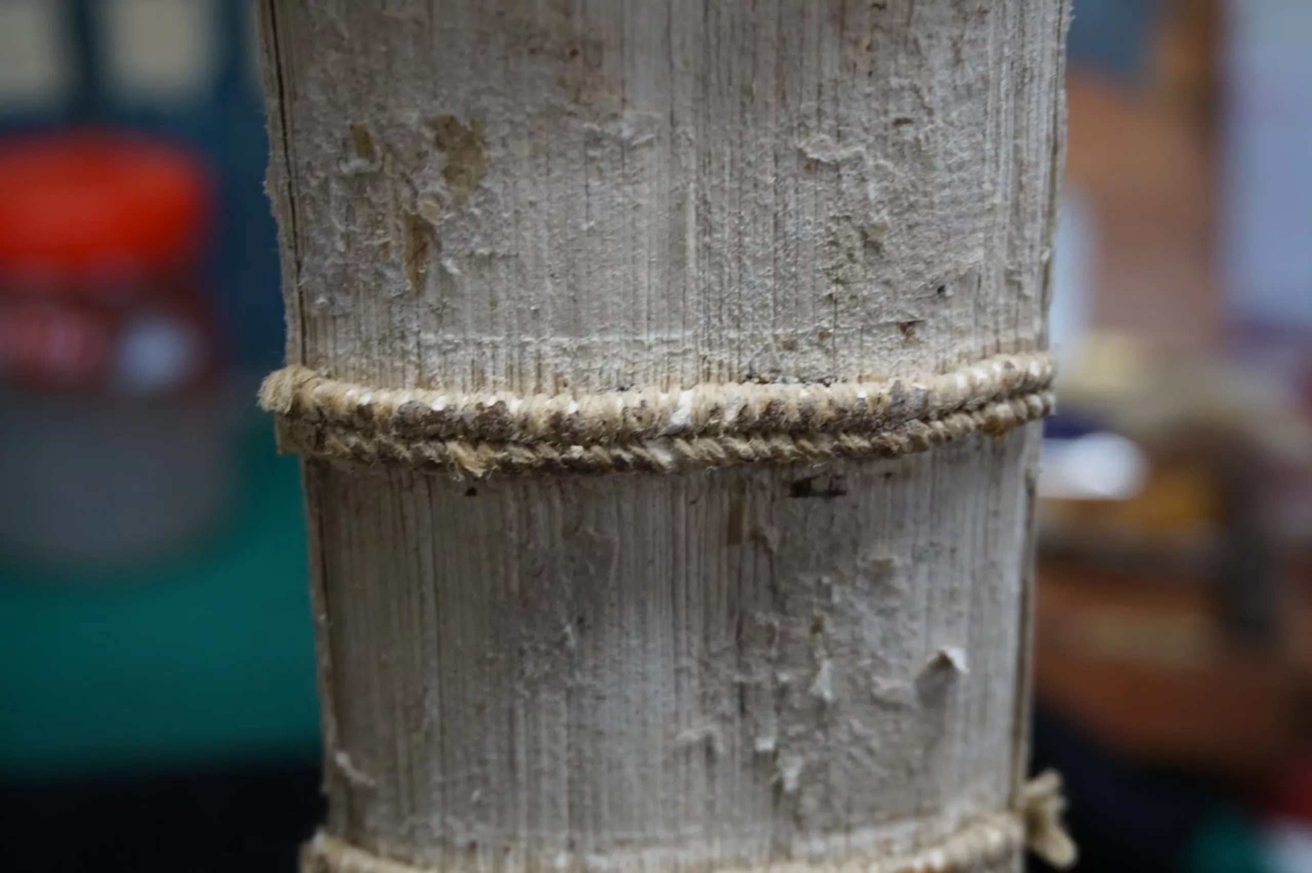
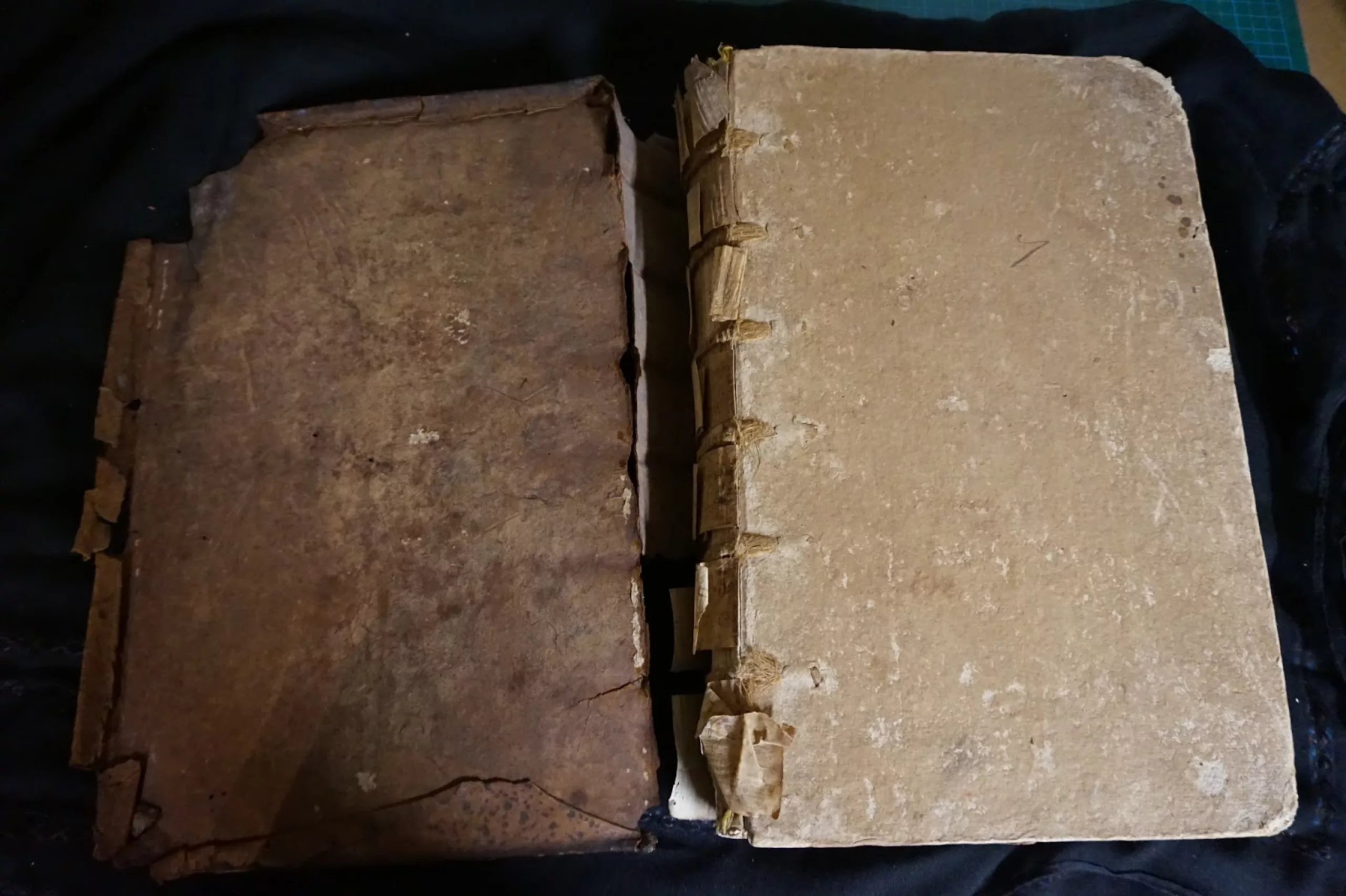
If the bindings illustrate the holiness of their contents, they all have the role of protecting the scriptures. A wooden plate is pressed between two pieces of fabric or leather, attached to the codex (the set of sheets folded into sheets), itself bound by hand. Actually, we’re not talking about the cover yet, but the binding.
For the sake of protection, books were often closed with metal or leather clasps until the end of the 15th century. They are designed to be laid flat and well protected. Then the clasps go out of fashion and are gradually replaced by strings and finally nothing more – except for some precious books. In the 16th century, it is the Genesis of the modern book as we know it: without clasp, with a hard cover, smaller format, easier to carry.
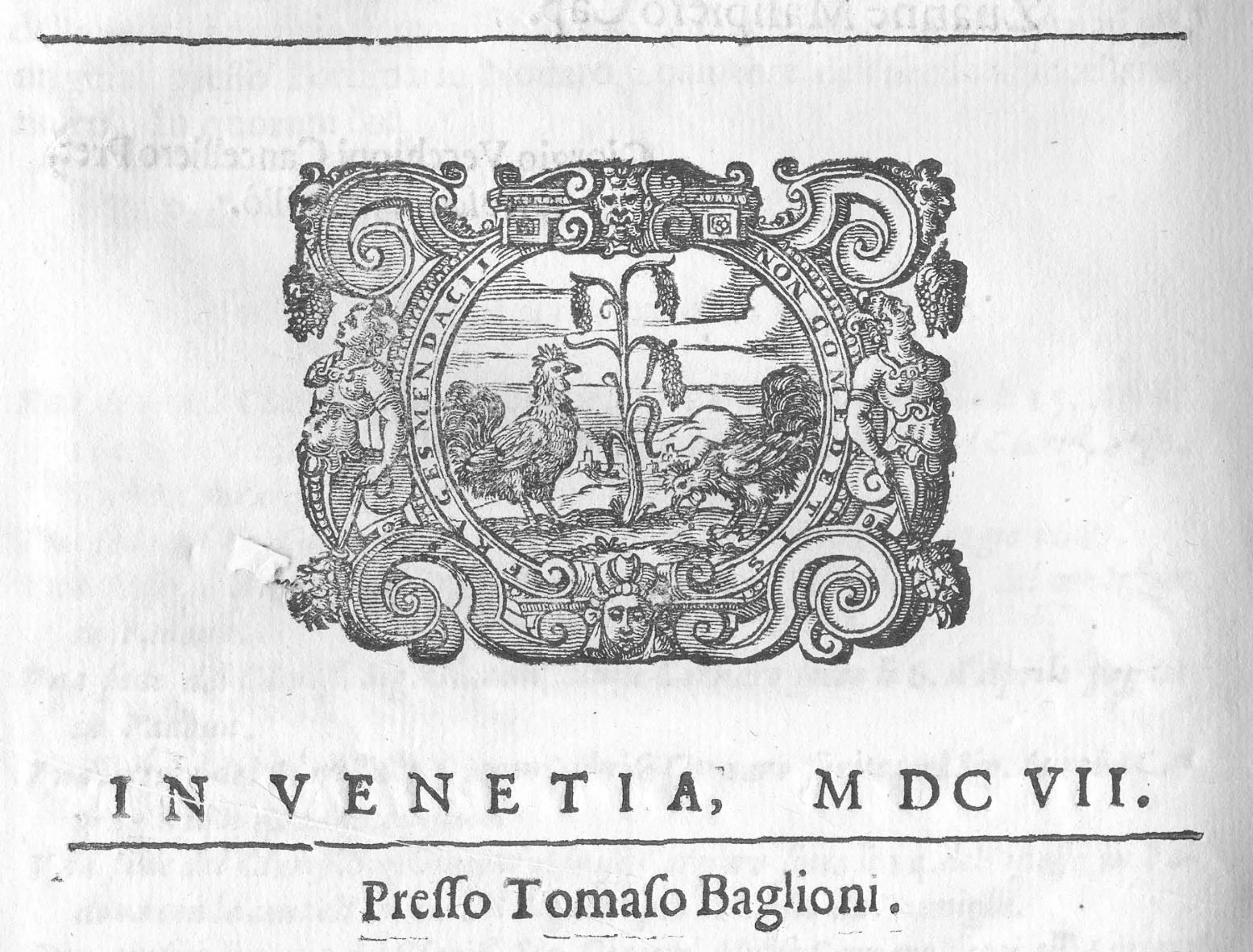
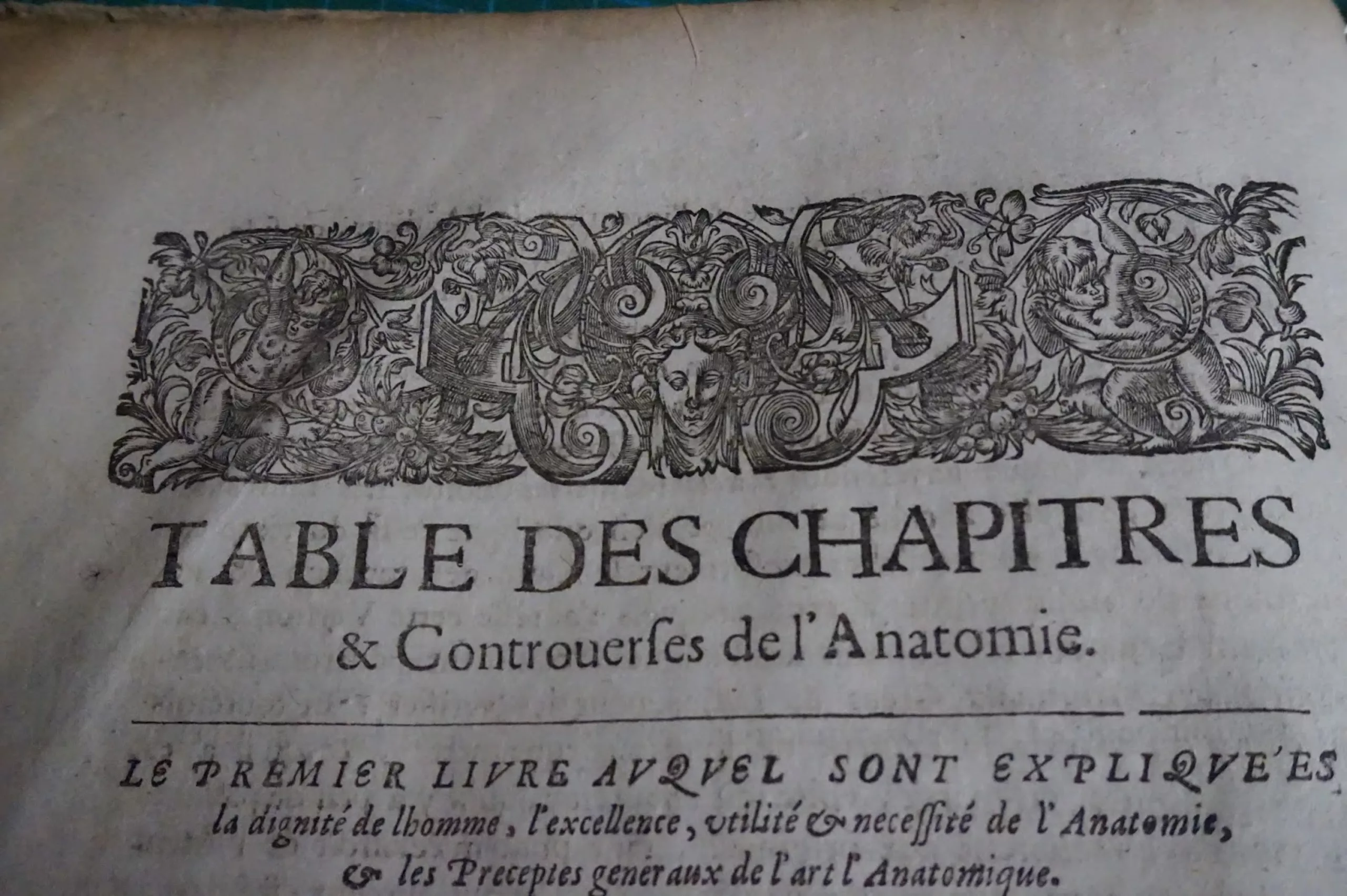
From colophon to title page
The title appears on the edge around the 16th century only. Information about the author, the translator if necessary, the name of the printer or copyist, the date or place are written at the end of the book in what is called a colophon (from Greek, meaning completion) like this one from 1607.
With the increase in the number of printed books, the colophon is less convenient to consult, and gradually migrates to the front of the book. As early as 1520, what we call the title page appeared, with the title, the author and the bookstore (which often rhymed with publisher) hierarchized on the first page.

My binder is rich (16th – 19th centuries)
At the time and until the 19th century, a book was bought uncovered with only a temporary seam, and wrapped in paper. The buyer has it assembled and bound by a specialist, where he can choose his “style”: all leather, paper, gold gilt edge, touch of red and embossed… according to his budget. The book still remains a very beautiful object which does not throne on all the shelves, and on which the purchaser can afford some fantasies.
Below is an example of leather binding from the late 16th century. There are lots of pictures of old books to discover on the Michigan State University Library site, if you want to see even more leather.
The pictures of old books are from the blog “Restauration livre à Trôo“.
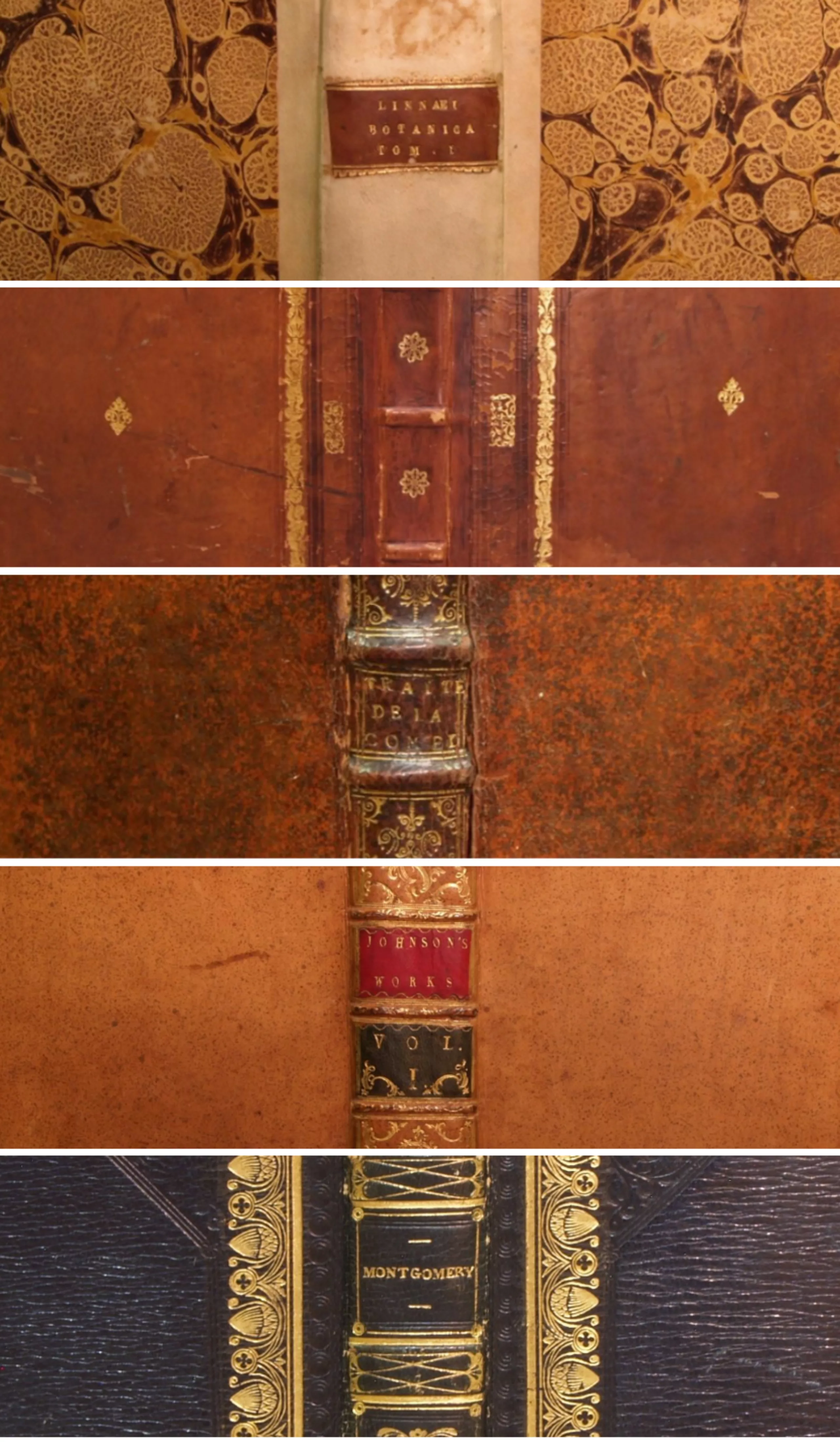
In the 17th and 18th centuries, leather binding with a golden edge, sometimes with touches of blue or red, was given pride of place. The use of marbled paper is gradually being introduced to reduce costs and enhance aesthetics. Books are more sophisticated but increasingly easy to make; the work and binding techniques are simplified.
Here, book bindings between 1600 and 1820 (the last, blue, marks the change of century and technique).
1820: the great revolution
Industrialization and lay literature: binding for all? (from 1820)
From 1820, printers included binding in the manufacture of the book itself. No need to go through a specialist. With presses, they manage to create embossed textures with simple geometric patterns in monochrome, integrating a gold print. We play with the embosses to imitate the textures of the leather. Thanks to machines and presses, the book creation process is becoming simpler, faster and cheaper. Every decade, immense progress is made in terms of printing techniques.
The year 1820 also heralded a great turning point in literature: until then almost exclusively pious, it emancipated itself from religion and became mostly profane. “The writers became the heroes and saints of the 19th century”, summarizes A. Compagnon according to Bénichou’s essay, Le Sacre de l’écrivain, 1750-1830. The status of writers has not necessarily changed since then for french publishing houses but one thing is certain: we will finally be able to have fun while reading!
Silk and emotions: the gift book (from 1830)
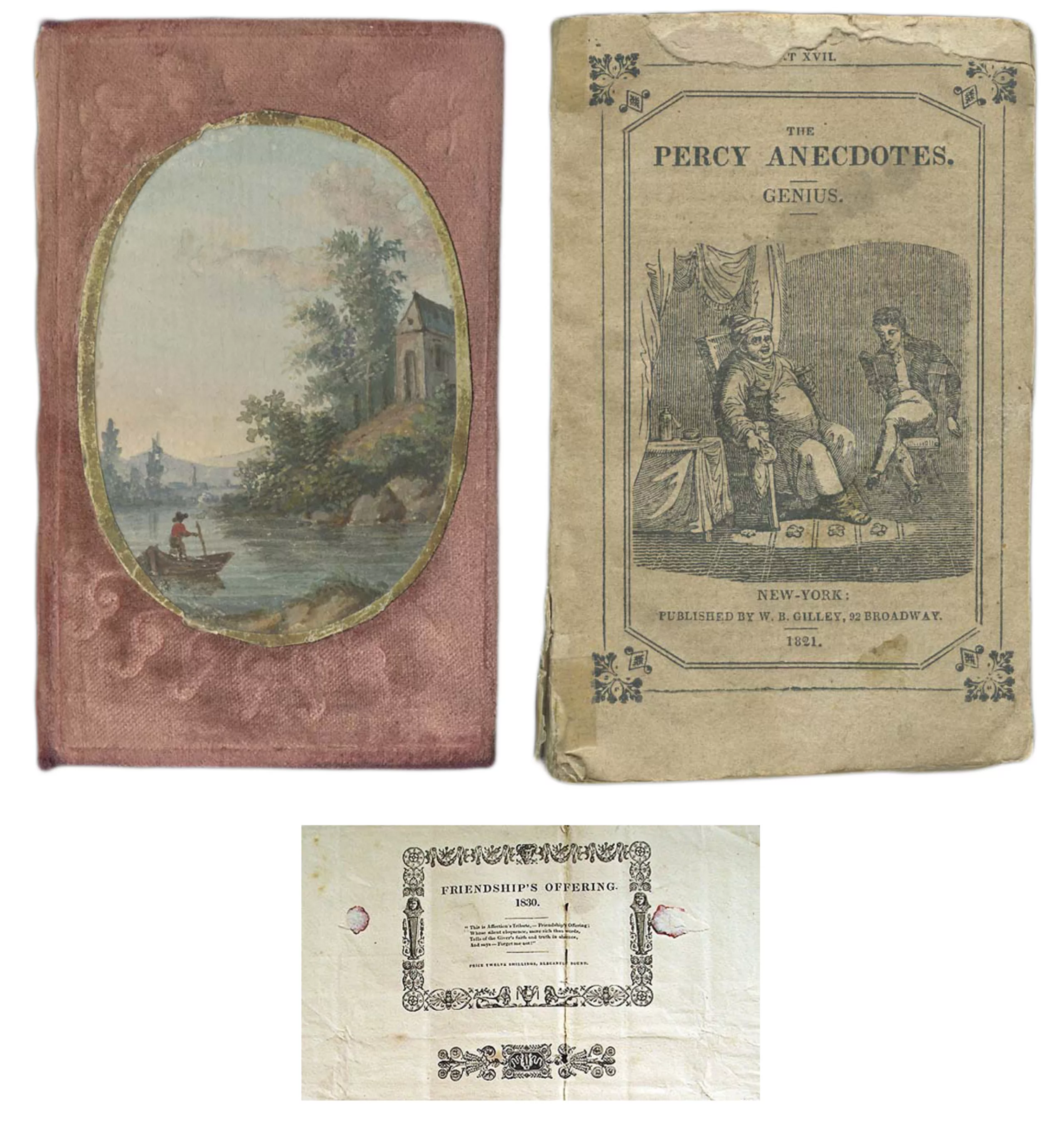
In 1830 it is now customary, and chic, to offer a book. The removable cover makes its appearance, a kind of illustrated tissue paper to protect the book during its transport (small image, bottom). It’s the ancestor of our book jackets. This type of cover was entirely wrapped around the book like a gift wrap, with a wax seal. The silk was probably torn when the package was opened and few survived. On this removable cover from 1830 we can read “friendship’s offering“, gift of friendship. How charming!
Before seeing the cover illustrations as we know them today, publishers used watercolour inlays in silk (left, 1818) or tissue paper packaging (right, 1821) half illustrations / half teasers announcing the next volumes to appear.
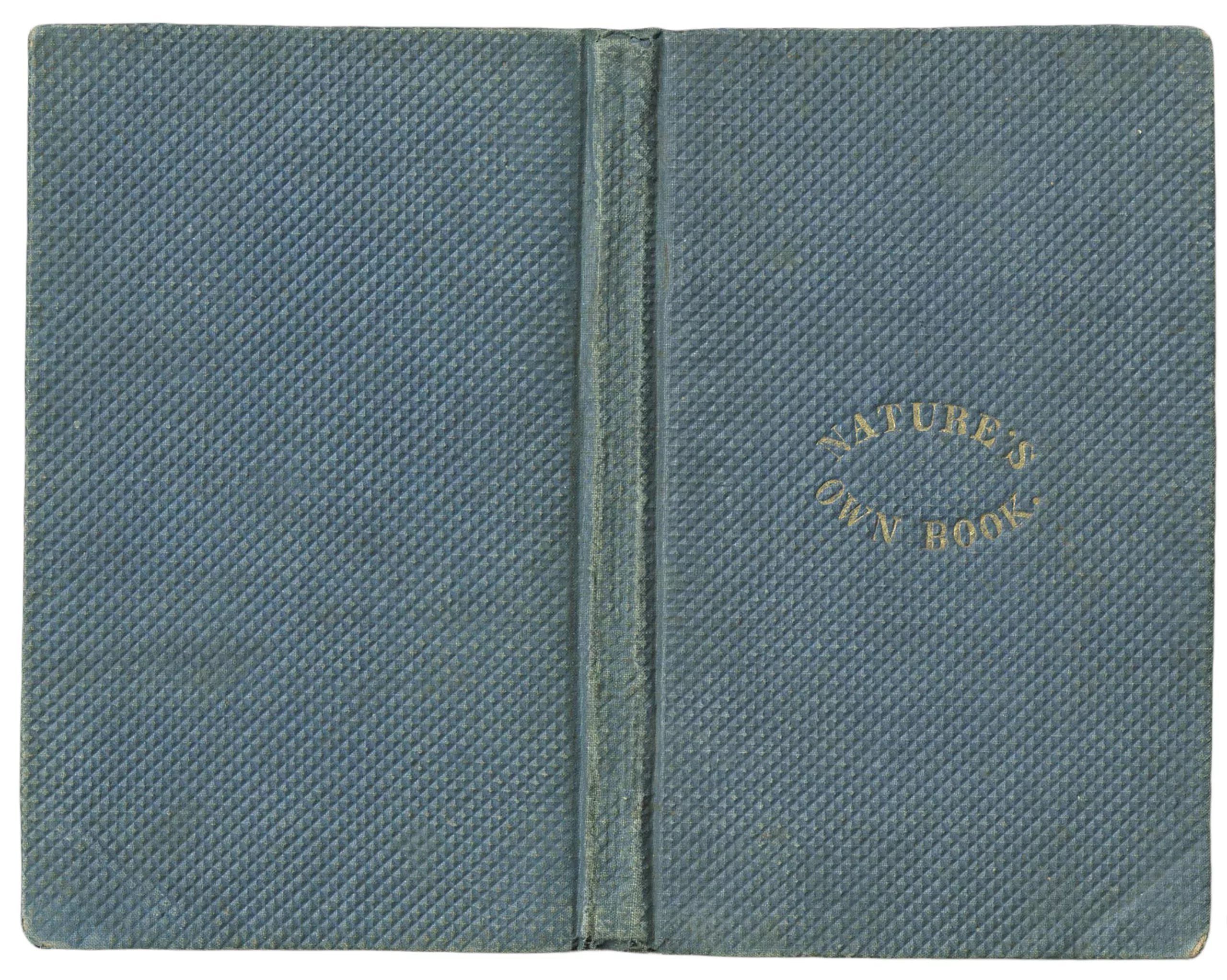
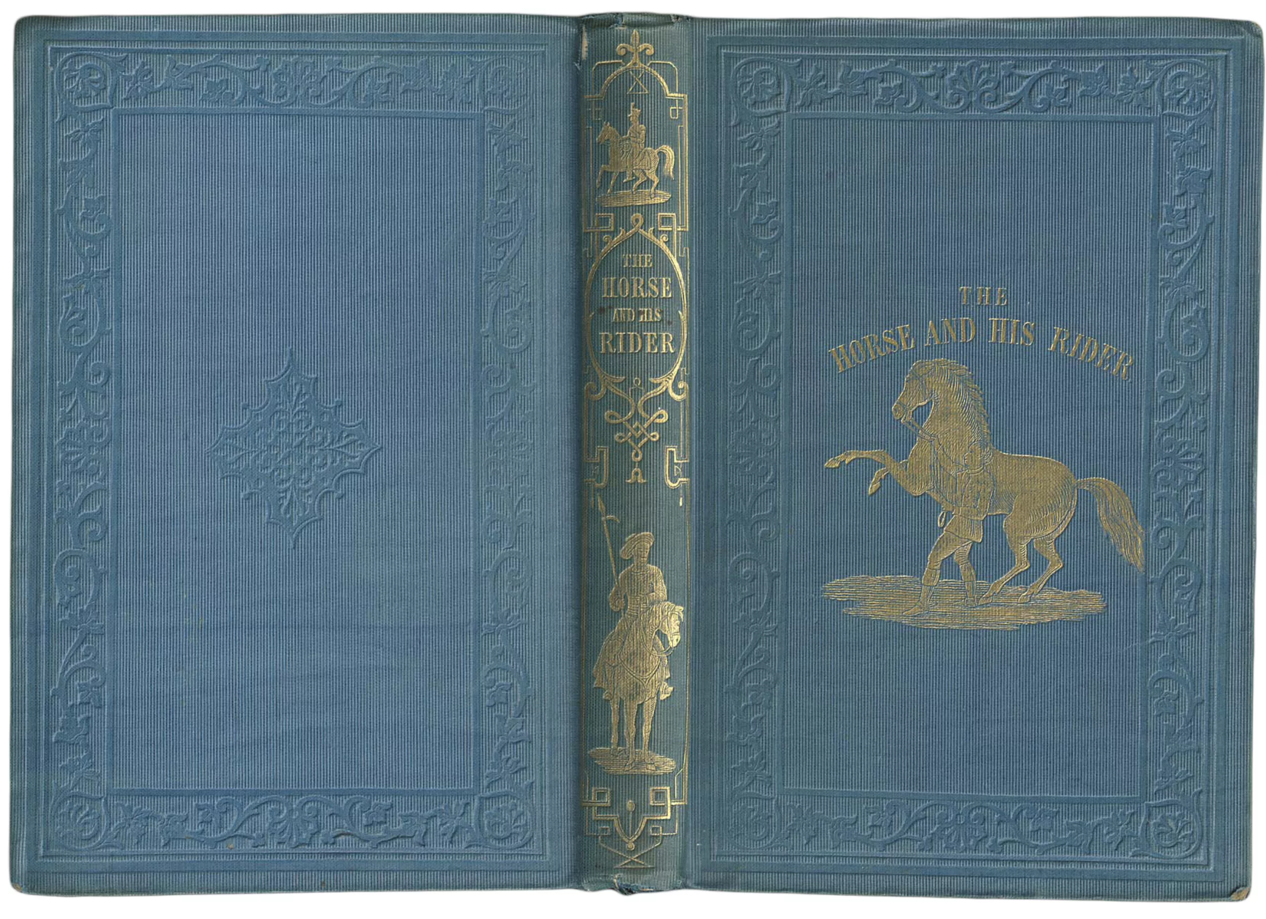
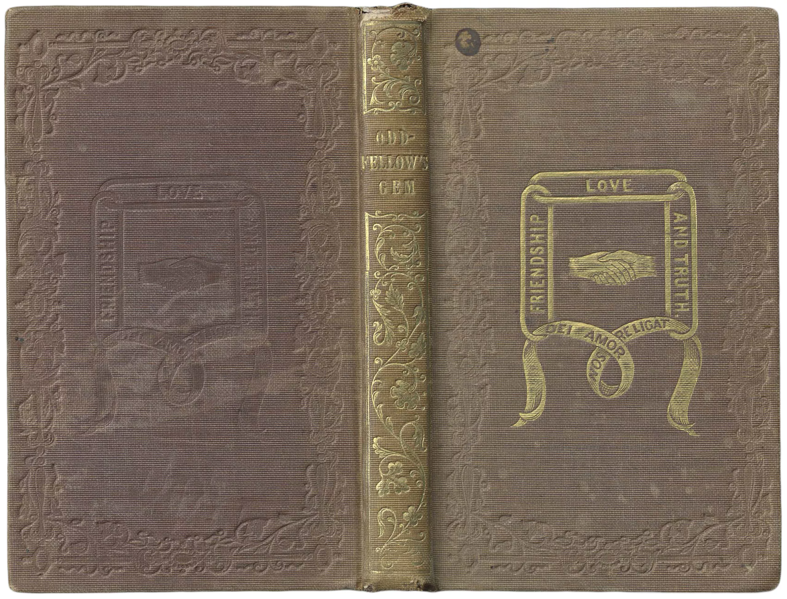
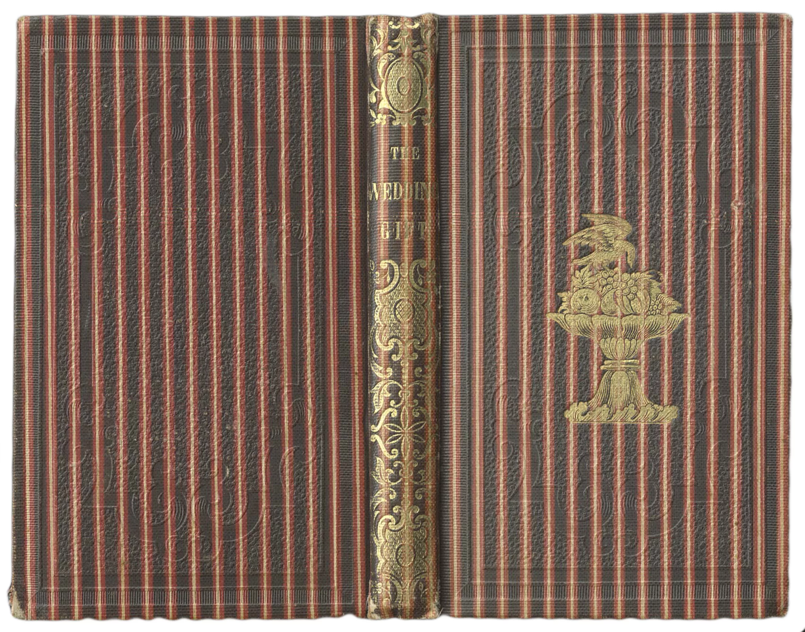
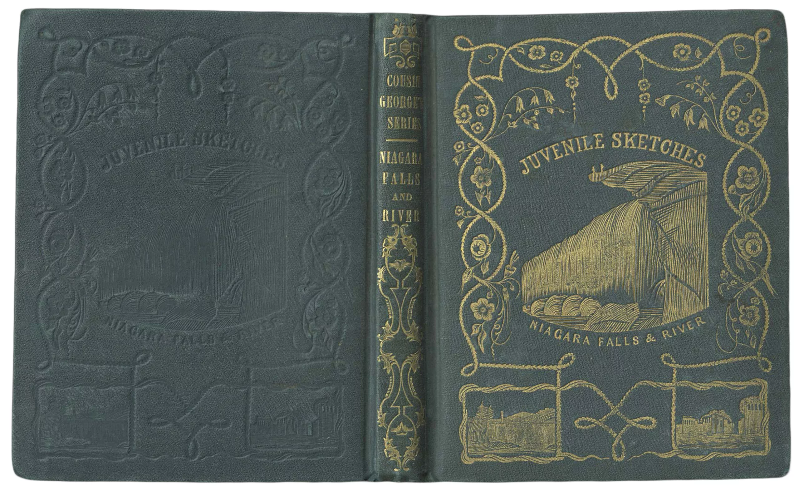
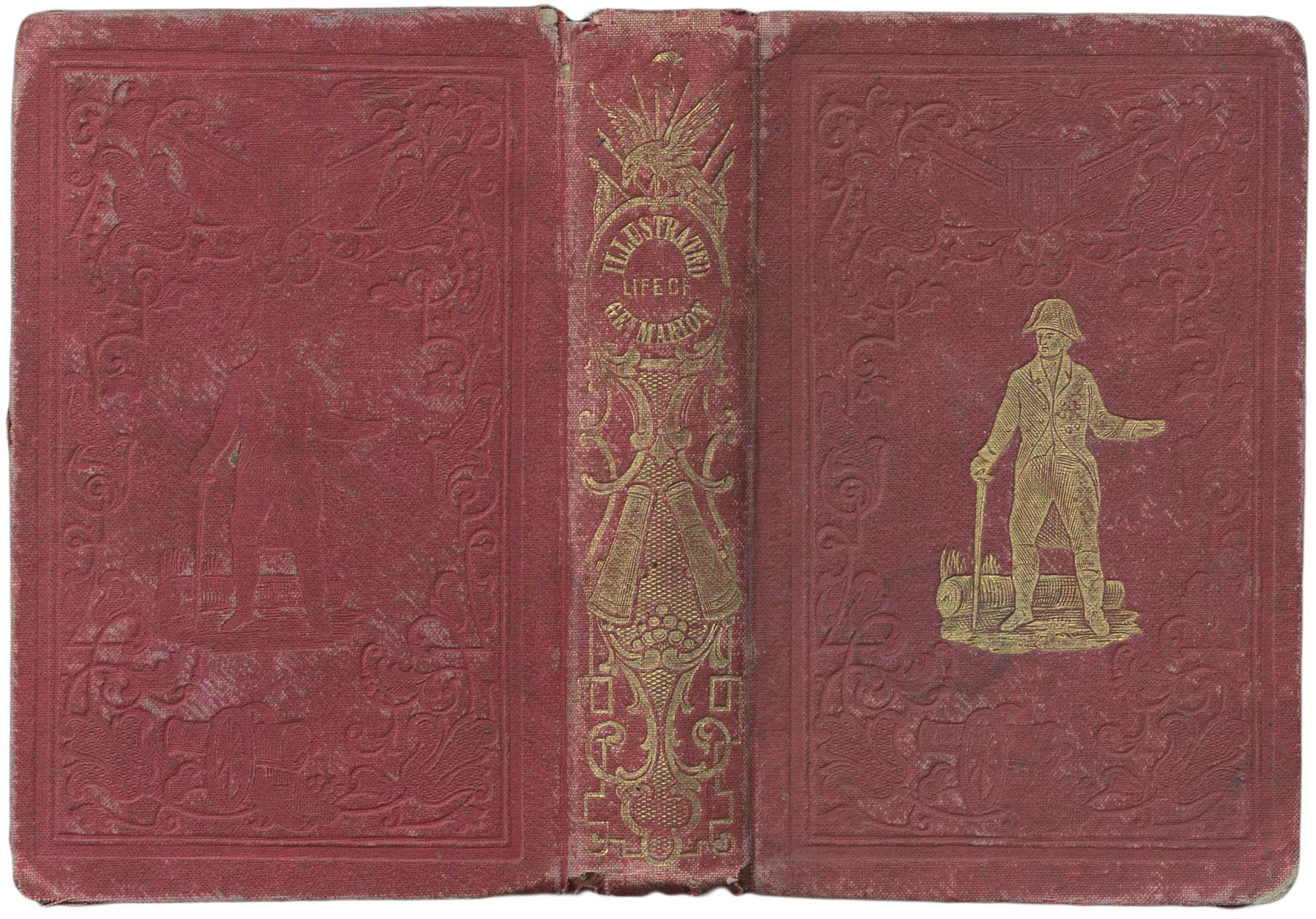
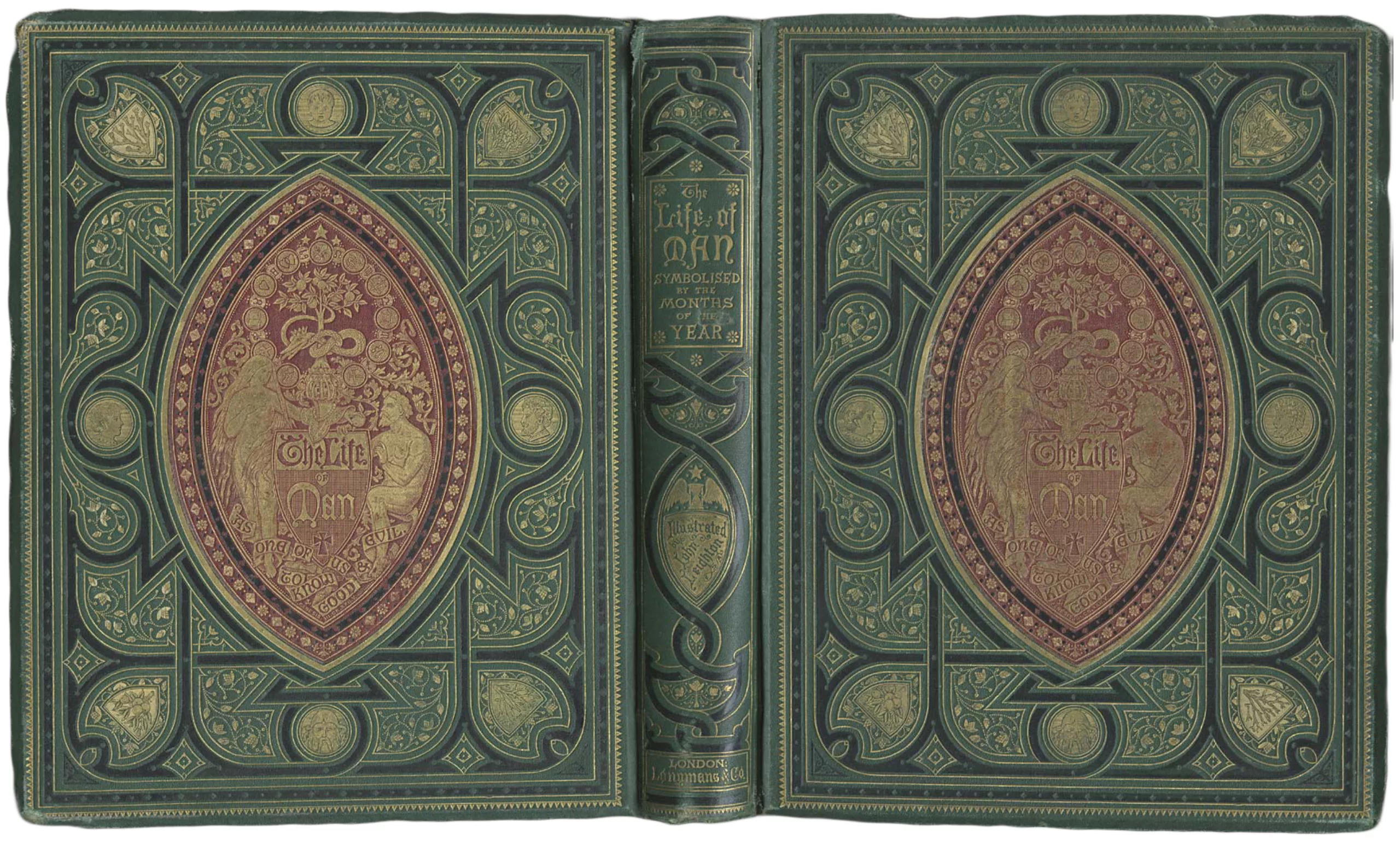
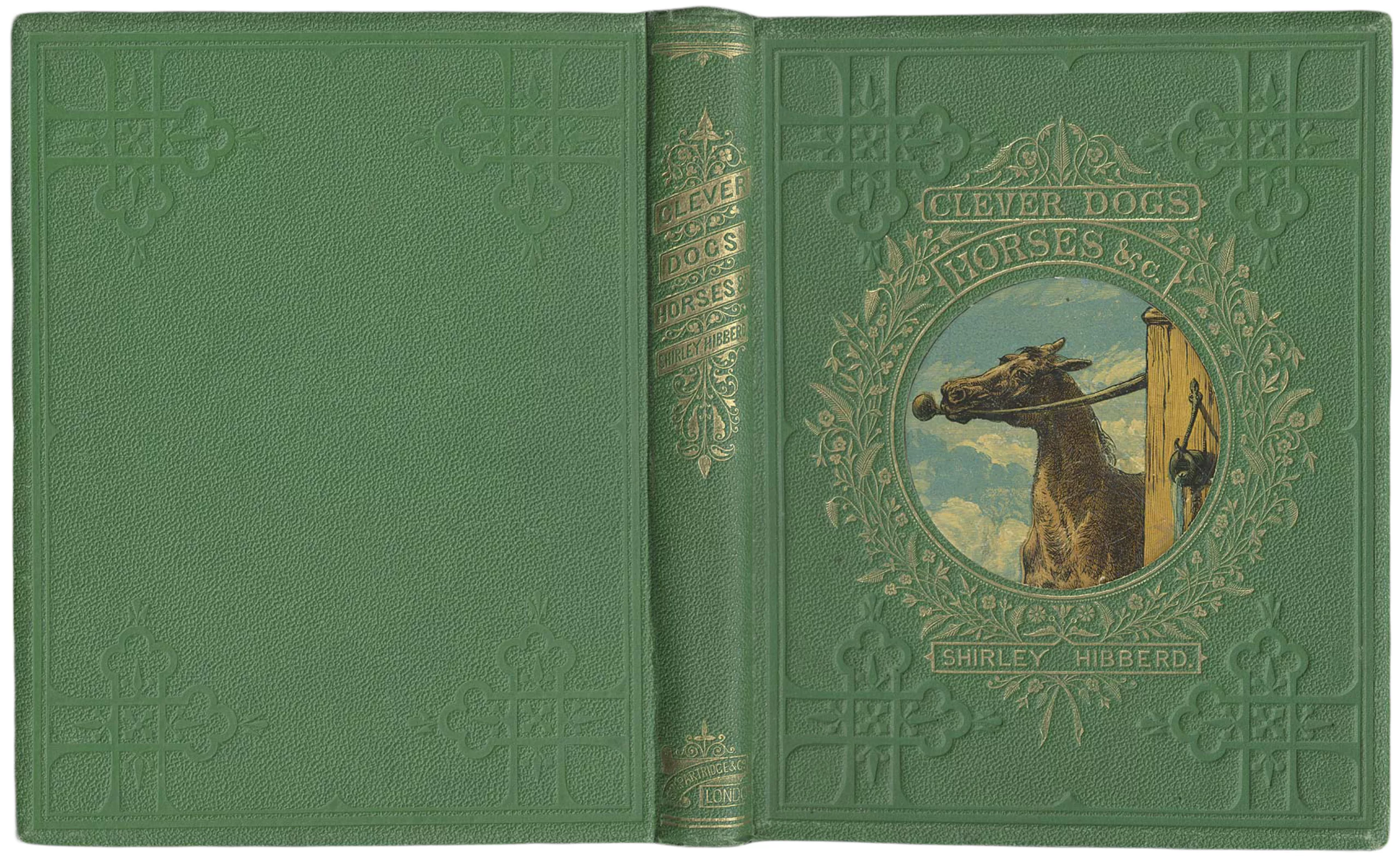
Gold illustrations (1840-1860)
From 1840, embossed or gold illustrations on fabric became more and more common to highlight the contents of the book, and the title gradually appeared on the front of the book, alone or in the middle of visuals. Fabric replaced leather, and by the end of the 19th century it had completely taken over the cover monopoly.
Below, typical covers of the years 1840 – 1855. One finds there fabric with various materials, the marking with gold and the appearance over the years of more and more complex illustrations.
The book is beautiful, it offers itself, and its cover no longer serves only to protect it; it also describes and illustrates its content. This is the birth of the cover.
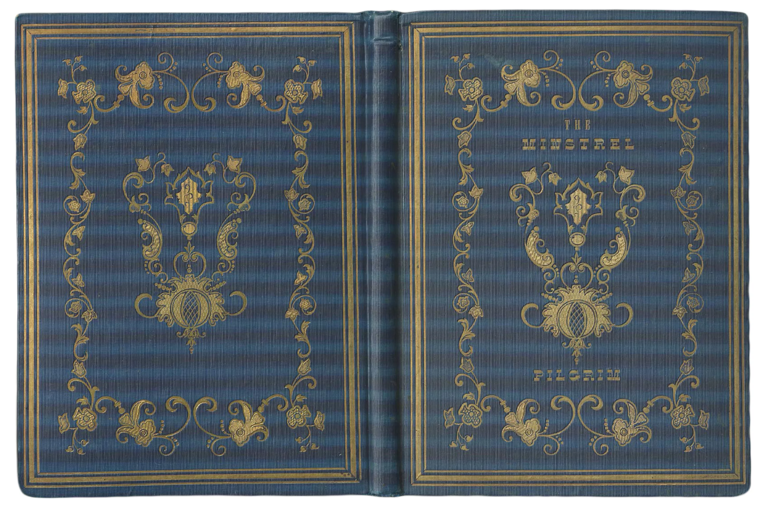
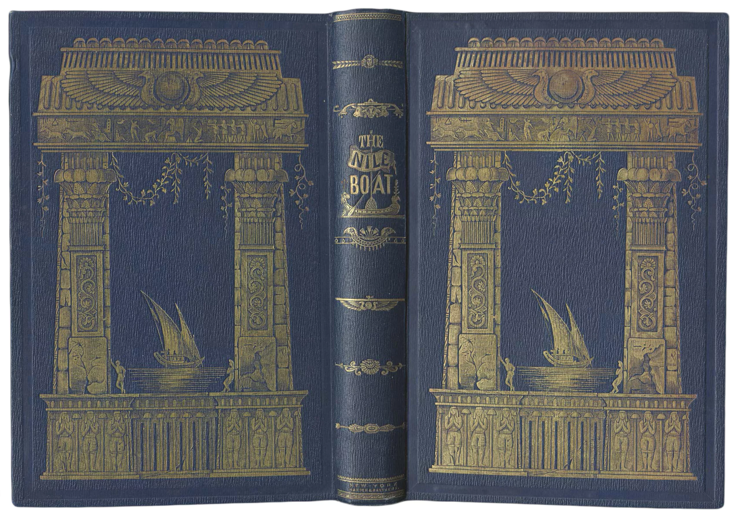
The cover in colour (around 1860)
Around 1840 the chromolitography technique was born. This ancestor of four-colour printing – still used today in printing – allows the diffusion of more and more colourful visuals, even if it takes ten or even twenty years before the technique is perfected.
This polychromic revolution in printing in the 1860s marked the advent of graphic design, with the rise of illustrators who specialized and became real stars in the field. Publishers understand that the public is fond of images and that they help sell books better. As a result, the removable covers gradually disappear, as the covers become covered with designs and colors.
Better to keep a nice book on your shelf than a crumpled tissue paper, we agree.
No more gold monochromes, hello illustrated covers printed in several copies, like these examples from the years 1860 – 1870.
Medieval is the new chic
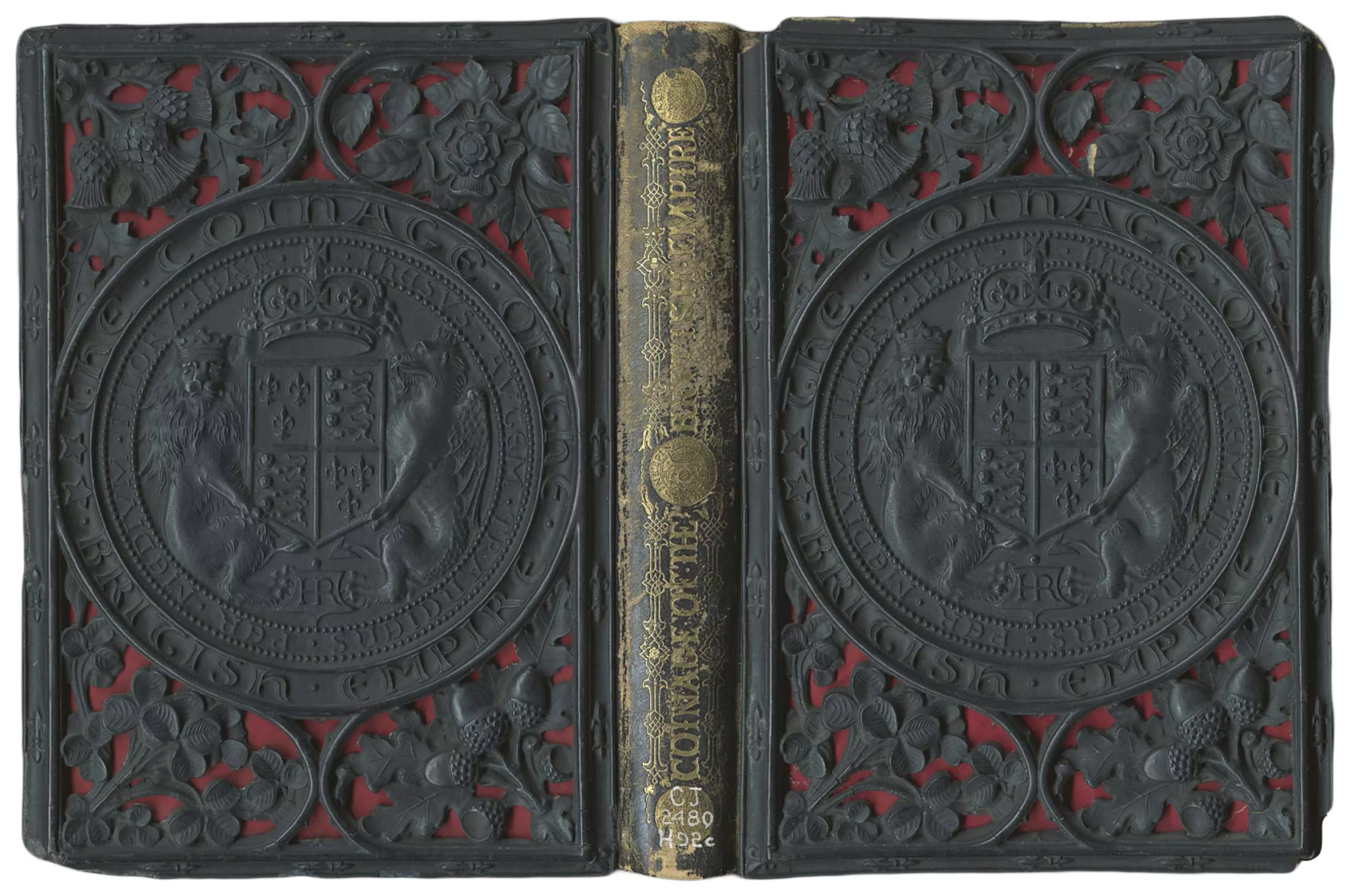
In parallel with this craze for beautiful books, the medieval style returned to fashion during the years 1840 to 1860. This is the great return of the embossing effects which this time are not made directly of ivory or leather as in the past (in case you didn’t follow) but of papier-mâché thanks to specialized machines and presses imitating Gothic letters. Unlike the manual work of the Middle Ages, this kind of result could be reproduced in series. Long live industrialization!
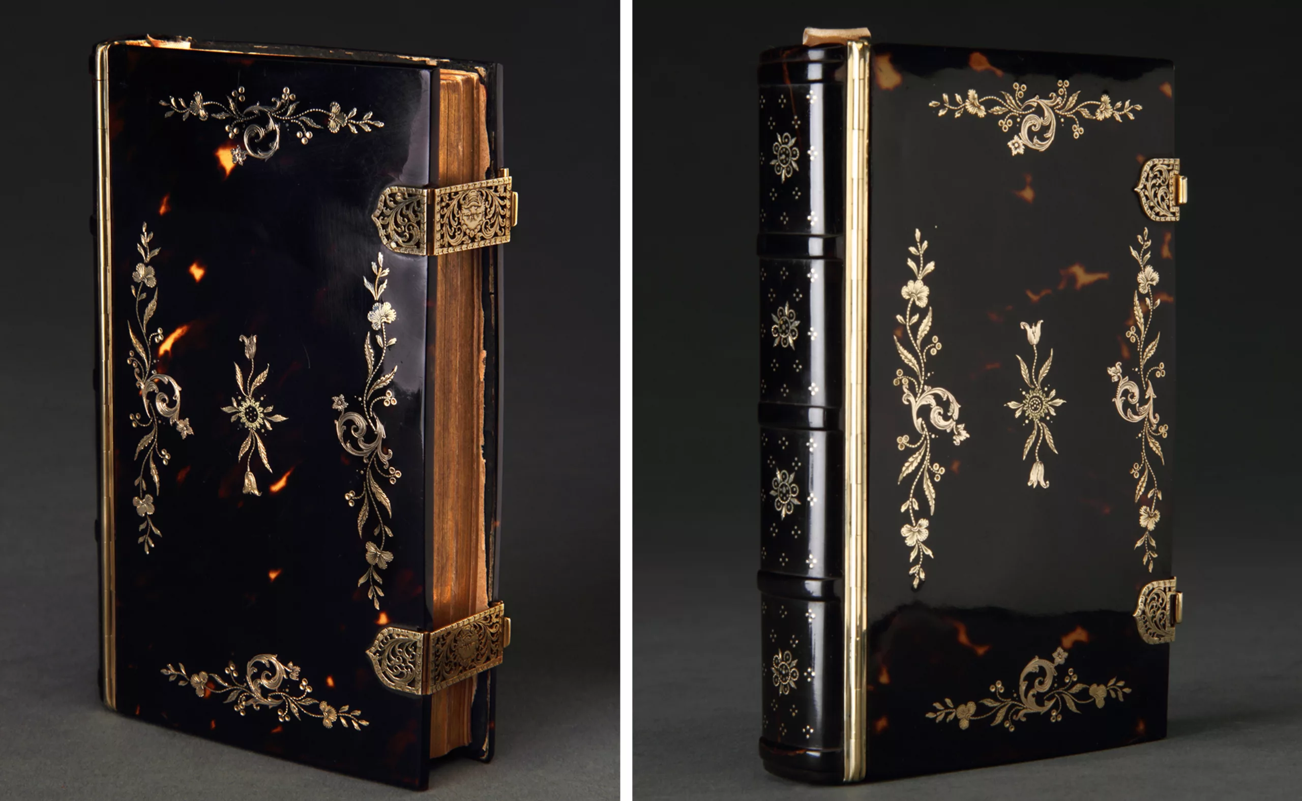
The tortoise shell and the marquetry of precious metals are all the rage (here in 1827, to see larger by clicking on the image) because it is “medieval soooo”. Simple and tasteful.
During this century of profane literature in profusion, the book cover knows its hours of glory. And this until after the war, around 1920. But we’ll discuss these fabulous adventures in Chapter 2.
Text: Tiphaine Guillermou
Sources / to go further:
- Photos of bindings of old books from the blog Restauration livre à Trôo
- 15th – 20th centuries: www.lib.msu.edu/exhibits/historyofbinding/20thcentury
- History of the cover: http://histoirevisuelle.fr/cv/icones/1818 and www.lamaisondubourg.net/single-post/2016/03/04/Explorons-en-profondeur-Les-couvertures-de-livre
On the subject
-

Maison Nicolas, a new logo for a new strategy
Maison Nicolas has unveiled a new logo and identity, unfortunately without drawing on its rich graphic heritage.
-

In India, the political logos are of a very original banality
How to make millions of voters, 50% of whom are illiterate, vote? India offers visual political logos that are out of the ordinary.
-
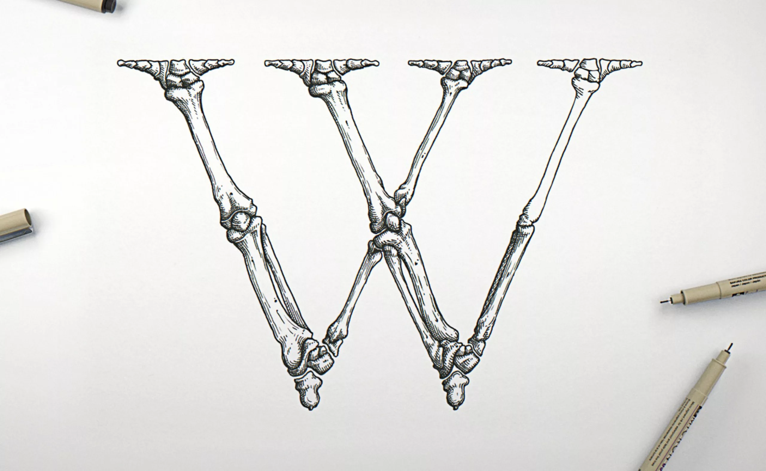
Garamond Corpvs a corp alphabet
Passionate about typography and anatomy, Swedish artist Björn Johansson has dissected Garamond typefaces to create a bony alphabet. From Tory to Vitruvius, letters take shape.