A short history of book cover design – 3/4
The third chapter of our complete series sweeping the graphic evolution of book covers to the present day, through its most striking revolutions. If you missed episodes 1 and 2, we invite you to discover them before reading this one :
Chatper 1: 3rd century to 1860
“From Codex to colour printing”
Chapter 2: 1860 to 1935
“From printed fabric to colour jacket”
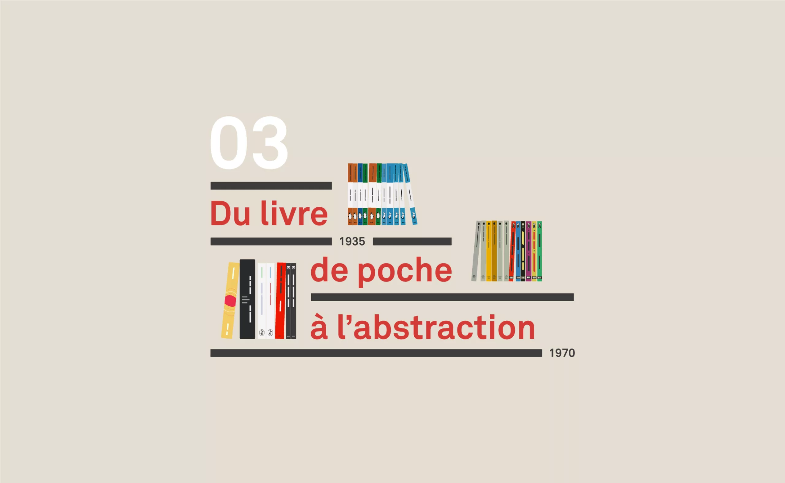
Chapter 3: 1935 to 1970
“From paperback to abstraction”
Chapter 4: from 1960 to the present day
“French paperback, contemporary graphic design and covers”
Chapter 3: from paperback to abstraction (from 1935 to the 70’s)
After the First World War, the book cover migrated from cloth to paper jacket. This response to a budgetary constraint leads to colossal changes which notably allow the paperback revolution. From Penguin Editions to the birth of graphic design, the cover is an open book on the social mores of a country and an era.
Here is the penultimate article in our series scanning the graphic evolution of book covers to the present day, through its most striking revolutions. We will first talk about the revolution launched by Penguin Editions, before we look at the american paperbacks of the fifties and the position of women, and then we will discuss the beginnings of the use of photography and abstraction. In this article, we will focus mainly on England and the USA, before looking at the French particularity in a future article.
Penguins in your pocket (1935)
Between the 2 wars, the technical revolutions helping (cf Chapter 2), the mentalities also evolve. Publishers have gone all paper, but each country is developing its own style.
The first paperback books were born, which took shape with, among others, the Penguin editions in 1935.
As in the days of Penny-Dreadful and Paperbacks, the book became accessible and available, even to the working classes. The cardboard cover disappears in favour of a simple soft paper cover. However, another important detail changes: the quality of the manuscripts proposed, and the balance between the price and the quality of the book. It’s a real revolution.
Allen in penguinland
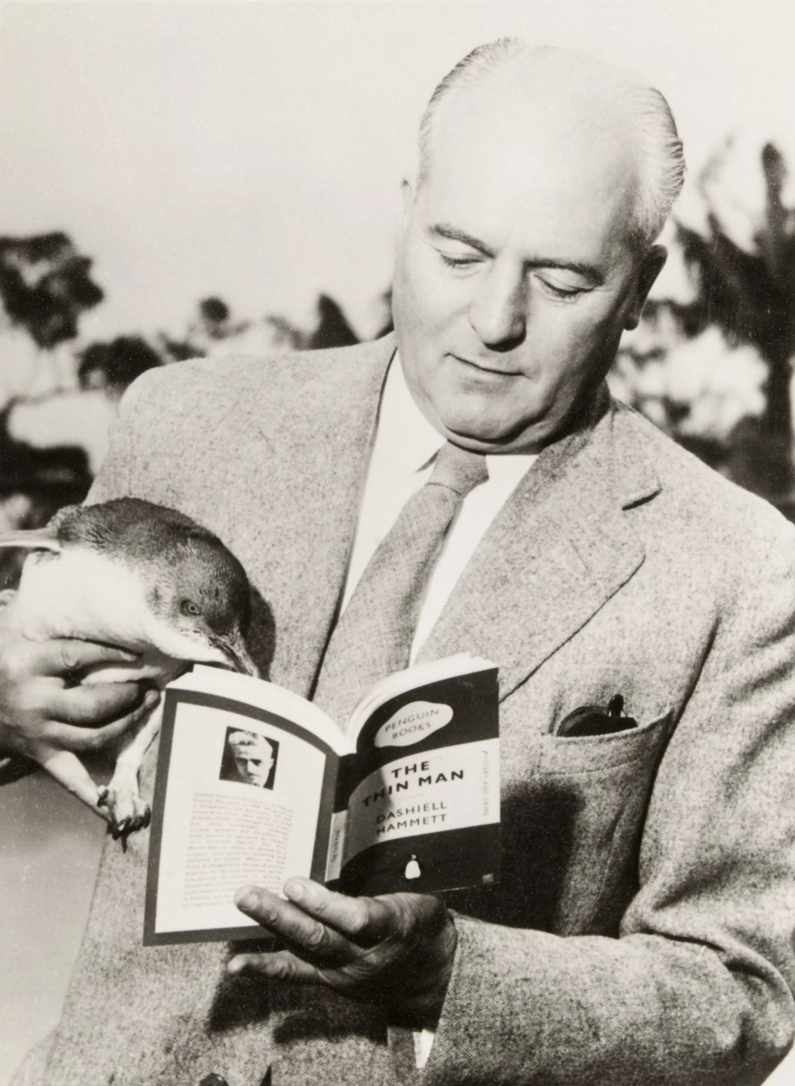
One year earlier, Allen Lane Williams returns from a stay with Agatha Christie (the class) and realizes that he does not find any book worthy of the name to be put under the hand. He then thought of creating a type of famous literary books but in pocket format, in paper, sold at 6 pence (the price of a pack of cigarettes at the time) and distributed a little everywhere in town in frequented places.
Problem: for publishers, paperbacks are synonymous with low-level literature – the reputation of penny dreadfuls is quite well known. They also think that readers of this kind of literature will have no desire to read “real” books with more literary content.
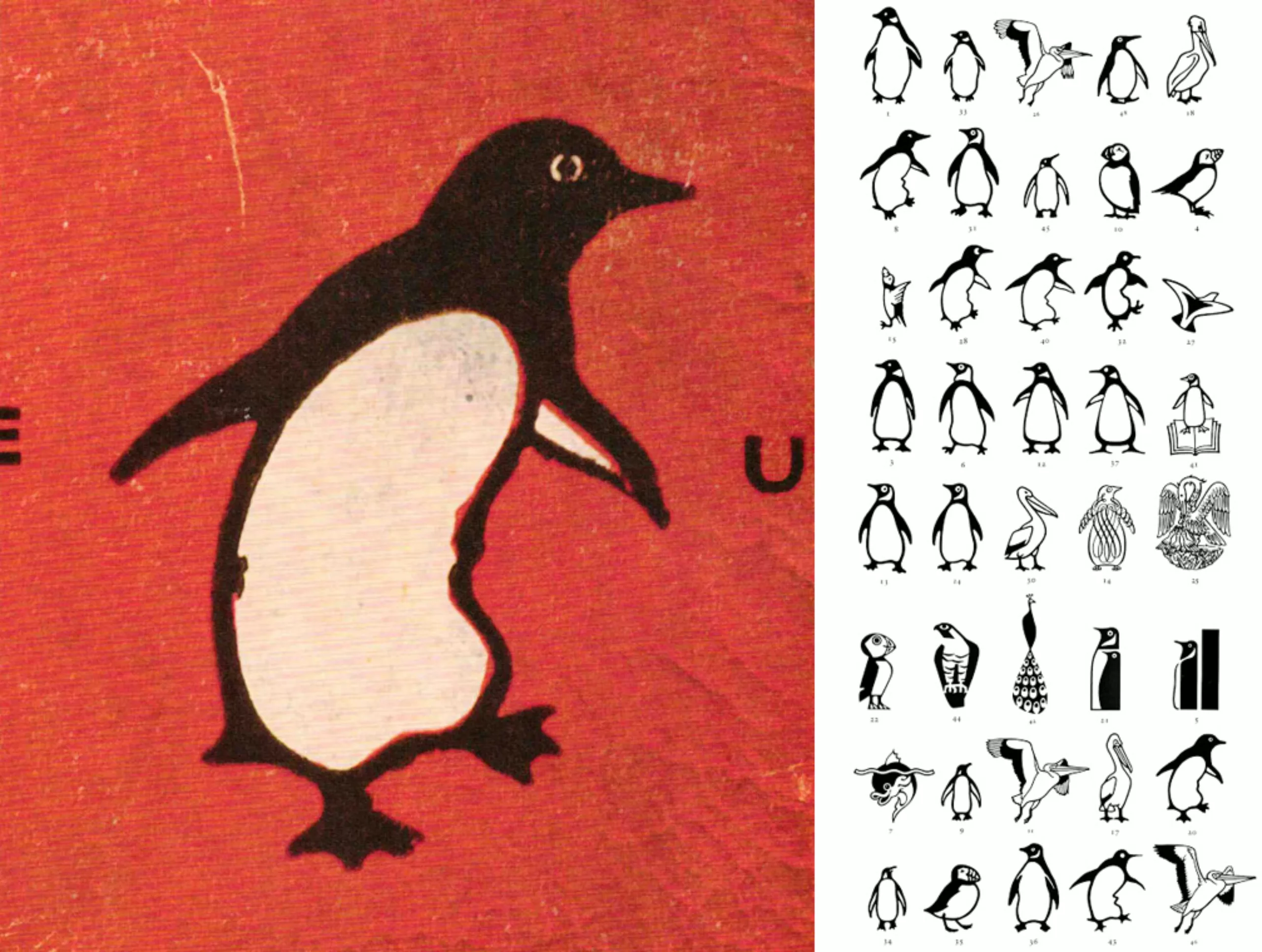
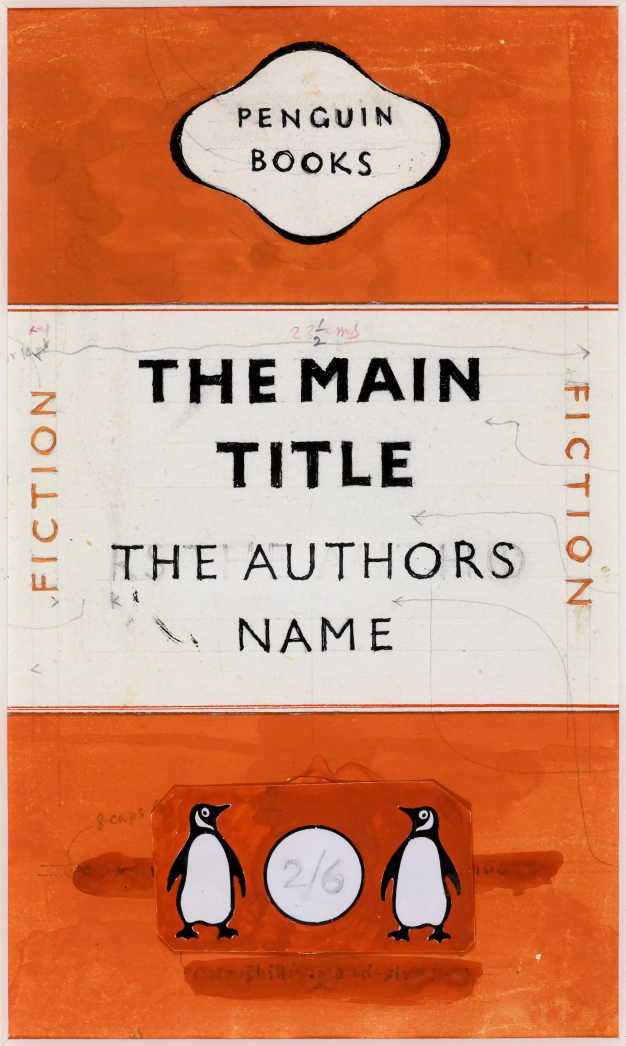
But Allen is pursuing his idea. He has the logo designed by Edward Young – junior editor at Bodley Head -, who goes to the zoo to watch the penguins. The latter returns with a beautiful series of sketches and a remark: “What the hell, these birds stink!”.
At the time, the professions of designer, artistic director and printer were not really separated as they are today. So it’s Young who naturally takes things in hand, and sets up a cover divided into horizontal triptychs, with one color per theme: orange for fiction, green for crime, dark blue for biographies, cherry for travel & adventure, red for theater.
The Bodoni Ultra Bold and Gill Sans typos are used respectively for the publisher’s name, (still Bodley Head at the time, before Penguin separated from it) for the title and the slice.
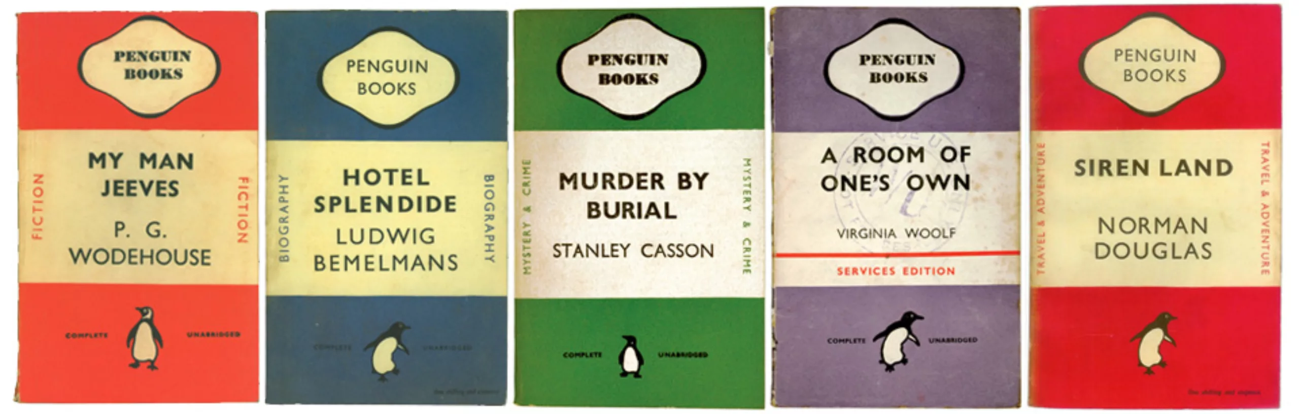
In order to sell his books, Allen innovates. It is getting closer to department stores and a myriad of new distributors to turn them into new points of sale. In July 1935, the first 10 Penguin books were published.
In the list are Hemingway, André Maurois or Agatha Christie: well-known names, and books that have already proved their worth. Bingo. In 10 months, one million books are published.
1937: incubator, pelicans and special edition
Two years later in 1937, Allen Lane launched the “Penguincubator“, a Penguin pocket book vending machine, which he installed in a busy street in London. By inserting 6 pences you choose and receive your book, or better, several books, as the small text under the photo indicates: “Some ingenious people noticed that a clever manipulation of the buttons of the machine made it possible to receive a pretty quantity of books beyond the 6 pences inserted. Lane hopes further testing will create a thug resistant machine“.

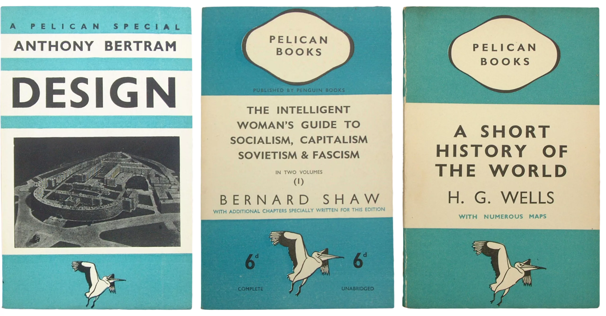
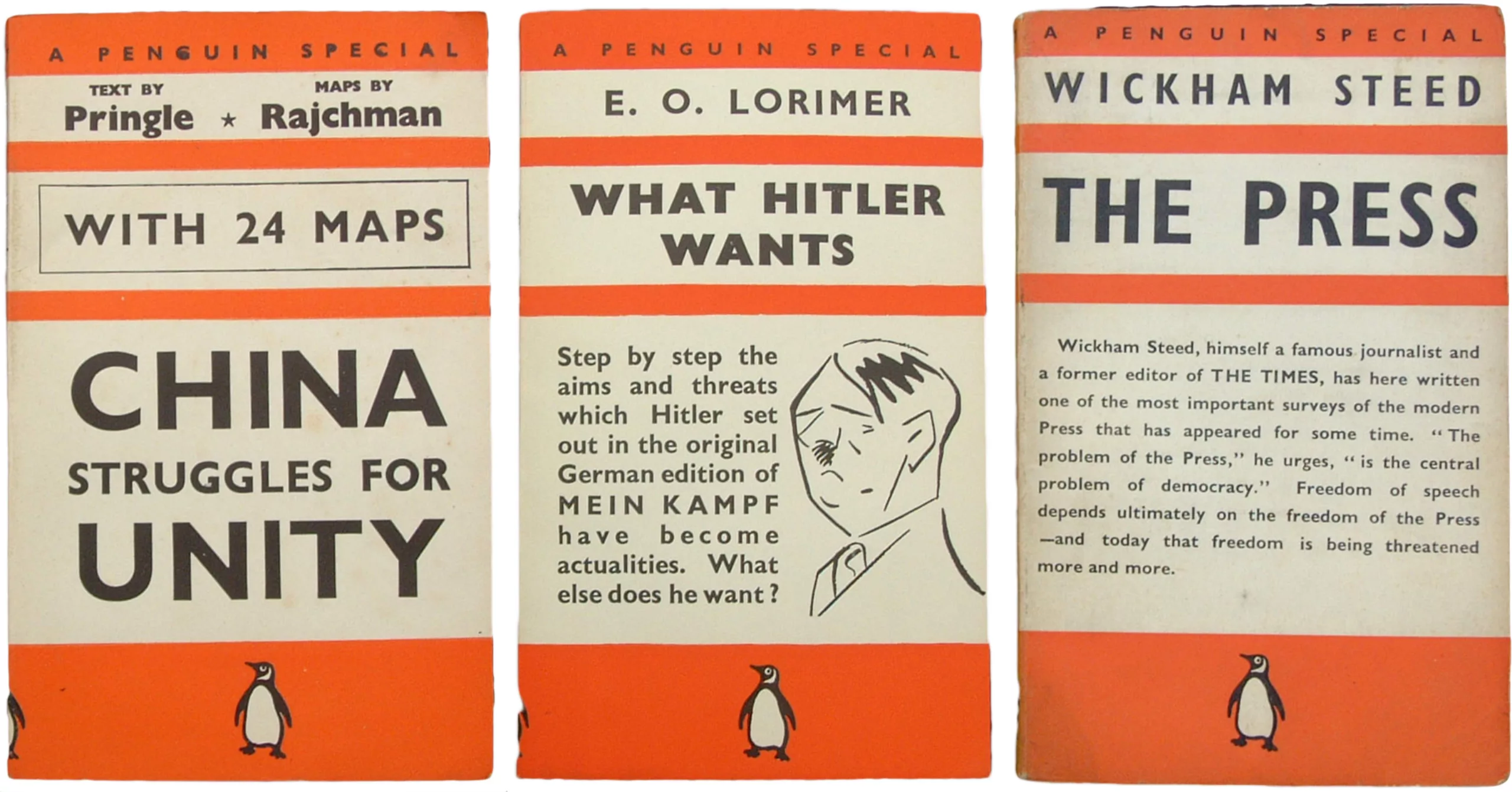
In 1937 Europe was in the middle of an arms race, just before the Second World War. Mussolini rages in Italy, fascism in Spain, Hitler in Germany… Penguin Editions decided to call on authors to explain the geopolitical situation or to propose cultural books to broaden their spectrum of paperback books.
Thus appeared the Pelican section, a special series of books for educational purposes. The first volume is entitled “Intelligent Woman’s Guide to Socialism and Capitalism“. The subjects were addressed to students and people interested in learning about science, history, archaeology and literature. In parallel, on more political, social and especially contemporary issues, the editions created A Penguin Special the same year.
You can find all the series of the first Penguin editions on this site.
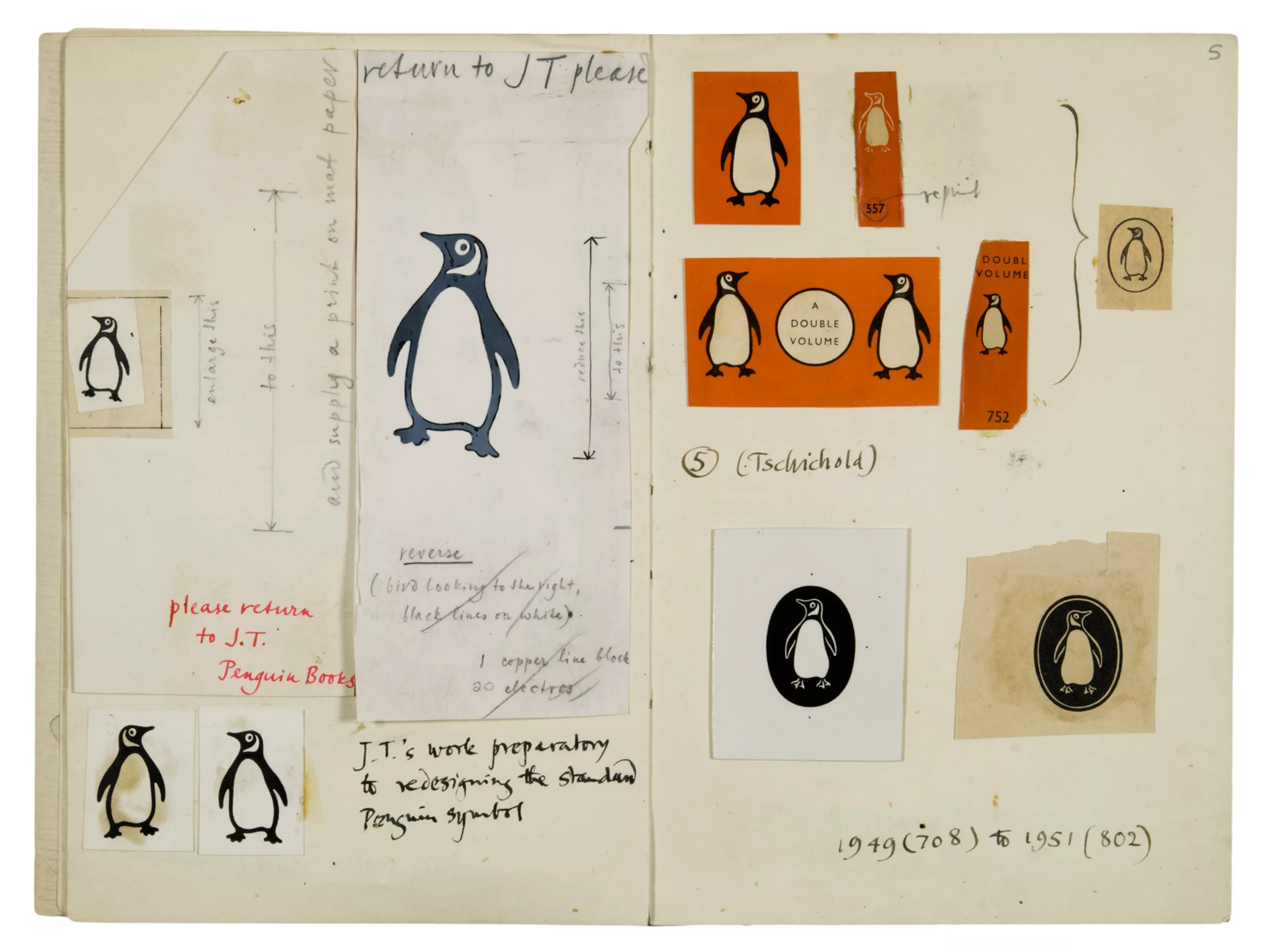
Before turning the page of Penguin Editions, it should be known that Jan Tschichold took up the torch of graphic design in 1946 and gave a new lease of life to the cover and the logo to fix the graphic design that we know today..:
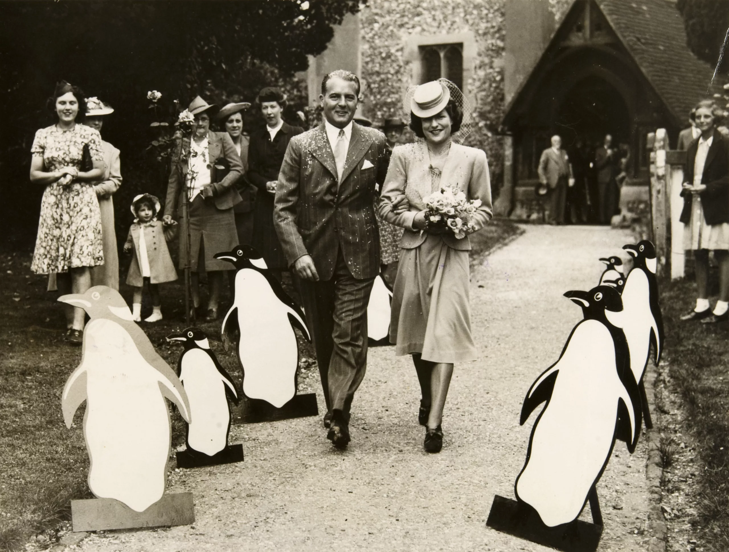
With the success we know, we can say it: they lived happily and had many penguins.
Illustration, glamour and housewives (1930 – 1950)
Illustration is Queen
From 1930 and for over 20 years, glamour was king and illustration queen.
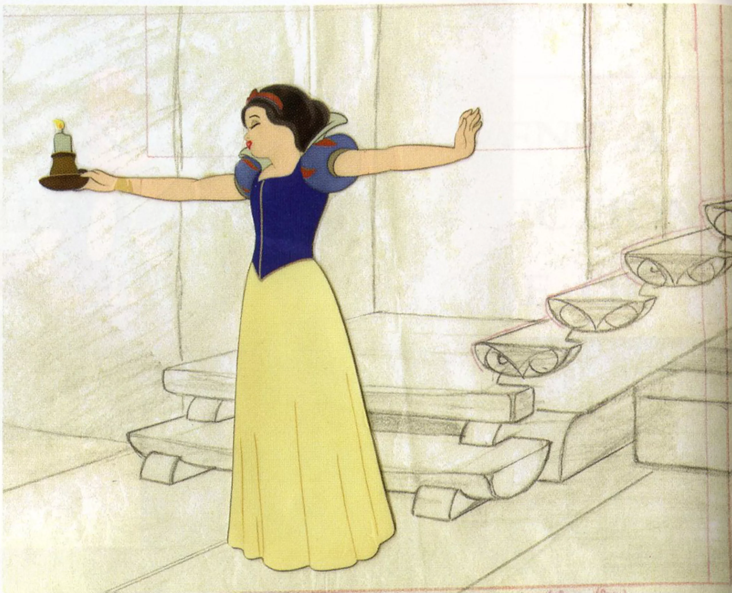
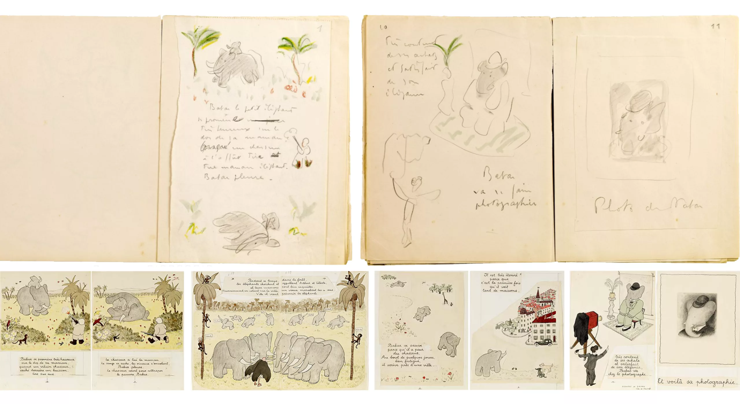
It is the time of Babar (1931) or Walt Disney (here Snow White, from 1934). Artists are used to decorate books or create movie posters and illustrations are all the rage in magazines and especially… in advertising. Extremely realistic at the time, the drawings depict modern life in all its splendour.
Below, for the pleasure and a little off topic, original boards of the first Babar and Snow White to see in big (attention spoiler, the hunter killed the mother) :
Glamour as King
With the advent of the consumer society driven by industrialization, stars become products in their own right, which sell dreams. It must be said that since 1927 talking cinema has made its appearance. The masses want Kiss Kiss Bang Bang. Radio, TV, cinema and illustrators put forward virile heroes and fatal women. So much for virtue! Jazz is all the rage and culture is popular.
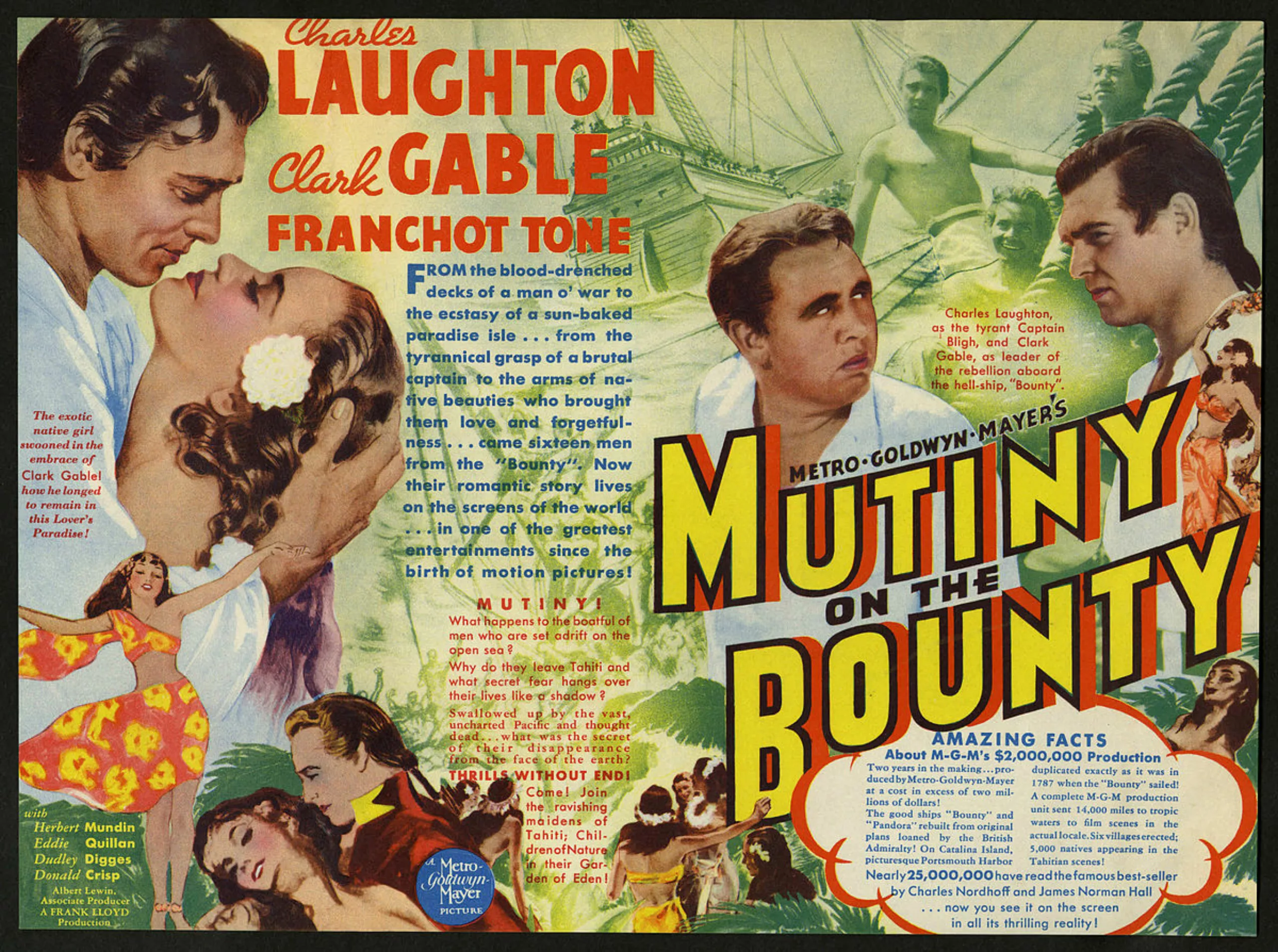
Some cult books are adapted to the screen – like Mutiny on the Bounty in 1935 (see picture below) – and the covers gradually evolve following the same construction as film posters, especially in the United States in the 1950s.
On these posters and books, the heroes have the first role in both senses of the word. They are highlighted in close-ups like figureheads, with large necklines, firm handles and lustrous hair. It’s Hollywood glamour. Its warm wind will blow as far as Europe where it will have a certain influence even on the pocket books.
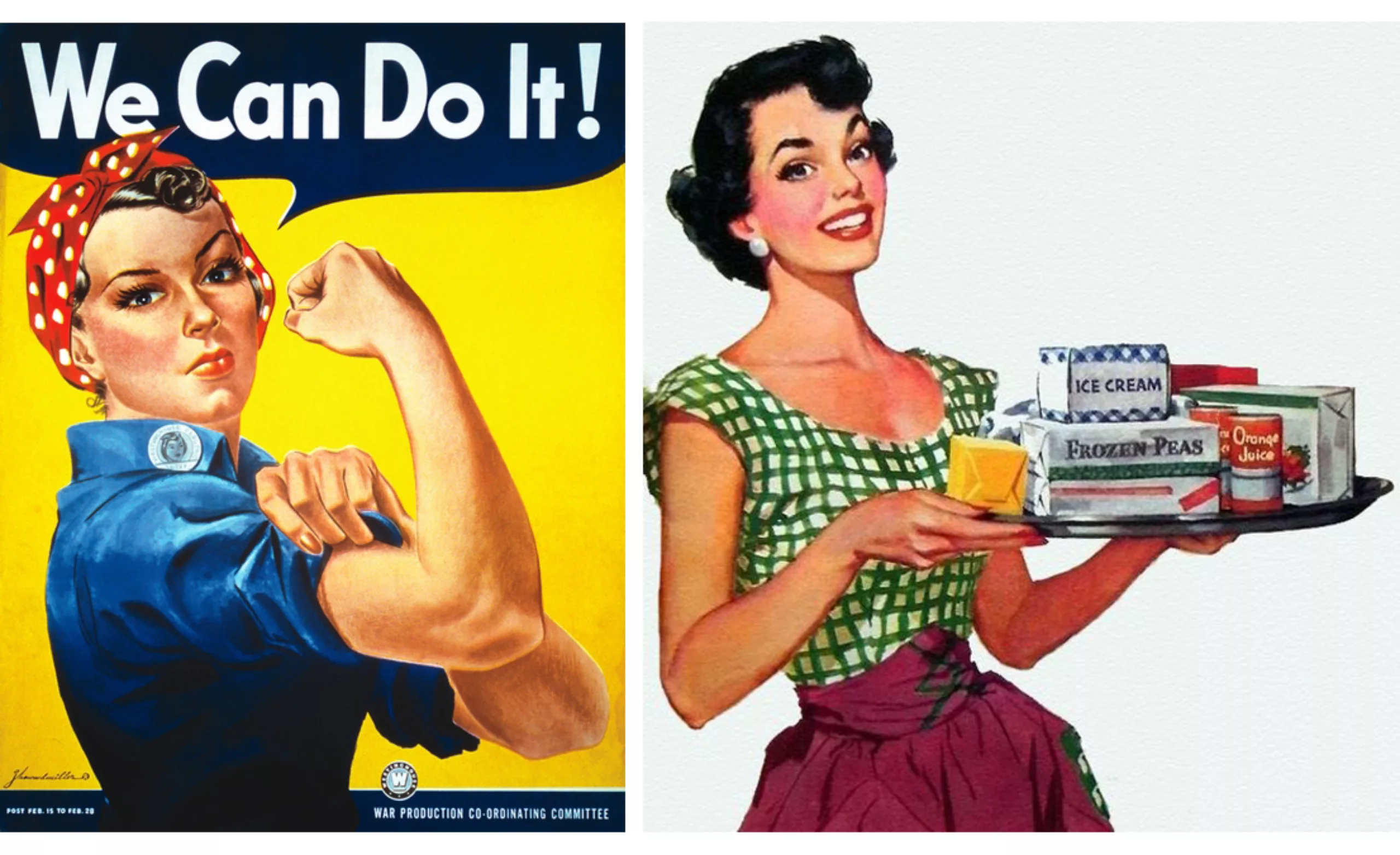
She can’t do it
The man, who left during the war, has been back since 1945. The woman who had rolled up her sleeves and managed on her own to participate in the common effort finds herself facing the male.
This kind of harmless face-to-face radically changes the position of women and puts them back in a secondary role: they no longer exist for what they are but only in relation to men. From then on, the woman will be submissive or fatal. She becomes a consumer and once again assumes her “perfect role” in society, that of a housewife: “show her it’s a man’s world” as the ad says.
We can see this evolution of the status of women on these posters during and after the war… :
In the anguish of a possible new nuclear catastrophe, there is a frenzy among American buyers. It takes more, better, more beautiful, faster, and “keep up with the Joneses” (impress the neighbours). Photography is not yet in use, and illustrators can still be found on advertisements, posters or book covers.
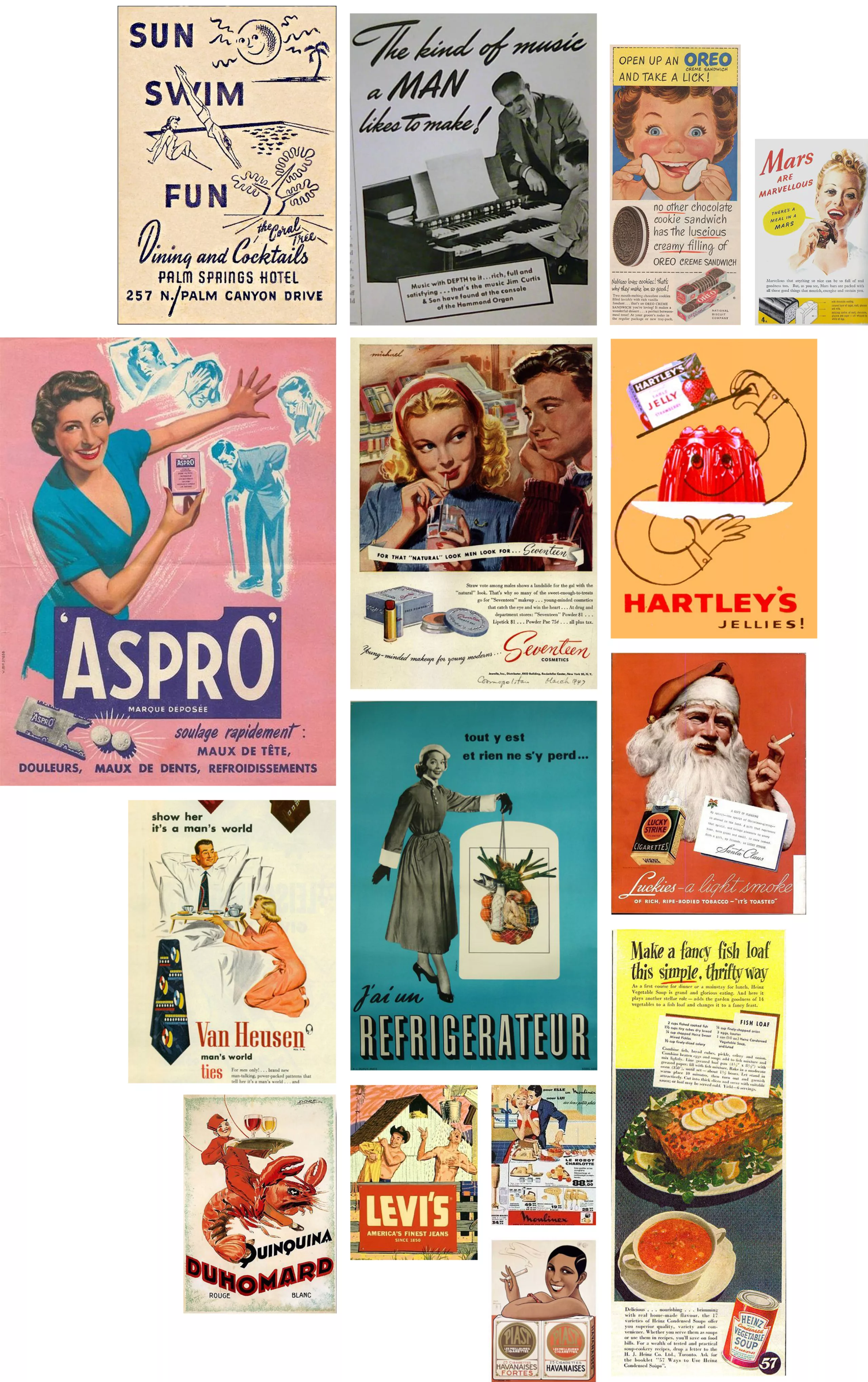
In parallel, and as a support to this noble cause, we see the birth of the great women’s magazines full of recipes and tricks to be the perfect woman, like “Marie-Claire” in France or “Glamour of Hollywood“, in 1939.
Long live the refrigerator and the appliances that finally free the woman!
Birth of graphic design (1945)
With advertising, illustrators now have their own role and a message to convey. From 1945, graphic design became a profession in its own right. This is the beginning of modern graphic design, we play with characters and layout. The Alliance Graphique Internationale was founded in Basel in 1950. In France, it is Massin who freely shapes the profession of artistic director, but we will discuss this in the next article.
50’s paperbacks
Too bad for virtue
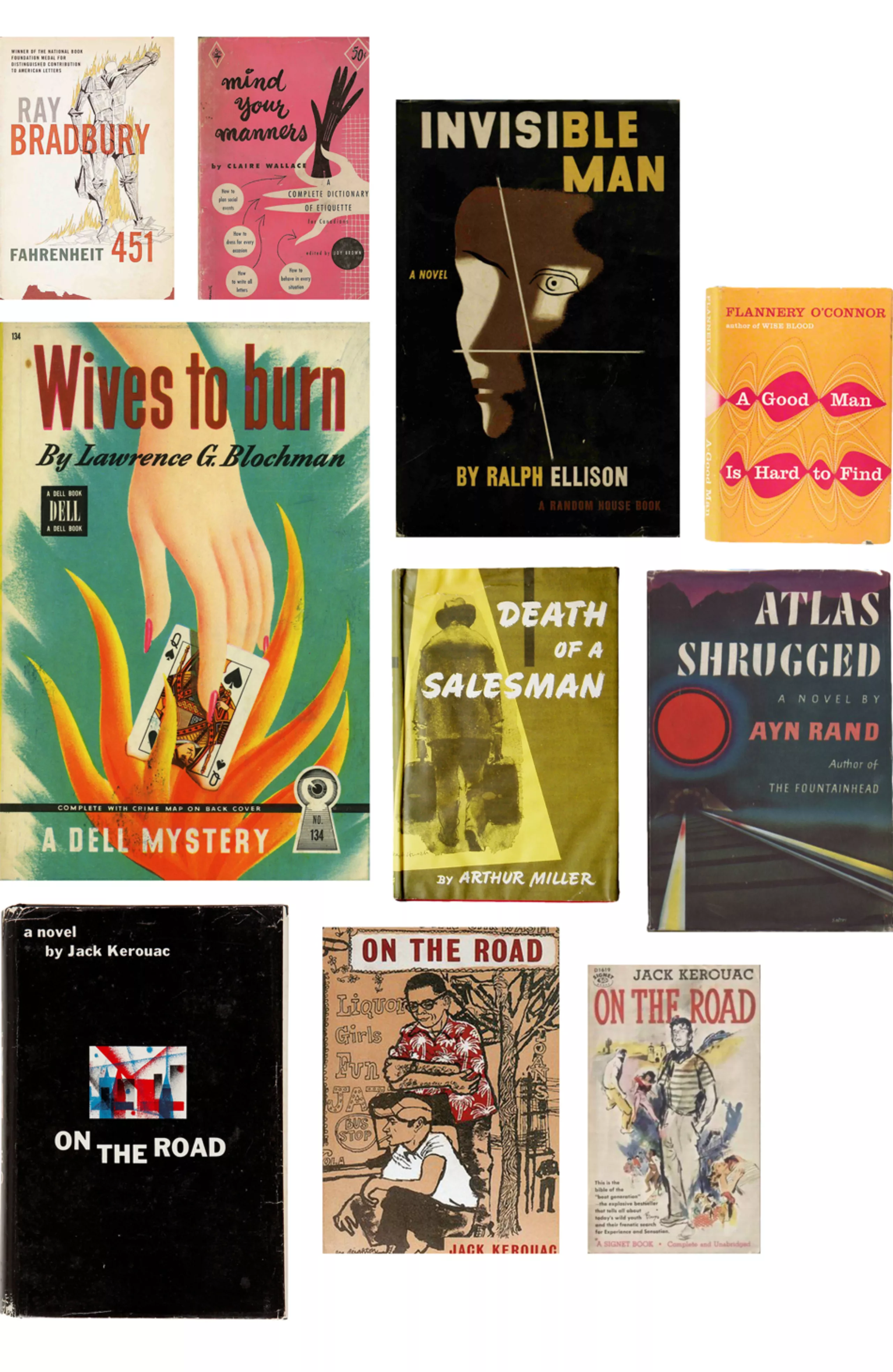
On the other side of the Atlantic, in the United States, pocket editions have been available since the 1940s. With this frenzy linked to access to consumption and leisure, publishers consider adventure novels as something to sell. So we apply the recipes that work: screaming colours, close-up portraits, pulpy women and virile men, as on cinema posters and advertising.
The covers are then all more or less similar, as Massin notes when he creates Folio 20 years later. “In the United States, (…) each publisher had a paperback book, it was the one who would shout the loudest and, even within each series, the authors would quote each other; the titles were overbidding and the images were so colourful and so full of meaning that one would end up seeing nothing at all“.
Snakes, half-naked women, murder and violence populate the covers of the american paperbacks of the fifties. It’s too grumpy. The good people fear that the mores will be disturbed and that this will disturb the virtue of the people.
All the more so as the new position of women in society feeds a fantasy that appears on the covers.
Woman and glam: small game (pretty difficult)
On this series of american paperback covers from the 1950s, can you guess if the woman is:
A/ fatale,
B/ submitted
C/ vulnerable?
Come on, we’ll give you a hand.
You want some more? Check over here.
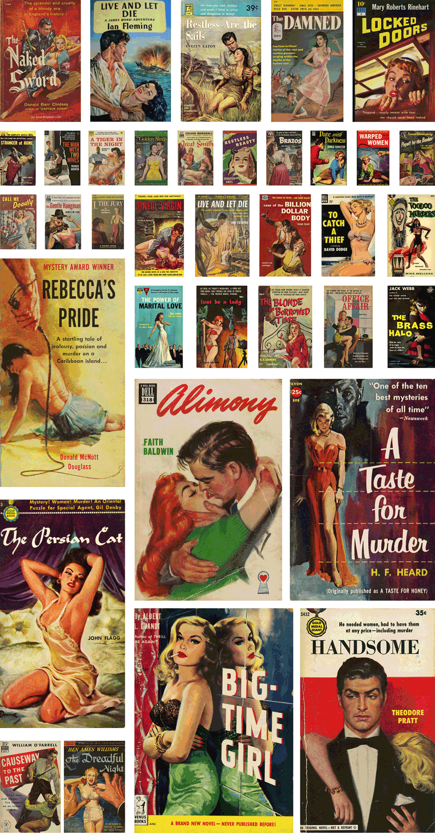
Fortunately, women are sometimes neither fatal, submissive nor vulnerable, as in this example:
Ha no, in time for me, on this only counter-example found the woman is “tomboy”, therefore to be classified in the category of men. Damn it doesn’t count.
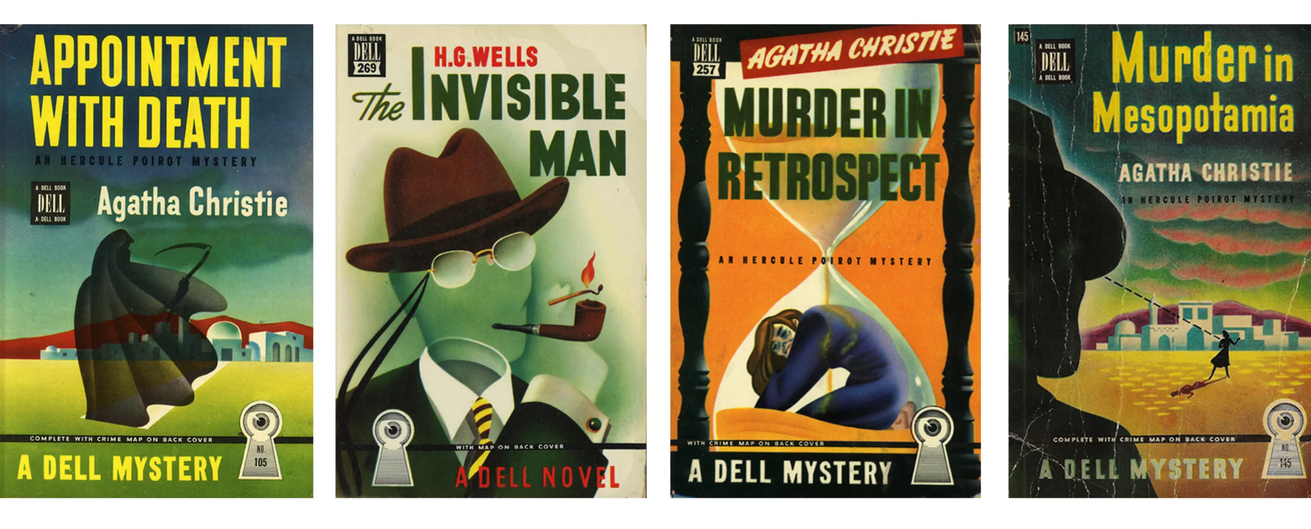
Mapbacks and the beginning of abstraction
In 1942 in the United States Dell Publishing launched its small format paper collection to compete with the Pocket Books created 3 years earlier. To stand out from the crowd, Dell invented a back cover map system that takes the places and characters from the book. These cards quickly become popular and are called “mapback”.
Dell’s distinctive logo – an eye in a lock – and vibrant airbrush colors set the collection apart from other pockets.
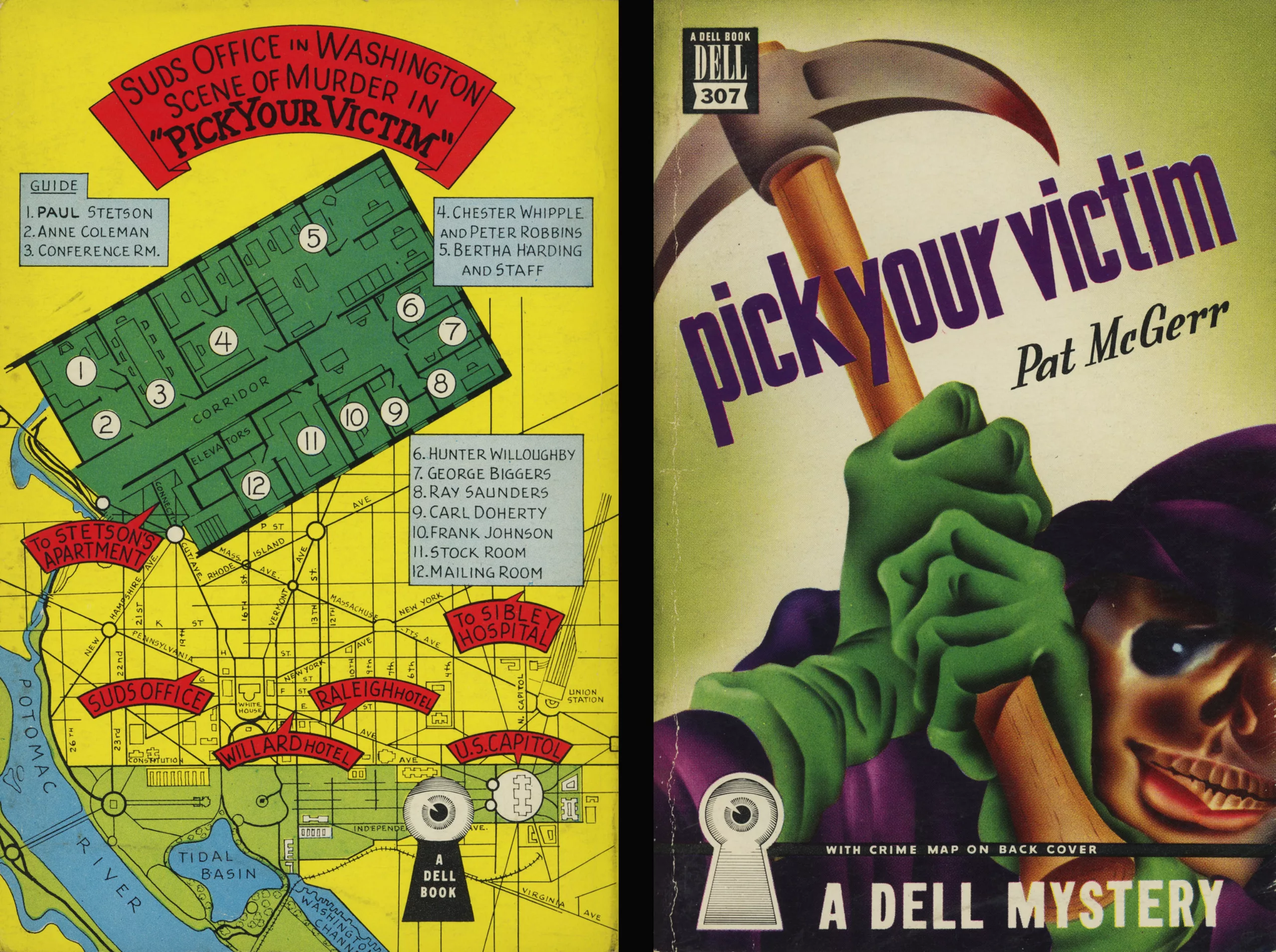
To go further, the surrealistic and imaginative illustrations have nothing to do with the ultra-realistic style of the time, and already announce the birth of abstraction. This is the case of these novels by Agatha Christie, published between 1946 and 48.
Abstraction, science fiction and graphic design
It was only around 1960 with the advent of photography, which now illustrates magazines and advertisements, that illustrators venture into the field of abstraction. Photographic and abstract covers rub shoulders in bookshelves. Colours, layout and typography are an integral part of image communication.
In France, books do not really have the same look, but we will dedicate a special parenthesis at the end of the article.
Illustrators must therefore stand out to continue to exist, and ultra-realism leaves room for the imagination.
Under the jackets, the books are sober, but we can already clearly see the designer’s trace, as on the first edition of On the Road de Kerouac in 1957 (jacket at the bottom left in black, and book below).

The 1960s brought their share of upheavals with the desire to free themselves from the conformism that had taken root since the Second World War. This is a breeding ground for the advent of science fiction and fantastic adventures, new literary genres devoted to abstraction, which are of course on the front cover (to be seen in grand).
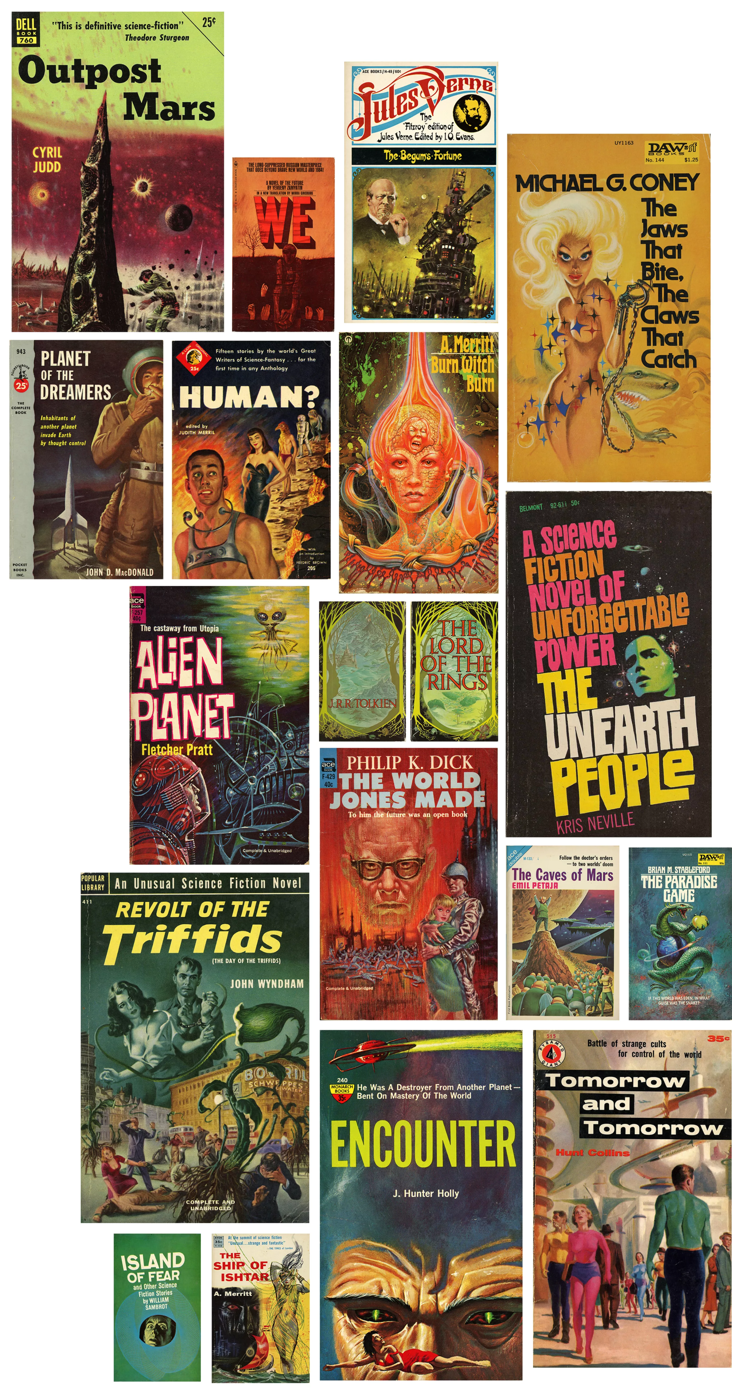
Ten years later, book covers are the medium for graphic experiments with typos, colors and abstraction, far from the trends of the mass market that remains mired (in the United States) in paperback covers. The 70s bring their share of psychedelia, flashy colors, art, and a form of freedom of thought that is transcribed in a graphics freed from the constraints of the last century.
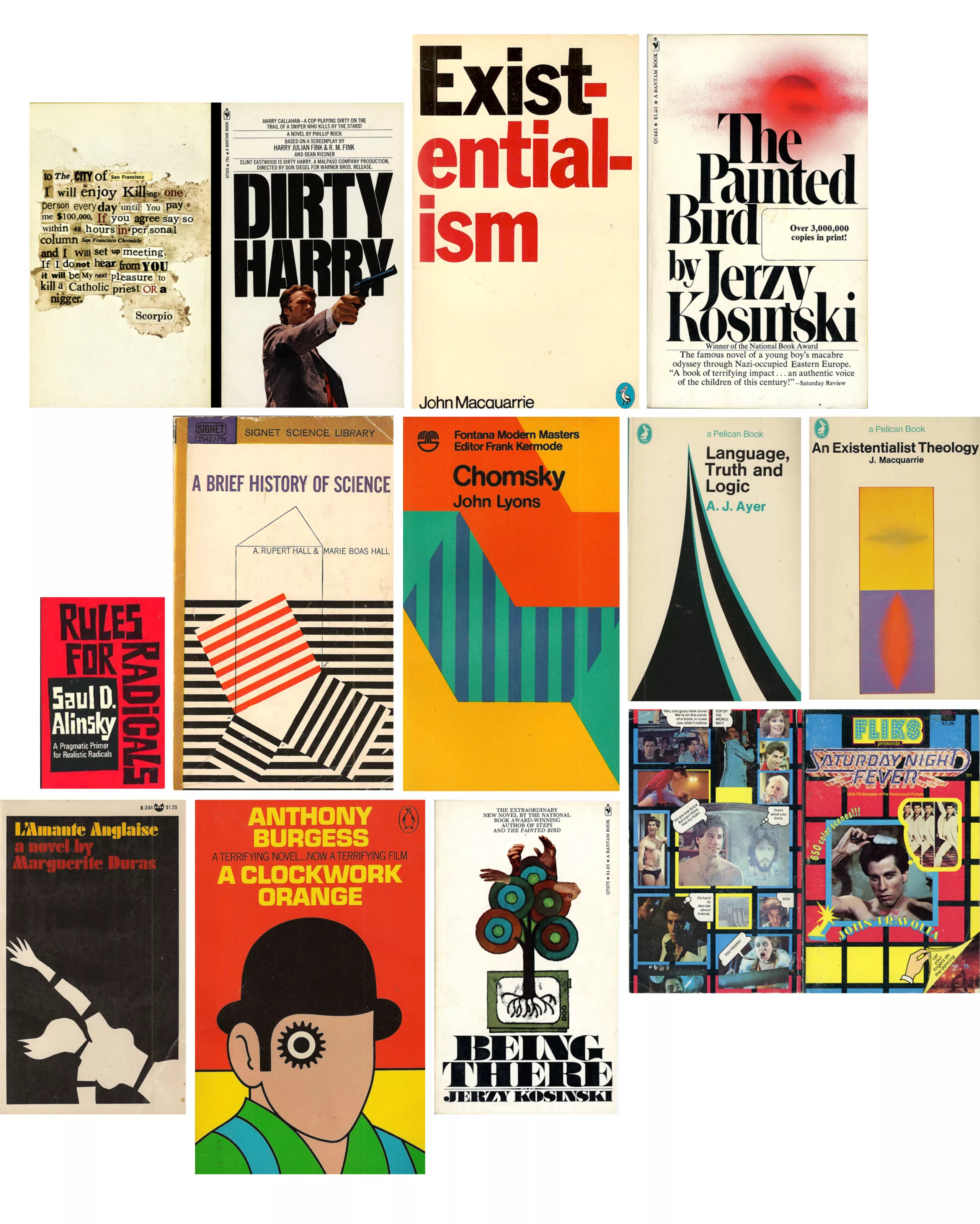
Speaking of art: small zoom on the influence of abstract artists on the covers of the 60s and 70s with the superb Fontana Modern Masters collection. Inspired by Vasarely’s plastic alphabet and optical art, the artistic director of Fontana Publishing -John Constable- has the brilliant idea of asking an artist to design covers following a repetitive pattern.
Together, they form a giant optical work of art: the book cover then rises to the rank of art, to hang on the wall!
Of course, we had fun playing with it:

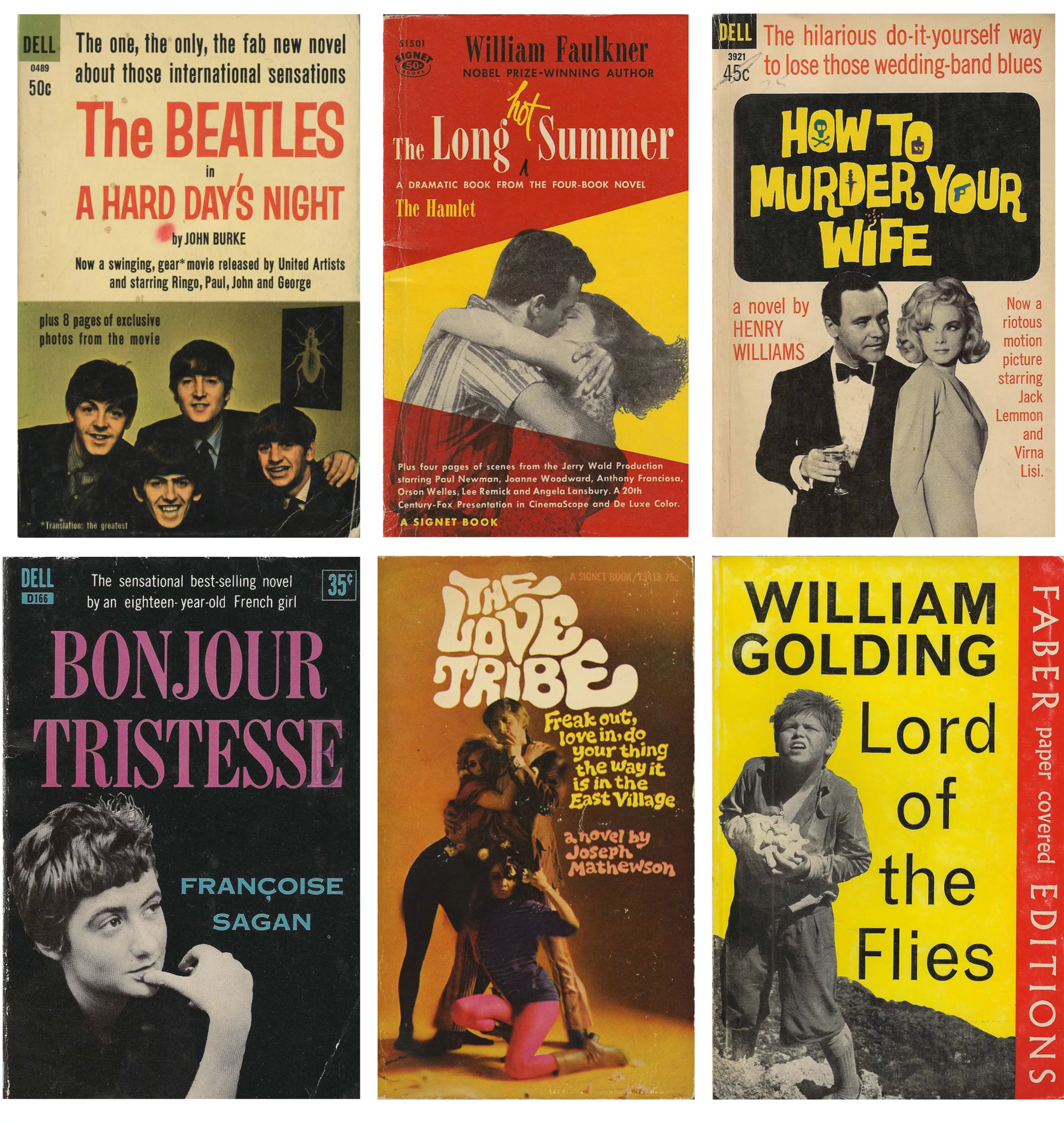
In parallel in France, the history of book covers has not taken the same graphic turn… see the next chapter to learn more!
Text: Tiphaine Guillermou
Sources / to go further:
- Penguin Editions: www.designtaxi.com/news/380285/An-Insightful-Look-At-The-Design-Process-Of-The-Penguin-Group-Logo-Over-77-Years/
www.penguinfirsteditions.com/index.php?cat=history
www.penguin.co.uk/articles/on-writing/cover-story/2017/may/penguin-modern-classics-design-part-1/
www.mentalfloss.com/article/66915/history-and-many-looks-penguin-books-logo
www.logodesignlove.com/penguin-logo - American paperbacks: www.flickr.com/photos/56781833@N06/albums
- Fontana Editions History: www.fontanamodernmasters.org/02.html
On the subject
-
The symbolism of cut hair in Iranian protest posters
In Iran, Mahsa Amini died for a lock of hair poorly concealed behind her headscarf, giving rise to a massive protest movement against the mullahs’ regime. The gesture of a severed lock of hair becoming the symbol of this struggle gives us the opportunity to look back at the many symbolic of hair.
-

Color and brands are all about identity !
Many brands use colors as symbols to convey their identity. But can we really legally appropriate a color?