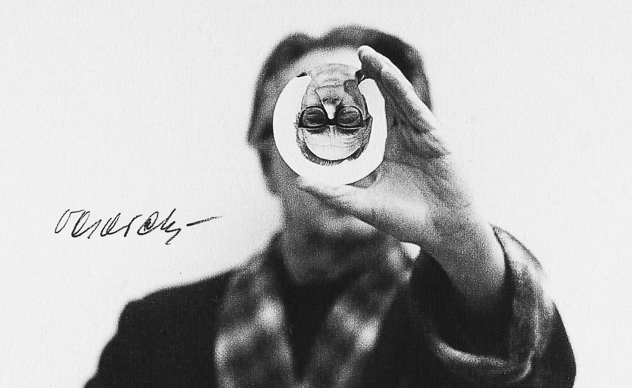
Vasarely, the father of optical art
We continue our portrait series on the History of Graphic Design, this time dedicating ourselves to a french legend of the art of the Pompidou years.
Victor Vasarely (1906-1997), whose real name was Gyozo Vasarhelyi, was born in Pecs in Hungary in 1906. When he was 3 years old, he drew rows of flowers, shells or insects and numbered the pages using a geometric alphabet. Later, he would become the father of Op Art (optical art). But before his glorious years, he worked as a “lucrative” (at the time!) advertising graphic designer specialized in pharmacy. A little known route of this great name of design, which we wish to highlight here.
Posters, glory and health
In the early 1930s Vasarely studied at the Bauhaus school in Hungary, Muhely, where he became familiar with abstraction and geometry. This school of Fine Arts not only promotes pure art, but also promotes applied art. Art must have a goal and carry a message, in addition to being adapted to a society in full modernization and industrialization.
Vasarely, Optique, graphisme et publicité (Art Présent, n° 4-5). 1947“If I compare advertising to a language, the line, shapes and colours would constitute the alphabet.”
There he learns the importance of composition and abstraction applied to the field of communication. On the advice of his master, Sandor Bortnyik, he learns how to make a living from a job well done, advertising, so he can devote himself to other personal work.
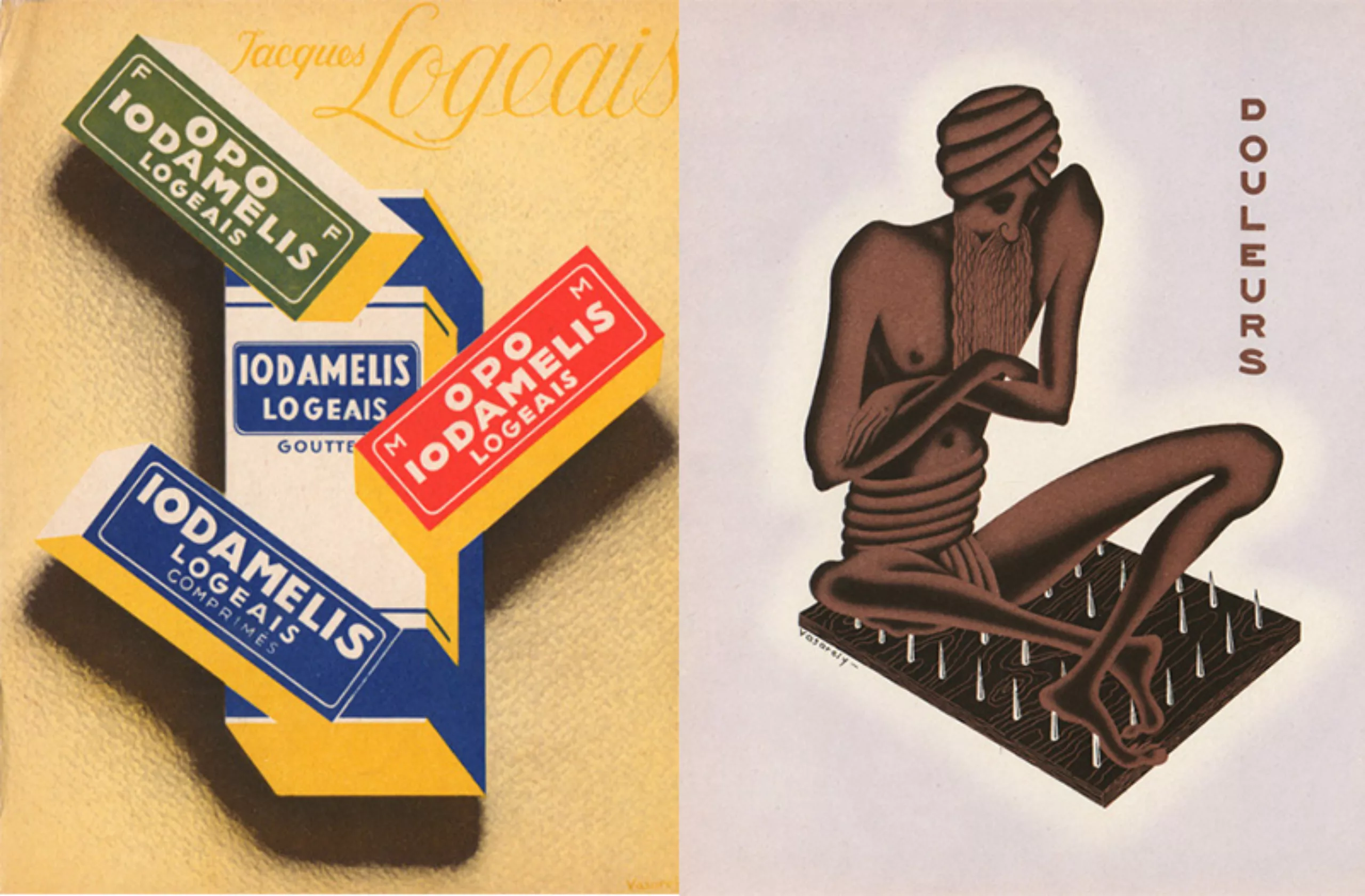
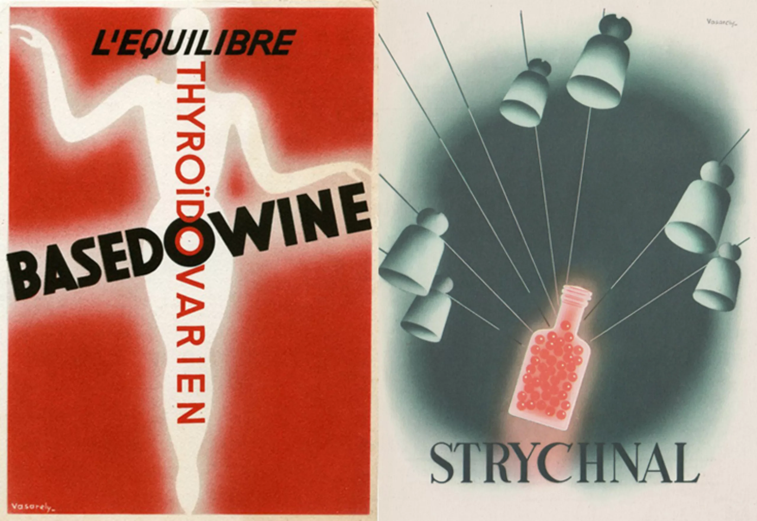
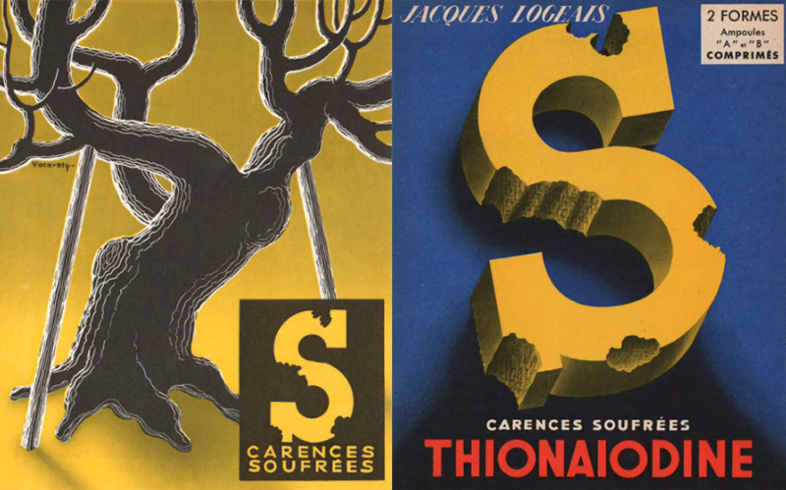
At the age of 24, Vasarely moved to Paris and began a career as an advertiser at Havas and Draeger, producing posters for the pharmaceutical industry.
Vasarely, Optique, graphisme et publicité (Art Présent, n° 4-5). 1947“The cartoonist must mute his personality and, if necessary, sacrifice it; the taste, genre, understanding and style of the advertising work vary according to the segment of the population to which it is addressed. The problem is essentially different for a football poster designed to attract the crowd and a pharmaceutical insert addressed to doctors.”
With a comfortable income, he founded a team of drawing assistants. He can thus continue his personal research on Graphic Studies.
The prints of the time were made thanks to the mastery of printing and typographers, especially those at Draeger, where Vasarely worked. Demanding papers such as blotting paper, gold or transparent substrates are used and allow embossed or textured finishes that rhyme with modernity.
During the Second World War, he came close to surrealism. He met Breton, Prévert, and was interested in Kandinsky, Mondrian, Malevitch and Klee among others.
Later, in waves, Vasarely immersed himself in his creative and artistic periods which enabled him to quickly acquire great world fame.
Line 4, Denfert period (1938-51-58)
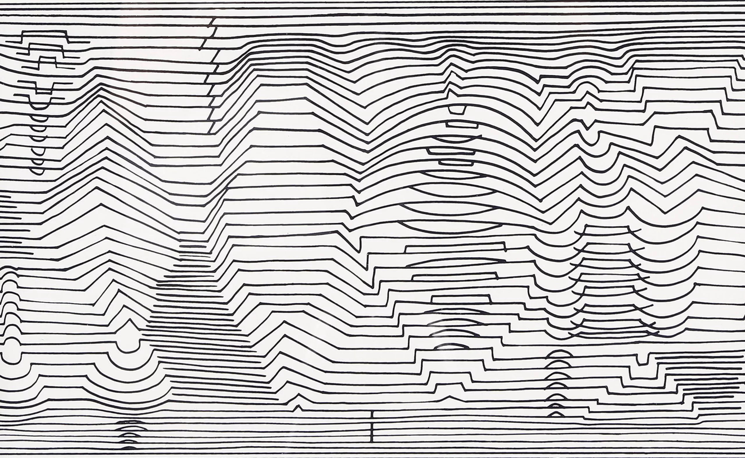
His subway routine-boulot-dodo passing by the Denfert Rochereau station gives birth in him an obsession for cracks, tiles, and black & white. Abstracting from the meaning and utility of things, Vasarely notices that shapes and geometry remain.
He then decorates landscapes in abstract lines, and creates among others a series of works that he calls Birth (here: 1969, 1973, 1951).
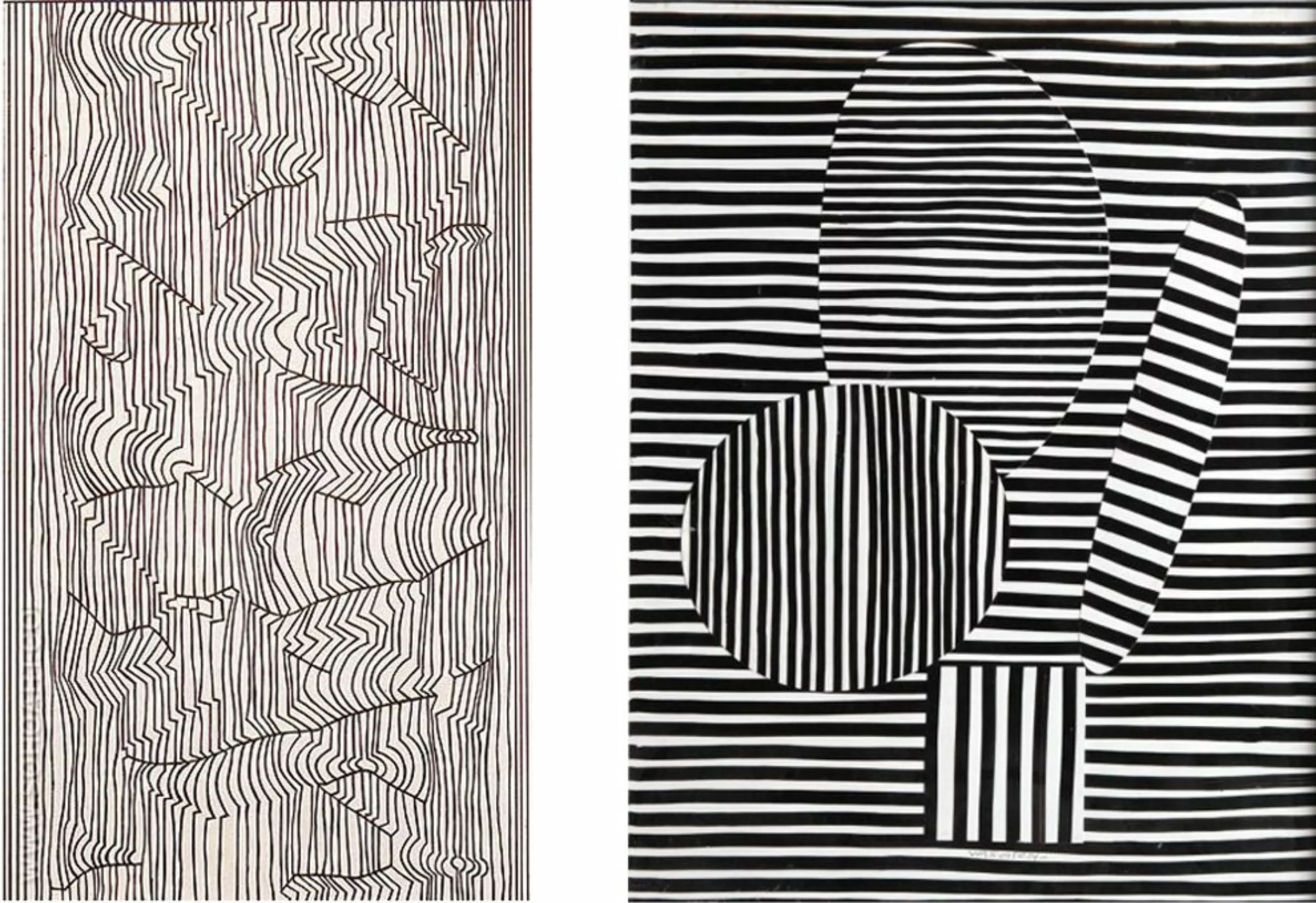
Belle Isle and the ellipses (1947-1954)
From 1944, he dedicated exclusively to painting and gave up his advertising work. Since then, he has explored his pictorial graphic research.
A vacation to Belle Isle in 1947 was a revelation and it was the beginning of his period of the same name. Nature appears to him as a gigantic composition of multiple abstract forms. With rigour, he works on abstract and oval shapes, illustrating pebbles on the beach, rolls of waves, pieces of polished glass. Rather than paint things realistically, he focuses on another reality made of shapes and geometry.
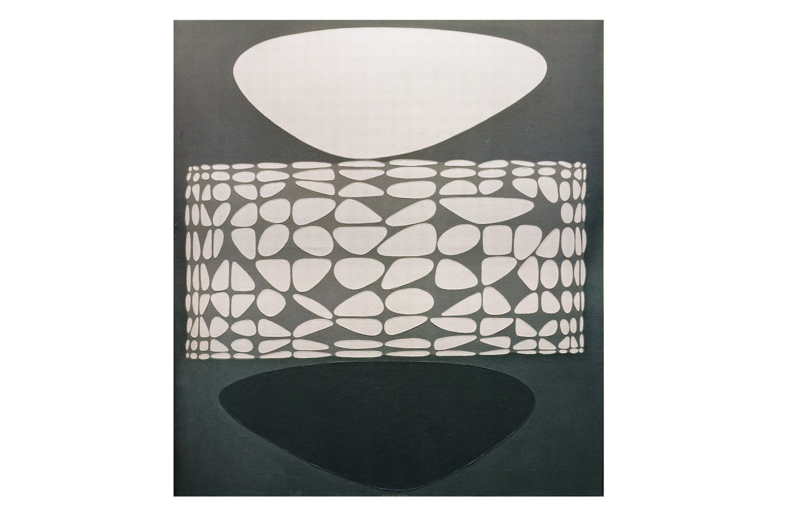
Crystal Strings, beyond Gestalt (1948-1960)
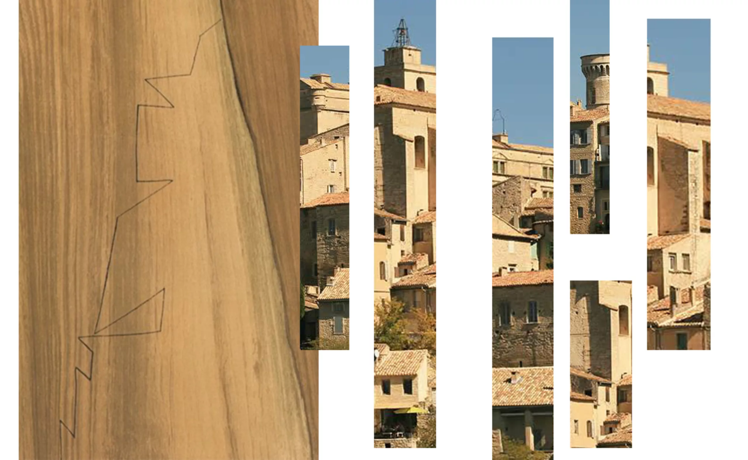
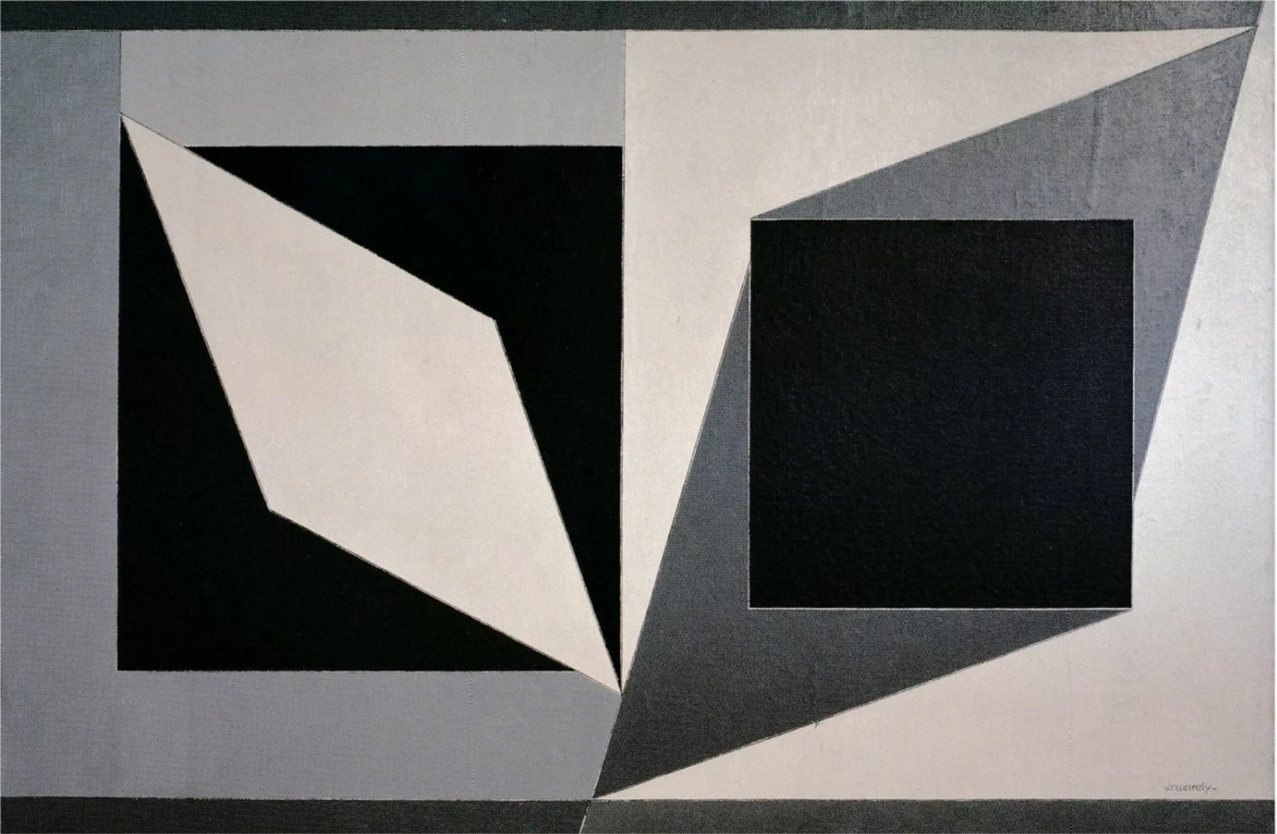
When he discovered Gordes in 1948, a village in Provence, he had a new revelation about the perspective of this high city. “Southern towns and villages devoured by an implacable sun have revealed to me a contradictory perspective. The eye never succeeds in identifying the belonging of a shadow or a wall section: full and empty merge, shapes and backgrounds alternate. Such triangle joins sometimes to the diamond on the left, sometimes to the trapeze on the right, such square jumps higher or flickers downwards, according to whether I mate it to a dark green spot or to a piece of pale sky. Thus identifiable things turned into abstractions and, exceeding the threshold of Gestalt, began their own life.” (1948)
For information, the Geslat – from the verb gestalten, “to shape, to give a meaningful structure”- is a holistic philosophy/psychotherapy of the humanist current where the whole is superior to all the parts, in the sense that everything is understood in relation to its global context, to understand the whole in its unity.
Here, on the contrary, Vasarely dissects everything outside its context, to extract a pure and abstract form, without proper meaning.

“Neglecting the history and beauty of old stones, it was this plasticity in the vertical plane that seized me and gave rise to a series of decisive works” (1964).
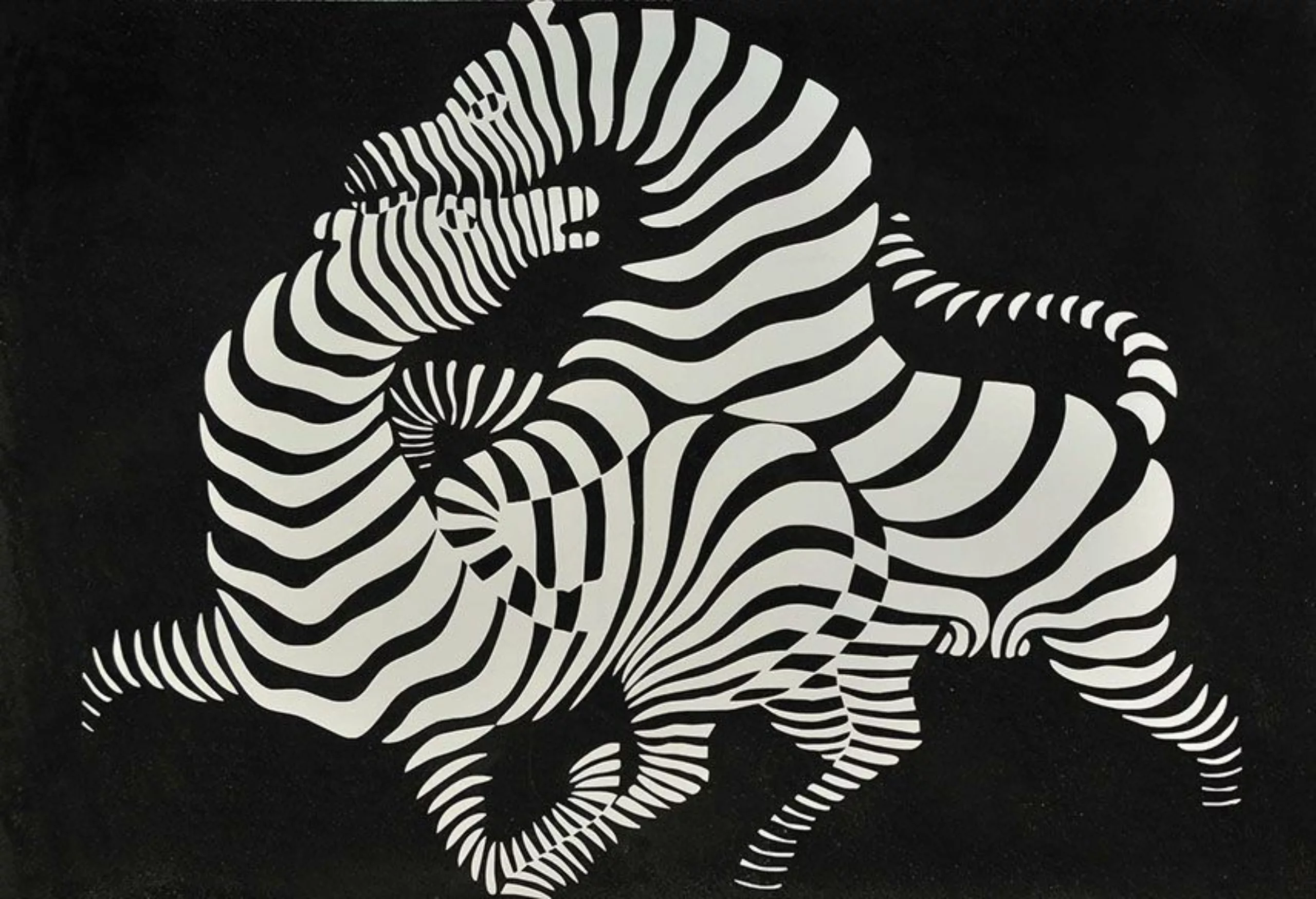
Malevich, the damage is done
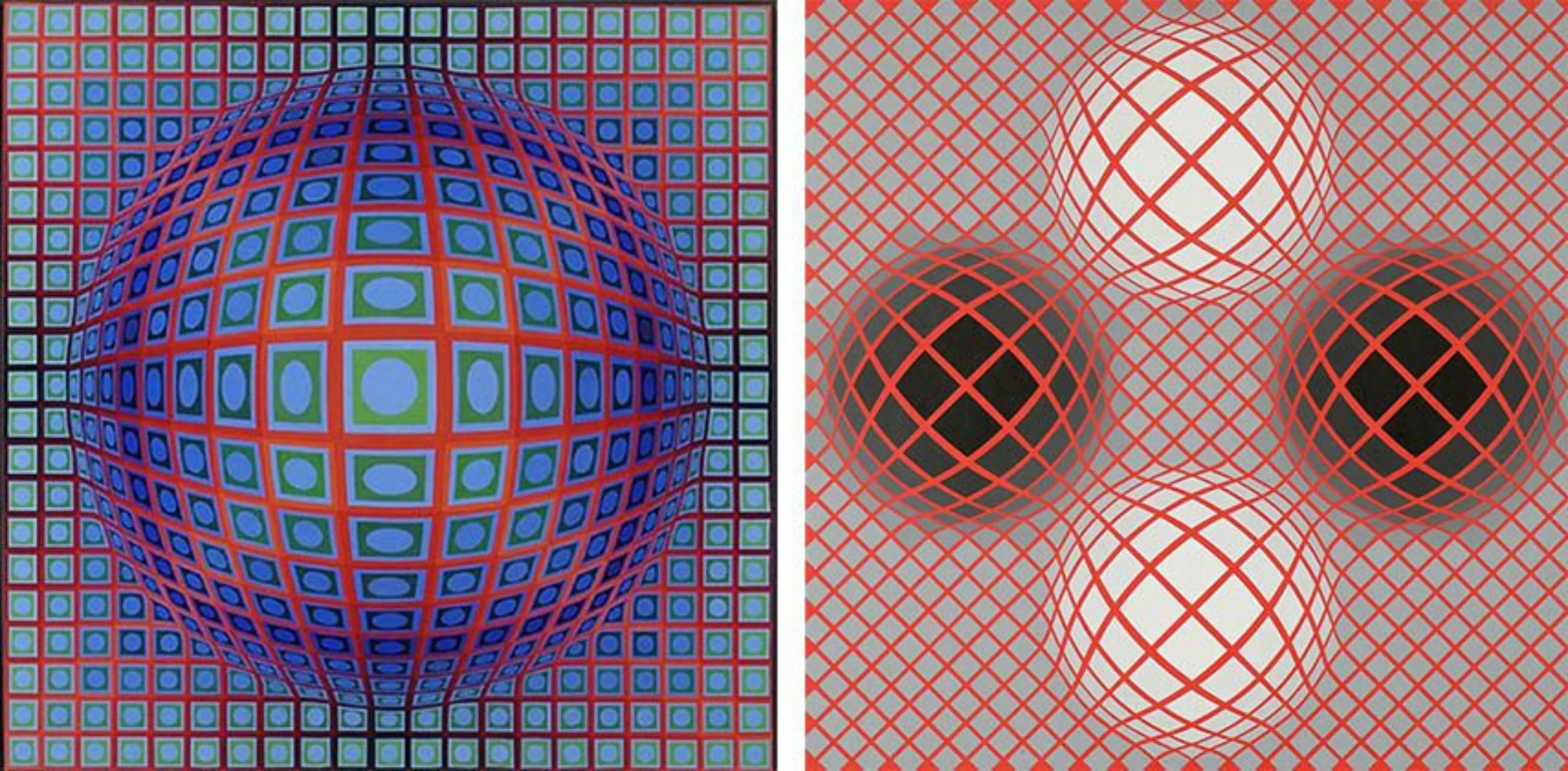
In the late 1950s, with his Hommages à Malevitch (Tribute to Malevitch, first two photos below), Vasarely created lines and forms that became the very symbol of his work: nature is now totally absent, but symmetry, lines and movement are now a prelude to Optical Art and its kinetic illusions.
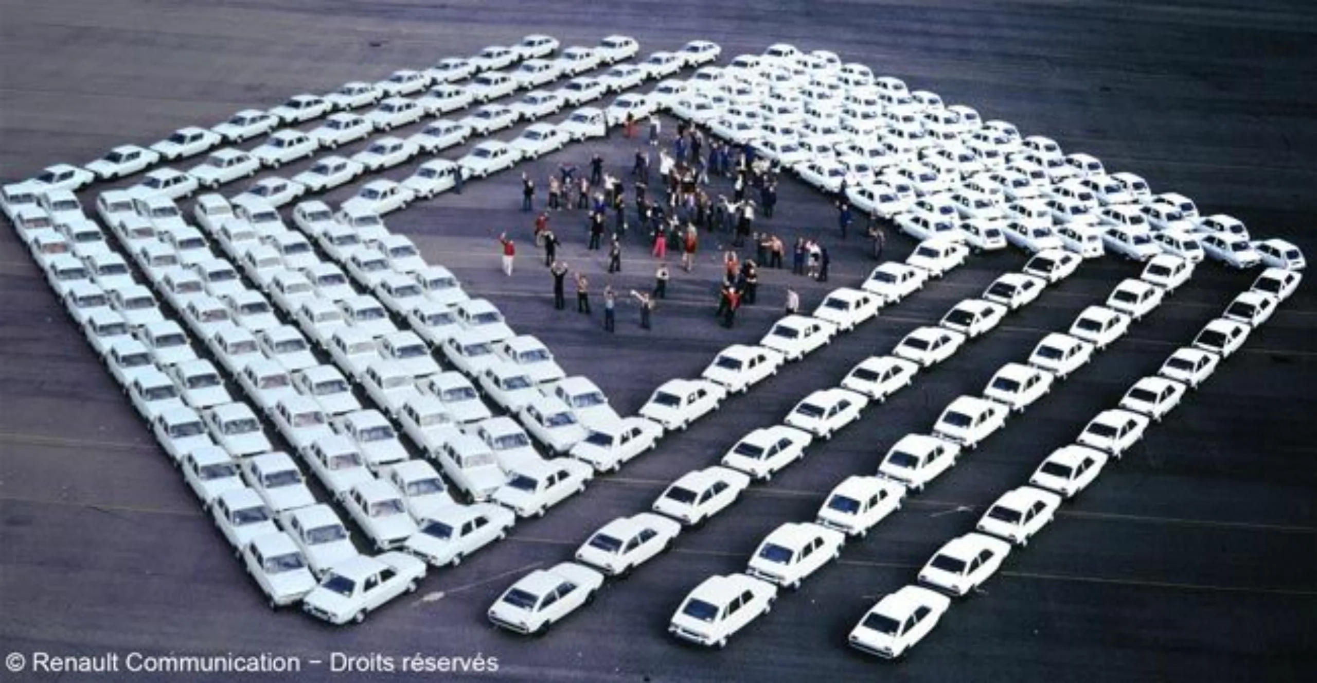
Renault logo: My R5 is a Vasalery!
The above series of works already seems to bear the beginnings of the Renault logo created in 1972, almost 20 years later.
For the short story, the logo would not only be the fruit of Victor Vasarely’s work but that of a collaboration between the artist and his son Yvaral. According to the sources, Vasarely’s name remains for the attribution of the logo, but it is less obvious to discern which of the son or father signed the line.
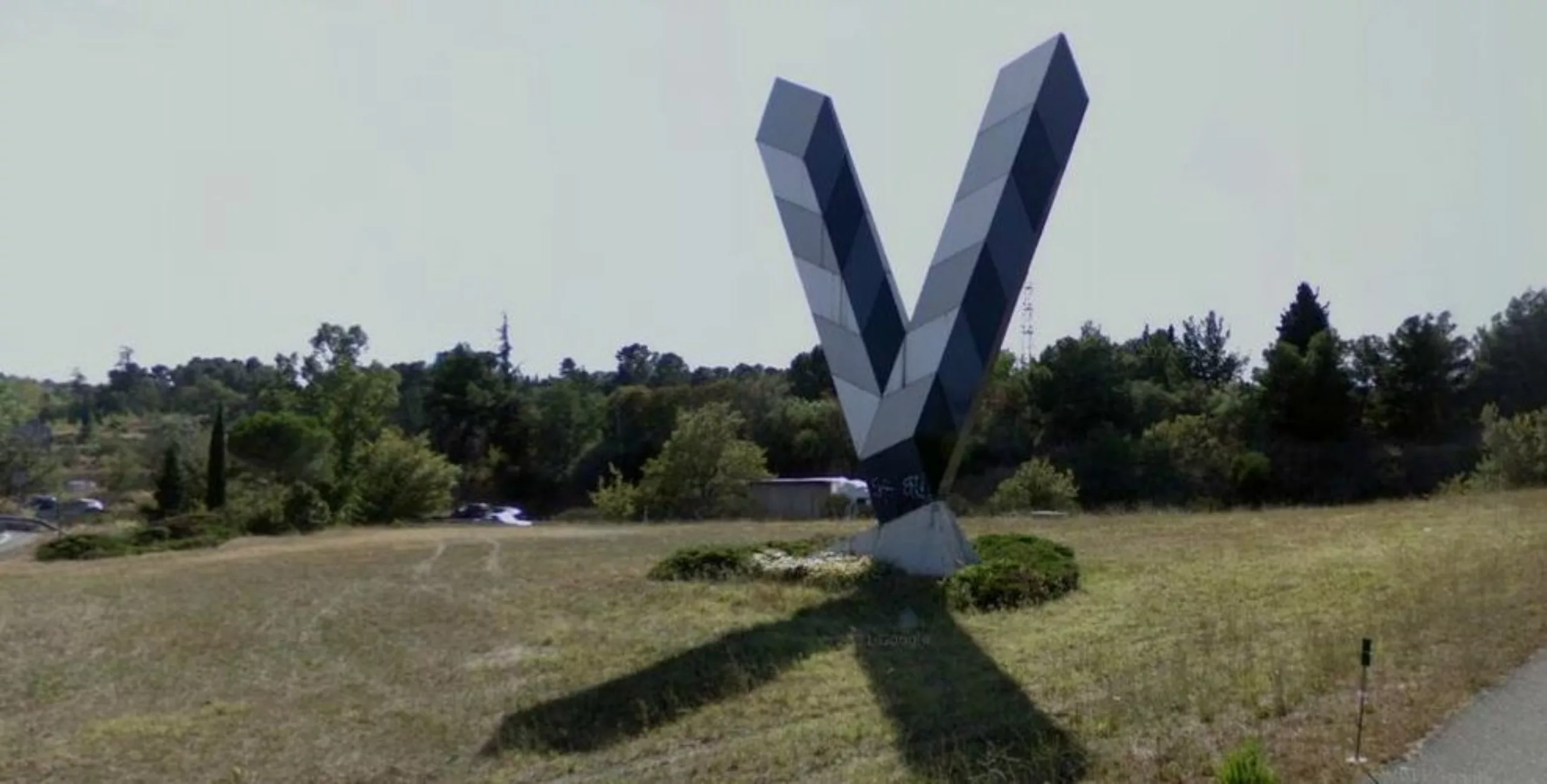
The collaboration between Vasarely (the father!) and Renault also took shape on the motorways. According to the artist, “the motorway is a happy marriage of natural and artificial landscapes”. With this in mind, Vasarely is using the company’s technology to build gigantic signals for the vicinity of motorways. Renault’s paint laboratory, when questioned, recommends the use of enamelled sheet metal to resist bad weather. An effective transfer of knowledge that clearly illustrates the nature of the relationship between artists and Renault.
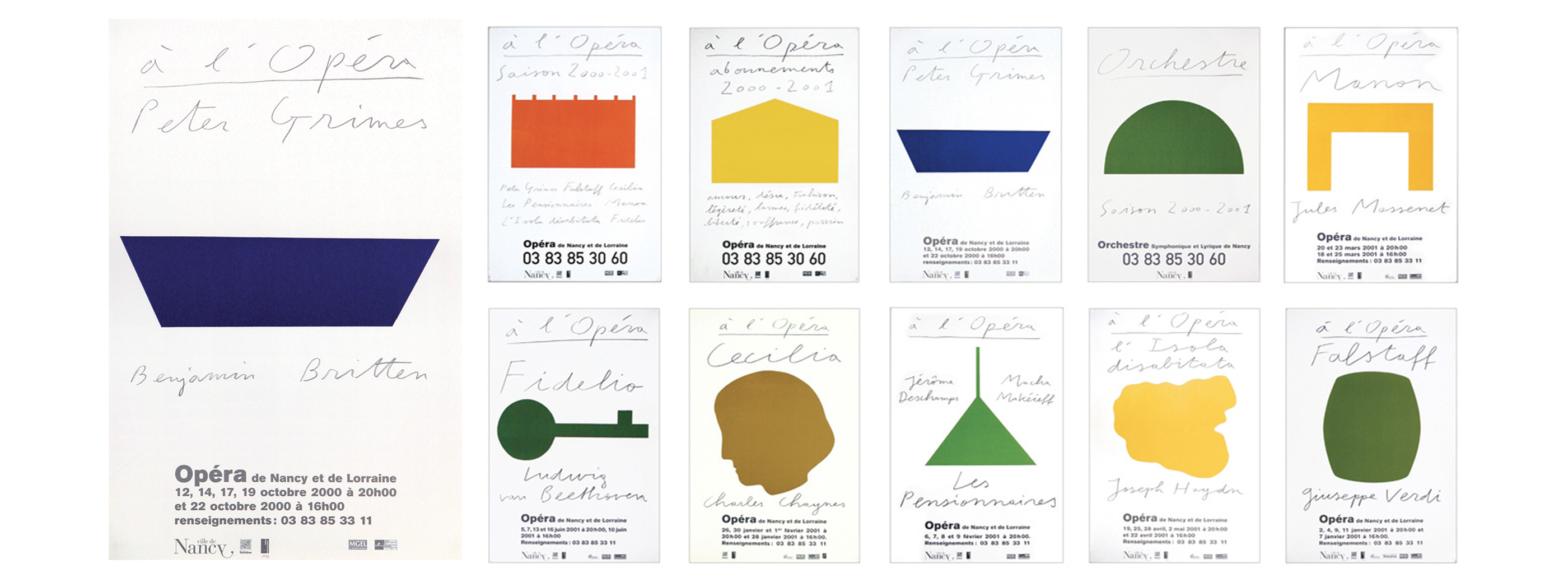
To continue on the Vasarely graphic designer and less known, Victor proposes tracks for the logo of the cinema museum, in 1970. Looks like Paul Cox 🙂
e know that Vasarely produced many logos, yet history did not retain many. Below is one of the few we could find.
Art is everywhere in the city
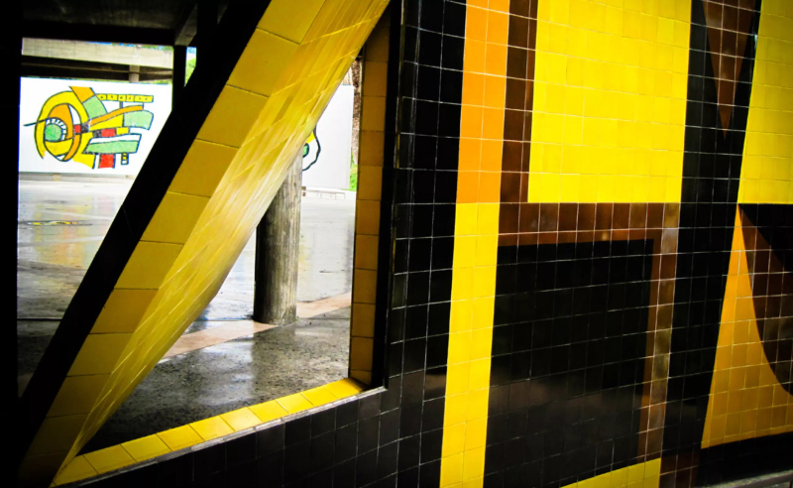
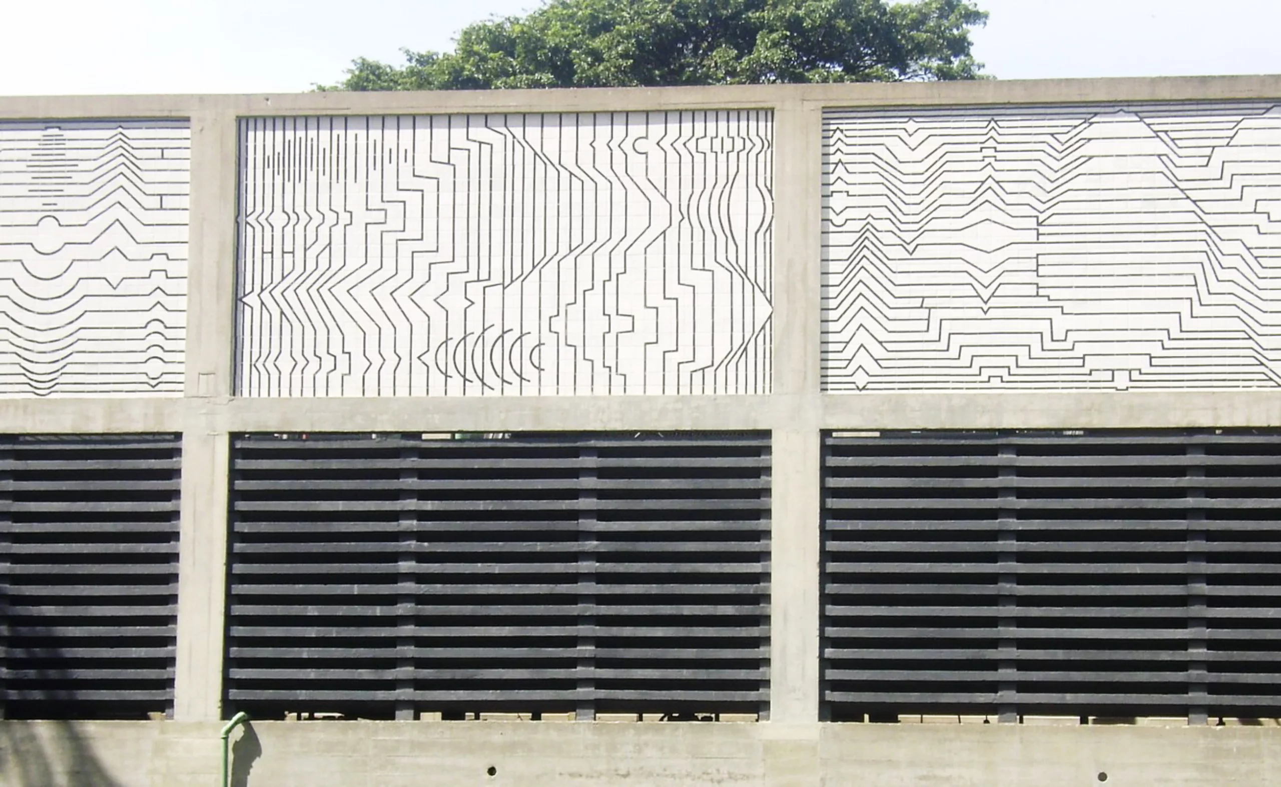
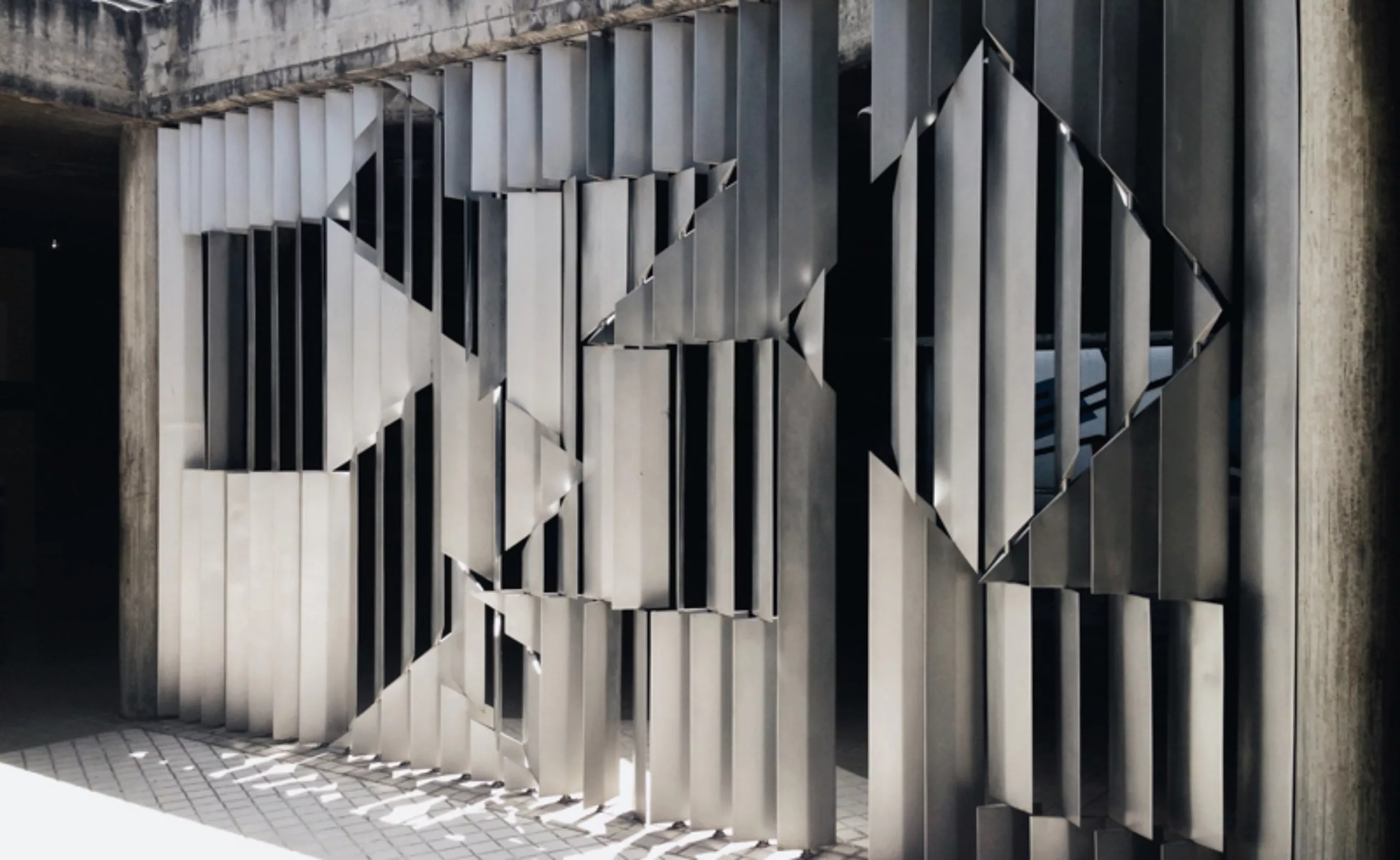
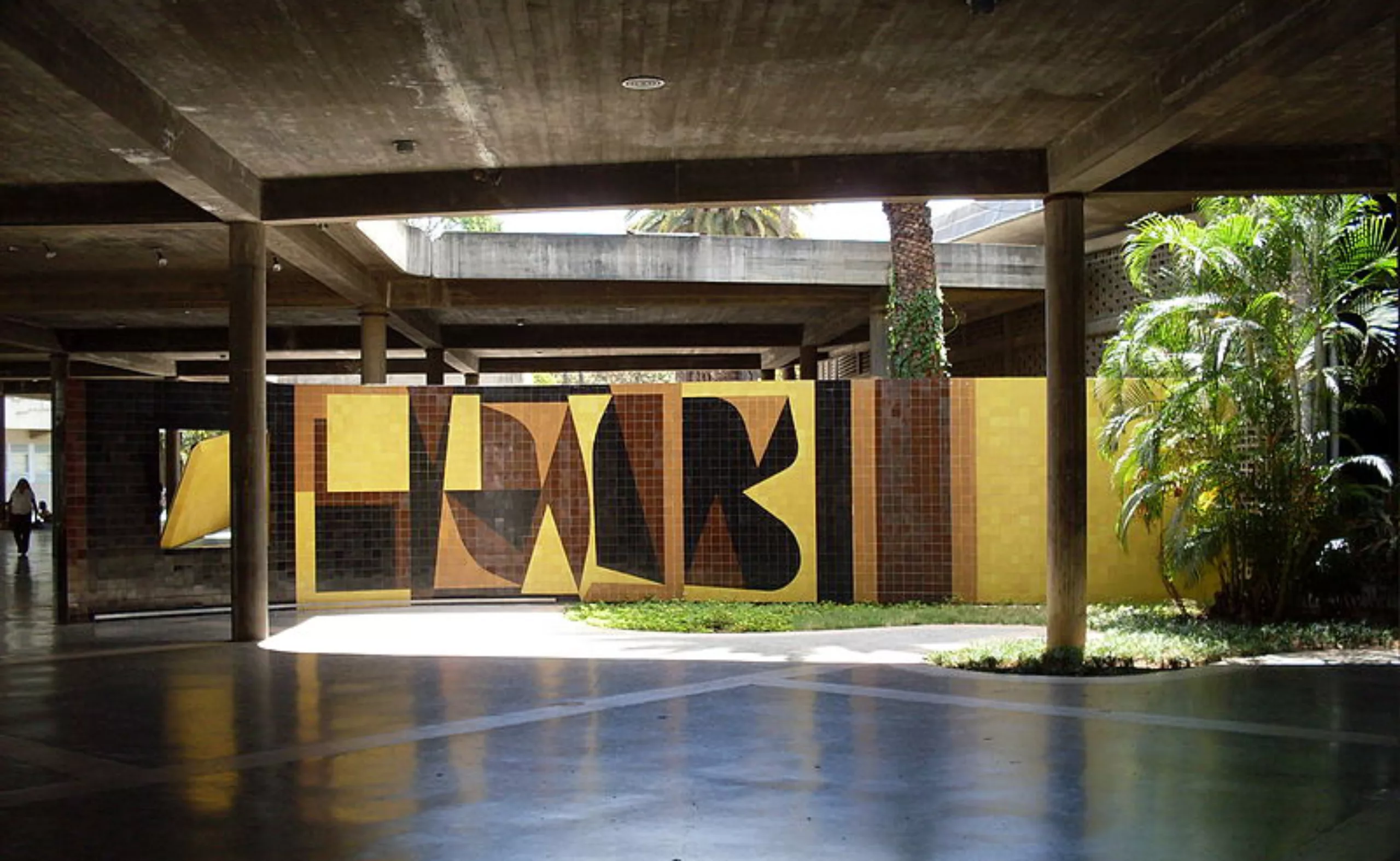
In the gloomy and grey surbubs, where buildings hide the sun, Vasarely imagines a “polychrome city of happiness” where art would be everywhere in the city. Since 1955, he has been actively involved in the development of panels for the University of Caracas.
The aim of art therefore became for him to “combat visual nuisances, beautify the artificial environment“, and be accessible to all.
Vasarely, 1962«Our dialectic – in the field of art – cannot be based on the study of history, nor on the exaltation of the masterpieces of the past. Are we in a desperate situation? Period. If we risk at every moment our title of ARTIST and the advantages that this entails, the task seems simple to me: START instead of CONTINUE. The Colour-Form or the Plastic Unit offers us the possibility to advance, always further, without having to turn around.»
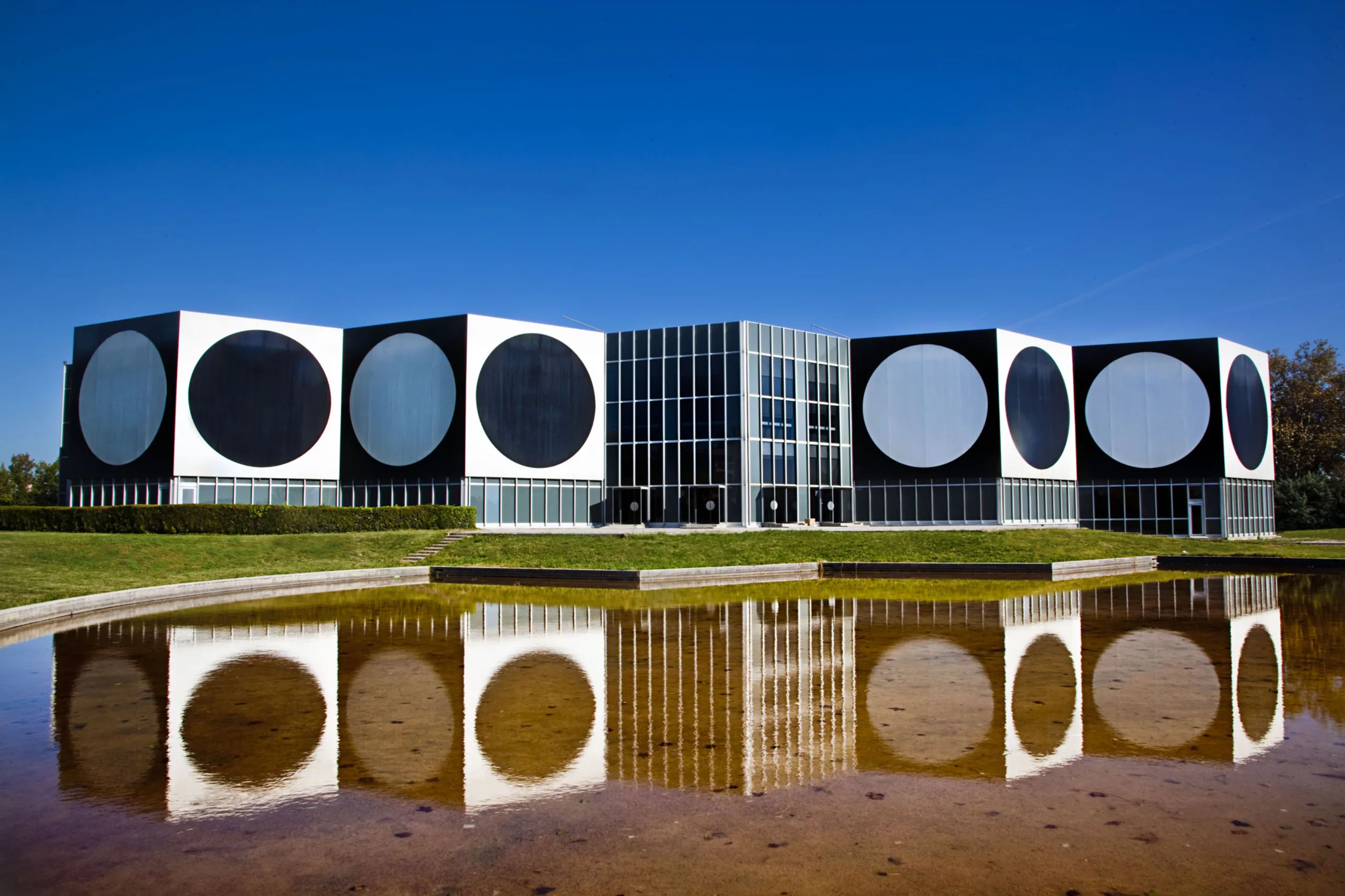
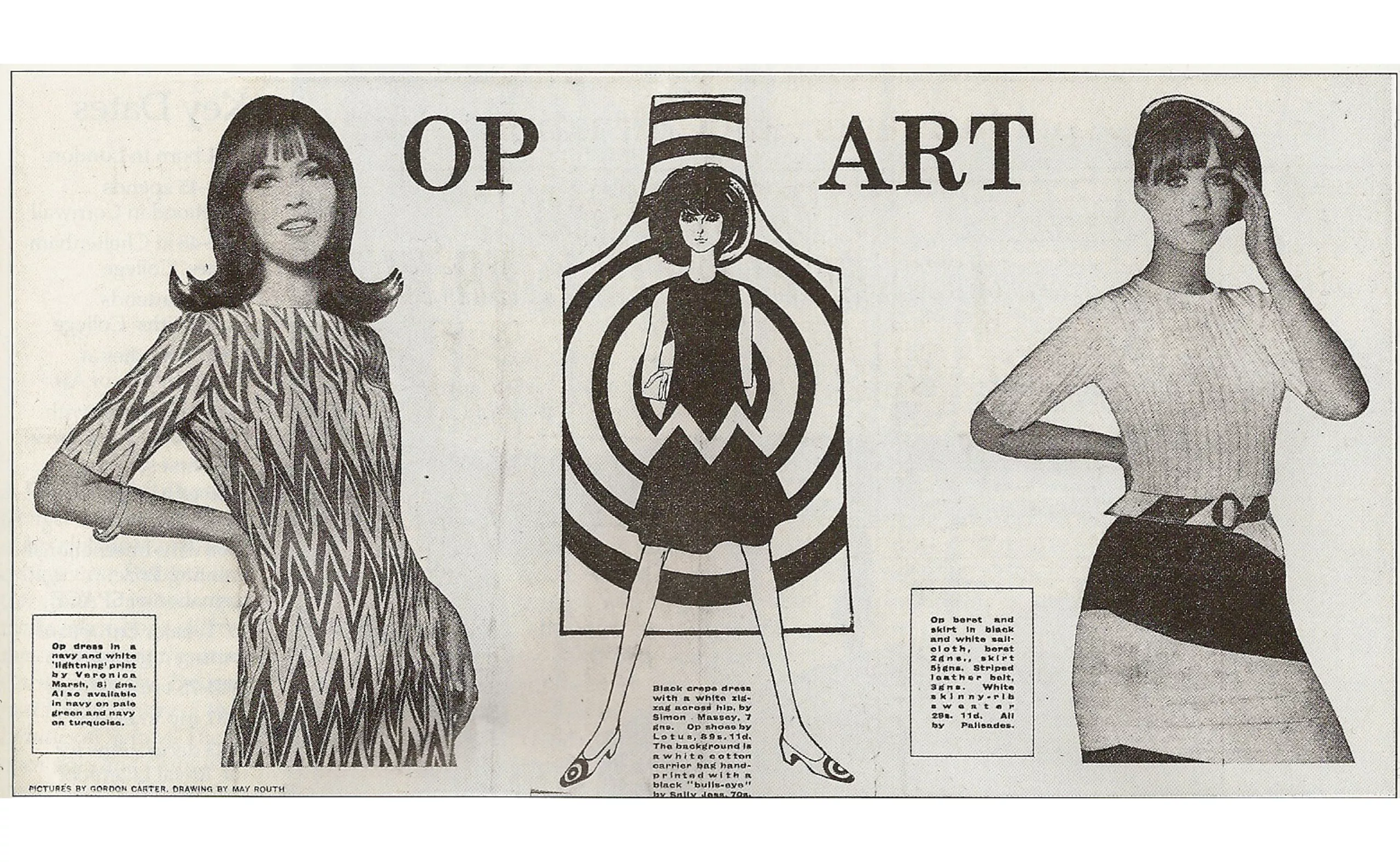
A true driving force of art, he participated in the exhibition “Responsive Eyes” at MOMA in New York in 1965 and was attributed the invention of optical art -Op Art- and kinetic art, in motion it is consecration.
Probably at the origin of the psychedelic wind of the 60’s, Vasarely’s art is all the rage and is found not only on the city walls, but also everywhere in fashion, design and advertising.
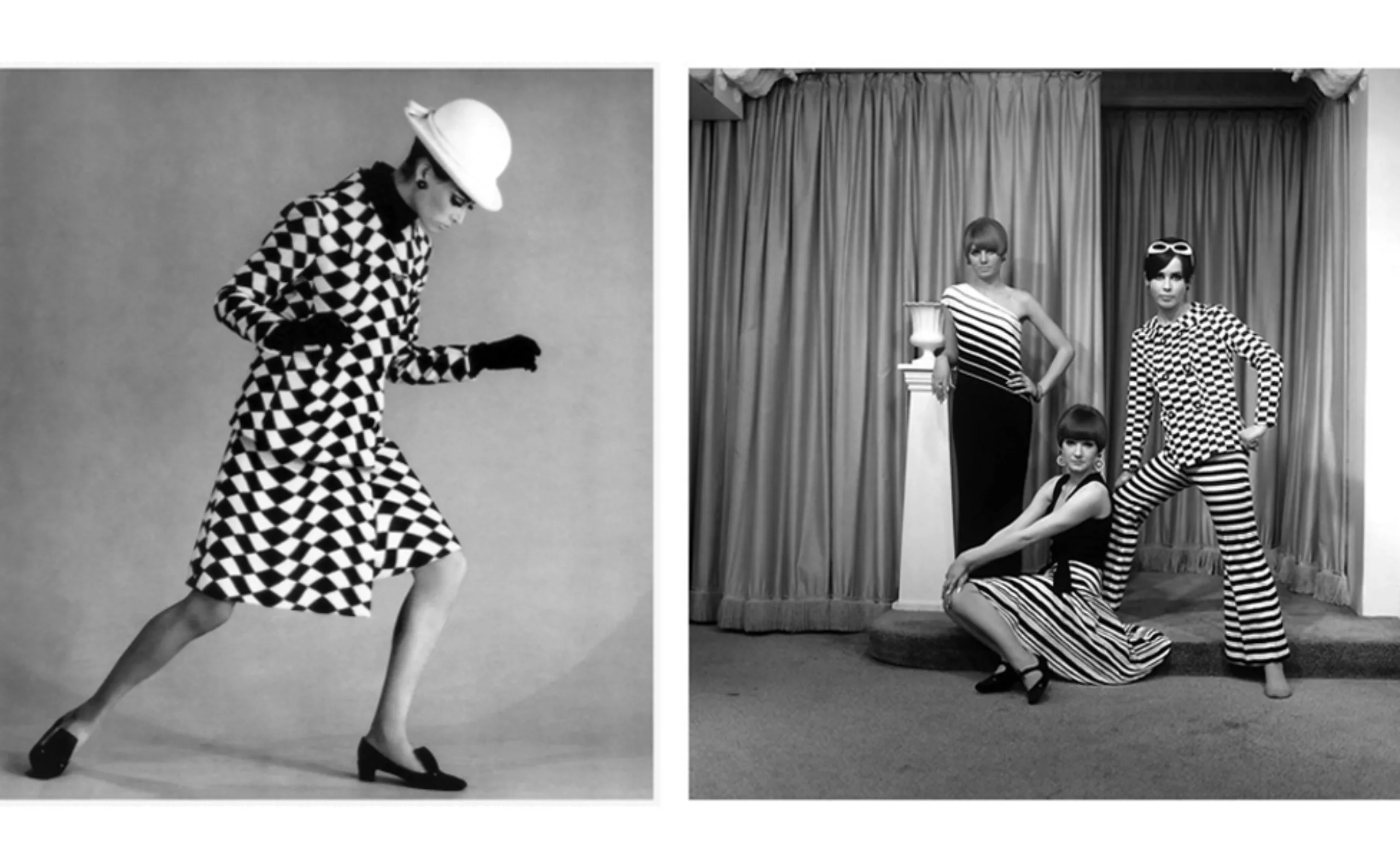
This vulgar art in the etymological sense of the term -of vulgos = understood by the crowd, the common of men- is an art for all, that everyone can understand and make live. If art is accessible to everyone, it is because illusion is created in everyone’s brain, and the artist fades into the work that lives and vibrates in the eye of the spectator.
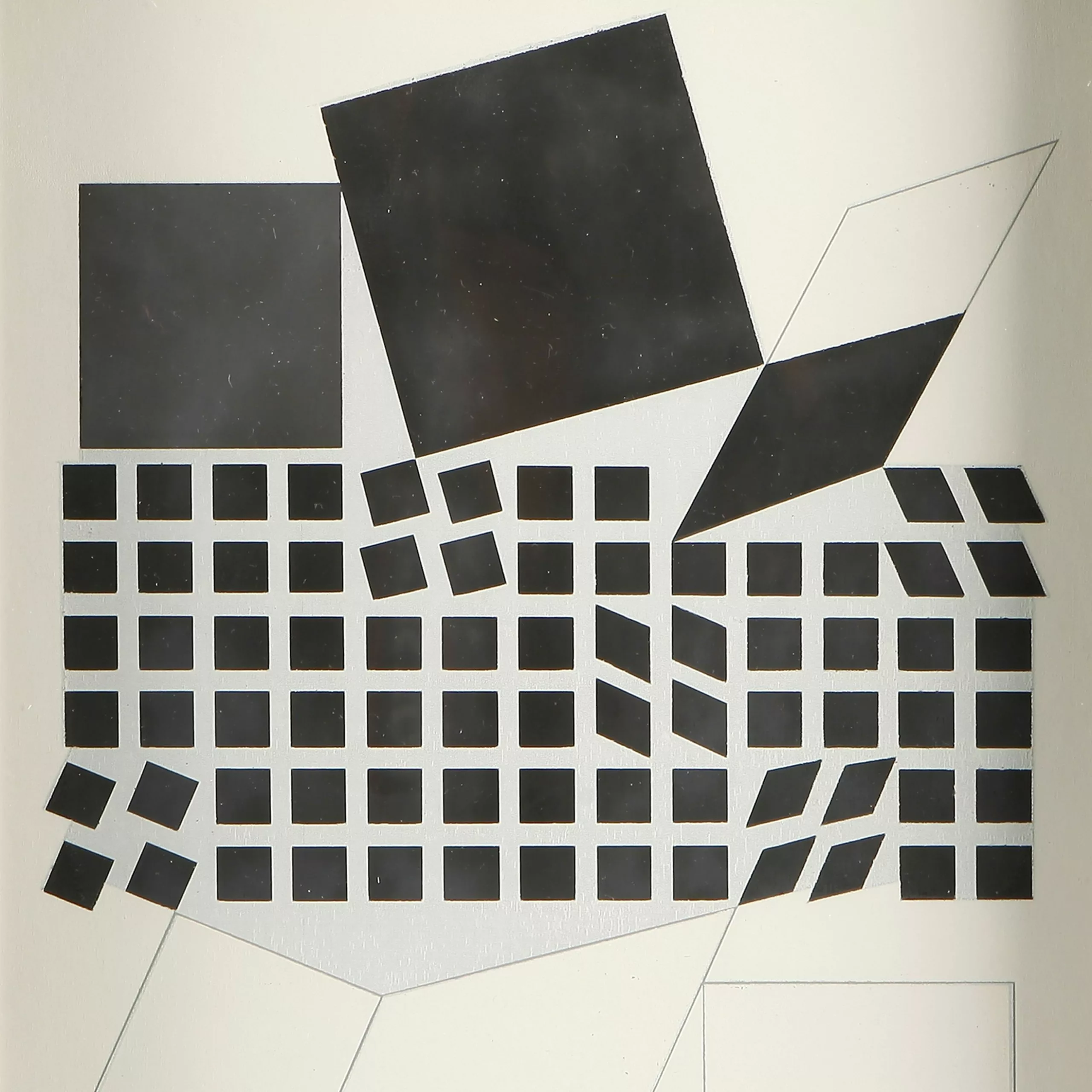
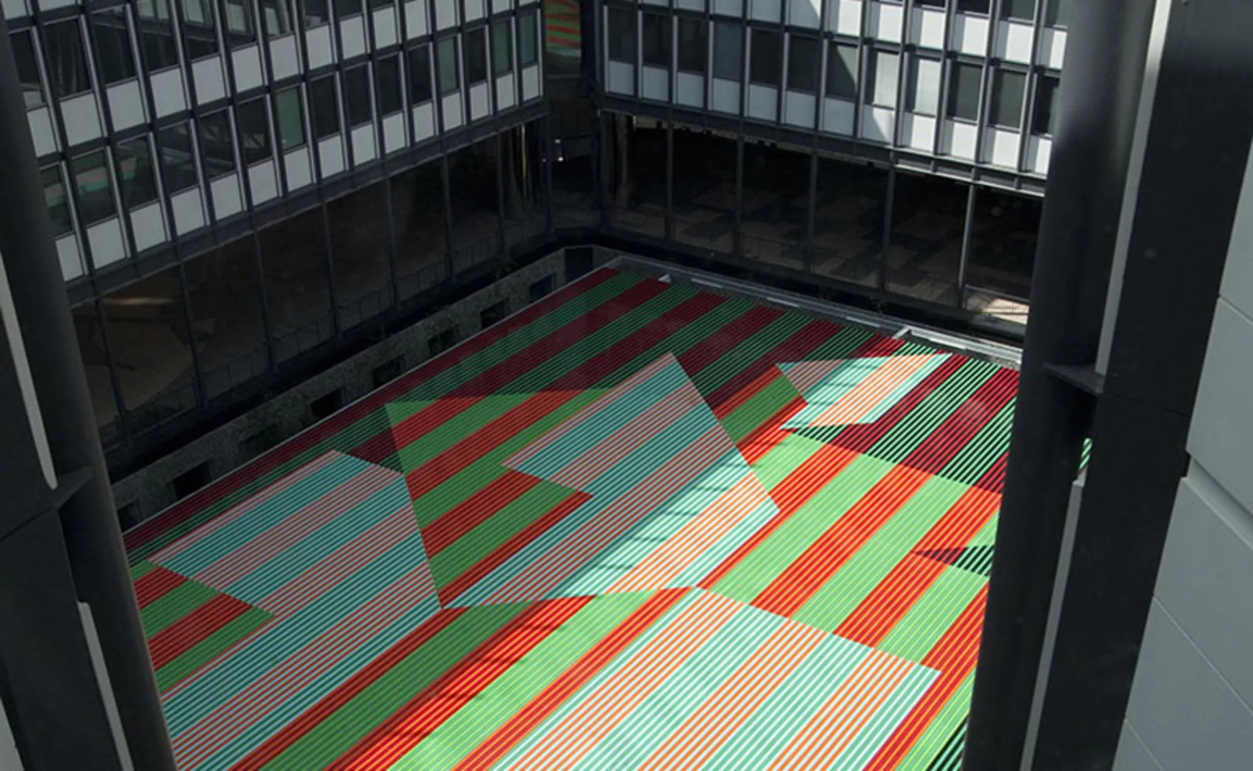
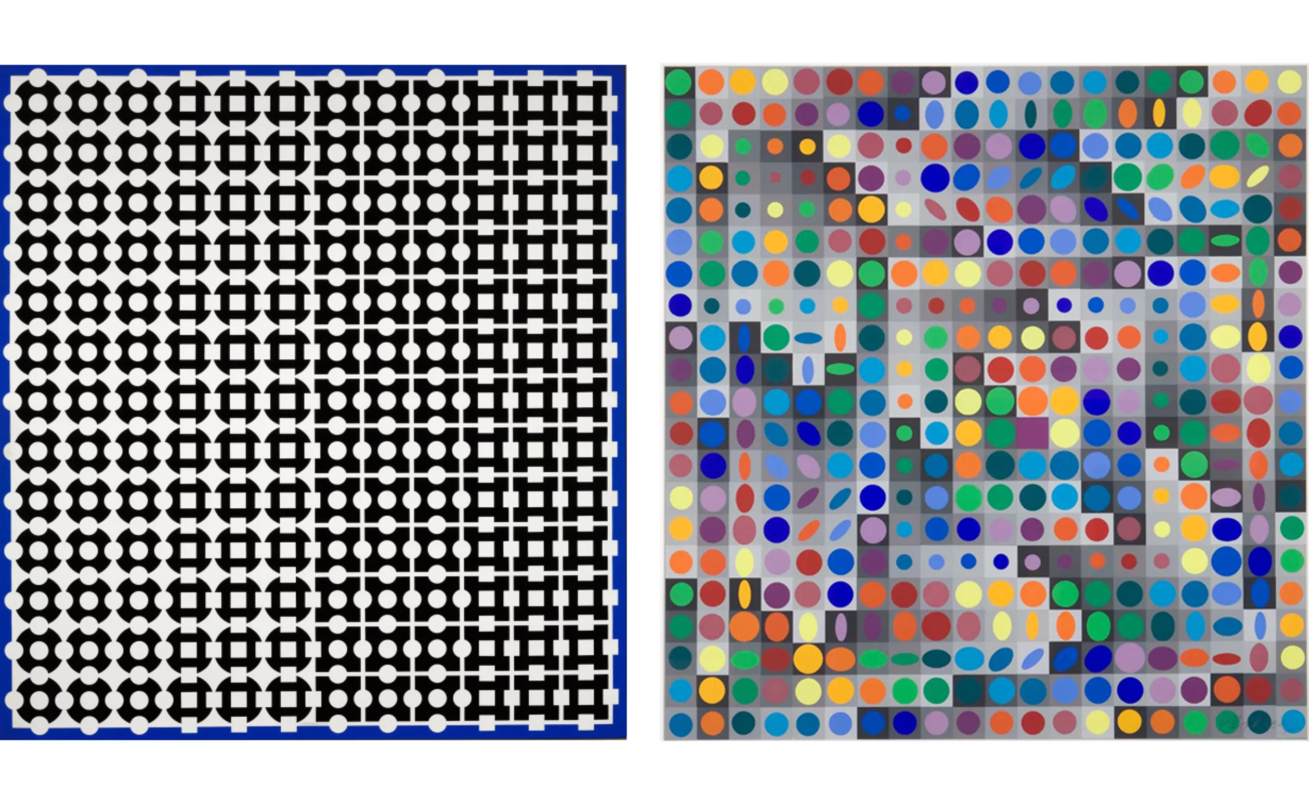
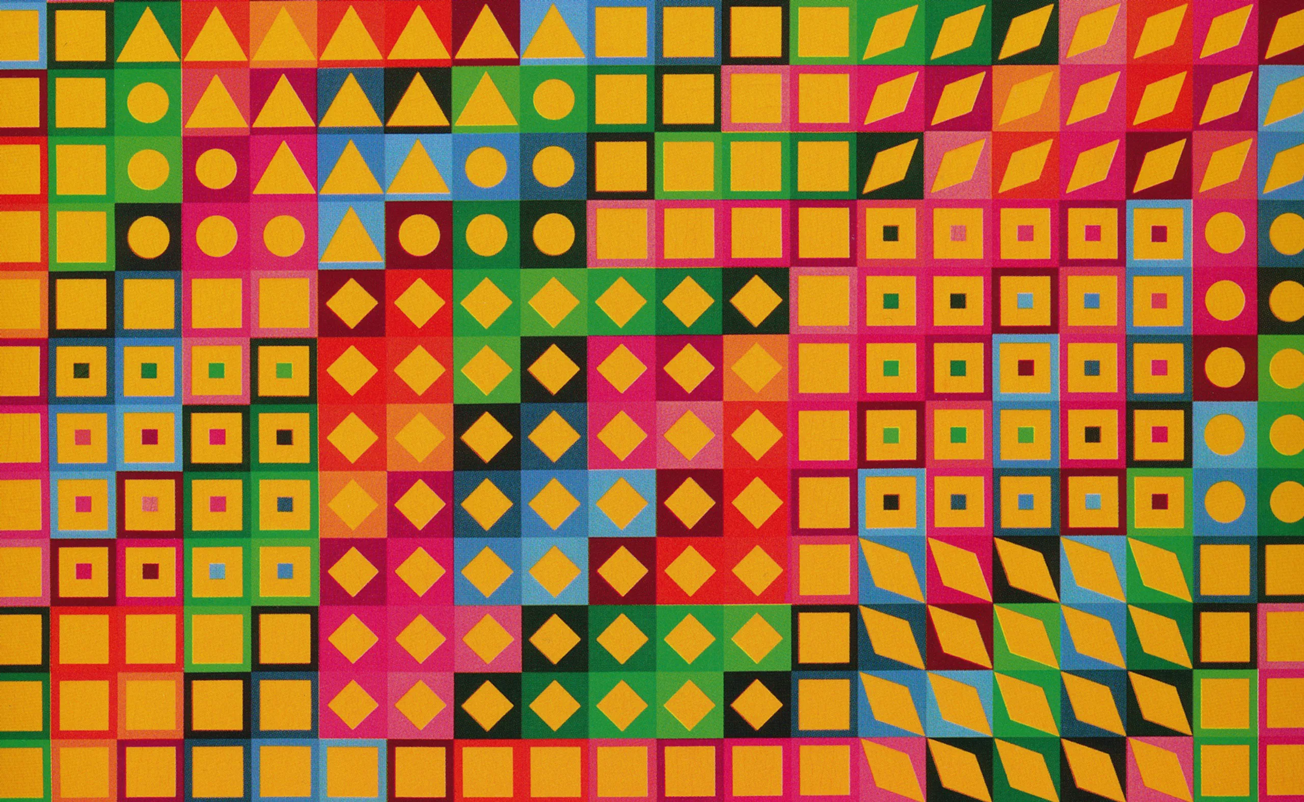
But it is also because Vasarely invents in parallel “starting prototypes” intended to be meticulously reproduced by executing assistants. He amasses tens of thousands of different shapes and sorts them in his workshop, in the same way as printing characters. By standardizing his art, he creates a plastic alphabet potentially accessible to all, it is “the plastic unit”.
The plastic unit™
Applying the same principles as when it was advertising, the composition retains a primordial character in Vasarely’s art. Optical illusions, geometries, repetitions… in 1959 Vasarely, now French, patented the “plastic unit”, a kind of alphabet formed from a shape (triangle, circle, diamond…) inscribed in a background (square). Like a graphic alphabet, these shapes are assembled to the millimetre following rigorous plans to form not words but graphic sets, from “six basic colors, a chrome yellow, an emerald green, an ultramarine, a cobalt violet, a red and a black and white” (let’s be precise in colors, shall we?).
Digital Art
From the mid-1960s, Vasarely had a passion for computers, which was booming at the time. The computer, like his assistants, allows to create identical combinations to his works, but in no time. More broadly, his passion for screens allows him to say “I can well imagine that we generate complete exhibitions by simply projecting them on the walls“.
The work is therefore above all a visual experience, reproducible rather than unique, authentic and signed; one must believe that this article aimed at sharing his work would have pleased him.
Optical Art today
We know how obsolete some of his work may seem these days. Some will say that his epileptic works of the 70s are reincarnated in some photoshop effects. Yet despite this, some graphic designers are rediscovering the optical art of the 1960s with delight.
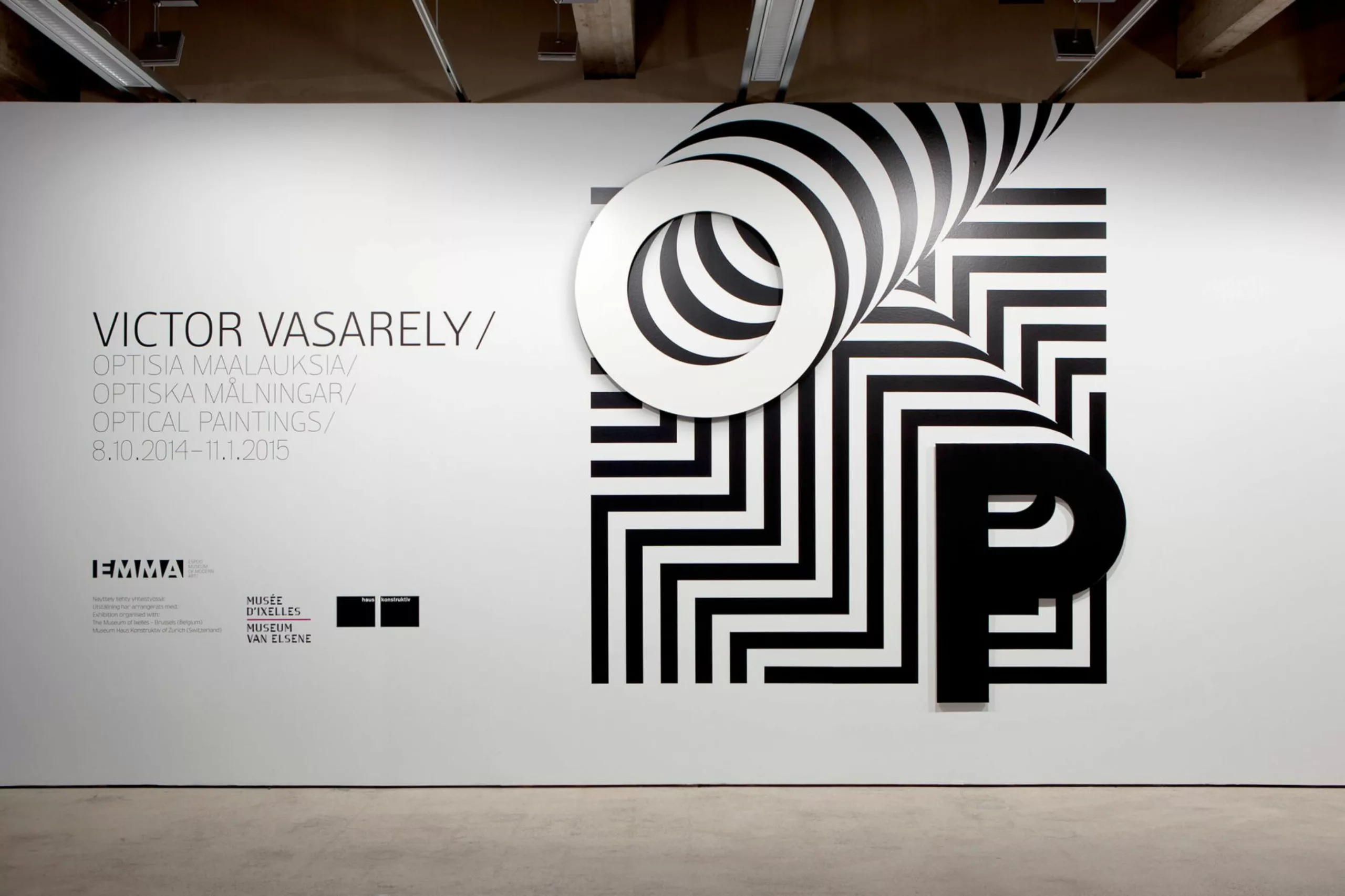
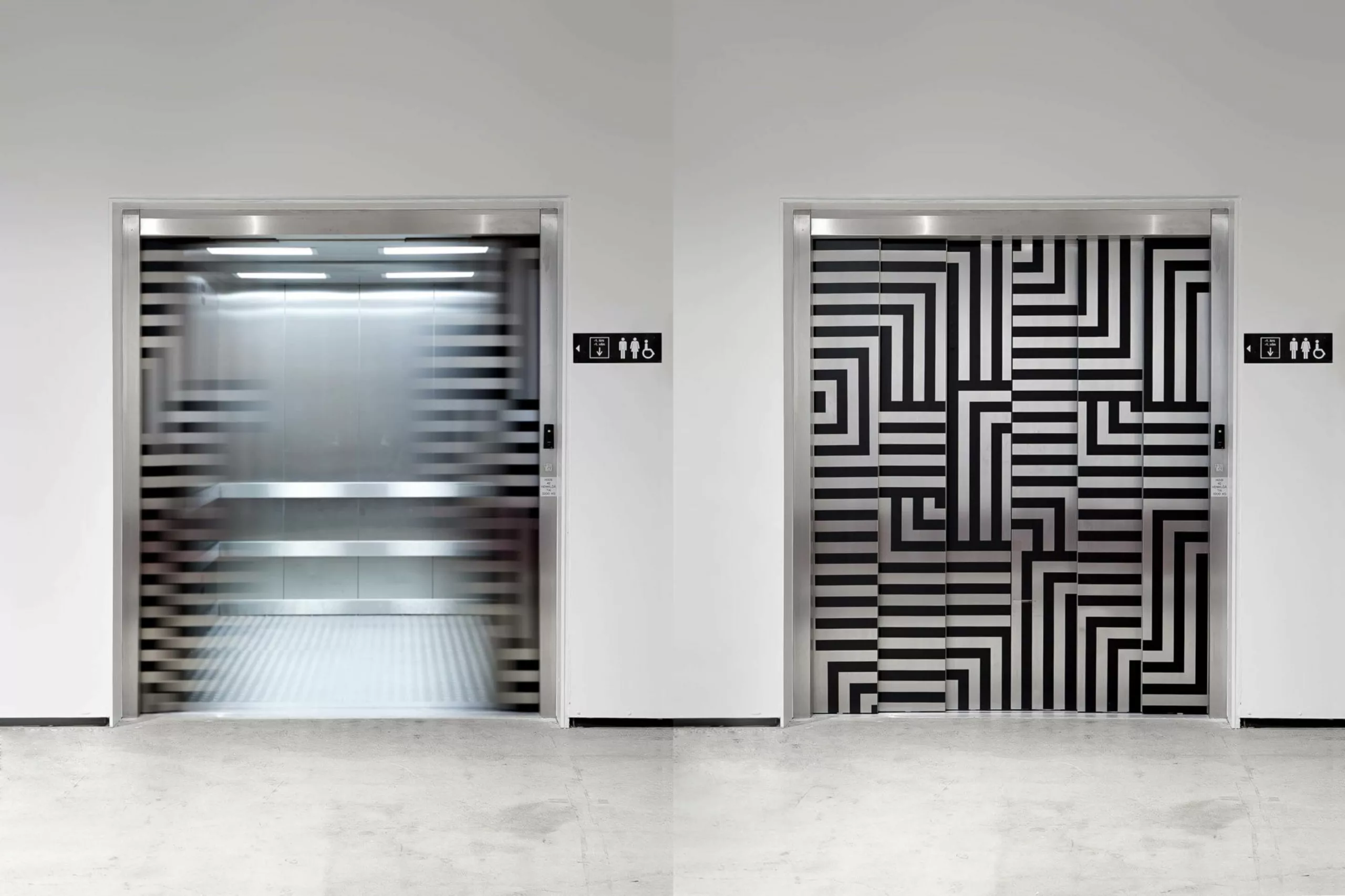
We can quote for example this work by the Finnish studio Werlig. For the blow, our example is easy, since it is a work for an exhibition Vasarely !
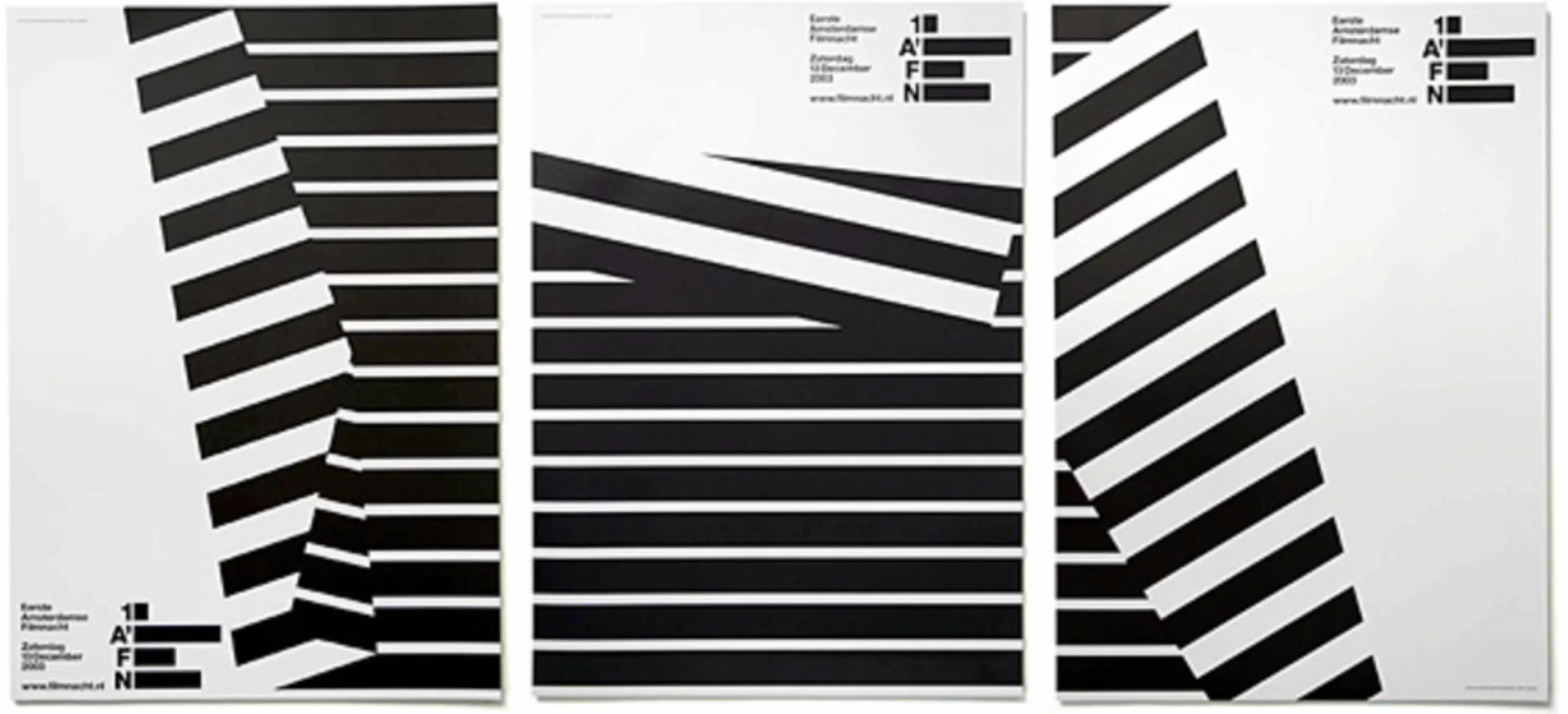
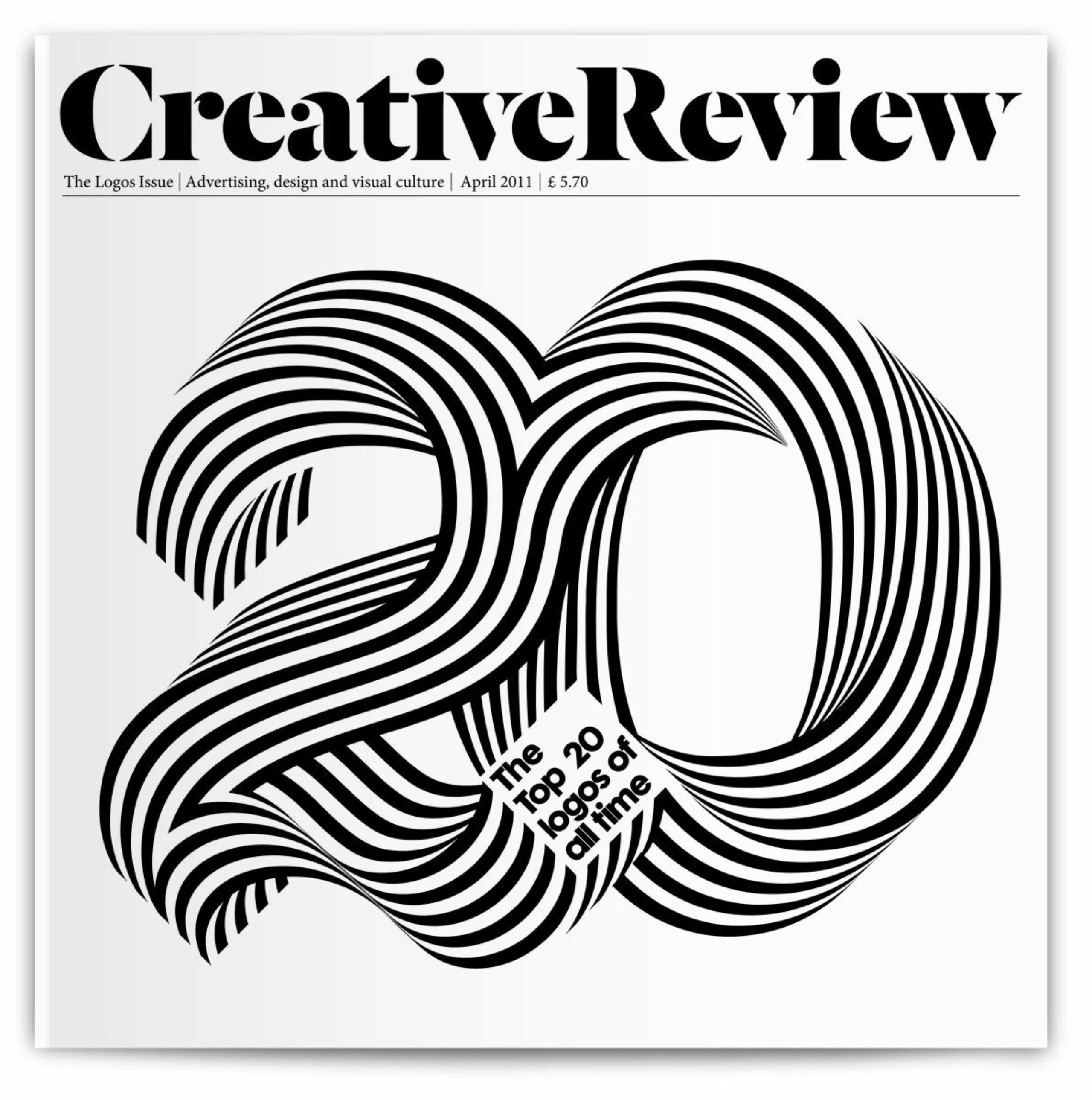
Below is a series of Experimental Jetset posters and a cover of Creative Review by Alex Trochut…
Two examples of contemporary projects that are totally Vasarelian!
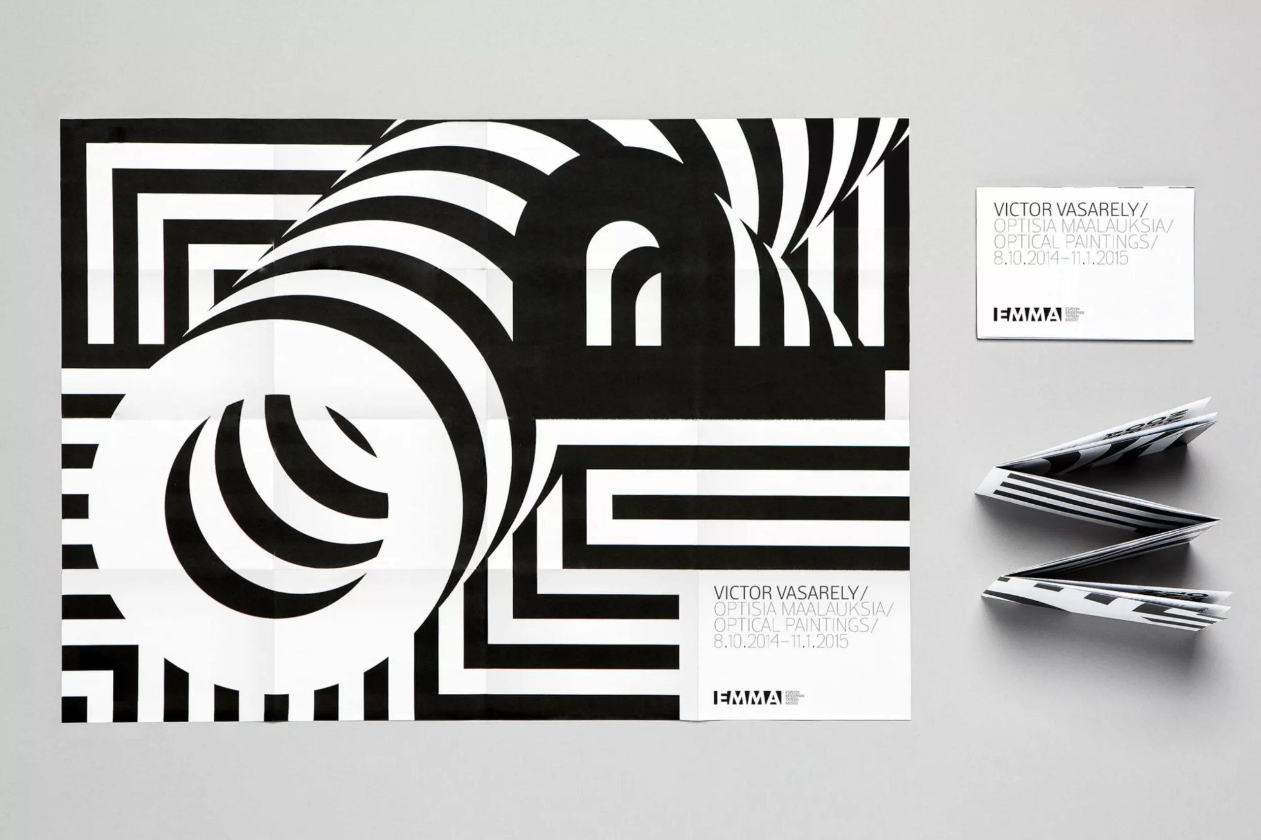
Vasarely exhibition
By the way, we inform you that you have 10 days left to visit the Vasarely exhibition at the Vouland museum in Avignon (until 6 November 2016). Nearby, you will also find the Vasarely Foundation in Aix-En-Provence. A must visit!
Sources:
- http://media.wix.com/ugd/80529a_589e161e799b4c98b5cf2858ecc7e235.pdf
- http://www.pierrevasarely.com/pressepdf/vas178.pdf
Thanks to the communication department of the Vouland museum in Avignon for its precious sources.
On the subject
-

3 questions to Joe La Pompe
Joe La Pompe analyzes the impact of digital and AI on creativity: more images, but no more originality. A lucid look to discover.
-

Heliophore, the animated paper
If Louis Dufay’s name has fallen into oblivion, one of his inventions will be remembered: the heliophore, the kinetic paper that shone in the 60s.
-
Luxury is going to drive the final in the coffin!
No mercy for Juste un Clou, the luxury bracelet that makes our skin crawl. From the 70s to today, a look at the evolution of the world of luxury.