San Serriffe typographic Island
Serif, make me laugh!
In 1977, the British newspaper The Guardian offered its readers an unexpected trip to a country as exotic as it was fanciful: San Serriffe. Published on April 1, this hoax became legendary for its skilful blend of subtle humor, geopolitical satire and refined typographical games.
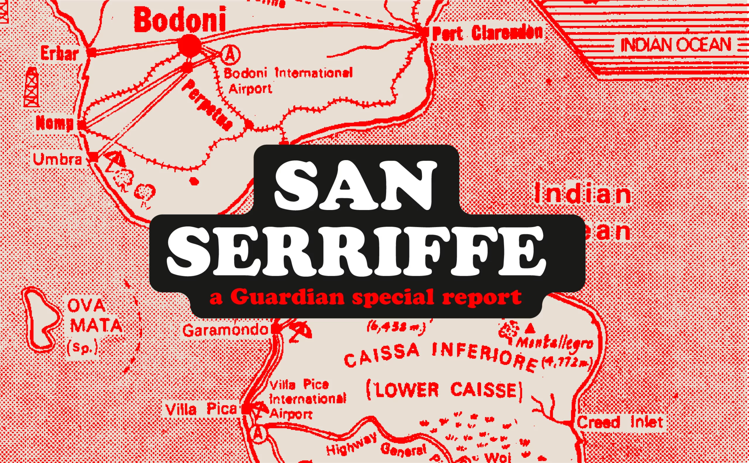
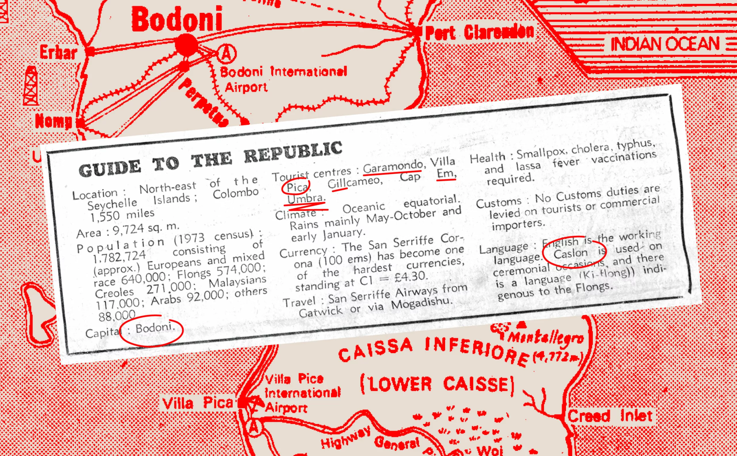
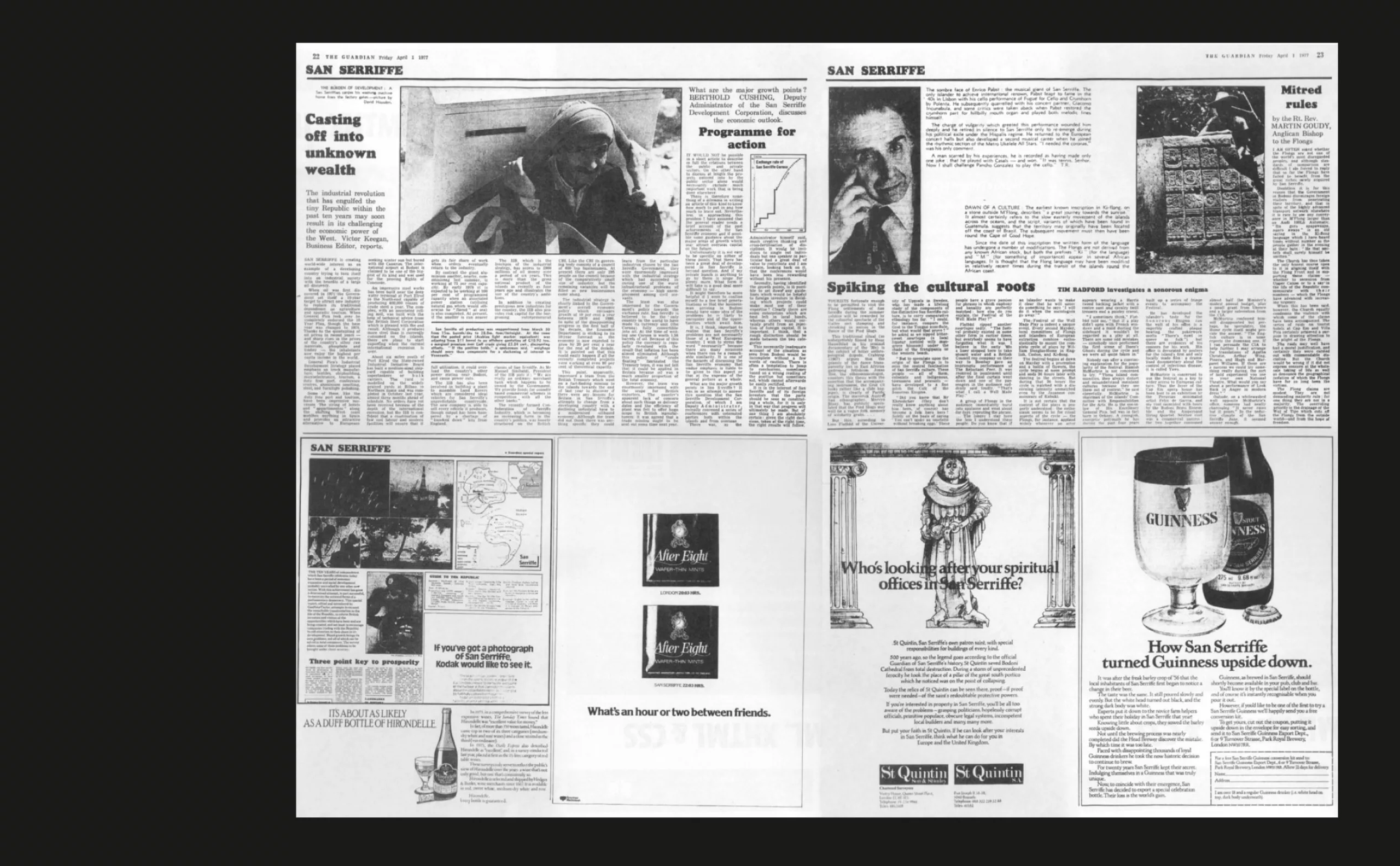
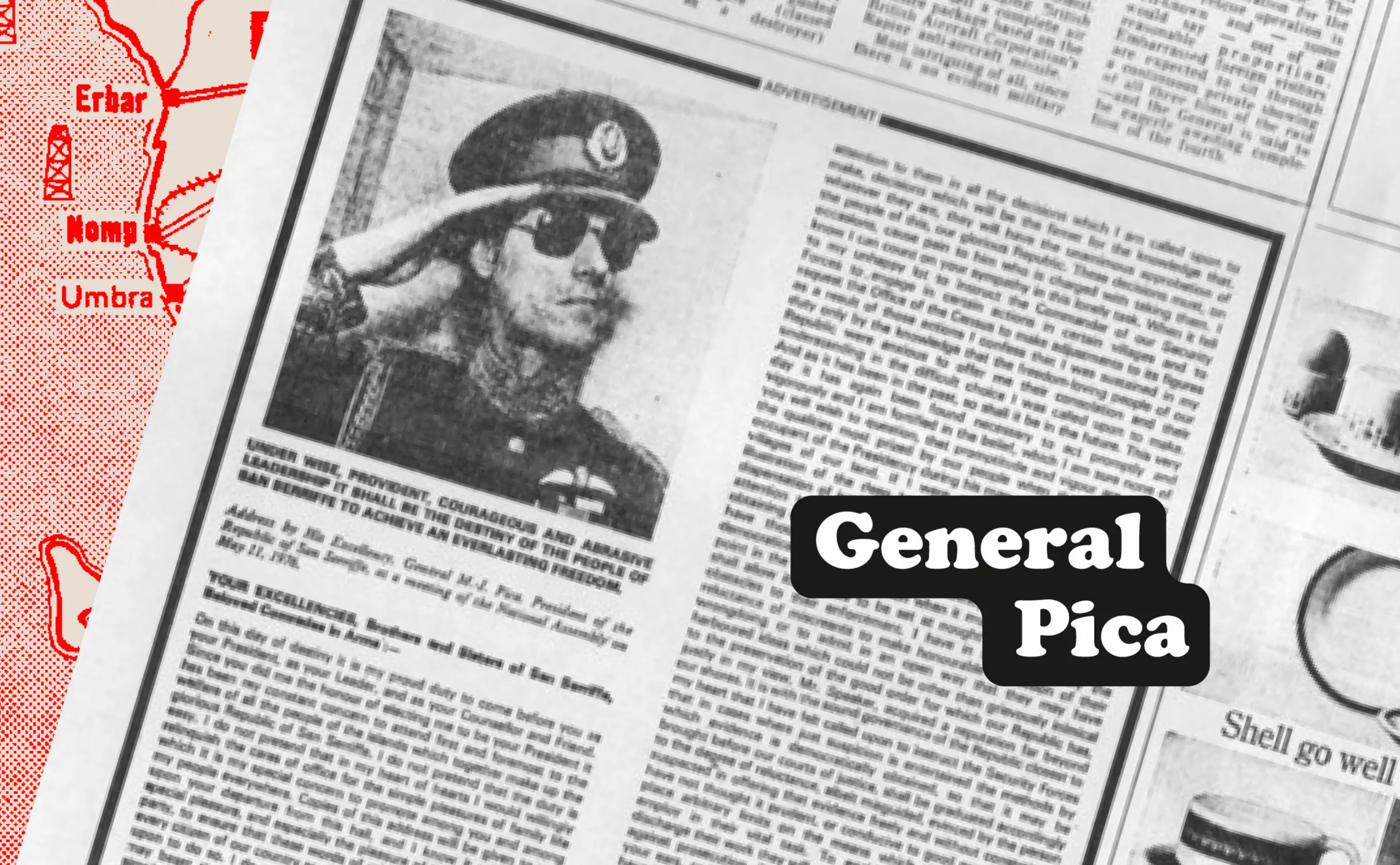
Imagined by journalist Philip Davies, San Serriffe was described as a republic somewhere in the Indian Ocean, made up of two main islands forming a semicolon. Everything about this fictional country was a subtle or explicit reference to the world of printing. Thus, the two islands were evocatively named “Upper Caisse” and “Lower Caisse” (upper and lower case in typography). This seemingly simple line of humor was intended to entertain readers, while at the same time giving a knowing wink to publishing professionals.
Le président fantoche de cette république imaginaire, le général Maria-Jesu Pica, renvoyait directement à une mesure typographique couramment utilisée, le point « pica », tandis que la capitale de San Serriffe se nommait « Bodoni », référence directe à la célèbre police d’écriture dessinée par Giambattista Bodoni. Le leader de l’opposition s’appelle “Ralph Baskerville“, la langue traditionnelle est le Caslon et le pays entier semblait ainsi gouverné par les règles strictes de la typographie, donnant au lecteur l’impression de parcourir un atlas imaginaire.
The typographic hoax of the century
At the time of the hoax, typographic jargon wasn’t as widespread as it is today, so many readers were fooled and reacted in the “letters to the editor” section, some even recounting their last vacation in San Serriffe. Even the advertisers of the time were invited to write about the country in the newspaper. At the time, the editorial staff was also receiving letters of complaint from tour operators and airlines, who found themselves at a loss when faced with customers who didn’t want to believe in the fictional nature of the archipelago. Too much!
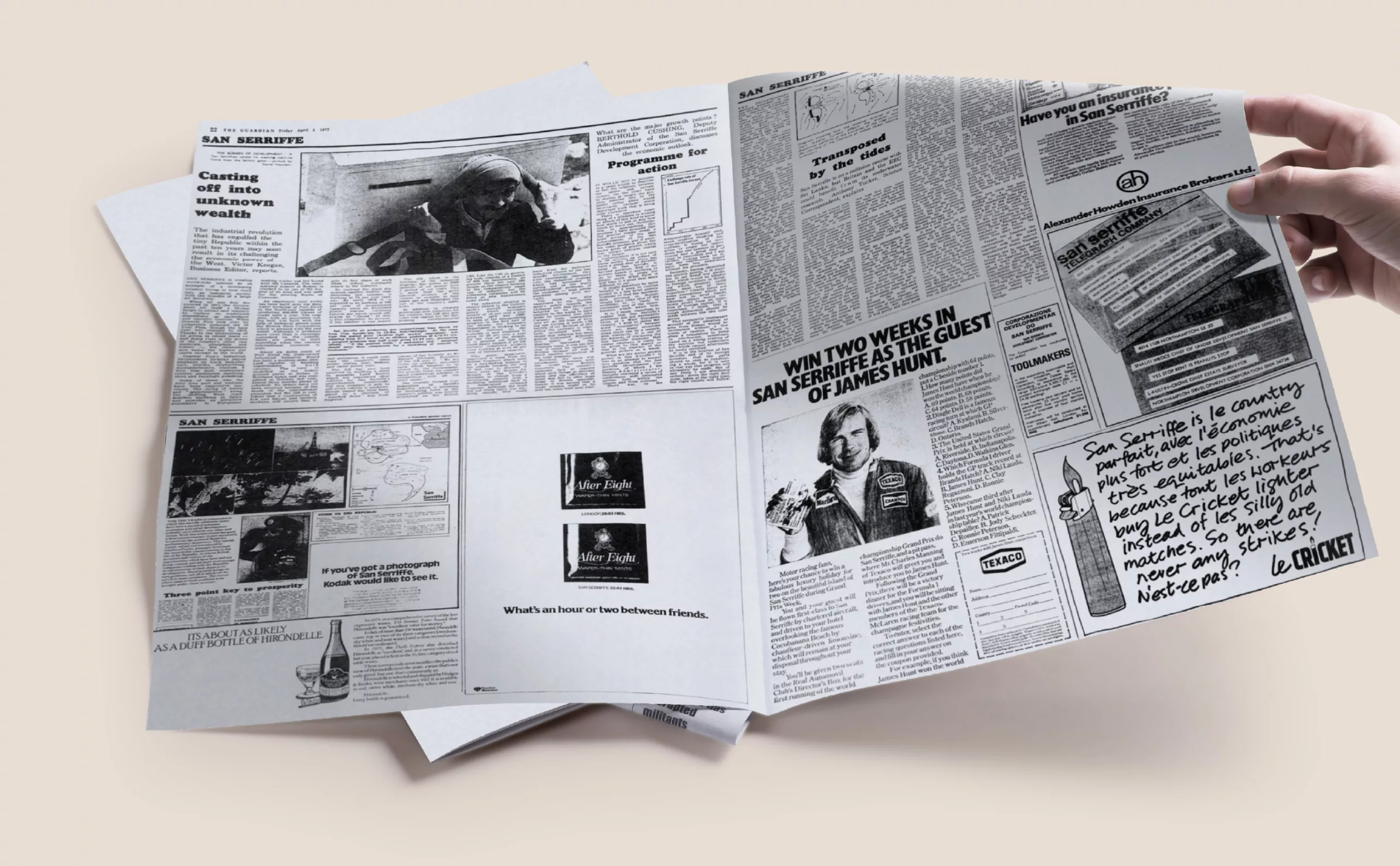
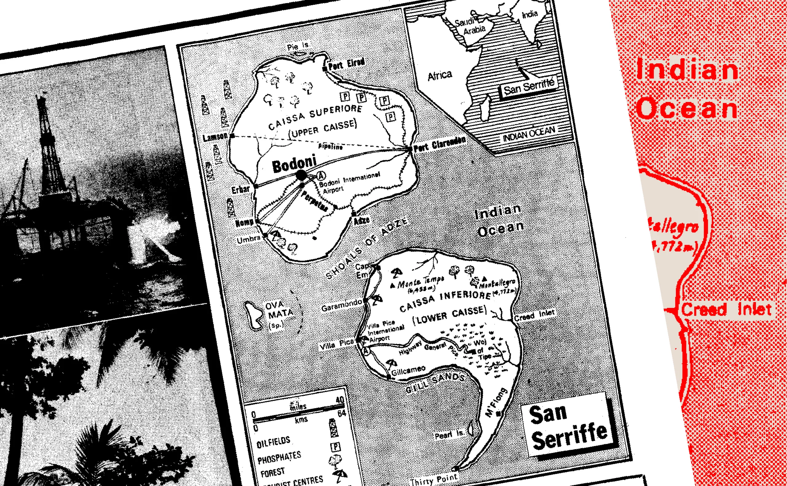
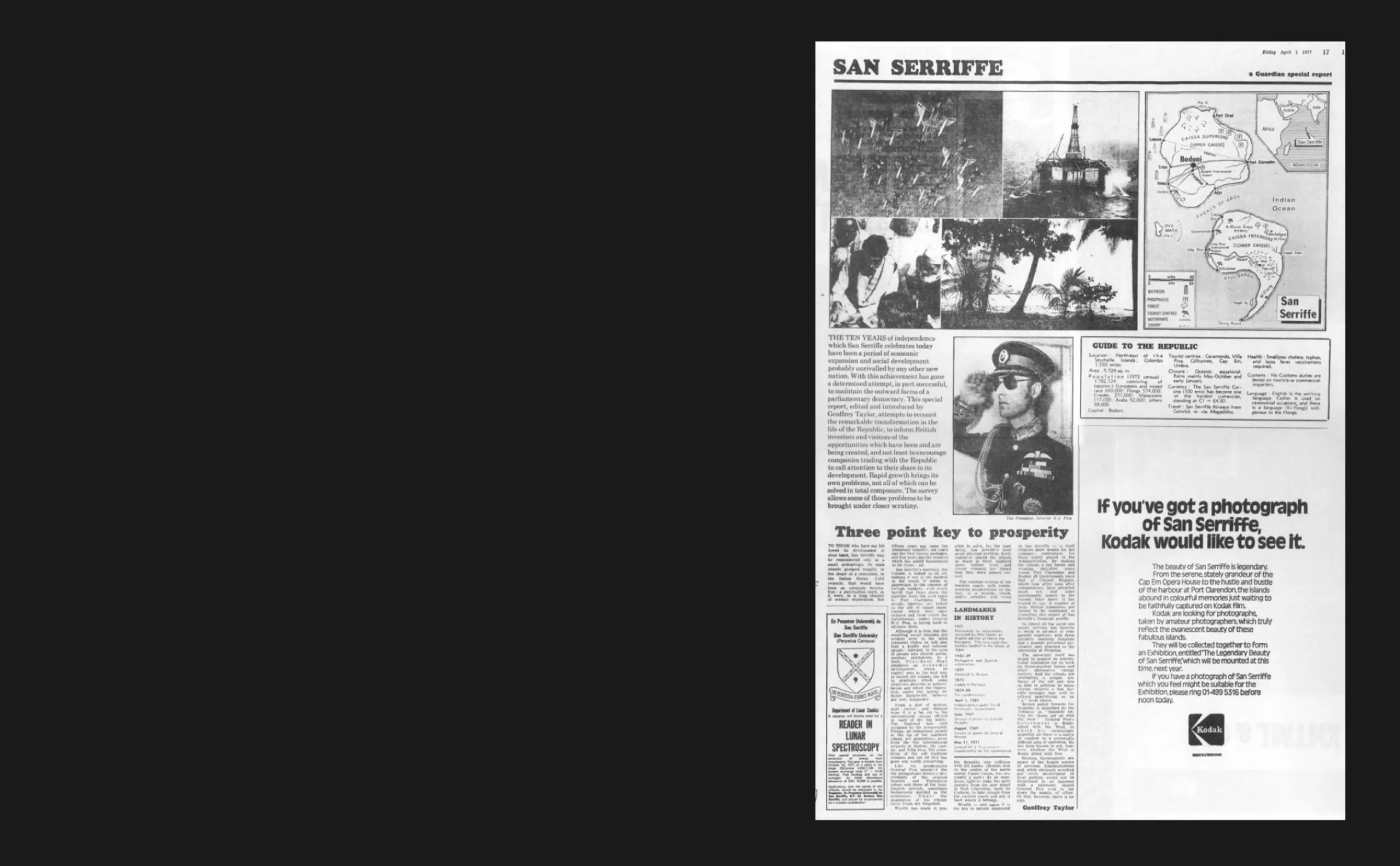
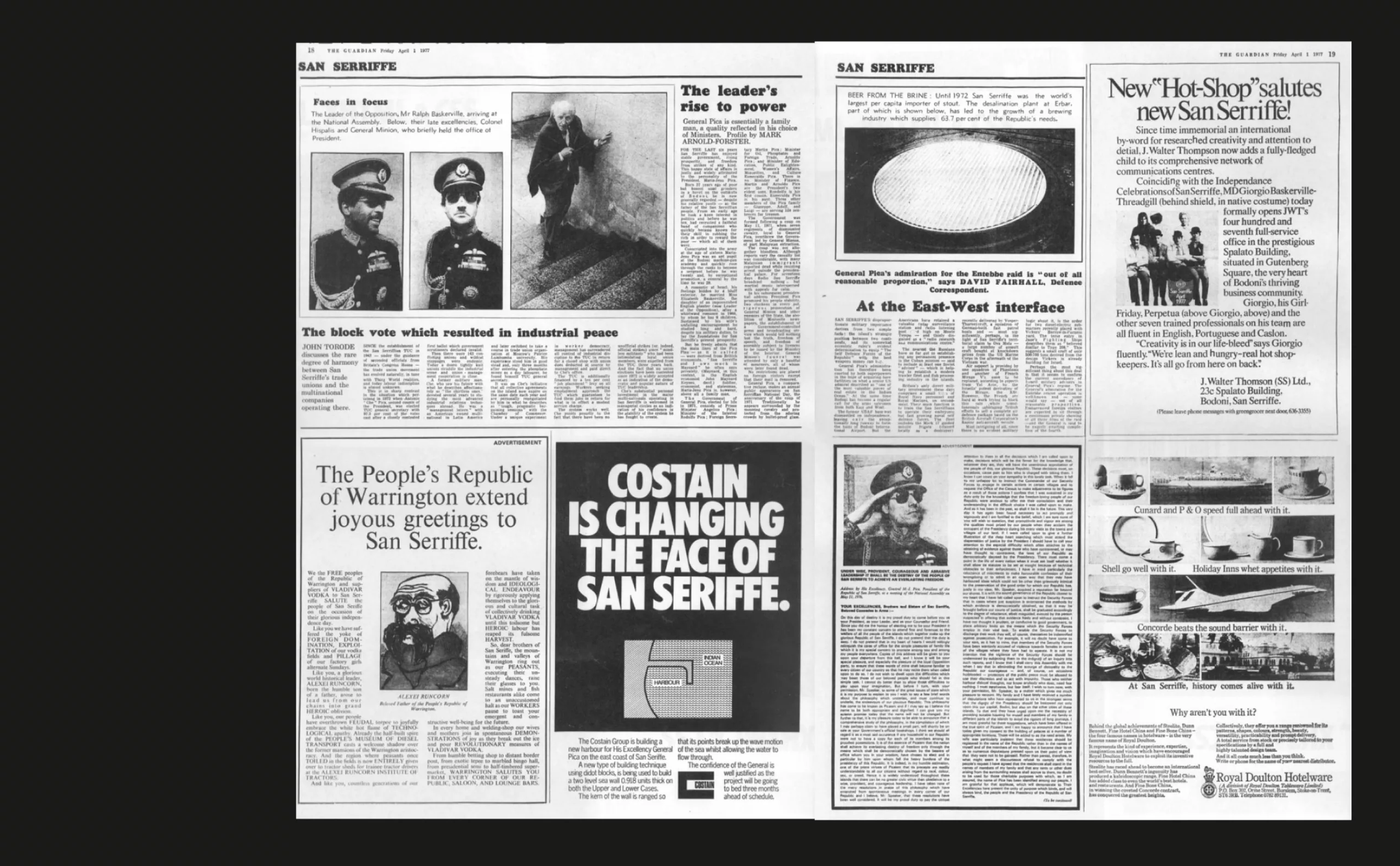
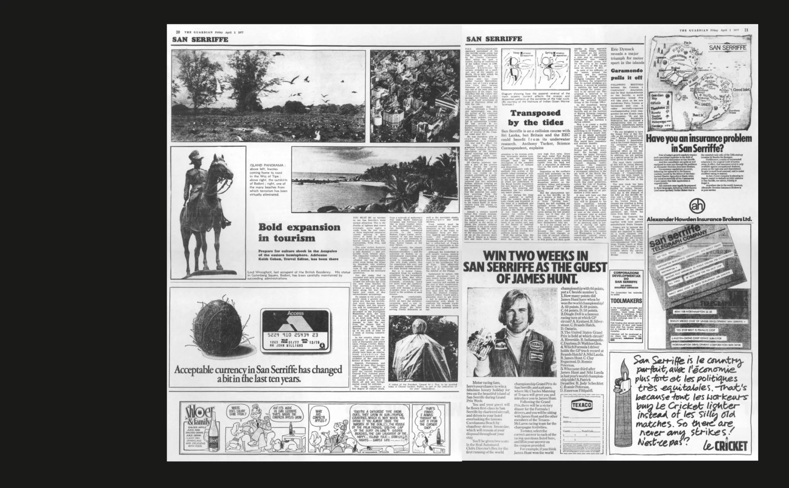
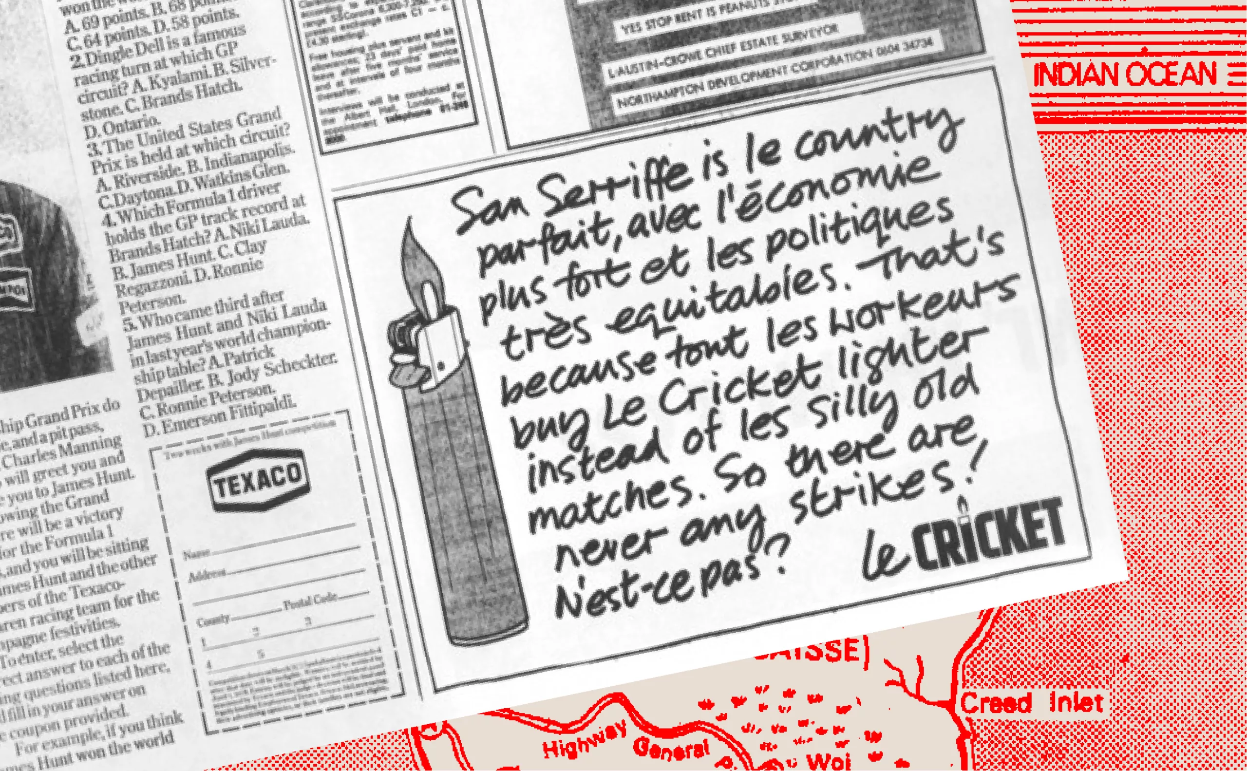
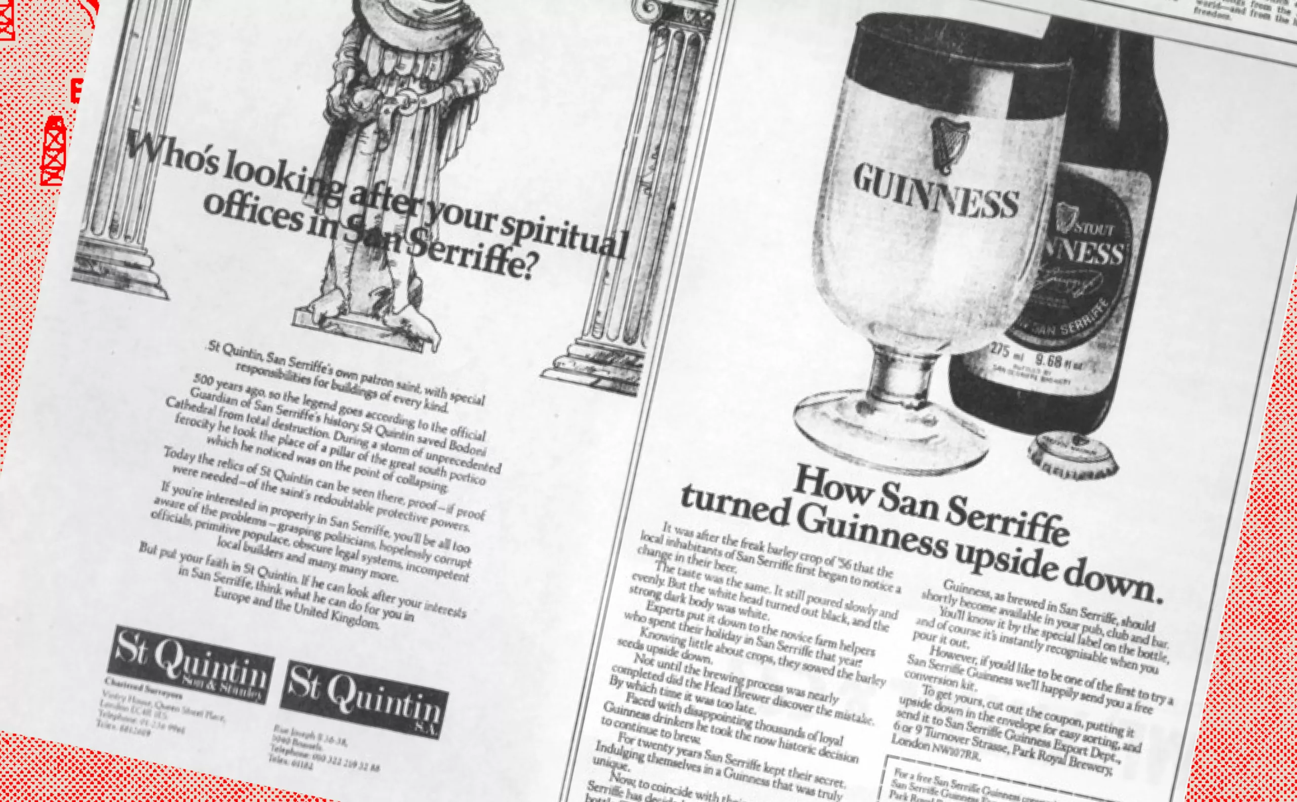
To reinforce the credibility of this joke, The Guardian had put together a complete dossier, worthy of a true journalistic investigation. The publication included a detailed map of the islands, a description of the local geography, politics, economy and even the cultural customs of the San Serriffians. Genuine advertisers had also played along, placing ads in the paper touting heavenly vacations in San Serriffe, further reinforcing the illusion. Such was the realism of the whole thing that many readers were tricked into believing in the real existence of this tropical paradise, even booking their vacations on these mysterious islands.
Initially, the idea was to place the island in the Atlantic Ocean, near Tenerife, but following the crash of a Boeing in Tenerife a few days before publication, it was moved to the Indian Ocean , near the Seychelles. This hoax has become such a classic that subscribers to The Guardian have long been able to choose “San Serriffe” as their country of origin when registering on the newspaper’s website.
Fake news before its time
The choice of typography as the central theme was not insignificant: it also represented a critique of the public’s credulity in the face of information, and a subtle reminder of the importance of verifying sources in a world where information circulates rapidly, and the boundaries between fiction and reality become permeable. Today, San Serriffe has become emblematic in the history of journalism, often cited as the perfect example of a successful April Fool’s joke. It bears witness to a time when the printed newspaper still held the exclusive power to inform, entertain and amaze its audience.
The San Serriffe phenomenon is also representative of the importance of graphics and design in the construction of a credible story. Attention to graphic detail, such as the creation of a realistic map and perfectly integrated advertisements, underlines the influence of typography and editorial design in the reader’s perception. What appeared to be a typographic joke became a lesson in the power of design and how it shapes our perceptions and beliefs.
Almost 50 years on, this April Fool’s joke continues to inspire us, reminding us how thin the line is between the real and the imaginary, and how crucial it is to keep a critical eye on the information we receive on a daily basis. As for the rest, let’s have fun!
On the subject
-
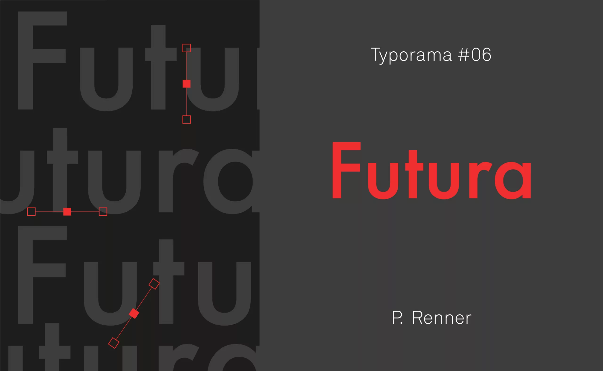
Typorama #06 : Futura by Paul Renner
From the Nazis to the moon, Futura is probably the most used typeface in the world, and yet it’s not new!
-
Stereotypography: typical, even racist, typefaces
Used mechanically and out of context, certain typographies convey cultural stereotypes. We call them “stereotypographies”.