Happy Helvetica to you!
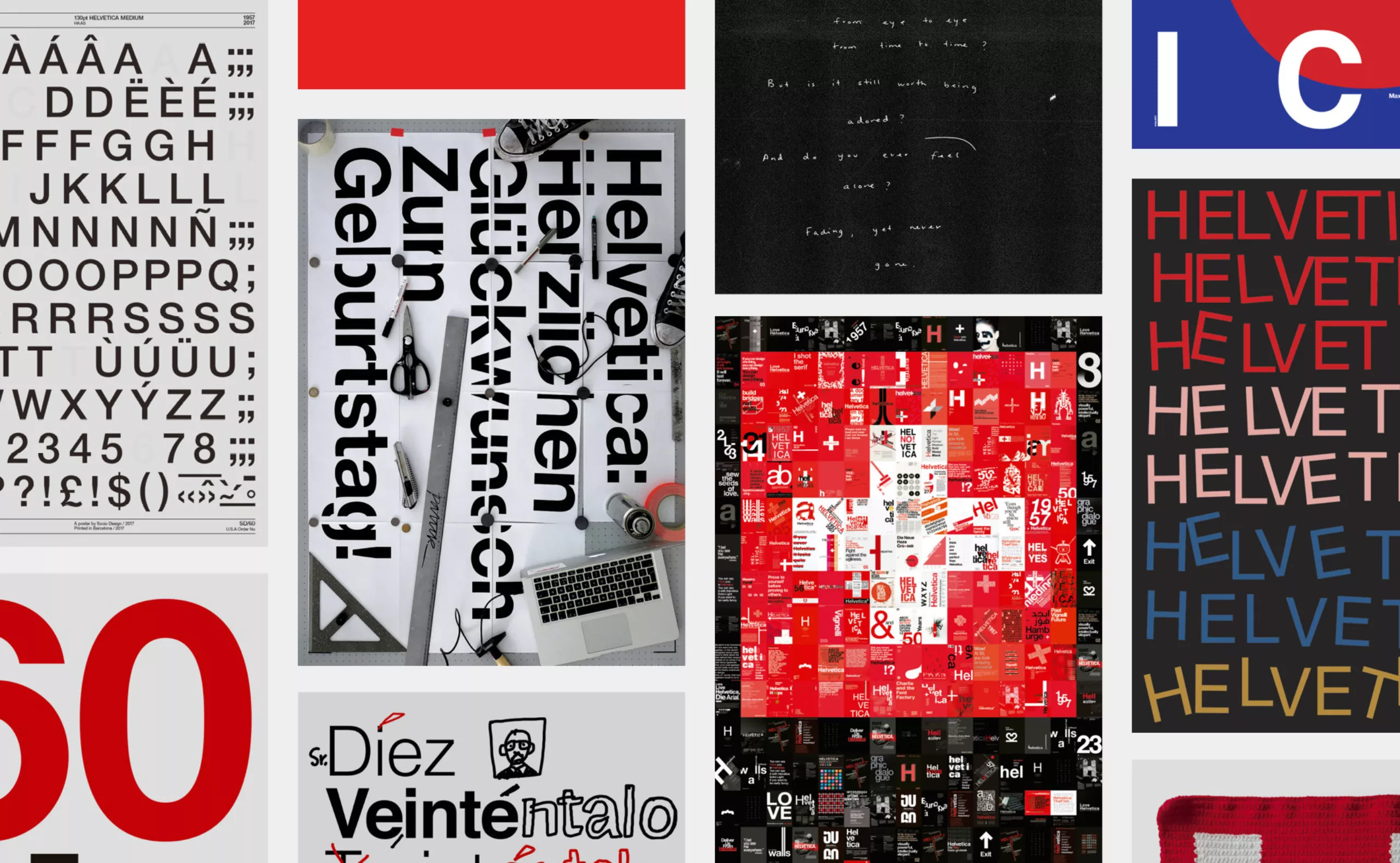
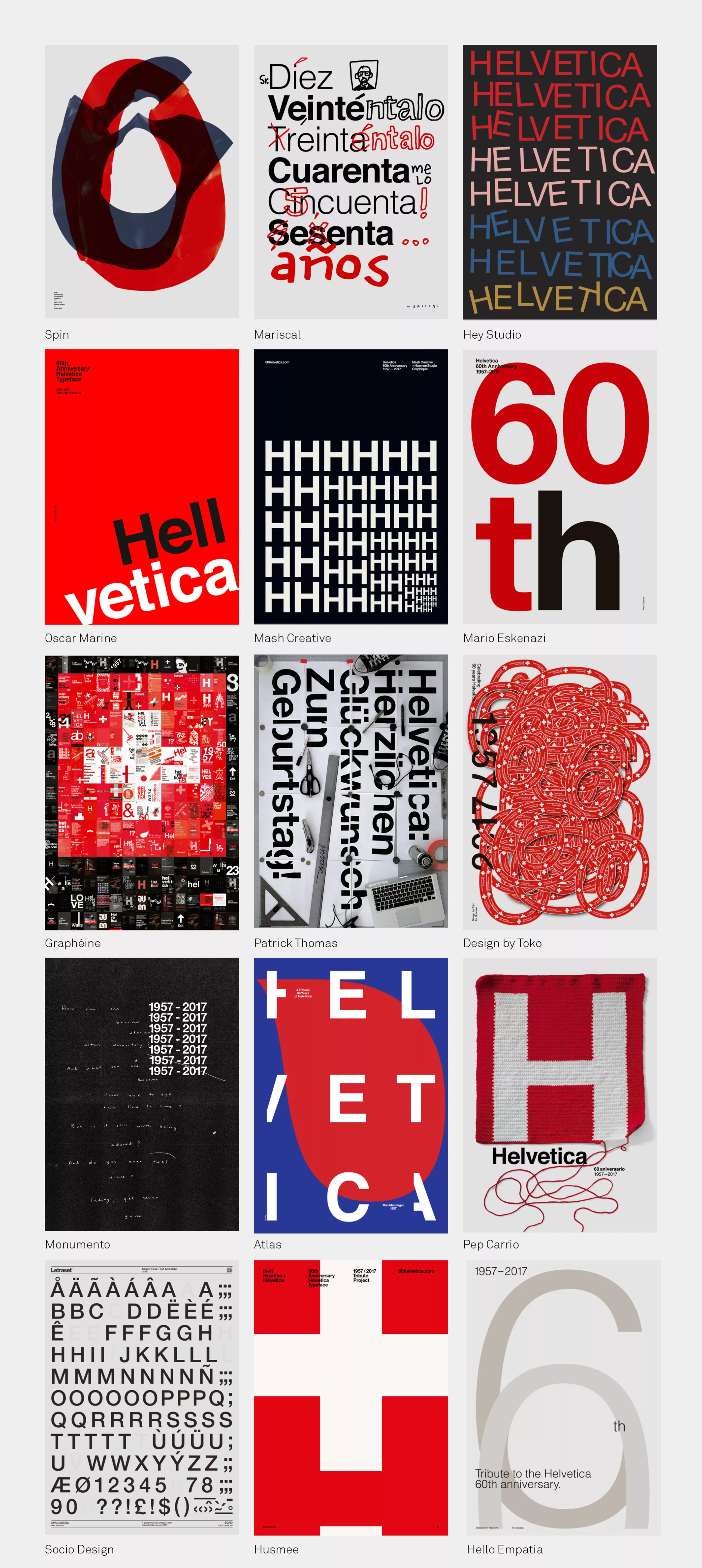
To celebrate the 60 years of the creation of the typography Helvetica by Max Miedinger (with the help of Eduard Hoffmann, almost always forgotten), the spanish studio Husmee invited a selection of international studios to create a tribute poster. A total carte blanche, leaving every designer the opportunity to express his/her love, perception, or even distrust for this universal character. As a result, some twenty posters, including ours.
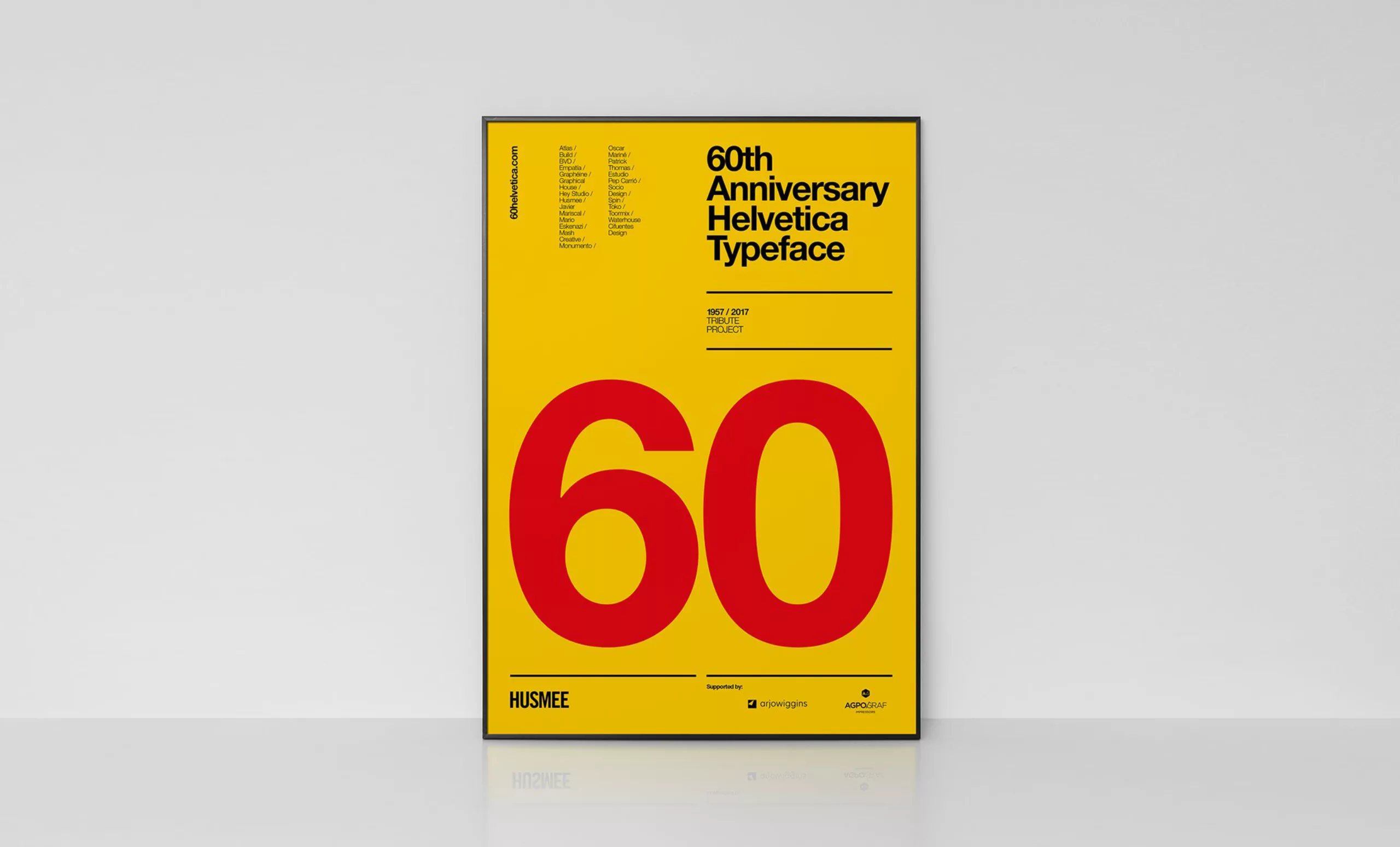
It is known that Miedinger & Hoffmann wanted to create the most harmonious font, from an optical point of view. Classified as a linear font (sans serif), Helvetica has conquered the entire planet and have been seen for over 60 years in streets, magazines, advertising, on clothes and so on. Husmee’s initiative is definitely a well-deserved tribute to a monument of typography, so often imitated but never equalled!
Check out all the posters on: http://60helvetica.com
Here’s a selection:
Our tribute
Tribute is a tough exercice. It is, to us, to avoid stereotypes and to propose an original and personal point of view, as the one we’d made for the Massimo Vignelli tribute a few months ago. For Helvetica, our answer is both an homage and a criticism.
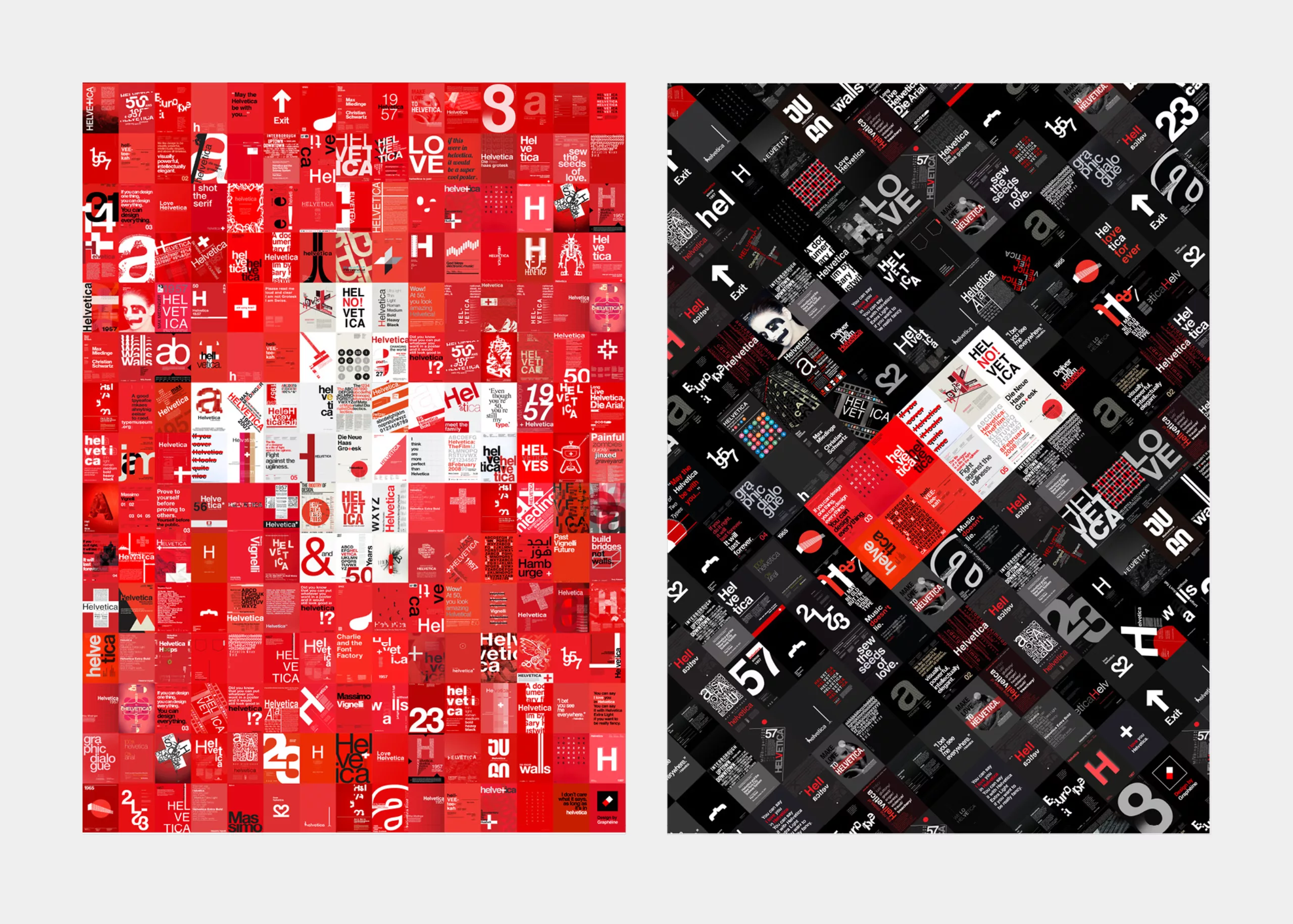
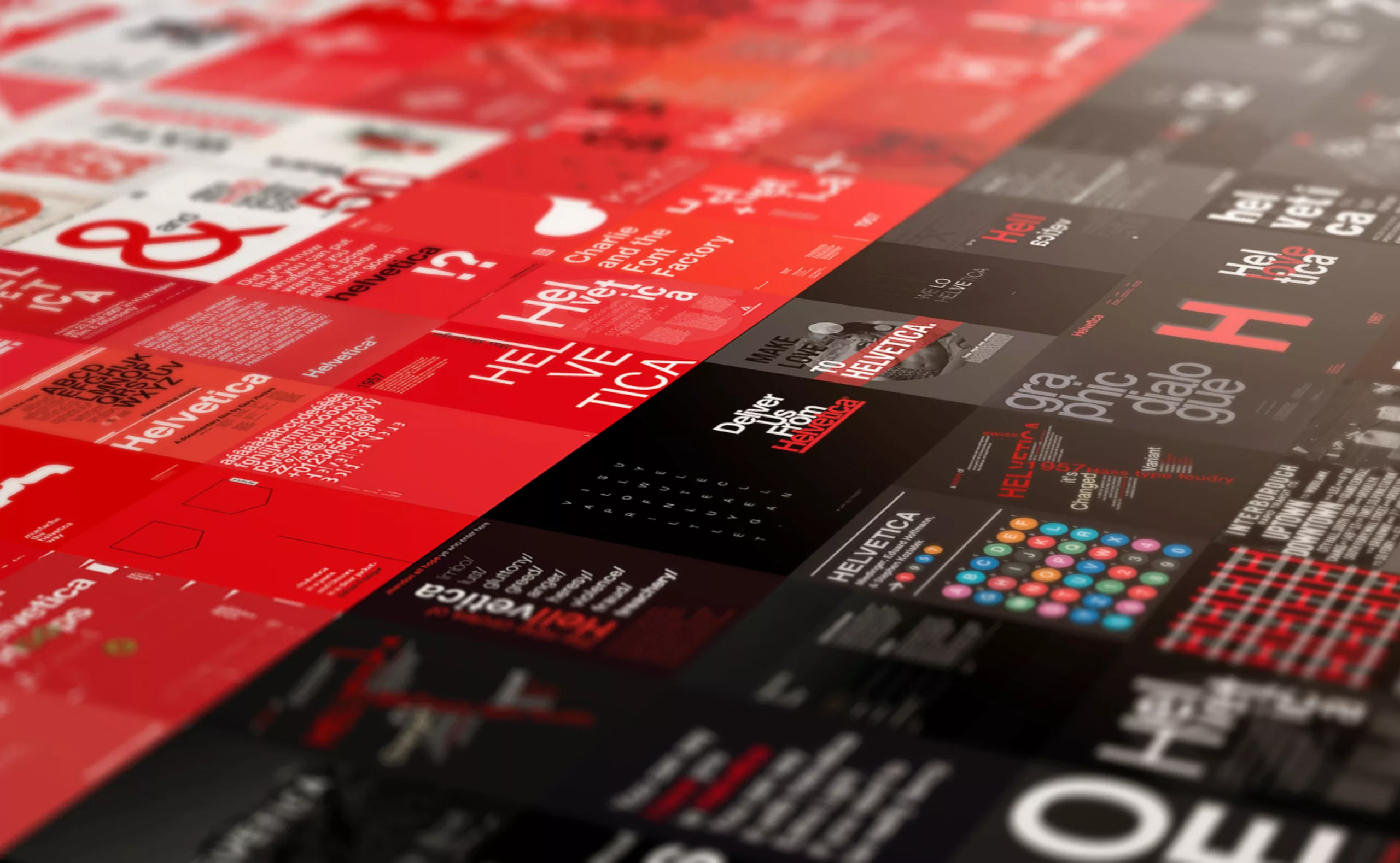
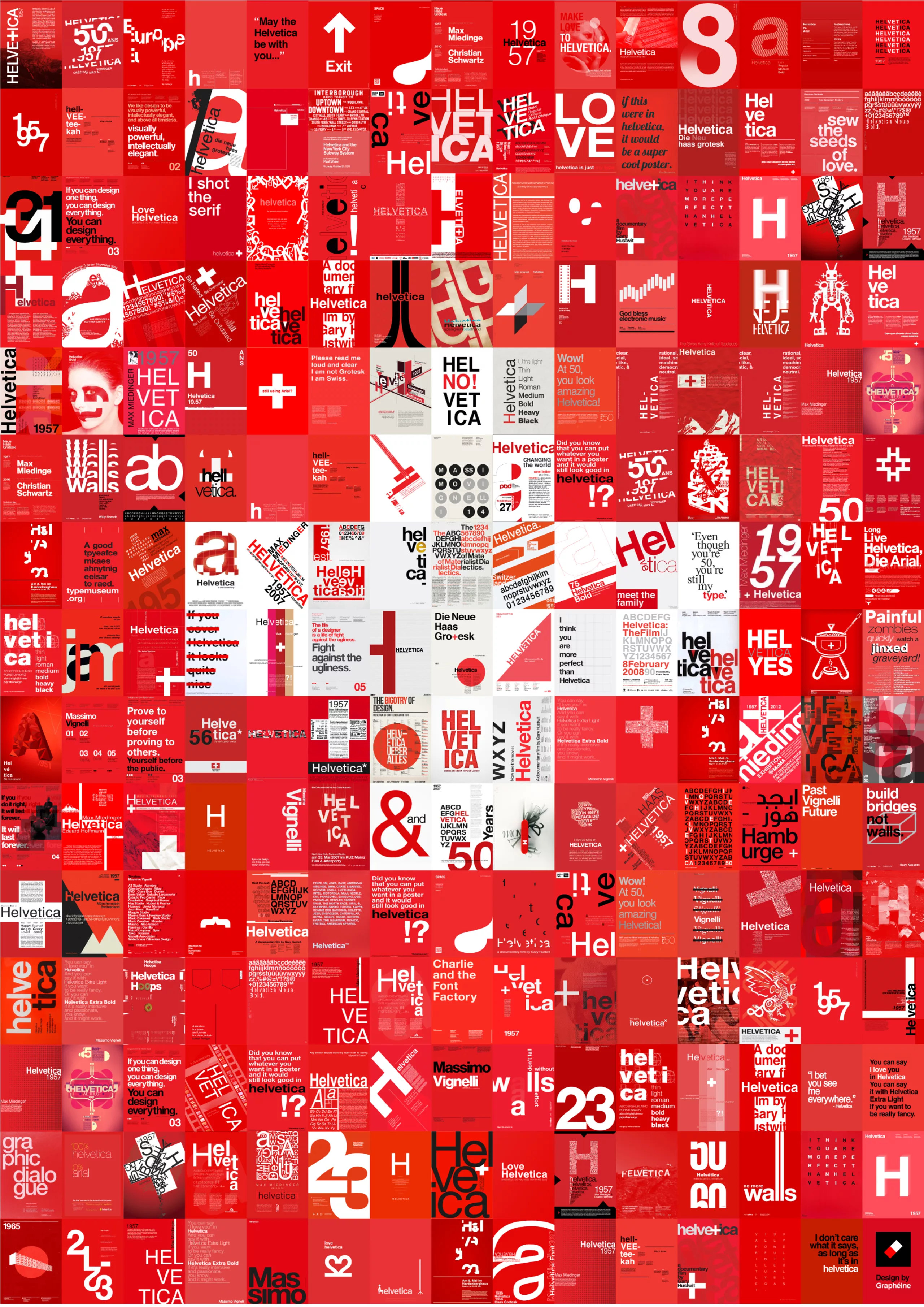
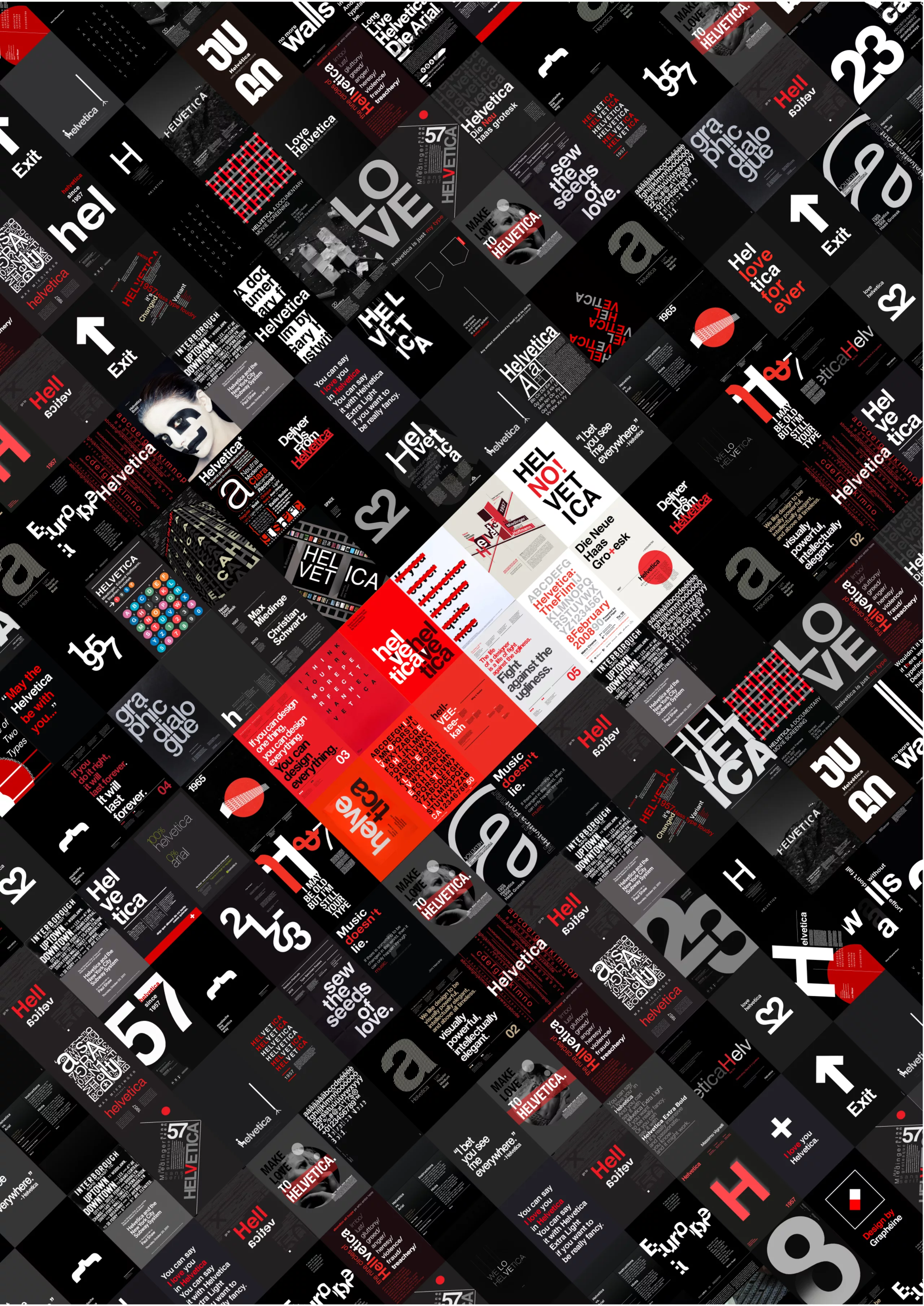
A homage since we present the massive influence of this font through a selection of “225 tribute-posters”, among the hundreds of existing posters. This type of poster that graphic designers are especially fond of.
But it’s also a critique, that starts with the simple observation of the “red, white, black” color trilogy. Helvetica is obviously associated to the international style (Swiss style), indeed it’s one of the main origins, but the observation is a form of sterile standardization. Hundreds of posters, most of which are copied and pasted. And that’s exactly what we’ve done to design this poster. In French, the expression “une réponse du berger à la bergère” (literally: “an answer from the from the shepherd to the shepherdess“) stands well for our poster concept: we speak frankly, we criticize, but basically “we’ve kept the sheep together for over 60 years!”.
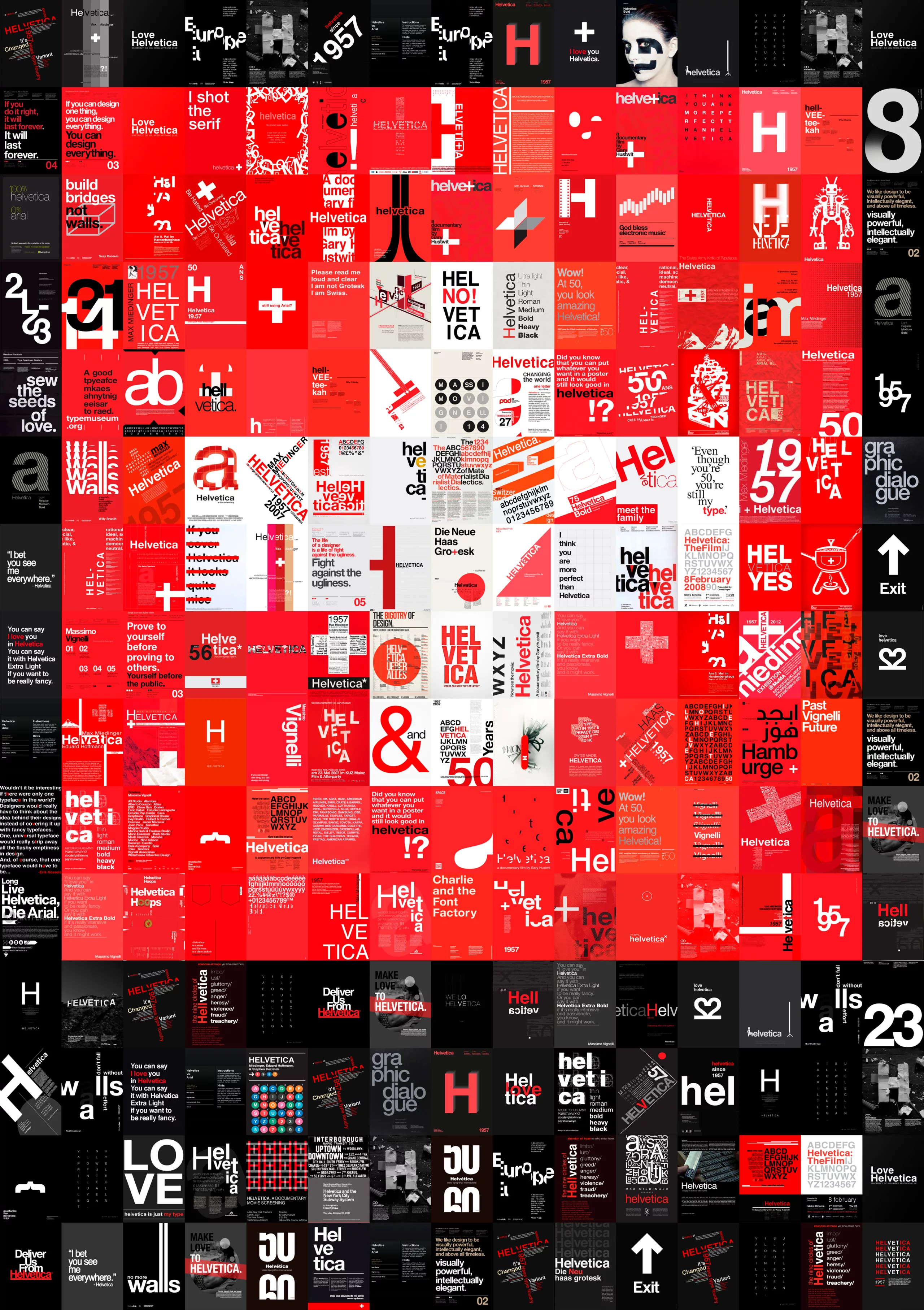
At first we had thought of presenting two posters, but in order to respect the “one poster per studio tribute concept”, we went only on one visual. In the images shown below, the swiss cross and the Graphéine pill can be seen as “+” and “-“, as well as “a shepherd and a shepherdess”…
The Helvetica protocol
A few years ago, we’d told you about our visit of the Museum of the Printing of Basel (Switzerland) in an article on this blog. We’d then discovered the “Helvetica protocol”, in the shape of a notebook containing the studies that led to the final design of the typeface. Here’s an excerpt of our article:
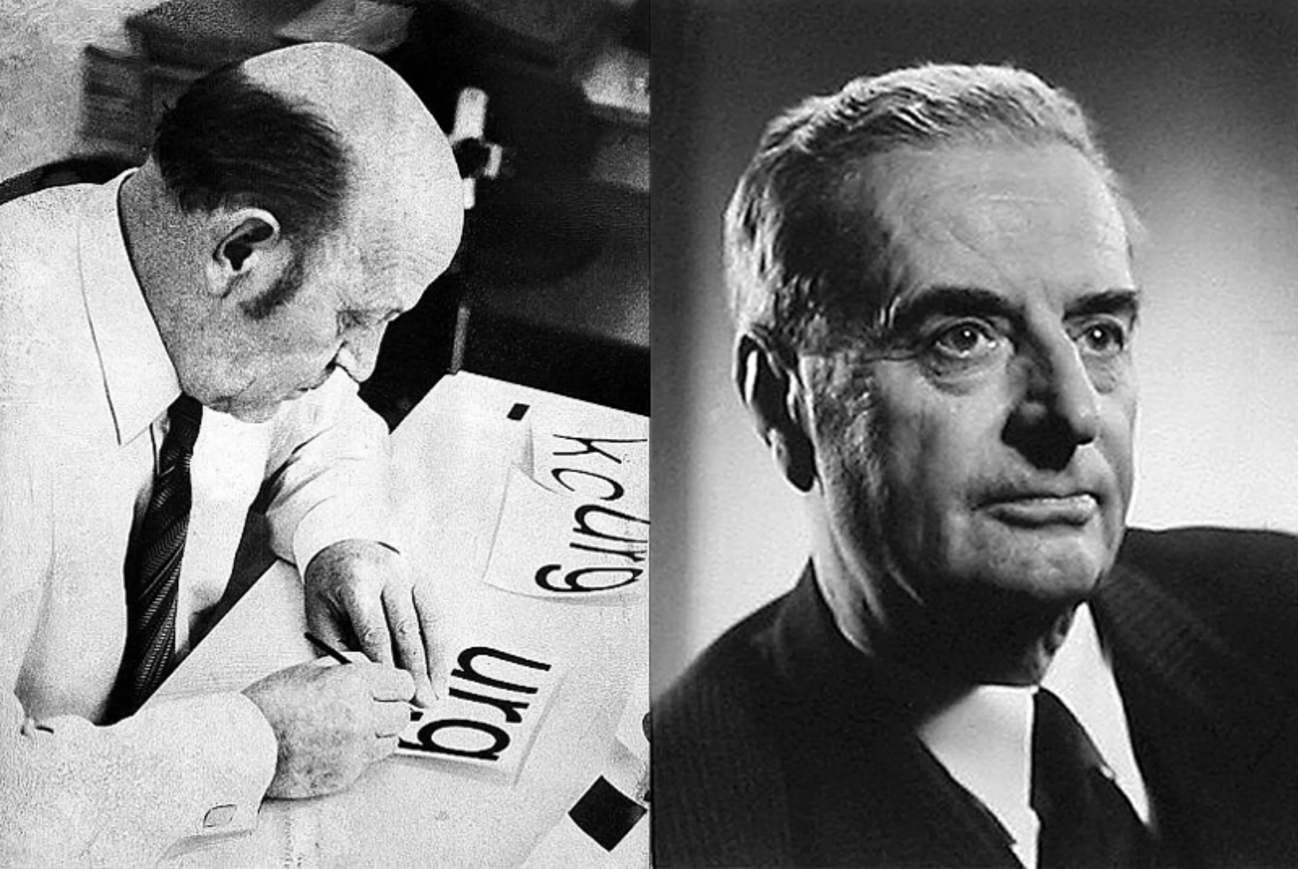
In 1956, Eduard Hoffmann (1892-1980), director of the Haas Character Foundry in Münchenstein, commissioned the Zurich graphic designer Max A. Miedinger (1910-1980) to create a new grotesque typeface without serif.
Indeed, at that time, the Haas foundry was loosing sale volume on its sans serif fonts (“Grotesk” in German). These fonts were probably less modern than those of its competitors, as the Akzidenz-Grotesk of the Berthold Foundry, widely used in the swiss graphic design industry (cf: international style).
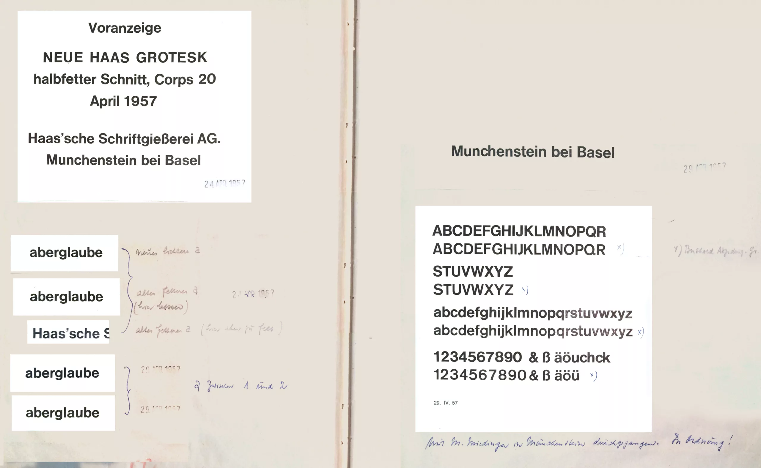
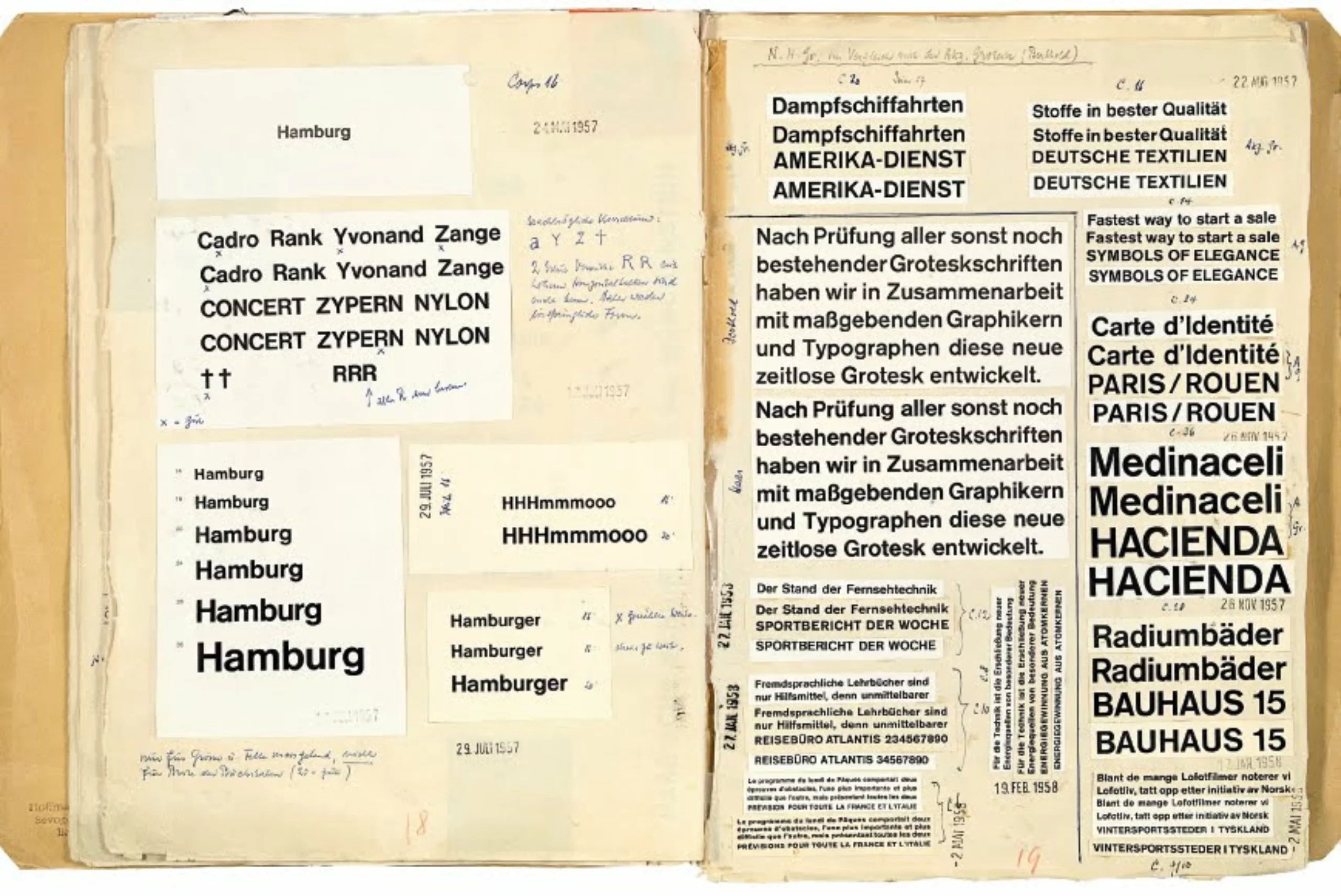
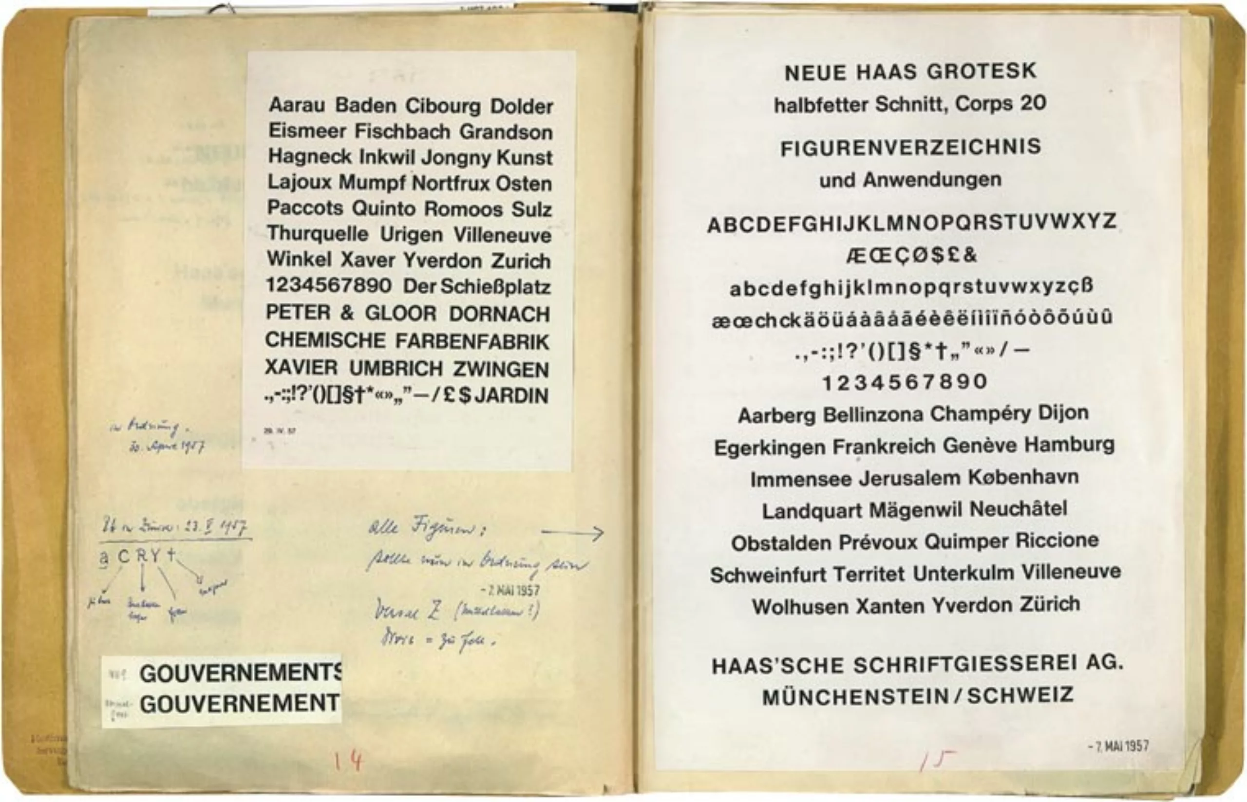
The works on the “Neue Haas Grotesk” began in the early fall of 1956. Eduard Hoffmann-Feer, director of the Foundry, carefully saved in a notebook the different stages of creation of Helvetica. He reported then, step by step, with print samples, the slightest changes made in each letter and the whole range of possible combinations of characters. This unique document provides a detailed overview of the development of Helvetica.
Under the name “Neue Hass-Grotesk” the font was presented for the first time at the International Exhibition “Graphic 57” in Lausanne, with great success. The font matched perfectly with the “swiss typography” style, that at the time was receiving a great international resonance. For marketing reasons, the name was changed to “Helvetica”.
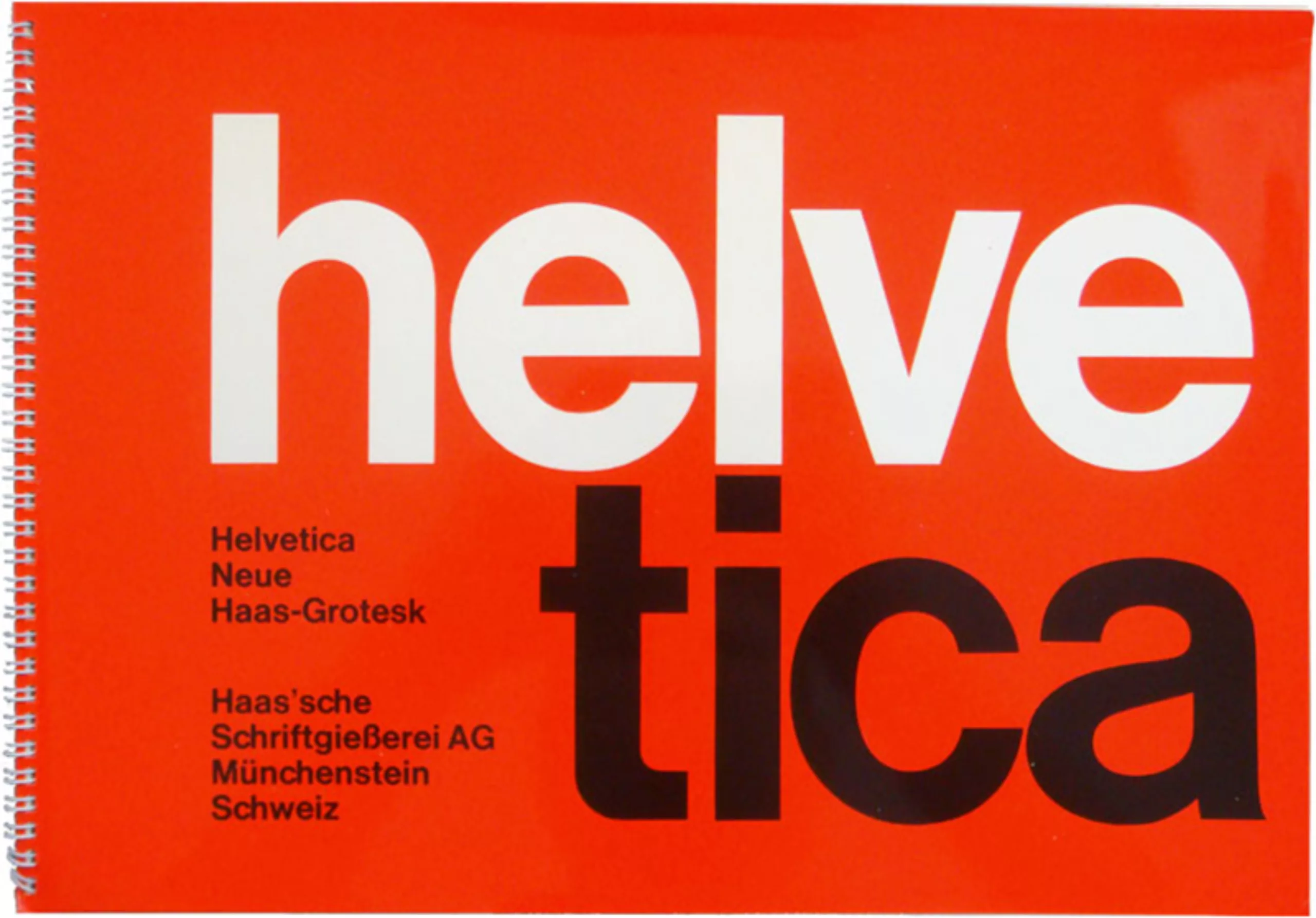
The success of this font was largely attributed to Miedinger. Of course he was the one with the pencil! But Hoffmann’s credit shouldn’t be underestimated. Indeed, his knowledge of the market and clients was truly essential to this brilliant success.
The worldwide success of Helvetica has remained unchanged to date. It is by far the best sold font and it is today available in 110 versions. And obviously, the Helvetica font can be seen in thousands of logos throughout the world… Here are some of the best known:

To read the full article.
On the subject
-
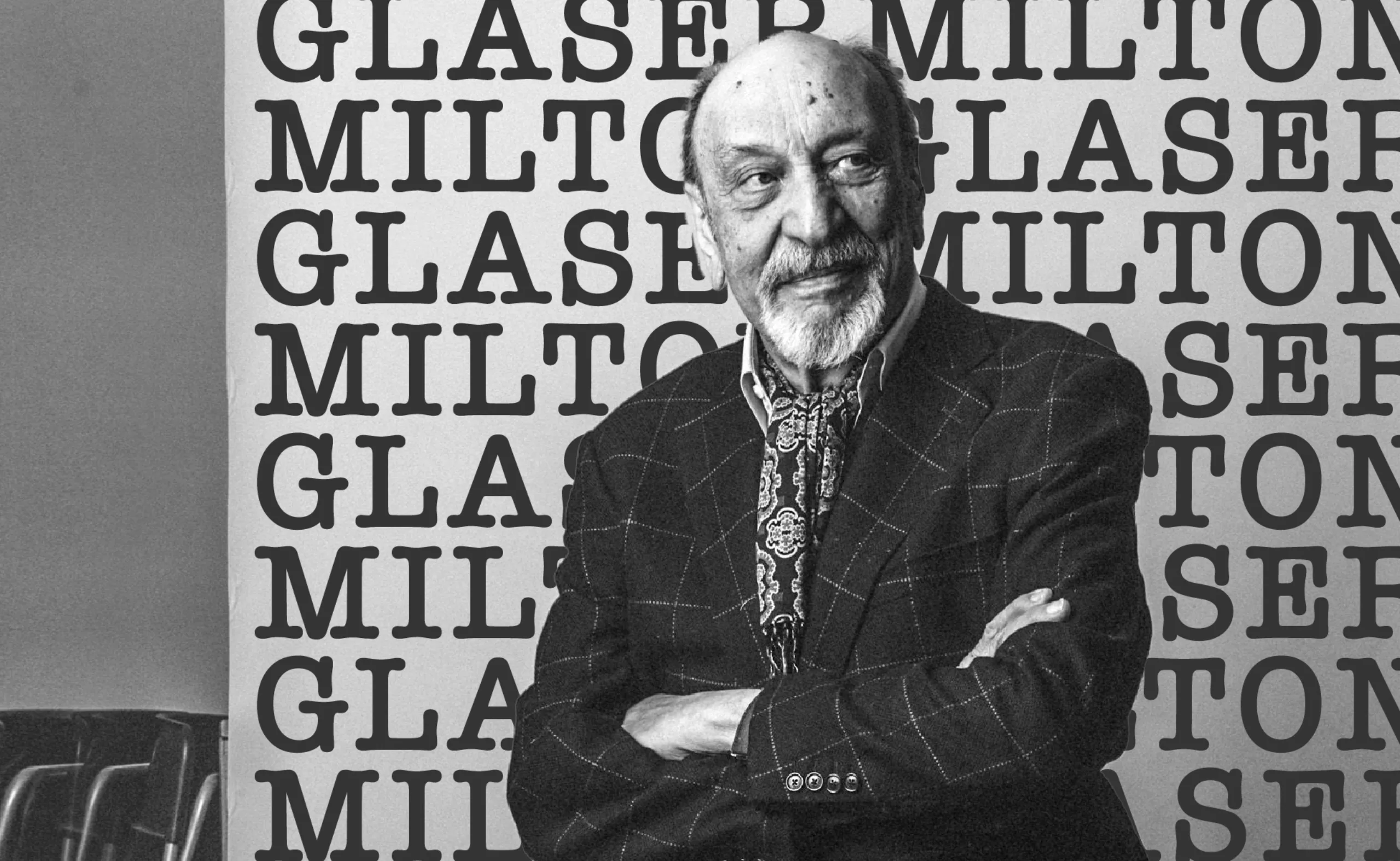
We ❤️ Milton Glaser !
Graphic designer Milton Glaser gave the 70s and 80s a cheerful and colourful face and New York a reason to love him. Among his most famous creations are the logo “I ❤ NY” and Bob Dylan’s psychedelic poster. Let’s go into the history of a very, very big name in American design.
-

Uber’s new visual identity doesn’t transport anyone!
Uber has chosen to go for a logo that doesn’t make waves, is neutral and anything but singular. In short, a visual identity that transports no one!
-
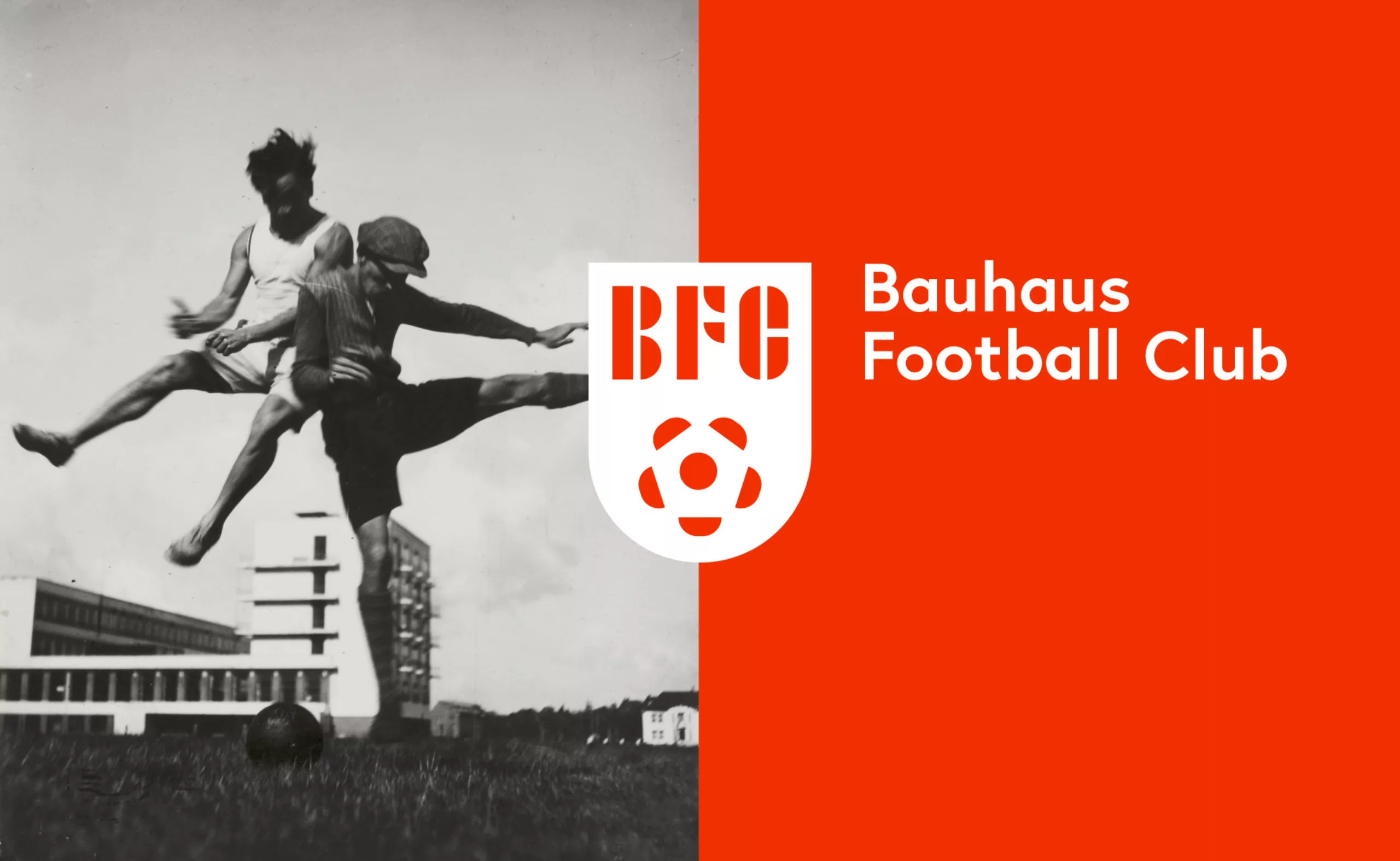
Bauhaus Football Club, the greatest design team of all time!
The Bauhaus Football Club, the story of the most beautiful design team in the world.
When the football world cup is a pretext to revise your classics…