Uber’s new visual identity doesn’t transport anyone!
Launched in 2009, Uber needs no introduction. With over 15 million rides per day, the transportation platform has become a must-have. It is also known for having sadly inspired the term “Uberization“! Today, Uber unveils its new logo.
There is hope
With a presence in over 660 cities worldwide and 65 countries, Uber had to adopt an international communication style that was clear and recognizable across all cultures and languages.
Surprisingly, in 2016, Uber’s logo had already been rebranded internally with a “fatter”, more imposing new identity, embroidering a story around bits and atoms. A slightly zany and complicated design that didn’t necessarily fit with the brand’s mission.
Just two years later, after a number of scandals still fresh in the memory, Uber approached the Wolff Olins agency to come up with a new logo and identity, and get back on the right foot. The objectives were clear: to enhance the brand’s value by building on its strengths: the color black, the familiar name, the U, and the iconic word Uber.
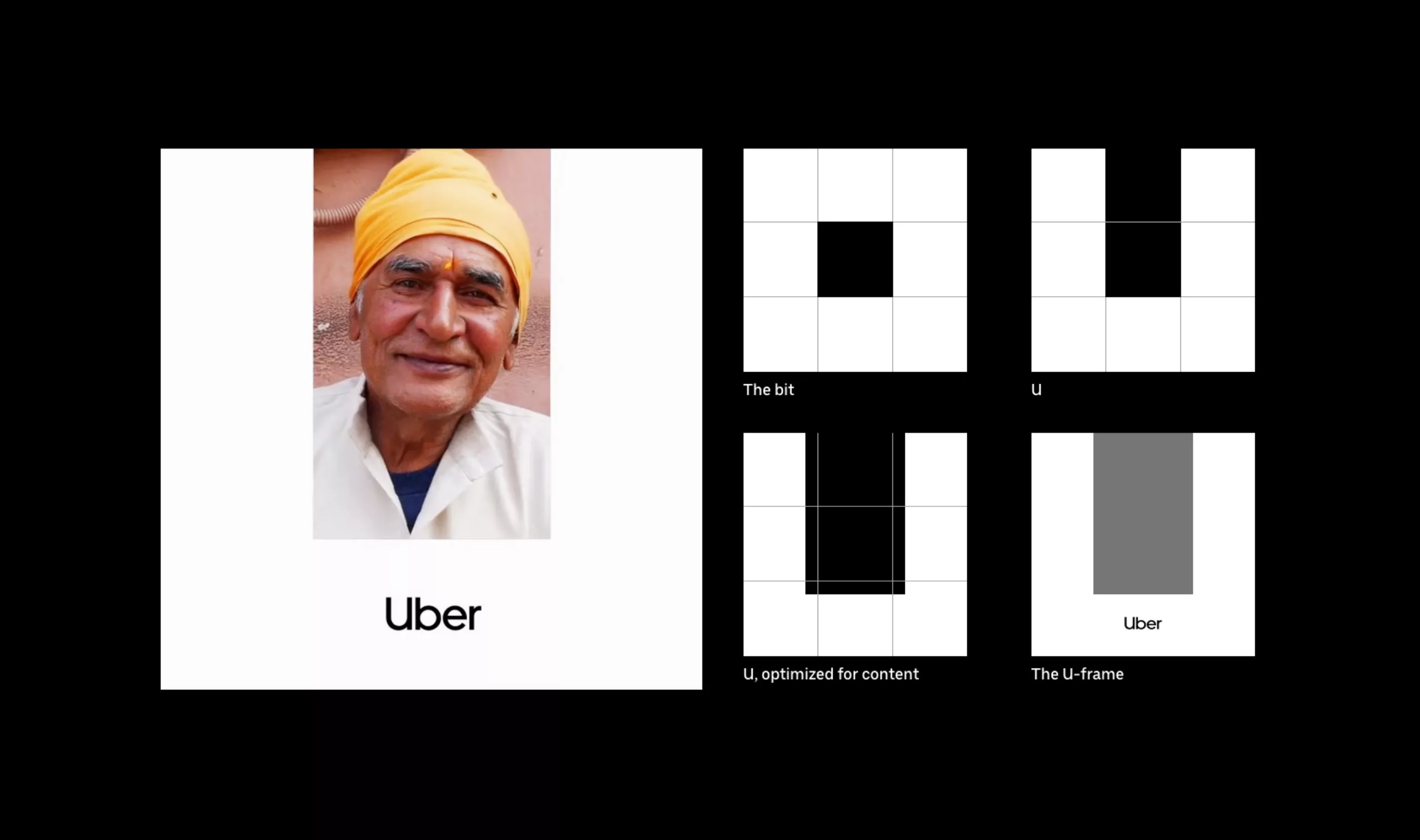
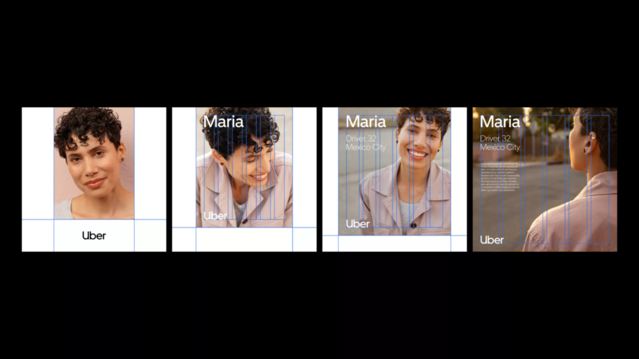
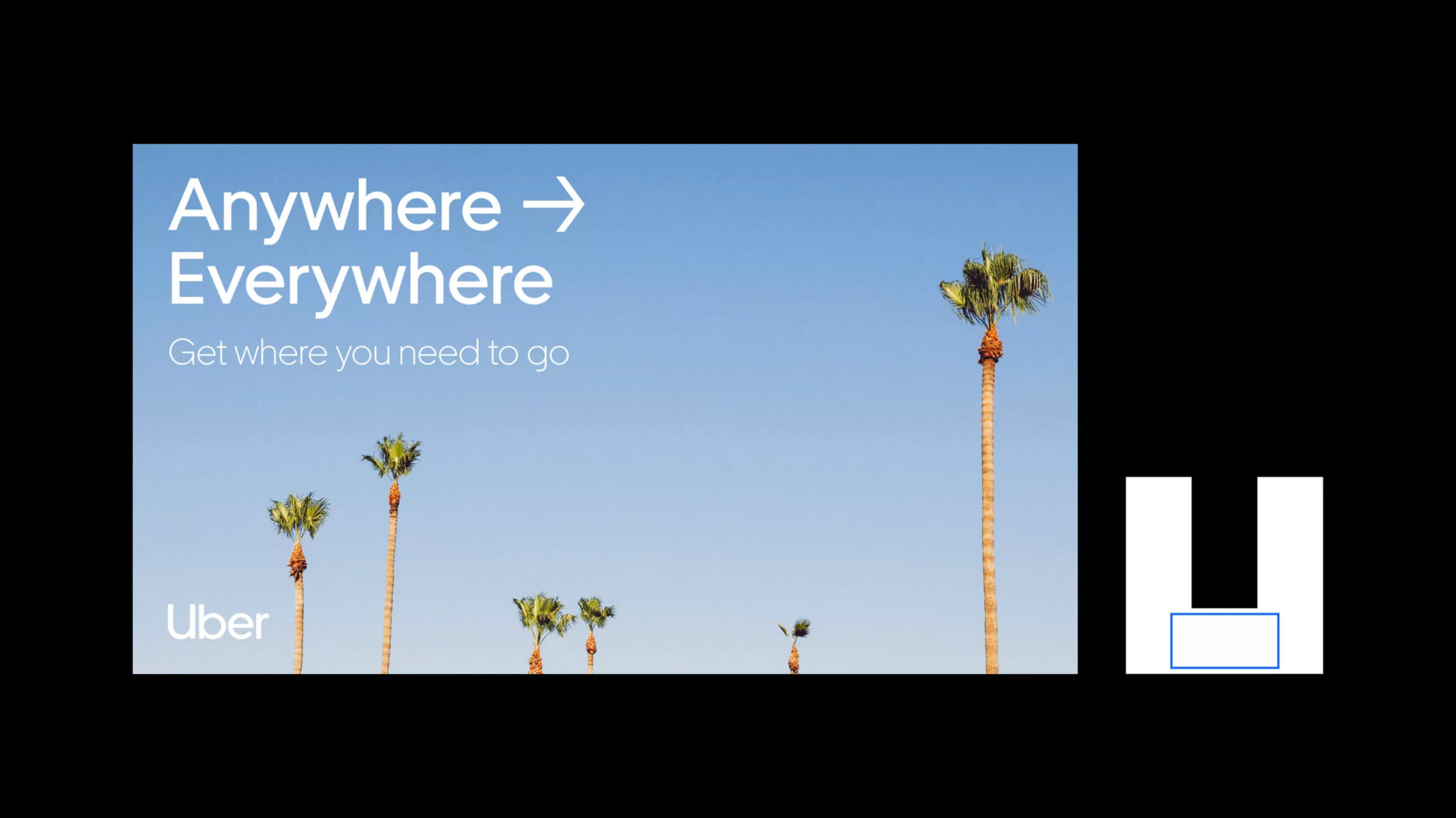
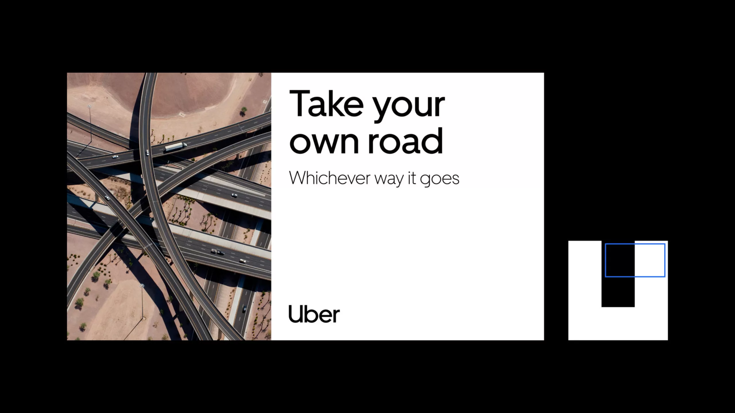
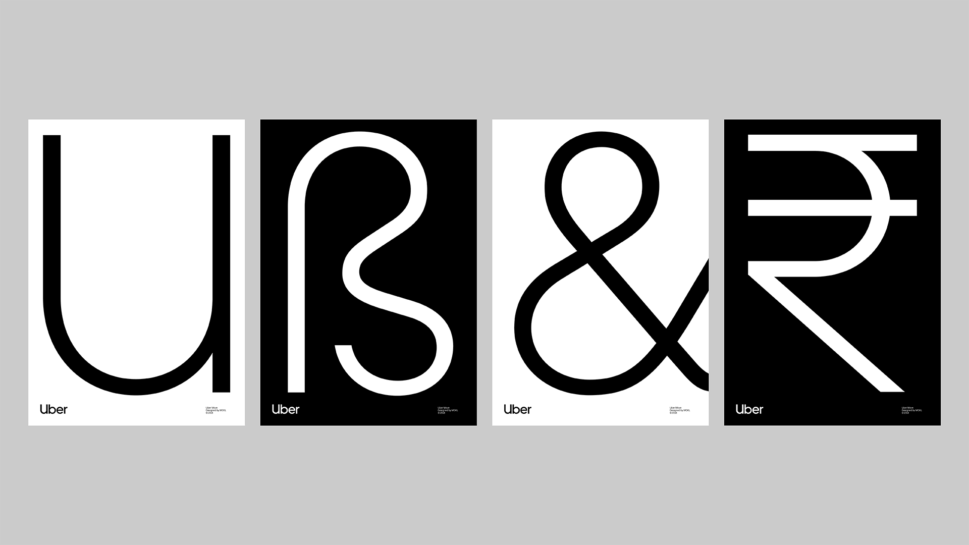
The graphic system is based on a “U” silhouette framing an image or a block of text, and can be adapted to different formats. (Between you and me, the “U” story is a nice way of describing a simple white border! Because nobody will ever read a “U”! )
Is Uber Swiss?
At first glance, and even when you dig deeper, the new Uber logo is grotesquely simple (not to say poor!) It relies exclusively on neutral without serif typography, in a very Swiss style. The simplicity of this clear, legible typography makes it possible to use the word Uber as both logotype and symbol, and to abandon the old square picto that looked like an iPhone charger.
The new Uber logo is positioned as a classic, timeless monolith, with no surprises or frills. The whole thing is coldly “signage“, not to say “no design”!

An identity worthy of transport signage!
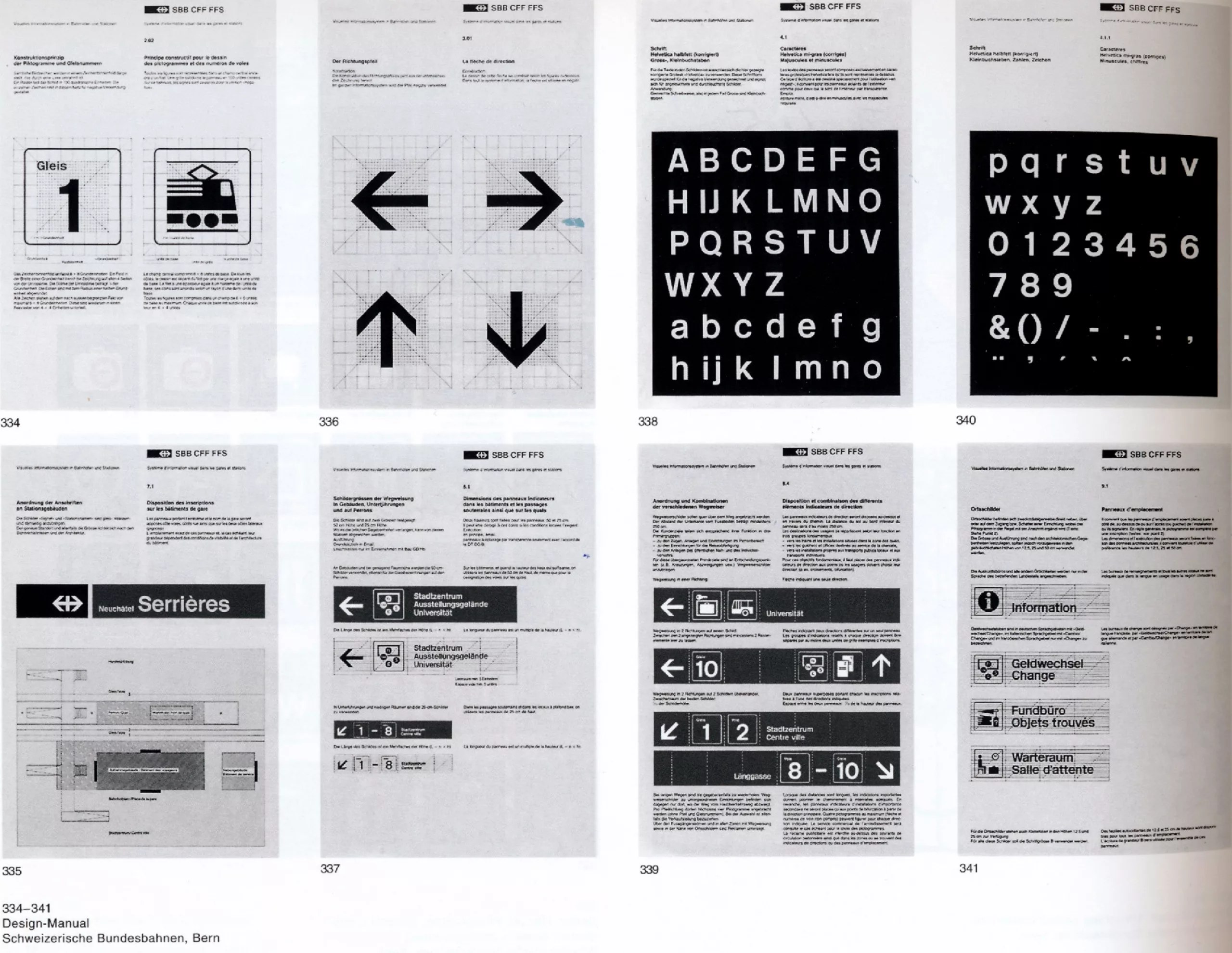
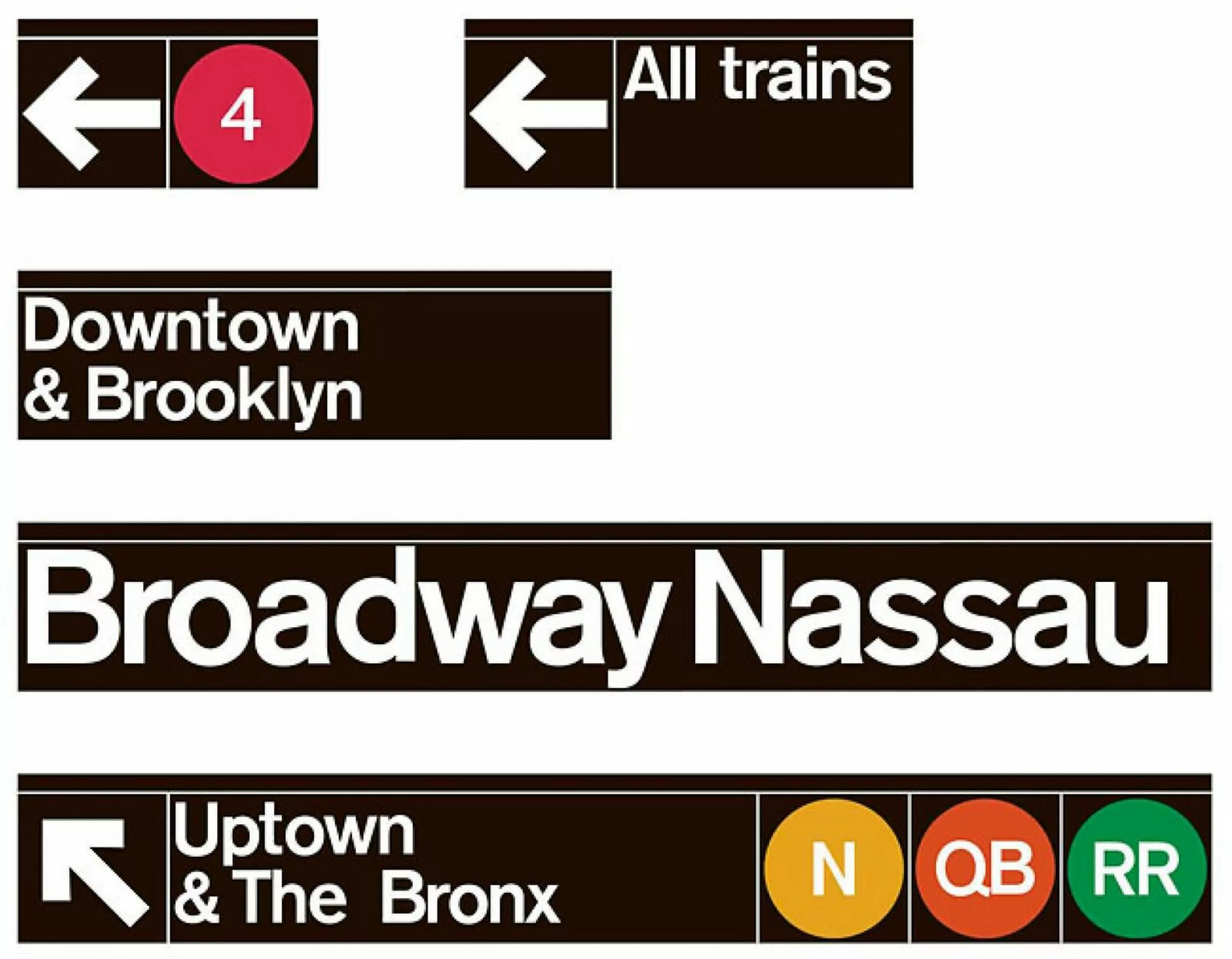
Uber’s typography and graphic charter are openly inspired by the large transport signs, themselves produced in the Swiss (or international) style. Below, we compare visuals of the new Uber signage (on a black background) with works by Müller-Brockmann, or Massimo Vignelli… Almost 60 years separate these images, but the style remains timeless.
A visual identity that doesn’t move anyone!
By abandoning its distinctive features and choosing to blend in with the norm, Uber is becoming the standard, crushing its competitors in the process. The message is loud and clear: “I’m the most famous, I’m a role model“. So why stand out when you’re the strongest? Since it’s a recognized transport brand, it simply adopts the language of transport signage.
For the past 5 to 10 years, all brands have been pursuing this path of minimalism and functionalism (Google, Facebook…), and Uber offers us a paroxysm. Not even a symbol, a sign, or even a singular color…. In short, it’s an air-conditioned, sanitized visual identity!
This disconcerting choice of neutrality begs the question.
What’s the point of what we’re taught about the role of design?
Where’s the emotional part? Subjective? Poetic? Human?
The part that “transports” you into the imaginary, and opens up the field of possibilities!
Is this not normally a brand’s strength, to stand out from the crowd, to make itself unique and desirable? Is it not one of the roles of design to create distinctiveness?
The answer is probably there. Uber has no competitors. Neither do Google, Facebook or Amazon. Understand that these brands are monopolies. So why take the risk of trying to stand out from the crowd? No competitor. No need for design. The visual codes of a “public transport service” are more than enough!
The Uber case invites us to reflect on the paradox of the monopolistic situation of these GAFAs. A paradox for these giants of capitalism, given that “capitalism doesn’t like monopolies” and that one of its fundamental laws prohibits the abuse of a dominant position. Against this backdrop, voices such as that of Nick Srnicek (professor at King’s College London) are putting forward radical solutions: “Let’s nationalize the GAFAs!”
So let’s get crazy, and project that behind these visual identities worthy of public services, there would be in our sights the nationalization of Uber, Facebook, Google… Dream on!
Until Uber becomes a public transport service, it remains a private company. Wanting to take over the codes of a public service is tantamount to stamping its monopoly and asserting that others no longer count. We can see in this technique of standardizing brands the risk of seeing a multitude of others disappear. Indirectly, it’s the designer’s profession that will be called into question.
For our part, we are convinced that design loves diversity, pluralism, cultural richness… that our role as designers is not to promote the “common minimum” but the “common maximum“!
On the subject
-

Groupama’s new visual identity, a logo in the open countryside
Groupama has just unveiled a new logo that updates its graphic design by abandoning its campaign in favor of a “startup” aesthetic.
-
From surnames to acronyms: creating a brand name from letters
From founders’ surnames to initials and acronyms, brand names have always oscillated between abstraction and familiarity.
-

The UN logo takes on water during COP28
For COP28, two designers have come up with a new UN logo showing the rising sea levels and the future disappearance of much land and coastline.