Algeco®, an iconic logo and the quest of timeless brand identities
What is a cult logo?
Algeco, the leader in modular construction and a long-time client of Graphéine since the beginning of the agency, invited us to share our vision of their logotype. This article is an expanded version of the one published on January 2021 in the Algeco Magazine as part of the “Algeco saga” which revisits the history of the brand and its fourth edition is dedicated to the company’s logotype. This is an opportunity to analyze the reasons for the success of a visual identity and to dig into the inspirations behind this cult logo.
While we’re on the topic, let’s start the revelations right away with the name “Algeco” itself, which is actually an acronym! It is a contraction of “Alliance de Gestion Commerciale”. In its early days, the company mainly operated tanker cars that transported raw materials. These were the ancestors of the future Algeco site module.
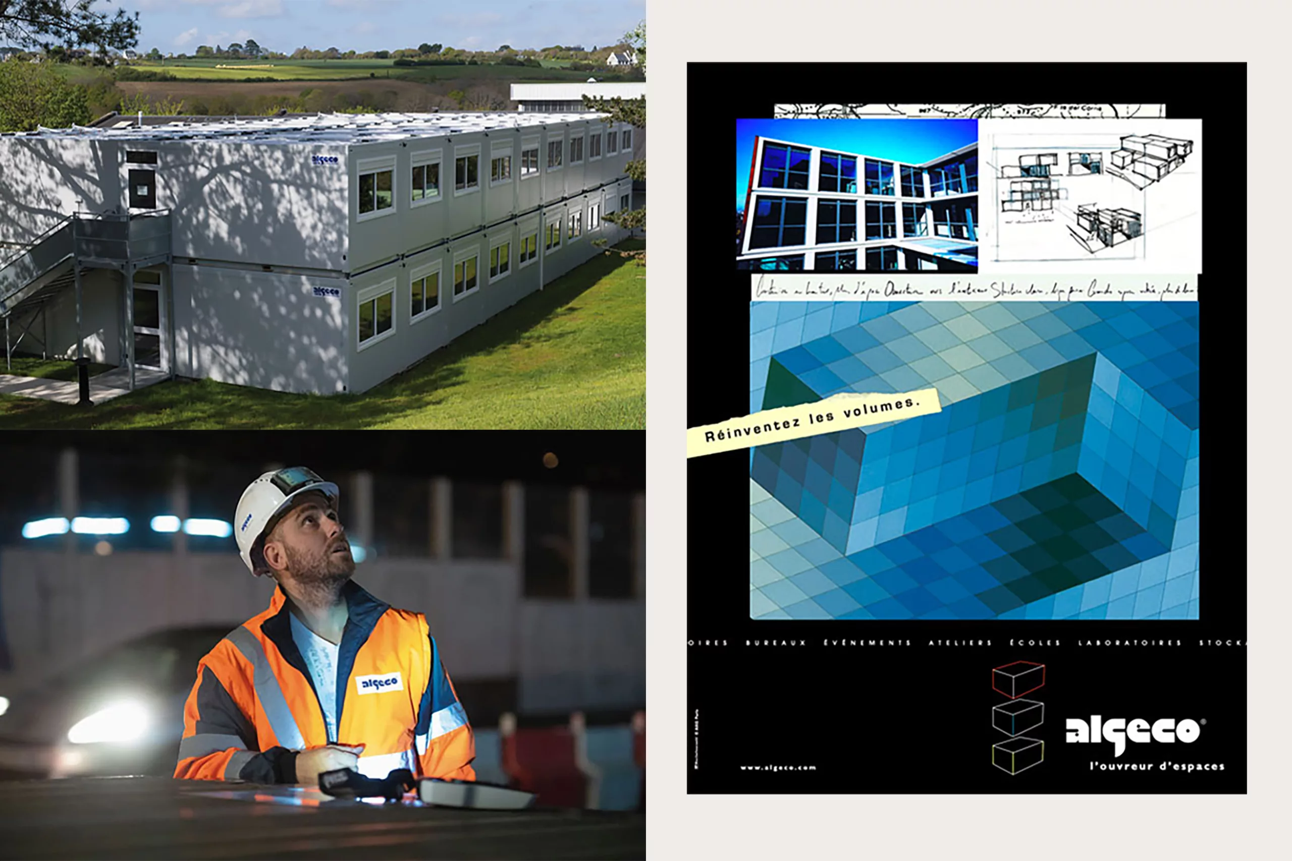
The Algeco® logo, a historic and innovative design
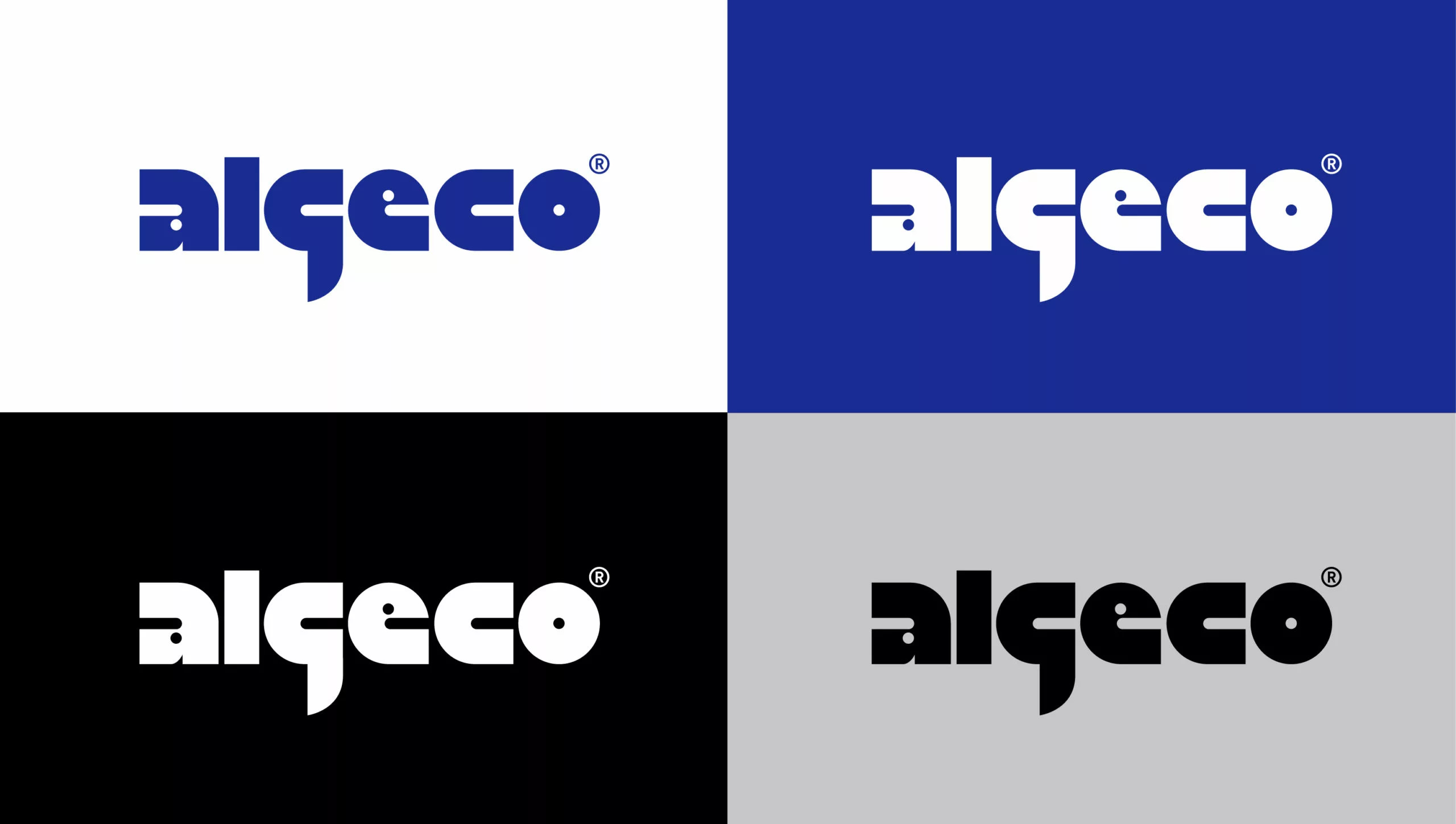
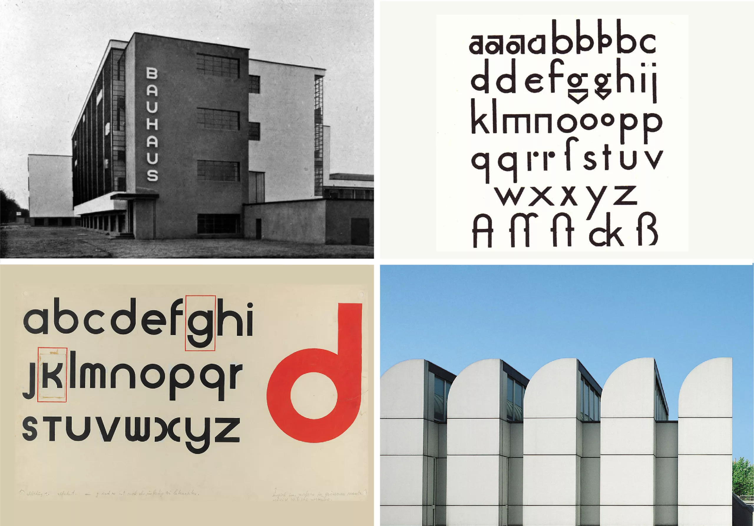
The Algeco® logo is a direct descendant of the universalist geometric aesthetic of the Bauhaus, the famous German school of architecture and applied arts founded by Walter Gropius in 1919. Its style is minimalist because “form must follow function”. The Bauhaus advocated a teaching method aimed at democratizing design in order to place it at the heart of everyday life to make it simpler and clearer. Its students also relied on the new methods of industrial production which allowed for manufacturing at scale.
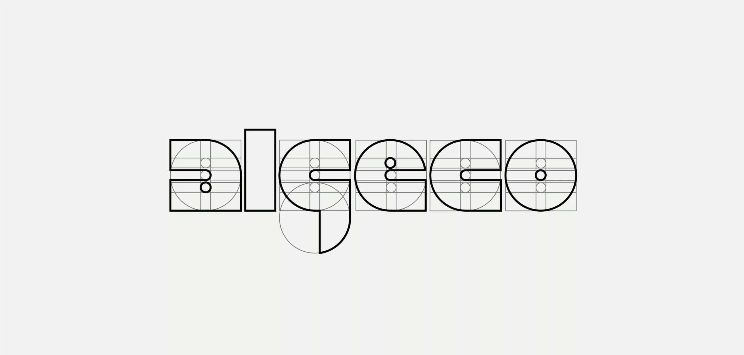
The Algeco® logo is above all a design… with purpose! Its style is in line with the avant-garde and rationalist typographic work of Herbert Bayer and Paul Renner, as seen in the typeface “Futura”. The shape of the alphabet is sifted through a methodical grid of construction where each letter is obtained by the arrangement of basic shapes, such as the circle and the rectangle. The logo is therefore strongly imbued with an innovative and even “graphically revolutionary” mindset at the time.
A modular aesthetic that makes sense
It is a typographic block whose lettering style evokes Algeco’s flagship product: the 15 m2 prefabricated module. Elementary and basic like a Lego brick, it evokes the idea of games, construction and customization.
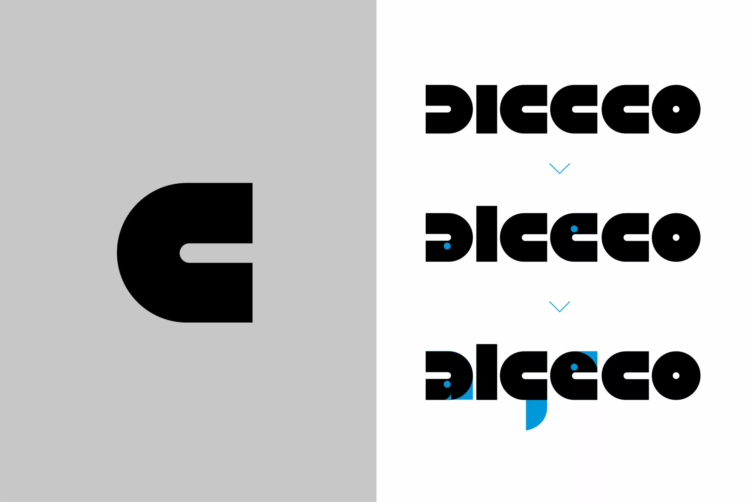
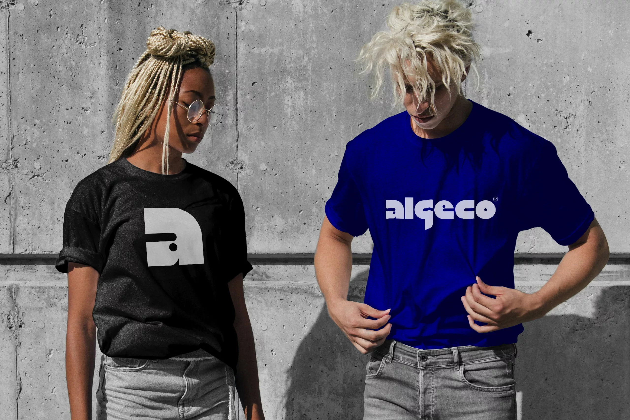
In addition, this logo, unlike any other, conveys a resolutely modular, made-to-measure identity, built with precision from several simple geometric shapes. These are combined to recreate all the letters of the brand name. And within the solid blocks, each letter represents an Algeco module. The result is a “raw” aesthetic that is simultaneously “playful” and “agile”. This custom lettering belongs only to Algeco. It conveys the brand values efficiently and with precision. While Nike uses its “Swoosh” emblem to complete its brand message, Algeco says it all with a “simple” formatting of its name.
What is a timeless logo?
A brand proves its value by lasting through time. We already discussed this phenomenon with the logo of the “MoMA”. It is also the case with the Algeco® logo that has become “cult” over the decades. Take the most iconic example of all: the Coca-Cola logo. I can’t tell you if I like it, or if it is particularly well designed. Certainly, its style is not contemporary. But that’s not the point of the logotype. Where Coke and Algeco have it right is that their respective logos sound “authentic” and the recognition of their identity is global. Therefore, changing their logo would break the emotional attachment that people have with the brand. Yes, a good logo is above all a shape that lasts over time. It is also to stand out from the crowd with a distinctive aesthetic.
Back to the roots of the iconic logo or a crisis of vintage nostalgia?
Speaking of this, we are currently witnessing a “revival” of logos designed in the 1970s. These had temporarily disappeared in the 2010s, while digital technology was deeply transforming the economy and consumer habits. This phenomenon has recently increased after a wave of “Blanding” (a portmanteau of “bland” + “branding”) where many brands seemed to lose their soul by trading their bold historical logotype for a uniform “sans serif” typographic style.
We had mentioned this “No Design” trend while talking about the evolution of logos in ready-to-wear brands.
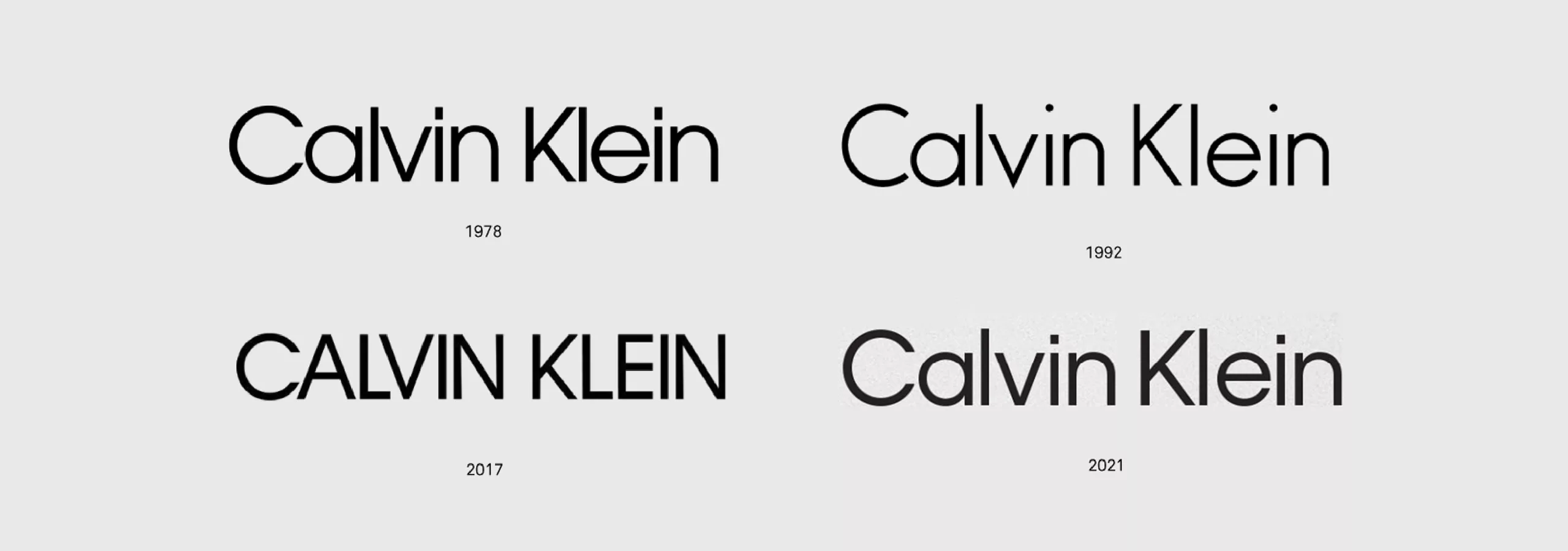
Even Calvin Klein, which is not exactly a logo that stands out because of its originality, decided in 2021 to change its logo with a return to its roots. Indeed, the new logo of 2021 revisits the 1978 version, with a lettering that slightly modernizes the Avant Garde Gothic typeface created in 1970 by Herb Lubalin. The previous “full cap” logo dates back to 2017 and was implemented by Peter Saville. What does this mean? Is old really gold when it comes to logos, or was this change simply a desire for change… with no particular motive?
A beautiful logo and a good logo in the same boat…
And yet, coming back to the Algeco® logo, it is not particularly beautiful. It’s even full of quirks and imbalances if you look at it from a typographic point of view. The “l” struggles to soar above the “a”, while the descender of the g is far too pronounced in comparison. And the “e” is simply a pac-man on steroids. But who knows, maybe its touch of madness lies in these questionable choices despite a strict compositional grid. The Algeco® logo dares to do what few logos do today. It has its own style, different, not necessarily fashionable, and a questionable but radical taste with a way of proudly owning its identity that ends up winning respect. No need for benchmarks, or opinion polls, the Algeco logo is cool, lit and stylish.
Interchangeable and neutral, such was the logo of the early 2020s. Today, it seems that many brands are redoing their homework and returning to identities that correspond to a certain “golden age” associated with the 70s. So were logos actually better before or is this simply a case of “instagrammable” nostalgia? We think that this return of historical logos is comforting because it takes you back to an era synonymous with prosperity, especially given the anxiety of the new generation, which struggles to see itself in a future impacted by an ecological and pandemic peril: it is but natural!
The logo, a formidable brand heritage
The Algeco® brand is wrongly used as a common name for a modular construction unit in everyday language. It is not uncommon to hear people say “Algeco” – inappropriately, given that Algeco is a registered trademark – when they are talking about a competing brand’s product.
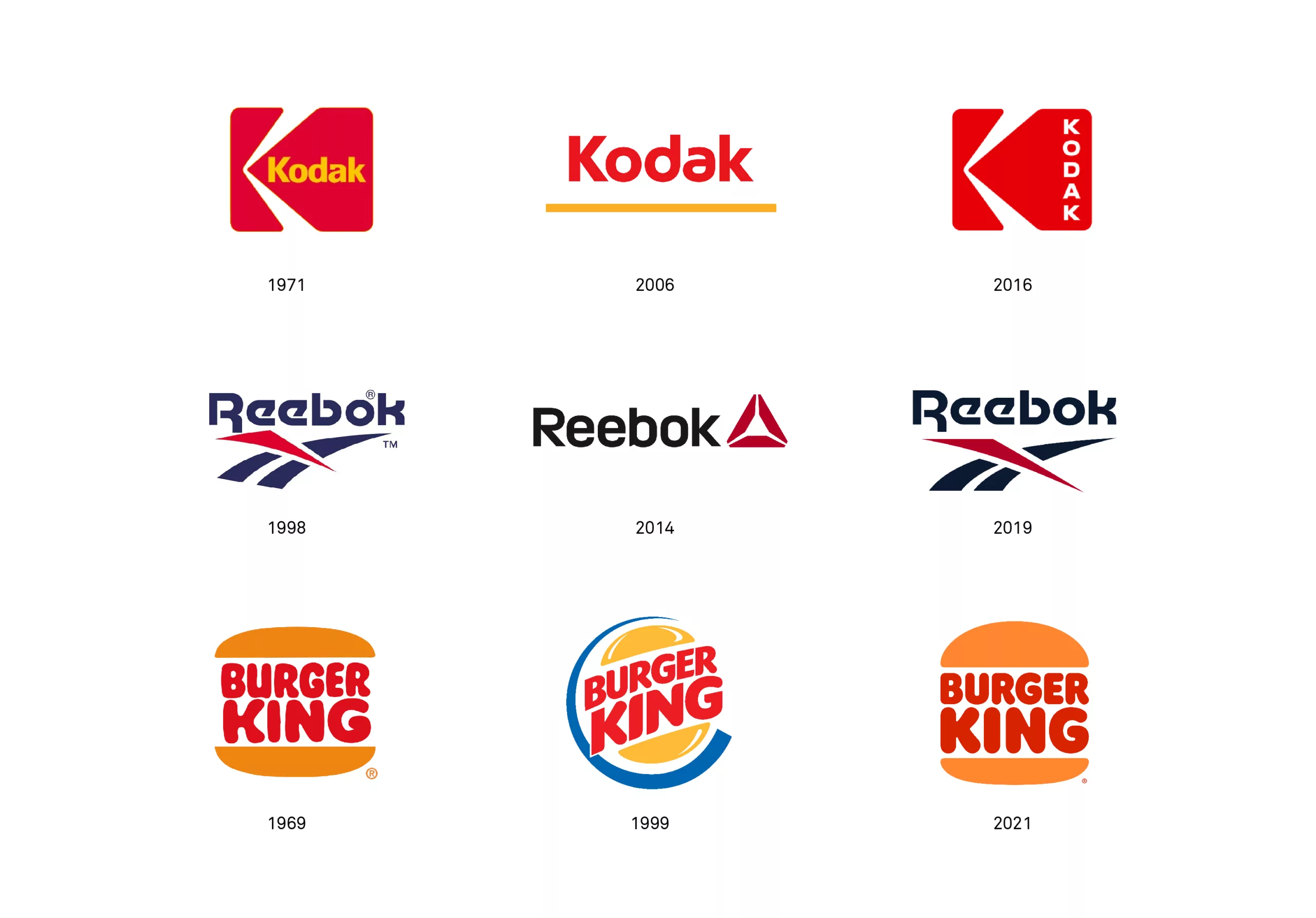
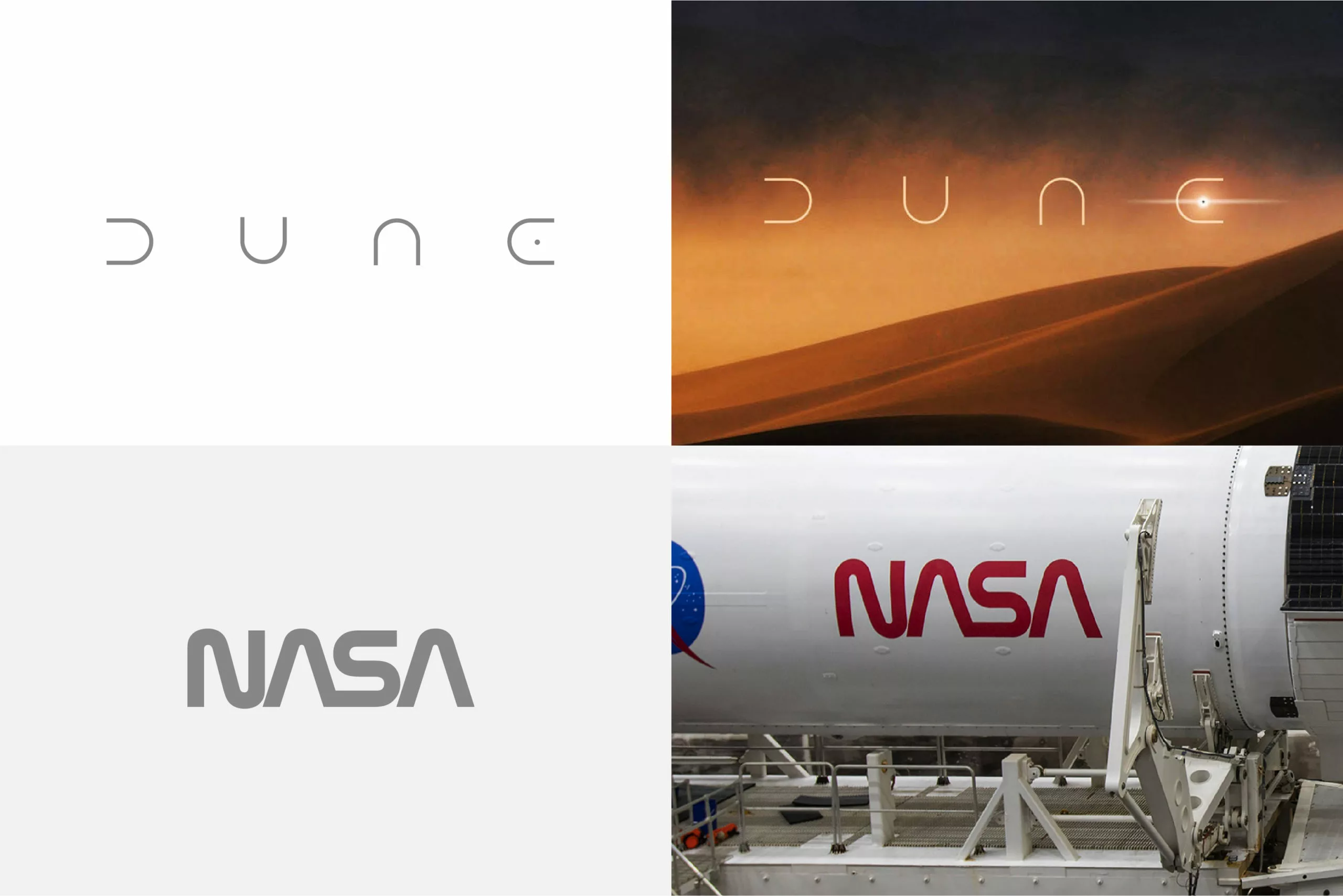
To perpetuate the Algeco® logo is also to enhance the history of the company and protect the timelessness of the brand. Reebok (we talked about it in this article), Kodak, Nasa (discover the history of its logo) and more recently Burger King have resurfaced with a “facelifted” version of their logo from the 70s. This shows that the logo is a great brand heritage, capable of enduring through the times if the products and services “follow”. It also shows that there is a risk in blindly giving in to the lure of trends, especially when there is already a strong brand equity, therefore a strong emotional link and experience between a logo and its public. The logo can be a priceless object that deserves to be treated with the utmost respect, otherwise this relationship will be broken.
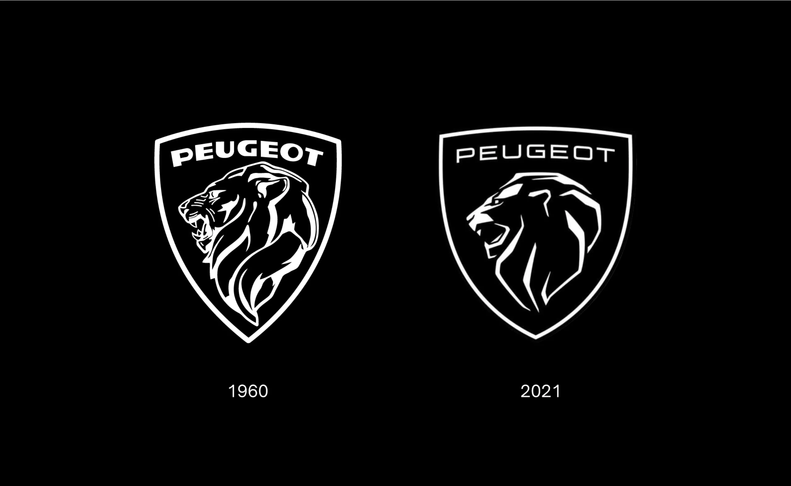
On this subject, the latest Peugeot logo unveiled at the beginning of 2021 and whose design is a reinterpretation of an old Peugeot logo from 1960, divides the critics. To learn more about it, we recommend you read our article New Peugeot logo and car rebranding, it smells musky!
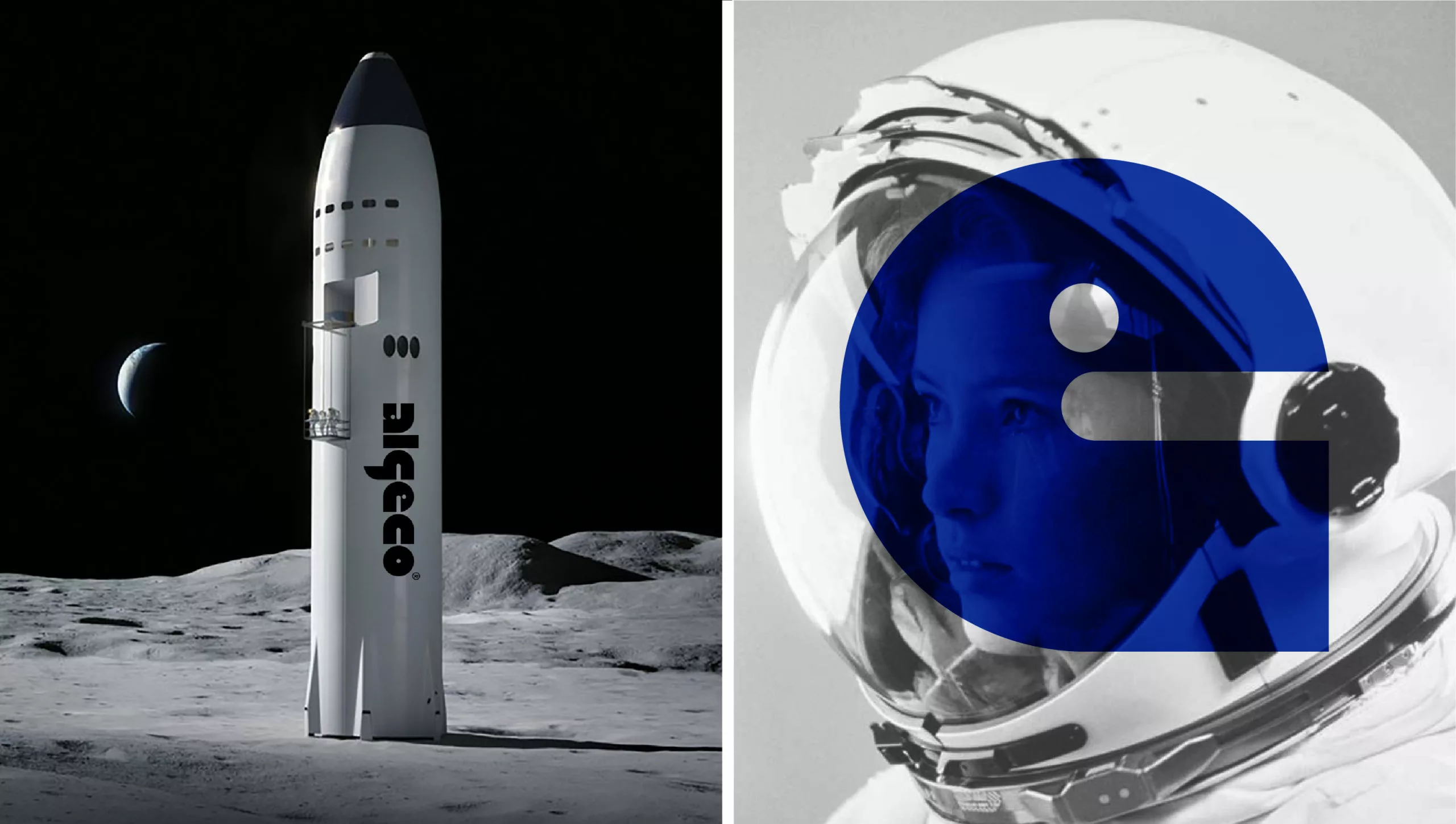
Algeco, the construction site as its cradle, what’s next?
If the Caterpillar brand has managed to evolve by offering construction vehicles, then protective footwear and now asserting itself in the field of fashion, it is likely that the Algeco® brand could follow a new trajectory to be a strong benchmark brand that reaches out towards a target of professionals as well as individuals. It might do this by moving away from its flagship product while maintaining its brand values in a related sector (Environment, Workwear, transport, etc…).
Seeing the creativity that emerges when students reinvent the Algeco module during the different editions of the Architectures Élementaires competition, there is no doubt that innovation is in the DNA of the brand. Housing, health, transport, environment, the future R&D unit of Algeco doesn’t seem far!
In 2019, Algeco invited François Bellanger, foresight consultant for a conference titled “What if the next step for Algeco was to make autonomous cars?” Not a far-fetched prospect.
Definitely, our lives are a work in progress, and our schedules are modular Algeco style.
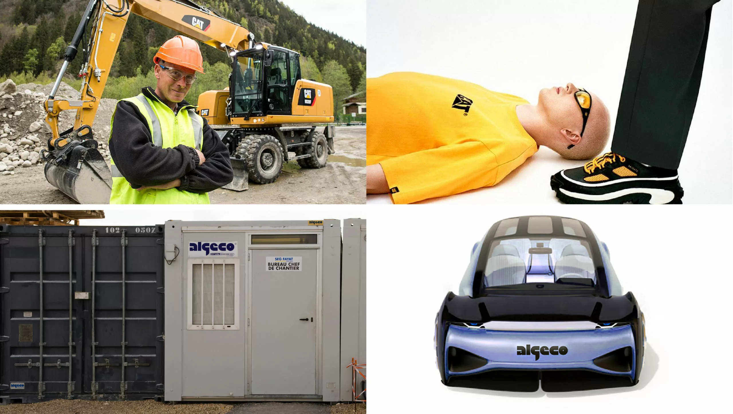
The popularity of the Algeco® brand is strongly anchored on what people are used to calling the “construction site hut”, while its services and products are far more than just living units at construction sites. The Caterpillar brand is an interesting example of a brand that has managed to change its public perception by venturing outside the perimeter of construction equipment. It capitalized on the idea of robustness and developed accessories and clothing that today allow it to enjoy a strong public reputation and to be present at fashion shows. Transport and mobility are part of Algeco’s history. We can therefore naturally imagine the release of an Algeco concept car module one day… hybrid or 100% electric?
Algeco, an iconic brand, an evident logo
This is the case of the Algeco® logo, definitely iconic, recognizable at first glance. It is also a reassuring reference point for everyday life. Its impactful, futuristic and uncompromising design conjures up a strong imagination, totally in tune with the concerns of our increasingly mobile and connected lifestyles. It is also close to the clothing and graphic styles of a globalized urban culture, and it is reasonable to think that it could gain some real “street cred” as an icon for the new generation.
This street cred is already visible in the classic freestyle rap song released in 2012 by 2 of the most influential rap collectives of their time, L’Entourage and L’Animalerie, when at 3:40 the rapper Na.K opens his verse with: “I ain’t got a long arm, I ain’t got a wide shoulder and my music don’t feed me, eat with me in the Algeco”.
Yes, the Algeco® logotype is much more than a graphic object: it has become a prominent symbol in urban poetry and a monument of our industrial heritage.
