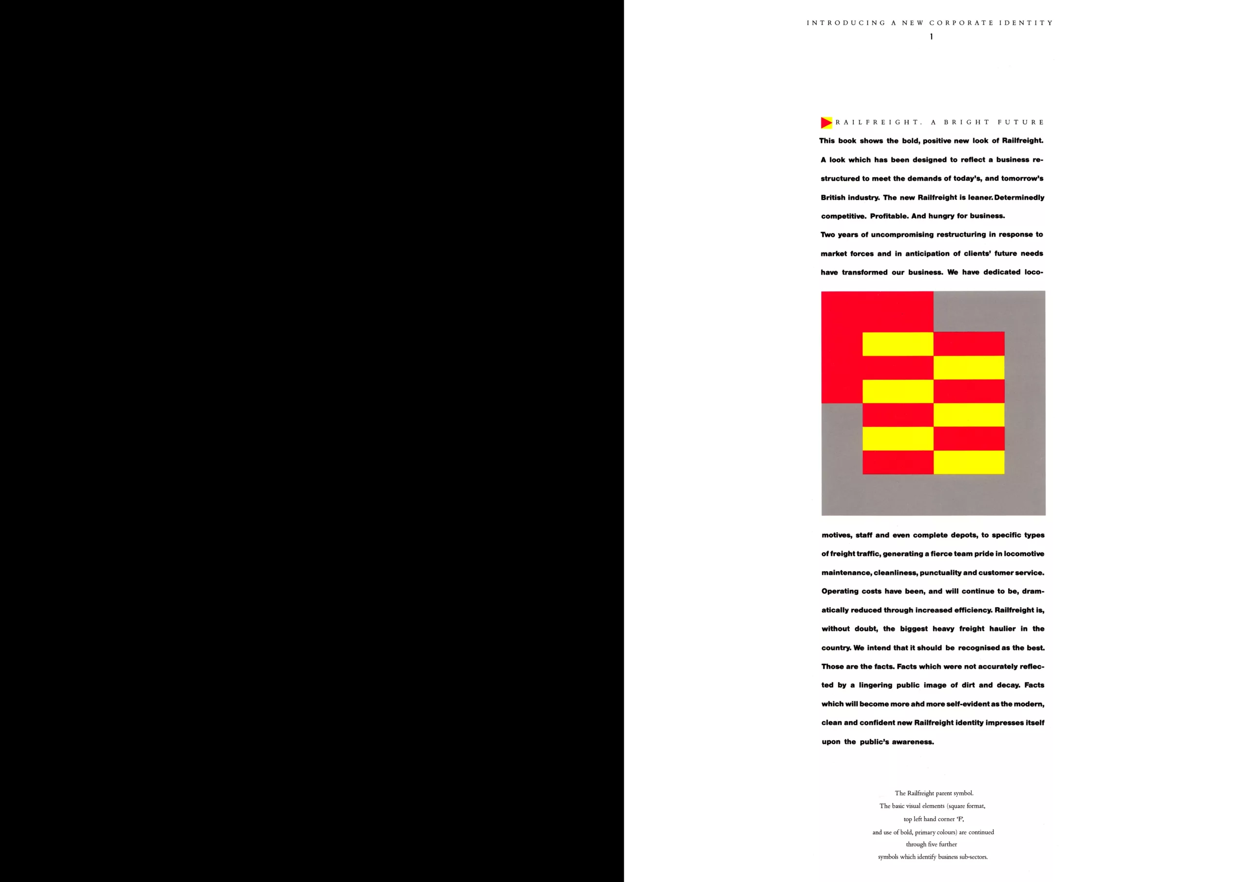
Railfreight visual identity (1987)
Design for Rail
Towards the end of the 80s, British Rail, England’s national railroad company, completely overhauled its visual identity (cf: the famous two-arrow logo, we’ll try to tell you more about that soon!). As is often the case, the aim is to improve the company’s image in order to get through a difficult financial period.
We are in the pre-privatization era of British railways. And the national rail company began to separate its activities. In 1986, the company split into several sub-categories: InterCity (city rail network), Network SouthEast (South East network), Regional Railways (regional rail network), Railfreight (rail freight) and Parcels. To better differentiate themselves as independent units, these sections have been given their own visual identities.
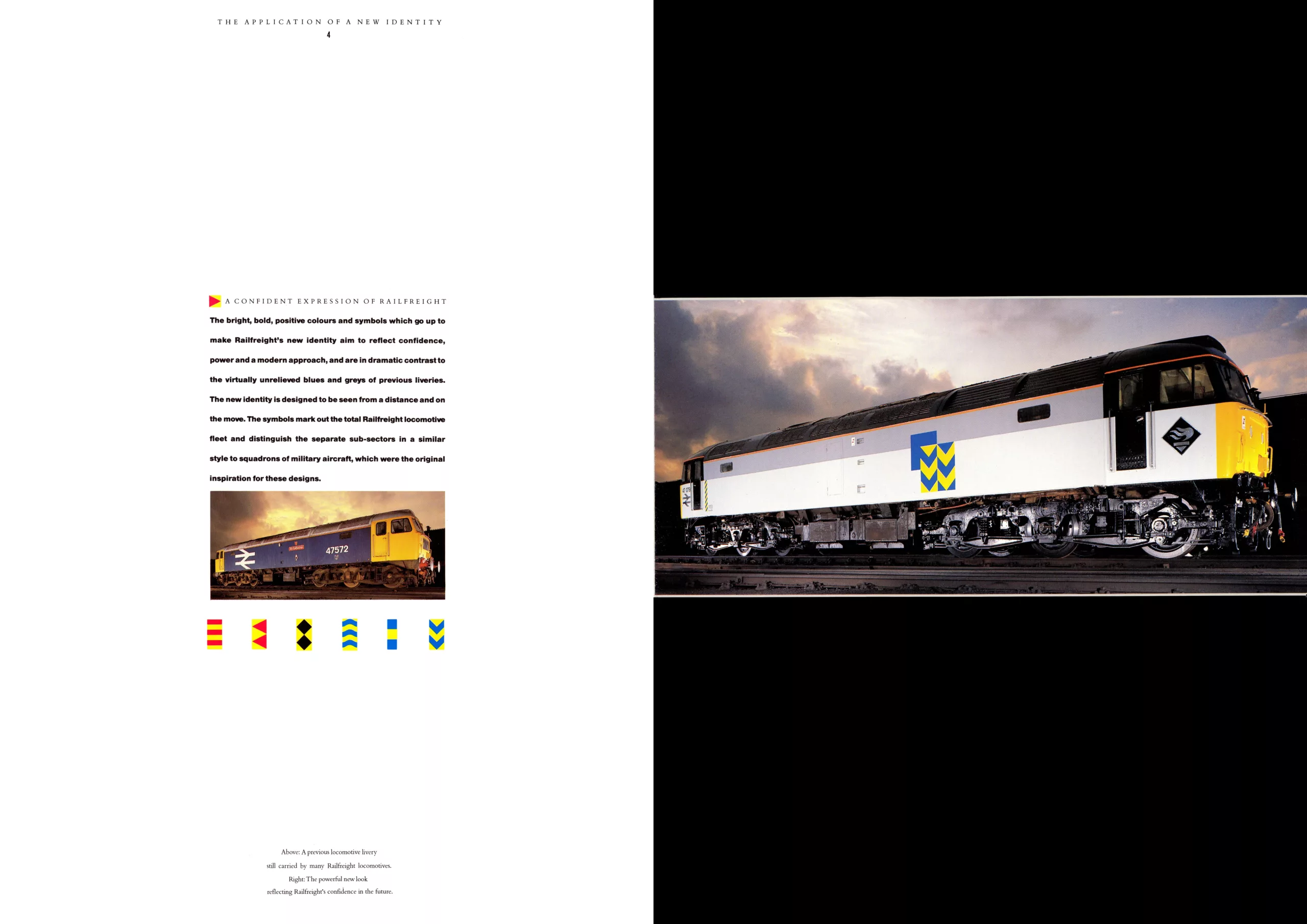
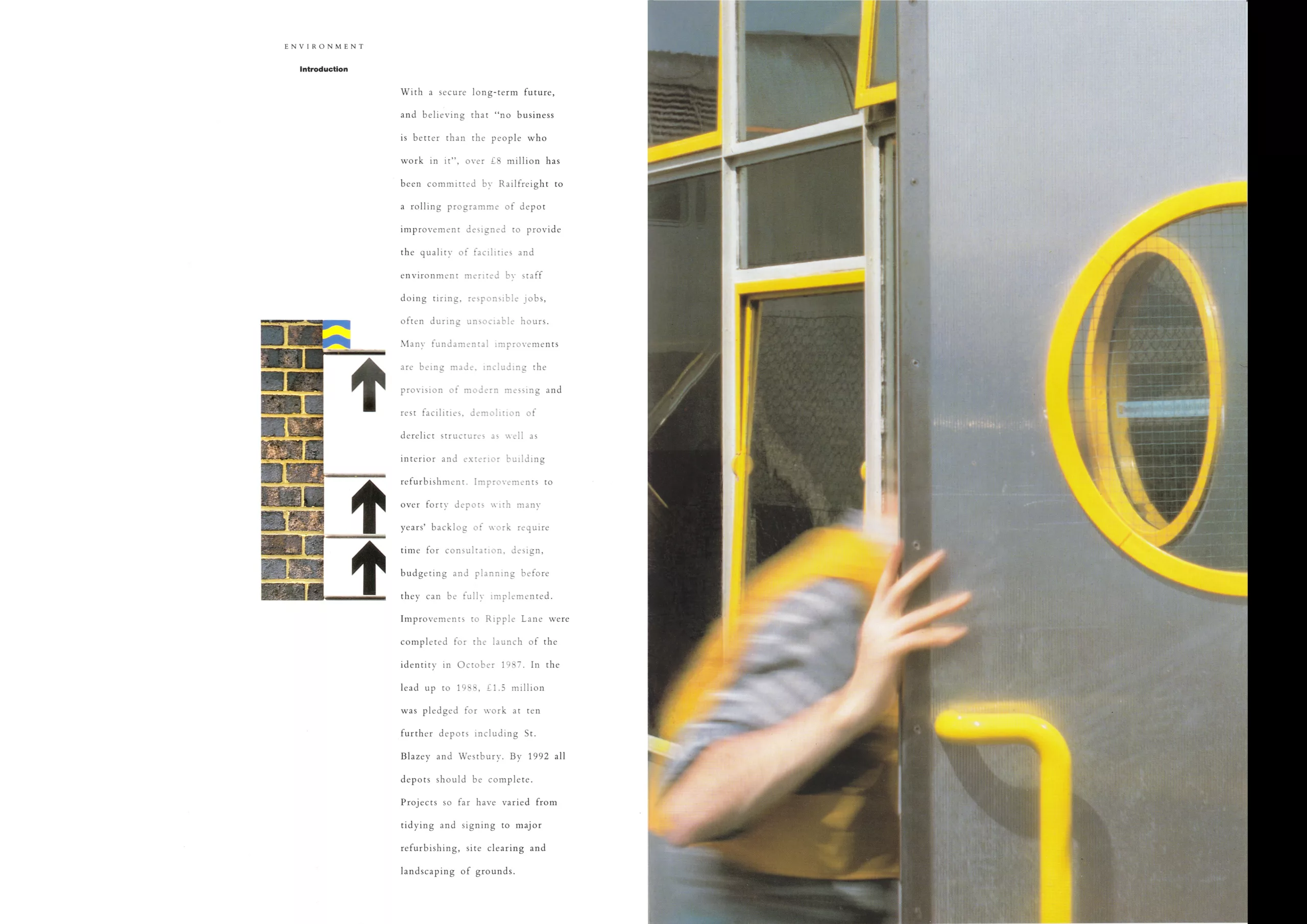
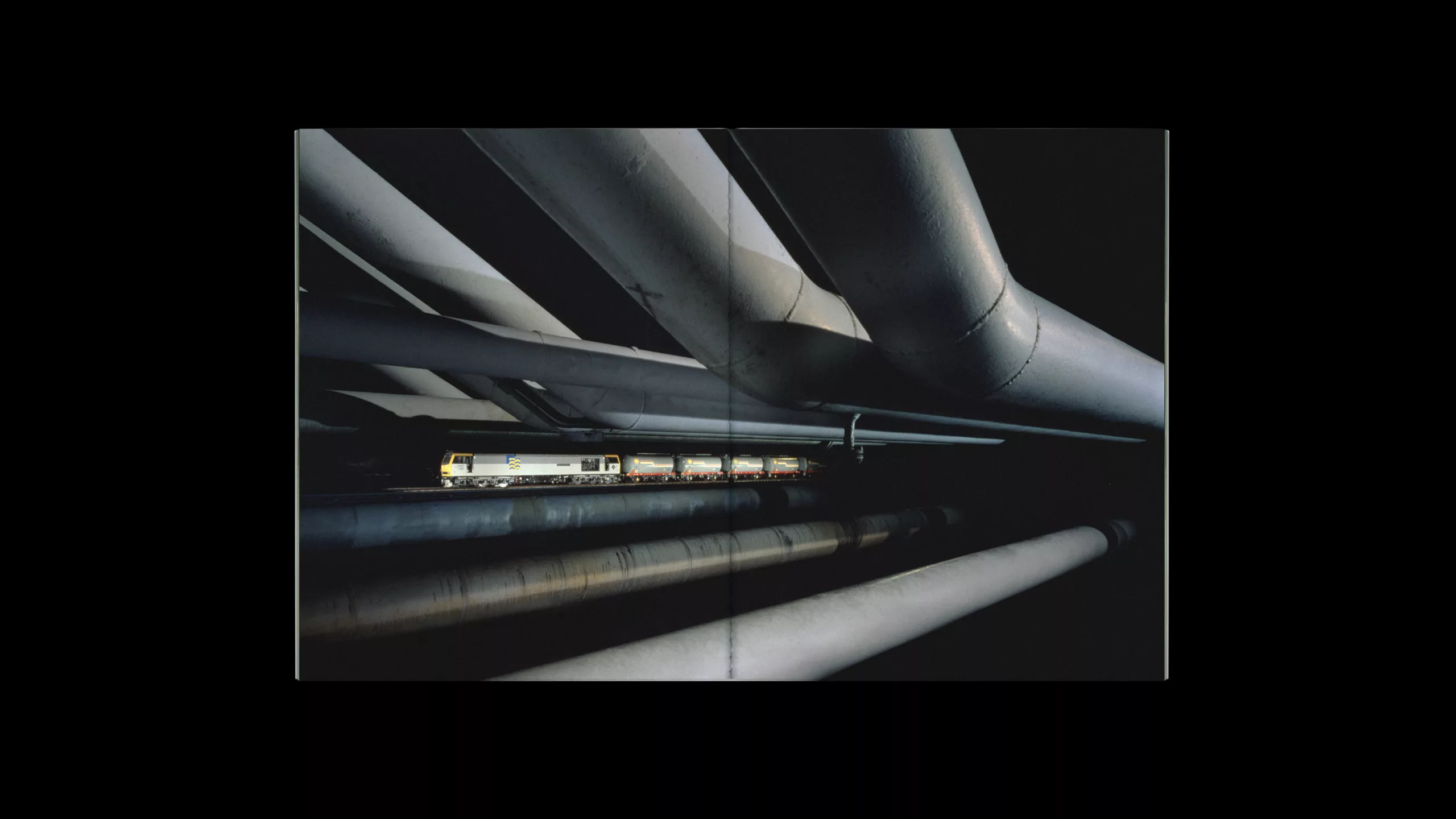
The rail freight one hits the nail on the head and stands out a world far removed from the of oiled rails. After the initial shock of this lively, modern identity, it left its mark on the British rail transport landscape for a long time to come, and will dispel dull memories. To the point of becoming a designer’s favorite train.
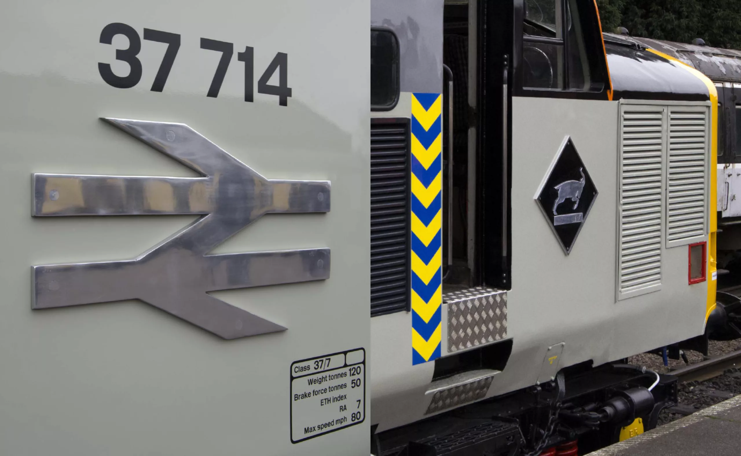
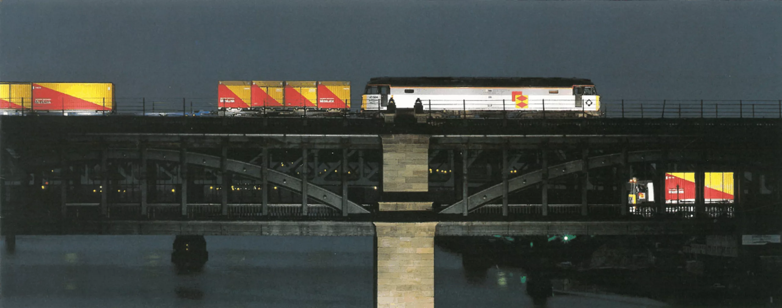
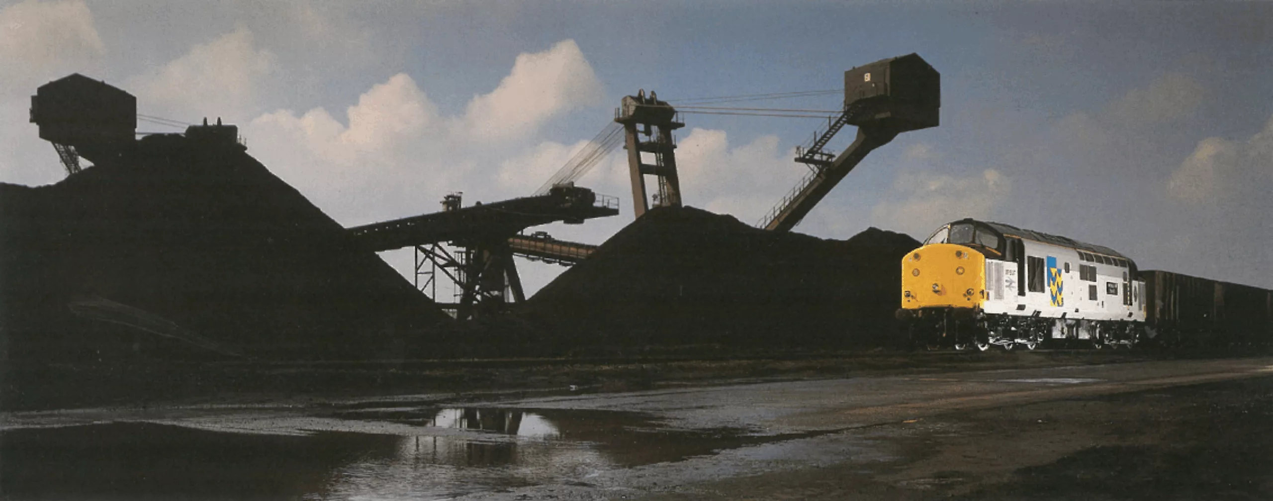
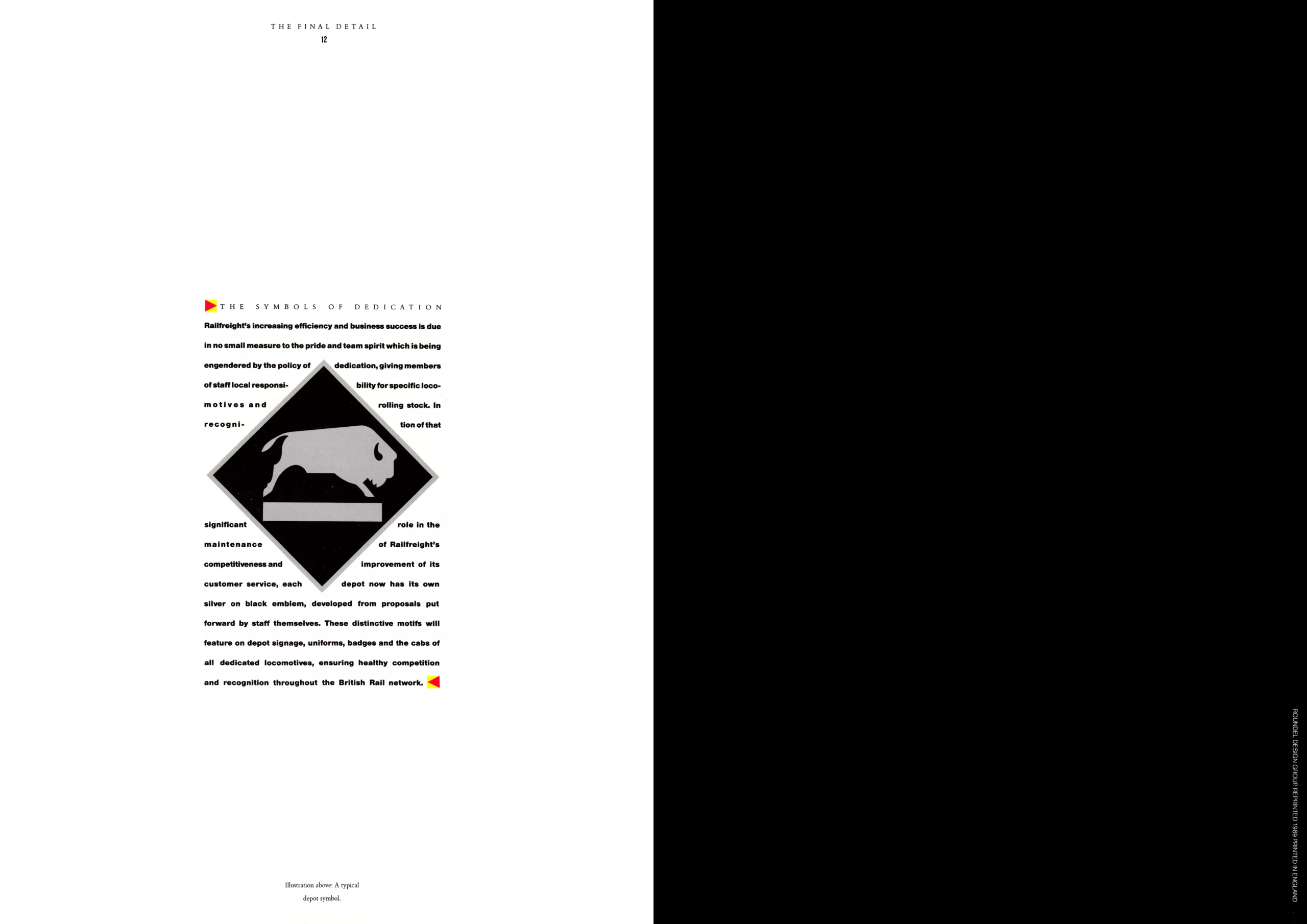
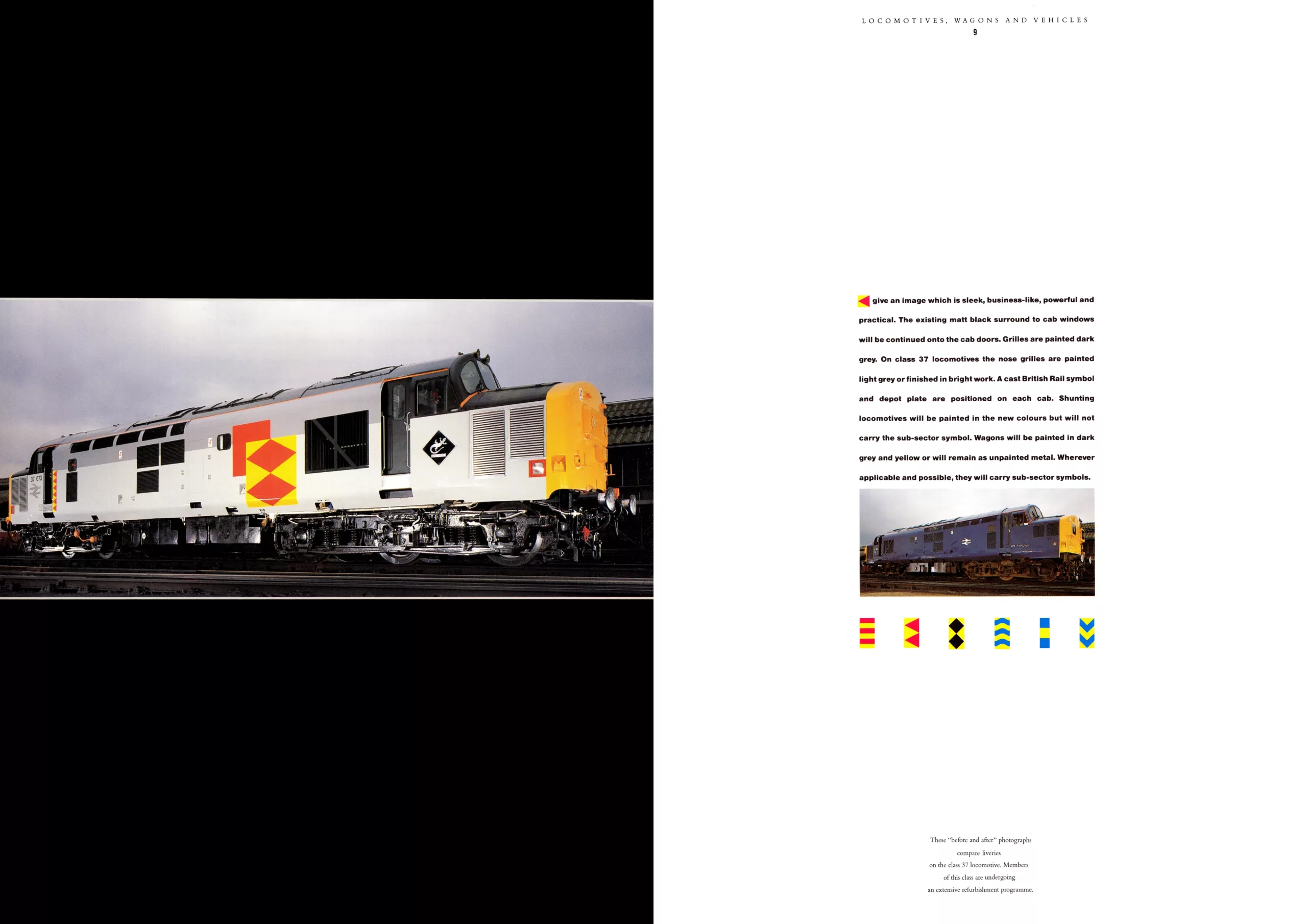
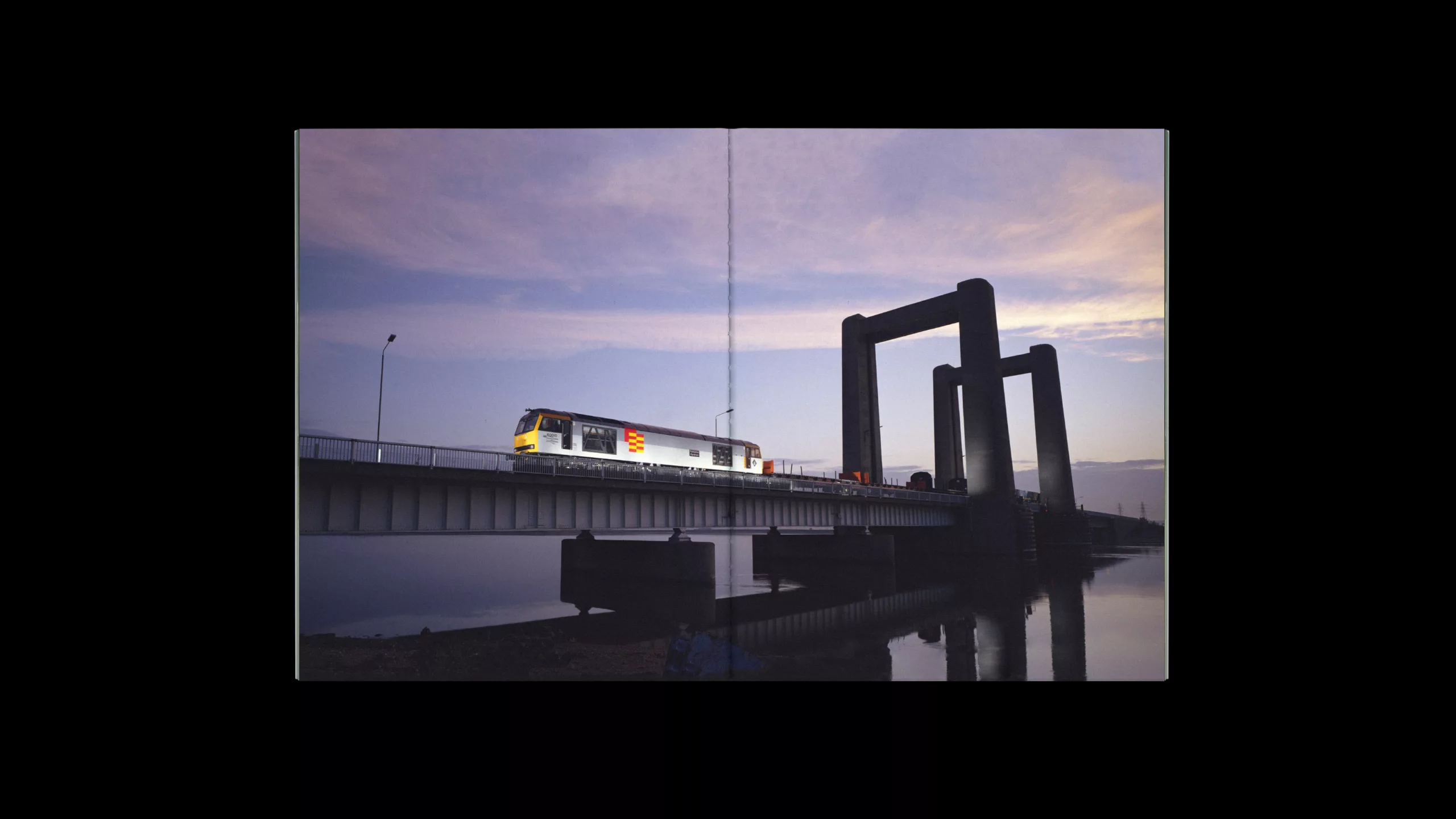
For one thing because the freight sector is far from being the most glamorous, and because it was (and still is) going through financial difficulties. These trains, which carried coal, oil and other goods, kept a low profile and went unnoticed, because they represented the dark side of the company. In 1987, the Roundel Design Group took on the task of adding a little color to these naturally metallic gray trains.
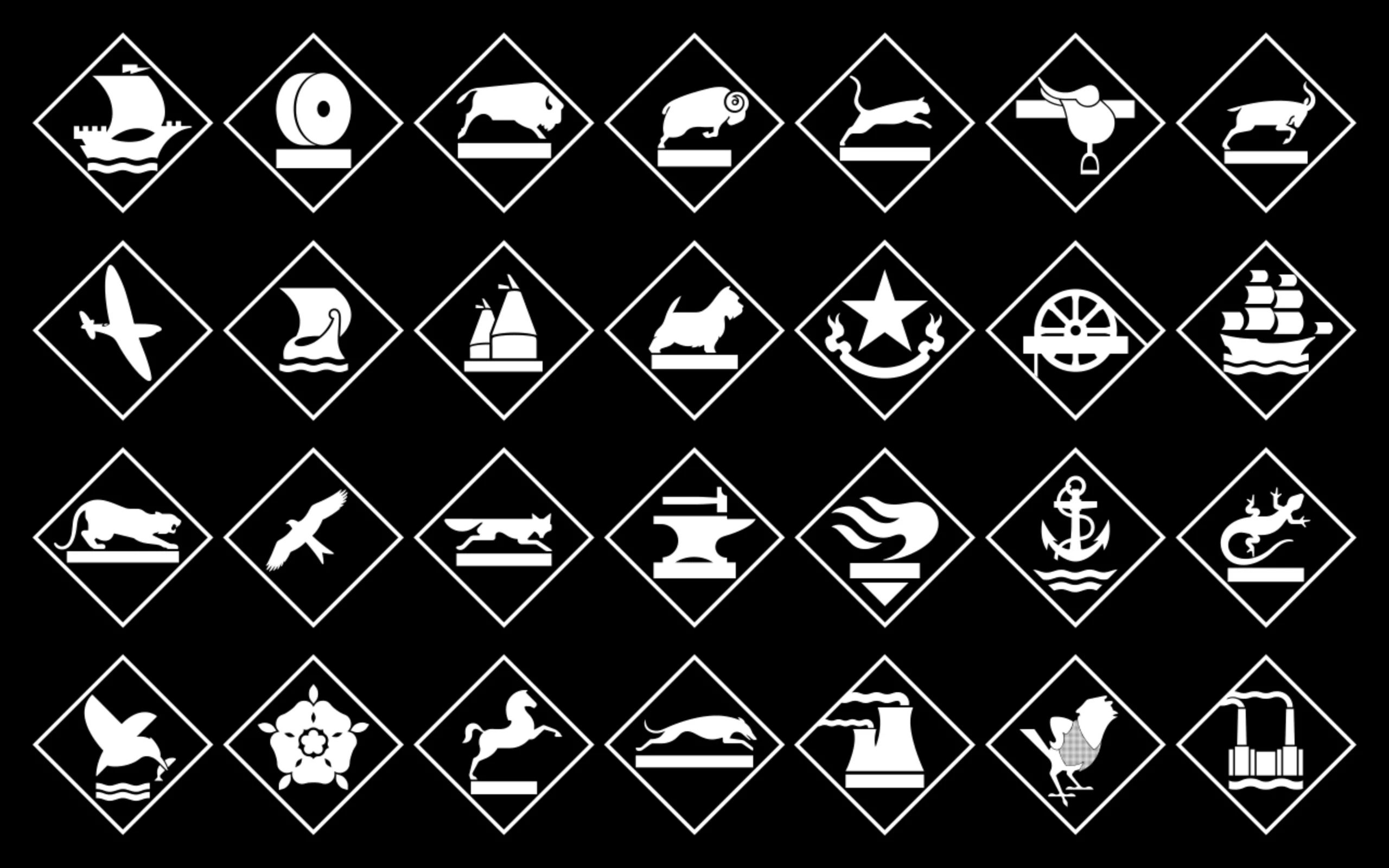
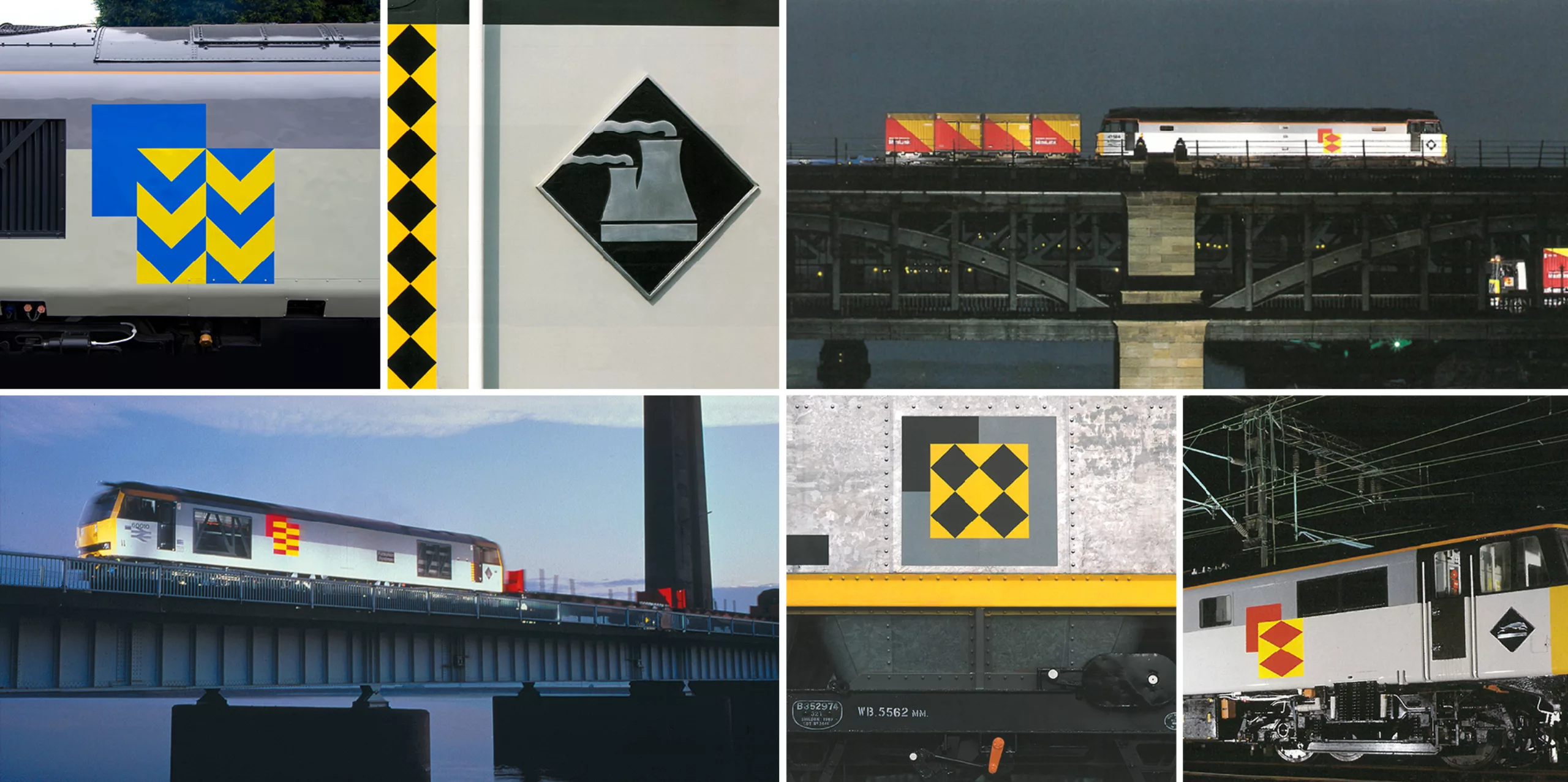
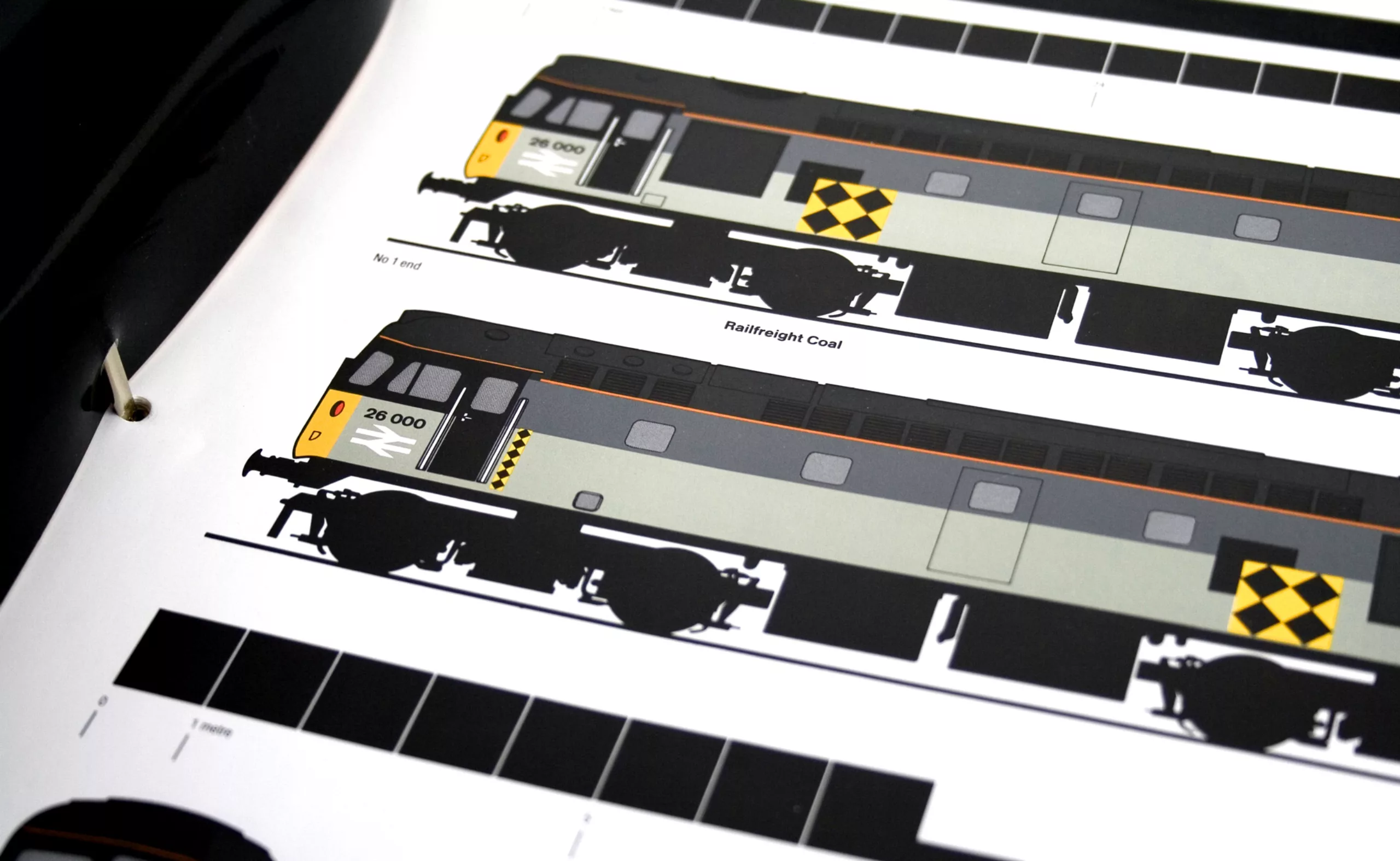
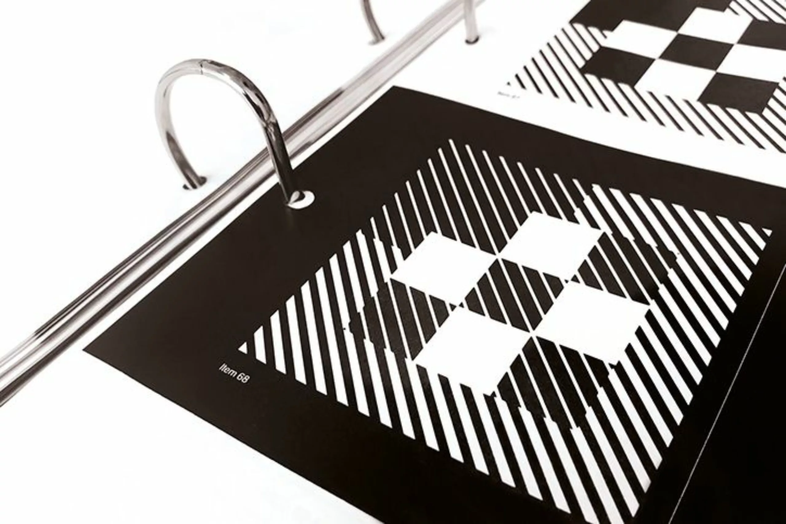
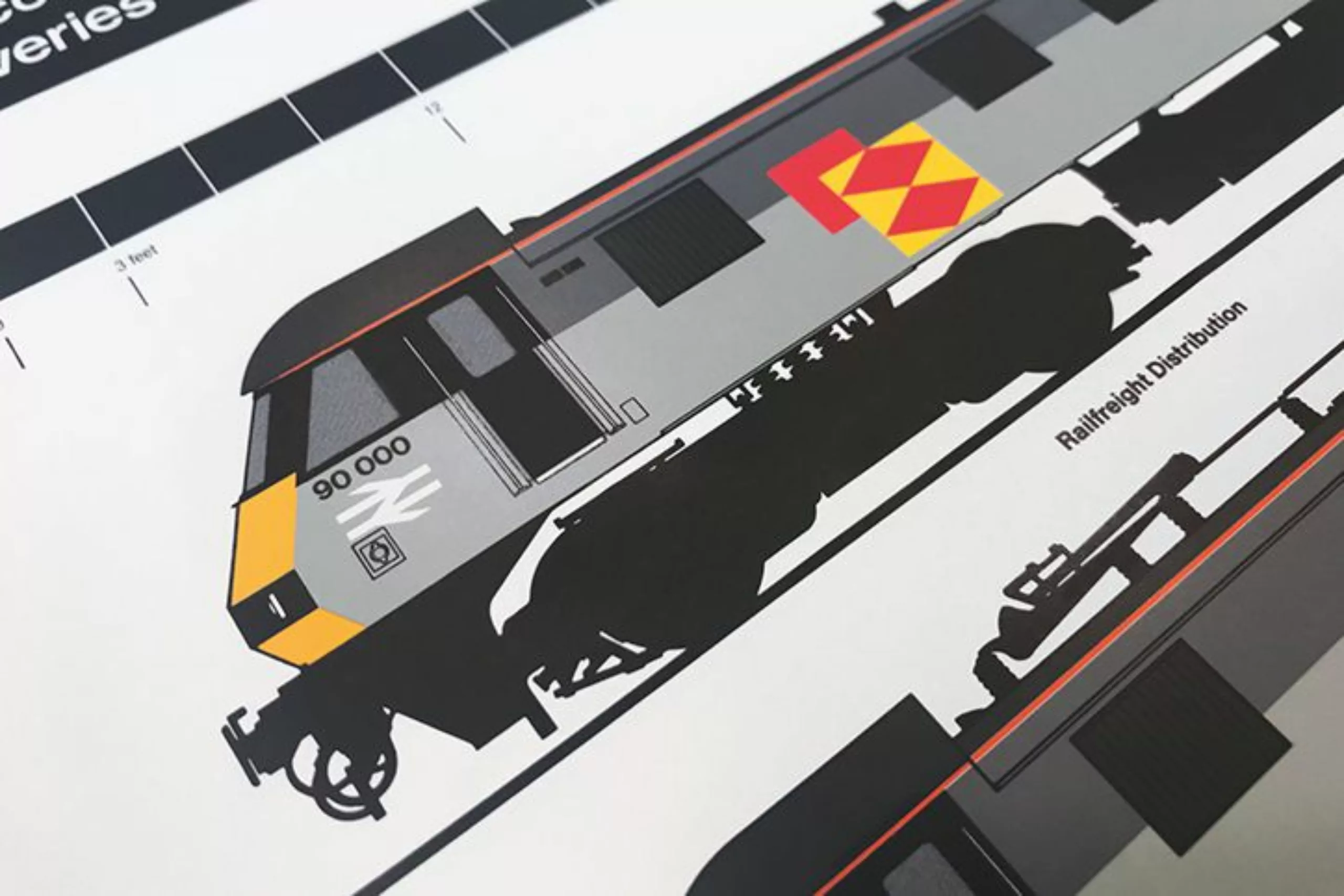
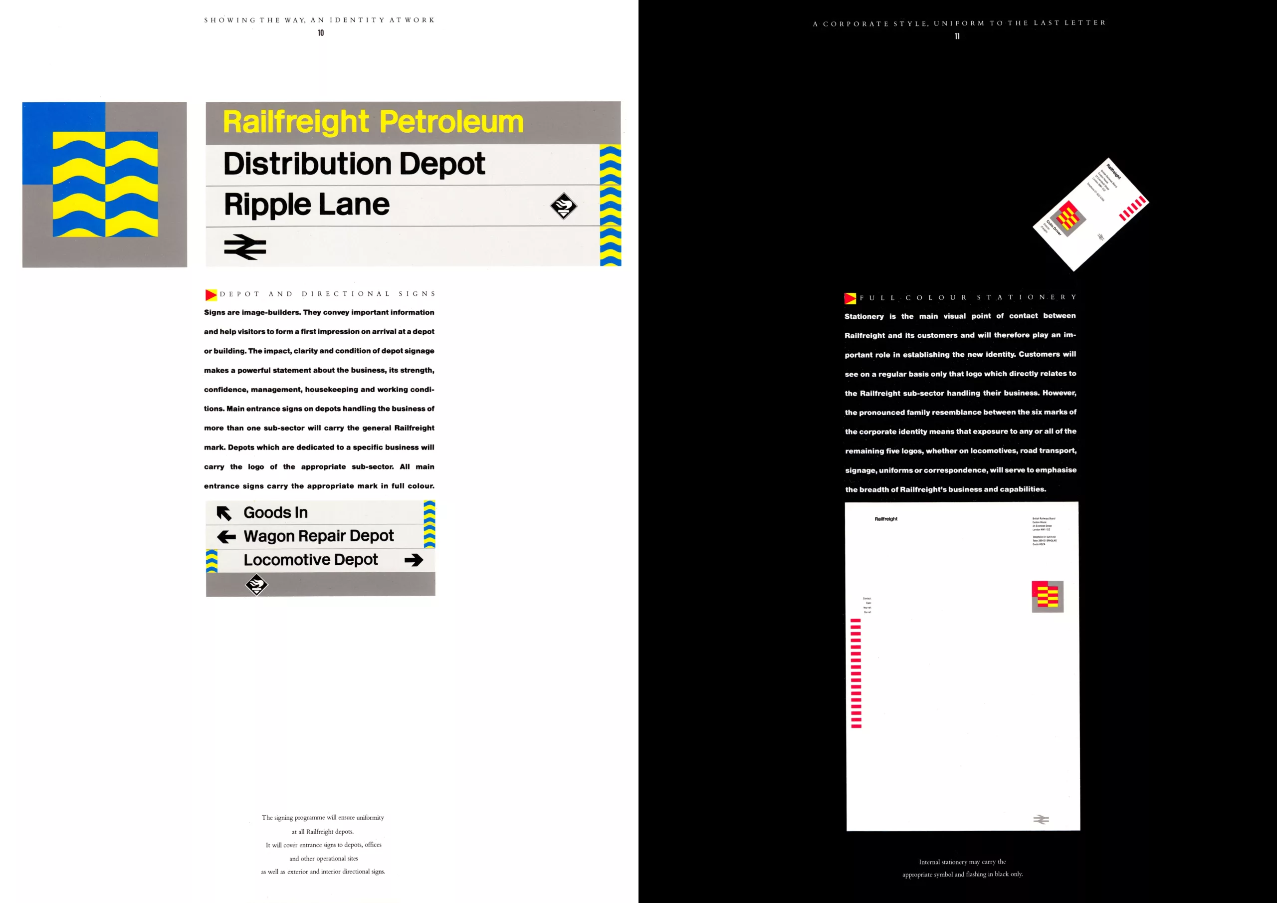
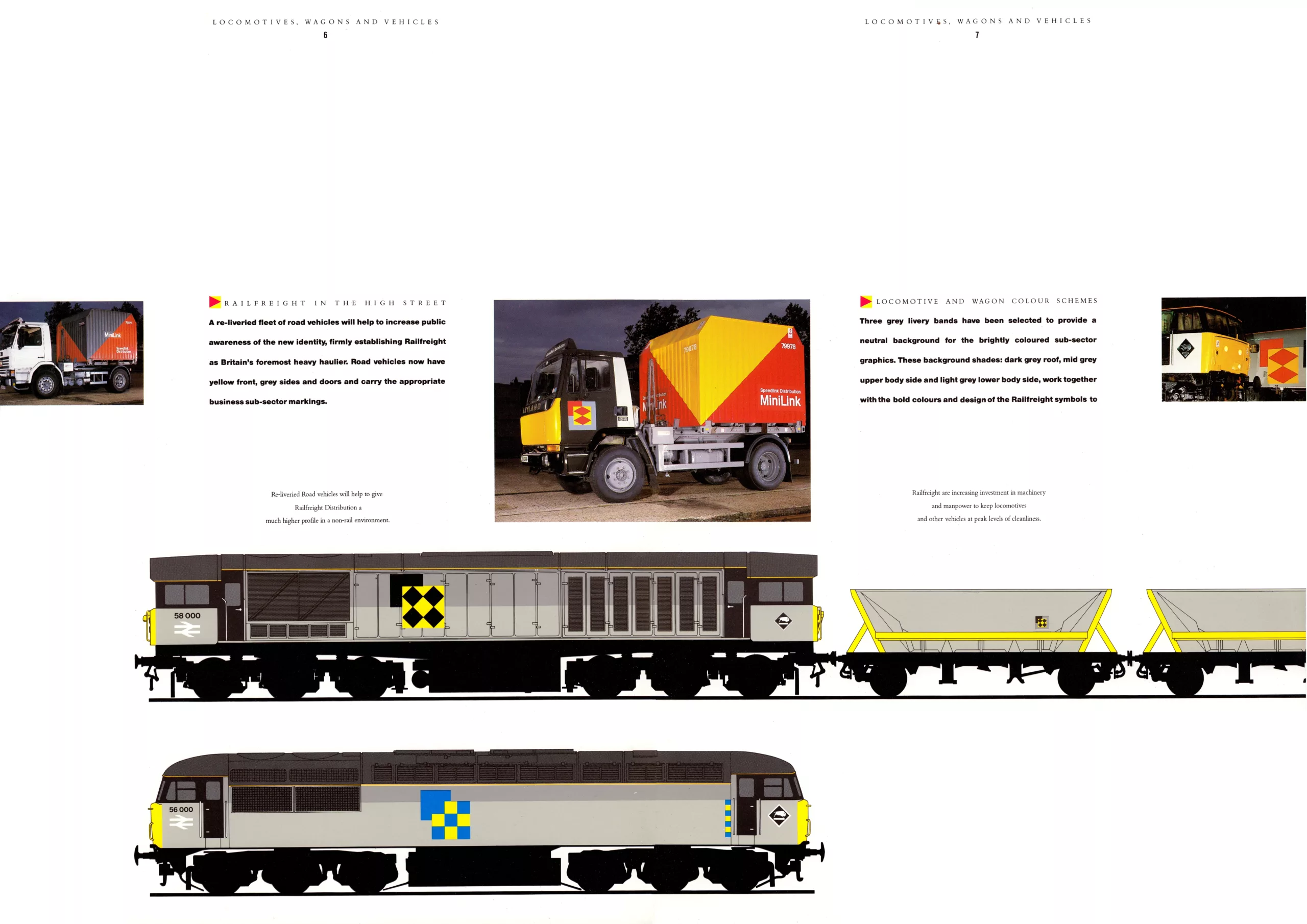
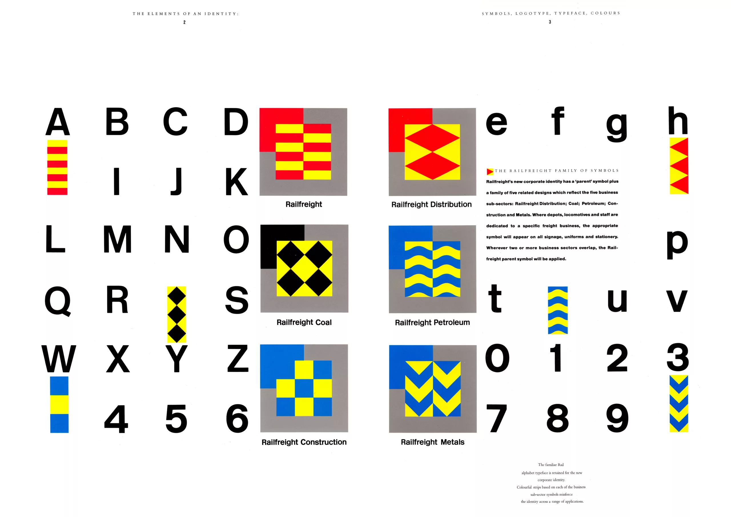
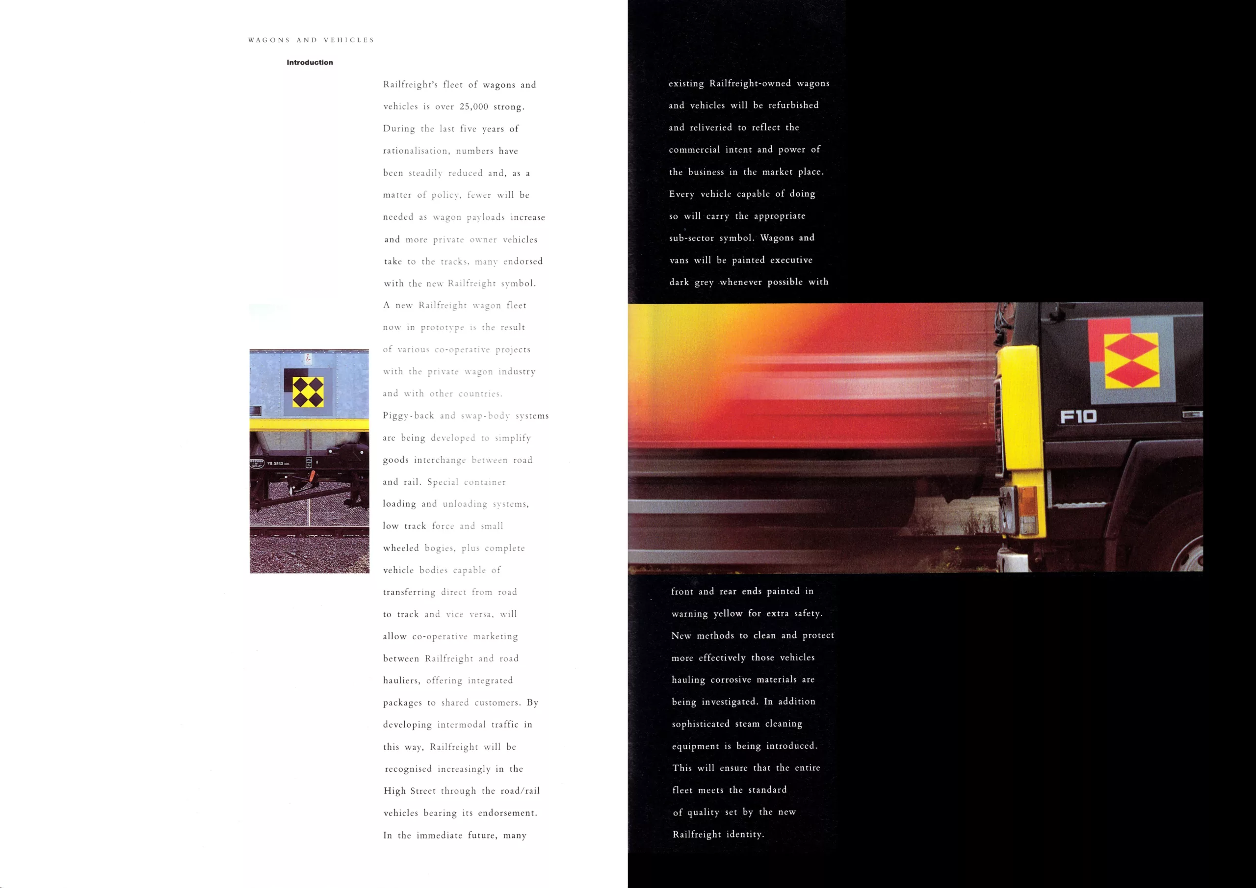
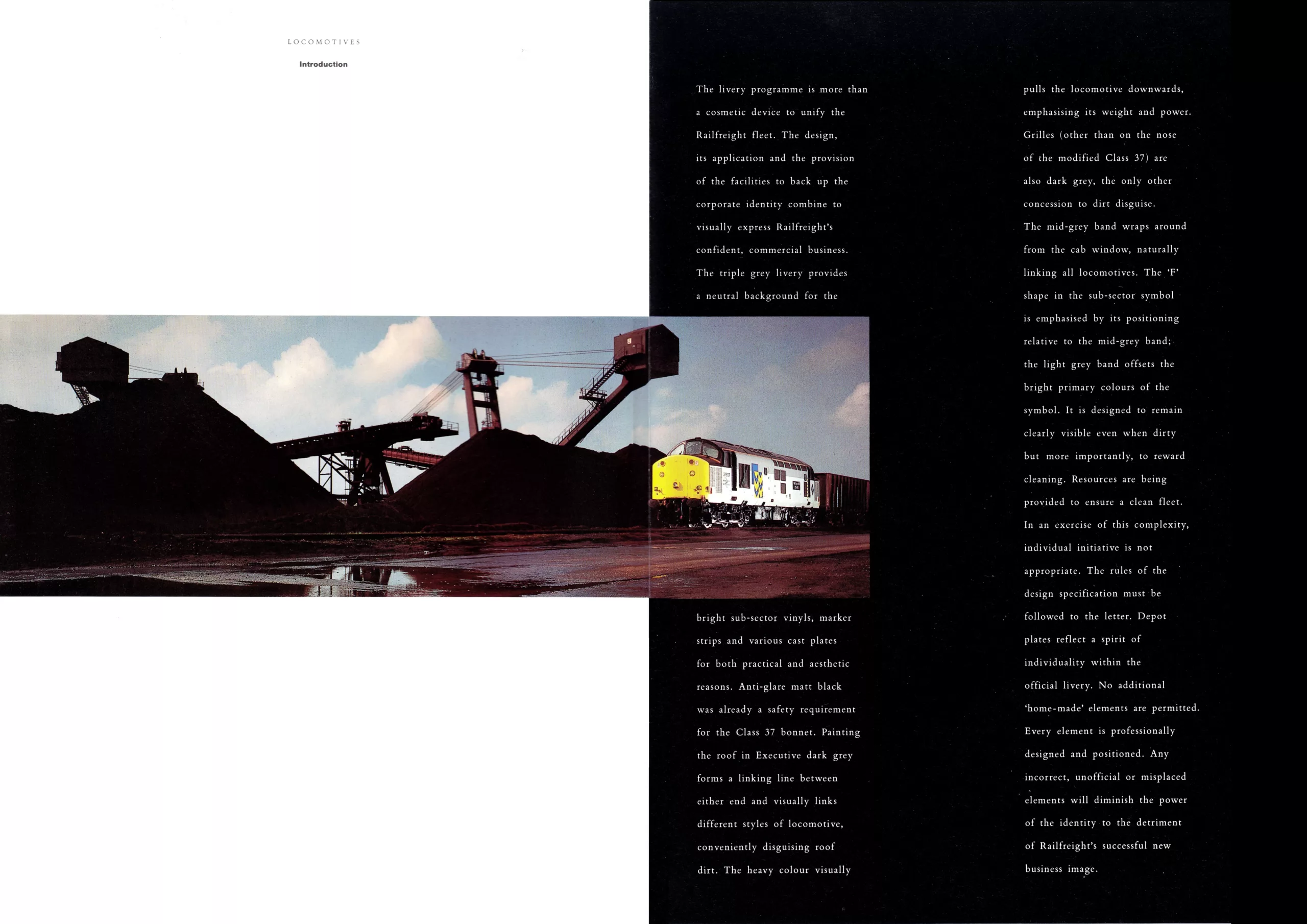
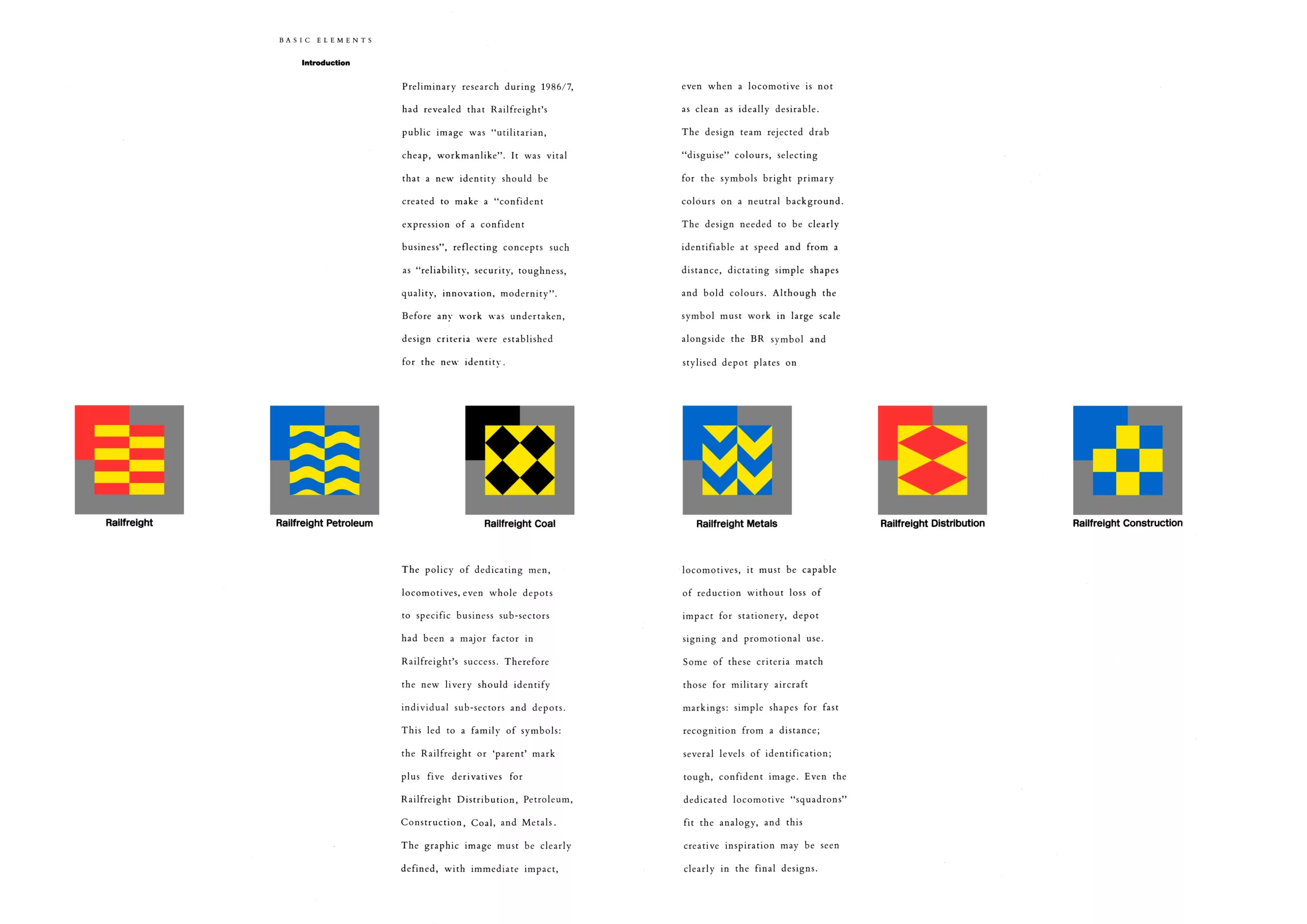
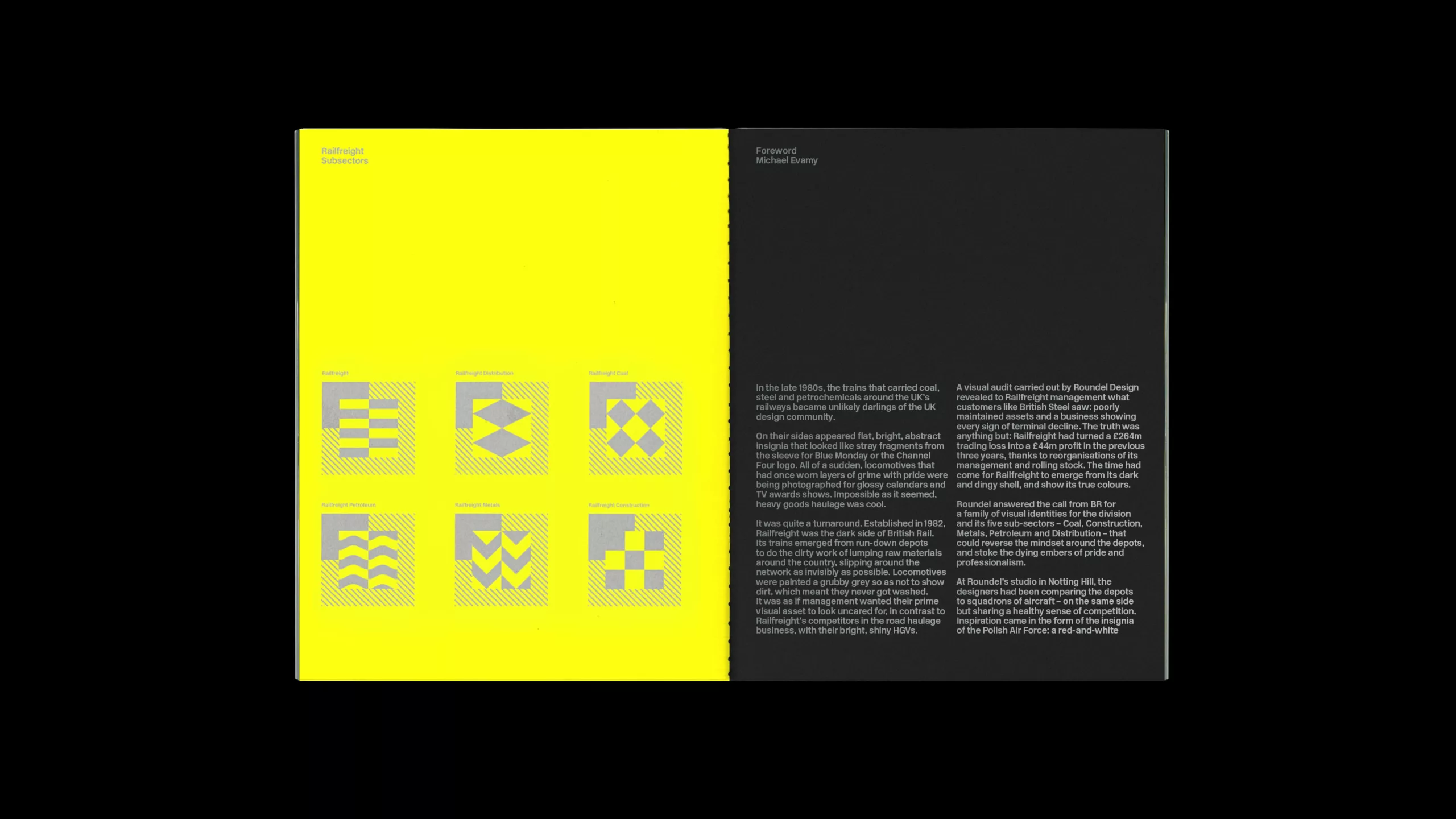
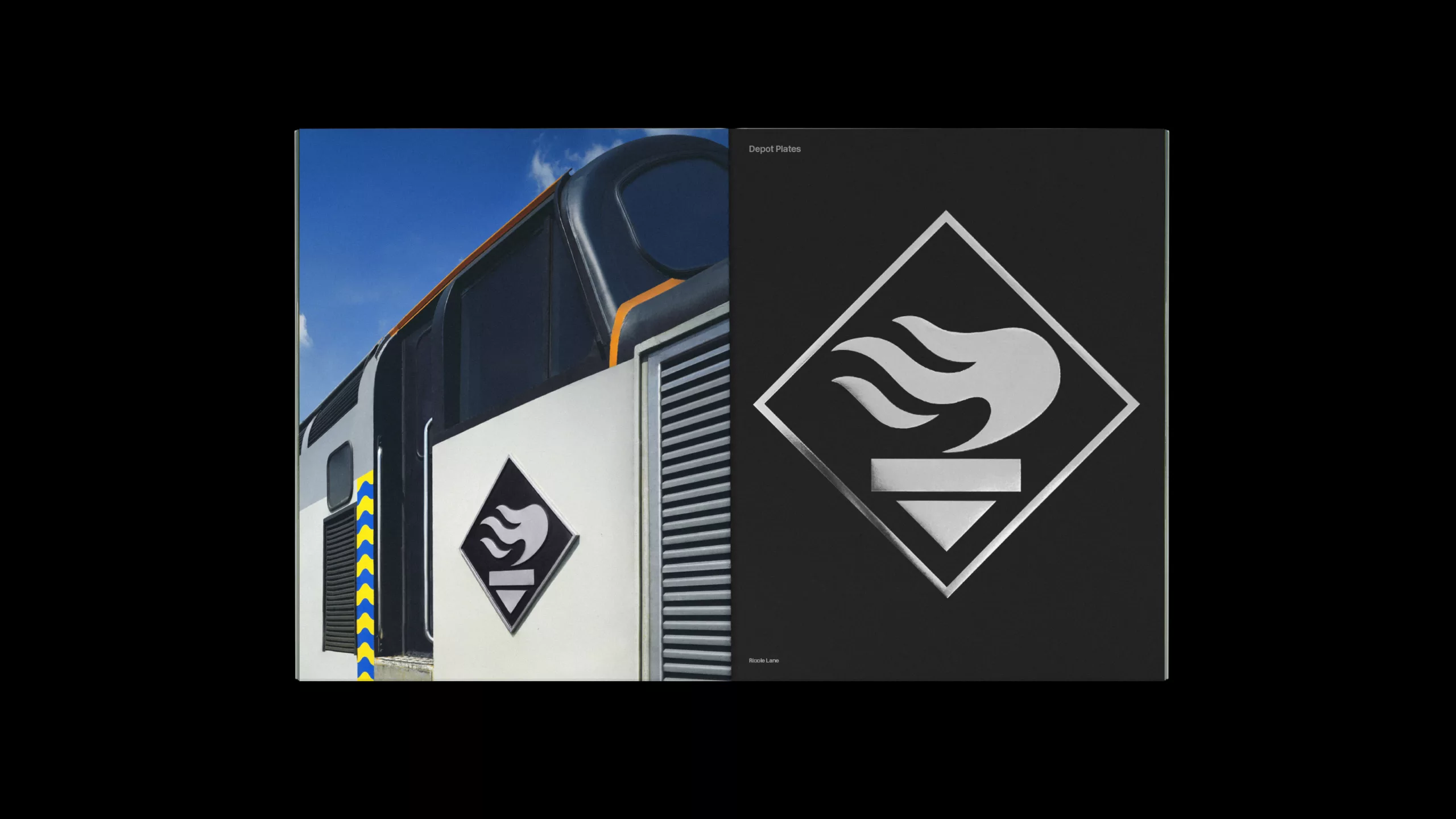
Freight is once again subdivided into six categories, rather like a kingdom reigning over 6 principalities, each bearing a unique blazon: coal, construction, distribution, general, metal, petroleum. Brightly colored and geometric, these insignia were more reminiscent of coats of arms than of the Second World War aviation cockades they were supposed to be inspired by. Nevertheless, it is said that it was the badge of the Polish Air Force, with its red and white checks, that inspired the Roundel team.
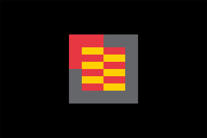
The colored corner in the left-hand corner serves both as an arrow in a positive impulse, and to visually create an F -for Fret- with the colored square patterns in juxtaposition. In a minimalist way like a logotype, these squares represent the characteristics of the materials transported. In order from left to right, 1st line: general, distribution, coal 2nd line: oil, construction, metals. We recognize the black and shape of coal, the waves of liquid petroleum, the folds of metal, or building blocks.
The blazon effect gives these trains a medieval knightly look as they criss-cross the landscape. Territory, identity, victory: beyond the fact that the brand does not appear clearly on the trains, these symbols leave no one indifferent.
This new identity has earned Roundel a flurry of awards, from D&AD, The Financial Times and the BBC. But only 7 years after its launch, despite a very promising future, it ended up in the garage. In 1993, the British railways were privatized, and each entity abandoned its logo.
It remains one of the few interesting branding projects of the 90s. It’s a little-known period that’s probably just waiting to be rediscovered, even if its legacy is more one of whimsical photoshop experiments than minimalist branding projects.

Interview with Bryan Edmondson (Ex-Roundel)
In February 2018, an exhibition in London is dedicated to this mythical visual identity, with as its subject matter the personal archives of Bryan Edmondson, a former collaborator of the Roundel Agency, now creative director and founder of the SEA agency. Here’s a short interview with him:
How did the exhibition come about?
In 1992, as a fresh graduate, I began my career at Roundel. At the time, I was very proud to work on this identity (launched in 1987), especially as our work was displayed alongside another great railway identity, that of RES (Rail Express Systems). After that, I always kept in touch with the Roundel founders. Reading an article on the visual identities of train companies motivated me to set up this exhibition. 12 months later, we inaugurated ‘Design for Rail’.
What does the exhibition consist of? Where did you find these archives?
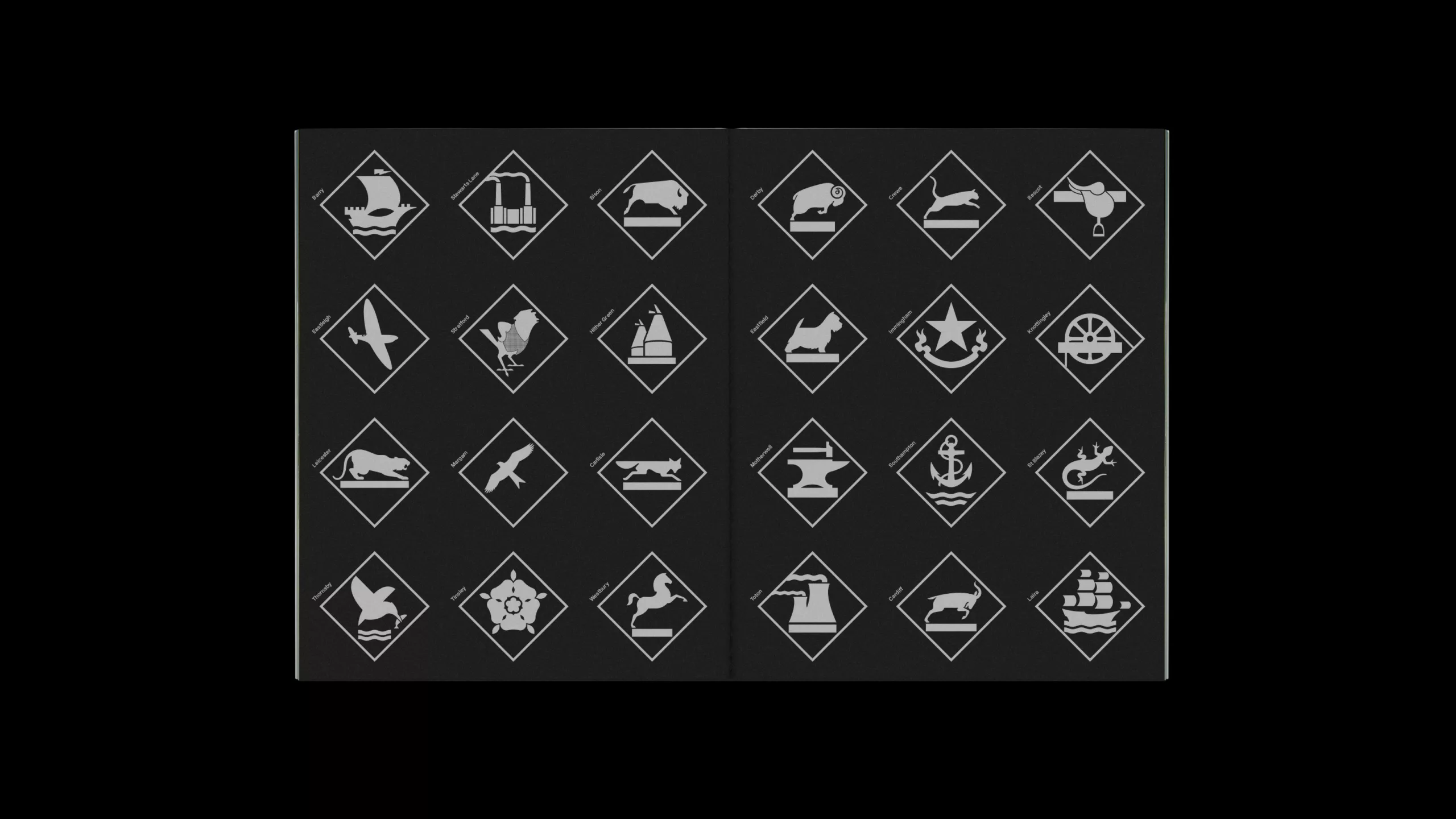
The exhibition is organized around archives from the period. We focused on printed documents such as the graphic charter, brochures, calendars, signage and icons. I personally had some archives of the project, but most were loaned by the founders of Roundel with the support of the National Railway Museum. We also located and recovered an existing Hampshire train depot sign – with the permission of the current rail operator!
Was the Roundel team involved in the exhibition, and if so, how?
The original team of Mike Denny, John Bateson and Harold Batten all supported the exhibition and helped tell the story of rail freight’s identity (with the help of writer Michael Evamy). They located and loaned printing supplies and some of the original metal depot plates pulled from their kitchen walls! I also had the kind help of ex-Roundel agency founders Darren Richardson and Chris Bradley, who also lent me rare and unseen items from the project and helped me identify some of the missing pieces.
What were your most interesting or unexpected discoveries during the research process and as the exhibition took shape?
After working at Roundel, I was well acquainted with the visual world of freight, but when we contacted the ex-Roundel team there were some beautiful printed documents, locomotive dressing manuals, identity guides, invisible depot boards, as well as a collection of original slides from their photo reports of the time, images taken in the middle of the night on various bridges and depots across the country.
What do you think are the main qualities of this identity?
Simplicity. When I was still studying graphic design in the late ’80s, I was always attracted by the simplest solutions to design, and that’s still the case. The Roundel team always described this graphic system as a reference to aircraft squadron markings, but I consider the identity to be designed as a code. The skin didn’t need the word “rail freight”, just a symbol to identify the different transport entities – with speed, an image is easier to read than words. I’ve always seen this project as a timeless, modernist design project. Unfortunately, the identity only lasted a few years, and in the mid-1990s it began to disappear with the change of management at British Rails. I still see this old look around the UK when I visit customers, and it reminds me that the 1980s had some rare examples of sober, simple identity design.
Extracts from the 1987 graphic charter…
Extracts from the exhibition catalog…

Credits: www.designforrail.co.uk
Thanks to Bryan Edmondson (www.seadesign.com) for the images and interview.
On the subject
-
New identity for the Gaîté Lyrique, a nice logo to start 2017
New visual identity for the Gaîté Lyrique, a nice logo to start 2017.
Yorgo Tloupas, our hexagonal madmen has struck again!