Cité-du-Vitrail-brand-identity

2020

Visual identity of Cité du Vitrail de Troyes
A unique place dedicated to the stained glass heritage of Aube en Champagne department

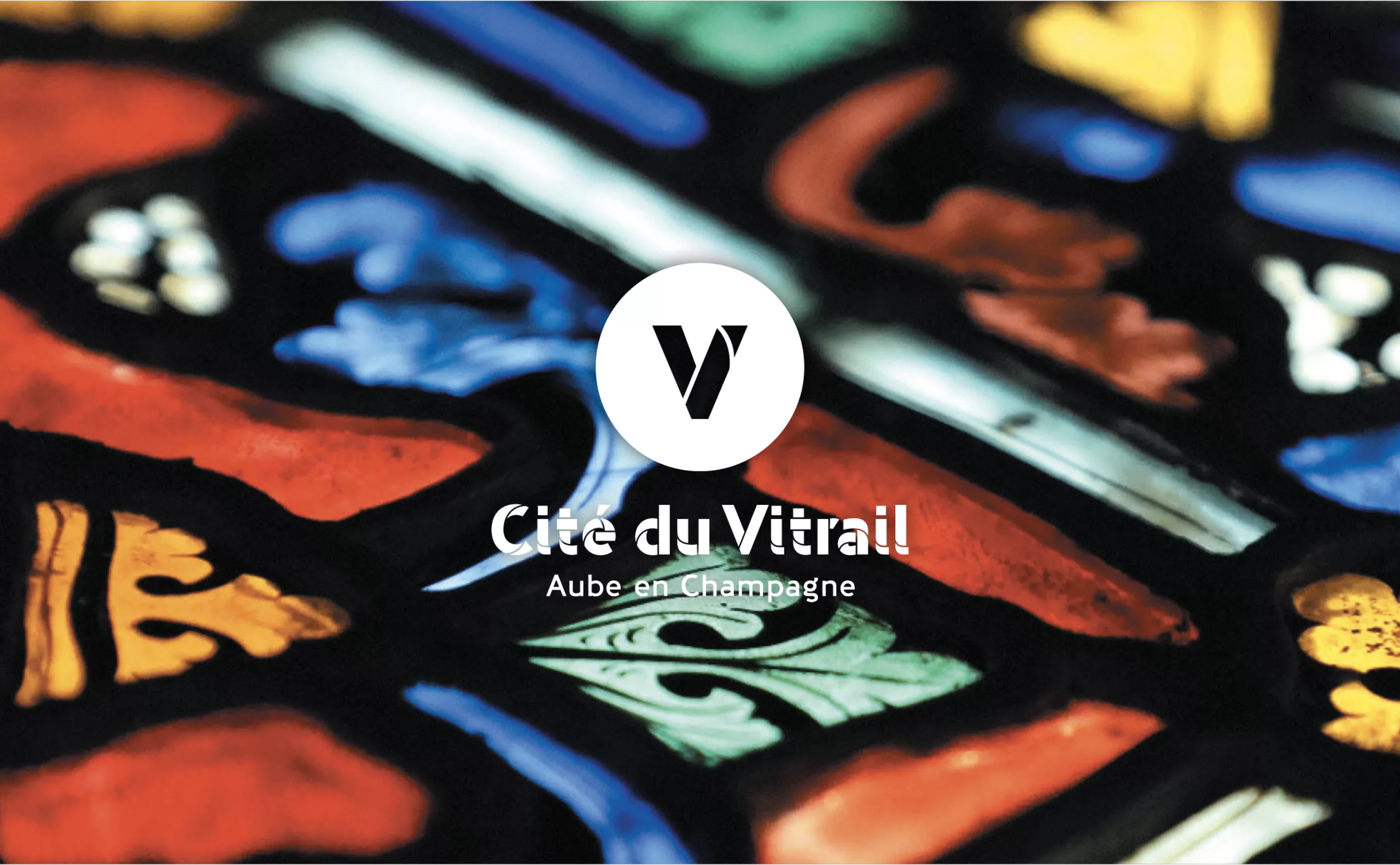
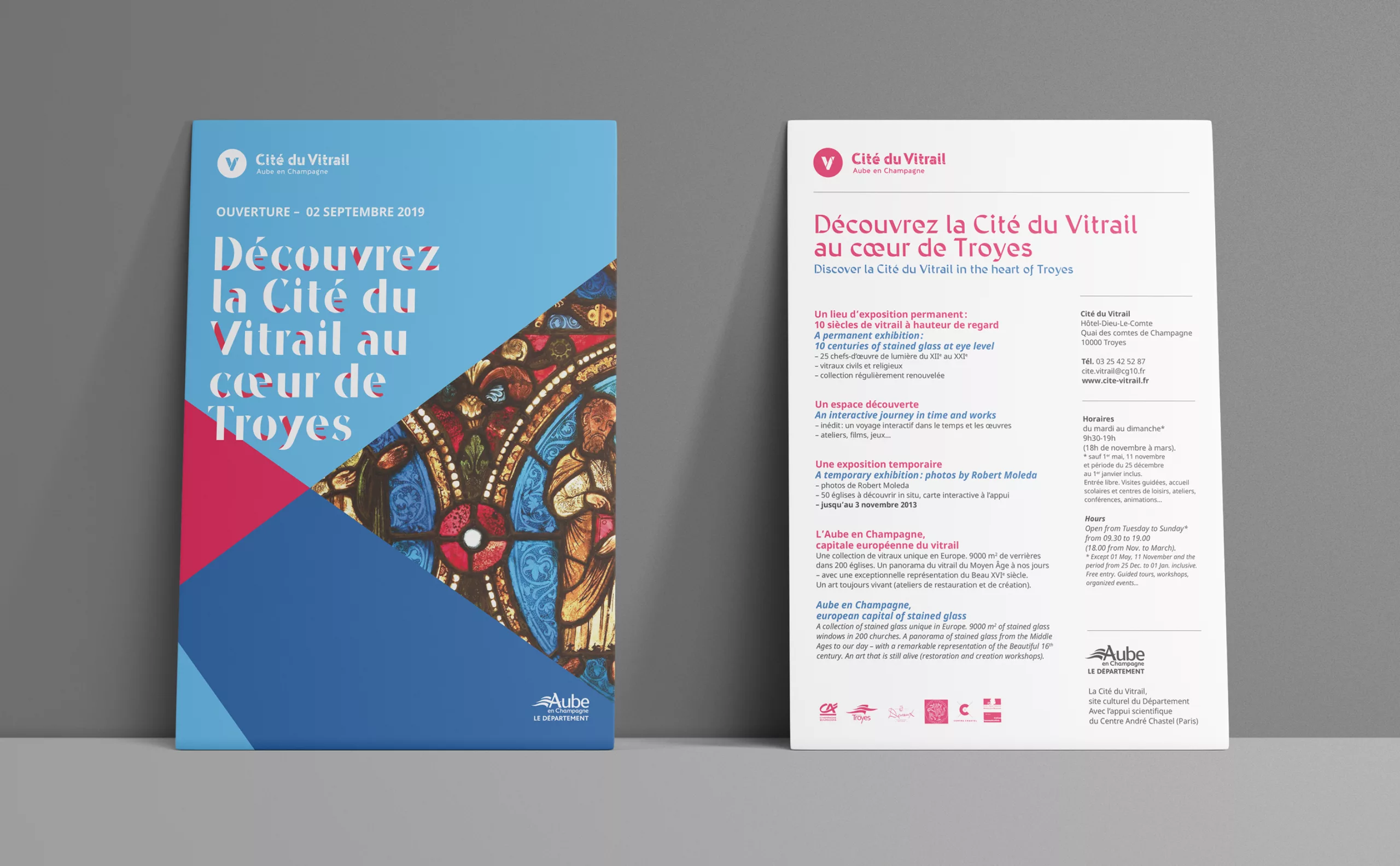
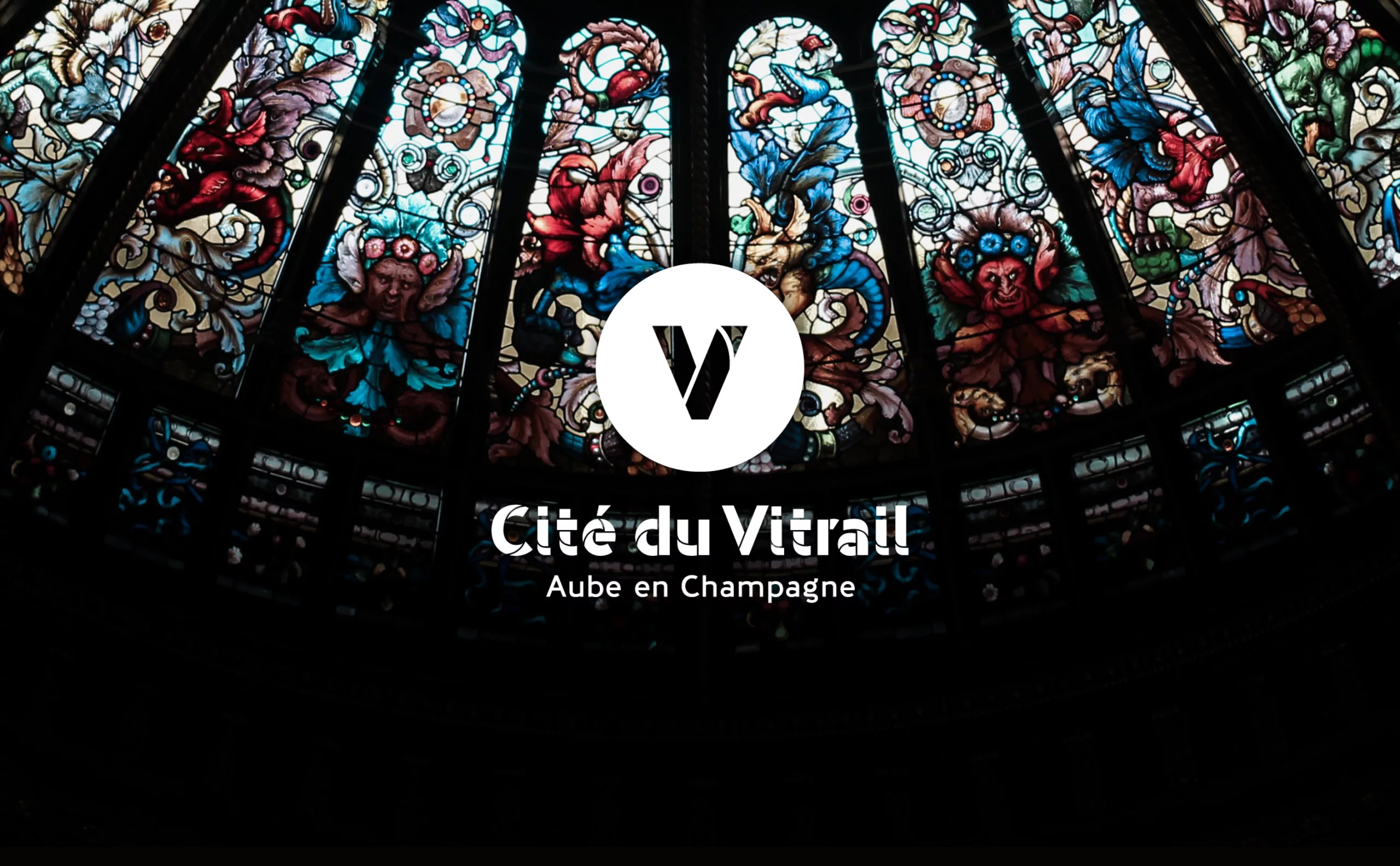
Cité du Vitrail is an exceptional scientific, cultural, educational and tourist project, supported by the Aube en Champagne department. Its inauguration took place on 17 December 2022, after more than 4 years of work. Located in Troyes in the Hôtel-Dieu-le-Comte, the Cité du Vitrail will offer nearly 3,000 m² of discovery, emotion and experimentation. This project aims to define the Aube en Champagne french Department as the European capital of stained glass.

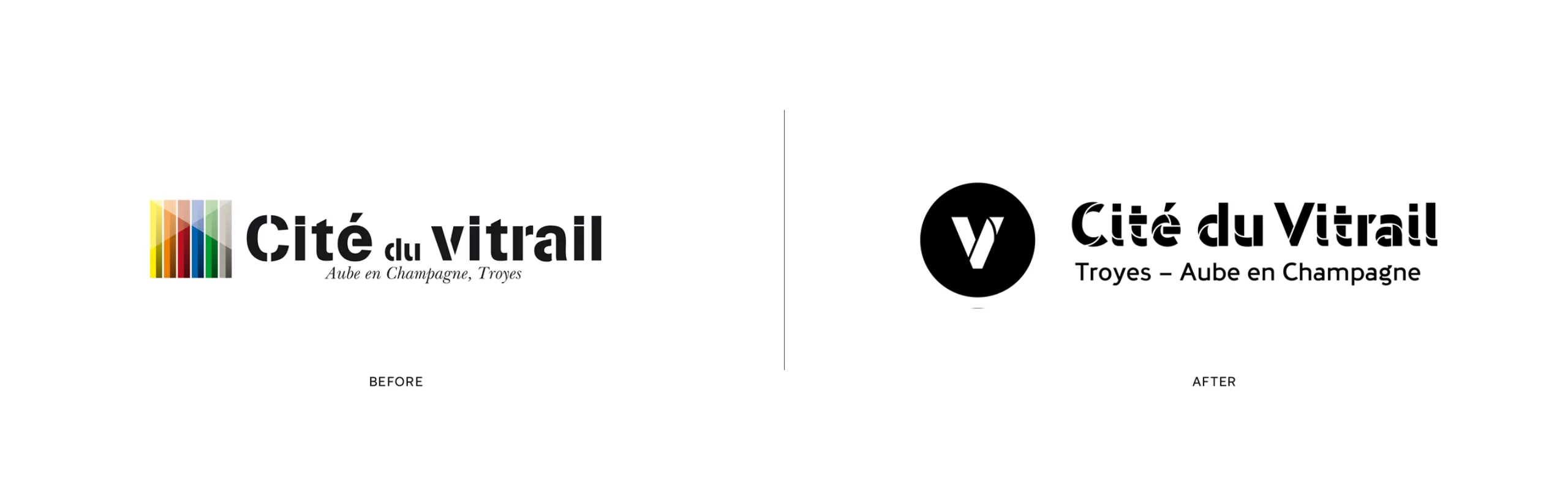
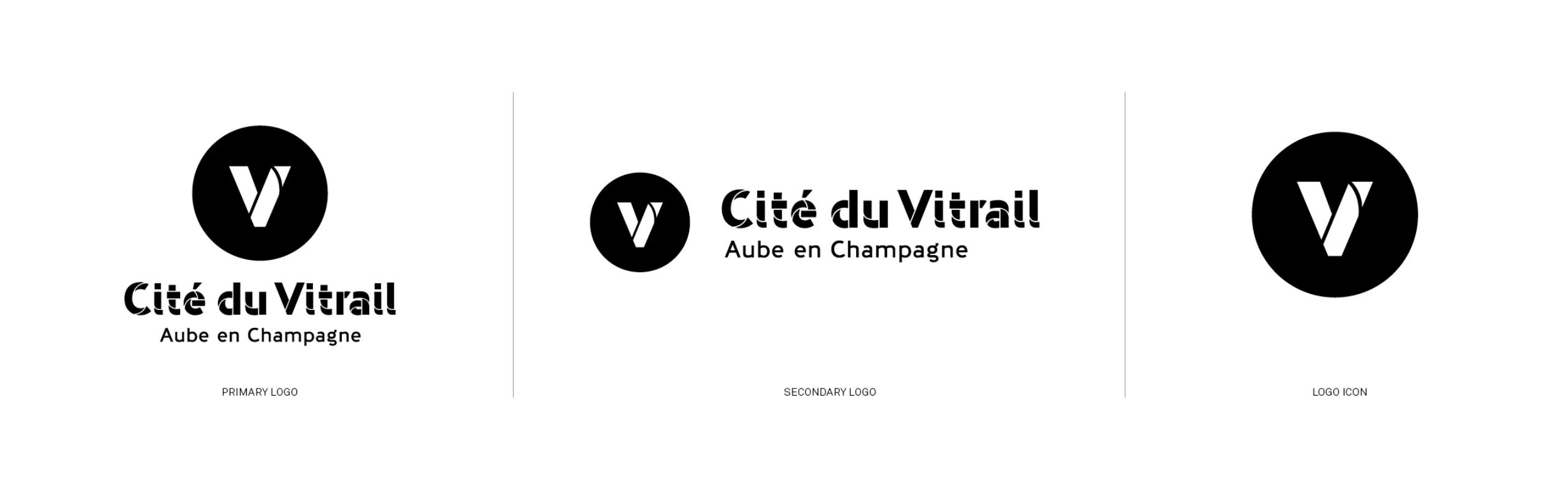
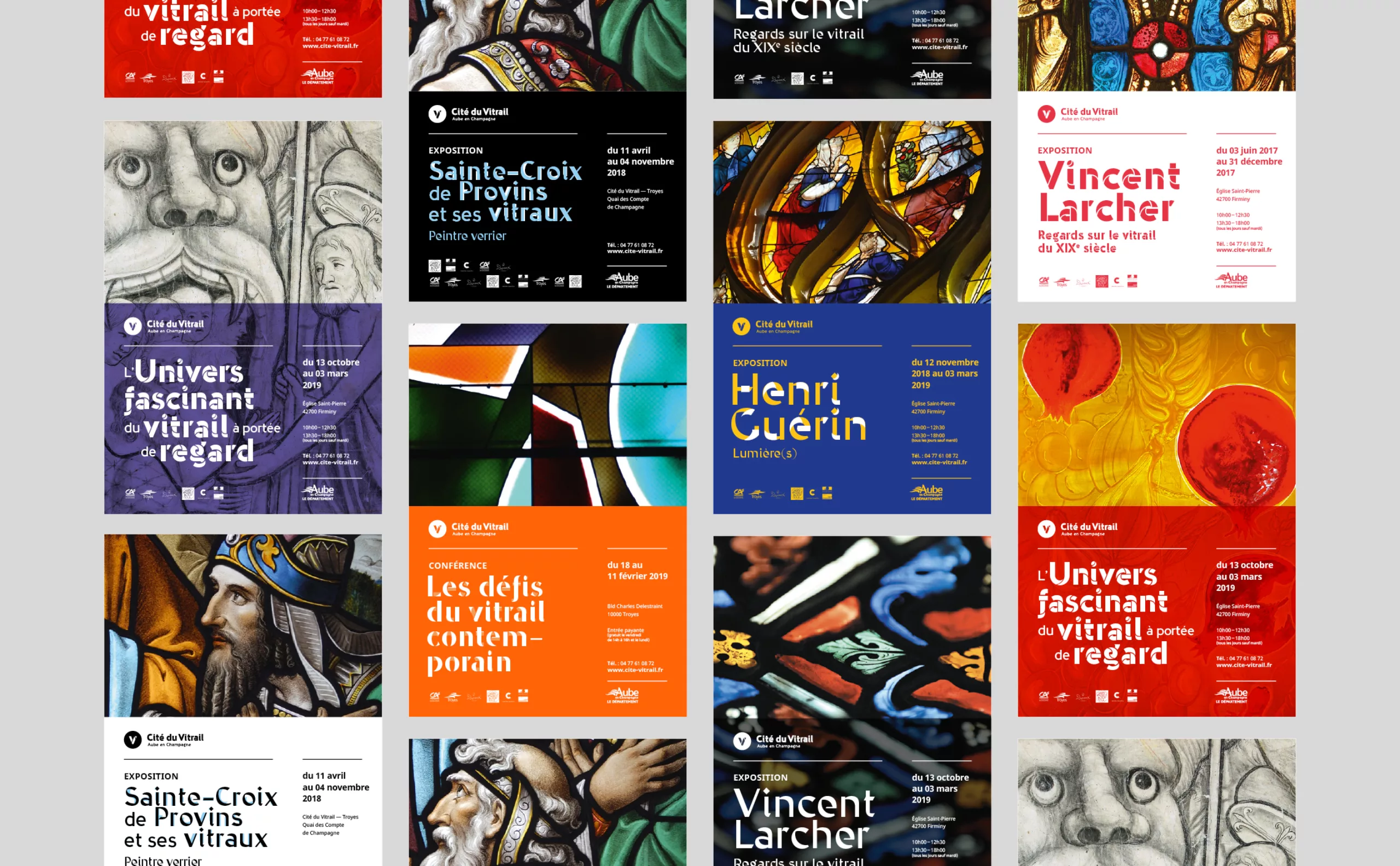
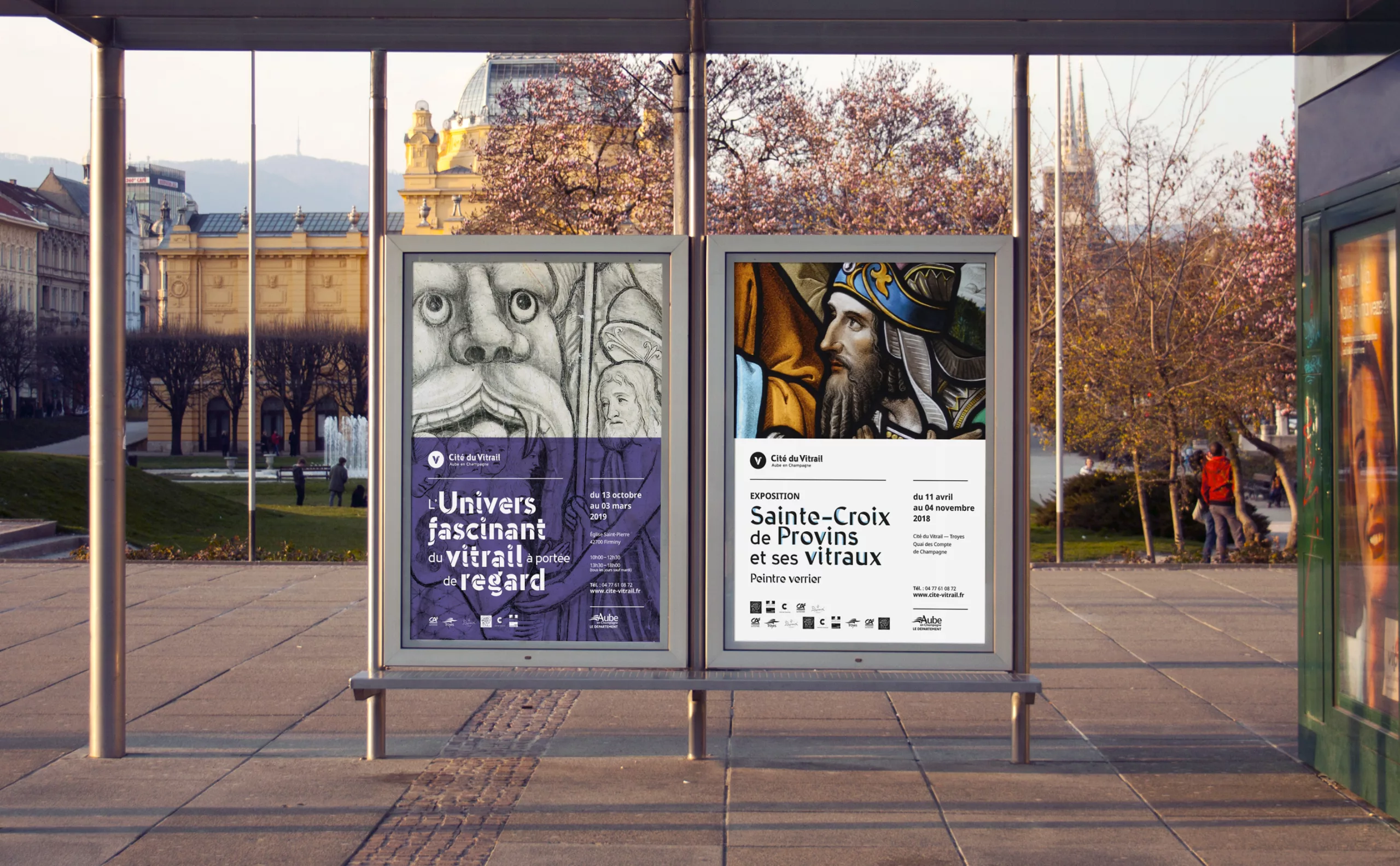
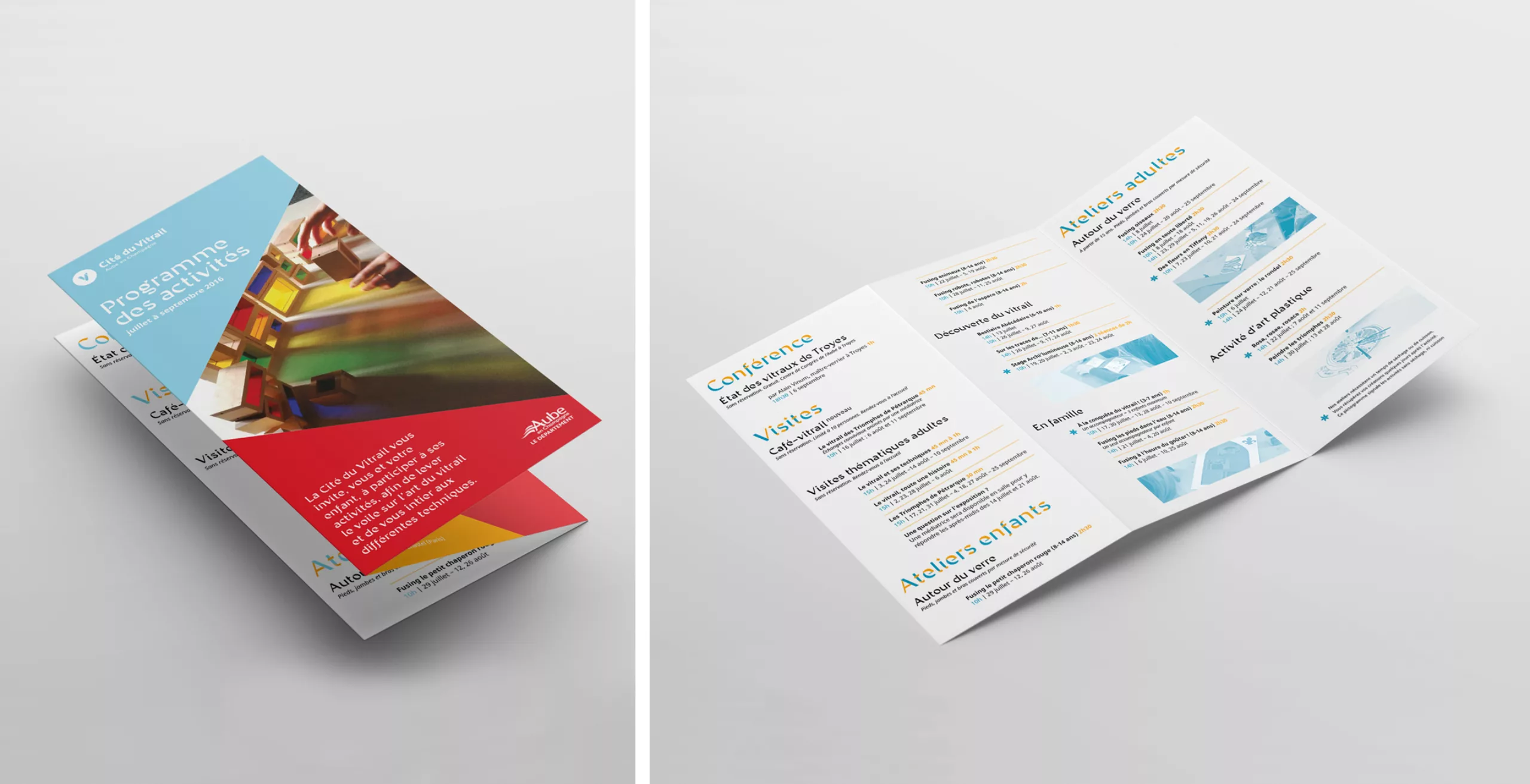
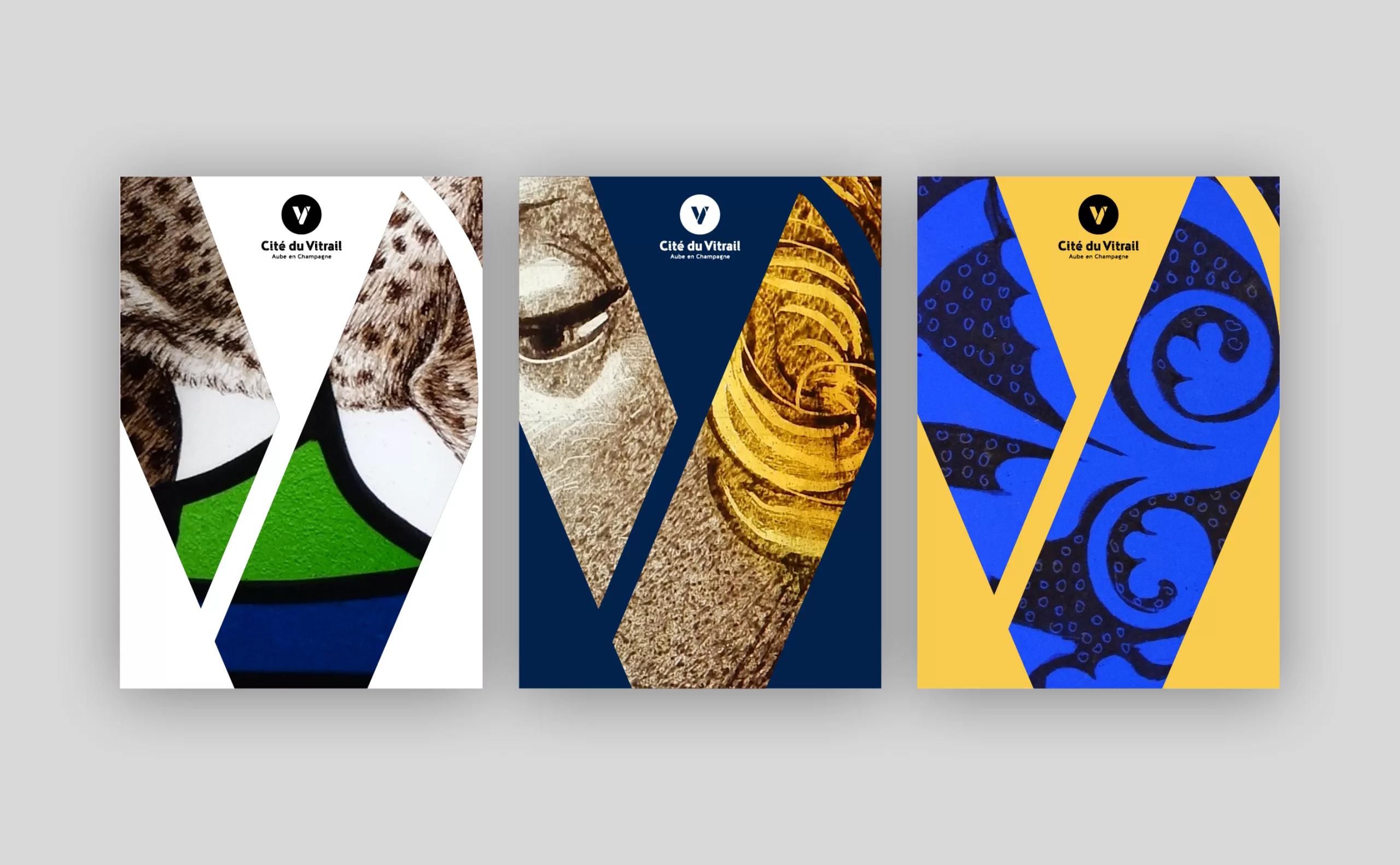
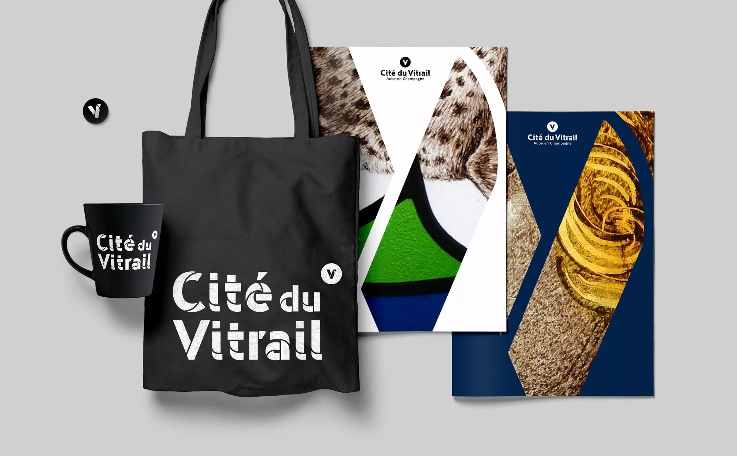
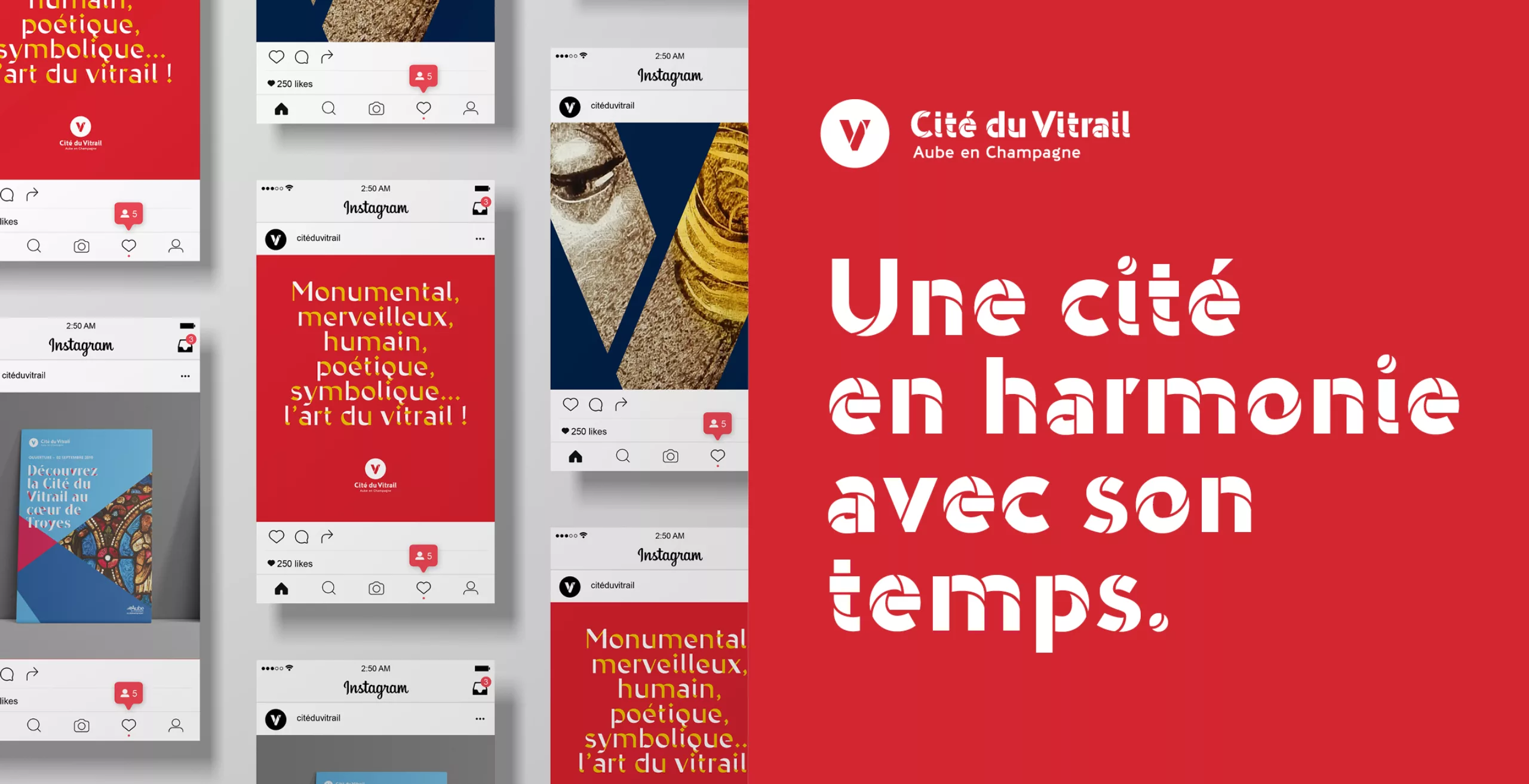
Graphéine had the pleasure of working with the Cité du Vitrail team to redefine its visual identity. The richness and abundance of the stained glass art in the Aubois region makes it an exceptional land on a European and world scale. The previous identity dates from 2013 and no longer corresponds to the ambition of a "great" City. Lacking legibility and without a coherent graphic guideline, the visual identity of the Cité du Vitrail needed a boost to match its new stature.

A visual identity that symbolises the art of stained glass

The new visual identity combines a redesign and the enhancement of an exceptional place. The primary objective was to break with the dusty image of stained glass and to give it a lively, dynamic, creative and innovative image.

The fragmentation of the stained glass windows and their geometry largely inspired the logotype. The "V" monogram emblem and the wordmark were made from the Ziza typography of Novo Typo foundry. It’s a cut-out typeface that recalls the art of stained glass and its manufacturing processes. The stencil aesthetic of this typographic choice is a nod to the netted structures of stained glass. The typeface, used in black and white for the logotype, has been adapted and customised to create a unique and impactful design. The use of the Ziza family of typefaces is expressed in colours and overlays within the graphic system.

This approach of composing the whole identity of the place on a typographic choice allows an original and singular identification. The Ziza typographic family is composed of different styles to be overlaid. The play of transparencies and cut-outs offered by these superimpositions translate very directly the constituent elements of stained glass: light (coloured or not), glass and the relationship between the stained glass and the architecture that receives it.

A typographic family that plays with fragments and transparency

The graphic system directly evokes its subject, whether the visuals take up stained glass illustrations or the compositions are solely typographic. The colours are based on the range that allows the typography to be layered in a fragmented way. A principle of transparent flat tints is overlaid on the visuals, which are displayed on the full page, allowing the finesse of the work to be admired. Finally, the emblem acts as a window, a piece of stained glass through which the works can be viewed.

The strength and typographical correspondence of this project perfectly reflects the desire of the Departmental Council: to rejuvenate the image of this craft and to promote the historical and contemporary heritage to be admired in the territory.

Context

The Cité du vitrail, a service of the Department of the Aube, had to make its transition. From a prefiguration exhibition, opened in 2013, its objective was to become a cultural establishment of international scope on the art of stained glass. Work on the west wing of the Hôtel-Dieu-Le-Comte in Troyes began in June 2018 and the prefiguration space will close its doors definitively on 31 December 2018. The Cité du vitrail will continue to operate for a time outside the walls during the closure period. After 4 years of renovation work on the Hôtel-Dieu-Le-Comte, the Cité du Vitrail opened its doors on 17 December 2022.

Objectifs

The new visual identity updates the image of the Cité du Vitrail and stands out from other stained glass structures in Europe. The new brand universe embodies a lively, dynamic, creative and innovative image of this art. This project allows the Department of the Aube to establish itself as the European capital of stained glass. The new visual system based on the Ziza typographic family is consistent with the constituent elements of stained glass: light, glass and the relationship between the stained glass and the architecture that receives it.


Share this project:
Project expertise:
Logo creation, visual identity and graphic guidelines.
Type of client:
Cultural communication agency for theaters, concert halls, festivals, dramatic and choreographic companies. Heritage, museums & cultural spaces.

Related projects: