New Peugeot logo and car rebranding, it smells musky!
The car manufacturer Peugeot unveiled its new logo on Thursday 25 February at a press conference. At a time of group mergers, PSA and now the mastodon Stellantis, Peugeot is getting a new look with a new brand image wich is more than ever comfortable with the mane and wild roar of its famous lion emblem.
A futurist Peugeot logo from the past
The return of the coat of arms gives a vintage or heraldic style to the new logotype of Peugeot and one would expect logical hostile reactions to this choice. One might have thought that this new logo would only move your grandparents who knew the brand when it mainly marketed coffee grinders, but it is actually quite the contrary.
In spite of this very “back to the future” logo, and after a quick look on Twitter, to our great surprise, the welcoming of the new Peugeot logo looks rather good. Some criticisms highlight the heraldic connection with the Ferrari and Lamborghini logos, or the fact that it could look like an amateur football club logo… no general outcry then!
A lion’s head roaring with a realistic graphic style (like a safari trophy) is necessarily a bit bestial and how to say… manly? Many reactions welcome this return of a fierce, royal and conquering logo.
Peugeot has taken the counterpart of what other manufacturers have done with recent rebranding that emphasise geometric simplicity to favour the integration of logos to the new screen interfaces. It sends a strong message to the new generation by removing the “boomers” chrome style 🙂
Back in 2010 we were already questioning this overdose of chromium in car logos and we forbade ourselves to speak only about the Peugeot logo!
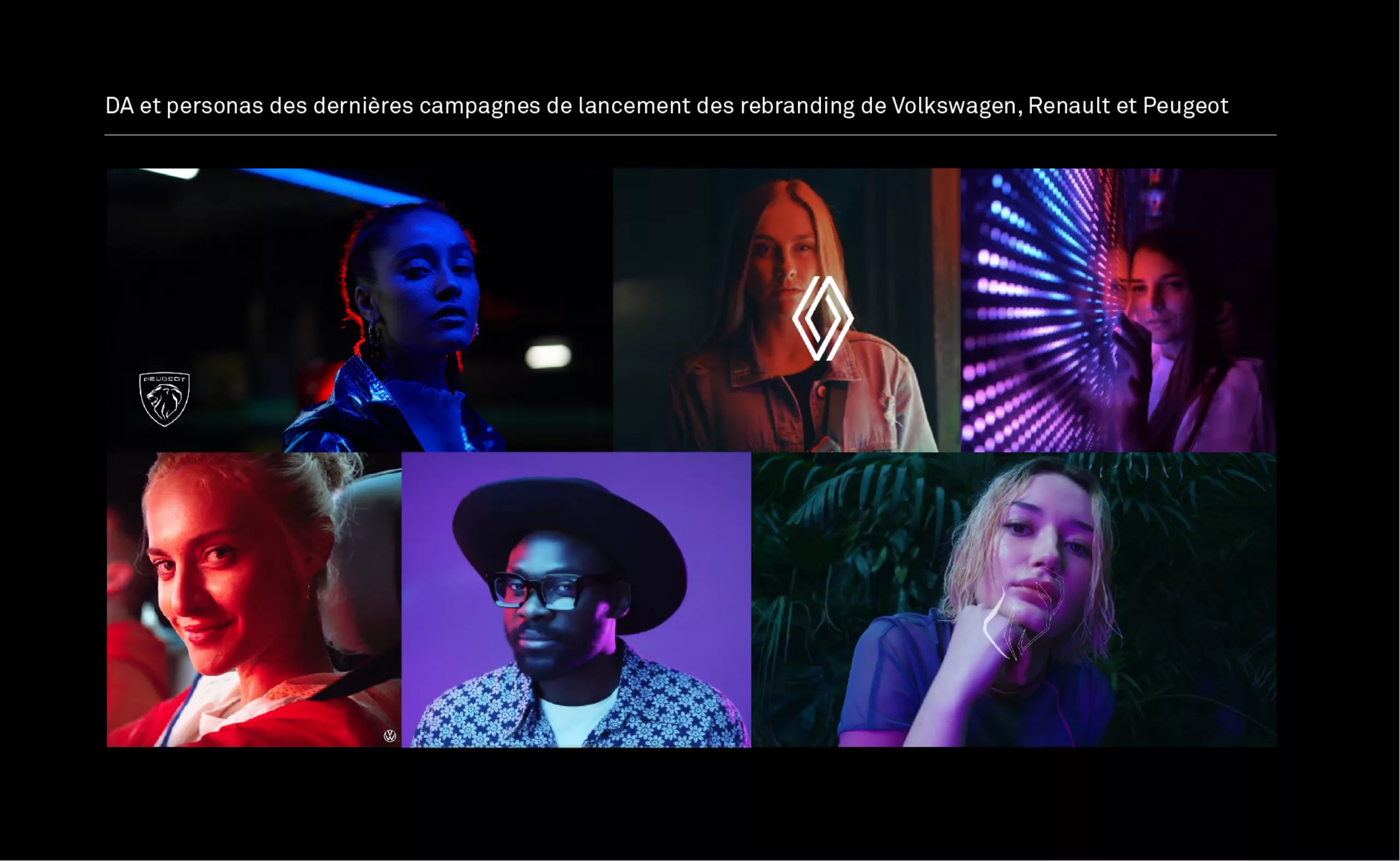
Chrome car logos were the era of oil spills and fine particle pollution scandals… This is what recent new identities are trying to make us forget with their advertising spots with their “flat” sleek logos declined in luminous versions; drivers who are old enough to be students in visio and the bank account at zero; Drive-like decors and faces bathed in stroboscopic and coloured lights as those seen in Nike and Adidas spots or in electro music videos.
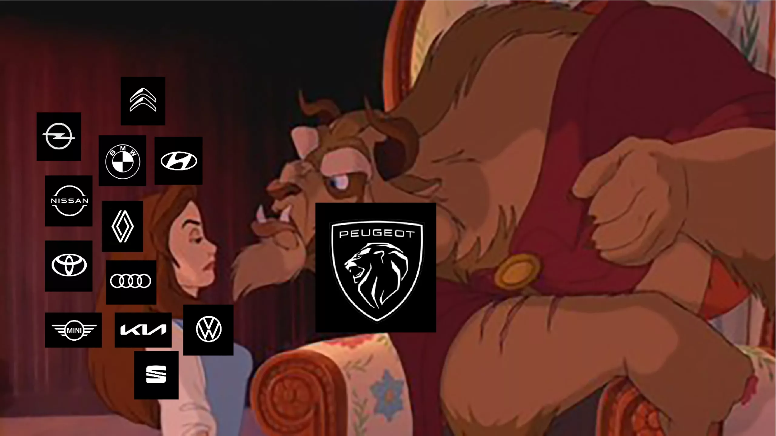
Note that in the new car logo topic, Renault has recently distinguished itself brilliantly by paying tribute to its graphic heritage with a vibrant emblem that revives the stripes of Vasarelian optical art, for a resolutely modern, simple and iconic result.
Disruption seducing the “new generation”
Welcome electricity fairy and bye bye pump petrol. No more libidinous arguments (you have the car, now you can have the woman), nor the promise of a perfect family life with a delighted flock in the rear seats. The car industry is definitively turning towards hybrid and electric aesthetics that dream of being cleaner, digital, and definitely fun. Smartphones, consoles, PCs or social networks, life has become “gamified”.
And yet Peugeot is returning to its medieval heraldic symbol of the 60s with a racy lion’s head full of furry details. A very figurative and naturalistic bias that risks opinion division and will also pose quite a few problems of reproduction and legibility in small scale. A new logo that has a very vintage and “grrrown up” -even “senior” style- but which has the merit of distinguishing itself from the competition. It is a return in force of the animal(ity) for the French car manufacturer in a landscape of minimalist and policed graphic identities. In this sense it is a surprising, possibly daring choice.
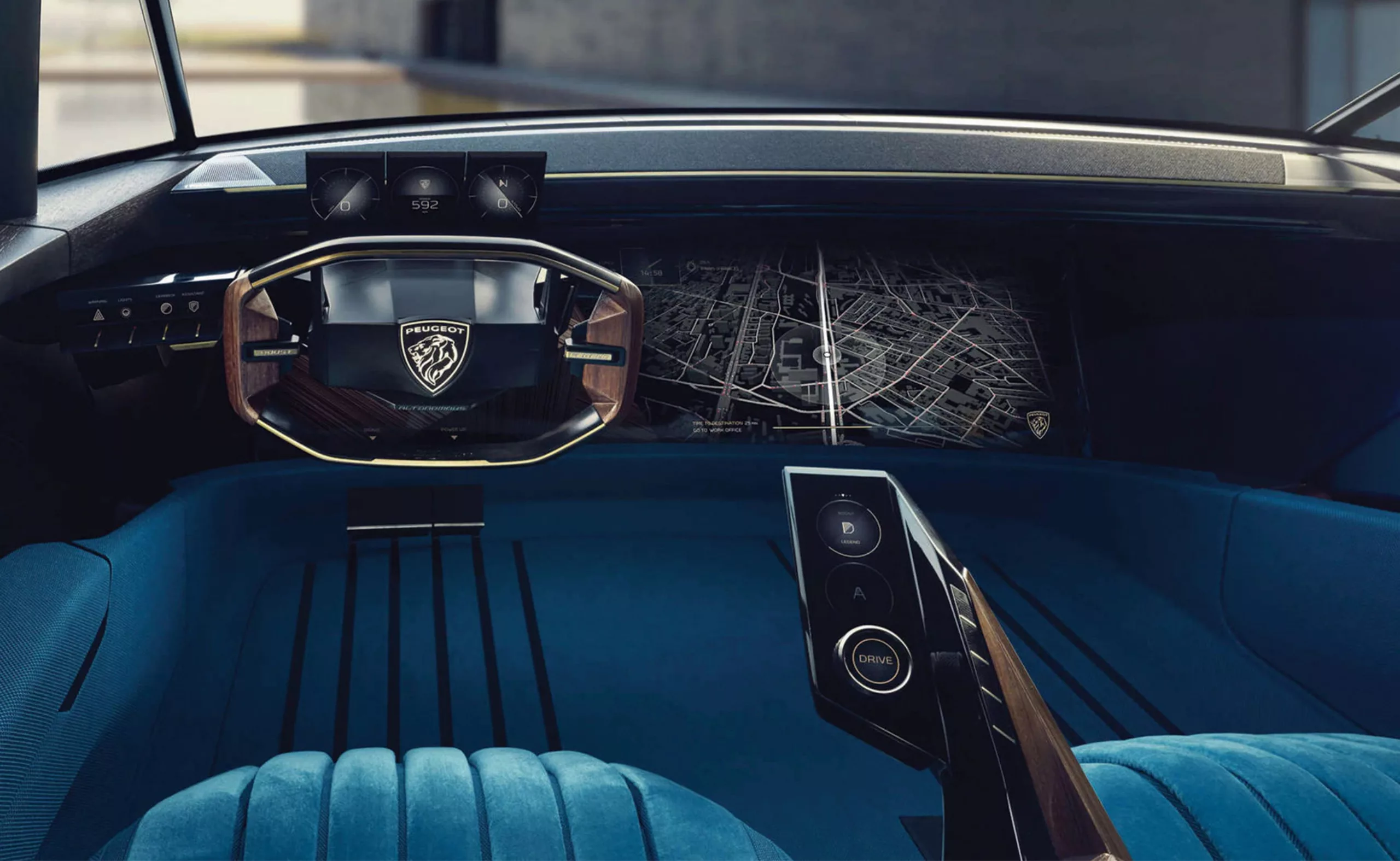
We actually already saw the 60s Peugeot logo on the e-LEGEND, a concept car of the future inspired by the past (the pimped 504 coupé), fully electric and even autonomous, which was recently released. Shall we use the same and start again? That’s what their #UnboringTheFuture seems to say.
One can also read in this new logo a conservative stance, searching in the depths of its heritage (60 years back!) for a story to cling to. From this angle, the new Peugeot logo offers us a vision of the automobile keeping an eye in the rearview mirror!
A block-buster from Franche-Comté
Have a look at the video revealing this new visual identity. We are impressed by the means deployed by the Sochaux firm (cf: the Peugeot lion comes from the coat of arms of the French department of Franche-Comté). A 22 minutes keynote in Hollywood-sur-Doubs.
The new mantra “Turn time into quality time“
If by any chance you manage to understand what they wanted to tell, do not hesitate to leave a comment. In the meantime you will see a collection of words that sound “style” but are profoundly meaningless. We just understand that Peugeot is trying to move up the range.
On the e-LEGEND website one could read: “in today’s environment where we are permanently ultra-stimulated, having time for oneself is probably the most precious thing”. The idea would be to use one’s free time to do everything but waste time, driving being one. Where we were once sold the luxury of space and then the pleasure of driving, we are now offered the luxury of doing something else. “Autonomous driving will allow you to find this time for yourself and create new experiences to live within your vehicle.” So in the car of the future we’re no longer going to drive but rather have fun.
It’s funny how car designers tend to sell us a fantasy by portraying the car (especially the SUV) as a protective bubble to escape the monotony of the outside world and reconnect with ourselves, whereas it’s precisely by cutting ourselves off from others that we disconnect from the world. We have seen this with the confinement… Man is a social animal, let’s not forget that, and most of the inventions of the last 20 years have contributed to dehumanizing social bonds in order to digitalize them, isolating individuals from the group. No, we won’t be happier if we all watch a movie together in our car. Singing at the top of one’s lungs on a single looping tape is priceless #nostalgia.
Switching on headlights instead of looking back in the mirror
We agree that a logo alone will not change the world’s face. On the other hand, we know how revealing these changes in codes are, and provide us with insight lights about organisations and their motivations.
Over the past decade, the automobile industry has sought to erase its ostentatious character. Chrome was to the car what gilding was to the 3rd republic. A superficial decorum aimed to shine and impress. We know how much the car was the showcase of the economic capital of its drivers. “You can show your car everywhere; not your home”.
At this point, one may legitimately wonder whether the arrival of Instagram, accompanied by its display of interior decorations and other “home-staging” has not siphoned off the myth of the car, by transferring the staging of economic capital to housing. In any case, this seems obvious to the younger generation.
Let’s get back to cars. With the climate emergency slowly infusing in society, with oil switching from black gold to pariah, now is probably time to keep a low profile. The switch from “chrome” to “flat” seems quite appropriate, and it’s a cheap way to reduce their logos’ symbolic carbon footprint. At the same time, SUVs tenfolded their sales.
But this still doesn’t really answer the fundamental question:
What desirable and sustainable future can car manufacturers offer us?
This is what we would like to see in the headlights rather than in the rearview mirrors.
We can already hear the manufacturers’ concerto of answers singing the praises of the electric car. The alpha and omega of “zero emissions” and other chimeras of “clean” vehicles.
During the two decades during which the subject has been on the table, our century-old behemoths have been advancing at a snail’s pace. There are a few cheetahs like Tesla who are trying to shake up the established order, but it is not with a 2-ton car and batteries made of rare metals that the ecological footprint of our transport will be reduced.
Yet looking at the scientists, economists, and engineers, the sentence is quite clear. We must cut our CO2 emissions off by four by 2050. Transport alone accounts for 14% of emissions, including 6% from private cars alone. And this is where electric cars appear to be the wrong answer to a real problem.
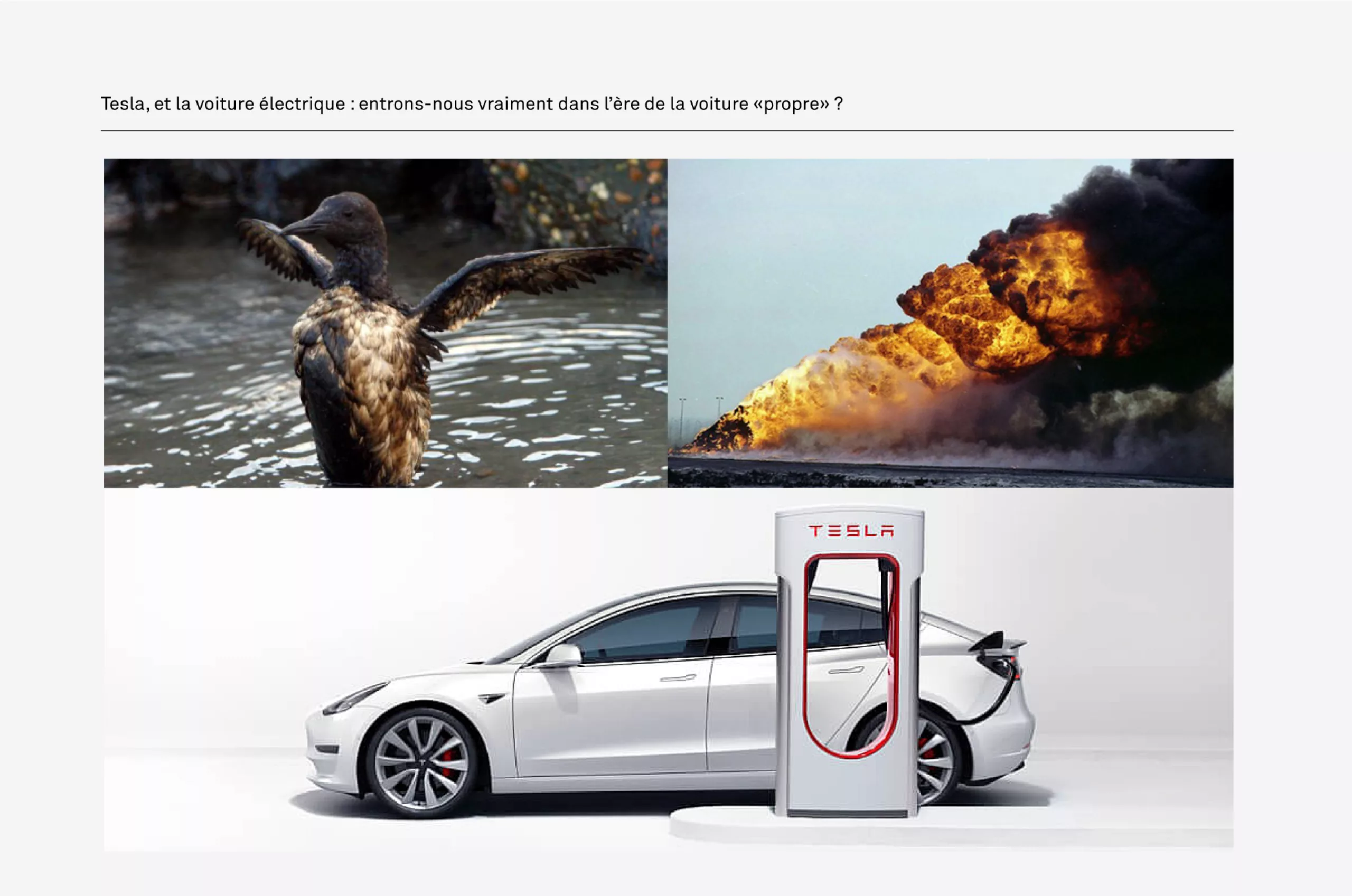
The electricity fairy won’t drive a car!
Replacing the current car fleet with electric vehicles is total nonsense when we know that an electric car, over its entire lifecycle, does not offer any particularly noticeable CO2 emission reductions.
On this subject, we invite you to make a diversion to the detailed analysis of Jean-Marc Jancovici (founder of the Shift Project and Carbone4) on his blog.
He thus dismantles the mantra of “clean” vehicles, and his common sense enables him to take a lucid look at our decarbonation objectives for 2050. Dividing our emissions by 4, when we know that a 2CV consumes 1.5L/100km, while an SUV consumes 8L/100km, and that it will probably take several decades to put in place the recharging infrastructure, gives us a clear picture!
The pragmatic solution would be to concentrate efforts on the production of small light petrol vehicles that consume less than 2L/100km. It is certain that with a 2CV, the economic capital of the drivers will not be glorified. This is where we expect the manufacturers to invent a new story, a tale of the transfer of economic capital to a much less polluting cultural capital. It’s certainly not by glorifying “power and speed” with this lion that this new chapter will be written. How about placing ecology before economy?
What about a Spotify of transport? For example, by valuing use rather than possession, shifting the burden of pollution to the service provider rather than the user. A supplier with an automatic economic interest in extending the life of leased goods, and therefore in polluting less. CQFD.
Peugeot’s new logo enhances power and strength through a roaring logo while the manufacturer could open up prospects for sustainable mobility. Instead, it prefers to look at the forms of the past. Is the lion dead tonight?
On the subject
-
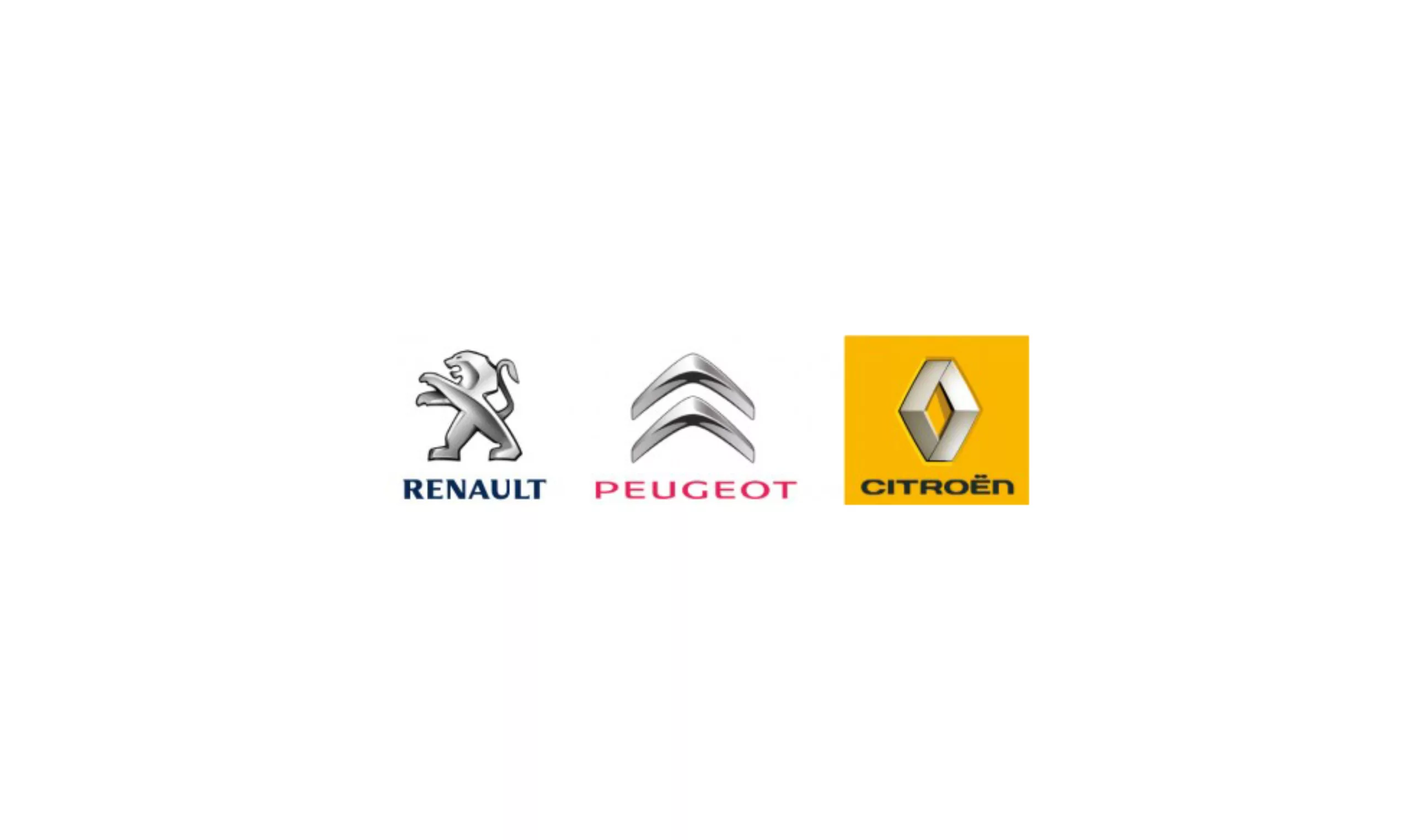
Logos: Peugeot vs Citroën vs Renault
In 3 years, the 3 French carmakers have renewed their visual identities: Renault in 2007, Citroën in 2008, and Peugeot in 2009. Chrome, chrome and chrome…