Why and how to create a new city or territory logo?
With each new election (municipal or other), municipal teams or political representatives ofter wonder whether to update their city logo. One can understand the desire to wipe out the past or to focus on the future when a new political edge arrives. On the other hand, a change of city logo and the implementation of a new identity should not be taken lightly. Firstly because a city’s identity touches the hearts of the citizens, and secondly because communication budgets usually comes from community, and any expenditure must be justified. If the project is to refresh the image of a city, it is better to do it well, once and for all, and invest an adequate budget with a specialized design agency to save money in the long term. A great identity will last for years. So why and how to make a good city logo?
New elected officials = new city logo?
A new municipal team – or a re-election – often brings new ideas or even a new political direction, and the desire to stand out from its predecessors. It is true that a new visual identity can illustrate a change, newness, and can dust off an identity that suffers from a bad image or is no longer relevant. However, when it comes to cities or regions, a new political orientation is not a sufficient change in itself to justify a redesign of a territory’s identity. A logo should not be political: the embodiment of a project carried by a team of elected officials is, logically, transitory.
Yet a logo must be sustainable. Here’s a simple parallel: it’s worth redoing your ID card when the photo seems too old and doesn’t look like you anymore. On the other hand, changing it every time you get a new haircut doesn’t make sense!
Territories and identities
The question of identity is intimately linked to the notion of territory. There is naturally a notion of appropriation of space. Man is going to invest and develop this space, first of all to guarantee its survival, its permanence. By facilitating exchanges and travel, they will weave links with the different communities around them to create a common space. This is the function of appropriation of the territory, which is exercised on a political level. Municipal elections are a perfect example of this notion of political appropriation.
Next comes the notion of belonging. A symbolic function, with its codes and signs (places, festivals, monuments…) that will allow the inhabitants to identify and recognize themselves, always in this logic of social construction (protection, mutual aid, economic exchanges…). This common culture becomes a factor of cohesion.
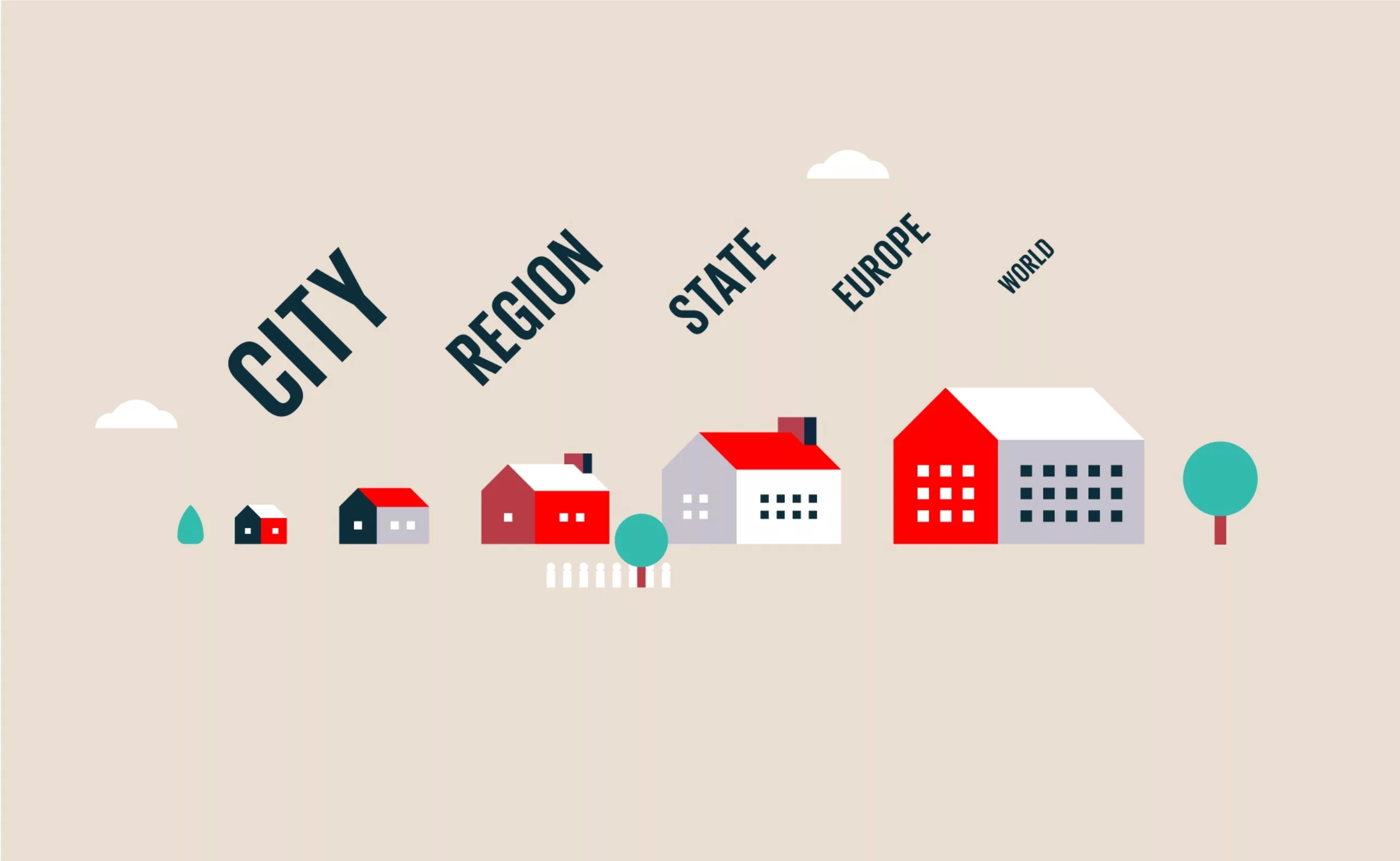
From then on, these two functions “appropriation/belonging” will “physically/mentally” delimit the boundaries of territories, which in turn will constitute identities (individual and collective). We are all permanently crossed by these multiple social and geographical identities. At different scales, and over time. Our city, our region, our country, Europe, our planet.
In these Russian dolls logic, the city would probably be the tiny nesting doll hidden in the heart, the closest to our roots, and therefore one of the most precious. It is the one that no one wants to lose. Therefore, changing a city’s logo is like working to redesign the face of this little doll, it is not innocent. Just look at how every city logo change is scrutinized, commented on and often vilified on social networks. A true national sport.
Why changing a city’s logo?
As explained, a city has several identities. Each one can be in tension with the others and it is necessary to clearly define the one that deserves to be reviewed.
So there is the social and cultural identity of the city, conveyed by its inhabitants. They shape and carry it, and the notions of anchoring and heritage are strong. It is the fruit of centuries of history, it is heritage.
Next comes the political identity of the city, which changes with each new mandate. It is the translation of the power relationships between the different constituent groups of the territory. This identity is forward-looking, it is a projection (vision+ambition).
If these two forms of identity are turned towards the interior of the common space, we can identify another form of identity which would be turned towards the exterior (tourists, investors, etc.) in a logic of territorial attractiveness. For example, touristic identities are a promise of leisure, cultural and gastronomic discoveries.
Each identity can give life to very different signs and logotypes. It is possible to create a sign that pays homage to the history and heritage of a territory (geographical, cultural, etc.), a sign that represents the political project of a “destiny” or “project” for the territory, and or a sign that is a promise of economic and tourist attractiveness to attract working populations and investors.
Finally, it is not impossible, according to the brief and the needs of the city, to mix these three aspects. We do not hide that it is extremely complicated to tell everything in a logo of a few square centimetres! The designer’s job is first to understand the city in question, in its entirety, in order to grasp its major strategic issues.
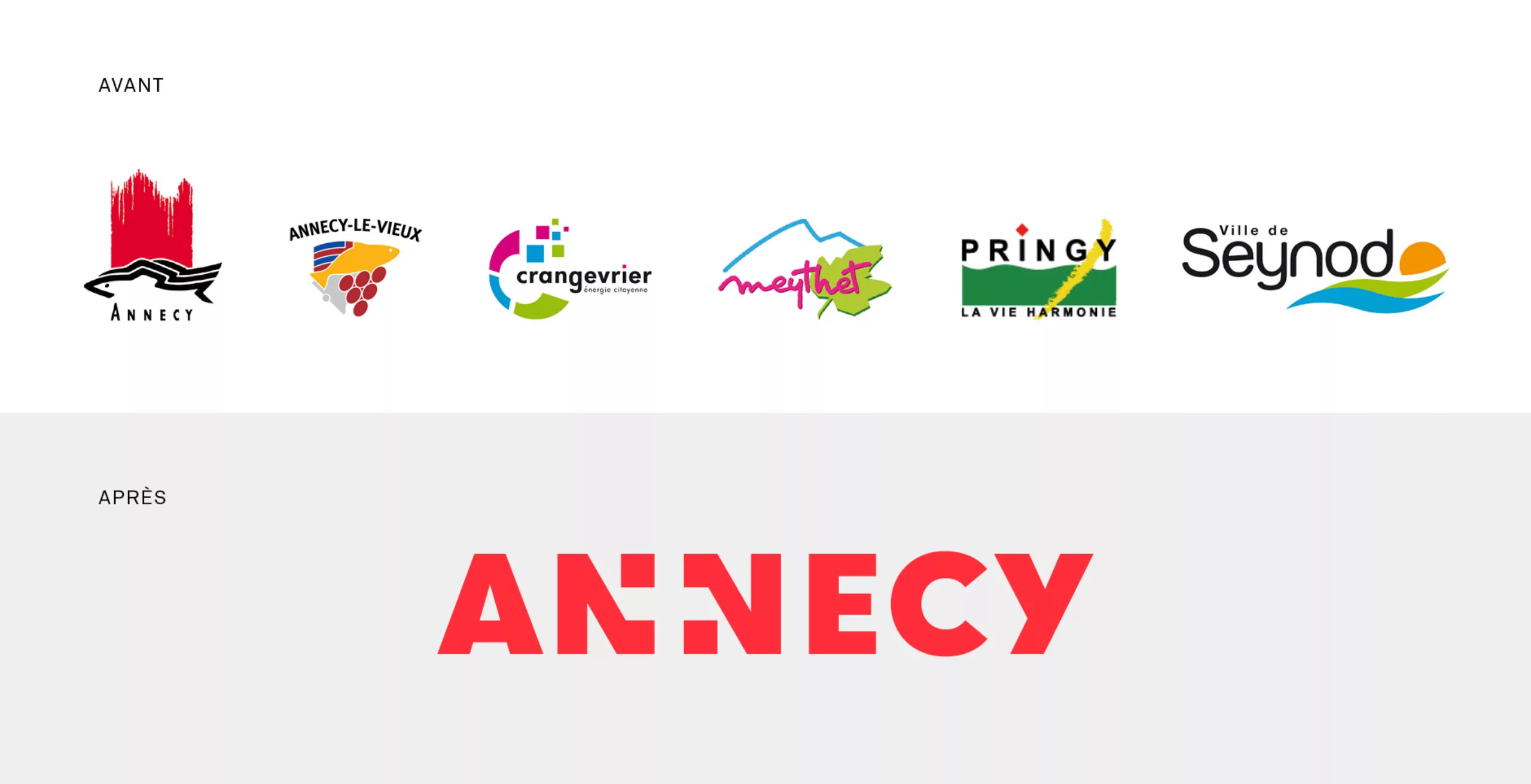
Here is the example of the new identity of the city of Annecy we designed. A level of “new city” appeared very recently in a logic of territorial mutualisation, acting as a kind of “super city”. Such an administrative change requires us to rethink the visual identity of this territory. In the work we have done, the logo pays direct tribute to the Savoyard heritage. The cross between the two N’s shows the Savoy cross. The strategy is clearly to position Annecy as the capital of Savoy, and indirectly to regain a symbolic territory that is brilliantly exploited (pre-empted?) by neighbouring Switzerland.
But why not going for lake and mountains, two founding ingredients of this city’s identity? Quite simply because the name “Annecy” is already naturally, and very strongly, associated with these geographical arguments. On the other hand, presenting a face of efficiency, precision, reliability and modernity seemed much more relevant when addressing the inhabitants, economic players or future students. Let’s leave the lake and the mountains to the tourist actors.
Here’s another example with the région Bretagne, which has its own graphic identity and logo, and the brand Bretagne (logos not created by Graphéine). Both are distinct identities. One aims at being attractive to tourists and investors (anglicism, contemporary and efficient typography…), the second represents the region (traditional typography, Hermine drawing the shape of the region and ending in Brest as an opening to the world…). They each aim at highlighting different aspects and are not used in the same contexts. Hence the interest of two different but compatible identities.
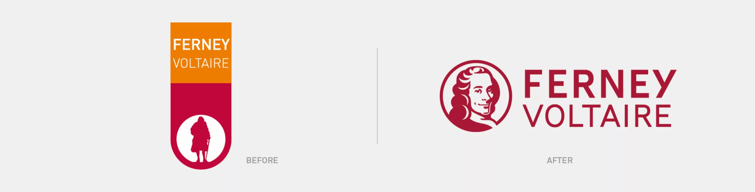
As another example, we worked on two cities that had the same goal: to refresh and boost their city image with a new logo and a new identity. Their heritage was highlighted in their old logo, but we did not make the same choices for the city Nevers and the city of Ferney-Voltaire.
The logo of the city of Nevers was a more political project, aiming to reawaken the ambition of the city and to put it in a dynamic in order to rejuvenate its image. We affirmed this choice by abandoning the historical symbol of the two towers and proposing a completely redesigned modular logo, made up of arrows, to give direction and rhythm to this identity. (“Nevers to(wards)morrow…”). In this way, the promise of future attractiveness prevails here over the city’s heritage attachment.
For the city of Ferney-Voltaire, it was also about dusting off an old image (an “old man with a cane” was already in the logo!), in order to make it consistent this time with the demographic, economic and cultural growth of the city. And because Ferney-Voltaire does not exist without Voltaire, we started from this emblematic figure – which already existed in the old logo – by proposing a more dynamic, younger and positive logo, while continuing to capitalise on this historical heritage.
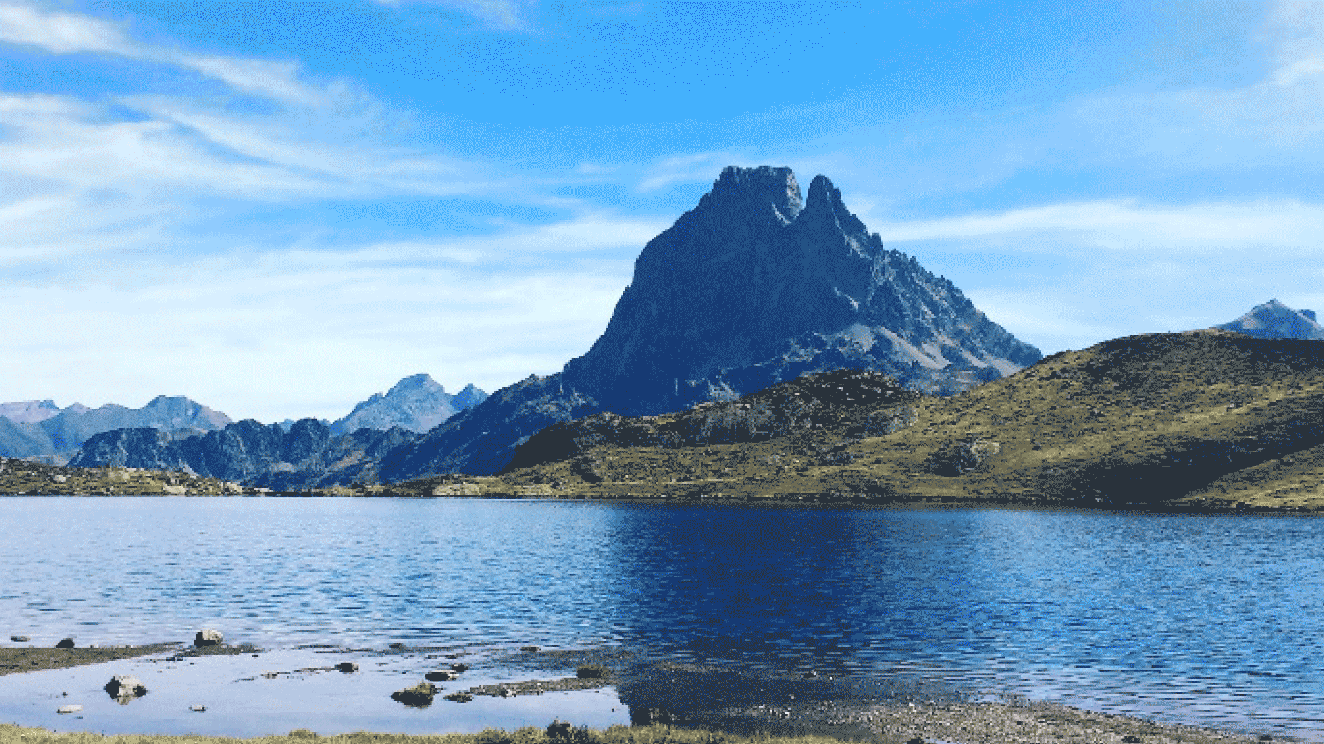
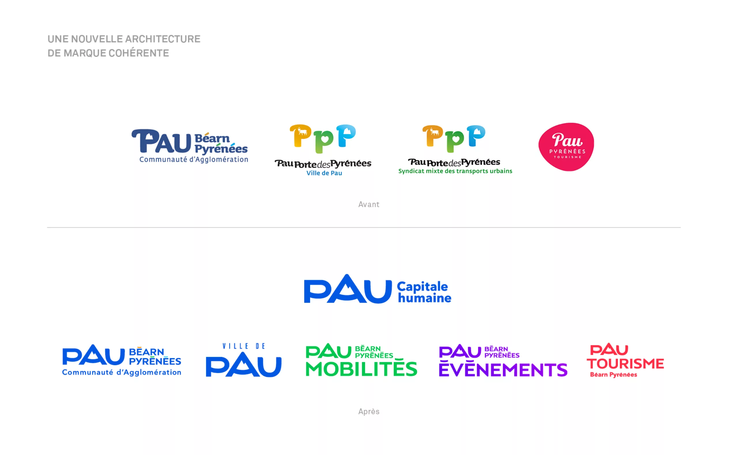
For the new visual identity of the city of Pau, we moved mountains (!) by cleverly inlaying the Pic d’Ossau (natural monument and Mona Lisa of the Pyrenees) in the counter-form of the “A” of “PAU”, whereas previously it was awkwardly housed in its letter “P”. This intervention allowed the old logotype to evolve, respecting its “DNA” while creating a new, more obvious and impactful design.
Combined with the creation of a typography made especially for the project, this identity has been used to create a coherent brand ecosystem including the logotype of the city, the agglomeration, the tourist office, as well as those of the transport union and the events centre. Beyond a simple logo facelift, we ended up with a complete brand architecture that unified all the communication of the territory.
Sometimes the three identities (socio-cultural, political and tourist) meet in the scope of the project and lead to very different results which are not necessarily fair or appropriate. Again with the ID card metaphor: how do you know if your portrait (= logo), no longer looks like you (= is no longer the image of the city?).
Maybe the logo has been made in a hurry, by people with little skill (=blurred portrait). The inhabitants don’t really know or like it, and don’t feel concerned by the visual identity. Maybe the logo has always been there, but it needs a facelift; it is not readable or adaptable on digital media, for example.
What is the budget for a new territory logo?
Very often, unfortunately, the logos of cities or territories are made in-house, due to a lack of budget. In order to save money on the creation of a new city logo, elected representatives call on graphic design students, launch free participatory contests among the inhabitants, or have the person responsible for communication do it internally, “because he.she makes nice PowerPoint”.
There is a misconception that making a logo in this way will save money, because no public money is spent (= hardly anyone gets paid). On paper it’s safe; less money is spent. But in the long run, it’s completely wrong, and it’s even much more expensive! Changing a logo with unskilled suppliers is like repairing a boat hull with small pieces of wood: it covers the hole but it is neither effective nor durable, and it is conspicuous.
Having a logo designed in-house is not free of charge because it represents an additional salary cost, and it should not be forgotten that the cost of designing a logo only represents between 1 and 3% of the cost of changing a logo on mail, facades, vehicles… Changing at each new election, or because the logo is not sustainable, means spending 97% more of the budget at each new change! A monumental part of the allocated budget that often remains hidden from the citizens.
A simple graphic solution: a complex job!
Because making a new logo is a profession, it’s not just about making a nice design. It requires hours of analysis, strategic thinking, graphic research, the production of several coherent and plausible leads, and their variations on several media to see if it all works. It’s certain that once it’s done, especially if it’s relevant and simple, the critics will go for it: ” ** ***€ to design this logo? My 6-year-old son could have done it “. Copying it, why not. But thought about it? Designing it from A to Z? Decline it and print it?
Making it simple is always more complicated than one thinks, and requires more work and experience. It is necessary to analyse, understand and then extract the essence of the city or the product in order to talk about it better. Remember that Picasso or Mondrian acquired their refined and minimalist style after several decades of work, as illustrated by these bull studies by Picasso (1945-46).
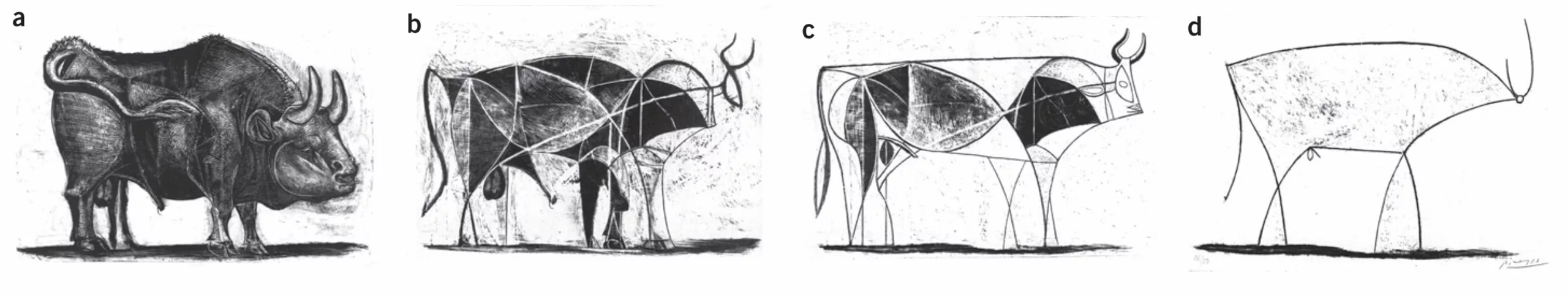
To get to this pure line, so simple in appearance, it was necessary to grasp the role of nuances, the power of the line, the right composition, to detach oneself from patterns and trends. In the same way: a logo suggests, it does not represent. It is open to interpretation, so that everyone can make it their own. It may thus seem easy to copy a Picasso drawing, which is what makes it strong and good, but few people can create such simplicity.
A logo never comes alone!
The logo is only the tip of the iceberg: it hides a long strategic positioning study and a team of designers, strategic planners, project managers etc. involved over several months.
A visual identity must fulfil several objectives. First of all, to make the institution visible. In this context, the signage function of the logotype is extremely important; it must be as visible from afar as a lower case letter on a screen.
It must make the institution legible. Legibility means comprehensible, intelligible. It is about clearly conveying knowledge, information, a message or an intention. Public action must be legible. It is even a democratic obligation!
It must also be irresistible.
This sign must be part of modernity (mode/eternity): it must be a sign for today, but also a sign that lasts.
The logo goes along with graphic guidelines to explain its use, examples of variations, layout models… If the new city logo is proposed by inhabitants or students working for free, who will then create the graphic charter, the web version, the urban design to illustrate this new visual identity? It is often an agency! As Ruedi Baur, a designer specialising in territorial branding explains, the work of a graphic design agency aims “to recreate a link between the action and its representation, leading to a language that allows the different elements of a territory to express themselves. Which implies new contracts of trust. Even if politicians are hardly aware of this disaster of their visual representation, of their educational responsibility. They delegate too much to communication specialists (Chrsitine, editor’s note), who are not graphic designers. Graphic art is not a buffer! ».
A logo without declination is nothing, because it tells its whole story and gives it life.
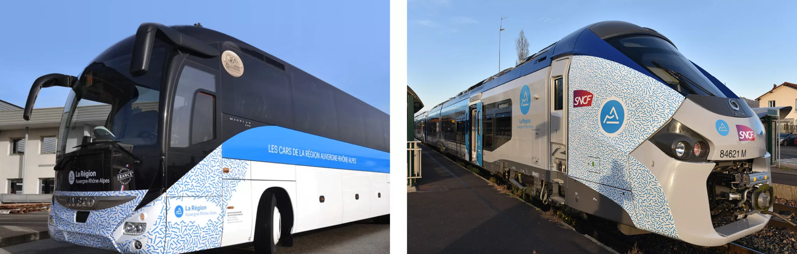
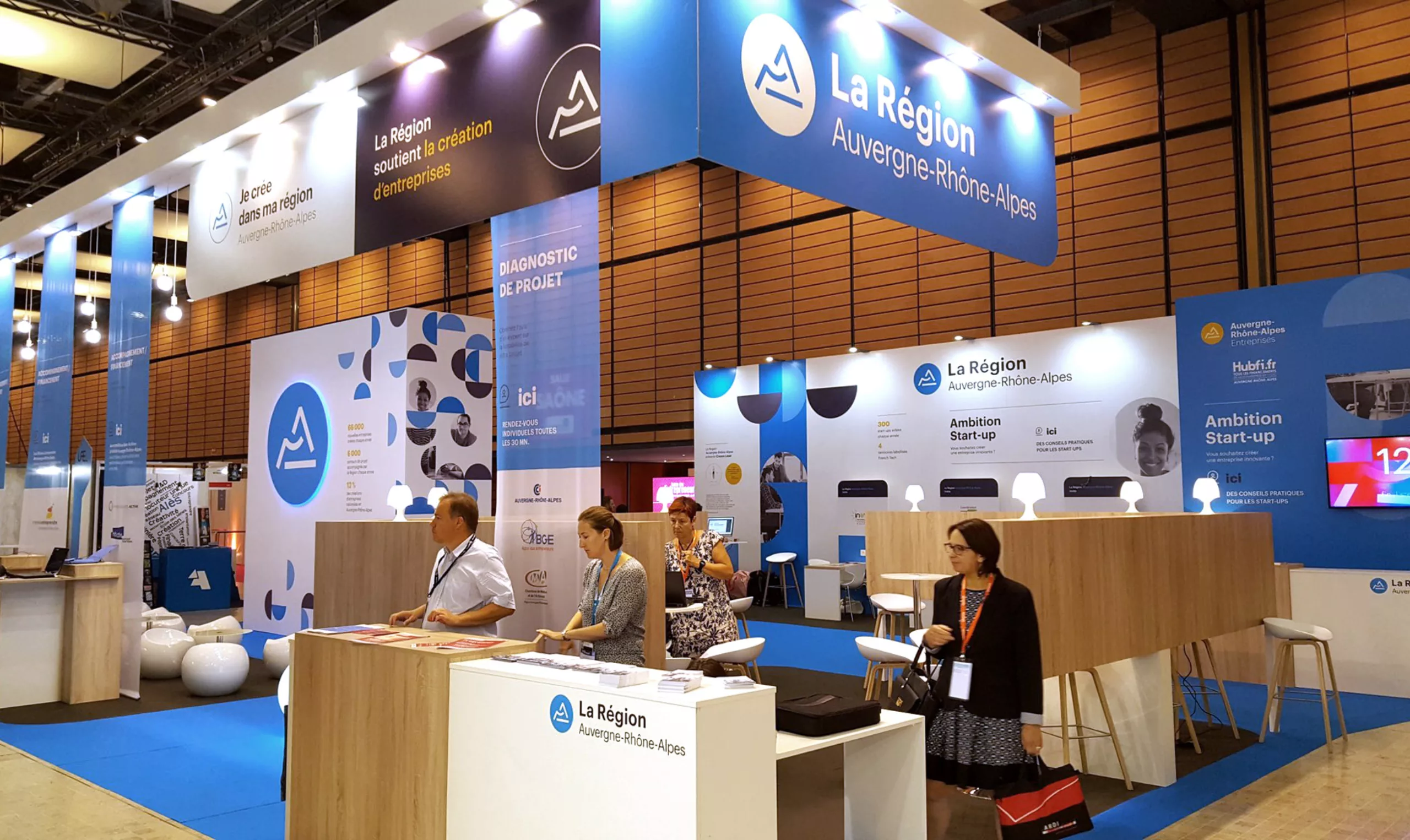
Here are a few examples with the graphic identity of the Rhône-Alpes Region that we designed.
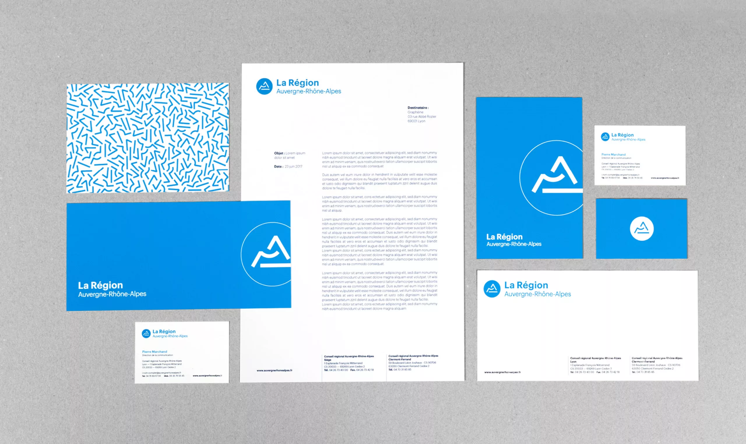
At Graphéine, we follow a very precise methodology. This graphic illustrates the hidden stages of the iceberg that are essential to the creation of a visual identity. The elements in red indicate the deliverables proposed to the client, the grey and dark grey are steps done in-house. It is important to show this process in order to fully understand the background of the creation of a global visual identity.
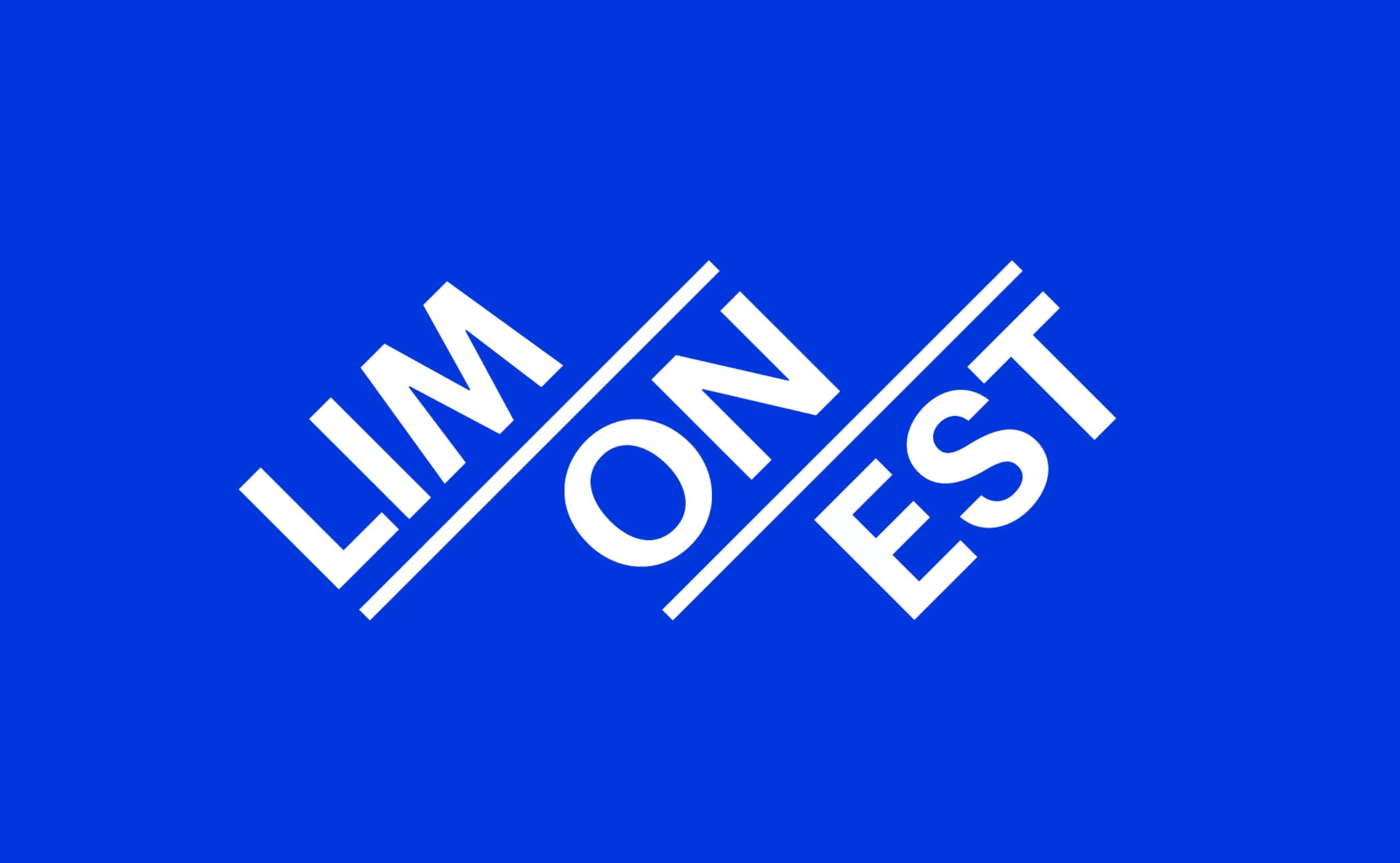
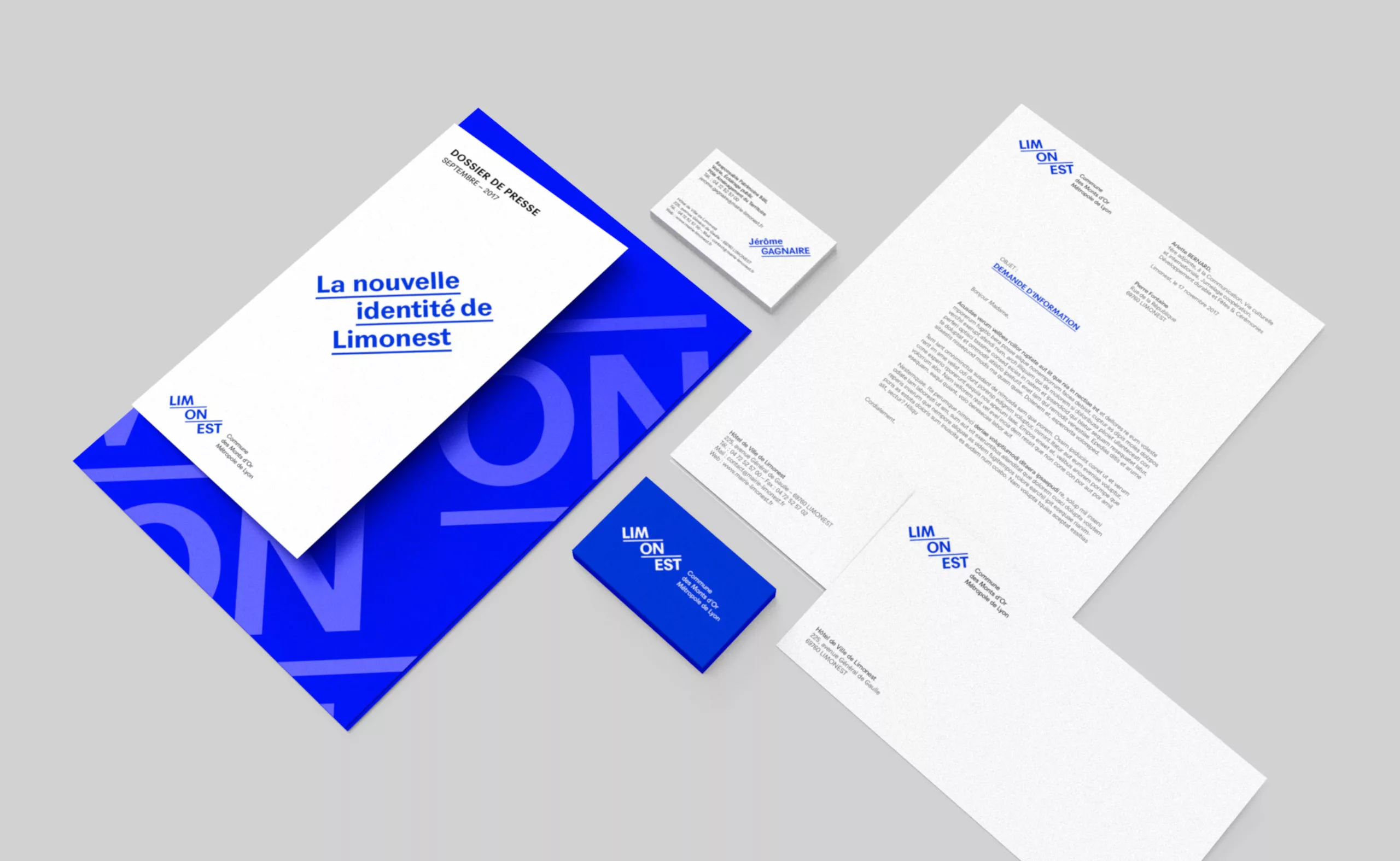
For example, here is a logo and a city graphic charter that we created for the city of Limonest, France.
A sustainable logo is an economic logo
A good territory logo, like any logo, must therefore be designed to be sustainable. A sustainable logo implies that it is recognisable, adapted, specific, legible and appropriate. A good visual identity, designed in a sustainable way, will then be the best source of savings for the community. Take, for example, the logo of the Ile-de-France region, which has remained virtually the same for over 16 years, resisting political alternation. Its design was certainly well thought out! When you know that a change of logo on the scale of a region is a cost that amounts to millions of euros…
Why don’t we hear that the designer who made the logo for the Île-de-France region helped save his fellow citizens this money? Perhaps it would be wise to communicate more on this aspect. In short, all this invites us to be pedagogical and to continue to share and explain the role of design.
The change of a city’s logo cannot be the result of a simple political decision that changes every 6 years. It would be a waste of time, energy and money, if we count the time spent on developing this logo and putting it on supports, street furniture and buildings. A sustainable logo is therefore, in the long run, an economical logo! And also an ecological logo, because it avoids having to throw away goodies, letterhead etc, or print new ones.
Reduce the cost of logo design
Nevertheless, it is understandable that small towns feel helpless with an often low budget and are seduced by the idea of making a “free logo”. Only large cities or regions seem to be entitled to new, shiny coats of arms. However, it is possible, from an accounting point of view, to add this type of expenditure over several years and thus spread the expenditure over several years, instead of relying solely on the budget for the year.
By entering the costs in the intangible fixed asset account such as 20 205 “Concessions and similar rights, patents, licences, trademarks, software”, or 20 122 “Advertising costs”, as part of exceptional costs for the creation of a new logo. Amortisation allows the value of the asset to be spread over its useful life. The accounting standards propose a classic life span of 5 years, but the city may choose a different period, justifying this choice. 10 years would seem a good figure to aim for!
Should citizens’ opinions be sought?
Another question that often comes up when creating a new territory logo is the question of citizen choice. Involved in the human identity of the city, they will necessarily be marked by this decision. But should they be involved at all levels?
It is important to respect each person’s area of expertise. Citizens are best placed to discuss this city identity with elected representatives. The design agency, for its part, is best placed to grasp the broad outlines, give shape to this identity and translate it into a relevant visual response.
It is useful to involve citizens in defining this human identity created around their city. The ideal would then be to work hand in hand with the graphic design agency: citizens and elected representatives can answer questionnaires to create a portrait of their city (with words, colours, impressions…). The agency then formalises it by drawing on this analysis as a toolbox that it puts at the service of its expertise. Each person thus excels in his or her field.
Reversing the roles would not make sense. Asking people to choose whether they prefer red or blue would not be beneficial to anyone: as mentioned above, lines and colours are not chosen “because it’s pretty” but because they bring meaning to the logo. Meaning that can only be offered by an experienced graphic designer’s eye. However, working in collaboration with the residents does not guarantee that they are necessarily satisfied with the result. The agency Register worked 2 years to design the logo of the city of Lille, thanks to studies, interviews and questionnaires with experts of the city and its inhabitants. And yet, as is often the case, the result was no more acclaimed than if it had been achieved without consulting the citizens.
Nevertheless, involving them allows them to value their belonging to the city or the region and to better understand the work of graphic designers as well. On the other hand, the closer the agency is to the hearts of the citizens and can understand and define their expectations (exactly as with clients for company logos), the more likely the final result will be to please. So it doesn’t matter if the agency is local, as long as it is close to the locals!
Because it touches their hearts, out of habit or chauvinism, the new identities of cities are very often criticised. It takes time to get used to it. It takes time to get used to the “it was better before”. One thing is certain, however: the most durable logos will prove their worth over time!
On the subject
-

Groupama’s new visual identity, a logo in the open countryside
Groupama has just unveiled a new logo that updates its graphic design by abandoning its campaign in favor of a “startup” aesthetic.
-
From surnames to acronyms: creating a brand name from letters
From founders’ surnames to initials and acronyms, brand names have always oscillated between abstraction and familiarity.
-

The UN logo takes on water during COP28
For COP28, two designers have come up with a new UN logo showing the rising sea levels and the future disappearance of much land and coastline.