The graphic codes of post-modernism in brand logos
Have you noticed that our reference points are crumbling? For many thinkers, the explanation is simple: we are gradually sliding from the modern age, the legacy of the Enlightenment, to post-modernity. By announcing the death of God, Nietzsche is often considered as the precursor of postmodernism. How to define this new era? For Michel Maffesoli, professor emeritus in sociology, we are entering “the time of the tribes” (1988). Obviously, the impact for brands and companies is major: new communication codes are emerging.
Here is the question to answer: what are the new graphic codes of post-modernity? Let’s decipher through logos and new visual identities.
This article was realized following an invitation and in collaboration with Elodie Mielczareck, a semiolinguist specialized in verbal and non-verbal language. We thank her warmly for this idea!
6 essential characteristics to characterize “post-modernity”
Tribalism (versus Individualism)
One passes from “I think therefore I am” (Descartes) to “I is another” (Rimbaud). The individual is no longer at the center of a one and indivisible Republic: it is the community ideal that takes over. The time of the tribes is an incarnated and human time, even animal. We are abandoning codes that are too statutory to favor simple emblems.
An example of this is Alan, a newcomer to the world of insurance.
Alan is one of the new faces of online insurance for a young generation of self-employed / freelancers. A mascot logo like a cuddly toy, infantilizing, but reassuring and “kawai” in the pure Japanese tradition of manga characters. We are close to the graphics of a Totoro from Ghibli studios, or even a Pikachu! A cute digital aesthetic with a rounded emblem and typography, which breaks the statutory “corporate” codes of other historical establishments’ logos. A logo-face that relies on the principle of “neotony”: It’s cute and I have a feeling of benevolence, because I recognize the characteristics of a juvenile face (the eyes are almost in the axis of the nose, the mouth is small and the whole is very close).
A deliberately disruptive and “fun” approach to avoid doing what mom and dad do. The name of the brand “Alan” is a first name that takes the opposite approach to the naming of competitors where the acronym was king: MAAF, MACIF, MAIF, MATMUT, GMF… A choice that aims to humanize the service, but without capitals to remain in the roundness of the “a” at the bottom. A cozy universe that makes you want to curl up in your “digital cocoon”.
Creativity (versus Work)
Work is no longer a categorical imperative (Kant) for self-realization. It is to make one’s life a work of art, and in any case, not to waste one’s life to earn it, which has meaning and qualifies one’s existence. The question of freedom becomes central. We abandon the codes that are too “confining”, the “mise en abyme” to open up closed spaces.
Illustration with the new logo of La Banque Postale:
La banque Postale opens the cage to the birds! A new logo that removes the frame to free the famous emblem. A dynamic and emancipating opening that assumes the iconicity of its emblem, which hybrids the image of an envelope and a bird in flight. A more ostentatious positioning, much more in line with the young teenage target eager for “brand codes” (see the poster campaign that unveiled this new image). This rebranding is therefore an attempt to build a more relaxed image and is aimed at the “gen Z” who, thanks to the postal bank, will obtain their first bank account, a new step towards building their independence. A postal bird that becomes light blue and is close to another famous bird logo, that of Twitter.
By removing the frame within the frame and keeping only the emblem and the typographic block, the logotype becomes lighter and more airy. It is simplified to offer a more flexible system that allows the logotype to be declined in a responsive way on digital media. It is a graphic solution less fixed and less statutory, but in return it gains in “agility”.
The tagline “Citizen” of the new logo implies that the Banque Postale is part of the companies that have the ambition to carry a raison d’être that positively impacts society. Which is the least we can do when we are a public bank!
Remagnification (versus Technicism)
Systematic and purely rational responses to organize and structure the world give way to a “remagification” of the world (Benjamin Walter). A holistic vision of the world is imposed. Graphically, this remagification of the world is translated by the valorization of rainbow colors.
Illustration with the latest Apple logo, which returns to the basics, changing just a few shades, and having definitively abandoned the black and gray …
As logo designers, we are naturally accustomed to creating changes in visual identity, with a certain idea of “graphic progress” underpinned by the effectiveness of formal simplification to facilitate the memorization of these signs. If we must note the consensus of the profession in this process of transformation, we must recognize that the opposite phenomenon of graphic regression affects recently and more and more large international companies.
Burger King, Reebok, Kodak are a good sample of brands affected by this mysterious phenomenon of “de-evolution” of their logo. Nostalgia or reboot to erase the successive mistakes of the last rebranding? Is it a way to get back to a good and memorable design?
With this logo Apple resurrects the golden age of its early years when the brand was still a pioneer. A “vintage” logo that de-evolved the previous monochrome version hailed for its minimalism and minimal elegance, to maintain a sense of nostalgia for the avant-garde origins of the brand. It’s an emulation of the past in Netflix’s Stranger Things sauce (a copy of the Amblin touch of Spielberg productions). It leaves us fantasizing about an idealized version of the 80s, and gives a sense of melancholy for that period to a whole generation too young to have really lived it. The dream of a bygone era where life seemed simpler and less stressful. This backward glance can also be read as a lack of vision for the future.
We could call this phenomenon “Golden age capitalism nostalgia”, as a resurgence of the graphic codes of an era when the American soft power was at its peak through its cultural and economic hold and domination.
The rainbow stripes can also be interpreted as “activism-washing”, an opportunistic technique to seduce the LGBTQ+ community by taking on a pseudo “inclusive” brand image.
Aestheticization (versus Utilitarianism)
We leave a utilitarian representation of the world (only what is useful is worthwhile (paranoia). We value an aesthetic and emotional vision: body-spirit-environment are linked (epinoia). Graphically, this translates into the management of white and transparency, over loaded photographic universes. A new space – without noise – is allowed.
Example with this variation of the Axa visual identity:
Axa continues its slow muse started several years ago in order to establish the “red slash” as the future emblem of the brand in the eyes of the public. The “red slash” is a graphic sign that signs the visuals and advertising campaigns of Axa. This may explain the white-transparent treatment of the former blue square cartridge which – let’s try a branding prophecy – should end up disappearing completely for a future logo where only the Axa typo block and the red slash should remain. We can guess a long term branding strategy with a slow visual habituation to prepare this evolution without losing the recognition and the graphic notoriety of the brand.
I read once – but I can’t remember where – that the Axa logo takes its graphic design from a Christ-like symbolism: the trinity of the three letters A, X, A, or Mary and the apostles at the foot of the Cross (?), while the red slash represents the spirit of Jesus rising to heaven.
Mastercard, Visa and most recently “SG” as a redesign of the Société Générale merged with Crédit du Nord”, have distinguished themselves on this side of geometric ultra minimalism. Mastercard by removing its name to keep only the two interlaced circles; Visa by trying to impose the two bars in the shape of an “equal” sign as its new emblem. “Trademark gains value over times”, as they say in the industry!
This search for geometric purity is a legacy of the precepts of the Bauhaus, which advocates a form determined by the prerogatives of functional efficiency in both production and use. At this rate, all basic geometric shapes will be monopolized by brands and copyrighted!
Let’s bet that with a little more patience we should soon discover a new modernized Axa logo.
Presentism (versus Sublimated Future)
The future is no longer a stake of sublimation, or considered as a postponement of enjoyment (Freud). It is the primacy of the present in its immediacy and of the eternal instant… The immediacy is a post-modern stake. The graphic codes are given to read in a more immediate and fast way. No more baroque details and rococo style! We leave room for the simplicity of codes and geometric forms more minimalist.
Illustration with the new Renault logo:
Renault’s latest rebranding, drawing on the origin of the logo designed by Vasarely in 1972, is in keeping with the brand’s historical foundation. This gesture of “timeless” simplicity translates the ambition to become eternal to get out of the infinite loop of passing graphic trends. The new design of the diamond revives the vibrant lines of optical art in a simplified and “flat” layout that adapts perfectly to the display constraints of screen interfaces. We invite you to read the article we wrote about this trend on the occasion of the new logo of the car manufacturer Peugeot.
With this visual redesign, Renault gives the impression of having synthesized the different versions of its logo through the ages for a design that seems to be the culmination of a definitive and timeless form as can be the monogram of Chanel. Da Vinci’s “simplicity is the ultimate sophistication” meets Mies van der Rohe’s “Less is more”.
Relativism (versus Truth)
The verticality of the “Law of the Fathers” (holding the Truth) gives way to the horizontality of plural truths, related to each other. It is the era of relativism: points of view coexist. This “horizontalization of the reports” passes by a modification of the typography. The capital lettering (upper case) is abandoned in favor of lower case lettering (lower case).
This is illustrated by the new Total logo:
When you want to develop “clean” energy, shouldn’t you be consistent and adopt a logo that is synonymous with sobriety and limits its environmental impact? This is the opposite of what Total, now TotalEnergies, is doing by putting all the visual overkill sliders in the red. First of all, a multicolored gradient, like a “digital and immaterial flow”, which we imagine to be the symbol of the new plurality of energies that Total Energies offers (after the acquisition of Direct Energies), poses real problems of legibility of the ligature emblem “Te”.
The rainbow is here a symbol of inclusiveness and exhaustiveness, and in another register of association of energies, the logo of the New Ecological and Social Popular Union, freshly unveiled, does not derogate from this very diplomatic tendency of “non choice”. Of course, the digital graphic creation tools have facilitated the deployment of this type of chromatic gimmick for several decades. They have allowed to give it its contemporary ubiquitous nature.
This becomes a real calamity as soon as it is necessary to reproduce the logo on “physical” supports. This means that the logo must always be printed in four colors to obtain a multicolored look. This means a large carbon footprint for the deployment of the new identity on signage, vehicles…!
It’s particularly flashy and in terms of visual pollution, we have a champion. The soft line of the “Te” ligature, which in addition to making no sense, is reminiscent of the ugly old snail logo of the TGV, the “take the time to go fast” era. We are in a case of rebranding that erases the old identity to redeem an ecological conscience while remaining visually turned to … fossil fuels, in the red. A revealing slip of the tongue!
What is the graphic style of a post-modern logo?
The end of statutory codes, openness, rainbow colors, transparency, simplicity of forms and low-case lettering: these are the graphic codes of post-modern logos. Form at the service of a background that questions us, but without which we would only be surface decorators! Of course, this article will not have given you the (ephemeral) trends of the logos for 2022, but we hope that it will have given you some sociological and semiological keys to decipher our time, and thus better understand how it influences the graphic choices that determine the current aesthetics of brand logos.
On the subject
-
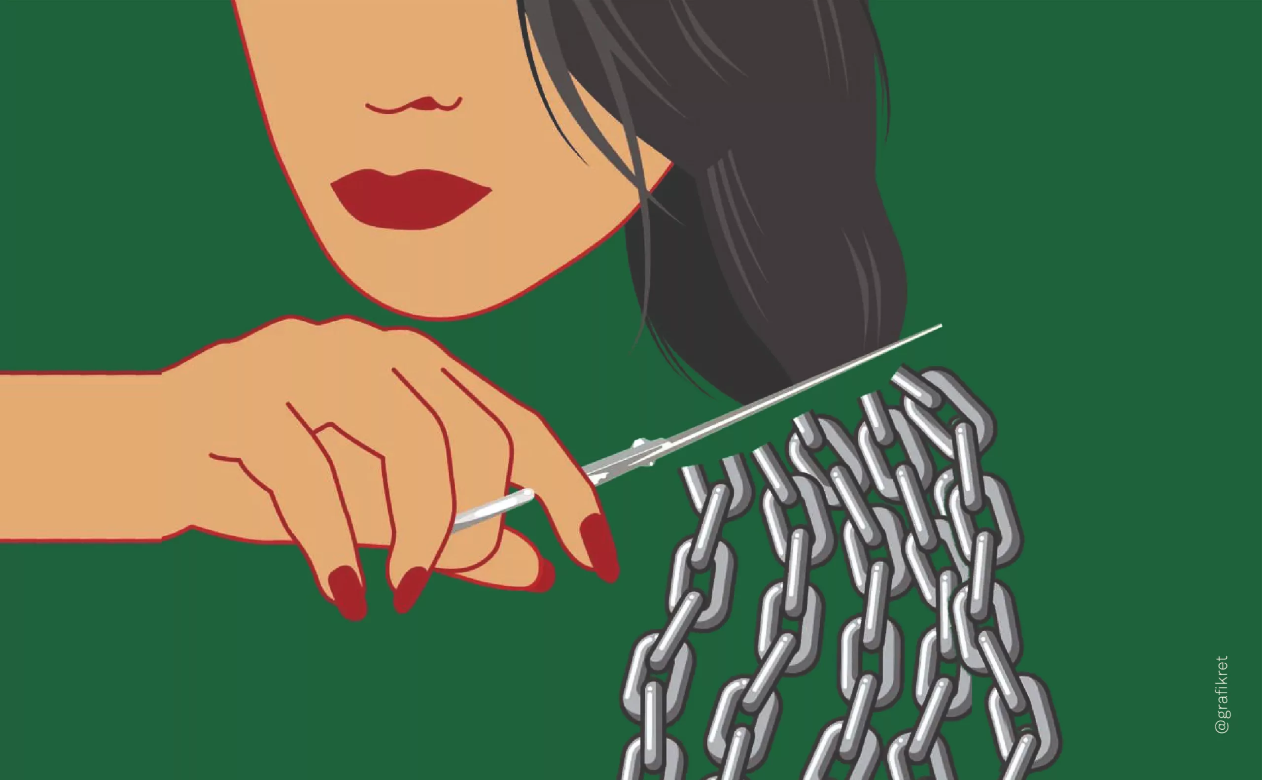
The symbolism of cut hair in Iranian protest posters
In Iran, Mahsa Amini died for a lock of hair poorly concealed behind her headscarf, giving rise to a massive protest movement against the mullahs’ regime. The gesture of a severed lock of hair becoming the symbol of this struggle gives us the opportunity to look back at the many symbolic of hair.
-
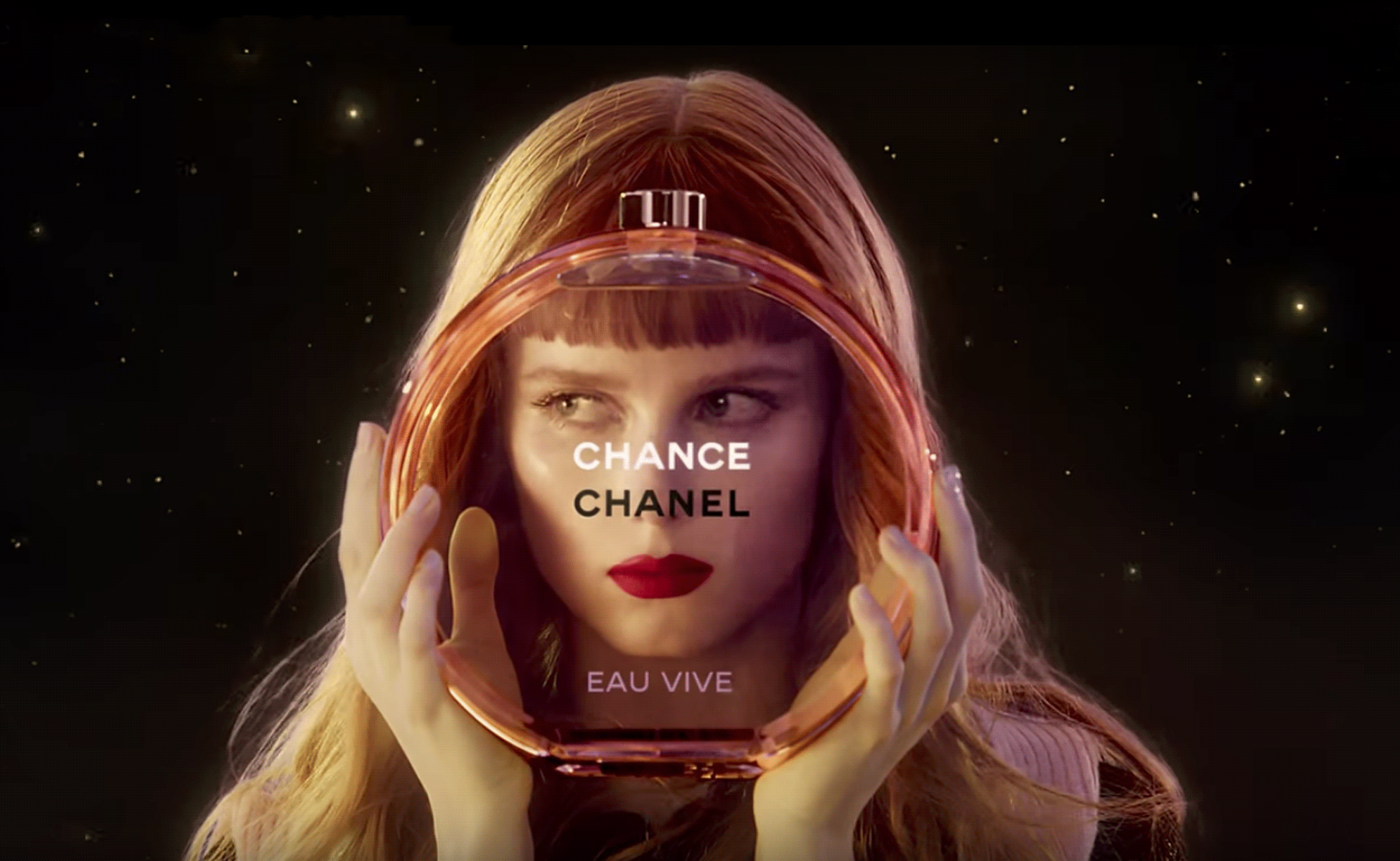
The hidden secret of CHANCE by CHANEL is Goude
Advertising sometimes offers us UFOs that seem to escape simple marketing specifications to project us towards an unexpected elsewhere. Here’s an analysis of the symbolic mystery of Chanel’s latest Chance perfume ad, directed by Jean-Paul Goude in 2016.
-
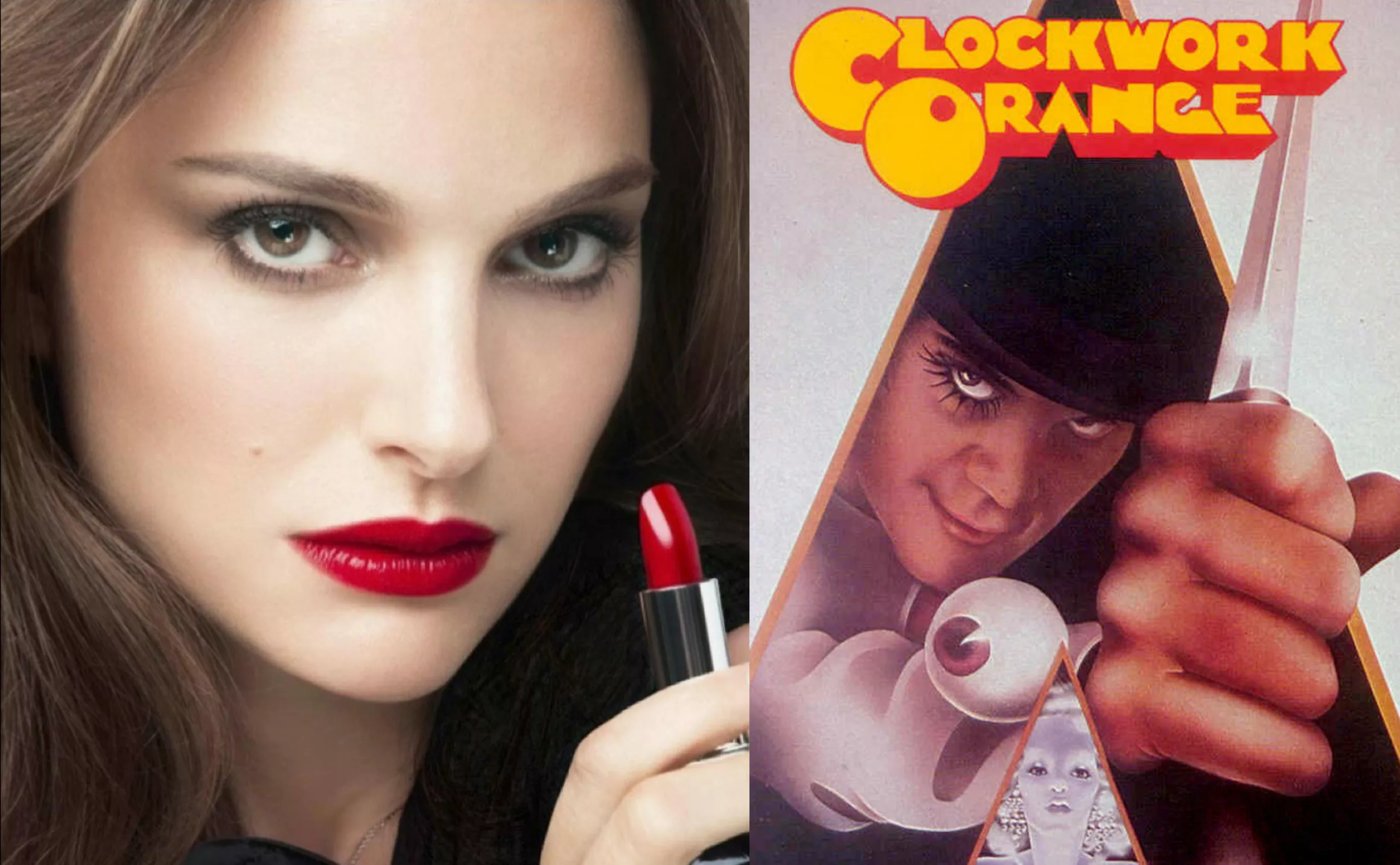
Natalie Portman, serial killer for Dior Rouge
After eight eventful seasons, the Dexter series has just come to an end. (You can continue reading this article without fear, it’s guaranteed spoiler-free!) It’s hard to come back down after being inside the head of a serial killer for so long. Will you miss it? I’m not so sure.