2024
2024
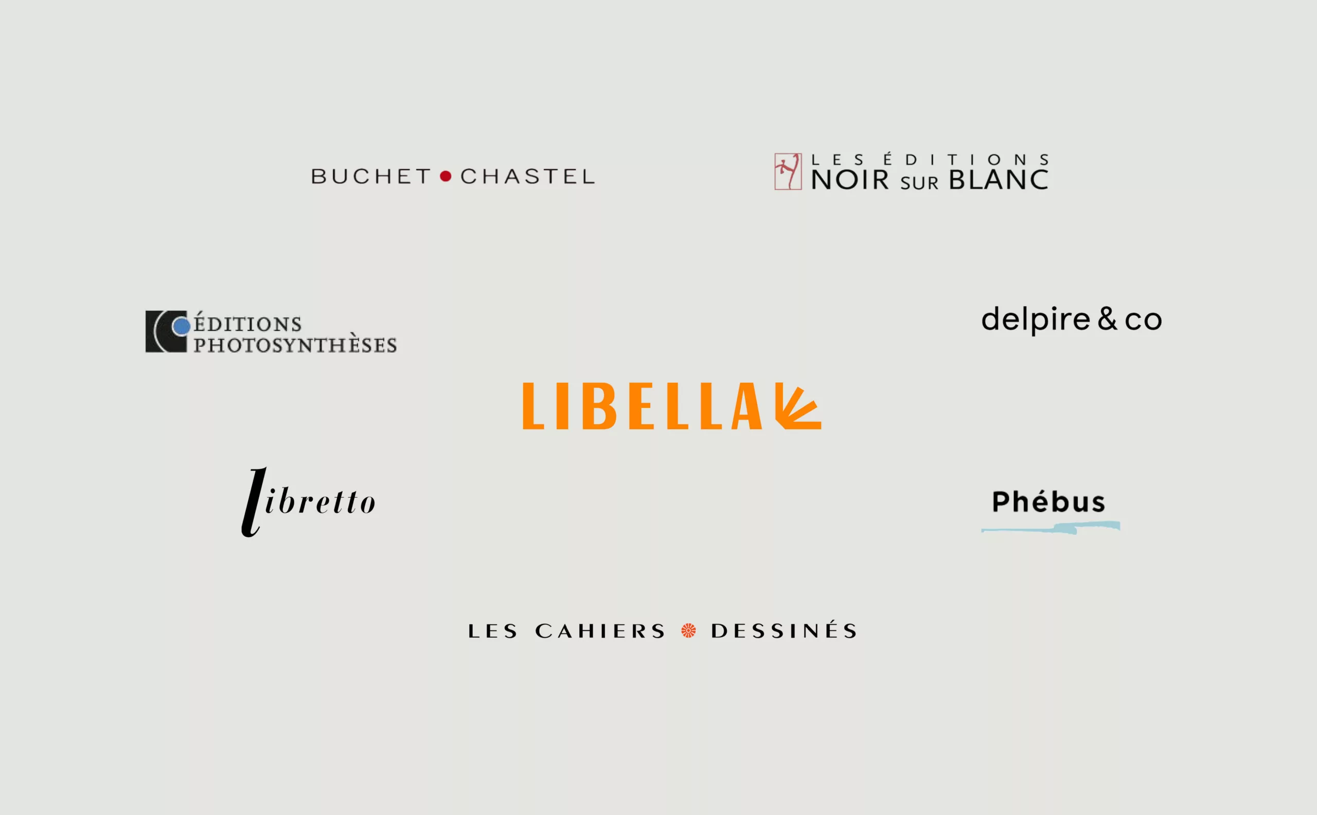
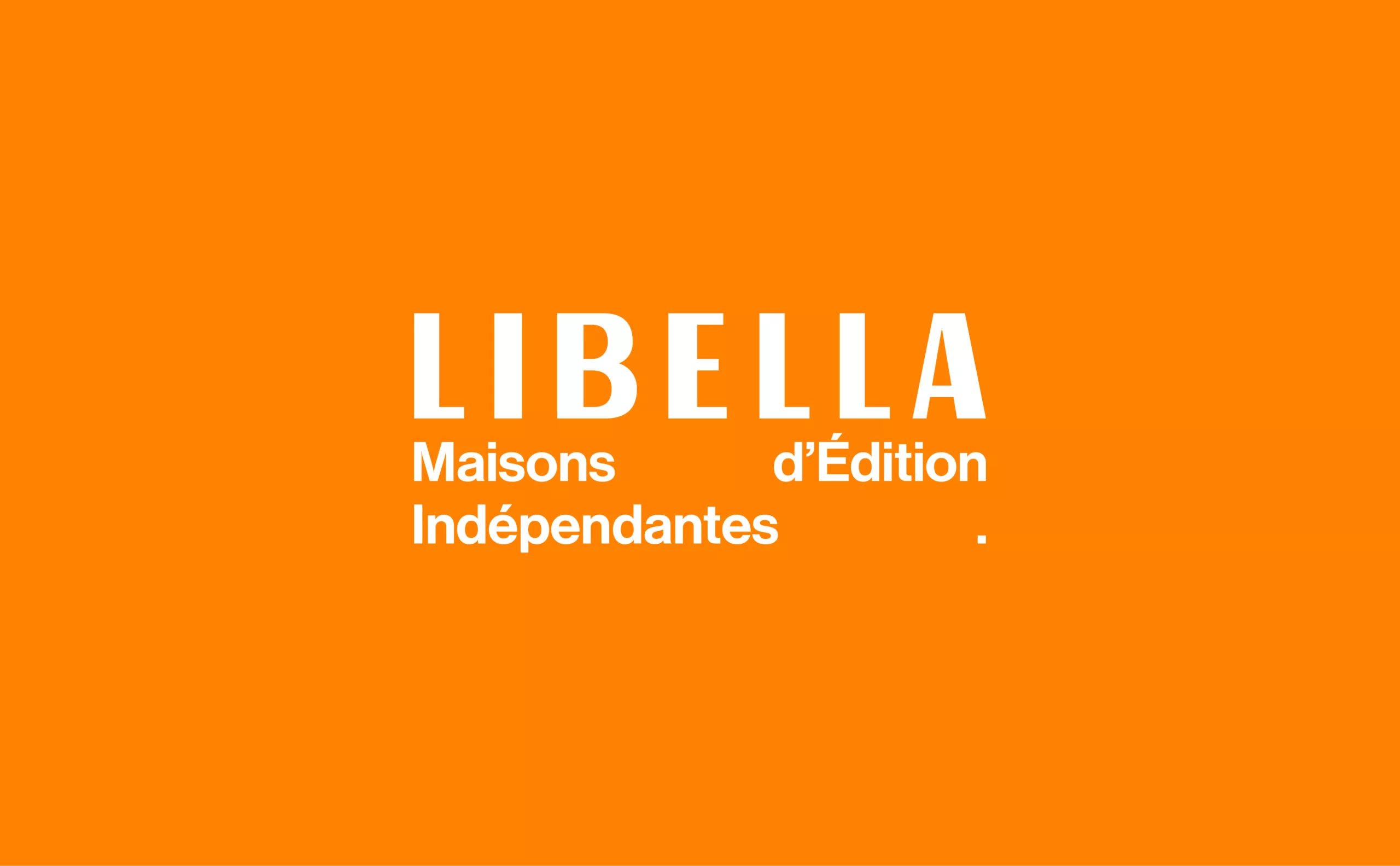
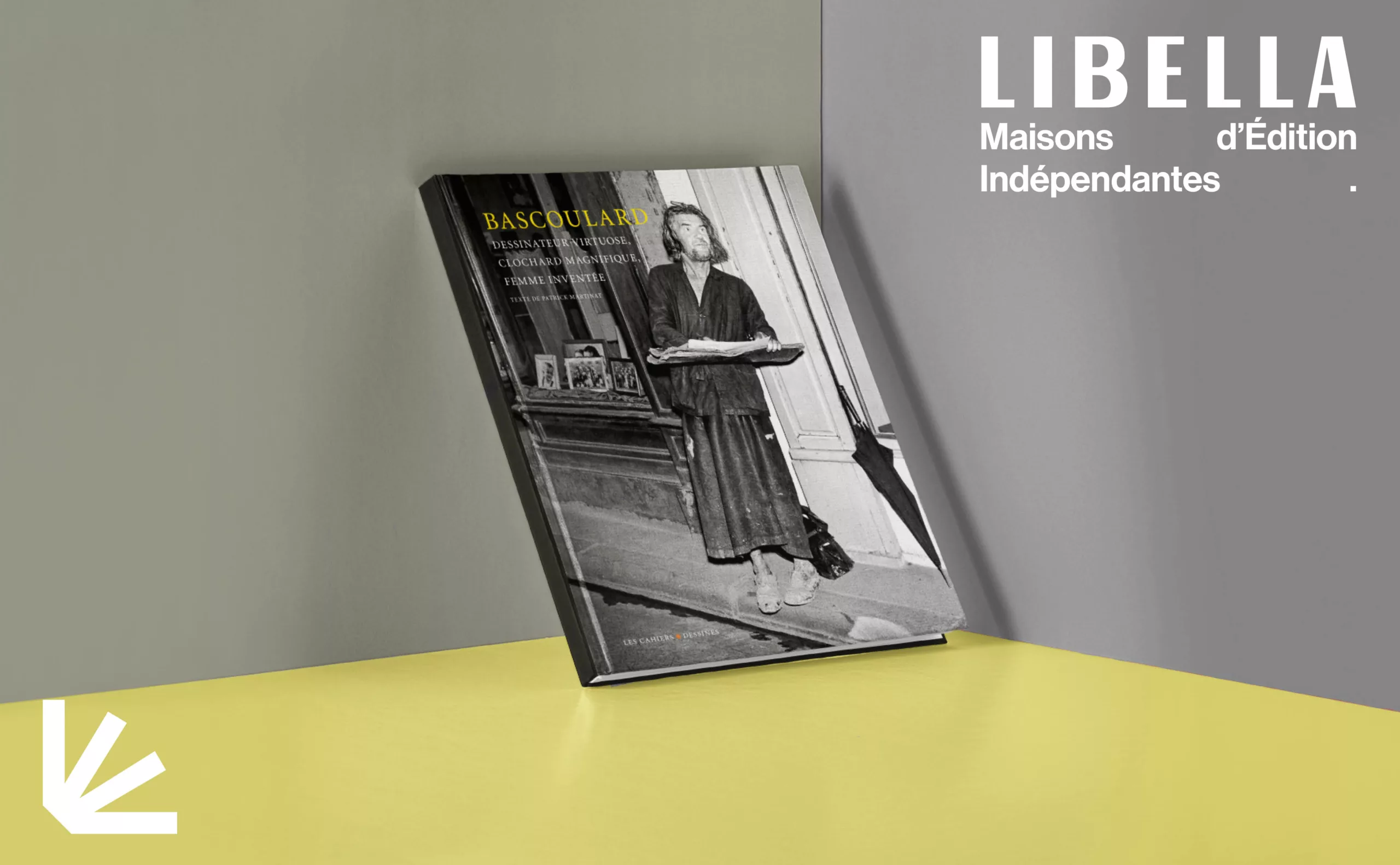
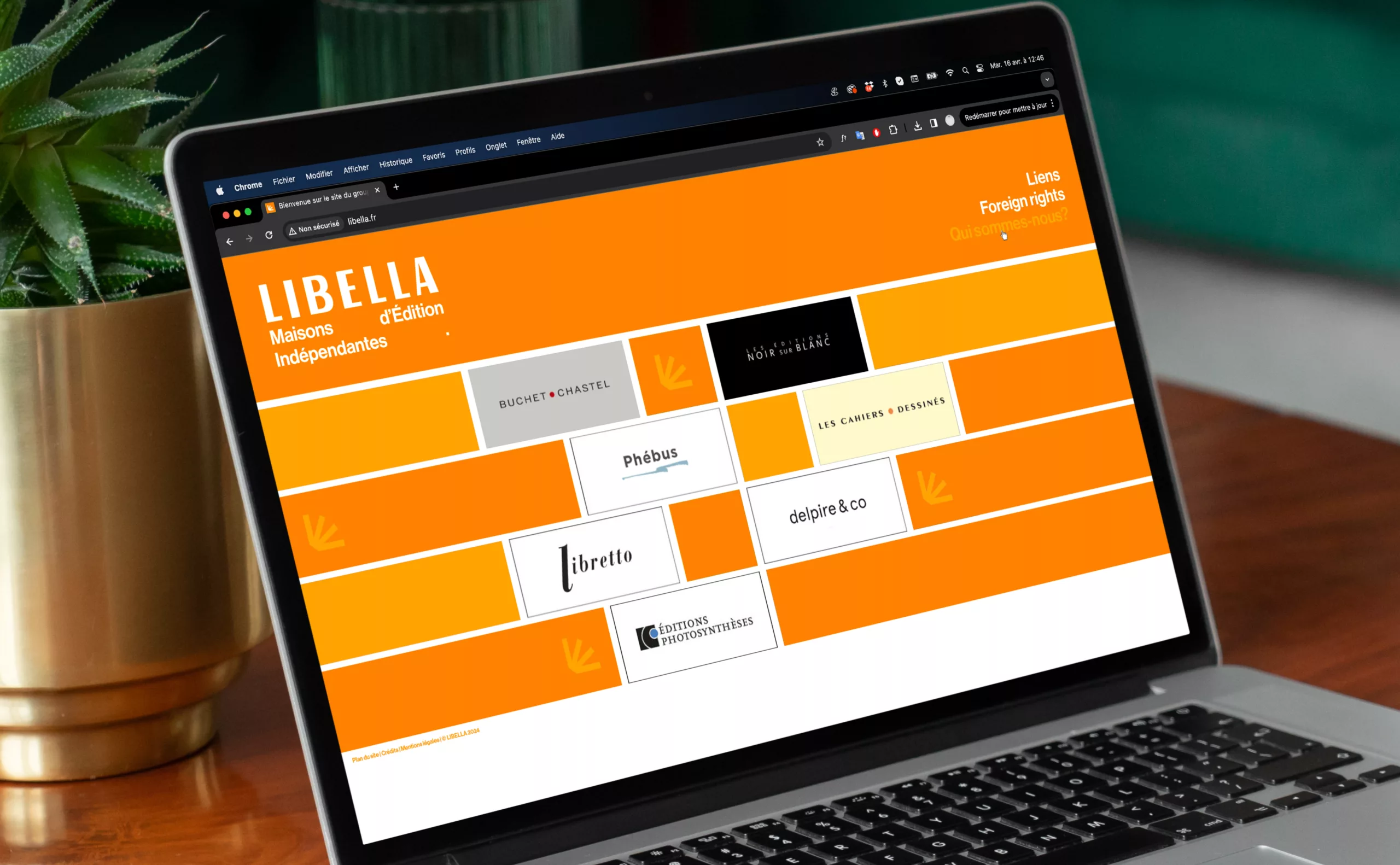
LIBELLA was founded in 2000 by Vera and Jan Michalski as a Franco-Swiss group of independent publishing houses. The group currently comprises seven publishers: Buchet/Chastel, Editions Noir sur Blanc, Phébus, Les Cahiers Dessinés, Libretto, Delpire & Co, and Editions Photosynthèses.
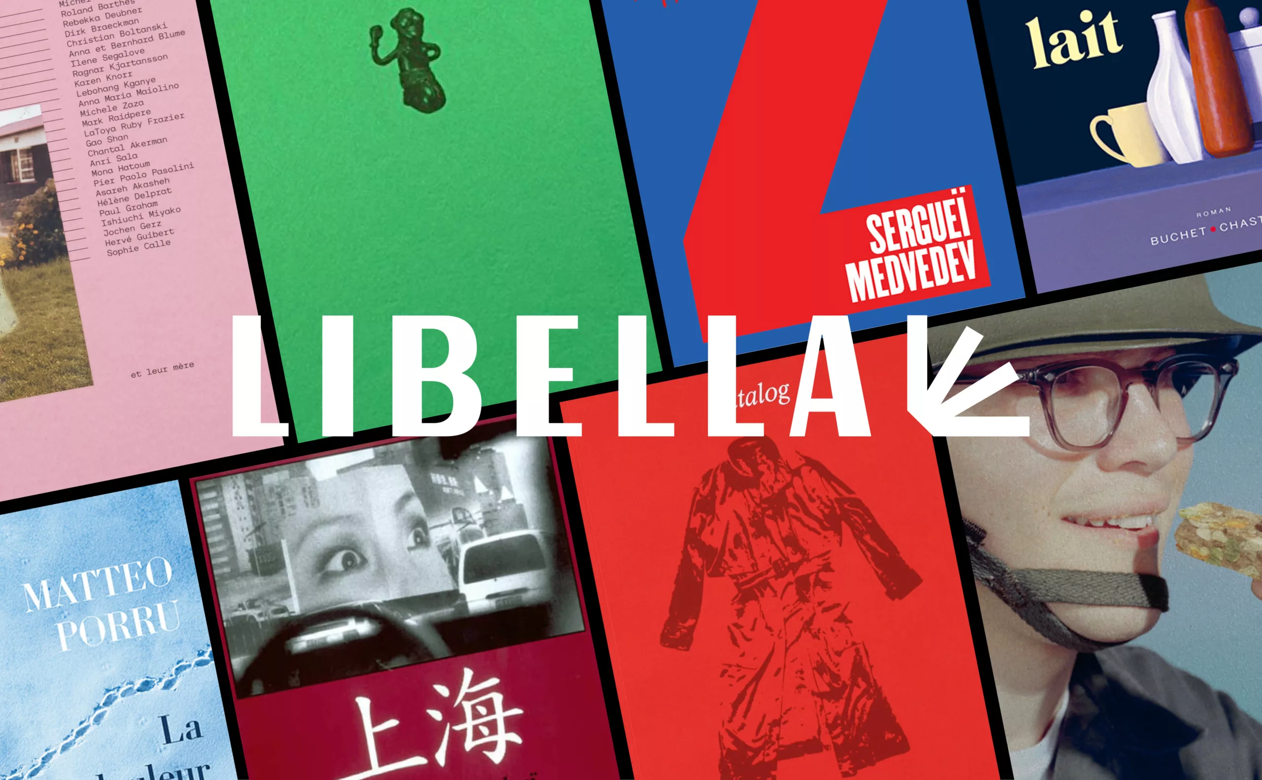
LIBELLA stands out for its diversified editorial output: French and foreign literature, travelogues, essays, documents, music, ecology, illustrated books and creative hobbies. The focus is on authors with a committed and sensitive approach.
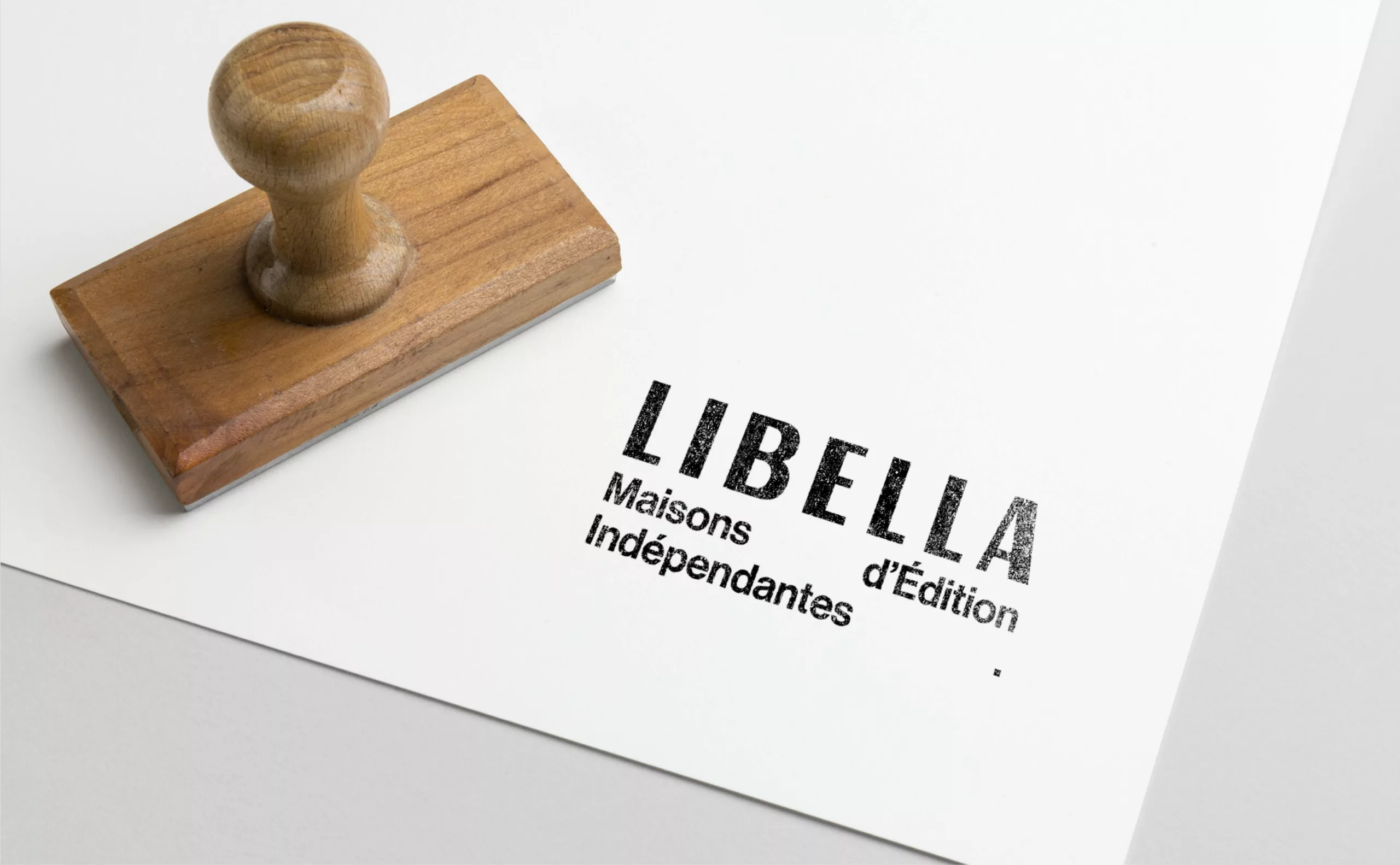
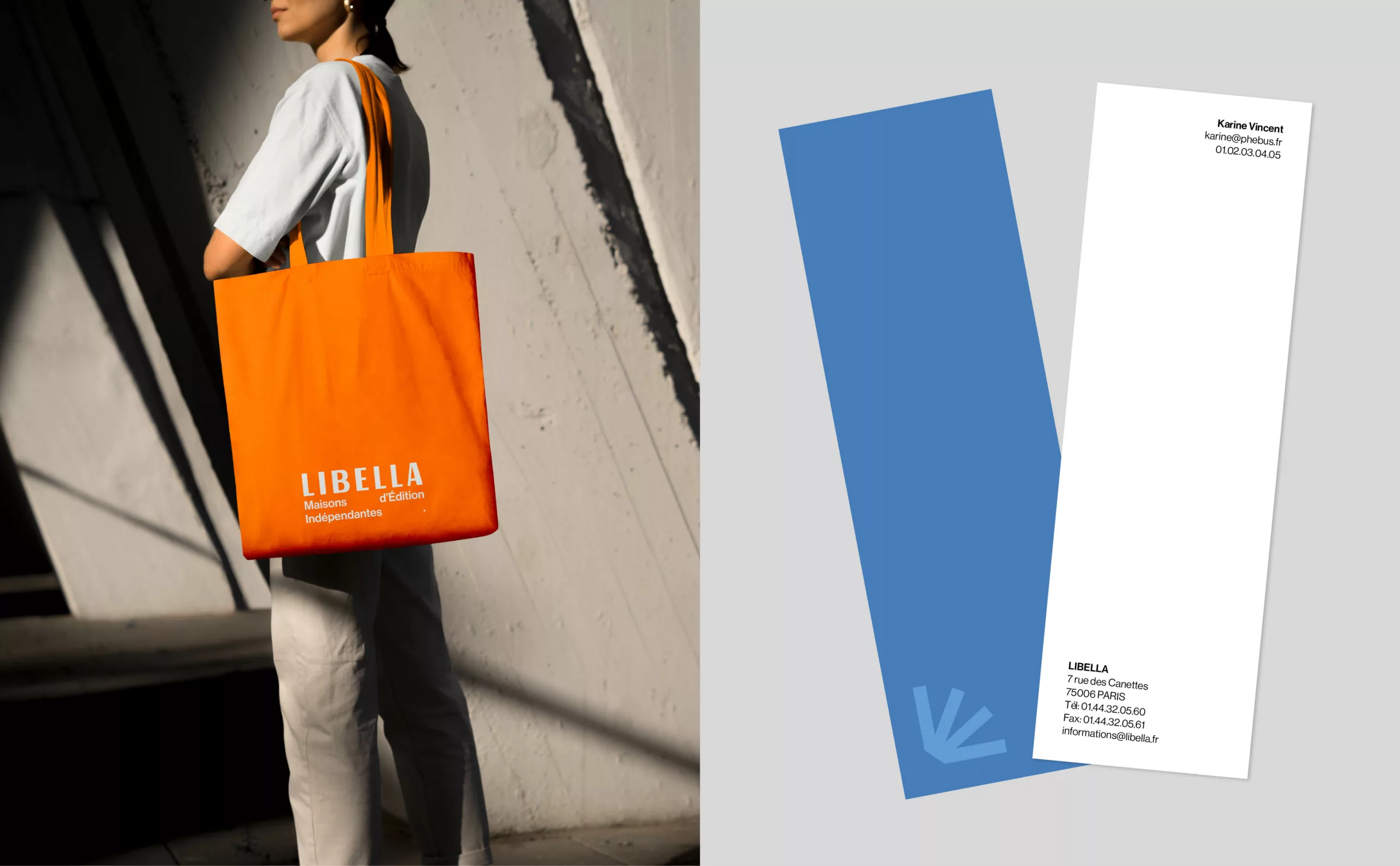
The LIBELLA group brand, which until now had not been very visible to the general public, asked Graphéine to rethink its brand identity.
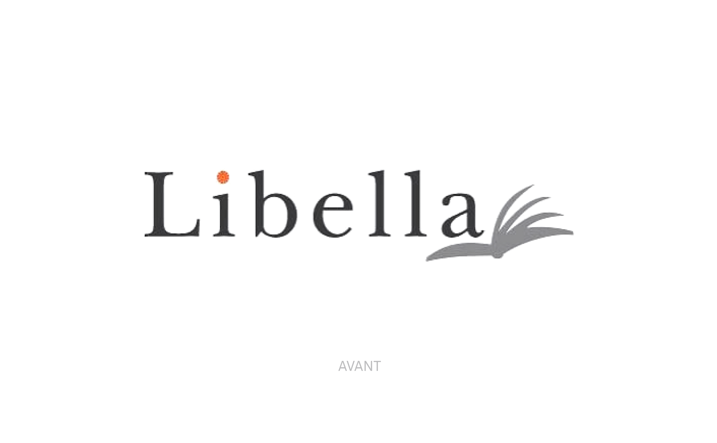
The old logo embodied a very ‘classic literary’ imagination. The round, lower-case typography lacked visual impact, and the floral tittle above the i was illegible on a small scale. As for the emblem, it seemed awkwardly associated with the wordmark.
A new logo reflecting LIBELLA's values
The new visual identity assertively embodies the values of independence, diversity and universality that LIBELLA promotes. The emblem is minimalist and elegant. It is directly inspired by the symbol of an open book, a reminder of the previous emblem, while evoking the ideas of cultural and literary expansion. Its branches are a reference to the diversity of its various publishing houses, that fall under the LIBELLA group.
The bold, contrasting and lightly spaced wordmark hints at the visual cues of the publishing sector, reflecting the rigour and quality of the works published.
To allow flexibility in the deployment of the LIBELLA brand, two versions of the logo co-exist. The first version with the emblem is LIBELLA's main logo. The second version with the tagline is dedicated to institutional use.
Typography and colours
The tagline uses the Neue Haas Grotesk Display typeface, a contemporary sans-serif typeface composed in lowercase. This is LIBELLA's new brand typeface.
The tagline, ‘Independent publishing houses’, simply defines LIBELLA's activity and acts as a manifesto for the institution. This signature complements the brand and extends its legibility. The spacing emphasises the notion of independence and the full stop ‘.’ completes the rectangular composition of the wordmark.
The new brand palette uses orange as its primary colour. Its use underpins the group's new visual identity and ensures effective brand recognition. The palette is completed by a luminous ochre and a deep blue, allowing a play of light/dark superimpositions.
Applications
The emblem can be used as a motif to create patterns for various media, whether printed or digital. We also designed stationery that is consistent with the brand’s sector. Business cards, for example, were designed to be used as bookmarks. The LIBELLA emblem acts as a strong marker for packaging materials.
With a modernised visual identity, LIBELLA is making its presence felt. This renewal of the brand affirms its status as an independent publisher and acts as the DNA of a strong brand.
LIBELLA, a Franco-Swiss publishing group founded in 2000, comprises seven independent publishing houses. Being a mostly B2B brand until now, the group asked Graphéine to rethink its visual identity and assert its presence for the general public.
Modernise the LIBELLA group's identity to better reflect its values of independence and diversity, while ensuring brand visibility and recognition.