Jacno, “Five capital letters!”

We are taking advantage of the news of an exhibition on the work of the graphic designer and draftsman of character “JACNO” which is currently taking place at the ÉSAD d’Amiens to enrich our collection of portraits of the great names in graphic design.
Marcel Jacno (1904- 1989), known as Jacno, is a French graphic designer, famous notably for having designed the NPT logo, as well as the Gauloises cigarette pack, which will be at the time one of the most popular logos for the French and is a kind of world record in the distribution of a signed creation.
Before going into Jacno’s story, we would like to thank Alice Savoie (teacher-researcher and type designer) who kindly provided us with the texts and images of the exhibition that you will find below.
JACNO – Five capital letters
Marcel Jacno, some biographical references
Jacno, whose real name is Marcel Jachnovitch (1904-89), is a French graphic designer and type designer. Self-taught, he entered the world of graphic arts in the 1920s, when he was employed as a draftsman in a printing company alongside a literary painter. On the strength of this experience, Jacno decided to embark on the “advertising art” and then received his first commissions for the cinema. He created over twenty posters for companies such as Gaumont and Paramount, including films with Charlie Chaplin and Louise Brooks.
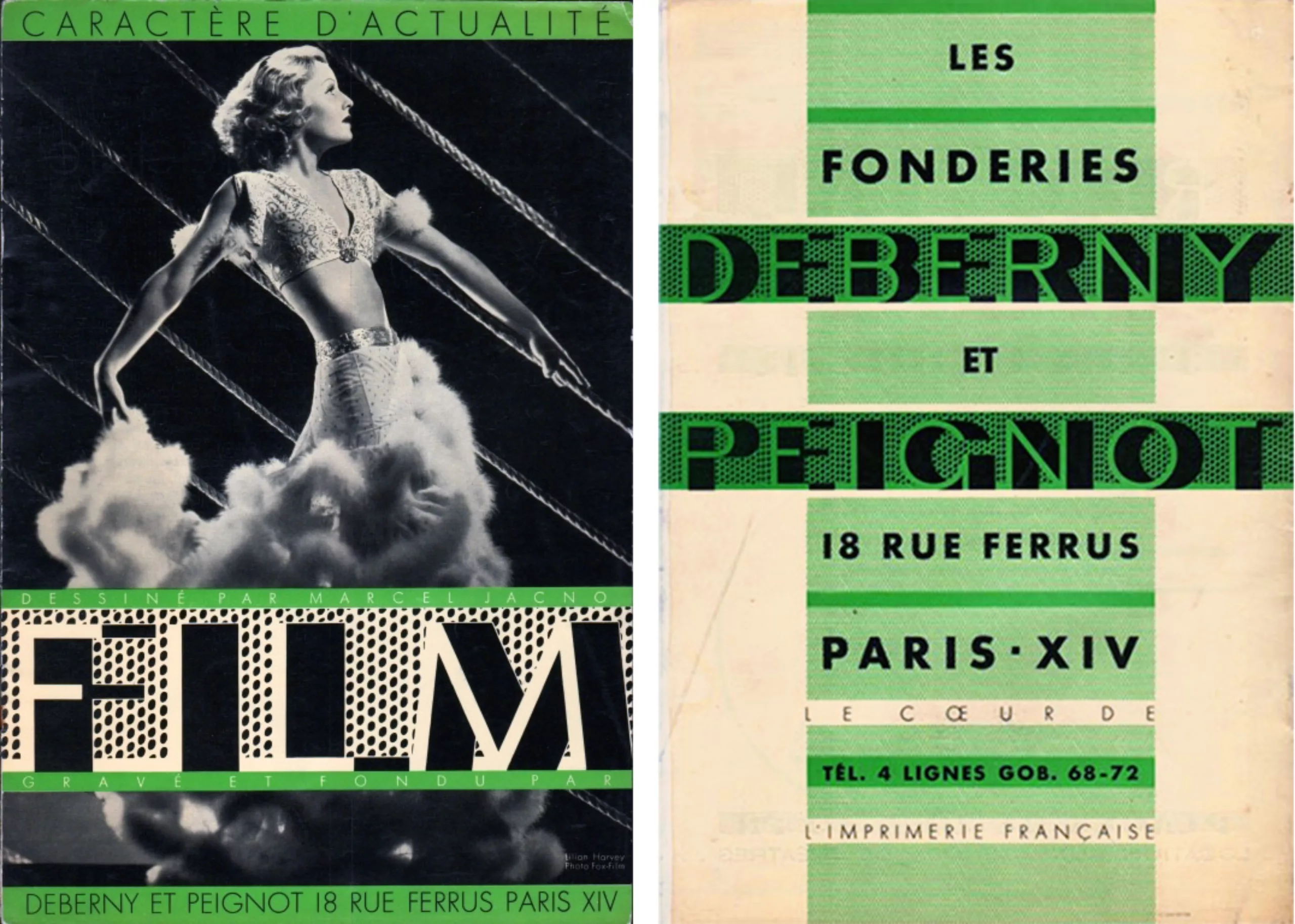
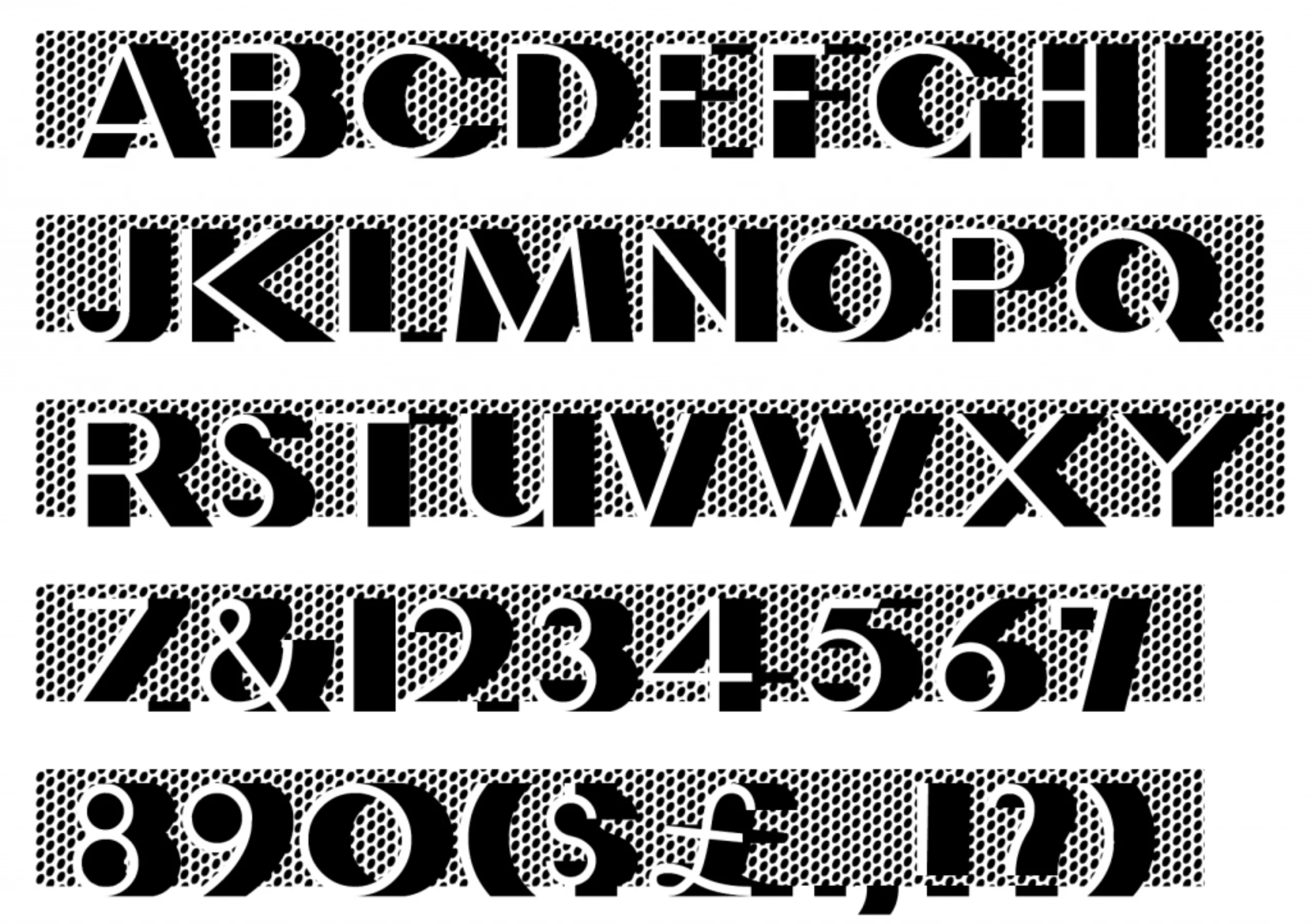
But these orders taken from the famous production company were for him disappointing, because they remained without tomorrow. And when he discovered, in the hall of the famous cabaret “Le Bœuf sur le toit”, a silver panel with the Bifur alphabet on it, created by Cassandre for the Deberny-Peignot foundry, he understood that the letter could be an object of creation. Very impressed, soon puts to good use his experience of painting in letters to start in his turn in the drawing of characters. Two of his creations were published by the prestigious Parisian foundry Deberny & Peignot in the 1930s: the Film, in 1934, illustrates Jacno’s filiation with the world of cinema.
Jacno, A Beautiful Future, pp. 35-38The modernity of these graphics delighted me. And inspired me to draw a print character too. The work was spread over long months to arrive at an alphabet with modernist forms, in the taste of the time. I pretended to propose it to the editor of the Bifur I had so admired. Overcoming my uncertainties not without difficulty, I was going to put my drawings before Charles Peignot’s eyes (…) He accepted my drawings.
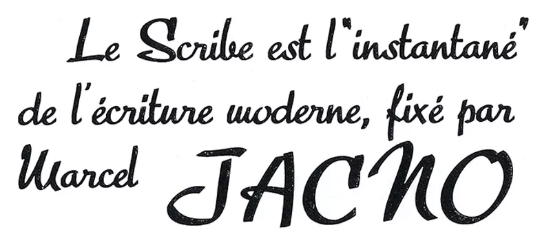
After the font character “Film” follows the “Scribe”, published in 1936, a script-inspired character that moves away from classic English-style models to a letter reflecting the “spoken style. More familiar and spontaneous in tone, the Scribe was essentially intended for the advertising sector, which was in full expansion at the time, and is still today emblematic of the successful characters of the time.
You can find a digital version, published under the name of Gaulois, right here.
Bloody Gauls!
Despite his obvious appetite for the letter, Jacno is far from being limited to typographic creation. Above all, he is an accomplished designer who enthusiastically tries his hand at the art of posters, packaging and visual identity. In 1936, he did one of his best identified works: he revisited the famous winged helmet on the Gauloises cigarette pack, originally designed in 1929 by Maurice Giot. Jacno now signs with his name the famous blue rectangle, which will greatly contribute to his fame.
Marcel Jacno« I was the record-breaker of multiples, given that this so banal package was printed in a number of copies that beat all signature records: one and a half billion copies every month. »
No signed work approaches this figure, even from very far away. This record is all the more curious as it is the work of an author whose fame is limited to a few small professional circles. His roadmap was to “modernize” the helmet, not to find another logo. A simple rebranding of sorts! He said he was inspired by a helmet from a Latin Quarter sculpture. He won the Oscar for packaging in 1955. Originally there is the logo of Maurice Giot created in 1925, a winged helmet, without real connection with tobacco, whose object is to give the idea that smoking gives a feeling of freedom.
[ Find the history of Gauloises packages here ]
For the anecdote, the musician and singer Jacno (aka Denis Quilliard (1957-2009) who largely influenced french pop in the 80s owes his nickname to his fatal consumption of “Goldos”.
His commitment
Jacno made several trips to the United States between 1936 and 1938, where he offered his services as an independent commercial artist, and taught at the New York School of Fine and Applied Art. When he returned to France, the Second World War put a brutal brake on his projects; he then went through one of the most difficult periods of his life, which saw him enter the Resistance and then be deported to the Buchenwald internment camp – an experience that left an indelible mark on the artist’s mind and body.
As soon as he returned to Paris after the war, Jacno resumed his professional activity. He brought the Gauloises package up to date, and produced numerous other packaging and advertising materials for prestigious fashion, perfume and spirits brands (Lip, Chanel, Bourgeois, Guerlain, Courvoisier, etc.). In an economic and social context favourable to advertising art and the expansion of the sphere of influence of what we would today call “graphic design”, his work was increasingly visible and courted throughout the 1950s and 1960s. He then extended his graphic practice to the fields of publishing and the press (France Soir) as well as theatre.
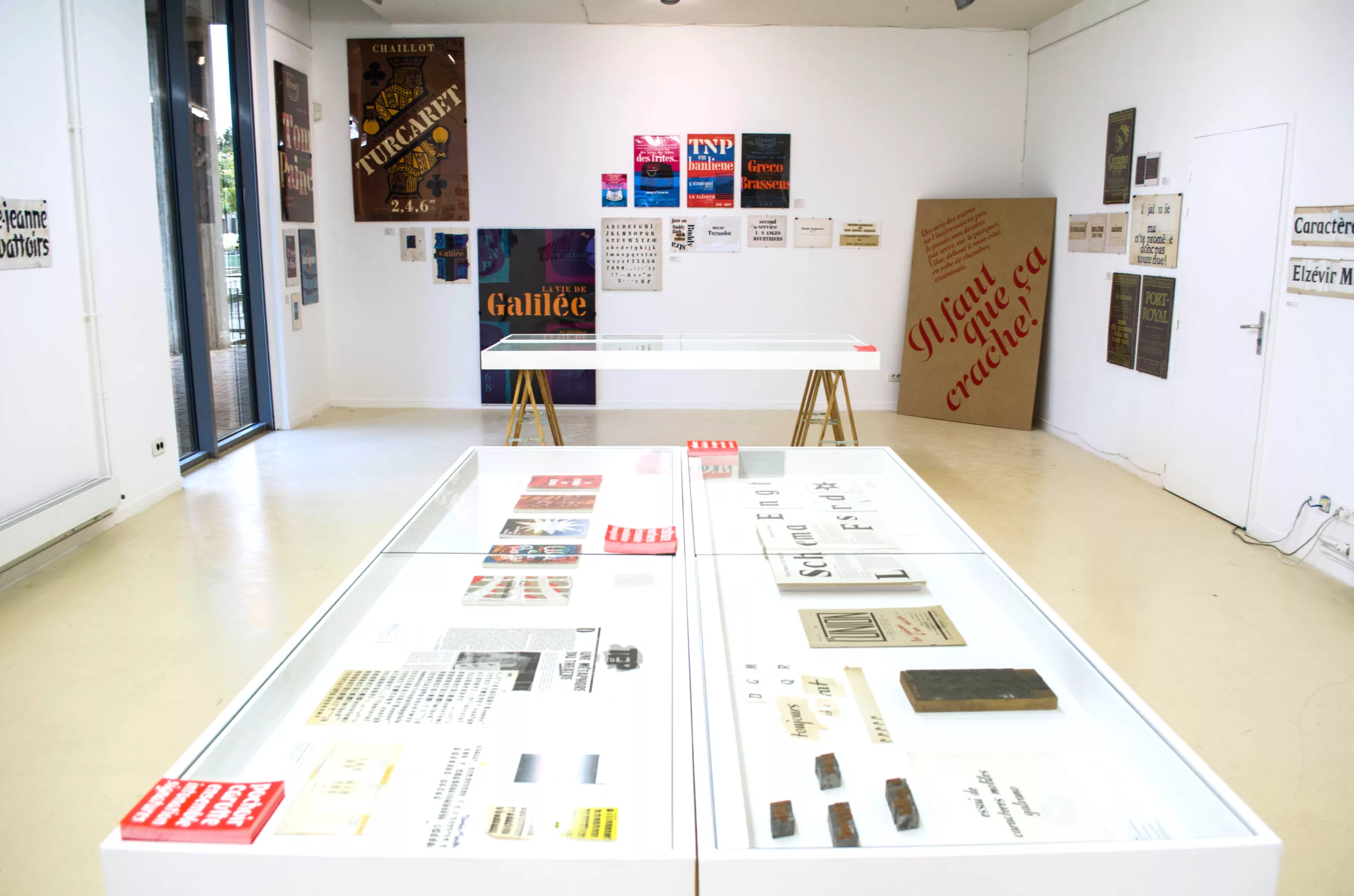
The collaboration between Jacno and the type foundry Deberny & Peignot also resumed at this period, giving rise to the publication in 1951 of its eponymous character. Inspired by what could be described as manual 1, Jacno adopts the logic of the cursive layout to produce a robust and catchy character, with “rustic” contours and assumed darkness. Beyond the characters edited by Deberny & Peignot, Jacno created several alphabets for the exclusive use of his clients, in the field of publishing in particular: let us quote an alphabet script intended for advertising Quillet editions, an onciale for the Bible and the Gospel according to Saint John illustrated by Edy Legrand, or a set of illuminated initials for the Club des Bibliophiles de France.
![]()
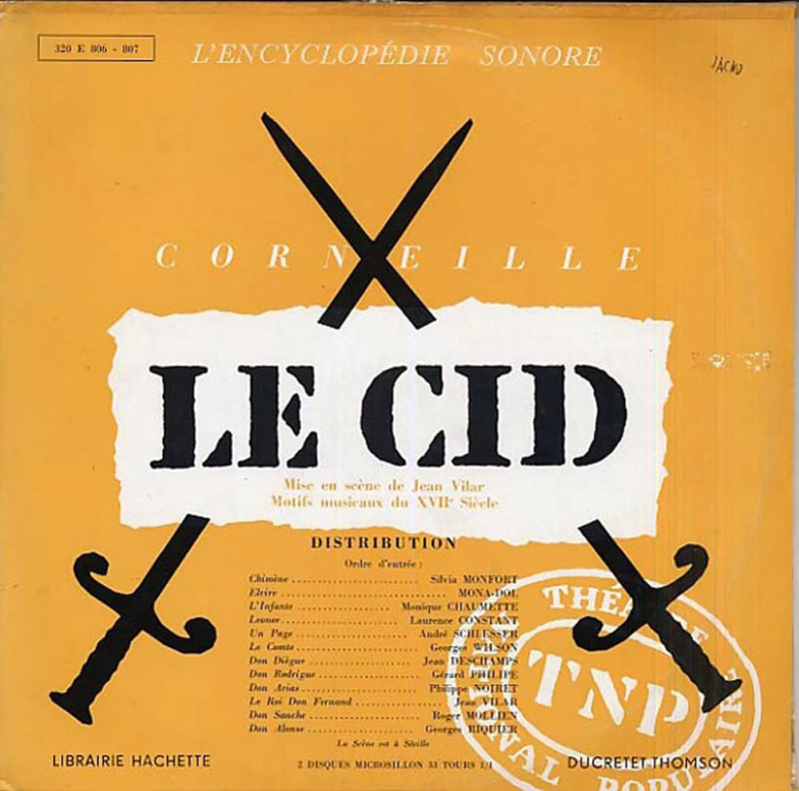
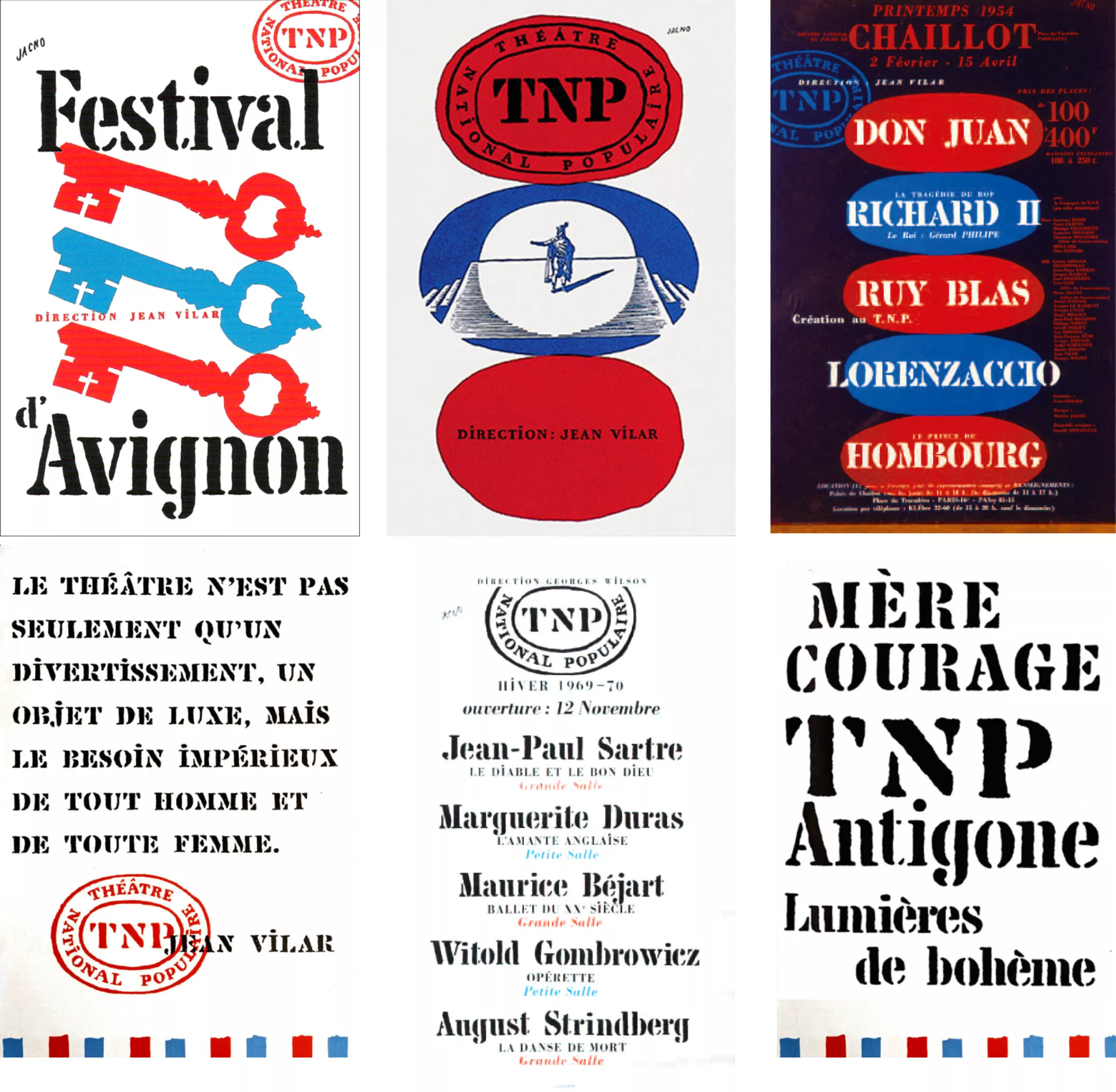
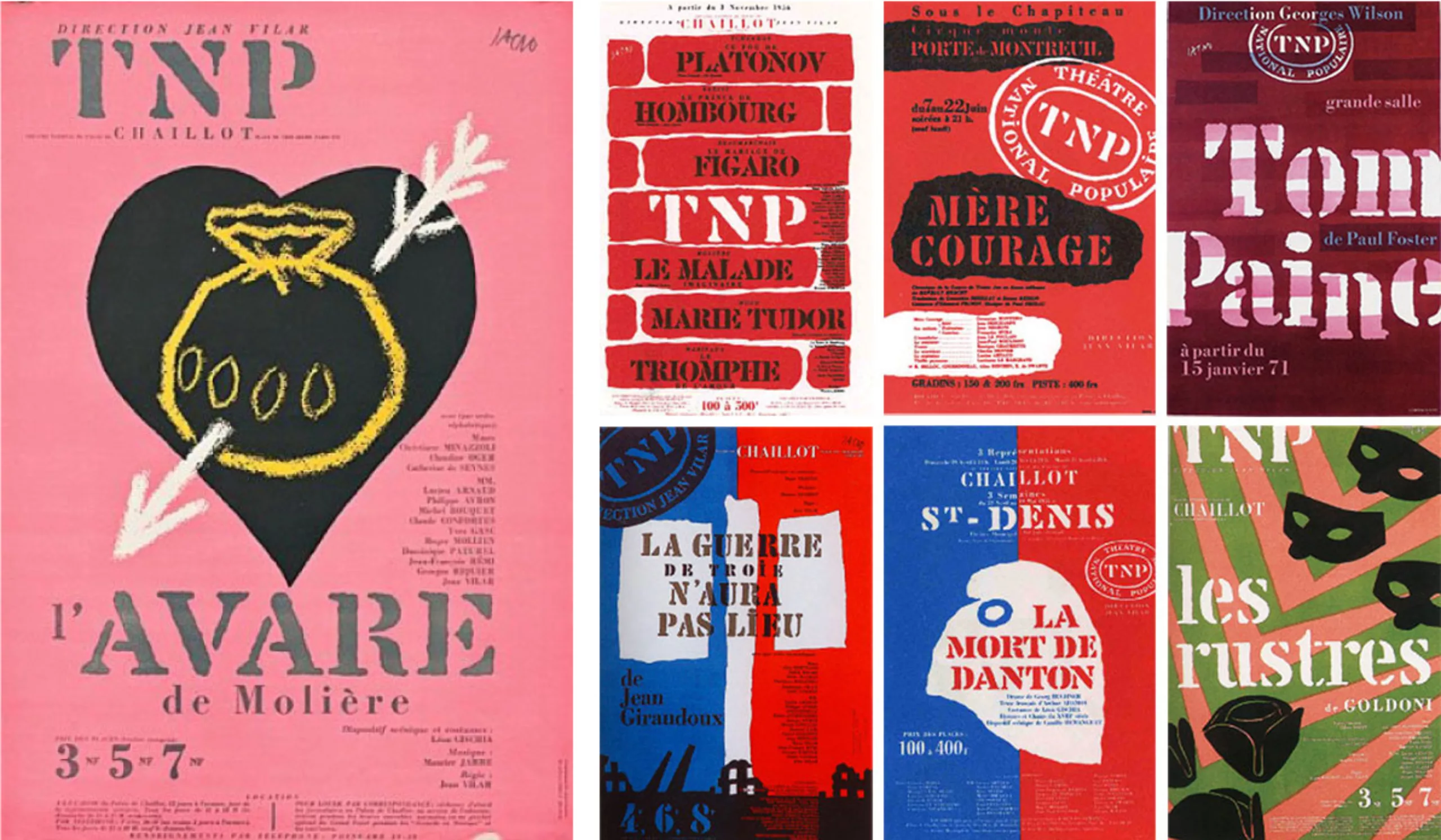
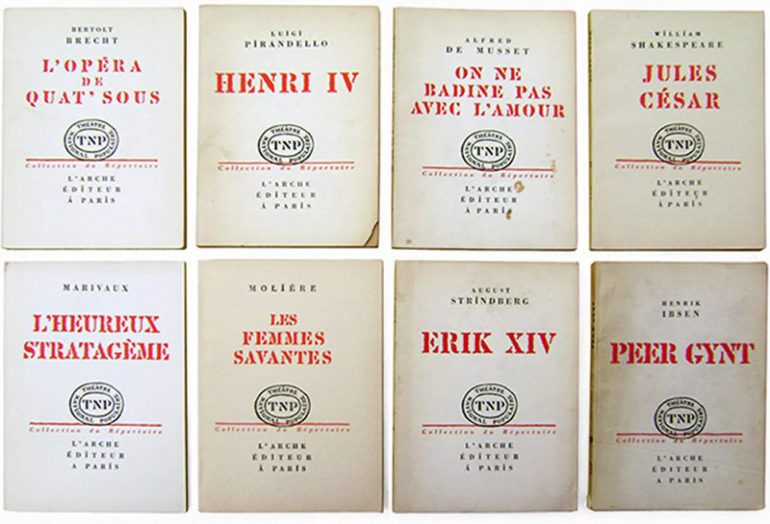
Théâtre National Populaire posters
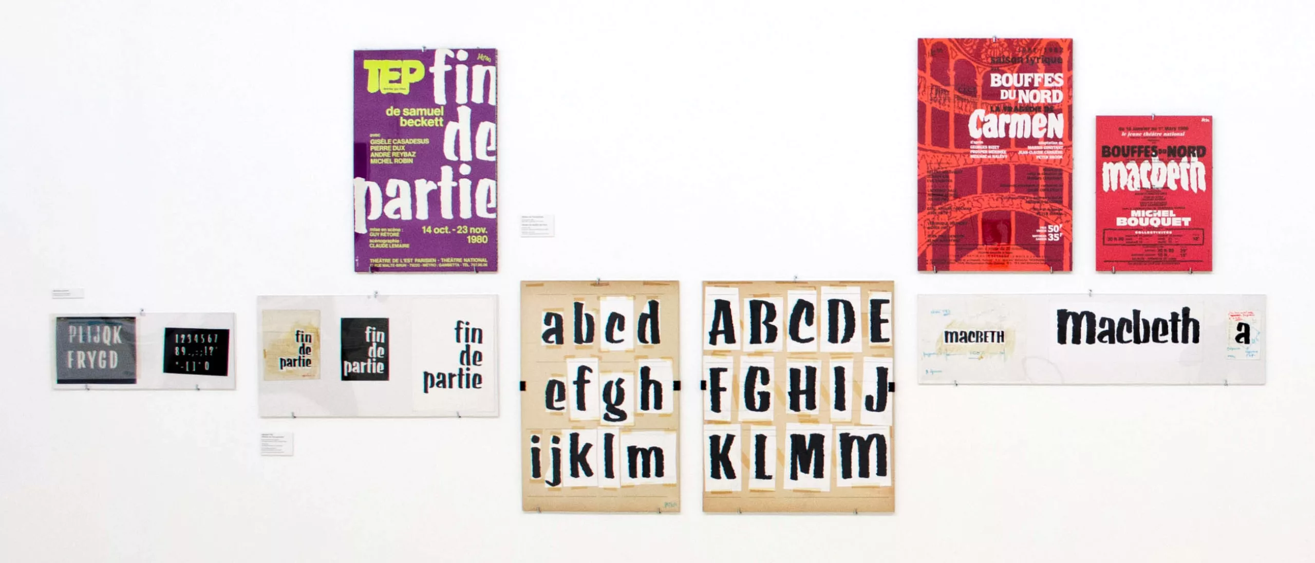
As his clientele diversified, one of the most emblematic collaborations of Jacno’s career began in the early 1950s with the Théâtre National Populaire, then under the direction of Jean Vilar. He signed the entire identity of the NPT as well as numerous posters that would follow one another for nearly twenty years. This work also gave rise to the Chaillot character (distributed by Deberny & Peignot from 1953 onwards), imitating the stencil style and based on the lettering Jacno produced for the NPT posters and logo.
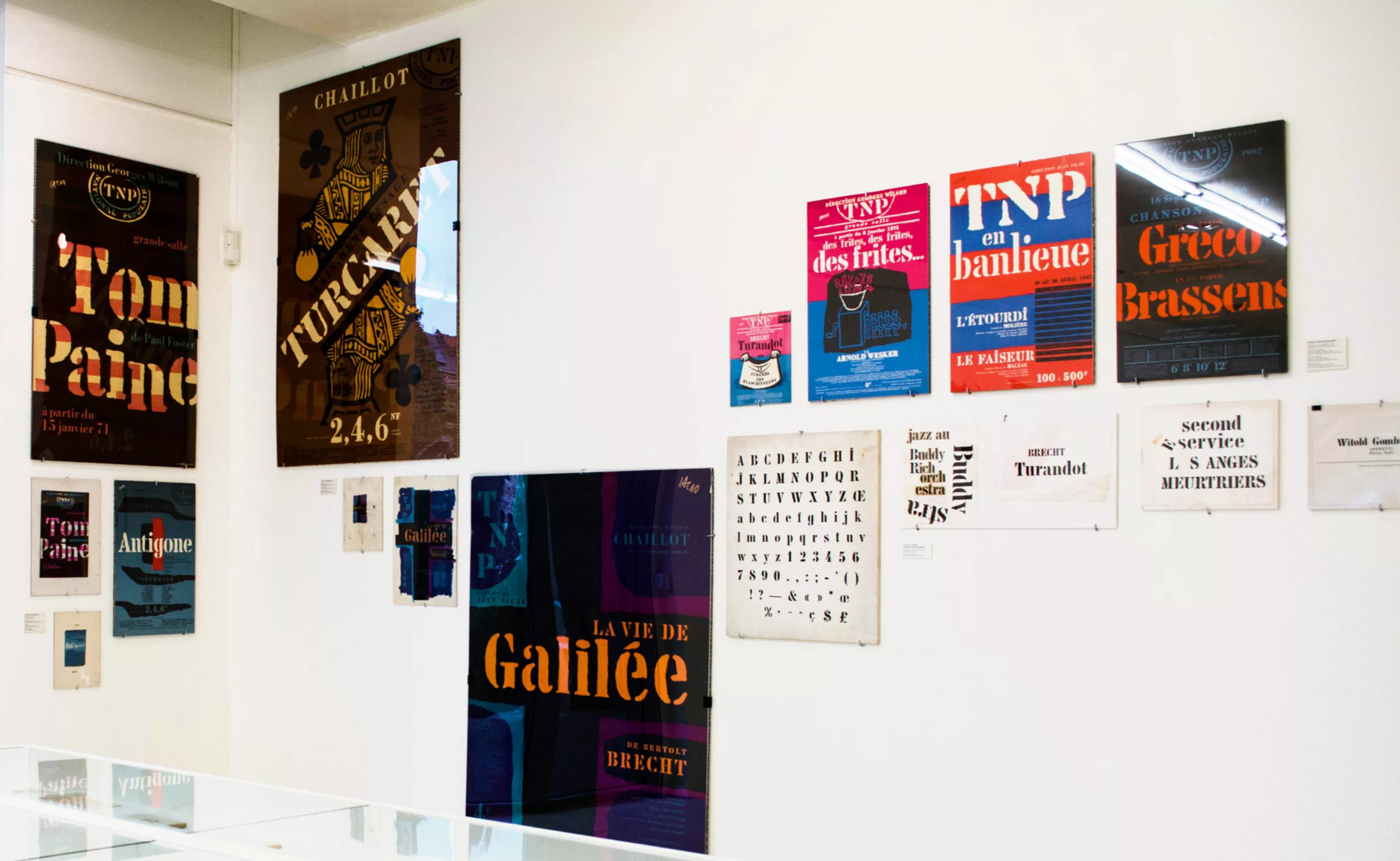
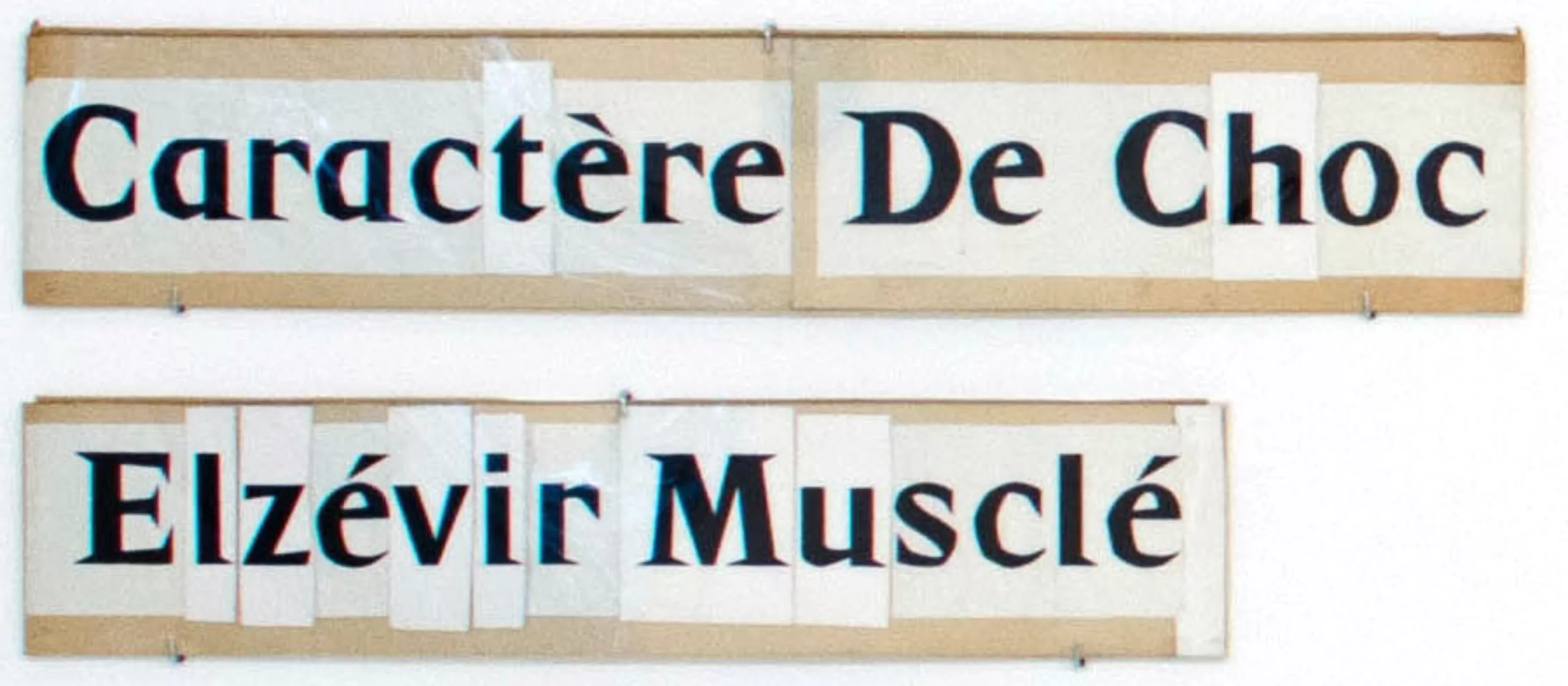
Ci-dessous, des travaux préparatoires réalisés à la main !
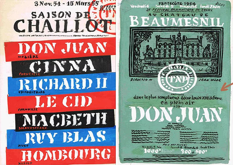
The work initiated in the 1950s by Jacno is still relevant. For more than 60 years, the Théâtre National Populaire has still not changed its logo, and each season entrusts its communication to new graphic talents. The 2015-16 programme was produced by Guerilla grafik. This is what it looks like (the spirit of Jean Vilar and Jacno is there!).
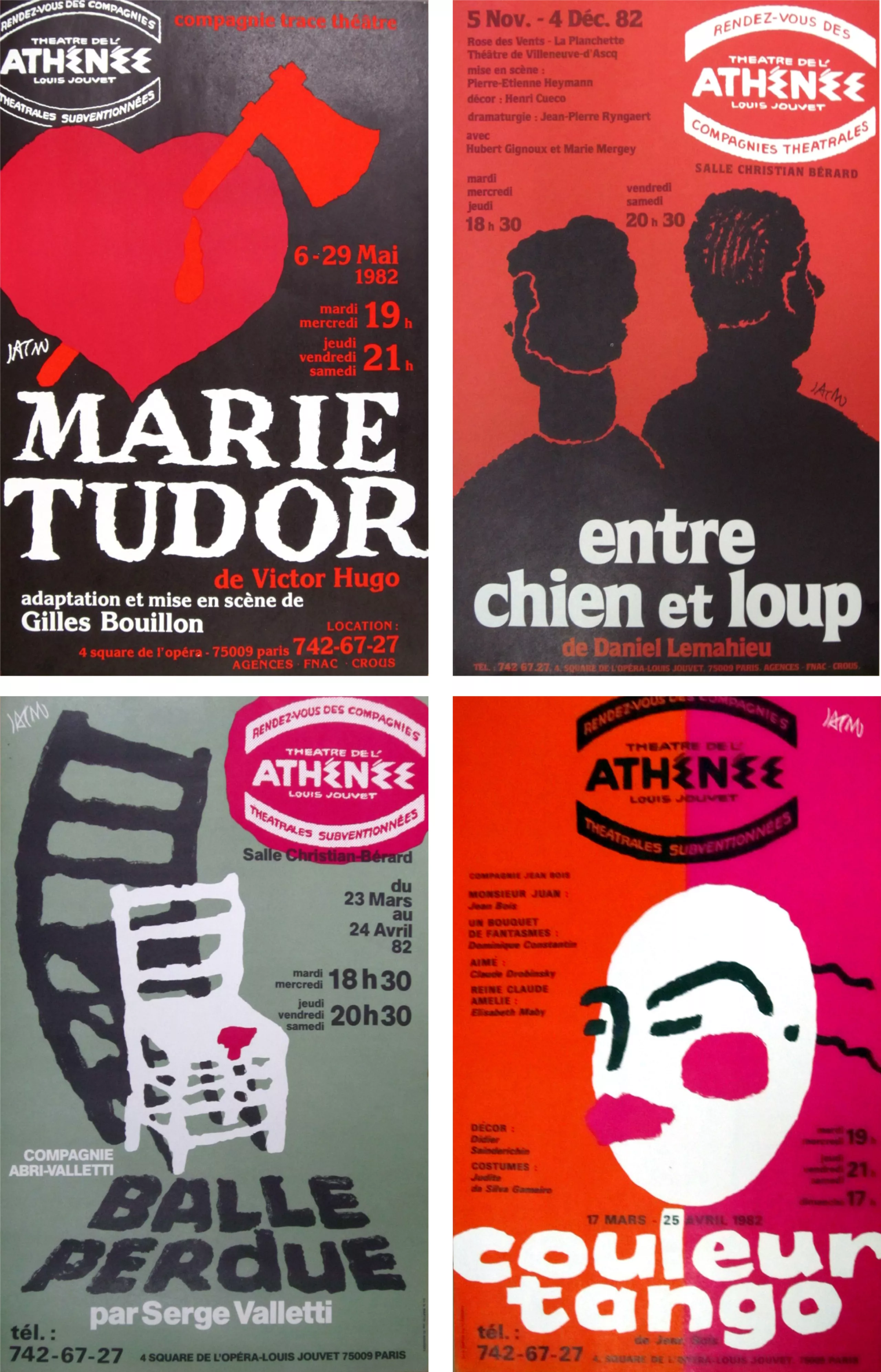
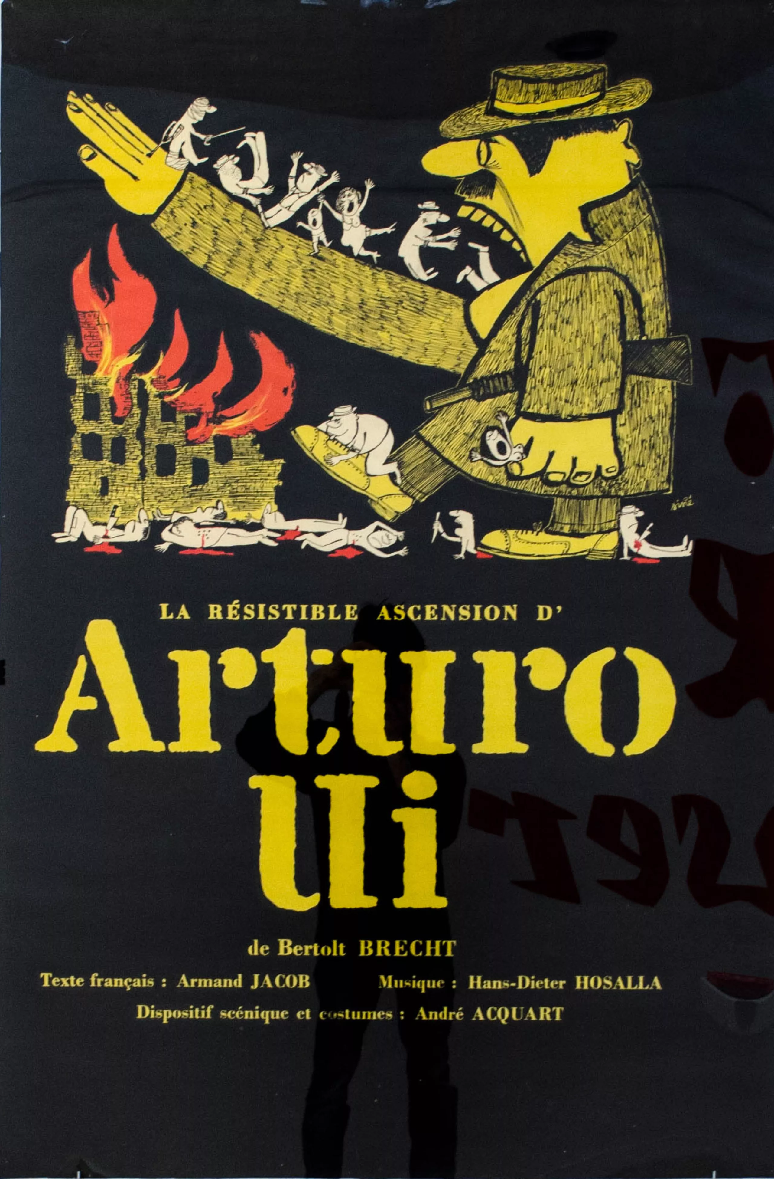
The fruit of this collaboration constitutes an outstanding and visible part of Marcel Jacno’s production, which led him to work later for many other institutions of the performing arts such as the Comédie Française, the Paris Opera, the Théâtre de l’Est Parisien or the Théâtre de L’Athénée (see below). For each of these institutions and like his work for the NPT, the letter plays a central role in Jacno’s thought identities, which usually result in the creation of a specific alphabet. He designed the Corneille for the memorial theatre of the same name, the Molière for the Comédie Française, and the Ménilmontant for the Théâtre de l’Est Parisien. Although each of these alphabets draws its sources from different models, each time we find the same will to propose a letter “raw”, matte, alive, a letter intended for the street and all those who walk it – and which testifies to the deeply democratic vision of culture that Jacno wishes to communicate through his graphic work.
Sources: The images in this article are presented for educational purposes.
- Photographs of the exhibition “Jacno, five letters in capitals” by post-graduate students Typography and language of the ÉSAD Amiens : Dorine Sauzet, Isaline Rivery, Erwan Beauvir, Quentin Schmerber, Hugues Gentile, Martin Pasquier.
- Wikipedia page on Jacno: https://fr.wikipedia.org/wiki/Marcel_Jacno
- http://indexgrafik.fr/marcel-jacno/
On the subject
-
Maison Nicolas, a new logo for a new strategy
Maison Nicolas has unveiled a new logo and identity, unfortunately without drawing on its rich graphic heritage.
-
Where does modernism come from? 2 – The two faces of modernism and the social ideologies surrounding ornamentation
L’usage ou l’absence d’ornementations symbolise pour l’homme “moderne” deux visions utopiques et différentes pour changer la société.