A gourmet logo for the International Gastronomy Exhibition

16 November 2021  |   0 Comments   |    |  

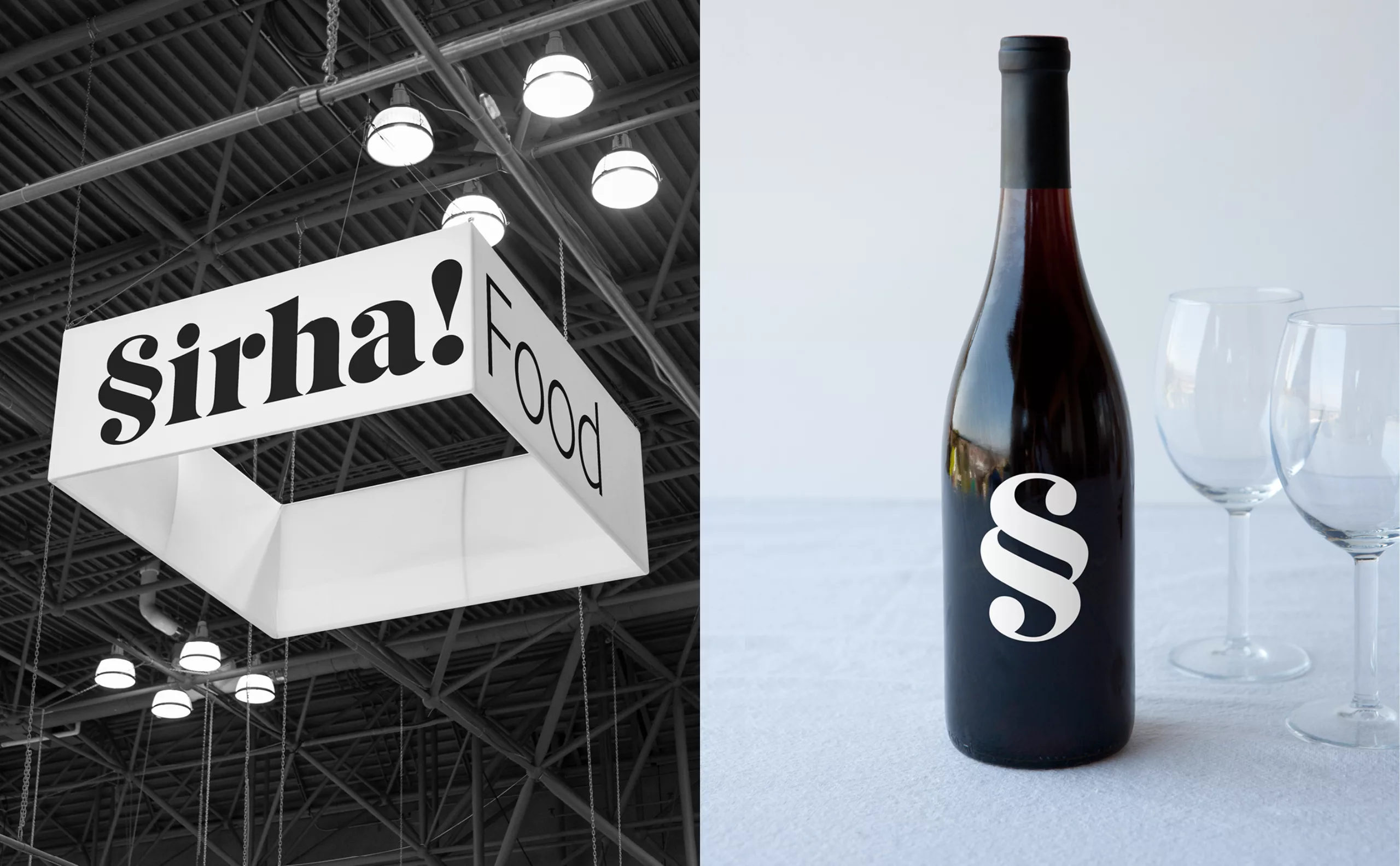
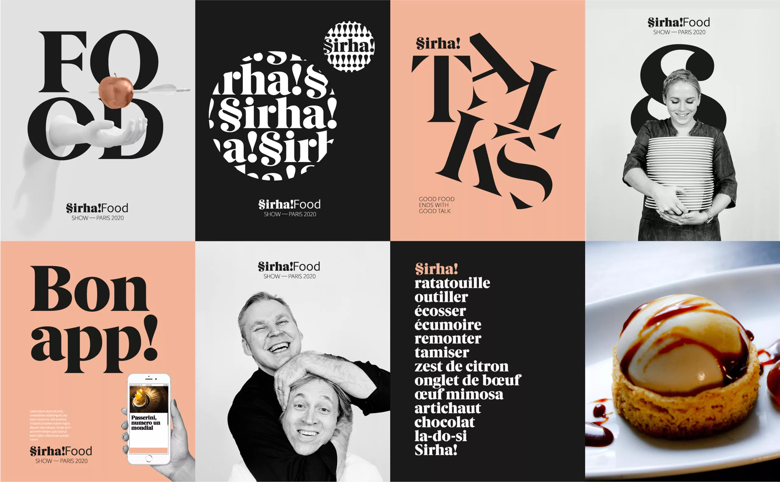
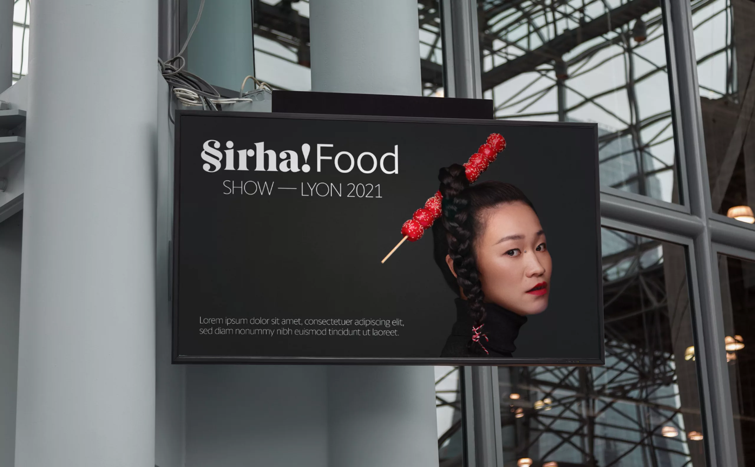
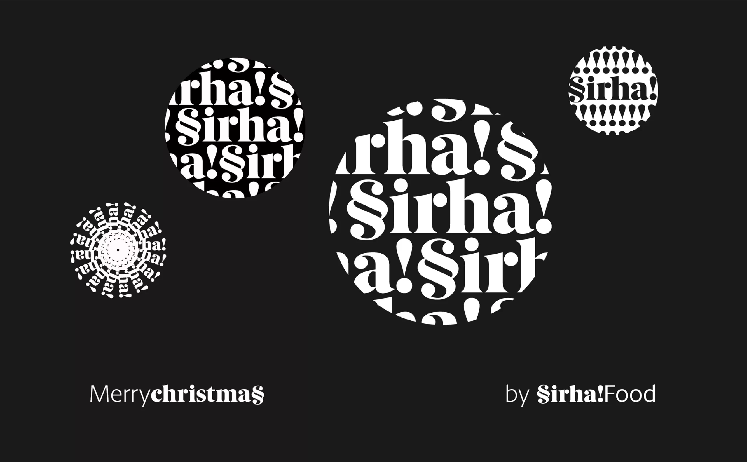
This is the project we presented as part of a call for tenders to rethink the brand identity of the Sirha. It is therefore a project that was not selected.

The Sirha is the largest professional event for the restaurant industry and everything that has to do with food. It is the acronym for "International Exhibition of Catering, Hotels and Food". Every two years, 210,000 professionals - including 26,000 chefs - from 132 countries come together to discover innovations, meet their colleagues and sign new contracts.

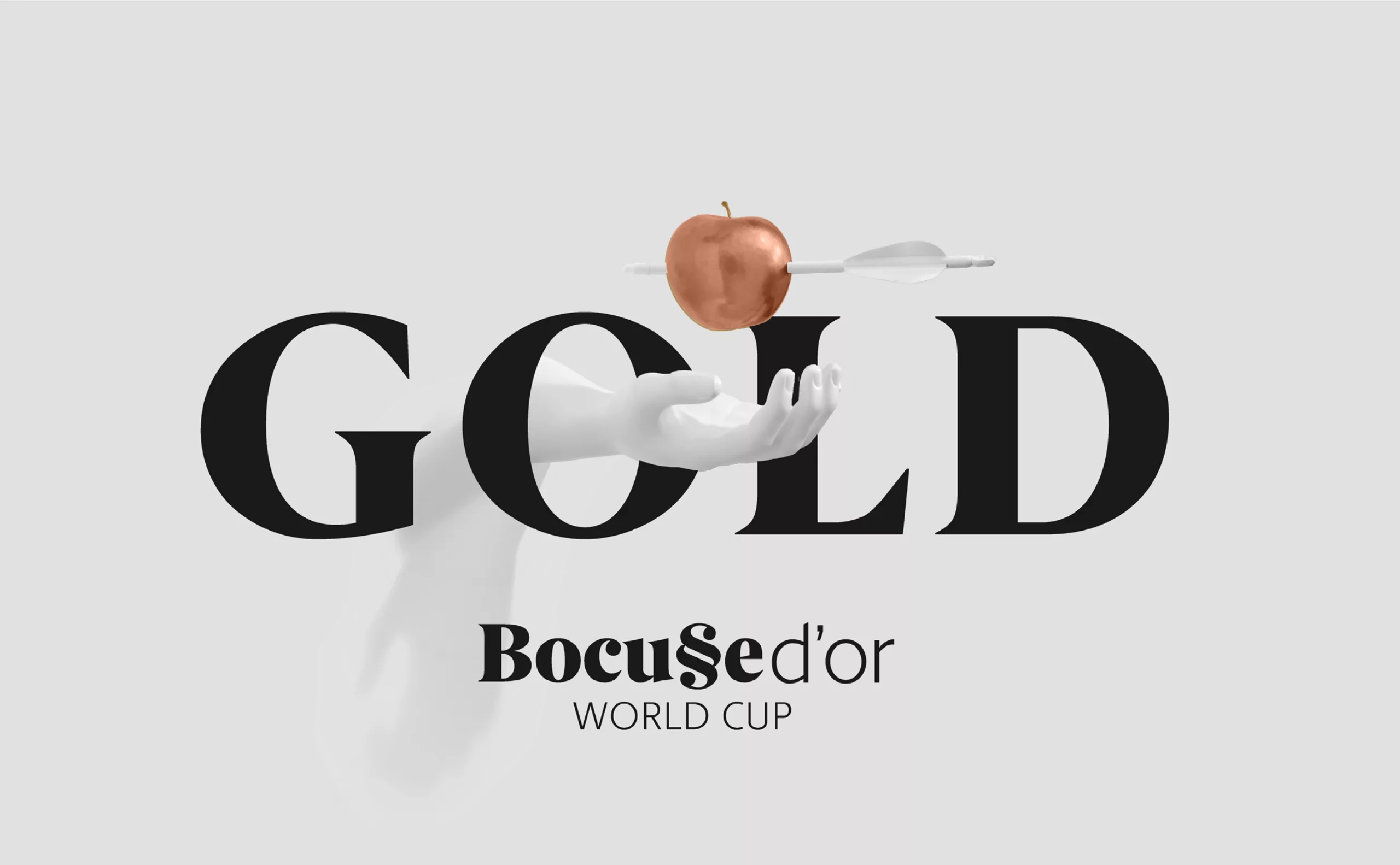
Sirha is where the major trends in the restaurant industry are made and unmade, and where decisions are made about what we will put on our plates. And Sirha is also the "Bocuses d'Or" and the "Coupe du monde de patisserie", a kind of culinary Olympic games.

Sirha food logo
motif graphique logo gastronomie

In this project, the challenge was to bring a personality to an acronym that lacked one. Of course, when one hears Sirha, one thinks of Syrah, the wine grape variety from the Rhone Valley. However, if Lyon's gastronomy cannot do without wine, this was not a wine fair either. This notion had to be discarded.

Our intuition was to try to represent the idea of generosity, conviviality and greed. This idea that the meal is a common good made to be shared, and that it is by nature generous.

While manipulating the letters of the word Sirha, we came across this symbol of the "§", a sort of voluptuous double "S". Our imagination took hold of it, and we started to look at this sign like a custard, like a chocolate scroll on a dessert, like a twisted bread. This sign makes you hungry!

Because of its typographic nature, this sign could easily become the central element of the brand's language. For example, writing the word "Saveur" with this symbol as the first letter allows a subtle alliance of the SIrha brand and its speech. And then, from a functional point of view, it is an extremely simple rule of the game to implement. An asset when it comes to deploying a brand identity on a multitude of variations.

The brand architecture of their different shows or competitions was based on this game with the letter "S", for example, interfering in the name "Bocuse d'Or".

Then, all that remained was to play the visual score. With this generous and talkative typography, the words could be the story of all these delicacies. The letter could become an image, in a delicate dialogue with the photograph.


Share this post:


Leave a Reply


Newsletter
Leave us your email and receive your monthly dose of Graphéine in your mailbox.