Interview with the designer of the AC/DC and HBO logos: Gerard Huerta
It is with pleasure (and not without a certain honor) that the following interview inaugurates a series of interviews with the most famous graphic designers on the planet.
Gerard Huerta, the man of logos
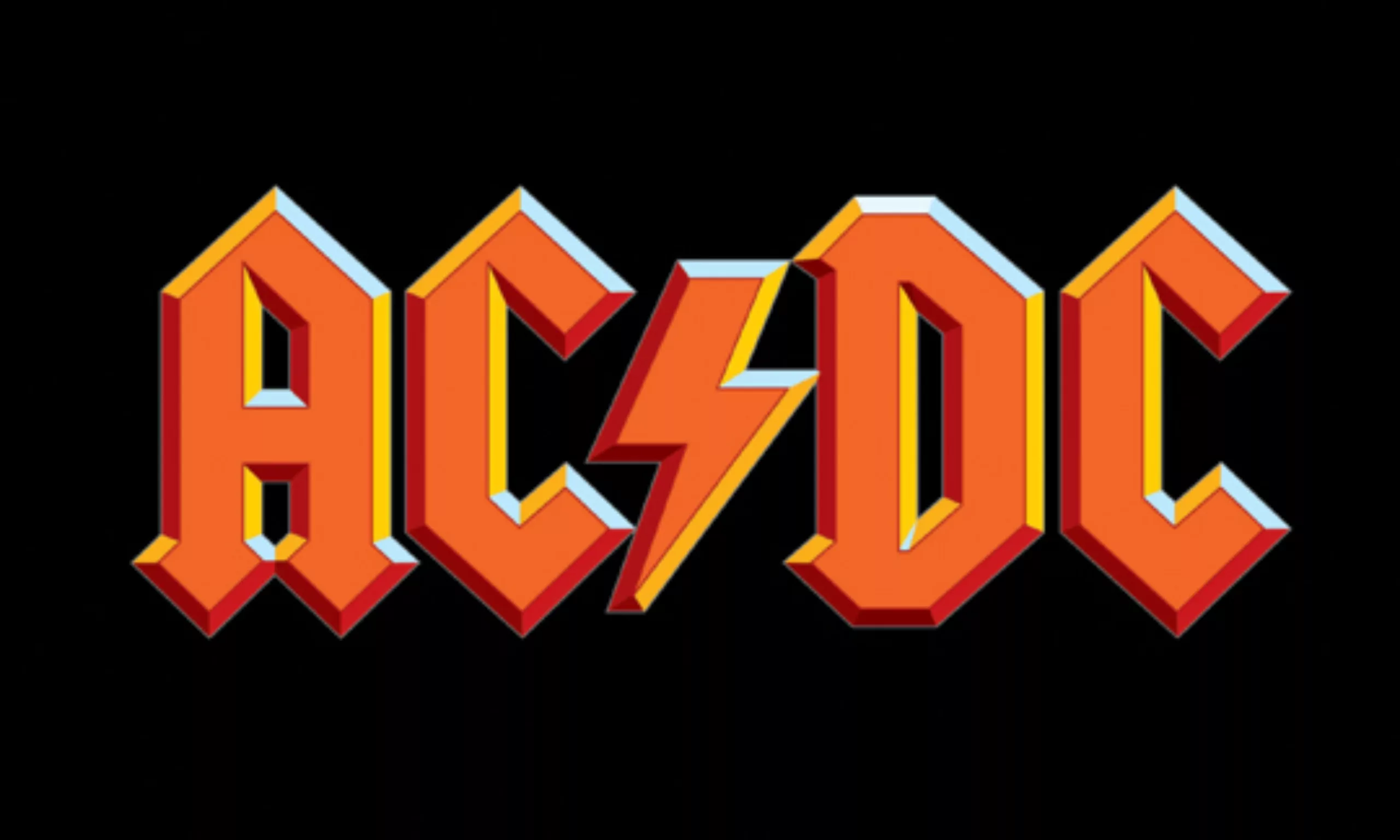
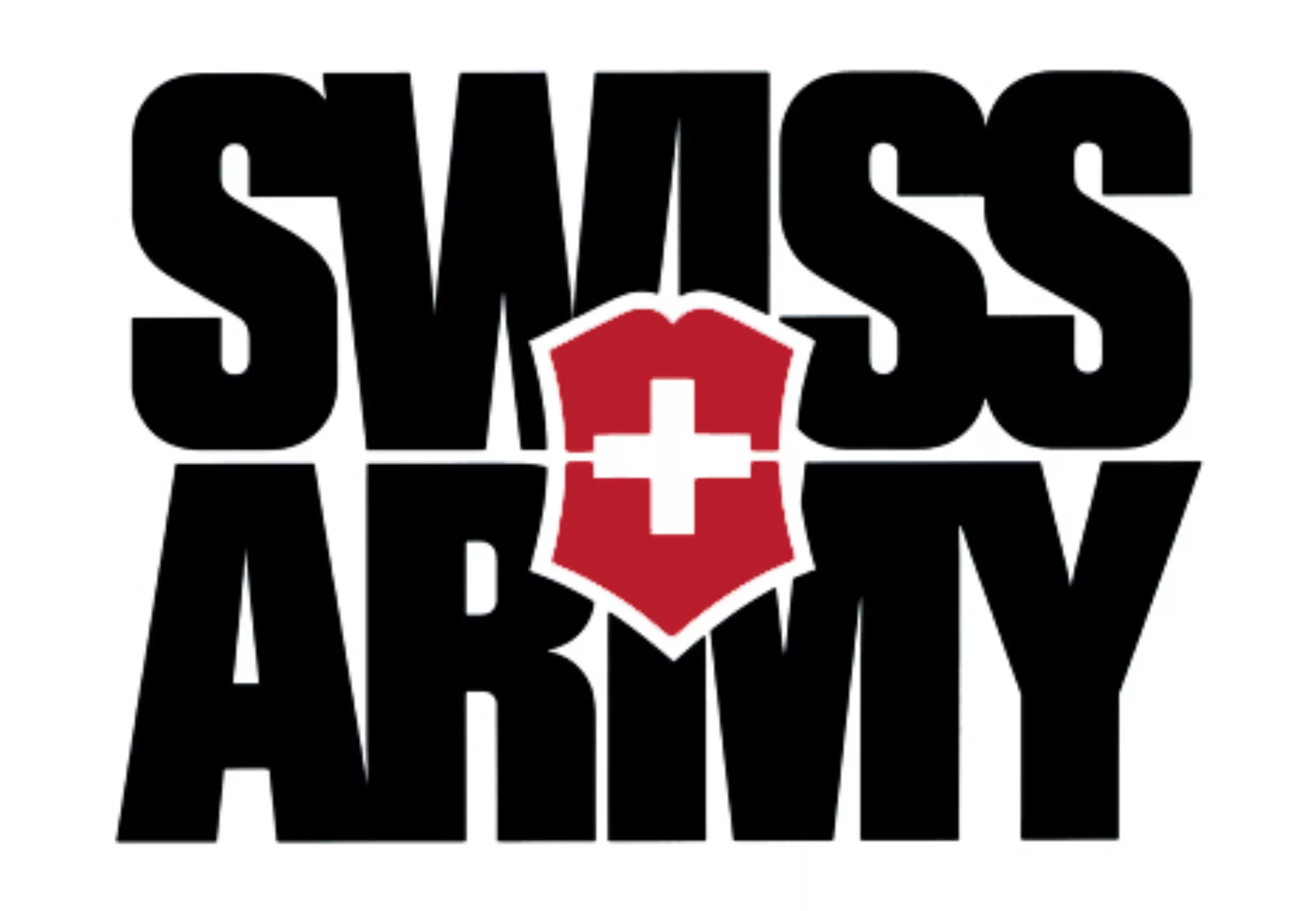
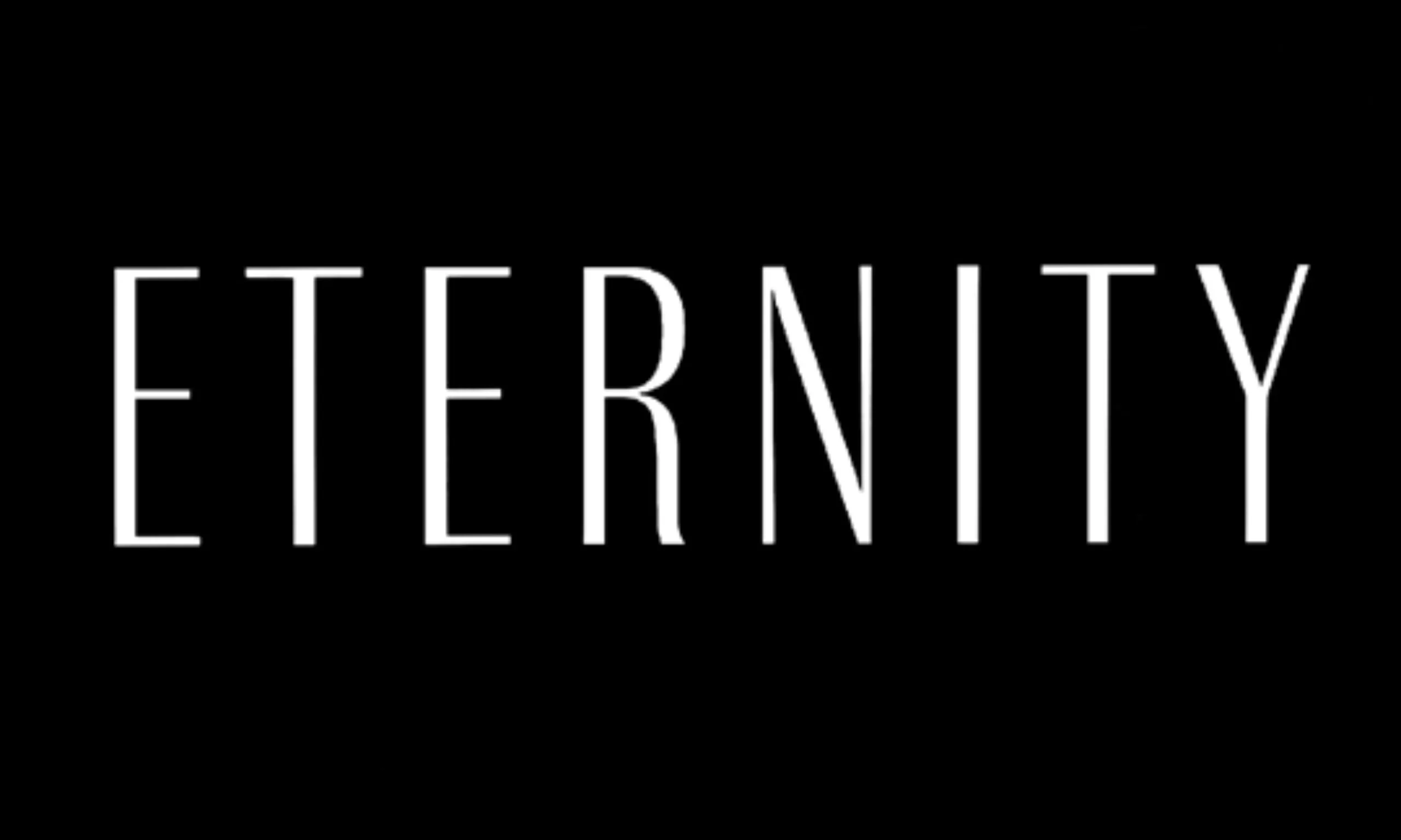
You would meet him in the street, you would not recognize him. The most passionate of graphic designers might possibly know his name. And yet, almost everyone has worn, looked at, read one of his logos. Gerard Huerta, born in California, is indeed recognized as one of the greatest graphic designers of his generation, and if his name means nothing to you, perhaps his logos will speak to you better. AC/DC, HBO, PC Magazine, Time, Adweek, Eternity by Calvin Klein, Spelling Entertainment, or even the SuperBowl, all have in common a logo designed by Gerard Huerta, who agreed to answer ActuLogo’s questions:
Interview of the great designer
ActuLogo : What does the logo represent for you today?
G. Huerta : A logo should simply be an instant, positive identifier of a brand or company. This comes down to two things: great design and strong exposure of that design. Its uniqueness aspect is especially important these days, as we are bombarded with so much visual imagery.
AL : You have designed many world famous logos, such as those of AC/DC, HBO, Spelling Entertainment, as well as numerous press titles. What is your creative process for a logo ?
G.H. : I like to find something in the verb, words or symbols that would become a unique visual. I bring this to life with the old-fashioned pencil and paper drawing method, and with lots of outlines. Then I select those I want to present and I scan them to redraw them in Adobe Illustrator.
AL : What do you think makes a good logo?
G.H. : Simplicity, the ability to adapt to many uses, good design lines, and fidelity to what it represents, that’s what makes a good logo.
AL : If you had to choose only one logo in the history of design, which one would you choose?
G.H. : It’s hard to choose just one! I love the Ford and GE ones for their ability to hold on to their history, while still being unique. Of course, the eye of CBS comes to mind, with again, plenty of history and length behind it.
It remains simple and contemporary after so many years of use. And probably the most famous in the world: the Coca-Cola logo. I think these companies, which have a graphic history, should never part with it just because someone wants to rebrand it.
AL : How do you explain the evolution of many logos towards this “glossy” effect? What do you think of this “Web 2.0” logo trend ?
G.H. : I think it’s a function of the ability to easily apply digital effects. In the past, objects were finished with spray paint, air brushes, etc… but it’s so easy now to create multi-dimensional objects with software. But like all fashions, it will seem outdated at some point, just like the illegible typography of the 1990s, or the psychedelic typos of the 1970s.
AL : How do you see logos evolving in the future?
G.H. : I’m not sure. I think simplicity of form and legibility will always be part of good logos, but who knows where that will lead?
AL : Was there a recent logo change that marked you?
G.H. : There’s this new Diet Coke identity, although I have only seen the packaging. I don’t know if there’s a complete new logo, as it appears on the bottles. I was flabbergasted by its simplicity, while at the same time wondering about the lack of story as Coca-Cola is such a distinctive brand. They have done such a good job of separating Diet Coke from the original Coca-Cola, not just in the design, but also in the name.
AL : Any advice for new logo designers?
G.H. : Draw. Sketch your ideas on paper. You’ll solve 90% of the graphics before you start working on digital. We all draw uniquely, and after all, aren’t we all looking for something unique?
Unique… is an apt adjective to describe the work of Gerard Huerta, whom I’d like to thank warmly for granting me this interview.