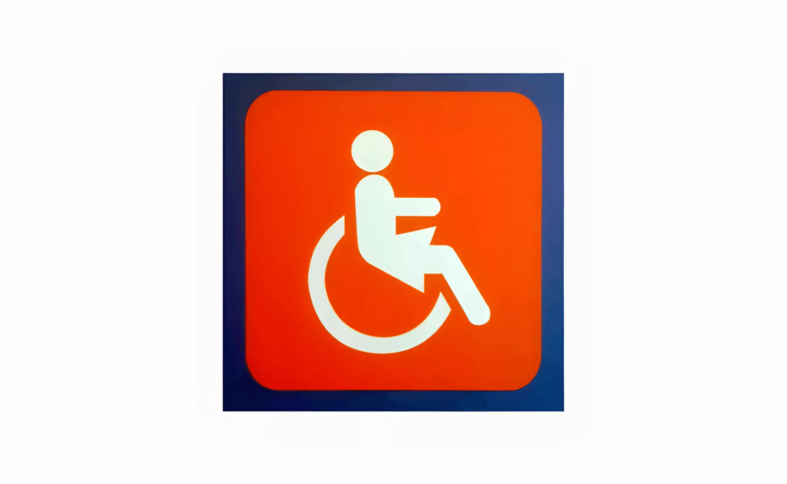
A “female” PRM pictogram?
Long live inclusive and feminist design!
Saturday 25 July, somewhere far from Paris, on a motorway service area like any other…
Well, like any other motorway service area until I spotted a surprising pictogram on my way to ‘where you should go on a motorway service area’…
We’re all familiar with its “male” alter-ego: the white and blue “PRM” pictogram. Maybe I don’t pay enough attention to this kind of symbol… but this is the first time I’ve seen a “female version”! So I decided to delve into the history of this pictogram.
This pictogram is 40 years old!
It was created in the 1960s as part of the international movement to defend the rights of people with disabilities. To be precise, it was the NGO ‘Rehabilitation International’ that took the initiative of organising a competition in 1969, which resulted in the work of Suzanne Koefoed (a Danish design student) being chosen. However, its international success was due to the support of the 3M company, which made it widely available on their self-adhesive labels. The pictogram was soon confirmed by ISO and the UN as the universal symbol of accessibility.
As Francine Saillant and Patrick Fougeyrollas describe in Reliance magazine (No. 2007/3), this pictogram, an icon of a person with reduced mobility, in a wheelchair, evokes a struggle for the widest possible access to places and buildings for people marked by the daily experience of a functional difference. Today, wheelchairs are everywhere, in our car parks, in lifts, in toilets…
The main criticism of this pictogram is its lack of meaning. It focuses on ‘people who can’t walk’, ignoring other disabilities such as sensory, visual, mental, psychological and cognitive impairments, as well as the elderly and even young children. This sign seems to place the ‘wheelchair user’ at the top of the hierarchy of disabilities, rather than representing the diversity of disabilities. In fact, the article in Reliance magazine reminds us that the original symbol showed the disabled person without a head, which was added by the jury in the 1969 competition.
Polysemy vs Minimalism
I can’t imagine what kind of “graphic designer” answer we could have given to such a question! This is one of the most difficult exercises in graphic design. To fit so many meanings into such a concise sign would be genius!
However, there are a few possibilities, starting with the use of colour. The Gay & Lesbian movement simply answers this question by flying a rainbow flag (a symbolic representation of the diversity of sexual orientations).
In the light of this example, the white and blue icon, which is intended to be universal (blue = the colour of the UN?), seems quite neutral, and only imperfectly conveys the complexity of the subject.
Like all graphic designers, we use signs handed down from our elders on a daily basis. Signs that claim to be universal (in the West!). But our role as designers is also to ensure that these signs always have the same universal value, even if it means changing them as society evolves.
I’m digressing, but the list could go on and on:
- How will our children interpret the floppy disk icon?
- What about the magnifying glass when the zoom goes digital?
- An envelope from the last century to symbolise an email?
- An hourglass for waiting?
- A Compact Disc in the age of MP3?
- …
PS – I give a big thumbs up to Apple for updating its ‘Power Saver’ icon in the latest version of its operating system…
PPS – For those of you who love obsolete icons, the list is always growing… Don’t hesitate to let us know about others!
On the subject
-
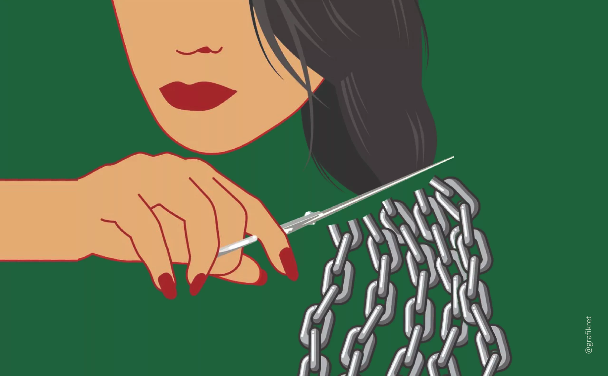
The symbolism of cut hair in Iranian protest posters
In Iran, Mahsa Amini died for a lock of hair poorly concealed behind her headscarf, giving rise to a massive protest movement against the mullahs’ regime. The gesture of a severed lock of hair becoming the symbol of this struggle gives us the opportunity to look back at the many symbolic of hair.
-
The graphic codes of post-modernism in brand logos
We are entering the “time of the tribes”. Let’s discover the impact of this post-modernity for the logos and visual identities of brands and companies.
-
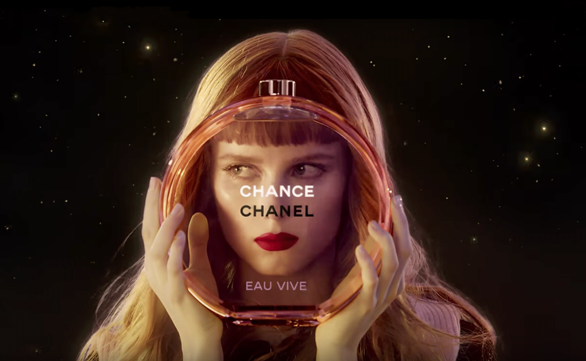
The hidden secret of CHANCE by CHANEL is Goude
Advertising sometimes offers us UFOs that seem to escape simple marketing specifications to project us towards an unexpected elsewhere. Here’s an analysis of the symbolic mystery of Chanel’s latest Chance perfume ad, directed by Jean-Paul Goude in 2016.