
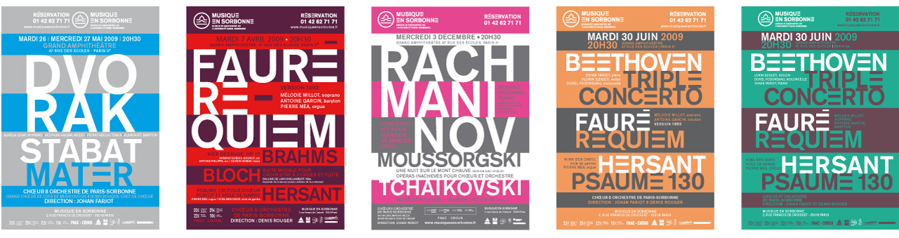
“Musique en Sorbonne” Posters

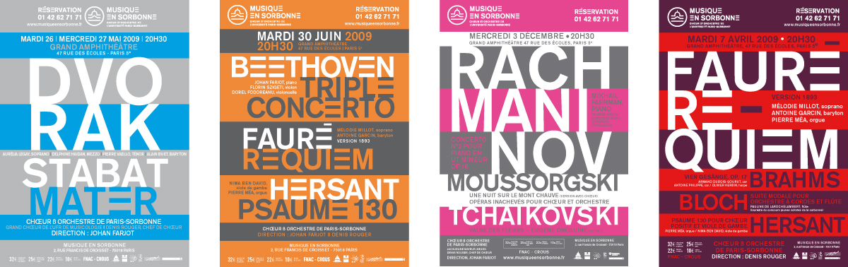


TYPOGRAPHY : AKZIDENZ GROTESK
The first versions of the Akzidenz Grotesk were marketed in 1896 by the typofonderie H. Berthold AG.
We offer a "modified" version, with a simplified capital "E" with 3 horizontal bars. The personalization of this vowel (the most frequently used in the French language) creates a new distinctive sign.
Evoking rhythm, intervals and musical staves, this abstract sign becomes the letter "E" when integrated into a word.
The use of a single "horizontal" accent echoes the rhythm of the "E", like an additional line on a stave.
( On this subject: http://airoe.org/spip.php?article125 )
The use of this typeface makes it possible, with a certain economy of means, to set up an effective and adaptable identity system.
THE MEDAILLON :
It symbolizes the prestige and history of the Sorbonne University.
We propose a simplified medallion that can be integrated into the typography.
Share this post:
 San Serriffe typographic Island
 Design, creativity and oblique strategies!
 Tote bag, a new social totem?
 Sister Corita Kent, the Pop Art nun
 Donald Trump, the martyr who makes history
 Evesio, Nuclear Medical Center – Naming & visual identity
 Khalvadjian Lawyers
 Ville d’Annecy – Visual identity
 History of Turkish Graphic Design
 The Art and Science of Hybrid Images
 A short history of book cover design – 1/4
 Creating a universal language
 Peter Gut “sketches real life”!
Leave a Reply