CNFPT Visual Identity
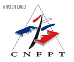 A few months ago, we were selected to take part in a tender to redesign the CNFPT visual identity (Centre National de la Fonction Publique Territoriale). This institution wanted to adopt a new visual identity and benefit from a new communication (logo and its principles of use) identifiable by all as a national public establishment, to distinguish itself from the competition, but also from the multitude of local public players. In short, to create a modern, dynamic and attractive image - the classic brief.
Except, apparently, the subject had been on the table for some time. The dossier submitted by the client was accompanied by several market studies (Ipsos) and research into previously proposed logos. We deduced that several agencies had already worked on the subject to no avail. Motivated to solve this problem, we put all our energy into presenting this project (cf: below :-) ). Despite this, none of our ideas caught their attention... and the same was true of the 2 or 3 other agencies taking part in the tender. Everyone was given a second chance to submit a logo. This time, a graphic reference was provided: the ÉNA logo... . In the end, their in-house studio produced the logo.
While the CNFPT deserves credit for "respectful compensation" (which is rare enough to be worth mentioning!), it's a shame that, with so much creative energy mobilized on this project, no candidate was ultimately selected.
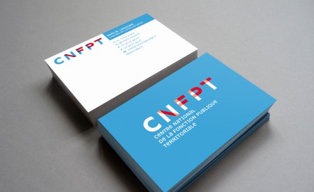
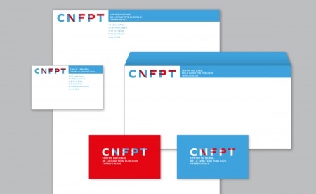
Our Project: A contemporary and colorful vision of public service
This proposal is based on the notion of territories. The mesh of frames, their intersection and superimposition are intended to reflect the density and diversity of this landscape: communes, communities of agglomerations, départements, regions, men, women...
It reflects the idea of the network created by the CNFPT through its twenty-nine regional delegations and their departmental branches, its four schools and its higher training institute.
These intersecting lines also echo the links that CNFPT creates between local authorities and their employees.
The construction aspect of the letters can reflect the idea of stability, anchoring and strength, as well as the idea of training, self-building and career development for the agent supported by the CNFPT.
The colors "blue, white and red" were adopted to reinforce the notion of public service and to link with the previous identity, while completely renovating it. We added transparency to preserve the fluidity and lightness of the sign.
The typeface selected for the baseline, Newut, was designed by André Baldinger in 2000. It follows in the tradition of universalist typefaces. The name Newut clearly refers to one of its models - the typeface Univers designed by Adrian Frutiger: NEW U(niversal) T(ypeface).
It has all the qualities of this typeface: clear, precise lines, classic layout, harmonious proportions, open forms (ensuring good legibility in small sizes), and adaptability to a wide range of media.
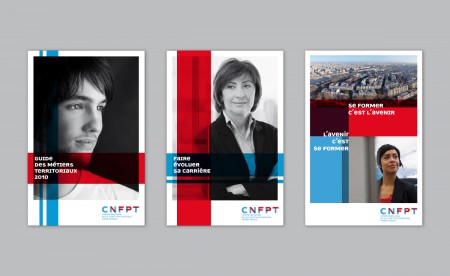
However, Newut has a distinctive characteristic: its capitals are reduced to lower-case height. This preserves their "monumental" design (as they derive from Roman lapidary inscriptions), while approaching the main interest of lowercase letters: their legibility. By blending the two forms, Newut achieves a balance that enables it to be used both for everyday texts (leaflets, forms) and as a titling typeface (posters, covers).
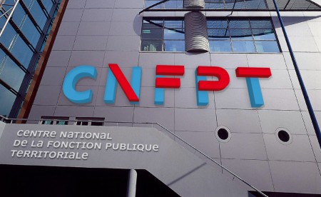
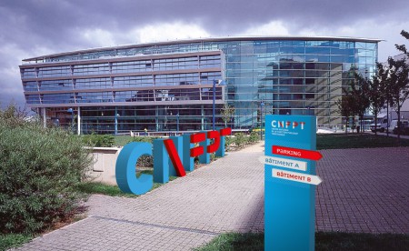
The logo can be used on a monumental scale.
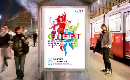
A freer use of the logo can be envisaged within the framework of event communication.
PS: Work carried out in collaboration with Florence Roller.
Share this post:






 San Serriffe typographic Island
 Design, creativity and oblique strategies!
 Tote bag, a new social totem?
 Sister Corita Kent, the Pop Art nun
 Donald Trump, the martyr who makes history
 Intiqal – Visual identity
 Tanjazz, Tangier jazz festival
 Montluçon’s riverbanks project – Visual identity
 YUV® hair colour device – branding, naming and visual identity
 Carbone4 – Visual identity
 The CIA gets a new identity!
 Alexander Girard, “the color-fool”
 Another brick in the wall : lego graphics !
 Uncle Bens’, Aunt Jemima… racist packaging rises up
 Poster of the humanitarian trades fair


Leave a Reply