A logotype for “L’Art pour Grandir” – Art education in Paris

25 February 2010  |   0 Comments   |    |  

A visual identity for arts education

Paris City Hall want to develop artistic education for all young Parisians, and to encourage them to visit cultural venues by bringing cultural establishments and schools closer together. The discovery of artistic practices by children and teenagers in various fields (theater, music, dance, public reading, museums...) is thus encouraged, through contact with works of art and cultural establishments.
We were therefore asked to design the logo for this "Art for Growing Up" label, to identify all the actions undertaken within this framework.

We were not selected, but here are our proposals...

IDEA 1 : a bouncy logo ! 


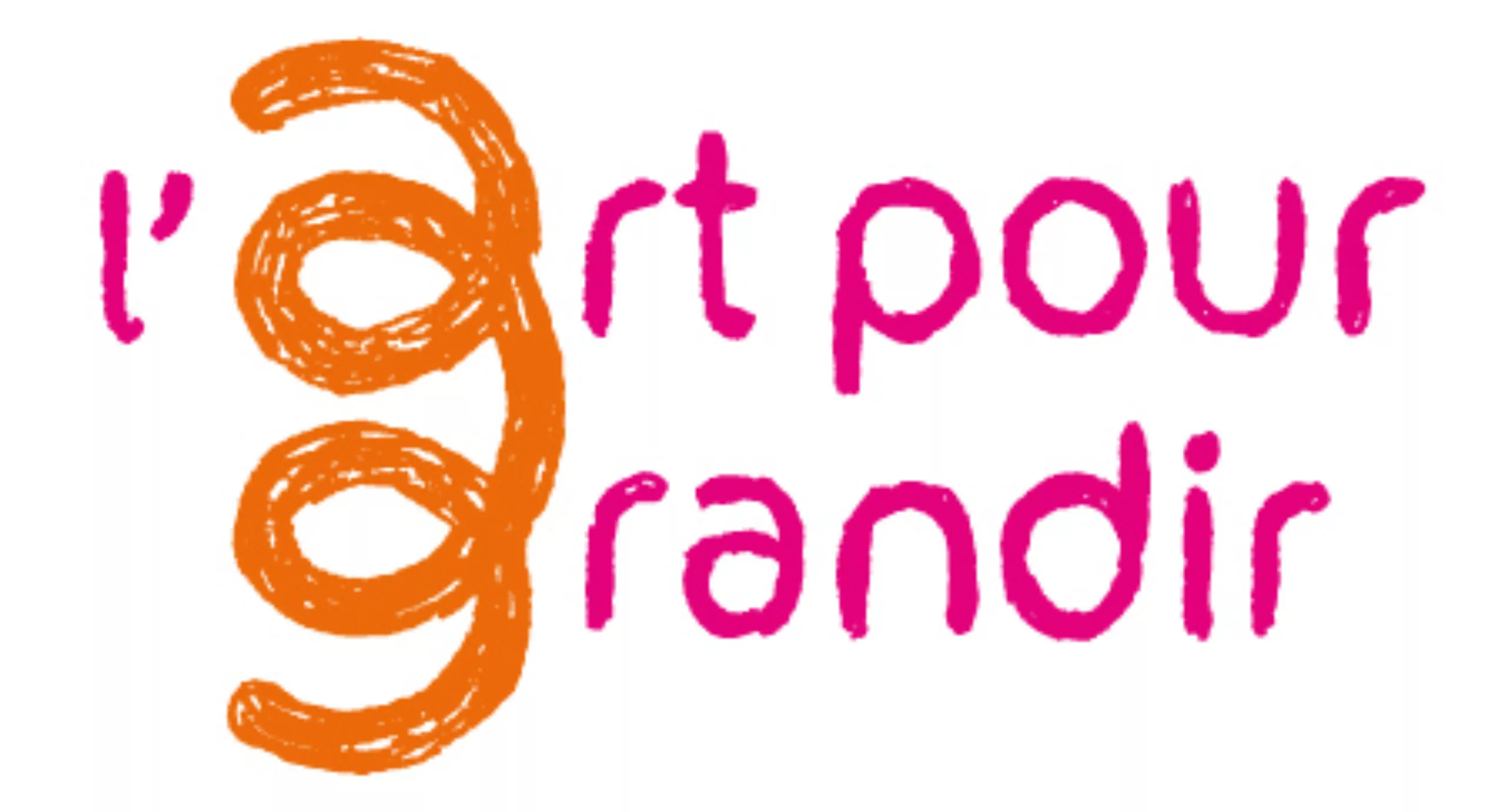
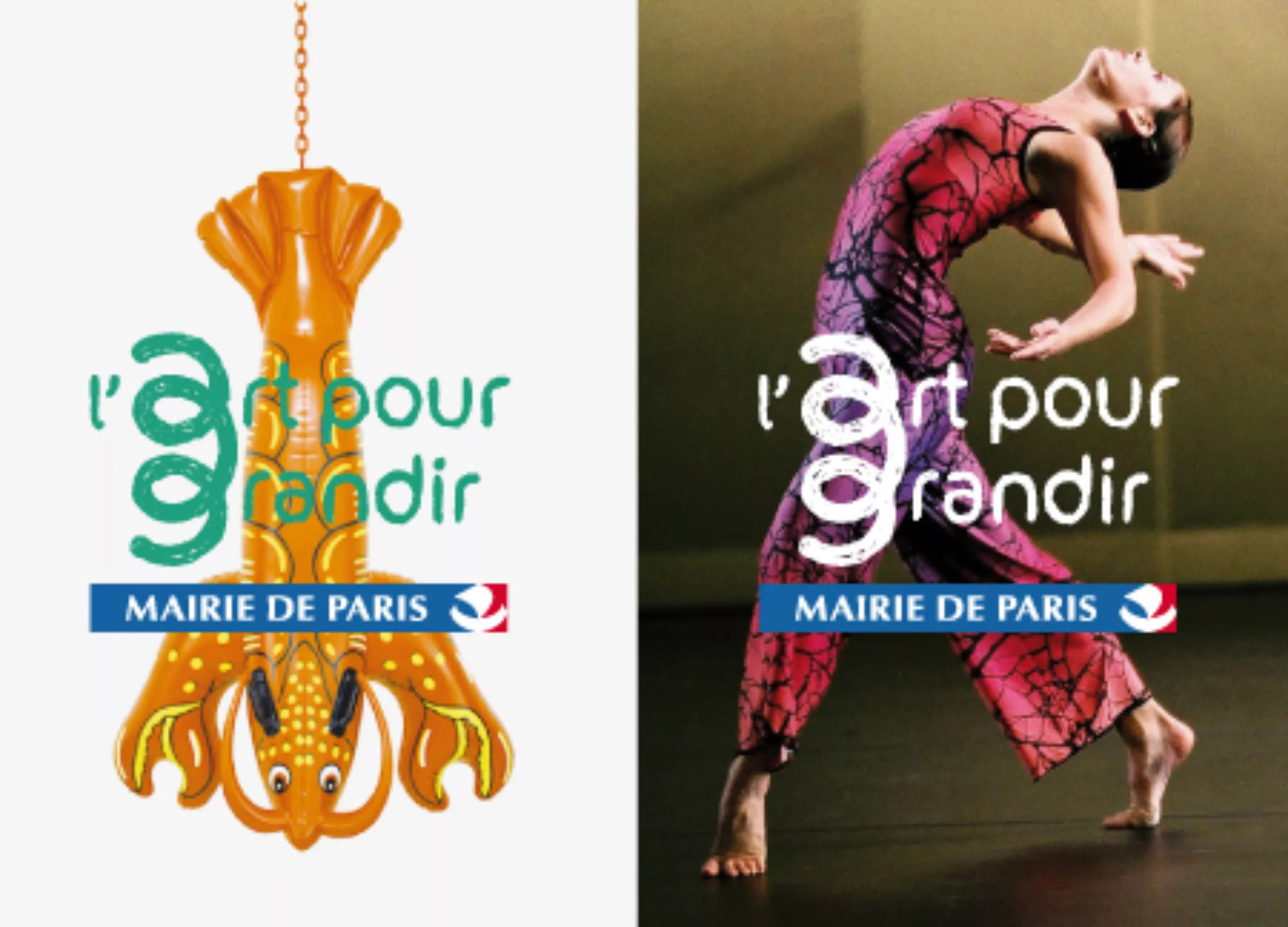
Proposal for a graphic (and typographic) symbol resulting from the ligature of the initials "a" for art and "g" for grow. This sign is similar to a spring or a sprout. Its purpose is to express the public's artistic awareness and curiosity, as well as the fantasy and freedom of thought that can challenge preconceived ideas about the artistic field.
The scribbled line evokes the spontaneous gesture of creativity, while the composition of the typographic block in rounded, low-case type conveys a desire for accessibility. It's an invitation to "bounce back" from what you've learned, to go further and blossom...with Art!

Its graphic simplicity and symbolic power make it a highly effective label for both the performing and visual arts.

IDEA 2 : a head full of ideas


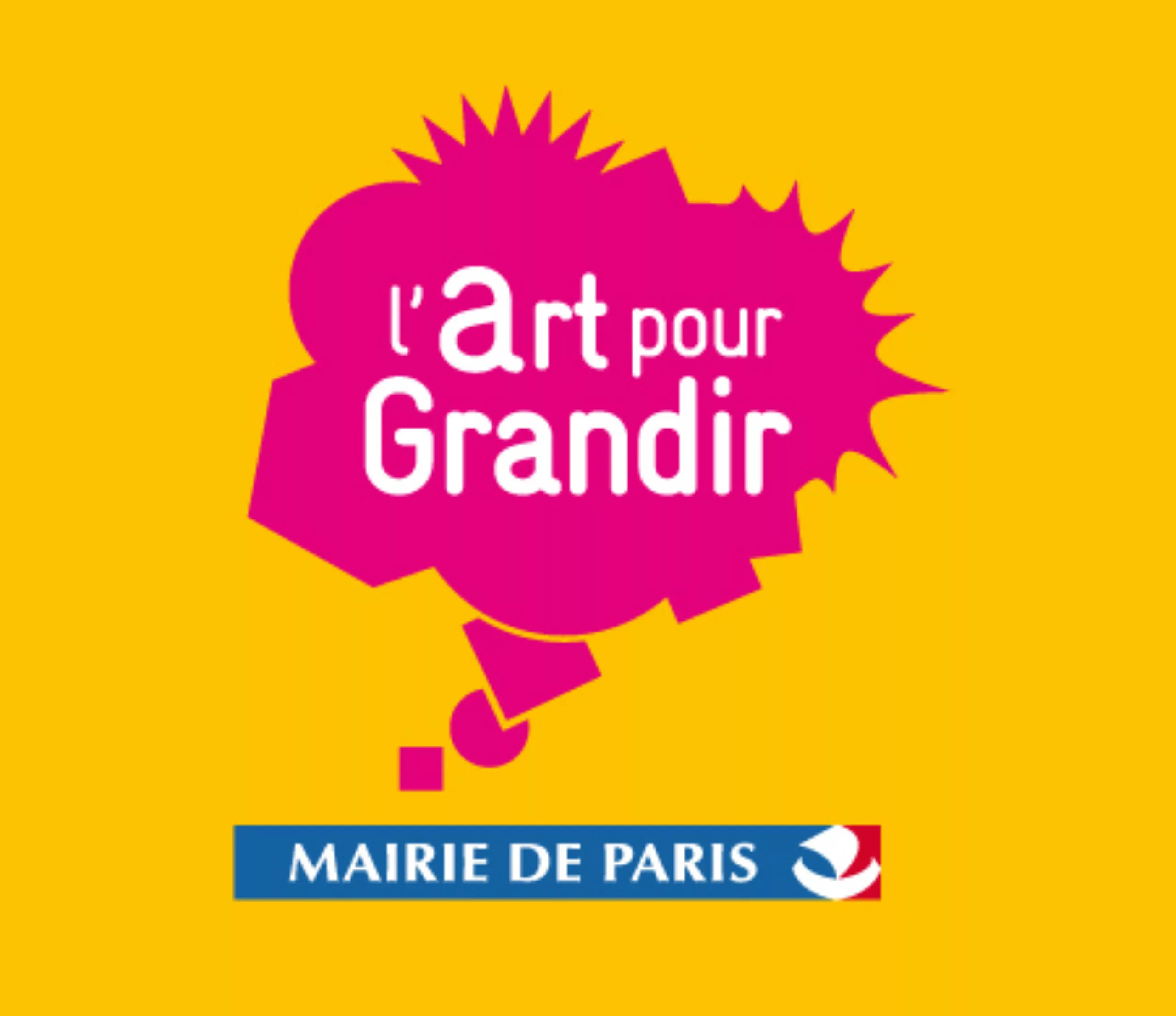
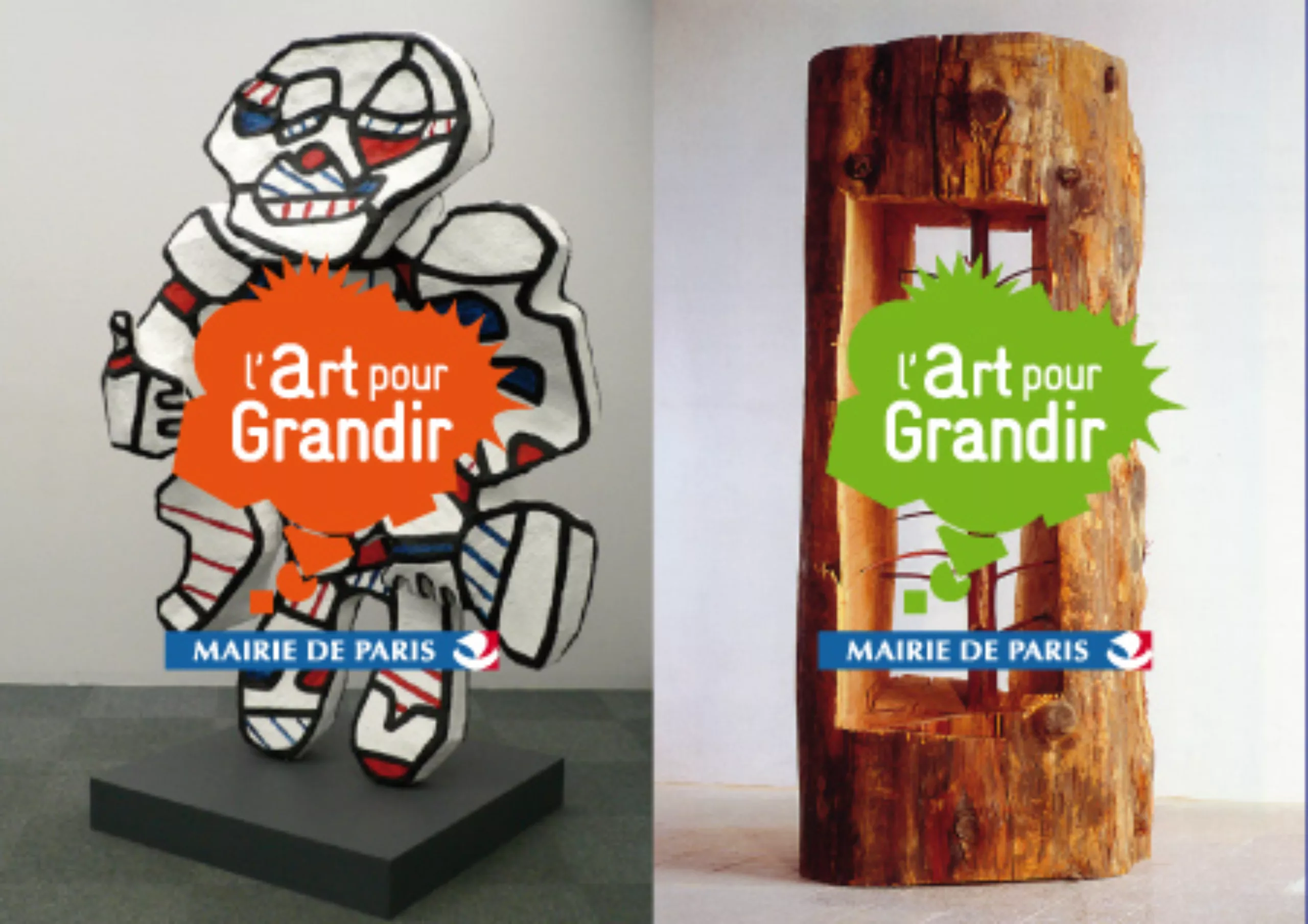
This idea revolves around a proposed sign, the "thought bubble". It conveys the idea of a projection into the future of oneself. This narrative sign translates the concepts of growth and intellectual fulfillment, through the figuration of a graphic space in the process of formation, whose strangely agitated silhouette expresses the heterogeneous fusion of different artistic fields.


Share this post:


Leave a Reply